This indicator is meant to be used for coming up with price targets based on past performances of rallies/selloffs.
It shows how much a trade could have made over a 30-day period (or other length of time) in terms of percentage gain.
It also show how much could have been lost in terms of percentage loss
The green plot shows percentage gain from current high to the low of the previous 30 days.
The red plot shows adjusted percentage loss from current low to the high of the previous 30 days.
The 30 can be adjusted and the chart can be used on any time interval.
Note on max loss adjustment:
Max loss percentage is adjusted to be higher to account for the fact that a percentage loss corresponds to a percentage
gain of a greater amount. For instance, a loss of 25% can only be recovered with a percentage gain of 33%.
A 25% loss looking at the chart from left to right would be a 33% gain looking at the same price
action from right to left. In order to compare apples to apples visually and performance wise, max loss percent needs to be adjusted.
The actual max loss percent is calculated and plottable but is not plotted by default because it is less useful and adds clutter.
There is not a great difference between actual max loss and adjusted max loss under everyday market conditions, but
major selloffs (SPY 2020), short squeezes (GME 2021), or other unusually directional moves will display percentage losses
that, in absolute terms, should be considered to be fairly incorrect. The adjusted percentages are good indicators of
relative performance when comparing the magnitudes to the magnitudes of the max gain percentages and
are more visually meaningful than the actual max loss percentages in every situation, so they are plotted despite having incorrect values.
Note on bear markets:
This indicator was designed for bull markets but should it be used in bear markets the indicators that are and aren't
plotted should be swapped using the plot check boxes in the settings dialogue if there is interest in using the loss percentages
for actual loss amount calculations while maintaining visual/performance adjustment
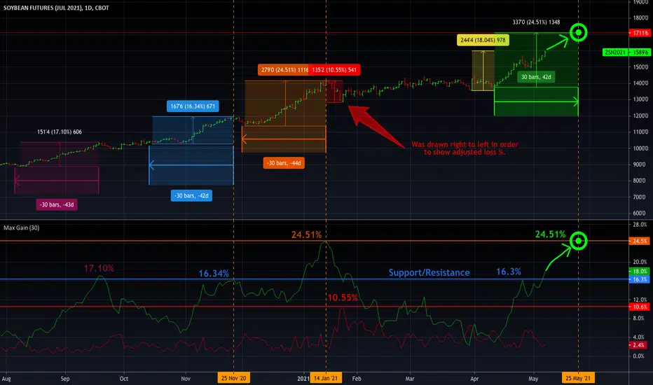
As can been seen in the example chart a gain of 16.3% to 17.1% appears to be a resistance level. This level was recently broken through and the next resistance is 24.5%.
The target is a 24.5% gain from the anticipated 30-day low at the time when the price can be expected to reach a 25.4% gain at the gain rate observed in recent rallies.
Previous rallies are shown for reference with their 30-day periods and corresponding gain percentages which are plotted below.
A selloff is shown in red for reference as well. It was drawn backward to trick the tool into thinking it was a gain, so as to demonstrate logic behind the adjustment.
In reality, this was closer to a 9.5% loss, not 10.55%.
I am still experimenting with this indicator to see how to best use it. Ultimately, it helps me do what I was already doing with the percentage gain tools
but now I can do those analyses in a more systematic manner and with charting. Please feel free to ask questions.
It shows how much a trade could have made over a 30-day period (or other length of time) in terms of percentage gain.
It also show how much could have been lost in terms of percentage loss
The green plot shows percentage gain from current high to the low of the previous 30 days.
The red plot shows adjusted percentage loss from current low to the high of the previous 30 days.
The 30 can be adjusted and the chart can be used on any time interval.
Note on max loss adjustment:
Max loss percentage is adjusted to be higher to account for the fact that a percentage loss corresponds to a percentage
gain of a greater amount. For instance, a loss of 25% can only be recovered with a percentage gain of 33%.
A 25% loss looking at the chart from left to right would be a 33% gain looking at the same price
action from right to left. In order to compare apples to apples visually and performance wise, max loss percent needs to be adjusted.
The actual max loss percent is calculated and plottable but is not plotted by default because it is less useful and adds clutter.
There is not a great difference between actual max loss and adjusted max loss under everyday market conditions, but
major selloffs (SPY 2020), short squeezes (GME 2021), or other unusually directional moves will display percentage losses
that, in absolute terms, should be considered to be fairly incorrect. The adjusted percentages are good indicators of
relative performance when comparing the magnitudes to the magnitudes of the max gain percentages and
are more visually meaningful than the actual max loss percentages in every situation, so they are plotted despite having incorrect values.
Note on bear markets:
This indicator was designed for bull markets but should it be used in bear markets the indicators that are and aren't
plotted should be swapped using the plot check boxes in the settings dialogue if there is interest in using the loss percentages
for actual loss amount calculations while maintaining visual/performance adjustment
As can been seen in the example chart a gain of 16.3% to 17.1% appears to be a resistance level. This level was recently broken through and the next resistance is 24.5%.
The target is a 24.5% gain from the anticipated 30-day low at the time when the price can be expected to reach a 25.4% gain at the gain rate observed in recent rallies.
Previous rallies are shown for reference with their 30-day periods and corresponding gain percentages which are plotted below.
A selloff is shown in red for reference as well. It was drawn backward to trick the tool into thinking it was a gain, so as to demonstrate logic behind the adjustment.
In reality, this was closer to a 9.5% loss, not 10.55%.
I am still experimenting with this indicator to see how to best use it. Ultimately, it helps me do what I was already doing with the percentage gain tools
but now I can do those analyses in a more systematic manner and with charting. Please feel free to ask questions.
開源腳本
本著TradingView的真正精神,此腳本的創建者將其開源,以便交易者可以查看和驗證其功能。向作者致敬!雖然您可以免費使用它,但請記住,重新發佈程式碼必須遵守我們的網站規則。
免責聲明
這些資訊和出版物並不意味著也不構成TradingView提供或認可的金融、投資、交易或其他類型的意見或建議。請在使用條款閱讀更多資訊。
開源腳本
本著TradingView的真正精神,此腳本的創建者將其開源,以便交易者可以查看和驗證其功能。向作者致敬!雖然您可以免費使用它,但請記住,重新發佈程式碼必須遵守我們的網站規則。
免責聲明
這些資訊和出版物並不意味著也不構成TradingView提供或認可的金融、投資、交易或其他類型的意見或建議。請在使用條款閱讀更多資訊。