OPEN-SOURCE SCRIPT
已更新 International [interest, exchange] rates

from my blog to quantguy :
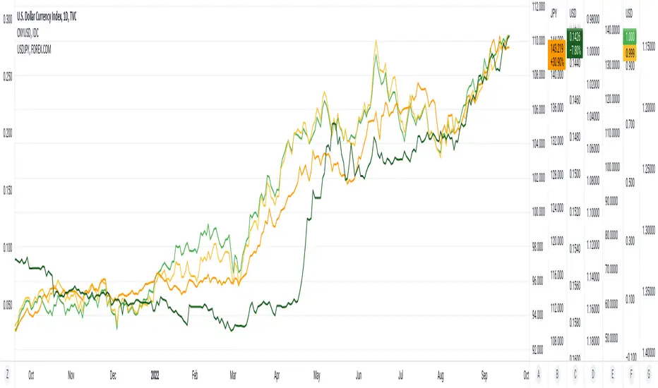
Below are links to a rapid-throw-together set of charts comparing [interest, exchange] rates internationally. There are probably millions of other graphs like this created by organisations and educationals institutes, but far more advanced and accurate. Even so, the graphs show the time relationship between [exchange, interest] rates, and are suggestive of some degree of correlation. No sense pushing this too far, it would be more fun to ferret out more of the network of inter-related factors. One possible current anomaly is the GBPUSD exchange rate?
The charts were generated using a simple PineScript (should be visible?)
// saved graphs - unfortunately, all of the colored labels on the graph were lost!!
// exchange rates are shown by darker colors, interest rates lighter similar colors
// China - green, Euro - purple, Great Britain - blue, Japan - orange (you can see this in the4 code below!)
// stable interest rates : [JP10Y, CN10Y]
// policy-manipulated interest rates : [TNX, EU10Y, GB10Y]
// maybe the "stable rates" countries do more "exchange rate" manipulation?
I haven't put in (min, max) interest rates for time periods EXCEPT for 6month & 1 year. the other periods will be erroneous (eg day, month, 3 month, 5 year, etc)
發行說明
20Sep2022 - This is an update of yesterday's Pine Script. I have simply provided additional constants for the (3M, 6M) time.periods, adding to constants for (1Y, 5Y) time.periods of yesterday. I did try to implement script to automatically provide the (min, max) of del_CN10Y = v_TNX - v_CN10Y (example), but PineScript does not work on full time-period information accurately, so I abandoned that. Below are links to a rapid-throw-together set of charts comparing rates internationally. There are probably millions of other graphs like this created by organisations and educationals institutes, but far more advanced and accurate. Even so, the graphs show the time relationship between rates, and are suggestive of some degree of correlation. No sense pushing this too far, it would be more fun to ferret out more of the network of inter-related factors. One possible current anomaly is the GBPUSD exchange rate?
// All manually-provided constants for del[Min, Max]_<sym>10Y will become inaccurate with time!!
// ONLY time.periods [3M, 6M, 1Y, 5Y] work.
// time.periods [1D, 5D, 1M, ALL] do NOT work - I haven't manually provided values from charts.
// there are some errors in my manually [read, record] of the 5Y time-periods
// additionally, this Pine Script was thrown together in a day, no rigorous testing
// exchange rates are shown by darker colors, interest rates lighter similar colors
// China - green, Euro - purple, Great Britain - blue, Japan - orange (you can see this in the4 code below!)
// stable rates : [JP10Y, CN10Y]
//
// policy-manipulated rates : [TNX, EU10Y, GB10Y]
//
開源腳本
秉持TradingView一貫精神,這個腳本的創作者將其設為開源,以便交易者檢視並驗證其功能。向作者致敬!您可以免費使用此腳本,但請注意,重新發佈代碼需遵守我們的社群規範。
免責聲明
這些資訊和出版物並非旨在提供,也不構成TradingView提供或認可的任何形式的財務、投資、交易或其他類型的建議或推薦。請閱讀使用條款以了解更多資訊。
開源腳本
秉持TradingView一貫精神,這個腳本的創作者將其設為開源,以便交易者檢視並驗證其功能。向作者致敬!您可以免費使用此腳本,但請注意,重新發佈代碼需遵守我們的社群規範。
免責聲明
這些資訊和出版物並非旨在提供,也不構成TradingView提供或認可的任何形式的財務、投資、交易或其他類型的建議或推薦。請閱讀使用條款以了解更多資訊。