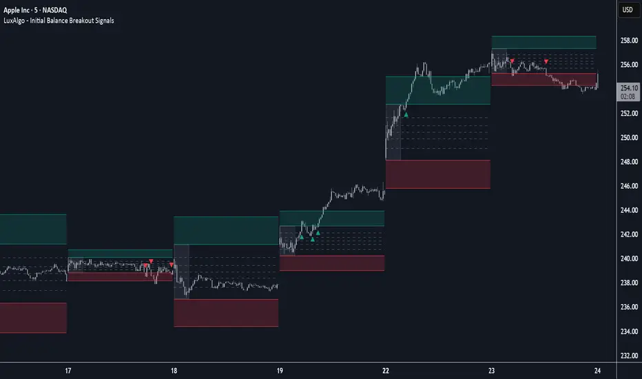
Initial Balance Breakout Signals [LuxAlgo]The Initial Balance Breakout Signals help traders identify breakouts of the Initial Balance (IB) range.
The indicator includes automatic detection of IB or can use custom sessions, highlights top and bottom IB extensions, custom Fibonacci levels, and goes further with an IB forecast with two different modes.
🔶 USAGE
The initial balance is the price range made within the first hour of the trading session. It is an intraday concept based on the idea that high volume and volatility enter the market through institutional trading at the start of the session, setting the tone for the rest of the day.
The initial balance is useful for gauging market sentiment, or, in other words, the relationship between buyers and sellers.
Bullish sentiment: Price trades above the IB range.
Mixed sentiment: Price trades within the IB range.
Bearish sentiment: Price trades below the IB range.
The initial balance high and low are important levels that many traders use to gauge sentiment. There are two main ideas behind trading around the IB range.
IB Extreme Breakout: When the price breaks and holds the IB high or low, there is a high probability that the price will continue in that direction.
IB Extreme Rejection: When the price tries to break those levels but fails, there is a high probability that it will reach the opposite IB extreme.
This indicator is a complete Initial Balance toolset with custom sessions, breakout signals, IB extensions, Fibonacci retracements, and an IB forecast. All of these features will be explained in the following sections.
🔹 Custom Sessions and Signals
By default, sessions for Initial Balance and breakout signals are in Auto mode. This means that Initial Balance takes the first hour of the trading session and shows breakout signals for the rest of the session.
With this option, traders can use the tool for open range trading, making it highly versatile. The concept behind open range (OR) is the same as that of initial balance (IB), but in OR, the range is determined by the first minute, three or five minutes, or up to the first 30 minutes of the trading session.
As shown in the image above, the top chart uses the Auto feature for the IB and Breakouts sessions. The bottom chart has the Auto feature disabled to use custom sessions for both parameters. In this case, the first three minutes of the trading session are used, turning the tool into an Open Range trading indicator.
This chart shows another example of using custom sessions to display overnight NASDAQ futures sessions.
The left chart shows a custom session from the Tokyo open to the London open, and the right chart shows a custom session from the London open to the New York open.
The chart shows both the Asian and European sessions, their top and bottom extremes, and the breakout signals from those extremes.
🔹 Initial Balance Extensions
Traders can easily extend both extremes of the Initial Balance to display their preferred targets for breakouts. Enable or disable any of them and set the IB percentage to use for the extension.
As the chart shows, the percentage selected on the settings panel directly affects the displayed levels.
Setting 25 means the tool will use a quarter of the detected initial balance range for extensions beyond the IB extremes. Setting 100 means the full IB range will be used.
Traders can use these extensions as targets for breakout signals.
🔹 Fibonacci Levels
Traders can display default or custom Fibonacci levels on the IB range to trade retracements and assess the strength of market movements. Each level can be enabled or disabled and customized by level, color, and line style.
As we can see on the chart, after the IB was completed, prices were unable to fall below the 0.236 Fibonacci level. This indicates significant bullish pressure, so it is expected that prices will rise.
Traders can use these levels as guidelines to assess the strength of the side trying to penetrate the IB. In this case, the sellers were unable to move the market beyond the first level.
🔹 Initial Balance Forecast
The tool features two different forecasting methods for the current IB. By default, it takes the average of the last ten values and applies a multiplier of one.
IB Against Previous Open: averages the difference between IB extremes and the open of the previous session.
Filter by current day of the week: averages the difference between IB extremes and the open of the current session for the same day of the week.
This feature allows traders to see the difference between the current IB and the average of the last IBs. It makes it very easy to interpret: if the current IB is higher than the average, buyers are in control; if it is lower than the average, sellers are in control.
For example, on the left side of the chart, we can see that the last day was very bullish because the IB was completely above the forecasted value. This is the IB mean of the last ten trading days.
On the right, we can see that on Monday, September 15, the IB traded slightly higher but within the forecasted value of the IB mean of the last ten Mondays. In this case, it is within expectations.
🔶 SETTINGS
Display Last X IBs: Select how many IBs to display.
Initial Balance: Choose a custom session or enable the Auto feature.
Breakouts: Enable or disable breakouts. Choose custom session or enable the Auto feature.
🔹 Extensions
Top Extension: Enable or disable the top extension and choose the percentage of IB to use.
Bottom extension: Enable or disable the bottom extension and choose the percentage of IB to use.
🔹 Fibonacci Levels
Display Fibonacci: Enable or disable Fibonacci levels.
Reverse: Reverse Fibonacci levels.
Levels, Colors & Style
Display Labels: Enable or disable labels and choose text size.
🔹 Forecast
Display Forecast: Select the forecast method.
- IB Against Previous Open: Calculates the average difference between the IB high and low and the previous day's IB open price.
- Filter by Current Day of Week: Calculates the average difference between the IB high and low and the IB open price for the same day of the week.
Forecast Memory: The number of data points used to calculate the average.
Forecast Multiplier: This multiplier will be applied to the average. Bigger numbers will result in wider predicted ranges.
Forecast Colors: Choose from a variety of colors.
Forecast Style: Choose a line style.
🔹 Style
Initial Balance Colors
Extension Transparency: Choose the extension's transparency. 0 is solid, and 100 is fully transparent.
指標和策略
🗽 {Wong FoohKin System©} | BrokeHomie_Kwam™️🚝Built by BrokeHomie_Kwam™, this system is a modular, high-precision trading framework designed for tactical execution across volatile market conditions. It reflects Kwamein’s elite engineering style—vault-synced logic, multi-phase overlays, and cheat-sheet clarity.
Core Identity:
• Name Origin: “Wong FoohKin” is a coded nod to trap logic and misdirection—mirroring how price action often fakes out retail sentiment before reversing.
• Style: Aggressive yet calculated. The system thrives on layered logic, HTF bias alignment, and real-time adaptability.
Key Features:
• 🔁 Multi-phase logic: Bias detection, trap zones, POI freshness, and vault toggles
• 🧩 Modular overlays: HTF structure, EQH/EQL sweeps, FVG sync, and NYO trap logic
• 🎯 Execution-ready clarity: Half-line formatting, toggle logic, and instantly actionable flows
Use Case:
Perfect for traders who want to compress prep time and execute with precision during NYSE open or high-volatility sessions. It’s especially tuned for GOAT Funded Trader accounts and Empire Auto-Runner workflows.

Estimated Manipulation Movement Signal [AlgoPoint]Follow the Footprints of Whale Movements That Drive the Market
Overview
The market is not always driven by natural supply and demand. Large players—often called "whales" or institutions—can create artificial price movements to trigger stop-losses, induce panic or FOMO, and build their large positions at favorable prices. These events are known as "stop hunts" or "liquidity grabs."
The EMMS indicator is a specialized tool designed to detect these specific moments of potential market manipulation. It does not follow trends in a traditional sense; instead, it identifies high-probability reversal points created by the calculated actions of Smart Money trapping other market participants.
How It Works: The 3-Module Logic
The indicator uses a multi-stage confirmation process to identify a potential stop hunt:
1. Anomaly Detection: The engine first scans the chart for "Anomaly Candles." These are candles with unusually high volume and a very long wick relative to their body. This combination signals a sudden, forceful, and potentially unnatural price push.
2. Liquidity Zone Detection: The indicator automatically identifies and tracks recent significant swing highs and lows. These levels are considered "Liquidity Zones" because they are areas where a large number of stop-loss orders are likely clustered. These are the "hunting grounds" for whales.
3. The Stop Hunt Signal: A final signal is generated only when these two events align in a specific sequence:
An Anomaly Candle (high volume, long wick) spikes through a previously identified Liquidity Zone.
The same candle then reverses, closing back inside the previous price range.
This sequence confirms that the move was likely a "trap" designed to engineer liquidity, and a reversal in the opposite direction is now highly probable.
How to Interpret & Use This Indicator
BUY Signal: A BUY signal appears after a sharp price drop that pierces a recent swing low (taking out the stops of long positions) and then aggressively reverses to close higher. This suggests that Smart Money has absorbed the panic selling they just induced. The signal indicates a potential move UP.
SELL Signal: A SELL signal appears after a sharp price spike that pierces a recent swing high (taking out the stops of short positions) and then aggressively reverses to close lower. This suggests that Smart Money has sold into the FOMO buying they just created. The signal indicates a potential move DOWN.
This indicator is best used as a high-probability confirmation tool, ideally in conjunction with your understanding of the overall market trend and structure.

Tristan's Star: 15m Shooting Star DetectorThis script is designed to be used on the 1-minute chart , but it analyzes the market as if you were watching the 15-minute candles.
Every cluster of 15 one-minute candles is grouped together and treated as a single 15-minute candle.
When that 15-minute “synthetic” candle looks like a shooting star pattern (small body near the low, long upper wick, short lower wick, bearish bias), the script triggers a signal.
At the close of that 15-minute cluster, the script will:
Plot a single “Sell” label on the last 1-minute bar of the group.
Draw a horizontal line across the 15 bars at the high, showing the level that created the shooting star.
Optionally display a table cell in the corner with the word “SELL.”
This lets you stay on the 1-minute timeframe for precision entries and exits, while still being alerted when the higher-timeframe (15-minute) shows a bearish reversal pattern.

AlgoPilotX - Breakout & Breakdown Meter (v1)Version Note:
This is a revised and improved version of the AlgoPilotX – Breakout & Breakdown Meter. It includes expanded explanations of the underlying logic, variable usage, and originality to comply with TradingView guidelines.
AlgoPilotX – Breakout & Breakdown Meter is a structured trading tool that combines Fair Value Gap (FVG) detection, session-based support/resistance breakouts, and a clean market condition info panel. It’s designed to help traders spot potential setups early and confirm stronger breakouts or breakdowns with context from momentum, volatility, and trend indicators.
How It Works
Session Levels → The first candle high/low of the session defines dynamic support/resistance. Unlike static pivots, these levels update with each new trading session and reflect real intraday sentiment.
Fair Value Gaps (FVGs) → A three-candle imbalance highlights inefficiencies. When detected, the script marks the open of the third candle as a potential entry (light green/red arrow).
Pullback Confirmations → If price pulls back into session support/resistance and then breaks away strongly, a stronger entry signal (dark green/red arrow) is plotted.
Breakouts & Breakdowns → Additional arrows appear when price crosses decisively above resistance or below support.
Signal Hierarchy → Arrows vary by color/size:
Light = early/potential setups.
Dark/Large = stronger confirmations.
Info Panel Dashboard → RSI, MACD, Bollinger Bands, and EMAs are displayed in a compact table with both numeric values and Bullish/Bearish/Neutral states, color-coded for quick interpretation.
How the Functions and Variables Work Together
Session Levels (Support & Resistance)
The script uses time() and session inputs to identify the first candle of the chosen trading session.
Variables sessionHigh and sessionLow are stored with var so they persist until the next session.
These levels are then plotted as dynamic support/resistance lines. This approach is different from static pivots or daily highs/lows, because it adapts in real-time to the market open.
Fair Value Gap (FVG) Detection
Conditions check for three-candle imbalances ( low > high for bullish, high < low for bearish).
When detected, a potential entry is marked at the open of the third candle.
Variables fvgBull and fvgBear define this logic , making FVGs a core entry condition rather than a side overlay.
Entry Hierarchy (Light vs. Dark Arrows)
longPotentialEntry and shortPotentialEntry mark light green/red arrows as early signals.
pullbackToSupport and pullbackToResistance build on these by requiring price to return to session levels and then break away again.
This creates the dark green/red arrows for stronger entries, introducing a two-step filtering process.
Breakout & Breakdown Detection
breakAbove = ta.crossover(close, sessionHigh)
breakBelow = ta.crossunder(close, sessionLow)
These conditions confirm true breakouts or breakdowns beyond support/resistance, reducing noise.
Info Panel Construction
A table is created and updated each bar.
Functions like ta.rsi(), ta.ema(), ta.sma(), and ta.stdev() calculate RSI, MACD, EMAs, and Bollinger Bands.
Each indicator’s state is summarized into human-readable text (e.g., “Bullish,” “Bearish,” “Above,” “Oversold”) and displayed with color coding using the helper function f_stateColor().
Values are also displayed numerically (RSI, MACD histogram, EMA levels, BB width), making this a dashboard rather than just arrows on a chart.
Helper Function for States
f_stateColor(state) translates qualitative states into consistent colors (green for bullish/above, red for bearish/below, orange for neutral, purple for overbought/oversold).
This ensures that every signal in the info panel has a visual identity that traders can read instantly.
Alerts Integration
alertcondition() is tied to each major event: FVG potential entries, strong pullback confirmations, and breakout/breakdown signals.
This allows the script to be used for alerts, notifications and automation , not just visual charting.
How to Use
1. Default timeframe = 15m (adjustable).
2. The first session candle defines support & resistance.
3. Watch for arrows:
Light green (▲) below candle → Potential breakout long (FVG detected).
Dark green (▲) below candle → Strong breakout confirmation after pullback.
Light red (▼) above candle → Potential breakdown short (FVG detected).
Dark red (▼) above candle → Strong breakdown confirmation after pullback.
Larger arrows = higher confidence signals.
4. Check the Info Panel for context:
RSI → momentum
MACD → trend confirmation
Bollinger Bands → overbought/oversold
EMA20 & EMA50 → short- and medium-term trend bias
5. Always confirm with your own price action, volume, and risk management rules.
6. Easily move the Info Panel to any corner of the chart via settings to keep your view clear.
Why This Structure Is Original
Not a mashup : Instead of simply overlaying RSI, MACD, or EMAs, the script integrates them into a signal-filtering framework.
Dynamic anchoring: Session-based high/low variables make levels adaptive to intraday structure, unlike fixed pivots.
Dual entry tiering: Light vs. dark arrows are built by combining FVGs + pullback conditions, offering nuance most breakout scripts lack.
Dashboard-style panel: Variables are summarized into a real-time info box with both numbers and state labels, replacing multiple chart overlays with one compact tool.
Modular functions: Breakout, pullback, FVG detection, and indicator states are modularized with separate variables — making the script flexible, extendable, and unique in design.
Disclaimer
This script is for educational purposes only. It does not constitute financial advice and does not guarantee profitable outcomes. Always backtest thoroughly, paper trade, and use proper risk management before trading live.

Volume-Weighted RSI & Multi-Normalized MACD### Description for Publishing: Volume-Weighted RSI & Multi-Normalized MACD
**Overview**
The "Volume-Weighted RSI & Multi-Normalized MACD" indicator is a powerful and versatile tool designed for traders seeking enhanced momentum and trend analysis. Combining a volume-weighted Relative Strength Index (VW-RSI) with a customizable Moving Average Convergence Divergence (MACD) featuring multiple normalization methods, this indicator provides deep insights into market dynamics. It supports multi-timeframe (MTF) analysis and includes an optional stepped plotting mode for discrete signal visualization, making it ideal for both trend-following and mean-reversion strategies across various markets (stocks, forex, crypto, etc.).
**Key Features**
1. **Volume-Weighted RSI (VW-RSI)**:
- A modified RSI that incorporates trading volume for greater sensitivity to market activity.
- Normalized to a user-defined range (default: -50 to +50) for consistent analysis.
- Optional smoothing with multiple moving average types (SMA, EMA, WMA, VWMA, SMMA, or SMA with Bollinger Bands) to reduce noise and highlight trends.
- Overbought (+20) and oversold (-20) levels for quick reference.
2. **Multi-Normalized MACD**:
- Offers six normalization methods for MACD, allowing traders to tailor the output to their strategy:
- Normalized Volume Weighted MACD (unbounded).
- Min-Max Normalization (bounded).
- Volatility Normalization (unbounded, volatility-adjusted).
- Volatility Normalization with Min-Max (bounded).
- Hyperbolic Tangent Normalization (bounded).
- Arctangent Normalization (bounded).
- Min-Max with Smoothing (bounded).
- All bounded methods scale to the user-defined range (default: -50 to +50), ensuring comparability with VW-RSI.
- Dynamic color changes for MACD line (lime/red) and histogram (aqua/blue/red/maroon) based on momentum and signal line crosses.
3. **Stepped Plotting Mode**:
- Optional mode to plot RSI and MACD as discrete, stepped lines, reducing noise by only updating when values change significantly (configurable thresholds).
- Ideal for traders focusing on clear, actionable signal changes.
4. **Multi-Timeframe Support**:
- Configurable timeframe input (default: chart timeframe) for analyzing RSI and MACD on higher or lower timeframes, enhancing cross-timeframe strategies.
5. **Customizable Display**:
- Toggle options to show/hide MACD line, signal line, histogram, and cross dots.
- Bollinger Bands for RSI smoothing (optional) with adjustable standard deviation multiplier.
- Clear visual cues with horizontal lines for overbought/oversold levels, midline, and MACD bounds.
**Usage Instructions**
1. **Add to Chart**: Apply the indicator to any symbol (e.g., BTCUSD, SPY) on any timeframe (1H, 1D, etc.).
2. **Configure Settings**:
- **General**: Adjust `Lower Bound` (-50 default) and `Upper Bound` (+50 default) for the output range. Set `Timeframe` for MTF analysis. Enable `Stepped?` for discrete plotting.
- **RSI**: Choose `Price Source` (default: ohlc4), `RSI Length` (default: 9), and smoothing options (e.g., EMA, Bollinger Bands). Adjust `RSI Diff Threshold` for stepped mode.
- **MACD**: Select `Price Source`, `Fast Length` (9), `Slow Length` (21), `Signal Length` (9), and a normalization method (default: Volatility Min-Max). Adjust `MACD Diff Threshold` for stepped mode.
- **Display Options**: Toggle MACD components and histogram colors for clarity.
3. **Interpretation**:
- **VW-RSI**: Watch for crosses above +20 (overbought) or below -20 (oversold) for potential reversals. Use smoothed RSI or Bollinger Bands for trend confirmation.
- **MACD**: Look for MACD/Signal line crosses (dots indicate crossings) and histogram changes for momentum shifts. Bounded normalizations align with RSI for unified analysis.
- **Stepped Mode**: Focus on significant changes in RSI/MACD for clearer signals.
4. **Companion Overlay**: For visualization on the main price chart, use the companion script "VW-RSI & MACD Price Overlay" (available separately, requires this script to be published). It plots RSI and MACD as price-scaled echo lines, with toggles to show/hide and customizable scaling (high/low or ATR).
**Who Is This For?**
- **Trend Traders**: Use MACD normalizations and MTF to identify momentum shifts across timeframes.
- **Mean-Reversion Traders**: Leverage VW-RSI’s overbought/oversold signals for entry/exit points.
- **Technical Analysts**: Customize normalization and smoothing to match specific market conditions.
- **All Markets**: Works on stocks, forex, cryptocurrencies, and more, with any timeframe.
**Notes**
- Unbounded MACD normalizations (`enable_nvw`, `enable_vol`) may produce values outside -50/+50, suitable for volatility-focused strategies.
- For price chart overlay, publish this script and use its ID in the companion script’s `request.security` call.
- Adjust scaling inputs in the companion script for optimal visualization on volatile or stable assets.
**Author’s Note**
Developed by NEPOLIX, this indicator combines volume-weighted precision with flexible normalization for robust technical analysis. Feedback and suggestions are welcome to enhance future versions!
Initial Balance SMC-V3
Initial Balance SMC-V3 – An Advanced Mean Reversion Indicator for Index Markets
The Initial Balance SMC-V3 indicator is the result of continuous refinement in mean reversion trading, with a specific focus on index markets (such as DAX, NASDAQ, S&P 500, etc.). Designed for high-liquidity environments with controlled volatility, it excels at precisely identifying value zones and statistical reversal points within market structure.
🔁 Mean Reversion at Its Core
At the heart of this indicator lies a robust mean reversion logic: rather than chasing extreme breakouts, it seeks returns toward equilibrium levels after impulsive moves. This makes it especially effective in ranging markets or corrective phases within broader trends—situations where many traders get caught in false breakouts.
🎯 Signals Require Breakout + Confirmation
Signals are never generated impulsively. Instead, they require a clear sequence of confirmations:
Break of a key level (e.g., Initial Balance high/low or an SMC zone);
Price re-entry into the range accompanied by a crossover of customizable moving averages (SMA, EMA, HULL, TEMA, etc.);
RSI filter to avoid entries in overbought/oversold extremes;
Volatility filter (ATR) to skip low-volatility, choppy conditions.
This multi-layered approach drastically reduces false signals and significantly improves trade quality.
📊 Built-in Multi-Timeframe Analysis
The indicator features native multi-timeframe logic:
H1 / 15-minute charts: for structural analysis and identification of Supply & Demand zones (SMC);
M1 / M5 charts: for precise trade execution, with targeted entries and dynamic risk management.
SMC zones are calculated on higher timeframes (e.g., 4H) to ensure structural reliability, while actual trade signals trigger on lower timeframes for maximum precision.
⚙️ Advanced Customization
Full choice of moving average type (SMA, EMA, WMA, RMA, VWMA, HULL, TEMA, ZLEMA, etc.);
Revenge Trading logic: after a stop loss is hit without reaching the 1:1 breakeven level, the indicator automatically prepares for a counter-trade;
Dynamic ATR-based stop loss with customizable multiplier;
Session filters to trade only during optimal liquidity windows (e.g., European session).
🧠 Who Is It For?
This indicator is ideal for traders who:
Primarily trade indices;
Prefer mean reversion strategies over pure trend-following;
Seek a disciplined, rule-based system with multiple confluence filters;
Use a multi-timeframe approach to separate analysis from execution.
In short: Initial Balance SMC-V3 is more than just an indicator—it’s a complete trading framework for mean reversion on index markets, where every signal emerges from a confluence of statistical, structural, and temporal factors.
Happy trading! 📈


Buying, selling and setting goalsBuying, selling and setting goals
Buying, selling and setting goals

Algorithmic Value Oscillator [CRYPTIK1]Algorithmic Value Oscillator
Introduction: What is the AVO? Welcome to the Algorithmic Value Oscillator (AVO), a powerful, modern momentum indicator that reframes the classic "overbought" and "oversold" concept. Instead of relying on a fixed lookback period like a standard RSI, the AVO measures the current price relative to a significant, higher-timeframe Value Zone .
This gives you a more contextual and structural understanding of price. The core question it answers is not just "Is the price moving up or down quickly?" but rather, " Where is the current price in relation to its recently established area of value? "
This allows traders to identify true "premium" (overbought) and "discount" (oversold) levels with greater accuracy, all presented with a clean, futuristic aesthetic designed for the modern trader.
The Core Concept: Price vs. Value The market is constantly trying to find equilibrium. The AVO is built on the principle that the high and low of a significant prior period (like the previous day or week) create a powerful area of perceived value.
The Value Zone: The range between the high and low of the selected higher timeframe.
Premium Territory (Distribution Zone): When the oscillator moves into the glowing pink/purple zone above +100, it is trading at a premium.
Discount Territory (Accumulation Zone): When the oscillator moves into the glowing teal/blue zone below -100, it is trading at a discount.
Key Features
1. Glowing Gradient Oscillator: The main oscillator line is a dynamic visual guide to momentum.
The line changes color smoothly from light blue to neon teal as bullish momentum increases.
It shifts from hot pink to bright purple as bearish momentum increases.
Multiple transparent layers create a professional "glow" effect, making the trend easy to see at a glance.
2. Dynamic Volatility Histogram: This histogram at the bottom of the indicator is a custom volatility meter. It has been engineered to be adaptive, ensuring that the visual differences between high and low volatility are always clear and dramatic, no matter your zoom level. It uses a multi-color gradient to visualize the intensity of market volatility.
3. Volatility Regime Dashboard: This simple on-screen table analyzes the histogram and provides a clear, one-word summary of the current market state: Compressing, Stable, or Expanding.
How to Use the AVO: Trading Strategies
1. Reversion Trading This is the most direct way to use the indicator.
Look for Buys: When the AVO line drops into the teal "Accumulation Zone" (below -100), the price is trading at a discount. Watch for the oscillator to form a bottom and start turning up as a signal that buying pressure is returning.
Look for Sells: When the AVO line moves into the pink "Distribution Zone" (above +100), the price is trading at a premium. Watch for the oscillator to form a peak and start turning down as a signal that selling pressure is increasing.
2. Best Practices & Settings
Timeframe Synergy: The AVO is most effective when your chart timeframe is lower than your selected "Value Zone Source." For example, if you trade on the 1-hour chart, set your Value Zone to "Previous Day."
Confirmation is Key: This indicator provides powerful context, but it should not be used in isolation. Always combine its readings with your primary analysis, such as market structure and support/resistance levels.

UpDownBow + BullBear ZoneUpDownBow + BullBear UpDownBow + BullBear ZoneUpDoUpDownBow + BullBear ZoneUpDownBow + BullBear ZoneUpDownBow + BullBear ZoneUpDownBow + BullBear ZoneUpDownBow + BullBear ZonewnBow + BullBear ZoneUpDownBow + BullBear UpDownBow + BullBear ZoneUpDoUpDownBow + BullBear ZoneUpDownBow + BullBear ZoneUpDownBow + BullBear ZoneUpDownBow + BullBear ZoneUpDownBow + BullBear ZonewnBow + BullBear ZoneUpDownBow + BullBear UpDownBow + BullBear ZoneUpDoUpDownBow + BullBear ZoneUpDownBow + BullBear ZoneUpDownBow + BullBear ZoneUpDownBow + BullBear ZoneUpDownBow + BullBear ZonewnBow + BullBear ZoneUpDownBow + BullBear UpDownBow + BullBear ZoneUpDoUpDownBow + BullBear ZoneUpDownBow + BullBear ZoneUpDownBow + BullBear ZoneUpDownBow + BullBear ZoneUpDownBow + BullBear ZonewnBow + BullBear ZoneUpDownBow + BullBear UpDownBow + BullBear ZoneUpDoUpDownBow + BullBear ZoneUpDownBow + BullBear ZoneUpDownBow + BullBear ZoneUpDownBow + BullBear ZoneUpDownBow + BullBear ZonewnBow + BullBear ZoneUpDownBow + BullBear UpDownBow + BullBear ZoneUpDoUpDownBow + BullBear ZoneUpDownBow + BullBear ZoneUpDownBow + BullBear ZoneUpDownBow + BullBear ZoneUpDownBow + BullBear ZonewnBow + BullBear ZoneUpDownBow + BullBear UpDownBow + BullBear ZoneUpDoUpDownBow + BullBear ZoneUpDownBow + BullBear ZoneUpDownBow + BullBear ZoneUpDownBow + BullBear ZoneUpDownBow + BullBear ZonewnBow + BullBear ZoneUpDownBow + BullBear UpDownBow + BullBear ZoneUpDoUpDownBow + BullBear ZoneUpDownBow + BullBear ZoneUpDownBow + BullBear ZoneUpDownBow + BullBear ZoneUpDownBow + BullBear ZonewnBow + BullBear Zone

CNagda Anchor2EntryCNagda Anchor2Entry Pine Script v6 overlay indicator pulls higher-timeframe (HTF) signal events to define anchor high/low levels and then projects visual entry labels on the lower-timeframe (LTF). It also draws auto-oriented Fibonacci retracement/extension levels for context, but it does not execute orders, stops, or targets—only visual guidance.
Inputs
Key inputs include Lookback Length for HTF scanning and a Signal Timeframe used with request.security to import HTF events onto the active chart.
Entry behavior can be set to “Confirm only” or “Wait candle,” trade side can be restricted to Buy/Sell/Both, and individual strategies (Buy WAIT/S1; Sell REV/S1/S2/S3) can be toggled.
HTF logic
The script defines WAIT/BUY setup and confirmation, SELL reversal on breaking the WAIT BUY low, and several volume/candle-based patterns (Sell S1/S2/S3, Buy S1).
It captures the associated highs/lows at those events with ta.valuewhen and imports them via request.security to form anchors (anc_hi/anc_lo) and “new trigger” booleans that gate label creation on the LTF.
Flip entries
When enabled, “Flip entries” generate contrarian labels based on breaking or confirming HTF anchors: crossing above anc_hi can trigger a flip-to-sell label, and crossing below anc_lo can trigger a flip-to-buy label.
The flip mode supports Immediate (on cross) or Confirm (on sustained break) to control how strict the trigger is.
Fibonacci drawing
User-specified Fib levels are parsed from a string, safely converted to floats, and drawn as dotted horizontal lines only when they fall inside an approximate visible viewport. Orientation (up or down) is decided automatically from pending signal direction and a simple context score (candle bias, trend, and price vs. mid), with efficient redraw/clear guards to avoid clutter.
Dynamic anchors
If HTF anchors are missing or too far from current price (checked with an ATR-based threshold), the script falls back to local swing highs/lows to keep the reference range relevant. This dynamic switch helps Fib levels and labels remain close to current market structure without manual intervention.
Signal labels
Labels are created only on confirmed bars to avoid repainting noise, with one “latest” label kept by deleting the previous one. The script places BUY/SELL labels for WAIT/CONFIRM, direct HTF patterns (Buy S1, Sell S1/S2/S3), and contrarian flip events, offset slightly from highs/lows with clear coloring and configurable sizes.
Visual context
Bars are softly colored (lime tint for bullish, orange tint for bearish) for quick context, and everything renders as an overlay on the price chart. Fib labels include a Δ readout (distance from current close), and line extension length, label sizes, and viewport padding are adjustable.
How to use
Set the Signal Timeframe and Lookback Length to establish which HTF structures and ranges will drive the anchors and entry conditions. Choose entry flow (Wait vs Confirm), enable Flip if contrarian triggers are desired, select the trade side, toggle strategies, and customize Fibonacci levels plus dynamic-anchor fallback for practical on-chart guidance.
Notes
This is a visual decision-support tool; it does not place trades, stops, or targets and should be validated on charts before live use. It is written for Pine Script v6 and relies heavily on request.security for HTF-to-LTF transfer of signals and anchors.

Hosoda’s CloudsMany investors aim to develop trading systems with a high win rate, mistakenly associating it with substantial profits. In reality, high returns are typically achieved through greater exposure to market trends, which inevitably lowers the win rate due to increased risk and more volatile conditions.
The system I present, called “Hosoda’s Clouds” in honor of Goichi Hosoda , the creator of the Ichimoku Kinko Hyo indicator, is likely one of the first profitable systems many traders will encounter. Designed to capture trends, it performs best in markets with clear directional movements and is less suitable for range-bound markets like Forex, which often exhibit lateral price action.
This system is not recommended for low timeframes, such as minute charts, due to the random and emotionally driven nature of price movements in those periods. For a deeper exploration of this topic, I recommend reading my article “Timeframe is Everything”, which discusses the critical importance of selecting the appropriate timeframe.
I suggest testing and applying the “Hosoda’s Clouds” strategy on assets with a strong trending nature and a proven track record of performance. Ideal markets include Tesla (1-hour, 4-hour, and daily), BTC/USDT (daily), SPY (daily), and XAU/USD (daily), as these have consistently shown clear directional trends over time.
Commissions and Configuration
Commissions can be adjusted in the system’s settings to suit individual needs. For evaluating the effectiveness of “Hosoda’s Clouds,” I’ve used a standard commission of $1 per order as a baseline, though this can be modified in the code to accommodate different brokers or preferences.
The margin per trade is set to $1,000 by default, but users are encouraged to experiment with different margin settings in the configuration to match their trading style.
Rules of the “Hosoda’s Clouds” System (Bullish Strategy)
This strategy is designed to capture trending movements in bullish markets using the Ichimoku Kinko Hyo indicator. The rules are as follows:
Long Entry: A long position is triggered when the Tenkan-sen crosses above the Kijun-sen below the Ichimoku cloud, identifying potential reversals or bounces in a bearish context.
Stop Loss (SL): Placed at the low of the candle 12 bars prior to the entry candle. This setting has proven optimal in my tests, but it can be adjusted in the code based on risk tolerance.
Take Profit (TP): The position is closed when the Tenkan-sen crosses below the bottom of the Ichimoku cloud (the minimum of Senkou Span A and Senkou Span B).
Notes on the Code
margin_long=0: Ideal for strategies requiring a fixed position size, particularly useful for manual entries or testing with a constant capital allocation.
margin_long=100: Recommended for high-frequency systems where positions are closed quickly, simulating gradual growth based on realized profits and reflecting real-world broker constraints.
System Performance
The following performance metrics account for $1 per order commissions and were tested on the specified assets and timeframes:
Tesla (H1)
Trades: 148
Win Rate: 29.05%
Period: Jan 2, 2014 – Jan 6, 2020 (+172%)
Simple Annual Growth Rate: +34.3%
Trades: 130
Win Rate: 30.77%
Period: Jan 2, 2020 – Sep 24, 2025 (+858.90%)
Simple Annual Growth Rate: +150.7%
Tesla (H4)
Trades: 102
Win Rate: 32.35%
Period: Jun 29, 2010 – Sep 24, 2025 (+11,356.36%)
Simple Annual Growth Rate: +758.5%
Tesla (Daily)
Trades: 56
Win Rate: 35.71%
Period: Jun 29, 2010 – Sep 24, 2025 (+3,166.64%)
Simple Annual Growth Rate: +211.5%
BTC/USDT (Daily)
Trades: 44
Win Rate: 31.82%
Period: Sep 30, 2017 – Sep 24, 2025 (+2,592.23%)
Simple Annual Growth Rate: +324.8%
SPY (Daily)
Trades: 81
Win Rate: 37.04%
Period: Jan 23, 1993 – Sep 24, 2025 (+476.90%)
Simple Annual Growth Rate: +14.3%
XAU/USD (Daily)
Trades: 216
Win Rate: 32.87%
Period: Jan 6, 1833 – Sep 24, 2025 (+5,241.73%)
Simple Annual Growth Rate: +27.1%
SPX (Daily)
Trades: 217
Win Rate: 38.25%
Period: Feb 1, 1871 – Sep 24, 2025 (+16,791.02%)
Simple Annual Growth Rate: +108.1%
Conclusion
With the “ Hosoda’s Clouds ” strategy, I aim to showcase the potential of technical analysis to generate consistent profits in trending markets, challenging recent doubts about its effectiveness. My goal is for this system to serve as both a practical tool for traders and a source of inspiration for the trading community I deeply respect. I hope it encourages the creation of new strategies, fosters creativity in technical analysis, and empowers traders to approach the markets with confidence and discipline.

Market Pressure Oscillator█ OVERVIEW
The Market Pressure Oscillator is an advanced technical indicator for TradingView, enabling traders to identify potential trend reversals and momentum shifts through candle-based pressure analysis and divergence detection. It combines a smoothed oscillator with moving average signals, overbought/oversold levels, and divergence visualization, enhanced by customizable gradients, dynamic band colors, and alerts for quick decision-making.
█ CONCEPT
The indicator measures buying or selling pressure based on candle body size (open-to-close difference) and direction, with optional smoothing for clarity and divergence detection between price action and the oscillator. It relies solely on candle data, offering insights into trend strength, overbought/oversold conditions, and potential reversals with a customizable visual presentation.
█ WHY USE IT?
- Divergence Detection: Identifies bullish and bearish divergences to reinforce signals, especially near overbought/oversold zones.
- Candle Pressure Analysis: Measures pressure based on candle body size, normalized to a ±100 scale.
- Signal Generation: Provides buy/sell signals via overbought/oversold crossovers, zero-line crossovers, moving average zero-line crossovers, and dynamic band color changes.
- Visual Clarity: Uses dynamic colors, gradients, and fill layers for intuitive chart analysis.
Flexibility: Extensive settings allow customization to individual trading preferences.
█ HOW IT WORKS?
- Candle Pressure Calculation: Computes candle body size as math.abs(close - open), normalized against the average body size over a lookback period (avgBody = ta.sma(body, len)). - Candle direction (bullish: +1, bearish: -1, neutral: 0) is multiplied by body weight to derive pressure.
- Cumulative Pressure: Sums pressure values over the lookback period (Lookback Length) and normalizes to ±100 relative to the maximum possible value.
- Smoothing: Optionally applies EMA (Smoothing Length) to normalized pressure.
- Moving Average: Calculates SMA (Moving Average Length) for trend confirmation (Moving Average (SMA)).
- Divergence Detection: Identifies bullish/bearish divergences by comparing price and oscillator pivot highs/lows within a specified range (Pivot Length). Divergence signals appear with a delay equal to the Pivot Length.
- Signals: Generates signals for:
Crossing oversold upward (buy) or overbought downward (sell).
Crossing the zero line by the oscillator or moving average (buy/sell).
Bullish/bearish divergences, marked with labels, enhancing signals, especially near overbought/oversold zones.
Dynamic band color changes when the moving average crosses MA overbought/oversold thresholds (green for oversold, red for overbought).
- Visualization: Plots the oscillator and moving average with dynamic colors, gradient fills, transparent bands, and labels, with customizable overbought/oversold levels.
Alerts: Built-in alerts for divergences, overbought/oversold crossovers, and zero-line crossovers (oscillator and moving average).
█ SETTINGS AND CUSTOMIZATION
- Lookback Length: Period for aggregating candle pressure (default: 14).
- Smoothing Length (EMA): EMA length for smoothing the oscillator (default: 1). Higher values smooth the signal but may reduce signal frequency; adjust overbought/oversold levels accordingly.
- Moving Average Length (SMA): SMA length for the moving average (default: 14, minval=1). Higher values make SMA a trend indicator, requiring adjusted MA overbought/oversold levels.
- Pivot Length (Left/Right): Candles for detecting pivot highs/lows in divergence calculations (default: 2, minval=1). Higher values reduce noise but add delay equal to the set value.
- Enable Divergence Detection: Enables divergence detection (default: true).
- Overbought/Oversold Levels: Thresholds for the oscillator (default: 30/-30) and moving average (default: 10/-10). For the moving average, no arrows appear; bands change color from gray to green (oversold) or red (overbought), reinforcing entry signals.
- Signal Type: Select signals to display: "None", "Overbought/Oversold", "Zero Line", "MA Zero Line", "All" (default: "Overbought/Oversold").
- Colors and Gradients: Customize colors for bullish/bearish oscillator, moving average, zero line, overbought/oversold levels, and divergence labels.
- Transparency: Adjust gradient fill transparency (default: 70, minval=0, maxval=100) and band/label transparency (default: 40, minval=0, maxval=100) for consistent visuals.
- Visualizations: Enable/disable moving average, gradients for zero/overbought/oversold levels, and gradient fills.
█ USAGE EXAMPLES
- Momentum Analysis: Observe the MPO Oscillator above 0 for bullish momentum or below 0 for bearish momentum. The SMA, being smoother, reacts slower and can confirm trend direction as a noise filter.
- Reversal Signals: Look for buy triangles when the oscillator crosses oversold upward, especially when the SMA is below the MA oversold threshold and the band turns green. Similarly, seek sell triangles when crossing overbought downward, with the SMA above the MA overbought threshold and the band turning red.
- Using Divergences: Treat bullish (green labels) and bearish (red labels) divergences as reinforcement for other signals, especially near overbought/oversold zones, indicating stronger potential trend reversals.
- Customization: Adjust lookback length, smoothing, and moving average length to specific instruments and timeframes to minimize false signals.
█ USER NOTES
Combine the indicator with tools like Fibonacci levels or pivot points to enhance accuracy.
Test different settings for lookback length, smoothing, and moving average length on your chosen instrument and timeframe to find optimal values.

Multi-Pattern Candlestick Entry IndicatorKey Features:
Bullish Patterns Detected:
Hammer
Inverted Hammer
Bullish Engulfing
Morning Star
Piercing Pattern
Dragonfly Doji
Bearish Patterns Detected:
Hanging Man
Shooting Star
Bearish Engulfing
Evening Star
Dark Cloud Cover
Gravestone Doji
Alert System:
Bullish Entry Alert: Triggers when any bullish pattern is detected
Bearish Entry Alert: Triggers when any bearish pattern is detected
Customizable alert messages with pattern name and price level
Visual Features:
Green triangles below bars for bullish signals
Red triangles above bars for bearish signals
Pattern name labels on chart
Background highlighting for confirmed entries
Status table showing which patterns are enabled
Customization Options:
Enable/disable individual patterns
Toggle visual elements (labels, shapes)
Control alert preferences
Pattern-specific on/off switches

mohamed rebouh zigzag//
// mohamed rebouh
//@version=5
//
// THIS CODE IS BASED FROM THE MT4 ZIGZAG INDICATOR
// THE ZIGZAG SETTINGS FOR THE MAIN ONE ON TRADINGVIEW DO NOT WORK THE SAME AS MT4
// I HOPE U LOVE IT
//
indicator(' mohamed rebouh ', overlay=true)
// inputs
Depth = input(12, title='Depth') // Depth
Deviation = input(5, title='Deviation') // Deviation
// ZigZag
var lastlow = 0.0
var lasthigh = 0.0
data(x) =>
d = request.security(syminfo.tickerid, timeframe.period, x)
d
getLow(x, y, z, a) =>
lastlow1 = y
v = data(x)
m = v == lastlow1 or data(z) - v > a * syminfo.mintick
if v != lastlow1
lastlow1 := v
if m
v := 0.0
v
getHigh(x, y, z, a) =>
lasthigh1 = y
v = data(x)
m = v == lasthigh1 or v - data(z) > a * syminfo.mintick
if v != lasthigh1
lasthigh1 := v
if m
v := 0.0
v
= getLow(ta.lowest(Depth), lastlow, low, Deviation)
lastlow := e
zBB = v != 0.0
= getHigh(ta.highest(Depth), lasthigh, high, Deviation)
lasthigh := e1
zSS = v1 != 0.0
zigzagDirection = -1
zigzagHigh = 0
zigzagLow = 0
zigzagDirection := zBB ? 0 : zSS ? 1 : nz(zigzagDirection , -1)
virtualLow = zigzagLow + 1
if not zBB or zBB and zigzagDirection == zigzagDirection and low > low
zigzagLow := nz(zigzagLow ) + 1
zigzagLow
virtualHigh = zigzagHigh + 1
if not zSS or zSS and zigzagDirection == zigzagDirection and high < high
zigzagHigh := nz(zigzagHigh ) + 1
zigzagHigh
line zigzag = line.new(bar_index - zigzagLow, low , bar_index - zigzagHigh, high , color=color.red, style=line.style_solid, width=2)
if zigzagDirection == zigzagDirection
line.delete(zigzag )

Options Max Pain Calculator [BackQuant]Options Max Pain Calculator
A visualization tool that models option expiry dynamics by calculating "max pain" levels, displaying synthetic open interest curves, gamma exposure profiles, and pin-risk zones to help identify where market makers have the least payout exposure.
What is Max Pain?
Max Pain is the theoretical expiration price where the total dollar value of outstanding options would be minimized. At this price level, option holders collectively experience maximum losses while option writers (typically market makers) have minimal payout obligations. This creates a natural gravitational pull as expiration approaches.
Core Features
Visual Analysis Components:
Max Pain Line: Horizontal line showing the calculated minimum pain level
Strike Level Grid: Major support and resistance levels at key option strikes
Pin Zone: Highlighted area around max pain where price may gravitate
Pain Heatmap: Color-coded visualization showing pain distribution across prices
Gamma Exposure Profile: Bar chart displaying net gamma at each strike level
Real-time Dashboard: Summary statistics and risk metrics
Synthetic Market Modeling**
Since Pine Script cannot access live options data, the indicator creates realistic synthetic open interest distributions based on configurable market parameters including volume patterns, put/call ratios, and market maker positioning.
How It Works
Strike Generation:
The tool creates a grid of option strikes centered around the current price. You can control the range, density, and whether strikes snap to realistic market increments.
Open Interest Modeling:
Using your inputs for average volume, put/call ratios, and market maker behavior, the indicator generates synthetic open interest that mirrors real market dynamics:
Higher volume at-the-money with decay as strikes move further out
Adjustable put/call bias to reflect current market sentiment
Market maker inventory effects and typical short-gamma positioning
Weekly options boost for near-term expirations
Pain Calculation:
For each potential expiry price, the tool calculates total option payouts:
Call options contribute pain when finishing in-the-money
Put options contribute pain when finishing in-the-money
The strike with minimum total pain becomes the Max Pain level
Gamma Analysis:
Net gamma exposure is calculated at each strike using standard option pricing models, showing where hedging flows may be most intense. Positive gamma creates price support while negative gamma can amplify moves.
Key Settings
Basic Configuration:
Number of Strikes: Controls grid density (recommended: 15-25)
Days to Expiration: Time until option expiry
Strike Range: Price range around current level (recommended: 8-15%)
Strike Increment: Spacing between strikes
Market Parameters:
Average Daily Volume: Baseline for synthetic open interest
Put/Call Volume Ratio: Market sentiment bias (>1.0 = bearish, <1.0 = bullish) It does not work if set to 1.0
Implied Volatility: Current option volatility estimate
Market Maker Factors: Dealer positioning and hedging intensity
Display Options:
Model Complexity: Simple (line only), Standard (+ zones), Advanced (+ heatmap/gamma)
Visual Elements: Toggle individual components on/off
Theme: Dark/Light mode
Update Frequency: Real-time or daily calculation
Reading the Display
Dashboard Table (Top Right):
Current Price vs Max Pain Level
Distance to Pain: Percentage gap (smaller = higher pin risk)
Pin Risk Assessment: HIGH/MEDIUM/LOW based on proximity and time
Days to Expiry and Strike Count
Model complexity level
Visual Elements:
Red Line: Max Pain level where payout is minimized
Colored Zone: Pin risk area around max pain
Dotted Lines: Major strike levels (green = support, orange = resistance)
Color Bar: Pain heatmap (blue = high pain, red = low pain/max pain zones)
Horizontal Bars: Gamma exposure (green = positive, red = negative)
Yellow Dotted Line: Gamma flip level where hedging behavior changes
Trading Applications
Expiration Pinning:
When price is near max pain with limited time remaining, there's increased probability of gravitating toward that level as market makers hedge their positions.
Support and Resistance:
High open interest strikes often act as magnets, with max pain representing the strongest gravitational pull.
Volatility Expectations:
Above gamma flip: Expect dampened volatility (long gamma environment)
Below gamma flip: Expect amplified moves (short gamma environment)
Risk Assessment:
The pin risk indicator helps gauge likelihood of price manipulation near expiry, with HIGH risk suggesting potential range-bound action.
Best Practices
Setup Recommendations
Start with Model Complexity set to "Standard"
Use realistic strike ranges (8-12% for most assets)
Set put/call ratio based on current market sentiment
Adjust implied volatility to match current levels
Interpretation Guidelines:
Small distance to pain + short time = high pin probability
Large gamma bars indicate key hedging levels to monitor
Heatmap intensity shows strength of pain concentration
Multiple nearby strikes can create wider pin zones
Update Strategy:
Use "Daily" updates for cleaner visuals during trading hours
Switch to "Every Bar" for real-time analysis near expiration
Monitor changes in max pain level as new options activity emerges
Important Disclaimers
This is a modeling tool using synthetic data, not live market information. While the calculations are mathematically sound and the modeling realistic, actual market dynamics involve numerous factors not captured in any single indicator.
Max pain represents theoretical minimum payout levels and suggests where natural market forces may create gravitational pull, but it does not guarantee price movement or predict exact expiration levels. Market gaps, news events, and changing volatility can override these dynamics.
Use this tool as additional context for your analysis, not as a standalone trading signal. The synthetic nature of the data makes it most valuable for understanding market structure and potential zones of interest rather than precise price prediction.
Technical Notes
The indicator uses established option pricing principles with simplified implementations optimized for Pine Script performance. Gamma calculations use standard financial models while pain calculations follow the industry-standard definition of minimized option payouts.
All visual elements use fixed positioning to prevent movement when scrolling charts, and the tool includes performance optimizations to handle real-time calculation without timeout errors.

Multi-Timeframe MACD Score (Customizable)this is a momentum based indicator to know the trend so we go with the trend.

Multi Timeframe BOS & rBOSThis is the same Multi-Timeframe Break of Structure and Market Structure Shift posted by Lenny_Kiruthu. However, the only difference is the naming of Market Structure Shift to rBOS (Break of Structure Reverse). To me, they are all break of structures when previous peaks or valleys are violated. The only difference is in sequence. Once a sequence of BOS reverses, then a new sequence begins. To me, this simplifies the various terminology incorporated by different systems such as ICT or SMT which adds unnecessary complexity.
eT

Anchored EMA/VWAP### Anchored EMA/VWAP Indicator
**Description:**
The **Anchored EMA/VWAP Indicator** is a powerful and versatile tool designed for traders seeking to analyze price trends and momentum from a user-defined anchor point in time. Built for TradingView using Pine Script v6, this indicator calculates and displays multiple **Exponential Moving Averages (EMAs)**, **Volume-Weighted Exponential Moving Averages (VWEMAs)**, and a **Volume-Weighted Average Price (VWAP)**, all anchored to a specific date and time chosen by the user. By anchoring these calculations, traders can focus on price action relative to significant market events, such as news releases, earnings reports, or key support/resistance levels.
The indicator supports multi-timeframe (MTF) analysis, allowing users to compute EMAs, VWEMAs, and VWAP on a higher or custom timeframe (e.g., 5-minute, 1-hour, daily) while overlaying the results on the current chart. It also includes customizable cross signals for EMA and VWEMA pairs, marked with distinct shapes (circles, diamonds, squares) to highlight potential trend changes or reversals. These features make the indicator ideal for trend-following, momentum trading, and identifying key price levels across various markets, including stocks, forex, cryptocurrencies, and commodities.
**Key Features:**
- **Anchored Calculations**: EMAs, VWEMAs, and VWAP start calculations from a user-specified anchor time, enabling analysis relative to significant market moments.
- **Multi-Timeframe Support**: Compute indicators on any timeframe (e.g., 60-minute, daily) and display them on the chart’s timeframe for flexible analysis.
- **Customizable EMAs and VWEMAs**: Four EMAs and four VWEMAs with adjustable lengths (default: 9, 21, 50, 100) and colors, with options to show or hide each.
- **Volume-Weighted Metrics**: VWAP and VWEMAs incorporate volume data, providing a more robust representation of market activity compared to standard EMAs.
- **Cross Signals**: Visual markers (circles, diamonds, squares) for crossovers between EMA and VWEMA pairs, with customizable visibility to highlight bullish (up) or bearish (down) signals.
- **User-Friendly Interface**: Organized input groups for General, EMA, VWEMA, VWAP, Arrow Settings, and Cross Visibility, with intuitive inline inputs for length and color customization.
- **Visual Clarity**: Overlaid on the price chart with distinct colors and line styles (dotted for EMAs, dashed for VWEMAs, solid for VWAP) to ensure easy interpretation.
**How to Use:**
1. **Set the Anchor Time**: Click a specific bar or enter a date/time (default: June 1, 2025) to start calculations from a significant market event.
2. **Select Timeframe**: Choose a timeframe (e.g., "5" for 5-minute, "D" for daily) to compute the indicators, allowing alignment with your trading strategy.
3. **Customize EMAs and VWEMAs**: Adjust lengths and colors for up to four EMAs and VWEMAs, and toggle their visibility to focus on relevant lines.
4. **Enable VWAP**: Display the anchored VWAP to identify volume-weighted price levels, useful as dynamic support/resistance.
5. **Monitor Cross Signals**: Enable cross visibility for specific EMA or VWEMA pairs to spot potential trend changes. Bullish crosses (e.g., shorter EMA crossing above longer EMA) are marked with green shapes below the bar, while bearish crosses are marked with red shapes above the bar.
6. **Interpret Signals**: Use EMA/VWEMA crossovers for trend confirmation, VWAP as a mean-reversion level, and volume-weighted VWEMAs for momentum analysis in high-volume markets.
**Use Cases:**
- **Trend Trading**: Identify trend direction using EMA and VWEMA crossovers, with shorter lengths (e.g., 9, 21) for faster signals and longer lengths (e.g., 50, 100) for trend confirmation.
- **Mean Reversion**: Use the anchored VWAP as a dynamic support/resistance level to trade pullbacks or breakouts.
- **Event-Based Analysis**: Anchor the indicator to significant events (e.g., earnings, economic data releases) to analyze price behavior post-event.
- **Multi-Timeframe Strategies**: Combine higher timeframe EMAs/VWAPs with lower timeframe price action for high-probability setups.
**Settings:**
- **Anchor Time**: Set the starting point for calculations (default: June 1, 2025).
- **Timeframe**: Choose the timeframe for calculations (default: 5-minute).
- **EMA/VWEMA Lengths**: Default lengths of 9, 21, 50, and 100 for both EMAs and VWEMAs, adjustable per user preference.
- **Colors**: Customizable colors with slight transparency for visual clarity.
- **Cross Visibility**: Toggle specific EMA and VWEMA cross signals (e.g., EMA1/EMA2, VWEMA1/VWEMA3) to reduce chart clutter.
- **Arrow Colors**: Green for bullish crosses, red for bearish crosses.
**Notes:**
- The indicator is overlaid on the price chart, ensuring seamless integration with price action analysis.
- VWEMAs and VWAP are volume-sensitive, making them particularly effective in markets with significant volume fluctuations.
- Ensure the anchor time is set to a valid historical or future bar to avoid calculation errors.
- Cross signals are conditional on non-NA values to prevent false positives during initialization.
**Author**: NEPOLIX
**Version**: 6 (Pine Script v6)
**Published**: For TradingView Community
This indicator is a must-have for traders looking to combine anchored, volume-weighted, and multi-timeframe analysis into a single, customizable tool. Whether you're a day trader, swing trader, or long-term investor, the Anchored EMA/VWAP Indicator provides actionable insights for informed trading decisions.

Higher High Lower Low Multi-TF📊 Higher High Lower Low Multi-Timeframe Indicator
Detects market structure shifts (HH, HL, LH, LL)
Identifies trend direction (bullish / bearish / neutral)
Works across multiple timeframes (M5 to Weekly)
Displays a compact trend summary table on the chart
Customizable pivot sensitivity (Left/Right Bars)
Visual labels on chart for structure points
Ideal for structure-based trading and SMC traders
Swing S/R Bounce ScreenerStep 1: Identify Swing Highs & Lows on 1 minute timeframe
- price bars that stand out from the 5 bars on each side (left and right). A swing high is a bar whose high is higher than the 5 bars before and after it. A swing low is a bar whose low is lower than the 5 bars before and after it.
Step 2: Draw Horizontal Lines
When a swing high/low is identified, the scanner draws a horizontal line from that point extending to the right of the chart.
Step 3: Monitor Price Returns
The scanner continuously watches for price to return to these horizontal lines. When price approaches and touches the line:
* Resistance: Price touches from below and closes below the line
* Support: Price touches from above and closes above the line
銘柄表示+ローソク実体ブレイク+週間ラインThree indicators in one package
1. Display symbol and timeframe
2. Mark and horizontal line at body and bar break
3. Weekly line ahead of next week's forecast
All three are independent indicators and can be used individually.
