Volume Weighted Balance of PowerAs always, this is not financial advice and use at your own risk. Trading is risky and can cost you significant sums of money if you are not careful. Make sure you always have a proper entry and exit plan that includes defining your risk before you enter a trade.
I have modified the Balance of Power indicator that measures the difference between the open and the close and the high and low of the current bar to incorporate volume information as well. Further, I have smoothed the indicator, which is usually very choppy and difficult to read with a 21 period Least Squares Moving Average to create a Volume-Weighted Balance of Power. Since we are all aware that volume precedes price I figured this could be a neat little trend-confirmation indicator.
Uses:
1) The indicator is fairly straight forward, when it crosses below its zero line, this signals that there is more selling pressure in the current market vs. buying. Conversely, when it crosses above its zero line, this means more buyers have stepped up and are pushing prices higher.
2) It is sensitive enough to volume and price shifts that it produce divergences, which are often thought to be some of the most powerful trading signals in any market.
3) Use this tool to confirm breaks from trendlines or trading ranges to see if there is enough pressure and volume to support the move.
Enjoy and trade responsibly!
均勢指標

+ Balance of PowerThe Balance of Power is an indicator that measures the strength of buyers versus that of sellers in the market, and needs to be smoothed by a moving average to be of much practical use (come to think of it, most indicators are smoothed by a moving average; this is why the RSI lookback mostly commonly used is 14, and not 1, but I digress...). I suppose it is possible to use it without smoothing, but that would be very difficult I think.
The oscillator pivots around a center line, and as with most indicators like this, above 0 is generally considered bullish in a bullish trend, and vice versa in a downtrend.
It can be good for spotting divergences (moreso with smaller lookback periods than I like).
To wit, you might be wondering why I have the default lookback period set at such a large number. My only answer I can give is that I prefer it that way.
The indicator is quite choppy, even when smoothed. The long period helps me to make beter sense of the data (smooth it with a Hull or Jurik MA and you get a different story, though).
In my version of this indicator I provide a pretty broad selection of moving averages with which one may choose to smooth out the BOP, as well as an EMA provided to use as a sort of signal line for trade entries and/or exits, taking partial profits, scaling into a position, etc.
I've also added the option for a second BOP, which is on by default. I think you might find the results interesting by pairing differently smoothed BOPs together.
Of course, you don't have to use both. In the case of the default settings you might look at the EMA-BOP crossing the JMA-BOP as an opportunity to look into exiting or entering trades.
Candle coloring is, as usual, included. I'd say I kind of overdid it here, but that seems to be my style. I just couldn't deal with the fact that with the indicator set to cumulative modes there is no zero line, therefor the color of the indicator plot and the candle coloring would not match the color swatches for bullish/bearish colors. So, there are selections for cumulative indicator/candle colors, and standard indicator/candle colors. Donchian Channels obviously doesn't matter because the colors of things are based on the channel only.
I've added Donchian channel bands (which I've begun adding to many of my indicators), and all necessary alerts as well.
The Donchian Channels can be a really effective tool for entering and exiting trades. I haven't mentioned it in my other indicators that have it, so I will here:
The outermost edge of the band is that which references the indicator for where it is plotted, and the inner channel is sort of dragged along, creating the band
It's a simple mathematical calculation that TradingView actually provided themselves in their manual for pinescript.
When the BOP (or any other indicator using this) enters the band and then exits that could be an indication that price may be reversing, this the bands themselves act, or rather, show a current area of support/resistance for the BOP plot.
One thing that I did with it that they did not, is give the user the ability to change the width of the band. It can only go so narrow, obviously, but anywhere from three (quite wide) to eight is probably sufficient.
I've also provided the option of plotting the BOP as a cumulative line (like OBV), making it no longer an indicator which oscillates around a central pivot.
Because the balance of power is plotted as an accumulation, you may actually want to set the lookback to 1 (it works because it's not an oscillator then).
If you wish to smooth the noise, I suspect a low number would be acceptable here, but it's not necessary.
Oh, and lastly (almost forgot, as this was a late addition), I've added options for the BOPs calculated with volume as well. Gives a different bit of a perspective on the market, versus the traditional version which does not include volume. Screenshots below.
The above image is the balance of power calculated with volume. You can see the obvious difference versus the traditional indicator, where price is in a downtrend and you'd want to sell the orange.
Cumulative version. Looks a lot like OBV.
Cumulative version with volume.

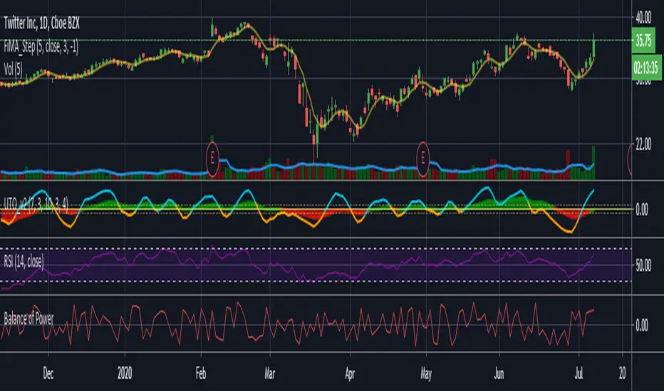
Ultimate Trader Oscillator - UTO v1Note; this is experimental / learning work -- has nothing to do with the existing "Ultimate Oscillator" -- i call this project UTOpia :)
This is based on some research work i was doing around the Balance Of Power - which i posted about in the past
the conclusion form there was a questions of, what would we get if we create an indicator that takes into consideration other factors that may be affecting momentum - so while the classic Balance of Power formula looks at where the open and close of a bar are compared to the full bar range, this is only a small part of the insight we need - when we visually inspect a price chart, we also look at many other factors. for example, how the bar closes compared to previous bar(s), how much did the bulls (or bears) managed to move the high (or low) of the bar compared to previous one, how much volume, how is the price spread ...etc
so i wanted to build an indicator that does exactly that - we will give a score of +100 / -100 to each bar based on these factors (some were identified in the linked post) -- imagine here that we are a judge in a tug of war contest (or a beauty contest if you would :)) and we give a score to the participating teams - the scores are given in different "categories" as these teams make effort to win the game (each bar) - to be totally fair, in some scoring categories, we choose to take the average of 3 points for a fair assessment - the final score is calculated based on the average from all judges - and then and average over the desired length is calculated. this score should be very fair and represents the true effort from all angles, right? that would be our UTOPIA :)
in our case, we don't use an average of total score after each category is evaluated, but rather create a directional index (similar to RSI) -- so we can avoid big spikes in the resulting numbers, and maintain a oscillator -like result.
-- the code is commented to explain the various pieces - and how the scoring happen.
the results are interesting - and you can see how the UTO stacks against the classic RSI and BoP - but it's more of a work to build on, rather than a usable indicator - although i do use it in my own trading :)
one final thought here, i came to learn after few years that the best indicators do not necessarily lead to profitable trading. from an indicator standpoint, if everyone else is trading using (for example) a moving average crossover or RSI, then a successful trader should be looking at these classic indicators too, cause these common indicators will drive the mass behavior - and will at many times trigger "self- fulfilling prophesies" in price action - but that's not the only or the biggest reason - the big reasons have to do with the fact that trading needs a lot of effort outside the charts, in researching markets, learning the discipline, then managing positions and managing the portfolio. these are all big topics to put in such short words.
i hope some will find this work inspiring.
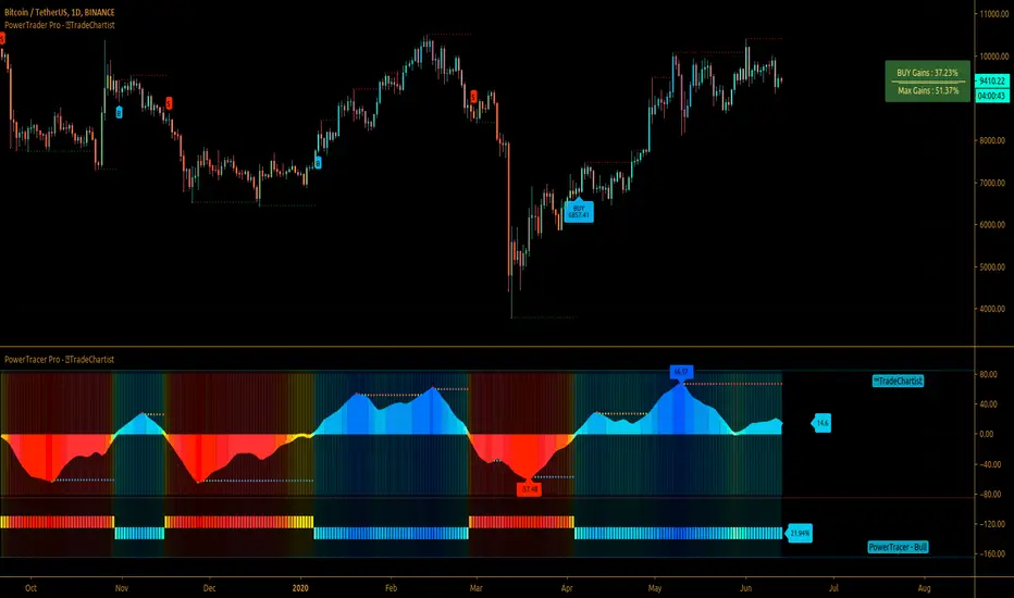
TradeChartist PowerTracer ProTradeChartist PowerTracer Pro is an exceptionally well designed and a functional indicator, requiring minimal user input to trace the asset's Bull and Bear Power. The indicator makes it visually engaging with its intelligent positioning of the PowerTracer Bar, tracking not just the current trend, but also the developing trend using visually easy to understand Power plots. PowerTracer Pro can be used with PowerTrader Pro to generate Trade signals with several possible combinations of settings based on PowerTracer Pro Backtester Performance results.
What does ™TradeChartist PowerTracer Pro do?
1. Tracks Bull and Bear Power and plots the information visually on chart using one of the following 2 Power plot options based on Timeframe Multiplier and Smoothing Factor..
𝗣𝗼𝘄𝗲𝗿𝗧𝗿𝗮𝗰𝗲𝗿 - Plot of the Bull and Bear Power Oscillator, pivotal to this script that tracks the true Bull and Bear Power along with Bull/Bear oscillator reading, calculated dynamically using a unique and original formula. Values beyond 50 and -50 are quite rare, but theoretically, they can go beyond 80 and -80. 𝗣𝗼𝘄𝗲𝗿𝗧𝗿𝗮𝗰𝗲𝗿's highs and lows are also tracked and updated real-time using labels placed exactly at the Highs and Lows with their readings.
Bar-wise Power Holder - Absolute Bull and Bear power of each bar. It is plotted by calculating the difference between Bull and Bear Power of each bar. The values can swing between -100 and +100 even though values above 90 and below 90 are rare.
2. Visually displays the Balance of Power between the Bulls and the Bears using Power density background fill.
3. Uses an accompanying 𝗣𝗼𝘄𝗲𝗿𝗧𝗿𝗮𝗰𝗲𝗿 bar that helps spot the true bull and bear power using simple linear blocks, displaying the power level using power intensity colors.
4. Paints price bars and PowerTracer background using Power intensity colors, which helps spot the increase or decrease in Bull and Bear Power. Price bar color changes are based on increasing/decreasing power intensity of the price bar's power holder and may not be the same as the Power plots. This is designed specifically to spot price trends based on chart timeframe power trend.
5. Inverts bar colors, and PowerTracer bar color to help see price trend using the Opponent's Point of View.
What markets can this indicator be used on?
-- Forex
-- Stocks - works best with 4hr or above and prices calculated taking gaps into account.
-- Commodities
-- Cryptocurrencies
and almost any asset on Trading View
What time-frames can this indicator be used on?
This indicator can be used on all timeframes. If the asset has very little volume / volatility or is far low in comparative value against the base currency, power detection can be choppy, but with most assets, this won't be an issue.
Does this indicator repaint?
-- No. Real-time Power plots can change colors and values based on current bar close as values get calculated dynamically. Once the bar closes, plots and power intensity colors don't repaint.
-- This can be verified using Bar Replay to check if the plots and fills stay in the same bar in real time as the Bar Replay
Does the indicator generate trade signals based on Power shifts?
Yes. PowerTracer Pro can be connected to PowerTrader Pro to generate BUY and SELL signals with automatic/user specified targets on the main price chart along with Fixed or Trailing Stop Loss plots based on the Power Plot opted by the user. PowerTrader Pro is highly recommended for traders who would like signals based on power trend on the main price chart as it comes with real time Dashboard and Gains tracker with the option to plot past performance displaying Max gains and Max Drawdowns for each trade. It also includes SL/TP Plots and Alerts system that can be used to automate trades based on settings that result in high ROI on PowerTracer Pro Backtester performance report.
The charts below show how this indicator can be used with PowerTrader Pro to generate trade signals with TP and SL plots.
GBP-USD 1hr chart with SL and TP plots with real-time gains tracker. Timeframe MUltiplier - 2, Smoothing Factor - 8
LINK-BTC 4hr chart with SL and TP plots, real-time gains tracker and past performance results. Timeframe Multiplier - 3, Smoothing Factor - 1
XAU-USD Gold 1hr chart with SL and TP plots, real-time gains on Dashboard with Automatic Targets and past performance labels. Timeframe Multiplier - 2, Smoothing Factor - 1
===================================================================================================================
This is not a free to use indicator. Get in touch with me (PM me directly if you would like trial access to test the indicator)
Premium Scripts - Trial access and Information
Trial access offered on all Premium scripts.
PM me directly to request trial access to the scripts or for more information.
===================================================================================================================
TradeChartist PowerTracer™TradeChartist PowerTracer is an exceptionally well designed and functional indicator, requiring minimal user input to trace the asset's Bull and Bear Power. The indicator makes it visually engaging with its various color schemes and intelligent positioning of the PowerTracer Bar, tracking not just the current trend, but also the developing trend using a visually easy to understand Power plots.
What does ™TradeChartist PowerTracer do?
1. Tracks Bull and Bear Power and plots the information visually on chart using one of the following 3 Power plot options based on high or low power detection sensitivity.
𝗣𝗼𝘄𝗲𝗿𝗧𝗿𝗮𝗰𝗲𝗿 - Plot of the Bull and Bear Power Oscillator, pivotal to this script that tracks the true Bull and Bear Power along with Bull/Bear oscillator reading, calculated dynamically using a unique and original formula. Values beyond 50 and -50 are quite rare, but theoretically, they can go beyond 80 and -80. 𝗣𝗼𝘄𝗲𝗿𝗧𝗿𝗮𝗰𝗲𝗿's highs and lows are also tracked and updated real-time using labels placed exactly at the Highs and Lows with their readings.
Bar-wise Power Holder - Absolute Bull and Bear power of each bar. It is plotted by calculating the difference between Bull and Bear Power or each bar. The values can swing between -100 and +100 even though values above 90 and below 90 are rare. The bar color on the chart will be painted using this value to visually display the Bull/Bear strength if "Paint Bars on Chart" is enabled from the indicator settings.
Bar-wise Power Fight - Plot of Maximum Bull and Bear Power of every bar that helps visualize the fight between Bulls and Bears in each bar.
2. Visually displays the Balance of Power between the Bulls and the Bears using Opponent Power Gain background fill when it is 50% or over. For example, if the current PowerTracer plot is a Bull zone, enabling this setting with Opponent Power Gain % set at 75, will paint the background when Bear Power increases beyond 75% using the Bear Power Intensity fill based on Color Scheme the user opts from the settings. This option can be enabled or disabled from settings and the Opponent Power gain % (minimum 50%) can also be adjusted to spot the change in price trend early on.
3. Uses an accompanying 𝗣𝗼𝘄𝗲𝗿𝗧𝗿𝗮𝗰𝗲𝗿 bar that helps spot the true bull and bear power using simple linear blocks, displaying the power level using power intensity colors based on the color scheme.
4. Paints price bars and PowerTracer background using Power intensity colors based on Color Scheme from the indicator settings, which helps spot the increase or decrease in Bull and Bear Power.
5. Inverts bar colors, background fill and PowerTracer bar color to help see price using the Opponent's Point of View.
What markets can this indicator be used on?
-- Forex
-- Stocks - works best with 4hr or above and prices calculated taking gaps into account.
-- Commodities
-- Cryptocurrencies
and almost any asset on Trading View
What time-frames can this indicator be used on?
This indicator can be used on all timeframes. If the asset has very little volume/volatility or is far low in comparative value against the base currency, power detection can be choppy, but with most assets, this won't be an issue.
Does this indicator repaint?
-- No. Real-time Power plots can change colors and values based on current bar close as values get calculated dynamically. Once the bar closes, plots and power intensity colors don't repaint.
-- This can be verified using Bar Replay to check if the plots and fills stay in the same bar in real time as the Bar Replay
Does the indicator send alerts when the power shifts from Bull to Bear or from Bear to Bull?
Yes. Users can get alerts when Power gets shifted using Trading View alerts. This can be done by choosing '™TradeChartist PowerTracer' and 'Powershift to Bulls' or 'Powershift to Bears' under Trading View Alert condition and by using 'Once per bar close' as user needs to wait for candle close for Power shift confirmation.
Example Charts
In this split screen chart of Bitcoin, it can be seen how the 30m chart on left is Bearish and 5m chart on right is Bullish based on Power changes. The trend can be spotted on PowerTracer by spotting the Opponent's background fill that started showing when Opponent's power gained by over 75%. This is a good example using the script for scalping/swing trading using 2 timeframes. Note that the chart on the left shows Price bars and PowerTracer bar with inverted colors to show Opponent's point of view.
In this 15m chart of GBP-USD, 100% Power gain for Entries and Exits is used. This is a more conservative approach and is suited for less aggressive traders based on complete change of trend.
In this 2hr chart of Ethereum, all 3 Power plots are used to identify the trend using low sensitivity using 100% Power Gain entries and this shows how a trade can be held longer to maximise gains using entries with Power shift confirmations.
===================================================================================================================
This is not a free to use indicator. Get in touch with me (PM me directly if you would like trial access to test the indicator)
Premium Scripts - Trial access and Information
Trial access offered on all Premium scripts.
PM me directly to request trial access to the scripts or for more information.
===================================================================================================================

Balance of Power StrategyA simple variation on the balance of power idea, using a weighted moving average and a basic lookback to attempt to predict the motion in the next tick.
As far as a trading pattern goes, it's performance is rather conservative, and it is rather noisy as it doesn't do a good job of preventing quick, meaningless trades.
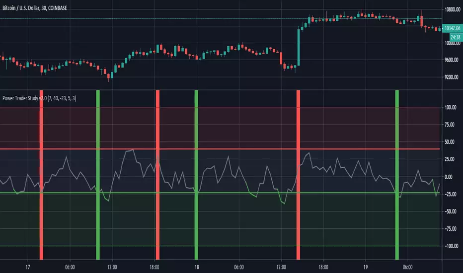
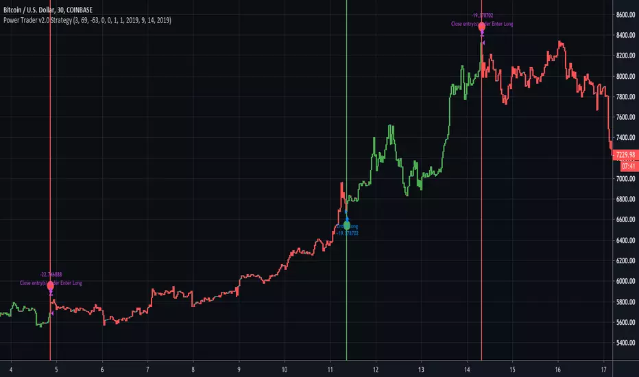
Power Trader Study The Power Trader is an indicator based around the Balance of Power Oscillator. Balance of Power is a price-based measurement that evaluates and compares the strength of buyers and sellers by assessing their respective abilities to push prices to extreme points(both extreme highs and extreme lows).
BoP values fluctuate between a maximum value of 100 and a minimum value of -100. When the BoP value is greater than 0, it indicates that buying pressure is greater than selling pressure. Conversely, negative BoP readings mean that selling pressure is greater than buying pressure.
The exponential moving average of Balance of Power values is displayed as a gray line on the chart. The upper red line represents the upper bound at which a security is considered overbought. The lower green line represents the threshold where we start to consider a security to be in an oversold state.
When the gray BoP EMA line crosses below the lower green line, it changes color to green then changes back to gray once it crosses back above that lower threshold. Similarly, the line turns red when it crosses above the upper red line.
When the EMA line is between the upper and lower bounds, it signifies that there is no significant difference between the power of buyers versus the power of sellers. The top red area indicates that the amount of buying pressure is relatively high. The lower green area means that selling pressure is abnormally high.
When the BoP line falls between the red and green areas, do not take action. When the BoP line turns green and is inside the green area, enter a long position. When the BoP line rises above the red line and into the upper red area, exit the long position.
Entry signals are displayed as vertical green lines that extend the length of the chart. Exit signals are represented by the same lines, except in red.
Users can decide the order of signals in the input option menu through the ‘allow repeat signals’ parameter. If this is set to false, the study will generate signals in the logical chronologic order of . If it is set to true, then signals will be generated as they come, regardless of whether the last signal was its inverse. This means that it could generate sequences like this for example .
Additionally, the stop and limit can also be set in the input menu through the ‘stop’ and ‘limit’ options. This input option accepts parameters of type float (ie: numbers that contain decimals).
The 'Upper Bound for BoP Values' and 'Lower Bound for BoP Values' input options gives traders the option to adjust the upper and lower thresholds for buy and sell signals. It is important to note that setting the upper bound higher or the lower bound lower will result in less frequent signals (and vice versa).
When it is time to enter a long position, an alert with the following message is sent “Power Trader - High Sell Pressure, Enter Long”.
When it is time to exit a long position, an alert with the following message is sent “Power Trader - High Buy Pressure, Exit Long”.
The Power Trader, along with all of our other invite-only scripts, can be found on our website:
profitprogrammers.com
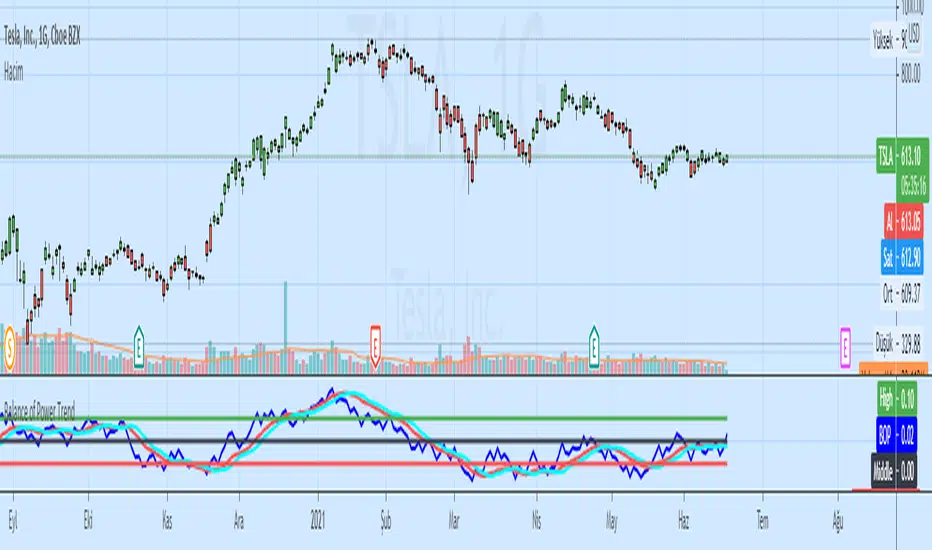
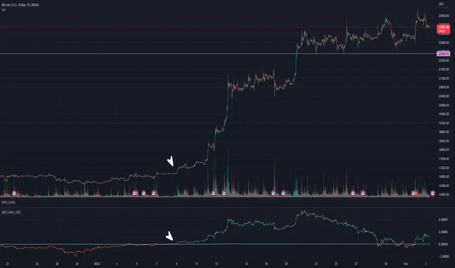
Composite Movement Indicator w/ Volume-Weighted Balance of PowerThe CMI+ is a composite indicator based on numerous other indicators and some special sauce that helps identify imminent directional changes in an asset's price. While CMI+ was designed for crypto assets, it is also quite useful in traditional markets.

Librehash Balance of Power RSIThis indicator is known as the ‘Zero_n0ncense Balance of Power RSI Extremes’ and it is one of the more effective indicators that I have ever used (in terms of its predictive power).
The creation of this indicator relies on a few different principles.
Principle #1
At a base level, the Balance of Power indicator was used. This indicator is typically utilized in order to gauge underlying price sentiment. However, it does so in a way that is much more sensitive to future price movements than regular RSI is and the way that it tracks price movements makes it much more ‘predictive’ in nature than the RSI as well.
However, the main problem with the Balance of Power is that the regular indicator is fairly unreadable.
Below is an example of what the indicator looks like in live time:
As you can see above, the usefulness of this indicator is diluted significantly by the difficulty in interpreting the signals that the indicator produces.
Normally it oscillates between the values of 0 and 1, with 1 representing an extreme in buying power and 0 representing an extreme in selling power.
But, this is of no use in the way its presented because one cannot see the underlying trend in the data.
That’s where this indicator comes in.
Principle #2
We adjusted the Balance of Power so that we could track its momentum over time (hence the RSI portion of the name). We then overlaid an actual RSI chart behind it, using classical oversold and overbought markings in the same way that you would do with the regular RSI.
The chart is printed here once again for the benefit of the viewer.
Principle #3
Using additional indicators and algorithms, we were able to ‘smooth’ the Balance of Power while ‘re-scaling’ it to fit on a different scale (no longer 0 to 1), in order to create a much more readable trend.
In addition, we implemented the ‘red’ portion of the indicator in order to signal when the sell and buy pressure have reached an ‘extreme’.
Interpreting the Indicator
When the indicator is to the ‘north’ in the overbought category, that means that the indicator is signaling a ‘strong buy’.
When the indicator line turns red, however, in that overbought portion, that means that there is an impending downturn in the price that is to be expected soon.
Below, we will show some examples:
That same period is reflected in the price movement of Bitcoin as well:
As you can see from the pictures above, the red portion of the indicator was our warning that there would be an impending drop in the price.
It should also be noted that this indicator does not re-paint itself, so these signals are produced in live time.
Best Time Frames
The best time frame for this indicator is on the daily or longer. Using the H8 or longer is preferred.
This is because the price movements on lower time frames are usually substantially more volatile, and thus, the predictive abilities of this indicator are diluted to a certain extent on the lower time frames.
Product Offering
If you're interested in gaining access to this indicator, just shoot a private message over this platform and we can talk.

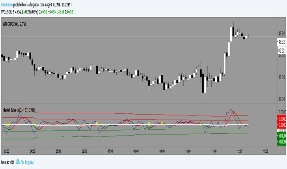
Market BalanceThis indicator simply tracks the balance of the supply/demand and will always revert to the mean.
If the market is over bought it will move above the mean, hit a limit and come back toward the mean. Opposite for oversold.
The difference between this and MFI or RSI is that a market can move up or down in an organized fashion and stay close to the mean. It is impulsive moves up or down that will correct.
So a trader might be able to gauge whether an given stock has the likelihood to pullback or bounce based on this indicator.
The color indicator attempts to predict the color of the next bar.
Works well with Heiken Ashi style candles as well.
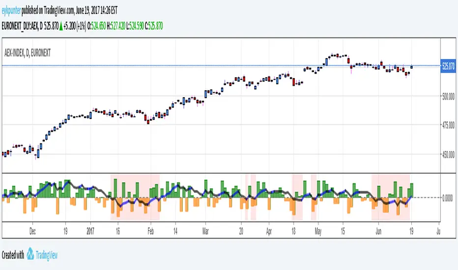
True Balance of powerThis is an improvement of the script published by LazyBear,
The improvements are:
1. it includes gaps because it uses true range in stead of the current bar,
2. it has been turned into a percent oscillator as the basic algorithm belongs in the family of stochastic oscillators.
Unlike the usual stochatics I refrained from over the top averaging and smoothing, nor did I attempt a signal line. There’s no need to make a mock MACD.
The indicator should be interpreted as a stochastics, the difference between Stochs and MACD is that stochs report inclinations, i.e. in which direction the market is edging, while MACD reports movements, in which direction the market is moving. Stochs are an early indicator, MACD is lagging. The emoline is a 30 period linear regression, I use linear regressions because these have no lagging, react immidiately to changes, I use a 30 period version because that is not so nervous. You might say that an MA gives an average while a linear regression gives an ‘over all’ of the periods.
The back ground color is red when the emoline is below zero, that is where the market ‘looks down’, white where the market ‘looks up’. This doesn’t mean that the market will actually go down or up, it may allways change its mind.
Have fun and take care, Eykpunter.
Volume weighted Balance of PowerIt's a simple indication.
I multiplied the output of bop with volume, make it more smoother.
SN Smoothed Balance of Power v2Hi all,
here is an updated version of the indicator script I published yesterday.
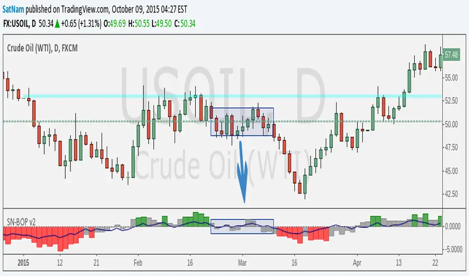
The goal of this indicator is to try and find darkpool activity. The indicator itself is not enough to fully identify darkpool but it should be able to detect quiet accumulation. What makes this Balance of Power different from others on TV is that it is smoothed by using a moving average.
Notes:
- The values that are default are completely arbitrary except for the VWMA length (a 14-day period for the 1D chart is the norm). For instance the limit where it shows red/green I picked because it works best for the 1D chart I am using. Other TF's and charts will need tweaking of all the values you find in the options menu to get the best results.
- I modified the indicator such that it is usable on charts that do not show volume. HOWEVER, this chart is default to NYMEX: CL1!. To get different volume data this needs to be changed in the option menu.
- I am in no way an expert on darkpool/HFT trading and am merely going from the information I found on the internet. Consider this an experiment.
Credits:
- Lazybear for some of the plotting-code
- Igor Livshin for the formula
- TahaBintahir for the Symbol-code (although I'm not sure who the original author is...)
Smoothed Balance of PowerSmoothed BOP to try and find dark pool activity. Only works in charts with working volume!
Credits go to LazyBear for some coding on the plotting and Igor Livshin for the formula.

Indicator: Balance Of Power**** Code updated. Make sure you pick up the latest version posted (not the code in the published chart) ******
An oscillator that represents the battle between the bulls and the bears in the market.
BOP supports spotting price divergence, trends, and overbought-oversold levels.A change in the BOP trend serves as a warning signal and should be confirmed by a change in the price direction.
More info @ www.fxtimes.com
Updated the code to match ThinkOrSwim platform's indicator (request from user @mika2k1). v2 code here: pastebin.com
This allows you to plot only the EMA (instead of actual BOP). Sample image posted in the comments below.
