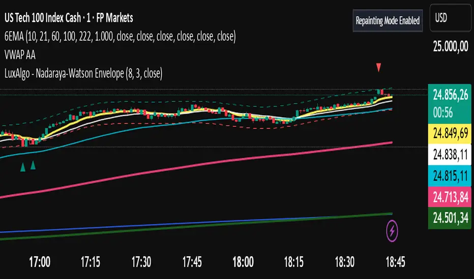
頻帶和通道
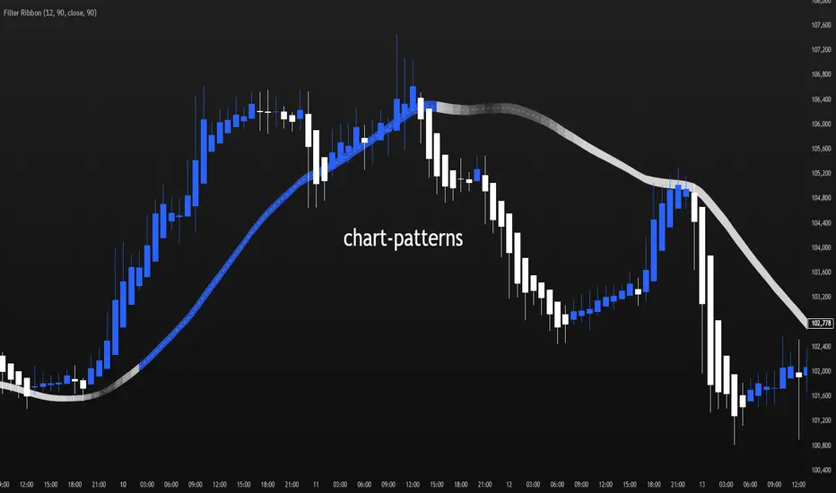
Filter Ribbon1. Indicator Name
Filter Ribbon
2. One-line Introduction
A trend visualization ribbon that uses linear regression and directional scoring to highlight bullish and bearish strength with intuitive color gradients.
3. General Overview
Filter Ribbon is a minimalistic yet powerful trend visualization tool that leverages linear regression slope ordering to determine directional momentum. It analyzes the ordering of regression values over a defined lookback period and quantifies how consistently the price has been trending upward or downward.
Using a pairwise comparison system, it calculates a trend "score" and compares this to a configurable threshold to determine if a bullish, bearish, or neutral condition exists.
The result is a color-coded ribbon that sits over the chart, changing hue and opacity based on both the direction and strength of the trend. The stronger the directional alignment, the more opaque the ribbon becomes, offering traders a fast, intuitive way to assess market sentiment at a glance.
It also includes an optional linear regression line to further help visualize the central trend.
This indicator is best used in trend-following systems or as a dynamic background layer when combined with signal-based strategies.
Thanks to its efficient design and protected logic, Filter Ribbon offers high-performance visualization without compromising strategy integrity.
4. Key Advantages
🌈 Visual Trend Heatmap
Dynamic color ribbon gives real-time visual feedback on both trend direction and strength.
🔢 Quantified Trend Scoring
Calculates a mathematically sound trend score using pairwise linear regression comparisons.
⚖️ Adjustable Sensitivity
Users can tune lookback and threshold parameters to fit different asset classes and timeframes.
📉 Smooth Ribbon Effect
Plots upper/lower bands around regression line with smooth filling for a professional chart look.
🎯 Precise Trend Confirmation
Acts as a confidence layer for other entry/exit signals by confirming broader trend bias.
🔒 Secure and Minimal Codebase
Core logic is embedded securely with minimal exposure, reducing risk of replication or misuse.
📘 Indicator User Guide
📌 Basic Concept
Filter Ribbon determines trend direction and intensity by comparing the order of linear regression values over time.
It forms a ribbon on the chart that changes color based on trend direction and opacity based on trend strength.
This makes it ideal for identifying clear trending periods vs. uncertain consolidations.
⚙️ Settings Explained
Lookback Period: Number of bars for scoring the trend direction (higher = smoother trend)
Range Tolerance (%): Determines how aggressive the trend classification is (lower = stricter)
Regression Length: Period for calculating the base linear regression line
Ribbon Colors: Customize colors for bullish and bearish conditions
📈 Bullish Timing Example
Ribbon color is green and becomes increasingly opaque
Regression line slopes upward and price remains above it
Can be used as trend confirmation for long trades
📉 Bearish Timing Example
Ribbon color is red with higher opacity
Price consistently below the regression line
Useful for confirming short trade setups or avoiding long entries
🧪 Recommended Use Cases
Combine with breakout indicators to validate if the breakout aligns with broader trend
Use in swing or trend-following strategies as a background filter
Helps filter out trades during unclear, sideways market conditions
🔒 Precautions
Not a signal generator on its own — meant for trend context only
Ribbon may lag slightly during sudden trend reversals; best used with reactive entry tools
Always test ribbon parameters on your specific market/timeframe before applying live
Avoid using solely in low-volatility or flat markets — sensitivity may require tuning
+++
Filter Cross1. Indicator Name
Filter Cross Indicator
2. One-line Introduction
A multi-filtered crossover strategy that enhances classic moving average signals with trend, volatility, volume, and momentum confirmation.
3. General Overview
The Filter Cross indicator builds upon the traditional golden/dead cross concept by incorporating additional market filters to evaluate the quality of each signal. It uses two key moving averages (50-period and 200-period SMA) to identify crossovers, while adding four advanced metrics:
Linear regression trend ordering,
ATR-based volatility positioning,
Volume pressure,
Price positioning relative to fast MA.
These components are individually scored and averaged to calculate a Confidence %, which is displayed on the chart alongside each crossover signal. Visual cues such as dynamic color changes reflect the current trend direction and strength, making it intuitive for both novice and experienced traders.
The indicator is especially effective in swing trading and trend-following strategies, where false signals can be filtered out through the additional logic.
Security measures are applied to ensure that the core logic remains protected, making it safe for proprietary use.
4. Key Advantages
✅ Multi-factor Signal Validation
Evaluates each signal using four key market filters to improve reliability over classic crossovers.
📉 Confidence Score Display
Each signal is accompanied by a Confidence % label to help traders assess entry/exit quality.
🎨 Dynamic Color Feedback
Automatically adjusts chart color based on trend intensity and direction, aiding visual clarity.
🔍 Linear Regression Trend Logic
Uses pairwise comparison of regression data to quantify trend alignment across lookback periods.
📈 Reduced False Signals
Minimizes noise and weak signals during sideways markets using adaptive thresholds.
📘 Indicator User Guide
📌 Basic Concept
Filter Cross enhances moving average crossover signals using four additional market-based filters.
These include trend alignment, volatility range, volume strength, and price momentum.
Final signals are graded with a Confidence % score, showing how favorable the conditions are for action.
⚙️ Settings Explained
Fast MA Length: Short-term moving average period (default: 50)
Slow MA Length: Long-term moving average period (default: 200)
Linear Regression Length: Period used to assess price trend alignment
Trend Lookback / Threshold: Sensitivity controls for trend scoring
Volume Lookback / ATR Length: Defines volatility and volume filters
Bull/Bear Color: Customize visual colors for bullish and bearish signals
📈 Buy Timing Example
Golden Cross occurs (50 MA crosses above 200 MA)
Confidence % is above 70%
Trend color turns green, volume is rising, price above fast MA → Strong entry signal
📉 Sell Timing Example
Dead Cross occurs (50 MA crosses below 200 MA)
Confidence % above 60% indicates a reliable bearish setup
Regression trend down, color turns red → Valid exit or short opportunity
🧪 Recommended Use Cases
Combine with RSI or MACD for timing confirmation in swing trades
Use Confidence % to filter out weak crossover signals during sideways trends
Effective in medium-to-long term trading with volatile assets
🔒 Precautions
Confidence % reflects current conditions—not future prediction—use with discretion
May produce delayed signals in ranging markets; test before real application
Best results achieved when combined with other indicators or price action context
Always optimize parameters based on the specific market or asset being traded
+++

Ultimate Std Dev Channel • 4 Zones • 100% WORKINGStandard-deviation channel — fully customizable (band width, line style, colors, opacity, thickness, and labels).

Adaptive Trend Finder SatishThis indicator will help you to identify intraday trend.
Credit Goes to Julien_Eche (This indicator is replicate of Adaptive Trend Finder and created separately only because the actual Adaptive Trend Finder code was not good for intraday trader and this code with small tweak will help short and long term, i only tweaked in shortterm logic. )

Astra EdgeAstra Edge Tool
Astra Edge is built from the ground up, through years of real market experience, observation, and execution — not theory.
It reflects how I personally analyze price structure, volatility, and directional bias in live markets.
The indicator combines multiple layers of technical logic — multi-timeframe trend context, fixed daily structure levels, volatility bands, and range compression detection — into one stable, easy-to-read system.
It does not predict or guarantee direction; it reads what the market is doing right now and presents it visually in a structured way.
Every element of Astra Edge — the dashboard, zones, and compression highlights — is designed to help traders interpret market behavior, not chase it.
It aims to bring clarity and control to your intraday or swing decision-making by helping you focus on structure, momentum, and context instead of noise.
It’s not a shortcut or a holy grail.
It’s a refined tool that mirrors how experienced traders actually think — visually, contextually, and systematically.
⚙️ Features
🟢 Multi–Timeframe Dashboard
A clean grid showing five user-selected symbols across three timeframes — giving instant trend alignment and strength visibility.
LTP, % change, and SMA direction are colour-coded for quick interpretation.
🔵 Fixed Market Structure Levels
Automatic plotting of previous day and today’s high, low, open, and close —
the four most powerful reference points for intraday structure and reaction levels.
No repainting, no recalculation — just static, reliable structure.
🟣 Zone Bands
Calculates zones from the prior candles
Weekly or custom timeframe zones
Zones are highlighted dynamically and labeled clearly, helping you identify balance, breakout, and reversal regions visually.
🟠 Sideways Zone Detector
Built-in compression detector that identifies when the market is stuck in range.
Highlights consolidation zones and labels them with optional Zig Zag markers, helping traders avoid choppy conditions or plan breakout traps early.
🟡 Optional Bollinger Framework
Toggleable Bollinger structure that adds volatility context to the chart, helping spot expansions, squeezes, or range resets quickly.
⚙️ Customization
Dashboard and Sideways Zone ON/OFF switches
Adjustable zone thickness, label names, and colours
Works across stocks, indices, forex, and crypto
Optimized for dark and light chart themes
🧠 How to Use
Best for intraday and positional structure analysis
Works on any timeframe — but ideal visualization on 1m to 1h charts
Ideal timeframe 5mins
Focus on zone reactions and structure shifts, not standalone signals
Combine with your own entry confirmation or volume logic
Remember — Astra Edge shows structure, it doesn’t decide trades.
💎 Philosophy
“Every trader has tools. The elite have Astra Edge.”
Astra Edge was built for traders who prefer clarity over clutter and discipline over guesswork.
It combines multiple technical frameworks — not to replace your strategy, but to enhance your judgment.
⚠️ Disclaimer
I am not a SEBI-registered advisor.
This indicator is created purely for educational and informational purposes.
It does not guarantee profits, nor should it be considered investment advice or a trading signal system.
Trading and investing involve risk — use at your own discretion and consult a SEBI-registered financial advisor before making any financial decisions.
Astra Edge follows price action — price action does not follow Astra Edge.
Sometimes it will align perfectly with the trend, other times it won’t.
This is not a Holy Grail, it’s a structured lens to view the market more intelligently.
💼 Access
“Access available to invite-only users.”
All existing users will receive lifetime updates and improvements without any additional charges.

sumeth.com EntryExit ProA professional multi-filter trading tool combining price action, pattern detection, dynamic trend filters, RSI/MACD confirmations, and breakout logic. Designed for precise entry & exit in any market.
ATR Trailing Stop + HL2 VWAP + EMAsmain atr/ema script
use this to guage immediate trend on the 2m
use this to guage long term trend on thr 6h and one day charts.
Typicallly most accurate with futures.

S/R MTF// This Pine Script™ code is subject to the terms of the Mozilla Public License 2.0 at mozilla.org
// © fluxchart
//@version=6
//S&R; V2.12
const bool DEBUG = false
const bool fixSRs = true
const bool fixRetests = false
indicator("crr S/R MTF", overlay = true, max_labels_count = 500, max_lines_count = 500, max_boxes_count = 500, dynamic_requests = true)
const int maxSRInfoListSize = 10
const int maxBarInfoListSize = 3000
const int maxDistanceToLastBar = 500
const int minSRSize = 5
const int retestLabelCooldown = 3
const float tooCloseATR = 1.0 / 8.0
const int labelOffsetBars = 20
const int atrLen = 20
atr = ta.atr(atrLen)
avgVolume = ta.sma(volume, atrLen)
var int curTFMS = timeframe.in_seconds(timeframe.period) * 1000
var map alerts = map.new()
alerts.put("Retest", false)
alerts.put("Break", false)
srPivotLength = input.int(15, "Pivot Length", minval = 3, maxval = 50, group = "General Configuration", display = display.none)
srStrength = input.int(1, "Strength", , group = "General Configuration", display = display.none)
srInvalidation = input.string("Close", "Invalidation", , group = "General Configuration", display = display.none)
expandZones = input.string("Only Valid", "Expand Lines & Zones", options = , group = "General Configuration", display = display.none)
showInvalidated = input.bool(true, "Show Invalidated", group = "General Configuration", display = display.none)
timeframe1Enabled = input.bool(true, title = "", group = "Timeframes", inline = "timeframe1", display = display.none)
timeframe1 = input.timeframe("", title = "", group = "Timeframes", inline = "timeframe1", display = display.none)
timeframe2Enabled = input.bool(false, title = "", group = "Timeframes", inline = "timeframe2", display = display.none)
timeframe2 = input.timeframe("D", title = "", group = "Timeframes", inline = "timeframe2", display = display.none)
timeframe3Enabled = input.bool(false, title = "", group = "Timeframes", inline = "timeframe3", display = display.none)
timeframe3 = input.timeframe("W", title = "", group = "Timeframes", inline = "timeframe3", display = display.none)
showBreaks = input.bool(true, "Show Breaks", group = "Breaks & Retests", inline = "ShowBR", display = display.none)
showRetests = input.bool(true, "Show Retests", group = "Breaks & Retests", inline = "ShowBR", display = display.none)
avoidFalseBreaks = input.bool(false, "Avoid False Breaks", group = "Breaks & Retests", display = display.none)
breakVolumeThreshold = input.float(0.3, "Break Volume Threshold", minval = 0.1, maxval = 2.0, step = 0.1, group = "Breaks & Retests", tooltip = "Only taken into account if Avoid False Breakouts is enabled. Higher values mean it's less likely to be a break.", display = display.none)
inverseBrokenLineColor = input.bool(false, "Inverse Color After Broken", group = "Breaks & Retests", display = display.none)
styleMode = input.string("Lines", "Style", , group = "Style", display = display.none)
lineStyle = input.string("____", "Line Style", , group = "Style", display = display.none)
lineWidth = input.int(2, "Line Width", minval = 1, group = "Style", display = display.none)
zoneSize = input.float(1.0, "Zone Width", minval = 0.1, maxval = 10, step = 0.1, group = "Style", display = display.none)
zoneSizeATR = zoneSize * 0.075
supportColor = input.color(#08998180, "Support Color", group = "Style", inline = "RScolors", display = display.none)
resistanceColor = input.color(#f2364580, "Resistance Color", group = "Style", inline = "RScolors", display = display.none)
breakColor = input.color(color.blue, "Break Color", group = "Style", inline = "RScolors2", display = display.none)
textColor = input.color(#ffffff80, "Text Color", group = "Style", inline = "RScolors2", display = display.none)
enableRetestAlerts = input.bool(true, "Enable Retest Alerts", tooltip = "Needs Show Retests option enabled.", group = "Alerts", display = display.none)
enableBreakAlerts = input.bool(true, "Enable Break Alerts", tooltip = "Needs Show Breaks option enabled.", group = "Alerts", display = display.none)
insideBounds = (bar_index > last_bar_index - maxDistanceToLastBar)
type srInfo
int startTime
float price
string srType
int strength
string timeframeStr
bool ephemeral = false
int breakTime
array retestTimes
type srObj
srInfo info
bool startFixed
bool breakFixed
bool rendered
string combinedTimeframeStr
line srLine
box srBox
label srLabel
label breakLabel
array retestLabels
type barInfo
int t
int tc
float c
float h
float l
var allSRList = array.new()
//#region Find Val RTN Time
findValRtnTime (barInfo biList, valToFind, toSearch, searchMode, minTime, maxTime, int defVal = na) =>
int rtnTime = defVal
float minDiff = na
if biList.size() > 0
for i = biList.size() - 1 to 0
curBI = biList.get(i)
if curBI.t >= minTime and curBI.t < maxTime
toLook = (toSearch == "Low" ? curBI.l : toSearch == "High" ? curBI.h : curBI.c)
if searchMode == "Nearest"
curDiff = math.abs(valToFind - toLook)
if na(minDiff)
rtnTime := curBI.t
minDiff := curDiff
else
if curDiff <= minDiff
minDiff := curDiff
rtnTime := curBI.t
if searchMode == "Higher"
if toLook >= valToFind
rtnTime := curBI.t
break
if searchMode == "Lower"
if toLook <= valToFind
rtnTime := curBI.t
break
rtnTime
//#endregion
formatTimeframeString (string formatTimeframe, bool short = false) =>
timeframeF = (formatTimeframe == "" ? timeframe.period : formatTimeframe)
if str.contains(timeframeF, "D") or str.contains(timeframeF, "W") or str.contains(timeframeF, "S") or str.contains(timeframeF, "M")
timeframe.from_seconds(timeframe.in_seconds(timeframeF))
else
seconds = timeframe.in_seconds(timeframeF)
if seconds >= 3600
hourCount = int(seconds / 3600)
if short
str.tostring(hourCount) + "h"
else
str.tostring(hourCount) + " Hour" + (hourCount > 1 ? "s" : "")
else
if short
timeframeF + "m"
else
timeframeF + " Min"
renderSRObj (srObj sr) =>
if na(sr.info.breakTime) or showInvalidated
sr.rendered := true
endTime = nz(sr.info.breakTime, time + curTFMS * labelOffsetBars)
extendType = extend.none
if na(sr.info.breakTime)
extendType := extend.right
if expandZones == "Only Valid" and na(sr.info.breakTime)
extendType := extend.both
else if expandZones == "All"
extendType := extend.both
endTime := time + curTFMS * labelOffsetBars
labelTitle = formatTimeframeString(sr.info.timeframeStr)
if not na(sr.combinedTimeframeStr)
labelTitle := sr.combinedTimeframeStr
labelTitle += " | " + str.tostring(sr.info.price, format.mintick) + ((sr.info.ephemeral and DEBUG) ? " " : "")
if styleMode == "Lines"
// Line
sr.srLine := line.new(sr.info.startTime, sr.info.price, endTime, sr.info.price, xloc = xloc.bar_time, color = sr.info.srType == "Resistance" ? resistanceColor : supportColor, width = lineWidth, style = lineStyle == "----" ? line.style_dashed : lineStyle == "...." ? line.style_dotted : line.style_solid, extend = extendType)
// Label
sr.srLabel := label.new(extendType == extend.none ? ((sr.info.startTime + endTime) / 2) : endTime, sr.info.price, xloc = xloc.bar_time, text = labelTitle, textcolor = textColor, style = label.style_none)
else
// Zone
sr.srBox := box.new(sr.info.startTime, sr.info.price + atr * zoneSizeATR, endTime, sr.info.price - atr * zoneSizeATR, xloc = xloc.bar_time, bgcolor = sr.info.srType == "Resistance" ? resistanceColor : supportColor, border_color = na, text = labelTitle, text_color = textColor, extend = extendType, text_size = size.normal, text_halign = (extendType != extend.none) ? text.align_right : text.align_center)
// Break Label
if showBreaks
if not na(sr.info.breakTime)
sr.breakLabel := label.new(sr.info.breakTime, sr.info.price, "B", yloc = sr.info.srType == "Resistance" ? yloc.belowbar : yloc.abovebar, style = sr.info.srType == "Resistance" ? label.style_label_up : label.style_label_down, color = breakColor, textcolor = color.new(textColor, 0), xloc = xloc.bar_time, size = size.small)
if (time - curTFMS <= sr.info.breakTime) and (time + curTFMS >= sr.info.breakTime)
alerts.put("Break", true)
// Retest Labels
if showRetests
if sr.info.retestTimes.size() > 0
for i = sr.info.retestTimes.size() - 1 to 0
curRetestTime = sr.info.retestTimes.get(i)
cooldownOK = true
if sr.retestLabels.size() > 0
lastLabel = sr.retestLabels.get(0)
if math.abs(lastLabel.get_x() - curRetestTime) < curTFMS * retestLabelCooldown
cooldownOK := false
if cooldownOK and (curRetestTime >= sr.info.startTime) and (na(sr.info.breakTime) or curRetestTime < sr.info.breakTime)
if time - curTFMS <= curRetestTime and time >= curRetestTime
alerts.put("Retest", true)
sr.retestLabels.unshift(label.new(curRetestTime, sr.info.price, "R" + (DEBUG ? (" " + str.tostring(sr.info.price)) : ""), yloc = sr.info.srType == "Resistance" ? yloc.abovebar : yloc.belowbar, style = sr.info.srType == "Resistance" ? label.style_label_down : label.style_label_up, color = sr.info.srType == "Resistance" ? resistanceColor : supportColor, textcolor = color.new(textColor, 0), xloc = xloc.bar_time, size = size.small))
safeDeleteSRObj (srObj sr) =>
if sr.rendered
line.delete(sr.srLine)
box.delete(sr.srBox)
label.delete(sr.srLabel)
label.delete(sr.breakLabel)
if sr.retestLabels.size() > 0
for i = 0 to sr.retestLabels.size() - 1
curRetestLabel = sr.retestLabels.get(i)
label.delete(curRetestLabel)
sr.rendered := false
var allSRInfoList = array.new()
var barInfoList = array.new()
pivotHigh = ta.pivothigh(srPivotLength, srPivotLength)
pivotLow = ta.pivotlow(srPivotLength, srPivotLength)
barInfoList.unshift(barInfo.new(time, time_close, close, high, low))
if barInfoList.size() > maxBarInfoListSize
barInfoList.pop()
if insideBounds and barstate.isconfirmed
// Find Supports
if not na(pivotLow)
validSR = true
if allSRInfoList.size() > 0
for i = 0 to allSRInfoList.size() - 1
curRSInfo = allSRInfoList.get(i)
if (math.abs(curRSInfo.price - pivotLow) < atr * tooCloseATR) and na(curRSInfo.breakTime)
validSR := false
break
if validSR
newSRInfo = srInfo.new(barInfoList.get(srPivotLength).t, pivotLow, "Support", 1, timeframe.period)
newSRInfo.retestTimes := array.new()
//for i = 1 to srPivotLength
//curBI = barInfoList.get(i)
//if (curBI.l <= newSRInfo.price and curBI.c >= newSRInfo.price)
//newSRInfo.strength += 1
//if curBI.t != newSRInfo.startTime
//newSRInfo.retestTimes.unshift(curBI.t)
allSRInfoList.unshift(newSRInfo)
while allSRInfoList.size() > maxSRInfoListSize
allSRInfoList.pop()
// Find Resistances
if not na(pivotHigh)
validSR = true
if allSRInfoList.size() > 0
for i = 0 to allSRInfoList.size() - 1
curRSInfo = allSRInfoList.get(i)
if (math.abs(curRSInfo.price - pivotLow) < atr * tooCloseATR) and na(curRSInfo.breakTime)
validSR := false
break
if validSR
newSRInfo = srInfo.new(barInfoList.get(srPivotLength).t, pivotHigh, "Resistance", 1, timeframe.period)
newSRInfo.retestTimes := array.new()
//for i = 1 to srPivotLength
//curBI = barInfoList.get(i)
//if (curBI.h >= newSRInfo.price and curBI.c <= newSRInfo.price)
//newSRInfo.strength += 1
//if curBI.t != newSRInfo.startTime
//newSRInfo.retestTimes.unshift(curBI.t)
allSRInfoList.unshift(newSRInfo)
if allSRInfoList.size() > maxSRInfoListSize
allSRInfoList.pop()
// Handle SR Infos
if insideBounds and (srInvalidation == "Wick" or barstate.isconfirmed)
if allSRInfoList.size() > 0
for i = 0 to allSRInfoList.size() - 1
srInfo curSRInfo = allSRInfoList.get(i)
// Breaks
invHigh = (srInvalidation == "Close" ? close : high)
invLow = (srInvalidation == "Close" ? close : low)
closeTime = time
if na(curSRInfo.breakTime)
if curSRInfo.srType == "Resistance" and invHigh > curSRInfo.price
if (not avoidFalseBreaks) or (volume > avgVolume * breakVolumeThreshold)
curSRInfo.breakTime := closeTime
if inverseBrokenLineColor and (not curSRInfo.ephemeral) and curSRInfo.strength >= srStrength
ephSR = srInfo.new(closeTime, curSRInfo.price, "Support", curSRInfo.strength, curSRInfo.timeframeStr, true)
ephSR.retestTimes := array.new()
allSRInfoList.unshift(ephSR)
else if curSRInfo.srType == "Support" and invLow < curSRInfo.price
if (not avoidFalseBreaks) or (volume > avgVolume * breakVolumeThreshold)
curSRInfo.breakTime := closeTime
if inverseBrokenLineColor and (not curSRInfo.ephemeral) and curSRInfo.strength >= srStrength
ephSR = srInfo.new(closeTime, curSRInfo.price, "Resistance", curSRInfo.strength, curSRInfo.timeframeStr, true)
ephSR.retestTimes := array.new()
allSRInfoList.unshift(ephSR)
// Strength & Retests
if na(curSRInfo.breakTime) and time > curSRInfo.startTime and barstate.isconfirmed
if curSRInfo.srType == "Resistance" and high >= curSRInfo.price and close <= curSRInfo.price
int lastRetestTime = 0
if curSRInfo.retestTimes.size() > 0
lastRetestTime := curSRInfo.retestTimes.get(0)
if lastRetestTime != time
if not curSRInfo.ephemeral
curSRInfo.strength += 1
curSRInfo.retestTimes.unshift(time)
else if curSRInfo.srType == "Support" and low <= curSRInfo.price and close >= curSRInfo.price
int lastRetestTime = 0
if curSRInfo.retestTimes.size() > 0
lastRetestTime := curSRInfo.retestTimes.get(0)
if lastRetestTime != time
if not curSRInfo.ephemeral
curSRInfo.strength += 1
curSRInfo.retestTimes.unshift(time)
fixSRToTimeframe (srObj sr) =>
srMS = math.max(timeframe.in_seconds(sr.info.timeframeStr), timeframe.in_seconds()) * 1000
if (not sr.startFixed)
if not sr.info.ephemeral
if sr.info.srType == "Resistance"
sr.info.startTime := findValRtnTime(barInfoList, sr.info.price, "High", "Nearest", sr.info.startTime - srMS, sr.info.startTime + srMS, sr.info.startTime)
else
sr.info.startTime := findValRtnTime(barInfoList, sr.info.price, "Low", "Nearest", sr.info.startTime - srMS, sr.info.startTime + srMS, sr.info.startTime)
sr.startFixed := true
else
if allSRList.size() > 0
for i = 0 to allSRList.size() - 1
curSR = allSRList.get(i)
if (not curSR.info.ephemeral) and (not na(curSR.info.breakTime)) and curSR.info.price == sr.info.price and ((sr.info.srType == "Resistance" and curSR.info.srType == "Support") or (sr.info.srType == "Support" and curSR.info.srType == "Resistance"))
if curSR.breakFixed
sr.info.startTime := curSR.info.breakTime
sr.startFixed := true
break
if not na(sr.info.breakTime)
if (not sr.breakFixed)
if sr.info.srType == "Resistance"
sr.info.breakTime := findValRtnTime(barInfoList, sr.info.price, srInvalidation == "Wick" ? "High" : "Close", "Higher", sr.info.breakTime - srMS, sr.info.breakTime + srMS, sr.info.breakTime)
else
sr.info.breakTime := findValRtnTime(barInfoList, sr.info.price, srInvalidation == "Wick" ? "Low" : "Close", "Lower", sr.info.breakTime - srMS, sr.info.breakTime + srMS, sr.info.breakTime)
sr.breakFixed := true
if sr.info.retestTimes.size() > 0 and fixRetests
for i = 0 to sr.info.retestTimes.size() - 1
curRetestTime = sr.info.retestTimes.get(i)
retestStartTime = curRetestTime - srMS
retestStartTime := math.max(retestStartTime, sr.info.startTime + 1)
retestEndTime = curRetestTime + srMS
if not na(sr.info.breakTime)
retestEndTime := math.min(retestEndTime, sr.info.breakTime - 1)
if sr.info.srType == "Resistance"
sr.info.retestTimes.set(i, findValRtnTime(barInfoList, sr.info.price, "High", "Higher", retestStartTime, retestEndTime, sr.info.retestTimes.get(i)))
else
sr.info.retestTimes.set(i, findValRtnTime(barInfoList, sr.info.price, "Low", "Lower", retestStartTime, retestEndTime, sr.info.retestTimes.get(i)))
getSR (srObj list, srPrice, eph, srType, timeframeStr) =>
srObj rtnSR = na
if list.size() > 0
for i = 0 to list.size() - 1
curSR = list.get(i)
if curSR.info.price == srPrice and curSR.info.ephemeral == eph and curSR.info.srType == srType and curSR.info.timeframeStr == timeframeStr
rtnSR := curSR
break
rtnSR
// Handle SR
handleTF (tfStr, tfEnabled) =>
if tfEnabled
tfSRInfoList = request.security(syminfo.tickerid, tfStr, allSRInfoList)
if not na(tfSRInfoList) and tfSRInfoList.size() > 0
for i = 0 to tfSRInfoList.size() - 1
srInfo curSRInfo = tfSRInfoList.get(i)
if fixSRs
currentSameSR = getSR(allSRList, curSRInfo.price, curSRInfo.ephemeral, curSRInfo.srType, curSRInfo.timeframeStr)
if not na(currentSameSR)
if currentSameSR.startFixed
curSRInfo.startTime := currentSameSR.info.startTime
if currentSameSR.breakFixed
curSRInfo.breakTime := currentSameSR.info.breakTime
curSRInfo.retestTimes := currentSameSR.info.retestTimes
// All other info should be replaced except fixed start, break and all retests.
currentSameSR.info := curSRInfo
if not currentSameSR.breakFixed
fixSRToTimeframe(currentSameSR)
else
srObj newSRObj = srObj.new(curSRInfo)
// We handle retests in current timeframe so no need to get them from upper.
newSRObj.info.retestTimes := array.new()
newSRObj.retestLabels := array.new()
fixSRToTimeframe(newSRObj)
allSRList.unshift(newSRObj)
else
srObj newSRObj = srObj.new(curSRInfo)
newSRObj.retestLabels := array.new()
allSRList.unshift(newSRObj)
true
if (bar_index > last_bar_index - maxDistanceToLastBar * 8) and barstate.isconfirmed
if not fixSRs
if allSRList.size() > 0
for i = 0 to allSRList.size() - 1
srObj curSRObj = allSRList.get(i)
safeDeleteSRObj(curSRObj)
allSRList.clear()
handleTF(timeframe1, timeframe1Enabled)
handleTF(timeframe2, timeframe2Enabled)
handleTF(timeframe3, timeframe3Enabled)
if allSRList.size() > 0
for i = 0 to allSRList.size() - 1
srObj curSRObj = allSRList.get(i)
safeDeleteSRObj(curSRObj)
tooClose = false
for j = 0 to allSRList.size() - 1
closeSR = allSRList.get(j)
if closeSR.rendered and math.abs(closeSR.info.price - curSRObj.info.price) <= tooCloseATR * atr and closeSR.info.srType == curSRObj.info.srType and closeSR.info.ephemeral == curSRObj.info.ephemeral
tooClose := true
if not str.contains((na(closeSR.combinedTimeframeStr) ? formatTimeframeString(closeSR.info.timeframeStr) : closeSR.combinedTimeframeStr), formatTimeframeString(curSRObj.info.timeframeStr))
if na(closeSR.combinedTimeframeStr)
closeSR.combinedTimeframeStr := formatTimeframeString(closeSR.info.timeframeStr) + " & " + formatTimeframeString(curSRObj.info.timeframeStr)
else
closeSR.combinedTimeframeStr += " & " + formatTimeframeString(curSRObj.info.timeframeStr)
break
if (curSRObj.info.strength >= srStrength) and (na(curSRObj.info.breakTime) or (curSRObj.info.breakTime - curSRObj.info.startTime) >= minSRSize * curTFMS) and (not tooClose)
renderSRObj(curSRObj)
// Current Timeframe Retests
if allSRList.size() > 0 and barstate.isconfirmed
for i = 0 to allSRList.size() - 1
srObj curSR = allSRList.get(i)
if na(curSR.info.breakTime) and time > curSR.info.startTime
if curSR.info.srType == "Resistance" and high >= curSR.info.price and close <= curSR.info.price
int lastRetestTime = 0
if curSR.info.retestTimes.size() > 0
lastRetestTime := curSR.info.retestTimes.get(0)
if lastRetestTime != time
curSR.info.retestTimes.unshift(time)
else if curSR.info.srType == "Support" and low <= curSR.info.price and close >= curSR.info.price
int lastRetestTime = 0
if curSR.info.retestTimes.size() > 0
lastRetestTime := curSR.info.retestTimes.get(0)
if lastRetestTime != time
curSR.info.retestTimes.unshift(time)
//plotchar(alerts.get("Break") ? high : na, "", "✅", size = size.normal)
//plotchar(alerts.get("Retest") ? high : na, "", "❤️", size = size.normal, location = location.belowbar)
alertcondition(alerts.get("Retest"), "New Retest", "")
alertcondition(alerts.get("Break"), "New Break", "")
if enableRetestAlerts and alerts.get("Retest")
alert("New Retests Occured.")
if enableBreakAlerts and alerts.get("Break")
alert("New Breaks Occured.")

[MTX] Weekly Support & Resistance Weekly Support & Resistance
Overview
Discover key market structure with this all-in-one indicator:
Weekly Support & Resistance (SR) levels , Fair Value Gap (FVG) detection , and Automatic Fibonacci retracements .
Designed for MTX traders, it plots non-repainting weekly highs/lows/opens/closes, highlights unmitigated FVGs for potential imbalances, and auto-draws Fib levels, Perfect for swing/day traders on XAUUSD.
🚀 Key Features
- Weekly SR Levels : Plots previous week's High (resistance), Low (support), Open, and Close. Optional historical levels (Week -2/-3).
- SR Zones : Customizable % zones around levels for dynamic support/resistance bands. Fill colors for easy visualization.
- FVG Detection : Identifies bullish (green) and bearish (red) Fair Value Gaps on your chart timeframe.
- buy/sell Signals :
- Trend Filter : Optional EMA/SMA to filter signals
- Auto Fibonacci : auto-retracement with 20+ levels (0%, 23.6%, 38.2%, 50%, 61.8%, 100%, extensions to 423.6%, negatives). Custom colors, labels, and background fills.
- Alerts: Built-in for FVG creation/mitigation + all buy/sell signals. Set up once for real-time notifications.
⚠️ Important Disclaimer
This indicator is for educational and analysis purposes only. It provides visual tools and signals based on historical price action— not financial advice. Past performance ≠ future results. Trading involves risk; use proper risk management. Backtest thoroughly. No guarantees of profitability. Consult a financial advisor.
#tradingview #smc #MTX #fvg #fibonacci #supportresistance

Ellipse Price Action Indicator v2 (Upgraded)
This upgraded Ellipse Price Action Indicator (EPAI v2) to take high-accuracy trades.
I am explaining it as if you are looking at the chart step by step, so you will understand exactly:
-When to buy
-When to
-When to avoid
-How to read Strength Meter
-How Ellipse zones work
⭐ 1. THE BASICS — What This Indicator Actually Does
This indicator tracks:
✔ The “Elliptical Path” of price
Like a planet revolving around the Sun, price “oscillates” around a center.
The indicator detects this hidden mathematical path using:
Two Focus Points (Fast MA & Slow MA)
Curved Ellipse boundaries
Compression of price
Momentum of trend
Breakout zones
⭐ 2. UNDERSTANDING THE 3 ZONES
🔴 UPPER ZONE = Sell Zone
Price is near the upper ellipse boundary → overbought space.
🟢 LOWER ZONE = Buy Zone
Price near lower ellipse boundary → oversold space.
🔵 CENTRAL ZONE = No Trade Zone
Price swinging inside the ellipse center → noise.
Only trade in UPPER or LOWER zones.
Never in the central zone.
⭐ 3. THE MOST IMPORTANT PART — Strength Meter v2
Strength Meter v2 (0 to 100%) is the core filter.
✔ Above 70% → High winning probability (take trade)
✔ 60–70% → Medium probability (trade if confident)
❌ Below 60% → Avoid trade
Strength combines:
Ellipse compression
Momentum slope
Price position curve
Eccentricity
Trend direction
This alone removes 70% bad trades.
⭐ 4. BUY SETUP (Exact Rules)
You get a BUY only if all conditions match:
① Price goes to lower ellipse zone
② Compression is ON (ellipse is tight)
③ Momentum slope direction = UP
④ Focus Lines Cross Bullish (Fast > Slow)
⑤ Strength v2 ≥ your threshold (default 60%)
⑥ A BUY signal prints (triangle UP)
When these align →
🟢 BUY with high accuracy
Best Accuracy Buy is:
Price in lower zone
Strength ≥ 0.75
Slope UP
Ellipse compressed
⭐ 5. SELL SETUP (Exact Rules)
Same logic reversed:
① Price in upper ellipse zone
② Compression ON
③ Momentum slope DOWN
④ Focus Lines cross bearish (Fast < Slow)
⑤ Strength v2 ≥ threshold
⑥ SELL signal prints (triangle DOWN)
This means:
🔴 SELL with high accuracy
Best Accuracy Sell is:
Price in upper zone
Strength ≥ 0.75
Slope DOWN
Ellipse compressed
⭐ 6. BREAKOUT TRADES (Optional but powerful)
When price breaks above/below ellipse:
🔸 Upper Breakout → SELL (if strength strong)
🔸 Lower Breakout → BUY (if strength strong)
Breakout signals are marked by orange arrows.
Breakouts are taken only if:
Strength v2 > 50%
Slope supports breakout
Compression exists before breakout
Breakout trades catch trend continuation.
⭐ 7. HOW TO CONFIRM A STRONG TRADE
Look at the table on the chart:
✔ Strength v2 ≥ 70% (GREEN)
✔ Compression = GREEN
✔ Slope direction = UP (for buy) or DOWN (for sell)
✔ Zone = LOWER or UPPER
✔ Eccentricity = LOW (<0.5 means smooth trend)
If these line up →
⭐ High-probability entry.
⭐ 8. WHEN YOU SHOULD NOT TRADE
❌ If price is in Central Zone
❌ Strength < 60
❌ No compression detected
❌ Slope is flat or against direction
❌ Only one condition is matching
❌ Eccentricity is too large
(Big ellipse = unpredictable swings)
⭐ 9. What Is the Accuracy Level?
In trending markets → 75% to 85% accuracy
In ranging markets → 50% (use compression filter to avoid)
The indicator is designed to avoid bad market conditions automatically.
⭐ 10. BEST TIMEFRAMES
✔ 5m, 15m, 1H → Intraday
✔ 4H, 1D → Swing Trading
✔ NOT recommended below 1m timeframe
⭐ SUMMARY (EASY VERSION)
🟢 BUY:
Lower zone + compression + bullish slope + strong focus cross + strength ≥ 60
🔴 SELL:
Upper zone + compression + bearish slope + strong focus cross + strength ≥ 60
🟠 Breakout:
Upper/lower breakout + strength ≥ 50
🔵 Avoid:
Central zone or weak strength

Thirdeyechart Global Gold PercentageThe global gold percentage – Percentage Change Indicator is a TradingView tool developed to help traders monitor multiple currency pairs and precious metals in one glance. This indicator was coded personally, using custom formulas to calculate the percentage change for each symbol over selected timeframes, making it unique and fully tailored to individual analysis needs.
Users can input any symbols they wish to track as a comma-separated list, making it highly flexible. The script automatically calculates percentage changes for Daily (D), 1-Hour (H1), and 4-Hour (H4) timeframes. Positive changes are highlighted in blue and negative changes in red, allowing for an instant visual representation of market movements. The table updates in real-time, giving traders immediate feedback without needing to switch between charts.
Designed with simplicity and functionality in mind, this indicator is ideal for intraday traders, swing traders, or anyone who wants to keep an eye on multiple markets efficiently. It works for currency pairs, metals like gold (XAUUSD, XAUJPY), or any TradingView-available symbol. The table is positioned at the top-right corner of the chart and automatically adapts to the number of symbols entered.
This script is purely informational and educational, providing a clear view of price movements but not offering buy or sell signals. Traders should perform their own analysis and risk management before making any trading decisions.
Disclaimer / Copyright:
© 2025 Thirdeyechart. All rights reserved. This indicator is for educational and informational purposes only. The author is not responsible for any trading losses or financial decisions made based on this script. Redistribution, copying, or commercial use of this code without permission is strictly prohibited.

Fractals Trend [BigBeluga]🔵 OVERVIEW
Fractals Trend is a trend-following overlay that leverages fractal swing points to define dynamic support and resistance zones. By storing and averaging recent high and low fractals, it determines trend direction and plots a smooth band that flips depending on market bias—displaying support during uptrends and resistance during downtrends .
🔵 CONCEPTS
Fractal Swings: Fractals are identified using a customizable length. A high fractal forms when the current high is the highest in a range; a low fractal when the current low is the lowest.
Fractal Memory: The indicator keeps a rolling window of recent high and low fractals inside arrays, limited by the user-defined storage quantity.
switch
upperF => FracrtalsUpper.push(high )
lowerF => FracrtalsLower.push(low )
FracrtalsUpper.size() > fCount => FracrtalsUpper.shift()
FracrtalsLower.size() > fCount => FracrtalsLower.shift()
Trend Detection: Price crossing above the average, min/max or median high fractals signals an uptrend; crossing below average, min/max or median low fractals signals a downtrend.
Dynamic Band Plotting: Depending on the trend, the script plots the average of either the upper or lower fractals as a trailing support or resistance line.
Visual Confirmation: Fractal labels appear as triangle markers at highs and lows, providing additional structural context.
🔵 FEATURES
Automatically detects high and low fractals using customizable length.
Stores a defined number of fractals to smooth out noise and reduce false signals.
Flips trend bias dynamically with colored band and smooth transitions.
Plots fractal-based support in bullish trends, resistance in bearish trends.
Triangle markers show real-time fractal highs and lows.
Fully configurable visuals, color themes, and fractal detection logic.
Clean, non-intrusive overlay that works on any market or timeframe.
🔵 HOW TO USE
Use the colored band as a directional filter: green = uptrend (support), orange = downtrend (resistance).
Combine with entry signals or break/retest strategies when price approaches the band.
Use triangle markers to confirm structural swing points.
Adjust Fractals Length to tune sensitivity—shorter values detect quicker shifts, longer values reduce noise.
Change the fractal bands type to adapt trend detection to different market conditions.
Use in conjunction with momentum or volume tools for confluence.
🔵 CONCLUSION
Fractals Trend offers a lightweight, intuitive way to track market bias using price structure alone. Its smart switching logic and clean visuals make it a powerful tool for trend traders seeking structure-based dynamic S/R—without laggy moving averages or overcomplicated signals.

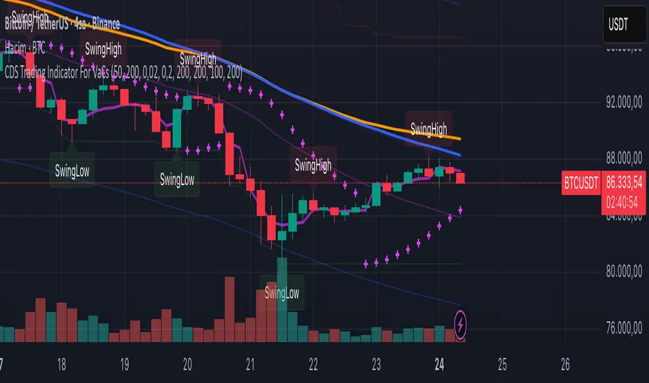
VaCs, Trade Indic## 🎛 **MAIN PRICE CHART (Primary Panel)**
Overlay on the main candlestick chart:
* 200 EMA + 50 EMA trend ribbons
* Parabolic SAR
* Logarithmic Growth Curves (LGC / LGH)
* Stock-to-Flow (S2F) bands
* Linear, Log, and Polynomial Regression Channels
* Liquidity mapping:
* Buyside liquidity
* Sellside liquidity
* Fair Value Gaps (FVG)
* Order Blocks
* Imbalance Zones
* Smart Money Concepts (SMC):
* HH, HL, LH, LL structure
* BOS (Break of Structure)
* CHOCH (Change of Character)
* Whale Accumulation Layers:
* Wallet cohorts (1–10 / 10–100 / 100–1K / 1K–10K)
* Whale inflow/outflow
* Exchange net positions
* On-chain macro layers:
* NUPL
* MVRV
* SOPR
* Realized price bands
* Miner Position Indicator
* Hash Ribbons
* Market cycle markers:
* Halving cycles
* Accumulation, Markup, Distribution, Markdown phases
* Fundamental macro overlays:
* Fed interest rate events
* CPI releases
* ETF inflow/outflow markers
* Major global news catalysts
---
## 📊 **SUB-PANEL #1 — Momentum Oscillators**
Add a clearly separated lower panel containing:
* MACD (standard)
* RSI (14) **with divergence lines**
* Stochastic RSI
* MFI (Money Flow Index)
This panel must be independent and **not overlayed** on the main chart.
---
## 📊 **SUB-PANEL #2 — Volume & Flow Analytics**
A second independent lower panel showing:
* Volume Profile
* On-Balance Volume (OBV)
* **VWAP** (Volume Weighted Average Price)
* Must be clean, visible, and used for trend confirmation
* Use logic equivalent to TradingView Pine Script v6 **ta.vwap()**
* Represents a stable VWAP line across the full dataset
* Funding Rate
* Open Interest (OI)
* CVD (Cumulative Volume Delta)
---
## 📊 **SUB-PANEL #3 — On-Chain Analytics Panel**
Add a dedicated panel for:
* Exchange inflow/outflow
* Miner flow
* Realized profits vs realized losses
* Stablecoin Supply Ratio (SSR)
* Any high-frequency on-chain volatility signals
---
Dynamic Fair-Value Ribbon Pro @darshakssc1. What This Indicator Is (In Simple Terms)
The Dynamic Fair-Value Ribbon Pro is a visual tool that helps you see how price behaves around a statistically derived “fair-value zone”:
A colored ribbon/cloud marks a central “fair” area.
Areas above the ribbon are labeled as “Unfair High Zone”.
Areas below the ribbon are labeled as “Unfair Low Zone”.
A small state panel tells you where price currently sits relative to this ribbon.
All calculations are based only on historical price, volume, and volatility.
It does not predict future price, does not give buy/sell signals, and is not financial advice.
2. Adding the Indicator
Open a chart on TradingView.
Click on Indicators .
Search for “Dynamic Fair-Value Ribbon Pro” .
Click to add it to your chart.
You will see:
A cloud/ribbon around price.
Colored bars when price is outside the ribbon.
A panel in the top right describing the current state.
3. Core Concept: Fair vs Unfair Zones (Analytical Only)
The indicator tries to answer a descriptive question:
“Where is price trading relative to a historically derived central area?”
It does this by:
Calculating a central value (“fair mid”).
Building a band around that mid.
Coloring the chart depending on whether price is inside or outside that band.
It is not claiming that:
Price “must” return to the band.
Price is “overvalued” or “undervalued”.
Any state is good or bad.
It is simply a visual classification tool .
4. Engine Modes — How the Ribbon Is Calculated
Under “Fair-Value Engine” you can choose:
4.1 Mode 1: Range
Looks back over a chosen number of bars (default: 100).
Finds the highest high and lowest low in that window.
Defines a central “slice” of that range as the fair-value ribbon :
Range Mode: Lower Percent → bottom boundary of the slice (e.g., 30%).
Range Mode: Upper Percent → top boundary of the slice (e.g., 70%).
Effect:
The ribbon represents a middle portion of the historical range .
Above the ribbon = “Unfair High Zone” (analytical label only).
Below the ribbon = “Unfair Low Zone”.
This is purely statistical — it does not mean price is wrong or will revert.
4.2 Mode 2: VWAP + Stdev
In this mode, the central value is based on VWAP :
VWAP (Volume-Weighted Average Price) is used as the midline.
A standard deviation envelope is built around VWAP:
VWAP Mode: Stdev Multiplier controls how wide that envelope is.
Effect:
The ribbon shows where price is trading relative to a volume-weighted average .
Again, areas above and below are just described as “unfair” zones in a visual, analytical sense , not a predictive one.
5. ATR Adaptive Width — Making the Ribbon React to Volatility
Under “ATR Adaptive Width” :
Use ATR Adaptive Width:
On: the band width scales with volatility.
Off: band width stays fixed based on Range or VWAP settings.
ATR Length: how many bars to use for ATR.
Reference ATR (% of price): a reference level for normal volatility.
Min Width Scale / Max Width Scale: clamps the scaling so that the band doesn’t get too narrow or too wide.
What this does (analytically):
When volatility (ATR) is higher than the reference, the band can become wider .
When volatility is lower , the band can become narrower .
This is a mathematical rescaling only and does not imply any optimal levels or performance.
6. Visual Elements — What You See on the Chart
6.1 Fair-Value Ribbon (Cloud)
The cloud between Fair Ribbon Low and Fair Ribbon High is the fair zone .
Color can be changed via “Fair Ribbon Color” .
6.2 Midline
If “Show Center Line” is enabled:
A line runs through the middle of the ribbon.
In Range mode, this is the average of the upper and lower band.
In VWAP mode, it’s essentially the VWAP-based mid.
This line is for visual reference only and makes no claims about support, resistance, or reversion.
6.3 Bar Colors
Unfair High Zone: bars are colored with Unfair High Bar Color.
Unfair Low Zone: bars are colored with Unfair Low Bar Color.
Inside the ribbon:
If “Fade Bars Inside Fair Zone” is ON, bars may be more faded/neutral.
These colors are simply classification highlights ; they do not tell you what to do.
6.4 State Panel (Top Right)
If “Show State Panel” is enabled, you’ll see a small box that displays:
Current engine:
Range or VWAP+Stdev.
Current price state:
Inside Ribbon (Fair Zone)
Above Ribbon (Unfair High Zone)
Below Ribbon (Unfair Low Zone)
This is a quick summary of where price sits relative to the computed ribbon.
7. Typical Ways to Use It (Informational Only)
The indicator can help you visually:
See when price is spending time inside a historically defined central zone.
Notice when price is frequently trading outside that zone.
Compare different timeframes (e.g., 5m vs 1h vs 4h) to see how the fair zone shifts.
Experiment with:
Range length (shorter vs longer lookback).
VWAP vs Range mode.
ATR adaptation on/off.
Important:
Any interpretation of these visuals is entirely up to the user.
The script does not tell you to buy, sell, hold, or do anything specific.
8. Limitations and Important Notes
All calculations use past data only (price, volume, volatility).
The ribbon does not guarantee:
that price will revert,
that zones will hold,
or that any outcome will occur.
There are no built-in signals such as “long/short” or automatic entries/exits.
The script is best used as a supporting, visual layer alongside other tools or methods you choose.
9. Disclaimer
This indicator is:
Strictly informational and educational.
Not a trading system or strategy.
Not financial advice or a recommendation.
Not guaranteed to be accurate, complete, or suitable for any specific purpose.
Users should always perform their own research and due diligence.
Past behavior of any visual pattern or zone does not guarantee future behavior.

RRE HARSI4951✅ Buy Signal
RSI crosses above 49
Heikin Ashi green (ha_close > ha_open)
✅ Sell Signal
RSI crosses below 51
Heikin Ashi red (ha_close < ha_open)
Everything else in your code remains unchanged.

RSI Driven ATR Trend [NeuraAlgo]
RSI Driven ATR Trend
Dynamic Trend Detection and Strength Analysis
Unlock the market’s hidden rhythm with the RSI Driven ATR Trend , a sophisticated tool designed to measure trend direction and strength using a combination of RSI momentum and ATR-based volatility . This indicator provides real-time insights into bullish and bearish phases, helping traders identify potential turning points and optimize entry and exit decisions.
1.Core In Logic:
Dynamically calculates trend levels based on RSI and ATR interactions.
Highlights trend direction with intuitive color coding: green for bullish, red for bearish.
Displays trend strength as a percentage to quantify momentum intensity.
Automatic visual cues for potential trend reversals with “Turn Up” and “Turn Down” labels.
Advanced smoothing and dynamic gating ensure responsive yet stable trend detection.
Compatible with all timeframes and instruments.
2.Inputs Explained:
Rsi Factor: Adjusts the sensitivity of the RSI in trend calculation. Higher values make the trend detection more responsive to momentum changes.
Multiplier: Multiplies the effect of Rsi Factor to fine-tune trend responsiveness.
Bar Back: Number of bars used for peak and dip calculations, determining how far back the indicator looks for trend changes.
Period: Lookback period used in trend gating and ATR calculations.
Source: Price source for calculations (default is close).
Main Colors: Customize bullish and bearish trend colors.
3.How it Works:
The indicator calculates RSI values and ATR-based dynamic ranges to determine upper and lower trend levels.
Trend direction is determined by price crossing above (bullish) or below (bearish) the dynamic trend line.
Trend strength is expressed as a percentage relative to the trend line, helping you assess momentum intensity.
Visual cues like "Turn Up" and "Turn Down" labels indicate potential trend reversals.
Bars are colored dynamically based on trend direction for quick interpretation.
Ideal for traders seeking a clear, actionable view of market trends without the clutter of multiple indicators. RSI Driven ATR Trend translates complex price behavior into an easy-to-read visual guide, helping you make smarter trading decisions.
Happy Trading!

Delta Zones Smart Money Concept (SMC) UT Trend Reversal Mul.Sig.🚀 What's New in This Version (V5 Update)
This version is a major overhaul focused on improving trade entry timing and risk management through enhanced UT Bot functionality:
Integrated UT Trailing Stop (ATR-based): The primary trend filter and moving stop-loss mechanism is now fully integrated.
Pre-Warning Line: A revolutionary feature that alerts traders when the price penetrates a specific percentage distance (customizable) from the UT Trailing Stop before the main reversal signal fires.
"Ready" Signal: Plots a "Ready" warning label on the chart and triggers an alert condition (UT Ready Long/Short) for pre-emptive trade preparation.
V5 Compatibility: All code has been optimized for Pine Script version 5, utilizing the modern array and type structures for efficient Order Block and Breaker Block detection.
💡 How to Use This Indicator
This indicator works best when confirming signals across different components:
1. Identify the Trend Bias (UT Trailing Stop)
Uptrend: UT Trailing Stop line is Green (Focus only on Buy/Long opportunities).
Downtrend: UT Trailing Stop line is Red (Focus only on Sell/Short opportunities).
2. Prepare for Entry (Warning Line)
Action: When you see the "Ready" label or the price hits the Pre-Warning Line (Dotted Orange Line), this is your alert to prepare for a trend flip, or to tighten the stop on your current trade.
3. Confirm the Entry (Multi-Signals)
Look for a primary entry signal that aligns with the desired trend:
High-Conviction Entry: Wait for the UT Buy/Sell label (confirmed trend flip) AND a Combined Buy/Sell arrow (confirmed by your selected Oscillator settings).
High-Liquidity Entry: Look for a Delta Zone Box forming near an active Order Block or Breaker Block (SMC zones), and then confirm with a UT or Combined Signal.
4. Manage Risk (Trailing Stop)
Always set your initial Stop Loss (SL) either just outside the opposite Order Block or at the UT Trailing Stop level itself.
If the price closes back across the UT Trailing Stop, exit your position immediately, as the trend bias has officially shifted.
Features & Components
1. Delta Zones (Liquidity/Wick Pressure)
Identifies periods of extreme buying or selling pressure based on wick-to-body ratios and standard deviation analysis.
Plots colored pressure boxes (Buy/Sell) to highlight potential exhaustion points or institutional activity.
2. Smart Money Concepts (SMC)
Automatically detects and plots Order Blocks (OBs) and Breaker Blocks (BBs) based on confirmed Market Structure Breaks (MSBs).
Includes Chop Control logic to remove less reliable Breaker Blocks.
3. UT Bot Trailing Stop & Warning Line
UT Trailing Stop (ATR-based): Plots a dynamic trend line (Green/Red) that acts as a moving stop-loss and primary trend filter.
Ready/Warning Signals: Alerts traders (via the "Ready" label and orange lines) when the price enters a "Pre-Reversal Zone" near the Trailing Stop.
4. Multi-Indicator Confirmation (Filters)
Includes customizable signals based on the crossover/crossunder of RSI, CCI, and Stochastic indicators against configurable Overbought/Oversold levels.
Allows selection of combination signals (e.g., RSI & CCI, All Combined, etc.) for high-conviction entries.

Rider Algo 5 & 6 Strategies - RSI Extreme Trading [Rider Algo]Rider Algo 5 & 6 Strategies – RSI Extreme Trading
This script combines two of my favorite RSI concepts into a single price-based framework:
Strategy 5 (S5): Extreme Continuation
Strategy 6 (S6): Strength & Weakness Reversal
Everything is plotted directly on the price chart using an “inverse RSI” model that shows where price would be if RSI were at specific levels (default 70/30).
Core Idea – RSI Price Bands
The script builds two dynamic price bands:
Upper RSI Band → price level where RSI = upper level (70)
Lower RSI Band → price level where RSI = lower level (30)
These bands show when the market is operating in RSI overbought/oversold conditions directly on the candles.
Optional markers:
“Exit OB” and “Exit OS” show when price returns inside the band.
Strategy 6 – Strength & Weakness Reversal (S6)
Goal:
Fade exhaustion after a sustained RSI extreme.
Two independent extreme lines:
RSI Extreme Line WEAKNESS (S6) → 70
RSI Extreme Line STRENGTH (S6) → 30
Bearish “Weakness (S6)” signal
RSI trades above the Weakness line for ≥3 bars.
RSI crosses back below.
→ Red Weakness (S6) arrow above price.
Bullish “Strength (S6)” signal
RSI trades below the Strength line for ≥3 bars.
RSI crosses back above.
→ Green Strength (S6) arrow below price.
These are counter-trend reversal setups after extreme RSI stretches.
Strategy 5 – Extreme Continuation (S5)
Goal:
Trade continuation after an extreme breakout, entering on the first clean retest of the extreme line.
Uses:
Same RSI bands/extreme lines
EMA15 as a filter
Long (S5) – Extreme Continuation Long
Price breaks above the upper band.
Price touches EMA15 at least once.
First wick retest of the upper band with close back above → “Long (S5)” with exact entry level.
Short (S5) – Extreme Continuation Short
Mirror logic:
Break below the lower band.
Touch of EMA15.
First wick retest of the lower band with close back below → “Short (S5)”.
Why EMA15 filter?
It forces a cooldown, avoiding rapid-fire continuation signals during a single vertical leg.
Non-repainting logic
All signals use closed bars only.
S6 3-bar regimes use historical bars.
S5 retests are validated after breakout bars close.
EMA15 uses closed candles.
No repainting of historical markers.
Inputs & Customization
Base RSI & Bands
RSI Length – 14
RSI Source – close
Upper/Lower RSI Levels – adjustable (default 70/30)
Strategy 6 – Extreme Reversal
Adjustable Weakness/Strength levels
Toggle signals on/off
Strategy 5 – Extreme Continuation
Toggle Long/Short markers
Optional Exit OB/OS markers
Visual Style
Custom band colors, width, and fill transparency.
Alerts
Master on/off
OB/OS
Band exits
Weakness / Strength
Long (S5) / Short (S5)
How I like to use it
S6 for counter-trend entries after clear extremes.
S5 for continuation when the market is explosive and pulls back to the extreme line after touching EMA15.
Ideas:
Stop-loss beyond the extreme line.
Combine with HTF structure, liquidity or volume.
Works well on assets with expansion characteristics: crypto, indices, FX.
Disclaimer
This script is for educational purposes only.
It is not financial advice.
Test everything in demo and use proper risk management.
Tagging it as:
“Rider Algo 5 & 6 – RSI Extreme Trading”
helps others find it.

Tactical Deviation🎯 TACTICAL DEVIATION - Volume-Backed VWAP Deviation Analysis
What Makes This Different?
Unlike basic VWAP indicators, Tactical Deviation combines:
• Multi-timeframe VWAP deviation bands (Daily/Weekly/Monthly)
• Volume spike intelligence - signals only appear with volume confirmation
• Pivot reversal detection at deviation extremes
• Optional multi-VWAP confluence system
• Smart defaults for quality over quantity
This unique combination filters weak setups and identifies high-probability entries at extreme price deviations from fair value.
📊 DEFAULT SETTINGS (Ready to Use)
✅ Daily VWAP with ±2σ deviation bands
✅ Volume spike detection (1.5x average required)
✅ 2σ minimum deviation for signals
❌ Weekly/Monthly VWAPs (enable for multi-timeframe)
❌ Pivot reversal requirement (enable for stronger signals)
❌ Fill zones (optional visual enhancement)
Why: Daily VWAP is most relevant for intraday trading. 2σ bands catch meaningful moves. Volume spikes ensure conviction. Clean chart focuses on what matters.
🚀 HOW TO USE
BASIC USAGE:
• Green triangles (below bars) = Long signals at oversold deviations
• Red triangles (above bars) = Short signals at overbought deviations
SIGNAL QUALITY:
• Normal size, bright colors = Volume spike (best quality)
• Small size, lighter colors = Volume momentum
• Tiny size = No volume confirmation
DEVIATION ZONES:
• ±2σ = Extreme deviation (signals appear here)
• ±1σ to ±2σ = Extended but not extreme
• Within ±1σ = Normal range
TRADING APPROACHES:
Mean Reversion:
→ Enter when price reaches ±2σ with volume spike
→ Target: Return to VWAP or opposite band
→ Stop: Beyond extreme deviation
Trend Continuation:
→ Use bands to identify pullbacks
→ Enter pullback to VWAP in trending market
→ Volume confirms continuation
Reversal Trading:
→ Enable "Require Pivot Reversal" for stronger signals
→ Signals only when deviation + pivot reversal occur
→ Higher probability, fewer signals
⚙️ EXPLORE SETTINGS FOR FULL USE
VWAP SETTINGS:
• Show Weekly/Monthly VWAP = Multi-timeframe context
• Show ±1σ Bands = Normal deviation range
• Show ±3σ Bands = Extreme extremes (rare but powerful)
SIGNAL SETTINGS:
• Min Deviation: 1σ (more signals) | 2σ (default) | 3σ (fewer, extreme only)
• Require Pivot Reversal: OFF (default) | ON (stronger but fewer)
• Volume Spike Threshold: 1.5x (default) | 2.0x+ (major spikes) | 1.2x (more signals)
CONFLUENCE SETTINGS:
• Require Multi-VWAP Confluence: OFF (default) | ON (2+ VWAPs must agree)
• Min VWAPs: 2 (Daily + Weekly/Monthly) | 3 (all must agree)
VISUAL SETTINGS:
• Show Fill Zones = Shaded areas between bands
• Fill Opacity = Transparency adjustment
• Line Widths = Customize thickness
💡 PRO TIPS
1. Start with defaults, then enable features as you learn
2. Volume spike requirement filters weak moves - keep it enabled
3. Enable Weekly/Monthly VWAPs for higher timeframe context
4. Enable confluence for swing trading setups
5. Pivot reversals: ON for reversals, OFF for continuations
6. Check top-right info table for current deviation levels
🎨 VISUAL GUIDE
• Cyan Line = Daily VWAP (fair value)
• Cyan Bands = Daily deviation zones
• Orange Line = Weekly VWAP (if enabled)
• Purple Line = Monthly VWAP (if enabled)
• Green Triangle = Long signal (oversold)
• Red Triangle = Short signal (overbought)
⚠️ IMPORTANT
Educational purposes only. Always use proper risk management. Signals are based on statistical deviation, not guarantees. Volume confirmation improves quality but doesn't guarantee outcomes. Combine with your own analysis.
The unique combination of VWAP deviation analysis, volume profile confirmation, pivot identification, and multi-timeframe confluence in a single clean interface makes Tactical Deviation different from basic VWAP indicators.
Happy Trading! 📈

Volume Spike & Second Entry (Fast Scalping)this indicator puts volume spikes on your chart which gives a good indicator of a large move

smartAitrade Complete FocusTrendPajinko-SmartAiTrade Complete is an all-in-one price-action technical system designed for high-precision entries, intelligent trade management, and fully automated exit logic.
The system combines RSI swings, advanced divergence detection, ATR-based PJK Bands, smart retest logic, swing-break POI zones, trend filters (ADX), and automated breakeven/TP management into a single integrated indicator.
It is built to support traders who want structured, rule-based entries with minimal discretion, while still maintaining the flexibility of price-action behavior.
🔍 Core Components
1. RSI System
Standard RSI for overbought/oversold levels.
RSI Swing High/Low detection (using pivots).
Used for:
momentum confirmation
swing structure alignment
divergence detection filters
2. Advanced Divergence Engine
The indicator features a high-accuracy divergence module that detects:
• Bullish Divergence
Price makes a lower low
RSI makes a higher low
Pivot distances must fall within a valid bar-range
Optional filter: RSI must be in oversold zone
• Bearish Divergence
Price makes a higher high
RSI makes a lower high
Optional filter: RSI must be in overbought zone
You can choose to draw divergence lines on either:
RSI only
Price chart
Both
This system is optimized for low repaint and filters weak divergence signals.
3. ATR-Based PJK Bands System
A volatility-adaptive band system similar to Keltner/Bollinger hybrids:
Middle line uses SMA/EMA/VWMA
Upper/lower bands = middle ± ATR × multiplier
Bands detect:
momentum breakouts
band touch signals
high-probability reversal zones
Buy signal:
Price touches lower band and shifts upward
Sell signal:
Price touches upper band and shifts downward
4. Smart Retest System
After a momentum breakout or band touch signal:
A “smart retest zone” is created
The system waits for price to come back to the zone
If retest occurs within a user-defined timeout window, the signal is validated
Used to avoid chasing entries and reduce false breakouts
5. Swing Break & POI Zones
The indicator automatically detects price-swing structure:
Swing High Break → Sell POI box created
Swing Low Break → Buy POI box created
POI zones:
Represent potential liquidity pockets
Drawn with customizable height and width
Work as target areas or confirmation zones
6. ADX Trend Filter
ADX trend strength filter ensures signals are valid only when:
Trend strength > threshold (default 20)
Avoids signals in flat, low-volatility markets
7. Auto Trade Management (Breakeven System)
Fully automated exit logic:
TP1 distance set in pips
Once TP1 is reached → move Stop Loss to breakeven + offset
Additional option:
Close all open positions automatically when trend bias changes
Everything works even with multiple open trades.
8. Dashboard & Visual Interface
The indicator includes a clean dashboard showing:
Trend condition
RSI status
Advanced divergence status
Band and swing conditions
Active signals
Breakeven status
Total signals statistics
All visual components can be enabled/disabled individually.
🎯 Trading Philosophy
The system is built on three core principles:
1. Confirm Trend
ADX + ATR Bands define direction and strength.
2. Identify High-Probability Reversal or Continuation Zones
Smart Retest + Swing Structure + POI + Divergence.
3. Automate the Exit
Breakeven, TP1, and automatic closing keep emotions out of the decision.
