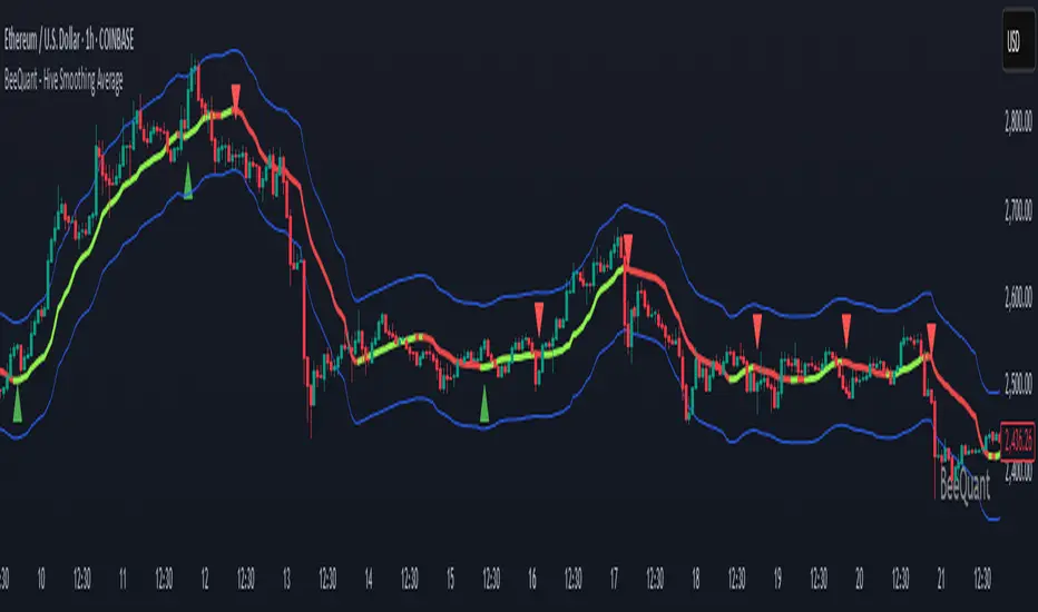
BeeQuant - Hive Smoothing Average🔶 OVERVIEW
The "Hive Smoothing Average" is your gateway to crystal-clear market insights, a truly advanced tool that cuts through confusing price "noise" to reveal the true underlying trend. Imagine having a panoramic view of the market's true direction, unclouded by minor ups and downs. This powerful indicator dynamically filters out market distractions, presenting you with a highly refined line that not only shows you the genuine path of price but also changes color. It’s built for traders who demand clarity and want to confidently spot opportunities that others might miss in messy charts.
__________________________________________________________________________
🧠 CONCEPTS
At its heart, the "Hive Smoothing Average" employs a sophisticated multi-stage processing system to transform raw price data into an incredibly smooth and responsive smoothed moving average line. It's designed to give you an unparalleled view of market direction and momentum.
⬜ Synthesizes multiple smoothing layers to deliver a balanced representation of underlying price action.
⬜ Offers enhanced visual consistency by filtering volatility distortion without delay-based lag.
⬜ Presents color-coded transitions and signal markers to aid in directional conviction and structural flow.
⬜ Embeds a modular smoothing core adaptable across market environments and asset classes.
Hive Smoothing Average doesn't forecast, it refines. It provides a more coherent view of price evolution, allowing for higher-confidence discretion and more robust strategy overlays.
__________________________________________________________________________
✨ FEATURES
Hive Smoothing Average is loaded with flexibility and visual power to enhance your decision-making:
🔹Customizable Smoothing
Tailor the indicator’s core behavior using a wide range of smoothing algorithms — from classic to advanced — to match your trading tempo and asset dynamics.
🔹 Intelligent Color Feedback
The line color dynamically shifts to reflect meaningful trend transitions, offering at-a-glance clarity without crowding your chart.
🔹 Trend Signal Markers
Built-in arrow markers highlight potential transitions in price momentum, acting as subtle nudges to investigate further.
🔹 Multi-Timeframe Ready
Designed to operate cleanly across all timeframes, from scalping micro-trends to monitoring macro cycles.
🔹 External Source Collaboration
Hive Smoothing Average includes two flexible input channels that can seamlessly connect with other indicators on your chart.
🔹 Adaptive Bands
A powerful enhancement to the Hive framework, the optional Standard Deviation Bands add dynamic context to price behavior by highlighting how far price is moving relative to its recent average volatility.
Length: Controls the lookback period for volatility calculation.
Lower values (e.g., 20 – 50) make the bands highly reactive Higher values (e.g., 200 – 500) smooth out the bands (classic envelope systems )
These bands offer valuable visual cues for both volatility expansion and mean reversion potential, especially when combined with Hive’s core candle coloration logic.
🔹Non-Repainting Logic for Historical Reliability
Each "Hive Smoothing Average" is plotted only when its internal reconstruction conditions are fully met and confirmed. This ensures that the historical display of Hive Smoothing Average does not repaint, providing a high degree of reliability and trust in past signals and visualizations.
🔹Cross-Market Versatility
This indicator is engineered to perform with precision across all major markets—whether you're trading forex, commodities, stocks, or indices. Its adaptive logic automatically aligns with the unique volatility and structure of each asset class, delivering consistently reliable insights no matter where you trade.
__________________________________________________________________________
⚙️ USAGE
Getting started with Hive Smoothing Average is seamless and intuitive:
✨ Apply to Any Chart
Simply add the indicator to any asset or timeframe and see immediate transformation in chart clarity.
💹 Source Data Flexibility
Choose your preferred price data source for each smoothing stage (e.g., Close, Open, High, Low), providing complete control over the input feeding the sophisticated smoothing algorithms.
🛠️ Adjust Smoothing Behavior
Choose your preferred initial and final smoothing types (EMA, HMA, ALMA, etc.), and tweak lengths for desired responsiveness or smoothness.
📐 Use Bands for Confluence
Enable the Bands mode to visualize dynamic zones around your smoothed price. Useful for breakout validation and fade zones.
🟩 Green Smoother Line
Indicates strengthening bullish bias and upward progression.
🟥 Red Smoother Line
Suggests weakening or shifting trend toward bearish territory.
📈 Arrow Signals
Upward or downward triangles appear when directional bias changes — confirming subtle pivots in trend behavior.
🎯 Offset Adjustment
Fine-tune the visual positioning of the smoothed line and bands on your chart with a convenient "Offset" input.
📏 Lookback Filter
Activate the “Lookback Filter” setting to remove weaker signals based on custom historical logic. By checking recent candle behavior, it filters out low-quality transitions and only keeps strong, confirmed shifts — helping you avoid noise and stay focused on reliable breakouts.
Experiment with settings based on your trading timeframe. Short-term traders may prefer fast-reactive configurations, while swing or positional traders can explore higher-period smoothings for structural signals.
__________________________________________________________________________
⚠️ LIMITATIONS
While Hive Smoothing Average delivers incredible trend clarity, it’s essential to use it within its designed purpose:
👉 Visual Clarity, Not Trade Calls: This tool enhances visibility of market behavior, not automatic signals. Use it as a trusted lens — not a standalone system.
👉 Reactive, Not Predictive: Hive Smoothing Average responds to price action with refined smoothing. It is not a forecasting model.
👉 Config-Sensitive Output: Different smoothing setups can produce different levels of sensitivity or delay. Calibration matters — explore what fits your asset and style.
👉 Focuses on Price Action Only: It does not integrate volume, fundamentals, or external market influences. It’s engineered purely for price structure refinement.
█ ▒▒▒▒▒▒▒▒▒▒▒▒▒▒▒▒▒▒▒▒▒▒▒ 『•••• ✎ ••••』 ▒▒▒▒▒▒▒▒▒▒▒▒▒▒▒▒▒▒▒▒▒▒▒▒ █
🎯 CONCLUSION
Hive Smoothing Average provides a high-performance, low-noise framework to view price with remarkable clarity. With its adaptive smoothing layers, bands support, and intelligent signal markers, it becomes a powerful tool to enhance your trend confidence and charting efficiency. By furnishing immediate, data-driven feedback on the market's core momentum and signaling critical turning points, it profoundly empowers traders to rapidly ascertain nascent market shifts and identify pivotal directional changes. Seamlessly integrate this sophisticated visual tool within your pre-existing technical analysis architecture to acquire a sharper, more insightful perspective, and fundamentally elevate your strategic acumen, optimizing your decision-making processes to a degree previously unattainable. It's about experiencing the market's true rhythm.
▣▣▣▣▣▣▣▣▣▣▣▣▣▣▣▣▣▣▣▣▣▣▣▣▣▣▣▣▣▣▣▣▣▣▣▣▣▣▣▣▣▣▣▣▣▣▣▣▣▣▣
🚨 RISK DISCLAIMER
Engagement in financial market speculation inherently carries a substantial degree of inherent risk, and the potential for capital diminution, potentially exceeding initial deposits, is a pervasive and non-trivial consideration. All content, algorithmic tools, scripts, articles, and educational materials disseminated by "Hive Smoothing Average" are exclusively purposed for informational and pedagogical objectives, strictly for reference. Historical performance data, whether explicitly demonstrated or implicitly suggested, offers no infallible assurance or guarantee of future outcomes. Users bear sole and ultimate accountability for their individual trading decisions and are emphatically urged to meticulously assess their financial disposition, risk tolerance parameters, and conduct independent due diligence prior to engaging in any speculative market activity.
Datascience
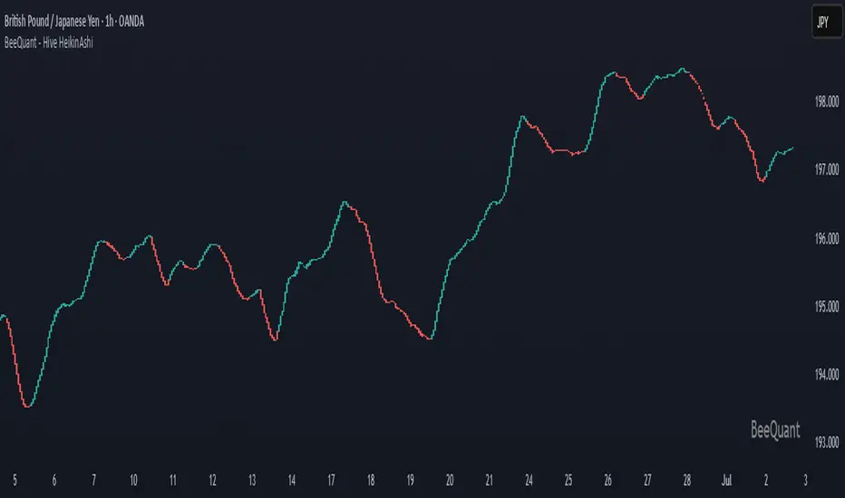
BeeQuant - Hive HeikinAshi💠 OVERVIEW
The "Hive HeikinAshi" is your ultimate tool for simplifying the chaotic world of price charts. Imagine a specialized lens that cuts through all the market "noise" – those tiny, confusing movements – and reveals the clear, underlying current of price action. This indicator transforms standard, sometimes choppy, candlestick charts into a powerful, trend-focused visualization. It’s designed to help every trader, whether you're a discretionary trader seeking cleaner structures or a quant enthusiast looking for visual cues to complement models, Hive HeikinAshi provides a simplified yet highly informative lens through which to read price action.
Its main advantage lies in its seamless compatibility with external indicators — offering a next-level smoothing foundation that enhances the clarity and reliability of any existing trend, momentum, or signal-based system layered on top of it.
__________________________________________________________________________
🧠 CONCEPTS
At its core, the "Hive HeikinAshi" isn't just another way to look at candles; it's a profound re-interpretation of price dynamics. It employs a sophisticated internal process to distill raw market movements into a more coherent, trend-identifying display, making the market's story incredibly easy to read.
The "Hive" Transformation: Unlike traditional candlesticks that show every small price fluctuation, the "Hive HeikinAshi" candles are intelligently constructed to smooth out the data. They are derived from a multi-point calculation process, creating a new, more consistent visual representation of price. This transformation helps to reduce the "visual clutter" and make trend following a much more intuitive experience. You'll see the forest, not just the trees.
⬜ Highlights dominant price direction by filtering reactive fluctuations
⬜ Visually separates impulsive vs corrective behavior with clear color transitions
⬜ Enables quicker discretionary recognition of trend shifts without complex overlays
⬜ Ideal for confirming momentum zones and stable trending phases
⬜ The Intelligent Filter. An optional yet powerful "Filter" mechanism has been integrated, providing an additional layer of analytical discernment.
⬜ Designed to integrate natively with trend-following, oscillator, or signal indicators — enabling amplified precision across diverse trading systems
A significant advantage of the "Hive HeikinAshi" is its inherent ability to minimize distracting "noise" from typical candle wicks. While standard candles can often show long, confusing wicks that obscure the true body direction, our specialized candles are engineered to emphasize the core directional move. This intelligent design allows you to focus on the momentum generated by the candle's body, rather than getting sidetracked by fleeting price extremes, thereby providing a cleaner, more reliable visual of trend strength.
__________________________________________________________________________
✨ FEATURES
Hive HeikinAshi includes several key features designed for both clarity and functionality:
🔹Multi-Bar Averaging
Generates a visually balanced candle structure using averaged pricing across configurable recent bars.
🔹 Wickless Visualization
Candles are rendered without upper/lower shadows, enhancing trend detection and reducing signal confusion.
🔹 Signal Filter
Adaptive color filter using a dynamic high/low lookback logic
🔹 Directional Color Coding
Clean green/red coloring helps instantly interpret bullish or bearish pressure.
🔹 Adjustable History Depth
Customize how many bars are considered in the smoothing process to match your style and timeframe.
🔹 Invisible Price Feed Outputs
Underlying smoothed OHLC values are available for custom strategies or overlays.
🔹Non-Repainting Logic for Historical Reliability
Each "Hive HeikinAshi" is plotted only when its internal reconstruction conditions are fully met and confirmed. This ensures that the historical display of HeikinAshi does not repaint, providing a high degree of reliability and trust in past signals and visualizations.
🔹Cross-Market Versatility
This indicator is engineered to perform with precision across all major markets—whether you're trading forex, commodities, stocks, or indices. Its adaptive logic automatically aligns with the unique volatility and structure of each asset class, delivering consistently reliable insights no matter where you trade.
__________________________________________________________________________
⚙️ USAGE
Using Hive HeikinAshi is simple and effective:
📥 Add to Chart
Once access is granted, apply the indicator to any timeframe or asset directly from your TradingView invite-only indicators list.
⚙️ Tweak “No. of Bars”
This setting controls how far back the smoothing engine looks.
• Lower values = more responsive, shorter-term smoothing
• Higher values = steadier candles, better for macro trends
🎚️ Next, consider the "Filter" option:
Turn this on to activate the advanced filtering mechanism. Then, adjust the "lookback bars" (from 1 to 10). A smaller number here will make the filter more responsive to immediate "Hive HeikinAshi" candle extremes, while a larger number will require a more sustained breakout from the recent filtered range. Experiment to discover the optimal "sweet spot" that best reveals the underlying market flow for your specific strategy. The tooltip guides you to this optimal setting.
Disable "Filter": If turned off, the candles will revert to a more direct HeikinAshi coloration based purely on their calculated open and close, without the additional layer of range filtering.
🔍 Interpreting Candles
• 🟢 Green Candle: Bullish continuation zone
• 🔴 Red Candle: Bearish pressure dominates
• Lack of wick = strong directional conviction
Combine with your favorite indicators — Hive HeikinAshi acts as a foundation to reduce noise and enhance clarity across tools like EMAs, MACD, VWAP, and more.
__________________________________________________________________________
⚠️ LIMITATIONS
While Hive HeikinAshi provides clear visual advantages, it is important to understand its scope:
👉 Not a Signal Generator: This indicator excels at identifying and confirming trends, making it less suitable for pinpointing exact, high-frequency entry and exit points that require unadulterated real-time price. It prioritizes overall directional clarity.
👉 Lag by Design: Due to multi-bar data smoothing, candles reflect stable price behavior but not ultra-short-term fluctuations.
👉 No Volume or Macro Inputs: Hive HeikinAshi focuses purely on price structure — it does not include volume, news, or external conditions.
👉 Filter Calibration: While the "Filter" enhances clarity, its effectiveness is dependent on appropriate "lookback bars" calibration. Users should understand that adding filtering inherently balances responsiveness with a more refined signal, and finding the optimal setting is part of the analytical process.
█ ▒▒▒▒▒▒▒▒▒▒▒▒▒▒▒▒▒▒▒▒▒▒▒ 『•••• ✎ ••••』 ▒▒▒▒▒▒▒▒▒▒▒▒▒▒▒▒▒▒▒▒▒▒▒▒ █
🎯 CONCLUSION
Hive HeikinAshi is a powerful visual companion for modern traders seeking smoother, clearer price trends. By combining directional clarity with reduced chart clutter, it allows you to interpret the market with less noise and more confidence. Seamlessly integrate this advanced visual tool within your analytical framework to gain a sharper, more confident perspective, and elevate your strategic decision-making in the markets. It's about seeing the unseen, with clarity.
▣▣▣▣▣▣▣▣▣▣▣▣▣▣▣▣▣▣▣▣▣▣▣▣▣▣▣▣▣▣▣▣▣▣▣▣▣▣▣▣▣▣▣▣▣▣▣▣▣▣▣
🚨 RISK DISCLAIMER
Engagement in financial market speculation inherently carries a substantial degree of inherent risk, and the potential for capital diminution, potentially exceeding initial deposits, is a pervasive and non-trivial consideration. All content, algorithmic tools, scripts, articles, and educational materials disseminated by "Hive HeikinAshi" are exclusively purposed for informational and pedagogical objectives, strictly for reference. Historical performance data, whether explicitly demonstrated or implicitly suggested, offers no infallible assurance or guarantee of future outcomes. Users bear sole and ultimate accountability for their individual trading decisions and are emphatically urged to meticulously assess their financial disposition, risk tolerance parameters, and conduct independent due diligence prior to engaging in any speculative market activity.
DataChartLibrary "DataChart"
Library to plot scatterplot or heatmaps for your own set of data samples
draw(this)
draw contents of the chart object
Parameters:
this : Chart object
Returns: current chart object
init(this)
Initialize Chart object.
Parameters:
this : Chart object to be initialized
Returns: current chart object
addSample(this, sample, trigger)
Add sample data to chart using Sample object
Parameters:
this : Chart object
sample : Sample object containing sample x and y values to be plotted
trigger : Samples are added to chart only if trigger is set to true. Default value is true
Returns: current chart object
addSample(this, x, y, trigger)
Add sample data to chart using x and y values
Parameters:
this : Chart object
x : x value of sample data
y : y value of sample data
trigger : Samples are added to chart only if trigger is set to true. Default value is true
Returns: current chart object
addPriceSample(this, priceSampleData, config)
Add price sample data - special type of sample designed to measure price displacements of events
Parameters:
this : Chart object
priceSampleData : PriceSampleData object containing event driven displacement data of x and y
config : PriceSampleConfig object containing configurations for deriving x and y from priceSampleData
Returns: current chart object
Sample
Sample data for chart
Fields:
xValue : x value of the sample data
yValue : y value of the sample data
ChartProperties
Properties of plotting chart
Fields:
title : Title of the chart
suffix : Suffix for values. It can be used to reference 10X or 4% etc. Used only if format is not format.percent
matrixSize : size of the matrix used for plotting
chartType : Can be either scatterplot or heatmap. Default is scatterplot
outliersStart : Indicates the percentile of data to filter out from the starting point to get rid of outliers
outliersEnd : Indicates the percentile of data to filter out from the ending point to get rid of outliers.
backgroundColor
plotColor : color of plots on the chart. Default is color.yellow. Only used for scatterplot type
heatmapColor : color of heatmaps on the chart. Default is color.red. Only used for heatmap type
borderColor : border color of the chart table. Default is color.yellow.
plotSize : size of scatter plots. Default is size.large
format : data representation format in tooltips. Use mintick.percent if measuring any data in terms of percent. Else, use format.mintick
showCounters : display counters which shows totals on each quadrants. These are single cell tables at the corners displaying number of occurences on each quadrant.
showTitle : display title at the top center. Uses the title string set in the properties
counterBackground : background color of counter table cells. Default is color.teal
counterTextColor : text color of counter table cells. Default is color.white
counterTextSize : size of counter table cells. Default is size.large
titleBackground : background color of chart title. Default is color.maroon
titleTextColor : text color of the chart title. Default is color.white
titleTextSize : text size of the title cell. Default is size.large
addOutliersToBorder : If set, instead of removing the outliers, it will be added to the border cells.
useCommonScale : Use common scale for both x and y. If not selected, different scales are calculated based on range of x and y values from samples. Default is set to false.
plotchar : scatter plot character. Default is set to ascii bullet.
ChartDrawing
Chart drawing objects collection
Fields:
properties : ChartProperties object which determines the type and characteristics of chart being plotted
titleTable : table containing title of the chart.
mainTable : table containing plots or heatmaps.
quadrantTables : Array of tables containing counters of all 4 quandrants
Chart
Chart type which contains all the information of chart being plotted
Fields:
properties : ChartProperties object which determines the type and characteristics of chart being plotted
samples : Array of Sample objects collected over period of time for plotting on chart.
displacements : Array containing displacement values. Both x and y values
displacementX : Array containing only X displacement values.
displacementY : Array containing only Y displacement values.
drawing : ChartDrawing object which contains all the drawing elements
PriceSampleConfig
Configs used for adding specific type of samples called PriceSamples
Fields:
duration : impact duration for which price displacement samples are calculated.
useAtrReference : Default is true. If set to true, price is measured in terms of Atr. Else is measured in terms of percentage of price.
atrLength : atrLength to be used for measuring the price based on ATR. Used only if useAtrReference is set to true.
PriceSampleData
Special type of sample called price sample. Can be used instead of basic Sample type
Fields:
trigger : consider sample only if trigger is set to true. Default is true.
source : Price source. Default is close
highSource : High price source. Default is high
lowSource : Low price source. Default is low
tr : True range value. Default is ta.tr

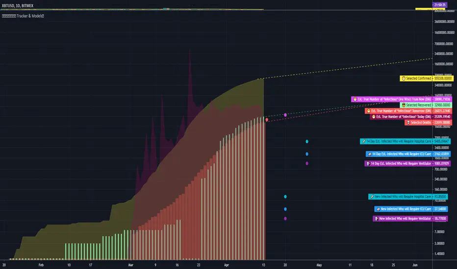
COVID Statistics Tracker & Model Projections by Cryptorhythms😷 COVID-19 Coronavirus Tracker & Statistics Tools by Cryptorhythms 😷
📜Intro
I wanted to put some more meaning behind the numbers for 2020's Covid pandemic. I hope this tool can help people analyze and deal with these hard times. With these metrics I hope to give greater depth and dimension to whats available. While also at the same time creating something that looks decently presentable and gives actionable information.
I had planned on including a few forecasting models and letting the user play with values to see how social distancing works. But alas I couldnt complete those in the scope of time I gave myself for the indicator. If you are interested in collaborating on it, I will share what I have with you and we can further work on it.
📋Description
The script contains 3 main parts you will interact with. I suggest you enable the chart labels for "indicator name" and "indicator last value" to make the charts more readable (right click on the scale of your chart and goto the "labels" pop out menu). Depending on what plots and data you choose to chart, logarithmic and regular scales can both be applied in different situations. To get similar visuals to the examples I will show below, you can goto the indicator options > style tab. I then play with the line styles, colors and transparencies to achieve the nice looking charts. Please also note there is a distinction between "Infected" and "Infectious". A model telling you the number of infected doesnt designate whether that person can still pass the virus on to others (infectious). So Infectious numbers are usually lower than total confirmed, but this isnt always the case if for example a country wasnt testing very much during the early phase or something else.
🚧Disclaimer
I am not a medical professional and none of this should be considered medical advice. All of the models, numbers and math I sourced from professional places but this is not a guarantee of the future only an approximation based on current information. Numbers change daily and so can these models!
🌐PART ONE
In this area you select a region to read the proper statistics data from tradingview. You can do global totals, country totals, or for a few places (AU, CA, CN, US) you can see state/province totals. Remember to SELECT ONLY ONE region.
🧮PART TWO
The Plots/Stats/Data section includes:
1. ) Plot the Days to Double Number of Confirmed
2. ) Plot the Infection Growth Ratio
3. ) Plot Fatality Risk Rate (Total Deaths / Total Outcomes)
4. ) Plot Overall Fatality Rate / Recovery Rate
5. ) Plot % of World Infected & % of USA Infected
6. ) Plot Daily New Deaths, Confirmed & Recovered
7. ) Plot Daily Change Percentages
🎱PART THREE
Forecasting Models and Settings:
1 .) Plot the % of Custom Population Infected (Vs. the Region Selected in Part 1 of Settings)
2 .) Plot the True Num. of Infectious (Death Model / DM)
3 .) Plot the Current and Next Weeks Cumulative Infection Projection (DM)
4 .) Plot Estimated Infection Rates? (DM)
5 .) Enable Basic Trajectory Projection?
6 .) Plot the Likelihood of > 0 **Infectious** in a Group (DM) for Today, Tomorrow and Next Week
7 .) Plot the True Num. of Infected (Confirmed/Tested Model)
8 .) Plot the Estimated Epidemiology for 7 and 14 Days Out (Hospital Beds, ICU Beds, Ventilator Units)
Planned But not completed
9.) SIR Epidemiology Model
10.) Exponential Growth Plot & Correlation
To use the Estimator for likelihood of Infected in N group of people you need to do 2 things. Select and use "Custom Population" as the population source for part 3. Then you need to enable "Custom Infected" as the source for the model. Then you enter your geographical area's population and confirmed cases. Its best to goto the smallest / most granular level of data available to accurately estimate the likelihood. So for instance in the order of least effective to most effective data source: global, country, state, county, city...etc.
If you do not understand what these terms or numbers represent, please read the source materials I have linked in the code, or use google. I dont have the time or expertise to explain all the various specific methods and terms included here. This entire project was a learning journey for me and I have zero experience in epidemiology so please excuse any errors I may have made. (and tell me, so I can change it!)
🔮Future Additions
If anyone has a model or stat they would like included I will be happy to add your code to this toolbox to make it more effective and give you credit here in the description. If you want to collaborate please message me.
📊Some Example Charts:
The Cryptorhythms Team wish you and your families all the absolute best of health!
P.S. Stay safe and act smart I dont think this will be the EOTW.