Liquidity Sniper V3 (ANTI-FAKEOUT)An advanced institutional trading indicator combining liquidity pool targeting, smart money concepts, and momentum-based entries with comprehensive risk management.
🎯 CORE FEATURES:
- Liquidity Sniper Module: Identifies and targets major liquidity pools (PDH/PDL, PWH/PWL, Equal Highs/Lows, HVN/LVN edges)
- Anti-Fakeout Stack: 10-layer confirmation system including VWAP reclaim, micro BOS, displacement, relative volume, and mitigation entries
- Momentum Engulf Add-On: Catches high-velocity impulsive moves with engulfing candles, volume spikes, and volatility breakouts
- GARCH Volatility Filter: Dynamic volatility analysis to avoid choppy conditions
- Multi-Timeframe Confirmation: Ensures alignment across timeframes before entries
📊 SIGNAL CLASSIFICATION:
- BEST (Green): Highest probability setups with all confirmations aligned - 6.0+ score
- BETTER (Medium Green): Strong setups with most confirmations - 4.5-6.0 score
- GOOD (Light Green): Valid setups with basic confirmations - 3.0-4.5 score
🔍 TRADE SCENARIOS:
S1: Liquidity Reversal - Sweeps + reversals at key levels with displacement
S2: Continuation - Trend following with VWAP mean reversion
S3: Mean Reversion - Extreme deviations (2σ+) with Fibonacci exhaustion
S4: Deep Sweep - 3σ sweeps at major liquidity with high confluence
⚡ MOMENTUM TRIGGERS:
- MET (Momentum Engulf): Bullish/bearish engulfing with 1.5x+ volume spike and ATR impulse
- VBT (Volatility Breakout): Range breakouts with sigma bursts and participation
🛡️ RISK MANAGEMENT:
- Dynamic TP/SL based on ATR, VWAP bands, and liquidity pools
- 3-tier targets (T1: VWAP, T2: Nearest pool, T3: 5R extension)
- Early invalidation tracking (0.5R movement monitoring)
- Minimum 2:1 RR requirement with cooldown periods
- RTH session filters and anti-spam protection
📈 TECHNICAL EDGE:
- SMT Divergence detection vs ES correlation
- CVD (Cumulative Volume Delta) divergence confirmation
- FVG (Fair Value Gap) and Order Block mitigation entries
- Equal highs/lows clustering analysis
- Volume profile HVN/LVN identification
⚙️ FULLY CUSTOMIZABLE:
All parameters adjustable including cooldowns, proximity thresholds, ATR multipliers, RR floors, and scenario weights.
Perfect for: ES/NQ futures, forex majors, and liquid stocks. Works on 1-15 min timeframes. Best results during NY session (9:35-11:00 AM & 1:30-3:30 PM ET).
Created for serious traders seeking institutional-grade edge with quantifiable risk/reward and high-probability setups
Educational

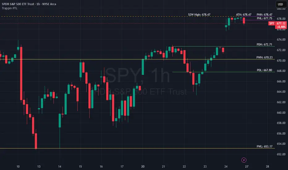
Trappin Previous Timeframe LevelsTrappin Previous Timeframe Levels (Trappin PTL)
Overview
Trappin PTL is a comprehensive multi-timeframe support and resistance indicator that displays key price levels from multiple timeframes on a single chart. This indicator helps traders identify critical price zones where reversals or breakouts are likely to occur, making it ideal for both intraday and swing trading strategies.
💡 Origin Story
I got tired of manually drawing these lines that I learned from watching Wallstreet Trapper on Trappin Tuesdays YouTube live streams. After repeatedly marking the same previous timeframe levels on every chart, I decided to automate the process. Hope it helps you as much as it helps me!
Key Features
📊 Multiple Timeframe Levels
The indicator tracks and displays high/low levels from:
Previous Hour (PHH/PHL) - Purple lines
Previous Day (PDH/PDL) - Green lines
Previous Week (PWH/PWL) - Yellow lines
Previous Month (PMH/PML) - Blue lines
All-Time High (ATH) - Red line
52-Week High - Orange line
🎨 Fully Customizable
Colors - Change the color of each timeframe independently
Line Styles - Choose between Solid, Dashed, or Dotted lines
Line Widths - Adjust thickness from 1-4 pixels
All settings organized in intuitive groups for easy access
📍 Smart Line Extension
Lines extend back to show when the level was established
Lines project forward to show current relevance
Historical context helps identify key support/resistance zones
🏷️ Clear Price Labels
Each level displays its exact price value (no currency symbols)
Labels positioned horizontally to avoid overlap
Adaptive text color for visibility on any chart theme (dark or light mode)
Why "Trappin"?
The name is a tribute to Wallstreet Trapper and his Trappin Tuesdays YouTube live streams, where I learned the importance of marking previous timeframe levels. The name also reflects the indicator's purpose: identifying price levels where traders often get "trapped" - whether it's bulls getting trapped below resistance or bears getting trapped above support. These levels represent zones where significant order flow and liquidity exist, making them prime areas for reversals or breakouts.
Credits
Created by resoh
Inspired by Wallstreet Trapper and Trappin Tuesdays YouTube live streams
This indicator is provided for educational and informational purposes. Always practice proper risk management and conduct your own analysis before making trading decisions.
Version History
v1.0 - Initial Release
Multi-timeframe high/low levels
All-time high tracking
52-week high tracking
Fully customizable colors, styles, and widths
Adaptive labels with price display
Smart line extension showing historical context
[PS] Planetary Movements & Nakshatras - Adv Astrological Trading🌟 Planetary Movements & Nakshatras - Advanced Astrological Trading Indicator
📊 Overview
Planetary Movements & Nakshatras is a comprehensive Pine Script indicator that bridges ancient Vedic astrology with modern technical analysis. This powerful tool overlays planetary positions, transitions, alignments, and nakshatras (lunar mansions) directly on your price charts, providing unique insights into potential market movements based on celestial patterns.
🎯 Key Features
1. Real-Time Planetary Tracking
Displays current positions of 7 major celestial bodies: Sun ☉, Moon ☽, Mercury ☿, Venus ♀, Mars ♂, Jupiter ♃, and Saturn ♄
Shows each planet's current zodiac sign and nakshatra
Optional degree display for precise astronomical positioning
Color-coded labels for easy identification
2. Industry-Specific Intelligence
Choose from 15 industry classifications with customized planetary and nakshatra associations:
Technology - Mercury, Rahu, Uranus (Innovation & Communication)
Finance/Banking - Jupiter, Mercury, Venus (Wealth & Trade)
Healthcare/Pharma - Sun, Moon, Jupiter (Vitality & Healing)
Energy/Oil - Sun, Mars (Power & Energy)
Agriculture - Moon, Venus, Jupiter (Growth & Fertility)
Real Estate - Saturn, Mars, Venus (Property & Construction)
Media/Entertainment - Venus, Mercury, Moon (Arts & Creativity)
Transportation - Mars, Mercury, Moon (Movement & Travel)
Metals/Mining - Saturn, Mars, Sun (Minerals & Iron)
FMCG/Retail - Venus, Mercury, Moon (Commerce & Consumer Goods)
Telecom - Mercury, Rahu (Communication & Networks)
Automobile - Mars, Saturn, Mercury (Machinery & Engineering)
Defense - Mars, Sun, Saturn (War & Discipline)
Education - Jupiter, Mercury, Moon (Knowledge & Learning)
General - All planets (Universal application)
Primary planets for each industry are marked with ★ and highlighted with vibrant colors, while secondary planets appear muted.
3. 27 Nakshatras (Lunar Mansions)
Complete coverage of all 27 Vedic nakshatras from Ashwini to Revati:
Each nakshatra spans 13.33° of the zodiac
Industry-specific favorable nakshatras marked with ✓
Visual nakshatra boundaries with dotted lines
Configurable display: Lines, Labels, Both, or None
Enhanced visualization for auspicious nakshatras
4. Planetary Transitions & Sign Changes
Track when planets change zodiac signs (every 30°):
Triangle markers indicate sign transitions
Historical price impact displayed with each transition
Shows average upward ↑% and downward ↓% swing following the event
Significant transitions highlighted at chart bottom
Regular transitions appear at chart top
5. Planetary Alignments & Aspects
Detects major astronomical events:
Conjunctions - Planets in the same position (customizable orb: 1-15°)
Oppositions - Planets 180° apart (customizable orb: 1-15°)
Sun-Moon Conjunctions (New Moon) - Powerful market turning points
Sun-Moon Oppositions (Full Moon) - High volatility periods
Jupiter-Saturn Conjunctions - Major cycle indicators (every 20 years)
Background highlighting for major alignments
6. Advanced Pattern Detection System
Machine learning-inspired historical analysis:
Automatic Pattern Recognition - Identifies recurring planetary configurations
Swing Analysis - Calculates price movements following each event
Configurable Parameters:
Minimum Swing Threshold (0.5% - 50%)
Lookforward Period (5-180 days)
Minimum Occurrences (1-10 instances)
Statistical Tracking:
Count of pattern occurrences
Average upward swing percentage
Average downward swing percentage
Maximum upward swing
Maximum downward swing
Industry Relevance Filtering - Focus only on patterns relevant to your sector
7. Three Interactive Information Tables
📋 Industry Planet Guide Table (Configurable Position)
Shows primary planets to watch for your selected industry
Lists favorable nakshatras for optimal timing
Legend explaining symbols (★ = Primary, ✓ = Favorable)
Compact format with color-coded information
📊 Pattern Statistics Table (Configurable Position)
Historical performance data for all detected patterns
Sortable by significance
Columns: Pattern Name, Count, Avg↑%, Avg↓%, Max↑%, Max↓%, Relevance
Color-coded thresholds (green for bullish, red for bearish)
Industry relevance marked with ★
Shows up to 15 most significant patterns
🔮 Future Events Table (Configurable Position)
Projects planetary events up to 365 days into the future
Lists upcoming transitions, conjunctions, and oppositions
Shows historical average price impacts for each future event
Date, Event type, Sign/Nakshatra, Expected swing percentages
Significant events marked with ★
Displays up to 20 upcoming events
Table Positioning: Each table can be placed in any of 9 positions:
Top: Left, Center, Right
Middle: Left, Center, Right
Bottom: Left, Center, Right
8. Visual Enhancements
Nakshatra Boundary Lines - Dotted vertical lines every 27 bars
Color-Coded Events - Orange (Sun), Silver (Moon), Yellow (Mercury), Green (Venus), Red (Mars), Purple (Jupiter), Blue (Saturn)
Significance Highlighting - Bright colors for high-impact events, muted for regular events
Background Shading - Subtle yellow for Sun-Moon conjunctions, purple for Jupiter-Saturn conjunctions
Responsive Labels - Adjustable size (tiny, small, normal, large)
9. Astronomical Calculations
Julian Day Number conversion for precise date handling
Keplerian Orbital Elements for planetary position calculation
J2000 Epoch (January 1, 2000) as reference point
Accurate for historical, current, and future dates
Accounts for mean longitude and orbital mechanics
🎛️ Comprehensive Settings
Industry Settings
15 industry types with pre-configured planetary associations
Planets Group
Toggle planetary positions display
Toggle transition markers
Toggle alignment indicators
Planet Selection
Individual on/off switches for all 7 planets
Mix and match based on your trading strategy
Pattern Detection
Enable/disable pattern recognition
Minimum swing threshold (%)
Days to measure swing impact
Minimum pattern occurrences for validity
Highlight significant events
Filter by industry-relevant planets
Alignments
Conjunction orb (1-15°)
Opposition orb (1-15°)
Customizable sensitivity
Display Options
Label size selection
Show/hide degree measurements
Toggle all three information tables
Nakshatra display modes
Table Settings
Show/hide Future Events Table
Show/hide Pattern Statistics Table
Show/hide Industry Guide Table
Configure position for each table (9 positions)
Adjust future projection days (30-365)
Nakshatras
Display modes: Lines, Labels, Both, or None
Automatic favorable nakshatra highlighting
💡 Use Cases
Timing Market Entries & Exits
Identify high-probability periods using planetary alignments
Watch for favorable nakshatra transits in your industry
Track historical success rates of specific planetary configurations
Risk Management
Be aware of volatile periods (Full Moons, major transitions)
Reduce position sizes during unfavorable planetary periods
Increase exposure during auspicious nakshatra alignments
Industry-Specific Analysis
Technology stocks may respond to Mercury movements
Banking stocks may correlate with Jupiter-Venus alignments
Energy stocks may track Sun-Mars aspects
Long-Term Cycle Analysis
Jupiter-Saturn conjunctions mark major market cycles (20-year cycles)
Saturn transitions indicate sector rotation (2.5-year cycles)
Jupiter transitions show expansion/contraction phases (1-year cycles)
Intraday & Swing Trading
Moon transitions every 2.5 days for short-term timing
Mercury retrogrades for communication/tech sector volatility
Venus transitions for consumer goods and luxury items
Pattern Backtesting
Quantify historical price impacts of specific events
Build confidence in planetary timing strategies
Compare multiple patterns for optimal selection
📈 Performance & Optimization
Efficient Calculations - Optimized algorithms for minimal lag
Smart Pattern Storage - Tracks only significant patterns
Configurable Display Limits - Control label and line counts
Future Projection - Pre-calculates events without real-time overhead
Industry Filtering - Reduces noise by focusing on relevant patterns
🔧 Technical Specifications
Pine Script Version: 6
Chart Type: Overlay (true)
Max Labels: 500
Max Lines: 500
Max Boxes: 500
Calculation Method: Simplified Keplerian orbital mechanics
Date Range: Works for past, present, and future dates
Zodiac System: Tropical (Western) zodiac with Vedic nakshatras
🌙 Nakshatra Reference
All 27 nakshatras are supported with industry-specific favorable classifications:
Ashwini - Swift action, healing, pioneering (Tech, Auto, Transport)
Bharani - Transformation, restraint (Defense, Entertainment)
Krittika - Purification, cutting through (Energy, Real Estate, Metals)
Rohini - Growth, beauty, fertility (Finance, Agriculture, FMCG)
Mrigashira - Seeking, curiosity (Agriculture, Auto)
Ardra - Storm, transformation, breakthroughs (Tech, Telecom)
Punarvasu - Renewal, expansion (Agriculture, Transport, Telecom, Education)
Pushya - Nourishment, prosperity (Finance, Healthcare, Agriculture, Education)
Ashlesha - Control, mysticism (Healthcare)
Magha - Power, authority, leadership (Energy, Metals, Defense)
... and 17 more nakshatras with specific industry associations
🎨 Color Scheme
Sun ☉ - Orange (vitality, authority)
Moon ☽ - Silver (emotions, public)
Mercury ☿ - Yellow (communication, intellect)
Venus ♀ - Green (beauty, wealth, harmony)
Mars ♂ - Red (action, energy, conflict)
Jupiter ♃ - Purple (expansion, wisdom, fortune)
Saturn ♄ - Blue (restriction, discipline, structure)
📚 Trading Strategy Ideas
The Industry-Specific Strategy
Select your stock's industry classification
Focus only on primary planet transitions (marked with ★)
Wait for favorable nakshatra alignments (marked with ✓)
Check Pattern Statistics Table for historical success rate
Enter on confluence of favorable conditions
The Alignment Trading Strategy
Monitor Sun-Moon conjunctions (New Moons) for trend reversals
Track Sun-Moon oppositions (Full Moons) for volatility spikes
Use conjunction orb settings to fine-tune sensitivity
Compare with technical support/resistance levels
The Pattern Recognition Strategy
Enable Pattern Detection with your preferred parameters
Set minimum swing threshold based on your risk tolerance
Focus on patterns with high occurrence counts (5+)
Use Future Events Table to plan entries in advance
Backtest patterns in Pattern Statistics Table
The Nakshatra Timing Strategy
Identify favorable nakshatras for your industry
Wait for Moon to transit through favorable nakshatras
Combine with planetary transitions for stronger signals
Use nakshatra boundary lines for visual confirmation
⚠️ Disclaimer
This indicator is for educational and research purposes only. Planetary positions and astrological calculations should not be the sole basis for trading decisions. Always combine with fundamental analysis, technical analysis, and proper risk management. Past performance of planetary patterns does not guarantee future results. Trading involves substantial risk of loss.
🔄 Updates & Support
This indicator combines ancient wisdom with modern data analysis. While planetary positions are calculated using established astronomical formulas, the correlation between celestial events and market movements is a subject of ongoing research and debate. Use this tool as one component of a comprehensive trading strategy.

Aude - Minimal Session IndicatorMinimal Session Indicator
- The indicator allows users to highlight specific sessions (time range) on the chart.
- There are options to change the visual settings of the session box (BG color, Border color, Border style).
- Max 500 sessions drawn

VIX Overnight Unch or Up AlertThis indicator alerts when VIX opens the day unchanged or higher on the day. If in fact VIX opens up unchanged or higher, it will display near the first bar of the day, previous day's close time and level and the opening time and level. The close time is typically 16:15 New York Time and the opening time is 09:30 or the first print a few minutes later. I use TVC:VIX instead of CBOT because TVC for me is real time. I also use the 1 minute chart and the script is coded as 1 minute.


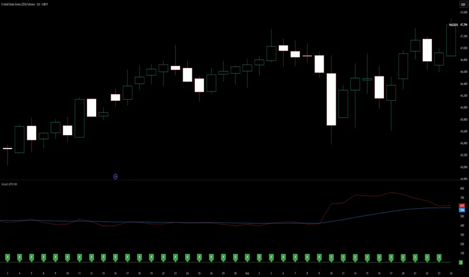
Smart ATR - Position Sizing for YM Dow JonesSmart ATR includes all basic functionality of ATR + an EMA of ATR. The EMA can give you a baseline or long-term perspective of what ATR normally is. The built-in, automatic sizing tool will display a recommended number of contracts each bar, based upon a multiple of the current ATR. Supports fractional tick values for MYM by clicking the down arrow. Supports fractional ATR values, such as 1.5x. Updates contract sizing on each new bar. This indicator will maintain your RR as volatility increases and decreases. Currently only optimized for YM, will publish other versions if there is an interest.
Market Profile based Support/ResistanceBrought to you by Stock Kaka - Your trading sidekick 🦜📈 - pay your visit at stockkaka.my.canva.site or find us on X #StockKaka
📊 What This Indicator Does
Ever wish the market would just tell you where the important levels are? Well, buckle up, because this indicator is like having a market whisperer on your chart!
Based on cutting-edge hierarchical market structure analysis (fancy words for "smart support and resistance"), this bad boy uses ATR-based Directional Change to identify turning points that actually matter. No more guessing where price might bounce or break—let the algorithm do the heavy lifting while you sip your coffee ☕
🎯 The Five Levels Explained (From Noisy to Mighty)
Think of these levels like a pyramid of importance. Level 0 is your chatty friend who notices everything, while Level 4 is the wise oracle who only speaks when it really matters.
Level 0: The Hyperactive Scout 🐿️
What it does: Catches every little zigzag in price using ATR confirmation
Significance: Very short-term, intraday noise
Best for: Scalpers who love action every few minutes
Trader Type: "I refresh my chart 100 times an hour"
Reliability: ⭐⭐ (It's enthusiastic but easily excitable)
Level 1: The Day Trader's Buddy 🎯
What it does: Filters Level 0 to show minor swing highs/lows
Significance: Intraday support/resistance, hourly structure
Best for: Day traders, scalpers looking for better entries
Trader Type: "I close all positions before dinner"
Reliability: ⭐⭐⭐ (Solid for quick moves)
Level 2: The Swing Trader's Sweet Spot 🎪
What it does: Identifies multi-day to weekly structure points
Significance: Intermediate support/resistance where battles happen
Best for: Swing traders, position traders
Trader Type: "I hold for days, not minutes"
Reliability: ⭐⭐⭐⭐ (Now we're talking real structure!)
Level 3: The Big Money Magnet 💰
What it does: Shows major market structure—where the whales play
Significance: Weekly to monthly levels, institutional zones
Best for: Position traders, trend followers
Trader Type: "I think in weeks and months, not hours"
Reliability: ⭐⭐⭐⭐⭐ (These levels have gravitational pull!)
Level 4: The Market Prophet 🔮
What it does: Reveals ultra-major turning points (think: quarterly/yearly pivots)
Significance: Long-term macro structure, investment-grade levels
Best for: Investors, long-term position traders
Trader Type: "Warren Buffett is my spirit animal"
Reliability: ⭐⭐⭐⭐⭐⭐ (When these break, market's rewrite the story)
⚙️ Parameter Setup Guide (The Secret Sauce)
The magic ingredient is the ATR Lookback Period—think of it as teaching the indicator your timeframe's "dialect." Here's your cheat sheet:
2-Minute Chart ⚡
ATR Lookback: 720 (24 hours of 2-min bars)
Who uses this: Crypto degens, futures scalpers, adrenaline junkies
Show Levels: L0, L1, L2 (L3+ won't budge much)
Pro Tip: Enable only L1 and L2 or your chart will look like spaghetti
5-Minute Chart 🏃
ATR Lookback: 288 (24 hours of 5-min bars)
Who uses this: Active day traders, news traders
Show Levels: L1, L2, L3
Pro Tip: L2 is your best friend here—perfect for intraday swings
15-Minute Chart 📈
ATR Lookback: 96 (24 hours of 15-min bars)
Who uses this: Swing traders, patient day traders
Show Levels: L1, L2, L3
Pro Tip: This is the "Goldilocks zone"—not too fast, not too slow
1-Hour Chart ⏰
ATR Lookback: 168 (1 week of hourly bars)
Who uses this: Swing traders, position traders
Show Levels: L2, L3, L4
Pro Tip: L3 levels here are like magnets for price action
Daily Chart 📅
ATR Lookback: 30 to 50 (1-2 months)
Who uses this: Investors, long-term traders, people with patience
Show Levels: L2, L3, L4
Pro Tip: L4 on dailies = "Don't fight this level, respect it"
🎨 How to Use This Thing
Add to Chart - Duh! 😄
Set Your ATR Lookback - Use the guide above (don't wing it!)
Enable Relevant Levels - Less is more! Turn off levels that just clutter
Watch the Magic - See horizontal lines appear at key S/R zones
Check the Table - Top-right corner shows current levels (fancy!)
Set Alerts - Get notified when price approaches or breaks levels
Trading Strategies 🎲
The Bounce Play:
Price approaches Level 2 or 3 support → Look for bullish reversal signals
Take profit at the next level resistance
Stop loss just below the support level
The Breakout Play:
Price breaks through Level 2/3 resistance with volume → Go long
Next level becomes your target
Failed breakout? Level becomes resistance again (classic fake-out)
The Confluence Play:
When Level 3 aligns with your favorite indicator (RSI oversold, moving average, Fibonacci) → Chef's kiss! 👨🍳💋
These multi-confirmation setups are where the money lives
🚨 Important Notes (Read This or Blame Yourself Later)
⚠️ This indicator REPAINTS on the current bar until an extreme is confirmed. That's not a bug, it's how directional change works. The past levels are solid as a rock, but the pending one is still... pending.
⚠️ More levels ≠ Better results. Showing all 5 levels is like having 5 GPS apps shouting directions at once. Pick 2-3 levels max.
⚠️ ATR Lookback matters! Wrong setting = garbage results. Use the guide above or experiment carefully.
⚠️ Volatile markets (crypto, meme stocks) work GREAT with this. Choppy, range-bound markets? Meh.
⚠️ Combine with other tools! This shows you WHERE, not WHEN. Use momentum indicators, volume, or your favorite chicken entrails for timing 🐔
🦜 Final Word from Stock Kaka
Remember: Indicators don't make money, traders do. This tool shows you where the market has historically respected structure. What you do with that info? That's on you, champ!
Use proper risk management, don't YOLO your rent money, and may your stops never get hunted 🎯
Trade smart, trade safe, and let Stock Kaka be your guide!
📝 Credits
Algorithm: neurotrader888 (Python implementation)
Pine Script Conversion: Your friendly neighborhood Stock Kaka team!!
Inspiration: Ginger chai, market inefficiencies, and a dash of chaos
📌 Tags
support-and-resistance market-structure atr directional-change multi-timeframe swing-trading day-trading levels hierarchical-analysis algo-trading

Price–Volume Anomaly DetectorDescription
This indicator identifies unusual relationships between price strength and trading volume. By analyzing expected intraday volume behavior and comparing it with current activity, it highlights potential exhaustion, absorption, or expansion events that may signal changing market dynamics.
How It Works
The script profiles average volume by time of day and compares current volume against this adaptive baseline. Combined with normalized price movement (ATR-based), it detects conditions where price and volume diverge:
Exhaustion: Strong price move on low volume (potential fade)
Absorption: Weak price move on high volume (potential reversal)
Expansion: Strong price move on high volume (momentum continuation)
Key Features
Adaptive time-based volume normalization
Configurable sensitivity thresholds
Optional visibility for each anomaly type
Adjustable label transparency and offset
Light Mode support: label text automatically adjusts for dark or light chart backgrounds
Lightweight overlay design
Inputs Overview
Volume Profile Resolution: Defines time bucket size for expected volume
[* ]Lookback Days: Controls how quickly the profile adapts
Price / Volume Thresholds: Tune anomaly sensitivity
Show Expansion / Exhaustion / Absorption: Toggle specific labels
Label Transparency & Offset: Adjust chart visibility
How to Use:
Apply the indicator to any chart or timeframe.
Observe where labels appear:
🔴 Exhaustion: strong price, weak volume
🔵 Absorption: weak price, strong volume
🟢 Expansion: strong price, strong volume
Use these as context clues, not trade signals — combine with broader volume or trend analysis.
How It Helps
Reveals hidden price–volume imbalances
Highlights areas where momentum may be fading or strengthening
Enhances understanding of market behavior beyond raw price action
⚠️Disclaimer:
This script is provided for educational and informational purposes only. It is not financial advice and should not be considered a recommendation to buy, sell, or hold any financial instrument. Trading involves significant risk of loss and is not suitable for every investor. Users should perform their own due diligence and consult with a licensed financial advisor before making any trading decisions. The author does not guarantee any profits or results from using this script, and assumes no liability for any losses incurred. Use this script at your own risk.

Opening Range + Daily LevelsA comprehensive multi-timeframe indicator designed for intraday traders who need critical support/resistance levels and EMAs all in one clean display.
Features:
📊 EMAs
9 EMA (default: white)
21 EMA (default: orange)
📅 Previous Day Levels
Yesterday's High, Low, Open, and Close
Lines extend progressively through the current session
Clean visual separation between trading days
📈 Previous Week Levels
Last Week's High, Low, Open, and Close
Dotted lines that extend through the current week
Perfect for identifying major support/resistance zones
🌙 Pre-Market Session (12:00 AM - 7:30 AM)
Pre-Market High and Low
Tracks overnight price action
Extends through the trading day
⏰ 15-Minute Opening Range (7:30 AM - 7:45 AM)
Opening Range High and Low with shaded box
Fibonacci retracement levels (0.382, 0.5, 0.618)
Golden ratio levels (0.382 & 0.618) in gold, midpoint (0.5) in dotted gray
Customization:
Adjustable timezone settings
Fully customizable colors for all levels
Adjustable line widths
Toggle Fibonacci levels on/off
Perfect For:
Day traders who need key levels at a glance
Price action traders using previous session data
Opening range breakout strategies
Multi-timeframe analysis
All levels update automatically and extend progressively as the day progresses, with labels staying visible at the current bar edge.

FX Sessions by m_cptForex Intraday Sessions Indicator, config time in UTC-4. Support 4 main sessions, smooth end-to-start candles mode, without gaps if your sessions has config like:
1) 19:00 - 03:00
2) 02:00 - 03:00
3) 03:00 -11:00
No excluded last candles issue on all TFs.
Working on LTF up to 1h TF since its intraday sessions indicator.

GOLD COSMIC ALGO Gold Cosmic Algo is an advanced, all-in-one trading system specially designed for Gold (XAUUSD). It combines trend, momentum, and volatility analysis to deliver high-accuracy scalping, intraday, and swing trading signals. Built with precision logic, it automatically adapts to changing market conditions to identify the strongest buy and sell opportunities.
The algo uses a multi-layer structure that includes trend filters, momentum confirmation, and volatility detection to avoid false breakouts and ensure disciplined trade entries. It supports all timeframes—from 1-minute scalping to 4-hour swing trading—making it ideal for both short-term traders and positional investors.
Gold Cosmic Algo is optimized for TradingView invite-only access, offering professional-grade signal clarity with automatic stop-loss, target zones, and real-time alerts. It is designed to help traders trade confidently in high-volatility gold markets with smart, rule-based precision.

IPDA Ranges – ProIPDA Ranges – Pro
This indicator plots Institutional Price Delivery Algorithm (IPDA) ranges based on lookback periods of 20, 40, and 60 days, as taught by ICT (Inner Circle Trader). It visualizes premium and discount zones, equilibrium levels, quadrants, and sub-quadrants to help traders identify key price areas and potential market biases.
Key Features:
- Displays IPDA ranges as boxes or lines, with customizable colors for discount, equilibrium, and premium zones.
- Optionally shades the 25%-75% mid-zone for each range.
- Supports quadrants (25% steps) and sub-quadrants with lines and labels for detailed price segmentation.
- Includes a table displaying either discount/premium status or percentage from equilibrium for each range.
- Configurable alerts for entry/exit into the mid-zone.
- Visual options include line styles, label sizes, price display on labels, and buffers for zone extension.
Settings Overview:
- IPDA Intervals: Enable/disable IPDA20, IPDA40, IPDA60; toggle quadrants, sub-quadrants, mid-zone shading, and drawing with lines vs. boxes.
- Colors and Styles: Customize colors for zones, lines, labels; select solid/dotted/dashed styles for borders and lines.
- Appearance: Adjust label and table sizes, table position, and background opacity.
- Labels: Show/hide per-range labels and include prices.
- Alerts: Enable mid-zone entry/exit alerts.
Usage:
Add the indicator to your chart and select the desired IPDA intervals. The ranges update dynamically based on daily highs and lows. Use the table for quick reference to current positioning (discount/premium or percentage). The mid-zone shading helps identify consolidation areas, while quadrants and sub-quadrants assist in pinpointing potential support/resistance levels.
© MadMonkTrading

Reddington Trading Bot Adaptive SignalsIntroduction
Reddington Trading Bot Adaptive Signals is a comprehensive multi-signal indicator designed for identifying adaptive trading opportunities across various market conditions. It combines popular technical indicators like SuperTrend, Bollinger Bands, MACD, RSI, ADX, and EMAs into a prioritized signal system, filtered by volatility (ATR), volume, and session times. Optimized for volatile assets like cryptocurrencies (e.g., ETH/USD on 15m–1H timeframes), it generates labeled buy/sell signals with dynamic Entry, SL, Half TP, and TP levels based on ATR.
This indicator adapts to timeframe scaling and trading sessions (Asian, European, American), making it suitable for scalping, counter-trend, or trend-following setups. It visualizes signals with labels and plots levels for easy manual trading. Note: This is an indicator for signal generation—pair it with your risk management rules. Always backtest and demo trade before live use!
Key Features
Adaptive Signals (Prioritized Order):
SuperTrend (ST): Trend-following entries on SuperTrend flips with EMA and BB confirmation.
Bollinger Bands (BB): Breakout signals at BB upper/lower bands.
MACD: Crossover/crossunder with momentum filters.
Counter-Trend (CT): Reversal from BB extremes with RSI bias.
Scalp (SC): Short-term EMA crossovers in neutral RSI zones.
Filters:
ADX > threshold for trend strength.
ATR volatility bounds to avoid low/high vol environments.
RSI neutral zone to skip overbought/oversold extremes.
Volume spike confirmation.
Candle body confirmation (close > open for long, etc.).
Optional session filters (UTC-based: Asian 00:00–08:00, European 08:00–16:00, American 16:00–00:00).
Dynamic Levels:
Entry: Current close on signal.
SL: Entry ± ATR * 2 (1:2 RR base).
Half TP: Entry ± ATR * 2 (partial close suggestion).
TP: Entry ± ATR * 4 (full target, RR 1:2).
Visualization:
Colored labels for each signal type (e.g., “ST Long 3889.43”).
Plots: Entry (yellow cross), SL (red), Half TP (blue), TP (green).
Session info label on last bar.
Timeframe Adaptive: Auto-scales periods based on chart TF (e.g., longer on 1H+).
The indicator uses timeframe-aware calculations for consistency across resolutions and supports alerts for signals.
Parameters (Inputs)
Supertrend Multiplier (3.0): ATR multiplier for SuperTrend (0.1–5.0, step 0.1).
ADX Trend Threshold (25): Minimum ADX for signal validity (10–50).
ATR Volatility Low Mult (0.5): Lower ATR filter multiplier (0.1–2.0).
ATR Volatility High Mult (3.0): Upper ATR filter multiplier (2.0–5.0).
RSI Overbought (70): RSI upper bound for neutral filter (50–90).
RSI Oversold (30): RSI lower bound for neutral filter (10–50).
Trade Asian Session (true): Enable 00:00–08:00 UTC.
Trade European Session (true): Enable 08:00–16:00 UTC.
Trade American Session (true): Enable 16:00–00:00 UTC.
How to Use
Installation: Add to your chart (recommended: 15m–1H for crypto/forex; adjust sessions for your timezone).
Settings: Tune ADX/ATR multipliers for your asset (e.g., higher for BTC volatility). Enable/disable sessions as needed.
Signals:
Long (Buy): Green upward label (e.g., “ST Long 3889.43”)—enter on next bar open.
Short (Sell): Red downward label (e.g., “BB Short 3876.61”)—enter on next bar open.
Prioritization: ST first (strongest trend), then BB/MACD/CT/SC (weaker setups).
Risk Management:
Use plotted levels: Enter at yellow cross, SL at red (stop ~2 ATR), partial at blue (~2 ATR reward), full at green (~4 ATR, RR 1:2).
Position size: Risk 1–2% of capital per trade based on SL distance.
Exit manually if no hit: Trail SL or close on opposite signal.
Alerts: Set up TradingView alerts on label creation for “Reddington Trading Bot Adaptive Signals” (condition: “Any alert() function call”).
Backtesting: Use with manual journaling or convert to strategy script for automated testing (see TradingView docs).
Recommendations:
Best on liquid pairs (ETH, BTC) during active sessions.
Combine with support/resistance for confluence.
Avoid news events—use economic calendar.
Demo trade 50+ signals before live.
Important Disclaimer
This indicator is provided for educational and informational purposes only. It does not constitute financial advice, investment recommendations, or guarantees of profit. Trading financial instruments involves substantial risk of loss and is not suitable for all investors. Past performance does not indicate future results. The author, TradingView, and any contributors are not liable for any losses or damages arising from the use of this indicator. Before trading, conduct thorough backtesting, forward testing, and consult a licensed financial advisor. Use at your own risk, and ensure you understand the risks involved.
If you have feedback or ideas for enhancements, share in the comments! Happy trading! 📈
Tags: #supertrend #macd #bollingerbands #rsi #adx #scalping #trendfollowing #cryptocurrency #forex

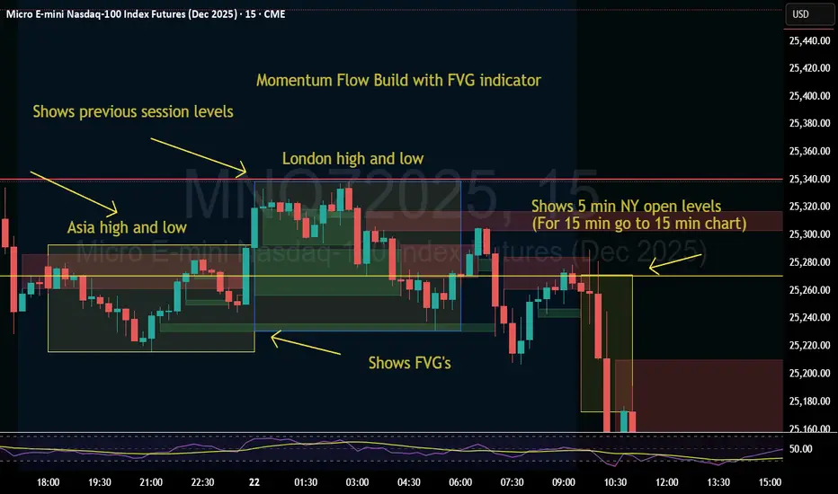
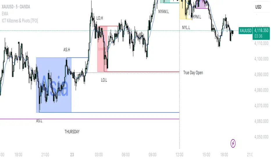
Momentum Flow Build w/ FVG v2Good day.
The Momentum Flow Build w/ FVG v2 indicator
shows the previous session levels of Asia and London,
and the 5 min NY open levels (for 15 min go to 15 min chart).
The indicator also shows the FVGs.
The idea is that if price reaches a key level, we then
watch the level for whether price respects FVGs with a
retracement and engulfing candle at the FVG, or whether
price inverts the FVG (IFVG).
Cool. Be encouraged. Peace
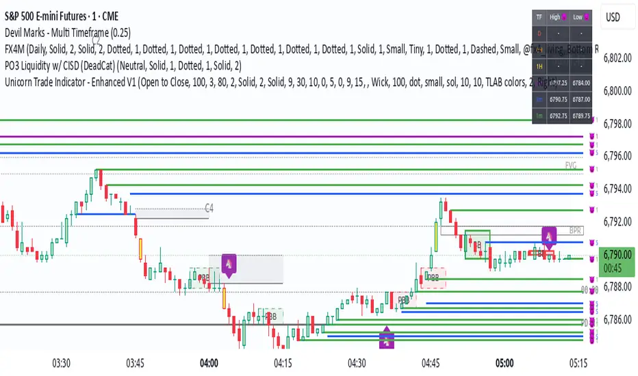
Unicorn Trade Indicator - Enhanced V1This code also contains pinescripts from iFVG (BPR) by Algorize and Visualizing displacement by tradeforopp who have kindly provided them as open source.
An ICT Unicorn is where a breaker block is traded through which incorporates a fair value gap. I decided to code this indicator as I couldn't find an existing free indicator on Trading View that performed adequately.
This indicator will highlight breaker blocks and when broken will post an Unicorn emoji and send an alert if requested. The last 3 breaker blocks are displayed, the prior boxes are labled PBB and are shown as red for bearish and green for bullish. After the main Unicorn is posted, the code continues to mark market structure shifts.
As all trading strategies work better with confluence I have added several other features which is very useful for people who are restricted on the number of indicators that can place on a single chart.
I have added iFVG (BPR) by Algoryze and Visualizing displacement by tradeforopp which have kindly been made open source by the authors. My thanks to them for their hard work.
Unicorn alerts will only be sent when a yellow displacement candle ( from the Visualizing displacement code) is present along with the Unicorn as this is the best type of Unicorn to trade.
The number of fvg's and bpr's from the code by Algoryze can be adjusted in the settings.
Also to add confluence I have used my own code to display liquidity depth boxes made popular by toodegrees.
I hope you find this indicator useful.

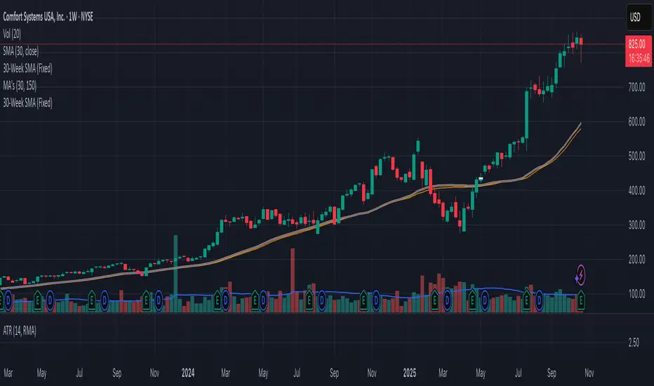
30-Week SMA (Fixed)This indicator plots a true 30-week Simple Moving Average (SMA) on any chart, regardless of the selected timeframe.
It uses weekly candle data (via the request.security() function) to calculate the 30-week average and keeps it fixed — meaning the line remains accurate even when you switch to daily, 4-hour, or other timeframes.
The 30-week SMA is a cornerstone of Stan Weinstein’s Stage Analysis strategy, commonly used to identify major trend phases:
Above a rising SMA → bullish (Stage 2 uptrend)
Below a falling SMA → bearish (Stage 4 downtrend)
Use this indicator to maintain a consistent long-term trend filter on all timeframes
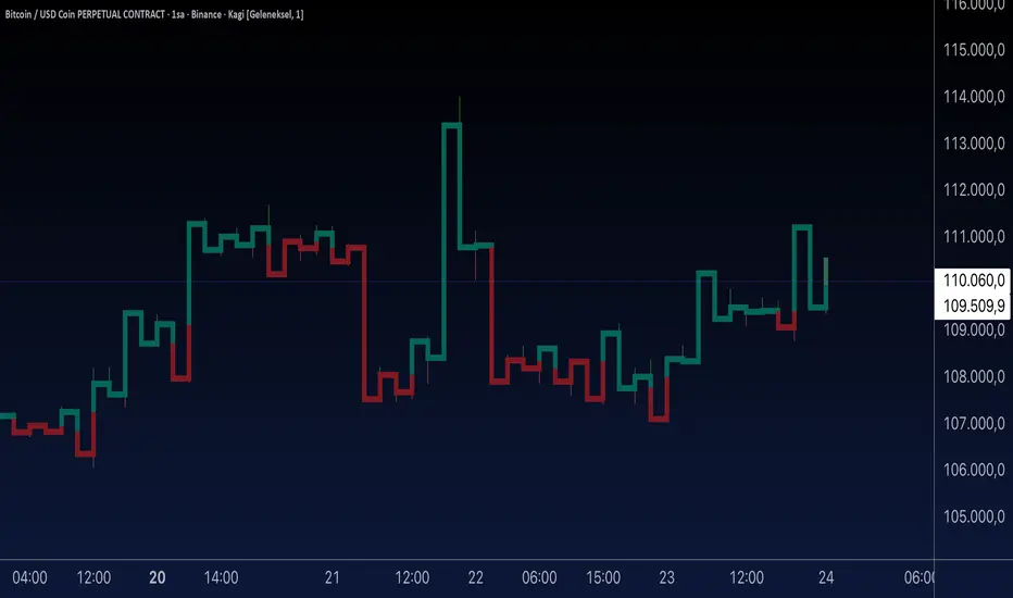
Aynet- True Wick Projector for Non-Standard ChartsTechnical Explanation: "Data Projection and Synchronization"
This script is, at its core, a "data projection" tool. The fundamental technical problem it solves is compensating for the information loss that occurs when using different data visualization models.
1. The Core Problem: Information Loss
Standard Charts (Time-Based): Normal candlesticks are time-based. Each candle represents a fixed time interval (like 1 hour or 1 day) and displays the complete Open, High, Low, and Close (OHLC) data for that period. The "wicks" show the volatility and the extreme price points (the High and Low).
Non-Standard Charts (Price/Momentum-Based): Charts like Kagi, Renko, or Line Break filter out time. Their only concern is price movement. While one Renko box or Kagi line is forming, 10 or more time-based candles might have formed in the background. During this "noise filtering" process, the true high and low values (the wicks) from those underlying candles are lost.
The problem is this: A trader looking at a non-standard chart cannot see how high or low the price actually went while that block or line was forming. This is a critical loss of information regarding market volatility, support/resistance levels, and price rejection.
2. The Technical Solution: A "Dual Data Stream"
This script intelligently combines two different data streams to compensate for this information loss:
Main Stream (Current Chart): The open and close data from your active Kagi, Renko, etc., chart.
Secondary Stream (Projected Data): The high and low data from the underlying standard (time-based) chart.
3. The Code's Methodical Steps
Step 1: Identifying the Data Source (syminfo...)
This step precisely identifies the source for the secondary data stream. By using syminfo.prefix + ":" + syminfo.ticker (e.g., "NASDAQ:AAPL"), it guarantees that the data is pulled from the exact correct instrument and exchange.
Step 2: Data Request & "Lookahead" Synchronization (request.security)
This is the most critical part of the operation.
request.security(...): This is the function Pine Script uses to pull data from another dataset (the secondary stream) onto the current chart.
: This tells the function, "The only data I care about is the 'High' and 'Low' of the standard candle from that timeframe."
lookahead = barmerge.lookahead_on (The Critical Key): This command solves the "time paradox."
Normally (without this): request.security fetches data from the last completed bar. But as your Kagi bar is currently forming, the standard candle is also currently forming. This would cause the data to always be one bar behind (lag).
With lookahead_on: This permits the script to "look ahead" at the data from the currently forming, incomplete standard bar. Because of this, as your Kagi bar moves, the true wick data is updated in real-time. This achieves real-time synchronization.
Step 3: Visual Engineering (plotcandle)
After the script retrieves the data, it must "draw" it. However, it only wants to draw the wicks, not the candle bodies.
bodyTop and bodyBottom: First, it finds the top and bottom of the current Kagi bar's body (using math.max(open, close)).
Plotting the Upper Wick (Green):
It calls the plotcandle function and instructs it to draw a fake candle.
It fixes this fake candle's Open, Low, and Close (open, low, close) values to the top of the Kagi bar's body (bodyTop).
It only sets the High (high) value to the realHigh it fetched with request.security.
The result: A wick is drawn from the bodyTop level up to the realHigh level, with no visible body.
Plotting the Lower Wick (Red):
It applies the reverse logic.
It fixes the fake candle's Open, High, and Close values to the bottom of the Kagi bar's body (bodyBottom).
It only sets the Low (low) value to the realLow.
The result: A lower wick is drawn from bodyBottom down to realLow.
Invisibility (color.new(color.white, 100)):
In both plotcandle calls, the color (body color) and bordercolor are set to 100 transparency. This makes the "fake" candle bodies completely invisible, leaving only the colored wicks.
Conclusion (Technical Summary)
This script reclaims the volatility data (the wicks) that is naturally sacrificed by non-standard charts.
It achieves this with technical precision by creating a secondary data stream using request.security and synchronizing it with zero lag using the lookahead_on parameter.
Finally, it intelligently manipulates the plotcandle function (by creating invisible bodies) to project this lost data onto your Kagi/Renko chart as an "augmented reality" layer. This allows a trader to benefit from the clean, noise-filtered view of a non-standard chart without losing access to the full picture of market volatility.
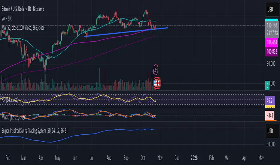
Dot traderInterpret Signals: Green triangles indicate buy (e.g., if BTC holds $109k with bullish crossover); red triangles indicate sell (e.g., if it breaks $108k with bearish divergence).
Candle Colors: Green/bullish, red/bearish, orange/overbought (>70 RSI), blue/oversold (<30 RSI).
Alerts: Enable in TradingView for real-time notifications.
EMA 9 & 26 + Bollinger Bands — Auto AlertsHere’s a professional **TradingView description** you can use when publishing your new version of the indicator with alerts 👇
---
## 🟢 EMA 9 & 26 + Bollinger Bands — Auto Buy/Sell Alerts
This indicator combines **EMA crossover strategy** and **Bollinger Bands** to generate high-clarity **Buy/Sell signals** for any market (crypto, forex, stocks).
It also includes **automatic alerts** that notify you the moment a new signal appears — perfect for traders using 3-minute or 5-minute charts such as ETHUSDT, BTCUSDT, or other pairs.
---
### ⚙️ **Core Features**
* **EMA 9 & EMA 26 Crossover Logic**
* 💚 **BUY** when EMA 9 crosses above EMA 26 → start of bullish momentum
* ❤️ **SELL** when EMA 9 crosses below EMA 26 → start of bearish momentum
* **Bollinger Bands Overlay**
* Visualize volatility and spot potential breakout or retracement zones
* **Real-Time Alerts**
* Instant notification as soon as a BUY or SELL signal appears
* Works seamlessly on any timeframe (3m / 5m / 15m / 1h / 4h / 1D)
* **Color-Coded Labels**
* BUY = Aqua-Green (#00FFCC)
* SELL = Pink-Red (#FF007F)
---
### 🔔 **How to Set Up Alerts**
1. Add the indicator to your chart.
2. Choose your symbol (e.g., **ETHUSDT**) and timeframe (**3 min or 5 min**).
3. Click the **Alarm Clock ⏰ → Create Alert**.
4. Under **Condition**, select this indicator → choose **BUY Signal** or **SELL Signal**.
5. Choose “Once per bar” or “Once per bar close”.
6. Enable **App**, **Email**, or **Webhook** notifications.
---
### 💡 **Best Use**
* Ideal for **scalpers** and **short-term trend traders**
* Works on any liquid asset (crypto, forex, stocks, indices)
* Combine with **RSI**, **volume**, or **support/resistance** for stronger confirmation
---
### ⚠️ **Disclaimer**
This indicator is a **technical tool**, not financial advice. Always confirm signals with your own analysis and risk management strategy.
---
Would you like me to make a **short SEO-optimized summary** (under 250 characters) for the *TradingView Public Library card* — e.g. what shows under the title when people browse indicators?
