Alt Trading: Mike's ORB Signal Pro
The Alt Trading: Mike's ORB Signal Pro indicator is a professional opening-range breakout system engineered for precision intraday trading on futures and CFD markets. It dynamically calculates the first 15-minute range (9:30–9:45 AM New York time) using 1-minute granularity, then monitors for clean breakout triggers when price closes decisively above or below these critical levels. The system allows only one long and one short setup per session, ensuring disciplined trade selection and eliminating overtrading. Once a valid breakout occurs, the indicator automatically generates visual risk/reward boxes that extend in real time, displaying entry, stop-loss, and take-profit zones with surgical clarity. Integrated money management logic calculates position size dynamically based on account balance, risk per trade, and stop distance, with support for both MNQ futures ($2/point) and CFD contracts with custom point values. The system caps position size to prevent over-leveraging and displays all critical metrics including raw and rounded contract size, risk percentage, and stop distance in a clean top-right table for instant decision-making. Trades automatically close when price hits the target, stop, or session end (4:00 PM by default), snapping all visual elements to the final bar for historical clarity. Optional session-level lines (CDH, CDL, PDH, PDL) provide additional context for confluence-based entries. With fully customizable styling for risk/reward zones, labels, ORB lines, and watermark branding, this indicator delivers a complete, exchange-grade framework for disciplined breakout trading with transparent risk modeling and real-time visual feedback.
Educational

Daily 9 SMA S/R with Std DevThis indicator plots the Daily 9 Simple Moving Average as dynamic support/resistance on any timeframe, with standard deviation bands to measure trend strength and identify overextended price action.
━━━━━━━━━━━━━━━━━━━━━━
HOW IT WORKS
━━━━━━━━━━━━━━━━━━━━━━
The Daily 9 SMA acts as a key level institutions watch. When price is above it, bullish bias. Below it, bearish bias. Simple.
Standard deviation bands show you:
- 1 StdDev = Strong trend territory
- 2 StdDev = Extreme/overextended - potential reversal zone
━━━━━━━━━━━━━━━━━━━━━━
FEATURES
━━━━━━━━━━━━━━━━━━━━━━
- Daily 9 SMA plotted on any timeframe
- 1 & 2 Standard Deviation bands
- Trend strength scoring (-3 to +3)
- Info table showing current values and trend status
- Visual signals for MA reclaims, losses, and trend entries
━━━━━━━━━━━━━━━━━━━━━━
ALERTS
━━━━━━━━━━━━━━━━━━━━━━
- Price Reclaims Daily 9 SMA
- Price Loses Daily 9 SMA
- Enter Strong Bullish Zone (>1 StdDev)
- Enter Strong Bearish Zone (<1 StdDev)
- Extreme Extension Alerts (2 StdDev)
- Bounce/Rejection at MA
━━━━━━━━━━━━━━━━━━━━━━
HOW TO USE
━━━━━━━━━━━━━━━━━━━━━━
1. Use on lower timeframes (5m, 15m, 1H) to see Daily levels
2. Look for bounces off the Daily 9 SMA for entries
3. Avoid longs when price loses the MA, avoid shorts when price reclaims
4. Use StdDev bands to gauge when price is overextended
━━━━━━━━━━━━━━━━━━━━━━
SETTINGS
━━━━━━━━━━━━━━━━━━━━━━
- MA Length - Default 9
- StdDev Multipliers - Default 1.0 and 2.0
- StdDev Lookback - Default 20
- Customizable colors
Works on any market - Forex, Crypto, Stocks, Futures.

Annual Lump Sum: Yearly & CompoundedAnnual Lump Sum Investment Analyzer (Yearly vs. Compounded)
Overview
This Pine Script indicator simulates a disciplined "Lump Sum" investing strategy. It calculates the performance of buying a fixed dollar amount (e.g., $10,000) on the very first trading day of every year and holding it indefinitely.
Unlike standard backtesters that only show a total percentage, this tool breaks down performance by "Vintage" (the year of purchase), allowing you to see which specific years contributed most to your wealth.
Key Features
Automated Execution: Automatically detects the first trading bar of every new year to simulate a buy.
Dual-Yield Analysis: The table provides two distinct ways to view returns:
Yearly %: How the market performed specifically during that calendar year (Jan 1 to Dec 31).
Compounded %: The total return of that specific year's investment from the moment it was bought until today.
Live Updates: For the current year, the "End Price" and "Yields" update in real-time with market movements.
Portfolio Summary: Displays your Total Invested Capital vs. Total Current Value at the top of the table.
Table Column Breakdown
The dashboard in the bottom-right corner displays the following:
Year: The vintage year of the investment.
Buy Price: The price of the asset on the first trading day of that year.
End Price: The price on the last trading day of that year (or the current price if the year is still active).
Yearly %: The isolated performance of that specific calendar year. (Green = The market ended the year higher than it started).
Compounded %: The "Diamond Hands" return. This shows how much that specific $10,000 tranche is up (or down) right now relative to the current price.
How to Use
Add the script to your chart.
Crucial: Set your chart timeframe to Daily (D). This ensures the script correctly identifies the first trading day of the year.
Open the Settings (Inputs) to adjust:
Annual Investment Amount: Default is $10,000.
Table Size: Adjust text size (Tiny, Small, Normal, Large).
Max Rows: Limit how many historical years are shown to keep the chart clean.
Use Case
This tool is perfect for investors who want to visualize the power of long-term holding. It allows you to see that even if a specific year had a bad "Yearly Yield" (e.g., buying in 2008), the "Compounded Yield" might still be massive today due to time in the market.

Dynamic TP Based on RR - Position ToolSimple indicator that automatically plots the take-profit (TP) level based on the below inputs:
- Entry price
- Stop-loss (SL)
- Risk-to-reward (RR)
The long/short-position drawing tools are simple enough to use, but wanted something that will automatically plot the TP instead. Couldn't find anything basic and free of extra features so built this instead.
This is how I use it.
1 (optional): Use the long/short-position drawing tool to plot the entry and stop-loss levels
2: Enable the indicator and enter the inputs
- Entry
- SL
- RR
3: The TP will automatically plot. Change the RR to your liking.

Daily Dollar Cost Averaging (DCA) Simulator & Yearly PerformanceThis indicator simulates a "Daily Dollar Cost Averaging" strategy directly on your chart. Unlike standard backtesters that trade based on signals, this script calculates the performance of a portfolio where a fixed dollar amount is invested every single day, regardless of price action.
Key Features:
Daily Accumulation: Simulates buying a specific dollar amount (e.g., $10) at the market close every day.
Yearly Breakdown Table: A detailed dashboard displayed on the chart that breaks down performance by year. It tracks total invested, average entry price, total holdings, current value, and PnL percentage for each individual year.
Global Stats: The bottom row of the table summarizes the total performance of the entire strategy since the start date.
Breakeven Line: Plots a yellow line on the chart representing your "Global Average Price." When the current price is above this line, the total strategy is in profit.
How to Use:
Add to chart (Works best on the Daily (D) timeframe).
Open settings to adjust your Daily Investment Amount and Start Year.
The table will automatically update to show how a daily investment strategy would have performed over time.

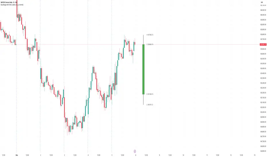
Day Range with OHLC LabelsThis indicator creates a synthetic daily candlestick that appears to the right of the chart, visually separated from real price bars.
It helps traders quickly view each day’s High, Low, Open, and Close without zooming, scrolling, or switching to higher timeframes.
What This Tool Does
✔ Draws a floating daily candle to the right of the current chart
✔ Displays the true Daily Open, High, Low, and Close
✔ Shows a center-aligned wick representing the full high-low range
✔ Shows a box-style candle body positioned using real OHLC values
✔ Labels the values (O, H, L, C) with large, clear fonts
✔ Automatically updates at each new day
✔ Works on any timeframe
✔ Helps intraday traders track daily structure visually
Why This Indicator Is Useful
This script is ideal for intraday traders who want instant awareness of the current day’s range.
Instead of guessing or drawing manual lines, you get a clean daily candlestick rendered off to the right side, avoiding chart clutter.
Great for:
Range traders
Breakout traders
Liquidity zone analysis
High/Low reference tracking
Traders who prefer non-intrusive visuals
Customization
Adjustable offset: position the candle further right
Configurable colors for wick + body
Large-font labels for easy reading
Automatically clears and redraws cleanly each day
Summary
This tool creates a clear, minimalistic, right-side daily candlestick complete with OHLC labels and centralized wick.
It’s designed to improve chart clarity and support quick decision-making without blocking price candles.
Smart Money Scanner Suite v6 - OptimizedWHAT IT DOES (longer version in the script):
// Identifies "Smart Money Stepping Back" (SMSB) zones where institutions quietly
// build positions without moving the market. Signals appear when ALL 4 conditions align:
//
// 1. OBV DIVERGENCE → Price up/OBV down (distribution) or Price down/OBV up (accumulation)
// 2. LOW VOLUME → Below 1.5x average (stealth activity)
// 3. NEAR VWAP → Within 0.5% (institutional fair value)
// 4. HTF CONFIRMATION → Higher timeframe shows directional momentum

Bayesian Liquidity Pain & Gain [Instit. Vol Weighted]Bayesian Liquidity Pain & Gain Indicator
Stop guessing where support and resistance are.
The Bayesian Liquidity Pain & Gain indicator moves beyond arbitrary lines and raw price action. It quantifies Institutional Intent by calculating the exact price levels where large volume has been accumulated and visualizes the "Pain" (stress) those participants feel when the market moves against them.
The Logic: Quantified Institutional Stress
Institutions don't trade single candles; they accumulate positions over time. This indicator tracks their Volume-Weighted Average Cost Basis to answer two critical questions:
Where did they enter? (The Cost Basis Lines)
Are they underwater? (The Pain Clouds)
By normalizing price distance using volatility (ATR) and statistical deviation (Z-Score), we filter out noise and only highlight zones where "Smart Money" is statistically forced to defend their positions or capitulate.
How to Read the Chart
1. The Cost Basis Lines (Anchors)
• 🟢 Green Line (Buyer Cost Basis): The average price where institutions accumulated long positions. This acts as dynamic Support.
• 🔴 Red Line (Seller Cost Basis): The average price where institutions accumulated short positions. This acts as dynamic Resistance.
2. The Pain Clouds (Signals)
When price moves significantly away from the cost basis (Z-Score > 2.0), "Clouds" appear to visualize the PnL status of the participants:
• 🔴 Red Cloud (Buyer Pain): Price is below the buyer's entry. Buyers are losing money (in the red). This creates a "Discount" zone where they may defend support.
• 🟢 Green Cloud (Seller Pain): Price is above the seller's entry. Sellers are losing money (shorts are squeezed). This indicates strong bullish momentum.
3. The Multi-Timeframe Dashboard
A real-time HUD showing the Z-Score status across 4 timeframes (1m, 5m, 15m, 1h):
• 🟢 Green: Profitable/Neutral (Trend Continuation)
• 🟠 Orange: Warning (Pressure Building)
• 🔴 Red: Critical Pain (High Probability Reversal)
Trading Strategies
Setup 1: The Defensive Bounce (Long)
• Context: Price drops into a 🔴 Red Cloud (Buyer Pain).
• Trigger: Price touches the 🟢 Green Line (Buyer Cost Basis) and shows a rejection wick.
• Logic: Institutional buyers defend their cost basis to avoid realizing losses.
Setup 2: The Short Squeeze (Momentum)
• Context: Price rallies into a 🟢 Green Cloud (Seller Pain).
• Trigger: Price holds above the 🔴 Red Line (Seller Cost Basis).
• Logic: Short sellers are trapped and forced to buy back (cover), fueling the rally.
Fractal Alignment:
For high-conviction trades, wait for the Dashboard to show "Pain" signals on both the 1h (Anchor) and 5m (Trigger) timeframes simultaneously.
Settings
• Memory Length (Default 144): The lookback period for the institutional cost basis. Increase for swing trading, decrease for scalping.
• Sigma Threshold (Default 2.0): The statistical confidence level for "Pain". Higher values = fewer, stronger signals.
• Volume Amp: When enabled, high volume amplifies the pain signal, giving more weight to institutional footprints.

RRG Style RS & Momentum (vs Benchmark) by AKM
## What this indicator does
This indicator is an **RRG‑style Relative Strength & Momentum tool**.
It compares the current symbol to a chosen benchmark (e.g. NIFTY / NIFTY 500) and plots:
- **RS‑Ratio**: Out/under‑performance of the symbol vs the benchmark, normalized around 100.
- **RS‑Momentum**: Momentum of that relative strength, also normalized around 100.
- **RS‑Signal**: A smoothed signal line of RS‑Ratio (EMA of RS‑Ratio).
Using these two axes (RS‑Ratio and RS‑Momentum), each bar is classified into one of four **RRG‑style quadrants**:
- **LEADING** – RS‑Ratio > 100 and RS‑Momentum > 100
- **WEAKENING** – RS‑Ratio > 100 and RS‑Momentum < 100
- **LAGGING** – RS‑Ratio < 100 and RS‑Momentum < 100
- **IMPROVING** – RS‑Ratio < 100 and RS‑Momentum > 100
The chart background is color‑coded by quadrant, and a label on the center (100) line shows the current zone name (LEADING / WEAKENING / LAGGING / IMPROVING) in real time.
> **Concept credit:**
> The conceptual framework of “Relative Strength vs Momentum” in four quadrants (Leading, Weakening, Lagging, Improving) is inspired by **Relative Rotation Graphs® (RRG®)**, created by **Julius de Kempenaer** and commercialized through RRG Research and platforms like Bloomberg, StockCharts, Optuma, etc.
> This script is only an RRG‑inspired *1‑symbol vs benchmark* implementation inside Pine, not an official RRG product.
***
## Inputs
- **Benchmark symbol**:
Default `NSE:NIFTY`. You can set `NSE:NIFTY500`, `NSE:BANKNIFTY`, sector indices, etc.
- **RS base length (`rsLen`)**:
EMA length for smoothing the raw price ratio (symbol / benchmark). Lower = more sensitive, higher = smoother.
- **Smoothing length (`smoothLen`)**:
Secondary smoothing for RS‑Ratio. Default 14.
- **Signal length (`signalLen`)**:
EMA length for the RS‑Signal line (EMA of RS‑Ratio).
- **Momentum length (`momLen`)**:
Lookback for optional ROC‑based momentum.
- **Use ROC‑based momentum**:
If `false` (default): RS‑Momentum is computed as RS‑Ratio / EMA(RS‑Ratio) × 100 (ratio‑style).
If `true`: RS‑Momentum uses ROC(RS‑Ratio, momLen) + 100 (ROC‑style).
- **Show quadrant background**:
Toggles colored background by quadrant.
- **Show zone name on background**:
Shows a label on the 100‑line with the current quadrant name.
***
## How to read it
There is a horizontal center line at **100**:
- **RS‑Ratio > 100** → symbol is outperforming the benchmark.
- **RS‑Ratio < 100** → symbol is underperforming the benchmark.
- **RS‑Momentum > 100** → relative strength is improving (momentum picking up).
- **RS‑Momentum < 100** → relative strength is fading.
The four zones behave similar to classic RRG quadrants:
- **LEADING (lime/green background)**
- RS‑Ratio > 100 and RS‑Momentum > 100.
- Symbol is **stronger than the benchmark and momentum is strong**.
- This is where leadership typically resides.
- **WEAKENING (orange background)**
- RS‑Ratio > 100 and RS‑Momentum < 100.
- Still outperforming, but momentum is rolling over.
- Late‑stage leadership / time to be more selective and manage exits.
- **LAGGING (red background)**
- RS‑Ratio < 100 and RS‑Momentum < 100.
- Underperforming with weak momentum.
- Worst zone for aggressive longs.
- **IMPROVING (green background)**
- RS‑Ratio < 100 and RS‑Momentum > 100.
- Still weaker than benchmark, but momentum is improving.
- Early turnaround zone where future leaders often start.
The **white RS‑Signal line** is just a smoother of RS‑Ratio, helpful to visually see RS trend and crossovers.
***
## Practical trading use (RRG‑style workflow)
This indicator is designed as a **selection and context filter**, not a stand‑alone entry/exit system.
### 1. Sector and stock selection
1. Apply it to **sector indices** vs a broad benchmark (e.g., Nifty IT vs NIFTY 500, Nifty Auto vs NIFTY 500).
2. Focus on sectors where:
- The zone label is **IMPROVING → LEADING** over recent bars.
- RS‑Ratio is rising and staying above 100 in LEADING.
3. Then, on individual stocks inside those strong sectors, use the same benchmark and indicator:
- Prefer stocks that are also in **LEADING** (or just moved from **IMPROVING** into **LEADING**).
This recreates the essence of using RRG to find sectors/stocks with strong relative strength and momentum.
### 2. Combining with your price setup
Once a stock/sector passes the RS filter:
- Use your own price‑action / indicator rules for entries (EMA trends, VWAP pullbacks, breakouts, etc.).
- Example for longs:
- Only take long setups when:
- Sector index AND stock are in **LEADING** or newly from **IMPROVING → LEADING**, and
- Price is in an uptrend on your main chart (e.g., above 20/50 EMA, higher highs and higher lows).
### 3. Managing exits and rotation
- When a held symbol shifts from **LEADING → WEAKENING → LAGGING** and RS‑Momentum stays < 100, consider:
- Tightening stops.
- Partially booking profits.
- Rotating into other names still in LEADING / IMPROVING.
This mirrors how many investors use “sector rotation” and RRG to stay in stronger groups and reduce exposure in weakening ones.
***
## Disclaimers
- This script is for **educational and analytical purposes only** and is **not financial advice or a recommendation** to buy/sell any security.
- **Relative Rotation Graphs® / RRG®** and the four‑quadrant concept belong to **Julius de Kempenaer and RRG Research**; this Pine implementation is an independent, simplified adaptation for one symbol vs a benchmark and is **not an official RRG product or library**.

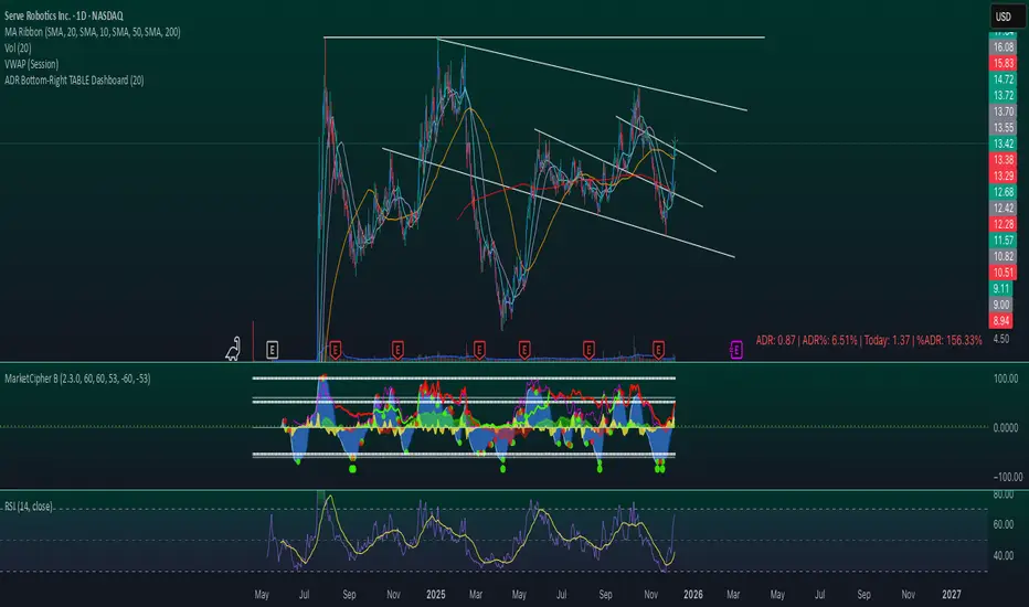
ADR Bottom-Right TABLE DashboardTitle: ADR Bottom-Right Dashboard
Version: 1.0
Author:
Description:
The ADR Bottom-Right Dashboard displays the Average Daily Range (ADR) and related metrics directly on your chart in a compact, easy-to-read table. It helps traders quickly see how much a stock has moved today relative to its normal daily range and identify potential overextended or trending moves.
This tool is ideal for swing traders, day traders, and scalpers who want a real-time, visual indication of volatility and intraday movement.
Features
ADR (Average Daily Range): Shows the average high-to-low movement over a customizable period (default 20 days).
ADR%: ADR as a percentage of the stock price, showing relative volatility.
Today: The current intraday range (high–low).
%ADR: How much of the ADR has already been reached today. Color-coded to indicate low, medium, or high extension.
Color coding: %ADR highlights:
Green: <50% (early-day / low volatility)
Yellow: 50–100% (normal movement)
Red: >100% (extended move / potential exhaustion)
Inputs
Input Description Default
ADR Period Number of days to calculate the ADR 20
Low %ADR Color Color for %ADR <50% Green
Medium %ADR Color Color for %ADR 50–100% Yellow
High %ADR Color Color for %ADR >100% Red
TCT - Daylight Saving TimeVisualize Daylight Saving Time (DST) transitions on your charts. This indicator marks the spring forward (2nd Sunday of March) and fall back (1st Sunday of November) dates with vertical lines and optional labels.
Features:
Automatic DST detection for US time zones
Customizable line color, width, and style (solid, dashed, dotted)
Optional date labels on transition days
Multiple timezone support: US Eastern, Central, Mountain, Pacific, London, Paris, Tokyo, Sydney
Extends lines across the chart
Memory-efficient (manages up to 100 lines/labels)
Use Cases:
Identify potential market behavior shifts around DST transitions
Track time changes that may affect trading sessions
Plan trades around known time adjustments
Historical analysis of DST impact on price action
Perfect for traders who want to see when clocks change and how it might affect market dynamics. Customize the appearance to match your chart style.

Obsidian Flux Matrix# Obsidian Flux Matrix | JackOfAllTrades
Made with my Senior Level AI Pine Script v6 coding bot for the community!
Narrative Overview
Obsidian Flux Matrix (OFM) is an open-source Pine Script v6 study that fuses social sentiment, higher timeframe trend bias, fair-value-gap detection, liquidity raids, VWAP gravitation, session profiling, and a diagnostic HUD. The layout keeps the obsidian palette so critical overlays stay readable without overwhelming a price chart.
Purpose & Scope
OFM focuses on actionable structure rather than marketing claims. It documents every driver that powers its confluence engine so reviewers understand what triggers each visual.
Core Analytical Pillars
1. Social Pulse Engine
Sentiment Webhook Feed: Accepts normalized scores (-1 to +1). Signals only arm when the EMA-smoothed value exceeds the `sentimentMin` input (0.35 by default).
Volume Confirmation: Requires local volume > 30-bar average × `volSpikeMult` (default 2.0) before sentiment flags.
EMA Cross Validation: Fast EMA 8 crossing above/below slow EMA 21 keeps momentum aligned with flow.
Momentum Alignment: Multi-timeframe momentum composite must agree (positive for longs, negative for shorts).
2. Peer Momentum Heatmap
Multi-Timeframe Blend: RSI + Stoch RSI fetched via request.security() on 1H/4H/1D by default.
Composite Scoring: Each timeframe votes +1/-1/0; totals are clamped between -3 and +3.
Intraday Readability: Configurable band thickness (1-5) so scalpers see context without losing space.
Dynamic Opacity: Stronger agreement boosts column opacity for quick bias checks.
3. Trend & Displacement Framework
Dual EMA Ribbon: Cyan/magenta ribbon highlights immediate posture.
HTF Bias: A higher-timeframe EMA (default 55 on 4H) sets macro direction.
Displacement Score: Body-to-ATR ratio (>1.4 default) detects impulses that seed FVGs or VWAP raids.
ATR Normalization: All thresholds float with volatility so the study adapts to assets and regimes.
4. Intelligent Fair Value Gap (FVG) System
Gap Detection: Three-candle logic (bullish: low > high ; bearish: high < low ) with ATR-sized minimums (0.15 × ATR default).
Overlap Prevention: Price-range checks stop redundant boxes.
Spacing Control: `fvgMinSpacing` (default 5) avoids stacking from the same impulse.
Storage Caps: Max three FVGs per side unless the user widens the limit.
Session Awareness: Kill zone filters keep taps focused on London/NY if desired.
Auto Cleanup: Boxes delete when price closes beyond their invalidation level.
5. VWAP Magnet + Liquidity Raid Engine
Session or Rolling VWAP: Toggle resets to match intraday or rolling preferences.
Equal High/Low Scanner: Looks back 20 bars by default for liquidity pools.
Displacement Filter: ATR multiplier ensures raids represent genuine liquidity sweeps.
Mean Reversion Focus: Signals fire when price displaces back toward VWAP following a raid.
6. Session Range Breakout System
Initial Balance Tracking: First N bars (15 default) define the session box.
Breakout Logic: Requires simultaneous liquidity spikes, nearby FVG activity, and supportive momentum.
Z-Score Volume Filter: >1.5σ by default to filter noisy moves.
7. Lifestyle Liquidity Scanner
Volume Z-Scores: 50-bar baseline highlights statistically significant spikes.
Smart Money Footprints: Bottom-of-chart squares color-code buy vs sell participation.
Panel Memory: HUD logs the last five raid timestamps, direction, and normalized size.
8. Risk Matrix & Diagnostic HUD
HUD Structure: Table in the top-right summarizes HTF bias, sentiment, momentum, range state, liquidity memory, and current risk references.
Signal Tags: Aggregates SPS, FVG, VWAP, Range, and Liquidity states into a compact string.
Risk Metrics: Swing-based stops (5-bar lookback) + ATR targets (1.5× default) keep risk transparent.
Signal Families & Alerts
Social Pulse (SPS): Volume-confirmed sentiment alignment; triangle markers with “SPS”.
Kill-Zone FVG: Session + HTF alignment + FVG tap; arrow markers plus SL/TP labels.
Local FVG: Captures local reversals when HTF bias has not flipped yet.
VWAP Raid: Equal-high/low raids that snap toward VWAP; “VWAP” label markers.
Range Breakout: Initial balance violations with liquidity and imbalance confirmation; circle markers.
Liquidity Spike: Z-score spikes ≥ threshold; square markers along the baseline.
Visual Design & Customization
Theme Palette: Primary background RGB (12,6,24). Accent shading RGB (26,10,48). Long accents RGB (88,174,255). Short accents RGB (219,109,255).
Stylized Candles: Optional overlay using theme colors.
Signal Toggles: Independently enable markers, heatmap, and diagnostics.
Label Spacing: Auto-spacing enforces ≥4-bar gaps to prevent text overlap.
Customization & Workflow Notes
Adjust ATR/FVG thresholds when volatility shifts.
Re-anchor sentiment to your webhook cadence; EMA smoothing (default 5) dampens noise.
Reposition the HUD by editing the `table.new` coordinates.
Use multiples of the chart timeframe for HTF requests to minimize load.
Session inputs accept exchange-local time; align them to your market.
Performance & Compliance
Pure Pine v6: Single-line statements, no `lookahead_on`.
Resource Safe: Arrays trimmed, boxes limited, `request.security` cached.
Repaint Awareness: Signals confirm on close; alerts mirror on-chart logic.
Runtime Safety: Arrays/loops guard against `na`.
Use Cases
Measure when social sentiment aligns with structure.
Plan ICT-style intraday rebalances around session-specific FVG taps.
Fade VWAP raids when displacement shows exhaustion.
Watch initial balance breaks backed by statistical volume.
Keep risk/target references anchored in ATR logic.
Signal Logic Snapshot
Social Pulse Long/Short: `sentimentEMA` gated by `sentimentMin`, `volSpike`, EMA 8/21 cross, and `momoComposite` sign agreement. Keeps hype tied to structural follow-through.
Kill-Zone FVG Long/Short: Requires session filter, HTF EMA bias alignment, and an active FVG tap (`bullFvgTap` / `bearFvgTap`). Labels include swing stops + ATR targets pulled from `swingLookback` and `liqTargetMultiple`.
Local FVG Long/Short: Uses `localBullish` / `localBearish` heuristics (EMA slope, displacement, sequential closes) to surface intraday reversals even when HTF bias has not flipped.
VWAP Raids: Detect equal-high/equal-low sweeps (`raidHigh`, `raidLow`) that revert toward `sessionVwap` or rolling VWAP when displacement exceeds `vwapAlertDisplace`.
Range Breakouts: Combine `rangeComplete`, breakout confirmation, liquidity spikes, and nearby FVG activity for statistically backed initial balance breaks.
Liquidity Spikes: Volume Z-score > `zScoreThreshold` logs direction, size, and timestamp for the HUD and optional review workflows.
Session Logic & VWAP Handling
Kill zone + NY session inputs use TradingView’s session strings; `f_inSession()` drives both visual shading and whether FVG taps are tradeable when `killZoneOnly` is true.
Session VWAP resets using cumulative price × volume sums that restart when the daily timestamp changes; rolling VWAP falls back to `ta.vwap(hlc3)` for instruments where daily resets are less relevant.
Initial balance box (`rangeBars` input) locks once complete, extends forward, and stays on chart to contextualize later liquidity raids or breakouts.
Parameter Reference
Trend: `emaFastLen`, `emaSlowLen`, `htfResolution`, `htfEmaLen`, `showEmaRibbon`, `showHtfBiasLine`.
Momentum: `tf1`, `tf2`, `tf3`, `rsiLen`, `stochLen`, `stochSmooth`, `heatmapHeight`.
Volume/Liquidity: `volLookback`, `volSpikeMult`, `zScoreLen`, `zScoreThreshold`, `equalLookback`.
VWAP & Sessions: `vwapMode`, `showVwapLine`, `vwapAlertDisplace`, `killSession`, `nySession`, `showSessionShade`, `rangeBars`.
FVG/Risk: `fvgMinTicks`, `fvgLookback`, `fvgMinSpacing`, `killZoneOnly`, `liqTargetMultiple`, `swingLookback`.
Visualization Toggles: `showSignalMarkers`, `showHeatmapBand`, `showInfoPanel`, `showStylizedCandles`.
Workflow Recipes
Kill-Zone Continuation: During the defined kill session, look for `killFvgLong` or `killFvgShort` arrows that line up with `sentimentValid` and positive `momoComposite`. Use the HUD’s risk readout to confirm SL/TP distances before entering.
VWAP Raid Fade: Outside kill zone, track `raidToVwapLong/Short`. Confirm the candle body exceeds the displacement multiplier, and price crosses back toward VWAP before considering reversions.
Range Break Monitor: After the initial balance locks, mark `rangeBreakLong/Short` circles only when the momentum band is >0 or <0 respectively and a fresh FVG box sits near price.
Liquidity Spike Review: When the HUD shows “Liquidity” timestamps, hover the plotted squares at chart bottom to see whether spikes were buy/sell oriented and if local FVGs formed immediately after.
Metadata
Author: officialjackofalltrades
Platform: TradingView (Pine Script v6)
Category: Sentiment + Liquidity Intelligence
Hope you Enjoy!

Finlu Momentum PRO What it does
Finlu Momentum PRO analyzes real price momentum and shows when the market is entering or leaving extreme zones, highlighting potential reversals or continuations with confirmation. It plots clean visual signals and can trigger real-time alerts.
Who it’s for
Traders who want to improve their entry and exit timing while avoiding the noise of traditional oscillators.
Recommended timeframes
15 min, 1 h, 4 h
Markets
Forex, indices, gold and cryptocurrencies.
Includes
Invite-only indicator: Finlu Momentum PRO
10-minute quick-start video guide
Risk management template
How to get access
Purchase access on the official page: finlutrading.systeme.io and enter your exact TradingView username at checkout.
Alternatively, you can send me a DM on Instagram @finlu_trading with the message “Finlu Momentum PRO access” to get the instructions.
Notes
Educational use only. Single-user license. Source code is not disclosed. Redistribution or reselling is strictly prohibited.

FCPO MASTER v6 – Sideway + Breakout + OB + FVG (TUPLE SAFE)TL;DR cepat
1. Gunakan M5 untuk entry & OB/FVG confirmation.
2. Gunakan M15 untuk confirm trend/false breakout.
3. Gunakan H1 untuk bias arah (overall market).
4. Entry hanya bila signal + OB/FVG/candle rejection (script buatkan).
5. SL 5–8 tick, TP 10–25 tick ikut setup (sideway vs breakout).
6. Follow checklist setiap trade — jangan lompat.
________________________________________
Setup awal (1–2 min)
1. Pasang script FCPO Sideway MASTER – OB + Imbalance + Confirmation di TradingView.
2. Timeframes: buka M5, M15, H1 (susun 3 chart atau 1 chart multi-timeframe).
3. Input default: ATR14, Breakout Buffer 5 tick, RangeLen 20, ADX14, TP12, SL8. (Kau boleh tweak nanti).
4. Aktifkan alerts pada BUY Confirm / SELL Confirm / Sideway Buy / Sideway Sell.
________________________________________
Step-by-step trading process
1) Mulakan dengan H1 — tentukan bias HTF
• Lihat H1 untuk jawapan: Trend Up / Down / Sideway.
• Rule ringkas:
o ADX H1 > 20 + price above H1 EMA → bias Bull
o ADX H1 > 20 + price below H1 EMA → bias Bear
o ADX H1 < 20 → market HTF sideway (no strong bias)
Kenapa: H1 bagi kau idea “kalau breakout pada M5, patut follow atau tolak”.
________________________________________
2) Pergi ke M15 — confirm trend & valid breakout
• M15 kena setuju dengan idea breakout.
o Untuk strong breakout: M15 kena tunjuk candle close di atas/bawah range + volume naik.
o Kalau M5 breakout tapi M15 tak setuju (M15 masih sideway) → treat as fakeout. Jangan masuk.
________________________________________
3) M5 — cari entry & confirmation (OB/FVG + candle)
• M5 adalah tempat kau buat keputusan masuk.
• Tunggu script keluarkan Sideway Buy/Sell atau Breakout Buy/Sell.
• CONFIRM entry mesti ada sekurang-kurangnya 1 dari:
o Bull/Bear Order Block searah signal (script detect).
o FVG / Imbalance zone dipenuhi & price retest.
o Candle rejection (pinbar / bearish/bullish engulfing) pada zone.
Jika tiada confirmation → no trade.
________________________________________
4) Checklist sebelum tekan Buy/Sell (MUST)
• H1 bias tidak melawan trade (prefer sama arah).
• M15 confirm breakout / trend or neutral.
• Script keluarkan signal (sideway or breakout).
• OB or FVG atau candle rejection ada.
• ATR kenaikan jika breakout (untuk breakout trade).
• Volume spike jika breakout.
• Risk:SL <= 2% akaun (position sizing).
Kalau semua ticked → boleh entry.
________________________________________
5) Setting SL / TP & position sizing
• Sideway (scalp): SL = 5–8 tick, TP = 8–12 tick.
• Breakout (trend): SL = 8–12 tick, TP = 15–25+ tick (trail later).
• Position sizing: Risk per trade 1–2%.
o Lot size = (Account Risk RM × 1 tick value) / (SL ticks × tickValue) — (kalau kau gunakan fixed tick value, adjust ikut lot).
(Script tunjuk SL & TP label — follow itu.)
________________________________________
6) Entry types
• A. Sideway Reversal (M5)
o Signal: Sideway Buy / Sideway Sell
o Confirm: OB/FVG or rejection candle at range bottom/top
o Trade: scalp target 8–12 tick, tight SL 5–8 tick
• B. Breakout (M5 entry, M15 confirm)
o Signal: Breakout Buy/Sell (Strong)
o Confirm: ATR expanding + volume spike + M15 alignment
o Trade: trend follow, TP 15–25 tick, trailing stop active
• C. Retest Entry
o Breakout happens, price returns to retest range / OB / FVG → wait for rejection candle then enter. Safer.
________________________________________
7) Trailing & exit rules
• Jika useTrail = true script plots trailing stop (ATR × multiplier).
• Exit rules:
1. Hit TP → close.
2. Hit SL → close.
3. If trailing stop hit → close.
4. If opposing confirmed signal muncul (e.g., SELL confirm while long) → consider close early.
5. If H1 bias flips strongly vs trade → tighten stop or close.
________________________________________
8) Multiple signals & scaling
• Never add to losing position (no averaging down).
• If want scale-in on confirmed trend: add 1 partial size after price moves +10–12 tick in favor and shows continuation candle + no bearish OB/FVG.
• Keep aggregated risk within your max (2–3%).
________________________________________
9) Example trade walkthrough (concrete)
• RangeHigh = 4065, RangeLow = 4035 (contoh).
• Market sideway M5.
Case A — Sideway Sell:
1. Price touches 4064–4065, script shows sidewaySell.
2. Lihat OB: ada bear OB zone di 4062–4066 → confirm.
3. Candle rejection (bearish pinbar) muncul → enter SELL M5.
4. Set SL = 5 tick above rangeHigh = 4070, TP = 10 tick → 4055.
5. Trail jika price turun > 8 tick: aktifkan trailing.
6. Close at TP or trail/SL.
Case B — Breakout Buy:
1. Price closes above 4065 + 5 tick buffer = 4070 on M5. Script shows trueBreakUp.
2. M15 shows candle close above M15 resistance + volume spike → confirm.
3. Enter BUY, SL = 8 tick below entry, TP initial 20 tick, trail with ATR×1.5.
4. Move stop to breakeven after +10 tick, scale out half at +12 tick, leave rest to trail.
________________________________________
10) Journal & review
• Semua trade: record entry time, TF, reason (which confirmations), SL/TP, result, lesson.
• Weekly review: check which confirmation worked best (OB vs FVG vs candle) and tweak settings.
________________________________________
11) Tweaks / optimisations cepat
• Jika terlalu banyak false sideway signals → kurangkan touchDist ke 2 tick.
• Kalau fakeout breakout banyak → tambah tickBuf ke 6–8.
• Nak lebih konservatif → cuma trade breakout yang juga setuju M15.
________________________________________
12) Alerts & execution (practical)
• Pasang alert pada BUY Confirm / SELL Confirm (script).
• Kalau kau guna broker yang support one-click order, siap sediakan template order (SL/TP default).
• Kalau manual, bila alert masuk: buka M5, cepat confirm OB/FVG & candle rejection → entry.
________________________________________
Quick reference table (handy)
• TF utama entry: M5
• Confirm mid-TF: M15
• Bias HTF: H1
• Sideway SL/TP: SL 5–8, TP 8–12
• Breakout SL/TP: SL 8–12, TP 15–25+
• Mandatory confirmation: (Script signal) + (OB or FVG or candle)

Pharma vs Market Monthly Returns (XLV vs SPY)A Bloomberg-style pharma momentum indicator built for TradingView.
This script recreates the “Pharma Index Monthly Returns” chart highlighted by Jordi Visser in his Youtube video — offering a clean, accessible poor man’s Bloomberg version of sector-rotation analysis for users without institutional data feeds.
Features
• XLV monthly returns (absolute mode)
• XLV vs SPY relative monthly returns (market-neutral mode)
• Top 5 strongest months ★ (momentum spikes)
• Top 5 weakest months ★ (capitulation signals)
• Optional 6-month rolling momentum line (regime trend)
• Full history from 1998 (XLV inception)
Use Cases
Ideal for tracking pharma/healthcare sector regimes, macro rotations, biotech cycles, and timing asymmetric entries in innovation themes (AI-pharma, computational drug discovery, biotech moonshots, etc.).

The Quantum Leap: Renko + ML(Note: This indicator uses the BackQuant & SuperTrend which takes a 4-5 seconds to load)
This strategy uses the following indicators (please see source code)
Synthetic Renko: Ignores time and focuses purely on price movement to detect clear trend reversals (Red-to-Green).
ATR (Average True Range): Measures volatility to calculate the Renko brick sizes and SuperTrend sensitivity.
Adaptive SuperTrend: A trend filter that uses volatility clustering to confirm if the market is currently in a "Bearish" state.
RSI (Relative Strength Index): A momentum gauge ensuring the asset is "Oversold" (exhausted) before we consider a setup.
Monthly Pivots: Horizontal support lines based on last month's data acting as price "floors" (S1, S2, S3).
SMA (Simple Moving Average): A 100-bar average ensuring we are strictly buying below the long-term mean (deep value).
BackQuant (KNN): A Machine Learning engine that compares current data to historical patterns to predict immediate momentum.
This is a sophisticated, multi-stage strategy script. It combines "Old School" price action (Renko) with "New School" Machine Learning (KNN and Clustering).
Here is the high-level summary of how we will break this down:
Topic 1: The "Bottom Hunter" Setup. How the script uses Renko bricks and aggressive filtering (SuperTrend, SMA, RSI, Pivots) to find a potential market bottom.
Topic 2: The ML Engine (BackQuant & SuperTrend). How the script uses K-Nearest Neighbors (KNN) to predict momentum and Volatility Clustering to adjust the SuperTrend.
Topic 3: The "Leap" Execution. How the script synchronizes the Setup (Topic 1) with the ML Trigger (Topic 2) using a time window.
Topic 1: The "Bottom Hunter" Setup
This script is designed as a Mean Reversion strategy (often called "catching a falling knife" or "bottom fishing"). It is trying to find the exact moment a downtrend stops and reverses.
Most strategies buy when price is above the 200 SMA or above the SuperTrend. This script does the exact opposite.
The Logic:
Renko Bricks: It simulates Renko bricks internally (without changing your chart view). It waits for a specific pattern: A Red Brick followed immediately by a Green Brick (a reversal).
The "Bearish" Filters: To generate a "WATCH" signal, the following must be true:
Price < SuperTrend: The market must officially be in a downtrend.
Price < SMA: Long-term trend is down.
Price < Monthly Pivot: Price is deeply discounted.
RSI < Threshold: The asset is oversold (exhausted).
Recommended Settings for daily signals for Stocks :
Confirmation : 10. (How many bars after Renko Buy signal the AI has to identify a bullish move).
Percentage : 2 (This is the Renko bar size. This represents 2% move.)
SMA: 100 (Signal must be found below 100 SMA)
Price must be below: PIVOT (This is the monthly Pivot levels)

Swing F&O All‑Inclusive + Auto Fib & TBEAutomatically find swing opportunities, plots FR & TBE automatically

Donchian 20/10 Screener + Alerts Donchian 20/10 Screener + Alerts identifies stocks breaking their 20-day high.
Includes ADX trend filter to confirm strong momentum.
Plots Donchian high/low lines and marks BUY/SELL signals on chart.
Screener output shows “PASS” for stocks meeting entry criteria.
Supports alerts for entry, exit, and screener signals for easy monitoring.

Swing Signals F&O All-InclusiveDetects the Swing Highs & Lows automatically to generate Entry & exit points

Sequential SMT + TCISD DeeptradeiqShort description. Educational indicator for studying Quarterly Theory Sequential smt concepts and True Change in State of Delivery across multiple timeframes.
FULL DESCRIPTION:
📊 Overview
An educational tool designed for studying Quarterly Theory Sequential concepts and temporal price analysis. This indicator visualizes divergence patterns between correlated instruments and tracks time-based price structures for analytical and learning purposes.
🔍 Key Features
Multi-Timeframe Analysis: Three modes - Quarters (6h), Sub-Quarters (90m), and Micro-Quarters (22.5m)
Sequential smt Divergence Visualization: Compare two instruments to study sequential divergence concepts with visual markers and invalidation tracking
True Change in State of Delivery (TCISD): Pattern identification with reference levels showing potential delivery state transitions
Customizable Visuals: Period boxes, high/low labels, color schemes, line styles, and information table
Timezone Support: DST-aware calculations for accurate period detection
⚙️ How It Works
The indicator divides trading sessions into time-based periods and tracks price extremes for each period. It compares the current instrument with a second pair (default: EURUSD) to identify when their price structures diverge sequentially - a key concept in Quarterly Theory education. Visual markers, lines, and labels help identify these patterns for study purposes.
🎯 Educational Applications
Study Quarterly Theory Sequential concepts in live market conditions
Understand temporal price structures and their characteristics
Analyze correlation and divergence between related instruments
Observe True Change in State of Delivery pattern formations
Practice pattern recognition and chart reading skills
Learn how price structures evolve across different timeframes
🛠️ Customization Options
Select analysis timeframe mode (Quarters/Sub-Quarters/Micro-Quarters)
Choose comparison pair for sequential analysis
Toggle visual elements (boxes, labels, lines, table)
Customize colors, styles, and sizes to match your chart theme
Show/hide invalidation markers and reference levels.
⚠️ IMPORTANT DISCLAIMER
This indicator is provided strictly for EDUCATIONAL and ANALYTICAL purposes. It does NOT provide trading signals, financial advice, or investment recommendations.
All patterns and markers are for study and observation only
Past price structures do not predict future movements
No guarantee of accuracy or profitability
Users must conduct independent analysis and risk assessment
All trading involves substantial risk of loss
Seek professional financial advice before making investment decisions
The creator assumes NO responsibility for trading decisions or financial outcomes from using this tool. This is a learning instrument - not a trading system.

Monthly DCA & Last 10 YearsThis Pine Script indicator simulates a Monthly Dollar Cost Averaging (DCA) strategy to help long-term investors visualize historical performance. Instead of complex timing, the script automatically executes a hypothetical fixed-dollar purchase (e.g., $100) on the first trading day of every month. It visually marks entry points with green "B" labels and plots a dynamic yellow line representing your Global Break-Even Price, allowing you to instantly see if the current price is above or below your average cost basis. To provide deep insight, it generates a detailed performance table in the bottom-right corner that breaks down metrics year-by-year—including total capital invested, shares/coins accumulated, and Profit/Loss percentage—along with a grand total summary of the entire investment period.

Weekly DCA & Yearly TableThis Pine Script indicator simulates a Weekly Dollar Cost Averaging (DCA) strategy directly on your TradingView chart. It automatically calculates a hypothetical portfolio where a fixed dollar amount (default $100) is invested every Friday (or the last trading day of the week) starting from a user-defined year. Visually, it marks every purchase with a green "B" label and plots a yellow line representing your Global Break-Even Price, allowing you to see exactly where your average entry lies relative to current price action. To track performance, it generates a detailed table in the bottom-right corner that breaks down your investment year-by-year, showing total capital invested, "coins" or shares accumulated, average buy price per year, current value, and profit/loss percentage, along with a grand total summary for the entire period.

ART Customizable Overbought Oversold indicatorThis toolkit will help you identify RSI levels on either extremes, you can customize them.
