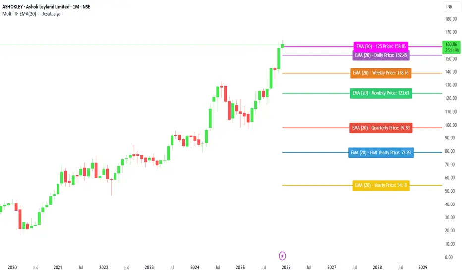
Multi-TF EMA(20) — JcsatasiyaOverview
This indicator plots 7 multi-timeframe EMA(20) lines on any chart and displays a clean dynamic label for each EMA showing:
Full timeframe name (Yearly, Half-Yearly, Quarterly, Monthly, Weekly, etc.)
EMA(20) value formatted with exactly 2 decimals
A label that is positioned automatically to the right of the latest candle
White text for maximum readability
Color-coded lines for each timeframe
All EMA lines extend horizontally and update in real-time when new candles form on the selected timeframes.
✅ Key Features
• 7 Custom Timeframes
Choose any timeframe for each EMA (Yearly, 6-Month, 3-Month, Monthly, Weekly, Daily, 4H, etc.)
• Horizontal EMA Levels
Each EMA is drawn as a fixed horizontal level, making structure and bias easier to analyze.
• Dynamic Label Placement
Labels automatically position:
Horizontally: Left, Middle, or Right of the right-side future area
Vertically: Above, Middle, or Below the EMA line
• Clean Readable Labels
Always white text
Shows: EMA (20) – Timeframe Price: 123.45
Price always displays with 2 decimals
Label style auto-adjusts based on position
• Color Customization
Each timeframe EMA has its own color picker.
• All EMA Thickness Unified
Set one line thickness for all EMA lines.
• Reliable Multi-TF Accuracy
Uses request.security() with proper lookahead handling.
⭐ Why This Indicator Is Useful
This tool makes it extremely easy to visualize where your chart sits relative to major multi-timeframe EMA levels.
You immediately see:
Higher-timeframe trend direction
Bias zones
Key support/resistance EMA levels
Long-term vs short-term trend alignment
Price interaction with institutional EMAs
Perfect for day traders, swing traders, and position traders.
📘 HOW TO USE
1️⃣ Add to Chart
After adding the indicator, open the Settings → Inputs panel.
2️⃣ Choose the 7 Timeframes
For each slot, select your desired timeframe (example setup):
Yearly
Half Yearly
Quarterly
Monthly
Weekly
Daily
4H
3️⃣ Customize Colors
Pick a different color for each EMA for clarity.
4️⃣ Choose Label Placement
Use the label position controls:
Vertical: Upper / Middle / Below
Horizontal: Left / Middle / Right (relative to right-side future space)
5️⃣ Adjust Line Thickness (Optional)
A single slider controls the thickness of all 7 EMAs.
📝 NOTES
The indicator places labels 2–50 bars into the future depending on chosen position.
Labels are always visible and readable due to white text.
EMA values always show exactly two decimals, even for crypto, indices, and forex.
Works on any market and any chart timeframe.
Educational
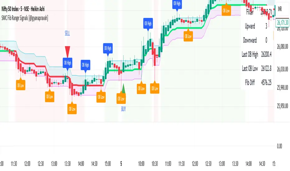
SMC Fib Range Signals [@gyanapravah]SMC Fib Range Signals
This indicator blends Smart Money Concepts (SMC) with a Range Filter Trend System and Fibonacci Retracement & Extensions to generate high-probability automated Buy/Sell signals.
Designed to avoid noise and focus on market structure + trend + price confluence, this tool is ideal for:
1. Intraday traders
2. Swing traders
3. Index & stock traders
4. Crypto & Forex traders
CORE FEATURES
Range Filter Trend Detection
Smooth adaptive filter identifies true trend direction
Visual confirmation:
🟢 Green filter = bullish pressure
🔴 Red filter = bearish pressure
🟡 Yellow filter = neutral
Upper & Lower Bands act as dynamic support/resistance zones
Smart Money Order Blocks (SMC)
Automatically detects important pivot highs & lows
Marks:
OB High → supply / resistance zone
OB Low → demand / support zone
Continuously tracks latest OB levels for live price interaction
Fibonacci Engine
Detects the current swing zone and plots:
Retracement levels
0.236 – 0.382 – 0.500 – 0.618 – 0.786 (editable)
Extension targets
1.272 – 1.618
All levels update dynamically on new market structure and pivots.
SIGNAL ENGINE
This indicator generates signals from three independent confirmation systems:
BUY SIGNALS trigger when:
1. Trend flips bullish (price crosses above the Filter)
2.Bullish trend + price reacts near:
Order Block support
Fibonacci 0.382 / 0.618 levels
Bounce from the Lower Band with trend support
All setups require volume confirmation to filter fake breakouts.
SELL SIGNALS trigger when:
1. Trend flips bearish (price crosses below the Filter)
2. Bearish trend + price reacts near:
Order Block resistance
Fibonacci 0.382 / 0.618 levels
Rejection from the Upper Band with trend support
ALERTS READY
Two built-in alerts:
BUY Alert — fires on bullish signal
SELL Alert — fires on bearish signal
INPUT SETTINGS
Trend Engine
1.Source
2.Sampling Period
3.Range Multiplier
Smart Money
Pivot detection sensitivity (Left / Right bars)
Fibonacci
1.Swing lookback length
2.Editable Fib retracement and extension values
3.Toggle show/hide Fib levels
BEST USE CASE
Works extremely well on:
⏱️ 3M – 15M Intraday scalping
⏱️ 30M – 1H positional entries
⏱️ 4H – D1 swing trading
Tested on:
NIFTY / BANKNIFTY / FINNIFTY
Stocks
Crypto
Forex
DISCLAIMER
This indicator is for educational purposes only.
It does NOT guarantee profits.
Always use:
Proper risk management
Stop-loss rules
Your own confirmation before entering trades.
AUTHOR
Built & shared by @gyanapravah (Odisha, India)
Open-source for learning and community improvement.
Custom indicator Enhanced Version 6orignal
1:https://in.tradingview.com/v/1S2VOnJP/
2:https://in.tradingview.com/v/c9vYco8x/
⚡ Key Features
📈 Multi-Timeframe Candle Display
Displays higher timeframe (HTF) candles directly on your chart
Configurable colors for bullish/bearish candles
Adjustable candle width and spacing
Real-time HTF timer showing time remaining in current candle
🔍 Price Level Tracing
Traces Open, High, Low, Close levels from HTF candles
Configurable line styles (dotted, dashed, solid)
Price labels showing exact values
Customizable colors for each trace line
⚡ Swing Point Detection
Identifies pivot highs and lows with custom lookback
Volume-based or count-based filtering
Visual zones showing swing areas
Configurable colors for support/resistance levels
📊 Moving Average System
Dual SMA analysis (current TF + HTF smoothed)
Color-coded based on price position
HTF MA smoothing for cleaner signals

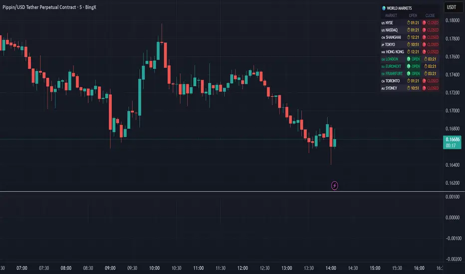
World Markets Table
🌍 World Markets Session Table - Track Global Exchanges in Real-Time
Monitor 10 major stock exchanges worldwide with live market status, countdown timers, and customizable themes. Perfect for multi-market traders, global portfolio managers, and anyone trading across time zones.
✨ Key Features
10 Global Exchanges Tracked:
🇺🇸 NYSE & NASDAQ (New York)
🇨🇳 Shanghai Stock Exchange
🇯🇵 Tokyo Stock Exchange
🇭🇰 Hong Kong Stock Exchange
🇬🇧 London Stock Exchange
🇪🇺 Euronext
🇩🇪 Frankfurt (Xetra)
🇨🇦 Toronto Stock Exchange
🇦🇺 Australian Securities Exchange
Real-Time Market Intelligence:
✅ Live OPEN/CLOSED status with colored indicators
⏱️ Countdown timers to market open/close
🗓️ Automatic weekday/weekend detection
🕒 Optional seconds display for precision timing
🎯 Visual status badges (green for open, red for closed)
Full Customization:
📍 6 table positions (top/bottom × left/center/right)
📏 4 size options (tiny, small, normal, large)
🎨 4 professional themes: Dark, Light, Neon, Ocean
🚩 Toggle country flags on/off
💼 Clean, professional table layout
🎨 Professional Themes
Dark Theme: Sleek charcoal design for night trading
Light Theme: Bright, clean interface for daylight charts
Neon Theme: Vibrant cyberpunk aesthetic with electric colors
Ocean Theme: Calming blue palette for focused analysis
💡 Perfect For
Multi-market traders monitoring global sessions simultaneously
Identifying optimal trading windows across time zones
Planning entries/exits around market opens and closes
Portfolio managers tracking international markets
Forex, indices, and commodities traders
Pre-market and after-hours trading planning
⚙️ How It Works
All market times are calculated in UTC and automatically adjust to your local timezone. The indicator overlays your chart without interfering with price action or technical analysis. Simply add it to any chart, customize the appearance, and stay informed about global market hours.
📊 Usage Tips
Place the table in a non-intrusive position to maintain chart clarity
Use countdown timers to prepare for volatility at market open/close
Match the theme to your chart colors for a cohesive workspace
Enable seconds display when precision timing matters most
Note: This is a display-only indicator showing market hours. It does not generate trading signals or plot price data.
Advanced Delta Trading System ProAdvanced Delta Trading System Pro
Overview
This indicator is an advanced order flow analysis tool that combines Delta Volume Analysis, Cumulative Volume Delta (CVD), Multi-Timeframe Trend Confirmation, and Volume Profile Zones to identify high-probability trading opportunities based on institutional buying and selling pressure.
🔍 Core Concepts & Methodology
1. Range-Weighted Delta Calculation (Original Implementation)
Unlike basic delta indicators that simply subtract selling volume from buying volume, this script uses a range-weighted approach:
Range Weight = |Price Movement| / Candle Range
Bar Delta = Volume × Direction × Range Weight
Why this matters:
Accounts for intra-bar price action strength
Provides more accurate representation of directional conviction
Filters out low-conviction volume during ranging periods
2. Cumulative Volume Delta (CVD) with Momentum
The script calculates CVD by accumulating bar deltas and applies:
EMA smoothing to reduce noise (adjustable period)
Delta Momentum indicator: Measures the rate of change of delta relative to its average
CVD Slope detection: Identifies accumulation/distribution phases
Formula:
Delta Momentum = Current Absolute Delta / Average Absolute Delta
This normalized momentum metric helps filter low-conviction signals.
3. Multi-Timeframe CVD Confluence (Unique Feature)
The indicator pulls CVD trend data from a higher timeframe (default: 15min) to:
Confirm signals only when aligned with HTF institutional flow
Display HTF bias in the dashboard (Bull ▲ / Bear ▼ / Neutral)
Prevent counter-trend trades against larger timeframe momentum
Edge: Many delta indicators operate on single timeframes; this multi-timeframe approach significantly reduces false signals.
4. Volume Profile Zone Detection
Instead of static support/resistance, the script dynamically identifies:
High Volume Nodes (HVN): Areas with 1.5x above-average volume - potential magnets/reversal zones
Low Volume Nodes (LVN): Areas with <0.5x average volume - breakout zones with minimal resistance
These zones are visualized as semi-transparent boxes on the chart, updated in real-time.
5. Delta-CVD Divergence Detection
The script identifies:
Bullish Divergence: Price makes lower low while CVD makes higher low (accumulation)
Bearish Divergence: Price makes higher high while CVD makes lower high (distribution)
Uses pivot detection with adjustable lookback periods and draws divergence lines automatically.
🎯 Signal Generation Logic
Buy Signal Requirements:
Bar delta exceeds threshold (Average Delta × Imbalance Multiplier)
Delta momentum ≥ minimum threshold (default: 1.2)
CVD slope is positive (accumulation phase)
Higher timeframe CVD is bullish (if MTF enabled)
Candle closes green (price confirmation)
Sell Signal Requirements:
Same criteria but inverted for selling pressure.
Enhanced Signals:
Signals are strengthened when accompanied by divergences, combining immediate imbalance with underlying accumulation/distribution patterns.
📊 Visual Features
1. Intelligent Candle Coloring
Color intensity based on delta momentum (0-3 scale)
Lime: Strong buying | Red: Strong selling | Gray: Neutral
Helps quickly identify conviction behind price moves
2. Delta Labels
Optional labels showing exact delta values (in thousands for readability)
Adjustable frequency (every Nth bar)
Color-coded by strength
3. Real-Time Dashboard
Displays:
Current bar delta
Cumulative Volume Delta (CVD)
Delta momentum reading
Higher timeframe bias
Active signals and divergences
⚙️ Customization Options
Delta Settings:
CVD Smoothing: Controls EMA period for CVD line
Avg Delta Length: Lookback for delta average calculation
Delta Momentum Period: Smoothing for momentum indicator
Signal Filters:
Imbalance Multiplier: Threshold for signal generation (higher = fewer, stronger signals)
CVD Confluence: Require/disable CVD trend alignment
Min Momentum: Filter weak signals below threshold
Volume Zones:
Lookback Period: Bars analyzed for HVN/LVN detection
Max Zone Boxes: Limit visual clutter
Toggle HVN/LVN independently
Multi-Timeframe:
Select any higher timeframe for CVD analysis
HTF Bias Panel: Show/hide dashboard element
🔔 Alert Conditions
Long/Short Signals: Fires when all confluence conditions met
Divergence Alerts: Bullish/Bearish divergence detected
Extreme Momentum: Delta momentum exceeds 2.5× average
HTF Trend Change: Higher timeframe CVD reverses
💡 How to Use
For Scalping:
Use 1-5min charts with 15min HTF confirmation
Focus on extreme momentum alerts (>2.5×)
Enter on signals near HVN zones for better R:R
For Swing Trading:
Use 15min-1H charts with 4H HTF confirmation
Wait for divergences + signal confluence
Avoid LVN zones (price likely to slice through)
Volume Profile Strategy:
Buy at HVN support with bullish delta
Sell at HVN resistance with bearish delta
Target LVN zones for breakout trades
🆚 What Makes This Script Unique
Unlike standard delta indicators, this combines:
Range-weighted delta (more accurate than simple volume delta)
Multi-timeframe confirmation (institutional flow alignment)
Dynamic volume profile zones (not static S/R)
Momentum-filtered signals (reduces noise significantly)
Divergence integration (catches reversals early)
Compared to free alternatives: Most delta scripts show raw cumulative delta without momentum filtering, MTF analysis, or volume profile integration. This script provides a complete order flow analysis system in one indicator.
⚠️ Important Notes
Not a standalone system: Use with price action and market structure
Optimize settings per asset: Crypto needs different settings than forex/stocks
Higher timeframes = more reliable: Reduce noise on lower timeframes with longer smoothing
Volume quality matters: Works best on high-liquidity assets with accurate volume data
📈 Best Timeframes
Scalping: 1m-5m (with 15m HTF)
Day Trading: 5m-15m (with 1H HTF)
Swing Trading: 1H-4H (with D HTF)
This indicator is designed for traders who understand order flow concepts and want a comprehensive, multi-layered approach to delta analysis beyond basic cumulative volume delta indicators.


VH LEVELSThis indicator plots multi-timeframe levels (Daily, Weekly, Monthly) along with dynamic movement zones derived from previous session ranges. It also includes optional smoothed Heikin Ashi candles, EMA structure, and an auto-direction framework that visually highlights shifts in market behavior.
The tool helps traders observe price movement, trend alignment, and structural changes directly on the chart without generating trading signals.

NeuralFlow Forecast Engine™ | SPY Weekly NeuralFlow Forecast Engine™ | SPY Weekly
AI-adaptive market equilibrium & expansion mapping. NeuralFlow doesn’t forecast by direction — it forecasts by where markets prefer to stabilize.
NeuralFlow Forecast Engine™ is a proprietary Artificial Intelligence framework trained to identify where price is statistically inclined to rebalance and where expansion zones historically exhaust rather than extend.
What the Bands Represent
Band Layer Meaning
AI Equilibrium (white core) Primary weekly balance zone where price is most likely to mean-revert
Predictive Rails (aqua / purple) High-confidence corridor of institutional flow containment
Outer Zones (green / red) Expansion limits where continuation historically decays
Extreme Zones (top/bottom) Rare deviation envelope where auction completion is statistically favored
NeuralFlow operates on proprietary, institution-grade Artificial Intelligence models trained specifically to map statistical rebalancing behavior, not trader predictions or sentiment. No discretionary drawing. No correlations. No lagging overlays.
This engine updates only when underlying structure changes — not when candles fluctuate intraday.
⚠ Risk & Use Notice
NeuralFlow Forecast Engine™ provides AI-derived structural zones, not trade signals or financial advice.
Markets can behave outside modeled distributions, especially during macro catalysts, thin liquidity, or surprise volatility events.
By loading or using this indicator, the user acknowledges full responsibility for any trades or outcomes based on its interpretation.
Educational & analytical use only. Not financial advice.

Optimal Trading ReplayOptimal Trading Replay
---------------------------------------------------------
This indicator helps you visualize your executed trades directly on the TradingView chart.
// Features:
// - Imports your trade list (CSV-style text input)
// - Plots entries, exits, and direction arrows
// - Draws P&L summary boxes on chart
// - Useful for replay, journaling, and verification

Alinin Sihirli Lambası v4.0 [AliBaba]This is not investment advice.
It works with 80% success in a 15-minute period and provides buy and sell signals.
It has been tested on SKL OP XTZ ALT VTHQ 100 CHEMS ZEC LUNC.
When the green vertical bar appears, if it is at least 2% below the upper pink line and institutional buying exceeds institutional selling (upper right window).
If you are a TradingView premium member, and the upper target is closer than the lower target, the best buy point is indicated.
The default profit and risk ratio is 2 to 1.5. You can try changing it.
A signal is generated by reprocessing the best indicators and considering general institutional buying and selling pressures.

Jim Kombein Ph.D, — ETH Micro-mHFT Spread Engine V2.0Overview
This indicator provides a visual dashboard designed to help traders monitor short-term ETH market conditions.
It highlights changes in momentum, temporary imbalance areas, and transitions between quiet and active phases.
The tool does not generate trading signals and contains no automated strategy logic.
개요
이 인디케이터는 ETH의 단기 시장 흐름을 시각적으로 관찰할 수 있도록 구성된 대시보드 도구입니다.
단기 모멘텀 변화, 일시적 불균형 구간, 변동성 전환을 손쉽게 확인할 수 있도록 설계되었습니다.
매매 신호나 자동 매매 기능은 포함되어 있지 않습니다.
Usage
Use this tool as a visual reference in combination with your own judgment.
It helps identify compression zones, movement transitions, and short-term structural shifts in market conditions.
사용법
이 도구는 사용자의 판단을 보조하는 시각적 참고용 지표입니다.
가격 압축 구간, 흐름 전환, 단기 구조 변화를 관찰하는 데 활용할 수 있습니다.
Access
This script is Invite-Only.
To request access, please send me your TradingView ID via direct message.
액세스 안내
본 지표는 초대 전용(Invite-Only) 으로 제공됩니다.
사용을 원하시면 TradingView 메시지를 통해 사용자 ID를 보내주세요.

Bassi MACD Pro + ADX Filter + Smart Histogram TP + RSIA professional-grade MACD indicator that dramatically reduces false signals by combining four powerful filters:
Key Features
Classic MACD (12,26,9) with clean, high-visibility histogram coloring
ADX + DI filter – only takes trades when ADX > user-defined threshold (default 25) ensuring you trade only in strong trending markets
Smart Histogram Take-Profit logic – automatically detects the exact moment bullish/bearish momentum starts to weaken after a strong move and marks a precise TP level (one TP per trade – no repainting, no multiple signals)
Zero-line crossover confirmation + histogram direction filter – eliminates many whipsaw signals common in regular MACD
Separate RSI pane with overbought/oversold levels and visual markers (for additional confluence – does not interfere with main logic)
Visual Signals
Green “MACD BUY” label + lime triangle = confirmed long entry in strong trend
Red “MACD SELL” label + red triangle = confirmed short entry in strong trend
Small lime/red “TP” triangles = Smart Histogram Take-Profit triggered (perfect exit timing based on momentum fade)
Alert Conditions Included
MACD BUY
MACD SELL
TP Long Hit
TP Short Hit
Combined “Any Signal” alert
Why this version outperforms standard MACD
Most MACD crossovers fail in ranging markets. This script solves that by:
Requiring strong trend (ADX filter)
Confirming histogram is actually growing in the new direction
Waiting for the true zero-line cross with momentum
Giving you an intelligent, non-fixed % take-profit based on real histogram exhaustion
Excellent for swing trading, day trading, crypto, forex, and stocks on any timeframe (works especially well on 1H–4H–Daily).
Clean, fast, no repainting, fully alert-ready.
Add to chart → set your alerts → trade only the highest-probability MACD signals.

NQ H1 Stats+NQ H1 Stats - Detailed Prob & Excursion Indicator
Overview
NQ H1 Stats - Detailed Prob & Excursion is a specialized statistical overlay indicator for TradingView, tailored for the Nasdaq futures (NQ) on a 1-hour timeframe. It provides real-time insights into the probability of price returning to the hourly open after sweeping the previous hour's high (PHH) or low (PHL), based on historical data segmented by hour and 20-minute intervals. The indicator visualizes these sweeps with lines, labels, circles, background fills, and "excursion zones" (also called "Magic Boxes") that highlight median/mean extensions post-sweep, along with percentile lines (75th, 90th, 95th) for gauging potential "pain" or extreme moves. This tool is designed for intraday traders focusing on liquidity sweeps, or mean-reversion setups, helping to quantify edge based on empirical probabilities and volatility excursions.
The data is hardcoded from extensive historical analysis of NQ behavior (e.g., probabilities range from ~7% to ~91%, with sample sizes up to 2000+ per segment), making it a backtested reference rather than dynamic learning. It emphasizes visual clarity during active hours, with options to filter for Regular Trading Hours (RTH: 09:00–15:59 ET) or high-probability (>70%) events only. Note: This is an educational tool for analyzing market structure; it does not predict future performance or provide trading signals/advice. Past data does not guarantee future results, and users should backtest on current conditions (as of December 2025 data availability) and use at their own risk, in compliance with TradingView's house rules.
Key Features
• Sweep Detection & Probability Labels: Identifies when price breaks PHH (upside) or PHL (downside), displaying a centered label with probability of returning to the hourly open, sample size (N), time of sweep, and a checkmark (✅) if the open is retested post-sweep.
• Visual Lines & Markers: Draws hourly open (h.o.), PHH, and PHL lines with customizable styles/colors; adds small circles on sweep bars for quick spotting.
• Breakout→Open Background Fill: Shaded zone from sweep bar until price returns to open, visualizing extension duration and retracement.
• Excursion (Pain) Zone - "Magic Box": Post-sweep box showing median/mean extension percentages, colored dynamically by probability (green high, orange mid, red low); includes dashed lines for 75th/90th/95th percentiles to mark statistical extremes.
• Time-Segmented Data: Probabilities and excursions vary by hour (0-23) and 20-min segments (0-19 min: _0, 20-39: _1, 40-59: _2), capturing intraday nuances (e.g., higher probs in early/late hours).
• Filters for Focus: RTH-only mode hides non-session elements; high-prob-only shows >70% events to reduce noise.
• Alerts: Triggers on PHH/PHL sweeps with messages for chart checks.
How It Works
• Data Foundation: Uses pre-computed maps for probabilities (prob_high_taken/prob_low_taken), sample sizes, and excursions (mean, median, p75/p90/p95 as percentages of open). Data is initialized on the first bar via f_init_high_data() and f_init_low_data(), covering 24 hours with 3 segments each (e.g., key "9_1" for 09:20-09:39). Probabilities represent historical likelihood of price returning to open after sweep; excursions quantify average/rare extensions (e.g., 0.156% mean = 0.156% of open price).
• Period Detection: On new 1H bars (new_period_bar), resets visuals, draws lines for open/PHH/PHL extending 1 hour forward, and labels if enabled. Uses request.security on standard ticker for real OHLC, bypassing chart transformations (e.g., Heikin Ashi).
• Sweep Logic: On each bar, checks if real high > PHH or real low < PHL. If so, fetches segment-specific data (hour + floor(minute/20)), displays probability label centered mid-hour. Skips if filtered (RTH-only or <70% prob).
• Excursion Visualization: If enabled, draws "Magic Box" from 1-min to 58-min into the hour, bounded by mean/median levels (top/bottom adjusted for high/low sweep). Adds percentile lines with labels (e.g., "75%") at right end. Box color reflects prob strength for quick bias assessment.
• Retest Check: Monitors for open retest post-sweep (high/low cross open, or gap scenarios from prev bar). Adds ✅ to label if hit on subsequent bars (skips sweep bar to avoid false positives). Stops background fill on retest or at 58-min mark.
• Background Fill: Activates on sweep, shades until retest, using user color.
• Cleanup & Performance: Manages labels in arrays, clears on new periods; no excess drawing beyond max counts (500 lines/labels/boxes).
This setup "meshes" statistical backtesting with real-time visualization: Hardcoded data provides empirical probabilities/excursions (reducing subjectivity in breakouts), while dynamic elements (lines, fills, boxes) overlay structure on the chart. It helps traders assess if a sweep is "high-edge" (e.g., >70% prob of revert) or likely to run (low prob, high excursion), blending historical context with current price action for informed decisions.
Settings and Customization
Inputs are grouped for ease:
1. Settings:
o Show RTH Only (9:00-15:59): Restricts to main session (default: false; tooltip: for RTH-focused stats).
o Show High Prob Only (>70%): Filters low-prob sweeps visually (default: false; tooltip: highlights confidence).
2. Visuals:
o Show Line Labels: Toggle "h.o."/ "phh"/ "phl" (default: true).
o Period Open Line Color: Gray 50% (default).
o Previous High/Low Line Colors: Gray 100% (default).
o Open Line Style/Width: Dotted/1 (default; options: Solid/Dotted/Dashed).
3. Breakout→Open Background:
o Show Breakout→Open Background: Toggle fill (default: true).
o Fill Color: Teal 85% (default).
4. Breakout Circles:
o Show Breakout Circles: Toggle (default: true).
o PHH/PHL Break Circle Colors: White 20% (default).
5. Info Label Style:
o Text Size: Small (default; options: Auto/Tiny/Normal/Large/Huge).
o Label Text Color: White (default).
o Low/Mid/High Probability Colors: Red 20%/Orange 20%/Green 20% (default).
6. Excursion (Pain) Zone:
o Show Excursion Zone: Toggle Magic Box (default: true).
o Excursion Box Color: Gray 75% (default; dynamic overrides).
o 75th/90th/95th Percentile Lines: Orange 30%/Red 30%/Dark Red 100% (default).
No additional tables/plots; all elements are lines/labels/boxes for overlay focus.
Usage Tips
• Breakout Trading: Watch for sweeps with high prob (>70%, green label) as potential fades back to open; low prob (red) may signal runs—use excursion box for targets (e.g., exit at 90th percentile for extremes).
• Time Awareness: Probabilities peak in open hours (e.g., 09:00 ~90%+ for initial sweeps) and drop in off-hours; segments capture momentum shifts (e.g., _2 often lower prob).
• RTH Focus: Enable for cleaner stats during high-liquidity sessions; disable for 24/7 view.
• Visual Filtering: Use high-prob-only in volatile conditions to avoid noise; combine with volume or other indicators for confirmation.
• Alerts Integration: Set TradingView alerts on sweeps; check label for prob/N before acting.
• Chart Setup: Best on 1H or lower NQ charts; adjust text size for readability on mobiles.
• Backtesting: Manually review historical sweeps against data maps to validate; update hardcoded values if new data emerges (as of 2025).
Limitations
• Fixed Data: Hardcoded stats may not reflect recent market changes (e.g., post-2025 volatility shifts); not adaptive.
• Reactive Only: Detects sweeps after they occur; no predictive signals.
• Timeframe Specific: Locked to 1H logic; may not translate to other assets/TFs without recoding data.
• Visual Clutter: On busy charts, labels/boxes may overlap—toggle off selectively.
• No Live Stats: Sample sizes are historical; real-time N/prob not updated.
• Gaps & Extremes: Handles gaps in retest logic, but rare events (e.g., news) may exceed 95th percentile.
Disclaimer
This indicator is for informational and educational purposes only. Trading involves significant risk of loss and is not suitable for all investors. The hardcoded data represents past NQ performance and does not guarantee future outcomes. No claims of profitability are made—results depend on market conditions, user strategy, and risk management. Consult a financial advisor before trading, and backtest extensively. Abiding by TradingView rules, this tool provides no investment recommendations.

FAD% - Futures vs Spot Spread (Custom Colors)Priority 1: Futures Rising + FAD Rising = Deep Green
// Priority 2: Futures Falling + FAD Rising = Deep Blue
// Priority 3: Yellow (Premium) or Red (Discount)

VH GOLD This indicator is designed to help traders understand price movement behavior using technical analysis. Instead of generating Buy/Sell signals, the script focuses on identifying the underlying strength, direction, and momentum of the market through visual chart plots.
How It Works
The indicator evaluates key technical conditions such as trend direction, momentum shifts, volatility changes, and structural swings. These conditions are converted into clean on-chart plots that highlight how the market is moving, helping traders interpret price action more confidently.

Jim Kombein Ph.D — ETH Micro-mHFT Spread EngineOverview
This indicator provides a visual micro-HFT dashboard designed to track the asymmetric short-term behavior between ETH and BTC using a statistical spread-based framework.
It highlights micro-structure drift, volatility regime shifts, and compressed/reversal zones that typically precede short-duration directional moves.
The goal is not to generate automatic buy/sell decisions, but to provide a structured real-time visualization of the underlying ETH/BTC spread environment used in high-frequency scalping contexts.
Concept
ETH/BTC relative movement often displays:
Short-horizon volatility asymmetry
Mean-reversion vs. micro-trend switching
Spread drift transitions
Regime-dependent noise amplification
Momentary structural compression before directional bursts
This engine visualizes multiple layers of this behavior simultaneously:
Short-term Z-spread
Slow Z-momentum layer
Mean-drift normalization
Volatility regime transformation
Entry & extreme statistical bands
The multi-layered structure helps traders interpret spread conditions at a glance without exposing algorithmic internals.
What the Indicator Shows
This indicator does not execute trades, nor does it expose private strategy logic.
It simply plots the following analytical layers:
Short & slow Z-spread curves
Mean-drift transitions
Volatility normalization
Statistical entry bands
Extreme deviation zones
Session-based state markers (L / l / S / s)
Visual background shading for regime interpretation
The visualization is designed to be compact and micro-HFT-friendly even on short timeframes.
Usage
Use cases include:
Identifying spread compression before expansion
Monitoring micro-drift reversal attempts
Visually confirming volatility regime suitability
Detecting early ETH/BTC imbalance pockets
Supplementing manual ETH scalping decisions
No trade logic, signals, or position recommendations are provided.
Access
This indicator is Invite-Only.
Users who wish to access it may send me their TradingView ID via message, and I will grant access after verification.


TF7 Weekly Synthetic FutureThis indicator plots a Synthetic Future Chart by combining the ATM (At-The-Money) Call and Put option prices for NIFTY or SENSEX indices.
It reconstructs the theoretical future price using the formula:
Synthetic Future = ATM Strike + ATM Call Price - ATM Put Price
The indicator allows users to:
View the synthetic future as a line chart or a candlestick chart
Visualise the underlying Call (CE) and Put (PE) prices separately
Choose between NIFTY and SENSEX indices
Select expiry and ATM strike manually for precision
This chart can be helpful for:
Traders comparing synthetic and actual futures prices
Option traders identifying potential mispricing or arbitrage opportunities
Intraday and positional traders who want a refined price reference
📘 How to Use
Add the Indicator
Apply the script on any chart (preferably NIFTY or SENSEX) from the TradingView indicator list.
Configure the Index
In the Trade Set Up section, choose "NIFTY" or "SENSEX" as the underlying index.
Set Expiry & ATM Strike
Input the Expiry Date in YYMMDD format (e.g., 251204 for Dec 4, 2025).
Input the Straddle Strike (ATM strike you want to analyze).
The script auto-generates 18 strikes around this base and selects the closest to LTP.
Toggle Display Options
Show ATM CE/PE: Plots the last traded prices of ATM Call & Put.
Show Synthetic Future: Plots the synthetic price.
Show Candlestick Chart Instead of Line: Plots OHLC of the synthetic future instead of just close price.
Visual Tips
Candlestick bars alternate between semi-transparent green and red for better visibility.
Use shorter timeframes (e.g., 5m, 15m) for intraday strategy testing.
✅ Tips for Best Results
Ensure you're using live market hours for accurate option price data.
Match the expiry and strike exactly with available option symbols on TradingView (format: NSE:NIFTY251204CXXXXX).
Compare synthetic futures with actual FUTURE contracts (e.g., NSE:NIFTY1!) for divergence or convergence signals.
Can be used for calendar spreads, option arbitrage, and volatility-based strategies.
⚠️ Limitations
Options data may not load correctly for illiquid strikes or expired contracts.
The indicator doesn’t account for transaction costs, slippage, or dividend impact.
Requires real-time data for optimal usage; delayed data might affect accuracy.

MNQ Momentum Suite – Intraday Confluence Dashboard (1-5M)MNQ Momentum Suite is a multi-factor intraday momentum dashboard designed primarily for MNQ / NQ on the 1M–5M timeframes during the New York session.
Instead of staring at 3–4 separate indicators, this script combines them into one clean pane
DMI / ADX → who’s in control (+DI vs –DI) and how strong the move is
Momentum MA Slope (T3 or EMA) → directional bias and trend quality
Squeeze Logic (BB vs Keltner) → volatility compression & expansion zones
Composite Momentum Score (–4 to +4) → single number capturing total confluence
Color-coded Dashboard Table → instant Bull / Bear / Flat status for each component
Core Components
1️⃣ Composite Momentum (Main Histogram)
Score range : –4 to +4
Built from 4 building blocks :
DMI direction (Bull/Bear)
ADX strength above threshold
MA slope direction (up/down)
Squeeze direction (after it fires)
Interpretation:
+3 / +4 → strong bullish confluence
+1 / +2 → mild bullish bias
0 → mixed / no edge
–1 / –2 → mild bearish bias
–3 / –4 → strong bearish confluence
2️⃣ DMI / ADX Block
Uses ta.dmi() under the hood.
DI spread histogram (teal/orange) shows which side is in control.
White ADX line measures trend strength – higher = cleaner moves, low = chop.
3️⃣ Momentum MA Slope (T3 / EMA)
User can choose T3 or EMA for the slope engine.
Slope histogram color:
Aqua → MA sloping up (bull-friendly)
Fuchsia → MA sloping down (bear-friendly)
4️⃣ Squeeze (BB vs Keltner)
Yellow dots mark when Bollinger Bands are inside Keltner Channels (volatility squeeze).
When the squeeze releases and price closes on one side of both BB basis and Keltner basis, the script flags a bullish or bearish squeeze fire that feeds the composite score.
Dashboard Table (Top-Right) : The table gives a fast, text-based read of the environment:
DMI Dir – Bull / Bear / Flat
ADX – Numeric trend strength
Slope – Up / Down / Flat based on chosen MA
Squeeze – Building / Fired Up / Fired Down / Idle
Row text is color-coded:
Green when that metric is bull-friendly
Red when it is bear-friendly
Gray/white when neutral
This makes it very easy to glance at the table and see if the environment is mostly green (long-friendly) or mostly red (short-friendly).
Session & Histogram Controls
Use NY Session Filter?
When enabled, all logic is focused on the defined NY session (default 09:30–16:00 exchange time).
how Histograms Only in NY Session?
true → plots only during the NY session (good for live trading focus).
false → plots on all bars, including overnight, so you can study past days and pre-/post-market behavior.
Alerts
Two built-in alert conditions are provided:
Strong Bull Momentum – Composite ≥ 3 during the session.
Strong Bear Momentum – Composite ≤ –3 during the session.
Use these as “heads-up” momentum pings, then confirm with your own price-action, VWAP, HTF levels, and liquidity zones.
Recommended Use
Primary instruments: MNQ / NQ futures, but it can be applied to any intraday symbol.
Primary timeframes: 1M to 5M.
Designed as a confluence and filter tool, not a stand-alone entry system.
Works especially well combined with:
VWAP
10 EMA
Pre-NY and RTH highs/lows
FVG/IFVG and liquidity zones
As with any tool, this is not financial advice and does not guarantee results. Always combine with risk management and your own playbook.

CapitalFlowsRsearch: YC RegimeCapitalFlowsResearch: YC Regime — Yield Curve Regime Histogram
CapitalFlowsResearch: YC Regime takes the same six-regime yield curve framework (bull/bear steepeners, bull/bear flatteners, and their twist variants) and presents it as a dedicated histogram panel. Instead of colouring the background of a price chart, this indicator plots the 2s–10s (or chosen pair) spread as a column series and tints each bar according to the active curve regime, with an overlaid white line to show the raw spread path through time.
By comparing how the spread itself is evolving against the regime classification, traders can see not just what the curve is doing (steepening vs flattening), but also how those moves are building, stalling, or reversing over the chosen lookback. An optional legend explains each regime and the colour mapping, making it easy to standardise interpretation across instruments and timeframes. In practice, this panel functions as a compact “yield curve dashboard” you can stack under risk assets, helping align trades with the prevailing rates environment without exposing the underlying regime logic.

CapitalFlowsResearch: YC Regime (Shading)CapitalFlowsResearch: YC Regime (Shading) — Yield Curve Environment Overlay
CapitalFlowsResearch: YC Regime (Shading) turns the yield curve into a live, colour-coded market backdrop, classifying the curve into six intuitive regimes: bull steepener, bear steepener, steepener twist, bull flattener, bear flattener, and flattener twist. Instead of staring at raw spreads or multiple rate charts, you get a simple visual answer to: “What kind of curve move am I trading in right now?”
The script compares a short-dated and long-dated yield and tracks how both the spread and the individual legs have evolved over a chosen lookback window. From that, it tags each bar with the dominant curve regime and paints either the background or the candles accordingly, so regime changes are immediately obvious on any price chart you overlay it on. An optional on-chart legend summarises the regime definitions and colour scheme, making it easy to interpret at a glance and consistent across instruments and timeframes.
In practice, this overlay acts as a rates context layer for everything else you trade—equities, FX, credit, commodities—helping you link price action back to whether the curve is bull-steepening, bear-flattening, or twisting in ways that often line up with shifts in macro narrative, policy expectations, and risk appetite, all without exposing the underlying classification logic.

BTC-ETH Visual DashboardOverview
A visual dashboard designed to monitor the statistical relationship between BTC and ETH.
The indicator displays filtered and normalized curves that approximate the underlying mean-reversion structure between the two assets.
Concept
BTC–ETH relative movements often exhibit asymmetric volatility and temporary divergence.
This dashboard helps visualize:
Spread compression/expansion
Regime transitions
Short-term structural dislocations
Usage
The curves represent different smoothed layers of the BTC/ETH relationship.
Persistent moves away from the central band may indicate spread imbalance or short-term inefficiency.
Purpose
This tool is designed for traders applying statistical arbitrage, relative-value trading, or volatility regime analysis.

SPX Cumulative AD Line IndicatorThe Other ADLines online are trash. Use this one.
This indicator, written in Pine Script version 6, is designed to track market breadth for the S&P 500 by constructing and analyzing a cumulative Advance-Decline (AD) Line. It begins by allowing the user to set two parameters: a smoothing length for the AD line itself and a moving-average length (defaulted to 50 weeks) that will later be applied to the smoothed line. These inputs let traders tailor the sensitivity of the indicator to their preferred timeframe and trading style.
To build the AD line, the script pulls real-time S&P 500 index prices as well as the number of advancing and declining stocks using dedicated market breadth tickers. It calculates the daily AD difference by subtracting declines from advances, a classic method for measuring participation across the index. This difference is fed into a cumulative calculation, which produces a running total that tracks whether market participation is strengthening or weakening over time.
The cumulative AD line is then smoothed with a simple moving average based on the user’s specified smoothing length. At the same time, the script dynamically converts the 50-week moving-average period into an equivalent value for whatever chart timeframe is being used—intraday, daily, weekly, or monthly. This ensures that the moving average of the AD line reflects a consistent long-term trend regardless of the chart’s resolution.
Next, the smoothed AD line is compared to its converted 50-week moving average to determine the market’s directional bias. When the AD line rises above its long-term average, the script labels the environment as bullish; when it falls below, it flags a bearish environment. It also detects crossovers between the two lines, generating discrete buy signals when the AD line crosses upward and sell signals when it crosses downward.
Finally, the indicator visualizes all elements on the chart: the smoothed AD line, its long-term moving average, a zero reference line, and the buy/sell markers. It also colors the line and background to reflect bullish or bearish conditions, making shifts in market breadth easy to spot at a glance. This provides traders with a comprehensive breadth-based tool for identifying trend strength and potential reversals in the S&P 500.
