Volume Surprise [LuxAlgo]The Volume Surprise tool displays the trading volume alongside the expected volume at that time, allowing users to spot unexpected trading activity on the chart easily.
The tool includes an extrapolation of the estimated volume for future periods, allowing forecasting future trading activity.
🔶 USAGE
We define Volume Surprise as a situation where the actual trading volume deviates significantly from its expected value at a given time.
Being able to determine if trading activity is higher or lower than expected allows us to precisely gauge the interest of market participants in specific trends.
A histogram constructed from the difference between the volume and expected volume is provided to easily highlight the difference between the two and may be used as a standalone.
The tool can also help quantify the impact of specific market events, such as news about an instrument. For example, an important announcement leading to volume below expectations might be a sign of market participants underestimating the impact of the announcement.
Like in the example above, it is possible to observe cases where the volume significantly differs from the expected one, which might be interpreted as an anomaly leading to a correction.
🔹 Detecting Rare Trading Activity
Expected volume is defined as the mean (or median if we want to limit the impact of outliers) of the volume grouped at a specific point in time. This value depends on grouping volume based on periods, which can be user-defined.
However, it is possible to adjust the indicator to overestimate/underestimate expected volume, allowing for highlighting excessively high or low volume at specific times.
In order to do this, select "Percentiles" as the summary method, and change the percentiles value to a value that is close to 100 (overestimate expected volume) or to 0 (underestimate expected volume).
In the example above, we are only interested in detecting volume that is excessively high, we use the 95th percentile to do so, effectively highlighting when volume is higher than 95% of the volumes recorded at that time.
🔶 DETAILS
🔹 Choosing the Right Periods
Our expected volume value depends on grouping volume based on periods, which can be user-defined.
For example, if only the hourly period is selected, volumes are grouped by their respective hours. As such, to get the expected volume for the hour 7 PM, we collect and group the historical volumes that occurred at 7 PM and average them to get our expected value at that time.
Users are not limited to selecting a single period, and can group volume using a combination of all the available periods.
Do note that when on lower timeframes, only having higher periods will lead to less precise expected values. Enabling periods that are too low might prevent grouping. Finally, enabling a lot of periods will, on the other hand, lead to a lot of groups, preventing the ability to get effective expected values.
In order to avoid changing periods by navigating across multiple timeframes, an "Auto Selection" setting is provided.
🔹 Group Length
The length setting allows controlling the maximum size of a volume group. Using higher lengths will provide an expected value on more historical data, further highlighting recurring patterns.
🔹 Recommended Assets
Obtaining the expected volume for a specific period (time of the day, day of the week, quarter, etc) is most effective when on assets showing higher signs of periodicity in their trading activity.
This is visible on stocks, futures, and forex pairs, which tend to have a defined, recognizable interval with usually higher trading activity.
Assets such as cryptocurrencies will usually not have a clearly defined periodic trading activity, which lowers the validity of forecasts produced by the tool, as well as any conclusions originating from the volume to expected volume comparisons.
🔶 SETTINGS
Length: Maximum number of records in a volume group for a specific period. Older values are discarded.
Smooth: Period of a SMA used to smooth volume. The smoothing affects the expected value.
🔹 Periods
Auto Selection: Automatically choose a practical combination of periods based on the chart timeframe.
Custom periods can be used if disabling "Auto Selection". Available periods include:
- Minutes
- Hours
- Days (can be: Day of Week, Day of Month, Day of Year)
- Months
- Quarters
🔹 Summary
Method: Method used to obtain the expected value. Options include Mean (default) or Percentile.
Percentile: Percentile number used if "Method" is set to "Percentile". A value of 50 will effectively use a median for the expected value.
🔹 Forecast
Forecast Window: Number of bars ahead for which the expected volume is predicted.
Style: Style settings of the forecast.
Liquidity

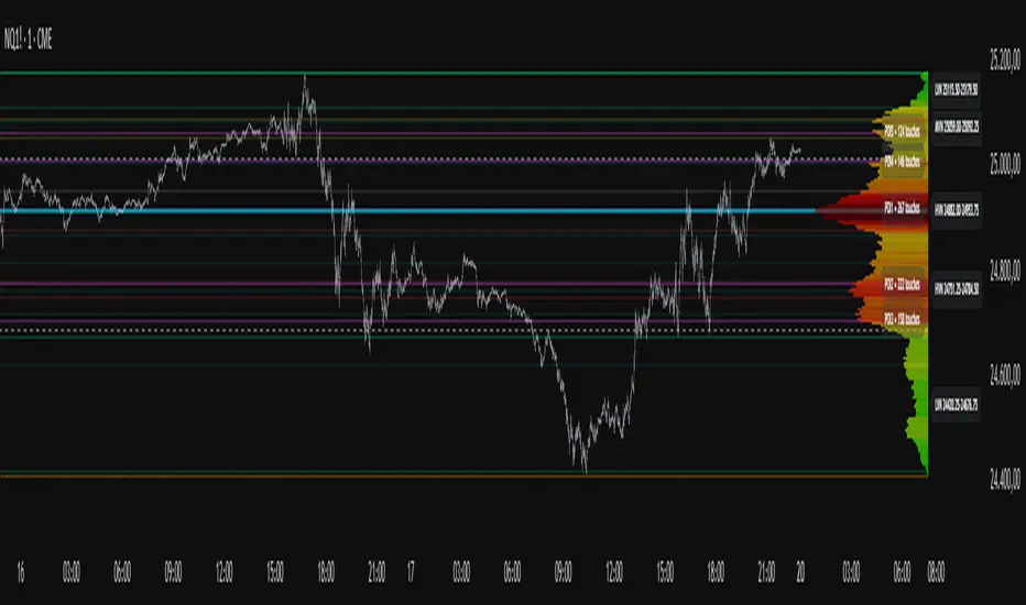
Project Pegasus SideMap • VRP Heatmap • Volume Node DetectionDescription CME_MINI:NQ1!
Project Pegasus – Volume SideMap V 1.0 builds a right-anchored horizontal volume heatmap silhouette, visualizing buy/sell participation per price level over any chosen lookback or visible range. It automatically detects Low-Volume Nodes (LVN), Medium-Volume Nodes (MVN), and High-Volume Nodes (HVN), while also marking Top Volume Peaks, POI Lines (Most-Touched Levels), and complete Value Area Levels (POC / VAH / VAL) including optional session highs/lows.
What’s Unique
Right-Fixed Rendering – All profile rows are anchored to the chart’s right edge, creating a consistent visual reference during live trading.
Gap-Free Silhouette – Each price row blends seamlessly with its neighbors, producing a clean and continuous volume shape.
Triple-Tier Node Detection (LVN / MVN / HVN) – Automatically highlights zones of rejection, transition, and acceptance based on relative volume strength.
Dynamic Binning System – Adapts to price range and lookback while preserving proportional per-row volume distribution.
POI Finder (Most Touches) – Highlights price rows that have been touched most frequently by bars (traffic clusters).
Top-N Peaks – Sorts and draws the strongest single-price clusters by total volume while respecting minimum spacing.
Integrated Value Area Metrics – Calculates and plots POC, VAH, and VAL with optional session High/Low markers.
Color Modes – Choose between heatmap intensity (volume-based) or buy/sell ratio blending for directional context.
Performance Optimized – Rebuilds only when structure changes, ensuring smooth operation even with large histories.
Technical Overview
1. Binning & Aggregation
The full price range is divided into a user-defined number of rows (bins) of equal height.
For each bar, traded volume is distributed across all intersecting bins proportionally to price overlap.
A buy/sell proxy is estimated based on candle close position, producing per-row Buy, Sell, and Total Volume arrays.
2. Silhouette Rendering
Each row’s strength = total volume ÷ maximum volume.
Two color modes:
• Volume Mode → intensity scales by relative volume (heatmap).
• Ratio Mode → blend between sell and buy base colors based on dominance (close position).
Weak or neutral rows can be faded or forced to minimum width via strength and ratio-deviation filters.
3. Node Detection (LVN / MVN / HVN)
Relative bands are defined by lower/upper % thresholds.
Consecutive rows meeting criteria are grouped into “bands.”
Optional gap-merge unifies nearby bands separated by small gaps (in ticks).
Quality filters:
• Min. Average in Band (%) → enforces minimum average participation.
• Min. Prominence vs. Neighbors (%) → compares contrast against adjacent volume peaks.
Enforces minimum center distance (in ticks) to prevent overlap.
Each valid band draws a Top/Bottom line pair and optional mid-label (LVN/MVN/HVN).
4. Volume Peaks
Ranks all rows by total volume (descending) and selects top N peaks with spacing filters.
Drawn as horizontal lines or labeled markers (P1, P2, etc.).
5. POI Lines (Most Touches)
During aggregation, each row counts how many bars overlap it.
The top X rows with highest touch counts are drawn as POI lines—often strong participation or mean-retest zones.
6. Value Area (POC / VAH / VAL)
POC = row with highest total volume.
Expands outward symmetrically until the configured Value Area % of total volume is covered.
VAH and VAL mark the acceptance range; optional High/Low lines outline total range boundaries.
7. Right-Fix Layout
All components are rendered relative to the chart’s rightmost bar.
Width dynamically scales with visible bars × % width setting, ensuring proportional scaling across zoom levels.
How to Use
Read market structure:
HVNs = high acceptance or balance areas → likely mean-reversion zones.
LVNs = thin participation → breakout or rejection points (“air pockets”).
MVNs = transition areas between acceptance and rejection.
Trade around POC / VAH / VAL:
These levels represent fair-value boundaries and rotational pivots.
POI & Peaks:
Use them as strong reference lines for responsive trading decisions.
Ratio-Color Mode:
Exposes directional imbalance and potential absorption zones visually.
Best practice:
Live trading → right-fix active, moderate row count.
Post-session analysis → higher granularity, LVN/HVN/MVN and peaks enabled with labels.
Key Settings
Core
Lookback length or visible-range mode
Row count (granularity)
Profile width (% of visible bars)
Right offset, minimum box width, transparency
Date Filter
Aggregate only bars from a defined start date onward.
Coloring
Buy/Sell ratio mode toggle
Base colors for buy and sell volume
Filters
Minimum ratio deviation (±) → ignore nearly balanced rows
Minimum volume strength (%) → fade weak rows
LVN / MVN / HVN Detection
Independent enable toggles
Lower/upper % thresholds
Minimum band height (rows)
Merge small gaps (ticks)
Minimum average in band (%)
Minimum prominence vs. neighbors (%)
Minimum distance between bands (ticks)
Line color, width, style, and label options
Peaks
Number of peaks (0–20)
Minimum distance between peaks (ticks)
Color, width, style, label placement
POI Lines
Enable toggle
POI count (1–5)
Minimum gap between POIs (rows)
Color, width, style, label offset
Value Levels (POC / VAH / VAL)
Show/hide Value Area Levels
Value Area % coverage
POC / VAH / VAL line styles, widths, colors
Optional Session High/Low lines
Notes & Limitations
Optimized for intraday and swing data; accuracy depends on chart volume granularity.
Large lookbacks with high row counts and all detection layers enabled may impact performance—adjust parameters for balance.
Buy/Sell ratio is a visual approximation based on candle structure, not actual order-book delta.
Designed as a contextual visualization tool, not a trade signal generator.
Disclaimer
For educational and informational purposes only.
Not financial advice.
QuantFlow ProQuantFlow Pro
QuantFlow Pro is an advanced institutional indicator designed to detect bias shifts, liquidity imbalances, and real-time flow transitions.
Built on an adaptive architecture, it combines institutional flow analysis, multi-timeframe liquidity levels, and structural reference points to provide a clear and precise view of market dynamics.
Unlike conventional indicators that repaint or produce noisy signals, QuantFlow Pro relies on robust calculations based on volume, delta imbalance, and the detection of structural dislocations.
⚙️ Optimized for Futures markets, QuantFlow Pro helps traders identify market turning points with institutional precision and consistent reliability over time.
ORDER FLOW Professional & Delta LineThe ORDER FLOW Professional & Delta Line indicator provides a powerful visualization of buy and sell volume imbalances within each candle — offering traders a deeper view into market order flow dynamics.
Inspired by footprint charts, this tool estimates Up Volume, Down Volume, and their difference (Delta) to highlight whether buyers or sellers are in control. It’s designed for traders who want a clear and professional way to track volume-based momentum directly on their charts.
🔹 Key Features:
Accurate estimation of buy (Up) and sell (Down) volume per bar
Delta Line displaying the net order flow difference
Customizable delta color for personalized visualization
Optional numeric labels showing Up, Down, and Δ values
Footprint-style column display in a clean lower panel
Background color shading to reflect positive/negative delta
💡 Ideal For:
Professional traders and volume analysts seeking to confirm price action through order flow insights, detect absorption or exhaustion, and enhance decision-making with visual delta tracking.

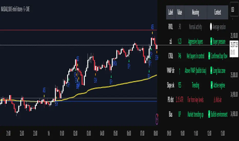
Institutional Orderflow Pro — VWAP, Delta, and Liquidity
Institutional Orderflow Pro is a next-generation order flow analysis indicator designed to help traders identify institutional participation, directional bias, and exhaustion zones in real time.
Unlike traditional volume-based indicators, it merges VWAP dynamics, cumulative delta, relative volume, and liquidity proximity into a single unified dashboard that updates tick-by-tick — without repainting.
The indicator is open-source, transparent, and educational. It aims to provide traders with a clearer read on who controls the market — buyers or sellers — and where liquidity lies.
The indicator combines multiple institutional-grade analytics into one framework:
RVOL (Relative Volume) = Compares current volume against the average of recent bars to identify strong institutional participation.
zΔ (Delta Z-Score) = Normalizes the buying/selling delta to reveal unusually aggressive market behavior.
CVDΔ (Cumulative Volume Delta Change) = Shows which side (buyers/sellers) is dominating this bar’s order flow.
VWAP Direction & Slope = Determines whether price is trading above/below VWAP and whether VWAP is trending or flat.
PD Distance (Prev Day Confluence) = Measures the current price’s distance from previous day’s high, low, close, and VWAP in ATR units — highlighting liquidity zones.
ABS/EXH Detection = Identifies institutional absorption and exhaustion patterns where momentum may reverse.
Bias Computation = Combines VWAP direction + slope to give a simplified regime signal: UP, DOWN, or FLAT.
All metrics are displayed through a color-coded, non-repainting HUD:
🟢 = bullish / favorable conditions
🔴 = bearish / weak conditions
⚫ = neutral / flat
🟡 = absorption (potential trap zone)
🟠 = exhaustion (momentum fading)
| Metric | Signal | Meaning |
| ---------------------- | ------- | ---------------------------------------------- |
| **RVOL ≥ 1.3** | 🟢 | High institutional activity — valid setup zone |
| **zΔ ≥ 1.2 / ≤ -1.2** | 🟢 / 🔴 | Unusual buy/sell aggression |
| **CVDΔ > 0** | 🟢 | Buyers dominate this bar |
| **VWAP dir ↑ / ↓** | 🟢 / 🔴 | Institutional bias long/short |
| **Slope ok = YES** | 🟢 | Trending market |
| **PD dist ≤ 0.35 ATR** | 🟢 | Near key liquidity zones |
| **Bias = UP/DOWN** | 🟢 / 🔴 | Trend-aligned environment |
| **ABS/EXH active** | 🟡 / 🟠 | Caution — possible reversal zone |
How to Use
Confirm Volume Context → RVOL > 1.2
Align with Bias → Take longs only when Bias = UP, shorts only when Bias = DOWN.
Check Slope and VWAP Dir → Ensure trending context (Slope = YES).
Confirm CVD and zΔ → Flow should agree with price direction.
Avoid ABS/EXH Triggers → These signal exhaustion or absorption by large players.
Enter Near PD Zones → Ideal trade zones are within 0.35 ATR of prior-day levels.
This multi-factor confirmation reduces noise and focuses only on high-probability institutional setups.
Originality
This script was written from scratch in Pine v6.
It does not reuse existing public indicators except for standard built-ins (ta.vwap, ta.atr, etc.).
The unique combination of delta z-scoring, VWAP slope filtering, and real-time confluence zones distinguishes it from typical orderflow tools or cumulative delta overlays.
The core innovation is its merged real-time HUD that integrates institutional metrics and natural-language feedback directly on the chart, allowing traders to read market context intuitively rather than decode multiple subplots.
Notes & Disclaimers
This indicator does not repaint.
It’s intended for educational and analytical purposes only — not as financial advice or a guaranteed signal system.
Works best on liquid instruments (Futures, Indices, FX majors).
Avoid non-standard chart types (Heikin Ashi, Renko, etc.) for accurate readings.
Open-source, modifiable, and compatible with Pine v6.
Recommended Use
Apply it with clean charts and standard candles for the best clarity.
Use alongside a basic structure or volume profile to contextualize institutional bias zones.
Author: Dhawal Ranka
Category - Orderflow / VWAP / Institutional Analysis
Version: Pine Script™ v6
License: Open Source (Educational Use)
Friday & Monday HighlighterFriday & Monday Institutional Range Marker — Know Where Big Firms Set the Trap!
🧠 Description
This indicator automatically highlights Friday and Monday sessions on your chart — days when institutional players and algorithmic firms (like Citadel, Jane Street, or Tower Research) quietly shape the upcoming week’s price structure.
🔍 Why Friday & Monday matter
Friday : Large institutions often book profits or hedge into the weekend. Their final-hour moves reveal the next week’s bias.
Monday : Big players rebuild positions, absorbing liquidity left behind by retail traders.
Together, these two days define the range traps and breakout zones that often control price action until midweek.
> In short, the Friday–Monday high and low often act as invisible walls — guiding scalpers, option sellers, and swing traders alike.
🧩 What this tool does
✅ Highlights Friday (red) and Monday (green) sessions
✅ Adds optional day labels above bars
✅ Works across all timeframes (best on 15min to 1hr charts)
✅ Helps you visually identify where institutions likely built their positions
Use it to quickly spot:
* Range boundaries that trap traders
* Gap zones likely to get filled
* High–low sweeps before reversals
⚙️ Recommended Use
1. Mark Friday’s high–low → Watch for liquidity sweeps on Monday.
2. When Monday holds above Friday’s high , breakout continuation is likely.
3. When Monday fails below Friday’s low , expect a reversal or trap.
4. Combine this with OI shifts, IV crush, and FII–DII flow data for confirmation.
⚠️ Disclaimer
This indicator is for **educational and analytical purposes only**.
It does **not constitute financial advice** or a trading signal.
Markets are dynamic — always perform your own research before trading or investing.

ICT Anchored Market Structures with Validation [LuxAlgo]The ICT Anchored Market Structures with Validation indicator is an advanced iteration of the original Pure-Price-Action-Structures tool, designed for price action traders.
It systematically tracks and validates key price action structures, distinguishing between true structural shifts/breaks and short-term sweeps to enhance trend and reversal analysis. The indicator automatically highlights structural points, confirms breakouts, identifies sweeps, and provides clear visual cues for short-term, intermediate-term, and long-term market structures.
A distinctive feature of this indicator is its exclusive reliance on price patterns. It does not depend on any user-defined input, ensuring that its analysis remains robust, objective, and uninfluenced by user bias, making it an effective tool for understanding market dynamics.
🔶 USAGE
Market structure is a cornerstone of price action analysis. This script automatically detects real-time market structures across short-term, intermediate-term, and long-term levels, simplifying trend analysis for traders. It assists in identifying both trend reversals and continuations with greater clarity.
Market structure shifts and breaks help traders identify changes in trend direction. A shift signals a potential reversal, often occurring when a swing high or low is breached, suggesting a transition in trend. A break, on the other hand, confirms the continuation of an established trend, reinforcing the current direction. Recognizing these shifts and breaks allows traders to anticipate price movement with greater accuracy.
It’s important to note that while a CHoCH may signal a potential trend reversal and a BoS suggests a continuation of the prevailing trend, neither guarantees a complete reversal or continuation. In some cases, CHoCH and BoS levels may act as liquidity zones or areas of consolidation rather than indicating a clear shift or continuation in market direction. The indicator’s validation component helps confirm whether the detected CHoCH and BoS are true breakouts or merely liquidity sweeps.
🔶 DETAILS
🔹 Market Structures
Market structures are derived from price action analysis, focusing on identifying key levels and patterns in the market. Swing point detection, a fundamental concept in ICT trading methodologies and teachings, plays a central role in this approach.
Swing points are automatically identified based exclusively on market movements, without requiring any user-defined input.
🔹 Utilizing Swing Points
Swing points are not identified in real-time as they form. Short-term swing points may appear with a delay of up to one bar, while the identification of intermediate and long-term swing points is entirely dependent on subsequent market movements. Importantly, this detection process is not influenced by any user-defined input, relying solely on pure price action. As a result, swing points are generally not intended for real-time trading scenarios.
Instead, traders often analyze historical swing points to understand market trends and identify potential entry and exit opportunities. By examining swing highs and lows, traders can:
Recognize Trends: Swing highs and lows provide insight into trend direction. Higher swing highs and higher swing lows signify an uptrend, while lower swing highs and lower swing lows indicate a downtrend.
Identify Support and Resistance Levels: Swing highs often act as resistance levels, referred to as Buyside Liquidity Levels in ICT terminology, while swing lows function as support levels, also known as Sellside Liquidity Levels. Traders can leverage these levels to plan their trade entries and exits.
Spot Reversal Patterns: Swing points can form key reversal patterns, such as double tops or bottoms, head and shoulders, and triangles. Recognizing these patterns can indicate potential trend reversals, enabling traders to adjust their strategies effectively.
Set Stop Loss and Take Profit Levels: In ICT teachings, swing levels represent price points with expected clusters of buy or sell orders. Traders can target these liquidity levels/pools for position accumulation or distribution, using swing points to define stop loss and take profit levels in their trades.
Overall, swing points provide valuable information about market dynamics and can assist traders in making more informed trading decisions.
🔹 Logic of Validation
The validation process in this script determines whether a detected market structure shift or break represents a confirmed breakout or a sweep.
The breakout is confirmed when the close price is significantly outside the deviation range of the last detected structural price. This deviation range is defined by the 17-period Average True Range (ATR), which creates a buffer around the detected market structure shift or break.
A sweep occurs when the price breaches the structural level within the deviation range but does not confirm a breakout. In this case, the label is updated to 'SWEEP.'
A visual box is created to represent the price range where the breakout or sweep occurs. If the validation process continues, the box is updated. This box visually highlights the price range involved in a sweep, helping traders identify liquidity events on the chart.
🔶 SETTINGS
The settings for Short-Term, Intermediate-Term, and Long-Term Structures are organized into groups, allowing users to customize swing points, market structures, and visual styles for each.
🔹 Structures
Swings and Size: Enables or disables the display of swing highs and lows, assigns icons to represent the structures, and adjusts the size of the icons.
Market Structures: Toggles the visibility of market structure lines.
Market Structure Validation: Enable or disable validation to distinguish true breakouts from liquidity sweeps.
Market Structure Labels: Displays or hides labels indicating the type of market structure.
Line Style and Width: Allows customization of the style and width of the lines representing market structures.
Swing and Line Colors: Provides options to adjust the colors of swing icons, market structure lines, and labels for better visualization.
🔶 RELATED SCRIPTS
Pure-Price-Action-Structures.
Market-Structures-(Intrabar).
CyberTradingV1.4 TRexCyberTradingV1.3 — Multi-TF Volatility/Structure + FVG Suite (by College Pips)
TL;DR
One utility to read volatility regime (ATR vs TH), map market structure & swings, and track FVG/CE imbalances—so you can gauge range, context and entries in one place. No signals or promises; it’s a contextual toolkit.
What it does
Volatility table (multi-TF): Shows ATR-style and TH proxies across 1m → Monthly, so you can compare current TF vs higher TFs.
Composite levels: LQC / GAM / Trigger / TRex quantify “how much is enough” for legs/impulses relative to the active TF.
Structure & swings: Validated swing highs/lows with optional time-anchored rectangles (height sized by LQC) and auto structure/diagonal lines.
Imbalances (FVG): Auto-detect UP/DOWN FVGs, extend forward, optional CE line; alerts fire on touches/entries/fills.
Candle sizing: Directional color map by fixed ATR-ratio buckets; Inside Bars are force-colored for clarity.
How components work together (mashup rationale)
Read regime with the table (ATR vs TH per TF).
Map structure with swings/lines to see HH/HL/LH/LL context.
Focus imbalances with FVG + optional CE; monitor with alerts.
Act with thresholds using LQC/GAM/Trigger/TRex to standardize expectations across symbols/TFs.
Method transparency
ATR/TH math: ATR is a smoothed multi-window blend; TH scales the daily range to TF via √time.
Composites: LQC ≈ √(ATR×TH) × C(TF); GAM2/3/4 and Trigger/TRex apply TF-specific scalars to min/max aggregates (see source for exact coefficients).
Multi-TF: Values come from request.security and finalize on higher-TF bar close (no look-ahead).
Swings: Confirmed using left/right strengths; labels are offset back to the pivot bar.
FVG/CE: Classic 3-bar definition; CE is the midpoint line. Boxes extend until touched/filled; optional auto-delete on fill.
Usage
Enable the table to gauge expansion/contraction.
Turn on swing rectangles for LQC-sized reaction zones.
Toggle FVG + CE on your execution TF; use alerts to catch re-entries/resolutions.
Combine with price action and your own trade plan.
Limitations & fair warnings (be honest)
Offsets/past plotting: Swing labels and rectangles are anchored to past bars (offset = -right_strength). They do not predict future bars.
Repainting notes: Swings confirm after right_strength bars; higher-TF values finalize on their close. Past markings can update as confirmations occur.
Tick handling: Uses syminfo.mintick (special cases for JPY/XAU/XAG). Validate on exotic symbols.
No promises: This is a context tool, not a buy/sell signal generator.
Alerts included
ABOVE/BELOW threshold: Price crossing CE or FVG bounds.
IOFED up/down: Price entering an FVG from above/below.
Inputs (high-level)
Layout/positioning, color palettes, swing rectangle styling (width/fill/border), detection strengths, label/line widths, FVG lookback, CE on/off & style, auto-delete filled boxes.
Credits & reuse
Concepts like FVG/CE are widely known in market-microstructure education.
This implementation—table architecture, LQC/GAM/Trigger framework, swing rectangles, candle bucketing, and alert logic—is original to College Pips / CyberTradingV1.4

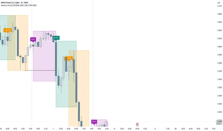
FOREXSOM Session Boxes (Local Time) — Asian, London & New YorkFOREXSOM Session Boxes (Local Time) highlights the three major Forex sessions — Asian, London, and New York — using your chart’s local timezone automatically.
This indicator helps traders visualize market structure, liquidity zones, and timing across global trading hours with accuracy and clarity.
Key Features
Automatically adjusts to your chart’s local timezone
Highlights Asian, London, and New York sessions with clean color zones
Works on all timeframes and asset classes
Ideal for Smart Money Concepts (SMC), ICT, and price action strategies
Helps identify range breakouts, session highs/lows, and liquidity grabs
How It Works
Each session box updates in real time to show the current range as the market develops.
The boxes reset at the end of each session, making it easy to compare volatility and liquidity shifts between regions.
Sessions (default times):
Asian: 17:00 – 03:00
London: 02:00 – 11:00
New York: 07:00 – 16:00
How to Use
Add the indicator to your chart.
Ensure your chart timezone matches your local time in chart settings.
Watch session ranges form and look for liquidity sweeps or breakouts between overlaps (London/New York).
Created by FOREXSOM
Empowering traders worldwide with precision-built tools for Smart Money and institutional trading education.
Smart Money Volume Activity [AlgoAlpha]🟠 OVERVIEW
This tool visualizes how Smart Money and Retail participants behave through lower-timeframe volume analysis. It detects volume spikes far beyond normal activity, classifies them as institutional or retail, and projects those zones as reactive levels. The script updates dynamically with each bar, showing when large players enter while tracking whether those events remain profitable. Each event is drawn as a horizontal line with bubble markers and summarized in a live P/L table comparing Smart Money versus Retail.
🟠 CONCEPTS
The core logic uses Z-score normalization on lower-timeframe volumes (like 5m inside a 1h chart). This lets the script detect statistically extreme bursts of buying or selling activity. It classifies each detected event as:
Smart Money — volume inside the candle body (suggesting hidden accumulation or distribution)
Retail — volume closing at bar extremes (suggesting chase entries or panic exits)
When new events appear, the script plots them as horizontal levels that persist until price interacts again. Each level acts as a potential reaction zone or liquidity footprint. The integrated P/L table then measures which class (Retail or Smart Money) is currently “winning” — comparing cumulative profitable versus losing volume.
🟠 FEATURES
Classifies flows into Smart Money or Retail based on candle-body context.
Displays live P/L comparison table for Smart vs Retail performance.
Alerts for each detected Smart or Retail buy/sell event.
🟠 USAGE
Setup : Add the script to any chart. Set Lower Timeframe Value (e.g., “5” for 5m) smaller than your main chart timeframe. The Period input controls how many bars are analyzed for the Z-score baseline. The Threshold (|Z|) decides how extreme a volume must be to plot a level.
Read the chart : Horizontal lines mark where heavy Smart or Retail volume occurred. Bright bubbles show the strongest events — their size reflects Z-score intensity. The on-chart table updates live: green cells show profitable flows, red cells show losing flows. A dominant green Smart Money row suggests institutions are currently controlling price.
See what others are doing :
Settings that matter : Raising Threshold (|Z|) filters noise, showing only large players. Increasing Period smooths results but reacts slower to new bursts. Use Show = “Both” for full comparison or isolate “Smart Money” / “Retail” to focus on one class.

Liquidity StatusKey Points
The Liquidity Status (LS) indicator is designed to directly monitor liquidity conditions and determine if they are Bullish or Bearish.
If conditions are bullish, the candle is painted green (or whichever color is chosen by you to represent bullish liquidity) and the expected price action is up.
If conditions are bearish, the candle is painted red (or whichever color is chosen by you to represent bearish liquidity) and the expected price action is down.
LS allows you to monitor for when traders are absorbing or supplying liquidity and in which direction the liquidity is flowing.
LS works on equities, cryptocurrencies, forex, options data, and futures.
Summary
The Liquidity Status (LS) indicator measures liquidity directly without relying on bid/ask spreads, order-book information, or any other traditional means. The benefit of this non-traditional approach is a novel and unique way to interpret and analyze liquidity in the market.
LS is designed to be as straightforward as possible: when conditions are bullish then the outlook is bullish and the candles are painted the bullish color (default: green), and when conditions are bearish then the outlook is bearish and the candles are painted the bearish color (default: red).
This means the candles are not colored based on their price movements but rather based on their liquidity status.
Additionally, LS indicates Liquidity Flow (LF) as well. LF indicates where the source of liquidity is or is moving towards: either towards the Ask (if the Bid is requiring liquidity then the liquidity source becomes the Ask), or towards the Bid (if the Ask is requiring liquidity then the liquidity source becomes the Bid). This can be helpful in early identification of trend changes.
The default settings are designed to be streamlined but the Settings section below outlines how to add additional information and detail to your charts if desired.
Examples
An example of LS on default setting:
With Full and Declarative reporting:
ES Futures:
Details
In the default settings, LS indicates if conditions are:
Bullish : meaning that current liquidity is bullish and so too are outlooks, or
Bearish: meaning that current liquidity is bearish and so too are outlooks.
There are additional data that are provided via LS, if toggled on (as described below). They include:
Aggressive Bid / Ask : This indicates that there is an aggressive trader present. Aggressive traders are large liquidity absorbers and are defined as having a sense of urgency in their trading that will cause them to go where-ever (whichever price) they can in order to transact. A classic Aggressive Bid, for instance, is a short-seller currently being squeezed.
Eager Bid / Ask : This indicates that there is an eager trader present. Eager traders are defined by their willingness to “cross the isle” in order to transact. For example, an eager bid will move to the ask in order to transact whereas an organic bid would not.
Organic Bid / Ask : This indicates that transactions are occurring at the organic traders. Organic traders are defined as having a large time-horizon and are value-seekers. For instance, an organic ask will likely move price up in order to sell high (the second part of buy low, sell high).
Additionally, LS indicates LF by specifying which party has the demand for liquidity and which has the supply for liquidity.
Flow to Ask : This indicates that the demand to transact is flowing to the ask (i.e.: the bid needs to transact more than the ask) and thus the ask is becoming the liquidity supplier.
Flow to Bid : This indicates that the demand to transact is flowing to the bid (i.e.: the ask needs to transact more than the bid) and thus the bid is becoming the liquidity supplier.
Neutral : No discernable difference in liquidity demand.
In combination, these signals can produce powerful measurements of underlying liquidity activity. For instance:
If LS indicates “At Organic Ask” and LF indicates “Flow to Ask” then this means that (1) transactions are predominantly occurring at or near the organic ask and (2) the organic ask is the dominate liquidity supplier. The consequence is likely substantial price appreciation (remember: the organic ask wants to sell high and now they are setting the terms and conditions of transacting!).
Example - How it started: transactions started to occur at the Organic Ask with Flow to Ask:
Example - How it ended:
Conversely, “At Organic Bid” and “Flow to Bid” indicates that transactions are predominantly occurring at or near the organic bid (who wants to buy low) and they the ones fulfilling the demand to transact coming from the ask. The expected outlook? Price depreciation as the organic bid lowers their orders to average down!
Example - How it started: transactions started to occur at Organic Bid with Flow to Bid:
Example - How it ended:
Lastly, LS (in combination with Liquidity Triggers) can identify moments of high-risk for bull and bear traps (see FAQ for details on how traps are found).
Example: Bear-Trap (with LT displayed)
Example: Bull-Trap (with LT displayed)
Customization
LS has many customization options available.
Sensitivity Mode
LS comes in a variety of sensitivities (for the nerds: adjusting the Sensitivity vs. Specificity), outlined below:
Aggressive : The Aggressive sensitivity mode puts LS in a state of hyper-awareness for anything that might indicate a change in overall liquidity status (i.e.: Bullish to Bearish or Bearish to Bullish) is underway. The benefit of the Aggressive mode is that it does not take much for LS to change its mind about current conditions. The trade-off, however, is increase in false alarms.
Balance : The balanced setting works to balance specificity (how right LS is) with sensitivity (how much chang it takes to convince LS to change its mind).
Conservative : The conservative setting is prone to change slower than both Aggressive and Balance but is intended to be more “certain” of the changes when they are indicated. This can lower the sensitivity (early entrances to trend-changes might be delayed slightly) in exchange for greater confidence in the future.
Diamond : This is the most specific and least sensitive option. Designed for when you only want LS to indicate a change with the strictest of criteria met.
Examples:
Aggressive LS:
Balanced LS:
Conservative LS:
Diamond LS:
LS Detail Amount
Controls how much detail and information you want displayed.
Simplified : Keeps messaging straightforward: Bearish or Bullish.
Full : Parsing the data for greater detail about if conditions are Strong or Weak. Produces candles and text output.
LS Reporting Style
Interpretive : Text output from LS is kept as either Bullish or Bearish.
Declarative : Additional information regarding if the transactions are being performed by an Aggressive, Eager or Organic trader.
LS Candle Replacement
In order to have LS produce candles colored by liquidity, the `LS Candle Replacement` option must be selected, along with deselecting the charts candle-making by going to Settings -> Symbol and de-selecting `Body`, `Border`, and `Wick`.
Otherwise, LS’ colors will be over-ridden by the chart.
Alerts
LS comes with several alerts to help keep track of changing liquidity conditions in the market. They include:
Is Bullish / Bearish : fires at the start of the candle if conditions are bullish/bearish.
Has Become Bullish / Bearish : Fires at the end of the candle if conditions have swapped (as compared to the previous candle).
Flow is to Ask / Bid : Fires at the start of the candle to indicate which direction liquidity is flowing via LF.
Flow Switch to Bid / Ask : Fires if there is a change in the LF from one to the other.
Suspected Bear Trap : Fires if a bear trap is detected.
Suspected Bear Trap Ended : Fires if an on-going bear-trap has ended.
Suspected Bull Trap : Fires if a bull trap is detected.
Suspected Bull Trap Ended : Fires if an on-going bull-trap has ended.
Frequently Asked Questions
How can I get access to LS?
Please see the Author’s Instructions for more information.
Where can I get more information on LS?
Please see the Author’s Instructions for more information.
I tried to add LS to my chart but nothing is showing.
That’s no good! Be sure that the indicator hasn’t errored out (if there is a small red dot next to its name then it has errored out). If it has, then try re-applying the indicator to your chart.
If there is no error indicated, and you still do not see anything it may be likely that the requested symbol either:
Doesn’t have sufficient data to calculate LS on, or
Lacks the data for LS to be calculated completed.
To check, try using LS on a smaller interval. If LS starts to populate, it is likely that the needed data is present but just not enough for the timeframe you were interested in. If there is no LS even when moving to lower intervals, then it may be that the specified underlying lacks the required data.
How come LS is saying things are Bearish but price is going up?
Sometimes that can happen! But until LS indicates bullish liquidity, the expectation is that price will fall back down.
How come LS is saying things are Bullish but price is going down?
Sometimes that can happen! But until LS indicates bearish liquidity, the expectation is that price will recover and continue moving on upwards.
How do you locate Bear and Bull traps?
LS has LT (Liquidity Triggers) baked into it for alerts and uses LT to compare expected conditions with real conditions. If LS and LT are mismatched then a trap is detected. The LT conditions checked are:
If LT is in a bull-stack : that means LT(144) > LT(377) > LT(610), or
If LT is in a bear-stack : that means LT(610) < LT(377) < LT(144)
Then once the stack is determined, if LS disagrees:
LS is indicating Bullish while LT is in a bear-stack, or
LS is indicating Bearish while LT is in a bull-stack
Then the alert is triggered (based off of LT’s orientation). This means:
If conditions are Bullish but LT is showing a Bearish stack, then a Bull Trap is detected, and
If conditions are Bearish but LT is showing a Bullish Stack, then a Bear Trap is detected.
I have questions and maybe a bug!
Please reach out and report! Please refer to the Author’s Instructions for more information on how to reach out.
Does LS get updates?
Yup! Improvements come relatively frequently and if you have any suggestions for improvements, please don’t hesitate to reach out.

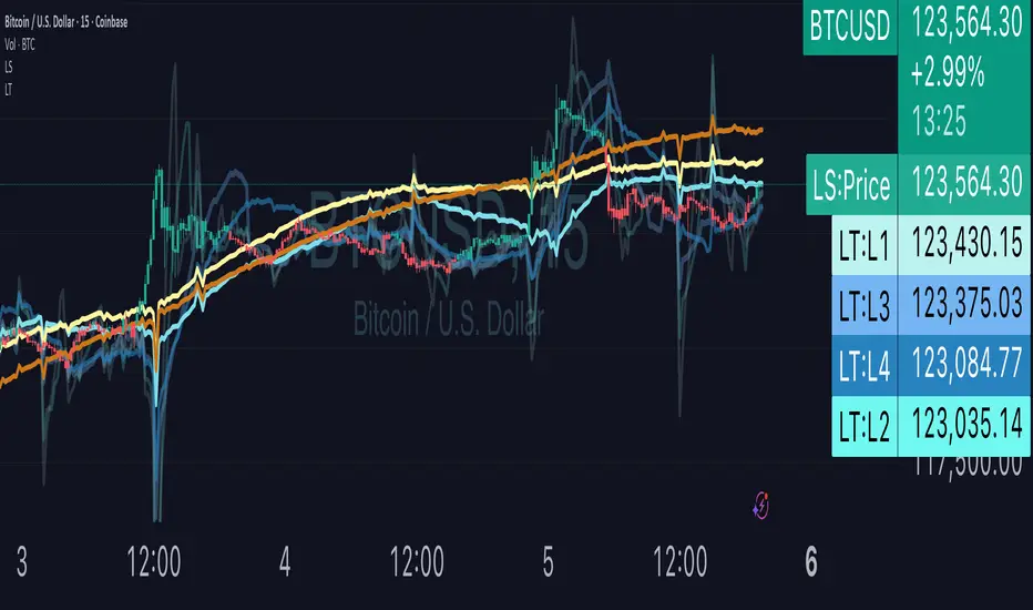
Liquidity TriggersKey Points
Liquidity Triggers indicate:
Where liquidity-derived support levels are.
Where liquidity-derived resistance levels are.
When a large price increase is approaching via the Rip Currents .
- When a large price decrease is approaching via the Dip Currents .
Summary
Liquidity Triggers are produced by measuring liquidity and determining where supportive liquidity and resistance-liquidity are. These trigger-levels designate price-points where breakouts, breakthroughs, and bounces are anticipated.
Liquidity Triggers are dynamic, and they constantly re-evaluate liquidity conditions to determine where the next group of sellers or buyers are that can fuel rapid changes in price movement, such as initiating a trend change or stalling price-action completely.
To use, simply apply to your chart and monitor for Supportive Liquidity Triggers (LTs that are below price) for bounces, and Resistance Liquidity Triggers (LTs that are above price) for rejections.
You can also set Alerts designed specifically around the Liquidity Triggers.
Examples
Example 1: A quick look at LT Resistances and Supports. When a LT is above spot, then it is considered a resistance. When LT is below spot, it is considered a support.
Example 2: LTs can indicate to us when an upcoming Rip Current (large price appreciation) or a Dip Current (large price depreciation) is starting.
Here is an example of a Rip Current:
And here is a Dip Current:
Details
Liquidity Triggers come with a default load-out that utilizes several pre-configured settings for quick and easy start-up.
Triggers
The default triggers are labeled LT-1 through LT-7, these correspond ` orders ` that describe which type of liquidity is monitored. The two groups of traders that are monitored are the ` Eager ` and the ` Organic `.
The default triggers use the Fibonacci sequence to adjust their orders in a standardized way.
Triggers 1, 2, 3, and 4 monitor the ` Eager ` traders (with default settings) while triggers 5, 6, and 7 monitor the ` Organic `traders.
Eager Triggers represent profit-takers and dip-buyers .
When the Eager Triggers are above the price, they are ` selling the rip `, and when the Eager Triggers are below price, they are ` buying the dip `. These moments indicate growing pressure for a reversal. Eager triggers are any trigger with an order of 89 or less .
Organic Triggers represent value-seekers with long-term goals. When they are below price, they are areas of support and tend to fuel bounces, while when organic triggers that are above price are areas of resistance and often provoke rejections. Organic triggers are any trigger with an order of 90 or more .
Here's an example showing the faint eager liquidity triggers above spot, indicating profit-taking and below spot after a price-dip indicating dip-buying .
Customization
There are additional settings and configurations available to the Liquidity Triggers indicator that help customize your view of liquidity.
Smoothing
Smoothing can be applied to the triggers for a more peaceful showing. The smoothing options are:
None - Default.
Exponential-Moving Average (EMA) : Ideal for when you want the most recent activity to take higher priority.
Simple-Moving Average (SMA) : Ideal for when you want a smoother appearance but do not want to change the data too much.
Weighted-Moving Average (WMA): Ideal for when you want the smoothing to increase as the trigger order increases.
Modified-Moving Average (RMA): Produces the most smooth data.
Here is an example of how smoothing can change the appearance of LTs for easier analysis for when things get complicated:
Modifying the Default Load-out
The default loadout attempts to balance having a wide view of the data without bringing too many lines or values into the picture that might be too noisy, but these values can be added to customize and expand your view if desired.
The Fib load-out has the options with t he default load-out being .
Feel free to mix and match and explore which views you prefer when analyzing liquidity.
For example, for the extreme data-heads, you can add LDPM twice on the chart to get all of the orders displayed at once:
Liquidity Triggers - Granular Triggers
The granular trigger can be toggled on (default: off) for when candle-specific liquidity measurements desired. They can help identify which specific candles have eager and aggressive traders attempting to move spot: the further away the granular trigger is from the candle, the more force is being applied!
Manual LTs
If you’re not satisfied with the default options for triggers, you can set your own with the Manual Liquidity Triggers option.
Time-Based LTs
Time-based liquidity triggers give you a view of support and resistance triggers based off of the time chosen, rather than by an order. This allows you to construct “weekly Liquidity-Triggers” or “hourly Liquidity Triggers” to analyze and compare against.
Note: If the timeframes are too far apart, you might get an error. For instance, putting a 1-week reference LT onto a 30-second chart may not work.
Liquidity-Triggers Data-Table
With the `Display Liquidity Trigger Statuses and Values` option, you can place a data-table on the chart that will display the time-based triggers, their values, and if they are above (bearish) or below (bullish) spot.
Alerts
When you set alerts, you can determine which order is used for determining `Is bullish`, `Is Bearish`, `Has Become Bullish`, `Has Become Bearish` alerts in the LT Alert Order setting.
Several LT alerts are available to set:
Is Bullish / Bearish: these are designed to analyze conditions at the end of the candle and if spot is above the alert-trigger, then an alert is sent out that conditions are bullish, and if spot is below the alert-trigger, then an alert is sent out if conditions are bearish.
Has Become Bullish / Bearish: designed to analyze conditions at the start of a candle and determine if a change has occurred (a LT cross-over).
Suspected Rip Current: these are designed to alert you when a suspected upwards rip in price is underway, as characterized by all LT triggers moving rapidly down away from spot.
Suspected Dip Current: these are designed to alert you when a suspected downwards rip in price is underway, as characterized by all LT triggers moving rapidly up and above, away from spot.
These alerts can then be put into a webhook for external processing if desired.
Frequently Asked Questions
How can I gain access to LT?
Check out the Author's Instructions section below.
Where can I get more information?
Check out the Author's Instructions section below for how to obtain more information.
I tried to add LT to my chart but it produced an error.
Sometimes this happens but no worries. Just change the chart's interval to a different time and then back, the indicator should re-load. If that fails, try removing it completely and re-applying it.
Is it normal for LTs to have different values on different timeframes?
Yup! Think of each time-interval as a different "zoom" of the market. Imagine you are taking a picture of the ocean to figure out the direction of water movement. If you take the picture from space, you will see big general trends but if you take the photo from your boat in the harbor, you're going to get specific data about that area. That's how LT works!
The view of the liquidity depends on the "zoom-age" (the chart's interval) used when taking the photo.
I think there is an issue with the alerts - what should I do?
This is not ideal! If this happens, please reach out via the contact information in the Author's Instructions section below with the following details:
What symbol?
What timeframe?
Which alert?
When did the alert occur?
Can I attach the alerts to webhooks?
Yup! Be sure to check out TV's guide on webhooks ( T.V. Guide to Alerts ) for how to get started.
Does LT receive updates?
Yup! If a bug or issue is found, an update is pushed out. You will be notified when this occurs and it is highly recommended that you replace all charts with LT on them with the new version as the updates go out.
Yen Carry Composite Index + Macro Flow GaugeWhat This Indicator Does
This chart visualizes the strength, trend, and macro conditions supporting or weakening the yen carry trade a strategy where investors borrow in low yielding yen to invest in higher yielding assets
How It Works: Core Components
Composite Index (Blue Line):
A weighted blend of z-scores from:
USD/JPY (strength of USD vs JPY)
10Y yield spread (US – Japan)
AUD/JPY (risk proxy for carry appetite)
VIX (global risk sentiment, inverted)
Z-scores normalize each input to show how far it deviates from recent history (not raw values).
Positive composite trend ⬅️ strong carry environment
Negative composite trend ➡️ signs of unwind or stress
Individual Z-Score Lines:
🟥 USD/JPY
🟩 Yield Spread (US10Y − JP10Y)
🟪 FX Proxy (AUD/JPY)
🟦 VIX (risk sentiment)
Threshold Lines & Signal Markers:
Green 🟢⬅️🟢🟢 “carry active” threshold (+1.5 std dev)
Red dashed line 🔴➡️🔴🔴→ “carry unwind risk” (−1.5 std dev)
Carry Trade Strength Gauge (Horizontal Bar, Bottom-Right) www.tradingview.com
Slots:
🟢 = strong carry inflow conditions
⚪ = neutral midpoint
🔴 = outflow / unwind pressure
A directional arrow (⬅️ or ➡️) shows momentum:
➡️ = composite rising → improving carry environment
⬅️ = composite falling → deteriorating carry conditions
Arrow is placed at the current strength level, visually combining position + momentum
Labels “Inflows” and “Outflows” flank the bar for clarity
Use Case Summary
Macro risk overlay for JPY pairs, EM FX, bond carry strategies
Detect early unwind phases (e.g. if arrow ⬅️ appears in red zone)
Confirm entry/exit in directional JPY trades or expected liquidity to enter the markets

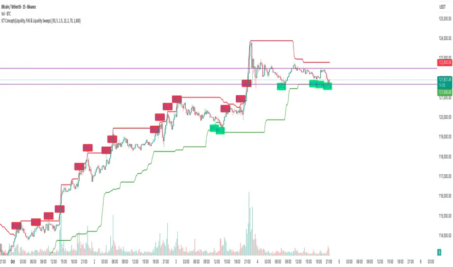
ICT Concepts(Liquidity, FVG & Liquidity Sweeps)📄 Description:
A Smart Money Concept (SMC)-based utility that blends ICT-style Liquidity Sweeps, Fair Value Gap (FVG) mapping, and Swing Structure proxies – designed for traders seeking clean precision in price imbalance analysis.
⸻
🔍 1. What This Script Does
T his indicator brings together three core Institutional Concepts:
• Liquidity Sweep Detection : Identifies buy/sell-side liquidity grabs (fakeouts) confirmed by volume spikes – a common precursor to institutional order flow shifts.
• Fair Value Gaps (FVGs) : Highlights inefficiencies between price legs using strict ICT-style 3-candle or gap-based rules. These are areas institutions often revisit.
• Swing Structure Proxy (OB Mapping) : Tracks dynamic swing highs/lows to act as proxy zones for potential order blocks and structural boundaries.
It also includes a cooldown-based signal filtering engine to prevent overfitting and noise, helping traders avoid false positives in choppy markets.
⚙️ 2. How It Works (Core Logic)
✅ A. Liquidity Sweep Engine
• Looks back N bars to find Equal Highs or Equal Lows.
• Triggers a signal only if price sweeps the level and closes on the other side with a volume spike.
• Customizable volume threshold (e.g., 1.5x average volume).
• Includes a signal cooldown period to reduce clutter and boost quality.
Bullish Sweep = Price dips below equal lows but closes higher
Bearish Sweep = Price spikes above equal highs but closes lower
Visuals: Signal arrows with alerts (BUY LQ / SELL LQ)
⸻
✅ B. Fair Value Gap (FVG) Zones
• Detects FVGs using:
• Sequential logic: Low > High (bullish), High < Low (bearish)
• Gap logic: Open gaps at bar open
• Dynamic box drawing:
• Automatically extends FVG zones until price fully closes through them.
• Different color coding for bullish (teal) and bearish (orange) gaps.
• Customizable:
• Opacity control
• Option to include/exclude gap-based FVGs
• Hide filled zones
• Limit total zones rendered (for performance)
⸻
✅ C. Swing High/Low Structure
• Uses a lookback period to find latest swing high/low levels.
• Acts as a proxy for Order Block zones or structural shift reference points.
• Plotted as red (high) and green (low) lines.
⸻
🚀 3. How to Use It
• Scalpers and Intraday Traders can use Liquidity Sweep + FVG Confluence to time reversals or catch early entries into trend continuation moves.
• Swing Traders can observe swing OB proxies and recent FVG zones to frame directional bias and target zones.
• Volume-Aware Traders benefit from the volume filter that confirms sweeps are meaningful – not just random stop hunts.
🔔 Set alerts on:
• Bullish Liquidity Sweeps
• Bearish Liquidity Sweeps
You can use this in combination with your own trend filters, or even confluence it with Order Blocks, VWAP, or EMA trend tools.
⸻
💡 What Makes It Original?
• The script doesn’t merely combine standard tools — it builds a cohesive ICT-style detection system using:
• A custom volume-confirmed liquidity sweep filter
• Dynamic FVG rendering with filled logic + performance optimization
• Visual hierarchy to avoid clutter: clean line plots, contextual boxes, and conditional signals
• Highly customizable yet lightweight, making it suitable for fast-paced decision making.
⸻
✅ Notes
• Invite-only script for serious traders interested in Smart Money and ICT concepts.
• Does not repaint signals.
• All visuals are dynamically managed for clarity and performance.
Anchored Session Volume Profile • Heatmap Profiles • Asia/EU/US Description
This indicator builds Anchored Session Volume Profiles for Asia, EU, and US sessions on intraday charts and renders them as right-docked line histograms (heatmap or classic style). Each session computes its own POC, VAH, VAL and optional Session High/Low lines. An optional per-price-bin Delta overlay estimates buy/sell pressure inside the profile rows for quick order-flow context.
What’s unique
Three independent session anchors (Asia/EU/US) with custom start/end times, bin size in ticks, and Value Area %.
Right-fixed live rendering or post-close persistence (draw levels only after the session closes).
Adaptive width: profile width scales with elapsed session length (anchor → now/end) within user limits.
Heatmap profile: row tint scales by relative volume; or Classic single-color with optional gradient.
Per-row Delta ticks (outside/inside, configurable direction) derived from bar delta and overlap with each price bin.
Clean POC/VAH/VAL line styling, optional ray extension, and Session High/Low rays per session.
How it works (technical)
Binning: Rows are built with a user-defined bin height in ticks. Arrays expand/shrink as price extends; the base is shifted when new lows appear to keep bins aligned.
Accumulation: For each bar within the active session window, traded volume is distributed to intersecting bins proportionally to the price overlap with that bin.
Value Area: POC is the highest-volume bin. VA is grown symmetrically around the POC until the selected coverage (VA%) is reached.
Delta per bin (optional): A bar-level delta proxy volume * (close − open) / range (clamped) is split into buy/sell and allocated to bins proportionally to the same overlap share, producing a per-row delta magnitude for rendering ticks.
Rendering modes:
Right fixed: refreshes each bar; lines/histogram are docked at the anchor X-position.
Draw Levels after Session Close: on close, only POC/VAH/VAL (and optional Session High/Low) are persisted.
No lookahead: All computations use confirmed bars; levels are deterministic on close.
How to use
Use the Asia/EU/US profiles to read participation hand-offs and session-driven rotations.
Trade off POC/VAH/VAL as acceptance/rejection references; confluence with session High/Low often marks responsive flows.
Employ Delta ticks per row to spot absorption, one-sided stacking, or fading participation inside the profile without leaving TradingView.
Prefer right-fixed during live trading and post-close when you want persistent session levels.
Key settings
General per session: Start/End (hh:mm), Bin size (ticks), Value Area %, toggle POC/VAH/VAL lines.
Rendering: Heatmap vs. Classic, orientation (Left/Right), gradient on/off, row thickness, right offset, adaptive width limits.
Delta (per price bin): global on/off, per-session on/off, tick width, max tick length (bars), outside/inside placement, direction (sign-based / always left / always right), colors.
Levels: POC/VAH/VAL styles (solid/dashed/dotted), widths, colors, extend right (ray).
Session High/Low: per-session on/off, style, width, colors, optional right-ray extension.
Notes & limitations
Designed for intraday data; accuracy depends on the feed’s volume granularity.
Large histories + small bins + delta ticks can be heavy; tune bin size, adaptive width, and delta max length for performance.
Timezone for anchors is set internally to Europe/Berlin.
Educational tool — not a signal generator.
Disclaimer
For educational and informational purposes only. Not financial advice.

Liquidity Zones - Joe v1This script lets you plot liquidity/order levels (similar to what you see on Bookmap) directly on your TradingView chart.
It is designed to help traders spot support/resistance levels where large limit orders sit and to visualize whether those liquidity pools are still active, already taken, or being replenished.
Key Features
Session-based
Works during a defined trading session.
Resets automatically at the first bar of the session.
Up to 8 Liquidity Zones, each of which includes:
Price level
Size (affects line thickness)
Status (Active, Taken, Re-Stocking, or Automatic).
Zone Statuses
Active → Untouched liquidity (potential support/resistance).
Taken → Liquidity consumed after price trades through it.
Re-Stocking → Level is being reloaded with fresh orders.
Automatic → Updates dynamically (switches to Taken when crossed, otherwise stays Active).
Visual Representation
Zones are drawn as horizontal lines.
Labels show price + size (e.g., 4010 (200k)).
Customizable line styles and colors:
Active = solid red
Taken = gray dashed
Re-Stocking = purple dotted
Dynamic Updates
Levels automatically update during the session.
If price crosses a zone → it’s marked as Taken.
Labels, line styles, and colors adjust live.
Line thickness = zone size ÷ 10 → visually represents liquidity strength.
How this indicator is Used
Upon market open, the order book tends to fill with limit orders. Using Bookmap, you can see where these orders are placed at each relative price point, along with their sizes. The most important ones to focus on are the larger levels, which are typically highlighted in reddish tones (depending on your Bookmap settings).
I then manually enter these levels into this indicator. It only takes a few seconds, and since there’s no direct way to connect TradingView to Bookmap, this method works as an effective workaround. Once entered, the levels will stay visible on your TradingView chart.
This seemingly simple script is very powerful and provides a strong edge. More often than not, price action gravitates toward these larger liquidity levels. Remember, the price of a security is influenced by market makers whose role is to fill orders and earn commissions on transactions. They have little interest in arbitrarily pushing price higher or lower; instead, their primary function is to guide price toward liquidity—where the large orders sit.
Of course, this is a general principle, and many other variables can affect price movement. Still, by keeping this concept in mind, you’ll often find yourself on the right side of the market.

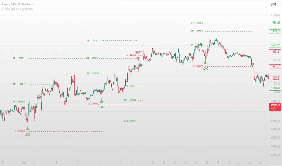
Liquidity Grab Strategy SuvorovLiquidity grab strategy
Description:
This indicator is built around the Liquidity Grab Strategy, which identifies and reacts to stop hunts and false breakouts at key swing highs and lows. It detects where liquidity is likely to be resting (e.g., above highs or below lows) and provides trade signals when that liquidity is taken and price begins to reverse.
Core Features:
Liquidity Detection: Automatically identifies and marks key swing highs and lows where stop-losses are likely to accumulate.
Entry Signals: Generates BUY/SELL signals after a liquidity sweep and a confirmed reversal — based on price action, volume, or structure shifts.
Stop Loss & Take Profit Zones: Visualizes stop-loss just beyond the liquidity wick and take-profit near the next major structure point, with configurable Risk/Reward ratios.
False Signal Filters: Optional filters based on volume spikes, RSI divergence, or market structure confirmation.
Multi-Timeframe Logic: Supports separate timeframes for structure detection and signal confirmation (e.g., structure on 1H, entry on 5m).
Maple Liquidity Hunter📌 Description for Maple Liquidity Hunter
Maple Liquidity Hunter – AI-Enhanced Volume Liquidity Detector
Maple Liquidity Hunter is an advanced volume-based indicator designed to uncover hidden liquidity zones in the market.
By dynamically analyzing price–volume interactions, it automatically highlights momentum shifts with adaptive color coding.
✨ Key Features
AI-inspired volume/price analysis model
Detects liquidity surges and potential absorption points
Auto-coloring of volume bars for quick visual recognition
Optional volume moving average filter for trend context
⚠️ Disclaimer: This tool is for educational and research purposes only. It does not guarantee future results. Always test thoroughly before live trading.

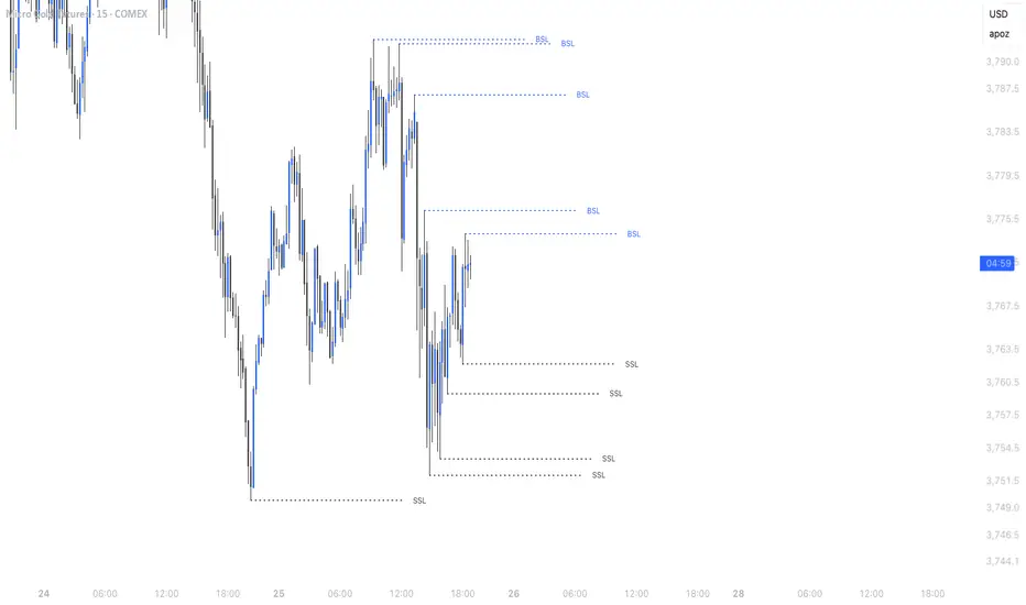
Simple Liquidity Sweep [rare_gold_steak]- Shows when the liquidity was swept.
- Shows BSL and SSL.
- Simple options to change styling.
I use it personally and some people liked it so I thought i'll share it with the public.
Estimated Manipulation Movement Signal [AlgoPoint]Follow the Footprints of Whale Movements That Drive the Market
Overview
The market is not always driven by natural supply and demand. Large players—often called "whales" or institutions—can create artificial price movements to trigger stop-losses, induce panic or FOMO, and build their large positions at favorable prices. These events are known as "stop hunts" or "liquidity grabs."
The EMMS indicator is a specialized tool designed to detect these specific moments of potential market manipulation. It does not follow trends in a traditional sense; instead, it identifies high-probability reversal points created by the calculated actions of Smart Money trapping other market participants.
How It Works: The 3-Module Logic
The indicator uses a multi-stage confirmation process to identify a potential stop hunt:
1. Anomaly Detection: The engine first scans the chart for "Anomaly Candles." These are candles with unusually high volume and a very long wick relative to their body. This combination signals a sudden, forceful, and potentially unnatural price push.
2. Liquidity Zone Detection: The indicator automatically identifies and tracks recent significant swing highs and lows. These levels are considered "Liquidity Zones" because they are areas where a large number of stop-loss orders are likely clustered. These are the "hunting grounds" for whales.
3. The Stop Hunt Signal: A final signal is generated only when these two events align in a specific sequence:
An Anomaly Candle (high volume, long wick) spikes through a previously identified Liquidity Zone.
The same candle then reverses, closing back inside the previous price range.
This sequence confirms that the move was likely a "trap" designed to engineer liquidity, and a reversal in the opposite direction is now highly probable.
How to Interpret & Use This Indicator
BUY Signal: A BUY signal appears after a sharp price drop that pierces a recent swing low (taking out the stops of long positions) and then aggressively reverses to close higher. This suggests that Smart Money has absorbed the panic selling they just induced. The signal indicates a potential move UP.
SELL Signal: A SELL signal appears after a sharp price spike that pierces a recent swing high (taking out the stops of short positions) and then aggressively reverses to close lower. This suggests that Smart Money has sold into the FOMO buying they just created. The signal indicates a potential move DOWN.
This indicator is best used as a high-probability confirmation tool, ideally in conjunction with your understanding of the overall market trend and structure.

⚪ Liquidity Spike Marker
Description:
The Liquidity Spike Marker indicator helps to identify abnormal bursts of liquidity in the market. The logic is based on comparing the product of the volume by the minimum candle price (Volume × Low) with the threshold value set by the user.
When the value exceeds the threshold, a white triangle appears under the candle, indicating a possible influx of liquidity. This can help traders pay attention to the key points where large participants may enter the market.
Features:
Displays a placemark (⚪ white triangle) when the threshold is exceeded.
Configurable parameter Volume × Low Threshold.
The ability to set an alert for automatic notification.
A lightweight and minimalistic tool without unnecessary elements.
Note: The indicator is not a trading recommendation. Use it in combination with your own trading system and other analysis methods.

VWAP + Range Breakout (Pre-Signal for Manual Entry)WHAT IT DOES
This tool highlights potential breakout opportunities when price sweeps the previous day’s high or low and aligns with VWAP and short-term range levels. It provides both pre-signals (early warnings) and confirmed signals (breakout closed) so traders can prepare before momentum accelerates.
Works on all timeframes and across markets (indices, forex, crypto). Especially useful during active London and New York sessions.
---
KEY FEATURES
Daily sweep logic: previous day high/low as liquidity reference
VWAP with cumulative calculation
Adjustable range breakout levels
Optional SMA trend filter
Session filter (London / NY trading hours)
Pre-Signal markers (early alert before breakout)
Confirmed LONG/SHORT signals after breakout close
Alerts for Pre-Long, Pre-Short, and Confirmed entries
---
HOW TO USE
1. Wait for price to sweep the previous day high/low.
2. Look for alignment with VWAP and the defined range breakout levels.
3. Use trend/session filters for higher accuracy.
4. Combine with your own risk management rules.
---
SETTINGS TIPS
Adjust range lookback for different timeframes (shorter for fast intraday, longer for higher timeframes).
Enable/disable session filters depending on your market.
Use SMA trend filter to stay aligned with higher-timeframe bias.
---
WHO IT’S FOR
Scalpers, intraday, and swing traders who want early signals when liquidity is taken and price is preparing for a breakout.
---
NOTES
For educational purposes only. No financial advice.
This script is open-source; redistribution follows TradingView rules.
ICT Turtle Soup (Riz)The ICT Turtle Soup Complete System is an advanced implementation of the Inner Circle Trader's interpretation of the classic Turtle Soup pattern, designed to identify and trade liquidity sweeps at key market levels. This strategy capitalizes on the systematic stop-loss hunting behavior of institutional traders by detecting when price temporarily breaches significant support/resistance levels to trigger retail stop-losses, then quickly reverses direction.
Core Trading Logic
Liquidity Sweep Detection Method
The strategy monitors five critical liquidity pools where retail traders commonly place stop-loss orders:
⦁ Yesterday's High/Low: Previous daily session extremes
⦁ Daily High/Low: Rolling 20-day period extremes
⦁ 4-Hour High/Low: 30-period extremes on 4H timeframe
⦁ 1-Hour High/Low: 50-period extremes on hourly timeframe
⦁ Recent High/Low: Current timeframe extremes (20-40 bars based on trading mode)
Entry Signal Generation Process
Buy Signal (Sell-Side Liquidity Sweep):
1. Price penetrates below a key support level by a minimum threshold (5-15 ticks depending on signal quality settings)
2. The penetration bar must show strong rejection with at least 30-50% of the candle's range closing back above the swept level
3. Multi-timeframe confirmation checks for structure shift on lower timeframe (break of recent swing high)
4. Confluence scoring system evaluates 7 factors, requiring minimum 3 confirmations:
⦁ Liquidity sweep detected (weighted 2x)
⦁ Higher timeframe bullish market structure
⦁ Lower timeframe bullish break of structure
⦁ Bullish Fair Value Gap presence
⦁ Bullish Order Block formation
⦁ ICT Kill Zone timing alignment
Sell Signal (Buy-Side Liquidity Sweep):
Mirror opposite of buy signal logic, detecting sweeps above resistance levels with bearish rejection.
Risk Management & Position Sizing
Stop Loss Placement:
⦁ Calculated using ATR (Average True Range) multiplied by an adaptive factor
⦁ Base multipliers: Scalping (1.0x), Day Trading (1.5x), Swing Trading (2.0x)
⦁ Further adjusted by signal quality: Conservative (-20%), Balanced (0%), Aggressive (+20%)
⦁ Positioned beyond the liquidity sweep point to avoid re-sweeping
Take Profit Targets:
⦁ TP1: 2.0R (Risk-Reward ratio)
⦁ TP2: 3.5R
⦁ TP3: 5.0R
⦁ All levels rounded to tick precision for accurate order placement
Advanced Features & Filters
Multi-Timeframe Structure Analysis
The system performs top-down analysis across three timeframes:
⦁ Higher Timeframe (HTF): Determines primary trend bias
⦁ Medium Timeframe (MTF): Confirms intermediate structure
⦁ Lower Timeframe (LTF): Identifies precise entry triggers
ICT Kill Zones
Incorporates time-based filtering for optimal trading sessions:
⦁ Asian Session (8PM-12AM UTC)
⦁ London Session (2AM-5AM UTC)
⦁ New York Session (7AM-10AM UTC)
⦁ London Close (10AM-12PM UTC)
Smart Money Concepts Integration
⦁ Fair Value Gaps (FVG): Identifies and displays price inefficiencies that act as magnets
⦁ Order Blocks: Marks institutional accumulation/distribution zones
⦁ Mitigation Detection: Automatically removes FVGs and Order Blocks when price fills them
⦁ Duplicate Sweep Prevention: 10-bar lookback prevents multiple signals at same level
Adaptive Trading Modes
Three pre-configured modes automatically adjust all parameters:
⦁ Scalping: Tight stops, quick targets, 15-minute to 1-hour focus
⦁ Day Trading: Balanced approach, 4-hour to daily analysis
⦁ Swing Trading: Wide stops, extended targets, daily to weekly perspective
⦁ Custom Mode: Full manual control of all parameters
Signal Quality Management
⦁ Conservative: Requires 5/7 confluence factors, tighter sweep threshold (5 ticks), 50% minimum rejection
⦁ Balanced: Standard 3/7 confluence, moderate threshold (10 ticks), 30% rejection
⦁ Aggressive: Only 2/7 confluence needed, wider threshold (15 ticks), 20% rejection
Visual Components & Dashboard
Real-Time Information Panel
Displays current market conditions including:
⦁ Active trading mode and quality settings
⦁ Timeframe configuration (HTF/MTF/LTF)
⦁ Market bias from higher timeframes
⦁ Current kill zone status
⦁ Liquidity sweep detection status
⦁ Confluence scoring for both directions
⦁ Risk parameters and targets
Trade Visualization
⦁ Entry, stop-loss, and three take-profit levels with precise price labels
⦁ Automatic cleanup when targets are hit or new signals appear
⦁ Maximum of one active setup displayed for chart clarity
⦁ Color-coded boxes for Fair Value Gaps and Order Blocks
How to Use This Indicator
Recommended Timeframes
⦁ Scalping Mode: 1-minute to 5-minute charts
⦁ Day Trading Mode: 5-minute to 15-minute charts
⦁ Swing Trading Mode: 1-hour to 4-hour charts
Optimal Market Conditions
⦁ Works best in ranging or trending markets with clear support/resistance levels
⦁ Most effective during high-liquidity sessions (London/New York overlap)
⦁ Avoid using during major news events unless specifically targeting news-driven sweeps
Signal Interpretation
1. Wait for triangle signal (up/down) with confluence score
2. Verify the swept level shown in the dashboard
3. Confirm risk-reward ratios match your trading plan
4. Enter at market or set limit order at indicated entry level
5. Place stop-loss and take-profit orders at displayed levels
Customization Tips
⦁ Adjust Signal Quality based on market volatility (Conservative for volatile, Aggressive for quiet)
⦁ Modify sweep threshold if getting too many/few signals
⦁ Toggle individual liquidity levels based on their relevance to your timeframe
⦁ Use Kill Zone filter for session-specific trading
Risk Disclaimer
This indicator identifies potential trade setups based on liquidity sweep patterns but does not guarantee profitable outcomes. Past performance does not indicate future results. Always use proper risk management and never risk more than you can afford to lose. The indicator should be used as part of a comprehensive trading plan that includes your own analysis and risk tolerance assessment.
