Fractal Support & Resistance [JOAT]
Fractal Support & Resistance — Automatic Level Detection with Volume Weighting
Fractal Support & Resistance automatically identifies key price levels using a proprietary combination of fractal detection, volume analysis, and dynamic touch counting. Levels are intelligently styled based on their strength and how many times they have been tested, giving you instant visual feedback on level importance.
Why This Script is Protected
This script is published as closed-source to protect the proprietary level management algorithm and the unique volume-weighted strength calculation methodology from unauthorized republishing. The specific implementation of touch detection, level merging logic, and dynamic opacity calculations represents original work that differentiates this from standard fractal indicators.
What Makes This Indicator Unique
Unlike basic fractal indicators that simply mark pivot points, this system:
Tracks how many times each level has been tested (touch counting)
Weights level importance by volume at the fractal point
Merges nearby fractals into single levels instead of cluttering the chart
Dynamically adjusts visual opacity based on level strength
Provides zone boxes around levels for realistic price reaction areas
What This Indicator Does
Detects fractal pivot highs and lows to establish support and resistance levels
Tracks how many times each level has been touched or tested
Weights level importance by volume at the fractal point
Draws extending lines and zone boxes for each level
Dynamically adjusts level opacity based on touch count for visual strength indication
Provides a dashboard with nearest levels and counts
Core Methodology
The indicator uses Williams Fractal concepts as a foundation but extends them with proprietary enhancements:
Fractal Detection — Identifies pivot highs and lows where price creates local extremes with confirmation bars on each side. A fractal high requires the highest point with lower highs on both sides; a fractal low requires the lowest point with higher lows on both sides.
Level Clustering — New fractals within a tolerance zone (based on Zone Padding %) update existing levels rather than creating duplicates. This keeps the chart clean and focuses on significant price areas.
Volume Integration — Volume at each fractal point is accumulated to weight level significance. Higher volume fractals are considered more important.
Touch Tracking — The system monitors when price approaches existing levels and increments touch counts. More touches indicate stronger, more significant levels.
Visual Strength System
Level appearance changes dynamically based on market interaction:
Newer or less-tested levels appear more transparent (up to 80% transparency)
Each additional touch reduces transparency by 15%
Heavily tested levels become more prominent and opaque (minimum 20% transparency)
Labels display level number and touch count (e.g., "R1 (3)" = Resistance 1 with 3 touches)
Zone boxes provide visual areas around each level
Color Scheme
Resistance Color — Default: #FF5252 (red) — Used for resistance levels and zones
Support Color — Default: #4CAF50 (green) — Used for support levels and zones
Zone Fill — 90% transparent version of level color
Zone Border — 70% transparent version of level color
Labels — 30% transparent background with white text
Dashboard Information
The on-chart table (bottom-left corner) displays:
Number of active resistance levels meeting minimum touch requirement
Number of active support levels meeting minimum touch requirement
Nearest resistance level above current price
Nearest support level below current price
Inputs Overview
Fractal Settings:
Fractal Period — Bars on each side for fractal confirmation (default: 2, range: 1-10)
Max Levels Per Side — Maximum resistance and support levels to track (default: 5, range: 1-20)
Zone Padding (%) — Level zone width as percentage of price (default: 0.2%, range: 0-2%)
Filtering:
Volume Weight Levels — Toggle volume-weighted level importance (default: on)
Min Touches to Show — Filter out levels with fewer touches (default: 1, range: 1-10)
Lookback Period — Historical bars to analyze for level detection (default: 200, range: 50-500)
Visual Settings:
Resistance/Support Colors — Customizable color scheme
Show Zone Boxes — Toggle filled zone areas around levels
Show Level Labels — Toggle level labels with touch counts
Show Fractal Markers — Toggle small triangles at fractal points
Show Dashboard — Toggle the information table
Line Width — Thickness of level lines (default: 2, range: 1-5)
How to Use It
For Support/Resistance Trading:
Use levels with higher touch counts as stronger support/resistance references
More opaque levels have been tested more times and are more significant
Watch for price reactions at zone boundaries, not just exact level prices
Combine with candlestick patterns at levels for entry signals
For Breakout Trading:
Watch for breakouts when price closes beyond a level
Levels with many touches that finally break often produce strong moves
Use the zone box—a close beyond the zone is more significant than just touching the level
Set alerts for resistance/support breaks
For Target Setting:
Use the nearest resistance as a profit target for long positions
Use the nearest support as a profit target for short positions
Dashboard shows these levels for quick reference
Alerts Available
FSR Resistance Break — Price closes above a resistance level
FSR Support Break — Price closes below a support level
FSR New Fractal High — Fresh fractal high detected
FSR New Fractal Low — Fresh fractal low detected
Best Practices
Increase Fractal Period for fewer but more significant levels
Use Min Touches filter to show only well-tested levels
Volume weighting helps identify institutionally significant levels
Combine with trend indicators—trade with the trend at levels
This indicator is provided for educational purposes. It does not constitute financial advice. Past performance does not guarantee future results. Always conduct your own analysis and use proper risk management before making trading decisions.
— Made with passion by officialjackofalltrades
Multitimeframe
C2 HTF Detection CRT [MarioLeb]What This Indicator Does:
1. Detects "C2 Sweeps" - Price retesting previous highs/lows then closing back inside the range.
2. Shows HTF Structure - Marks High Timeframe support/resistance zones (C1 ranges).
3. Finds Multi-Timeframe Confluence - When HTF and LTF C2 signals align at same levels.
4. Highlights CRT Cycles - Complete market cycles (C1→C2→C3 pattern).
Visual Output:
Horizontal lines = C2 sweep levels
Colored zones = C1 ranges (key areas)
Yellow line = 50% level of C1 range
Boxes = CRT cycles (if enabled)
CISD lines = Change in supply/demand confirmation
Purpose:
Identify where higher timeframe structure meets lower timeframe precision - shows where big moves often start.
Alert Features:
Automated Alerts trigger when:
HTF C2 Detected - "Bullish/Bearish HTF C2 Detected on "
CRT Cycle Complete - "Bullish/Bearish CRT Cycle Detected on "
CISD Confirmed - "HTF CISD Confirmed on "
LTF C2 Detected - "Bullish/Bearish LTF C2 vs HTF C1 Detected"
Key Alert:
Once C2 candle closes inside C1 range after sweeping high/low → Alert fires immediately.
Each alert includes:
Direction (Bullish/Bearish)
Timeframe
Mode (Strict/Easy)
Pattern type (C2/CRT/CISD)
Alert frequency: Once per bar (no spam).

Market time opens @NeoNztime opens marked out new york session , london session, asia session and highs and lows of each one

Price Prediction Forecast ModelPrice Prediction Forecast Model
This indicator projects future price ranges based on recent market volatility.
It does not predict exact prices — instead, it shows where price is statistically likely to move over the next X bars.
How It Works
Price moves up and down by different amounts each bar. This indicator measures how large those moves have been recently (volatility) using the standard deviation of log returns.
That volatility is then:
Projected forward in time
Scaled as time increases (uncertainty grows)
Converted into future price ranges
The further into the future you project, the wider the expected range becomes.
Volatility Bands (Standard Deviation–Based)
The indicator plots up to three projected volatility bands using standard deviation multipliers:
SD1 (1.0×) → Typical expected price movement
SD2 (1.25×) → Elevated volatility range
SD3 (1.5×) → High-volatility / stress range
These bands are based on standard deviation of volatility, not fixed probability guarantees.
Optional Drift
An optional drift term can be enabled to introduce a long-term directional bias (up or down).
This is useful for markets with persistent trends.

ADX + DI Trend Gate PROADX + DI Trend Gate PRO is a trend filter and signal tool built around DMI (DI+ / DI-) and ADX. It helps you avoid choppy conditions by requiring real trend strength and DI separation before allowing signals.
Key features:
AUTO presets for 5m / 15m (optimized for fast intraday use)
Optional MTF confirmation (5m → 15m, 15m → 1H)
Adaptive DI Gap (volatility-based adjustment using ATR/Close)
Confirm on bar close option (no repaint mode)
Signal modes: DI Cross (classic) or Gate Flip (more responsive)
Optional filters: ATR volatility filter and Volume filter
Exit signals when trend weakens (ADX weakening / DI convergence / DI flip)
Info panel with active parameters, AUTO vs MANUAL, MTF diff, and adjustable panel font size
How to use (practical):
For cleaner signals, keep AUTO presets ON and enable Confirm on bar close.
For stricter filtering, enable MTF confirmation and/or Require ADX rising.
Volume filter is best on instruments with meaningful volume; on Forex (tick volume) it’s often better OFF.
Disclaimer : This indicator is a trend filter and timing tool, not financial advice. Always backtest and use proper risk management.

Trinity Multi-Timeframe CCITrinity Multi-Timeframe CCI Indicator
This Pine Script indicator is a powerful **multi-timeframe Commodity Channel Index (MTF CCI)** tool that displays three CCI lines on a single pane:
- **Current timeframe** (whatever chart you're viewing, e.g., 1h, 15m, etc.)
- **4-hour timeframe**
- **Daily timeframe**
All three use the same CCI length (default 20, adjustable) and are fully customizable—you can enable/disable each line, change its timeframe, color, and thickness. Horizontal levels at 0 (dashed white by default), +100 (red), and -100 (green) are also included and fully editable.
### Core Functionality & Visual Signals
The standout feature is the **dynamic coloring of the current timeframe CCI line**:
- **Green**: Strong **bullish alignment**. This occurs when **all three CCIs are above the zero line** AND the current timeframe CCI is the **highest** of the three (leading the move upward with higher-timeframe confirmation).
- **Red**: Strong **bearish alignment**. This occurs when **all three CCIs are below the zero line** AND the current timeframe CCI is the **lowest** of the three (leading the move downward with higher-timeframe confirmation).
- **Yellow**: Neutral or no clear alignment (default state when the above conditions aren't met).
An optional light background shading (green or red) highlights when the indicator is in a bullish or bearish state.
Small triangle markers appear on the pane when a new bullish or bearish alignment forms, and built-in alerts notify you of new signals or when a signal ends. These are editable to enable or disable.
### How Traders Can Use It
This indicator helps identify **high-probability trend continuations or reversals** by combining momentum (CCI) across multiple timeframes with alignment confirmation:
- **Trend-following entries**: A green current line (especially with a fresh alert) suggests strong upward momentum backed by higher timeframes—ideal for long entries or adding to positions in an uptrend.
- **Bearish entries/short setups**: A red current line signals strong downward momentum confirmed across timeframes—good for short entries or exiting longs.
- **Confluence filter**: Use it as a filter for other strategies. Only take trades in the direction of the alignment (e.g., only long if current line is green).
- **Early warning of weakness**: When the current line turns yellow after being green/red, it often signals the trend is losing multi-timeframe support—useful for tightening stops or taking partial profits.
In essence, it visually answers the question: “Is the short-term momentum not only strong, but also aligned with and leading the medium- and long-term momentum?” When the answer is yes (green or red), it highlights moments of **multi-timeframe confluence**—some of the most reliable setups in technical trading.
The alerts make it practical for active traders: you get notified the moment a strong aligned signal appears, without needing to watch the chart constantly.
It's clean, highly customizable, and focuses on one clear concept—**multi-timeframe CCI leadership**—making it excellent for trend, swing, and even intraday traders looking for higher-timeframe confirmation.

Neural Trend Engine [JOAT]Neural Trend Engine - Multi-Layer Adaptive Trend Detection
Neural Trend Engine uses a multi-layer filtering approach inspired by neural network concepts. It combines multiple adaptive moving averages with proprietary momentum and volatility weighting to generate trend signals with reduced lag and improved confidence scoring.
Why This Script is Protected
This script is published as closed-source to protect the proprietary signal composition algorithm and the specific weighting methodology from unauthorized republishing. The unique combination of adaptive layer calculations, momentum normalization, and volatility integration represents original work that goes beyond standard indicator implementations.
What Makes This Indicator Unique
Unlike simple moving average crossover systems, Neural Trend Engine:
Uses three Kaufman Adaptive Moving Averages (KAMA) that automatically adjust their smoothing based on market efficiency
Combines layer alignment, momentum, and volatility into a single "neural signal"
Provides signal strength percentages so you know the conviction level of each signal
Creates a visual trend cloud that makes direction immediately obvious
What This Indicator Does
Plots three adaptive moving average "layers" that respond dynamically to market efficiency
Creates a trend cloud between fast and slow layers for visual trend identification
Generates weighted composite signals from layer alignment, momentum, and volatility
Displays buy/sell labels with signal strength percentages
Provides a comprehensive dashboard with multi-component breakdown
Colors the neural line and cloud based on current trend direction
Core Methodology
The indicator employs a three-layer adaptive system where each layer responds to market conditions at different speeds:
Fast Layer (default: 8) — Quick response for short-term direction changes
Medium Layer (default: 21) — Intermediate trend reference
Slow Layer (default: 55) — Long-term trend anchor
Each layer uses efficiency-based adaptation, meaning they become more responsive during trending conditions and smoother during choppy markets.
The neural signal is a proprietary composite that weighs three distinct market components:
Momentum Component (default: 40%) — Measures directional price velocity, normalized to its recent range
Trend Component (default: 35%) — Evaluates alignment between the three adaptive layers
Volatility Component (default: 25%) — Incorporates market volatility state into signal generation
These components are combined using a weighted formula that has been calibrated to balance responsiveness with noise reduction.
Signal Generation
Direction changes occur when the smoothed neural signal crosses a configurable strength threshold:
Bullish — Signal exceeds positive threshold with layer alignment confirmation
Bearish — Signal drops below negative threshold with layer alignment confirmation
Neutral — Signal remains within threshold range, indicating consolidation
Signal strength percentages indicate the conviction level of each signal, helping traders assess trade quality. Higher percentages suggest stronger trend conviction.
Visual Features
Trend Cloud — Filled area between fast and slow layers, colored by trend direction
Neural Line with Glow — Weighted average of all three layers with glow effect
Medium Layer — Subtle white line showing intermediate trend
Signal Labels — BUY/SELL labels with strength percentages at signal points
Small Markers — Alternative triangle markers when labels are disabled
Color Scheme
Bullish Color — Default: #26A69A (teal green) — Used for bullish trends and signals
Bearish Color — Default: #EF5350 (red) — Used for bearish trends and signals
Cloud Fill — 85% transparent version of trend color
Neural Line Glow — 60% transparent version for glow effect
Dashboard Information
The on-chart table (top-right corner) displays:
Current direction (BULLISH, BEARISH, or NEUTRAL)
Neural signal percentage
Layer alignment status (ALIGNED UP, ALIGNED DOWN, or MIXED)
Momentum direction and percentage
Trend strength percentage
Inputs Overview
Neural Layers:
Fast Layer — Period for fast adaptive MA (default: 8, range: 2-50)
Medium Layer — Period for medium adaptive MA (default: 21, range: 5-100)
Slow Layer — Period for slow adaptive MA (default: 55, range: 10-200)
Source — Price source for calculations (default: close)
Sensitivity:
Momentum Weight — Weight for momentum component (default: 0.4)
Trend Weight — Weight for trend/layer alignment (default: 0.35)
Volatility Weight — Weight for volatility component (default: 0.25)
ATR Period — Period for volatility calculations (default: 14)
Visual Settings:
Bullish/Bearish Colors — Customizable color scheme
Show Trend Cloud — Toggle the filled cloud area
Show Signal Labels — Toggle BUY/SELL labels with percentages
Show Neural Line — Toggle the main trend line
Show Dashboard — Toggle the information table
Alerts:
Await Bar Confirmation — Wait for bar close before triggering (recommended)
Min Signal Strength — Threshold for direction changes (default: 0.3 = 30%)
How to Use It
For Trend Following:
Follow the trend cloud color for overall market direction
Enter long when cloud turns bullish (teal) and signal strength is high
Enter short when cloud turns bearish (red) and signal strength is high
Use the neural line as a trailing stop reference
For Signal Trading:
Wait for BUY/SELL labels to appear
Check the signal strength percentage—higher is better
Confirm with dashboard showing aligned layers
Avoid signals during MIXED layer alignment
For Confirmation:
Use Neural Trend Engine to confirm signals from other systems
Strong confirmation when all three layers are aligned
Dashboard shows momentum and trend strength for additional context
Alerts Available
NTE Buy Signal — Bullish direction change detected
NTE Sell Signal — Bearish direction change detected
NTE Direction Change — Any trend direction change
Best Practices
Higher signal strength percentages indicate more reliable signals
Wait for layer alignment (shown in dashboard) before entering trades
Use on higher timeframes for more reliable trend identification
Combine with support/resistance levels for entry timing
This indicator is provided for educational purposes. It does not constitute financial advice. Past performance does not guarantee future results. Always conduct your own analysis and use proper risk management before making trading decisions.
— Made with passion by officialjackofalltrades


Scooby SpecialThis indicator detects bullish and bearish divergences between price and 5-period RSI using confirmed pivot points. Signals only trigger below RSI 40 for bullish setups and above RSI 60 for bearish setups.

Range EncapsulatorWhen a user selects a start date and the desired duration, the specified date range will be highlighted. High and low data lines corresponding to this range will be drawn. Additionally, quarter-point interval lines from the previous data range will be displayed between the high and low lines of the current range, provided they fall within those boundaries.

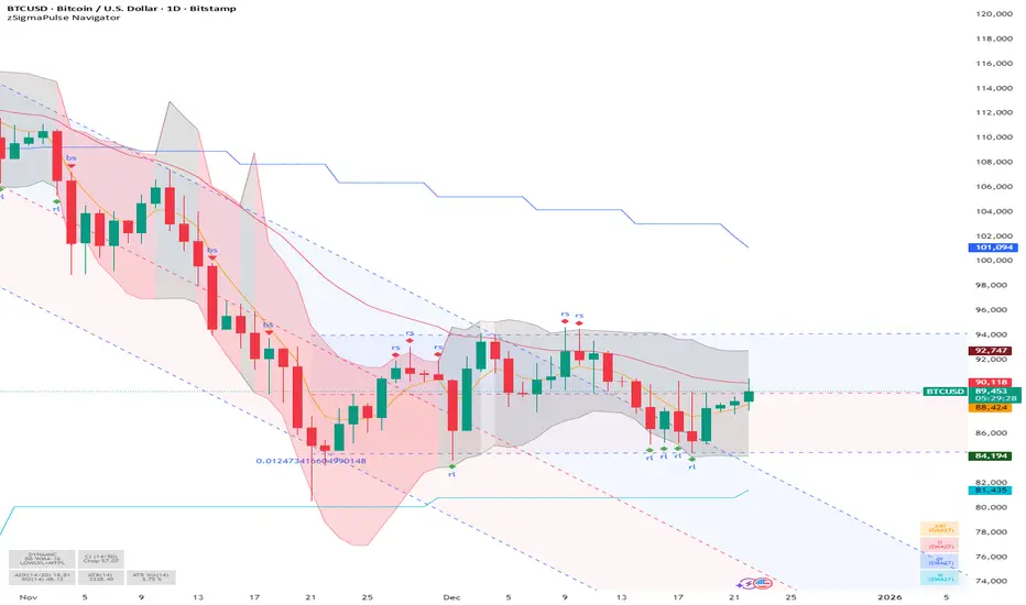
SigmaPulse NavigatorThe **zSigma Pulse Navigator** is a comprehensive, "Regime-Based" algorithmic trading tool designed for TradingView. Unlike standard technical indicators that generate continuous buy or sell signals regardless of market conditions, the zSigma Pulse functions primarily as a **market filter**. It first mathematically classifies the market environment as either "Efficient" (Trending) or "Inefficient" (Choppy) and only unlocks specific trading signals that are statistically valid for that specific state.
It is constructed from three distinct computational "engines" that work in unison to eliminate false signals:
### 1. The Regime Engine (The Filter)
The foundation of the zSigma Pulse is the **Choppiness Index (CI)**. The algorithm uses this to quantify the "Fractal Dimension" of price action.
* **Trend Mode (Green/Red Background):** If the Chop Index falls below a specific threshold (default 50), the system declares a Trend. The chart background lights up Green (Bullish) or Red (Bearish), permitting breakout strategies.
* **Chop Mode (Grey Background):** If the Chop Index rises above the threshold, the background turns Grey. This signals consolidation, warning the trader to ignore breakout signals and focus on mean reversion.
### 2. The Consensus Engine (The Vote)
To determine momentum direction, the indicator employs a proprietary "Voting System" that aggregates three independent indicators: **ADX** (Trend Strength), **RSI** (Momentum), and **SuperTrend** (Price Action).
* **The "2-out-of-3" Rule:** A directional signal (e.g., a Green Cloud) is only generated if at least **two** of these three engines agree. This consensus mechanism filters out "fake-outs" where price might move (SuperTrend) but lacks the internal energy (ADX) to sustain the move.
### 3. The Volatility Engine (The Cloud)
The tool visualises volatility through a **Dynamic Range**—a shaded cloud that expands and contracts based on market noise.
* It typically uses **Bollinger Bands** (based on Standard Deviation) or **Keltner Channels** (based on ATR).
* **In Trends:** The cloud expands, and the bottom of the cloud acts as a dynamic trailing stop.
* **In Chop:** The cloud contracts, creating a visual channel where traders can "buy the dip" (Diamond signals) at the bottom of the range.
### Key Features and Defaults
* **Institutional Tuning:** The indicator is hardcoded with "smart" defaults rather than standard retail settings. For example, it utilizes an **EMA 27** (a Fibonacci-adjacent number) rather than the standard 20 or 50 Moving Average, designed to catch institutional trends earlier.
* **Multi-Timeframe (MTF) Stack:** It automatically plots higher-timeframe Moving Averages (e.g., Weekly and Monthly lines) onto the Daily chart. This allows traders to ensure their trades align with the dominant structural trend without switching tabs.
* **Signal Shapes:**
* **Triangles:** Signal a **Breakout** (Trend Following).
* **Diamonds:** Signal a **Mean Reversion** entry (buying the bottom of the range in a pullback).
### Analogy
Think of the zSigma Pulse Navigator as a **sophisticated voltmeter** for the market.
Just as you wouldn't plug a sensitive appliance into an unstable power outlet, this tool measures the "current" of the market. If the volatility is erratic (Grey/Chop), it cuts the circuit to protect your capital. It only gives you the "Green Light" to trade when the voltage (Momentum) is stable and flowing in one direction.
Account GuardianAccount Guardian: Dynamic Risk/Reward Overlay
Introduction
Account Guardian is an open-source indicator for TradingView designed to help traders evaluate trade setups before entering positions. It automatically calculates Risk-to-Reward ratios based on market structure, displays visual Stop Loss and Take Profit zones, and provides real-time position sizing recommendations.
The indicator addresses a fundamental question every trader should ask before entering a trade: "Does this setup make mathematical sense?" Account Guardian answers this question visually and numerically, helping traders avoid impulsive entries with poor risk profiles.
Core Functionality
Account Guardian performs four primary functions:
Detects swing highs and swing lows to identify logical stop loss placement levels
Calculates Risk-to-Reward ratios for both long and short setups in real-time
Displays visual SL/TP zones on the chart for immediate trade planning
Computes position sizing based on your account size and risk tolerance
The goal is to provide traders with instant feedback on whether a potential trade meets their minimum risk/reward criteria before committing capital.
How It Works
Swing Detection
The indicator uses pivot point detection to identify recent swing highs and swing lows on the chart. These swing points serve as logical areas for stop loss placement:
For Long Trades: The most recent swing low becomes the stop loss level. Price breaking below this level would invalidate the bullish thesis.
For Short Trades: The most recent swing high becomes the stop loss level. Price breaking above this level would invalidate the bearish thesis.
The swing detection lookback period is configurable, allowing you to adjust sensitivity based on your trading timeframe and style.
It automatically adjusts the tp and sl when it is applied to your chart so it is always moving up and down!
Risk/Reward Calculation
Once swing levels are identified, the indicator calculates:
Entry Price: Current close price (where you would enter)
Stop Loss: Recent swing low (for longs) or swing high (for shorts)
Risk: Distance from entry to stop loss
Take Profit: Entry plus (Risk × Target Multiplier)
R:R Ratio: Reward divided by Risk
The R:R ratio is then evaluated against your configured thresholds to determine if the setup is valid, marginal, or poor.
Visual Elements
SL/TP Zones
When enabled, the indicator draws colored boxes on the chart showing:
Red Zone: Stop Loss area - the region between your entry and stop loss
Green/Gold/Red Zone: Take Profit area - colored based on R:R quality
The color coding provides instant visual feedback:
Green: R:R meets or exceeds your "Good R:R" threshold (default 3:1)
Gold: R:R meets minimum threshold but below "Good" (between 2:1 and 3:1)
Red: R:R below minimum threshold - setup should be avoided
Swing Point Markers
Small circles mark detected swing points on the chart:
Green circles: Swing lows (potential support / long SL levels)
Red circles: Swing highs (potential resistance / short SL levels)
Dashboard Panel
The dashboard in the top-right corner displays comprehensive trade planning information:
R:R Row: Current Risk-to-Reward ratio for long and short setups
Status Row: VALID, OK, BAD, or N/A based on R:R thresholds
Stop Loss Row: Exact price level for stop loss placement
Take Profit Row: Exact price level for take profit placement
Pos Size Row: Recommended position size based on your risk parameters
Risk $ Row: Dollar amount at risk per trade
Position Sizing Logic
The indicator calculates position size using the formula:
Position Size = Risk Amount / Risk per Unit
Where:
Risk Amount = Account Size × (Risk Percentage / 100)
Risk per Unit = Entry Price - Stop Loss Price
For example, with a $10,000 account risking 1% per trade ($100), if your entry is at 100 and stop loss at 98 (risk of 2 per unit), your position size would be 50 units.
Input Parameters
Swing Detection:
Swing Lookback: Number of bars to look back for pivot detection (default: 10). Higher values find more significant swing points but may be slower to update.
Target Multiplier: Multiplier applied to risk to calculate take profit distance (default: 2). A value of 2 means TP is 2× the distance of SL from entry.
Risk/Reward Thresholds:
Minimum R:R: Minimum acceptable Risk-to-Reward ratio (default: 2.0). Setups below this show as "BAD" in red.
Good R:R: Threshold for excellent setups (default: 3.0). Setups at or above this show as "VALID" in green.
Account Settings:
Account Size ($): Your trading account size in dollars (default: 10,000). Used for position sizing calculations.
Risk Per Trade (%): Percentage of account to risk per trade (default: 1.0%). Professional traders typically risk 0.5-2% per trade.
Display:
Show SL/TP Zones: Toggle visibility of the colored zone boxes on chart (default: enabled)
Show Dashboard: Toggle visibility of the information panel (default: enabled)
Analyze Direction: Choose to analyze Long only, Short only, or Both directions (default: Both)
How to Use This Indicator
Basic Workflow:
Add the indicator to your chart
Configure your account size and risk percentage in the settings
Set your minimum and good R:R thresholds based on your trading rules
Look at the dashboard to see current R:R for potential long and short entries
Only consider trades where the status shows "VALID" or at minimum "OK"
Use the displayed SL and TP levels for your order placement
Use the position size recommendation to determine lot/contract size
Interpreting the Dashboard:
VALID (Green): Excellent setup - R:R meets your "Good" threshold. This is the ideal scenario for taking a trade.
OK (Gold): Acceptable setup - R:R meets minimum but isn't optimal. Consider taking if other confluence factors align.
BAD (Red): Poor setup - R:R below minimum threshold. Avoid this trade or wait for better entry.
N/A (Gray): Cannot calculate - usually means no valid swing point detected yet.
Best Practices:
Use this indicator as a filter, not a signal generator. It tells you IF a trade makes sense, not WHEN to enter.
Combine with your existing entry strategy - use Account Guardian to validate setups from other analysis.
Adjust the swing lookback based on your timeframe. Lower timeframes may need smaller lookback values.
Be honest with your account size input - accurate position sizing requires accurate inputs.
Consider the target multiplier carefully. Higher multipliers mean larger potential reward but lower probability of hitting TP.
Alerts
The indicator includes four alert conditions:
Good Long Setup: Triggers when long R:R reaches or exceeds your "Good R:R" threshold
Good Short Setup: Triggers when short R:R reaches or exceeds your "Good R:R" threshold
Bad Long Setup: Triggers when long R:R falls below your minimum threshold
Bad Short Setup: Triggers when short R:R falls below your minimum threshold
These alerts can help you monitor multiple charts and get notified when favorable setups appear.
Technical Implementation
The indicator is built using Pine Script v6 and includes:
Pivot-based swing detection using ta.pivothigh() and ta.pivotlow()
Dynamic box drawing for visual SL/TP zones
Table-based dashboard for clean information display
Color-coded visual feedback system
Persistent variable tracking for swing levels
Code Structure:
// Swing Detection
float swingHi = ta.pivothigh(high, swingLen, swingLen)
float swingLo = ta.pivotlow(low, swingLen, swingLen)
// R:R Calculation for Long
float longSL = recentSwingLo
float longRisk = entry - longSL
float longTP = entry + (longRisk * targetMult)
float longRR = (longTP - entry) / longRisk
// Position Sizing
float riskAmount = accountSize * (riskPct / 100)
float posSize = riskAmount / longRisk
Limitations
The indicator uses historical swing points which may not always represent optimal SL placement for your specific strategy
Position sizing assumes you can trade fractional units - adjust accordingly for instruments with minimum lot sizes
R:R calculations assume linear price movement and don't account for gaps or slippage
The indicator doesn't predict price direction - it only evaluates the mathematical viability of a setup
Swing detection has inherent lag due to the lookback period required for pivot confirmation
Recommended Settings by Trading Style
Scalping (1-5 minute charts):
Swing Lookback: 5-8
Target Multiplier: 1-2
Minimum R:R: 1.5
Good R:R: 2.0
Day Trading (15-60 minute charts):
Swing Lookback: 8-12
Target Multiplier: 2
Minimum R:R: 2.0
Good R:R: 3.0
Swing Trading (4H-Daily charts):
Swing Lookback: 10-20
Target Multiplier: 2-3
Minimum R:R: 2.5
Good R:R: 4.0
Why Risk/Reward Matters
Many traders focus solely on win rate, but profitability depends on the combination of win rate AND risk/reward ratio. Consider these scenarios:
50% win rate with 1:1 R:R = Breakeven (before costs)
50% win rate with 2:1 R:R = Profitable
40% win rate with 3:1 R:R = Profitable
60% win rate with 1:2 R:R = Losing money
Account Guardian helps ensure you only take trades where the math works in your favor, even if you're wrong more often than you're right.
Disclaimer
This indicator is provided for educational and informational purposes only. It is not intended as financial, investment, trading, or any other type of advice or recommendation.
Trading involves substantial risk of loss and is not suitable for all investors. The calculations provided by this indicator are based on historical price data and mathematical formulas that may not accurately predict future price movements.
Position sizing recommendations are estimates based on user inputs and should be verified before placing actual trades. Always consider factors such as leverage, margin requirements, and broker-specific rules when determining actual position sizes.
The Risk-to-Reward ratios displayed are theoretical calculations based on swing point detection. Actual trade outcomes will vary based on market conditions, execution quality, and other factors not captured by this indicator.
Past performance does not guarantee future results. Users should thoroughly test any trading approach in a demo environment before risking real capital. The authors and publishers of this indicator are not responsible for any losses or damages arising from its use.
Always consult with a qualified financial advisor before making investment decisions.

MARAL Execution WorkflowOverview
MARAL Execution Workflow is a discretionary execution decision-support indicator designed to organize market context into a consistent workflow. It is not an automated trading system, does not place orders, and does not predict outcomes.
Meaning of MARAL: Market Alignment + Risk Awareness + Logic-based execution gating — a structured workflow framework designed to improve clarity and consistency in discretionary execution.
This tool supports discretionary decision-making across three stages: Context → Qualification → Management.
It extends analysis beyond entry by supporting post-entry decisions such as: Should I stay? Should I reduce risk? Should I exit? Or should I wait? These are decision-support questions, not predictions.
Key Features
9-Layer Framework + 3 Boards + EDC
The script uses a 9-layer framework coordinated by a centralized decision-state layer (EDC). Each layer has a defined role:
1. Directional Context (Trend/Bias Layer) — establishes a directional preference using configurable bias filters.
2. Higher-Timeframe Context (HTF Layer) — anchors execution to broader context when enabled.
3. Structure Mapping (Swing/Structure Layer) — identifies structural behavior (highs/lows) to frame decision areas.
4. Location / Proximity Awareness (Obstacle Layer) — evaluates proximity to likely reaction areas for risk awareness.
5. Momentum Quality (Momentum Layer) — distinguishes healthier follow-through vs weakening/choppy conditions.
6. Volatility / Stability Regime (VOL/REGIMI) evaluates volatility using ATR% thresholds and regime support using ADX.
7. Pre-Entry Qualification (Checklist Layer) — confirms whether minimum execution conditions are satisfied before entry.
8. Post-Entry Management Context (Management Layer) — monitors changing conditions after a setup for discretionary management.
9. Liquidity Context (Liquidity Layer) — integrates liquidity-based location context using PDH/PDL proximity, sweep/reclaim behavior, and lookback extreme breaks. When enabled, the script may also plot liquidity reference points for visual mapping.
Liquidity Regime States (Panel Output)
The Liquidity Layer displays a 3-state liquidity regime used for execution risk awareness:
• HIGH — a liquidity event is detected (e.g., sweep/reclaim or lookback extreme break).
• NEUTRAL — no event, but liquidity is nearby (proximity to PDH/PDL within a defined threshold).
• LOW — no event and no nearby liquidity pressure detected.
These are context/risk states used for discretionary gating — not buy/sell signals and not outcome predictions.
Boards
• Context Board — summarizes direction, HTF context, structure, momentum, volatility (ATR%), trend regime (ADX), scores, and liquidity context.
• Qualification Gate — rule-based checklist view to confirm minimum execution conditions before entry.
• Management Desk — post-setup view to monitor risk changes, obstacle proximity, deterioration cues, and management states.
EDC — Execution Decision Core
EDC consolidates outputs from the framework into unified workflow states. It applies rule-based gating to reduce conflict when conditions are mixed.
EDC Unified Output States (Decision-Support Only):
• SETUP: WAIT / LONG / SHORT
• ENTRY PERMISSION: ENTER / WAIT / SKIP
• LIQUIDITY: HIGH / NEUTRAL / LOW
• TRADE STATUS: VALID / RISKY / WEAK / —
• ACTION STATE: HOLD / TIGHT SL / SCALE OUT / EXIT / —
— may appear when a state is not applicable (e.g., no active management window is being tracked).
Panels & Labels (Exact On-Chart Meanings)
1) Context Board (Market Environment Snapshot)
• DIRECTION → Bullish / Bearish / Neutral
• H1 CONTEXT / H4 CONTEXT / DAILY CONTEXT → HTF bias states (when enabled). If HTF is disabled, shows OFF.
• STRUCTURE → Bull Struct / Bear Struct / Neutral Struct
• MOMENTUM → BULL / BEAR / NEUTRAL
• VOLATILITY (ATR%) → ATR as a percentage of price (volatility context)
• TREND STRENGTH → ADX context value
• LONG SCORE / SHORT SCORE → internal workflow alignment scores (0–100) with grade: A++ / A+ / A / B / No-Trade
• ALIGNMENT SCORE → combined alignment score used for gating
• LIQUIDITY CONTEXT → HIGH / NEUTRAL / LOW
Important: Scores are internal workflow scoring for filtering/alignment. They are not performance statistics and do not imply guaranteed probability or outcomes.
2) Qualification Gate (Pre-Entry Checklist)
Gate Legend: OK = passes filter, WARN = mixed/caution, BAD = fails filter (execution gated).
• SETUP → WAIT / LONG / SHORT
• HTF CONTEXT → OK / WARN / BAD / —
• STRUCTURE → OK / WARN / BAD / —
• MOMENTUM → OK / WARN / BAD / —
• VOL/REGIME → OK / WARN / BAD / — (Volatility + regime filter; not volume)
o OK = ATR% within thresholds AND ADX meets regime requirement
o WARN = ATR% within thresholds but regime is mixed (ADX below threshold)
o BAD = ATR% outside thresholds
• LIQUIDITY → HIGH / NEUTRAL / LOW
• ALIGNMENT → shows score vs required minimum threshold
• ENTRY PERMISSION → ENTER / WAIT / SKIP
Purpose: reduce forced entries by requiring minimum execution quality.
3) Management Desk (Post-Setup Decision Support)
The Management Desk operates inside an Active Window measured in bars after the last setup (configurable by input). When the management window is not active, some fields may show —.
• TRADE STATUS → VALID / RISKY / WEAK / —
— appears when no active trade state is being tracked (not applicable).
• MARKET PHASE → RANGE / IMPULSE / PULLBACK / CONTINUATION
Environment classification used for management context (not prediction).
• OBSTACLE AHEAD → YES / NO
Proximity risk context (e.g., near PDH/PDL or near swing levels under the script’s logic).
• EXIT PRESSURE → LOW / RISING / HIGH
Management pressure context based on deterioration cues (not a signal).
• MOMENTUM HEALTH → STRONG / WEAKENING / WEAK / NEUTRAL
Follow-through quality context used for management.
• SCORE TREND → IMPROVING / DETERIORATING / STABLE
Direction of the internal workflow score trend (not P&L, not performance).
• RISK STATE → OVEREXTENDED / NORMAL
Overextension context based on distance from EMA vs ATR.
• TRADE AGE → FRESH / MID / LATE / —
Workflow age based on bars since last setup. — when not applicable.
• SL MODE → BE OK / TIGHT / NORMAL / —
Stop-management context used for discretionary risk control. — when not applicable.
• ACTION STATE → HOLD / TIGHT SL / SCALE OUT / EXIT / —
o HOLD = maintain the current plan under present conditions
o TIGHT SL = discretionary prompt to reduce risk by tightening protection
o SCALE OUT = discretionary prompt to partially reduce exposure (partial exit / trim size), typically when obstacle proximity risk is detected
o EXIT = discretionary prompt that conditions deteriorated and exit may be considered
o — = not applicable
• ACTIVE WINDOW → ON / OFF
Shows whether the post-setup management window is active (bars after the last setup, per the “Active Window” input). When OFF, management/trade states may show —.
Optional Modules (Toggleable)
To keep the chart clean and workflow-focused, optional modules can be enabled/disabled:
A) PDH/PDL Reference (Optional)
• Plots Previous Day High / Previous Day Low as structured reference points (risk awareness only).
B) ATR-Based Planning Guides (Optional)
• Optional visual guides for SL / TP1 / TP2 / TP3 based on ATR.
• Visual planning references only. Does not place orders and does not guarantee outcomes.
C) Visual Color Layer (Optional)
• Optional state-based candle coloring for readability only.
D) State Markers (Optional)
• Optional state markers (e.g., LONG/SHORT confirmations). These are state confirmations only, not trade recommendations.
Display & Layout Options
• Display Mode: Mobile / Medium / Desktop
• Mobile Minimal View: optional minimal mode (EDC-only)
• Panel Positioning: 9 anchor positions
(Top Left / Top Center / Top Right / Middle Left / Middle Center / Middle Right / Bottom Left / Bottom Center / Bottom Right)
Why This Is Not a “Mashup”
This publication is not intended to bundle multiple classic indicators as independent buy/sell tools. While it uses familiar building blocks (trend/bias filtering, volatility/regime context, structure references, liquidity context), each component has a defined role inside a single execution workflow:
• Context Board → Qualification Gate → Management Desk organizes information into a consistent discretionary process.
• EDC consolidates multi-layer conditions into unified states using rule-based gating to reduce conflict and prioritize risk awareness.
This is a decision-support framework designed to improve clarity and consistency in discretionary execution. It does not place orders and does not provide guaranteed outcomes.
How to Use (Recommended Workflow)
1. Set context: Use the Context Board to determine directional preference, volatility/regime stability, and location context.
2. Qualify execution: Use the Qualification Gate as the filter. If alignment is not sufficient, avoid forcing entries.
3. Execute with location awareness: Avoid late entries into nearby obstacles. Treat proximity as increased risk.
4. Manage post-setup: Use the Management Desk to monitor risk changes. If states deteriorate, follow your plan (reduce risk, protect, or exit).
5. Stay consistent: Works best with position sizing rules and disciplined confirmation.
Screenshots / Visual Reference (What each panel shows)
Screenshot 1 — Full Workflow View (Desktop)
Shows the complete workflow layout on one chart: Context Board, Qualification Gate, Management Desk, and the EDC (Execution Decision Core) summary together.
Screenshot 2 — Context Board
Shows directional context, HTF context (if enabled), structure mapping, momentum quality, volatility/stability regime (ATR + ADX), and liquidity context (HIGH/NEUTRAL/LOW). This board is used to understand “market alignment” before considering execution.
Screenshot 3 — Qualification Gate (Pre-Entry)
Shows the rule-based checklist view used for discretionary pre-entry qualification. It summarizes SETUP (WAIT/LONG/SHORT), key confluence checks, liquidity context, and ENTRY PERMISSION (ENTER/WAIT/SKIP). This is a gating view—meant to prevent forced entries when alignment is insufficient.
Screenshot 4 — Management Desk (Post-Entry)
Shows post-entry condition monitoring within the active window after the last setup. It highlights trade status shifts (VALID/RISKY/WEAK), obstacle proximity, exit pressure, momentum health, score trend, risk state, SL mode, and action guidance context.
Screenshot 5 — EDC Panel (Execution Decision Core) — Centralized State
Shows the unified decision-support outputs consolidated from the workflow layers and boards into one compact view:
• SETUP: WAIT / LONG / SHORT
• ENTRY PERMISSION: ENTER / WAIT / SKIP
• LIQUIDITY: HIGH / NEUTRAL / LOW
• TRADE STATUS: VALID / RISKY / WEAK
• ACTION STATE: HOLD / TIGHT SL / SCALE OUT / EXIT
These are rule-based guidance states for discretionary execution and risk awareness — not automated actions.
Screenshot 6 — Example –Execution context
The screenshot shows MARAL Execution Workflow applied to XAUUSD on the 1-hour timeframe. All three boards and the EDC panel are visible:
• Context Board (top-right) – Confirms a fully aligned bullish environment: direction and all HTF contexts are Bullish, structure is “Bull Struct”, momentum is “BULL”, volatility (ATR%) is within normal bounds, and the long-side alignment score is high while the short-side score is in “No-Trade” territory. Liquidity Context is “LOW”, indicating limited immediate liquidity pressure.
• Qualification Gate (top-center) – For the same bar, the checklist produces a LONG setup with HTF CONTEXT, STRUCTURE, MOMENTUM and VOL/REGIME all marked OK. Liquidity is LOW, and ALIGNMENT shows “93 / 65”, meaning the current long-side score (93) is above the user-defined minimum threshold (65). ENTRY PERMISSION = ENTER, signaling that, within this framework, execution conditions are sufficiently aligned to allow a discretionary long entry according to the trader’s own plan.
• Management Desk (left) – Once a trade is active, the post-entry view monitors evolving risk. In this example the trade status is VALID and MARKET PHASE is CONTINUATION, while RISK STATE highlights OVEREXTENDED and TRADE AGE is FRESH. MOMENTUM HEALTH = STRONG, SCORE TREND = STABLE, and ACTION STATE = HOLD. This illustrates how the panel can flag extension or emerging pressure without forcing a decision.
• EDC | Execution Decision Core (bottom-right) – The EDC panel consolidates the key states into one unified view: SETUP = LONG, ENTRY PERMISSION = ENTER, LIQUIDITY = LOW, TRADE STATUS = VALID, ACTION STATE = HOLD. These are rule-based guidelines summarizing the interaction between Context, Qualification, Management and liquidity conditions. They are decision-support outputs only; they do not place orders and do not imply any guaranteed outcome.
Inputs & Customization
Inputs are provided to adapt the workflow to different instruments and timeframes, including:
• bias/trend parameters and smoothing, optional HTF context,
• structure sensitivity and lookback,
• momentum thresholds,
• volatility thresholds (ATR% limits) and regime filter (ADX),
• liquidity sensitivity (lookback / proximity thresholds),
• visuals (show/hide boards, display mode, mobile minimal view, text size, positioning).
Markets & Timeframes
Designed for multiple markets and instruments available on Trading View, including:
• Indices (index charts / index futures where available — not an options-chain or options-pricing tool)
• Crypto
• Forex
• Stocks / ETFs
• Commodities
Timeframe-agnostic: can be applied from lower to higher timeframes based on your trading style. Results vary by instrument, timeframe, and volatility/regime.
Limitations (Important)
• Discretionary analysis tool only; does not place trades.
• Optional markers/labels (if enabled) are state confirmations only, not recommendations.
• HTF values can update as HTF candles develop.
• Structure/obstacle references are informational decision areas and may be exceeded.
• No indicator removes risk; risk management remains essential.
• Provided “as-is.” Outputs may differ across symbols, sessions, spreads, or data feeds.
Risk & Disclaimer
Trading involves risk. Past behavior does not indicate future performance. This script is provided for educational and analytical purposes only. You are responsible for all trading decisions, including entries, exits, position sizing, and risk management. The script does not place trades and does not provide investment advice.

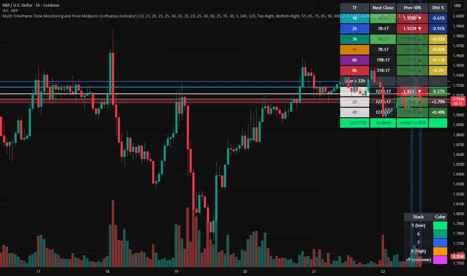
Multi-Timeframe Close and Midpoint ConfluenceMulti-Timeframe Close Monitoring and Price Midpoint Confluence Indicator
This indicator is designed to assist traders in monitoring multiple timeframe candle closes and identifying areas where price midpoints (50% levels) from different timeframes cluster together.
The tool focuses on timing awareness and structural context, helping users observe periods where multiple timeframe events occur close together, which may coincide with increased market activity.
What the Indicator Tracks
The indicator monitors candle close timing and price context across multiple timeframes, including:
Intraday timeframe closes (30m, 1h, 2h, 3h, 4h, 6h, 8h)
Higher-timeframe closes (Daily, Weekly, Monthly) when within a defined scan window
The midpoint (50%) of the previous candle for each tracked timeframe
The distance between current price and each midpoint level
This information is evaluated independently for each timeframe.
Timeframe Close Confluence
When multiple timeframes are approaching a candle close within a short window, the indicator highlights this period visually.
These moments can be useful for observing potential shifts in activity or volatility, particularly when combined with other forms of analysis.
Visual markers and optional alerts are used to draw attention to these timing clusters.
Midpoint (50%) Level Clustering
The indicator also evaluates whether multiple 50% levels from different timeframes are located within a user-defined proximity.
When several midpoints cluster closely together, the area is highlighted as a zone of interest for further observation, as overlapping price references may act as areas of interaction.
Countdown & Information Panel
An optional on-chart panel displays:
A live countdown to upcoming timeframe closes
Relative urgency based on proximity to each close
Whether current price is above or below each midpoint
Distance metrics to help gauge proximity
Color coding is used to improve readability rather than indicate trade direction.
Visual Context Tools
Additional visual options include:
Background shading when multiple timing or midpoint conditions overlap
Adjustable thresholds to control sensitivity
Customizable colors, opacity, and panel placement
These visuals are intended to provide contextual awareness, not trade signals.
Intended Use
Style: Multi-timeframe analysis and timing awareness
Markets: Forex, crypto, equities, futures
Purpose:
Monitor upcoming timeframe closes
Observe overlapping price reference zones
Improve preparation around potential activity windows
The indicator is best used as a supplementary tool alongside independent analysis.
Important Notes
This script is provided for educational and analytical purposes only.
It does not predict market outcomes and should not be used as a standalone decision-making tool. Users are encouraged to apply appropriate risk controls and confirm observations with additional analysis.
Ichimoku MTF Heatmap WITH ALERT meeting D and W conditionsThis is a version of the Ichimoku Cloud Heatmap but adds a can't miss alert when it meets Daily and Weekly conditions. The cloud metric is still being refined and the qualifier is ignoring just the cloud for now. As of 12/21/2025 GLD is meeting the conditions to set this flag.

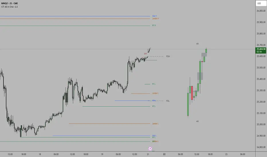
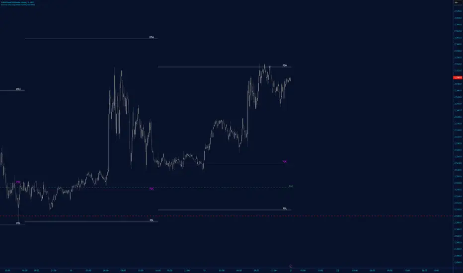
ICT all in oneSessions, PDH, PDL, High Time Frame Candles and Inversion Fair Value gap detector.
This indicator helps detect FVG's on the higher time frame for you to mark with the HTF candles.
Helps see Session sweeps, Small SMT's, Previous day high and low and one Inversion closes to price on the current time frame for possible entry.
SVEA - Smart Valuation & Analysis [Gabremoku]SVEA is a smart overbought/oversold map that paints dynamic price zones and reversal signals directly on the chart using RSI and ATR‑based volatility bands.📈✨
🧠 Smart context: Automatically adapts OB/OS levels to asset type and timeframe (equities, crypto, forex, 15m) for more realistic signals.
🎯 Actionable zones: Highlights continuous OB/OS price areas as dynamic support/resistance, helping to spot stretched moves and potential reversals at a glance.
🌡️ Volatility‑aware: Uses ATR‑driven padding so zones expand in high volatility and contract in calm markets, keeping signals relevant across regimes.
🛠️ Fully customizable: Fine‑tune OB/OS levels, lookback, padding, and visibility to match your strategy and preferred signal frequency.

Multi-Group Trend Boxes with POC Trend Line - XWiseTradeAdvanced multi-timeframe trend structure visualization.
This indicator creates three independent groups of trend boxes, each with:
• Custom bar count and lower timeframe POC calculation
• Automatic up/down/sideways coloring
• Connecting POC trend line
Perfect for:
• Multi-timeframe confluence analysis
• Identifying trend strength across scales
• Clean structural price action mapping
Features:
• 3 fully customizable groups (short/medium/long term)
• Dynamic POC-based trend lines
• Transparent colored boxes
• High performance with object management
More premium indicators and strategies coming soon at:
xwisetrade.com
Be Wise. Trade X.

Fixed Time Frame EMA [TickDaddy]Show a 50 period EMA on the 15 minute timeframe on any other timeframe like 5 min, 1 min, 1 hour, etc.. etc..
it's all customizable, you choose the timeframe, ema, color, all that good stuff.

PM/PW/PD/OVN/CD Highs & Lows with prices+ EMAsPM/PW/PD/OVN/CD Highs & Lows with prices
+
3 customizable EMAs (def 12/34/55)

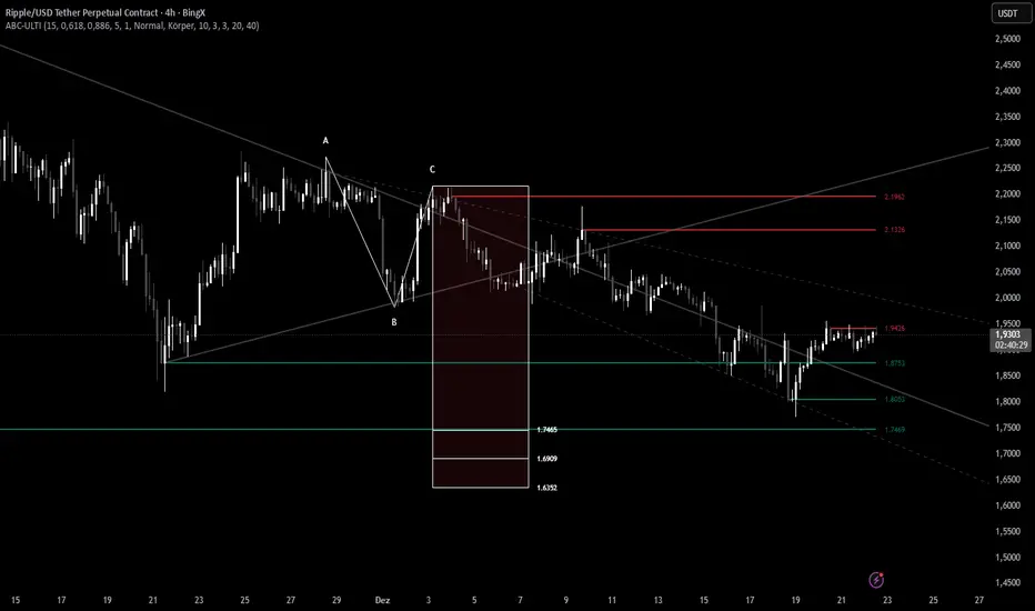
ABC Pro Ultimate S/RABC Pro Ultimate is a high-precision trading tool designed to identify harmonic ABC (Zigzag) patterns and combine them with institutional Support & Resistance levels. Unlike standard indicators that clutter your chart with noise, this script filters for high-relevance pivot points from the distant past to provide truly meaningful trade setups.