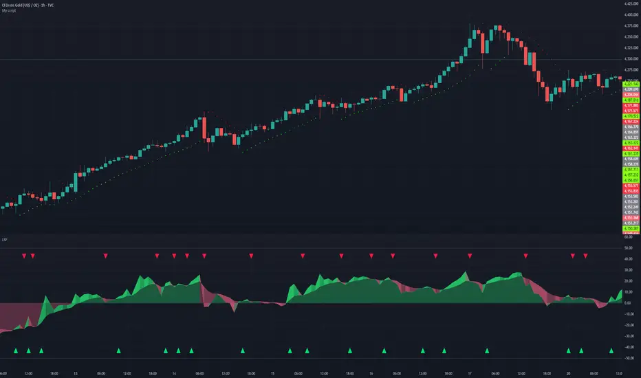
RSI Momentum LockConcept & Philosophy This indicator is a unique hybrid trend-following system that combines the momentum power of RSI with the visual simplicity of the SuperTrend. Unlike standard indicators that flip constantly during choppy markets, the RSI Momentum Lock uses a "State Machine" logic to capture and hold strong trends.
How It Works The indicator creates a "Trend Lock" based on RSI breakout levels:
Bullish Lock (Green): Triggered ONLY when RSI closes above 70 (Overbought Breakout). The trend remains bullish even if RSI falls back to neutral levels (50-60), filtering out minor corrections.
Bearish Lock (Red): Triggered ONLY when RSI closes below 30 (Oversold Breakdown). The trend remains bearish until a new bullish breakout occurs.
Visuals The plot looks like a SuperTrend, calculated using ATR (Average True Range) to provide a dynamic Trailing Stop line.
Green Line: Support level during an uptrend.
Red Line: Resistance level during a downtrend.
Why Use This Indicator?
Filters Noise: It ignores sideways movement between RSI 30 and 70.
Early Entry: Catches the momentum explosion right at the breakout.
Longer Rides: Keeps you in the trade longer than traditional SuperTrends.
Settings
RSI Length: Default is 14.
Levels: Default triggers are 70 (Buy) and 30 (Sell).
ATR Factor: Controls the distance of the line from the price (Default 3.0).
الفكرة والفلسفة (Concept & Philosophy)
هذا المؤشر هو نظام اتجاه هجين فريد يجمع بين قوة زخم مؤشر RSI والبساطة البصرية لمؤشر SuperTrend.
على عكس المؤشرات التقليدية التي تغيّر اتجاهها باستمرار في الأسواق العرضية (المتذبذبة)، يعتمد مؤشر RSI Momentum Lock على منطق آلة الحالات (State Machine) لالتقاط الاتجاهات القوية والاحتفاظ بها لأطول فترة ممكنة.
كيف يعمل المؤشر؟ (How It Works)
يقوم المؤشر بإنشاء ما يُعرف بـ قفل الاتجاه (Trend Lock) بناءً على اختراقات مؤشر RSI:
قفل صاعد (Bullish Lock – أخضر)
يتم تفعيله فقط عندما يغلق مؤشر RSI أعلى مستوى 70 (اختراق تشبع شرائي).
يظل الاتجاه صاعدًا حتى لو عاد RSI إلى مناطق محايدة (50 – 60).
هذا الأسلوب يمنع الخروج المبكر بسبب التصحيحات البسيطة.
قفل هابط (Bearish Lock – أحمر)
يتم تفعيله فقط عندما يغلق مؤشر RSI أسفل مستوى 30 (اختراق تشبع بيعي).
يظل الاتجاه هابطًا حتى يحدث اختراق صاعد جديد.
يساعد على تجنب الإشارات الكاذبة أثناء التذبذب.
الشكل البصري (Visuals)
يظهر المؤشر بصريًا بشكل مشابه لـ SuperTrend، ويتم حسابه باستخدام ATR (متوسط المدى الحقيقي) لإنشاء خط وقف متحرك ديناميكي:
الخط الأخضر: مستوى دعم أثناء الاتجاه الصاعد.
الخط الأحمر: مستوى مقاومة أثناء الاتجاه الهابط.
لماذا تستخدم هذا المؤشر؟ (Why Use This Indicator?)
فلترة الضوضاء: يتجاهل الحركة العرضية عندما يكون RSI بين 30 و70.
دخول مبكر: يلتقط انفجار الزخم مباشرة عند الاختراق الحقيقي.
صفقات أطول: يبقيك داخل الصفقة لفترة أطول مقارنة بمؤشرات SuperTrend التقليدية.
الإعدادات (Settings)
طول RSI: القيمة الافتراضية 14
المستويات:
شراء: 70
بيع: 30
عامل ATR: يحدد بُعد الخط عن السعر (القيمة الافتراضية 3.0)
Oscillaltor
SuperRSI: Enhanced MomentumTitle: SuperRSI: Enhanced Momentum
Description:
Overview The SuperRSI is not your standard Relative Strength Index. While traditional RSI calculates momentum based solely on close prices, this "Titan Edition" incorporates price structure breakouts. It analyzes whether the price is breaking new highs or lows within the lookback period to calculate momentum. This makes the SuperRSI significantly more responsive to volatility and genuine market action than the classic formula.
Key Features
Titan Calculation Logic: Uses High/Low breakouts to capture true momentum, making it faster and more sensitive than standard RSI.
Dynamic Trend Coloring: The RSI line automatically changes color to give you an instant visual bias:
Green: RSI is above the Signal Line (Bullish Momentum).
Red: RSI is below the Signal Line (Bearish Momentum).
Signal Line Filtering: Includes a built-in "Slow Signal" (EMA based) to help filter out market noise and identify sustainable trends.
Visual Gradients: Clear background fills for Overbought (OB) and Oversold (OS) zones to highlight extreme conditions.
How to Use
Trend Identification: Simply look at the line color. If it’s Green, momentum is bullish. If it’s Red, momentum is bearish.
Entry & Exit Signals: Watch for the crossover between the RSI line and the Signal Line. A cross above is a buy signal; a cross below is a sell signal.
Overbought/Oversold:
Above 80: Extreme bullish momentum (potential reversal or strong trend continuation).
Below 20: Extreme bearish momentum.
Settings
Fully customizable lengths for RSI and Signal lines.
Adjustable Smoothing methods (RMA, SMA, EMA).
Customizable Overbought/Oversold levels (Default: 80/20)
العنوان: SuperRSI: Enhanced Momentum
الوصف:
نظرة عامة مؤشر SuperRSI ليس مجرد مؤشر قوة نسبية تقليدي. بينما يعتمد الـ RSI العادي على أسعار الإغلاق فقط، تعتمد هذه النسخة المطور (Titan Edition) على اختراقات الهيكل السعري. يقوم المؤشر بحساب الزخم بناءً على ما إذا كان السعر يكسر قمماً جديدة أو قيعانًا جديدة خلال الفترة المحددة. هذا يجعله أكثر استجابة للتقلبات وحركة السوق الحقيقية مقارنة بالمعادلة الكلاسيكية.
أهم المميزات
معادلة Titan للزخم: تستخدم اختراقات القمم والقيعان (High/Low) لالتقاط الزخم الحقيقي، مما يجعله أسرع وأدق من RSI العادي.
تلوين ديناميكي للاتجاه: يتغير لون خط المؤشر تلقائياً ليعطيك رؤية فورية للاتجاه:
اللون الأخضر: الـ RSI يتداول فوق خط الإشارة (زخم صاعد).
اللون الأحمر: الـ RSI يتداول تحت خط الإشارة (زخم هابط).
فلترة الإشارات: يحتوي على "خط إشارة" مدمج (Slow Signal) لتنقية ضجيج السوق (Noise) وتحديد الاتجاهات المستدامة.
تدرجات لونية: خلفيات واضحة لمناطق التشبع الشرائي (Overbought) والتشبع البيعي (Oversold).
طريقة الاستخدام
تحديد الاتجاه: انظر ببساطة إلى لون الخط. إذا كان أخضر فالزخم شرائي، وإذا كان أحمر فالزخم بيعي.
إشارات الدخول والخروج: راقب التقاطع بين خط الـ RSI وخط الإشارة. التقاطع لأعلى يعتبر إشارة شراء، والتقاطع لأسفل يعتبر إشارة بيع.
مناطق التشبع:
فوق 80: تشبع شرائي (احتمالية انعكاس أو استمرار قوي للترند).
تحت 20: تشبع بيعي.
الإعدادات
إمكانية تعديل المدة الزمنية (Length) للـ RSI وخطوط الإشارة.
خيارات متعددة لنوع المتوسط المستخدم (RMA, SMA, EMA).
مستويات تشبع قابلة للتعديل (الافتراضي: 80/20).
Smart RSI Candles [DotGain]Smart RSI Candles – Description
Smart RSI Candles is a minimalist yet powerful overlay indicator that visualizes RSI conditions directly on price candles. Instead of plotting a separate RSI oscillator, this tool colors the chart bars based on customizable RSI threshold levels, allowing traders to instantly identify overbought and oversold regimes within the price action itself.
The indicator is built on the classic Wilder RSI and supports up to three upper (overbought) and three lower (oversold) levels. Each level can be individually enabled or disabled, making the indicator fully modular and adaptable to different trading styles and market conditions.
Key Features
RSI-based candle coloring (no separate panel required)
Up to 6 customizable RSI levels
Individual On/Off toggle for each level
Extreme conditions highlighted in blue
Works on any market and timeframe
Clean, non-intrusive visual design
Color Logic
Overbought (Upper Levels)
Level 1: Light green → mild overbought
Level 2: Dark green → strong overbought
Level 3: Blue → extreme overbought
Oversold (Lower Levels)
Level 1: Light red → mild oversold
Level 2: Dark red → strong oversold
Level 3: Blue → extreme oversold
Neutral RSI values keep the original candle color.
How to Use
Use upper levels to identify potential exhaustion in bullish moves.
Use lower levels to spot potential panic or capitulation zones.
Combine with trend analysis, support/resistance, or volume for confirmations.
Disable specific levels to create conservative or aggressive RSI regimes.
Use Cases
Mean reversion strategies
Momentum exhaustion detection
Visual risk regime mapping
Multi-timeframe RSI context
Smart RSI Candles is designed for traders who want RSI information integrated directly into price, without clutter — fast, intuitive, and highly customizable.
Have fun :)
Disclaimer
This Smart RSI Candles indicator is provided for informational and educational purposes only. It does not, and should not be construed as, financial, investment, or trading advice.
This indicator is an independent implementation of a Relative Strength Index (RSI) based visualization tool and is not affiliated with, or endorsed by, any third-party trading systems, strategies, or trademarked methodologies. The colored candles displayed by this indicator are generated by a predefined set of algorithmic conditions based on RSI threshold levels. They do not constitute a direct recommendation to buy or sell any financial instrument.
All trading and investing in financial markets involves a substantial risk of loss. You may lose part or all of your invested capital. Past performance does not guarantee future results. This indicator highlights potential overbought and oversold market conditions and may produce false, lagging, or misleading signals. Market conditions can change rapidly and remain irrational longer than expected.
The creator DotGain assumes no responsibility or liability for any financial losses, damages, or decisions made based on the use of this indicator or the information it provides.You are solely responsible for your own trading and investment decisions. Always conduct your own research (DYOR), use proper risk management, validate signals with additional tools or analysis, and consider your personal financial situation and risk tolerance before entering any trade.
Regression Slope Oscillator [BigBeluga]🔵 OVERVIEW
The Regression Slope Oscillator is a trend–momentum tool that applies multiple linear regression slope calculations over different lookback ranges, then averages them into a single oscillator line. This design helps traders visualize when price is extending beyond typical regression behavior, as well as when momentum is shifting up or down.
🔵 CONCEPTS
Regression Slope – Measures the steepness and direction of price trends over a selected length.
f_log_regression(src, length) =>
float sumX = 0.0
float sumY = 0.0
float sumXSqr = 0.0
float sumXY = 0.0
for i = 0 to length - 1
val = math.log(src )
per = i + 1.0
sumX += per
sumY += val
sumXSqr += per * per
sumXY += val * per
slope = (length * sumXY - sumX * sumY) / (length * sumXSqr - sumX * sumX)
slope*-1
Multi–Sample Averaging – Instead of relying on one regression slope, the indicator loops through many lengths (from Min Range to Max Range with Step increments) and averages their slopes.
multiSlope(length)=>
// Get regression slope
slope = f_log_regression(close, length)
slopAvg.push(slope)
for i = minRange to maxRange by step
multiSlope(i)
Color Gradient – The oscillator and candles are colored dynamically from oversold (orange) to overbought (aqua), based on slope extremes observed within the user–defined Color Range.
Trend Oscillation – When the oscillator rises, price trend is strengthening; when it falls, momentum weakens.
🔵 FEATURES
Calculates regression slopes across a user–defined range (e.g., 10–100 with steps of 5).
Averages all sampled slopes into a single oscillator line.
Dynamic coloring of oscillator and chart candles based on slope values.
User–controlled Color Range :
High values (e.g., 50–100) → interpret as overbought vs oversold zones.
Low values (e.g., 2–5) → interpret as slope rising vs falling momentum shifts.
Dashboard table (top–right) displaying number of slope samples and current averaged slope value.
Candle coloring mode (optional) – candles take on the oscillator gradient color for at–a–glance reading of trend bias.
Signal Line (SMA) – A moving average of the slope oscillator used to identify momentum reversals.
Bullish Reversal Signal – Triggered when the oscillator crosses above the signal line while below zero, indicating downside momentum exhaustion and potential trend recovery.
Bearish Reversal Signal – Triggered when the oscillator crosses below the signal line while above zero, indicating upside momentum exhaustion and potential trend rollover.
Dual Placement Signals – Reversal signals are plotted both:
On the oscillator pane (for momentum context)
On the price chart (for execution alignment)
Confirmation Logic – Signals are only printed on confirmed bars to reduce repainting and false triggers.
🔵 HOW TO USE
Watch the oscillator cross above/below zero: signals shifts in regression slope direction.
Use the signal line crossovers near zero to identify early trend reversals.
Use high Color Range settings to identify potential overbought/oversold extremes in trend slope.
Use low Color Range settings for a faster, momentum–driven color change that tracks slope rising/falling.
Candle coloring highlights short–term trend pressure in sync with the oscillator.
Combine reversal signals with structure, support/resistance, or volume for higher–probability entries.
🔵 CONCLUSION
The Regression Slope Oscillator transforms raw regression slope data into a smooth, color–coded oscillator. By averaging across multiple regression lengths, it avoids the noise of single–range analysis while still capturing trend extensions and momentum shifts.
With the addition of signal line crossovers and confirmed reversal markers, the indicator now provides both trend context and actionable momentum signals within a single regression-based framework.
ARPAKET_FLOW_CRYPTOArpaket_FLOW - TradingView Script
---
## 📝 Short Description (for subtitle)
```
Advanced Money Flow Indicator with Multi-Asset Support, Whale Detection & Multi-Timeframe Analysis
```
---
## 📄 Full Description (copy below this line)
---
### 🌊 ARPAKET_FLOW - Smart Money Flow Indicator
**Arpaket_FLOW** is a comprehensive money flow indicator designed to help traders visualize whether smart money is flowing INTO or OUT of the market, along with the intensity of that flow. This indicator combines multiple proven technical analysis methods into a single, easy-to-read tool for making informed buy/sell decisions.
---
### 🎯 What Does This Indicator Do?
This indicator answers the most critical question in trading: **"Is money flowing into or out of this asset?"**
By combining volume analysis with price action, Arpaket_FLOW calculates a **Flow Score (0-100)** that tells you:
- **Above 70**: Strong money inflow → Bullish bias
- **50-70**: Moderate inflow → Cautiously bullish
- **30-50**: Neutral zone → Wait for confirmation
- **Below 30**: Strong money outflow → Bearish bias
---
### 🔬 How It Works
Arpaket_FLOW combines **6 powerful indicators** into one unified score:
| Component | Weight | Purpose |
|-----------|--------|---------|
| **Volume Ratio** | 25% | Detects unusual volume activity |
| **Money Flow Index (MFI)** | 20% | Measures buying/selling pressure with volume |
| **Chaikin Money Flow (CMF)** | 20% | Identifies accumulation/distribution |
| **On-Balance Volume (OBV)** | 15% | Tracks volume flow direction |
| **RSI Momentum** | 10% | Confirms price momentum |
| **VWAP Deviation** | 10% | Institutional price reference |
---
### ✨ Key Features
#### 🎛️ Multi-Asset Adaptation
- **Crypto Mode**: Higher volatility thresholds + Whale detection
- **Low Liquidity Stocks**: Adjusted sensitivity for thin markets (SET Index, Small Caps)
- **High Liquidity Markets**: Standard settings for Forex, Major Indices
#### ⏱️ Multiple Trading Styles
- **Scalping** (1-5 min): Ultra-fast signals with noise filtering
- **Day Trading** (15min-1H): Balanced speed and reliability
- **Swing Trading** (4H-Daily): Multi-timeframe confirmation
- **Position Trading** (Weekly+): Long-term flow analysis
#### 🐋 Whale Detection (Crypto)
Automatically detects unusual large-volume activity that may indicate whale accumulation or distribution. When volume exceeds 3x the average, a whale marker (🐋) appears on the chart.
#### 📊 Multi-Timeframe Panel
For Swing and Position traders, view flow direction across 4 timeframes (1H, 4H, Daily, Weekly) simultaneously to ensure alignment before entering trades.
#### 📋 Real-Time Dashboard
A clean dashboard displaying:
- Flow Direction (Inflow/Outflow/Neutral)
- Flow Score (0-100)
- Flow Strength (Weak/Moderate/Strong/Extreme)
- Volume Status (Normal/Surge/Whale)
- MFI & CMF readings
- Overall Signal (Buy/Sell/Neutral)
#### ⚠️ Divergence Detection
Automatically identifies bullish and bearish divergences between price and money flow, providing early reversal warnings.
---
### 📖 How To Use
#### Basic Usage:
1. **Select your Market Type** in settings (Crypto/Low Liquidity/High Liquidity)
2. **Select your Trading Style** (Scalping/Day Trading/Swing/Position)
3. **Watch the histogram**:
- Green bars = Money flowing IN (bullish)
- Red bars = Money flowing OUT (bearish)
- Bar height = Flow intensity
#### Signal Interpretation:
| Signal | Meaning | Suggested Action |
|--------|---------|------------------|
| 🟢 Green Triangle | Strong buy signal | Consider long entry |
| 🔴 Red Triangle | Strong sell signal | Consider short/exit |
| 🐋 Whale Icon | Large player activity | Watch for direction |
| DIV Label | Divergence detected | Potential reversal |
#### Best Practices:
- Use **higher timeframes** for trend direction
- Use **lower timeframes** for entry timing
- Wait for **MTF alignment** (3+ timeframes agreeing) for higher probability trades
- Combine with support/resistance levels for optimal entries
---
### ⚙️ Settings Guide
#### General Settings
- **Market Type**: Match to your traded asset
- **Trading Style**: Match to your timeframe
- **Sensitivity**: Conservative (fewer signals) → Aggressive (more signals)
#### Period Settings
- **Fast Period**: Short-term calculation (default: 7)
- **Slow Period**: Long-term calculation (default: 21)
- **Signal Smoothing**: Reduces noise (default: 5)
#### Alert Settings
- **Buy Threshold**: Score level for buy signals (default: 70)
- **Sell Threshold**: Score level for sell signals (default: 30)
- **Volume Surge Multiplier**: Volume spike detection (default: 2.0x)
- **Whale Multiplier**: Whale detection threshold (default: 3.0x)
---
### 🔔 Available Alerts
1. **Strong Buy/Sell Signal** - When confirmed signals trigger
2. **Enter Buy/Sell Zone** - When score crosses thresholds
3. **Whale Activity** - Accumulation or distribution detected
4. **Bullish/Bearish Divergence** - Price/flow divergence
5. **Volume Surge** - Unusual volume spike
6. **MTF Alignment** - Multiple timeframes agree
7. **Extreme Conditions** - Score above 90 or below 10
8. **Flow Reversal** - Direction change confirmed
---
### 📈 Recommended Combinations
This indicator works best when combined with:
- **Support/Resistance levels** for entry points
- **Trend lines** for direction confirmation
- **Moving Averages** (EMA 20/50/200) for trend context
- **Price Action patterns** for timing
---
### ⚠️ Disclaimer
This indicator is a tool to assist in trading decisions, not a guarantee of profits. Always:
- Use proper risk management
- Never risk more than you can afford to lose
- Backtest before live trading
- Consider multiple factors before entering trades
Past performance does not guarantee future results. Trading involves substantial risk of loss.
---
### 🙏 Credits & Acknowledgments
This indicator combines concepts from:
- Money Flow Index (Gene Quong & Avrum Soudack)
- Chaikin Money Flow (Marc Chaikin)
- On-Balance Volume (Joe Granville)
- Volume-Weighted Average Price (Institutional standard)
---
### 💬 Feedback
If you find this indicator helpful, please leave a comment or like! Your feedback helps improve future updates.
For questions or suggestions, feel free to comment below.
**Happy Trading!** 🚀
---
## 🏷️ Suggested Tags (for TradingView)
```
moneyflow, volume, smartmoney, whaledetection, crypto, stocks, forex, mfi, cmf, obv, vwap, multitimeframe, buysellindicator, flowanalysis, accumulation, distribution
```
---
## 📸 Suggested Screenshots to Include
1. **Main Chart View** - Show the indicator with histogram and dashboard
2. **Buy Signal Example** - Zoom in on a successful buy signal
3. **Whale Detection** - Show crypto chart with whale markers
4. **MTF Panel** - Display multi-timeframe alignment
5. **Settings Panel** - Show available customization options
MACD Matrix: Angle & SettlementThis indicator is a comprehensive Multi-Timeframe (MTF) Dashboard designed for technical traders who rely on MACD not just for crossovers, but for Momentum Angle and Settlement (Hooks).
Instead of cluttering your screen with 5 different MACD charts, this Matrix calculates the math in the background and presents a clean "Heads-Up Display" of the MACD state across your specific timeframes (Default: 3m, 15m, 1h, 4h, 16h).
The Concept: "Angle Settlement"
Standard MACD indicators only show you when a cross happens. By then, the move is often halfway over. This script focuses on the Angle (Slope) of the MACD line to predict turns before they happen:
Steep Angle: Momentum is accelerating. (Strong Trend)
Settling Angle: The slope is flattening out. The MACD line is "hooking." (Reversal/Cross Imminent)
Dashboard Columns Explained
TF (Timeframe): Auto-formats your settings into readable text (e.g., "240" becomes "4h").
Zone:
> 0 (Green): MACD is above the Zero Line (Bullish Trend context).
< 0 (Red): MACD is below the Zero Line (Bearish Trend context).
Cross:
PCO (Green): Positive Crossover (MACD > Signal).
NCO (Red): Negative Crossover (MACD < Signal).
Deg (°):
The calculated mathematical angle of the MACD line.
Positive (+): Momentum is rising.
Negative (-): Momentum is falling.
State (The Strategy):
STEEP (Bright Color): The angle is increasing. Do not trade against this momentum.
SETTLE (Dim Color): The angle is decreasing compared to the previous bar. The momentum is "cooling off," often signaling a "Hook" or an upcoming crossover.
Settings & Customization
Custom Timeframes: You can freely change TF-1, TF-2, etc., in the settings. The table labels will auto-update (e.g., if you change 4h to 1D, the table will display "1D").
MACD Lengths: Fully customizable (Default 12, 26, 9).
Angle Sensitivity: A multiplier to calibrate the "Degrees" to your specific asset class (Crypto, Forex, or Indices). If angles look too small, increase this value.
Aura Vortex Oscillator [Pineify]Aura Vortex Oscillator – Adaptive Momentum with Visual Depth
The Aura Vortex Oscillator is a sophisticated momentum indicator that transforms raw price action into a visually immersive analytical tool. By combining Sigmoid-based normalization through ArcTan mathematics with adaptive momentum calculations, this oscillator delivers clear, bounded signals while filtering market noise. The distinctive "Vortex Mesh" visualization creates a layered depth effect that reveals trend consensus across multiple smoothing periods.
Key Features
Sigmoid normalization using ArcTan function for bounded output (-100 to +100)
Adaptive momentum calculation with standard deviation normalization
Multi-layered "Vortex Mesh" creating visual depth and trend confluence signals
Dynamic color-coded visualization for instant trend recognition
Zero-line crossover signals with plotted reversal markers
Extreme zone highlighting for overbought/oversold conditions
How It Works
The core calculation begins with computing the Z-score of price relative to its simple moving average, normalized by standard deviation. This adaptive component automatically adjusts sensitivity based on recent volatility. The normalized value then passes through an ArcTan function, which acts as a sigmoid transformation, "squarifying" the output to emphasize extreme conditions while keeping values bounded.
os = atan(z × intensity) × 63.66
The multiplier 63.66 scales the output to approximately -100 to +100, providing intuitive overbought/oversold levels at ±50.
Trading Ideas and Insights
Use zero-line crossovers as primary trend change signals – bullish when crossing above, bearish when crossing below
Monitor the Vortex Mesh thickness – a thick, solid aura indicates strong trend consensus across timeframes
Watch for background highlighting at ±50 levels to identify statistical extremes for potential reversals
Combine with price action analysis when the oscillator reaches boundary zones
How Multiple Indicators Work Together
The Aura Vortex Oscillator integrates three technical concepts into one cohesive system. The adaptive momentum calculation provides the raw signal, responding dynamically to market volatility. The ArcTan normalization bounds this signal and emphasizes extremes without clipping. Finally, the Vortex Mesh applies multiple EMA smoothing layers to the base signal, creating visual depth that shows whether different momentum speeds agree on trend direction.
Unique Aspects
Unlike traditional oscillators that show a single line, this indicator visualizes momentum as a "thermal field" through its layered mesh system. The mesh expands and contracts based on trend agreement – a thick, cohesive glow suggests high-confluence momentum, while a thin, scattered appearance warns of choppy, range-bound conditions.
How to Use
Add the indicator to your chart as a separate pane
Look for color transitions (green to red or vice versa) at zero-line crosses for trend reversals
Use the ±50 boundary zones and background highlighting to identify overextended conditions
Enable the Vortex Mesh to visualize trend strength and momentum consensus
Customization
Vortex Sensitivity (20) : Base period for momentum calculation – lower values increase responsiveness
Vortex Intensity (2.0) : Amplifies signal squarification – higher values push readings toward extremes faster
Aura Smoothing (8) : EMA period for the main signal line – higher values reduce noise
Enable Vortex Mesh : Toggle the layered visualization effect
Color Settings : Customize bullish, bearish, and neutral colors
Conclusion
The Aura Vortex Oscillator offers traders a unique perspective on momentum analysis by combining mathematical rigor with innovative visualization. Its adaptive normalization ensures reliable signals across different market conditions, while the Vortex Mesh provides instant visual feedback on trend quality. Whether you are identifying trend reversals, measuring momentum strength, or seeking confluence confirmation, this oscillator delivers actionable insights in an intuitive format.
AIO Oscillator SuiteOverview
The AIO Oscillator Suite is a comprehensive, all-in-one technical analysis tool designed to declutter your chart and streamline your workflow. Instead of constantly adding, removing, and re-configuring different oscillators, this script allows you to switch between 30+ of the most popular and effective momentum, trend, and volatility indicators from a single dropdown menu.
Whether you are a trend follower, a mean-reversion trader, or a volatility analyst, this suite provides instant access to the tools you need without consuming multiple indicator slots on your chart.
Features & Included Indicators
This suite includes a vast array of oscillators, meticulously coded to match standard calculations. You can instantly toggle between:
Momentum & Trend : RSI, Stochastic, Stoch RSI, MACD, PPO, TSI, Williams %R, Momentum (ROC), Ultimate Oscillator, CMO, Connors RSI.
Volatility : ATR, Bollinger %b, Choppiness Index.
Volume-Based : Money Flow Index (MFI), Chaikin Money Flow (CMF), Chaikin Oscillator, Force Index, Ease of Movement (EOM), OBV Oscillator, ADX/DMI.
Advanced/Specialized : TRIX, KST, Aroon, Fisher Transform, Cyber Cycle, Vortex, Balance of Power (BOP), Relative Vigor Index (RVI), Detrended Price Oscillator (DPO).
How It Works
Dynamic Plotting: The script intelligently adjusts the plotting style based on your selection. It automatically renders upper/lower bands (e.g., 70/30 for RSI), midlines (0 lines for MACD), histograms, or signal lines depending on the specific requirements of the chosen indicator.
Clean Interface: To keep your chart pristine, all input parameters (lengths, sources, smoothing factors) are hidden from the status line. You only see the current value of the indicator, ensuring a distraction-free analysis environment.
Customization: Every indicator retains its full set of customizable settings. You can tweak lengths, smoothing types (RMA, SMA, EMA, WMA), and sources within the settings menu.
Level Overrides: By default, the script uses standard levels for each indicator (e.g., 70/30 for RSI, 100/-100 for CCI). However, you can enable the "Override Default Levels" option in the settings to manually define your own Upper, Lower, and Midline values for any indicator.
How to Use
Add the indicator to your chart.
Open the Settings menu.
Under the "Main Settings" group, use the dropdown menu to select your desired indicator (default is RSI).
Adjust the specific parameters for that indicator in the sections below if necessary.
(Optional) To set custom overbought/oversold levels, check the "Override Default Levels?" box and enter your preferred values.
Benefits for Traders
Efficiency: Save time by not having to search for and load different scripts for every analysis technique.
Space Saving: TradingView limits the number of indicators per chart based on your plan. This script counts as only one indicator but functions as thirty.
Comparative Analysis: Quickly cycle through different oscillators to confirm signals. For example, if you see a divergence on RSI, you can instantly check if the same divergence exists on the Stochastic or TSI without leaving the screen.
Disclaimer
This tool is for informational and educational purposes only. It does not constitute financial advice or a recommendation to trade. Technical indicators should be used as part of a comprehensive trading strategy. Past performance is not indicative of future results. Always practice proper risk management.
Open Source
The code is published as open-source to allow the community to verify calculations, learn from the logic, and customize it further if needed.
Anchored VWAP PercentageINDICATOR: ANCHORED VWAP PERCENTAGE (AVWAP)
1. Overview
The Anchored VWAP Percentage (AVWAP) is a quantitative momentum and mean-reversion tool. It measures the percentage distance between the current price and a Volume Weighted Average Price (VWAP) that resets automatically based on specific time cycles. It allows traders to identify overextended market conditions relative to institutional value.
---
2. Core Logic & Calculation
The script tracks the relationship between price and volume starting from a specific Anchor Point .
* Volume-Weighted Foundation: Unlike simple moving averages, this indicator uses the VWAP formula: sum(Volume * Price) / sum(Volume) .
* Automatic Anchoring: The starting point (Anchor) resets automatically depending on the chart timeframe (e.g., resets weekly on a 15m chart, or yearly on a Daily chart).
* Percentage Deviation: It calculates the precise gap between the price and the VWAP, plotted as an oscillator: ((Price - VWAP) / VWAP) * 100 .
---
3. Adaptive Intelligence (Multi-Asset & Multi-TF)
The AVWAP is built with an internal database of 85th Percentile (P85) volatility thresholds. It recognizes that different assets have different "stretching" limits:
1. Asset-Specific Calibration: It includes optimized data for Bitcoin, Ethereum, Altcoins, Forex, and Indices .
2. Dynamic Timeframe Mapping: The anchor period and the exhaustion thresholds adjust automatically. For example:
* Intraday (1m-5m): Anchors to an 8-hour (480 min) cycle.
* Mid-Term (15m-60m): Anchors to a Weekly (W) cycle.
* Swing (Daily): Anchors to a Yearly (12M) cycle.
---
4. Visual Anatomy
The indicator is designed for high-speed decision-making:
* The Histogram:
* Green: Price is trading above the VWAP (Bullish premium).
* Red: Price is trading below the VWAP (Bearish discount).
* P85 Threshold Lines:
* These lines represent the 85th percentile of historical deviations . Historically, the price stays within these boundaries 85% of the time.
* Background Highlighting: When the histogram crosses the P85 line, the background glows, signaling a Statistical Exhaustion Zone where a retracement to the mean is highly probable.
---
5. How to Trade with AVWAP
* Mean Reversion: When the histogram reaches the P85 Zone , the price is "statistically overextended." This is a prime area to look for reversals or to take profits on existing trends.
* Trend Strength: If the histogram stays near the Zero Line while the price moves, the trend is supported by healthy volume.
* Value Area: The Zero Line represents the Fair Value . Buying near the Zero Line during a bullish histogram (Green) offers a high-probability entry with low risk.
---
6. Technical Parameters
* Asset Selection: A dropdown to switch between Crypto, Forex, and Indices.
* Color Customization: User-defined colors for bullish and bearish sentiment.
* Precision Control: 4-decimal precision for accurate tracking of thin-margin assets like Forex.
Multi-indicator Signal Builder [Skyrexio]Overview
Multi-Indicator Signal Builder is a versatile, all-in-one script designed to streamline your trading workflow by combining multiple popular technical indicators under a single roof.
It features a single-entry, single-exit logic, intrabar stop-loss/take-profit handling, an optional time filter, a visually accessible condition table, and a built-in statistics label.
Traders can choose any combination of 12+ indicators (RSI, Ultimate Oscillator, Bollinger %B, Moving Averages, ADX, Stochastic, MACD, PSAR, MFI, CCI, Heikin Ashi, and a “TV Screener” placeholder) to form entry or exit conditions.
This script aims to simplify strategy creation and analysis , making it a powerful toolkit for technical traders.
Indicators Overview
RSI (Relative Strength Index)
Measures recent price changes to evaluate overbought or oversold conditions on a 0–100 scale.
Ultimate Oscillator (UO)
Uses weighted averages of three different timeframes, aiming to confirm price momentum while avoiding false divergences.
Bollinger %B
Expresses price relative to Bollinger Bands, indicating whether price is near the upper band (overbought) or lower band (oversold).
Moving Average (MA)
Smooths price data over a specified period. The script supports both SMA and EMA to help identify trend direction and potential crossovers.
ADX (Average Directional Index)
Gauges the strength of a trend (0–100). Higher ADX signals stronger momentum, while lower ADX indicates a weaker trend.
Stochastic
Compares a closing price to a price range over a given period to identify momentum shifts and potential reversals.
MACD (Moving Average Convergence/Divergence)
Tracks the difference between two EMAs plus a signal line, commonly used to spot momentum flips through crossovers.
PSAR (Parabolic SAR)
Plots a trailing stop-and-reverse dot that moves with the trend. Often used to signal potential reversals when price crosses PSAR.
MFI (Money Flow Index)
Similar to RSI but incorporates volume data. A reading above 80 can suggest overbought conditions, while below 20 may indicate oversold.
CCI (Commodity Channel Index)
Identifies cyclical trends or overbought/oversold levels by comparing current price to an average price over a set timeframe.
Heikin Ashi
A type of candlestick charting that filters out market noise. The script uses a streak-based approach (multiple consecutive bullish or bearish bars) to gauge mini-trends.
TV Screener
A placeholder condition designed to integrate external buy/sell logic (like a TradingView “Buy” or “Sell” rating). Users can override or reference external signals if desired.
Unique Features
Multi-Indicator Entry and Exit
You can selectively enable any subset of 12+ classic indicators, each with customizable parameters and conditions. A position opens only if all enabled entry conditions are met, and it closes only when all enabled exit conditions are satisfied, helping reduce false triggers.
Single-Entry / Single-Exit with Intrabar SL/TP
The script supports a single position at a time. Once a position is open, it monitors intrabar to see if the price hits your stop-loss or take-profit levels before the bar closes, making results more realistic for fast-moving markets.
Time Window Filter
Users may specify a start/end date range during which trades are allowed, making it convenient to focus on specific market cycles for backtesting or live trading.
Condition Table and Statistics
A table at the bottom of the chart lists all active entry/exit indicators. Upon each closed trade, an integrated statistics label displays net profit, total trades, win/loss count, average and median PnL, etc.
Seamless Alerts and Automation
• Configure alerts in TradingView using “Any alert() function call.”
• The script sends JSON alert messages you can route to your own webhook.
• The indicator can be integrated with Skyrexio alert bots to automate execution on major cryptocurrency exchanges.
Optional MA/PSAR Plots
For added visual clarity, optionally plot the chosen moving averages or PSAR on the chart to confirm signals without stacking multiple indicators.
Methodology
Multi-Indicator Entry Logic
When multiple entry indicators are enabled (e.g., RSI + Stochastic + MACD), the script requires all signals to align before generating an entry. Each indicator can be set for crossovers, crossunders, thresholds (above/below), etc. This “AND” logic aims to filter out low-confidence triggers.
Single-Entry Intrabar SL/TP
• One Position At a Time: Once an entry signal triggers, a trade opens at the bar’s close.
• Intrabar Checks: Stop-loss and take-profit levels (if enabled) are monitored on every tick. If either is reached, the position closes immediately, without waiting for the bar to end.
Exit Logic
All Conditions Must Agree: If the trade is still open (SL/TP not triggered), then all enabled exit indicators must confirm a closure before the script exits on the bar’s close.
Time Filter
Optional Trading Window: You can activate a date/time range to constrain entries and exits strictly to that interval.
Justification of Methodology
Indicator Confluence: Combining multiple tools (RSI, MACD, etc.) can reduce noise and false signals.
Intrabar SL/TP: Capturing real-time spikes or dips provides a more precise reflection of typical live trading scenarios.
Single-Entry Model: Straightforward for both manual and automated tracking (especially important in bridging to bots).
Custom Date Range: Helps refine backtesting for specific market conditions or to avoid known irregular data periods.
How to Use
Add the Script to Your Chart
• In TradingView, open Indicators , search for “Multi-indicator Signal Builder” .
• Click to add it to your chart.
Configure Inputs
• Time Filter: Set a start and end date for trades.
• Alerts Messages: Input any JSON or text payload needed by your external service or bot.
• Entry Conditions: Enable and configure any indicators (e.g., RSI, MACD) for a confluence-based entry.
• Close Conditions: Enable exit indicators, along with optional SL (negative %) and TP (positive %) levels.
Set Up Alerts
• In TradingView, select “Create Alert” → Condition = “Any alert() function call” → choose this script.
• Entry Alert: Triggers on the script’s entry signal.
• Close Alert: Triggers on the script’s close signal (or if SL/TP is hit).
• Skyrexio Alert Bots: You can route these alerts via webhook to Skyrexio alert bots to automate order execution on major crypto exchanges (or any other supported broker).
Visual Reference
• A condition table at the bottom summarizes active signals.
• Statistics Label updates automatically as trades are closed, showing PnL stats and distribution metrics.
Backtesting Guidelines
Symbol/Timeframe: Works on multiple assets and timeframes; always do thorough testing.
Realistic Costs: Adjust commissions and potential slippage to match typical exchange conditions.
Risk Management: If using the built-in stop-loss/take-profit, set percentages that reflect your personal risk tolerance.
Longer Test Horizons: Verify performance across diverse market cycles to gauge reliability.
Example of statistic calculation
Test Period: 2023-01-01 to 2025-12-31
Initial Capital: $1,000
Commission: 0.1%, Slippage ~5 ticks
Trade Count: 680 (varies by strategy conditions)
Win rate: 75.44% (varies by strategy conditions)
Net Profit: +90.14% (varies by strategy conditions)
Disclaimer
This indicator is provided strictly for informational and educational purposes.
It does not constitute financial or trading advice.
Past performance never guarantees future results.
Always test thoroughly in demo environments before using real capital.
Enjoy exploring the Multi-Indicator Signal Builder! Experiment with different indicator combinations and adjust parameters to align with your trading preferences, whether you trade manually or link your alerts to external automation services. Happy trading and stay safe!
Harmonic Liquidity Waves [JOAT]Harmonic Liquidity Waves
Overview
Harmonic Liquidity Waves is an open-source oscillator indicator that combines multiple volume-based analysis techniques into a unified liquidity flow framework. It integrates VWAP calculations, Chaikin Money Flow (CMF), Money Flow Index (MFI), and Klinger Volume Oscillator (KVO) with custom harmonic wave calculations to provide a comprehensive view of volume dynamics and money flow.
What This Indicator Does
The indicator calculates and displays:
Liquidity Flow - Volume-weighted price movement accumulated over a lookback period
Harmonic Wave - Multi-depth smoothed oscillator derived from liquidity flow
Chaikin Money Flow (CMF) - Classic accumulation/distribution indicator
Money Flow Index (MFI) - Volume-weighted RSI showing buying/selling pressure
Klinger Volume Oscillator (KVO) - Trend-volume relationship indicator
Wave Interference - Combined constructive/destructive wave patterns
Volume Profile POC - Point of Control from simplified volume distribution
How It Works
The core liquidity flow calculation tracks volume-weighted price changes:
calculateLiquidityFlow(series float vol, series float price, simple int period) =>
float priceChange = ta.change(price)
float volumeFlow = vol * math.sign(priceChange)
// Accumulated over period using buffer array
float avgFlow = flowSum / period
avgFlow
The harmonic oscillator applies multi-depth smoothing:
harmonicOscillator(series float flow, simple int depth, simple int period) =>
float harmonic = 0.0
for i = 1 to depth
float wave = ta.ema(flow, period * i) / i
harmonic += wave
harmonic / depth
CMF measures accumulation/distribution using the Money Flow Multiplier:
float mfm = ((close - low) - (high - close)) / (high - low)
float mfv = mfm * vol
float cmf = ta.sum(mfv, period) / ta.sum(vol, period) * 100
Signal Generation
Liquidity shift signals occur when:
Bullish Shift: Smoothed wave crosses above signal line
Bearish Shift: Smoothed wave crosses below signal line
Strong signals require volume indicator confirmation:
Strong Bull: Bullish shift + CMF > 0 + MFI > 50 + KVO > 0
Strong Bear: Bearish shift + CMF < 0 + MFI < 50 + KVO < 0
Divergence detection compares price pivots with liquidity wave pivots to identify potential reversals.
Dashboard Panel (Bottom-Right)
Wave Strength - Normalized wave magnitude
Volume Pressure - Current volume vs average percentage
Flow Direction - BUYING or SELLING based on wave sign
Histogram - Wave minus signal line value
CMF - Chaikin Money Flow reading
MFI - Money Flow Index value (0-100)
KVO - Klinger oscillator value
Vol Confluence - Combined volume indicator score
Signal - Current actionable status
Visual Elements
Liquidity Wave - Main oscillator line
Wave Signal - Smoothed signal line for crossover detection
Wave Histogram - Difference between wave and signal
Wave Interference - Area plot showing combined wave patterns
CMF/KVO/MFI Lines - Individual volume indicator plots
Divergence Labels - BULL DIV / BEAR DIV markers
Shift Markers - Triangles for basic shifts, labels for strong shifts
Input Parameters
Wave Period (default: 21) - Base period for liquidity calculations
Volume Weight (default: 1.5) - Multiplier for volume emphasis
Harmonic Depth (default: 3) - Number of smoothing layers
Smoothing (default: 3) - Final wave smoothing period
Suggested Use Cases
Identify accumulation/distribution phases using CMF and wave direction
Confirm momentum with MFI overbought/oversold readings
Watch for divergences between price and liquidity flow
Use strong signals when multiple volume indicators align
Timeframe Recommendations
Best on 15m to Daily charts. Volume-based indicators require sufficient trading activity for meaningful readings.
Limitations
Volume data quality varies by exchange and instrument
Divergence detection uses pivot-based lookback and may lag
Volume Profile POC is simplified and not a full profile analysis
Open-Source and Disclaimer
This script is published as open-source under the Mozilla Public License 2.0 for educational purposes. It does not constitute financial advice. Past performance does not guarantee future results. Always use proper risk management.
- Made with passion by officialjackofalltrades
Market Participation Gradient [Interakktive]Market Participation Gradient (MPG) is a diagnostic oscillator that measures the quality and intensity of market participation by combining price efficiency with activity (volume or a FX-safe proxy) into a single 0–100 score.
Most tools tell you "how much activity exists." MPG focuses on "how effective that activity is," helping you differentiate clean directional participation from absorbed / inefficient participation where effort produces limited directional progress.
█ WHAT IT DOES
- Produces a 0–100 participation score (higher = stronger participation environment)
- Uses color as state context (not buy/sell)
- Classifies participation into four tiers for quick readability
- Includes an optional status-line HUD for at-a-glance context without chart clutter
█ WHAT IT DOES NOT DO
- NO buy/sell signals
- NO entries/exits
- NO alerts by default
- NO repainting / no lookahead (diagnostic context only)
█ HOW TO READ MPG
Level (0–100)
- Higher values = stronger participation environment
- Lower values = thin, drifting participation environment
Color (state language, not direction)
- Teal = Clean participation (efficient movement)
- Magenta = Absorbed participation (high activity, low efficiency)
- Amber = Building / transition state
- Grey = Thin / neutral state
█ TIER SYSTEM
MPG uses four tiers:
- THIN (0–20): low participation environment
- BUILDING (20–40): participation emerging / transitional
- STRONG (40–65): solid participation environment (quality becomes more meaningful)
- EXTREME (65+): very high participation environment (contextually important during events or late-cycle pushes)
█ QUALITY ASSESSMENT (STRONG / EXTREME)
Within STRONG and EXTREME tiers, MPG evaluates participation quality:
- Clean (Teal): Efficiency > 55%
- Absorbed (Magenta): Efficiency < 30% AND Activity > 1.5×
- Neutral (Grey): otherwise (mixed quality)
█ STATUS LINE HUD
MPG can display key values in TradingView's status line:
- Minimal: MPG (0–100) + Tier (0–3)
- Full: adds Direction (-1/0/1) and Quality (-1/0/1)
This provides quick context without tables or on-chart panels.
█ HOW IT WORKS (METHODOLOGY)
MPG combines two independent measurements:
1. Efficiency (0–1)
Efficiency = |Net Displacement| / Total Path Length
- High efficiency = price moved more directly
- Low efficiency = price moved less directly (more back-and-forth)
2. Activity (centered at 1.0)
Activity = Current Volume / Average Volume
- Activity > 1 = above-average activity
- Activity < 1 = below-average activity
FX / indices fallback: If volume is unreliable/unavailable, MPG uses a range-based proxy: (High–Low) / ATR (capped) to prevent distortion.
3. Participation Score (0–100)
Participation = Efficiency × √Activity × 100
The square root applies diminishing returns so activity alone cannot dominate without efficiency support.
█ SETTINGS
Core
- ATR Length — normalization baseline
- Efficiency Lookback — bars used for efficiency
- Volume Average Length — baseline for activity
- Smoothing Length — EMA smoothing (1 = minimal smoothing)
Visuals
- Histogram / Line / Tier Bands toggles
- Optional pane background tint (default OFF)
- Theme: Cinematic (subtle) or Vivid (brighter)
HUD
- Status Line HUD toggle
- HUD Detail: Minimal or Full
█ SUITABLE MARKETS
Works on any market with price data. For symbols with unreliable volume (common in FX), MPG automatically uses the range/ATR activity proxy.
█ RELATED (INTERAKKTIVE)
- MER — Market Efficiency Ratio (pure efficiency)
- ERD — Effort–Result Divergence (effort vs outcome)
- VSI — Volatility State Index (expansion/contraction context)
█ DISCLAIMER
This indicator is for educational and informational purposes only and does not constitute financial advice. Always do your own research and use appropriate risk management.
Quant VWAP System 3.8 This is the lower-indicator companion to the "Quant VWAP System." While the main chart tells you where the price is, this oscillator tells you how statistically significant the move is.
It uses a Z-Score algorithm to normalize price action. This means it ignores dollar amounts and instead measures how many Standard Deviations (SD) the price is away from its mean (VWAP). This allows you to instantly spot "Overbought" or "Oversold" conditions on any asset (Bitcoin, Forex, or Stocks) without needing to guess.
Key Features:
1. Normalized Extremes (The "Kill Zones")
±2.0 SD: These dotted lines represent statistical extremes. When the signal line crosses above +2.0, the asset is mathematically expensive (Overbought). When it crosses below -2.0, it is mathematically cheap (Oversold).
The Logic: Price rarely sustains movement beyond 2 Standard Deviations without a reversion or a pause.
2. The Squeeze Radar (Yellow Dots)
Volatility Detection: A row of Yellow Dots appearing on the center line indicates a "Squeeze."
What it means: The Standard Deviation bands are compressing. Energy is building.
Warning: DO NOT trade Mean Reversion when you see Yellow Dots. A squeeze often leads to a violent breakout. Wait for the dots to disappear to confirm the direction of the explosion.
3. Momentum Coloring
Green Line: Z-Score is rising (Bullish Momentum).
Red Line: Z-Score is falling (Bearish Momentum).
This helps you spot divergences (e.g., Price makes a Higher High, but the Oscillator makes a Lower High = Exhaustion).
How to Trade with It
Strategy A: The "Zero Bounce" (Trend Continuation)
Scenario: You are in a Bull Trend.
Signal: The Oscillator line pulls back to the Zero Line (White), turns Green, and curls upward.
Meaning: Price has tested the average (VWAP) and buyers have stepped in. This is a high-probability entry for trend continuation.
Strategy B: The "Extreme Fade" (Reversion)
Scenario: The Oscillator pushes deep into the Red Zone (+2.0 SD).
Signal: The line turns Red and crosses back down below the +2.0 dotted line. A small Red Triangle will appear.
Meaning: The statistical extension has failed, and price is likely snapping back to the mean.
Strategy C: Squeeze Breakout
Scenario: Yellow Dots appear on the center line.
Action: Stop trading. Wait.
Signal: The dots disappear, and the line shoots aggressively through +1.0 SD (Long) or -1.0 SD (Short). Ride the momentum.
Liquidity Sentiment Profile | LUPENIndicator Guide: Liquidity Sentiment Profile (LSP).
What is the LSP?
The Liquidity Sentiment Profile (LSP) is a "Next-Generation" oscillator designed to look beyond simple price action. While standard indicators (like RSI or MACD) primarily focus on where a candle closes, the LSP analyzes the micro-structure of the entire candle—specifically the relationship between the candle's Body, its Wicks (Shadows), and the Volume.
The Core Philosophy:
Wicks tell the truth: A long lower wick indicates that sellers pushed the price down, but buyers aggressively absorbed that liquidity and pushed it back up.
That is hidden bullish strength.
Volume validates intent: A price move with low volume is noise. A price move (or wick rejection) with high volume is a commitment by institutional players.
The LSP calculates a "Sentiment Score" between -100 and +100 based on these factors.
How to Read the Visuals
The Colors (Intensity)
color: Light Green - Bullish Acceleration. Buyers are in control, and momentum is increasing. This is the ideal time to be in a Long trade.
color: Dark Green - Bullish Deceleration. Buyers are still in control (price is likely rising), but the momentum is fading. This is a warning sign to tighten stop-losses or take profits.
color: Light Red - Bearish Acceleration. Sellers are dominating, and panic is increasing. This is the ideal time to be Short.
color: Dark Red - Bearish Deceleration. Sellers are still in control, but the downward pressure is exhausted. Be careful with new short positions.
The Lines & Fills
The Main Line: The actual LSP sentiment value.
The Yellow Signal Line: A smoothed average of the sentiment.
The Core Fill: The colored area between the Main Line and the Signal Line. When this area "glows", the trend is strong. When it dims (Dark), the trend is weak. Bearish Deceleration. Sellers are still in control, but the downward pressure is exhausted. Be careful with new short positions.
The Lines & Fills
The Main Line: The actual LSP sentiment value.
The Yellow Signal Line: A smoothed average of the sentiment.
The Core Fill: The colored area between the Main Line and the Signal Line. When this area "glows" (Neon), the trend is strong. When it dims (Dark), the trend is weak.
How to Use It (Trading Strategies)
Strategy A: The "Power Cross" (Trend Entry)
Use this for entering trends when the market wakes up.
Long Entry: Wait for the LSP line to cross ABOVE the Yellow Signal Line.
Confirmation: The fill color must turn Neon Green.
Short Entry: Wait for the LSP line to cross BELOW the Yellow Signal Line.
Confirmation: The fill color must turn Neon Red.
Strategy B: The "Absorption" Play (Reversals)
This is where the LSP shines. It detects when liquidity is being absorbed before price turns.
Bullish Absorption: The Price makes a Lower Low, but the LSP makes a Higher Low. This happens because the LSP detects the Volume on the Lower Wicks (buyers absorbing selling pressure). This is a high-probability reversal signal.
Bearish Absorption: The Price makes a Higher High, but the LSP makes a Lower High. The volume on the Upper Wicks suggests sellers are absorbing the buy orders.
Strategy C: The "Dimming" Exit (Risk Management)
Don't wait for the price to crash to exit a trade.
If you are in a Long trade (Neon Green) and the color instantly shifts to Dark Green, it means the "fuel" is running out. Consider taking partial profits or moving your Stop Loss to break even.
Standard oscillators (like RSI) often give false signals during strong trends (showing "Overbought" while price keeps going up). The LSP avoids this because it weights Volume and Wicks. If price goes up and volume increases, the LSP stays Neon Green, telling you the move is genuine, not just overextended.
Programmers Toolbox of ta LibraryA programmer's "Swiss army knife" for selecting functions from the " ta Library by Trading View " during coding. Illustrates the results of the individual library functions. Adds a few extra features. Extensively and uniquely documented.
Harmonic Sniper Trigger [Fisher] - PyraTime**Concept: Precision Momentum**
The Harmonic Sniper Trigger is a custom-tuned implementation of the Fisher Transform, designed specifically to identify sharp market reversals with zero lag. Unlike standard moving averages that react slowly to price changes, the Fisher Transform uses Gaussian probability to convert price into a normal distribution, creating clear, sharp turning points.
This indicator serves as the *Trigger* component of the PyraTime system. While Time Cycles tell you *when* to look, this indicator tells you *what* to do.
Key Features
Visual Signal Markers : Prints clear "B" (Buy) and "S" (Sell) labels on the oscillator pane for instant recognition.
Trend Fills : Dynamic Green/Red shading between the signal lines makes it easy to identify trend direction at a glance.
Integrated Alerts: Fully compatible with TradingView alerts, allowing you to be notified the second momentum flips.
How to Use This Indicator
This tool is designed to filter out noise and identify the exact moment a trend reverses.
1. Wait for the Setup: Do not trade every signal. This indicator is most powerful when price is approaching a key support/resistance level or a specific Time Pivot.
2. The Trigger: When the Fisher line crosses the Signal line (changing from Red to Green or vice versa), it confirms that momentum has mathematically shifted.
3. The Execution: Use this crossover as your entry signal *only* if it aligns with your broader market thesis.
Best Practice:
Use this in conjunction with a Time-Cycle indicator (such as the GPM Architecture).
Scenario: Price hits a Vertical Time Line.
Action: Wait for this Fisher indicator to print a "B" or "S".
Result: You enter exactly at the pivot, minimizing drawdown.
Disclaimer: This tool is for technical analysis purposes only. Past performance does not guarantee future results.
Order Flow AnalysisOrder Flow Pressure Suite — Wick, Volume & Absorption-Based Pressure Map
This indicator builds a composite buying/selling pressure score from candle structure, volume behavior, and absorption signals.
It is designed to infer the “intent” behind price moves by looking at how candles form, where they close, and how volume behaves — even without access to true bid/ask or footprint data.
Core Concepts
Wick-to-Body Analysis
The script evaluates the ratio of upper and lower wicks to the total candle range.
Strong wicks with relatively small bodies are treated as rejections :
Long upper wick → potential selling pressure / rejection of higher prices
Long lower wick → potential buying pressure / rejection of lower prices
Close Position Analysis
The close is normalized within the candle range:
Close near the high → bullish pressure
Close near the low → bearish pressure
Close near the middle → more neutral , context taken from wicks and volume
Volume Delta Estimation
Since true bid/ask data is not available on standard charts, the script estimates “volume delta” by distributing total volume between buyers and sellers based on candle characteristics:
Bull candles receive more “buying volume,” weighted toward closes near the high
Bear candles receive more “selling volume,” weighted toward closes near the low
This is an approximation of order flow, not a direct time & sales feed.
Absorption Detection
The script looks for candles where volume is high but price movement is relatively small .
This combination often suggests:
Bullish absorption → buyers absorbing aggressive selling (potential accumulation)
Bearish absorption → sellers absorbing aggressive buying (potential distribution)
Absorption zones are tracked over a configurable lookback and can be shaded in the background.
Composite Pressure Oscillator
All the above components (wicks, close position, heuristic volume delta, absorption bias) are blended into a single pressure score :
Values > 0 → net buying pressure
Values < 0 → net selling pressure
The raw score is smoothed with an EMA to reduce noise and create a cleaner oscillator line.
Divergence Detection
The indicator compares price pivots to pressure pivots:
Bullish divergence : price makes a lower low while pressure makes a higher low
Bearish divergence : price makes a higher high while pressure makes a lower high
These conditions can help highlight potential exhaustion or hidden participation from larger players.
Visual Elements
Histogram showing the intensity of buying/selling pressure
Color-coding for increasing vs. decreasing pressure
Background shading for detected absorption zones
Status table summarizing current pressure, trend bias, volume delta, wick signal, and absorption state in real time
How To Use
Use the pressure oscillator to gauge whether the current bar sequence is dominated by buyers or sellers. Strong positive readings may indicate sustained buying pressure; strong negatives may indicate sustained selling pressure.
Watch for divergences between price and the pressure oscillator around key levels, swings, or zones you already care about.
Use absorption zones and wick rejection signals as additional context around support/resistance, breakouts, or failed moves.
Treat all signals as context and confluence , not as stand-alone trade entries or exits. This tool is best used alongside your existing price action, volume, and risk management framework.
Important Notes & Limitations
This script does not access real bid/ask, footprint, or order book data . All volume delta and absorption interpretations are heuristic estimates derived from OHLCV candles.
Signals are probabilistic , not guarantees. They can be early, late, or outright wrong in fast or low-liquidity markets.
Always validate signals with your own analysis, timeframe alignment, and risk management. This indicator is intended as an analytical tool , not financial advice.
BTC Risk Metric DCA Adapter (3Commas Webhook Strategy)Risk Metric DCA Adapter (3Commas Webhook Strategy) - WORK IN PROGRESS
This Pine Script strategy, originally inspired by the Risk Metric Indicator, is fundamentally engineered as an Adapter to interface with external trading bots like 3Commas via Webhooks. It calculates a dynamic market risk score and translates that score into specific dollar-cost averaging (DCA) entry levels and tiered profit-taking exits.
Key Features & Logic
Risk Metric Calculation (Credit to The Trading Parrot):
The strategy incorporates a complex, multi-timeframe Risk Metric calculation based on daily and weekly moving averages (SMA) and standard deviation (StDev). This metric aims to quantify the current market overextension or compression relative to long-term historical data. The resulting score dictates the level of conviction for a new trade.
Tiered DCA Entry Sizing:
The strategy defines three distinct Buy Levels (L1, L2, L3) corresponding to increasingly favorable (lower) Risk Metric scores.
L1 (Base): Risk is moderate, initiating the minimum defined trade amount.
L2 (Scaled): Risk is low, initiating L1 amount + L2 amount.
L3 (Aggressive): Risk is very low, initiating L1 + L2 + L3 amounts.
Tiered Profit-Taking Exits:
The strategy implements a staggered, partial profit-taking approach based on the Risk Metric rising:
Sell L1 & L2: Closes a percentage of the current position when the Risk Metric reaches defined high thresholds, locking in partial profits.
Sell L3 (Full Exit): Closes the remaining position when the Risk Metric reaches the highest defined threshold.
The Adapter Function (Webhook Integration)
This script is unique because it uses the Pine Script strategy() function to trigger Order Fills, which are necessary to access powerful placeholders in the TradingView alert system.
Trigger Type: The alert must be set to trigger on Any order fill.
Dynamic Webhook Data: Instead of using fixed alert() commands, the strategy generates dynamic labels (e.g., BUY_ENTRY_L3_USD_1000 or SELL_L1_PCT_25) using the strategy.entry and strategy.close commands.
Data Transfer: The alert message then uses the placeholder {{strategy.order.comment}} to pass these dynamic labels to the 3Commas bot, allowing the bot to execute the precise action (e.g., start_deal_with_volume_in_quote_currency or close_deal_at_market_percentage).
Full Strategy Webhook payload
{
"secret": "YOUR_3COMMAS_SECRET_KEY",
"max_lag": "300",
"timestamp": "{{timenow}}",
"trigger_price": "{{close}}",
"tv_exchange": "{{exchange}}",
"tv_instrument": "{{ticker}}",
"action": "{{strategy.order.action}}",
"bot_uuid": "YOUR_BOT_UUID",
"strategy_info": {
"market_position": "{{strategy.market_position}}",
"market_position_size": "{{strategy.market_position_size}}",
"prev_market_position": "{{strategy.prev_market_position}}",
"prev_market_position_size": "{{strategy.prev_market_position_size}}"
},
"order": {
"amount": "{{strategy.order.contracts}}",
"currency_type": "base",
"comment": "{{strategy.order.comment}}"
}
}
Disclaimer: This script is an adapter tool and does not guarantee profit. Trading requires manual configuration of risk settings, bot parameters, and adherence to platform-specific setup instructions.
TICK & ADD Market Internals SuiteOverview: This is the ultimate Market Internals tool designed for professional SPX/ES and NQ intraday traders.
Traders often monitor both TICK (for short-term timing) and ADD (for daily trend context). However, displaying them on the same chart is usually problematic due to their different scales (TICK ±1000 vs. ADD ±2000), causing chart compression.
Market Internals Suite solves this with a smart "Visual Scaling" algorithm, perfectly fusing TICK Candles and the ADD Line into a single, coherent pane.
Key Features
1.Hybrid Visualization:
· TICK (Foreground): Displayed as OHLC Candles to capture instant liquidity sweeps and wicks.
· ADD (Background): Displayed as a clean Line to show the underlying market breadth trend without clutter.
2.Smart Visual Scaling:
· To prevent chart distortion, the ADD line is visually scaled down (Default Ratio: 1.5).
· This aligns the ADD trend volatility with the TICK range, allowing you to instantly spot divergences or resonance between sentiment and trend.
3.Real-Time Data Dashboard:
· Never lose track of the actual numbers. A dashboard in the top-right corner displays the TRUE values for both TICK and ADD (unscaled).
· Customizable Text Size: You can adjust the dashboard font size (Small/Normal/Large/Huge) in the settings to fit your screen.
4.TICK Extreme Alerts:
· Visual Highlight: The chart background highlights (Green/Red) only when TICK hits the extreme ±1000 levels.
· The ADD line remains clean and alert-free to serve as a stable reference.
Strategy: Context + Timing:
1.Trend Resonance
When the ADD line trends upward and TICK candles consistently maintain levels above zero, it indicates a healthy, strong trend. This is a signal to look for trend-following long setups.
2.Divergence Analysis (The "Holy Grail" Signal)
This combination view makes spotting internal divergences incredibly easy:
· Bearish Divergence: When Price makes a New High, but the ADD line or TICK peaks make a Lower High. This suggests buying exhaustion beneath the surface and often precedes a reversal down.
· Bullish Divergence: When Price makes a New Low, but the ADD line or TICK lows make a Higher Low. This suggests that selling pressure is being absorbed, signaling a potential bounce or reversal up.
Spot-Futures SpreadSpot-Futures Spread Indicator
A comprehensive indicator that automatically calculates and visualizes the percentage spread between spot and perpetual futures prices across multiple exchanges.
Key Features:
Automatic Exchange Detection - Automatically detects your current exchange and finds the corresponding spot/futures pair
Smart Fallback System - If the counterpart isn't available on your exchange, it automatically searches across 7+ major exchanges (Binance, Bybit, OKX, Gate.io, MEXC, KuCoin, HTX) and uses the first valid match
Multi-Exchange Support - Works with 14 exchanges including Binance, Bybit, OKX, MEXC, BitGet, Gate.io, KuCoin, and more
Clear Exchange Attribution - Shows exactly which exchanges are providing spot and futures data in the statistics table
Configurable Moving Average - Track the average spread with customizable period
Standard Deviation Bands - Identify unusual spread conditions with Bollinger-style bands
Built-in Alerts - Get notified when spread crosses bands or zero (parity)
Statistics Table - Real-time stats showing current spread, MA, std dev, and bands
Manual Override Options - Advanced users can manually specify exchanges and symbols
How It Works:
The indicator calculates the spread as: (Futures Price - Spot Price) / Spot Price × 100
Positive spread = Futures trading at a premium (contango)
Negative spread = Futures trading at a discount (backwardation)
Zero = Parity between spot and futures
Use Cases:
Funding Rate Analysis - Correlates with perpetual funding rates
Arbitrage Opportunities - Identify significant spot-futures divergences
Market Sentiment - Premium/discount indicates bullish/bearish positioning
Cross-Exchange Analysis - Compare spreads when spot and futures are on different exchanges
Smart Features:
Works whether you're viewing a spot or futures chart
Automatically handles exchange-specific perpetual contract naming (.P, PERP, SWAP, etc.)
Color-coded visualization (green for premium, red for discount)
Customizable colors and display options
Background shading based on spread direction
Perfect For:
Crypto traders monitoring funding rates, arbitrage traders, market makers, and anyone interested in spot-futures dynamics across multiple exchanges.
Getting Started:
Simply add the indicator to any spot or perpetual futures chart. It will automatically detect the exchange and find the corresponding pair. The statistics table shows which exchanges are being used for maximum transparency.
Note: The indicator automatically ignores invalid symbols, so you'll never see errors even if a specific pair doesn't exist on a particular exchange.
Kudos to @AlekMel that made the "Spot - Fut Spread v2" indicator that I enhance the Automatic detection feature which was not working in some case.
RSI + Elder Bull-Bear pressure RSI + Bull/Bear (Elder-Ray enhanced RSI)
What it is
An extended RSI that overlays Elder-Ray Bull/Bear Power on the same, zero-centered scale. You get classic RSI regime cues plus a live read of buy/sell pressure, with optional smoothing, bands, and right-edge value labels.
Key features
RSI with bands – default bands 30 / 50 / 70 (editable).
Bull/Bear Power (Elder) – ATR-normalized; optional EMA/SMA/RMA/HMA smoothing.
One-pane overlay – RSI and Bull/Bear share a common midline (RSI-50 ↔ panel 0).
Right-edge labels – always visible at the chart’s right margin with adjustable offsets.
How to read it
Cyan line = RSI (normalized)
Above the mid band = bullish regime; below = bearish regime.
Green = Bull Power, Red = Bear Power
Columns/lines above 0 show buy pressure; below 0 show sell pressure.
Smoothing reduces noise; zero-line remains your key reference.
Trade logic (simple playbook)
Entry
BUY (primary):
RSI crosses up through 50 (regime turns bullish), and
Bull (green) crosses up through 0 (buy pressure confirms).
SELL (primary):
RSI crosses down through 50, and
Bear (red) crosses down through 0 (sell pressure confirms).
Alternative momentum entries
Aggressive BUY: Bull (green) pushes above RSI-80 band (strong upside impulse).
Aggressive SELL: Bear (red) pushes below RSI-30 band (strong downside impulse).
Exits / trade management
In a long: consider exiting or tightening stops if Bear (red) dips below the 0 line (rising sell pressure) or RSI loses 50.
In a short: consider exiting or tightening if Bull (green) rises above 0 or RSI reclaims 50.
Tip: “0” on the panel is your pressure zero-line (maps to RSI-50). Most whipsaws happen near this line; smoothing (e.g., EMA 21) helps.
Defaults (on first load)
RSI bands: 30 / 50 / 70 with subtle fills.
Labels: tiny, pushed far right (large offsets).
Bull/Bear smoothing: EMA(21), smoothed line plot mode.
RSI plotted normalized so it overlaps the pressure lines cleanly.
Tighten or loosen the Bull/Bear thresholds (e.g., Bull ≥ +0.5 ATR, Bear ≤ −0.5 ATR) to demand stronger confirmation.
Settings that matter
Smoothing length/type – balances responsiveness vs. noise.
Power/RSI Gain – visual scaling only (doesn’t change logic).
Band placement – keep raw 30/50/80 or switch to “distance from 50” if you prefer symmetric spacing.
Label offsets – move values clear of the last bar/scale clutter.
Good practices
Combine with structure/ATR stops (e.g., 1–1.5× ATR, swing high/low).
In trends, hold while RSI stays above/below 50 and the opposite pressure line doesn’t dominate.
In ranges, favor signals occurring near the mid band and take profits at the opposite band.
Disclaimer: This is a research/visual tool, not financial advice at any kind. Test your rules on multiple markets/timeframes and size positions responsibly.
Range Opening (ADX)▶ OVERVIEW
Range Opening (ADX) dynamically detects market opening ranges triggered by ADX (Average Directional Index) momentum shifts. Upon a user-defined ADX crossover or crossunder event, it builds a volume-based range box that tracks high and low prices over a fixed bar length and visualizes order flow pressure with delta volume and breakout buffer zones.
▶ RANGE TRIGGER VIA ADX CROSSOVER
The range begins when ADX crosses a custom threshold, indicating a shift in trend strength:
Users choose between ADX crossover or crossunder as the trigger.
Once triggered, the indicator starts collecting price and volume data for the specified “Range Opening Length.”
The ADX plot on the subchart is colored dynamically using a green-to-magenta gradient based on its strength.
A small label marks the ADX crossover/crossunder event visually.
▶ RANGE DEVELOPMENT BOX
While the range is forming:
Price highs and lows over the defined period are collected and stored.
A temporary gray box is drawn between the maximum high and minimum low, showing the developing range.
At each bar, delta volume is updated:
Positive if close > open
Negative if close < open
A total delta volume value is shown inside the developing box for real-time monitoring.
▶ RANGE COMPLETION & BREAKOUT LINES
Once the range completes (after the defined bar count):
The gray box is replaced with a finalized, color-coded range box.
Color Logic:
Green box if delta volume is positive (bullish bias)
Magenta box if delta is negative (bearish bias)
Two solid horizontal lines are drawn:
Top line from the range high
Bottom line from the range low
Two dashed lines are added above and below the range using ATR-based buffers, acting as buffer zones.
These lines extend until a new ADX trigger occurs, helping track future price interaction with the range.
▶ INFO PANEL & STATUS MONITORING
A compact data table appears in the top-right corner, offering quick insight:
ADX: Current value, color-coded to strength.
Threshold: User-defined trigger level.
Range Status:
Shows a green diamond when range is still forming.
Shows a magenta diamond after the range has completed.
Tooltip updates to “Developing” or “Formatted” based on stage.
▶ USAGE
Traders can use Range Opening (ADX) to:
Identify periods of strength expansion and price consolidation using ADX signals.
Track breakout potential and liquidity zones formed during opening-type setups.
Monitor delta volume to gauge buying/selling bias inside short-term ranges.
Use ATR buffer zones for breakout confirmation or fade setups.
Visually mark where the most recent structured range was defined.
▶ CONCLUSION
Range Opening (ADX) offers a systematic method to detect and monitor market ranges triggered by volatility surges. With real-time delta volume insight, persistent breakout levels, and ADX-driven logic, it serves as a versatile tool for both breakout traders and range strategists looking to capitalize on momentum-based setups.
Modern Combo Crypto SuiteBlends long and short playbooks in one overlay with quick toggles.
Tracks EMA stacks, SuperTrend, WaveTrend, QQE, and volume to score bias.
Colors the chart background when watch/ready conditions align.
Fires alerts for imminent or fully aligned long/short setups.
Displays a live checklist table summarizing trend, momentum, and volume confidence.


