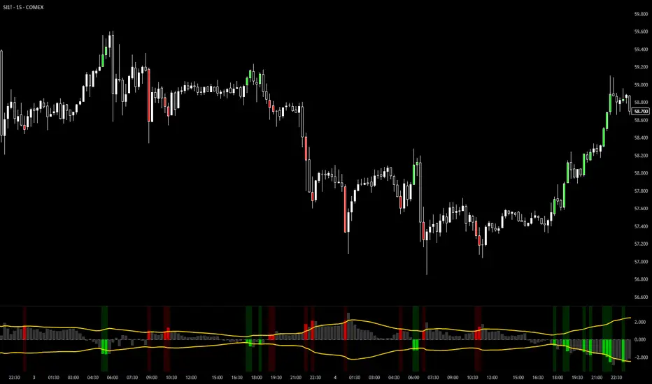
Liquidity Oscillator (Price Impact Proxy)Osc > +60: liquidity is high relative to recent history → slippage tends to be lower.
Osc < -60: liquidity is low → expect worse fills, bigger wicks, easier manipulation.
It’s most useful as a filter (e.g., “don’t enter when liquidity is low”).
震盪指標

VCAI Stochastic RSI+VCAI Stoch RSI+ is a cleaned-up Stochastic RSI built with V-Core colours for faster, clearer momentum reads and more reliable OB/OS signals.
What it shows:
Purple %K line → bearish momentum strengthening
Yellow %D line → bullish momentum building and smoothing
Soft purple/yellow background bands → OB/OS exhaustion zones, not just raw 80/20 triggers
Midline at 50 → balance point where momentum shifts between bull- and bear-side control
Optional HTF mode → run Stoch RSI from any timeframe while viewing it on your current chart
How to read it:
Both lines rising out of OS → early bullish shift; pullbacks that hold direction favour continuation
Both lines falling from OB → early bearish shift; bounces into the purple OB zone can become fade setups
Lines stacked and moving together → strong, cleaner momentum
Lines crossing repeatedly → low-conviction, choppy conditions
OB/OS shading highlights exhaustion so you focus on moves with context, not every 80/20 tick
Why it’s different:
Classic Stoch RSI is hyper-sensitive and mostly noise.
VCAI Stoch RSI+ applies V-Core’s colour-driven regime logic, controlled OB/OS shading, and optional HTF smoothing so you see momentum structure instead of clutter — making it easier to judge when momentum is genuinely shifting and when it’s just another wiggle.

Elmas Formasyonu 2.0Diamond Formation 2.0 is a multi-layered market intelligence engine, designed beyond classical technical indicators.
It does not rely on a single oscillator or a standard formula; instead, it merges multiple market dynamics into a proprietary structure called the Diamond Intelligence Engine.

Proxy Index [MTF]Description This indicator is a specialized implementation of the Proxy Index, a market timing tool originally conceptualized by Larry Williams. It is designed to identify potential market reversals by analyzing the relationship between price momentum and real volatility.
Unlike standard oscillators that look at absolute price levels, the Proxy Index measures the duration and intensity of price movement relative to the asset's specific volatility.
Underlying Concepts & Methodology The script operates by normalizing price action against volatility. The calculation logic is as follows:
Momentum Component: The script first calculates the net movement of each bar (Close minus Open) to determine the true directional strength, ignoring gaps.
Smoothing: This raw momentum is smoothed using a Moving Average (default 8-period) to filter out market noise.
Volatility Normalization (ATR): The smoothed value is then divided by the Average True Range (ATR).
Significance: This step adjusts the indicator for changing market conditions. A 50-point move is treated differently in a low-volatility environment versus a high-volatility one.
MTF Dashboard: A built-in table monitors this calculation across Daily, Weekly, and Monthly timeframes simultaneously.
How to Use
Buy Zone (≤ 30): Indicates the asset is historically cheap/oversold relative to its recent volatility.
Sell Zone (≥ 70): Indicates the asset is historically expensive/overbought relative to its recent volatility.
Divergences: Strong signals occur when Price makes a new High/Low, but the Proxy Index fails to confirm it, indicating exhaustion.
Settings
Timeframes: Fully customizable MTF table.
Colors: Dynamic coloring based on Overbought/Oversold zones.
Portugês
Descrição Este indicador é uma implementação especializada do Proxy Index, uma ferramenta de timing de mercado originalmente conceituada por Larry Williams. Ele foi projetado para identificar potenciais reversões de mercado analisando a relação entre o momentum do preço e a volatilidade real.
Ao contrário de osciladores padrão, o Proxy Index mede a duração e intensidade do movimento do preço em relação à volatilidade específica do ativo.
Metodologia
Componente de Momentum: Calcula o movimento líquido da barra (Fechamento - Abertura).
Normalização pela Volatilidade: O valor é dividido pelo ATR (Average True Range). Isso ajusta o indicador para as condições atuais do mercado.
Tabela MTF: Monitora esses dados em múltiplos tempos gráficos simultaneamente.
Como Usar
Zona de Compra (≤ 30): Ativo "barato" em relação à volatilidade.
Zona de Venda (≥ 70): Ativo "caro" em relação à volatilidade.
3. Categorias (Categories)
Marque estas 3 opções (são as que melhor descrevem a matemática do script):
✅ Volatility (Volatilidade) - Pois usa ATR.
✅ Oscillators (Osciladores) - Pois oscila entre 0 e 100.
✅ Trend Analysis (Análise de Tendência) - Pois identifica reversões.

Valuation Multi-Asset [MTF]Description This indicator is a specialized Intermarket Analysis tool designed to determine the relative valuation of an asset by comparing its performance against key global benchmarks (Currency, Commodities, Bonds, and Sector ETFs).
Unlike standard oscillators (like RSI) that only look at the asset's own price, this script calculates a Relative Value Index.
Underlying Concepts & Methodology The script operates on the principle of asset correlation and mean reversion ratios. The calculation logic follows these steps:
Ratio Calculation: It computes the price ratio between the Chart Asset and a Benchmark Asset (e.g., Symbol / DXY).
Smoothing: It applies a double smoothing method using Exponential Moving Averages (EMAs) to filter out short-term noise from the ratio.
Historical Normalization: Based on valuation theories (inspired by concepts like Larry Williams' valuation window), the script normalizes the smoothed ratio over a user-defined lookback period (default is 3 years/156 weeks). This ranks the current relative value between 0 and 100.
Key Features
Multi-Benchmark Comparison: Automatically compares the asset against the Dollar Index (DXY), Gold (GC1!), Bonds (ZB1!), and Sector ETFs.
MTF Dashboard: Includes a Multi-Timeframe table to see valuation status across Daily, Weekly, and Monthly views simultaneously.
ETF Reference: A built-in reference table to help you quickly find the correct Sector ETF for stock correlation.
How to Use
Undervalued Zone (< 15): When the line turns Green (or enters the bottom zone), the asset is historically cheap relative to the benchmark. This often indicates a potential accumulation or reversal point.
Overvalued Zone (> 85): When the line turns Red (or enters the top zone), the asset is historically expensive relative to the benchmark, suggesting potential distribution.
Divergences: Watch for divergences between the asset price and the Valuation Index (e.g., Price makes a new high, but the Valuation Index against Gold makes a lower high).
Settings
You can toggle individual benchmark lines (Asset 1 to 4).
Adjust the "Lookback Period" to change the historical normalization window.
Customize the Overbought/Oversold thresholds.

Infinity RSI📌 Infinity RSI is an analytical indicator that integrates RSI-based trend fluctuations, momentum changes, and volatility structures into a single system.
It features an independent module that scales and displays RSI information on a price chart, and a Supertrend line that changes color according to RSI conditions, allowing you to simultaneously monitor price, momentum, and volatility.
This indicator does not determine a specific direction or guarantee trading results, but rather serves as a reference tool for interpreting market conditions.
■ Calculation Logic
● ① Basic Supertrend (Price-based)
The upper and lower bands are calculated based on the ATR (period and multiple),
and the Supertrend direction is determined based on which band the current price is above or below.
The Supertrend line color changes depending on whether the RSI value is above or below 50.
● ② Extended RSI Calculation
Two methods are provided:
Standard RSI
HMA-based Smoothed RSI
RSI length and smoothing duration are customizable.
Each option has a different purpose, depending on whether you want to interpret momentum changes more gently or more sensitively.
● ③ User-selectable RSI Moving Average
Select from SMA, EMA, HMA, WMA, RMA, and VWMA based on the RSI.
This auxiliary line visually identifies directional deviations in the RSI.
● ④ RSI-based Supertrend
This is one of the indicator's core and unique elements.
The existing Supertrend logic is applied to "RSI values" instead of "price."
It creates an RSI-based ATR band structure and then converts it to a price chart scale.
(Since the RSI range is 0-100, it cannot be directly displayed on the chart.)
Conversion Process:
The RSI Supertrend value is linearly mapped to the recent RSI range → price range.
This process outputs the RSI volatility-based trend in a form that can be directly visualized on the actual price.
■ How to Use
● Price-Based Supertrend + RSI Condition Color
If the RSI is above 50, it is considered a relative strength condition and is displayed in an uptrend color.
If the RSI is below 50, it is displayed in a downtrend color.
→ Supertrend visually distinguishes trend fluctuations.
● Utilizing RSI Moving Averages
The distance or crossover between the RSI and the RSI-MA is used to compare short-term market momentum.
● RSI Supertrend (Scalable)
This module helps interpret RSI movements on a chart "in the same form as price."
Usage Example:
If the RSI trend is strengthening but the price is weak → Check the price response relative to momentum.
Comparing RSI Supertrend and Price Supertrend Transitions
Useful for structural analysis of the gap between the two trends.
The advantage of this module is that it allows you to compare price and RSI changes on a single screen using the same criteria.
■ Visual Elements
Supertrend (Price-Based)
Automatically changes up/down colors based on RSI conditions
Trend lines displayed in a stepline format
RSI Supertrend (Converted to price scale)
Stepline Diamond Style
Reflects specified up/down colors
RSI Moving Average
Displayed with user-selected MA type
Each element does not use strong arrows or buy/sell icons,
and is designed to intuitively observe price, momentum, and volatility trends.
■ Input Parameters
● Price-Based Module
ATR Length
ATR Multiplier
RSI Length
RSI Source
● RSI Settings
RSI Length
RSI Smoothing and Period
MA Length and Type Selection (SMA/HMA/EMA/SMMA/WMA/VWMA)
MA Display
● RSI Supertrend Settings
Factor
ATR Length
● Color Settings
Up Color
Down Color
● Scale Conversion
Lookback Period (for price range/RSI range calculation)
All parameters adjust the sensitivity, response speed, and smoothness of the results.
They are not intended for price prediction or automatic trading signal generation.
■ Repaint Function
Supertrend, RSI Calculation, Moving Average, ATR Calculation
→ No repainting as the values are determined based on the closing price.
RSI Supertrend Scale Conversion
Within the lookback interval used for conversion, the lowest and highest values may be updated during bar printing.
This is a real-time update and is not a recalculation or repaint.
Due to the nature of the indicator, values may change in real-time candlesticks.
The values are fixed when the candlestick closes completely.
■ Purpose
Infinity RSI was designed to facilitate the following analyses:
Observe the flow of RSI-based momentum along with the trend structure.
Map a volatility-based RSI Supertrend directly onto the price.
Compare the inter-structural differences between price-based and RSI-based Supertrends.
Visually interpret the relationship between RSI volatility and actual price, rather than simply reading the RSI value.
This is an analytical tool for intuitively understanding market components, not a tool that provides a conclusion about a specific market direction.
■ Precautions and Limitations
Volatility exists in real-time candlesticks, which is a normal behavior and not a repaint.
Parameters are for data interpretation purposes only and should not be used as entry or exit signals.
Supertrend intervals may vary widely or narrowly depending on market volatility.

VLinerMarket R1"VLiner Market R1" is our debut volume analysis tool designed to provide traders with comprehensive market insights through basic volume analysis - Delta volume. Inspired by the principles of an Order-Flow Trader.
Further details:
Market R1 features a unique design approach that combines two powerful analytical components, Volume Oscillator and Delta Bubbles (tick-volume).
The VO tracks 15-minute candle momentum using white/orange color coding.
Whilst the Delta Bubbles track 30-minute candle buy/sell pressure.
Documents:
The full User's manual for the use and concepts of this indicator is available on MT Blue's website
: mtblue-nsg.com
R1 uses:
- Tick movement volume (not real data volume)
- A look-back system for *semi-stochastic oscillation (delta toning: white & orange part of the VO's line)
Slight concerns:
- Although it may seem to be an indicator trading tool; it is Not .
This indicator only provides visualization for educational purposes, and is strictly advised Not to be use for trading/investing executions.

DR.SS:Advanced Market PhaseTRADING ROADMAP WITH THIS INDICATOR
📊 UNDERSTANDING THE INDICATOR
Market Phases Explained:
Phase 0 (Red): Severe decline - AVOID BUYING
Phase 1 (Blue): Accumulation - PREPARE TO BUY
Phase 2 (Green): Strong uptrend - BEST TIME TO BUY
Phase 3 (Orange): Distribution - TIME TO SELL/TAKE PROFITS
Phase 4 (Maroon): Decline - SELL/SHORT OPPORTUNITIES
MA Zones:
20-50 Zone: Short-term momentum (bullish/bearish/compressed)
150-200 Zone: Long-term trend (bullish/bearish/compressed)
🚀 TRADING STRATEGY - STEP BY STEP
STEP 1: IDENTIFY MARKET PHASE
Check the background color & label:
Green Background = Phase 2 (Best for buying)
Blue Background = Phase 1 (Look for entry opportunities)
Red/Orange/Maroon = Phase 0,3,4 (Avoid buying, consider selling)
STEP 2: CHECK SIGNAL STRENGTH
Look for signals on chart:
🔺 Green Triangle = Strong Buy (Strength ≥ 2)
🟢 Green Circle = Weak Buy (Strength = 1)
🔻 Red Triangle = Strong Sell (Strength ≥ 2)
🟠 Orange Circle = Weak Sell (Strength = 1)
Signal Strength Scale (1-7):
1-2: Weak signal (caution)
3-4: Moderate signal
5-7: Strong signal (best)
STEP 3: CONFIRM WITH MA ZONES
In the label, check:
"20-50 Zone: Bullish" + "150-200 Zone: Bullish" = Strongest confirmation
"Both MA Zones Bullish" = Maximum confidence
Zone Compression = Potential breakout coming
STEP 4: CHECK PRICE POSITION VS MAS
In label:
">20/>150/>50/>200" = All MAs aligned bullish (strong trend)
"<20/<150/<50/<200" = All MAs aligned bearish (strong downtrend)
Mixed = Sideways/choppy market
🎯 SPECIFIC TRADING SCENARIOS
SCENARIO 1: STRONG BUY (BEST)
Conditions:
Phase 2 (Green background)
Strong Buy signal (Green triangle)
Both MA Zones Bullish
Price > All MAs (">20/>150/>50/>200")
Signal Strength ≥ 4
Action:
Enter LONG position
Set stop loss below 200 MA
Target: Next resistance level
SCENARIO 2: EARLY ACCUMULATION BUY
Conditions:
Phase 1 (Blue background)
Weak Buy signal (Green circle)
150-200 Zone Bullish (long-term support)
20-50 Zone Compressed (potential breakout)
RSI > 45 and MACD improving
Action:
Small LONG position
Tight stop loss
Scale in as Phase 2 confirms
SCENARIO 3: SELL/TAKE PROFIT
Conditions:
Phase 3 (Orange background)
Sell signal (Red triangle/circle)
Price < Weekly MA(30)
Negative MACD Histogram
RSI crossed below 60
Action:
Exit LONG positions
Take profits
Consider SHORT if other bearish confirmations
SCENARIO 4: AVOID/EXIT
Conditions:
Phase 0 or 4 (Red/Maroon background)
Both MA Zones Bearish
Price < All MAs
RSI < 40, MACD < 0
Action:
NO BUYING
Exit all LONG positions
Consider SHORT positions
⚙️ RISK MANAGEMENT
Position Sizing:
Strong Signal (5-7): 2-3% risk per trade
Moderate Signal (3-4): 1-2% risk per trade
Weak Signal (1-2): 0.5-1% risk per trade
Stop Loss Placement:
LONG: Below 200 MA OR below recent swing low
SHORT: Above 200 MA OR above recent swing high
Tight SL: When MA zones are compressed
Wider SL: When strong trend confirmed
Take Profit Levels:
TP1: 1:1.5 Risk:Reward (exit 50% position)
TP2: 1:3 Risk:Reward (exit remaining 50%)
Trailing Stop: When Phase 3 signals appear
📈 ENTRY TRIGGERS
Buy Entry (Best):
Phase 2 confirmed + Strong Buy signal
Price breaks above Weekly MA(30)
Volume spike on breakout
Candle closes above 20 MA
Sell/Short Entry:
Phase 3 or 4 confirmed + Sell signal
Price breaks below Weekly MA(30)
Increasing volume on breakdown
Candle closes below 20 MA
🔄 TRADE MANAGEMENT
During Trade:
MONITOR DAILY:
Market Phase changes
MA Zone status changes
New signal appearances
Price vs MA relationships
Exit Rules:
EXIT LONG WHEN:
Phase changes to 3 or 4
Sell signal appears
Price closes below 200 MA
Both MA Zones turn Bearish
EXIT SHORT WHEN:
Phase changes to 1 or 2
Buy signal appears
Price closes above 200 MA
Both MA Zones turn Bullish
📊 EXAMPLE TRADE JOURNAL
Date Phase Signal Zones Strength Action Result
MM/DD 2 Strong Buy Both Bullish 6/7 Long Entry +3.2%
MM/DD 1 Weak Buy 150-200 Bullish 3/7 Small Long +1.5%
MM/DD 3 Strong Sell 20-50 Bearish 5/7 Exit All Saved -2%
🎓 PRO TIPS
Patience is Key: Wait for Phase 2 with strong signals
Multiple Confirmations: Never trade on just one signal
Weekly MA is King: Weekly MA(30) is your trend filter
Zone Alignment: Best trades when both MA zones agree
Strength Matters: Higher signal strength = higher probability
Avoid Choppiness: When MAs are mixed, stay out
Watch Transitions: Phase 1→2 and Phase 2→3 are critical
⚠️ WARNING SIGNS
DO NOT BUY WHEN:
Red/Maroon background (Phase 0/4)
Both MA Zones Bearish
Price below all MAs
RSI < 40, MACD < 0
No Buy signals on chart
DO NOT SELL/SHORT WHEN:
Green background (Phase 2)
Both MA Zones Bullish
Price above all MAs
RSI > 60, MACD > 0
Buy signals still appearing
✅ QUICK CHECKLIST BEFORE TRADING
What's the Market Phase? (2 = Best)
Any Buy/Sell signals on chart?
Signal Strength? (≥3 for trade)
MA Zones status? (Both Bullish = Best)
Price position vs MAs? (Above all = Strong)
Weekly MA direction? (Price > Weekly MA = Bullish)
Risk:Reward calculated? (Min 1:1.5)
Position size appropriate for signal strength?

Hybrid Confluence (RSI,MFI,StochRSI) Two-Tier Momentum Framework
Many traders explore multi-oscillator hybrid confluence approaches that combine momentum and volume signals—most commonly RSI, Money Flow Index (MFI), and Stochastic RSI—to study stretched market conditions. These hybrid concepts are widely used to analyze potential exhaustion zones, cycle extremes, and periods of sustained buying or selling pressure across different timeframes.
This script does not replicate, reverse-engineer, or replace any paid or closed-source indicator.
Instead, it provides a fully transparent framework built exclusively from standard, well-documented technical indicators. All calculations are explicit and configurable, allowing traders to study hybrid momentum behavior without relying on proprietary logic or black-box tools.
What the Script Does
1. Builds a hybrid momentum confluence model
The script combines three widely used oscillators:
• RSI (Relative Strength Index) — price momentum
• MFI (Money Flow Index) — volume-weighted momentum
• Stochastic RSI — momentum relative to its own recent range
Each component operates on a normalized 0–100 scale, allowing meaningful comparison and aggregation.
2. Implements a clear two-tier signal structure
Instead of producing a single binary buy/sell output, the script separates early pressure from extreme conditions:
2-of-3 Confluence (Setups)
When any two of the three oscillators reach oversold or overbought levels:
• Displayed as semi-transparent circles
• Indicates building pressure or a developing condition
• Designed as a heads-up, not a trade signal
3-of-3 Confluence (Signals)
When all three oscillators reach oversold or overbought levels:
• Displayed as prominent vertical bars spanning the oscillator range
• Represents extreme momentum alignment
• Intended to highlight potential exhaustion zones
3. Visualizes sustained pressure using consecutive signal intensity
When 3-of-3 conditions persist across multiple bars:
• Each consecutive bar becomes progressively darker
• Up to six discrete intensity levels
• Darkness reflects duration and persistence, not prediction
This helps visualize scenarios where markets continue pushing higher or lower before a major turning point, rather than assuming a single signal marks the exact top or bottom.
4. Works across markets and timeframes
Because all inputs rely on standard technical indicators:
• Works on crypto, equities, futures, and FX
• Scales naturally from intraday to higher timeframes
• Can be used on Daily and multi-day charts for macro context
Why This Script Is Useful
Traditional oscillators often produce isolated signals that lack context. This framework adds clarity by:
1. Requiring multi-indicator agreement instead of single-signal triggers
2. Separating early pressure from extreme conditions
3. Showing how momentum can persist before a reversal
4. Avoiding binary “buy now / sell now” outputs
5. Remaining transparent and configurable
This makes the tool especially useful for:
• Swing traders
• Macro and cycle-focused traders
• Crypto traders studying extended momentum phases
• Analysts who prefer contextual signals over rigid rules
How to Use
1. Adjust RSI, MFI, and StochRSI lengths to suit your timeframe
2. Observe 2-of-3 circles as early warnings of building pressure
3. Watch 3-of-3 bars for extreme momentum alignment
4. Note increasing bar intensity as pressure persists
5. Combine with structure, trend, volume, or price action for decisions
This script is best used as a contextual tool, not a standalone trading system.
What This Script Is Not
• Not a recreation of any paid or proprietary indicator
• Not affiliated with any trading educator or platform
• Not intended as a predictive or standalone trading system
• Does not claim to identify exact tops or bottoms
All signals are derived solely from openly documented RSI, MFI, and Stochastic RSI calculations.
Important Notes
• This script is original, with a transparent methodology
• All calculations use standard, well-known technical formulas
• No hidden logic or undisclosed weighting is used
• Signal visuals are descriptive, not predictive
Disclaimer
This tool is provided for educational and analytical purposes only.
It does not constitute financial advice or a recommendation to trade.
Always validate settings, test on multiple assets and timeframes, and use proper risk management before trading live.

VixTrixVixTrix - Because markets move in both directions.
VixTrix was born from a fundamental limitation in traditional volatility indicators: they only measure downside panic, completely missing the greed-driven extremes that form market tops.
How It Works:
Dual-Component Analysis:
vixBear = Panic selling intensity (distance from recent highs)
vixBull = FOMO buying intensity (distance from recent lows)
Oscillator = vixBear - vixBull = Net fear/greed imbalance
When the oscillator is positive, fear dominates (potential bottom forming). When negative, greed dominates (potential top forming).
Professional-Grade Filtering:
The magic happens with the symmetric RMS (Root Mean Square) bands. Unlike fixed percentage bands or standard deviation, RMS:
Creates mathematically symmetric positive/negative thresholds
Naturally adapts to changing volatility regimes
Provides statistical significance to extremes
VixTrix also adds selectable MA smoothing for the RMS calculation:
WMA (default): Balanced – middle-ground approach
VWMA: Volume-weighted – filters low-volume noise
EMA: Responsive – catches quick reversals
SMA: Stable – for swing trading
HMA: Fast and smooth – ideal for day trading
Signals require triple confirmation:
Statistical Extreme: Oscillator beyond RMS band
Price Action Confirmation: Correct candle color (bullish for bottoms, bearish for tops)
Momentum Continuation: Oscillator still moving toward extreme (exhaustion)
This multi-filter approach reduces premature entries and false signals while maintaining early positioning at potential reversal points.
Why This Matters for Your Trading:
In bull markets, traditional fear indicators sit near zero, giving no warning of impending tops.
VixTrix identifies when greed becomes excessive – when FOMO buying reaches statistical extremes that often precede corrections.
In range-bound markets, VixTrix excels at identifying overreactions in both directions, providing high-probability mean reversion opportunities.
During crashes, it captures the panic selling with the same precision as VixFix, but with better timing through its momentum confirmation.
VixTrix spots continuations through:
"No Signal" = Healthy Trend – Oscillator stays between RMS bands (no exhaustion)
Failed Extremes – Touches band but no triple confirmation = trend likely continues
Hidden Divergence – Price makes higher low while oscillator makes shallower low = uptrend continues
Controlled Emotions – Oscillator negative but not extreme in uptrends (greed present but not excessive)
Key Insight: When VixTrix doesn't give a signal during a pullback, institutions aren't panicking – they're just pausing before resuming the trend.
Green columns = Bullish exhaustion (potential bottoms)
Red columns = Bearish exhaustion (potential tops)
Golden RMS bands = Dynamic thresholds adapting to current volatility
Background highlights = Active signal conditions
The Result: A professional-grade oscillator that works in all market conditions – trending up, trending down, or ranging – by measuring the complete emotional spectrum driving price action.
RSI Multi-TimeFrame [PACHI]This will show a Table with multiple time frames RSI levels.
> 68 the table cell will be red for given timeframe to indicate overbought
< 35 the table cell will be green for given timeframe to indicate oversold
there are few settings you can play with. if you have any suggestions, let me know.
// Pachi

Disparity Offset [WizardTrendsInc]Disparity Offset
Description
Disparity Offset measures how far price is offset from a selected moving average, expressed as a percentage. It shows whether price is trading above or below its average and by how much, helping visualize price extension, balance, and deviation from the mean. The indicator oscillates around a zero line, where zero represents price being aligned with the moving average.
How to Use Disparity Offset
Zero Line (0%)
When the Disparity Offset is near zero, price is close to the moving average, suggesting equilibrium.
Positive Values
Values above zero indicate price is above the moving average. Larger positive readings show stronger upward offset from the average.
Negative Values
Values below zero indicate price is below the moving average. Larger negative readings show stronger downward offset
Upper & Lower Offset Zones
The configurable upper and lower percentage levels highlight when price is relatively far from the moving average. Movement back toward the zero line can be used to study mean-reversion behavior.
Visual Aids
Histogram bars show direction and intensity of the offset
Shaded zones emphasize overextended conditions
Optional markers display crossings of offset levels and the zero line for observation and learning
"Disclaimer: This indicator is intended for educational purposes only and does not constitute financial advice. Trading involves significant risk, and users should perform their own research and consult with a licensed financial advisor before making any trading decisions.
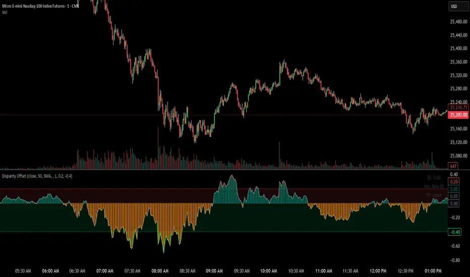
ARDO - Adaptive Regression Deviation Oscillator (v2.4.6)ARDO – Adaptive Regression Deviation Oscillator (v2.4.6)
ARDO (Adaptive Regression Deviation Oscillator) quantifies deviation of price structure from a regression-based equilibrium baseline using adaptive moving-average spreads. It combines percentile-normalized distance, linear-regression slope, and dynamic gradient scaling to reveal trend extension, exhaustion, and regime shifts—offering a structural view of trend integrity and mean-reversion timing beyond traditional momentum oscillators. It is designed to help you answer two questions:
Where are we in the regime? (extended, neutral, or reversal-prone)
Is this a “trade” environment or a “stand aside” environment? (Gate PASS vs Gate BLOCK / drift)
ARDO is best used as a context + timing framework , not a standalone entry/exit system.
What you see in the ARDO pane
1) Spread A (% vs baseline)
Primary “timing” spread (default: stepline). Spread A is colored by a 4-state maColor model:
GREEN : above baseline and strengthening
ORANGE : above baseline but weakening
RED : below baseline and weakening
GRAY : below baseline but improving
2) Spread B (% vs baseline)
Secondary “context” spread (default: columns). Same 4-state color model as above, often used to confirm or filter Spread A behavior.
3) LinReg (slope-gradient)
A LinReg line fit to a selected source (Spread A / Spread B / Spread A+B). ARDO applies a slope-magnitude gradient (opacity/intensity) to visualize regime:
Stronger slope magnitude = stronger directional regime
Fading / low slope magnitude = drift / dead-zone (lower edge, choppy conditions, or end-of-move)
4) Tier zones (Q0–Q2, H2–H4)
ARDO classifies LinReg values into percentile tiers (extremes and mid-tiers). These tiers can be rendered as:
Background regions, or
Zero-line marker circles (“MK …” plots)
Important: Background colors do not export . The “MK Q0 … MK H4” series are emitted so you can reconstruct tier membership in CSV/backtests.
5) Gate PASS / Gate BLOCK
A compact “permission layer” that can require:
Spread A > LinReg
EMA Fast > EMA Slow
Minimum Spread A threshold
Minimum absolute LinReg slope
Use Gate PASS to focus on higher-quality conditions; use Gate BLOCK as a “do nothing / reduce size” warning.
Key settings (what they change)
Tier Mode
Standard: symmetric cut structure (general purpose)
Asymmetric: separate tuning for highs vs lows (often better when upside and downside behavior are not symmetric)
Tier Population
All Bars (LinReg): tiers represent the full LinReg distribution
Pivots Only: tiers are computed from pivot events only (can tighten “extreme” definition and change how frequently zones appear)
Render Mode
Background: easiest to read visually
Zero-line Markers: best for export/backtesting workflows (MK series)
Gating options
Turn on/off each rule independently; adjust thresholds to match symbol volatility and timeframe.
Color overrides
Optional per-state color customization for Spread A, Spread B, and LinReg (4-state).
Alerts included (v2.4.6)
ARDO exposes named alerts you can use for automation or review, including:
Gradient / regime alerts (HIGH vs LOW slope-magnitude regimes; regime shift transitions)
Color-state changes (Spread B → GREEN/ORANGE/RED/GRAY; LinReg state changes)
Tier entry alert s (LinReg entering key tiers such as Q0/Q1/H3/H4)
Structural primitives (Bullish A > B, Bearish A < B, Gate PASS/BLOCK, crosses of 0, etc.)
How to use (practical workflow)
Anchor timeframe (65m or Daily): identify regime (tiers + gradient) and whether you should be aggressive or defensive.
Execution timeframe (5m/1m): time entries using Spread A/B structure and Gate PASS, aligned with the anchor regime.
Avoid forcing trades in drift: fading gradient + mid/low-edge tiers often marks “dead-zone” conditions.
Notes / limitations
ARDO is a context engine: it describes regime and location, not guaranteed direction.
Tier thresholds are distribution-based and will vary by window/timeframe.
Always apply your own risk management; this script is not financial advice.

Adaptive Signal IndicatorAdaptive Signal Indicator
Overview
The Adaptive Signal Indicator is a multi-timeframe confirmation system designed to help traders and investors identify potential entry and exit points. It automatically adjusts its analysis timeframes based on your chart's timeframe, providing consistent signal logic whether you're viewing 15-minute or weekly charts.
How It Works
This indicator combines multiple technical components that must align before generating a signal. However, the signal has a heavier weighting on price action because real investors know that "Only Price Pays." Additionally, rather than relying on a single indicator, it requires confirmation across several dimensions:
Trend Analysis — Evaluates short-term price structure using dual exponential moving averages
Wave Detection — Monitors momentum shifts using smoothed momentum calculations
Flow Tracking — Analyzes volume dynamics to confirm price movements have participation
Pulse Filter — Ensures signals align with the current directional bias of oscillator momentum
Macro Alignment — Checks higher-timeframe trend agreement before triggering signals
Drift Gate — Requires short-term trend confirmation on the daily timeframe
Cross Detection — Identifies key moving average crossovers on the daily timeframe
Range Position — Uses volatility bands to filter signals at extreme price levels
Signal Logic
Buy signals require:
Multiple bullish confirmations across different analysis methods
Macro trend not in bearish alignment
Pulse filter confirming upward momentum
Drift gate showing bullish daily bias
Sell signals require:
Bearish momentum confirmation
Macro trend not in bullish alignment
Pulse filter confirming downward momentum
Dashboard
Two real-time tables display:
Status Panel (Top Right)
Current state of all 8 analysis components
Color-coded for quick visual assessment
Shows conditions count and last signal status with % change since signal
Statistics Panel (Bottom Right)
Total signals generated
Success rate with win/loss breakdown
Average return per signal
Average winning and losing trade percentages
Profit factor
Maximum win and loss percentages
Key Features
✓ Adaptive Timeframes — Automatically selects appropriate analysis timeframes based on your chart
✓ Multiple Confirmations — Reduces false signals by requiring agreement across different analysis methods
✓ Clear Signals — Distinct BUY/SELL markers with no ambiguity
✓ Built-in Statistics — Track historical performance directly on chart
✓ Works on Any Market — Stocks, crypto, forex, indices, commodities
✓ Clean Visual Design — Overlay design keeps your chart readable
Best Practices
Use this indicator as one component of your overall trading plan
Consider your own risk management rules for position sizing and stop losses
Backtest on your preferred markets and timeframes before live trading
Signals work best in trending market conditions (the indicator filters for trend strength)
Who This Is For
Traders who prefer a systematic approach with clearly defined entry conditions. Suitable for swing trading and position trading timeframes. The multi-confirmation requirement means fewer signals, but each signal has passed multiple filters.
Note: Past performance shown in the statistics panel is based on historical data and does not guarantee future results. This indicator provides analysis tools to support your trading decisions—it is not financial advice. Always use proper risk management

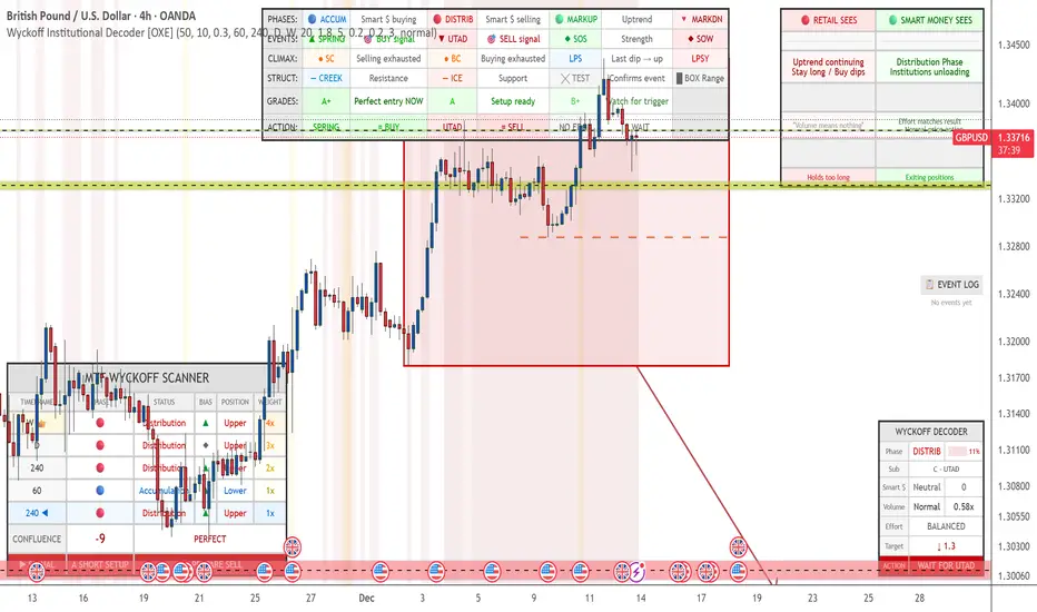
Wyckoff Institutional Decoder [OXE]4 Professional Dashboard Panels
Panel 1: RETAIL VS SMART MONEY INSIGHT (Top-Right)
This is the showstopper - side by side comparison:
🔴 RETAIL SEES🟢 SMART MONEY SEES"Support broke! 📉 SELL!""Spring trap complete ✓ Institutions buying""Breakout! 📈 BUY!""Upthrust trap complete ✓ Institutions selling""Downtrend continuing, Stay short""Accumulation Phase, Institutions loading""Just a pullback, Buy the dip!""Late Distribution, Breakdown approaching"
Plus:
Effort vs Result interpretation
Outcome prediction (Retail: "Gets stopped out 💀" vs Smart Money: "Enters at best price ✓")
Panel 2: MAIN WYCKOFF DASHBOARD (Bottom-Right)
MetricDisplayPhaseACCUMULATION / DISTRIBUTION / MARKUP / MARKDOWNStrength████ 85% (visual progress bar)Sub-PhaseA - Selling Climax, B - Building Cause, C - Spring, etc.Smart MoneySTRONG BUYING / Buying / Neutral / Selling / STRONG SELLINGVolume🔊 EXTREME / 🔉 High / 🔈 Low with ratio (2.3x)Effort/ResultABSORPTION / EASY MOVE / BALANCEDCause Built45 bars (45%) - shows target potentialTarget↑ 2,145.50 (projected price target)◆ ACTIONBUY THE SPRING / SELL THE UPTHRUST / WAIT & OBSERVE
Panel 3: EVENT LOG (Middle-Right)
Real-time chronological log of Wyckoff events:
📋 EVENT LOG
━━━━━━━━━━━━━━━━━
SPRING 🟢 | 3 bars
Test (Spring) | 8 bars
Sign of Strength | 15 bars
Selling Climax | 42 bars
Panel 4: LEGEND (Bottom-Left)
Quick reference for all chart markers:
▲ SPRING = Buy Signal
▼ UTAD = Sell Signal
◆ SOS = Strength Confirmed
◆ SOW = Weakness Confirmed
● SC/BC = Climax Volume
╳ T = Test Event
— — = Creek / Ice levels
📊 Chart Visualizations
Structure Elements
Trading Range Box - Color-coded by phase (blue=accumulation, red=distribution)
Creek Level - Dashed blue line (resistance within accumulation)
Ice Level - Dashed red line (support within distribution)
Target Projection - Arrow showing price target based on "cause"
Event Markers
SPRING ▲ - Green triangle below bar
UTAD (Upthrust) ▼ - Red triangle above bar
SOS ◆ - Green diamond (Sign of Strength)
SOW ◆ - Red diamond (Sign of Weakness)
SC/BC ● - Orange circles (Selling/Buying Climax)
Tests ╳ - Small X markers
LPS/LPSY - Labels for Last Point of Support/Supply
Volume Highlighting
Orange background = Ultra-high volume (institutional activity)
Yellow background = High volume
🧠 Smart Detection Engine
Phase Detection
Automatically identifies:
ACCUMULATION (Smart money buying)
Sub-phases: A (Selling Climax), B (Building Cause), C (Spring), D (SOS), E (Breakout)
DISTRIBUTION (Smart money selling)
Sub-phases: A (Buying Climax), B (Building Cause), C (UTAD), D (SOW), E (Breakdown)
MARKUP (Uptrend)
MARKDOWN (Downtrend)
Event Detection
Selling Climax (SC)
Automatic Rally (AR)
Secondary Test (ST)
Spring
Sign of Strength (SOS)
Last Point of Support (LPS)
Buying Climax (BC)
Upthrust After Distribution (UTAD)
Sign of Weakness (SOW)
Last Point of Supply (LPSY)
Tests (low volume confirmations)
Volume Analysis
Effort vs Result - Detects absorption (high volume, small move)
Stopping Volume - Climax with rejection wicks
No Demand/Supply - Low volume showing lack of interest
Smart Money Score - Composite Operator activity gauge (-10 to +10)
Price Targets
Cause & Effect calculation
Projects targets based on consolidation width
Shows when enough "cause" has built up
⚡ All Alerts Included
Spring detected
Upthrust detected
Sign of Strength
Sign of Weakness
Selling/Buying Climax
Spring/Upthrust Tests
LPS/LPSY
Phase changes (Accumulation → Markup, etc.)
🎨 Optimized for White Backgrounds
All colors carefully selected for:
High contrast on white charts
Easy readability
Professional appearance
No eye strain
Settings You Can Customize
Structure detection length
Pivot sensitivity
Volume spike thresholds
Spring/Upthrust sensitivity
Dashboard size (small/normal/large)
All colors
Toggle each panel on/off
Toggle each visualization element
Combined: Gann HL + Supertrend + Supertrend v6Combined: Gann HL + Supertrend + Supertrend v6
Included Indicators
1. Gann High-Low Activator
A dynamic trend tool that flips direction when price crosses its smoothed high/low average. Gann signals often catch clean directional swings and act as an excellent early trend filter.
2. Standard Supertrend (ATR-based)
The classic trend-following indicator using average true range for volatility-adaptive stop levels. Its direction flips mark trend reversals, especially effective in trending markets.
3. Orekhov Supertrend (GPL Classic)
A robust version of Supertrend that includes wick sensitivity and doji-handling logic. It behaves smoothly on lower timeframes, avoiding false flips and maintaining direction more intelligently.

Squeeze Momentum OscillatorTitle: Squeeze Momentum Oscillator
Description: This indicator is a panel-based oscillator designed to visualize the relationship between market volatility and momentum. Based on the classic TTM Squeeze concept, it helps traders identify periods of consolidation ("The Squeeze") and the subsequent release of energy ("The Breakout").
Originality & Enhancements: Standard squeeze oscillators only show when a squeeze fires (turning from red to green). This enhanced version adds a specific Breakout Validation layer. It changes the center-line dot color to Fuchsia or Blue only if the squeeze release is confirmed by the slope of the 20-period Moving Average, filtering out weak or false fires.
How It Works:
1. The Center Line (Volatility State): The dots along the zero line tell you the current volatility condition:
🔴 Red Dot: Squeeze ON. Bollinger Bands are inside Keltner Channels. Volatility is compressed. The market is charging up.
🟣 Fuchsia Dot: Bullish Breakout. The squeeze has fired upward, and the underlying trend (20 SMA slope) is positive.
🔵 Blue Dot: Bearish Breakout. The squeeze has fired downward, and the underlying trend (20 SMA slope) is negative.
🟢 Green Dot: Squeeze OFF. Normal volatility conditions.
2. The Histogram (Momentum): The bars indicate the strength and direction of the price movement using Linear Regression logic:
Cyan/Green: Bullish momentum. (Darker = weakening).
Red/Maroon: Bearish momentum. (Darker = weakening).
Visual Guide:
Setup: Wait for a series of Red Dots.
Trigger: Look for the first Fuchsia (Bullish) or Blue (Bearish) dot accompanied by an expanding Histogram in the same direction.
Settings:
Feature Toggle: You can turn the "Breakout Colors" (Fuchsia/Blue) on or off if you prefer the classic look.
Sensitivity: Fully customizable lengths and multipliers for Bollinger Bands and Keltner Channels.
Credits: Based on the foundational TTM Squeeze oscillator logic. Linear regression momentum calculation adapted from standard open-source methods. Breakout validation logic added for enhanced reliability.

Trade TableDisplays a trade table for a given account size and risk percentage for long or short trades along with a calculated stop loss and number of shares to purchase. An optional table showing the PSC calculations is also available.

Oscillation filterDescription: This is a customized technical indicator designed to assist traders in analyzing overbought and oversold conditions in volatile or trending markets. It plots overbought and oversold conditions of different colors as distinctions for multiple periods.
Working principle: This indicator calculates the oscillation index value of the given parameter and projects it onto a chart to visualize the fluctuation limit. It helps identify oscillations, trend reversals and manage risks under various market conditions.
Access: This is an invitation-only script. To request access or permission, please refer to X: @Dev0x_AI for communication.
震荡过滤器

Multi Timeframe Signal DashboardShows 10 indicators across 6 timeframes (5M, 15M, 30M, 1H, 4H, 1D):
EMA 50/100 crossover
RSI (with oversold/overbought highlighting)
MACD
DMI (DI+/DI-)
Stochastic (with extremes)
CCI
Bollinger Bands
VWAP
EMA 200 Trend
Momentum
Each cell shows ▲ (bullish/green) or ▼ (bearish/red), with scores per row and column, plus an overall BUY/SELL/HOLD signal.

Trend Change ScannerTrend Change Scanner
Focused on detecting trend reversals:
Shows reversal status: BULL REV, BEAR REV, BULL SETUP, BEAR SETUP, or Neutral
Displays: Trend direction, RSI, ADX, EMA Gap %, Bull/Bear scores
Yellow highlight when EMA gap < 0.5% (EMAs converging - potential cross)
Overall signal with action recommendation

Fusion Reversion Meter LiteFusion Reversion Meter Lite™
Market Energy & Exhaustion Gauge
Fusion Reversion Meter Lite shows whether market conditions support your next trade — not direction, but energy state.
It answers a critical question:
Does price have fuel to continue… or is it running out of steam?
METER STATES
🟢 GO → Energy depleted
→ Reversion behavior favored
🟡 CAUTION → Energy transitioning
→ Expect chop or mixed conditions
🔴 STOP → Energy expanding
→ Continuation behavior favored
HOW TO USE
GO → Favor reversion trades
CAUTION → Reduce size or wait for clarity
STOP → Favor continuation trades; avoid fading price
This allows you to trade with confidence, knowing whether retracements are likely or not.
WHAT THIS MEASURES
A composite of:
Oscillator intensity
Volume energy
Volatility expansion
Combined into a single, real-time energy gauge.
It tells you whether the market has fuel — not which way it’s going.
PAIRS WELL WITH
FusionPredict Lite™ — shows where price may want to go.
Used together:
FusionPredict target + Meter GO → Wait for pullback / reversion
FusionPredict target + Meter STOP → Continuation may run clean
FULL VERSION
The full Fusion Reversion Meter™ includes:
Directional awareness
Multi-timeframe energy analysis
Smart alerts and automation hooks
Available at fusionpredictor.com

FusionPredict LiteFusionPredict Lite
Single-Timeframe Reversion Target Indicator
FusionPredict Lite highlights where price is statistically likely to revert toward equilibrium after momentum displacement.
Rather than chasing candles, this tool helps you see where price may want to go next — allowing for cleaner entries, better patience, and reduced emotional trading.
LINE COLORS
🟢 Green Line → Reversion target above current price (bullish bias)
🔴 Red Line → Reversion target below current price (bearish bias)
WHY THIS MATTERS
Knowing the reversion level helps you:
Avoid entering directly into a pullback
Anticipate where momentum may pause or unwind
Decide whether to wait for price to come to you or trade continuation confidently
This is useful not only for scalping, but also for timing cleaner entries during strong moves.
HOW TO USE
Watch how price approaches and reacts to the reversion line
Use it to plan entries without chasing price
Best on 1–5 minute charts, but works on all timeframes
Compatible with crypto, forex, futures, indices, and metals
WHAT THIS IS
FusionPredict Lite is the single-timeframe version of the FusionPredict engine.
It measures:
Momentum displacement
Oscillator imbalance
Volatility structure
…and projects where price may revert as energy normalizes.
PAIRS WELL WITH
Fusion Reversion Meter Lite™ — helps determine whether market conditions favor:
A clean move toward the target
Or a continuation without retracement
FULL VERSION
The full FusionPredict™ includes:
Multi-timeframe alignment (up to 6 timeframes)
Smart alerts and confluence logic
Advanced energy-aware projections
Available at fusionpredictor.com
