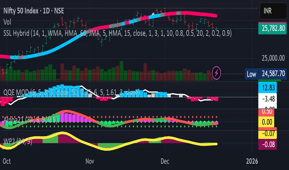
HTF EMA Bias BackgroundThis indicator gives you the cross over points from EMAs on the 15 min chart as a coloured background, you can then go to the 1 min chart to see the overlay. Useful for a higher time frame BIAS.
指標和策略

Mini RSI+STOCH-RSI+RSI-DIVERGENCE @Marx_CapitalMini version of RSI + STOCHASTIC-RSI with RSI-Divergence detection - all in one, adjustable small table overlayed on your chart. The table box gives RSI and Stoch-RSI values and signals detected RSI divergences.
Uncheck 'Update only on bar close' in indicator settings if the box does not appear right away.

Refined Liquidity Flow IndicatorRefined Liquidity Flow Indicator - How It Works
The Refined Liquidity Flow Indicator is designed to help traders identify the flow of liquidity into and out of the market based on multiple technical factors. It combines price movement, market sentiment, volatility, and volume to give a comprehensive view of market conditions. The indicator gives buy and sell signals by calculating the flow of liquidity based on these factors.
Key Components of the Indicator:
Liquidity Flow Calculation:
The core of the indicator is the liquidity flow calculation, which is based on several factors:
Liquidity Flow=(V×ΔP)+(α×ATR)+(β×RSI)+(γ×ΔP)
Where:
𝑉 is the volume (the amount of trading activity).
ΔP is the price change (the difference between the current and previous closing price).
ATR (Average True Range) is used to measure market volatility.
RSI (Relative Strength Index) reflects market sentiment.
𝛼 𝛽 𝛾
are adjustable weights (parameters) that allow you to control how much influence each factor has on the liquidity flow calculation.
Key Indicators:
Volume (V): The amount of trades occurring in the market. A high volume indicates more activity, which is essential for confirming liquidity flow.
Price Change (ΔP): The difference between the current price and the previous price, which helps assess the strength and direction of the market move.
ATR (Average True Range): A measure of market volatility, indicating how much the price fluctuates over a specified period. A higher ATR suggests greater volatility, which often corresponds with a greater flow of liquidity.
RSI (Relative Strength Index): A momentum oscillator that measures whether a market is overbought or oversold. The RSI can help determine whether the market sentiment is bullish or bearish.
How to Use the Indicator:
Set Up: After adding the Refined Liquidity Flow Indicator to your chart, you can adjust the following settings directly from the indicator's settings panel:
α: Weight for volatility (ATR).
β: Weight for market sentiment (RSI).
γ: Weight for price change.
ATR Length: Customize the period for the ATR.
RSI Length: Customize the period for the RSI.
SMA Length: Customize the period for the Simple Moving Average.
Interpreting Signals:
Green Signal (Liquidity In): Indicates that liquidity is entering the market. This often signals a potential buy opportunity when the price is moving upwards with strong volume and market sentiment.
Red Signal (Liquidity Out): Indicates that liquidity is leaving the market. This typically signals a potential sell opportunity when the price is moving downwards with strong volume and market sentiment.
Fine-Tuning for Your Strategy:
By adjusting the weights and the lengths of the indicators, you can fine-tune the indicator to match your trading style. For example, if you want to give more weight to price movements, you can increase γ. If you want to focus more on market sentiment, adjust β.

Trade Time & Position Duration Monitor (Multi-Entry)Overview
Active Position Hold Timer is a specialized risk management tool designed to track the "psychological time cost" of your trades. Beyond just monitoring price, it focuses on the precise duration your position stays in profit or loss.
Key Features:
Real-time Duration Tracking: Automatically calculates total time in profit vs. loss.
Max Loss Streak: Records the longest continuous time in a losing state.
Multi-Entry Cost Averaging: Supports initial entry plus 2 scale-ins.
Dual Language Interface: Switch between English and Traditional Chinese.
Time-Based Alerts: Set custom alerts for total or consecutive duration.
Calculation Logic:
Baseline Calculation: Starts accumulating once entry time is reached.
Profit/Loss Detection: Compares Close Price to Average Cost on every bar.
Live Update: Uses timenow for second-by-second dashboard updates.
中文說明
本指標專為管理「心理時間成本」而設計。它不僅監控價格,更專注於記錄倉位處於盈虧狀態的精確時間,幫助交易者克服持倉時的心理壓力。
主要功能:
即時時長統計:自動計算總浮盈/浮虧時間,以及當前連續狀態的持續時間。
歷史最大浮虧時長:記錄該筆交易中,最長一次連續虧損的時間壓力。
多筆進場計算:支援初始進場加上兩次加倉,自動繪製動態成本線。
雙語切換:表格界面支援中/英文切換。
多維度警報:可針對總時間或連續時間設定警報,提醒您交易是否持有過久。
計算邏輯:
基準計時:當時間超過進場點後,根據圖表週期累加時長。
盈虧判定:每根 K 棒收盤時,自動比較收盤價與平均成本。
即時秒級更新:加入 **Live Timer** 邏輯,計算當前 K 棒已跳動的時間,確保儀表板數據每秒更新。
壓力追蹤:持續追蹤並記錄最長的連續虧損時長。


MACD Divergences + RSI/ADXMACD Divergences + RSI/ADX Indicator
This indicator combines the classic MACD divergence detection with real-time RSI and ADX monitoring in fixed corner labels.
🔹 MAIN FEATURES:
- Automatic MACD divergence detection (Classic & Hidden)
- Visual RSI and ADX labels fixed in the right corner
- Color-coded trend direction (Green: DI+ > DI- | Red: DI- > DI+)
- Customizable MACD settings (Fast/Slow Length, Signal Smoothing)
- Configurable RSI and ADX periods
- Built-in alerts for all divergence types
🔹 DIVERGENCE TYPES:
- Classic Bullish: Price makes lower lows, MACD makes higher lows (Reversal signal)
- Classic Bearish: Price makes higher highs, MACD makes lower highs (Reversal signal)
- Hidden Bullish: Price makes higher lows, MACD makes lower lows (Continuation signal)
- Hidden Bearish: Price makes lower highs, MACD makes higher highs (Continuation signal)
🔹 RSI & ADX DISPLAY:
- Fixed labels in top-right (RSI) and bottom-right (ADX) corners
- Real-time values updated on every bar
- Background color changes based on directional movement (DI+ vs DI-)
- Large, easy-to-read format
🔹 HOW TO USE:
1. Watch for divergence patterns on MACD histogram
2. Monitor RSI for overbought/oversold conditions
3. Check ADX for trend strength (>25 = strong trend)
4. Green labels = Bullish momentum (DI+ > DI-)
5. Red labels = Bearish momentum (DI- > DI+)
🔹 BEST FOR:
- Swing trading on 4H and Daily timeframes
- Trend-following strategies with mo

Custom Reversal Oscillator [wjdtks255]📊 Indicator Overview: Custom Reversal Oscillator
This indicator is a momentum-based oscillator designed to identify potential trend reversals by analyzing price velocity and relative strength. It visualizes market exhaustion and recovery through a dynamic histogram and signal dots, similar to premium institutional tools.
Key Components
Dynamic Histogram (Bottom Bars): Changes color based on momentum strength. Bright Green/Red indicates accelerating momentum, while Darker shades suggest fading strength.
Signal Line: A white line tracing the core momentum, helping to visualize the "wave" of the market.
Buy/Sell Dots: Small circles at the bottom (Mint) or top (Red) that signal high-probability reversal points when the market is overextended.
📈 Trading Strategy (How to Trade)
1. Long Entry (Buy Signal)
Condition 1: The price should ideally be near or above the 200 EMA (for trend following) or showing a Bullish Divergence.
Condition 2: The Histogram bars transition from Dark Red to Bright Green.
Condition 3: A Mint Buy Dot appears at the bottom of the oscillator (near the -25 level).
Entry: Enter on the close of the candle where the Buy Dot is confirmed.
2. Short Entry (Sell Signal)
Condition 1: The price is struggling at resistance or showing a Bearish Divergence.
Condition 2: The Histogram bars transition from Dark Green to Bright Red.
Condition 3: A Red Sell Dot appears at the top of the oscillator (near the +25 level).
Entry: Enter on the close of the candle where the Sell Dot is confirmed.
3. Exit & Take Profit
Take Profit: Close the position when the Signal Line reaches the opposite extreme or when the histogram color starts to fade (loses its brightness).
Stop Loss: Place your stop loss slightly below the recent swing low (for Longs) or above the recent swing high (for Shorts).
💡 Pro Tips for Accuracy
Watch for Divergences: The most powerful signals occur when the price makes a lower low, but the Custom Reversal Oscillator makes a higher low. This indicates "Hidden Strength" and a massive reversal is often imminent.

ADX&DIThis is an enhanced version of the classic ADX and Directional Movement Index (DMI). It is designed to filter out ranging markets and visually highlight trend strength.
Key Features:
Dual Threshold System:
Level 1 (Default 20): Signals the start of a trend. The background fill appears with high transparency.
Level 2 (Default 25): Signals a strong trend. The background fill becomes more opaque/solid to indicate momentum.
Visual Clarity: The area between DI+ and DI- is only filled when the ADX is above your defined thresholds. This helps you ignore noise in low-volatility environments.
Clean Settings: The logic is optimized so you can easily adjust colors and transparency directly in the "Style" tab without cluttered input menus.

IQR Bands boromeyIQR is the price's "comfort zone," covering the middle 50% of activity.
Inside: Just noise. Ignore it.
Breakout: A real move. Pay attention.
It filters out choppy markets so you only catch the true trends.

Professional 3SD Institutional Rejection
This indicator identifies institutional "liquidity grab" and "momentum exhaustion" zones using the statistical extremes of 3 Standard Deviations (3SD) on Bollinger Bands. Unlike standard strategies, it doesn't just look for band touches; it confirms price "wicking" outside the 3SD and closing back inside the 2SD band (rejection), while ensuring the Money Flow Index (MFI) shows signs of exhaustion. It is highly effective on 1H, 4H, and Daily timeframes for mean-reversion setups targeting the median line.

MA20 Dual Color Line IndicatorMA20 Dual Color Line Indicator
The MA20 Dual Color Line is a simple yet effective moving average indicator designed to help traders quickly visualize price trends and potential reversal points. It plots a 20-period Simple Moving Average (SMA) that changes color based on the relationship between the current closing price and the moving average itself.
🔶 How It Works
When the close price is above the MA20, the moving average line turns green, suggesting a potential bullish trend.
When the close price is below the MA20, the line turns red, indicating a possible bearish trend.
If the price is exactly at the MA20, the line remains white, highlighting a neutral or decision point.
📈 Ideal For
Identifying trend direction at a glance
Spotting support and resistance levels around the MA20
Enhancing visual analysis without cluttering the chart
🛠 Features
Clean and customizable line width
Real-time color switching based on price action
Overlay display to keep charts organized
This indicator is perfect for traders who prefer a clear, color-coded visual aid to complement their trading strategy. Whether you’re a beginner or an experienced trader, the MA20 Dual Color Line helps you stay aligned with the short-term trend.


Advanced custom multi MA signals (EMA/SMA/VWMA/VWAP) Features of Multi Moving Averages
The biggest enemy in trading is "Noise." If you get swayed by minute fluctuations on the chart, you end up missing the forest for the trees.
This indicator (Advanced Custom Multi MA Signals) is not just a simple line. By combining the three core elements of Price, Time, and Volume, it acts as a navigation system that visualizes the market's "true trend." In particular, the ability to analyze 5 moving averages simultaneously across various timeframes is akin to viewing a 3D map of the battlefield.
Understanding Core Concepts
This indicator supports 4 types of moving averages. It is crucial to clearly understand the nature of each tool.
SMA (Simple Moving Average): The most basic average value. Since it produces fewer whipsaws (false signals), it is used as a baseline to judge the "long-term trend."
EMA (Exponential Moving Average): Places more weight on recent prices. It reacts sensitively to market changes, making it advantageous for identifying "entry points."
VWMA (Volume Weighted Moving Average): Incorporates "volume" into the price calculation. It acts as a "false signal filter," weeding out price moves that aren't backed by trading volume.
VWAP (Volume Weighted Average Price): The benchmark price used by institutional investors for daily trading. It is calculated based on the session, regardless of the period settings. It is considered the "lifeline" of day trading.
Indicator Settings Guide
Open the settings window and tune it to fit your trading style.
MA 01 ~ 05 (Moving Average Settings)
MA Type: Select according to your purpose. (Generally, EMA is recommended for short-term analysis, SMA/VWMA for long-term).
Length: Enter the period you wish to analyze (e.g., 20, 60, 120, 200).
Timeframe: This is the core feature. It allows you to overlay moving averages from a higher timeframe (e.g., 4-hour, Daily) onto the chart you are currently viewing (e.g., 15-minute).
Signal Option (Trading Signals)
Golden Cross (GC) / Death Cross (DC): Captures the moment the short-term line breaks through the long-term line. You can run up to 3 strategies simultaneously.
Ribbon Gradient (Trend Visualization)
Represents the gap between two moving averages with color. As the color deepens and the width expands, it indicates a powerful trend; if the width narrows, it suggests a high probability of a trend reversal.
5 Usage Strategies
The highlight of this indicator is the cross strategy utilizing the "Multi-Timeframe (MTF)" feature. Familiarize yourself with the 5 example strategies below and set up your own strategy based on your expertise.
💡 Tip 1. Do not go against the "Major Trend" (The Authority of the Weekly Candle)
Settings: Set MA5 to .
Interpretation: The Weekly 50 line is the "major trend line" managed by institutions and market makers. If the current price is above this line, maintain only a "Buy (Long)" bias; if below, maintain only a "Sell (Short)" bias. Adhering to this rule alone can help you avoid massive losses.
💡 Tip 2. Highly Reliable "Swing Signal" (Daily Golden Cross)
Settings: In Signal 1, configure the Short MA to and the Long MA to .
Interpretation: A Golden Cross where the 4-Hour 50 EMA breaks above the Daily 50 EMA often signifies a major "trend reversal" rather than a temporary rebound. This provides an ideal entry signal for office workers or swing traders who need high reliability.
💡 Tip 3. 4-Hour Candle as the Standard for "Precision Entry"
Situation: When the Daily trend is rising (Bullish alignment).
Strategy: While watching the 15-minute or 1-hour chart, set the indicator's Signal 2 to the cross of and .
Interpretation: When the Daily chart is in an uptrend, a Golden Cross occurring on the 4-Hour chart marks "the point where a correction (pullback) ends and the rise resumes." This is the entry point with the best risk-to-reward ratio.
💡 Tip 4. Filtering Out "Fake Signals" (The Secret of Volume)
Strategy: When creating a cross signal, try using VWMA (Volume Weighted) for the Long MA, even if you use EMA for the Short MA.
Reason: A Golden Cross caused simply by a rise in price can be a trap. However, if it breaks through the heavy VWMA line accompanied by volume, it is strong evidence that "genuine liquidity" has entered.
💡 Tip 5. Remember the "Hierarchy" (Higher Timeframe Priority Rule)
Principle: If a Golden Cross (Buy Signal) appears on the 4-Hour chart, but the Daily chart is in a Death Cross (Sell Signal) state, do not enter.
Interpretation: A signal from a lower timeframe cannot overcome the power of a higher timeframe. The professional approach is to trade with significant volume only when signals align (Sync) in the order of Weekly > Daily > 4-Hour. Keep this indicator's dashboard feature on and always check the status of higher timeframes.
Signal Generation Principle (Operating Mechanism)
Signals are generated when the set short-term moving average and long-term moving average cross each other.
📈 1. Golden Cross (BUY = Buy Signal)
Situation: The moment the short-term MA crosses upward from below the long-term MA.
Principle: It implies that recent buying pressure has broken through the resistance level accumulated over a long period.
📉 2. Death Cross (SELL = Sell Signal)
Situation: The moment the short-term MA crosses downward from above the long-term MA.
Principle: It implies that recent selling pressure has collapsed the long-term support line.
※ If the candles are not displaying correctly or are flickering, please set the indicator's 'Visual order' to 'Bring to front' as shown in the image below.
Investment Caution and Disclaimer
Before using this indicator for actual trading, please strictly read the contents below.
① Auxiliary indicators are a "Compass," not a "Book of Prophecy."
This indicator is merely a tool that mathematically calculates and visualizes past price data. A "magic indicator" that predicts future price fluctuations 100% accurately or guarantees profit does not exist. The signals provided are for reference only and must never be the sole basis for entry/exit decisions.
② The responsibility for all investments lies with "Yourself."
Financial investment (Cryptocurrencies, Stocks, Futures, etc.) involves high volatility and is a risky activity that can result in the loss of some or all of the principal. The final responsibility for all trading results (profits and losses) incurred by utilizing this indicator lies entirely with the investor. The distributor and developer accept no legal responsibility for investment results under any circumstances.
③ Past data does not guarantee the future.
Even a Golden Cross that fit perfectly in backtesting or past charts may operate differently in tomorrow's market situation (News, Macroeconomics, Unexpected Variables, etc.). Do not rely solely on technical analysis; you must conduct fundamental analysis and risk management in parallel.
④ Risk management is the top priority.
No matter how promising a signal appears, "all-in trading" (investing all assets in a single trade) is a shortcut to bankruptcy. More important than the indicator itself is adhering to the principles of strict scaling in (split buying) and Stop-Loss.

Zone Eleven HTF Gate SweepThis indicator is designed as a simple visual framework rather than a rigid signal system. It highlights time-based structure and key alignment zones to help identify when price behavior is more likely to be active or responsive. The logic is intentionally flexible, allowing the user to apply their own discretion instead of relying on strict conditions. Its primary value is visual clarity and context, not automatic entries or exits.

Goldbach Timing Model This indicator is designed as a simple visual framework rather than a rigid signal system. It highlights time-based structure and key alignment zones to help identify when price behavior is more likely to be active or responsive. The logic is intentionally flexible, allowing the user to apply their own discretion instead of relying on strict conditions. Its primary value is visual clarity and context, not automatic entries or exits.


krishnadeshmukh/NIFTY50 Micro Sentiment Part 1📘 Script Description: NIFTY50 Micro Sentiment — Part 1
This indicator tracks real-time micro sentiment across the top 25 weighted stocks of the NIFTY50 index using a volume-based distribution model.
🔍 How it works:
Scans last N bars (configurable) for each stock.
Divides each stock’s price range into equal bins.
Measures bullish vs bearish volume in each bin based on:
Candle Color (Close > Open) or
Close Near High (Close > Midpoint).
Assigns a sentiment value:
+1 → Bullish dominance
-1 → Bearish dominance
0 → Neutral
📊 Each stock's sentiment is weighted by its contribution to the index.
🧮 Displays:
Weighted Sentiment Score
Bullish / Bearish / Neutral Components
Updated every 5 bars with an easy-to-read table.
Use this to gauge underlying micro shifts in sentiment before broader market moves.
krishnadeshmukh/NIFTY50 Micro Sentiment Part 2📘 Script Description: NIFTY50 Micro Sentiment — Part 2
This indicator continues the NIFTY50 Micro Sentiment model by analyzing the remaining 25 stocks (Rank 26–50 by index weight) of the NIFTY50.
🔍 Key Features:
Applies the same volume-bin methodology used in Part 1.
Sentiment detection based on:
Candle Color (default) or
*Close vs Midpoint of the candle range.
Stocks are weighted by their index influence.
Output is a clean sentiment table:
+ve / -ve / Neutral Volume Score
Weighted Sentiment Output
Use this in conjunction with Part 1 to analyze the entire NIFTY50 sentiment landscape.
📘 Script Description: NIFTY50 Combined Score
This script aggregates live sentiment data from both:
🧩 NIFTY50 Micro Sentiment — Part 1
🧩 NIFTY50 Micro Sentiment — Part 2
🚀 What it does:
Imports Score, +ve, -ve, and Neutral components from both scripts.
Combines them to produce:
✅ Total Weighted Sentiment
🟢 Bullish Weight
🔴 Bearish Weight
🟡 Neutral Component
📊 Outputs are shown via a middle-right sentiment table, updated every 5 bars.
Perfect for traders seeking a unified view of micro sentiment across the entire NIFTY50 ecosystem — in one glance.

MTF Bollinger Bands (2SD & 3SD)
개요
1분봉이나 5분봉 등 하위 타임프레임에서 스캘핑을 할 때, 차트를 변경하지 않고 상위 타임프레임(기본 4시간)의 볼린저 밴드 위치를 확인하기 위해 제작했습니다.
주요 기능
MTF (Multi-Timeframe): 현재 보고 있는 차트와 상관없이 설정한 타임프레임의 볼린저 밴드를 표시합니다. (기본값: 4시간)
듀얼 밴드 시각화 (Dual Zone): 표준편차 2(2SD)와 표준편차 3(3SD)을 동시에 계산합니다.
2SD 영역: 2SD와 3SD의 배경색이 겹치도록 설계하여, 중심부(2SD)가 시각적으로 더 진하게 보입니다. 이는 주요 지지/저항 구간을 직관적으로 보여줍니다.
3SD 영역: 외곽은 연하게 표시되어 과매수/과매도 구간을 식별하기 좋습니다.
끊김 없는 라인: gaps_off 처리를 통해 타임프레임 변경 시 선이 끊기지 않고 부드럽게 연결됩니다.
설정 가이드
Timeframe: 기준이 될 상위 시간대를 선택하세요. (기본: 240분/4시간)
Multiplier: 표준편차 배수를 변경할 수 있습니다. (기본: 2.0 / 3.0)
Transparency: 배경 투명도를 조절해 밴드의 진하기를 변경하세요.
==========================================
Overview
Designed for traders who need to monitor Higher Timeframe (HTF) volatility while scalping on Lower Timeframes (LTF). This indicator overlays HTF Bollinger Bands on your current chart without the need to switch tabs.
Key Features
MTF Capability: Displays Bollinger Bands from any user-defined timeframe. (Default: 4 Hours).
Dual Zone Visualization: Plots both 2 Standard Deviations (2SD) and 3 Standard Deviations (3SD).
Visual Depth: The script utilizes an overlapping fill method. The inner 2SD band appears darker as it layers on top of the 3SD background, clearly highlighting the primary support/resistance zone.
Extreme Zones: The outer 3SD band remains lighter, indicating extreme overbought/oversold conditions.
Seamless Plotting: Uses gaps_off to ensure lines remain continuous across different timeframes.
Settings
Timeframe: Select the target HTF. (Default: 240 / 4H)
Multiplier: Adjust the standard deviation multipliers. (Default: 2.0 & 3.0)
Style: Customize colors and transparency to fit your chart theme.

GS Tactical Overlay (SMC + Squeeze)designed to sit atop the 6 pillar commander. it will tell you signs for puts and calls

S&R Zones + Signals V6.4 (Rejection & Break)This indicator is to trigger once the Candle go into the Zone, get rejection and Break