Low Volume Pullback DetectorThis script incorporates the logic of Volume Price Analysis (VPA), identifying potential trend continuations by detecting pullbacks with decreasing volume.
###**Features:**1. **Trend Filtering:** Uses a 50-period EMA to ensure trades align with the dominant market direction.
2. **Structure Identification:** Detects recent highs and lows to confirm that price action is indeed a pullback within a trend.
3. **Volume Analysis:** Checks if the volume during the pullback is below the 20-period average, signaling a lack of conviction from counter-trend traders.
4. **Signal Generation:** Triggers a "Buy" or "Sell" signal when price breaks out of the pullback range, confirming momentum is returning in the direction of the trend.
5. **User Guide:** Detailed comments explaining the strategy, setup, trade execution, and best markets are included directly within the script for easy reference.
###**How to Use:*** **Setup:** Apply the script to a chart (works best on Stocks and Futures).
* **Identify Trend:** Ensure price is above (for Buy) or below (for Sell) the gray 50 EMA line.
* **Wait for Signal:** Look for the **"VOL DRY"** label. This appears when a low-volume pullback is followed by a breakout candle.
* **Execution:** Enter on the close of the signal candle. Set your Stop Loss below/above the pullback swing and target the previous structural high/low.
指標和策略

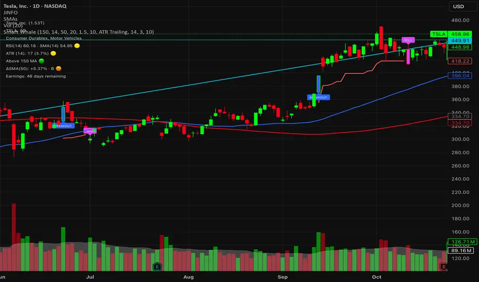
Smart WhaleOverview The Smart Whale Breakout System is a pure momentum strategy designed for Swing Traders who want to capture high-probability breakouts while managing risk with a mechanical trailing stop.
Unlike indicators that try to guess "bottoms," this system follows the "Smart Money" approach: buying strength when institutional volume enters, and riding the trend until the momentum breaks.
How it Works
1. The Entry (The Hunter) The system identifies a valid BREAKOUT signal only when four specific conditions align:
Trend Filter: Price must be above the 150 SMA. We only trade with the long-term trend.
Momentum: RSI > 50. Ensuring bulls are in control.
Volume Spike (Whale Activity): Current volume must be significantly higher than the average (Default: 1.5x). This filters out weak retail moves.
Price Action: A bullish candle closing higher than it opened.
2. The Exit (The Manager) Once in a trade, the system activates a dynamic Trailing Stop line. You never have to guess when to sell. You can choose between two exit logic modes in the settings:
ATR Trailing (Default): Adapts to volatility. The stop moves up based on a multiple of the Average True Range (ATR). Great for volatile stocks (e.g., TSLA, NVDA).
Percent Trailing: A fixed percentage drop from the highest high. (e.g., "Sell if price drops 10% from peak").
3. The Context (Optional Filter)
Squeeze Filter: Includes a built-in Bollinger/Keltner squeeze detection. If enabled in settings, the system will only signal a buy if the price recently broke out of a consolidation (squeeze). Default is OFF to catch all momentum moves.
Key Features
NO Repainting: Signals are confirmed at candle close.
Visual Risk Management: A Red Trailing Stop line clearly shows where your invalidation point is.
Fully Customizable: Adjust the Volume multiplier, ATR sensitivity, or Percentage drop to fit your asset class (Crypto/Stocks/Forex).
Clean Visuals: Only colors the Breakout and Sell candles to keep your chart clean.
Settings Guide
Trend SMA Length: Define the long-term trend baseline (Default: 150).
Volume Spike (xAvg): How much volume is needed to trigger a buy? (1.5 = 150% of average).
Exit Method: Choose between "ATR Trailing" or "Percent Trailing".
ATR Multiplier: Tighter stop (2.0) vs Looser stop (3.0).
Require Squeeze?: Check this to filter for breakouts that only happen after a consolidation period.
Disclaimer This tool is for educational purposes only. Always use proper risk management.
Pair Creation🙏🏻 The one and only pair construction tech you need, unlike others:
Applies one consistent operation to all the data features (not only prices). Then, the script outputs these, so you can apply other calculations on these outputs.
calculates a very fast and native volatility based hedge ratio, that also takes into account point value (think SPY vs ES) so you can easily use it in position sizing
Has built-in forward pricing aka cost of carry model , so you can de-drift pairs from cost of carry, discover spot price of oil based on futures, and ofc find arbitrage opportunities
Also allows to make a pair as a product of 2 series, useful for triangular arbitrage
This script can make a pair in 2 ways:
Ratio, by dividing leg 1 by leg 2
Product, by multiplying leg 1 by leg 2
The real mathematically right way to construct a pair is a ratio/product (Spreads are in fact = 2 legged portfolio, but I ain't told ya that ok). Why? Because a pair of 2 entities has a mathematically unique beauty, it allows direct comparisons and relationship analysis, smth you can't do directly with 3 and more components.
Multiplication (think inversions like (EURUSD -> USDEUR), and use cases for triangular arbitrage) is useful sometimes too.
...
Quickguide:
First, "Legs" are pair components: make a pair of related assets. Don’t be guided exclusively by clustering, cointegrations, mutual information etc. Common sense and exogenous info can easily made them all Forward pricing model: is useful when u work with spot vs futures pairs. Otherwise: put financing, storage and yield all on zeros, this way u will turn it off and have a pure ratio/product of 2 legs.
Look at the 2 numbers on the script’s status line: the first one would always be 1), and the second one is a variable.
First number (always 1) is multiplier for your position size on leg 1
The second number is the multiplier for your position size on leg 2 in the opposite direction.
If both legs are related, trading your sizes with these multipliers makes you do statistical arbitrage -> trading ~ volatility in risk free mode, while the relationship between the assets is still in place.
Also guys srsly, nobody ‘ever’ made a universal law that somewhy somehow for whatever secret conspiracy reason one shall only trade pairs in mean reverting style xd. You can do whatever you want:
Tilt hedge ratio significantly based on relative strength of legs
Trade the pair in momentum style
Ignore hedge ratio all together
And more and more, the limit is your imagination, e.g.:
Anticipate hedge ratio changes based on exogenous info and act accordingly
Scalp a pair just like any other asset
Make a pair out of 2 pairs
Like I mean it, whatever you desire
About forward pricing model:
It’s applied only to leg 2;
Direct: takes spot price and finds out implied futures price
Inverse: takes futures price and finds out implied spot price (try on oil)
Pls read online how to choose parameters, it’s open access reliable info
About the hedge ratio I use:
You prolly noticed the way I prefer to use inferred volumes vs the “real” ones. In pairs it’s especially meaningful, because real volumes lose sense in pair creation. And while volumes are closely tied to volatility, the inferred volumes ‘Are’ volatility irl (and later can be converted to currency space by using point value, allowing direct comparisons symbol vs symbol).
This hedge ratio is a good example of how discovering the real nature of entities beats making 100s of inventions, why domain knowledge and proper feature engineering beats difficult bulky models, neural networks etc. How simple data understanding & operations on it is all you need.
This script simply does this:
Takes inferred volume delta of both assets, makes a ratio, normalizes it by tick sizes and points values of both legs, calculates a typical value of this series.
That’s it, no step 2, we’re done. No Kalman filters, no TLS regression, no vine copulas, or whatever new fancy keywords you can come up with etc.
...
^^ comparing real ES prices vs theoretical ones by forward-pricing model. Financing: 0.04, yield 0.0175
^^ EURUSD, 6E futures with theoretical futures price calculated with interest rate differential 0.02 (4% USD - 2% EUR interest rates)
^^4 different pairs (RTY/ES, YM/ES, NQ/ES, ES/ZN) each with different plot style (pick one you like in script's Style settings)
^^ YM/RTY pair, each plot represents ratio of different features: ratio of prices, ratio of inferred volume deltas, ratio of inferred volumes, ratio of inferred tick counts (also can be turned on/off in Style settings)
...
How can u upgrade it and make a step forward yourself:
On tradingview missing values are automatically fixed by backfilling, and this never becomes a thing until you hit high frequency data. You can do better and use Kalman filter for filling missing values.
Script contains the functions I use everywhere to calculate inferred volume delta, inferred volume, and inferred tick count.
...
∞

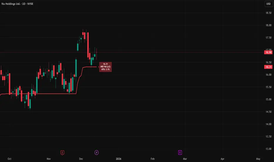
MA 50/150 Status Light לקראת שנת 2026. בודק האם אנחנו נמצאים מעל ממוצע 150 ו 50 האם בין והאם מתחת
במידה ואנחנו מעל אז מצב המניה חזק
במידה ובין אז סימן אזהרה, החלשות המניה
במידה ומתחת אז מניה חלשה
“Heading into 2026, we check whether the price is above the 50-day and 150-day moving averages, between them, or below them.
If the price is above both, the stock is in a strong condition.
If the price is between them, it is a warning sign — the stock is weakening.
If the price is below both, the stock is weak.”

Initial Balance with AlertsThis indicator is a comprehensive tool for Auction Market Theory (AMT) practitioners who rely on the Initial Balance (IB) to determine the day's likely structure. It automatically plots the High and Low of the opening session (user-definable) and extends those levels to provide key support and resistance zones for the remainder of the trading day.
Unlike standard IB indicators, this script features Smart Alerts that are time-filtered. You can define a specific "Active Alert Window" (e.g., RTH only) to ensure you are notified of breakouts during key hours, while avoiding spam notifications during overnight or low-volume sessions.
Key Features:
1. Customizable Initial Balance
Flexible Session: Define the exact start and end time for your IB calculation (Default: 08:30–09:30).
Visual Clarity: Plots IB High, IB Low, and the 50% Midpoint with fully customizable line styles, colors, and widths.
2. Smart Time-Filtered Alerts
Breakout Detection: Triggers an alert when price crosses above the IB High or below the IB Low.
Session Filter: Includes a unique "Allowed Alert Time" input. Alerts will only fire if the breakout happens within this window (Default: 08:30–15:00), preventing unwanted notifications during overnight chop.
3. Advanced Extensions & Targets
Extensions: Option to display multiples of the IB range (2x, 3x) to serve as statistical targets for trend days.
Intermediate Levels: Option to display half-step extensions (e.g., 1.5x) for tighter scalping targets.
4. IB Delta Analytics Dashboard
Context is Key: An optional on-screen dashboard tracks the size of the Initial Balance over the last 20 days.
Sentiment: Automatically categorizes today's IB as "Huge," "Medium," or "Small" compared to the 20-day average. This helps you anticipate if the day is likely to be a "Range Day" (Large IB) or a "Trend Day" (Small IB).
Settings Overview:
Calculation Period: The time used to measure the high and low (e.g., first 60 mins).
Allowed Alert Time: The window during which alerts are active.
Show Extra Levels: Toggles the 2x and 3x extensions.
Fill IB Areas: Adds a background color to the opening range for better visibility.
Delta Analytics: Toggles the statistics table on/off.
Author's Instructions
How to Configure the Time Settings: This script uses two distinct time inputs to give you maximum control:
"Calculation period": This is when the script measures the High and Low.
Example: 0830-0930 (The first hour of the NYSE session).
"Allowed Alert Time (RTH)": This is when the script is allowed to send you alerts.
Example: 0830-1500 (The full trading day).
Why this matters: If price breaks the IB High at 18:00 (during the overnight session), the script will ignore it if your alert time ends at 15:00. This saves you from waking up to low-probability signals.
Setting Up Alerts: To activate the alerts, add the indicator to your chart, click the "Alerts" button (clock icon) in the top toolbar, select this indicator from the "Condition" list, and choose "Any alert() function call".
Disclaimer: This tool is for informational purposes only. Past performance does not guarantee future results.

Daily Levels ImporterUser Guide: Daily Levels Importer
What This Indicator Does
This tool allows you to instantly draw multiple support and resistance lines on your TradingView chart by pasting a list of data. It avoids the need to manually draw lines one by one. It also features a dashboard to identify the ticker and filters to toggle specific line colors on or off.
1. The Data Format
The indicator reads text in a specific 3-column format (Comma Separated).
Format: \, \, \
* Ticker: The symbol name (used for the dashboard display).
* Price: The price level where the line will be drawn.
* Color Code:
r = Red
g = Green
y = Yellow
Example:
ES, 4150.25, r
ES, 4200.00, g
ES, 4175.50, y
2. How to Use It
3. Copy Your Data: Select your list of levels (from Excel, a text file, or a website) and copy them to your clipboard.
4. Open Settings: On your TradingView chart, hover over the indicator name and click the Settings (Gear Icon).
5. Paste Data:
* Find the "Paste Data Here" text box in the Inputs tab.
* Delete any existing text.
* Paste your new list.
6. Save: Click OK. The lines will instantly render on your chart.
7. Controls & Filters
You can customize the view without deleting data by using the checkboxes in the Settings menu:
* Line Filters:
* Show Red Levels: Uncheck to hide all red lines.
* Show Green Levels: Uncheck to hide all green lines.
* Show Yellow Levels: Uncheck to hide all yellow lines.
* Dashboard Location:
* Use the dropdowns to move the Ticker ID box to any corner of the screen (e.g., Top Right, Bottom Left) or change its size.
8. Troubleshooting
Lines aren't showing up?
* Ensure the prices match the asset you are viewing (e.g., don't paste SPX prices on an AAPL chart).
* Check if you accidentally unchecked the "Show " box in the settings.
"No Data" in Dashboard?
* The script reads the ticker name from the first row of your pasted data. Ensure the first row is not blank.
Is there a limit?
* Yes. TradingView allows approximately 4,000 characters in the text box. This is roughly 250 lines of price levels. If you need more, add a second instance of the indicator to the chart.

Custom Monthly Volume Profile [Multi-Timeframe]This indicator renders a high-precision Monthly Volume Profile designed for intraday traders and practitioners of Auction Market Theory. Unlike standard volume profiles, this script utilizes Multi-Timeframe (MTF) data request capability to build the profile from lower timeframe data (e.g., 5-minute bars) while displaying it on your trading timeframe.
This tool is optimized to keep your chart clean while providing critical developing levels (POC, VAH, VAL) and historical context from the previous month.
Key Features:
1. Dynamic "Auto-Scaling" Width One of the biggest issues with monthly profiles is visual clutter.
Early Month: The profile starts wide (default 10% width) so you can clearly see the developing structure when data is scarce.
Late Month: As volume accumulates, the profile automatically shrinks (scales down to 2% width) to prevent the histogram from obscuring price action.
Note: This can be toggled off for a static width.
2. Developing & Static Levels
Current Month: Displays real-time Developing Point of Control (dPOC), Value Area High (dVAH), and Value Area Low (dVAL).
Previous Month: Automatically locks in the levels from the previous month at the close, providing immediate support/resistance references for the new month.
3. Time-Filtered Alerts Avoid waking up to notifications during low-volume overnight sessions. This script includes a Session Filter (Default: 0830-1500).
Alerts for crossing POC, VAH, or VAL will only trigger if the price cross occurs within the user-defined time window.
4. Calculation Precision
Multi-Timeframe Data: The profile is built using lower timeframe data (Input: Calculation Precision) rather than just the current chart bars. This ensures the Volume Profile shape remains accurate even when viewing higher timeframes.
Row Size: Fully adjustable "Tick/Row Size" to control the resolution of the volume buckets.
Settings Overview:
Calculation Precision: Determine the granularity of the data (e.g., "5" for 5-minute data).
Row Size: Controls vertical resolution (Lower = higher detail).
Value Area %: Standard 70% default, fully adjustable.
Auto-Width: Set the Start % (Day 1) and End % (Day 31).
Alerts: Toggle Current or Previous month alerts and define the active time session.
Visual Customization:
Customize colors for the Histogram (Value Area vs. Outer Area).
Customize line width and colors for POC, VAH, and VAL.
Supports Right or Left alignment.
Disclaimer: This tool is for informational purposes only. Past performance and volume levels do not guarantee future price action.

Trading Dashboard + Daily SMAsThis indicator is an all-in-one workspace overlay designed for futures and intraday traders. It consolidates critical market internals, session statistics, and daily technical levels into a single, highly customizable dashboard.
The goal of this script is to reduce chart clutter by placing essential data into a clean table while overlaying key Daily Moving Averages onto your intraday timeframe.
Key Features:
1. Comprehensive Market Internals Dashboard Monitor the health of the broad market directly from your chart. The dashboard includes real-time data for:
VIX: Volatility Index.
TICK & TRIN: Sentiment and volume flow indicators.
Breadth Data: ADD, ADV, and DECL (Advance/Decline lines and volume).
Multi-Ticker Watch: Monitor 3 additional assets (Defaults: NQ, RTY, YM) with real-time price and % change.
2. Session Statistics & Probabilities Automated calculation of intraday statistics based on a user-defined lookback period (default 100 days):
RTH Data: Tracks Regular Trading Hours Open, Close, and Range.
Contextual ATR: Compares current RTH range to the 14-day ATR.
Probabilities: Displays historical probabilities for "Gap Fill," "Break of Yesterday's High," and "Break of Yesterday's Low."
3. Daily SMAs on Intraday Charts Plot key Daily Simple Moving Averages (21, 50, 200) directly on your lower timeframe charts (1m, 5m, etc.) without switching views.
Fully Customizable: Toggle each SMA on/off individually.
Color Control: Users can change the color of every SMA line to fit their theme.
4. "Dark Mode" Optimized The dashboard features a specific "Very Dark Grey" (#121212) background by default, designed to reduce eye strain and blend seamlessly with dark-themed trading setups.
Settings & Customization:
Session Times: Define your specific RTH start and end times.
Symbols: All ticker symbols (VIX, ADD, NQ, etc.) can be customized in the settings menu to match your data provider.
Visibility: Every element in the table and every SMA line has a toggle switch. You only see what you need.
Visuals: Change table position, text size, and line colors.
Author's Instructions: Configuration Guide
This script relies on specific ticker symbols to pull data for Market Internals (TICK, TRIN, ADD) and the Watchlist. Depending on your data subscription plan (CME, CBOE, etc.), you may need to adjust the default symbols to match what you have access to.
1. How to Change Symbols
Add the indicator to your chart.
Hover over the indicator name in the top-left corner and click the Settings (Gear Icon).
Scroll to the "Symbols" section.
Click inside the text box for the symbol you want to change.
2. Common Symbol Formats If the default symbols show "N/A" or "Error," try these alternatives based on your data feed:
TICK (NYSE Tick)
Default: USI:TICK (Requires specific data)
Alternative: TVC:TICK (General TradingView feed)
Alternative: TICK (Generic)
TRIN (Arms Index)
Default: USI:TRIN
Alternative: TVC:TRIN
Alternative: TRIN
Breadth (ADD/ADV/DECL)
ADD (Advance-Decline Line): Try USI:ADD, TVC:ADD, or ADD
ADV (Advancing Volume): Try USI:ADV, TVC:ADV, or UVOL (Up Volume)
DECL (Declining Volume): Try USI:DECL, TVC:DECL, or DVOL (Down Volume)
VIX
Standard: CBOE:VIX or TVC:VIX
3. Setting Up the Ticker Watchlist (Ticker 1, 2, 3) The script defaults to "Continuous Contracts" (indicated by the 1!), which automatically rolls to the front month.
Nasdaq: CME_MINI:NQ1!
S&P 500: CME_MINI:ES1!
Russell 2000: CME_MINI:RTY1!
Dow Jones: CBOT_MINI:YM1!
Note: If you want to watch a specific contract month (e.g., December 2025), enter the specific code like NQZ2025.
4. Troubleshooting "N/A" Data If a cell in the table is empty or says "N/A":
Verify you are not viewing the chart on a timeframe that excludes the data (though dynamic_requests=true usually handles this).
Ensure you have the correct data permission for that specific symbol.
Market Closed: Some internal data points only populate during the active NYSE session (09:30 - 16:00 ET).
Disclaimer: This tool is for informational purposes only and does not constitute financial advice. Past probabilities do not guarantee future results.

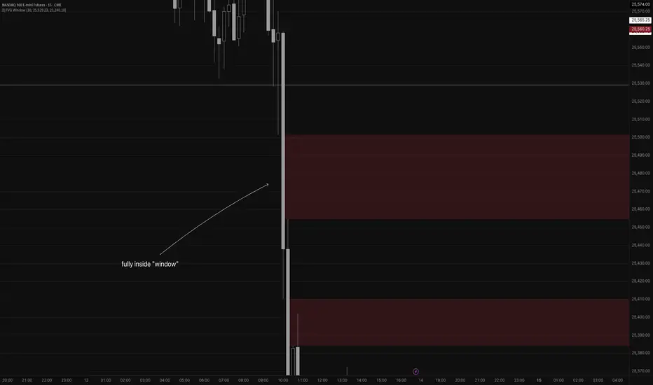
Fair Value Gap WindowStupid little toy I made to get my toes back in the water. How does this work?
Detects fair value gaps up to the count you specify in the settings
Plots them on the chart if they are inside of the 2 lines (top and bottom)
If the fair value gap is partially outside of the "window", it will only draw the part of it thats inside the window.
Not really useful but if you wanna take a look at the code for practice for yourself, feel free I guess haha
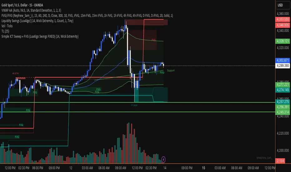
XAUUSD Session Move Stats (Last 14 Days)This indicator analyzes Gold (XAUUSD) session behavior over the last 14 days and calculates how price typically moves during the Asia, London, and New York sessions.
For each session, it shows:
Average Max Up (%) – how far price moves up from session open
Average Max Down (%) – how far price moves down from session open
Average Net Close (%) – where price typically finishes relative to the session open
The data is calculated session-by-session and displayed in a table, helping traders understand session bias, volatility tendencies, and directional behavior.
Best used on intraday timeframes for session-based analysis and contextual trade planning (signals only, no automated trades).

Trinity Real Move Detector DashboardRelease Notes (critical)
1. This code "will" require tweaks for different timeframes to the multiplier, do not assume the data in the table is accurate, cross check it with the Trinity Real Move Detector or another ATR tool, to validate the values in the table and ensure you have set the correct values.
2. I mention this below. But please understand that pine code has a limitation in the number of security calls (40 request.security() calls per script). This code is on the limit of that threshold and I would encourage developers to see if they can find a way around this to improve the script and release further updates.
What do we have...
The Trinity Real Move Detector Dashboard is a powerful TradingView indicator designed to scan multiple assets at once and show when each one has genuine short-term volatility "energy" — the kind that makes directional options trades (especially 0DTE or short-dated) have a high probability of follow-through, and can be used for swing trading as well. It combines a simple ATR-based volatility filter with a SuperTrend-style bias to tell you not only if the market is "awake" but also in which direction the momentum is leaning.
At its core, the indicator calculates the current ATR on your chosen timeframe and compares it to a user-defined percentage of the asset's daily ATR. When the short-term ATR spikes above that threshold, it signals "enough energy" — meaning the underlying is moving with real force rather than choppy noise. The SuperTrend logic then determines bullish or bearish bias, so the status shows "BULLISH ENERGY" (green) or "BEARISH ENERGY" (red) when energy is on, or "WAIT" when it's not. It also counts how many bars the energy has been active and shows the current ATR vs threshold for quick visual confirmation.
The dashboard displays all this in a clean table with columns for Symbol, Multiplier, Current ATR, Threshold, Status, Bars Active, and Bias (UP/DOWN). It's perfect for 3-minute charts but works on any timeframe — just adjust the multiplier based on the hints in the settings.
Editing symbols and multipliers is straightforward and user-friendly. In the indicator settings, you'll see numbered inputs like "1. Symbol - NVDA" and "1. Multiplier". To change an asset, simply type the new ticker in the symbol field (e.g., replace "NVDA" with "TSLA", "AVGO", or "ADAUSD"). You can also adjust the multiplier for each asset individually in the corresponding "Multiplier" field to make it more or less sensitive — lower numbers give more signals, higher numbers give stricter, higher-quality ones. This lets you customize the dashboard to your watchlist without any coding. For example, if you switch to a 4-hour chart or a slower-moving stock like AVGO, you may need to raise the multiplier (e.g., to 0.3–0.4) to avoid false "bullish" signals during minor bounces in a larger downtrend.
One important note about the multiplier and timeframes: the default values are optimized for fast intraday charts (like 3-minute or 5-minute). On higher timeframes (15-minute, 1-hour, 4-hour, or daily), the SuperTrend bias can be too sensitive with low multipliers (1.0 default in the code), leading to situations like the AVGO 4-hour example — where price is clearly downtrending, but the dashboard shows "BULLISH ENERGY" because the tight bands flip on small bounces. To fix this, you need to manually increase the multiplier for that asset (or all assets) in the settings. For 4-hour or daily charts, 0.25–0.35 is often better to match smoother SuperTrend indicators like Trinity. Always test on your timeframe and asset — crypto usually needs slightly lower multipliers than stocks due to higher volatility.
TradingView has a hard limit of 40 request.security() calls per script. Each asset in the dashboard requires several calls (current ATR, daily ATR, SuperTrend components, etc.), so with the full ATR-based bias, you can safely monitor about 6–8 assets before hitting the limit. Adding more symbols increases the number of calls and will trigger the "too many securities" error. This is a platform restriction to prevent excessive server load, and there's no official way around it in a single script. Some advanced coders use tricks like caching or lower-timeframe requests to squeeze in a few more, but for reliability, sticking to 6–8 assets is recommended. If you need more, the common workaround is to create two separate indicators (e.g., one for stocks, one for crypto) and add both to the same chart.
Overall, this dashboard gives you a professional-grade multi-asset scanner that filters out low-energy noise and highlights real momentum opportunities across stocks and crypto — all in one glance. It's especially valuable for options traders who want to avoid theta decay on weak moves and only strike when the market has true fuel. By tweaking the per-symbol multipliers in the settings, you can perfectly adapt it to any timeframe or asset behavior, avoiding issues like the AVGO false bullish signal on higher timeframes.

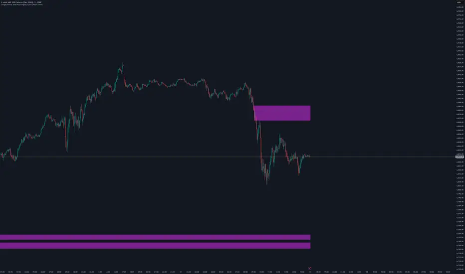
AMT Structure: 80% Traverse, PD Levels & nPOCsHere is a clean, professional description formatted for the TradingView description box. It highlights the methodology (AMT/80% Rule), the specific features, and the credits.
Title: AMT Structure: 80% Traverse, PD Levels & nPOCs
Description:
This indicator is a comprehensive toolkit designed for futures traders utilizing Auction Market Theory (AMT) and Volume Profile strategies. It consolidates multiple scripts into a single, unified overlay to declutter your chart while providing essential structural references for the 80% Traverse setup, intraday context, and longer-term auction targets.
Key Features:
1. 80% Rule / Traverse Setup (Chart Champions Logic)
Automated RTH Open Detection: Hardcoded to the 08:30 AM CT Open to ensure accuracy for US Futures (ES/NQ) regardless of your chart's timezone settings.
Value Area Logic: Automatically calculates the Previous Day's Value Area High (VAH), Value Area Low (VAL), and Point of Control (POC).
Setup Detection: If the market opens outside of the previous day's value, the script highlights the Value Area in color (default: Purple), signaling that an 80% traverse (filling the value area) is structurally possible if price re-enters value.
Background Fill: Optional shading between VAH and VAL to clearly visualize the "playing field" for the traverse.
2. Auction Market Theory (AMT) Premarket Levels
Overnight High/Low: Automatically captures the highest and lowest prices traded during the overnight session (17:00 - 08:30 CT).
Breakout Alerts: Includes logic to detect and alert when these overnight levels are broken during the RTH session.
Auto-Cleanup: Lines can be set to auto-delete after a specified time (default: 60 mins into the session) to keep the chart clean after the Initial Balance (IB) period.
3. Structural Reference Levels
Previous Day Levels: Plots Previous Day High, Low, and Equilibrium (Midpoint) as standard reference lines.
Initial Balance (IB): Option to display the First Hour High and Low (08:30 - 09:30 CT) to assess day type (Neutral, Trend, Normal Variation, etc.).
RTH VWAP: An anchored VWAP that resets specifically at the RTH Open (08:30 CT), distinct from the standard 24-hour VWAP.
4. Naked Points of Control (nPOCs)
Multi-Timeframe Tracking: Tracks and plots Naked POCs for Daily, Weekly, and Monthly profiles.
Auto-Cleanup: Lines automatically delete themselves the moment price touches them, ensuring you only see untested levels.
Customization: Toggle each timeframe on/off individually.
Settings & Customization:
Global Offset: Move all text labels to the right with a single setting to prevent price action from obscuring text.
8:30 Open Offset: Independent offset for the Open label to distinguish it from other opening references.
Smart Coloring: Text labels automatically match their corresponding line colors for easy identification.
Modular Toggles: Every section (AMT, VWAP, PD Levels, CCV, nPOCs) can be turned on or off individually to suit your specific trading plan.
Usage: This tool is specifically tuned for ES and NQ futures trading but can be adapted for other instruments. It replaces the need for separate indicators for Overnight Highs/Lows, Previous Day Levels, and Volume Profile targeting.

Peter Lynch Value (Dynamic Growth)This indicator implements Peter Lynch's core valuation principle: Fair Price = Earnings Per Share (EPS) * Growth Rate.
It provides a dynamic "fair value" line overlaid on the price chart, allowing traders and investors to quickly assess whether a stock's current price is trading above or below its intrinsic value according to the Lynch method.
Key Features
1. Dynamic Growth Rate Calculation
The indicator uses a custom algorithm to calculate the critical EPS Growth Rate, making it robust against missing data from standard financial fields.
Methodology: It fetches historical TTM Diluted EPS reports (EARNINGS_PER_SHARE_DILUTED, TTM) and calculates the Year-over-Year (YoY) Growth Percentage from the current TTM value versus the TTM value 4 periods prior.
Reliability: This custom calculation ensures the value line appears even when TradingView's pre-calculated growth metrics are unavailable (na).
2. Multiplier Control
P/E Cap: You can enforce a maximum P/E multiplier (maxPE, default 25), preventing the fair value from becoming unrealistically high for extremely fast-growing companies (as Lynch suggested).
Fallback P/E: If insufficient financial history is available to calculate the growth rate, the indicator automatically switches to a user-defined fallbackPE (default 15) and highlights the line in orange as a warning.
3. Smoothing (Optional)
To reduce the volatility often seen in valuation metrics, you can apply an optional Simple Moving Average (SMA) to the Fair Value line. This helps visualize the underlying trend of intrinsic value.
4. Forward Estimate (Optional)
Display an optional projection (circles) based on the analysts' next Fiscal Year EPS Estimate (EARNINGS_ESTIMATE, FY). This shows the potential fair value if the company meets future expectations.
5. Diagnostic Table
A table in the corner provides transparency on the calculation:
Green/Red: Confirms if TTM EPS and Calculated Growth are found.
Final P/E Used: Shows the exact multiplier used (calculated growth or the manual fallback).
Disclaimer: This tool is for informational and educational purposes only and should not be considered financial advice.

Single Prints and Poor Highs/Lows [Real-Time]This indicator is designed for traders utilizing Auction Market Theory (AMT) who need real-time visibility into market structure inefficiencies. Unlike standard TPO tools that often wait for closed bars or finished sessions, this script builds a developing TPO profile tick-by-tick to identify Single Prints and Poor Highs/Lows the moment they form.
Key Features:
Real-Time Single Prints: Automatically detects and highlights areas of single-print inefficiencies (buying/selling tails) as they happen. These "ghost" boxes persist on the chart until price repairs (fills) them, acting as immediate targets or support/resistance zones.
Poor High/Low Detection: Strictly implements AMT logic to identify "unfinished" auctions. If a session extreme is formed by two or more TPO blocks (indicating a flat top/bottom rather than a rejection tail), it marks the level with a dotted line.
Repair Logic: Both Single Prints and Poor High/Low lines are dynamic. If price revisits and repairs the structure, the markers automatically vanish to keep your chart clean.
Session Control: Fully customizable RTH (Regular Trading Hours) session input (default 08:30–15:15) to ensure profiles are built on relevant liquidity.
Quantization: Adjustable "Ticks per Block" allowing you to tune the sensitivity of the TPO profile to different assets (ES, NQ, CL, etc.).
How It Works:
TPO Construction: The script breaks the session into 30-minute periods (configurable) and tracks price overlap.
Single Prints: When the market expands rapidly, leaving gaps in the profile (single TPO blocks), a box is drawn. If price trades back through this box, it deletes itself.
Poor Extremes: It monitors the current session High and Low. If the extreme price level has a TPO count of ≥ 2, it is flagged as "Poor." If the extreme is a single print (count = 1), it is considered a valid tail and left unmarked.
Settings:
RTH Session: Define your specific trading session time.
TPO Period: Default is 30 minutes (standard AMT).
Ticks per Block: Controls the vertical resolution of the TPO. (Higher values = coarser profile, Lower values = more precision).
Colors: Fully customizable colors for Live Prints, Historical Prints, and Poor High/Low lines.
Usage:
Use this tool to spot immediate structural targets. A Poor High often acts as a magnet for price to revisit and "repair," while Single Prints often defend as support/resistance on the first retest.
3 EMA with Alerts 2025This indicator plots three key EMAs (20, 50, and 200) directly on the chart, making it easy to track short-, medium-, and long-term trends. A color-coded table is displayed in the top-right corner for quick reference.
The script also includes smart alerts that trigger only when the state changes:
• 🔵 EMA 20 crossing above EMA 50 & EMA 200 → Bullish signal
• 🔴 EMA 20 crossing below EMA 50 & EMA 200 → Bearish signal
This tool is designed for traders who want clean visuals, reliable alerts, and simplified trend recognition in 2025 markets.
Volume Delta Divergence Candle ColorThis indicator identifies divergences between price action and volume delta, highlighting potential reversal or continuation signals by coloring candles when buyer/seller pressure conflicts with the candle's direction.
**How It Works:**
The indicator analyzes real-time up/down volume data to detect two types of divergences:
🟣 **Seller Divergence (Fuscia)** - Occurs when a candle closes bullish (green) but the volume delta is negative, indicating more selling pressure despite the upward price movement. This suggests weak buying or potential distribution.
🔵 **Buyer Divergence (Cyan)** - Occurs when a candle closes bearish (red) but the volume delta is positive, indicating more buying pressure despite the downward price movement. This suggests weak selling or potential accumulation.
**Features:**
✓ Colors only divergent candles - non-divergent candles maintain your chart's default colors
✓ Uses actual exchange volume delta data (works best with CME futures and other instruments with tick-level data)
✓ Optional triangle markers above/below divergent candles for quick visual identification
✓ Clean, minimal design that doesn't clutter your chart
**Best Used For:**
- Identifying potential reversals or continuations
- Spotting weak price movements that may not follow through
- Confirming price action with underlying volume pressure
- Works on any timeframe with available volume delta data
**Note:** This indicator requires volume data from exchanges that provide tick-level information (CME futures, cryptocurrency exchanges, etc.). Results may vary on instruments with limited volume data.

Index & Stock Options Reference Tool-(ISORT) [Arjo]The Index & Stock Options Reference Tool-(ISORT) is an indicator that helps users observe price trend direction together with commonly used option strike levels for selected indices and stocks in Indian market .
The indicator integrates a smoothed trend framework with structured option-related data to help users observe how price direction aligns with commonly referenced option strike levels .
It does not generate trading signals, does not provide buy or sell recommendations, and does not evaluate profitability .
Key Features
1. Trend Context Engine
Uses a Super-Smoother filter combined with EMA smoothing
Highlights directional context through color-based trend states
Designed to reduce short-term noise
2. Dynamic ATM & Strike Reference
Automatically computes ATM strike and offset strike levels to select OTM strike
Strike intervals adapt to the selected index or stock
Supports both NSE and BSE instruments, including SENSEX
3. Expiry Awareness
User-selectable expiry date inputs
Displays a visual warning if the selected expiry has already passed
Helps avoid referencing outdated option contracts
4. Option Price Reference Panel
Displays last observed CALL and PUT prices (when available)
Allows optional manual entry values for analytical comparison
All price values are shown strictly as references
5. Informational Table Overlay
Customizable on-chart table layout
Displays strike, timestamp, price reference, and arithmetic P&L values
Table values are informational only, not predictive or advisory
How to Use
1. Select the Underlying Instrument
Choose whether to reference the current chart symbol or a custom index/stock from the input settings
Supported instruments include major NSE indices, selected stocks, and SENSEX
2. Configure Expiry Parameters
Enter the option expiry date using the Day, Month, and Year inputs
If an expired date is selected, the indicator will display a visual warning
This helps ensure option references remain time-relevant
3. Observe Trend Context
The smoothed trend line provides directional context only
Color changes reflect shifts in price structure, not trade instructions
This trend is intended for contextual analysis, not timing entries
4. Review Strike References
The indicator automatically calculates ATM and offset strike levels
Strike spacing adjusts based on the selected index or stock
These values serve as reference levels commonly observed in options markets
5. Interpret the Information Table
The on-chart table displays:
Strike level
Timestamp of the most recent context change
Last observed option price (when available)
Arithmetic price difference values
All values are informational references only and do not represent performance or outcomes
6. Optional Manual Inputs
Manual price fields can be used to compare external reference values
These inputs do not trigger signals or automated calculations
Important Notes
This indicator is not a trading system
It does not generate buy or sell signals
It does not provide financial or trading advice
It is intended for learning, observation, and market study
Disclaimer
This script is provided for educational and analytical purposes only. It does not constitute investment advice, trading advice. The author assumes no responsibility for decisions made using this indicator.
Happy Trading (Arjo)

ATR Trailing StopATR Trailing Stop (Dynamic Volatility Regimes)
==============================================
This indicator implements an adaptive ATR-based trailing stop for long positions. The stop automatically adjusts based on stock volatility, tightening during fast movements and widening during calm periods. It is designed as a trade management tool to help protect profits while staying aligned with strong trends.
How It Works
------------
* Tracks the highest high over a configurable lookback window and ensures this “top” never moves downward.
* Computes the trailing stop as:**Top – ATR × Dynamic Multiplier**
* The ATR multiplier changes depending on volatility:
* Low volatility → Wide stop (slower trailing)
* Medium volatility → Standard trailing
* High volatility → Tight stop (faster trailing)
* The trailing stop only moves upward; it never decreases.
* If price falls significantly below the stop (default: 5%), the system resets and begins trailing from a new top.
* An optional price-scale label displays:
* Current stop value
* Volatility regime (LOW / MID / HIGH)
* ATR percentage and active multiplier
Alerts
------
Two alert conditions are included:
### Trailing Stop – Near
Triggers when price moves within a user-defined percentage above the stop.
### Trailing Stop – Hit
Triggers when price touches or closes below the stop.
How to Use
----------
1. Add the indicator to any chart (daily timeframe recommended).
2. Configure:
* ATR length
* Lookback bars
* Volatility thresholds
* ATR multipliers
3. Set alerts for early warnings or stop-hit events.
4. Use the stop line as a dynamic risk-management tool to guide exit decisions and protect profits.
Notes
-----
* Designed for long-only trailing logic.
* This indicator does not generate entry signals; it is intended for stop management.
Simple ICT Sweep + FVG (LuxAlgo Swings FIXED)something i created if anyone can improve it or change for better visual
Volatility High/Low Projection (PHOD / PLOD)AP Capital – Volatility + High/Low Projection
This indicator is designed to identify high-probability intraday turning points by combining daily range statistics, session behaviour, and volatility context into a single clean framework.
It is built for index, forex, and metals traders who want structure, not noise.
🔹 Core Features
1️⃣ Potential High of Day (PHOD) & Potential Low of Day (PLOD)
The indicator highlights likely intraday extremes based on:
Session timing (Asia, London, New York)
Current day volatility vs historical averages
Prior day expansion or compression behaviour
Each level is displayed with:
A clear label (PHOD / PLOD)
A forward-extending box acting as a live Point of Interest (POI)
Automatic invalidation when price breaks the zone
2️⃣ Volatility & Range Context (Info Panel)
A compact information panel in the top-right corner provides real-time context without cluttering the chart:
20-Day Average Range
% of the average range already used today
Range status (NORMAL / EXHAUSTED)
Average session ranges for:
Asia
London
New York
This allows traders to immediately assess whether price is:
Early in the day with room to trend
Statistically stretched and prone to reversal
Over-extended where breakout chasing is risky
3️⃣ Session-Aware Logic
The model respects how markets behave across the trading day:
Asia favours accumulation and potential lows
London provides expansion
New York often delivers distribution or exhaustion
This prevents random high/low marking and focuses only on structurally meaningful levels.
🧠 How to Use
Use PHOD / PLOD boxes as reaction zones, not blind entries
Combine with your own confirmation (structure break, momentum, volume, EMA reclaim, etc.)
Avoid chasing trades when the Range Status = EXHAUSTED
Particularly effective on 15m – 1h timeframes
⚠️ Important Notes
This indicator does not repaint
It is contextual, not a buy/sell signal generator
Best used as part of a complete trading plan
📈 Suitable Markets
XAUUSD (Gold)
Indices (NASDAQ, S&P 500, DAX)
Major FX pairs
📌 Disclaimer
This indicator is for educational and analytical purposes only.
It does not constitute financial advice. Trading involves risk.

Weekend Asia High/Low Dots + Trading Window (UTC+1)**Weekend Asia High/Low Dots & Trading Window** is a lightweight TradingView indicator designed to **mark the exact Asia session extremes on weekends (Saturday & Sunday)** and highlight predefined **trading time windows** with maximum clarity and minimal chart clutter.
The indicator focuses on **precision, simplicity, and manual trading workflows**.
---
### 🔍 Key Features
#### 🟢 Asia Session High & Low (Weekend Only)
* Tracks the **Asia session on Saturday and Sunday**
* Marks **exactly two points per session**:
* One dot at the **true wick high**
* One dot at the **true wick low**
* Dots are plotted **only once**, at the **end of the Asia session**
* **No lines, no boxes, no extensions** – just clean reference points
* Ideal for traders who prefer to **draw their own ranges manually**
#### 🟩 Trading Window Highlight
* Customizable **trading time windows** for Saturday and Sunday
* Displayed as a **clean outline box** (no background fill)
* Helps visually separate **range formation** from **active trading hours**
---
### ⏰ Time Handling
* All session times are defined in **UTC+1**
* Uses a **fixed UTC+1 timezone** (`Etc/GMT-1`) for consistent behavior
* Easily adjustable to other timezones if needed
---
### ⚙️ Customizable Inputs
* Asia session times (Saturday & Sunday)
* Trading session times (Saturday & Sunday)
* Optional trading window labels
* Easy point size adjustment directly in the code
---
### 🎯 Use Cases
* Weekend trading (Crypto, Indices, Synthetic markets)
* Asia range analysis
* Manual range drawing & breakout planning
* Clean, distraction-free chart layouts
---
### 🧠 Who Is This Indicator For?
* Price action traders
* Range & session-based traders
* Traders who prefer **manual chart markup**
* Anyone trading **weekends with structured time windows**
---
### 🛠 Technical Details
* Pine Script® **Version 6**
* Overlay indicator
* Optimized for clarity and performance
---
If you want, I can also provide:
* a **short description** (1–2 lines for the TradingView header)
* **tags & keywords** for better discoverability
* or a **version with user-adjustable dot size via Inputs**

ORB + Killzones - Universal AutoORB + Killzones • Universal Auto
A clean overlay indicator that automatically plots 15-minute Opening Range Breakout (ORB) levels for major global sessions with full DST handling and optional Killzone shading.
Key Features
Universal auto-detection: adapts session times and timezones perfectly for crypto (24/7) and traditional markets (cash hours only)
15-minute ORB high/low lines for Tokyo, Hong Kong, China, London, and New York sessions
Precise DST-aware London (Europe/London) and New York (America/New_York) sessions
Optional translucent Killzone background shading: London Open (0800–1100), NY Open (0930–1100), London Close (1530–1630) — with custom colors and transparency
Individual toggle switches for each session ORB and Killzone display
Clean neon color scheme matching popular retrowave setups (Tokyo teal, HK magenta, China red, London blue, NY gold)
Efficient drawing with persistent lines that extend until session end
No repainting, low resource usage (max 250 lines, 60 labels)
Ideal for ICT/SMC traders who want accurate multi-session ORBs and high-probability Killzone windows on any instrument or timeframe. Works on forex, indices, stocks, and crypto.
Recommend to uncheck timeframes over 1 hour in the Visibility tab of the Settings.

FOMC Sweep Reaction AP Capital – FOMC Sweep Reaction v1.0
AP Capital – FOMC Sweep Reaction v1.0 is a news-reaction and liquidity-based trading tool designed specifically to track and trade FOMC volatility on Gold (XAUUSD) and other highly reactive instruments.
The indicator focuses on liquidity sweeps, structure breaks, and EMA reclaims that commonly occur around Federal Reserve interest-rate decisions and Powell speeches, helping traders identify high-probability reversal or continuation moves after the initial spike.
🔍 What This Indicator Detects
This tool highlights the most repeatable FOMC behaviours observed across multiple months of broker data:
• Sweeps of previous day’s high or low
• Stop-hunt wicks into liquidity pools
• EMA13 reclaim after the news spike
• Break and close beyond short-term structure
• Momentum shift following volatility exhaustion
The goal is not to predict the news, but to react to confirmed price behaviour after liquidity has been taken.
📌 Core Features
• FOMC Sweep Detection
Identifies aggressive wicks into prior highs/lows during news volatility
• EMA Reclaim Confirmation
Uses EMA13 to validate momentum shift after the sweep
• Market Structure Awareness
Filters reactions that fail to break structure to avoid false reversals
• Session-Aligned Logic
Designed around London → NY → FOMC release timing
• Clean Visuals
Minimal chart clutter for fast decision-making during volatile conditions
🧠 How to Use
Wait for FOMC release / Powell speech
Allow price to sweep previous liquidity (PDH / PDL / local extremes)
Observe reclaim of EMA13
Enter only after structure confirmation
Manage trade using EMA trailing or structure-based exits
⚠️ This is a reaction system, not a prediction tool.
📊 Best Use Cases
• XAUUSD (Gold)
• NASDAQ / US indices
• High-impact macro news events
• 5-min to 15-min timeframes
⚠️ Important Notes
• News volatility is extreme — risk management is essential
• Not designed for low-volatility or ranging markets
• Best combined with a clear trading plan and strict risk rules
📎 Disclaimer
This indicator is for educational purposes only and does not constitute financial advice. Trading during high-impact news events involves significant risk.
