Two individual BB - AxeThis indicator combines two Bollinger Bands into a single script, designed for traders who utilize dual-band strategies but want to keep their chart and indicator list clean.
Instead of adding two separate indicators, this script allows you to manage two Bollinger Bands within one interface. It maintains the full flexibility of the classic Bollinger Bands while adding independent toggles for better visibility control.
指標和策略

Impulse Day PlanOverview
This script provides a structured intraday trade plan built on three interacting components:
Impulse-based TP/SL system
Detects trend bias shifts and automatically generates Entry, TP1–TP3 and SL based on impulse range projections. Targets update dynamically and wick-touch confirmation is used for accurate ✓ tracking.
ATR day zones
A blended ATR model (Daily + selected base timeframe) produces support, balance and resistance zones derived from the previous session close. These zones provide directional context and realistic intraday expansion boundaries.
VWAP/EMA trend filter
Trend confirmation is applied using VWAP and EMA 50/200 structure. Signals are only considered aligned when price, VWAP and EMA trend agree.
The script displays a compact dashboard with the active trade plan, including:
Entry
TP1, TP2, TP3
Stop Loss
Checkmarks showing completed targets
This makes the indicator a planning framework, not a simple overlay.
How it differs from my previous publications
I previously released:
Smart Money OB + Limit Orders + Priority
SM OB Intraday Bot Assistant
Impulse TP/SL Zones
Those scripts focus on isolated concepts such as Smart Money structure, intraday automation or basic impulse mapping.
This script introduces a new integrated workflow: impulse TP/SL logic, ATR day zones and VWAP/EMA trend confirmation operating together as a single system. It does not reproduce the functionality of my previous tools and is designed as a standalone intraday planning method.
How to use
Select a base timeframe for the ATR zone model (15m, 1H, 4H).
Follow the dashboard for entry, targets and SL.
Use ATR zones to understand where targets sit within the day’s expected range.
Execute trades only when impulse signal and VWAP/EMA trend align.

Jurik Angle Flow [Kodexius]Jurik Angle Flow is a Jurik based momentum and trend strength oscillator that converts Jurik Moving Average behavior into an intuitive angle based flow gauge. Instead of showing a simple moving average line, this tool measures the angular slope of a smoothed Jurik curve, normalizes it and presents it as a bounded oscillator between plus ninety and minus ninety degrees.
The script uses two Jurik engines with different responsiveness, then blends their information into a single power score that drives both the oscillator display and the on chart gauge. This makes it suitable for identifying trend direction, trend strength, exhaustion conditions and early shifts in market structure. Built in divergence detection between price and the Jurik angle slope helps highlight potential reversal zones while bar coloring and a configurable no trade zone assist with visual filtering of choppy conditions.
🔹 Features
🔸 Dual Jurik slope engine
The indicator internally runs two Jurik Moving Average calculations on the selected source price. A slower Jurik stream models the primary trend while a faster Jurik stream reacts more quickly to recent changes. Their slopes are measured as angles in degrees, scaled by Average True Range so that the slope is comparable across different instruments and timeframes.
🔸 Angle based oscillator output
Both Jurik streams are converted into angle values by comparing the current value to a lookback value and normalizing by ATR. The result is passed through the arctangent function and expressed in degrees. This creates a smooth oscillator that directly represents steepness and direction of the Jurik curve instead of raw price distance.
🔸 Normalized power score
The angle values are transformed into a normalized score between zero and one hundred based on their absolute magnitude, then the sign of the angle is reapplied. This yields a symmetric score where extreme positive values represent strong bullish pressure and extreme negative values represent strong bearish pressure. The final power score is a weighted blend of the slow and fast Jurik scores.
🔸 Adaptive color gradients
The main oscillator area and the fast slope line use gradient colors that react to the angle strength and direction. Rising green tones reflect bullish angular momentum while red tones reflect bearish pressure. Neutral or shallow slopes remain visually softer to indicate indecision or consolidation.
🔸 Trend flip markers
Whenever the primary Jurik slope crosses through zero from negative to positive, an up marker is printed at the bottom of the oscillator panel. Whenever it crosses from positive to negative, a down marker is drawn at the top. These flips act as clean visual signals of potential trend initiation or termination.
🔸 Divergence detection on Jurik slope
The script optionally scans the fast Jurik slope for pivot highs and lows. It then compares those oscillator pivots against corresponding price pivots.
Regular bullish divergence is detected when the oscillator prints a higher low while price prints a lower low.
Regular bearish divergence is detected when the oscillator prints a lower high while price prints a higher high.
When detected, the tool draws matching divergence lines both on the oscillator and on the chart itself, making divergence zones easy to notice at a glance.
🔸 Bar coloring and no trade filter
Bars can be colored according to the primary Jurik slope gradient so that price bars reflect the same directional information as the oscillator. Additionally a configurable no trade threshold can visually mute bars when the absolute angle is small. This highlights trending sequences and visually suppresses noisy sideways stretches.
🔸 On chart power gauge
A creative on chart gauge displays the composite power score beside the current price action. It shows a vertical range from plus ninety to minus ninety with a filled block that grows proportionally to the normalized score. Color and label updates occur in real time and provide a quick visual summary of current Jurik flow strength without needing to read exact oscillator levels.
🔹 Calculations
Below are the main calculation blocks that drive the core logic of Jurik Angle Flow.
Jurik core update
method update(JMA self, float _src) =>
self.src := _src
float phaseRatio = self.phase < -100 ? 0.5 : self.phase > 100 ? 2.5 : self.phase / 100.0 + 1.5
float beta = 0.45 * (self.length - 1) / (0.45 * (self.length - 1) + 2)
float alpha = math.pow(beta, self.power)
if na(self.e0)
self.e0 := _src
self.e1 := 0.0
self.e2 := 0.0
self.jma := 0.0
self.e0 := (1 - alpha) * _src + alpha * self.e0
self.e1 := (_src - self.e0) * (1 - beta) + beta * self.e1
float prevJma = self.jma
self.e2 := (self.e0 + phaseRatio * self.e1 - prevJma) * math.pow(1 - alpha, 2) + math.pow(alpha, 2) * self.e2
self.jma := self.e2 + prevJma
self.jma
This method implements the Jurik Moving Average engine with internal state and phase control, producing a smooth adaptive value stored in self.jma.
Angle calculation in degrees
method getAngle(float src, int lookback=1) =>
float rad2degree = 180 / math.pi
float slope = (src - src ) / ta.atr(14)
float ang = rad2degree * math.atan(slope)
ang
The slope between the current value and a lookback value is divided by ATR, then converted from radians to degrees through the arctangent. This creates a volatility normalized angle oscillator.
Normalized score from angle
method normScore(float ang) =>
float s = math.abs(ang)
float p = s / 60.0 * 100.0
if p > 100
p := 100
p
The absolute angle is scaled so that sixty degrees corresponds to a score of one hundred. Values above that are capped, which keeps the final score within a fixed range. The sign is later reapplied to restore direction.
Slow and fast Jurik streams and power score
var JMA jmaSlow = JMA.new(jmaLen, jmaPhase, jmaPower, na, na, na, na, na)
var JMA jmaFast = JMA.new(jmaLen, jmaPhase, 2.0, na, na, na, na, na)
float jmaValue = jmaSlow.update(src)
float jmaFastValue = jmaFast.update(src)
float jmaSlope = jmaValue.getAngle()
float jmaFastSlope = jmaFastValue.getAngle()
float scoreJma = normScore(jmaSlope) * math.sign(jmaSlope)
float scoreJmaFast = normScore(jmaFastSlope) * math.sign(jmaFastSlope)
float totalScore = (scoreJma * 0.6 + scoreJmaFast * 0.4)
A slower Jurik and a faster Jurik are updated on each bar, each converted to an angle and then to a signed normalized score. The final composite power score is a weighted blend of the slow and fast scores, where the slow score has slightly more influence. This composite drives the on chart gauge and summarizes the overall Jurik flow.

SMA Cross PreventionTraditional MA crossover indicators are reactive — they tell you a cross happened after the fact.
This indicator is prescriptive — it tells you exactly what price action is required to prevent a cross from happening.
The Core Insight
When a fast MA is above a slow MA but they're converging, traders ask: "Will we get a death cross?"
This indicator answers a more useful question:
"What is the minimum price path required to prevent the cross?"
By treating the MA structure as a constraint and solving for the required input (future prices), we transform a lagging indicator into a forward-looking risk assessment tool.

Pivot Oscillator█ OVERVIEW
Pivot Oscillator is a versatile oscillator that measures market strength by comparing the current price to local price pivots. Values are scaled by ATR, normalized to a 0–100 range, and displayed along with an SMA line.
Oscillator: generates signals suitable for pullback strategies.
SMA line: serves as a momentum indicator.
█ CONCEPTS
Pivot Oscillator is designed with dual functionality:
- Oscillator & signals: ideal for pullback strategies, detecting local highs/lows and short-term reversals.
- SMA (Momentum): shows stable market-side dominance and filters price impulses.
Calculation logic:
- Oscillator = closing price − pivot line (derived from average high/low pivots).
Scaled by ATR and normalized to 0–100:
50 – bullish dominance,
< 50 – bearish dominance.
SMA is computed from smoothed oscillator values and serves as a momentum indicator.
█ FEATURES
Pivot Calculation:
- Pivot Length (lenSwing) – the number of bars used to identify local pivots (highs/lows). Higher values filter only larger extremes, while lower values make the oscillator react faster to local highs and lows.
- Pivot Level (pivotLevel) – determines the position of the pivot line between the average low and high pivots. A value of 0.5 places the pivotLine exactly halfway between the average high and low pivots; values closer to 0 or 1 shift the line toward the low or high pivots, respectively.
- Pivot Lookback (lookback) – the number of recent pivots used to calculate the average pivot, which smooths the pivotLine and reduces noise caused by individual extremes.
- Oscillator calculation: closing price − pivotLine (average of pivots computed from the above parameters).
The pivotLine is then scaled by ATR and normalized to a 0–100 range.
ATR Scaling:
- ATR period (atrLen)
- Multipliers (multUp / multDown) for upper and lower scaling.
Dynamic Colors:
- Oscillator > 50 → green (bullish)
- Oscillator < 50 → red (bearish)
SMA Line (Momentum):
- Smoothed oscillator (SMA) serves as a momentum indicator.
- Dynamic color indicates direction of SMA.
- Helps identify dominant market side and trend.
Overbought / Oversold Zones:
- Configurable OB/OS levels for both oscillator and SMA.
- Dynamic band colors: change depending on SMA relative to maOverbought / maOversold.
- Provides visual confirmation for potential corrections or strong momentum.
Gradients & Visualization:
- Oscillator and SMA gradients (3 layers) with adjustable transparency.
- Gradient visualization for OB/OS zones and oscillator.
- Full customization of colors, line width, and transparency.
Signals:
- Oscillator leaving oversold zone → long signal
- Oscillator leaving overbought zone → short signal
- OB/OS band colors dynamically reflect SMA levels for additional confirmation.
Alerts:
- OB/OS cross alerts.
█ HOW TO USE
Add the indicator to your TradingView chart → Indicators → search for “Pivot Oscillator”.
Parameter Configuration:
- Pivot Settings: pivot length, pivot level, pivot lookback.
- ATR Settings: ATR period, scaling multipliers.
- Threshold Levels: OB/OS levels for oscillator and SMA.
- Signal Settings: SMA length, extra smoothing.
- Style Settings: bullish/bearish colors, OB/OS lines, midline, text colors.
- Gradient Settings: enable/disable gradients and transparency.
Signal Interpretation:
BUY (Long):
- Oscillator leaves the oversold zone (OS crossover).
- OB/OS band color may additionally confirm the signal when SMA < maOversold.
SELL (Short):
- Oscillator leaves the overbought zone (OB crossunder).
- OB/OS band color may additionally confirm the signal when SMA > maOverbought.
█ APPLICATIONS
Pivot Oscillator and SMA can be scaled for different strategies:
- Pullback strategies: oscillator detects local highs/lows.
- Momentum / Trend: SMA shows market-side dominance and trend direction.
Adjust pivot and ATR parameters:
- Lower settings: faster reaction, suitable for scalping or intraday trading.
- Higher settings: more stable readings, suitable for swing trading or longer timeframes.
█ NOTES
- In strong trends, the oscillator may remain in extreme zones for extended periods – reflects dominance, not necessarily a reversal.
- OB/OS levels should be adapted to the instrument and pivot/ATR settings.
- Works best when combined with other tools: support/resistance, market structure, and volume analysis.

Bassi MA Entry Helper MTF EMA , VWMA Swing , ADX , SMA200 , TPBassi MA Entry Helper is an advanced multi-timeframe confluence system designed to identify high-probability entries using trend, volume, market structure, and volatility filters.
It is built for traders who want cleaner signals, fewer false entries, and strong multi-confirmation setups.
Key Features
Multi-Timeframe EMA Crossovers – HTF signal engine
SMA200 Trend Filter – prevents counter-trend trades
VWMA Swing Confirmation – volume-validated micro-swings
ADX Filter – only trade when the trend has strength
Fractal Structure Mapping – identifies swing highs/lows
Retracement Filter – confirms pullbacks before entries
TP/SL Automation – ATR or percentage based
Clean Entry Labels – main & additional entry signals
Highly Customizable – mode, timeframe, filters, visuals
This script is ideal for:
Scalping • Intraday • Swing • Trend continuation • Volume-based setups • Multi-timeframe alignment
How It Works
Main Buy/Sell Signals
Triggered when:
✔ Fast EMA crosses Slow EMA (HTF)
✔ Price aligned with trend
✔ SMA200 filter valid
✔ VWMA confirmation (optional)
✔ ADX strong
✔ Retracement valid (optional)
Additional Buy/Sell Signals
Triggered when VWMA crosses Slow EMA during trend continuation.
TP/SL System
You can choose between:
%-based take-profit & stop-loss
ATR-based dynamic levels
Automatically projects clean visual levels on your chart.
Notes
This indicator does not repaint and is suitable for both real-time and historical analysis.
Always combine signals with proper risk management.
Initial Release – v1.0
Added multi-timeframe EMA engine
Added SMA200 trend filter
Added VWMA swing entries
Added ADX strength filter
Added retracement filter
Added fractal swing detection
Added TP/SL auto plotting
Added main & additional entry labels
Performance optimized
RRE ZonesLine Creation: Each FVG box now has a corresponding dashed line drawn through its center:
Uses a dashed style for clear visibility
Matches the FVG color (with 30% transparency)
Extends to the right like the box
Width of 1 pixel
Synchronized Cleanup: When FVG boxes are removed (either by reaching max count or being filled by price), their corresponding center lines are also deleted automatically.
The center lines help you:
Quickly identify the 50% level of each FVG
Use it as a potential target or entry level
Better visualize the gap's midpoint for trading decisions

ForzAguanno - Premium / Discount (Range Glissant)Premium / Discount Zones – Dynamic Range (Fibo-based)
This indicator highlights Premium, Discount, and Equilibrium zones using a dynamic Fibonacci range calculated from recent price action.
It is designed to help traders contextualize price and avoid taking trades in unfavorable locations (e.g. buying too high or selling too low).
- How it works
The indicator automatically:
- Detects the highest high (HH) and lowest low (LL) over a rolling range
- Builds a Fibonacci-style structure between LL → HH
- Defines three key areas:
Discount Zone (lower part of the range)
Equilibrium Zone (around the 50% level)
Premium Zone (upper part of the range)
Two additional extreme levels are used:
0.075 → deep discount
0.925 → deep premium
These levels help isolate areas where price is statistically stretched.
- Visual elements
- Horizontal levels:
- Green → Discount
- Purple → Equilibrium
- Red → Premium
- Text labels are placed inside each zone for instant readability.
Zones are extended into the future for cleaner visualization.
- How to use it
This tool is best used as a context filter, not a standalone signal generator.
Typical use cases:
Look for longs in Discount
Look for shorts in Premium
Use Equilibrium as a neutral / decision zone
Combine with structure, momentum, or entry models
It works particularly well with:
Market structure concepts
Smart money / range-based trading
Session-based strategies
⚠️ Important notes
This indicator does not predict direction
It provides context, not signals
Always combine with proper risk management
Final thoughts
The goal of this indicator is simplicity and clarity:
Know where price is located inside its range before taking a trade.
If you find it useful, feel free to share feedback.

Orderblock Footprints [AlgoAlpha]🟠 OVERVIEW
This script highlights orderblocks and then drills into what actually trades inside them. Zones are created only after an abnormal directional impulse, measured with a z-score on consecutive candle bodies, so the orderblocks are tied to real expansion rather than simple pivots. Once a zone exists, the script overlays lower-timeframe volume footprints inside the candle when price trades back into that zone. The goal is to show not just where an orderblock sits, but whether price is being accepted or absorbed when it is revisited.
🟠 CONCEPTS
Orderblocks are detected after extreme bullish or bearish impulses. The script tracks consecutive body movement up or down, normalizes that distance with a rolling z-score, and only triggers when the move is statistically large. The last opposite candle before that impulse defines the orderblock range. These zones then extend forward until they are either mitigated by price closing through them or they expire by age.
Inside an active zone, the script switches to a lower timeframe and builds a footprint-style profile for each bar. Each candle is split into price rows, counting time-at-price and volume delta. Positive and negative delta are colored separately. Absorption is flagged when opposing delta prints appear in the wick that rejects the zone. In practice: the impulse defines context ; the footprint shows interaction .
🟠 FEATURES
Separate bullish and bearish zones with automatic extension
Volume split inside each zone candle (up vs down volume)
Lower-timeframe footprint with TPO-style rows and delta gradient
Absorption detection using opposing delta in rejection wicks
Alerts for zone creation and absorption events
🟠 USAGE
Setup : Add the script to your chart. It works on any market and timeframe. The lower timeframe for footprints is fixed at 5 minutes, so higher chart timeframes show clearer structure. Use the Z-Score Window to control how strict impulse detection is and Max Box Age to limit how long old zones stay on the chart.
Read the chart : Bullish orderblocks are created after strong upward impulses and are invalidated when price closes below them. Bearish orderblocks are created after strong downward impulses and are invalidated when price closes above them. When price trades inside a zone, footprint rows appear. Green-tinted rows show positive delta; red-tinted rows show negative delta. Absorption labels appear when opposing delta prints into a rejecting wick.
Settings that matter : Increasing the Z-Score Window makes orderblocks rarer but more significant. Disabling Prevent Overlap allows stacked zones if you want to study clustering. Adjusting Rows per bar changes footprint resolution—lower values are cleaner, higher values show more detail but use more objects.

3LL+Baby & 3HH+Baby Pattern3LL+Baby & 3HH+Baby Pattern Indicator
Overview
This indicator identifies powerful reversal patterns based on momentum exhaustion and inside bar formations. It detects two specific candlestick patterns that signal potential trend reversals: the bullish 3LL+Baby and the bearish 3HH+Baby.
Pattern Descriptions
📈 3LL+Baby Pattern (Bullish Reversal)
Conditions:
Three consecutive candles form lower lows (each low is lower than the previous)
The fourth candle is bullish/green (closes higher than it opens)
The fourth candle is completely contained within the third candle's range (both high and low)
Interpretation: After a downward momentum with three lower lows, a bullish inside bar (baby candle) suggests sellers are exhausted and buyers may be taking control. This pattern often precedes upward reversals.
📉 3HH+Baby Pattern (Bearish Reversal)
Conditions:
Three consecutive candles form higher highs (each high is higher than the previous)
The fourth candle is bearish/red (closes lower than it opens)
The fourth candle is completely contained within the third candle's range (both high and low)
Interpretation: After upward momentum with three higher highs, a bearish inside bar indicates buyers are losing strength and sellers may be gaining control. This pattern often signals potential downward reversals.
Features
Visual Signals
Green Triangle (↑): Appears below bars when 3LL+Baby pattern is detected
Red Triangle (↓): Appears above bars when 3HH+Baby pattern is detected
Labels: Clear text labels identifying each pattern type
Background Highlighting: Subtle background colors (green for bullish, red for bearish)
Customization Options
Toggle labels on/off
Toggle arrow signals on/off
Enable/disable bullish patterns independently
Enable/disable bearish patterns independently
How to Use
Add to Chart: Apply the indicator to any timeframe and instrument
Configure Settings: Adjust visibility options based on your preference
Set Alerts: Create alerts for immediate pattern notifications
Trading Strategy:
3LL+Baby : Consider long positions or closing shorts
3HH+Baby: Consider short positions or closing longs
Always confirm with additional analysis and risk management
Best Practices
Use in conjunction with support/resistance levels
Combine with volume analysis for confirmation
Works on all timeframes (higher timeframes generally more reliable)
Apply proper risk management and stop-loss orders
Consider the broader market context and trend

Combined Signal + Auto Day Plan + Volume📘 TradingView Description — Combined Signal + Auto Day Plan + Volume
Strategy Overview
This strategy combines trend-following signals, daily context levels, and volume confirmation to generate high-probability intraday trading setups.
It is designed to filter noise, identify trend direction early, and avoid trades during low-quality market conditions.
🔷 1. Combined Signal Logic
The strategy merges multiple indicators to produce a single, cleaner signal:
Long Signal
Trend bias is bullish
Momentum histogram (MACD/Custom) shows upward pressure
Price crosses above the midline (WMA/EMA/etc.)
Volume supports the move
Short Signal
Trend bias is bearish
Momentum histogram shows downward pressure
Price crosses below the midline
Volume supports the move
This reduces false breakouts and ensures signals appear only during strong directional moves.
🔶 2. Auto Day Plan Levels (D-1 → D)
The script automatically reads previous day levels and displays them on today’s session:
Previous Day High (PDH)
Previous Day Low (PDL)
Previous Day Close (PDC)
Previous Day Mid / Range Zones
Optional FIB levels or custom zones
These levels act as intraday support/resistance, helping identify breakout, reversal, and retest opportunities.
Behavior:
D-1 levels are plotted from today’s open until today’s close.
Levels do not overlap into the wrong day.
Optional: extend lines to next day (D+1) for planning.
🔷 3. Volume Confirmation
To improve entry accuracy, the script checks for strength in volume:
Volume > X-period average
Volume spike detection
Relative Volume (RVOL) filter
Optional low-volume avoidance
A trade is taken only when the market shows real participation, reducing traps and sideways chop trades.
🔶 4. Entry & Exit Logic
Entry
Long Entry: Combined bull signal + volume confirmation
Short Entry: Combined bear signal + volume confirmation
Exit
Long Exit → Histogram turns down (hist < hist )
Short Exit → Histogram turns up (hist > hist )
Optional:
Auto SL at PDL/PDH
Trailing based on midline
Take profit using FIB or volatility levels
💠 5. Visuals
The chart plots:
Buy/Sell markers
D-1 support/resistance lines
Trend direction midline
Volume confirmation label
Combined signal status
Colors and styles can be customized from the input panel.
🎯 6. Purpose of the Strategy
This is a complete intraday automation tool combining:
✔ Trend
✔ Momentum
✔ Volume strength
✔ Key day levels
The goal is to provide structured, mechanical, rule-based trading — reducing emotional decisions and improving consistency.

BALANCED Strategy: Intraday Pro + Smart DashboardWelcome to the BALANCED Strategy: Intraday Pro.
This all-in-one indicator is designed for Intraday traders looking to capture trend movements while effectively filtering out sideways market noise. It combines the power of Supertrend for direction, EMA 100 for the baseline trend, and rigorous validation via RSI and ADX.
The script also integrates a complete Risk Management system with targets based on the Golden Ratio (Fibonacci) and a real-time Dashboard.
⏳ Recommended Timeframes
This algorithm is optimized for Intraday volatility:
M5 (5 Minutes) ⭐️: Ideal for quick Scalping. The ADX filter is crucial here to avoid false signals.
M15 (15 Minutes) 🏆: The "Sweet Spot." It offers the best balance between signal frequency and trend reliability.
M30 / H1: For a "Swing Intraday" approach—calmer, fewer signals, but higher precision.
Not recommended for M1 (1 Minute) with default settings (too much noise).
🚀 How It Works
The algorithm follows a strict 3-step logic to generate high-quality signals:
1. Trend Identification (The Engine)
Supertrend: Determines the immediate direction.
EMA 100: Acts as a background trend filter. We only buy above and sell below the EMA.
2. Noise Filtering (Safety)
ADX (Average Directional Index): The signal is only validated if there is sufficient volatility (Configurable threshold, default 12) to avoid "chop markets" (flat markets).
RSI (Relative Strength Index): Strict momentum filter. Buy only if RSI > 50, Sell if RSI < 50.
3. Entry Confirmation (The Trigger)
The script doesn't just rely on a crossover. It waits for "Price Action" confirmation: the candle must close higher than the previous one (for Long) or lower (for Short) to validate the entry.
🛡️ Risk Management (Money Management)
This is the core strength of this tool. Upon signal validation, the script automatically calculates and plots:
Stop Loss (SL): Based on volatility (ATR). It places the stop at the recent Low/High with a safety padding.
Take Profit (TP): Two modes available:
Fibonacci Mode (Default): Targets the 1.618 extension (Golden Ratio) of the risk taken.
Fixed Ratio Mode: Targets a manual Risk/Reward ratio (e.g., 2.0).
📊 The Dashboard
Located at the bottom right, the smart dashboard provides vital info at a glance:
Signal Time: To check if the alert is fresh.
Type (LONG/SHORT): Color-coded (Green/Pink).
Tech Data: RSI and ADX values at the moment of the signal.
Exact Prices: Entry Level, Target (TP), and Stop Loss (SL).
⚙️ Configurable Settings
Sensitivity: Adjust the Supertrend factor (Default 2.0).
Filters: Toggle the RSI filter ON/OFF or adjust the ADX threshold.
Execution: Choose between Fibonacci Target (1.618) or a Manual Ratio.
⚠️ Disclaimer: This tool is a technical decision aid and does not constitute financial investment advice. Always use prudent risk management and backtest the indicator on your preferred assets before live use.

Golden hour 1130 1230 Session LinesGolden Hour 11:30–12:30 Session Lines
Overview :
Calculate the session high and low between 11:30 AM and 12:30 PM and mark the lines.
Trading Rule
Once the price breaks either side (high or low), it will continue to move further in that direction.
Session Time : 11:30 AM – 12:30 PM
Key Levels : Session High & Session Low
Strategy : Breakout continuation in the direction of the break

Prince Break and RetestHow to use the new visuals (super simple)
When the script prints RETEST BUY or RETEST SELL, you will instantly see:
ENTRY line (lime)
SL line (orange)
TP1 line (teal)
TP2 line (purple)
Entry Mode options
Close = enter at the close of the retest signal candle (simplest)
Box Edge = enter at the box edge (more “limit-order-ish”)
For your style (break + retest), start with Close.

USOIL BOS Retest Overlay (HTF + Blocks + Profit Zone + Lot Size)This is a test overlay that should show entry positions and lot sizes to take based on R20 000 account. This was made purely for USOIL

RSI with Multi-Level OB/OS (65/70 & 35/30)With a revised 65 and 35 level for higher probability of winning
SharelineUI_LibraryLibrary "SharelineUI_Library"
get_text_size(opt)
Parameters:
opt (string)
status_color(val)
Parameters:
val (float)
trend_color(trend_cat)
Parameters:
trend_cat (string)
momentum_color(score, bullTh, bearTh)
Parameters:
score (float)
bullTh (float)
bearTh (float)
create_standard_hud(pos, cols, rows)
Parameters:
pos (string)
cols (int)
rows (int)


SharelineCore_LibraryLibrary "SharelineCore_Library"
funding_premium(premiumSym, funding_period, plot_type, interest_rate, fundScale)
Parameters:
premiumSym (string)
funding_period (string)
plot_type (string)
interest_rate (float)
fundScale (float)
cvd_vwap_delta(spotSym, perpSym, normLen, resetCVD)
Parameters:
spotSym (string)
perpSym (string)
normLen (int)
resetCVD (bool)
cvd_trend_norm(spotSymbol, perpSymbol, normLen, resetOnSession)
Parameters:
spotSymbol (string)
perpSymbol (string)
normLen (int)
resetOnSession (bool)
trend_strength_engine(cvdSpot, cvdPerp)
Parameters:
cvdSpot (float)
cvdPerp (float)
bias_engine(plot_value, spotTrendVal, perpTrendVal, spotStrength, perpStrength)
Parameters:
plot_value (float)
spotTrendVal (float)
perpTrendVal (float)
spotStrength (float)
perpStrength (float)
smc_engine(h, l, c, v, ms_len, bos_len, vol_filter, scale_factor, smooth_len, signal_len)
Parameters:
h (float)
l (float)
c (float)
v (float)
ms_len (int)
bos_len (int)
vol_filter (bool)
scale_factor (float)
smooth_len (simple int)
signal_len (simple int)
momentum_engine(o, c, v, fast, slow, signal, rsiLen, normLen, smaShort, smaLong, wMacd, wRsi, wCvd, wVpi)
Parameters:
o (float)
c (float)
v (float)
fast (simple int)
slow (simple int)
signal (simple int)
rsiLen (simple int)
normLen (int)
smaShort (int)
smaLong (int)
wMacd (float)
wRsi (float)
wCvd (float)
wVpi (float)
oi_engine(quotecur, useBinance, useBinance2, useBinance3, useBitmex, useBitmex2, useKraken, d_mult, strength1_mult, strength2_mult)
Parameters:
quotecur (string)
useBinance (bool)
useBinance2 (bool)
useBinance3 (bool)
useBitmex (bool)
useBitmex2 (bool)
useKraken (bool)
d_mult (float)
strength1_mult (float)
strength2_mult (float)

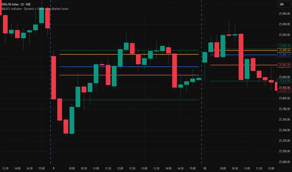
BALA'S Indicator - Dynamic + 5-Min + Pre-Market LevelsINTRADAY Strategy on Nifty with 15min Candle Setup.
Miela Labs | John Dee's Watchtower [257-463]Bridging the gap between 16th-century esoteric mathematics and modern algorithmic trading.
The Enochian Watchtower is not merely a trend indicator; it is a computational artifact developed by Miela Labs LLC. This script translates Dr. John Dee’s "Great Table of the Watchtowers" and the "Sigil Dei Aemeth" into actionable financial data points.
Using our proprietary Occultator V2.0 Engine, we have derived specific mathematical constants that resonate with the current market structure.
🏛️ The Algorithmic Logic
This indicator utilizes three sacred numbers to construct a "Future Vision" of the market:
1. The Axis Mundi (Vector 257): derived from Fermat Primes and John Dee’s Grid coordinates. This Weighted Moving Average (WMA) acts as the spinal cord of the trend.
2. The Gates (Cipher 463): A prime number derived from the "Galethog" cipher stride. These bands define the absolute volatility limits (Heaven & Earth Gates).
3. Future Vision (Offset 21): Utilizing Fibonacci time sequences, the indicator projects Support and Resistance levels 21 bars into the future, allowing traders to anticipate market movements before they occur.
⚡ How to Use
• The Trend: If price is above the Purple Axis (257), the market is in a bullish phase.
• The Entry: Look for "L" (Long) and "S" (Short) signals. These are confirmed when the signal path crosses the Axis.
• The Future: Watch the projected lines on the right side of the chart to identify upcoming resistance zones.
About Miela Labs
Miela Labs is a Technomancy Research Institute based in McKinney, Texas. We specialize in building open-source esoteric trading tools and the Magic Programming Language (MPL).
🌐 Official Hub: Visit Miela Labs
💻 Source Code & Research: GitHub Repository
Disclaimer: This tool is for educational and research purposes only. It demonstrates the application of esoteric mathematics in financial analysis. Trade responsibly.

Risk & Position CalculatorThis indicator is called "Risk & Position Calculator".
This indicator shows 4 information on a table format.
1st: 20 day ADR% (ADR%)
2nd: Low of the day price (LoD)
3rd: The percentage distance between the low of the day price and the current market price in real-time (LoD dist.%)
4th: The calculated amount of shares that are suggested to buy (Shares)
The ADR% and LoD is straightforward, and I will explain more on the 3rd and 4th information.
__________________________________________________________________________________
The Lod dist.% is a useful tool if you are a breakout buyer and use the low of the day price as your stop loss, it helps you determine if a breakout buy is at a risk tight area (~1/2 ADR%) or it is more of a chase (>1 ADR%).
I use four different colors to visualize this calculation results (green, yellow, purple, and red).
Green: Lod dist.% <= 0.5 ADR%
Yellow: 0.5 ADR% < Lod dist.% <= 1 ADR%
Purple: 1 ADR% < Lod dist.% <= 1.5 ADR%
Red: 1.5 ADR% < Lod dist.%
(e.g., if Lod dist.% is colored in Green, it means your stop loss is <= 0.5 ADR%, therefore if you buy here, the risk is probably tight enough)
__________________________________________________________________________________
The Shares is a useful tool if you want to know exactly how many shares you should buy at the breakout moment. To use this tool, you first need to input two information in the indicator setting panel: the account size ($) and portfolio risk (%).
Account Size ($) means the dollar value in your total account.
Portfolio Risk (%) means how much risk you are willing to take per trade.
(e.g. a 1% portfolio risk in a 5000$ account is 50$, which is the risk you will take per trade)
After you provide these two inputs, the indicator will help you calculate how many shares you should buy based on the calculated Dollar Risk ($), real-time market price, and the low of the day price.
(e.g. Dollar Risk (50$), real-time market price (100$), Lod price (95$) -> then you will need to buy 50/(100-95) = 10 shares to meet your demand, so it will display as Shares { 10 } )
In addition, I also introduce a mechanism that helps you avoid buying too big of a position relative to your overall account . I set the limit to 25%, which means you don't put more than 25% of your account money into a single trade, which helps prevent single stock risk.
By introducing this mechanism, it will supervise if the suggested Shares to buy exceed max position limit (25%). If it actually exceeds, instead of using Dollar Risk ($) to calculate Shares, it will use position limit to calculate and display the max Shares you should buy.
__________________________________________________________________________________
That's it. Hope you find this explanation helpful when you use this indicator. Have a great day mate:)

ATR Regime Filter (ATR14 vs SMA20)ATR volatility + ATR SMA
Green ATR above Red SMA + green background
→ Volatility expanding
→ Trend mode only
Green ATR below Red SMA + blue background
→ Volatility compressing
→ Mean reversion allowed
Crossovers / flickering
→ Transition
→ Size down or stay flat
