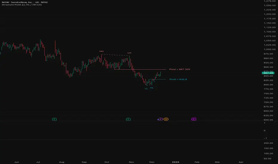
Structure Pivot (LL-HL / HH-LH)Structure Pivot (LL-HL / HH-LH) - Indicator Guide
This indicator scans for market structure pivot patterns—specifically the bullish Higher Low (LL–HL) and the bearish Lower High (HH–LH) —across multiple lengths simultaneously.
It automatically selects the most optimal pattern based on a "Priority Mode" and plots the structure and breakout/breakdown levels on the chart.
1. Basic Calculation Method
The indicator builds upon TradingView’s ta.pivotlow and ta.pivothigh functions to identify structural points.
Bullish Structure (LL–HL)
1.LL (Lowest Low): A standard Pivot Low is identified.
2.HL (Higher Low): A subsequent Pivot Low forms higher than the previous LL. This completes the setup.
3.Pivot Line (Resistance): The indicator finds the highest price (High) that occurred between the LL and the HL. This level becomes the breakout trigger.
Bearish Structure (HH–LH)
1.HH (Highest High): A standard Pivot High is identified.
2.LH (Lower High): A subsequent Pivot High forms lower than the previous HH. This completes the setup.
3.Pivot Line (Support): The indicator finds the lowest price (Low) that occurred between the HH and the LH. This level becomes the breakdown trigger.
2. Multi-Length Scanning
Unlike standard indicators that use a single fixed length (e.g., Length = 5), this indicator scans a range of lengths simultaneously.
・Settings: Defined by Min Length and Max Length.
・Mechanism: If set to Min=2 and Max=10, the indicator internally runs 9 separate calculations (Length 2 through 10) in parallel.
This allows it to capture everything from small, short-term pullbacks to larger, significant structural pivots without manual adjustment.
3. Priority Mode System
Since multiple lengths are scanned, multiple valid patterns may appear at the same time. The Priority Mode determines which single pattern is the "winner" and gets displayed.
A. Tightest Structure (Default)
・For Bullish (Long): Selects the pattern with the lowest Pivot Line (Resistance).
・For Bearish (Short): Selects the pattern with the highest Pivot Line (Support).
・Advantage: It finds the "tightest" contraction (like a VCP). This offers the entry point closest to the stop-loss level, providing the best Risk/Reward ratio.
B. Longest Length
・Selects the pattern detected by the longest length setting.
・Advantage: Focuses on major structural points, filtering out short-term noise. Best for trend confirmation.
C. Shortest Length
・Selects the pattern detected by the shortest length setting.
・Advantage: Extremely sensitive. Best for scalping or catching immediate micro-pullbacks.
4. Real-Time Logic & Features
Structure Invalidation (Failure)
・Bullish: If the current price drops below the HL (the support of the structure), the setup is considered failed.
・Bearish: If the current price rises above the LH (the resistance of the structure), the setup is considered failed.
・Result: All lines and labels for that structure are immediately deleted to keep the chart clean.
Pivot Line Extension
・As long as the structure remains valid (price hasn't violated the HL or LH), the Pivot Line extends to the right, acting as a live reference for breakouts or breakdowns.
Alerts
・Bullish Breakout: Triggered when the Close price crosses over the Pivot Line.
・Bearish Breakdown: Triggered when the Close price crosses under the Pivot Line.
樞軸點
Daily Levels [cryptalent]Daily High / Low / Mid / Open Levels is a session-based reference indicator designed to visualize key daily price levels directly on the chart.
This indicator automatically plots the Daily High, Daily Low, Daily Midpoint (High + Low / 2), and Daily Open as horizontal lines for each trading day. These levels help traders quickly identify important structural prices where liquidity, reactions, or acceptance often occur.
Key Features
Automatic Daily Levels
Plots Daily High (H), Low (L), Mid (M), and Open (O) using higher-timeframe daily data.
Levels update in real time as the current day develops.
Multi-Day History
Displays daily levels for a configurable number of past days.
Older levels are automatically removed to keep the chart clean.
Line Extension
Current day levels can be extended forward by a user-defined number of bars.
Useful for projecting intraday reaction zones and liquidity targets.
Visual Customization
Independent line width and color settings for each level.
Mid level is shown as a dashed line for quick visual distinction.
Labels & Price Tags
Optional letter labels (H / L / M / O) displayed near the extended levels.
Optional price labels showing the exact level values on the right side of the chart.
Labels update dynamically and only display for the active trading day.
Performance-Oriented Design
Efficient line and label management using arrays.
Automatically cleans up unused objects to stay within TradingView limits.
Use Cases
Identifying intraday support and resistance
Tracking daily range behavior
Monitoring mean reversion vs. range expansion
Aligning intraday execution with higher-timeframe structure
This indicator is particularly useful for traders who rely on market structure, session behavior, and objective price references rather than subjective trend lines.

Multi-Timeframe CPR Pattern AnalyzerMulti-Timeframe CPR + Advanced Pattern Analyzer
A powerful, all-in-one indicator designed for professional price-action traders who use CPR (Central Pivot Range) as the core of their intraday, positional, and swing-trading strategies.
This script automatically plots Daily, Weekly, and Monthly CPR, identifies major CPR patterns, highlights Developing / Next CPR, and displays everything neatly in an interactive dashboard.
✨ Key Features
1️⃣ Daily, Weekly & Monthly CPR
Fully configurable CPR for all three timeframes
Clean plots with no vertical connector lines
Automatic zone shading
Adjustable line width, transparency, and colors
2️⃣ Support & Resistance (S1–S3, R1–R3)
Choose which timeframe’s S/R you want
Only plotted for the current day/week/month (no cluttering past charts)
Helps traders identify reaction zones and breakout levels
3️⃣ Next / Developing CPR
A unique feature rarely found in CPR indicators.
You can display:
Developing Daily CPR
Developing Weekly CPR
Next Monthly CPR (after month close)
All next/developing CPRs are plotted in a dashed style with optional transparency, plus labels:
“Developing Daily CPR”
“Developing Weekly CPR”
“Next Weekly CPR”
“Next Monthly CPR”
This allows you to anticipate the next session’s CPR in advance, a major edge for intraday, swing, and options traders.
4️⃣ Advanced CPR Pattern Detection
The script automatically detects all important CPR market structures:
📌 Narrow CPR
Uses statistical percentiles based on historical CPR width
Helps identify potential high-volatility breakout days
📌 CPR Width Contraction
Detects compression zones
Excellent for identifying trending days after tight ranges
📌 Ascending / Descending CPR
Bullish trend continuation (Ascending)
Bearish trend continuation (Descending)
📌 Virgin CPR
Highlights untouched CPR zones
Strong support/resistance zones for future days/weeks
📌 Overshoots
Detects:
Bullish Overshoot
Bearish Overshoot
Useful for understanding trend exhaustion.
📌 Breakouts
Identifies when price breaks above TC or below BC, signaling trend shifts.
📌 Rejections
Shows wick-based CPR rejections — reversal cues used by many price-action traders.
5️⃣ CPR Pattern Dashboard
A beautifully formatted dynamic table showing:
For Daily, Weekly, Monthly:
TC, Pivot, BC values
Current CPR Pattern
CPR Width with %
+ Next/Developing CPR values and patterns (for Daily/Weekly)
No need to manually calculate anything — everything is displayed in a clean, compact panel.
6️⃣ Completely Dynamic Across Timeframes
Works on all intraday, daily, weekly, and monthly charts
Automatically adjusts CPR length based on chart timeframe
Perfect for NIFTY, BANKNIFTY, FINNIFTY, stocks, crypto, forex
7️⃣ Alerts Included
Receive alerts for:
Narrow CPR formation
Virgin CPR
CPR breakouts
Pattern transitions
Great for traders who want automated monitoring.
8️⃣ Clean Chart, No Clutter
The script includes:
No vertical connecting lines
S/R only on the current period
Smart hiding of CPR on boundaries (to avoid "jump lines")
Fully toggleable features
You get a professional-grade, clutter-free CPR experience.
🎯 Why This Indicator?
This script goes beyond standard CPR tools by offering:
Next AND Developing CPR
Multi-timeframe CPR analysis
Professional CPR pattern detection
Smart dashboard visualization
Perfect setup for trend traders, reversal traders, and breakout traders
Whether you're scalping, day trading, swing trading, or doing positional analysis — this tool gives you context, structure, and precision.
📌 Recommended Use Cases
Intraday index trading (NIFTY, BANKNIFTY, NIFTY 50 Stocks)
Swing trading stocks
Crypto CPR analysis
Options directional setups
CPR-based breakout and reversal strategies
Trend continuation identification
Understanding volatility days (Narrow CPR Days)
⚠️ Disclaimer
This is a technical tool for chart analysis and does not guarantee profits. Always combine CPR analysis with price action, volume, and risk management.

Market Structure Pivots with BOS & CHoCH [zazenio]What is Market Structure?
Market structure is simply the pattern of highs and lows that price creates as it moves. When you look at any chart, you'll notice price doesn't move in a straight line — it swings up, pulls back, swings up again (in an uptrend), or the opposite in a downtrend.
These swing points — the peaks and valleys — are what traders call pivots . Identifying them correctly is the foundation of understanding where a market has been and where it might go next.
What This Indicator Does
Swing Pivots automatically marks these peaks and valleys on your chart so you don't have to draw them manually. It works on any market — stocks, crypto, forex, futures, indices — and on any timeframe.
Beyond just marking pivots, this indicator also draws BOS (Break of Structure) and CHoCH (Change of Character) lines — two essential concepts that help you understand when a trend is continuing or potentially reversing.
How Pivots Are Detected
This indicator confirms pivots based on price structure, not a fixed bar count.
Here's how it works:
A swing high is confirmed when price breaks below the previous swing low. At that moment, we know the high was real — price tried to go higher, failed, and reversed. The market "proved" that level was a genuine turning point.
A swing low is confirmed when price breaks above the previous swing high. The same logic applies — price tried to go lower, failed, and reversed direction.
This creates a natural alternation: high, low, high, low. Each pivot is validated by the market's actual behavior, not by waiting for an arbitrary number of bars to pass.
Understanding BOS and CHoCH
Once you can identify pivots, the next step is understanding what happens when price breaks through them. This is where BOS and CHoCH come in.
BOS (Break of Structure)
A Break of Structure occurs when price continues in the direction of the current trend by breaking a previous pivot level.
In an uptrend : Price breaks above a previous swing high → This signals strength. Buyers are pushing price to new highs, and the trend is likely to continue.
In a downtrend : Price breaks below a previous swing low → This signals weakness. Sellers are pushing price to new lows, and the trend is likely to continue.
Think of BOS as the market saying "the trend is still intact." Each BOS confirms that the dominant side (buyers or sellers) remains in control.
CHoCH (Change of Character)
A Change of Character occurs when price breaks a pivot level in the opposite direction of the current trend. This is an early warning signal that the trend may be reversing.
In an uptrend : Price breaks below a previous swing low → This is unexpected. In a healthy uptrend, lows should hold. When they don't, it suggests buyers are losing control and sellers may be taking over.
In a downtrend : Price breaks above a previous swing high → This is unexpected. In a healthy downtrend, highs should hold. When they don't, it suggests sellers are losing control and buyers may be stepping in.
Think of CHoCH as the market's behavior "changing character" — it's no longer acting the way it should if the trend were healthy.
Why BOS and CHoCH Matter
These concepts give you a framework for reading what the market is actually doing:
BOS tells you the trend is continuing — stay with it or look for entries in that direction
CHoCH warns you the trend may be ending — time to be cautious, take profits, or look for trades in the new direction
By visualizing these breaks directly on your chart, you don't have to guess. You can see at a glance whether the market is trending smoothly (consecutive BOS) or showing signs of reversal (CHoCH).
Why This Approach Works
Most pivot indicators use a "lookback" method — they wait for a certain number of bars (say, 5 or 10) on each side of a candle before confirming it as a pivot. This creates a fixed delay. By the time the pivot appears on your chart, price has already moved on.
This indicator doesn't wait. It confirms pivots the moment price structure proves them. The result is pivots that align with how traders actually read charts — based on breaks of structure, not arbitrary countdowns.
Settings
Configuration
Swing Width : Controls how sensitive the detection is. Higher numbers show only major swings; lower numbers capture smaller moves within the structure.
Pivot Settings
High/Low Color : Customize the colors of swing high and swing low markers
Style : Choose between Triangle or Circle markers
Size : Adjust the size of pivot markers (Auto, Tiny, Small, Normal)
Structure Lines
Show CHoCH : Toggle Change of Character lines on/off
CHoCH Color : Customize the color of CHoCH lines
CHoCH Label : Show/hide the "CHoCH" text label
Show BOS : Toggle Break of Structure lines on/off
BOS Color : Customize the color of BOS lines
BOS Label : Show/hide the "BOS" text label
Use Cases
See the "skeleton" of price action at a glance
Identify potential support and resistance levels
Understand if the market is trending or ranging
Spot trend continuations with BOS lines
Catch early reversal signals with CHoCH lines
Build a foundation for more advanced trading strategies
━━━━━━━━━━━━━━━━━━━━━━
Version History
v1.1
Added BOS (Break of Structure) lines to visualize trend continuation
Added CHoCH (Change of Character) lines to identify potential trend reversals
Added toggle options for BOS and CHoCH visibility
Added customizable colors for structure lines
Added optional labels for BOS and CHoCH
v1.0
Initial release
Automatic swing high and swing low detection
Structure-based pivot confirmation (not fixed lookback)
Customizable pivot markers (style, size, colors)
Adjustable swing width sensitivity
━━━━━━━━━━━━━━━━━━━━━━
Disclaimer:
This script is provided for educational and informational purposes only. It is not financial advice and does not constitute a recommendation to buy or sell any financial instrument. Always do your own research and trade at your own risk.

Swing Pivots - Market Structure High Low [zazenio]What is Market Structure?
Market structure is simply the pattern of highs and lows that price creates as it moves. When you look at any chart, you'll notice price doesn't move in a straight line — it swings up, pulls back, swings up again (in an uptrend), or the opposite in a downtrend.
These swing points — the peaks and valleys — are what traders call pivots. Identifying them correctly is the foundation of understanding where a market has been and where it might go next.
What This Indicator Does
Swing Pivots automatically marks these peaks and valleys on your chart so you don't have to draw them manually. It works on any market — stocks, crypto, forex, futures, indices — and on any timeframe.
How Pivots Are Detected
This indicator confirms pivots based on price structure, not a fixed bar count.
Here's how it works:
A swing high is confirmed when price breaks below the previous swing low. At that moment, we know the high was real — price tried to go higher, failed, and reversed. The market "proved" that level was a genuine turning point.
A swing low is confirmed when price breaks above the previous swing high. The same logic applies — price tried to go lower, failed, and reversed direction.
This creates a natural alternation: high, low, high, low. Each pivot is validated by the market's actual behavior, not by waiting for an arbitrary number of bars to pass.
Why This Matters
Most pivot indicators use a "lookback" method — they wait for a certain number of bars (say, 5 or 10) on each side of a candle before confirming it as a pivot. This creates a fixed delay. By the time the pivot appears on your chart, price has already moved on.
This indicator doesn't wait. It confirms pivots the moment price structure proves them. The result is pivots that align with how traders actually read charts — based on breaks of structure, not arbitrary countdowns.
Settings
Swing Width: Controls how sensitive the detection is. Higher numbers show only major swings; lower numbers capture smaller moves within the structure.
Style/Size/Colors: Customize how the pivot markers look on your chart.
Use Cases
See the "skeleton" of price action at a glance
Identify potential support and resistance levels
Understand if the market is trending or ranging
Build a foundation for more advanced concepts like Break of Structure (BOS) and Change of Character (CHoCH)
⸻
Disclaimer:
This script is provided for educational and informational purposes only. It is not financial advice and does not constitute a recommendation to buy or sell any financial instrument. Always do your own research and trade at your own risk.

LL-HL PivotThis indicator scans for the bullish structure known as a Higher Low (HL) across multiple lengths simultaneously, automatically selects the most suitable pattern, and plots it on the chart.
Below is a detailed explanation of how it works.
1. Basic Calculation Method (Definition of LL and HL)
This indicator is built on TradingView’s ta.pivotlow function.
Detecting Pivot Lows
For a given length, a Pivot Low is identified as the lowest point among the candles within the specified range to the left and right.
LL and HL Determination
LL (Lowest Low): The most recent Pivot Low is treated as the previous low.
HL (Higher Low): When a new Pivot Low forms above the previous LL, it is recognized as an HL, and the setup is considered “complete.”
Identifying the Pivot Line
During the LL–HL structure, the highest high between them is identified and used as the breakout level (Pivot Line / resistance), where a horizontal line is drawn.
2. Multi-Length Scanning
Unlike standard indicators that use only one length (e.g., Length = 5), this indicator evaluates a full range of lengths.
Min Length to Max Length
Example: Min = 2, Max = 10
Internally, it functions as if nine separate indicators (Length 2, 3, 4 … 10) are running simultaneously.
This allows the indicator to capture:
Small waves (short-term pullbacks)
Larger waves (broader structural moves)
3. Priority Mode System
Because multiple lengths are calculated at the same time, different LL–HL patterns may appear simultaneously.Priority Mode determines which setup is selected and displayed.
A. Lowest LH
Selects the pattern with the lowest pivot line (intermediate high).
Advantages:
Produces the lowest possible entry price
B. Longest Length
Selects the pattern with the longest length.
Advantages:
Focuses on larger structures and broader waves
Filters out noise
C. Shortest Length
Selects the pattern with the shortest length.
Advantages:
Reacts quickly to small moves
Useful for scalping or fast trend-following
Captures very short-term pullbacks
4. Additional Behavior and Features
Real-Time Invalidation
If price breaks below the confirmed HL, the structure is immediately considered invalid.
All previously drawn lines and labels are removed instantly, preventing outdated structures from remaining on the chart.
Pivot Line Extension
As long as the HL remains intact, the Pivot Line (breakout level) continues extending to the right.
Alerts
An alert can be triggered the moment price breaks above the Pivot Line on a closing basis.

Zaka Pro: Clear Structure (HH/LL) + MSS ZonesCertainly! Here is a description of the Pine Script indicator you provided, focusing on its main functions and trading strategy, written in English.
---
## Zaka Pro: Clear Structure (HH/LL) + MSS Zones
This is a technical analysis indicator developed in Pine Script (`//@version=5`) designed to automatically identify and plot key price action structural elements based on the **Zig Zag** method, while incorporating a simplified **Market Structure Shift (MSS)** concept, often used in Smart Money Concepts (SMC) or Wyckoff trading.
### Key Features:
1. **Pivot-Based Structure Identification:**
* The indicator uses the standard **`ta.pivothigh`** and **`ta.pivotlow`** functions, determined by the user-defined `Pivot Length` (`prd`). This forms the foundation of the price "swing" structure.
2. **Structural Labeling (HH/LL/LH/HL):**
* It automatically labels the resulting swing points to clearly show the prevailing trend:
* **HH (Higher High):** Continuation of an uptrend.
* **LL (Lower Low):** Continuation of a downtrend.
* **LH (Lower High):** A potential reversal or weakening of an uptrend.
* **HL (Higher Low):** A potential reversal or weakening of a downtrend.
3. **Zig Zag Plotting:**
* The indicator connects the identified pivot points with a **gray line** to visually represent the market swings.
4. **Market Structure Shift (MSS) Strategy:**
* The core strategy detects a potential **trend reversal** when the price breaks the most recent structural pivot:
* **Buy MSS Trigger:** Detected when the price breaks **above the last High** (`last_high`) while the market was in a confirmed **downtrend** (forming Lower Lows).
* **Sell MSS Trigger:** Detected when the price breaks **below the last Low** (`last_low`) while the market was in a confirmed **uptrend** (forming Higher Highs).
5. **Order Block / Entry Zone Plotting:**
* Upon detection of a confirmed MSS (reversal), the indicator plots a colored **Box** representing a potential re-entry zone:
* **BUY ZONE (Green Box):** Plotted after a Buy MSS (breakout to the upside). The zone is defined by the **High and Low of the two candles preceding the last swing Low** (`ob_low_top`, `ob_low_btm`). This acts as a simplified "Order Block" for potential long entries.
* **SELL ZONE (Red Box):** Plotted after a Sell MSS (breakout to the downside). The zone is defined by the **High and Low of the two candles preceding the last swing High** (`ob_high_top`, `ob_high_btm`). This acts as a simplified "Order Block" for potential short entries.
6. **Alerts:**
* Custom alerts are included to notify the user immediately when a Buy or Sell MSS (Market Structure Shift) is detected.
In summary, the indicator is a visual tool that simplifies price action analysis by drawing structure and highlights potential reversal points (MSS) by painting corresponding re-entry zones (Order Blocks) on the chart.

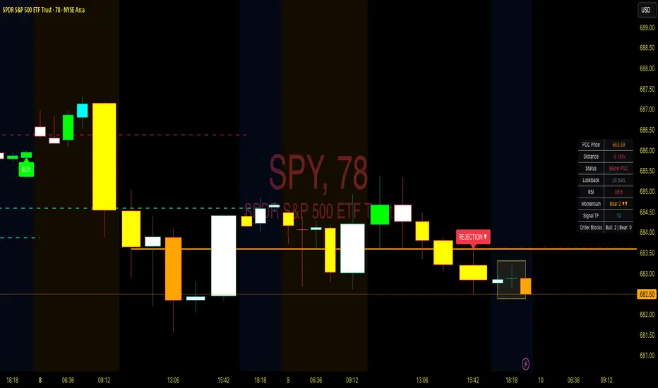
Point of Control + Momentum CandlesPOINT OF CONTROL + MOMENTUM CANDLES
A multi-feature indicator combining volume-based POC detection, 6-level momentum candle coloring, higher timeframe buy/sell signals, and order block identification.
FEATURES
Point of Control (POC)
Calculates the price level with highest traded volume over a customizable lookback period. Includes break and rejection detection with visual signals.
Momentum Candle Coloring
Colors candles based on EMA positioning and RSI values across 6 momentum levels:
- Bull 3/2/1: Strong to weak bullish momentum (Blue/Cyan/Green)
- Bear 1/2/3: Weak to strong bearish momentum (Yellow/Orange/Red)
- Neutral: No clear momentum (White)
Buy/Sell Signals
Generates signals from a user-selectable timeframe using EMA crossovers and RSI conditions. Signals appear on your current chart for multi-timeframe analysis.
Order Blocks
Detects potential institutional entry zones:
- Bullish OB: Last bearish candle before bullish impulse
- Bearish OB: Last bullish candle before bearish impulse
Blocks extend forward and optionally delete when mitigated.
Dashboard
Displays POC price, distance, RSI, momentum level, signal timeframe, and active order block count.
ALERTS
10 conditions available: POC breaks, rejections, buy/sell signals, and order block formations.
HOW TO USE
- Trade POC breaks for trend continuation
- Trade POC rejections for reversals
- Use candle colors to gauge momentum strength
- Confirm entries with higher timeframe signals
- Watch for price returning to order blocks
SETTINGS
All parameters are fully customizable including lookback periods, thresholds, timeframes, colors, and visual styles.
DISCLAIMER
For educational purposes only. Not financial advice. Trading involves risk. Always conduct your own analysis before making trading decisions.
Point of Control + Momentum CandlesPOINT OF CONTROL + MOMENTUM CANDLES
A comprehensive technical analysis indicator combining volume-based Point of Control detection, momentum-graded candle coloring, higher timeframe buy/sell signals, and order block identification.
━━━━━━━━━━━━━━━━━━━━━━━━━━━━━━━━━━━━━━━━━━━━━━━━━━━━━━━━━━━━━━━━━━
WHAT THIS INDICATOR DOES
This indicator identifies key price levels where the most trading activity has occurred (Point of Control), colors candles based on momentum strength, generates buy/sell signals from a user-selected timeframe, and detects order blocks that may act as future support/resistance zones.
━━━━━━━━━━━━━━━━━━━━━━━━━━━━━━━━━━━━━━━━━━━━━━━━━━━━━━━━━━━━━━━━━━
FEATURES
1. POINT OF CONTROL (POC)
The POC represents the price level with the highest traded volume over a lookback period. This indicator calculates a volume profile by distributing volume across price levels and identifying where the most activity occurred.
- Orange horizontal line shows the current POC level
- Yellow box highlights the candles used in the POC calculation
- Break detection identifies when price closes decisively beyond the POC
- Rejection detection identifies when price tests but fails to break the POC
2. MOMENTUM CANDLE COLORING
Candles are colored based on a 6-level momentum system using EMA positioning and RSI values:
Bullish Levels (price above both EMAs):
- Bull Level 3 (Royal Blue): Strong momentum, RSI above 70
- Bull Level 2 (Cyan): Medium momentum, RSI above 60
- Bull Level 1 (Green): Weak momentum, above EMAs
Bearish Levels (price below both EMAs):
- Bear Level 1 (Yellow): Weak momentum, below EMAs
- Bear Level 2 (Orange): Medium momentum, RSI below 40
- Bear Level 3 (Red): Strong momentum, RSI below 30
Neutral (White): No clear directional momentum
3. BUY/SELL SIGNALS
Signals are generated from a user-selectable timeframe (default: 10 minutes) and appear on your current chart. This allows you to see higher timeframe signals while trading on lower timeframes.
Buy Signal Conditions:
- EMA crossover (fast crosses above slow) OR RSI exits oversold
- Bullish candle on the signal timeframe
- Close above both EMAs
Sell Signal Conditions:
- EMA crossunder (fast crosses below slow) OR RSI exits overbought
- Bearish candle on the signal timeframe
- Close below both EMAs
4. ORDER BLOCKS
Order blocks identify potential institutional entry zones that may act as future support or resistance.
- Bullish Order Block (Green zone): The last bearish candle before a bullish impulse move
- Bearish Order Block (Red zone): The last bullish candle before a bearish impulse move
- Blocks automatically extend forward and can be set to delete when mitigated (price closes through the zone)
5. DASHBOARD
A customizable info panel displays:
- Current POC price
- Distance from POC (percentage)
- Position relative to POC (Above/Below/At)
- Lookback period
- Current RSI value
- Current momentum level
- Signal timeframe
- Active order block count
━━━━━━━━━━━━━━━━━━━━━━━━━━━━━━━━━━━━━━━━━━━━━━━━━━━━━━━━━━━━━━━━━━
HOW TO USE
POC Trading:
- Watch for breaks above POC for potential long entries
- Watch for breaks below POC for potential short entries
- Rejections at POC can indicate reversal opportunities
Momentum Reading:
- Use candle colors to gauge trend strength at a glance
- Level 3 colors indicate strong momentum (potential continuation)
- Level 1 colors indicate weakening momentum (potential reversal)
- Neutral/white candles suggest consolidation or indecision
Signal Confirmation:
- Use buy/sell signals from a higher timeframe to confirm entries on your trading timeframe
- Combine signals with POC breaks/rejections for higher probability setups
Order Block Strategy:
- Look for price to return to bullish order blocks for potential long entries
- Look for price to return to bearish order blocks for potential short entries
- Mitigated blocks (price closes through) lose their significance
━━━━━━━━━━━━━━━━━━━━━━━━━━━━━━━━━━━━━━━━━━━━━━━━━━━━━━━━━━━━━━━━━━
SETTINGS OVERVIEW
POC Settings:
- Lookback Period: Number of bars for POC calculation (default: 20)
- Volume Resolution: Price level granularity (default: 50)
- Recalculation Frequency: How often POC updates (default: every 3 bars)
Break/Rejection Detection:
- Break Threshold: Minimum percentage move to confirm a break (default: 0.3%)
- Rejection Wick Ratio: Minimum wick-to-body ratio for rejections (default: 0.5)
Momentum Settings:
- Fast/Slow EMA lengths for trend determination
- RSI length and threshold levels for momentum grading
Buy/Sell Signals:
- Signal Timeframe: The timeframe used for signal calculation
- Separate EMA and RSI parameters for signal generation
Order Blocks:
- Order Block Timeframe: Timeframe for OB detection
- Max Blocks Per Side: Limits displayed order blocks
- Delete Mitigated: Automatically removes invalidated blocks
All visual elements (colors, sizes, line styles) are fully customizable.
━━━━━━━━━━━━━━━━━━━━━━━━━━━━━━━━━━━━━━━━━━━━━━━━━━━━━━━━━━━━━━━━━━
ALERTS
10 alert conditions are available:
- Bullish/Bearish POC Break
- Bullish/Bearish POC Rejection
- Any POC Break
- Any POC Rejection
- Buy Signal
- Sell Signal
- Bullish Order Block Formed
- Bearish Order Block Formed
━━━━━━━━━━━━━━━━━━━━━━━━━━━━━━━━━━━━━━━━━━━━━━━━━━━━━━━━━━━━━━━━━━
NOTES
- The indicator uses request.security() to fetch data from the signal and order block timeframes. This is designed to work when viewing charts at timeframes equal to or lower than your selected signal/OB timeframes.
- POC calculations are based on the visible volume data. Assets with limited volume data may produce less reliable POC levels.
- Order blocks are detected using a simplified algorithm based on candle patterns and displacement. They represent potential zones of interest, not guaranteed support/resistance levels.
━━━━━━━━━━━━━━━━━━━━━━━━━━━━━━━━━━━━━━━━━━━━━━━━━━━━━━━━━━━━━━━━━━
DISCLAIMER
This indicator is provided for educational and informational purposes only. It does not constitute financial advice or a recommendation to buy or sell any security. Trading involves substantial risk of loss. Past performance is not indicative of future results. Always conduct your own analysis and consider your risk tolerance before making trading decisions. Use this tool as part of a comprehensive trading strategy, not as a standalone signal generator.

MM-Auto SQ9 V1.0MM-Auto SQ9 V1.0 — Automatic Square-of-9 levels from a selected pivot (Bottom/Top). Choose base shape or Custom Angle, optional half-angles, cycles, and full color/style control.
Disclaimer: Educational purposes only — not financial advice.
What it is
A visual Gann Square-of-9 level engine. It projects horizontal SQ9 price levels from a single pivot using root/square transforms, with selectable geometric bases (90°/60°/72°/120°/45°) or a **Custom Angle**, optional **Sub-Angles (half-angles)**, multi-cycle expansion, full styling control, and a **draggable 0-line** pivot.
**Key features**
* **Draggable 0-line:** Drag the pivot line on the chart and drop it on any swing high/low — no need to type the reference price. Levels recalc instantly.
* **Bottom/Top modes** for projection direction.
* **Shapes or Custom Angle** (Square/Octagon/Hexagon/Triangle/Pentagon or your own).
* **Sub-Angles (½)** with separate style/color.
* **Cycles** to extend the grid.
* **Clean UI**: labels (size/distance), line thickness/style/colors, pivot line style.
**Inputs (quick guide)**
Pivot Price • Pivot Type (Bottom/Top) • Space Multiplier • Geometric Shape / Custom Angle Value • Number of Cycles • Show Sub-Angles & Line Style • Colors & Line Thickness • Labels (on/size/distance).
**Workflow**
1. Drag the **0-line** to your pivot (any swing high/low) or set **Pivot Price** and **Bottom/Top**.
2. Pick shape or **Custom Angle**; increase **Cycles** if needed.
3. Tune **Space Multiplier** to align levels with historical reactions.
4. (Optional) Enable **Sub-Angles** for finer structure.
5. Observe **bounce / break / retest** around levels and combine with your system.
**Pro tips**
* Use a **structural swing** as pivot.
* Reduce clutter by lowering cycles or disabling sub-angles.
* Pair with **market structure / volume / ATR / fractals** for decision support.
* Adjust label size/distance to keep charts clean.
**Troubleshooting (dragging)**
If the 0-line doesn’t move, ensure drawings are **unlocked** and “Move drawings” is enabled in chart settings.
**Disclaimer & Rights**
Educational purposes only — **not financial advice**.
Script programmed by **Mohammad Murad (MM)**.
© 2025 **Mohammad Murad**. **All rights reserved.

Adaptive Risk Management [sgbpulse]1. Introduction:
Adaptive Risk Management is an advanced indicator designed to provide traders with a comprehensive risk management tool directly on the chart. Instead of relying on complex manual calculations, the indicator automates all critical steps of trade planning. It dynamically calculates the estimated Entry Price , the Stop Loss location, the required Position Size (Quantity) based on your capital and risk limits, and the three Take Profit targets based on your defined Reward/Risk ratios. The indicator displays all these essential data points clearly and visually on the chart, ensuring you always know the potential risk-reward profile of every trade.
ARM : The A daptive R isk M anagement every trader needs to ARM themselves with.
2. The Critical Importance of Risk Management
Proper risk management is the cornerstone of successful trading. Consistent profitability in the market is impossible without rigorously defining risk limits.
Risk Control: This starts by setting the maximum risk amount you are willing to lose in a single trade (Risk per Trade), and limiting the total capital allocated to the position (Max Capital per Trade).
Defining Boundaries (Stop Loss & Take Profit): It is mandatory to define a technical Stop Loss and a Take Profit target. A fundamental rule of risk management is that the Reward/Risk Ratio (R/R) must be a minimum of 1:1.
3. Core Features, Adaptivity, and Customization
The Adaptive Risk Management indicator is engineered for use across all major trading styles, including Swing Trading, Intraday Trading, and Scalping, providing consistent risk control regardless of the chosen timeframe.
Real-Time Dynamic Adaptivity: The indicator calculates all risk management parameters (Entry, Stop Loss, Quantity) dynamically with every new bar, thus adapting instantly to changing market conditions.
Trend Direction Adjustment: Define the analysis direction (Long/Uptrend or Short/Downtrend).
Intraday Session Data Control: Full control over whether lookback calculations will include data from Extended Trading Hours (ETH), or if the daily calculations will start actively only from the first bar of Regular Trading Hours (RTH).
Status Validation: The indicator performs critical status checks and displays clear Warning Messages if risk conditions are not met.
4. Intuitive Visualization and Real-Time Data
Dynamic Tracking Lines: The Entry Price and Stop Loss lines are updated with every new bar. Crucially, the length of these lines dynamically reflects the calculation's lookback range (e.g., the extent of Lookback Bars or the location of the confirmed Pivot Point), providing a visual anchor for the calculated price.
Risk and Reward Zones: The indicator creates a graphical background fill between Entry and Stop Loss (marked with the risk color) and between Entry and the Reward Targets (marked with the reward color).
Essential Information Labels: Labels are placed at the end of each line, providing critical data: Estimated Entry Price, Stock/Contract Quantity (Quantity), Total Entry Amount, Estimated Stop Loss, Risk per Share, Total Financial Risk (Risk Amount), Exit Amount, Estimated Take Profit 1/2/3, Reward/Risk Ratio 1/2/3, Total Reward 1/2/3, TP Exit Amount 1/2/3.
4.1. Data Window Metrics (16 Full Series)
The indicator displays 16 full data series in the TradingView Data Window, allowing precise tracking of every calculation parameter:
Entry Data: Estimated Entry, Quantity, Entry Amount.
Risk Data (Stop Loss): Estimated Stop Loss, Risk per Share, Risk Amount, Exit Amount.
Reward Data (Take Profit): Estimated Take Profit 1/2/3, Reward/Risk Ratio 1/2/3, Total Reward 1/2/3, TP Exit Amount 1/2/3.
4.2. Instant Tracking in the Status Line
The indicator displays 6 critical parameters continuously in the indicator's Status Line: Estimated Entry, Quantity, Estimated Stop Loss, Estimated Take Profit 1/2/3.
5. Detailed Indicator Inputs
5.1 General
Focused Trend: Defines the analysis direction (Uptrend / Downtrend).
Max Capital per Trade: The maximum amount allocated to purchasing stocks/contracts (in account currency).
Risk per Trade: The maximum amount the user is willing to risk in this single trade (in account currency).
ATR Length: The lookback period for the Average True Range (ATR) calculation.
5.2 Intraday Session Data Control
Regular Hours Limitation : If enabled, all daily lookback calculations (for Entry/Stop Loss anchor points) will begin strictly from the first Regular Trading Hours (RTH) bar. This limits the lookback range to the current RTH session, excluding preceding Extended Trading Hours (ETH) data. Only relevant for Intraday charts. Default: False (Off)
5.3 Entry Inputs
Entry Method: Selects the entry price calculation method:
Current Price: Uses the closing price of the current bar as the estimated entry point (Market Entry).
ATR Real Bodies Margin :
- Uptrend: Calculates the Maximum Real Body over the lookback period + the calculated safety margin.
- Downtrend: Calculates the Minimum Real Body over the lookback period - the calculated safety margin.
ATR Bars Margin :
- Uptrend: Calculates the Maximum High price over the lookback period + the calculated safety margin.
- Downtrend: Calculates the Minimum Low price over the lookback period - the calculated safety margin.
Lookback Bars: The number of bars used to calculate the extremes in the ATR-based entry methods (Relevant only for ATR Real Bodies Margin and ATR Bars Margin methods).
ATR Multiplier (Entry): The multiplier applied to the ATR value. The result of the multiplication is the calculated safety margin used to determine the estimated Entry Price.
5.4 Risk Inputs (Stop Loss)
Risk Method: Selects the Stop Loss price calculation method.
ATR Current Price Margin :
- Uptrend: Entry Price - the calculated safety margin.
- Downtrend: Entry Price + the calculated safety margin.
ATR Current Bar Margin :
- Uptrend: Current Bar's Low price - the calculated safety margin.
- Downtrend: Current Bar's High price + the calculated safety margin.
ATR Bars Margin :
- Uptrend: Lowest Low over lookback period - the calculated safety margin.
- Downtrend: Highest High over lookback period + the calculated safety margin.
ATR Pivot Margin :
- Uptrend: The first confirmed Pivot Low point - the calculated safety margin.
- Downtrend: The first confirmed Pivot High point + the calculated safety margin.
Lookback Bars: The lookback period for finding the extreme price used in the 'ATR Bars Margin' calculation.
ATR Multiplier (Risk): The multiplier applied to the ATR value. The result of the multiplication is the calculated safety margin used to place the estimated Stop Loss. Note: If set to 0, the Stop Loss will be placed exactly at the technical anchor point, provided the Minimum Margin Value is also 0.
Minimum Margin Value: The minimum price value (e.g., $0.01) the Stop Loss margin buffer must be.
Pivot (Left / Right): The number of bars required on either side of the pivot bar for confirmation (relevant only for the ATR Pivot Margin method).
5.5 Reward Inputs (Take Profit)
Show Take Profit 1/2/3: ON/OFF switch to control the visibility of each Take Profit target.
Reward/Risk Ratio 1/ 2/ 3: Defines the R/R ratio for the profit target. Must be ≥1.0.
6. Indicator Status/Warning Messages
In situations where the Stop Loss location cannot be calculated logically and validly, often caused by a mismatch between the configured Focused Trend (Uptrend/Downtrend) and the actual price action, the indicator will display a warning message, explaining the reason and suggesting corrective action.
Status Message 1: Pivot reference unavailable
Condition: The Stop Loss is set to the "ATR Pivot Margin" method, but the anchor point (Pivot) is missing or inaccessible.
Message Displayed: "Pivot reference unavailable. Wait for valid price action, or adjust the Regular Hours Limitation setting or Pivot Left/Right inputs."
Status Message 2: Calculated Stop Loss is unsafe
Condition: The calculated Stop Loss is placed illogically or unsafely relative to the trend direction and the Entry price.
Message Displayed: "Calculated Stop Loss is unsafe for current trend. Wait for valid price action or adjust SL Lookback/Multiplier."
7. Summary
The Adaptive Risk Management (ARM) indicator provides a seamless and systematic approach to trade execution and risk control. By dynamically automating all critical trade parameters—from Entry Price and Stop Loss placement to Position Sizing and Take Profit targets—ARM removes emotional bias and ensures every trade adheres strictly to your predefined risk profile.
Key Benefits:
Systematic Risk Control: Strict enforcement of maximum capital allocation and risk per trade limits.
Adaptivity: Dynamic calculation of prices and quantities based on real-time market data (ATR and Lookback).
Clarity and Trust: Clear on-chart visualization, precise data metrics (16 series), and unambiguous Status/Warning Messages ensure transparency and reliability.
ARM allows traders to focus on strategy and analysis, confident that their execution complies with the core principles of professional risk management.
Important Note: Trading Risk
This indicator is intended for educational and informational purposes only and does not constitute investment advice or a recommendation for trading in any form whatsoever.
Trading in financial markets involves significant risk of capital loss. It is important to remember that past performance is not indicative of future results. All trading decisions are your sole responsibility. Never trade with money you cannot afford to lose.

Price Action Ultimate LITE by 🅰🅻🅿 🇹🇷📌 Price Action Ultimate LITE by 🅰🅻🅿 🇹🇷
— Clean, Visual, and Trader-Friendly Price Action Tool
Price Action Ultimate LITE is a simplified but highly functional introduction to our full PRO model.
It offers a clean visual framework for Order Blocks , Breaker Blocks , Risk/Reward zones , a Trend Ribbon , and a real-time Trade Manager — all without automation or strategy execution.
Designed for discretionary traders who want structure, clarity and visual confidence — not complexity.
🟪 1 — Core Visual Layout
i.imgur.com
This panel demonstrates the visual foundation of the LITE version.
Blocks, labels, the MA ribbon and the R/R box adapt to the selected Pastel or Light theme.
Minimal, clean, easy to read — built for long screen-time.
🟩 2 — Order Blocks (OB / BB / MB)
i.imgur.com
Detected block types:
Bullish / Bearish Order Blocks
Breaker Blocks (failed OBs that reverse direction)
Mitigation Blocks (inefficiency retests)
Visual controls for each block:
Styles: Gradient / Solid / Outline / Glass
Opacity 0–100
Theme-adaptive colors
Blocks auto-extend and auto-clean when invalidated.
🟧 3 — MA Ribbon (Trend Guide)
i.imgur.com
The MA Ribbon provides trend context only .
It does not auto-trade or make long/short decisions.
Features:
Fast & slow MA with adjustable type (SMA / EMA / WMA / VWMA / Hull)
Ribbon style + opacity control
Smooth theme-based transitions
Optional colored candles
Clear trend awareness while keeping full discretion.
🟥 4 — Risk Management & R/R Box
i.imgur.com
This section includes a dynamic Risk/Reward Box showing:
Entry level
Stop level
Target level (based on R:R multiplier)
Real-time risk/reward shading
You control:
Risk Amount (USD) → defines 1R
Risk Multiplier (R:R)
Max Trade Duration (timeout)
Label visibility & offsets
Zone colors & transparency
Instant visual risk clarity — no manual calculations.
🟦 5 — Alert System
i.imgur.com
Included alerts:
Entry Alert (OB/BB Break)
Stop Loss Hit
Take Profit Hit
Timeout Alert
PnL Alert (threshold-based, optional)
Entry alerts confirm on bar close.
Exit alerts trigger immediately.
Timeouts show a ⏰ label on chart.
🟨 6 — Trade Manager (Real-Time Dashboard)
i.imgur.com
A lightweight panel updated every bar.
Displays:
Position (Long / Short / Inactive)
Entry, Stop, Target
Floating PnL (based on 1R)
Last 10 Trades PnL
R:R ratio
Status (Active / Timeout Soon / Inactive)
Entry reason
Bars active
Entry history
The Trade Manager is informational only — no automation.
🟫 7 — Final Overview
i.imgur.com
A complete look at how the system behaves in live market conditions.
Blocks, Ribbon, R/R Box and Trade Manager all work together seamlessly.
📝 Important Notes
This is a closed-source protected script .
It does not place, close, or manage trades.
All signals are discretionary.
Use replay mode before trading live.
Not financial advice; markets carry risk.
🙏 Acknowledgements
Inspired by the price-action research found across TradingView, including the work of JustUncleL and EmreKb .
This script, however, is a fully independent implementation built from the ground up.
🚀 Who Is LITE For?
✔ Traders who want clean structural guidance
✔ OB / Breaker / Mitigation Block users
✔ R:R-based discretionary traders
✔ Traders preparing for the PRO edition
✔ Anyone wanting a lightweight, modern PA tool
🌟 Enjoy Price Action Ultimate LITE.
Trade cleaner. Trade clearer. Trade with structure.
🔵 About This LITE Version (Before the PRO Edition)
Price Action Ultimate LITE is intentionally built as a lightweight introduction to the concepts behind the upcoming PRO version.
Instead of overwhelming traders with automation, multi-TF engines or advanced filtering, LITE focuses on:
Core OB / BB / MB mechanics
Simplified trend guidance
Clear visual risk mapping
Essential alerts
Real-time trade monitoring
The purpose is simple:
Build confidence with the fundamentals before stepping into the advanced PRO environment.
LITE shares the same visual style and OB logic family as PRO, but without:
Multi-TF anchored blocks
Smart OB validation
Auto-management features
Multi-stage TP logic
Break-even or trailing engines
Strength filters
Liquidity-layer mapping
Advanced dashboards
Many traders prefer LITE for its clarity — structure without noise.
🟢 Who Should Use LITE?
Traders who want a calm, focused chart
Users preparing for the PRO version
Visual OB/BB practitioners
Discretionary traders wanting structure (not automation)
Anyone needing a clean, stable PA toolkit
🟡 Why LITE First?
Learn OB/BB structure
Develop consistent R:R habits
Improve timing with alerts
Build discipline via the Trade Manager
Strengthen intuition before automation
🟠 Final Note
LITE is not a restricted trial.
It is a complete, fully usable tool on its own —
but also a natural gateway into the more advanced PRO ecosystem.

VWAP From Pivots Lows and Highs
This script starts automatically VWAP from pivot lows and highs.
Parameter allows you to enable up to 3 VWAP (default).
If you use 3, the VWAP from the last three pivots point will be drawn.
If you use 1, just the last pivot point will be used.
You can also just enable VWAPs starting from pivot lows or highs.
Let me know if there are any problems.

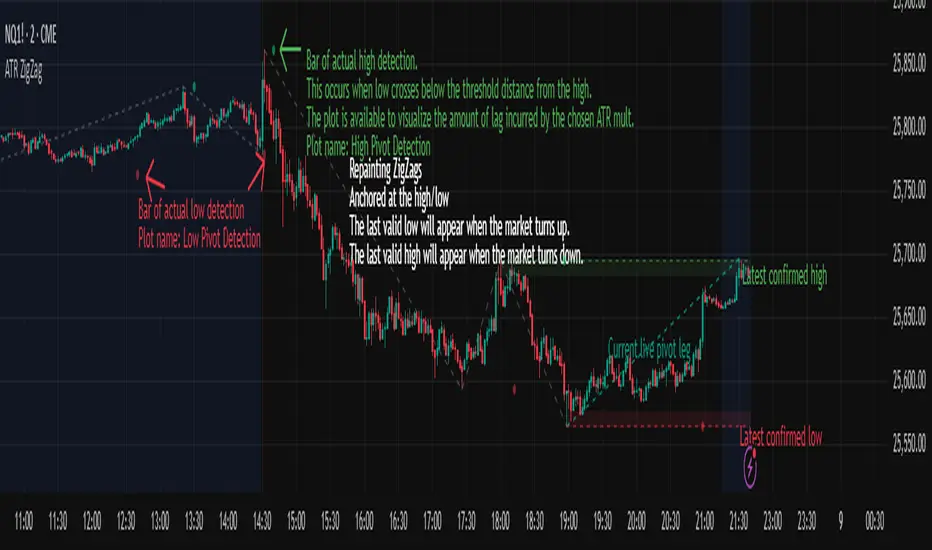
ATR ZigZag - Volatility-Filtered Market StructureDescription
This indicator draws ZigZags using an ATR based threshold for direction switching to identify major swing highs and lows. Instead of relying on fractals or fixed bar-count swings, pivots are confirmed only when price moves beyond the prior extreme by:
threshold = ATR(length) × ATR_mult
This filters noise, enforces valid swing structure (high → low → high), and adapts automatically to volatility. The ATR ZigZag is ideal for traders who want a clean, objective view of swing structure without noise. This has many uses, including mapping swing structure, drawing chart patterns, and trading around extremes.
Lag and Repainting
Pivots are confirmed only after price moves sufficiently in the opposite direction. This creates necessary lag. The ZigZag is drawn when this occurs, and will anchor to the high/low in the past. Optional detection dot plots show exactly when confirmation occurred.
What You See
ZigZag: dashed gray line, repainted to anchor at the confirmed highs and lows
Latest Pivot Levels: Dashed horizontal lines at the most recent confirmed high/low.
Optional Live Swing Leg: A real-time line from the last confirmed pivot to the current swing extreme, updating until a new pivot forms.
Optional ATR Boxes: 1×ATR shaded zones around the latest pivot for structural context.
Optional Pivot Confirmation Dots: Markers show the bar where the threshold is crossed and a swing is officially confirmed. This is to understand the lag and see when the ZigZag repainted.
Pivot-Based Trend Labels [BETA]Automatically labels Higher Highs, Lower Highs, Higher Lows and Lower Lows using pivots, with optional zigzag lines and resistance proximity alerts. BETA version for testing and feedback.
## Overview
**Pivot-Based Trend Labels v2.0 ** is a structure-focused tool that automatically detects pivot highs and lows, then labels them as:
- **HH** – Higher High
- **LH** – Lower High
- **LL** – Lower Low
- **HL** – Higher Low
It’s designed to make trend structure (higher highs / higher lows vs lower highs / lower lows) easy to read at a glance. You can optionally draw connecting “zigzag” lines between pivots and enable a resistance proximity alert.
---
## Key Features
- **Pivot-based structure labels**
- Detects pivot highs/lows using a configurable lookback period
- Labels each new pivot as HH / LH / LL / HL
- Optional filter for minimum price change to ignore noise
- **Clean visual controls**
- Show/hide all labels with a single toggle
- Choose between HH/LH/LL/HL text or actual **price values**
- Individual toggles & customizable colors for each structure label
- Label size & background transparency controls
- **Optional ZigZag lines**
- Connects successive pivots to visualize swing structure
- Customizable color, transparency, width, and style
- **Resistance proximity alert** (optional)
- Dynamic resistance using highest high of last `length * 2` bars
- Or choose a **Manual Resistance** price
- Visual ⚠ label on the chart when price gets within threshold
- Cooldown to avoid duplicate alerts
- **Date range filter** (optional)
- Show labels/lines only within selected time window
- Optional end date or live continuation
---
## Inputs (Quick Guide)
**Pivot Settings**
- Pivot Lookback Period — Pivot confirmation threshold
- Min Bars Between Labels — Prevents label overcrowding
- Min Price Change (Absolute) — Filters noise
**Visuals: Labels**
- Global “Show Labels”
- Toggle/Color HH / LH / LL / HL
- Price or Structure text display
- Adjustable size & transparency
**Visuals: Lines**
- Toggle pivot-connecting lines
- Width, color, transparency, style options
**Resistance Alerts**
- Enable/disable resistance proximity detection
- Manual or dynamic resistance logic
- Percent threshold + visual label options
- Cooldown in bars
**Date Range Filter**
- Restrict script drawings to a specific window
---
## How to Use
1. Start with default settings to view baseline structure.
2. Increase **Pivot Lookback Period** for smoother swings on higher TFs.
3. Adjust **Min Price Change** to filter small movements in volatile markets.
4. Enable **zigzag lines** for clearer visual swing structure.
5. Turn on **resistance alerts** if you want proactive warnings.
6. Use the **date filter** for clearer backtesting or focused study.
---
## Alerts
Alerts trigger automatically when:
- A **new HH, LH, LL, or HL** is confirmed
- Price **approaches your resistance level**
Configure alerts using TradingView’s “Create Alert” on this script.
---
## Notes & Limitations
- **BETA version**: features & settings may change in future updates.
- Labels appear **after confirmation** — pivots require lookback bars.
- Performance & appropriateness depend on market/timeframe — experiment!
---
## Disclaimer
This script is for **educational and informational purposes only** and does not constitute financial advice. Past performance does not guarantee future results. You are responsible for all investment decisions made while using this tool.
---
## License / Terms of Use
© 2025 YourName. All rights reserved.
Personal-use only. Redistribution, resale, or inclusion in paid products/services is prohibited without explicit written permission from the author.

Market Level Finder By Sultan of Multan)Market Level Finder is a premium visual tool designed to help traders clearly identify high-importance market levels in real time. It focuses purely on price levels and reactions, not complicated strategies — making it ideal for both beginners and advanced traders.
This indicator does not give blind buy/sell signals. Instead, it provides a structured environment where traders can make smart, disciplined, and level-based decisions.
⸻
✅ What This Indicator Shows
• Support & Resistance
• Liquidity Levels
• Fair Value Gaps (FVG)
• Order Blocks (OB)
• Previous Day High / Low (PDH / PDL)
• Volume Point of Control (POC)
• Fibonacci Levels
• Asian Session Range
• Psychological Round Numbers
• Dynamic Dashboard with Live Status
All important levels are visualised directly on the chart with a clean dashboard for quick decision-making.
⸻
📌 How to Use
• 🟢 Green zones = Buy areas
• 🔴 Red zones = Sell areas
• Only consider entries when:
• Price approaches a strong level
• Dashboard highlights it as active
• The more levels that overlap at one price, the stronger the zone
• 🚫 Avoid trading in the middle of the range
• ✅ Always wait for:
Level → Price Reaction → Confirmation
• ⏱️ Best performance during:
• London Session
• New York Session
⸻
🛡️ Risk Disclaimer
This indicator is not a financial advisory tool.
It is designed for educational and analytical purposes only.
• Always use Stop Loss
• Never risk money you cannot afford to lose
• Past performance does not guarantee future results
⸻
⭐ Who This Tool Is For
• Scalpers
• Intraday Traders
• Gold (XAUUSD) Traders
• Index & Crypto Traders
• Anyone who trades using levels and structure

Pivot Points Standard w/ Future PivotsPivot Points Standard with Future Projections
This indicator displays traditional pivot point levels with an added feature to project future pivot levels based on the current period's price action.
Key Features:
Multiple Pivot Types: Choose from Traditional, Fibonacci, Woodie, Classic, DM, and Camarilla pivot calculations
Flexible Timeframes: Auto-detect or manually select Daily, Weekly, Monthly, Quarterly, Yearly, and multi-year periods
Future Pivot Projections: Visualize potential pivot levels for the next period based on current price movement
Custom Price Scenarios: Test "what-if" scenarios by entering a custom close price to see resulting pivot levels
Customizable Display: Adjust line styles, colors, opacity, and label positioning for both historical and future pivots
Historical Pivots: View up to 200 previous pivot periods for context
Future Pivot Options:
The unique future pivot feature calculates what the next period's support and resistance levels would be using the current period's High, Low, Open, and either the current price or a custom price you specify for the closing value. Future pivots are displayed with customizable line styles (solid, dashed, dotted) and opacity to distinguish them from historical levels.
Use Cases:
Plan entries and exits based on projected support/resistance
Scenario analysis with custom price targets
Identify key levels before the period closes
Multi-timeframe pivot analysis
Works on all timeframes and instruments.

Alt Trading: TX Price Action
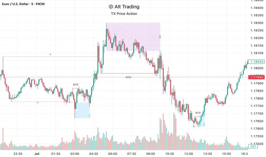
The Alt Trading: TX Price Action Indicator is a multi-layered market-structure and liquidity engine built for intraday and swing traders who want a clean, rules-based map of how price is actually moving through liquidity. It runs a fractal-based swing engine in the background to define objective structure, then derives Break-of-Structure (BOS) legs, inducement sweeps, and execution zones from that single model so nothing on the chart is contradictory or “bolted on.” Asian-session profiling builds a dynamic liquidity range that anchors the QuickStrikes filter, allowing you to require BOS and/or entry zones to sit in specific relation to session highs/lows before a setup is even allowed to print. Displacement legs are converted into Fibonacci- and POI-based retracement zones with configurable frequency (High/Medium/Low), automatically projecting forward in time with transparent, non-intrusive boxes for both long and short scenarios. A tiered inducement engine tracks minor (current day), medium (previous day), and major (weekly) highs and lows, promoting levels to permanent lines once they’ve been meaningfully swept, and labeling them directly on the chart for instant context. As sweeps form and BOS confirms, the indicator constructs entry zones, optional risk/reward panels, and live-updating TP/SL visualization boxes that track active long or short scenarios until completion. All elements—zones, BOS lines, inducement levels, fractal structure, arrows, and risk blocks—are fully style-able so the tool can be tuned to any chart theme without losing clarity. TX Price Action doesn’t attempt to “predict” price; instead, it translates complex liquidity behavior into a consistent, visual playbook that makes it easier to systematize premium/discount entries and manage trades with discipline.
Unchased Wick Detector and ReversalsThis indicator can be used to track unchased wick from previous pivot points.
The idea is to visualise liquidity cluster and grab before a potential reversal.
Unchased wick Visual:
- White lines are protected highs or lows.
- Gray lines are previous wicks where prices have passed through and where the prices did not reverse.
Reversal window:
Reversal window parameters define a period range (a min and a max bars) where the reversal is valid.
The idea is that the reversal must be done in the couple bars right after the wick is chased (this event should stay short in time but you can adjust the period as you wish).
By default the default, the window 1-5 bars (e.g., daily, during 1-5 days).
Green color indicates a grab from a low and a reversal to the upside.
Red color indicates a grab from a high and a reversal to the downside.
Disclamer:
Of course this indicator can lead to false reversal signals and must be combined with other data and must be careful to use it alone for opening any position.
This indicator is a Alpha version let me know if any problem.

Multi-Pivot Plotter//================================================================================
//📌 Manual Pivot Plotter (4 Sets: P, R1–R3, S1–S3)
// - Up to 4 indices
// - Each index: Name + P/S/R values
// - One shared Style block: colors, visibility, line width (applies to all indices)
// - Lines start at 00:00 UTC+8 and extend a few bars
// - Labels at line end or start, with optional "Index Name" and price value
//================================================================================

Daily Dual Pivots (Std + Fib) Extended by Jackel
簡介: 這個指標旨在為日內交易者提供最強大的支撐與阻力參考。它將市場上最常用的兩種 Pivot Points 計算方式——標準 (Standard) 與 斐波那契 (Fibonacci)——結合在同一個圖表中,讓你一眼就能看出關鍵的價格匯聚點 (Confluence Areas)。
主要特色:
雙重系統並存:
標準 Pivot (Standard):以 實線 (Solid Lines) 顯示。這是機構與大部分交易者使用的傳統支撐阻力位。
斐波那契 Pivot (Fibonacci):以 圓點/虛線 (Dotted Lines) 顯示。利用 Fib 黃金比例 (0.382, 0.618) 計算出的潛在反轉位。
清晰的視覺區分:標準版使用暖色系 (紅/綠/橙),Fib 版使用冷色系 (藍/紫),互不干擾,清晰易讀。
可選擴展關卡 (S4-S5 / R4-R5):預設顯示 P, R1-R3, S1-S3。如果市場波動劇烈,你可以在設定中開啟 "Show Extra Levels" 來顯示 R4/R5 及 S4/S5。
自動隱藏歷史:預設只顯示「當日」的線條,保持圖表整潔。如需回測,可開啟「顯示歷史數據」選項。
如何使用:
當 實線 (Standard) 與 虛線 (Fib) 重疊或非常接近時,該區域通常具有更強的支撐或阻力效力。
適用於 15分鐘、1小時或 4小時圖表操作日內交易。
Introduction: This indicator is designed for intraday traders who need precise Support & Resistance levels. It combines the two most popular Pivot Point calculation methods—Standard (Traditional) and Fibonacci—into a single chart, allowing you to easily identify key areas of confluence.
Key Features:
Dual System Strategy:
Standard Pivots: Displayed as Solid Lines. These represent the traditional structural levels used by most traders and institutions.
Fibonacci Pivots: Displayed as Dotted/Circle Lines. These use key Fibonacci ratios (0.382, 0.618) to identify potential reversal zones.
Visual Clarity: Different line styles and color groups allow you to distinguish between Standard and Fib levels instantly without chart clutter.
Extended Levels (Optional): By default, it shows P, R1-R3, and S1-S3. In highly volatile markets, you can enable "Show Extra Levels" in the settings to reveal S4/S5 and R4/R5.
Clean Chart: By default, it only shows levels for the current day. You can enable "Show History" in the settings if you need to backtest.
How to Use:
Look for Confluence: When a Solid Line (Standard) and a Dotted Line (Fib) overlap or are very close to each other, it indicates a very strong Support or Resistance zone.
Best used on 15m, 1H, or 4H charts for intraday analysis.

Paneksu Smart Liquidity & SessionsOVERVIEW:
This indicator is designed for ICT/SMC traders. It visualizes key trading
sessions (Asia, London, New York) and automatically marks significant
High/Low liquidity pools.
KEY FEATURES:
1. Smart Liquidity: Liquidity lines extend into the future and automatically
stop drawing (cut off) once the price sweeps the level. This ensures
only untested liquidity is shown.
2. Precision Anchoring: Lines originate exactly from the pivot High/Low
timestamp for maximum accuracy on higher timeframes.
3. Main Session Focus: Allows you to hide the background box of your
active trading session for the current day to keep the chart clean,
while still showing historical data.
4. Auto-Timeframe: Visuals are automatically disabled on timeframes
higher than 5 minutes to prevent clutter.
SETTINGS:
- Main Trading Session: Select the session you trade to hide its current box.
- Show History: Toggle to keep old swept lines or show only fresh ones.

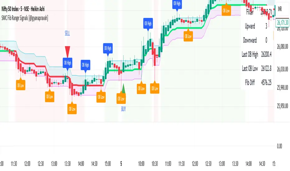
SMC Fib Range Signals [@gyanapravah]SMC Fib Range Signals
This indicator blends Smart Money Concepts (SMC) with a Range Filter Trend System and Fibonacci Retracement & Extensions to generate high-probability automated Buy/Sell signals.
Designed to avoid noise and focus on market structure + trend + price confluence, this tool is ideal for:
1. Intraday traders
2. Swing traders
3. Index & stock traders
4. Crypto & Forex traders
CORE FEATURES
Range Filter Trend Detection
Smooth adaptive filter identifies true trend direction
Visual confirmation:
🟢 Green filter = bullish pressure
🔴 Red filter = bearish pressure
🟡 Yellow filter = neutral
Upper & Lower Bands act as dynamic support/resistance zones
Smart Money Order Blocks (SMC)
Automatically detects important pivot highs & lows
Marks:
OB High → supply / resistance zone
OB Low → demand / support zone
Continuously tracks latest OB levels for live price interaction
Fibonacci Engine
Detects the current swing zone and plots:
Retracement levels
0.236 – 0.382 – 0.500 – 0.618 – 0.786 (editable)
Extension targets
1.272 – 1.618
All levels update dynamically on new market structure and pivots.
SIGNAL ENGINE
This indicator generates signals from three independent confirmation systems:
BUY SIGNALS trigger when:
1. Trend flips bullish (price crosses above the Filter)
2.Bullish trend + price reacts near:
Order Block support
Fibonacci 0.382 / 0.618 levels
Bounce from the Lower Band with trend support
All setups require volume confirmation to filter fake breakouts.
SELL SIGNALS trigger when:
1. Trend flips bearish (price crosses below the Filter)
2. Bearish trend + price reacts near:
Order Block resistance
Fibonacci 0.382 / 0.618 levels
Rejection from the Upper Band with trend support
ALERTS READY
Two built-in alerts:
BUY Alert — fires on bullish signal
SELL Alert — fires on bearish signal
INPUT SETTINGS
Trend Engine
1.Source
2.Sampling Period
3.Range Multiplier
Smart Money
Pivot detection sensitivity (Left / Right bars)
Fibonacci
1.Swing lookback length
2.Editable Fib retracement and extension values
3.Toggle show/hide Fib levels
BEST USE CASE
Works extremely well on:
⏱️ 3M – 15M Intraday scalping
⏱️ 30M – 1H positional entries
⏱️ 4H – D1 swing trading
Tested on:
NIFTY / BANKNIFTY / FINNIFTY
Stocks
Crypto
Forex
DISCLAIMER
This indicator is for educational purposes only.
It does NOT guarantee profits.
Always use:
Proper risk management
Stop-loss rules
Your own confirmation before entering trades.
AUTHOR
Built & shared by @gyanapravah (Odisha, India)
Open-source for learning and community improvement.