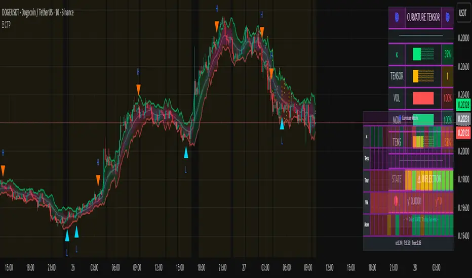
Curvature Tensor Pivots🌀 Curvature Tensor Pivots
Curvature Tensor Pivots: Geometric Pivot Detection Through Differential Geometry
Curvature Tensor Pivots applies mathematical differential geometry to market price analysis, identifying pivots by measuring how price trajectories bend through space. Unlike traditional pivot indicators that rely solely on price highs and lows, this system calculates the actual geometric curvature of price paths and detects inflection points where the curvature changes sign or magnitude—the mathematical hallmarks of directional transitions.
The indicator combines three components: precise curvature measurement using second-derivative calculus, tensor weighting that multiplies curvature by volatility and momentum, and a tension-based prediction system that identifies compression before pivots form. This creates a forward-looking pivot detector with built-in confirmation mechanics.
What Makes This Original
Pure Mathematical Foundation
This indicator implements the classical differential geometry curvature formula κ = |y''| / (1 + y'²)^(3/2), which measures how sharply a curve bends at any given point. In price analysis, high curvature indicates sharp directional changes (active pivots), while curvature approaching zero indicates straight-line motion (inflection points forming). This mathematical approach is fundamentally different from pattern recognition or statistical pivots—it measures the actual geometry of price movement.
Tensor Weighting System
The core innovation is the tensor scoring mechanism, which multiplies geometric curvature by two market-state variables: volatility (ATR expansion/compression) and momentum (rate of change strength). This creates a multi-dimensional strength metric that distinguishes between meaningful pivots and noise. A high tensor score means high curvature is occurring during significant volatility with strong momentum—a genuine structural turning point. Low tensor scores during high curvature indicate choppy, low-conviction moves.
Tension-Based Prediction
The system calculates tension as the inverse of curvature (Tension = 1 - κ). When curvature is low, tension is high, indicating price is moving in a straight line and approaching an inflection point where it must curve. The tension cloud visualizes this compression, tightening before pivots form and expanding after they complete. This provides anticipatory signals rather than purely reactive confirmation.
Integrated Confirmation Architecture
Rather than simply flagging high curvature, the system requires convergence of four elements: geometric inflection detection (sign changes in second derivative or curvature extrema), traditional price structure pivots (pivot highs/lows), tensor strength above threshold, and minimum spacing between signals. This multi-layer confirmation prevents false signals while maintaining sensitivity to genuine turning points.
This is not a combination of existing indicators—it's an application of pure mathematical concepts (differential calculus and tensor algebra) to market geometry, creating a unique analytical framework.
Core Components and How They Work Together
1. Differential Geometry Engine
The foundation is calculus-based trajectory analysis. The system treats price as a function y(t) and calculates:
First derivative (y'): The slope of the price trajectory, representing directional velocity
Second derivative (y''): The acceleration of slope change, representing how quickly direction is shifting
Curvature (κ): The normalized geometric bend, calculated using the formula κ = |y''| / (1 + y'²)^(3/2)
This curvature value is then normalized to a 0-1 range using adaptive statistical bounds (mean ± 2 standard deviations over a rolling window). High κ values indicate sharp bends (active pivots), while κ approaching zero indicates inflection points where the trajectory is straightening before changing concavity.
2. Tensor Weighting Components
The raw curvature is weighted by market dynamics to create the tensor score:
Volatility Component: Calculated as current ATR divided by baseline ATR (smoothed average). Values above 1.0 indicate expansion (higher conviction moves), while values below 1.0 indicate compression (lower reliability). This ensures pivots forming during volatile periods receive higher scores than those in quiet conditions.
Momentum Component: Measured using rate of change (ROC) strength normalized by recent average. High momentum indicates sustained directional pressure, confirming that curvature changes represent genuine trend shifts rather than noise.
Tensor Score Fusion: The final tensor score = κ × Volatility × Momentum × Direction × Gain. This creates a directional strength metric ranging from -1 (strong bearish curvature) to +1 (strong bullish curvature). The magnitude represents conviction, while the sign represents direction.
These components work together by filtering geometric signals through market-state context. A high curvature reading during low volatility and weak momentum produces a low tensor score (likely noise), while the same curvature during expansion and strong momentum produces a high tensor score (likely genuine pivot).
3. Inflection Point Detection System
Inflection points occur where the second derivative changes sign (concave to convex or vice versa) or where curvature reaches local extrema. The system detects these through multiple methods:
Sign change detection: When y'' crosses zero, the price trajectory is transitioning from curving upward to downward (or vice versa)
Curvature extrema: When κ reaches a local maximum or minimum, indicating peak bend intensity
Near-zero curvature: When κ falls below an adaptive threshold, indicating straight-line motion before a directional change
These geometric signals are combined with traditional pivot detection (pivot highs and lows using configurable lookback/lookahead periods) to create confirmed inflection zones. The geometric math identifies WHERE inflections are forming, while price structure confirms WHEN they've completed.
4. Tension Cloud Prediction
Tension is calculated as 1 - κ, creating an inverse relationship where low curvature produces high tension. This represents the "straightness" of price trajectory—when price moves in a straight line, it's building tension that must eventually release through a curved pivot.
The tension cloud width adapts to this tension value: it tightens (narrows) when curvature is low and tension is high, providing visual warning that a pivot is forming. After the pivot completes and curvature increases, tension drops and the cloud expands, confirming the turn.
This creates a leading indicator component within the system: watch for the cloud to compress, then wait for the pivot marker and tensor direction confirmation to enter trades.
5. Multi-Layer Visualization System
The visual components work hierarchically:
Curvature ribbons (foundation): Width expands with curvature magnitude, color shifts with tensor direction (green bullish, red bearish)
Tension cloud (prediction): Purple overlay that compresses before pivots and expands after
Tensor waves (context): Harmonic oscillating layers driven by three phase accumulators (curvature, tensor magnitude, volatility), creating visual texture that becomes erratic before pivots and smooth during trends
Inflection zones (timing): Golden background highlighting when geometric conditions indicate inflection points forming
Pivot markers (confirmation): Triangles marking confirmed pivots where geometric inflection + price structure + tensor strength all align
Each layer adds information without redundancy: ribbons show current state, tension shows prediction, waves show regime character, zones show geometric timing, and markers show confirmed entries.
Calculation Methodology
Phase 1 - Derivative Calculations
Price is normalized by dividing by a 50-period moving average to improve numerical stability. The first derivative is calculated as the bar-to-bar change, then smoothed using a configurable smoothing length (default 3 bars) to reduce noise while preserving structure.
The second derivative is calculated as the bar-to-bar change in the first derivative, also smoothed. This represents the acceleration of directional change—positive values indicate price is curving upward (concave up), negative values indicate curving downward (concave down).
Phase 2 - Curvature Formula
The classical curvature formula is applied:
Calculate y'² (first derivative squared)
Calculate (1 + y'²)^1.5 as the denominator
Divide |y''| by this denominator to get raw curvature κ
This formula ensures curvature is properly normalized regardless of the steepness of the trajectory. A vertical line with high slope (large y') can still have low curvature (straight), while a gradual slope with changing direction produces high curvature (curved).
The raw curvature is then normalized to 0-1 range using adaptive bounds (rolling mean ± 2 standard deviations), allowing the system to adapt to different market volatility regimes.
Phase 3 - Tensor Weighting
ATR is calculated over the specified volatility length (default 14). Current ATR is divided by smoothed ATR to create the volatility ratio. Momentum is calculated as the rate of change over the momentum length (default 10), normalized by recent average ROC.
The tensor score is computed as: Curvature × Volatility × Momentum × Tensor Gain × Direction Sign
This creates the final directional strength metric used for ribbon coloring and signal generation.
Phase 4 - Inflection Detection
Multiple conditions are evaluated simultaneously:
Second derivative sign changes (y'' × y'' < 0)
Curvature local maxima (previous bar κ > current bar κ AND previous bar κ > two bars ago κ)
Curvature local minima (opposite condition)
Low curvature threshold (current κ < adaptive threshold)
Any of these conditions triggers inflection zone highlighting. For confirmed pivot signals, inflection detection must coincide with traditional pivot highs/lows AND tensor magnitude must exceed threshold AND minimum spacing since last signal must be satisfied.
Phase 5 - Tension Calculation
Tension = 1 - κ (smoothed)
This inverse relationship creates the compression/expansion dynamic. When curvature approaches zero (straight trajectory), tension approaches 1 (maximum compression). When curvature is high (sharp bend), tension approaches zero (released).
The tension cloud bands are calculated as: Basis ± (Ribbon Width × Tension)
This creates the visual tightening effect before pivots.
Phase 6 - Wave Generation
Three phase accumulators are maintained:
Phase 1: Accumulates based on curvature magnitude (0.1 × κ per bar)
Phase 2: Accumulates based on tensor magnitude (0.15 × tensor per bar)
Phase 3: Accumulates based on volatility (0.08 × volatility per bar)
For each wave layer (2-8 configurable), a unique frequency is used (layer number × 0.6). The wave offset is calculated as:
Amplitude × (sin(phase1 × frequency) × 0.4 + sin(phase2 × frequency × 1.2) × 0.35 + sin(phase3 × frequency × 0.8) × 0.25)
This creates complex harmonic motion that reflects the interplay of curvature, strength, and volatility. When these components are aligned, waves are smooth; when misaligned (pre-pivot conditions), waves become chaotic.
All calculations are deterministic and execute on closed bars only—there is no repainting.
How to Use This Indicator
Setup and Configuration
Apply the indicator to your chart with default settings initially
Enable the main dashboard (top right recommended) to monitor curvature, tensor, and tension metrics in real-time
Enable the curvature matrix (bottom right) to see historical patterns in the heatmap
Choose your ribbon mode: "Dual Ribbon" shows both bullish and bearish zones, "Tension Cloud" emphasizes the compression zones
For your first session, observe how the tension cloud behaves before confirmed pivots—you'll notice it consistently tightens (narrows) before pivot markers appear, then expands after.
Signal Interpretation
High Pivot (Bearish) - Red triangle above price:
Occurs when price makes a pivot high (local maximum)
Second derivative is negative (concave down curvature)
Tensor magnitude exceeds threshold (strong confirmation)
Minimum spacing requirement met (noise filter)
Interpretation: A confirmed bearish inflection point has formed. Price trajectory has curved over and is transitioning from upward to downward movement.
Low Pivot (Bullish) - Blue triangle below price:
Occurs when price makes a pivot low (local minimum)
Second derivative is positive (concave up curvature)
Tensor magnitude exceeds threshold
Spacing requirement met
Interpretation: A confirmed bullish inflection point has formed. Price trajectory has curved upward and is transitioning from downward to upward movement.
Dashboard Metrics
κ (Curvature): 0-100% reading. Above 70% = sharp active pivot, 40-70% = moderate curve, below 40% = gentle or approaching inflection
Tensor: Directional strength. Arrow indicates bias (⬆ bullish, ⬇ bearish, ⬌ neutral). Magnitude indicates conviction.
Volatility: Current ATR expansion state. Above 70% = high volatility (pivots more significant), below 40% = compressed (pivots less reliable)
Momentum: Directional strength. High values confirm trend continuation, low values suggest exhaustion
Tension: 0-100% reading. Above 70% = pivot forming soon (high compression), below 40% = pivot recently completed (expanded)
State: Real-time regime classification:
"🟢 STABLE" = normal trending conditions
"🟡 TENSION" = pivot forming (high compression)
"🔴 HIGH κ" = active sharp pivot in progress
"⚠ INFLECTION" = geometric inflection zone (critical transition)
Curvature Matrix Heatmap
The matrix shows the last 30 bars (configurable 10-100) of historical data across five metrics:
κ row: Curvature evolution (green = low, yellow = moderate, red = high)
Tension row: Purple intensity shows compression building
Tensor row: Strength evolution (green = strong, yellow = moderate, red = weak)
Volatility row: Expansion state
Momentum row: Directional conviction
Pattern recognition: Look for purple clustering in the tension row followed by red spikes in the κ row—this shows compression → release pivot sequence.
Trading Workflow
Step 1 - Monitor Tension:
Watch the tension cloud and dashboard tension metric. When tension rises above 60-70% and the cloud visibly tightens, a pivot is building. The matrix will show purple bands clustering.
Step 2 - Identify Inflection Zone:
Wait for the golden background glow (inflection zone) to appear. This indicates the geometric conditions are met: curvature is approaching zero, second derivative is near sign change, or curvature extrema detected. The dashboard state will show "⚠ INFLECTION ZONE".
Step 3 - Confirm Direction:
Check the tensor arrow in the dashboard:
⬆ (bullish tensor) = expect bullish pivot
⬇ (bearish tensor) = expect bearish pivot
Also verify the y'' status in the dashboard:
"🔵↑ Concave Up" = bullish curvature forming
"🔴↓ Concave Down" = bearish curvature forming
Step 4 - Wait for Pivot Marker:
Do not enter on inflection zones alone—wait for the confirmed pivot marker (triangle). This ensures all confirmation layers have aligned: geometric inflection + price structure pivot + tensor strength + spacing filter.
Step 5 - Execute Entry:
Long entry: Blue triangle below price + ⬆ tensor + tension releasing (dropping)
Short entry: Red triangle above price + ⬇ tensor + tension releasing
Step 6 - Manage Risk:
Initial stop: Place beyond the opposite ribbon edge plus one ATR buffer
Trailing stop: Follow the ribbon edge (basis ± adaptive width) as curvature sustains in your direction
Exit signal: If tension spikes again quickly (another inflection forming), consider taking profit—the trend may be reversing
Best Practices
Use multiple timeframe confirmation: Check that higher timeframe tensor aligns with your trade direction
Respect the spacing filter: If a pivot just fired, wait for minimum spacing before taking another signal
Distinguish regime: In "🔴 HIGH κ" state (choppy), reduce position size; in "🟢 STABLE" state, full confidence
Combine with support/resistance: Pivots near key levels have higher probability
Watch particle density: Clustering of particles indicates rising curvature intensity
Observe wave texture: Smooth flowing waves = trending environment (pivots are reversals); chaotic erratic waves = reversal environment (pivots are trend starts)
Ideal Market Conditions
Best Performance
Liquid markets with clear swing structure (forex majors, large-cap stocks, major indices)
Timeframes from 15-minute to daily (the system adapts across timeframes)
Markets with periodic swings and clear directional phases (where geometric curvature is meaningful)
Trending markets with consolidation phases (where tension builds before breakouts)
Challenging Conditions
Extremely choppy/sideways markets for extended periods (high curvature but low tensor magnitude—system will reduce signals appropriately)
Very low liquidity instruments (erratic price action creates false geometric signals)
Ultra-low timeframes (1-minute or below) where spread and noise dominate structure
Markets in deep consolidation (the system will show high tension but no clean pivot confirmation)
The indicator is designed to adapt: in poor conditions, tensor scores remain low and signals reduce naturally. In optimal conditions, tension compression → inflection → pivot confirmation sequences occur cleanly.
Parameter Optimization by Trading Style
Scalping (5-15 Minute Charts)
Curvature Window: 3-5 (faster response)
Curvature Smoothing: 2 (minimal lag)
Volatility Length: 10-14
Momentum Length: 8-10
Tensor Gain: 1.2-1.5 (moderate sensitivity)
Inflection Threshold: 0.10-0.15 (more sensitive)
Min Pivot Spacing: 3-5 bars
Pivot Mode: Aggressive
Ribbon Mode: Dual Ribbon (clearer entries)
Day Trading (15-60 Minute Charts)
Curvature Window: 5 (default)
Curvature Smoothing: 3 (balanced)
Volatility Length: 14
Momentum Length: 10
Tensor Gain: 1.5 (default)
Inflection Threshold: 0.15 (default)
Min Pivot Spacing: 5-8 bars
Pivot Mode: Normal or Adaptive
Ribbon Mode: Dual Ribbon
Swing Trading (4-Hour to Daily Charts)
Curvature Window: 7-10 (smoother)
Curvature Smoothing: 4-5 (noise reduction)
Volatility Length: 20-30
Momentum Length: 14-20
Tensor Gain: 1.8-2.5 (higher conviction requirement)
Inflection Threshold: 0.20-0.30 (more selective)
Min Pivot Spacing: 8-12 bars
Pivot Mode: Conservative
Ribbon Mode: Tension Cloud (focus on compression zones)
Performance Optimization
If you experience lag on lower-end systems:
Reduce Wave Layers: 4 → 2 (50% reduction in calculations)
Lower Particle Density: 3 → 1 (66% reduction in label creation)
Decrease Matrix History: 30 → 15 bars (50% reduction in table size)
Disable Tensor Waves entirely if not needed for your trading
Important Disclaimers
- This indicator is a technical analysis tool designed to identify potential pivot points through mathematical analysis of price trajectory geometry. It should not be used as a standalone trading system. Always combine with proper risk management, position sizing, and additional confirmation methods (support/resistance, volume analysis, multi-timeframe alignment).
- The curvature and tensor calculations are deterministic mathematical formulas applied to historical price data—they do not predict future price movements with certainty. Past geometric patterns do not guarantee future pivot behavior. The tension-based prediction system identifies conditions where pivots are likely to form based on trajectory straightness, but market conditions can change rapidly.
- All trading involves risk. Use appropriate stop losses and never risk more than you can afford to lose. The signal spacing filters and tensor confirmation layers are designed to reduce noise, but no indicator can eliminate false signals entirely.
This system is most effective when combined with sound trading principles, market context awareness, and disciplined execution.
Technical Notes
All calculations execute on closed bars only (no repainting)
Lookback functions limited to 5000 bars maximum
Arrays are fixed-size (waves) or hard-capped (particles at 80 labels)
Dashboard and matrix update only on the last bar to minimize computational load
Particle generation throttled to every 2 bars
Phase accumulators use modulo operations to prevent overflow
Statistical normalization (mean ± 2σ) automatically adapts to different volatility regimes
— Dskyz, Trade with insight. Trade with anticipation.
樞軸點
Daily Key Levels + VWAPThis indicator is daily price levels and previous day's VWAP for precision intraday trading decisions.

Strong PivotsThis finds pivots based on your inputs (number of candles back and forward that are above or below the range of the potential pivot points) and then optionally changes the color to help you visually identify the pivot. You can also specify pivots as strong pivots if they reverse in 1 time segment beyond a certain percentage (wick % of full candle range).
For example, if the pivot is at a high point but has a green body candle and a wick > 35% of the candle, it will change the body color to red to help visually understand that the candle can be considered a strong part of the downtrend, regardless of it closing green. This will help your mind interpret the top pivot candle as part of the potential trend reversal for the following candles and could even be used as part of your strategy ruleset.

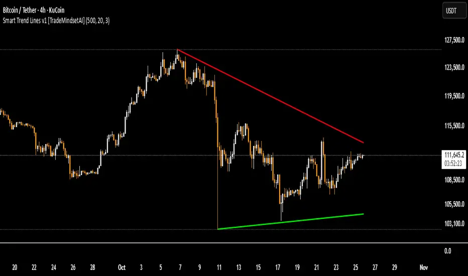
Smart Trend Lines v.1 [TradeMindsetAI]
✅ " 🚀 Smart Trend Lines V.1 🚀 " is an advanced Pine Script indicator that automatically detects and draws dynamic trend lines based on real pivot points from candle shadows (wicks).
✅ Key Features:
• Accurately identifies pivot highs and lows using customizable lookback periods
• Draws support/resistance trend lines only if price has respected them (via pullback or bounce validation)
• Validates lines by ensuring price doesn't cross the projected line in its path
• Limits the number of displayed lines to keep the chart clean
• Auto-removes outdated lines (older than 500 bars)
• Fully customizable line colors, styles (solid/dashed/dotted), and widths
✅ Ideal for traders seeking reliable, reactive trend lines across all timeframes.
✅ Note: Lines are calculated only after analyzing at least 1000 candles for maximum accuracy.
✅ Recommended Settings:
`Lookback Candles: 500` | `Pivot Period: 20` | `Pivot Points: 3`
`Lookback Candles: 500` | `Pivot Period: 17` | `Pivot Points: 3`
`Lookback Candles: 500` | `Pivot Period: 11` | `Pivot Points: 3`
🎯Built for traders who demand **pixel-perfect accuracy**.
⭐Like & Follow for more elite tools!
#trendline #smart #support #resistance #pivot #crypto #forex
✅ این اندیکاتور🚀"Smart Trend Lines V.1" 🚀 به صورت خودکار خطوط روند صعودی (حمایتی) و نزولی (مقاومتی) را بر اساس پیوتهای واقعی سایه کندلها شناسایی و رسم میکند.
✅ ویژگیهای کلیدی:
• تشخیص خودکار پیوتهای کف و سقف با دوره قابل تنظیم
• رسم خطوط روند تنها در صورتی که قیمت به آنها واکنش نشان داده باشد
• اعتبارسنجی دقیق خطوط با بررسی عدم نفوذ قیمت در مسیر روند
• محدود کردن تعداد خطوط نمایش داده شده برای جلوگیری از شلوغی چارت
• حذف خودکار خطوط قدیمی (بیش از ۵۰۰ کندل)
• قابلیت تنظیم رنگ، سبک و ضخامت خطوط حمایتی و مقاومتی
✅ مناسب برای تحلیلگرانی که به دنبال خطوط روند معتبر و پویا در تایمفریمهای مختلف هستند.
✅ نکته: خطوط فقط پس از بررسی حداقل ۱۰۰۰ کندل رسم میشوند تا از دقت بالا اطمینان حاصل شود.
✅ تنظیمات پیشنهادی:
`Lookback Candles: 500` | `Pivot Period: 20` | `Pivot Points: 3`
`Lookback Candles: 500` | `Pivot Period: 17` | `Pivot Points: 3`
`Lookback Candles: 500` | `Pivot Period: 11` | `Pivot Points: 3`
🎯 برای معاملهگرانی که دقت پیکسلبهپیکسل میخواهند.
⭐ لایک و فالو کنید تا ابزارهای حرفهای بیشتری ببینید!
W1 Keyzones Overlay (D1) by Delta 1 / Norman AXLRODW1 Keyzones Overlay (D1) — Description and User Guide
What it does:
This indicator projects weekly key zones (W1) onto your D1 chart. It detects confirmed weekly pivot highs and lows and derives resistance and support zones. Zones are intentionally invisible (no fill, no border). Instead, centered labels are shown at the current bar: “W1 Res” for weekly resistance and “W1 Sup” for weekly support. Two alerts are included: “Approach” (price approaches a zone within a set distance) and “Hit” (price is inside a zone).
Features:
Automatic W1 pivot high/low detection. Configurable zone width (percentage of pivot price). Centered labels placed at the zone midpoint and aligned to the current bar on the right. Invisible zones to keep the chart clean. Alerts for approach and hit. FX pip handling including the JPY 0.01 pip convention.
Inputs:
W1 Pivot Period (default 5): sensitivity of weekly pivot detection; higher values produce fewer, stronger zones.
Max Zones: maximum number of stored and visible zones.
Zone Width (% of price): for example 0.0025 equals 0.25% of price.
Show Labels: toggle to show or hide W1 Res/W1 Sup labels.
Colors: base colors for resistance and support labels (zones remain invisible).
Approach Distance (pips): distance to the top of a zone that triggers the Approach alert; pip size is handled automatically, JPY pairs use 0.01.
How to read it:
Focus on the labels. W1 Res marks an active weekly resistance zone. W1 Sup marks an active weekly support zone. Labels sit at the midpoint of each zone and at the current bar, so key levels are always visible on the right side of the chart. Zones are invisible by design; the internal zone width still governs the alert logic and whether price is considered “inside” the zone. Use the alerts as prompts: “Approach” is an early heads-up, “Hit” signals active interaction with the zone where you can look for confirmation via price action.
Typical use:
Set your directional bias on D1 by noting which weekly levels are nearby. Check confluence with your own levels, moving averages, structure, volume and the calendar. Consider playbook ideas such as rebounds at W1 Sup after confirmation, fades at W1 Res with protective stops, or break-and-retest setups after a clean break.
Best practices:
Use D1 for context and time entries on H1 or M15. Increase the pivot period if you see too many labels. Adjust zone width so it is neither too narrow (false touches) nor too wide (diluted signals). Set a larger approach distance for JPY pairs. Never use the tool in isolation; combine it with price action, regime (trend or range), volatility and event risk.
Alert setup (TradingView):
Create a new alert. In Condition, select this indicator. Choose either “Approach to W1 Keyzone” or “W1 Keyzone Hit.” Pick the frequency (once per bar or once per bar close). Optionally customize the message with symbol and plan. Save.
Notes and limits:
FX pip logic auto-detects JPY pairs (pip equals 0.01). Non-FX defaults to 1.0 for the pip unit. The indicator uses confirmed weekly pivots and does not look ahead; labels update each bar while zones remain stable. Very large Max Zones values over long histories may affect performance. Zones are intentionally invisible; reduce transparency or add border width in the code if you want visible boxes.
Example workflow:
On D1, locate nearby W1 Res or W1 Sup relative to current price. Check the calendar for risk events such as CPI, NFP or central bank decisions. Drop to H1 or M15 and wait for a trigger (rejection or break and retest). Place the stop beyond or behind the zone and plan risk-reward. Manage the trade with partials at the first structure level, move to break even after a retest, and let the remainder run.
FAQ:
Why do I only see labels? This is by design to keep charts clean. The logic still uses the zones internally.
Can I make zones visible? Yes. Reduce transparency and/or increase border width in the code or expose those as inputs.
How large should the approach distance be for JPY pairs? Typically larger than for non-JPY, for example 40 to 80 pips where one pip equals 0.01.
Disclaimer:
This is not financial advice. For educational purposes only. Always do your own research and use strict risk management.
Support / contact:
Questions or suggestions: (mailto:Delta1trading@protonmail.com).

MAG Support Resistance Lines⚡ MAG Support Resistance Lines
💡 MAG S/R maps high-probability intraday reversal zones derived from directional magnitude — letting you trade where structure and liquidity truly converge.
🔍 Purpose
Automatically detects dynamic support and resistance zones using a Magnitude Bias Line — a proprietary directional-strength model built from historical price behavior.
Optimized for 1m–15m intraday charts to highlight high-impact support and resistance areas.
🧭 How It Works
Magnitude Bias Line – Computes a long-length bias curve that smooths directional flow (default 258 bars).
Pivot Detection – Identifies local highs/lows of this curve to mark potential structural turning points.
These zones DO NOT repaint, meaning the lines you see were plotted before price reached them.
Zones do expire once historic price data fed by TradingView is too far back/no longer available.
Zones should be treated as "nothing" until price action confirms it wants to respect it or continue past it.
Zone Creation –
A zone box is created around each pivot level, providing a visual approximation of potential support or resistance.
Thickness is defined by Box Height % (e.g. 0.0004 ≈ 0.04 %).
Extension & Mitigation – Zones extend forward until a new bias pivot overlaps them; new pivots replace old ones at updated price levels.
⚙️ Key Inputs
Setting | Default | Description
Magnitude Range | 258 | Controls how smooth/strong the Magnitude Bias Line is (larger = fewer zones).
Box Height % | 0.0004 | Fraction of price defining zone height (use 0.0007 on SPX, 0.0004 on ES).
Zone Color / Transparency | Green / 85% | Visual style for zone fill and border.
🕐 Timeframe Guidelines
Fitted for 1m → 15m charts. Future updates may allow higher timeframes.
If loaded outside this range, a red label reminder will appear.
🎯 Usage Tips
Watch price action for reversals or continuations at each zone. Price may V-rebound from a zone or punch through then retest the opposite side before continuing.
Utilize next zone as a TP or SL depending on your strategy rules.
Combine with VWAP, Expected Move bands, or Gamma levels for confluence.
Adjust Box Height % to match current volatility.
If you see a specific indicator that pairs well with this one, please let other's know in the comments! Together we find success and I am forever grateful to the trading communities that shared knowledge with me!
⚠️ Disclaimer (NIF)
This tool is for research and informational purposes only (Not Investment or Financial advice).
Trading involves risk; users should exercise independent judgment before making financial decisions.
Pivot Regime Anchored VWAP [CHE] Pivot Regime Anchored VWAP — Detects body-based pivot regimes to classify swing highs and lows, anchoring volume-weighted average price lines directly at higher highs and lower lows for adaptive reference levels.
Summary
This indicator identifies shifts between top and bottom regimes through breakouts in candle body highs and lows, labeling swing points as higher highs, lower highs, lower lows, or higher lows. It then draws anchored volume-weighted average price lines starting from the most recent higher high and lower low, providing dynamic support and resistance that evolve with volume flow. These anchored lines differ from standard volume-weighted averages by resetting only at confirmed swing extremes, reducing noise in ranging markets while highlighting momentum shifts in trends.
Motivation: Why this design?
Traders often struggle with static reference lines that fail to adapt to changing market structures, leading to false breaks in volatile conditions or missed continuations in trends. By anchoring volume-weighted average price calculations to body pivot regimes—specifically at higher highs for resistance and lower lows for support—this design creates reference levels tied directly to price structure extremes. This approach addresses the problem of generic moving averages lagging behind swing confirmations, offering a more context-aware tool for intraday or swing trading.
What’s different vs. standard approaches?
- Baseline reference: Traditional volume-weighted average price indicators compute a running total from session start or fixed periods, often ignoring price structure.
- Architecture differences:
- Regime detection via body breakout logic switches between high and low focus dynamically.
- Anchoring limited to confirmed higher highs and lower lows, with historical recalculation for accurate line drawing.
- Polyline rendering rebuilds only on the last bar to manage performance.
- Practical effect: Charts show fewer, more meaningful lines that start at swing points, making it easier to spot confluences with structure breaks rather than cluttered overlays from continuous calculations.
How it works (technical)
The indicator first calculates the maximum and minimum of each candle's open and close to define body highs and lows. It then scans a lookback window for the highest body high and lowest body low. A top regime triggers when the body high from the lookback period exceeds the window's highest, and a bottom regime when the body low falls below the window's lowest. These regime shifts confirm pivots only when crossing from one state to the other.
For top pivots, it compares the new body high against the previous swing high: if greater, it marks a higher high and anchors a new line; otherwise, a lower high. The same logic applies inversely for bottom pivots. Anchored lines use cumulative price-volume products and volumes from the anchor bar onward, subtracting prior cumulatives to isolate the segment. On pivot confirmation, it loops backward from the current bar to the anchor, computing and storing points for the line. New points append as bars advance, ensuring the line reflects ongoing volume weighting.
Initialization uses persistent variables to track the last swing values and anchor bars, starting with neutral states. Data flows from regime detection to pivot classification, then to anchoring and point accumulation, with lines rendered globally on the final bar.
Parameter Guide
Pivot Length — Controls the lookback window for detecting body breakouts, influencing pivot frequency and sensitivity to recent action. Shorter values catch more pivots in choppy conditions; longer smooths for major swings. Default: 30 (bars). Trade-offs/Tips: Min 1; for intraday, try 10–20 to reduce lag but watch for noise; on daily, 50+ for stability.
Show Pivot Labels — Toggles display of text markers at swing points, aiding quick identification of higher highs, lower highs, lower lows, or higher lows. Default: true. Trade-offs/Tips: Disable in multi-indicator setups to declutter; useful for backtesting structure.
HH Color — Sets the line and label color for higher high anchored lines, distinguishing resistance levels. Default: Red (solid). Trade-offs/Tips: Choose contrasting hues for dark/light themes; pair with opacity for fills if added later.
LL Color — Sets the line and label color for lower low anchored lines, distinguishing support levels. Default: Lime (solid). Trade-offs/Tips: As above; green shades work well for bullish contexts without overpowering candles.
Reading & Interpretation
Higher high labels and red lines indicate potential resistance zones where volume weighting begins at a new swing top, suggesting sellers may defend prior highs. Lower low labels and lime lines mark support from a fresh swing bottom, with the line's slope reflecting buyer commitment via volume. Lower highs or higher lows appear as labels without new anchors, signaling possible range-bound action. Line proximity to price shows overextension; crosses may hint at regime shifts, but confirm with volume spikes.
Practical Workflows & Combinations
- Trend following: Enter longs above a rising lower low anchored line after higher low confirmation; filter with rising higher highs for uptrends. Use line breaks as trailing stops.
- Exits/Stops: In downtrends, exit shorts below a higher high line; set aggressive stops above it for scalps, conservative below for swings. Pair with momentum oscillators for divergence.
- Multi-asset/Multi-TF: Defaults suit forex/stocks on 1H–4H; on crypto 15M, shorten length to 15. Scale colors for dark themes; combine with higher timeframe anchors for confluence.
Behavior, Constraints & Performance
Closed-bar logic ensures pivots confirm after the lookback period, with no repainting on historical bars—live bars may adjust until regime shift. No higher timeframe calls, so minimal repaint risk beyond standard delays. Resources include a 2000-bar history limit, label/polyline caps at 200/50, and loops for historical point filling (up to current bar count from anchor, typically under 500 iterations). Known limits: In extreme gaps or low-volume periods, anchors may skew; lines absent until first pivots.
Sensible Defaults & Quick Tuning
Start with the 30-bar length for balanced pivot detection across most assets. For too-frequent pivots in ranges, increase to 50 for fewer signals. If lines lag in trends, reduce to 20 and enable labels for visual cues. In low-volatility assets, widen color contrasts; test on 100-bar history to verify stability.
What this indicator is—and isn’t
This is a structure-aware visualization layer for anchoring volume-weighted references at swing extremes, enhancing manual analysis of regimes and levels. It is not a standalone signal generator or predictive model—always integrate with broader context like order flow or news. Use alongside risk management and position sizing, not as isolated buy/sell triggers.
Many thanks to LuxAlgo for the original script "McDonald's Pattern ". The implementation for body pivots instead of wicks uses a = max(open, close), b = min(open, close) and then highest(a, length) / lowest(b, length). This filters noise from the wicks and detects breakouts over/under bodies. Unusual and targeted, super innovative.
Disclaimer
The content provided, including all code and materials, is strictly for educational and informational purposes only. It is not intended as, and should not be interpreted as, financial advice, a recommendation to buy or sell any financial instrument, or an offer of any financial product or service. All strategies, tools, and examples discussed are provided for illustrative purposes to demonstrate coding techniques and the functionality of Pine Script within a trading context.
Any results from strategies or tools provided are hypothetical, and past performance is not indicative of future results. Trading and investing involve high risk, including the potential loss of principal, and may not be suitable for all individuals. Before making any trading decisions, please consult with a qualified financial professional to understand the risks involved.
By using this script, you acknowledge and agree that any trading decisions are made solely at your discretion and risk.
Do not use this indicator on Heikin-Ashi, Renko, Kagi, Point-and-Figure, or Range charts, as these chart types can produce unrealistic results for signal markers and alerts.
Best regards and happy trading
Chervolino

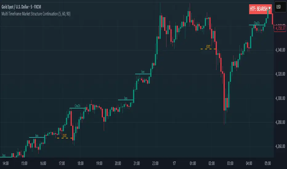
Multi Timeframe Market Structure ContinuationOverview
This indicator identifies Break of Structure (BOS) and Change of Character (ChoCh) patterns using multi-timeframe (MTF) analysis to filter high-probability trade setups. By aligning lower timeframe signals with higher timeframe bias, it helps traders enter positions in the direction of the dominant trend while avoiding counter-trend traps.
Multi-Timeframe Analysis
The indicator analyzes market structure on two timeframes simultaneously:
Current Timeframe (CTF): Detects immediate BOS and ChoCh signals for entry timing
Higher Timeframe (HTF): Establishes the overall trend direction (default: 1H, customizable)
Signals only appear when the current timeframe structure aligns with the higher timeframe bias, ensuring you're trading with the momentum, not against it.
Break of Structure (BOS)
BOS signals indicate trend continuation - when price breaks a previous high in an uptrend or a previous low in a downtrend. These are reliable entries that confirm the trend is still active and strong.
Change of Character (ChoCh)
ChoCh signals mark early trend reversals - when market structure shifts from bearish to bullish (or vice versa). When captured in alignment with the higher timeframe trend, ChoCh entries can achieve exceptional risk-to-reward ratios as they allow entry near the beginning of a new impulse move.
Exit Signals
Exit signals are plotted when a ChoCh occurs in the opposite direction of the HTF trend. For example, if the HTF is bullish and a bearish ChoCh forms on the current timeframe, an orange "EXIT" signal appears - warning long traders that the lower timeframe structure is shifting against them. This provides an early warning system to protect profits or minimize losses before the HTF trend itself reverses.
Trading Strategy Recommendations
Trending Markets (Recommended)
In strong trending conditions, both BOS and ChoCh signals can be taken when aligned with the HTF bias. ChoCh entries are particularly powerful as they catch early reversals within the larger trend, offering entries with tight stop losses and extended profit targets.
Ranging Markets
During consolidation or choppy conditions, it's best to be selective and take only BOS entries. BOS signals confirm that the trend is continuing beyond the range, reducing false breakouts and whipsaw trades that are common with counter-trend ChoCh signals in sideways markets.
Customization
Pivot Length: Adjust the sensitivity of structure detection (default: 5). Lower values detect structure more frequently with earlier but potentially noisier signals. Higher values provide cleaner, more significant structural breaks but with some delay.
Higher Timeframe: Customize the HTF to suit your trading style. Day traders might use 1H HTF on 5m charts, while swing traders could use 4H or Daily HTF.
Alert System
Six alert conditions available:
Long BOS Entry / Long ChoCh Entry
Short BOS Entry / Short ChoCh Entry
Long Exit / Short Exit
All alerts fire only on confirmed candle closes to eliminate repainting and false signals.
Visual Features
Color-coded background showing HTF bias
Clear BOS/ChoCh labels with horizontal lines at structure levels
Orange "EXIT" signals when structure breaks against your position
Gray lines tracking current swing highs/lows
HTF trend indicator in the top-right corner
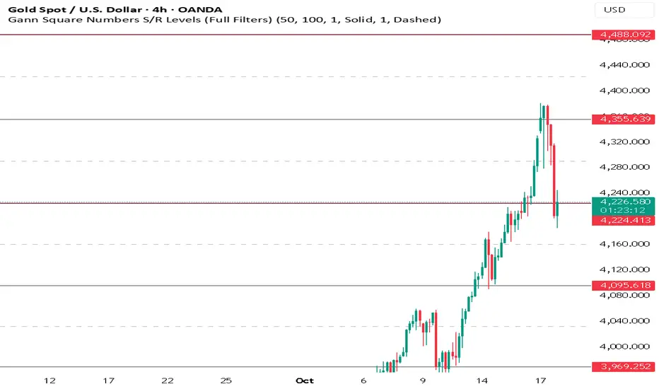
Gann Square Numbers S/R Levels This script can draw support and demand levels using Gann numbers of natural level.
Functions:
1: Default levels draw from natural numbrers 1 to 100.
2. can change minimum and maximum numbers of natural number. e.g min 50 and max 60. it will draw levels from 50 to 60.
3. You can filter levels of natural number by even and odd.
4. you can draw decimal levels of natural numbers also. e.g if natural number is 50
1.you can draw gann number for 50.01, 50.02, 50.03 , 50.04....
2. you can filter decimal points by odd, even, multiple of 3,5,10,20,25,50 also.
ONH, ONL, PDH, PDL [CleatsUp]Displays the Overnight High/Low values and Previous Day High/Low. Also works in replay mode.
Cross3x v2Cross3x – Smart Trend & Rejection Detection System
Cross3x is a precision trading indicator designed for traders who combine trend-following with early reversal detection. Built on a triple moving average core, it delivers high-quality signals with minimal noise and maximum clarity.
Core Features:
Trend Filtered Crossover: Uses a fast EMA (18), slow EMA (33), and long-term SMA (99) to generate reliable entry signals only in the direction of the dominant trend.
Dynamic SL/TP/BE Management:
Stop Loss placed at the lowest/highest extreme over a user-defined lookback.
Take Profit calculated using a customizable Risk/Reward ratio.
Break-Even level set as a percentage between entry and TP (e.g., 10% = BE just above entry).
Early Rejection Signals: Flags potential reversals when price tests a moving average with a long wick during a countertrend candle — ideal for spotting pullbacks before the next leg.
Green flag: "Potential Long Setup" after a bullish rejection.
Red flag: "Potential Short Setup" after a bearish rejection.
Confirmation Points: Circles appear when price retraces cleanly after a crossover, signaling optimal entry zones.
Interactive Dashboard: Real-time table showing current signal, SL, and TP levels.
Customizable Alerts: Fully configurable alerts for entries, confirmation points, and rejection setups.
Why Use Cross3x?
It doesn’t just follow trends — it anticipates them. By combining classical crossovers with smart rejection logic and structured risk management, Cross3x helps you enter earlier, manage risk better, and stay aligned with market momentum.
Perfect for swing traders, intraday scalpers, and algorithmic strategies seeking a clean, robust foundation.
Usage Tips:
Combine "Potential" flags with order blocks or key levels for higher accuracy.
Use confirmation circles as entry triggers after early setups.
Adjust RR and BE% based on volatility and trading style.
Deploy Cross3x to turn simple crossovers into a complete trading methodology.
Cross3xCross3x – Early Rejection & Crossover Detection System
Cross3x is a powerful yet intuitive trading tool designed for traders who want early signals with structured risk management.
Built around a dual EMA crossover (18 & 33), it generates entry signals on every crossover and crossunder — no trend filter interference. The long-term SMA 99 provides context but doesn’t block valid setups.
Key Features:
Unfiltered Entries: Triangles appear on every EMA 18/33 crossover, ideal for catching reversals early.
Smart SL/TP/BE:
SL based on recent extremes (configurable lookback).
TP using adjustable Risk/Reward ratio (default 2:1).
BE level set at a % between entry and TP (e.g., 10% = just above cost).
Early Rejection Signals: Diamonds highlight potential reversals when price tests a moving average with a long wick during a countertrend candle:
🟩 Green diamond below bar → Potential Long Setup
🟥 Red diamond above bar → Potential Short Setup
Confirmation Points: Circles appear when price retraces properly after a crossover, marking optimal entry zones.
Real-Time Dashboard: Dynamic table shows current signal, SL, and TP levels.
Customizable Alerts: Enable alerts per signal type for timely execution.
Why Traders Love Cross3x:
It combines simplicity with intelligence. Whether you're scalping, swing trading, or building an algo strategy, Cross3x gives you clarity, timing, and discipline in one compact package.
Use the diamonds to anticipate moves, the triangles to confirm momentum, and the confirmation circles to refine entries — all backed by precise risk controls.
Perfect For:
Breakout traders
Pullback hunters
Price action + MA confluence strategies
Deploy Cross3x to turn basic crossovers into a complete edge.

Micro fast trendline [sma] Overview
Micro Fast Trendline is an automated trendline drawing tool that connects pivot points in real-time. It dynamically creates trendlines between consecutive pivot highs and pivot lows, extending them forward to visualize potential support and resistance trajectories.
How It Works
Pivot Detection System
The indicator uses a symmetric pivot detection algorithm:
1. Scans for pivot highs: local peaks with lower highs on both left and right sides
2. Scans for pivot lows: local troughs with higher lows on both left and right sides
3. Confirms pivots only after the specified number of right bars have formed
4. Default settings: 5 bars left + 5 bars right (customizable)
Trendline Construction
When a new pivot is detected:
- **For Pivot Highs**: Draws a descending trendline from the previous pivot high to the current one (bearish)
- **For Pivot Lows**: Draws an ascending trendline from the previous pivot low to the current one (bullish)
- Calculates the slope between the two pivots
- Extends the line forward based on that slope for the specified number of bars (default 30)
Line Management System
The indicator includes intelligent line management:
- **Maximum Lines Control**: Limits the number of displayed trendlines (default 4, max 10)
- **Automatic Cleanup**: Removes oldest lines when the maximum is exceeded
- **Extension Expiry**: Deletes lines after they've extended beyond their lifespan
- Uses arrays to track pivot history and associated trendline objects
Key Features
- **Automatic Drawing**: No manual trendline drawing required
- **Real-time Updates**: Creates new trendlines as pivots form
- **Slope-based Extension**: Projects trendlines forward using calculated slope
- **Memory Management**: Automatically cleans up old lines to prevent clutter
- **Dual Tracking**: Separate systems for bullish and bearish trendlines
- **Optional Pivot Markers**: Can display pivot points for validation
Parameters
Pivot Configuration
- **Left Bars** (default 5): Number of bars to the left of the pivot for confirmation
- **Right Bars** (default 5): Number of bars to the right of the pivot for confirmation
- Higher values = fewer but more significant pivots
Visual Configuration
- Show Pivot Points (default off): Display triangles at confirmed pivots
- Bullish Line Color (default dark green): Color for upward trendlines
- Bearish Line Color (default dark red): Color for downward trendlines
- Line Width (default 1): Thickness of trendlines
- Maximum Lines (default 4, range 1-10): Maximum concurrent trendlines
- Line Extension (default 30 bars, range 10-200): Forward projection length
Interpretation
Bullish Trendlines (Green)
- Connect consecutive pivot lows
- Act as dynamic support levels
- Upward slope indicates strengthening uptrend
- Price breaking below suggests weakening support
Bearish Trendlines (Red)
- Connect consecutive pivot highs
- Act as dynamic resistance levels
- Downward slope indicates strengthening downtrend
- Price breaking above suggests weakening resistance
Trading Applications
- **Breakout Trading**: Watch for price breaking extended trendlines
- **Support/Resistance**: Use as dynamic S/R levels
- **Trend Confirmation**: Slope direction confirms trend strength
- **Reversal Signals**: Multiple trendline breaks may indicate reversals
Technical Implementation
This indicator uses:
- Custom type definition (PivotData) to store pivot price, time, and line object
- Array-based data structure for efficient pivot history management
- Dynamic line objects with calculated slope extension
- Automatic memory cleanup to prevent performance degradation
- Separate processing loops for highs and lows to avoid conflicts
Originality Statement
This indicator features a unique approach to automated trendline creation:
- Implements a custom data structure combining pivot data with line objects
- Uses slope-based mathematical projection for realistic line extensions
- Employs an intelligent cleanup system that removes expired lines automatically
- Maintains separate arrays for bullish/bearish trendlines with independent management
- Projects trendlines forward using calculated slope rather than simple horizontal extension
The combination of pivot detection, slope calculation, and automated line lifecycle management creates a hands-free trendline system.
Best Practices
- Lower pivot bar settings (3-5) for faster, more responsive trendlines
- Higher pivot bar settings (7-15) for major swings and longer-term trends
- Adjust line extension based on your trading timeframe
- Reduce maximum lines on lower timeframes to avoid clutter
- Increase maximum lines on higher timeframes for historical context
Works on all timeframes and asset classes. For educational purposes only. Not financial advice.

BOS PullbackBOS Pullback
Trend-following indicator that detects pullbacks for entries in a continuation phase.
A green diamond above a bearish candle signals a buy opportunity in an uptrend.
A red diamond below a bullish candle signals a sell opportunity in a downtrend.
Based on a configurable moving average (EMA, SMA, WMA). Ideal for Break of Structure (BOS) or pullback trading strategies.

ZZ RangeHappy Trading!
This is a real-time range detection indicator. Based on previous supply and demand levels, it classifies each new bar as Up, Down, or Range.
New supply and demand levels are typically detected within two bars. The indicator can be used as a filter and supports indicator-on-indicator functionality.
Intro
Concept
Usage and Settings Menu
Declaration for TradingView House Rules on Script Publishing
Disclaimer
1. Concept
Based on a variation of the Bilson-Gann Algorithm, this indicator calculates local supply and demand levels and determines whether the current price is:
Between those levels → Ranging
Above → Uptrending
Below → Downtrending
Less significant supply and demand levels are filtered out using a user-adjustable intensity setting.
2. Usage and Settings Menu
There are four settings available:
Indicator Timeframe – Display results from higher timeframes on the lower timeframe chart.
Range Detection Rule – Choose whether a bar must be fully inside supply and demand zones to be considered ranging, or if touching the zone is sufficient.
Bar Structure Basis – Select whether wicks or bodies of bars are used to calculate supply and demand levels.
Rule to set S&D – Choose among three rules defining how often new supply and demand levels are calculated. Each rule adjusts the sensitivity and responsiveness of detection.
Alert Signals Available:
Trend Signal 1 = Uptrend, 0 = Ranging, -1 = Downtrend
last supply Level
last demand Level
3. Declaration for TradingView House Rules on Script Publishing
The unique feature of ZZ Range is its real-time range detection capability.
This script is closed-source and invite-only, to support and compensate for months of development work.
4. Disclaimer
Trading involves risk, and losses can and do occur. This script is intended for informational and educational purposes only. All examples are hypothetical and not financial advice.
Decisions to buy, sell, hold, or trade securities, commodities, or other assets should be based on the advice of qualified financial professionals. Past performance does not guarantee future results.
Use this script at your own risk. It may contain bugs, and I cannot be held responsible for any financial losses resulting from its use.
Cheers!

Support and Resistance LevelsSupport and Resistance Levels Indicator
Introducing an indicator that helps automatically identify key support and resistance levels. It analyzes historical data to detect price pivot points and draws horizontal lines based on them. This simplifies chart analysis and allows you to focus on important zones.
How the Indicator Works
The indicator searches for groups of pivot points (minimum three by default) that lie at the same price level within a specified tolerance (in ATR). If the price has bounced off this level three or more times—up or down—the indicator draws a line. The line displays all the points that formed it (small markers "•").
The line color depends on the type of the last point: green for support (lower pivots) and red for resistance (upper pivots). But remember, this is conditional—any level can act as support or resistance depending on the context. The key is that these are zones of interest where price often reacts.
Features
The indicator excels at finding strong levels, but on lower timeframes or during prolonged consolidation (sideways movement) due to market noise, it may draw many lines. To avoid accidentally removing useful levels, I didn't add automatic filtering. In such cases, just evaluate the levels manually—look at the context and the strength of the touches.
Main Feature: Alerts for Premium Subscription
If you have TradingView Premium, the indicator turns into a powerful scanner. Set up an alert for a list of hundreds of instruments: when the price on any of them approaches a level closely (by default within 0.15 ATR), you'll get a push notification. Add filters for trading volume (over 5 minutes or 24 hours) and volatility—and false signals are minimized.
For example, you have a list of 100 instruments. Set up the alert—and you'll immediately receive notifications for all where the price is already close to a level: "BTCUSD on 1h: price near resistance level 60,000", "ETHUSD on 4h: price near support 3,000", and so on. And if later the price on any other instrument from the list approaches a level—you'll get a new message with details. All that's left is to open the relevant chart, assess the situation, and decide: enter the trade or skip it. This saves hours of monitoring!
Индикатор уровней поддержки и сопротивления
Представляю индикатор, который помогает автоматически находить ключевые уровни поддержки и сопротивления. Он анализирует исторические данные, выявляя точки разворота цены, и строит на их основе горизонтальные линии. Это упрощает анализ графика и позволяет фокусироваться на важных зонах.
Как работает индикатор
Индикатор ищет группы точек разворота (по умолчанию минимум три), которые лежат на одной ценовой отметке в пределах заданной погрешности (в ATR). Если цена трижды (или больше) отскакивала от этого уровня — вверх или вниз, — индикатор рисует линию. На линии отображаются все точки, которые её сформировали (маленькие метки "•").
Цвет линии зависит от типа последней точки: зелёный для поддержки (нижние развороты) и красный для сопротивления (верхние). Но помните, это условно — любой уровень может работать как поддержка или сопротивление в зависимости от контекста. Суть в том, что это зоны интереса, где цена часто реагирует.
Особенности
Индикатор хорошо справляется с поиском сильных уровней, но на низких таймфреймах или в длительной консолидации (боковике) из-за рыночного шума может появиться много линий. Чтобы не рисковать удалением полезных уровней, я не добавил автоматическую фильтрацию. В таких случаях просто оценивайте уровни вручную — смотрите на контекст и силу касаний.
Главная фишка: Алерты для Premium-подписки
Если у вас TradingView Premium, индикатор превращается в мощный сканер. Создайте алерт на список из сотен инструментов: когда цена на любом из них подойдёт близко к уровню (по умолчанию в пределах 0.15 ATR), вы получите push-уведомление. Добавьте фильтры по объёму торгов (за 5 минут или 24 часа) и волатильности — и ложные сигналы минимизированы.
Например, у вас список из 100 инструментов. Настройте алерт — и сразу придут уведомления по всем, где цена уже близко к уровню: "BTCUSD на 1ч: цена у уровня сопротивления 60 000", "ETHUSD на 4ч: цена у поддержки 3000" и так далее. А если позже на любом другом инструменте из списка цена приблизится к уровню — придет новое сообщение с деталями. Остаётся только открыть нужный график, оценить ситуацию и решить: входить в сделку или пропустить. Это экономит часы мониторинга!
Key-Levels - D/W/M High-Low + Fib + MA🧭 Key-Levels – D/W/M High-Low + Fibonacci + Moving Averages
A complete multi-timeframe analysis toolkit that combines Daily, Weekly, and Monthly high/low levels, Fibonacci retracements, and customizable moving averages — all in one clean, efficient display.
Ideal for traders who want to identify key reaction zones, retracement levels, and trend alignment across multiple timeframes.
🔹 Features
1. Prior High/Low Levels
Plots Daily (PDH/PDL), Weekly (PWH/PWL), and Monthly (PMH/PML) key levels
Adjustable colors, styles (Solid / Dashed / Dotted), and line widths
Optional midline display for each timeframe
Displays live labels with price values and % difference from current close
Extend lines rightward to project future price interactions
2. Fibonacci Retracement
Auto-detects swing highs/lows using configurable pivot lengths
Smart pivot logic prioritizes major swings based on % span
Auto-orients retracements depending on trend direction
Customizable visibility and color for each Fibonacci level
Supports 0.236 → 1.618 levels, with optional auto-extension in uptrend scenarios
Displays ratio + price for each level label
3. Pivot Labels
Optionally show pivot high/low labels with customizable text and background colors
Independent control of left/right length and label style
4. Moving Averages
Up to three customizable MAs (default: 8 EMA, 21 EMA, 50 SMA)
Choose between EMA or SMA for each
Toggle individual or all moving averages
Adjustable lengths, colors, and line widths
5. Alerts
Built-in alert condition for price crossing a user-defined level
Clean alert message format with ticker symbol and live price
⚙️ Customization
Flexible style controls for lines, labels, and colors
Adjustable right-extension length for projecting levels
Font size and visibility toggles for all elements
Smart grouping for intuitive settings management
📈 Ideal For
Identifying key reversal or breakout zones
Spotting Fibonacci confluence between retracements and prior highs/lows
Tracking trend structure via multi-timeframe MAs
Swing traders, intraday traders, and technical analysts
💡 Summary
Key-Levels – D/W/M High-Low + Fib + MA is a professional-grade indicator designed to simplify complex multi-timeframe analysis.
It helps you see the bigger picture, find actionable zones, and trade with confidence.
🧩 Compatible with any market and timeframe.

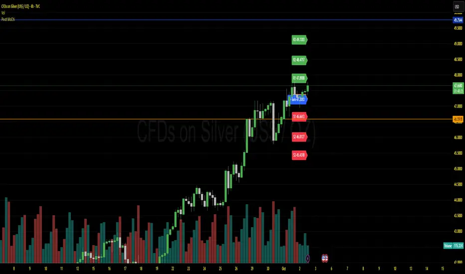
Pivot MoChiThis uses Current Day opening in place of previous day close
More Dynamic than Traditional Pivots
Candle Opens by HAZED🎯 Candle Opens by HAZED - Multi-Timeframe Open Levels Indicator
📊 Overview
This powerful indicator displays multiple timeframe opening prices on your chart, providing crucial reference levels that institutional traders and algorithms frequently monitor. Track up to 7 different timeframe opens simultaneously, from 1-hour to yearly, with advanced visualization features including dynamic coloring, heatmap analysis, and real-time status tracking.
✨ Key Features
📈 Multi-Timeframe Support:
- 1H, 4H, Daily, Weekly, Monthly, Quarterly, and Yearly opens
- Each timeframe can be individually enabled/disabled
- Automatic visibility adjustment based on chart timeframe
🎨 Dynamic Visual System:
- Smart Color Coding: Lines automatically change color based on price position (green above, red below)
- Customizable Styling: Adjust line thickness, transparency, and colors
- Intelligent Line Positioning: Choose between equal-length or staggered lines for better visibility
- Enhanced Labels: Display timeframe only or include price with colored background
🌈 Advanced Heatmap:
- Background coloring shows overall market sentiment across all timeframes
- Gradient or solid color modes
- Instantly see when multiple timeframes align bullish or bearish
📊 Status Table Dashboard:
- Real-time overview of all active opens
- Shows current price position relative to each open
- Simplified view when all timeframes align
- Customizable position and font style
⚙️ Professional Tools:
- Alert system for new open levels
- Extended hours session support
- Price discovery mode for EOD/intraday discrepancies
- Left/right line extensions for enhanced visibility
💡 Trading Applications
Support & Resistance:
Opening prices act as natural support/resistance levels. Price often reacts at these levels, providing entry/exit opportunities.
Trend Confirmation:
When price is above multiple opens (especially higher timeframes), it confirms bullish momentum. The opposite indicates bearish pressure.
Mean Reversion:
Price tends to revert to significant opens, particularly daily and weekly levels. Use these as targets for counter-trend trades.
Breakout Trading:
Monitor when price breaks above/below clustered opens for potential continuation moves.
Risk Management:
Use opens as logical stop-loss levels or position sizing references based on distance from key opens.
🔧 Indicator Settings
Timeframes Section:
- Toggle each timeframe on/off
- Customize individual colors
Visual Style Section:
- Dynamic Colors: Auto-color based on price position
- Line Thickness: 1-4 pixels
- Transparency: 0-80%
- Extension Length: How far lines extend right
- Label Style: Plain or enhanced with price
Heatmap Section:
- Enable/disable background coloring
- Adjust transparency
- Choose gradient or solid zones
Status Table Section:
- Position on chart
- Font selection
Advanced Section:
- Enable alerts for new opens
- Price discovery mode
- Extended hours inclusion
]📈 Best Practices
1. Timeframe Selection:
- For intraday: Focus on 1H, 4H, and Daily
- For swing trading: Daily, Weekly, Monthly
- For position trading: Monthly, Quarterly, Yearly
2. Color Coding:
- Enable dynamic colors for instant sentiment reading
- Use heatmap for overall market bias
3. Confluence Zones:
- Pay special attention when multiple opens cluster
- These zones often produce stronger reactions
4. Alignment Signals:
- When all timeframes show same color = strong trend
- Mixed colors = potential consolidation or reversal zone
🎯 Pro Tips
- Volume Confirmation: Combine with volume indicators to confirm reactions at open levels
- Multiple Instruments: Compare opens across correlated assets for divergences
- News Events: Opens often act as magnets after major news releases
- Options Trading: Weekly and monthly opens align with options expiry levels
- Algorithmic Levels: Many algorithms use these opens for entries/exits
🔄 Updates in Version 8.3
- Added 1H and 4H timeframe support
- Enhanced dynamic color system
- Implemented heatmap visualization
- Added real-time status table
- Optimized performance for smoother operation
- Improved label styling options
- Better yearly timeframe detection
⚡ Performance Optimizations
This indicator uses advanced Pine Script v6 features for optimal performance:
- Efficient object reuse instead of recreation
- Smart calculation loops
- Minimal repainting
- Optimized for real-time updates
📝 Notes
- Works on all markets (stocks, forex, crypto, futures)
- Best on timeframes lower than the opens you're tracking
- Lines automatically hide when their timeframe is lower than chart timeframe
- Past opens are not displayed (indicator shows current opens only)
🙏 Credits & Support
Created by HAZED | Version 8.3
Optimized for TradingView Pine Script v6
For questions, suggestions, or bug reports, please comment below.
If you find this indicator useful, please consider leaving a like and a follow!
Remember: No indicator is perfect. Always use proper risk management and combine multiple confirmation signals in your trading decisions.

Supply Zone & Demand M15Supply Zone & Demand M15
This indicator automatically detects and plots supply and demand zones based on 15-minute pivots and impulse strength.
🔎 Features
Multi-timeframe visibility: Zones are detected on M15 pivots but can be viewed on any lower timeframe (M1, M5, etc.).
Zone validation: Zones appear only after a strong impulsive move, measured against ATR.
Retest counting: Each time price retests a zone, a counter is displayed.
Retests can be merged by time window (No merge, 30 minutes, or 1 hour).
Zone merging: Nearby overlapping zones are automatically combined with a tolerance setting.
Configurable display: Choose between immediate display of zones or only after N retests.
Customizable style: Full control over colors, extension to the left, and max number of zones kept.
⚙️ Settings
Pivot strength: Minimum bars for swing highs/lows.
Impulse filter: Require ATR-based momentum before validating a zone.
Zone width: Defined as a multiple of ATR.
Retest merge: Select None, 30 minutes, or 1 hour.
Invalidation: Option to remove zones once broken.
Display mode: Show zones immediately or only after the required number of retests.
✅ Use Cases
Identify high-probability reversal areas.
Track how many times a zone has been retested.
Spot confluence when historical zones align with current price action.
⚠️ Disclaimer: This indicator is a technical tool, not financial advice. Always combine with proper risk management.

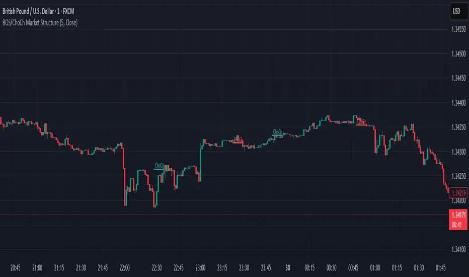
BOS & ChoCh Market StructureBOS/ChoCh Market Structure Indicator
This indicator identifies key market structure shifts using Break of Structure (BOS) and Change of Character (ChoCh) signals based on pivot point analysis.
Concept
Break of Structure (BOS) occurs when price breaks through a significant pivot level in the direction of the current trend, signaling trend continuation. A bullish BOS happens when price breaks above a pivot high while in an uptrend, while a bearish BOS occurs when price breaks below a pivot low during a downtrend.
Change of Character (ChoCh) signals a potential trend reversal. It occurs when price breaks against the prevailing trend - breaking above a pivot high while in a downtrend, or breaking below a pivot low while in an uptrend. This indicates the market structure is shifting.
How It Works
The indicator automatically detects swing highs and lows using configurable pivot strength. When price breaks these levels, it plots:
Color-coded labels (cyan for bullish breaks, red for bearish breaks)
Small horizontal lines marking the exact breakout level
Extended lines from pivot points showing key support/resistance levels
Settings
Pivot Strength - Number of candles on each side required to confirm a swing high/low (default: 5). Higher values identify more significant pivots but produce fewer signals.
Breakout Confirmation - Choose whether breakouts require a candle close beyond the level ("Close") or just a wick touch ("Wick").
Show BOS / Show ChoCh - Toggle visibility of Break of Structure and Change of Character signals independently.
Colors - Customize the colors for bullish (cyan) and bearish (red) signals.
Perfect for swing traders and market structure analysis.
Swing High/Low MarkerThis indicator allows you to find the swing highs and lows of the chart and offsets it by the ATR and a custom factor to give you concrete breakout and stop loss prices.
