SADROCThe "Smoothed Accumulation/Distribution Rate of Change" (SADROC) indicator draws inspiration from the Chaikin Oscillator's use of accumulation and distribution, formatted in a manner just like the MACD (Moving Average Convergence Divergence) indicator. My goal was to create something with greater speed and accuracy than the classic MACD
Here's a breakdown of its key elements:
Inputs: Users can customize the indicator by specifying the fast length, slow length, and signal length to fit their preferences.
Calculations: The indicator calculates cumulative volume and then computes the Accumulation/Distribution (AD) value based on price and volume data. The SADROC is calculated as the Rate of Change of the exponential moving averages of the price. The difference between these two values is further smoothed to generate the final SADROC value.
Plotting: The indicator plots the SADROC line and a signal line on the chart. Additionally, it includes a histogram that visually represents the difference between SADROC and the signal line.
在腳本中搜尋"半导体设备ETF"

Market Health OscillatorDesigned to provide traders with a comprehensive view of the overall health of a market. By combining the rate of change of key indicators, the MHO offers insight into potential shifts in market sentiment.
Components:
Price Rate of Change: The MHO considers the rate of change of the price of an asset over a specified period. This element reflects the momentum of the asset's price movement, aiding in the assessment of potential trend shifts.
Volume Rate of Change: Tracking the rate of change of trading volume provides insights into market participation and interest. Changes in volume can signify shifts in market sentiment and potential trend reversals.
Volatility Rate of Change: The rate of change of volatility, often measured using the Average True Range (ATR), helps gauge the level of uncertainty in the market. An increase in volatility can indicate heightened market activity and potential reversals.
Advance-Decline Line: The MHO takes into account the Advance-Decline Line, which compares the number of advancing stocks to declining stocks. This component offers insights into market breadth and the underlying strength of the current trend.
Calculation and Interpretation:
The MHO aggregates the rate of change of these components and combines them to provide a single oscillator reading. This reading is then normalized to a range between -1 and 1. Positive values suggest bullish market health, while negative values indicate bearish conditions. The oscillator's extremes, coupled with divergence patterns, can signal potential market turning points.
Application:
Identify potential trend reversals or corrections by watching for extreme MHO readings.
Assess the overall health of a market by observing the general direction and amplitude of the oscillator.
Look for divergences between price and the MHO for insights into potential shifts in market sentiment.
This was inspired to offer a holistic perspective on market dynamics. By encompassing price, volume, volatility, and breadth factors, the MHO assists in a comprehensive assessment of market health.
The Next Pivot [Kioseff Trading]Hello!
This script "The Next Pivot" uses various similarity measures to compare historical price sequences to the current price sequence!
Features
Find the most similar price sequence up to 100 bars from the current bar
Forecast price path up to 250 bars
Forecast ZigZag up to 250 bars
Spearmen
Pearson
Absolute Difference
Cosine Similarity
Mean Squared Error
Kendall
Forecasted linear regression channel
The image above shows/explains some of the indicator's capabilities!
The image above highlights the projected zig zag (pivots) pattern!
Colors are customizable (:
Additionally, you can plot a forecasted LinReg channel.
Should load times permit it, the script can search all bar history for a correlating sequence. This won't always be possible, contingent on the forecast length, correlation length, and the number of bars on the chart.
Reasonable Assessment
The script uses various similarity measures to find the "most similar" price sequence to what's currently happening. Once found, the subsequent price move (to the most similar sequence) is recorded and projected forward.
So,
1: Script finds most similar price sequence
2: Script takes what happened after and projects forward
While this may be useful, the projection is simply the reaction to a possible one-off "similarity" to what's currently happening. Random fluctuations are likely and, if occurring, similarities between the current price sequence and the "most similar" sequence are plausibly coincidental.
That said, if you have any ideas on cool features to add please let me know!
Thank you (:
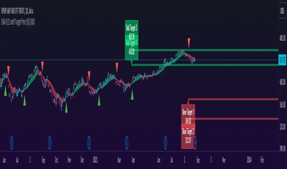
EMA 9/21 with Target Price [SS]Hey everyone,
Coming back with my EMA 9/21 indicator.
My original one was removed a long time ago because I didn't really realize that there were already plenty of similar indicators (my bad!) but this one is my unique, Steversteves edition haha.
About the Indicator:
Essentially, it just combines the 2 only EMA's I ever really use (the 9 and 21) with an ATR based analysis to calculate the average range a ticker undergoes after an EMA 9 / 21 Cross-over and Cross-under.
You can see the major example being in the chart above. I use this for dramatic effect as SPY just happened to have topped at the second expected bull target on the daily. But obviously the intention for this indicator is to be used on the smaller timeframes. Let's take a look at some examples with various tickers.
TSLA:
So let's just use the previous day as example (which was Friday). If we look to the chart below:
TSLA did an EMA 9/21 crossover (bullish) in premarket. This put the immediate TP at 234.59. If we play out the chart:
We shot right to it at open.
We then did a cross under with a TP of 225.93, but that was not realized as the sentiment was too bullish. We then cross back over to the upside, putthing next TP at 238.88 which was realized:
NVDA:
On Friday, NVDA was a bit of a mess, lots of whipsaw off open. But once we finally had a cross under with 3 consecutive closes below the EMA9/21 on the 5 minute chart, it solidified the likelihood of a short:
And this was the result:
We came down to the first target, held it actually as support before finally crossing back over, setting the next TP at 475.05. We got 3 consecutive closes above the EMA 9/21, so let's see what happened:
Nothing really, we closed before we got there, but we did make progress towards it.
And last but not least SPY:
We opened the day with a bullish crossover and 3 consecutive closes above the EMA9/21, making our TP 441.38 (chart above). Let's see what happened:
We came just shy of it after the fed release volatility slammed it down, where we got a crossunder (bearish) to a TP of 436.21:
This ended up playing out, we did get a bullish crossover later in the day and so let's see what happened then:
So those are the real examples, most recent examples of trading using this. They are not all perfect, which is intentional because you need to use a bit of your own analysis, of course, when you are using this type of strategy or indicator. The EMA 9/21 is not sufficient generally on its own, but it is very helpful to gauge the immediate PA and whether the expected move aligns with your overall thesis on the day in terms of realistic target prices.
Customizability:
In terms of the customizability, this is a very basic indicator aside from the assessment of ranges. So there really is not a lot to customize.
You can toggle off and on the labels if you do not want them, you can also adjust the lookback length for the ATR assessment. The lookback length is defaulted to 500, I do really highly suggest you leave it at 500 because this has worked well for me and in back-testing, it has performed above my own expectations.
But, that said, you can take this and back-test as you wish with whatever parameters you feel are most appropriate. I haven't back-tested this on every stock known to man, my go to's are SPY, QQQ, sometimes MSFT and so it works well on those. But perhaps some others will have differing results.
Final Thoughts:
That is the indicator in a nutshell! It is really self explanatory and its likely a strategy most of you already know. This just helps to add realistic price targets and context to those cross-overs and cross-unders.
It also works fine on larger timeframes. We can see it on the 1 hour with MSFT:
On the 2 hour hour with QQQ:
And I am sure you can find other examples!
That's it everyone, safe trades!
ROC Based Buy/Sell SignalsIndicator Explanation:
The "Consolidation Identifier (ROC) with Buy/Sell Signals" indicator is designed to help traders identify potential consolidation zones in the market using the Rate of Change (ROC) indicator. It plots both the positive and negative ROC values, providing insights into price momentum changes. The indicator also includes buy and sell signals that are generated when the positive ROC crosses above the negative ROC (buy signal) or when the negative ROC crosses above the positive ROC (sell signal).
How It Works:
The indicator calculates the ROC of the closing price over a specified period. ROC measures the percentage change in price over a given period. Positive ROC values indicate price increases, while negative ROC values indicate price decreases.
The positive and negative ROC values are plotted on the chart using different colors. The key feature of this indicator is the buy and sell signals that occur when the positive ROC crosses above the negative ROC (buy signal) or when the negative ROC crosses above the positive ROC (sell signal). These signals can help traders identify potential shifts in momentum and potential consolidation zones.
Why It's Useful:
Consolidation Detection: The indicator helps identify periods of potential consolidation in the market. Consolidation zones often precede significant price movements, making them valuable for traders looking to anticipate trends.
Momentum Shifts: The ROC crossovers provide insights into momentum changes. Buy and sell signals can indicate shifts in the market sentiment, helping traders make more informed decisions.
Pairs Well With:
Volume Analysis: Combining this indicator with volume analysis can provide a more comprehensive view of market activity during consolidation zones.
Trend Confirmation Indicators: Pairing with trend-following indicators can help confirm the direction of potential breakout moves following consolidations.
Warnings:
False Signals: Like any technical indicator, false signals can occur, especially in choppy or low-volume markets. Always use additional indicators or analysis to confirm signals.
Market Conditions: The effectiveness of the indicator can vary based on market conditions. It may work better during ranging or consolidation periods rather than strong trending phases.
Parameter Optimization: Adjusting the indicator's parameters (ROC period, SMA period, ROC threshold) may be necessary to fine-tune its performance for specific assets or timeframes.

Swing Point Oscillator with Trend Filter [Quantigenics]The "Swing Point Oscillator with Trend Filter" is a sophisticated trading oscillator designed to enhance trading decisions by adapting to market conditions. Oscillators typically signal overbought/oversold market states, often yielding false signals in strong trends. This trend indicator addresses this by implementing a 'Trend Filter' which changes color in strong trends, alerting traders to avoid typical oscillator reversals. In strong trends (when the trend Filter is red), mid-high or mid-low levels can be used for pullback entries. In more neutral markets (when the trend Filter is close to blue), extreme high and low levels (top and bottom) can be used, as a true 'over bought / over sold' oscillator. The oscillator combines components of the Stochastic Oscillator and the CCI, then normalizes the result, providing a unique, adaptive signal. The color-coded lines and Trend Filter offer clear visual cues, making this a comprehensive tool for various market scenarios.
Caution: Always use the indicator in conjunction with other tools and analysis methods to confirm trading decisions. Avoid trading solely based on this indicator.
GOLD 4HR
CL1! 4HR
How to Use:
Swing Point Oscillator: Displays the momentum of the price relative to its recent high and low.
Trend Filter: Highlights the general direction of the market trend.
Zones: Visual representation to categorize oscillator values (Up Zone and Down Zone).
Interpretation:
Oscillator:
When the oscillator moves upward and approaches or enters the Up Zone, it indicates increasing bullish momentum.
When the oscillator moves downward and approaches or enters the Down Zone, it suggests increasing bearish momentum.
Values near the middle (around zero) often indicate indecision or consolidation in the market.
Trend Filter:
A trend filter line above the Mid-High or below the Mid-Low suggests a strong trend.
When the trend filter is between the Mid-High and Mid-Low, it might indicate a weaker or sideways trend.
Its color will change based on its position relative to the zones. For instance, it turns red when indicating a stronger trend.
Zones:
Up Zone: The area between the Top Line and the Mid-High. Indicates strong bullish momentum when the oscillator is within this zone.
Down Zone: The area between the Mid-Low and the Bottom Line. Indicates strong bearish momentum when the oscillator is in this zone.
Trading Tips:
Bullish Scenario: Consider long positions when the oscillator is rising, and the trend filter indicates a strong upward trend.
Bearish Scenario: Consider short positions when the oscillator is falling, and the trend filter indicates a strong downward trend.

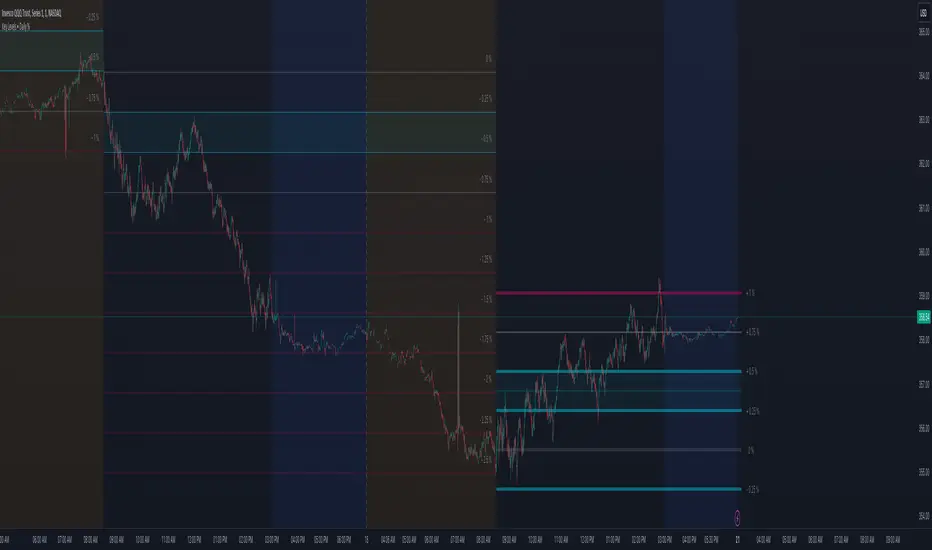
Key Levels (Daily Percentages)OVERVIEW
This indicator automatically identifies and progressively draws daily percentage levels, normalized to the first market bar.
Percentages are one of the most common ways to measure price movement (outside price itself). Being able to visually reference these levels helps contextualize price action, in addition to giving us a glimpse into how algos might "see" the market.
This script is most useful on charts with smaller time frames (1 to 5 minutes). This is not ideal for medium or larger time frames (greater than 5 minutes).
INPUTS
You can configure:
• Line size, style, colors and maximum length
• Label colors and visibility
• Fractional and intra level visibility
• Bidirectional zone parameters (custom range and extended anomalies)
• Normalization source
• Price Proximity features
• Market Hours and Time Zone
INSPIRATION
Broad Assumptions:
• +/- 70% of days move 1%, 20% of days move 1-2%, and 10% of days have moves exceeding 2%.
• +/- 10-20% of days trend, with moves ≥ 1%.
• All trading strategies are effectively scalping, mean reversion, or trend.
• Humans program algos to capitalize on these assumptions, using percentages to mange / execute trades.
Papercuts Time Sampled Higher Timeframe EMA Without SecurityThis EMA uses a higher time sampled method instead of using security to gather higher timeframe data.
Its quite fast and worked well with the timeframes prescribed, up to 8hrs, after 8hrs, the formatting gets more complicated and i probably wouldn't use it anyway.
You can use this as a guide to avoid security and even f_security with this method.
NOTE: This includes the non repainting f_security call so that i woudl be able to check my results against what it does, thats not nessecary to keep at all.
There is some minor differences in data, but its so minor it doesnt bother me, though it would be interesting to know what the difference actually is. If anyone figures that out, leave a comment and let me know!
This is meant to be an example for others to build and learn and play with.. so enjoy!

Moving Average Continuity [QuantVue]"Moving Average Continuity," is designed to compare the position of two Moving Averages (MAs) across multiple timeframes.
The user can select three timeframes and determine the length and type of both a fast and slow moving average.
The indicator will display a small table in a user selected location.
This table helps traders quickly determine if, for their selected timeframes, the faster moving average is trending above or below the slower moving average.
The “Moving Average Continuity” indicator can also send you three types of alerts;
1. All moving averages are aligned bullish
2. All moving averages are aligned bearish
3. Moving averages are mixed
Key Features:
1. Timeframes: The user can select up to three distinct timeframes to compare the moving averages.
2. Moving Average Inputs: For each MA, users can determine:
• Length of the MA
• Type of the MA - Options include EMA (Exponential Moving Average), SMA (Simple Moving Average), HMA (Hull Moving Average), WMA (Weighted Moving Average), and VWMA (Volume Weighted Moving Average).
3. Positioning: Users have the ability to adjust the table's positioning (top, middle, or bottom) and horizontal alignment (right, center, or left) on the chart overlay.
4. Runtime Error Prevention: The indicator will throw an error if the chart's timeframe exceeds the maximum selected timeframe, ensuring that comparisons are done correctly.
Give this indicator a BOOST and COMMENT your thoughts!
We hope you enjoy.
Cheers.

MarketSmith Daily Market IndicatorsMarketSmith Daily Market Indicators is designed to mimic the Daily Market Indicators tab found in MarketSmith. This tab contains 4 different secondary indicators to help gauge the health of the overall market.
This indicator allows you to choose which of the 4 indicators to show, as well as which index to pull data from, Nasdaq or NYSE. There is also a snapshot table showing the following:
# of stock advancing and up volume
# of stocks declining and down volume
# of stock unchanged and unchanged volume
# of stocks making new highs and new lows
Now let's look at the 4 indicators and how they work.
Advance/Decline Line
Plots the number of advancing shares vs the number of declining shares. Heavily weighted index stocks can skew price action, this line helps reveal that and whether most stocks are aligned with the trend.
Short Term Overbought/Oversold Oscillator
A 10-day moving average of the number of stocks moving up in price less the number of stocks moving down in price.
10 Day Moving Average of Up & Down Volume
Two 10 day moving averages to represent the volume of all stocks. Blue line: total volume of all stocks moving up in price. Red line: the total volume of all stocks moving down in price.
10 Day Moving Average of New Highs & New Lows
Two 10-day moving average to represent stocks making new highs and new lows. Blue line: The number of stocks making new price highs. Red line: The number of stocks reaching new lows.
Note this indicator is designed to work on a daily time frame chart. Data typically updates 90 minutes after the close. Data may differ from Marketsmith due to different providers, however the general trends are the same.

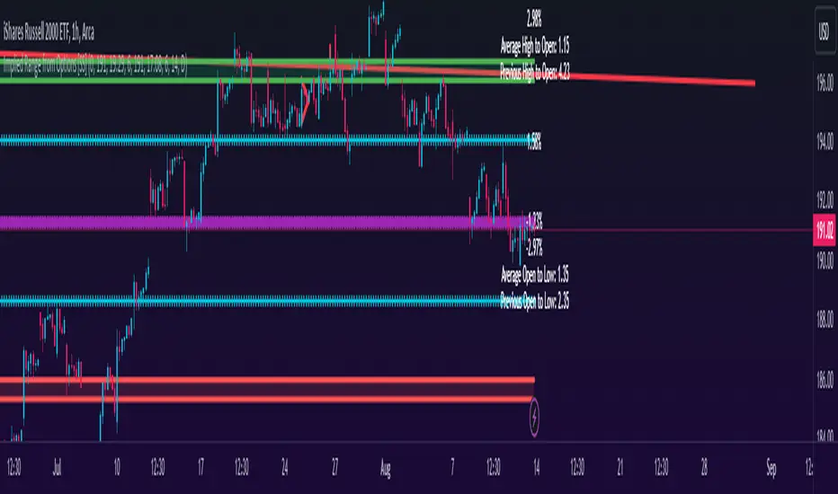
Implied Range from Options [SS]I have been promising to post this for a while, but I just needed to make sure that a) there were no similar indicators already available and b) make it a bit more user friendly.
So here it is, a basic indicator that will display the implied range from options.
In addition to displaying the implied range from options, it will provide some secondary information to help add context to the implied range. Those are shown in the chart below:
The indicator will list various precents at each point to the upside and to the downside. This is the percent move required, based on the current close price, to obtain any point in the implied move range.
In addition, the indicator will display the average move from open to high and open to low over a user defined period (default to 14 candle period) as well as the previous open to high and open to low move from the previous day.
This is to give you context of:
a) How much of a % increase or decrease is required to reach the implied ranges; and
b) How does the implied range compare to the ticker's average moves.
An increased implied range that exceeds the ticker's average move can alert you that the market is pricing in an above average move. This can be helpful and alert you to potential news releases or other fundamental things that have the potential to move the market.
How to Use the indicator:
So unfortunately, this indicator requires a bit of manual input. I was going to do an auto IV calculcation using Black-Scholes Model but just to be more rigorous in accuracy, I decided to, for now, leave it at a manual input. So when you launch the settings menu, this is what you will see:
You can collect all of this required information from your broker. Inversely, you can collect it online for free from various services such as Barchart or COBE's exchange website. The easiest way is to just pull it from your broker though.
Make sure, if you are doing weekly options to see the weekly range, you set the timeframe to 1 week. The timeframe function will calculate the average move over the desired timeframe length. So if you are doing a 0 dte for the next day, you want to see the intra-day range and will select the 1 day timeframe. It will then present to you the range averages and information on the daily timeframe for you to compare to the implied options range.
Same for the weekly, monthly, yearly, etc.
Additional options:
The indicator provides the midline average and midway points, to add static targets if you are trading the implied range.
These can be toggled on or off in the settings menu:
As well, as you can see, you can also toggle off the range labels.
There is also an offset option. This allows you to extend the range into the future:
Simply select how many candles you would like to plot the range in advance.
Closing remarks
That is the indicator. Its very simple, but it is handy. I was never one to pay attention to option pricing data, but I have been plotting it out daily and weekly these past few weeks and it does add a bit of context in terms of what the market is thinking. So I do recommend actually adding it to your repertoire of analyses going into the weeks and months, and really just paying attention to how the average ranges compare to what the market is pricing in.
One quick suggestion, select the strike price that aligns with the closing price of the ticker. This gives you a better representation of the range.
Safe trades everyone and leave your comments, questions and suggestions below!
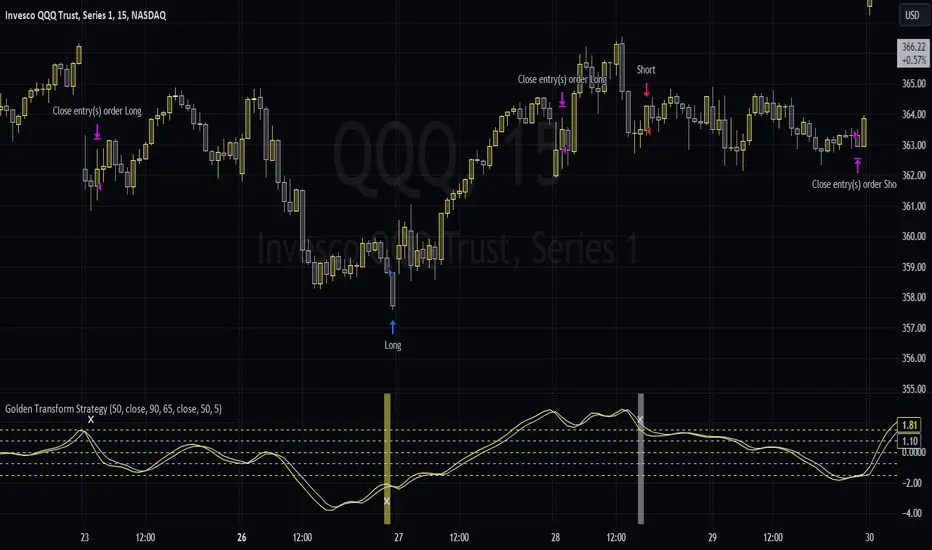
Golden Transform The Golden Transform Oscillator contains multiple technical indicators and conditions for making buy and sell decisions. Here's a breakdown of its components and what it's trying to achieve:
Strategy Setup:
The GT is designed to be plotted on the chart without overlaying other indicators.
Rate of Change (ROC) Calculation:
The Rate of Change (ROC) indicator is calculated with a specified period ("Rate of Change Length").
The ROC measures the percentage change in price over the specified period.
Hull Modified TRIX Calculation:
The Hull Modified TRIX indicator is calculated with a specified period ("Hull TRIX Length").
The Hull MA (Moving Average) formula, a modified WMA, is used to calculate a modified TRIX indicator, which is a momentum oscillator.
Hull MA Calculation:
A Hull Moving Average (Hull MA) is calculated as an entry filter.
Fisher Transform Calculation:
The Fisher Transform indicator is calculated to serve as a preemptive exit filter.
It involves mathematical transformations of price data to create an oscillator that can help identify potential reversals. The Fisher Transform is further smoothed using a Hull Moving Average (HMA).
Conditions and Signals:
Long conditions are determined based on crossovers between ROC and TRIX, as well as price relative the the MA. Short conditions are inversed.
Exit Conditions:
Exit conditions are defined for both long and short positions.
For long positions, the strategy exits if ROC crosses under TRIX, or if the smoothed Fisher Transform crosses above a threshold and declines. Once again, short conditions are the inverse.
Visualization and Plotting:
The script uses background colors for entry and shapes for exits to highlight different levels and conditions for the ROC/TRIX correlation.
It plots the Fisher Transform values and a lag trigger on the chart.
Overall, this script is a complex algorithm that combines multiple technical indicators and conditions to generate trading signals and manage positions in the financial markets. It aims to identify potential entry and exit points based on the interplay of the mentioned indicators and conditions.
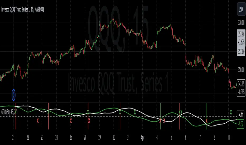
Gaussian Detrended ReversionThis strategy, titled "Gaussian Detrended Reversion Strategy," aims to identify potential price reversals using the customized Gaussian Detrended Price Oscillator (GDPO) in combination with smoothed price cycles.
Key Elements of the Strategy:
GDPO Calculation: The strategy first calculates the Detrended Price Oscillator (DPO) by comparing the close price to an Exponential Moving Average (EMA) of a specified period. This calculation helps identify short-term price cycles by detrending the price data.
Gaussian Smoothing: The DPO values are then smoothed using the Arnaud Legoux Moving Average (ALMA), applying a Gaussian smoothing technique. This smoothed version of the DPO is intended to filter out noise and provide a clearer picture of price trends.
Entry and Exit Conditions: The strategy defines conditions for both long and short entry points as well as exit points. It looks for specific crossover events between the smoothed GDPO and its lagged version. The strategy enters a long position when the smoothed GDPO crosses above the lag and is negative, and exits the long position when the smoothed GDPO crosses below the lag or the zero line. Similarly, the strategy enters a short position when the smoothed GDPO crosses below the lag and is positive, and exits the short position when the smoothed GDPO crosses above the lag or the zero line.
Visualization: The smoothed GDPO and its lag are plotted on the chart using distinct colors. The zero line is also displayed as a reference point. Additionally, the chart background changes color when the strategy enters a long or short position. Cross markers are also plotted at the crossover points as exit cues.
Overall, this strategy aims to capture potential price reversals using the GDPO and Gaussian smoothing, with specific entry and exit conditions to guide trading decisions.
EMA X Oscillator
This indicator combines elements of the Exponential Moving Average (EMA) crossover and Rate of Change (ROC), generating a solid simple tool for technical analysis.
Overall, this script creates an oscillator by calculating the Rate of Change between two Exponential Moving Averages (Fast and Slow) based on the chosen smoothing methods and lengths. The oscillator helps identify potential trends. It offers customization options for the types of smoothing and other parameters, making it versatile for various strategies.

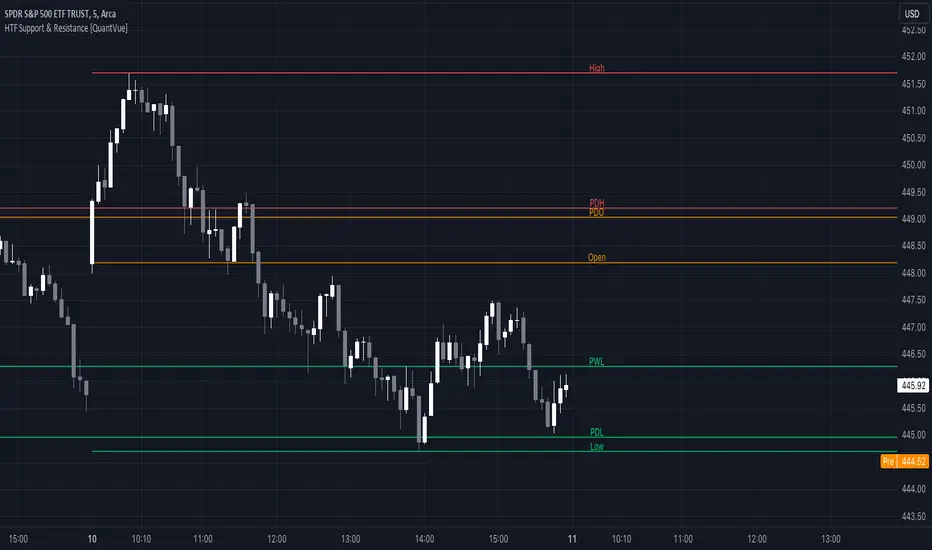
HTF Support & Resistance [QuantVue]The "HTF Support / Resistance" indicator highlights critical price levels across multiple timeframes helping you recognize major support/resistance areas.
Whether you're a day trader needing to understand the current day's price action, or a long-term investor looking to analyze yearly trends, this indicator can be a valuable addition to your trading toolkit.
The daily levels, which can be enabled or disabled according to your preference, will give you insights into the open, high, and low levels for the current and previous day.
Similarly, weekly levels provide information for the current and previous weeks, while monthly levels cover the current and previous months.
In addition, the indicator offers more extended views through its quarterly and yearly levels. These will help you understand long-term trends and major support/resistance areas, and they can be particularly beneficial for major support/resistance levels.
Features:
🔹Visualization: View support and resistance levels from Daily, Weekly, Monthly, Quarterly, and Yearly timeframes.
🔹Customizable Appearance: Tailor the display colors and line styles for each level according to your preferences.
🔹Clear Labeling: Each level is clearly labeled for quick identification.
🔹Extension Option: Opt to extend the support and resistance lines across the chart for better visualization.
Give this indicator a BOOST and COMMENT your thoughts!
We hope you enjoy.
Cheers.
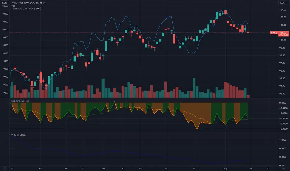
VWCE * DXY valuationVWCE is priced in EUR, but it is calculated in USD. It is always good to know VWCE´s "real" valuation. As sometimes the price of VWCE may seem expensive, but the underlying DXY can indicate otherwise. Helpful to get an impression of the real value of VWCE for EUR-based traders and to know where the world market is standing.
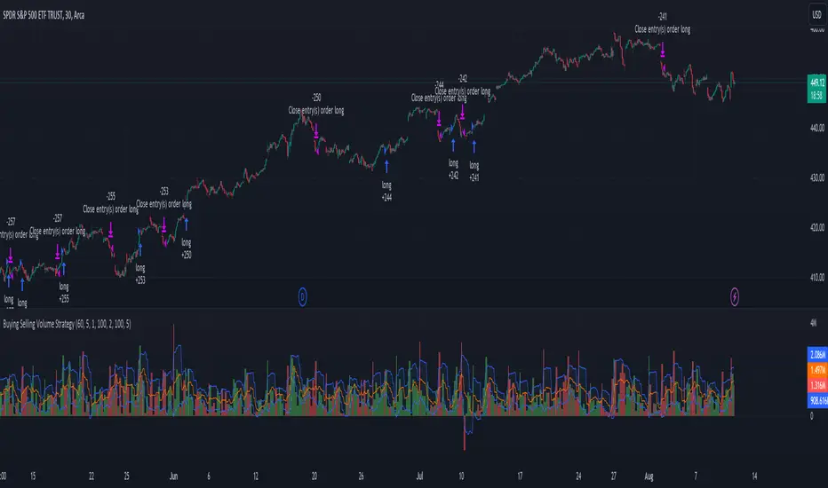
Buying Selling Volume StrategyFirst I would like to give the original credit and thanks to @ceyhun for his amazing volume script.
The way I decided to convert it into a strategy is divided into multiple types.
First, I decided in order to smooth out the values and make it more accurate to adapt the values to multiple timeframes.
After that I took the initial values from the buyers and sellers , and made a rest operation between them to have a flat difference between the power of both sides.
WIth that later on I decided to to apply a volatility filter,in this case bollinger bands, in order to find out potential leading trends.
At the same time in order to filter even more, I decided to make use as well for weekly VWAP values of the asset used.
Lastly I added a dynamic risk management into it , based on the ATR Daily values of the asset values.
As for the rules used, for example for long, I am looking that the price of the asset is above the weekly VWAP, after that I am checking that the MTF volume rest operation is both bullish and above the upper side of the bollinger.
For short we would want the asset to be below the weekly VWAP, and the volume to be bearish and above the upper side of bollinger.
The exit is either based on daily ATR values multipliers, or if we have a reverse condition.
If you have any questions, please let me know !
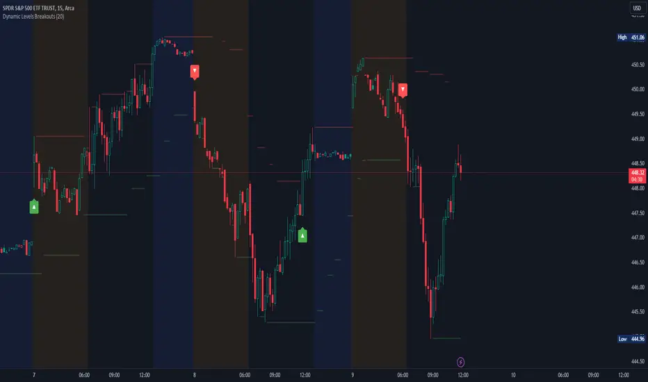
Dynamic Levels Breakouts [Angel Algo]INTRODUCTION
The Dynamic Levels Breakouts indicator is a powerful tool designed to identify dynamic support and resistance levels in the price action. It plots these levels on the chart and provides visual signals for bullish and bearish breakouts.
FEATURES
1. Dynamic Support and Resistance Levels.
The indicator calculates the maximum (resistance) and minimum (support) price levels within the defined rolling window. The highest high and lowest low are used to identify dynamic resistance and support levels, respectively.
2. Coloring Conditions
The indicator uses conditional coloring to highlight potential support and resistance levels. When a significant level is detected, it will be colored with a transparent overlay. Red color indicates potential resistance (max_level), and green color indicates potential support (min_level).
3. Bullish and Bearish Breakouts
The indicator also identifies potential bullish and bearish breakouts from the dynamic levels. A bullish breakout occurs when the closing price crosses above the dynamic resistance level (max_level). A bearish breakout occurs when the closing price crosses below the dynamic support level (min_level). The breakout signals are marked with arrow symbols (▲ for bullish and ▼ for bearish) below and above the respective bars.
4. Market Regime
To prevent multiple signals within a short period, the indicator considers the current market regime. If a bullish breakout has occurred recently, it will not generate a new bullish signal until a bearish breakout occurs, and vice versa.
HOW TO USE
The Dynamic Levels Breakouts indicator can be used to identify potential breakout trading opportunities. A bullish breakout signal (▲) suggests a potential long entry or an increase in buying pressure. A bearish breakout signal (▼) indicates a potential short entry or an increase in selling pressure. Traders can use these signals as a reference and combine them with other technical analysis tools and strategies for confirmation.
SETTINGS
Period (length): The user can adjust the "Period" input to define the rolling window for calculating the maximum and minimum price levels. The default value is 20, but it can be set anywhere between 2 and 30. A higher value may yield more significant levels but can also result in delayed signals
Indicator Based Market Exposure (IBME)The Indicator Based Market Exposure (IBME) system was created by Big Wave Chartist as a way to navigate the markets using a confluence of three different signals to determine when the "internals" of the market are in your favor and how heavily invested to be at any point. The idea of the system is also to flash warning signs when the market internals are beginning to deteriorate so as to take a defensive stance. Of course this system can be strictly adhered to, or it can be incorporated into a more discretionary style of trading, and be combined with progressive exposure into (and out of) the market as positions gain (or lose) traction.
The IBME displays a straightforward action signal based on the combination of the 3 separate signals:
Green 🟢 Full size-longs permitted
Yellow 🟡 Pilot positions permitted
Red 🔴 No longs allowed
So let's get into the signals used:
McClellan Summation Index
Net New Highs/Lows
Net New Highs Crossover
McClellan Summation Index (MSI)
The McClellan Summation Index is a long-term version of the McClellan Oscillator, which is a market breadth indicator based on stock advances and declines. Interpretation is similar to that of the McClellan Oscillator, except that it is more suited to intermediate to major trends and related reversals. The McClellan Summation Index can be calculated as the sum of all the daily values of the McClellan Oscillator. This is used along with the 10-sma to watch for a crossover indicating an uptrend or downtrend beginning.
Net New Highs/Lows
This is the net number of stocks making 52-week highs or lows. For instance, if there are 60 new 52-week highs and 20 new 52-week lows, the net number will be 40 net new 52 week highs. This signal is particularly useful in gauging breadth.
Net New Highs Crossover
This is the description of NNHC from the original separate version of this indicator created by HikoStory: "Net New Highs can guide you to increase or decrease your exposure based on the current market health. They are calculated by subtracting the new highs from the new lows, based on all stocks of the...NASDAQ. A positive value shows that the market is doing good, since more stocks are making new highs compared to new lows. A negative value shows that the market is doing bad, since more stocks are making new lows compared to new highs. Combined with a moving average you can see crossovers that can warn you early when there is a change in the current market health."
The default index for the IBME is the Nasdaq.
The IBME is meant to be used on a daily time frame chart, therefore the signal will only show on a daily time frame chart.
Display options include:
Show/hide individual signals
Table background/font color
Table size/placement

ATR + Momentum Shifts w/Take ProfitThis script is a technical analysis indicator designed to assist in identifying potential entry points and setting take profit levels in trading. It combines the Average True Range (ATR) indicator, momentum shifts, and customizable take profit levels to provide insights into potential market movements.
Differences from Currently Published Ones:
This script is unique due to its use of a combination of elements:
ATR and Momentum: The script combines the ATR indicator to provide dynamic support and resistance levels with the momentum indicator to identify shifts in the underlying momentum.
Customizable Take Profit Levels: It offers the ability to set take profit levels based on customizable multipliers of the ATR, helping traders manage potential profits.
How to Use:
ATR Bands: The script plots upper and lower ATR bands as potential dynamic support and resistance levels.
Shift Arrows: Arrows are plotted below bars for potential long entry opportunities (green triangle) and above bars for potential short entry opportunities (yellow triangle).
Take Profit Levels: The script also plots take profit levels both above and below the source price based on the ATR multipliers set in the inputs.
Markets and Conditions:
This script can be used across various financial markets, including stocks, forex, commodities, and cryptocurrencies. It's most effective in trending markets where momentum shifts can signal potential reversals or continuation of trends. Traders should consider the following conditions:
Trend Confirmation: Look for momentum shifts in the direction of the prevailing trend for higher probability setups.
Volatility: Higher volatility can amplify ATR movements and subsequently affect the placement of ATR bands and take profit levels.
Risk Management: Always implement proper risk management strategies to protect your capital.
Additional Considerations:
Customization: Traders can adjust input parameters like ATR length, momentum length, and take profit multipliers to match their trading style and market conditions.
Combining with Other Indicators: Consider using this indicator in conjunction with other technical indicators or chart patterns for confirmation.

Feigenbaum ProjectionsThe theory of price delivery per Feigenbaum projections is credited to TRSTNGLRD, this indicator aims to aid traders from all backgrounds to utilize projections for determination of potential future price moves.
What follows is the simplest description of where to anchor the projection:
As price delivers and clears higher high (buy side liquidity) then reverses to clear most recent low (sell side liquidity), this becomes the anchorage point for the Feigenbaum projection and is referred to as perturbation. The start and end points for the projection should be only those candle bodies that wholly exist within the range within the high and low that were cleared by the perturbation, this range of candle bodies is to be considered the "initial condition". Structure that appears as a broadening formation is one such price delivery occurrence that can be utilized with these projections.
The projected zones are all pre-configured by TRSTNs specifications per Feigenbaum but can be adjusted if the need arises.
Price is expected to expand beyond the initial condition and into the negative and positive target zones, accuracy diminishes with further expansion and reevaluation should occur when a new perturbation is discovered.
It's recommended to explore various timeframes to find a perturbation by which to anchor the next Feigenbaum projection.
I'll do my best to update this description with time as more discoveries are made and TRSTNGLRD provides more guidance and feedback on this indicator.

merge_pinbar_modifiedLibrary "merge_pinbar"
Published by @dandrideng
Modified by @RpNm1337
merge_pinbar: merge bars and check whether the bar is a pinbar
merge_pinbar(period, max_bars)
merge_pinbar: merge bars and check whether the bar is a pinbar
Parameters:
period (simple int)
max_bars (simple int)
Returns: array:
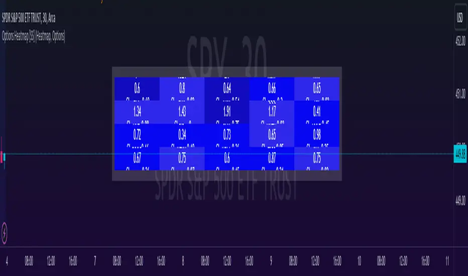
Options & Leveraged Shares Heatmap This is the leveraged share/option heatmap / screener.
Tradingview offers a few different tickers that have PTCR data on the daily timeframe. So I was able to pull those few tickers that display the PTCR data and format it into a heatmap.
I also had some room to add leveraged share data as well.
It is pretty self explanatory but I will go over it really briefly:
The timeframe is 1 D. This cannot be changed because this is the only timeframe available for the PTCR data.
It will pull the current day PTCR as well as the previous day PTCR and display the PTCR and change value.
The screening will be done according to the 1 day change.
You have the ability to select the option to sort by Max and Min or sort by heatmap:
Displaying max and min will show you the max positive and negative change among all the available tickers.
Max positive = bearish, as this indicates an uptick in Puts.
Max negative = bullish, as this indicates a decline in Puts.
If we flip over to the leveraged shares, it is the same:
To keep it consistent, the leveraged share ratio is displayed similar to PTCR. It is Sell to Buy ratio. The higher the ratio, the more selling and vice versa.
Thus, the same rules apply. Max positive = bearish and max negative = bullish.
If you want to display the heatmap, this is what it will look like:
The darker the blue, the higher the change in either a negative or positive direction. The same for the leveraged shares:
And that is the indicator.
Hopefully you find it helpful. I like to reference it at the end of each day to see how things are looking in terms of positioning for the following day.
Leave your comments/questions and suggestions below.
Safe trades!