Diodato 'All Stars Align' Signal (Trend Filtered)This indicator implements the Diodato "All Stars Align" strategy, a breadth-based system designed to identify high-probability reversal points by analyzing internal market strength rather than just price action. It works by monitoring Advancing versus Declining issues and volume across the exchange to detect moments of extreme market panic. When these internal breadth metrics hit specific oversold thresholds and align simultaneously with a standard Stochastic oscillator, the script signals a potential bottom.
I have modified this version to strictly enforce trend alignment. The signals are now filtered so that they will only appear if the 50 SMA is trading above the 200 SMA. This ensures that the indicator only highlights buying opportunities during established uptrends while completely filtering out signals during bearish market regimes.
You should use this tool to time entries during market pullbacks. A green cross indicates that one of the major breadth components has aligned with oversold Stochastics, while a purple cross indicates a stronger signal where both volume and issue-based breadth metrics have triggered together.
在腳本中搜尋"可以当天买卖的etf的代码"

Volatility Tsunami RegimeVolatility Tsunami Regime
This indicator identifies periods of extreme volatility compression to help anticipate upcoming market expansions. It detects when volatility is unusually quiet, which historically precedes violent price moves.
The script pulls data from the CBOE VIX and VVIX indices regardless of the chart you are viewing. It calculates the standard deviation of both indices over a user-defined lookback period (default is 20). If the standard deviation drops below specific thresholds, the script flags the market regime as compressed.
The background color changes based on the severity of the compression. A red background signals a Double Compression, meaning both the VIX and VVIX are below their volatility thresholds. An orange background signals a Single Compression, meaning only one of the two indices has dropped below its threshold.
Use this tool to spot the "calm before the storm." When the background is red, volatility is statistically suppressed, making it a prime time to look for breakouts or buy options while premiums are cheap. Conversely, it serves as a warning to tighten stops if you are short volatility.

BOSS_VIX_LASERBOSS_VIX_LASER – Real-Time VIX Pressure + TICK Market Pulse Dashboard
Overview
BOSS_VIX_LASER is a compact market-volatility dashboard designed to keep you aligned with short-term risk conditions. It combines the 1-minute VIX rate-of-change with TICK 200-EMA breadth pressure to deliver a simple but highly responsive view of intraday psychological shifts in the market.
This tool is built for active traders who need fast visual confirmation of volatility expansion, risk-off behavior, and market internal strength/weakness — without clutter, noise, or lag.
Core Features
1. VIX Direction Monitor (1m)
Calculates the 1-minute VIX rate-of-change over a selectable lookback window.
Flags VIX expansion (▼) when volatility increases above threshold.
Flags VIX compression (▲) when volatility decreases below threshold.
Box color adjusts automatically:
Red: VIX rising (risk-off pressure)
Green: VIX falling (risk-on relief)
Gray: Neutral
2. TICK 200 EMA Market Pulse
A fast overview of internal market strength:
Green: TICK 200EMA above +150
Red: TICK 200EMA below –150
Yellow: Neutral/transition zone
Also shows the exact 200-EMA numerical value for precision.
3. Clean Dashboard Format
Everything displayed inside a stable top-right panel
No labels (using TradingView tables for maximum stability)
Zero chart clutter; works with any system or chart layout
Why Traders Use It
Identifies shifts in volatility before price reacts
Confirms or invalidates intraday setups
Highlights when volatility conditions will help or hurt your trade
Provides a fast read on market breadth and pressure
Helps avoid fighting volatility spikes blind
Suggested Use
Pair with momentum or trend systems to gauge risk conditions
Use VIX direction to confirm breakouts, breakdowns, or failed moves
Use TICK 200EMA for assessing intraday risk appetite and strength
Especially useful during open, news, lunchtime chop, and EoD rotations

EMA Distance Meter (14 vs 50)This is an EMA Distance Meter.
Its only job is to show you how far the 14 EMA is from the 50 EMA, both:
✔ As a percentage
✔ As a raw point difference
✔ With color-coded trend strength
✔ With a small on-chart table showing current values
This kind of tool is meant to help you confirm trend vs chop without guessing.
✅ Main Concept
It measures the distance between the fast EMA (14) and slow EMA (50).
When the 14 EMA is above the 50 → bullish distance
When the 14 EMA is below the 50 → bearish distance
Bigger distance = stronger trend
Tiny distance = chop/consolidation
🔧 How It Works (Step-by-Step)
1. Inputs
You can change:
Fast EMA length (default 14)
Slow EMA length (default 50)
Source (close by default)
Thresholds for:
Trend strength
Choppy/no-trend zone
These thresholds are percentages.
Example:
Trend threshold = 0.20 → trend when EMAs differ by ≥ 0.20%
Chop threshold = 0.10 → chop when EMAs differ by ≤ 0.10%

Percentage Distance from 200-Week SMA200-Week SMA % Distance Oscillator (Clean & Simple)
This lightweight, no-nonsense indicator shows how far the current price is from the classic 200-week Simple Moving Average, expressed as a percentage.
Key features:
• True percentage distance: (Price − 200w SMA) / 200w SMA × 100
• Auto-scaling oscillator (no forced ±100% range → the line actually moves and looks alive)
• Clean zero line
• +10% overbought and −10% oversold levels with subtle background shading
• Real-time table showing the exact current percentage
• Small label on the last bar for instant reading
• Alert conditions when price moves >10% above or below the 200-week SMA
Why 200-week SMA?
Many legendary investors and hedge funds (Stan Druckenmiller, Paul Tudor Jones, etc.) use the 200-week SMA as their ultimate long-term trend anchor. Being +10% or more above it has historically signaled extreme optimism, while −10% or lower has marked deep pessimism and generational buying opportunities.
Perfect for Bitcoin, SPX, gold, individual stocks – works on any timeframe (looks especially good on daily and weekly charts).
Open-source • No repainting • Minimalist & fast
Enjoy and trade well!

Distribution Day Grading [Blk0ut]Distribution Day Grading
This script is designed to give traders and investors a fast, objective, and modern read on market health by analyzing distribution days, and stall days, two forms of institutional selling that often begin to appear before trend weakness, failed breakouts, and sharp corrections.
The goal of this script isn’t to predict tops or bottoms, but instead, it measures the character of the tape in a way that’s simple, visual, and immediately actionable.
While distribution analysis has existed for decades, my implementation is, I think, a little more adaptive. Traditional rules for identifying distribution days, coming from CANSLIM methodology, were built for markets which had lower volatility, different liquidity profiles, and slower institutional rotation. This script updates the traditional method with modernized thresholds, recency-weighted decay, stall-day logic, and dynamic presets tuned uniquely for the personality of each major U.S. index (you can change the values yourself as well).
The results are displayed as a compact letter-grade that quantitatively reflects a measure of how much institutional supply has been hitting the market, as well as how recently. This helps determine whether conditions are supportive of breakouts, mean reversion trades, aggressive trend trades, or whether caution and lighter sizing are warranted.
__________________________________________________________________________________
How It Works
The script evaluates each bar for two conditions:
1. Distribution Day
A bar qualifies as distribution when:
- Price closes down beyond a threshold (default 0.30%, adjustable)
- Volume is higher than the prior session (optional toggle)
Distribution days typically represent active institutional selling .
2. Stall Day
A softer form of supply:
-Price remains flat to slightly negative within a small threshold
-Close < open
-Volume higher than prior day
Stall days represent a passive distribution or hidden supply .
Each distribution day is counted as 1 unit by the script, each stall day as 0.5 units.
Recency Weighting
The script applies an optional half-life decay so that fresh distribution matters more than old distribution. This mimics the “aging out” effect that professional traders use, but does it in a smoother, more mathematically consistent way.
The script then produces:
A weighted distribution score
A raw distribution + stall count
A letter grade from A → F
Let's talk about the letters...
_________________________________________________________________________________
Letter Grade Meaning
A — Very Healthy Tape
Minimal institutional selling.
Breakouts behave better, momentum holds, pullbacks are shallow, upside targets are hit more consistently.
B — Healthy / Slight Caution
Some isolated supply but nothing structural.
Conditions remain favorable for trend trades, pullbacks, and breakout continuation.
C — Mixed / Caution Warranted
Distribution is building.
Breakouts begin to fail faster, candles widen, rotation becomes unstable, and risk/reward compresses.
D — Weak / Risk Elevated
Institutional selling is becoming persistent.
Failed breakouts, sharp reversals, and failed rallies become more common. Position sizing should tighten.
F — Clear Deterioration
Broad, repeated institutional distribution.
This is where major tops, deeper pullbacks, and corrections often begin to form underneath the surface.
_________________________________________________________________________________
Index-Tuned Presets (Auto Mode)
Market structure varies dramatically across indices.
To address this, the script includes auto-detect presets for:
SPY / SPX equivalents
QQQ / NASDAQ-100 equivalents
IWM / Russell 2000 equivalents
DIA / Dow 30 equivalents
Each preset contains optimized values based on volatility, liquidity, noise, and institutional behavior:
SPY / SPX
Low noise, deep liquidity → classic thresholds work well.
Distribution thresholds remain conservative.
QQQ
Higher volatility → requires a slightly larger down-percentage filter to avoid false signals.
IWM
Noisiest of the major indices → requires much stricter thresholds to filter out junk signals.
DIA
Slowest-moving index → tighter conditions catch real distribution earlier.
The script automatically detects which symbol family you’re viewing and loads the appropriate preset unless manual overrides are enabled.
__________________________________________________________________________________
How to Interpret This Indicator
Grade A–B:
Breakouts have higher odds of clean continuation
Mean reversion is smoother
Position sizing can be more assertive
Grade C:
Start tightening risk
Focus on A- setups, not B- or C- risk ideas
Grade D–F:
Expect lower win rates
Expect breakout failures
Favor countertrend plays or reduced exposure
Take faster profits
____________________________
This indicator should help traders prevent themselves from fighting the tape or sizing aggressively when the underlying environment is deteriorating through:
- Modernized distribution logic, not the 1990s thresholds
- Recency-weighted decay instead of the old 5-week “aging out”
- Stall-day detection for subtle institutional supply
- Auto-presets tuned per index, adjusting thresholds to match volatility and liquidity
- Unified letter-grade scoring for visual clarity
- Independent application for any trading style, it helps with trend, momentum, mean reversion, and options
_________________________________________________________________________________
Keep in mind: This script is provided strictly for educational and informational purposes.
Nothing in this indicator constitutes financial advice, trading advice, investment guidance, or a recommendation to buy or sell any security, option, cryptocurrency, or financial instrument.
No indicator should ever be used as the sole basis for a trading or investment decision.
Markets carry risk. Past performance does not predict future results.
Always perform your own analysis, use proper risk management, and consult a licensed professional if you need advice specific to your financial situation.
Happy Trading!
Blk0uts

BOSS_DELTA_XRAYBOSS DELTA XRAY is a momentum-classification system designed to quantify short-term rate-of-change (ΔROC) behavior using a structured, 7-zone intensity model. The indicator measures 5-bar ROC and maps it into clearly defined thresholds to identify acceleration, deceleration, and momentum degradation with high precision.
The goal of BOSS DELTA XRAY is to provide a continuous, color-coded representation of momentum strength to support trade management, continuation assessment, and early detection of weakening trend velocity. This makes it suitable for intraday trading, momentum confirmation, and exit-timing decisions.
Mathematical Basis
The core metric is a 5-period Rate of Change:
𝑅
𝑂
𝐶
5
=
𝐶
𝑙
𝑜
𝑠
𝑒
−
𝐶
𝑙
𝑜
𝑠
𝑒
5
𝐶
𝑙
𝑜
𝑠
𝑒
5
×
100
ROC
5
=
Close
5
Close−Close
5
×100
This 5-bar ΔROC value is compared against three threshold tiers on both positive and negative sides, creating a symmetric 7-zone classification.
Zone Definitions (Absolute ROC%)
Zone ROC Threshold Classification Color
+3 / –3 > 0.20% High-Intensity Momentum Bright Green
+2 / –2 0.10%–0.20% Moderate Momentum Light Green
+1 / –1 0.05%–0.10% Low Momentum Yellow
0 < 0.05% Neutral / No Significant Δ Tan
The system applies the same structure to positive and negative ROC, maintaining symmetry for upward and downward momentum events.
Indicator Output
A continuously-colored histogram representing real-time ΔROC magnitude.
Color transitions reflect zone boundaries, enabling rapid interpretation of momentum intensity.
A zero-line reference is included for structural orientation.
Intended Use Cases
BOSS DELTA XRAY is designed for:
Momentum verification during trend continuation setups
Exit timing, identifying when momentum begins to degrade
Filtering low-energy environments where continuation probability decreases
Monitoring momentum integrity on breakdowns, pullbacks, and retracement legs
Confirming trade validity based on sustained ΔROC structure
Key Advantages
Objective classification of short-term trend velocity
Fast identification of momentum failure or deceleration
High clarity in intraday environments where momentum shifts rapidly
Supports disciplined, systematic trade management
Minimizes discretionary interpretation by relying on defined ΔROC thresholds
Technical Summary
BOSS DELTA XRAY provides a mathematically precise and visually interpretable momentum framework. By quantifying short-term rate-of-change into discrete operational zones, the indicator enables traders to assess momentum strength, weakness, and transition states with consistency and reliability.

BOSS_ROC_ZONES📌 BOSS ROC ZONES — Indicator Description
BOSS ROC ZONES is a precision momentum-intensity oscillator that transforms the 5-bar Rate-of-Change into a clean, color-coded, 7-zone heat map. Instead of a messy, noisy ROC line, this tool converts momentum into clear visual “temperature” zones that show you exactly how strong (or weak) the market really is.
Neutral conditions are shown in tan, while momentum increases transition through yellow (warm) → light green (hot) → bright green (flaming) for both bullish and bearish moves. The result is a smooth, continuous oscillator that reveals trend acceleration, reversals, and exhaustion with zero guesswork.
🔥 Zone Definitions (5-Bar ROC %)
0 — Neutral: |ROC| < 0.05% (Tan)
±1 — Warm / Cool: 0.05%–0.10% (Yellow)
±2 — Hot / Cold: 0.10%–0.20% (Light Green)
±3 — Flaming / 0-Kelvin: > 0.20% (Bright Green)
Zones appear symmetrically whether momentum is bullish or bearish.
🚀 What BOSS ROC ZONES Shows You
Momentum acceleration before a breakout or breakdown
When a trend is strengthening vs fading
Hidden weakness inside pullbacks
Low-energy chop (avoid these zones)
High-velocity legs where the best trades form
Early warning signs of reversal through momentum contraction
🎯 Best Use Cases
Intraday scalping
Trend continuation trades
Breakdown/flip entries
Identifying “false strength” pullbacks
Filtering low-momentum environments
Spotting velocity shifts before the candles show it
💡 Why Traders Love It
Momentum is the heartbeat of a chart—BOSS ROC ZONES makes that heartbeat visible.
No noise. No guessing. Just pure price velocity read in seconds.

Market Breadth Decision HelperMarket Breadth Decision Helper (NYSE/NASDAQ VOLD, ADD, TICK)
Combines NYSE VOLD, NASDAQ VOLD (VOLDQ), NYSE/NASDAQ ADD, and TICK into a single intraday dashboard for tactical bias and risk management.
Tiered pressure scale (sign shows direction, abs(tier) shows intensity): 0 = Neutral, 1 = Mild, 2 = Strong, 3 = Severe, 4 = Panic. On-chart legend makes this explicit.
Table view highlights value, tier, bull/bear point contributions, and notes (PANIC, OVERRIDE, DIVERGENCE). VOLD and ADD panic trigger “stand down”; VOLD ±2 triggers bull/bear overrides; NYSE vs NASDAQ ADD divergence triggers “scalp only.”
Bull/bear points: VOLD 2 pts, ADD NYSE 2 pts, ADD NASDAQ 1 pt, TICK 1 pt. ≥3 pts on a side lifts that side’s multiplier to 1.5. Bias flips Bullish/Bearish only if a side leads and has ≥2 pts; otherwise Neutral.
Breadth modes: PANIC_NO_TRADE → DIVERGENCE_SCALP_ONLY → VOLD_OVERRIDE_BULL/BEAR → NORMAL/NO_EDGE.
Intraday context: tracks current session day_high / day_low for the chart symbol.
JSON/Alert export (optional) sends raw values plus *_tier and *_tier_desc labels (NEUTRAL/MILD/STRONG/SEVERE/PANIC) with sign/magnitude hints, so agents/bots never have to guess what “1 vs 2 vs 3 vs 4” mean.
Customizable bands for VOLD/ADD/TICK, table styling, label placement, and dashboard bias input to align with higher-timeframe context.
Best use
Quick read on internal participation and pressure magnitude.
Guardrails: respect PANIC and overrides; treat divergence as “scalp only.”
Pair with your strategy entries; let breadth govern when to press, scale back, or stand down.
Symbols (defaults)
VOLD (NYSE volume diff), VOLDQ (NASDAQ volume diff), ADD (NYSE), ADDQ (NASDAQ), TICK (NYSE). Adjust in Inputs as needed.
Alerts
Panic, divergence, strong bullish/bearish breadth. Enable JSON export to feed algo/agent workflows.

ORB 9:30 AM 15-Min Range - All TimeframesMy NYC session ORB stategy script. It find the NYC opening range on the 15min timeframe and displays it across all timeframes.

3 Band Volume matched Candles3 Band Volume matched Candles– is a clean, high-signal volume-based candle colouring system designed to highlight the extremes of market participation. Instead of using complex multi-band gradients, this simplified version focuses on what truly matters to scalpers and intraday traders:
🔵 Very Weak Volume (Exhaustion)
Shows when the market is running out of participation. These candles often appear near tops, stalled moves, fake breakouts, and areas where liquidity is drying up. Perfect for spotting potential reversals or rug-pull conditions.
⚪ Normal Volume (Baseline Flow)
Represents regular market activity. These neutral candles keep the chart clean and make the extremes stand out instantly.
🟥 Neon Hot-Red (High-Impact Volume)
Highlights moments of significant volume — intervention, aggression, absorption, stop hunts, or strong rejection wicks. These candles are critical for identifying real moves vs. fake ones, spotting wickbacks, and confirming momentum shifts.
Why This Tool Works
By focusing only on the very low and very high ends of market volume, the indicator cuts through noise and exposes the true behaviour behind each candle. Traders can instantly see:
When a move is losing strength
When a trend is topping or stalling
When big volume enters the market
When a wickback is driven by strong rejection
Whether a breakout is real or weak
When reversals are highly probable
This makes it ideal for scalpers, and anyone who trades fast-moving instruments
Customisation
Fully customisable weak/normal and normal/strong thresholds
User-defined colours for each band
Brightness control
Borders-only mode
Adjustable fill opacity
Optional corner legend for clarity

2-Stage Dashboard (SQZPRO Wide + EMA)Dashboard for Darvas Box EMA momentum traders, located in the bottom right, mostly for quickly screening if a setup is viable.
- EMAs are 9 & 21
- SQZPRO set to wide squeezes
Long setup:
- Green SQZPRO row
- Green EMA row
Short setup:
- Green SQZPRO row
- Red EMA row

Day Open ± Ø DailyRangeScript Function Description
This indicator draws two horizontal dashed lines during the Regular Trading Hours (RTH) session.
The upper line is calculated as the RTH Open price plus the average daily range (based on the last 10 days).
The lower line is calculated as the RTH Open price minus the average daily range.
🔍 How it works
Average Daily Range (ADR): The script requests daily candles and computes the 10‑day simple moving average of the daily range (High–Low). This value remains constant throughout the trading day.
RTH Detection: The script identifies the first bar of the RTH session (e.g., 09:00 local exchange time). The open price of this bar is stored as the RTH Open.
Line Creation: At the first RTH bar, two dashed lines are drawn:
Green line above the RTH Open (Open + ADR).
Red line below the RTH Open (Open – ADR).
Dynamic Extension: As new bars appear, the lines are automatically extended to the current bar, keeping their Y‑values constant. This ensures the levels remain visible throughout the session.
✅ What Users See
A green dashed line above the RTH Open, marking the typical upside boundary.
A red dashed line below the RTH Open, marking the typical downside boundary.
Both lines start at the first RTH bar and extend to the latest bar of the session.
This helps traders quickly assess whether price action is staying within or breaking beyond the typical daily range relative to the RTH Open.

IDRV – Market Structure & Projection ("cup and handle")1. Market Context
1. IDRV has completed a multi-month bottoming structure resembling a rounded accumulation base.
2. Price has broken above local resistance, confirming a bullish shift in trend.
3. RSI signals alternating bear/bull divergences, showing momentum compression before expansion.
2. Accumulation & Breakout Structure
4. Multiple higher lows since early 2024 indicate sustained accumulation.
5. The breakout above the neckline marks the beginning of an upward trend cycle.
6. Volume and structure support continuation rather than a fake-out.
3. Bullish Continuation Zone
7. The chart highlights a bullish expansion zone between $38 and $42.
8. Holding above this zone confirms trend strength and supports further upside.
9. A clean retest in this area offers a high-probability reload opportunity.
4. Projection Target
10. The projected upside shows a potential +56% move, targeting the $48–$52 region.
11. This aligns with previous supply zones and Fibonacci extension symmetry.
12. Price is expected to follow an ascending impulse pattern into 2026.
5. Risk Management
13. Invalidations occur below the $34–$35 support band where trend structure breaks.
14. A loss of this zone signals a likely return to the accumulation range.
15. Watch RSI bear signals during the climb for early signs of exhaustion.
6. Summary
16. Rounded base → Breakout → Retest → Expansion.
17. Structure supports continued bullish momentum into 2026.
18. Target zone remains $48–$52 if support is maintained.

ATR EMA Bands (Kerry Lovvorn Style) - Fixed Scale//@version=5
indicator("ATR EMA Bands (Kerry Lovvorn Style) - Fixed Scale",
overlay = true,
scale = scale.right, // ⭐ 强制使用右侧价格刻度
precision = 2)
// ——— 参数 ———
src = input.source(close, "Source")
emaLength = input.int(34, "EMA Length")
atrLength = input.int(13, "ATR Length")
atrMult1 = input.float(1.0, "ATR ×1")
atrMult2 = input.float(2.0, "ATR ×2")
atrMult3 = input.float(3.0, "ATR ×3")
// ——— 计算 ———
ema = ta.ema(src, emaLength)
atr = ta.atr(atrLength)
// 上下轨
upper1 = ema + atr * atrMult1
upper2 = ema + atr * atrMult2
upper3 = ema + atr * atrMult3
lower1 = ema - atr * atrMult1
lower2 = ema - atr * atrMult2
lower3 = ema - atr * atrMult3
// ——— 绘图 ———
plot(ema, "EMA", color = color.white, linewidth = 2)
plot(upper1, "Upper 1×ATR", color = color.new(color.green, 0))
plot(upper2, "Upper 2×ATR", color = color.new(color.green, 30))
plot(upper3, "Upper 3×ATR", color = color.new(color.green, 60))
plot(lower1, "Lower 1×ATR", color = color.new(color.red, 0))
plot(lower2, "Lower 2×ATR", color = color.new(color.red, 30))
plot(lower3, "Lower 3×ATR", color = color.new(color.red, 60))
// ——— 可选:在当前 K 线上标记数值,方便你肉眼对比 ———
showDebug = input.bool(false, "Show Debug Labels (for checking value vs position)")
if showDebug
var label lb = na
if barstate.islast
label.delete(lb)
txt = "EMA: " + str.tostring(ema, format.mintick) + "\n" +
"U1: " + str.tostring(upper1, format.mintick) + "\n" +
"U2: " + str.tostring(upper2, format.mintick) + "\n" +
"U3: " + str.tostring(upper3, format.mintick)
lb := label.new(bar_index, upper1, txt, style = label.style_label_right, textcolor = color.white, color = color.new(color.black, 40))

Myanverse Scalper BurmeseThis is Public Indicators from many resources and translated into burmese to use at ease.
I have another option sale indicators to use together.
RSI + BB + ATR Short SignalThis indicator highlights potential short setups by combining three conditions:
RSI Overbought – RSI must be above the user-defined level.
Bollinger Band Break – Price must close above the upper Bollinger Band.
Extended Above the 5-Day Low – Price must sit at least X ATR above the recent 5-day low.
When all conditions line up on the same bar, the script plots a red triangle above the candle and triggers an alert so you can act immediately.
To help visualise the setup, the script also plots the full Bollinger Bands (upper, middle, lower) and a line showing the threshold of 5-day-low + ATR × multiplier. You can adjust RSI length and level, Bollinger settings, ATR length, and the ATR multiplier.
TNT TRADER MARKET ClOSEVertical Line of red showing the New York market close. Color and time can be changed
TNT TRADER EMA FANEMA fan of 8 20 50 200, very simple and straight forward with color change options.
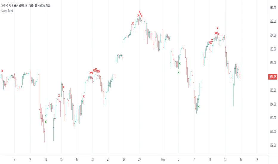
Slope Rank ReversalThis tool is designed to solve the fundamental problem of "buying low and selling high" by providing objective entry/exit signals based on momentum extremes and inflection points.
The System employs three core components:
Trend Detection (PSAR): The Parabolic SAR is used as a filter to confirm that a trend reversal or transition is currently underway, isolating actionable trade setups.
Dynamic Momentum Ranking: The indicator continuously measures the slope of the price action. This slope is then ranked against historical data to objectively identify when an asset is in an extreme state (overbought or oversold).
Signal Generation (Inflection Points):
Oversold/Buy: A 🟢 Green X is generated only when the slope ranking indicates the market is steeply negative (oversold), and the slope value begins to tick upwards (the inflection point), signaling potential mean reversion.
Overbought/Sell: A 🔴 Red X is generated only when the slope ranking indicates the market is steeply positive (overbought), and the slope value begins to tick downwards, signaling momentum exhaustion.
The core philosophy is simple: Enter only when the market is exhausted and has started to turn.
O'Neil Market TimingBill O'Neil Market Timing Indicator - User Guide
Overview
This Pine Script indicator implements William O'Neil's market timing methodology, which assigns one of four distinct states to a market index (such as SPY or QQQ) to help traders identify optimal market conditions for investing. The indicator is designed to work exclusively on Daily timeframe charts.
The Four Market States
The indicator tracks the market through four distinct states, with specific transition rules between them:
1. Confirmed Uptrend (Green)
- Meaning: The market is in a healthy uptrend with institutional support
- Action: Favorable conditions for building positions in leading stocks
- Can transition to: State 2 (Uptrend Under Pressure)
2. Uptrend Under Pressure (Yellow)
- Meaning: The uptrend is showing signs of weakness with increasing distribution
- Action: Be cautious, tighten stops, reduce position sizes
- Can transition to: State 1 (Confirmed Uptrend) or State 3 (Downtrend)
3. Downtrend (Red)
- Meaning: The market is in a confirmed downtrend
- Action: Stay mostly in cash, avoid new purchases
- Can transition to: State 4 (Rally Attempt)
4. Rally Attempt (Pink/Fuchsia)
- Meaning: The market is attempting to bottom and reverse
- Action: Watch for Follow-Through Day to confirm new uptrend
- Can transition to: State 1 (Confirmed Uptrend) or State 3 (Downtrend)
Key Concepts
Distribution Day
A distribution day occurs when:
1. The index closes down by more than the critical percentage (default 0.2%)
2. Volume is higher than the previous day's volume
Distribution days indicate institutional selling and are marked with red triangles on the indicator.
Follow-Through Day
A follow-through day occurs during a Rally Attempt when:
1. The index closes up by more than the critical percentage (default 1.6%)
2. Volume is higher than the previous day's volume
A Follow-Through Day confirms a new uptrend and triggers the transition from Rally Attempt to Confirmed Uptrend.
State Transition Logic
Valid Transitions
The system only allows specific transitions:
- 1 → 2: When distribution days reach the "pressure number" (default 5) within the lookback period (default 25 bars)
- 2 → 1: When distribution days drop below the pressure number
- 2 → 3: When distribution days reach "downtrend number" (default 7) AND price drops by "downtrend criterion" (default 6%) from the lookback high
- 3 → 4: When the market doesn't make a new low for 3 consecutive days
- 4 → 3: When a new low is made, undercutting the downtrend low
- 4 → 1: When a Follow-Through Day occurs during the Rally Attempt
Input Parameters
Distribution Day Parameters
- Distribution Day % Threshold (default 0.2%, range 0.1-2.0%)
- Minimum percentage decline required to qualify as a distribution day. While 0.2% seems to be the canonical number I see in literature about this, I use a much higher threshold (at least 0.5%)
Follow-Through Day Parameters
- Follow-Through Day % Threshold (default 1.6%, range 1.0-2.0%)
- Minimum percentage gain required to qualify as a follow-through day
### State Transition Parameters
- Pressure Number (default 5, range 3-6)
- Number of distribution days needed to transition from Confirmed Uptrend to Uptrend Under Pressure
- Lookback Period (default 25 bars, range 20-30)
- Number of days to count distribution days
- Downtrend Number (default 7, range 4-10)
- Number of distribution days needed (with price drop) to transition to Downtrend
- Downtrend % Drop from High (default 6%, range 5-10%)
- Percentage drop from lookback high required for downtrend confirmation
Visual Settings
- Color customization for each state
- Table position selection (Top Left, Top Right, Bottom Left, Bottom Right)
## How to Use This Indicator
### Installation
1. Open TradingView and navigate to SPY or QQQ (or another major index)
2. **Important**: Switch to the Daily (1D) timeframe
3. Click on "Indicators" at the top of the chart
4. Click "Pine Editor" at the bottom of the screen
5. Copy and paste the Pine Script code
6. Click "Add to Chart"
### Interpretation
**When the indicator shows:**
- **Green (State 1)**: Market is healthy - consider adding quality positions
- **Yellow (State 2)**: Exercise caution - tighten stops, be selective
- **Red (State 3)**: Defensive mode - preserve capital, avoid new buys
- **Pink (State 4)**: Watch closely - prepare for potential Follow-Through Day
### The Information Table
The table displays:
- **Current State**: The current market condition
- **Distribution Days**: Number of distribution days in the lookback period
- **Lookback Period**: Number of bars being analyzed
- **Rally Attempt Day**: (Only in State 4) Days into the current rally attempt
### Visual Elements
1. **State Line**: A stepped line showing the current state (1-4)
2. **Red Triangles**: Mark each distribution day
3. **Horizontal Reference Lines**: Dotted lines marking each state level
4. **Color-Coded Display**: The state line changes color based on the current market condition
## Trading Strategy Guidelines
### In Confirmed Uptrend (State 1)
- Build positions in stocks breaking out of proper bases
- Use normal position sizing
- Focus on stocks showing institutional accumulation
- Hold winners as long as they act properly
### In Uptrend Under Pressure (State 2)
- Take partial profits in extended positions
- Tighten stop losses
- Be more selective with new entries
- Reduce overall exposure
### In Downtrend (State 3)
- Move to cash or maintain very light exposure
- Avoid new purchases
- Focus on preservation of capital
- Use the time for research and watchlist building
### In Rally Attempt (State 4)
- Stay mostly in cash but prepare
- Build a watchlist of strong stocks
- On Day 4+ of the rally attempt, watch for Follow-Through Day
- If FTD occurs, begin cautiously adding positions
## Best Practices
1. **Use with Major Indices**: This indicator works best with SPY, QQQ, or other broad market indices
2. **Daily Timeframe Only**: The indicator is designed for daily bars - do not use on intraday timeframes
3. **Combine with Stock Analysis**: Use the market state as a filter for individual stock decisions
4. **Respect the Signals**: When the market enters Downtrend, reduce exposure regardless of individual stock setups
5. **Monitor Distribution Days**: Pay attention when distribution days accumulate - it's a warning sign
6. **Wait for Follow-Through**: Don't jump back in too early during Rally Attempt - wait for confirmation
## Alert Conditions
The indicator includes built-in alert conditions for:
- State changes (entering any of the four states)
- Distribution Day detection
- Follow-Through Day detection during Rally Attempt
To set up alerts:
1. Click the "Alert" button while the indicator is on your chart
2. Select "O'Neil Market Timing"
3. Choose your desired alert condition
4. Configure notification preferences
## Customization Tips
### For More Sensitive Detection
- Lower the "Pressure Number" to 3-4
- Lower the "Distribution Day % Threshold" to 0.15%
- Reduce the "Downtrend Number" to 5-6
### For More Conservative Detection
- Raise the "Pressure Number" to 6
- Raise the "Distribution Day % Threshold" to 0.3-0.5%
- Increase the "Downtrend Number" to 8-9
### For Different Market Conditions
- **Bull Market**: Consider slightly higher thresholds
- **Bear Market**: Consider slightly lower thresholds
- **Volatile Market**: May need to increase percentage thresholds
## Limitations and Considerations
1. **Not a Crystal Ball**: The indicator identifies conditions but doesn't predict the future
2. **False Signals**: Follow-Through Days can fail - use proper risk management
3. **Whipsaws Possible**: In choppy markets, the indicator may switch states frequently
4. **Confirmation Lag**: By design, there's a lag as the system waits for confirmation
5. **Works Best with Price Action**: Combine with your analysis of individual stocks
## Historical Context
This methodology is based on William J. O'Neil's decades of market research, documented in books like "How to Make Money in Stocks" and through Investor's Business Daily. O'Neil's research showed that:
- Most major market tops are preceded by accumulation of distribution days
- Most successful rallies begin with a Follow-Through Day on Day 4-7 of a rally attempt
- Identifying market state helps prevent buying during unfavorable conditions
## Troubleshooting
**Problem**: Indicator shows "Initializing"
- **Solution**: Let the chart load at least 5 bars to establish the initial state
**Problem**: No distribution day markers appear
- **Solution**: Verify you're on daily timeframe and check if volume data is available
**Problem**: Table not visible
- **Solution**: Check the table position setting and ensure it's not off-screen
**Problem**: State seems to change too frequently
- **Solution**: Increase the lookback period or adjust threshold parameters
## Support and Further Learning
For deeper understanding of this methodology:
- Read "How to Make Money in Stocks" by William J. O'Neil
- Study Investor's Business Daily's "Market Pulse"
- Review historical market tops and bottoms to see the pattern
- Practice identifying distribution days and follow-through days manually
## Version History
**Version 1.0** (November 2025)
- Initial implementation
- Four-state system with proper transitions
- Distribution day detection and marking
- Follow-through day detection
- Customizable parameters
- Information table display
- Alert conditions
---
## Quick Reference Card
| State | Number | Color | Action |
|-------|--------|-------|--------|
| Confirmed Uptrend | 1 | Green | Buy quality setups |
| Uptrend Under Pressure | 2 | Yellow | Tighten stops, be selective |
| Downtrend | 3 | Red | Cash position, no new buys |
| Rally Attempt | 4 | Pink | Watch for Follow-Through Day |
**Distribution Day**: Down > 0.2% on higher volume (red triangle)
**Follow-Through Day**: Up > 1.6% on higher volume during Rally Attempt (triggers State 4→1)
---
*Remember: This indicator is a tool to help identify market conditions. It should be used as part of a comprehensive trading strategy that includes proper risk management, position sizing, and individual stock analysis.*
Also, I created this with the help of an AI coding framework, and I didn't exhaustively test it. I don't actually use this for my own trading, so it's quite possible that it's materially wrong, and that following this will lead to poor investment decisions.. This is "copy left" software, so feel free to alter this to your own tastes, and claim authorship.
