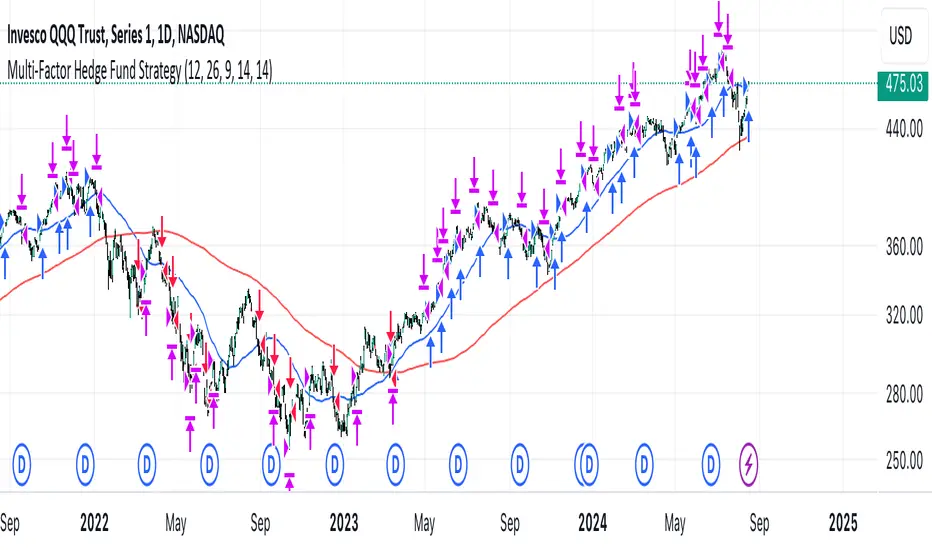
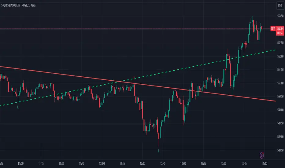
Multi-Factor StrategyThis trading strategy combines multiple technical indicators to create a systematic approach for entering and exiting trades. The goal is to capture trends by aligning several key indicators to confirm the direction and strength of a potential trade. Below is a detailed description of how the strategy works:
Indicators Used
MACD (Moving Average Convergence Divergence):
MACD Line: The difference between the 12-period and 26-period Exponential Moving Averages (EMAs).
Signal Line: A 9-period EMA of the MACD line.
Usage: The strategy looks for crossovers between the MACD line and the Signal line as entry signals. A bullish crossover (MACD line crossing above the Signal line) indicates a potential upward movement, while a bearish crossover (MACD line crossing below the Signal line) signals a potential downward movement.
RSI (Relative Strength Index):
Usage: RSI is used to gauge the momentum of the price movement. The strategy uses specific thresholds: below 70 for long positions to avoid overbought conditions and above 30 for short positions to avoid oversold conditions.
ATR (Average True Range):
Usage: ATR measures market volatility and is used to set dynamic stop-loss and take-profit levels. A stop loss is set at 2 times the ATR, and a take profit at 3 times the ATR, ensuring that risk is managed relative to market conditions.
Simple Moving Averages (SMA):
50-day SMA: A short-term trend indicator.
200-day SMA: A long-term trend indicator.
Usage: The strategy uses the relationship between the 50-day and 200-day SMAs to determine the overall market trend. Long positions are taken when the price is above the 50-day SMA and the 50-day SMA is above the 200-day SMA, indicating an uptrend. Conversely, short positions are taken when the price is below the 50-day SMA and the 50-day SMA is below the 200-day SMA, indicating a downtrend.
Entry Conditions
Long Position:
-MACD Crossover: The MACD line crosses above the Signal line.
-RSI Confirmation: RSI is below 70, ensuring the asset is not overbought.
-SMA Confirmation: The price is above the 50-day SMA, and the 50-day SMA is above the 200-day SMA, indicating a strong uptrend.
Short Position:
MACD Crossunder: The MACD line crosses below the Signal line.
RSI Confirmation: RSI is above 30, ensuring the asset is not oversold.
SMA Confirmation: The price is below the 50-day SMA, and the 50-day SMA is below the 200-day SMA, indicating a strong downtrend.
Opposite conditions for shorts
Exit Strategy
Stop Loss: Set at 2 times the ATR from the entry price. This dynamically adjusts to market volatility, allowing for wider stops in volatile markets and tighter stops in calmer markets.
Take Profit: Set at 3 times the ATR from the entry price. This ensures a favorable risk-reward ratio of 1:1.5, aiming for higher rewards on successful trades.
Visualization
SMAs: The 50-day and 200-day SMAs are plotted on the chart to visualize the trend direction.
MACD Crossovers: Bullish and bearish MACD crossovers are highlighted on the chart to identify potential entry points.
Summary
This strategy is designed to align multiple indicators to increase the probability of successful trades by confirming trends and momentum before entering a position. It systematically manages risk with ATR-based stop loss and take profit levels, ensuring that trades are exited based on market conditions rather than arbitrary points. The combination of trend indicators (SMAs) with momentum and volatility indicators (MACD, RSI, ATR) creates a robust approach to trading in various market environments.
在腳本中搜尋"国泰黄金ETF联接C相关行业指数的最新政策"
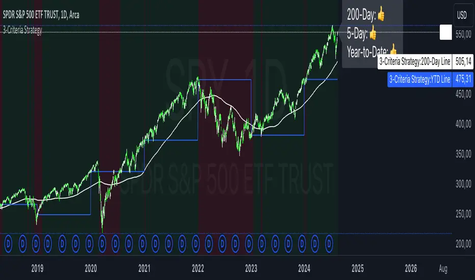
3-Criteria StrategyThe "3-Criteria Strategy" is a simple yet effective trading strategy based on three criteria:
200-Day Moving Average: The first criterion checks whether the current price is above or below the 200-day moving average (SMA). A price above the 200-day line is considered bullish (thumbs up), while a price below is considered bearish (thumbs down).
5-Day Indicator: The second criterion evaluates the performance of the first five trading days of the year. If the closing price on the fifth trading day is higher than the closing price on the last trading day of the previous year, this is considered bullish (thumbs up). Otherwise, it's bearish (thumbs down).
Year-to-Date (YTD) Effect: The third criterion compares the current price with the closing price at the end of the previous year. A current price above the year-end price is bullish (thumbs up), while a price below is bearish (thumbs down).
Signal Interpretation:
Buy Signal: At least two of the three criteria must give a bullish signal (thumbs up).
Sell Signal: Zero or one bullish signal results in a bearish outlook.
The script provides visual cues with background colors:
Green background: Indicates a buy signal.
Red background: Indicates a sell signal.
Additionally, the script plots the 200-day moving average and the YTD line on the chart for better visualization.
Usage:
Apply the Script: Add the script to your TradingView chart.
Interpret Signals: Monitor the background color and the status label to determine trading actions.
Visual Aids: Use the 200-day line and YTD line plotted on the chart to confirm the criteria visually.
Scientific Research
The concepts used in this script—like the 200-day moving average and Year-to-Date effects—are well-documented in financial literature. However, the combination of these specific criteria as a trading strategy is more of a heuristic approach commonly used by traders rather than a subject of extensive academic research.
200-Day Moving Average: The 200-day moving average is widely regarded as a significant level in technical analysis, often serving as a demarcation between long-term bullish and bearish trends. Research has shown that long-term moving averages can be useful for trend-following strategies.
Reference: Brock, W., Lakonishok, J., & LeBaron, B. (1992). Simple Technical Trading Rules and the Stochastic Properties of Stock Returns. Journal of Finance, 47(5), 1731-1764.
Year-to-Date and Calendar Effects: The Year-to-Date effect and early-year performance (such as the January effect) have been studied extensively in the context of seasonal market anomalies.
Reference: Rozeff, M. S., & Kinney, W. R. (1976). Capital Market Seasonality: The Case of Stock Returns. Journal of Financial Economics, 3(4), 379-402.
While these papers don't address the exact combination of criteria used in your strategy, they provide a solid foundation for understanding the underlying concepts.
Buy and Sell Alerts using VWAPThis is my first script, which I hope you'll enjoy.
The script generates alerts for buy and sell trades using VWAP and volume threshold that you select.
Indicators and Moving Averages :
This script allows you to choose which moving averages like VWAP, 9EMA, 10, 20, 50, 100, 200, and 325 SMAs you want to see on your chart.
Volume Threshold :
You can set a volume threshold, which is the minimum required volume required for buy and sell signals to be considered valid. (For example, I like 60,000 on SPY, 5 minute chart.)
Buy and Sell Signals :
The script checks if the stock prices crosses above or below the VWAP and if the trading volume is above the threshold you set.
If the price crosses above the VWAP and the volume is sufficient, a "Buy" signal is generated.
If the price crosses below the VWAP and the volume is sufficient, a "Sell" signal is generated.
This hopefully user-friendly indicator will alert you when certain conditions trading conditions are met, helping to make it a little easier to make informed trading decisions.

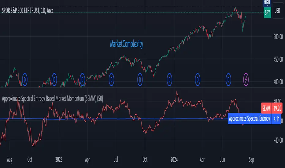
Approximate Spectral Entropy-Based Market Momentum (SEMM)Overview
The Approximate Spectral Entropy-Based Market Momentum (SEMM) indicator combines the concepts of spectral entropy and traditional momentum to provide traders with insights into both the strength and the complexity of market movements. By measuring the randomness or predictability of price changes, SEMM helps traders understand whether the market is in a trending or consolidating state and how strong that trend or consolidation might be.
Key Features
Entropy Measurement: Calculates the approximate spectral entropy of price movements to quantify market randomness.
Momentum Analysis: Integrates entropy with rate-of-change (ROC) to highlight periods of strong or weak momentum.
Dynamic Market Insight: Provides a dual perspective on market behavior—both the trend strength and the underlying complexity.
Customizable Parameters: Adjustable window length for entropy calculation, allowing for fine-tuning to suit different market conditions.
Concepts Underlying the Calculations
The indicator utilizes Shannon entropy, a concept from information theory, to approximate the spectral entropy of price returns. Spectral entropy traditionally involves a Fourier Transform to analyze the frequency components of a signal, but due to Pine Script limitations, this indicator uses a simplified approach. It calculates log returns over a rolling window, normalizes them, and then computes the Shannon entropy. This entropy value represents the level of disorder or complexity in the market, which is then multiplied by traditional momentum measures like the rate of change (ROC).
How It Works
Price Returns Calculation: The indicator first computes the log returns of price data over a specified window length.
Entropy Calculation: These log returns are normalized and used to calculate the Shannon entropy, representing market complexity.
Momentum Integration: The calculated entropy is then multiplied by the rate of change (ROC) of prices to generate the SEMM value.
Signal Generation: High SEMM values indicate strong momentum with higher randomness, while low SEMM values indicate lower momentum with more predictable trends.
How Traders Can Use It
Trend Identification: Use SEMM to identify strong trends or potential trend reversals. Low entropy values can indicate a trending market, whereas high entropy suggests choppy or consolidating conditions.
Market State Analysis: Combine SEMM with other indicators or chart patterns to confirm the market's state—whether it's trending, ranging, or transitioning between states.
Risk Management: Consider high SEMM values as a signal to be cautious, as they suggest increased market unpredictability.
Example Usage Instructions
Add the Indicator: Apply the "Approximate Spectral Entropy-Based Market Momentum (SEMM)" indicator to your chart.
Adjust Parameters: Modify the length parameter to suit your trading timeframe. Shorter lengths are more responsive, while longer lengths smooth out the signal.
Analyze the Output: Observe the blue line for entropy and the red line for SEMM. Look for divergences or confirmations with price action to guide your trades.
Combine with Other Tools: Use SEMM alongside moving averages, support/resistance levels, or other indicators to build a comprehensive trading strategy.
Follow the Volumes / Path of Least ResistanceThis indicator tracks price movements following significant volume increases. It identifies volume spikes by comparing recent average volume to a longer-term average. After a spike, it monitors price changes over a specified number of bars.
In plain English, the point of this is to “let the market show it’s hand”, vs. other common and preemptive methods of execution.
You can think of it as a better version of a volume up/down indicator which only uses opening and closing prices to identify "bullish" or "bearish" behavior.
To optimize this, I used a very small range chart, hence the small values. You will need to experiment with other values, ESPECIALLY the % change. If you do not do this, the indicator will generate a lot of noise.
The indicator has three main conditions:
1. Significant price increase, bullish: A green triangle appears below the bar.
2. Significant price decrease, bearish: A red triangle appears above the bar.
3. Price change within thresholds: A fuschia triangle appears, pointing up or down based on the overall (short-term) trend. This is common behavior during trends. A spike in volume will appear, and price simply does not budge. Volume/price is essentially declaring a new found value, in which case prices tend to follow the impulse movement (see market profile theory).
The color scheme is intuitive: green for positive moves, red for negative, and fuschia for subtle changes following the existing trend. Blue circles mark volume spikes for reference, which I recommend using only for reference, and disabling to remove unneeded noise.
Because this indicator "lags" in the sense of waiting for the market to show its hand, best opportunities are typically found on retests of the volume spikes themselves. On drives, however, the market will unlikely pullback, which (in my view) is one of its best use cases.
Bottom line, you will need to adjust the parameters to the instrument. This is not a plug and play solution, but far more accurate than those which are.
Settings, and what they mean:
Volume spike average bars: length for identification of high volumes. On smaller timeframes, such as my optimization period, you’ll want several bars. But on something such as a 5 minute or higher, only 1.
Lookback period: for identification of high volumes.
Volume Increase Threshold (%): % which constitutes a jump in volume
Bars After Spike: How long to wait for ensuing price movement. Also sensitive to the timeframe you are using. 1-2 recommended for 5m+, more for smaller range-based.
Negative Price Change Threshold (%): For red arrows (Volume + Price Movement)
Positive Price Change Threshold (%): Inverse of above
WMA Period for Stability Function: When price spikes on high volumes but does not move (price is “trapped” between negative and positive price change thresholds) the indicator marks direction (in fuchsia) in the direction of the underlying trend. This short-term MA identifies that trend.
Finally, because this indicator is volume-based, I recommend using primary instruments only and discourage its use on CFDs or other firm-generated instruments. Just use the primary. I would ignore signals off the open, which is subject to erroneous behavior. Other methods are far more effective for that.
This script is purposely uncomplicated. Feel free to play with settings and change code to suit your needs.

Midpoint Candle and BodyThis script provides the options to mark the:
1. Midpoint of the candle body and/or
2. Midpoint of the full candle (including the wicks)
Works on all timeframes. This indicator can be used to help determine the mean (midpoint) reversion of price.
-

MM Market Range MapWhat this script does:
The purpose of this script is to help traders identify when the major sectors of the market are moving in one direction - also known as a "market trend day".
How this script works:
The indicator uses QQQ, SMH and NVDA to represent the technology side of the market, and XLF, XLV & IWM to represent everything else. It tracks where price is within the day's range for each of those symbols, and presents that data in a table and in also in a dot-based "map".
How to use this script:
Using the dot-based map, you can see if all symbols were ever at the highs or lows of their range together. You can use this information to decide which direction you should be trading (ie. with trend). For example, in order for there to be healthy bullish moves in the market, you would want this indicator to show you that all sectors are at the highs or trending in that direction.
What makes this script original:
Most indicators and even the TradingView watchlist measure the percent changed on the day from the closing price of a stock on the prior trading day, essentially telling you what sentiment is since yesterday. This script tells you the sentiment today since it is priced from the opening print. It also provides the map so you can see if they were ever at the highs or lows together throughout the day, which can be an early indicator that the market will trend.
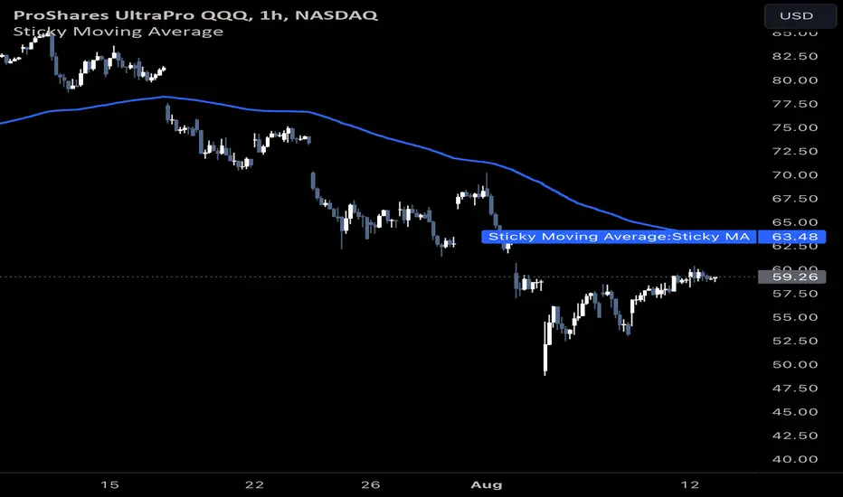
Sticky Moving AverageThe Sticky Moving Average is a custom indicator designed to provide a unique smoothing effect by combining different moving averages derived from a single base period. This indicator creates a single line on the chart, representing the average of the following three moving averages:
1. X-period Simple Moving Average (SMA): A traditional moving average that smooths the price data over the full period.
2. X/2-period Simple Moving Average (SMA): A faster-moving average that smooths the price data over half of the base period.
3. X/4-period Exponential Moving Average (EMA): An exponential moving average that gives more weight to recent prices, calculated over one-fourth of the base period.
The result is a moving average that "sticks" to price action by considering both short-term and long-term trends, offering a balanced view of market momentum.
This indicator is ideal for traders looking to gain a nuanced understanding of price movements by incorporating multiple smoothing periods into a single, easy-to-use line. Adjust the `X` value to suit your trading strategy and enjoy the clarity this composite moving average can bring to your charts.
Monte Carlo (Polyline Traceback) [Kioseff Trading]Hello!
This script "Monte Carlo (Polyline Traceback) " performs a Monte Carlo simulation using polylines!
By using polylines, and tracing back the initial simulation to its origin point, we can better replicate the ideal output of a Monte Carlo simulation!
Such as:
The image above shows the output of a simulation (image sourced outside TV).
With this script, and polyline capabilities, we can come quite close on TradingView.
The image above shows the indicator in action! Not bad considering the ideal output.
Of course, the script is quite heavy and tries its best to circumvent limitations :D
You might run into load time errors, in which case you might try applying the built-in setting "Force Script Load". This setting will cut-off the visuals for some simulations, but has a higher chance of passing load-time limitations!
As shown in the image above, you can select to only show worst-case and best-case simulations. Using this option will reduce chart lag and improve load times.
Features
Monte Carlo Simulation: Performs Monte Carlo simulation to generate multiple future paths.
Asset Price: Can simulate future asset prices based on historical log returns.
Statistical Methods: Offers two simulation methods—Gaussian (Normal) distribution and Bootstrapping.
Adjustable Parameters: Offers numerous user-adjustable settings like number of simulations, forecast length, and more.
Historical Data Points: Option to specify the amount of historical data to be used in the simulation (price).
Best/Worst Case: Allows you to show only the best case / worst case outcome (range) for all simulations!
Thank you!

Market Internal Pivots by SyntaxGeekThis indicator combines simple pivot detection with market breadth ratios.
The thought was to show market breadth strength or weakness where price was making potential pivots.
Lookback can be adjusted and currently it supports NYSE and NASDAQ market breadth.
Configuration is limited given the simplicity but live breadth printout can be displayed at current candle.
Max label count is at 500 but the indicator makes use of the visible chart library and will redraw old pivot labels when scrolling back, up to 500.
Considering that market breadth data is only available during RTH, do not expect data during ETH sessions. I've only tested this up to 1hr timeframe so I can't guarantee higher timeframes will present correctly.
Feel free to leave feedback, happy trading!
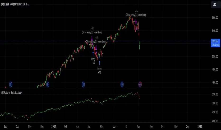
VIX Futures Basis StrategyVIX Futures Basis Strategy
The VIX Futures Basis Strategy is a trading approach that takes advantage of the unique characteristics of the VIX index and its futures market. The VIX, often referred to as the "fear index," measures market expectations of near-term volatility. This strategy focuses on how the VIX futures contracts behave in relation to the spot VIX index and seeks to capitalize on the market's contango and backwardation phases.
Key Concepts:
VIX Index and VIX Futures:
The VIX index reflects the market's expectation of volatility over the next 30 days.
VIX futures allow traders to speculate on the future value of the VIX index.
Contango and Backwardation:
Contango occurs when the futures price is higher than the spot price, often indicating that the market expects volatility to rise in the future.
Backwardation is when the futures price is lower than the spot price, suggesting that the market expects a decrease in volatility.
Basis:
The basis is the difference between the futures price and the spot price. This strategy examines the basis for two consecutive VIX futures contracts.
Strategy Overview:
The VIX Futures Basis Strategy uses the relationship between the VIX index and its futures contracts to generate trading signals:
Long Position on Contango:
When both the front month and the second month VIX futures contracts are in contango (their prices are above the spot VIX index by a specified threshold), the strategy takes a long position.
This implies an expectation that the market will move from a state of expected higher future volatility to a more stable state, allowing profits to be made as the futures prices converge toward the spot price.
Closing Position on Backwardation:
If the basis for both futures contracts indicates backwardation (their prices are below the spot VIX index by a threshold), the strategy closes any long positions.
This condition suggests that the market anticipates decreasing volatility, and closing positions helps to avoid potential losses.
Market Breadth - AsymmetrikMarket Breadth - Asymmetrik User Manual
Overview
The Market Breadth - Asymmetrik is a script designed to provide insights into the overall market condition by plotting three key indicators based on stocks within the S&P 500 index. It helps traders assess market momentum and strength through visual cues and is especially useful for understanding the proportion of stocks trading above their respective moving averages.
Features
1. Market Breadth Indicators:
- Breadth 20D (green line): Represents the percentage of stocks in the S&P 500 that are above their 20-day moving average.
- Breadth 50D (yellow line): Represents the percentage of stocks in the S&P 500 that are above their 50-day moving average.
- Breadth 100D (red line): Represents the percentage of stocks in the S&P 500 that are above their 100-day moving average.
2. Horizontal Lines for Context:
- Green line at 10%
- Lighter green line at 20%
- Grey line at 50%
- Light red line at 80%
- Dark red line at 90%
3. Background Color Alerts:
- Green background when all three indicators are under 20%, indicating a potential oversold market condition.
- Red background when all three indicators are over 80%, indicating a potential overbought market condition.
Interpreting the Indicator
- Market Breadth Lines: Observe the plotted lines to assess the percentage of stocks above their moving averages.
- Horizontal Lines: Use the horizontal lines to quickly identify important threshold levels.
- Background Colors: Pay attention to background colors for quick insights:
- Green: All indicators suggest a potentially oversold market condition (below 20).
- Red: All indicators suggest a potentially overbought market condition (above 80).
Troubleshooting
- If the indicator does not appear as expected, please contact me.
- This indicator works only on daily and weekly timeframes.
Conclusion
This Market Breadth Indicator offers a visual representation of market momentum and strength through three key indicators, helping you identify potential buying and selling zones.
Brooks Always In [KintsugiTrading]Brooks Always In
Overview:
The "Brooks Always In Indicator" by KintsugiTrading is a tool designed for traders who follow price action methodologies inspired by Al Brooks. This indicator identifies key bar patterns and breakouts, plots an Exponential Moving Average (EMA), and highlights consecutive bullish and bearish bars. It is intended to assist traders in making informed decisions based on price action dynamics.
Features:
Consecutive Bar Patterns:
Identifies and highlights consecutive bullish and bearish bars.
Differentiates between bars that are above/below the EMA and those that are not.
Customizable EMA:
Option to display an Exponential Moving Average (EMA) with user-defined length and offset.
The EMA can be smoothed using various methods such as SMA, EMA, SMMA (RMA), WMA, and VWMA.
Breakout Patterns:
Recognizes bullish and bearish breakout bars and outside bars.
Tracks inside bars and prior bar conditions to better understand the market context.
Customizable Display:
Users can display or hide the EMA, consecutive bar patterns, and consecutive bars relative to the moving average.
How to Use:
Customize Settings:
First, I like to navigate to the top right corner of the chart (bolt icon), and change both the bull and bear body color to match the background (white/black) - this helps the user visualize the indicator far better.
Next, Toggle to display EMA, consecutive bar patterns, and consecutive bars relative to the moving average using the provided input options.
Adjust the EMA length, source, and offset as per your trading strategy.
Select the smoothing method and length for the EMA if desired.
Analyze Key Patterns:
Observe the highlighted bars on the chart to identify consecutive bullish and bearish patterns.
Use the plotted EMA to gauge the general trend and analyze the relationship between price bars and the moving average.
Informed Decision Making:
Utilize the identified bar patterns and breakouts to make informed trading decisions, such as identifying potential entry and exit points based on price action dynamics.
Good luck with your trading!

Linear Regression ChannelLinear Regression Channel with Logarithmic Scale Option
This advanced Linear Regression Channel indicator offers traders a powerful tool for technical analysis, with unique features that set it apart from standard implementations.
Key Features:
Logarithmic Scale Option: One of the most distinctive aspects of this indicator is the ability to switch between classic and logarithmic scales. This feature is particularly valuable for long-term analysis, as it ensures that equal percentage changes are represented equally, regardless of the price level.
Flexible Start Date: Unlike many indicators that rely on a fixed number of periods, this tool allows users to set a specific start date and time. This feature provides precise control over the regression analysis timeframe, enhancing its adaptability to various trading strategies.
Customizable Channel Settings: Users can adjust the upper and lower deviation multipliers, allowing for fine-tuning of the channel width to suit different market conditions and trading styles.
Trend Strength Indicator: An optional feature that displays the strength of the trend based on the Pearson correlation coefficient, offering additional insight into the reliability of the current trend.
Comprehensive Visual Customization: The indicator offers extensive color and style options for the regression line, upper and lower channel lines, and fill areas, allowing traders to create a visually appealing and easy-to-read chart setup.
Extended Line Options: Users can choose to extend the regression lines to the left, right, or both, facilitating projection and analysis of future price movements.
Multiple Alert Conditions: The indicator includes four alert conditions for crossing the upper deviation, lower deviation, and the main regression line in both directions, enhancing its utility for active traders.
Why Choose This Indicator:
The combination of logarithmic scale option and flexible start date setting makes this Linear Regression Channel uniquely suited for both short-term and long-term analysis. The logarithmic scale is particularly beneficial for analyzing assets with significant price changes over time, as it normalizes percentage moves across different price levels. This feature, coupled with the ability to set a precise start date, allows traders to perform more accurate and relevant regression analyses, especially when studying specific market cycles or events.
Moreover, the trend strength indicator and customizable visual elements provide traders with a comprehensive tool that not only identifies potential support and resistance levels but also offers insight into the reliability and strength of the current trend.
In summary, this Linear Regression Channel indicator combines flexibility, precision, and insightful analytics, making it an invaluable tool for traders seeking to enhance their technical analysis capabilities on TradingView.

Trend LinesThis script, titled "Trend Lines," is designed to detect and plot significant trend lines on a TradingView chart, based on pivot points. It highlights both uptrend and downtrend lines using different colors and allows customization of line styles, including color and thickness. Here's a breakdown of how the script works:
Inputs
Left Bars (lb) and Right Bars (rb): These inputs determine the number of bars to the left and right of a pivot point used to identify significant highs and lows.
Show Pivot Points: A boolean input to display markers at detected pivot points on the chart.
Show Old Line as Dashed: A boolean input to display older trend lines as dashed for visual distinction.
Uptrend Line Color (ucolor) and Downtrend Line Color (dcolor): Color inputs to customize the appearance of uptrend and downtrend lines.
Uptrend Line Thickness (uthickness) and Downtrend Line Thickness (dthickness): Inputs to adjust the thickness of the trend lines.
Calculations
Pivot Highs and Lows: The script calculates potential pivot highs and lows by looking at lb bars to the left and rb bars to the right. If a bar's high is the highest (or low is the lowest) within this window, it is considered a pivot point.
Trend Lines: The script connects the most recent and previous pivot highs to form downtrend lines, and the most recent and previous pivot lows to form uptrend lines. These lines are drawn with the specified color and thickness.
Angles: The angle of each trend line is calculated to determine whether the trend is strengthening or weakening. If the trend changes significantly, the line's extension is adjusted accordingly.
Plotting
Pivot Point Markers: If Show Pivot Points is enabled, markers labeled "H" for highs and "L" for lows are plotted at the pivot points.
Trend Lines: The script draws lines between pivot points, coloring them according to the trend direction (uptrend or downtrend). If Show Old Line as Dashed is enabled, the script sets older lines to a dashed style to indicate they are no longer the most recent trend lines.
This script is useful for traders who want to visually identify key support and resistance levels based on historical price action, helping them to make more informed trading decisions. The customization options allow traders to tailor the appearance of the trend lines to suit their personal preferences or charting style.
Relative Strength with 3 SMAMansfield RS with 3 SMAs
Overview
The Mansfield Relative Strength (RS) indicator with three Simple Moving Averages (SMAs) enhances traditional RS analysis by adding more clarity and precision to trend identification. This personalized version aims to define RS trends more clearly and end them sooner, helping traders make better-informed decisions.
Key Features
Relative Strength Calculation:
Comparison: Calculates the RS of a chosen symbol against a benchmark (default: S&P 500).
Normalization: Uses the stock’s closing price divided by the closing price of the benchmark over a specified period.
Three SMAs:
Periods: Configurable periods for three SMAs (default: 10, 20, 50).
Trend Smoothing: SMAs help smooth the RS line, making it easier to spot trends and potential reversals.
Visualization:
Area Plot: The RS line is displayed as an area plot.
Color Coding: Different colors for each SMA to distinguish them easily (yellow, orange, purple).
Customization Options:
Comparative Symbol: Choose any benchmark symbol.
Period Adjustment: Customize the periods for both the RS calculation and the SMAs.
Visibility: Option to show or hide the SMAs.
How to Use
Setup:
Add to Chart: Apply the indicator to your TradingView chart.
Customize: Adjust the comparative symbol, RS period, and SMA periods as per your preference.
Interpretation:
Rising RS Line: Indicates the stock is outperforming the benchmark.
Falling RS Line: Suggests underperformance.
SMA Crossovers: Watch for the RS line crossing above or below the SMAs to signal potential buy or sell points.
Trend Direction: SMAs help confirm the trend direction. A rising RS line above the SMAs indicates a strong relative performance.
Trading Strategy:
Trend Confirmation: Use SMA crossovers to confirm trends.
Divergence: Identify divergences between the price action and the RS line for potential reversal signals.
Market Cycle Phases IndicatorOverview
The Market Cycle Phases Indicator is a powerful tool designed to help traders identify and visualize the different phases of market cycles. By distinguishing between Accumulation, Uptrend, Distribution, and Downtrend phases, this indicator provides a clear and color-coded representation of market conditions, aiding in better decision-making and strategy development. It is especially useful for long-term investors to observe and understand market cycles over extended periods. The phases are color-coded for easy identification: Green for Accumulation, Blue for Uptrend, Yellow for Distribution, and Red for Downtrend.
Key Features
Identifies four key market phases: Accumulation, Uptrend, Distribution, and Downtrend
Uses a combination of moving averages and volatility measures
Color-coded background for easy visualization of market phases
Adjustable parameters for moving average length, volatility length, and volatility threshold
Plots the moving average and Average True Range (ATR) for reference
Suitable for both short-term trading and long-term investing
Concepts Underlying the Calculations
The calculations behind the Market Cycle Phases Indicator are straightforward, combining the principles of moving averages and volatility measures:
Moving Average (MA): A simple moving average is used to determine the overall trend direction.
Average True Range (ATR): This measures market volatility over a specified period.
Volatility Threshold: A multiplier is applied to the ATR to distinguish between high and low volatility conditions.
How It Works
The indicator first calculates a moving average (MA) of the closing prices and the Average True Range (ATR) to measure market volatility. Based on the position of the price relative to the MA and the current volatility level, the indicator determines the current market phase:
Accumulation Phase: Price is below the MA, and volatility is low (Green background). This phase often indicates a period of consolidation and potential buying interest before an uptrend.
Uptrend Phase: Price is above the MA, and volatility is high (Blue background). This phase represents a strong upward movement in price, often driven by increased buying activity.
Distribution Phase: Price is above the MA, and volatility is low (Yellow background). This phase suggests a period of consolidation at the top of an uptrend, where selling interest may start to increase.
Downtrend Phase: Price is below the MA, and volatility is high (Red background). This phase indicates a strong downward movement in price, often driven by increased selling activity.
How Traders Can Use It
Traders can use the Market Cycle Phases Indicator to:
Identify potential entry and exit points based on market phase transitions.
Confirm trends and avoid false signals by considering both trend direction and volatility.
Develop and refine trading strategies tailored to specific market conditions.
Enhance risk management by recognizing periods of high and low volatility.
Observe long-term market cycles to make informed investment decisions.
Example Usage Instructions
Add the Market Cycle Phases Indicator to your chart.
Adjust the input parameters as needed:
Base Length: Default is 50.
Volatility Length: Default is 14.
Volatility Threshold: Default is 1.5.
Observe the color-coded background to identify the current market phase
Use the identified phases to inform your trading decisions:
Consider buying during the Accumulation or Uptrend phases.
Consider selling or shorting during the Distribution or Downtrend phases.
Combine with other indicators and analysis techniques for comprehensive market insights.
By incorporating the Market Cycle Phases Indicator into your trading toolkit, you can gain a clearer understanding of market dynamics and enhance your ability to navigate different market conditions, making it a valuable asset for long-term investing.

Prometheus Black-Scholes Option PricesThe Black-Scholes Model is an option pricing model developed my Fischer Black and Myron Scholes in 1973 at MIT. This is regarded as the most accurate pricing model and is still used today all over the world. This script is a simulated Black-Scholes model pricing model, I will get into why I say simulated.
What is an option?
An option is the right, but not the obligation, to buy or sell 100 shares of a certain stock, for calls or puts respective, at a certain price, on a certain date (assuming European style options, American options can be exercised early). The reason these agreements, these contracts exist is to provide traders with leverage. Buying 1 contract to represent 100 shares of the underlying, more often than not, at a cheaper price. That is why the price of the option, the premium , is a small number. If an option costs $1.00 we pay $100.00 for it because 100 shares * 1 dollar per share = 100 dollars for all the shares. When a trader purchases a call on stock XYZ with a strike of $105 while XYZ stock is trading at $100, if XYZ stock moves up to $110 dollars before expiration the option has $5 of intrinsic value. You have the right to buy something at $105 when it is trading at $110. That agreement is way more valuable now, as a result the options premium would increase. That is a quick overview about how options are traded, let's get into calculating them.
Inputs for the Black-Scholes model
To calculate the price of an option we need to know 5 things:
Current Price of the asset
Strike Price of the option
Time Till Expiration
Risk-Free Interest rate
Volatility
The price of a European call option 𝐶 is given by:
𝐶 = 𝑆0 * Φ(𝑑1) − 𝐾 * 𝑒^(−𝑟 * 𝑇) * Φ(𝑑2)
where:
𝑆0 is the current price of the underlying asset.
𝐾 is the strike price of the option.
𝑟 is the risk-free interest rate.
𝑇 is the time to expiration.
Φ is the cumulative distribution function of the standard normal distribution.
𝑑1 and 𝑑2 are calculated as:
𝑑1 = (ln(𝑆0 / 𝐾) + (𝑟 + (𝜎^2 / 2)) * 𝑇) / (𝜎 * sqrt(𝑇))
𝑑2= 𝑑1 - (𝜎 * sqrt(𝑇))
𝜎 is the volatility of the underlying asset.
The price of a European put option 𝑃 is given by:
𝑃 = 𝐾 * 𝑒^(−𝑟 * 𝑇) * Φ(−𝑑2) − 𝑆0 * Φ(−𝑑1)
where 𝑑1 and 𝑑2 are as defined above.
Key Assumptions of the Black-Scholes Model
The price of the underlying asset follows a lognormal distribution.
There are no transaction costs or taxes.
The risk-free interest rate and volatility of the underlying asset are constant.
The underlying asset does not pay dividends during the life of the option.
The markets are efficient, meaning that all known information is already reflected in the prices.
Options can only be exercised at expiration (European-style options).
Understanding the Script
Here I have arrows pointing to specific spots on the table. They point to Historical Volatility and Inputted DTE . Inputted DTE is a value the user may input to calculate premium for options that expire in that many days. Historical Volatility , is the value calculated by this code.
length = 252 // One year of trading days
hv = ta.stdev(math.log(close / close ), length) * math.sqrt(365)
And then made daily like the Black-Scholes model needs from this step in the code.
hv_daily = request.security(syminfo.tickerid, "1D", hv)
The user has the option to input their own volatility to the Script. I will get into why that may be advantageous in a moment. If the user chooses to do so the Script will change which value it is using as so.
hv_in_use = which_sig == false ? hv_daily : sig
There is a lot going on in this image but bare with me, it will all make sense by the end. The column to the far left of both the green and maroon colored columns represent the strike price of the contract, if the numbers are white that means the contract is out of the money, gray means in the money. If you remember from the calculation this represents the price to buy or sell shares at, for calls or puts respective. The column second from the left shows a value for Simulated Market Price . This is a necessary part of this script so we can show changes in implied volatility. See, when we go to our brokerages and look at options prices, sure the price was calculated by a pricing model, but that is rarely the true price of the model. Market participant sentiment affects this value as their estimates for future volatility, Implied Volatility changes.
For example, if a call option is supposed to be worth $1.00 from the pricing model, however everyone is bullish on the stock and wants to buy calls, the premium may go to $1.20 from $1.00 because participants juice up the Implied Volatility . Higher Implied Volatility generally means higher premium, given enough time to expiration. Buying an option at $0.80 when it should be worth $1.00 due to changes in sentiment is a big part of the Quant Trading industry.
Of course I don't have access to an actual exchange so get prices, so I modeled participant decisions by adding or subtracting a small random value on the "perfect premium" from the Black-Scholes model, and solving for implied volatility using the Newton-Raphson method.
It is like when we have speed = distance / time if we know speed and time , we can solve for distance .
This is what models the changing Implied Volatility in the table. The other column in the table, 3rd from the left, is the Black-Scholes model price without the changes of a random number. Finally, the 4th column from the left is that Implied Volatility value we calculated with the modified option price.
More on Implied Volatility
Implied Volatility represents the future expected volatility of an asset. As it is the value in the future it is not know like Historical Volatility, only projected. We provide the user with the option to enter their own Implied Volatility to start with for better modeling of options close to expiration. If you want to model options 1 day from expiration you will probably have to enter a higher Implied Volatility so that way the prices will be higher. Since the underlying is so close to expiration they are traded so much and traders manipulate their Implied Volatility , increasing their value. Be safe while trading these!
Thank you all for clicking on my indicator and reading this description! Happy coding, Happy trading, Be safe!
Good reference: www.investopedia.com

Stocks Above 5-Day Average (FOMO)Overview
Inspired by Matt Carusos's FOMO indicator, this breadth indicator is designed to provide a visual representation of the percentage of stocks within major indices that are trading above their 5-day moving average.
Functionality
The indicator plots the percentage of stocks trading above their 5-day moving average for the following indices:
S&P 500
Nasdaq
Russell 2000
Dow Jones
All Markets (MMFD)
The indicator includes two horizontal lines:
Upper Threshold: Default at 85%
Lower Threshold: Default at 15%
These lines are used to identify potential overbought (above upper threshold) or oversold (below lower threshold) conditions.
Plot Shapes:
Small circles are plotted at the points where the percentage of stocks crosses the upper or lower thresholds, with colors matching the respective index.
Table:
The current percentage of stocks above the 5-day average for each index.
A warning sign (⚠️) is shown in the table if the percentage crosses the upper or lower threshold, regardless of whether the index plot is enabled or not.

HTF TriangleHTF Triangle by ZeroHeroTrading aims at detecting ascending and descending triangles using higher time frame data, without repainting nor misalignment issues.
It addresses user requests for combining Ascending Triangle and Descending Triangle into one indicator.
Ascending triangles are defined by an horizontal upper trend line and a rising lower trend line. It is a chart pattern used in technical analysis to predict the continuation of an uptrend.
Descending triangles are defined by a falling upper trend line and an horizontal lower trend line. It is a chart pattern used in technical analysis to predict the continuation of a downtrend.
This indicator can be useful if you, like me, believe that higher time frames can offer a broader perspective and provide clearer signals, smoothing out market noise and showing longer-term trends.
You can change the indicator settings as you see fit to tighten or loosen the detection, and achieve the best results for your use case.
Features
It draws the detected ascending and descending triangles on the chart.
It supports alerting when a detection occurs.
It allows for selecting ascending and/or descending triangle detection.
It allows for setting the higher time frame to run the detection on.
It allows for setting the minimum number of consecutive valid higher time frame bars to fit the pattern criteria.
It allows for setting a high/low factor detection criteria to apply on higher time frame bars high/low as a proportion of the distance between the reference bar high/low and open/close.
It allows for turning on an adjustment of the triangle using highest/lowest values within valid higher time frame bars.
Settings
Ascending checkbox: Turns on/off ascending triangle detection. Default is on.
Descending checkbox: Turns on/off descending triangle detection. Default is on.
Higher Time Frame dropdown: Selects higher time frame to run the detection on. It must be higher than, and a multiple of, the chart's timeframe. Default is 5 minutes.
Valid Bars Minimum field: Sets minimum number of consecutive valid higher time frame bars to fit the pattern criteria. Default is 3. Minimum is 1.
High/Low Factor checkbox: Turns on/off high/low factor detection criteria. Default is on.
High/Low Factor field: Sets high/low factor to apply on higher time frame bars high/low as a proportion of the distance between the reference bar high/low and open/close. Default is 0. Minimum is 0. Maximum is 1.
Adjust Triangle checkbox: Turns on/off triangle adjustment using highest/lowest values within valid higher time frame bars. Default is on.
Detection Algorithm Notes
The detection algorithm recursively selects a higher time frame bar as reference. Then it looks at the consecutive higher time frame bars (as per the requested number of minimum valid bars) as follows:
Ascending Triangle
Low must be higher than previous bar.
Open/close max value must be lower than (or equal to) reference bar high.
When high/low factor criteria is turned on, high must be higher than (or equal to) reference bar open/close max value plus high/low factor proportion of the distance between reference bar high and open/close max value.
Descending Triangle
High must be lower than previous bar.
Open/close min value must be higher than (or equal to) reference bar low.
When high/low factor criteria is turned on, low must be lower than (or equal to) reference bar open/close min value minus high/low factor proportion of the distance between reference bar low and open/close min value.

MM Sector Intraday TrackerWhat this script does:
This script tracks the percent that price has moved from the opening print of each of the 9 sector ETFs. It color codes the values so you can see which sectors are down (red color) and which sectors are up (green color). If a sector is only up or down half of one ATR, it the color will be light, but if it is beyond half of one ATR, it is a darker color.
How this script works:
It simply measures the distance that price has moved from the opening print today, and presents that information in an easy to read table on your chart.
How to use this script:
If all sectors are moving in one direction, it indicates that the entire market is in a trend day in that direction. You can use this information to decide which direction you should be trading (ie. with trend). For example, in order for there to be healthy bullish moves in the market, you would want this indicator to show you that all sectors are green, or at least that some sectors are green, which would indicate that there is healthy rotation of capital across the market sectors.
What makes this script original:
Most indicators and even the TradingView watchlist measure the percent changed on the day from the closing price of a stock on the prior trading day, essentially telling you what sentiment is since yesterday. This script tells you the sentiment today since it is priced from the opening print.

ToxicJ3ster - Day Trading SignalsThis Pine Script™ indicator, "ToxicJ3ster - Signals for Day Trading," is designed to assist traders in identifying key trading signals for day trading. It employs a combination of Moving Averages, RSI, Volume, ATR, ADX, Bollinger Bands, and VWAP to generate buy and sell signals. The script also incorporates multiple timeframe analysis to enhance signal accuracy. It is optimized for use on the 5-minute chart.
Purpose:
This script uniquely combines various technical indicators to create a comprehensive and reliable day trading strategy. Each indicator serves a specific purpose, and their integration is designed to provide multiple layers of confirmation for trading signals, reducing false signals and increasing trading accuracy.
1. Moving Averages: These are used to identify the overall trend direction. By calculating short and long period Moving Averages, the script can detect bullish and bearish crossovers, which are key signals for entering and exiting trades.
2. RSI Filtering: The Relative Strength Index (RSI) helps filter signals by ensuring trades are only taken in favorable market conditions. It detects overbought and oversold levels and trends within the RSI to confirm market momentum.
3. Volume and ATR Conditions: Volume and ATR multipliers are used to identify significant market activity. The script checks for volume spikes and volatility to confirm the strength of trends and avoid false signals.
4. ADX Filtering: The ADX is used to confirm the strength of a trend. By filtering out weak trends, the script focuses on strong and reliable signals, enhancing the accuracy of trade entries and exits.
5. Bollinger Bands: Bollinger Bands provide additional context for the trend and help identify potential reversal points. The script uses Bollinger Bands to avoid false signals and ensure trades are taken in trending markets.
6. Higher Timeframe Analysis: This feature ensures that signals align with broader market trends by using higher timeframe Moving Averages for trend confirmation. It adds a layer of robustness to the signals generated on the 5-minute chart.
7. VWAP Integration: VWAP is used for intraday trading signals. By calculating the VWAP and generating buy and sell signals based on its crossover with the price, the script provides additional confirmation for trade entries.
8. MACD Analysis: The MACD line, signal line, and histogram are calculated to generate additional buy/sell signals. The MACD is used to detect changes in the strength, direction, momentum, and duration of a trend.
9. Alert System: Custom alerts are integrated to notify traders of potential trading opportunities based on the signals generated by the script.
How It Works:
- Trend Detection: The script calculates short and long period Moving Averages and identifies bullish and bearish crossovers to determine the trend direction.
- Signal Filtering: RSI, Volume, ATR, and ADX are used to filter and confirm signals, ensuring trades are taken in strong and favorable market conditions.
- Multiple Timeframe Analysis: The script uses higher timeframe Moving Averages to confirm trends, aligning signals with broader market movements.
- Additional Confirmations: VWAP, MACD, and Bollinger Bands provide multiple layers of confirmation for buy and sell signals, enhancing the reliability of the trading strategy.
Usage:
- Customize the input parameters to suit your trading strategy and preferences.
- Monitor the generated signals and alerts to make informed trading decisions.
- This script is made to work best on the 5-minute chart.
Disclaimer:
This indicator is not perfect and can generate false signals. It is up to the trader to determine how they would like to proceed with their trades. Always conduct thorough research and consider seeking advice from a financial professional before making trading decisions. Use this script at your own risk.
Brooks 18 Bars [KintsugiTrading]Brooks 18 Bars
Overview:
This indicator allows traders to specify a time frame within each trading day and plots lines at the highest and lowest prices recorded during that period. It is particularly useful for identifying key levels of support and resistance within a specified time range.
Features:
User-Defined Time Frame: Traders can input their desired start and end times in a 24-hour format, allowing flexibility to analyze different market sessions.
High and Low Price Levels: The indicator plots lines representing the highest and lowest prices observed within the specified time frame each day.
Clear Visual Representation: The high and low lines are color-coded for easy identification, with the high & low prices in Kintsugi Trading Gold.
How to Use:
Set the Time Frame:
Adjust the "Start Time Hour" and "Start Time Minute" to define the beginning of your desired time frame.
Adjust the "End Time Hour" and "End Time Minute" to define the end of your desired time frame.
Analyze Key Levels:
Al Brooks popularized the following idea and basis for creating this indicator:
On a 5-minute chart, Bar 1 has a 20-30% chance of being the High or Low of the day.
Bar 12 has a 50% chance.
Bar 18 has an 80-90% chance.
Use the plotted lines to identify significant support and resistance levels within your specified time frame. These levels can help inform your trading decisions, such as entry and exit points.
Good luck with your trading!
