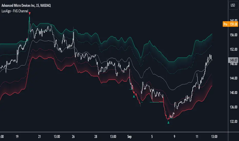
FVG Channel [LuxAlgo]The FVG Channel indicator displays a channel constructed from the averages of unmitigated historical fair value gaps (FVG), allowing to identify trends and potential reversals in the market.
Users can control the amount of FVGs to consider for the calculation of the channels, as well as their degree of smoothness through user settings.
🔶 USAGE
The FVG Channel is constructed by averaging together recent unmitigated Bullish FVGs (contributing to the creation of the upper bands), and Bearish unmitigated FVGs (contributing to the creation of the lower bands) within a lookback determined by the user. A higher lookback will return longer-term indications from the indicator.
The channel includes 5 bands, with one upper and one lower outer extremities, as well as an inner series of values determined using the Fibonacci ratios (respectively 0.786, 0.5, 0.236) from the channel's outer extremities.
An uptrend can be identified by price holding above the inner upper band (obtained from the 0.786 ratio), this band can also provide occasional support when the price retraces to it while in an uptrend.
Breaking below the inner upper band with an unwillingness to reach above again is a clear sign of hesitation in the market and can be indicative of an upcoming consolidation or reversal.
This can directly be applied to downtrends as well, below are examples displaying both scenarios.
Uptrend Example:
Downtrend Example:
🔹 Breakout Levels
When the price mitigates all FVGs in a single direction except for 1, the indicator will display a "Breakout Level". This is the level that price will need to cross in order for all FVGs in that direction to be mitigated, because of this they can also be aptly called "Last Stand Levels".
These levels can be considered as potential support and resistance levels, however, should always be monitored for breakouts since a substantial push above or below these points would indicate strong momentum.
🔹 Signals
The indicator includes Bullish and Bearish Signals, these signals fire when all FVGs for a single direction have been mitigated and an engulfing candle occurs in the opposite direction. These are reversal signals and should be used alongside other indicators to appropriately manage risk.
Note: When all FVGs in a single direction have been mitigated, the candles will change colors accordingly.
🔶 DETAILS
The script uses a typical identification method for FVGs. Once identified, the script collects and stores the mitigation levels of the respective bullish and bearish FVGs:
For Bullish FVGs this is the bottom of the FVG.
For Bearish FVGs this is the top of the FVG.
The data is managed to only consider a specific amount of FVG mitigation levels, determined by the set "Unmitigated FVG Lookback". If an FVG is mitigated, it frees up a spot in the memory for a new FVG, however, if the memory is full, the oldest will be deleted.
The averages displayed (Channel Upper and Lower) are created from 2 calculation steps, the first step involves taking the raw average of the FVG mitigation levels, and the second step applies a simple moving average (SMA) smoothing of the precedent obtained averages.
Note: To view the mitigation levels average obtained in the first step, the "Smoothing Length" can be set to 1.
🔶 SETTINGS
Unmitigated FVG Lookback: Sets the maximum number of Unmitigated FVG mitigation levels that the script will use to calculate the channel.
Smoothing Length: Sets the smoothing length for the channel to reduce noise from the raw data.
在腳本中搜尋"通达信+选股公式+换手率+0.5+源码"
display_valueOVERVIEW
This script is a tinny library for creating and displaying formatted values in TradingView scripts. It provides a structured way to present key information like titles, percentages, currency values, decimals, and integers with clear formatting. This allows you to coordinate your strings in advance and hold one item to use for calling your string to a label, box, table.. Made for day to day use of most typical use cases, more advanced techniques should be used for complicated scenarios.
Building Blocks
User Defined Types (UDTs)
The script defines a UDT called `DisplayValue` to encapsulate the components of a display value:
* title : The title or label of the value.
* format_string : The string used to format the value (e.g., "{0} - 1,number,percent}").
* value : The actual value to be displayed.
* format : An enum value specifying the desired format (percent, currency, etc.).
Enums
The `DisplayFormat` enum provides predefined constants for various formatting options, making the code more readable and less prone to errors.
Functions
* create() : This function creates a new `DisplayValue` instance. It takes the title, value, and desired format as arguments and generates the appropriate format string.
* to_string() : This function converts a `DisplayValue` instance into a formatted string ready for display on the chart.
How to Use
1. Import the library:
import kaigouthro/display_value/1as dv
2. Create a DisplayValue instance:
myValue = dv.create("My Percentage", 0.5, dv.DisplayFormat.percent)
3. Convert it to a string:
formattedString = dv.to_string(myValue)
4. Display the formatted string:
label.new(bar_index, high, formattedString)
Example
//@version=5
import kaigouthro/display_value/1 as dv
myValue = dv.create("Profit", 0.15, dv.DisplayFormat.percent)
formattedString = dv.to_string(myValue)
label.new(bar_index, high, formattedString)
This will display a label on the chart with the text "Profit - 15%".
### Notes
* The library handles the formatting details, making it easier to display values consistently in your scripts.
* The use of enums and UDTs improves code organization and readability.
--------
Library "display_value"
create(display_name, display_value, display_format)
Gets the appropriate format string based on the display format.
Parameters:
display_name (string) : (string) The name of the display value. Default is na.
display_value (float)
display_format (series DisplayFormat)
Returns: (DisplayValue) A new DisplayValue instance with the formatted value.
to_string(item)
Converts the display value to a string with the specified format.
Parameters:
item (DisplayValue) : (DisplayValue) The display value to convert to a string.
Returns: (string) The string representation of the display value.
DisplayValue
Structure representing a display value.
Fields:
title (series string) : (string) The title of the display value.
format_string (series string) : (string) The format string to use for display.
value (series float) : (float) The value to display.
format (series DisplayFormat) : (DisplayFormat) The format to use.

Burst PowerThe Burst Power indicator is to be used for Indian markets where most stocks have a maximum price band limit of 20%.
This indicator is intended to identify stocks with high potential for significant price movements. By analysing historical price action over a user-defined lookback period, it calculates a Burst Power score that reflects the stock's propensity for rapid and substantial moves. This can be helpful for stock selection in strategies involving momentum bursts, swing trading, or identifying stocks with explosive potential.
Key Components
____________________
Significant Move Counts:
5% Moves: Counts the number of days within the lookback period where the stock had a positive close-to-close move between 5% and 10%.
10% Moves: Counts the number of days with a positive close-to-close move between 10% and 19%.
19% Moves: Counts the number of days with a positive close-to-close move of 19% or more.
Maximum Price Move (%):
Identifies the largest positive close-to-close percentage move within the lookback period, along with the date it occurred.
Burst Power Score:
A composite score calculated using the counts of significant moves: Burst Power =(Count5%/5) +(Count10%/2) + (Count19%/0.5)
The score is then rounded to the nearest whole number.
A higher Burst Power score indicates a higher frequency of significant price bursts.
Visual Indicators:
Table Display: Presents all the calculated data in a customisable table on the chart.
Markers on Chart: Plots markers on the chart where significant moves occurred, aiding visual analysis.
Using the Lookback Period
____________________________
The lookback period determines how much historical data the indicator analyses. Users can select from predefined options:
3 Months
6 Months
1 Year
3 Years
5 Years
A shorter lookback period focuses on recent price action, which may be more relevant for short-term trading strategies. A longer lookback period provides a broader historical context, useful for identifying long-term patterns and behaviors.
Interpreting the Burst Power Score
__________________________________
High Burst Power Score (≥15):
Indicates the stock frequently experiences significant price moves.
Suitable for traders seeking quick momentum bursts and swing trading opportunities.
Stocks with high scores may be more volatile but offer potential for rapid gains.
Moderate Burst Power Score (10 to 14):
Suggests occasional significant price movements.
May suit traders looking for a balance between volatility and stability.
Low Burst Power Score (<10):
Reflects fewer significant price bursts.
Stocks are more likely to exhibit longer, sustainable, but slower price trends.
May be preferred by traders focusing on steady growth or longer-term investments.
Note: Trading involves uncertainties, and the Burst Power score should be considered as one of many factors in a comprehensive trading strategy. It is essential to incorporate broader market analysis and risk management practices.
Customisation Options
_________________________
The indicator offers several customisation settings to tailor the display and functionality to individual preferences:
Display Mode:
Full Mode: Shows the detailed table with all components, including significant move counts, maximum price move, and the Burst Power score.
Mini Mode: Displays only the Burst Power score and its corresponding indicator (green, orange, or red circle).
Show Latest Date Column:
Toggle the display of the "Latest Date" column in the table, which shows the most recent occurrence of each significant move category.
Theme (Dark Mode):
Switch between Dark Mode and Light Mode for better visual integration with your chart's color scheme.
Table Position and Size:
Position: Place the table at various locations on the chart (top, middle, bottom; left, center, right).
Size: Adjust the table's text size (tiny, small, normal, large, huge, auto) for optimal readability.
Header Size: Customise the font size of the table headers (Small, Medium, Large).
Color Settings:
Disable Colors in Table: Option to display the table without background colors, which can be useful for printing or if colors are distracting.
Bullish Closing Filter:
Another customisation here is to count a move only when the closing for the day is strong. For this, we have an additional filter to see if close is within the chosen % of the range of the day. Closing within the top 1/3, for instance, indicates a way more bullish day tha, say, closing within the bottom 25%.
Move Markers on chart:
The indicator also marks out days with significant moves. You can choose to hide or show the markers on the candles/bars.
Practical Applications
________________________
Momentum Trading: High Burst Power scores can help identify stocks that are likely to experience rapid price movements, suitable for momentum traders.
Swing Trading: Traders looking for short- to medium-term opportunities may focus on stocks with moderate to high Burst Power scores.
Positional Trading: Lower Burst Power scores may indicate steadier stocks that are less prone to volatility, aligning with long-term investment strategies.
Risk Management: Understanding a stock's propensity for significant moves can aid in setting appropriate stop-loss and take-profit levels.
Disclaimer: Trading involves significant risk, and past performance is not indicative of future results. The Burst Power indicator is intended for educational purposes and should not be construed as financial advice. Always conduct thorough research and consult with a qualified financial professional before making investment decisions.

Open-Close Absolute Difference with Threshold CountsThe Open-Close Absolute Difference with Threshold Counts indicator is a versatile tool designed to help traders analyze the volatility and price movements within any given timeframe on their charts. This indicator calculates the absolute difference between the open and close prices for each bar, providing a clear visualization through a color-coded histogram.
Key features include:
• Timeframe Flexibility: Utilizes the current chart’s timeframe, whether it’s a 5-minute, hourly, or daily chart.
• Custom Thresholds: Allows you to set up to four custom threshold levels (Thresholds A, B, C, and D) with default values of 10, 15, 25, and 35, respectively.
• Period Customization: Enables you to define the number of bars (N) over which the indicator calculates the counts, with a default of 100 bars.
• Visual Threshold Lines: Plots horizontal dashed lines on the histogram representing each threshold for easy visual reference.
• Dynamic Counting: Counts and displays the number of times the absolute difference is less than or greater than each threshold within the specified period.
• Customizable Table Position: Offers the flexibility to position the results table anywhere on the chart (e.g., Top Right, Bottom Left).
How It Works:
1. Absolute Difference Calculation:
• For each bar on the chart, the indicator calculates the absolute difference between the open and close prices.
• This difference is plotted as a histogram:
• Green Bars: Close price is higher than the open price.
• Red Bars: Close price is lower than the open price.
2. Threshold Comparison and Counting:
• Compares the absolute difference to each of the four thresholds.
• Determines whether the difference is less than or greater than each threshold.
• Utilizes the ta.sum() function to count occurrences over the specified number of bars (N).
3. Results Table:
• Displays a table with three columns:
• Left Column: Counts where the absolute difference is less than the threshold.
• Middle Column: The threshold value.
• Right Column: Counts where the absolute difference is greater than the threshold.
• The table updates dynamically and can be positioned anywhere on the chart according to your preference.
4. Threshold Lines on Histogram:
• Plots horizontal dashed lines at each threshold level.
• Each line is color-coded for distinction:
• Threshold A: Yellow
• Threshold B: Orange
• Threshold C: Purple
• Threshold D: Blue
How to Use:
1. Add the Indicator to Your Chart:
• Open the Pine Editor on TradingView.
• Copy and paste the provided code into the editor.
• Click “Add to Chart.”
2. Configure Settings:
• Number of Bars (N):
• Set the period over which you want to calculate the counts (default is 100).
• Thresholds A, B, C, D:
• Input your desired threshold values (defaults are 10, 15, 25, 35).
• Table Position:
• Choose where you want the results table to appear on the chart:
• Options include “Top Left,” “Top Center,” “Top Right,” “Bottom Left,” “Bottom Center,” “Bottom Right.”
3. Interpret the Histogram:
• Observe the absolute differences plotted as a histogram.
• Use the color-coded bars to quickly assess whether the close price was higher or lower than the open price.
4. Analyze the Counts Table:
• Review the counts of occurrences where the absolute difference was less than or greater than each threshold.
• Use this data to gauge volatility and price movement intensity over the specified period.
5. Visual Reference with Threshold Lines:
• Refer to the horizontal dashed lines on the histogram to see how the absolute differences align with your thresholds.
Example Use Case:
Suppose you’re analyzing a 5-minute chart for a particular stock and want to understand its short-term volatility:
• Set the Number of Bars (N) to 50 to analyze the recent 50 bars.
• Adjust Thresholds based on the typical price movements of the stock, e.g., Threshold A: 0.5, Threshold B: 1.0, Threshold C: 1.5, Threshold D: 2.0.
• Position the Table at the “Top Right” for easy viewing.
By doing so, you can:
• Quickly see how often the stock experiences significant price movements within 5-minute intervals.
• Make informed decisions about entry and exit points based on the volatility patterns.
• Customize the thresholds and periods as market conditions change.
Benefits:
• Customizable Analysis: Tailor the indicator to fit various trading styles and timeframes.
• Quick Visualization: Instantly assess market volatility and price movement direction.
• Enhanced Decision-Making: Use the counts and visual cues to make more informed trading decisions.
• User-Friendly Interface: Simple configuration and clear display of information.
Note: Always test the indicator with different settings to find the configuration that best suits your trading strategy. This indicator should be used as part of a comprehensive analysis and not as the sole basis for trading decisions.
EMA Regime FilterEMA REGIME FILTER INDICATOR
✦ OVERVIEW
The EMA Regime Filter is a custom indicator, designed to identify and visualize different market regimes based on the relationship between price action and an Exponential Moving Average (EMA).
✦ KEY FEATURES
Identifies four distinct market regimes: Strong Bullish, Weak Bullish, Strong Bearish, and Weak Bearish
Uses a current/higher timeframe for calculations to reduce noise
Incorporates ATR (Average True Range) to determine significant price moves
Includes an inactivity timer to revert to a neutral state after periods of low volatility
Visualizes the regime through bar colors and candle plots
✦ INPUT PARAMETERS
Source Timeframe : The timeframe used for calculations (default is the chart's timeframe)
ATR Threshold For Significant Move : Multiplier for ATR to determine significant price moves (default: 0.5)
Inactive Regime Period : Number of periods of inactivity before reverting to neutral (default: 10)
EMA Length : Period for the Exponential Moving Average calculation (default: 22)
✦ HOW IT WORKS
Higher Timeframe Data: The indicator requests data from a higher timeframe specified by the user.
Significant Move Detection:
Calculates ATR and multiplies it by the user-defined threshold.
Compares the body width of each candle to this threshold to determine if it's a significant move.
EMA Calculation: Computes an EMA based on the user-defined length.
Regime Determination:
Strong Bullish (2): Significant bullish move above EMA
Weak Bullish (1): Transitioning from bearish, but still above EMA
Strong Bearish (-2): Significant bearish move below EMA
Weak Bearish (-1): Transitioning from bullish, but still below EMA
Neutral (0): After a period of inactivity or at the start
Regime Transitions:
The indicator tracks the current regime and updates it based on new significant moves and the price's relation to the EMA.
An inactivity counter reverts the regime to neutral if no significant moves occur for the specified period.
Visualization:
Bar colors change based on the current regime (lime for bullish, red for bearish, white for neutral).
The intensity of the color indicates the strength of the regime.
✦ USING THE INDICATOR
Add the indicator to your TradingView chart.
Adjust the input parameters as needed:
Increase the ATR threshold for fewer but more significant regime changes.
Adjust the inactive period to change how quickly the indicator reverts to neutral.
Modify the EMA length to suit your trading timeframe.
Observe the changing bar colors to identify the current market regime.
Use the regime information to inform your trading decisions, such as:
Looking for long opportunities in bullish regimes
Considering short positions in bearish regimes
Being cautious or staying out of the market during neutral regimes

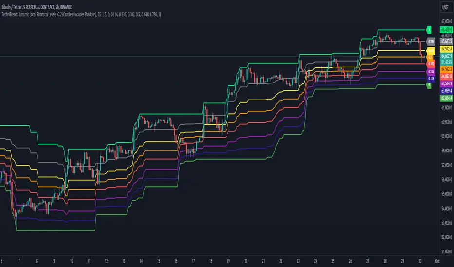
TechniTrend: Dynamic Local Fibonacci LevelsTechniTrend: Dynamic Local Fibonacci Levels
Description: The "Dynamic Local Fibonacci Levels" indicator dynamically displays Fibonacci levels only when the market is experiencing significant volatility. By detecting volatile price movements, this tool helps traders focus on Fibonacci retracement levels that are most relevant during high market activity, reducing noise from calm market periods.
Key Features:
Adaptive Fibonacci Levels: The indicator calculates and plots Fibonacci levels (from 0 to 1) only during periods of high volatility. This helps traders focus on actionable levels during significant price swings.
Customizable Chart Type: Users can choose between Candlestick charts (including shadows) or Line charts (excluding shadows) to determine the high and low price points for Fibonacci level calculations.
Volatility-Based Detection: The Average True Range (ATR) is used to detect significant volatility. Traders can adjust the ATR multiplier to fine-tune the sensitivity of the indicator to price movements.
Fully Customizable Fibonacci Levels: Traders can modify the default Fibonacci levels according to their preferences or trading strategies.
Real-Time Volatility Confirmation: Fibonacci levels are displayed only if the price range between the local high and low exceeds a user-defined volatility threshold, ensuring that these levels are only plotted when the market is truly volatile.
Customization Options:
Chart Type: Select between "Candles (Includes Shadows)" and "Line (Excludes Shadows)" for detecting price highs and lows.
Length for High/Low Detection: Choose the period for detecting the highest and lowest price in the given time frame.
ATR Multiplier for Volatility Detection: Adjust the sensitivity of the volatility threshold by setting the ATR multiplier.
Fibonacci Levels: Customize the specific Fibonacci levels to be displayed, from 0 to 1.
Usage Tips:
Focus on Key Levels During Volatility: This indicator is best suited for periods of high volatility. It can help traders identify potential support and resistance levels that may be more significant in turbulent markets.
Adjust ATR Multiplier: Depending on the asset you're trading, you might want to fine-tune the ATR multiplier to better suit the market conditions and volatility.
Recommended Settings:
ATR Multiplier: 1.5
Fibonacci Levels: Default levels set to 0.00, 0.114, 0.236, 0.382, 0.5, 0.618, 0.786, and 1.0
Length for High/Low Detection: 55
Use this indicator to detect key Fibonacci retracement levels in volatile market conditions and make more informed trading decisions based on price dynamics and volatility.
TechniTrend: Relative Volume IndexRelative Volume Index (RVI)
Short Description:
Relative Volume Index (RVI) with customizable volume bands, moving averages, and alerts for high and low volume thresholds. Includes options for displaying daily and weekly relative volume for enhanced analysis.
Full Description:
The Relative Volume Index is a powerful and versatile tool designed to help traders easily identify volume trends and anomalies in the market. By comparing the current volume to its moving average, this indicator highlights significant increases or decreases in relative volume, allowing traders to catch potential breakouts, breakdowns, or volume spikes early on.
Key Features:
Relative Volume Comparison : Compares the current volume to the moving average volume over a customizable period, highlighting overbought and oversold conditions.
Volume Alerts : Customizable alert thresholds for high and low relative volume to quickly notify traders when volume exceeds predefined limits.
Custom Moving Averages : Choose from various moving average types (SMA, EMA, WMA) to calculate the average volume over a given length.
Volume Normalization : For better readability, volumes greater than 1000 are divided by 1000 and displayed with a 'K' suffix (thousands).
Volume Bands : Configurable high, average, and low volume bands for visual reference.
Daily Relative Volume : Option to display the daily relative volume in comparison to its daily average.
Weekly Average Volume : Option to display the weekly average volume for broader market trends.
Customization Options:
Length : Customize the period for calculating the moving average.
Volume Moving Average : Toggle to show/hide the volume moving average (normalized in 'K').
Alerts : Set thresholds for high and low volume alerts and configure alerts for immediate notification.
Volume Bands : Toggle to show/hide volume bands for easy visual identification of volume zones.
Daily/Weekly Relative Volume : Optional display of relative volume data on a daily and weekly basis.
This indicator provides traders with a more intuitive view of market volume dynamics, making it easier to spot significant volume changes and take action accordingly.
Recommended Settings:
High Volume Alert Threshold: 2.0
Low Volume Alert Threshold: 0.5
Length for Moving Average Calculation: 14
Show Weekly Average Volume: On for broader trend insights
Use this indicator to stay ahead of market moves by monitoring volume trends with precision.
Alerts:
High Volume Alert : Get notified when relative volume exceeds your high threshold.
Low Volume Alert : Get notified when relative volume drops below your low threshold.

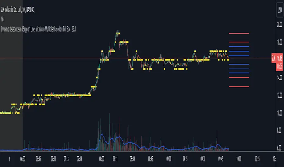
Dynamic Resistance and Support LinesThis script is designed to dynamically plot support and resistance lines based on full-dollar and half-dollar price levels relative to the close price on a chart. The script is particularly useful for day traders and scalpers, as it helps visualize key psychological price levels that often act as support and resistance zones in volatile and fast-moving markets in real time.
Key Features:
Dynamic Resistance and Support Levels:
Full-dollar levels: These are calculated by rounding the close price to the nearest full dollar and then extending the levels by adding and subtracting increments of 1 (e.g., $1, $2, $3).
Half-dollar levels: These are calculated by adding and subtracting 0.5 increments to the nearest full-dollar price, providing additional reference points. The historical full-dollar levels remain where support and resistance may have occurred in the past.
Extend Lines:
You can toggle whether the support and resistance lines are extended to the right, left, or both directions. This allows flexibility in projecting potential future areas of support or resistance.
Custom Line Extension:
The user can set the number of bars (or time periods) that the support and resistance lines will extend, giving control over how long the levels remain on the chart.
Color-Coded Lines:
Red lines represent full-dollar resistance and support levels.
Blue lines represent half-dollar levels, making it easy to differentiate between key psychological price zones.
Line Flexibility:
The script allows the lines to extend both left and right on the chart, making it useful for analyzing historical price action or projecting future price movements. The number of bars for extension is customizable, allowing for tailored setups.
Nearest Full Dollar Plot:
The nearest full-dollar price level is plotted as a yellow circle on the chart. This serves as a quick visual cue for traders to monitor price proximity to critical levels.
Benefits in Day Trading, Scalping, and Volatile Markets:
Visualizing Key Psychological Levels:
Full-dollar and half-dollar price levels often act as psychological barriers for traders. This script helps traders easily identify these levels, which are important in both fast-moving markets and during sideways consolidation.
Improved Decision-Making:
By automatically drawing these support and resistance levels, the script helps day traders and scalpers make quicker and more informed decisions, especially in volatile markets where every second counts.
Adaptability to Market Conditions:
The flexibility of extending lines based on trader preferences allows the user to adapt the script to various market conditions, such as high volatility or trend-based trading, providing a clear view of potential breakout or reversal areas.
Better Risk Management:
Having predefined support and resistance levels helps traders better manage risk, as these levels can act as logical areas for setting stop losses or taking profits.
This script is especially valuable for traders looking to capitalize on quick market movements or identify key entry and exit points during market volatility.
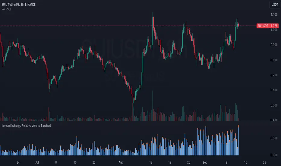
Korean Exchange Relative Volume BarchartKorean Exchange Relative Volume Barchart
The Korean Exchange Relative Volume Barchart indicator compares the trading volume of a cryptocurrency on any symbol with the combined volumes of major Korean exchanges, Upbit and Bithumb. This tool helps traders understand regional trading activities, offering insights into market sentiment influenced by Korean markets.
For example 0.5 would indicate that the Korean exchanges are doing 50% of the volume of the selected symbol.
Features:
Exchange Selection: Include or exclude Upbit and Bithumb in the comparison.
Automatic Symbol Mapping: Automatically maps the current chart's symbol to equivalent symbols on Upbit and Bithumb.
Stacked Bar Chart Visualization: Plots a stacked bar chart showing the relative volume contributions of Binance, Upbit, and Bithumb.
Usage:
Add the Indicator: Apply it to a cryptocurrency chart on TradingView.
Configure Settings: Toggle inclusion of Upbit and Bithumb in the settings.
Interpret the Chart: The stacked bar chart displays the proportion of trading volumes from each exchange.
Notes:
Symbol Compatibility: Ensure the cryptocurrency is listed on the Korean exchanges for accurate comparison.
Data Accuracy: Volumes are compared in the same base currency (e.g., BTC), so no exchange rate conversion is necessary.
Enhance your trading analysis by understanding the influence of Korean exchanges on cryptocurrency volumes with the Korean Exchange Volume Comparison indicator.
Gaussian Filter [BigBeluga]The Gaussian Filter - BigBeluga indicator is a trend-following tool that uses a Gaussian filter to smooth price data and identify directional shifts in the market. It provides dynamic signals for entering and exiting trades based on trend changes, helping traders stay aligned with the market's momentum. What sets this indicator apart is its ability to display precise entry and exit points with real-time tracking of percentage price changes, making it ideal for trend-based strategies.
SP500:
NIFTY50:
🔵 KEY FEATURES & USAGE
◉ Gaussian Filter Trend Line:
//@function GaussianFilter is used for smoothing, reducing noise, and computing derivatives of data.
//@param src (float) The source data (e.g., close price) to be smoothed.
//@param params (GaussianFilterParams) Gaussian filter parameters that include length and sigma.
//@returns (float) The smoothed value from the Gaussian filter.
gaussian_filter(float src, params) =>
var float weights = array.new_float(params.length) // Array to store Gaussian weights
total = 0.0
pi = math.pi
for i = 0 to params.length - 1
weight = math.exp(-0.5 * math.pow((i - params.length / 2) / params.sigma, 2.0))
/ math.sqrt(params.sigma * 2.0 * pi)
weights.set(i, weight)
total := total + weight
for i = 0 to params.length - 1
weights.set(i, weights.get(i) / total)
sum = 0.0
for i = 0 to params.length - 1
sum := sum + src * weights.get(i)
sum
The core functionality of the Gaussian Filter line is to show trend direction. When the trend line increases four times consecutively, it indicates an uptrend signal. Similarly, if it decreases four times in a row, it signals a downtrend. The smoothness of the filter helps traders stay on the right side of the market by filtering out noise and emphasizing the dominant trend direction.
◉ Entry and Exit Levels with Real-Time Price and Performance Data:
Each time the indicator detects a trend change, it plots an entry or exit level on the chart. For an uptrend, an entry level is marked, and for a downtrend, an exit level is plotted. These levels display the price at the time of the signal.
While the trend is ongoing, the indicator tracks the percentage change in price from the initial entry or exit signal to the current bar, updating in real-time. When a trend concludes, it displays the total percentage change from the entry or exit point to the trend's end. This feature provides valuable insights into how much the price has moved during each trend phase and allows traders to monitor the performance of each trade.
◉ Color-Coded Candlestick Representation with Trend Shift Alerts:
In addition to coloring the candlesticks based on the trend direction, the indicator also uses gray candles to highlight potential early trend shifts. For example, if the Gaussian Filter detects a downtrend but the price moves above the filter line, the candles turn gray, signaling a possible reversal or shift in momentum. Similarly, in an uptrend, if the price moves below the Gaussian Filter line, the candles turn gray as an early indication of potential bearish momentum. This visual cue helps traders stay alert to possible faster shifts in market direction, allowing for quicker decision-making.
🔵 CUSTOMIZATION
Length and Sigma for Gaussian Filter:
Adjust the length and sigma parameters to control how the Gaussian Filter smooths the price data. A longer length provides smoother trend lines, while adjusting sigma can fine-tune the level of smoothing applied.
Levels Display and Candle Coloring:
You can toggle the visibility of entry and exit levels as well as enable or disable the dynamic coloring of candlesticks based on the trend direction. The additional gray color setting provides an extra layer of information, allowing you to spot potential trend reversals early.
🔵 CONCLUSION
The Gaussian Filter indicator is a powerful tool for identifying and following market trends. By providing clear entry and exit signals, along with real-time tracking of price changes, it gives traders a structured way to manage trades and monitor performance. The color-coded candles, including gray to highlight possible trend shifts, add another dimension to visualizing market dynamics. The added flexibility of customizing colors and trend levels makes it a versatile indicator suitable for both trend-following and reversal strategies.

Combo 2/20 EMA & CCI
This is another part of my research work, where I test a combination of two strategies, receiving a combined signal. In order to understand which indicator combinations work better, which work worse, as filters for trades. This is combo strategies for get a cumulative signal.
First strategy
This indicator plots 2/20 exponential moving average. For the Mov Avg X 2/20 Indicator, the EMA bar will be painted when the Alert criteria is met.
Second strategy
The Commodity Channel Index (CCI) is best used with markets that display cyclical or seasonal characteristics, and is formulated to detect the beginning and ending of the cycles by incorporating a moving average together with a divisor that reflects both possible and actual trading ranges. The final index measures the deviation from normal, which indicates major changes in market trend.
Strategy tester settings:
Initial capital: 1000
Order size: 0.5
Commission: 0.1%
Other as default.
Indicator settings:
EMA Length: 50
CCI Length: 10
Fast MA Length: 15
Slow MA Length: 20
Other as default.
WARNING:
- For purpose educate only
- This script to change bars colors.

Trailing Stop ProTrailing Stop Pro is a sophisticated TradingView indicator designed to enhance your trading strategy by dynamically managing trailing stops based on market volatility. This tool leverages the Average True Range (ATR) to adjust stop levels, providing traders with a robust mechanism to protect profits and minimize losses.
Key Features:
Dynamic Trailing Stops: Automatically adjusts stop levels using ATR, allowing for responsive and adaptive risk management.
Customizable Inputs: Tailor the indicator to your trading style with adjustable parameters such as ATR Length, ATR Multiplier, and Source Vector.
Visual Clarity: Distinct color settings for long and short stops, with adjustable line thickness and transparency, ensuring clear visualization on your charts.
Professional Grade: The "Pro" designation signifies advanced features suitable for both novice and experienced traders seeking reliable and efficient stop management.
How It Works:
To set up the indicator, begin by defining the Chrono Point, which specifies the exact time you want the trailing stop mechanism to activate. This allows for precise control over when your stops begin to trail. Next, set the Credit Unit as the initial entry price for your trade, serving as the baseline from which the trailing stops will adjust.
The indicator uses ATR-based adjustments to determine stop levels. Customize the sensitivity of the trailing stop by adjusting the ATR Length (default is 14) and ATR Multiplier (default is 0.5). A longer ATR length smooths out volatility, while a higher multiplier increases the distance of the stop from the price.
Select your Source Vector from "High/Low," "Close," or "Open" prices as the basis for stop calculation. This flexibility allows you to align the indicator with your preferred trading strategy. The indicator plots trailing stops directly on the chart, with color-coded lines indicating long (teal) and short (red) positions. You can adjust the line thickness and transparency for optimal visibility.
The Mission Status feature automatically detects whether the trade is long or short and adjusts the trailing stop accordingly. If the price hits the trailing stop, the trade is considered exited, and the indicator calculates the profit or loss percentage.
Benefits:
Risk Management: Protect your trades from adverse market movements while locking in profits as prices move favorably.
Automation: Reduce manual intervention with automatic stop adjustments, allowing you to focus on strategic decision-making.
User-Friendly Interface: Intuitive settings and clear visual cues make it easy to integrate into your existing trading workflow.
Conclusion:
Trailing Stop Pro is an essential tool for traders looking to enhance their risk management strategies with precision and ease. By automating the trailing stop process and providing clear visual feedback, this indicator empowers you to navigate the markets with confidence. Whether you're a seasoned trader or just starting, Trailing Stop Pro offers the functionality and flexibility needed to optimize your trading performance.
The Trailing Stop Pro indicator is a tool designed to assist traders in managing risk and optimizing their trading strategies. However, it should not be considered as financial advice or a guarantee of profitability. Trading involves significant risk, and it is possible to lose more than your initial investment. Users are encouraged to thoroughly test the indicator in a demo environment and consider their own financial situation and risk tolerance before using it in live trading. Past performance is not indicative of future results, and users should seek advice from a qualified financial advisor if needed.

BTC Top Indicator - Extension from 20 Week SMA (Normalized)This Indicator calculates the logarithmic deviation of the BTCUSD price from its 20-week SMA and dynamically normalizes it between a lower signal line (-0.57) and an upper trendline defined by two historical points (May 30, 2011, at 1.75 and March 4, 2024, at 0.45).
The indicator line color changes dynamically:
green below 0
blue at 0.5
red above 1
Ideal for analyzing BTCUSD on the Index chart to identify potential overbought or oversold levels. It's better suited for identifying tops, than bottoms.

Trend Signals with TP & SL [UAlgo] StrategyThe "Trend Signals with TP & SL Strategy" is a trading strategy designed to capture trend continuation signals while incorporating sophisticated risk management techniques. This strategy is tailored for traders who wish to capitalize on trending market conditions with precise entry and exit points, automatically calculating Take Profit (TP) and Stop Loss (SL) levels based on either Average True Range (ATR) or percentage values. The strategy aims to enhance trade management by preventing multiple simultaneous positions and dynamically adapting to changing market conditions.
This strategy is highly configurable, allowing traders to adjust sensitivity, the ATR calculation method, and the cloud moving average length. Additionally, the strategy can display buy and sell signals directly on the chart, along with visual representation of entry points, stop losses, and take profits. It also features a cloud-based trend analysis using a MACD-driven color fill that indicates the strength and direction of the trend.
🔶 Key Features
Configurable Trend Continuation Signals:
Source Selection: The strategy uses the midpoint of the high-low range as the default source, but it is adjustable.
Sensitivity: The sensitivity of the trend signals can be adjusted using a multiplier, ranging from 0.5 to 5.
ATR Calculation: The strategy allows users to choose between two ATR calculation methods for better adaptability to different market conditions.
Cloud Moving Average: Traders can adjust the cloud moving average length, which is used in conjunction with MACD to provide a visual trend indication.
Take Profit & Stop Loss Management:
ATR-Based or Percent-Based: The strategy offers flexibility in setting TP and SL levels, allowing traders to choose between ATR-based multipliers or fixed percentage values.
Dynamic Adjustment: TP and SL levels are dynamically adjusted according to the selected method, ensuring trades are managed based on real-time market conditions.
Prevention of Multiple Positions:
Single Position Control: To reduce risk and enhance strategy reliability, the strategy includes an option to prevent multiple positions from being opened simultaneously.
Visual Trade Indicators:
Buy/Sell Signals: Clearly displays buy and sell signals on the chart for easy interpretation.
Entry, SL, and TP Lines: Draws lines for entry price, stop loss, and take profit directly on the chart, helping traders to monitor trades visually.
Trend Cloud: A color-filled cloud based on MACD and the cloud moving average provides a visual cue of the trend’s direction and strength.
Performance Summary Table:
In-Chart Statistics: A table in the top right of the chart displays key performance metrics, including total trades, wins, losses, and win rate percentage, offering a quick overview of the strategy’s effectiveness.
🔶 Interpreting the Indicator
Trend Signals: The strategy identifies trend continuation signals based on price action relative to an ATR-based threshold. A buy signal is generated when the price crosses above a key level, indicating an uptrend. Conversely, a sell signal occurs when the price crosses below a level, signaling a downtrend.
Cloud Visualization: The cloud, derived from MACD and moving averages, changes color to reflect the current trend. A positive cloud in aqua suggests an uptrend, while a red cloud indicates a downtrend. The transparency of the cloud offers further nuance, with more solid colors denoting stronger trends.
Entry and Exit Management: Once a trend signal is generated, the strategy automatically sets TP and SL levels based on your chosen method (ATR or percentage). The stop loss and take profit lines will appear on the chart, showing where the strategy will exit the trade. If the price reaches either the SL or TP, the trade is closed, and the respective line is deleted from the chart.
Performance Metrics: The strategy’s performance is tracked in real-time with an in-chart table. This table provides essential information about the number of trades executed, the win/loss ratio, and the overall win rate. This information helps traders assess the strategy's effectiveness and make necessary adjustments.
This strategy is designed for those who seek to engage with trending markets, offering robust tools for entry, exit, and overall trade management. By understanding and leveraging these features, traders can potentially improve their trading outcomes and risk management.
🔷 Related Script
🔶 Disclaimer
Use with Caution: This indicator is provided for educational and informational purposes only and should not be considered as financial advice. Users should exercise caution and perform their own analysis before making trading decisions based on the indicator's signals.
Not Financial Advice: The information provided by this indicator does not constitute financial advice, and the creator (UAlgo) shall not be held responsible for any trading losses incurred as a result of using this indicator.
Backtesting Recommended: Traders are encouraged to backtest the indicator thoroughly on historical data before using it in live trading to assess its performance and suitability for their trading strategies.
Risk Management: Trading involves inherent risks, and users should implement proper risk management strategies, including but not limited to stop-loss orders and position sizing, to mitigate potential losses.
No Guarantees: The accuracy and reliability of the indicator's signals cannot be guaranteed, as they are based on historical price data and past performance may not be indicative of future results.

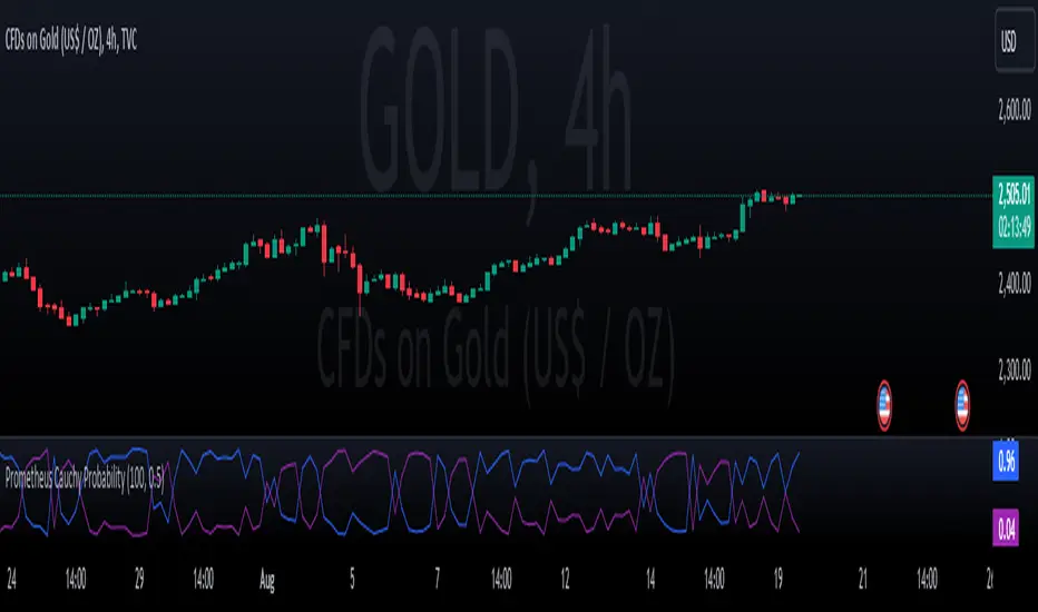
Prometheus Cauchy ProbabilityThe Cauchy probability distribution is a distribution that is better suited to be used on non normal data, such as stock returns. Markets characterized by volatility and fat-tails can be better modeled like this.
This script provides two values to a user. The blue line represents the probability for the underlying to rise. The purple line represents its probability to fall. Rise and fall by how much? By default a prediction of 0.5% is set, but users can adjust it. The script automatically calculates based on how many bars would be in an entire day. For example there are 390 minutes from 9:30am to 4:00pm est. time so the script uses 390 bars. Users have the option to set a custom bars back length.
Developer’s note. This script works best with extended market hours on. Every example shown will have it on. The more price and volatility the better!
Code breakdown:
cauchy_cdf(x, x0, gamma)=>
1 / math.pi * math.atan((x - x0) / gamma) + 0.5
This function is what calculates the Cauchy cumulative density function.
// Calculate x and gamma
x = close * (1 + pred)
x0 = hi
gamma := ta.stdev(close, Len, false)
y = cauchy_cdf(x, x0, gamma)
//down
x_lo = close * (1 - pred)
x0_lo = lo
y_lo = cauchy_cdf(x_lo, x0_lo, gamma)
x represents the target price. x0 represents the current highest price of the day. Gamma is the standard deviation of prices over the desired length. x_lo, x0_lo, are variables to determine the probability of falling. Inputting these values into the function we get back our chance of rising and falling. Our blue and purple line.
Trade Examples:
Step 1: After a move down there is some choppiness, the values are close to each other and moving sharply.
Step 2: The chance to rise (Blue Line) strongly moves above the chance to fall (Purple Line), uptrend ensues.
Step 3: Small breaks below the purple line show breaks in the overall trend.
Step 4: Strong move down in price, and up in purple line end up trend.
Step 1: Strong cross in purple and blue line, marking the start of a downtrend.
Step 2: Small breaks above the purple line show breaks in the overall trend.
Step 3: Strong move up in price, and up in the blue line end downtrend.
Day trading example:
Custom input:
Step 1: Pre market weakness ends with a move up in the blue line and price.
Step 2: Consolidation in the uptrend with a small downtrend and above the purple line.
Step 3: Strong move up in price, and up in the blue line end consolidation and resumes strong uptrend.
This example is with custom input: 100 bars back, and 1% prediction.
Step 1: Downtrend starts after a big move up.
Step 2: Big crossover in blue and purple line. Uptrend starts.
Step 3: Lines get close signaling choppiness.
Step 4: Purple crosses over blue ending uptrend.
No indicator is 100% accurate, we encourage traders to use them along with their own discretion. Please use these tools with your own decision making. Comments about desired features and updates are encouraged!
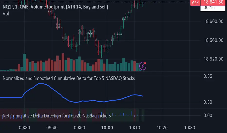
Normalized and Smoothed Cumulative Delta for Top 5 NASDAQ StocksThis script is designed to create a TradingView indicator called **"Normalized and Smoothed Cumulative Delta for Top 5 NASDAQ Stocks."** The purpose of this indicator is to track and visualize the cumulative price delta (the change in price from one period to the next) for the top five NASDAQ stocks: Apple Inc. (AAPL), Microsoft Corporation (MSFT), Alphabet Inc. (GOOGL), Amazon.com Inc. (AMZN), and Meta Platforms Inc. (FB).
### Key Features of the Script:
1. **Ticker Selection**:
- The script focuses on the top five NASDAQ stocks by automatically setting their tickers.
2. **Price Data Retrieval**:
- It fetches the closing prices for each of these stocks using the `request.security` function for the current timeframe.
3. **Delta Calculation**:
- The script calculates the delta for each stock, which is simply the difference between the current closing price and the previous closing price.
4. **Cumulative Delta Calculation**:
- It calculates the cumulative delta for each stock by adding the current delta to the previous cumulative delta. This helps track the total change in price over time.
5. **Summing and Smoothing**:
- The cumulative deltas for all five stocks are summed together.
- The script then applies an Exponential Moving Average (EMA) with a period of 5 to smooth the summed cumulative delta, making the indicator less sensitive to short-term fluctuations.
6. **Normalization**:
- To ensure the cumulative delta is easy to interpret, the script normalizes it to a range of 0 to 1. This is done by tracking the minimum and maximum values of the smoothed cumulative delta and scaling the data accordingly.
7. **Visualization**:
- The normalized cumulative delta is plotted as a smooth line, allowing users to see the overall trend of the cumulative price changes for the top five NASDAQ stocks.
- A horizontal line is added at 0.5, serving as a midline reference, which can help traders quickly assess whether the normalized cumulative delta is above or below its midpoint.
### Usage:
This indicator is particularly useful for traders and investors who want to monitor the aggregated price movements of the top NASDAQ stocks, providing a high-level view of market sentiment and trends. By smoothing and normalizing the data, it offers a clear and concise visualization that can be used to identify potential market turning points or confirm ongoing trends.
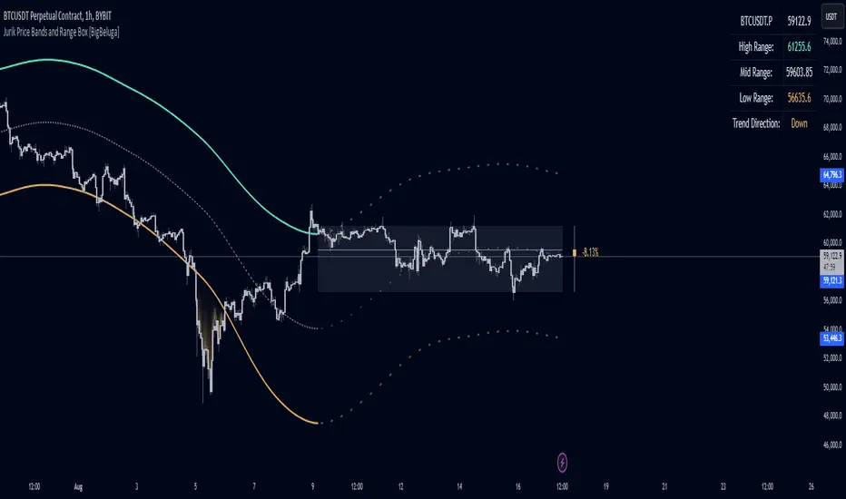
Jurik Price Bands and Range Box [BigBeluga]Jurik Price Bands and Range Box
The Jurik Price Bands and Range Box - BigBeluga indicator is an advanced technical analysis tool that combines Jurik Moving Average (JMA) based price bands with a dynamic range box. This versatile indicator is designed to help traders identify trends, potential reversal points, and price ranges over a specified period.
🔵 KEY FEATURES
● Jurik Price Bands
Utilizes Jurik Moving Average for smoother, more responsive bands
//@function Calculates Jurik Moving Average
//@param src (float) Source series
//@param len (int) Length parameter
//@param ph (int) Phase parameter
//@returns (float) Jurik Moving Average value
jma(src, len, ph) =>
var float jma = na
var float e0 = 0.0
var float e1 = 0.0
var float e2 = 0.0
phaseRatio = ph < -100 ? 0.5 : ph > 100 ? 2.5 : ph / 100 + 1.5
beta = 0.45 * (len - 1) / (0.45 * (len - 1) + 2)
alpha = math.pow(beta, phaseRatio)
e0 := (1 - alpha) * src + alpha * nz(e0 )
e1 := (src - e0) * (1 - beta) + beta * nz(e1 )
e2 := (e0 + phaseRatio * e1 - nz(jma )) * math.pow(1 - alpha, 2) + math.pow(alpha, 2) * nz(e2 )
jma := e2 + nz(jma )
jma
Consists of an upper band, lower band, and a smooth price line
Bands adapt to market volatility using Jurik MA on ATR
Helps identify potential trend reversal points and overextended market conditions
● Dynamic Range Box
Displays a box representing the price range over a specified period
Calculates high, low, and mid-range prices
Option for adaptive mid-range calculation based on average price
Provides visual representation of recent price action and volatility
● Price Position Indicator
Shows current price position relative to the mid-range
Displays percentage difference from mid-range
Color-coded for quick trend identification
● Dashboard
Displays key information including current price, range high, mid, and low
Shows trend direction based on price position relative to mid-range
Provides at-a-glance market context
🔵 HOW TO USE
● Trend Identification
Use the middle of the Range Box as the primary trend reference point
Price above the middle of the Range Box indicates an uptrend
Price below the middle of the Range Box indicates a downtrend
The bar on the right shows the percentage distance of the close from the middle of the box
This percentage indicates both trend direction and strength
Refer to the dashboard for quick trend direction confirmation
● Potential Reversal Points
Upper and lower Jurik Bands can indicate potential trend reversal points
Price reaching or exceeding these bands may suggest overextended conditions
Watch for price reaction at these levels for possible trend shifts or pullbacks
Range Box high and low can serve as additional reference points for price action
● Range Analysis
Use Range Box to gauge recent price volatility and trading range
Mid-range line can act as a pivot point for short-term price movements
Percentage difference from mid-range helps quantify price position strength
🔵 CUSTOMIZATION
The Jurik Price Bands and Range Box indicator offers several customization options:
Adjust Range Box length for different timeframe analysis
Toggle between standard and adaptive mid-range calculation
Standard:
Adaptive:
Modify Jurik MA length and deviation for band calculation
Toggle visibility of Jurik Bands
By fine-tuning these settings, traders can adapt the indicator to various market conditions and personal trading strategies.
The Jurik Price Bands and Range Box indicator provides a multi-faceted approach to market analysis, combining trend identification, potential reversal point detection, and range analysis in one comprehensive tool. The use of Jurik Moving Average offers a smoother, more responsive alternative to traditional moving averages, potentially providing more accurate signals.
This indicator can be particularly useful for traders looking to understand market context quickly, identify potential reversal points, and assess current market volatility. The combination of dynamic bands, range analysis, and the informative dashboard provides traders with a rich set of data points to inform their trading decisions.
As with all technical indicators, it's recommended to use the Jurik Price Bands and Range Box in conjunction with other forms of analysis and within the context of a well-defined trading strategy. While this indicator provides valuable insights, it should be considered alongside other factors such as overall market conditions, volume, and fundamental analysis when making trading decisions.
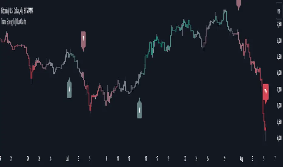
Trend Strength | Flux Charts💎 GENERAL OVERVIEW
Introducing the new Trend Strength indicator! Latest trends and their strengths play an important role for traders. This indicator aims to make trend and strength detection much easier by coloring candlesticks based on the current strength of trend. More info about the process in the "How Does It Work" section.
Features of the new Trend Strength Indicator :
3 Trend Detection Algorithms Combined (RSI, Supertrend & EMA Cross)
Fully Customizable Algorithm
Strength Labels
Customizable Colors For Bullish, Neutral & Bearish Trends
📌 HOW DOES IT WORK ?
This indicator uses three different methods of trend detection and combines them all into one value. First, the RSI is calculated. The RSI outputs a value between 0 & 100, which this indicator maps into -100 <-> 100. Let this value be named RSI. Then, the Supertrend is calculated. Let SPR be -1 if the calculated Supertrend is bearish, and 1 if it's bullish. After that, latest EMA Cross is calculated. This is done by checking the distance between the two EMA's adjusted by the user. Let EMADiff = EMA1 - EMA2. Then EMADiff is mapped from -ATR * 2 <-> ATR * 2 to -100 <-> 100.
Then a Total Strength (TS) is calculated by given formula : RSI * 0.5 + SPR * 0.2 + EMADiff * 0.3
The TS value is between -100 <-> 100, -100 being fully bearish, 0 being true neutral and 100 being fully bullish.
Then the Total Strength is converted into a color adjusted by the user. The candlesticks in the chart will be presented with the calculated color.
If the Labels setting is enabled, each time the trend changes direction a label will appear indicating the new direction. The latest candlestick will always show the current trend with a label.
EMA = Exponential Moving Average
RSI = Relative Strength Index
ATR = Average True Range
🚩 UNIQUENESS
The main point that differentiates this indicator from others is it's simplicity and customization options. The indicator interprets trend and strength detection in it's own way, combining 3 different well-known trend detection methods: RSI, Supertrend & EMA Cross into one simple method. The algorithm is fully customizable and all styling options are adjustable for the user's liking.
⚙️ SETTINGS
1. General Configuration
Detection Length -> This setting determines the amount of candlesticks the indicator will look for trend detection. Higher settings may help the indicator find longer trends, while lower settings will help with finding smaller trends.
Smoothing -> Higher settings will result in longer periods of time required for trend to change direction from bullish to bearish and vice versa.
EMA Lengths -> You can enter two EMA Lengths here, the second one must be longer than the first one. When the shorter one crosses under the longer one, this will be a bearish sign, and if it crosses above it will be a bullish sign for the indicator.
Labels -> Enables / Disables trend strength labels.
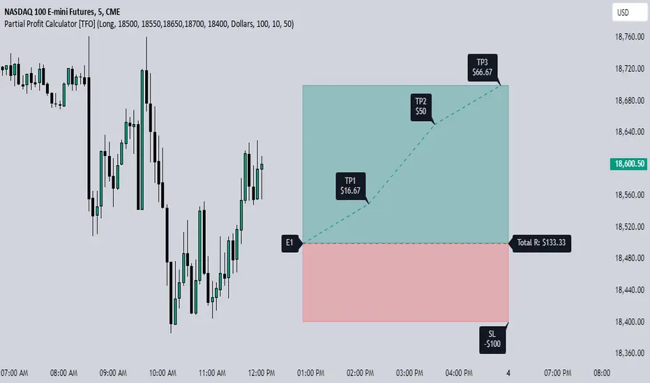
Partial Profit Calculator [TFO]This indicator was built to help calculate the outcome of trades that utilize multiple profit targets and/or multiple entries.
In its simplest form, we can have a single entry and a single profit target. As shown below in this long trade example, the indicator will draw risk and reward boxes (red and green, respectively) with several annotations. On the left-hand side, all entries will be displayed (in this case there is only one entry, "E1"). On the bottom, the "SL" label indicates the trade's stop loss placement. On the top, all target prices are displayed (in this case there is only one target, "TP1"). Lastly, on the right-hand side a label will display the total R that is to be expected from a winning trade, where R is one's unit of risk.
In the following example, we have two target prices - one at 18600 and one at 18700. You can input as many target prices as you'd like, separated by commas, i.e. "18600,18700" in this example. Make sure the values are separated by commas only, and not spaces, new lines, etc. As a result, we can see that the indicator draws where our profit targets would be with respect to our entry, E1. The indicator assumes that equal parts of the trade position are taken off at each target price. In this example on Nasdaq futures (NQ1!), since we have 2 target prices, this would be equivalent to assuming that we take exactly half the trade position off at TP1, and the remaining half of the position at TP2.
If we wanted to take more of the position off at a certain target, we could simply duplicate the target price. Here I set the target prices to "18600,18600,18700" to enforce that two thirds of the position be taken off at TP1 and TP2, while the remaining third gets taken off at TP3.
We can also show outcome annotations to describe how much R is generated from each possible trade outcome. Using the below chart as an example, the stop loss indicates a -1R loss. The total R from this trade criteria is 1.33 R, and each target price shows how much R is being generated if one were to take off an equal part of the position at said target prices. In this case, we would generate 0.17 R from taking one third of the position off at TP1, another 0.5 R from taking one third of the position off at TP2, and another 0.67 R from taking the remaining one third of the position off at TP3, all adding up to the total R indicated on the right-hand side label.
Using multiple entries works the same way as using multiple target prices, where the input should indicate each entry price separated by commas. In this example I've used "18550,18450" to achieve an average price of 18500, as indicated by the "E_avg" label that appears when more than one entry price is utilized. We can also opt to display risk as dollars instead of R values, where you can input your desired risk per trade, and all values are shown as dollar amounts instead of R multiples, as shown below with a risk per trade of $100.
This is meant to be an educational tool for trades that utilize multiple profit targets and/or entries. Hope you like it!
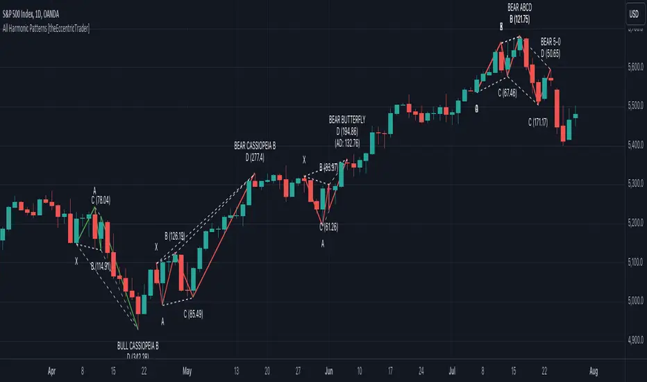
All Harmonic Patterns [theEccentricTrader]█ OVERVIEW
This indicator automatically draws and sends alerts for all of the harmonic patterns in my public library as they occur. The patterns included are as follows:
• Bearish 5-0
• Bullish 5-0
• Bearish ABCD
• Bullish ABCD
• Bearish Alternate Bat
• Bullish Alternate Bat
• Bearish Bat
• Bullish Bat
• Bearish Butterfly
• Bullish Butterfly
• Bearish Cassiopeia A
• Bullish Cassiopeia A
• Bearish Cassiopeia B
• Bullish Cassiopeia B
• Bearish Cassiopeia C
• Bullish Cassiopeia C
• Bearish Crab
• Bullish Crab
• Bearish Deep Crab
• Bullish Deep Crab
• Bearish Cypher
• Bullish Cypher
• Bearish Gartley
• Bullish Gartley
• Bearish Shark
• Bullish Shark
• Bearish Three-Drive
• Bullish Three-Drive
█ CONCEPTS
Green and Red Candles
• A green candle is one that closes with a close price equal to or above the price it opened.
• A red candle is one that closes with a close price that is lower than the price it opened.
Swing Highs and Swing Lows
• A swing high is a green candle or series of consecutive green candles followed by a single red candle to complete the swing and form the peak.
• A swing low is a red candle or series of consecutive red candles followed by a single green candle to complete the swing and form the trough.
Peak and Trough Prices
• The peak price of a complete swing high is the high price of either the red candle that completes the swing high or the high price of the preceding green candle, depending on which is higher.
• The trough price of a complete swing low is the low price of either the green candle that completes the swing low or the low price of the preceding red candle, depending on which is lower.
Historic Peaks and Troughs
The current, or most recent, peak and trough occurrences are referred to as occurrence zero. Previous peak and trough occurrences are referred to as historic and ordered numerically from right to left, with the most recent historic peak and trough occurrences being occurrence one.
Upper Trends
• A return line uptrend is formed when the current peak price is higher than the preceding peak price.
• A downtrend is formed when the current peak price is lower than the preceding peak price.
• A double-top is formed when the current peak price is equal to the preceding peak price.
Lower Trends
• An uptrend is formed when the current trough price is higher than the preceding trough price.
• A return line downtrend is formed when the current trough price is lower than the preceding trough price.
• A double-bottom is formed when the current trough price is equal to the preceding trough price.
Range
The range is simply the difference between the current peak and current trough prices, generally expressed in terms of points or pips.
Wave Cycles
A wave cycle is here defined as a complete two-part move between a swing high and a swing low, or a swing low and a swing high. The first swing high or swing low will set the course for the sequence of wave cycles that follow; for example a chart that begins with a swing low will form its first complete wave cycle upon the formation of the first complete swing high and vice versa.
Figure 1.
Retracement and Extension Ratios
Retracement and extension ratios are calculated by dividing the current range by the preceding range and multiplying the answer by 100. Retracement ratios are those that are equal to or below 100% of the preceding range and extension ratios are those that are above 100% of the preceding range.
Fibonacci Retracement and Extension Ratios
The Fibonacci sequence is a series of numbers in which each number is the sum of the two preceding numbers, starting with 0 and 1. For example 0 + 1 = 1, 1 + 1 = 2, 1 + 2 = 3, and so on. Ultimately, we could go on forever but the first few numbers in the sequence are as follows: 0 , 1, 1, 2, 3, 5, 8, 13, 21, 34, 55, 89, 144.
The extension ratios are calculated by dividing each number in the sequence by the number preceding it. For example 0/1 = 0, 1/1 = 1, 2/1 = 2, 3/2 = 1.5, 5/3 = 1.6666..., 8/5 = 1.6, 13/8 = 1.625, 21/13 = 1.6153..., 34/21 = 1.6190..., 55/34 = 1.6176..., 89/55 = 1.6181..., 144/89 = 1.6179..., and so on. The retracement ratios are calculated by inverting this process and dividing each number in the sequence by the number proceeding it. For example 0/1 = 0, 1/1 = 1, 1/2 = 0.5, 2/3 = 0.666..., 3/5 = 0.6, 5/8 = 0.625, 8/13 = 0.6153..., 13/21 = 0.6190..., 21/34 = 0.6176..., 34/55 = 0.6181..., 55/89 = 0.6179..., 89/144 = 0.6180..., and so on.
Fibonacci ranges are typically drawn from left to right, with retracement levels representing ratios inside of the current range and extension levels representing ratios extended outside of the current range. If the current wave cycle ends on a swing low, the Fibonacci range is drawn from peak to trough. If the current wave cycle ends on a swing high the Fibonacci range is drawn from trough to peak.
Measurement Tolerances
Tolerance refers to the allowable variation or deviation from a specific value or dimension. It is the range within which a particular measurement is considered to be acceptable or accurate. I have applied this concept in my pattern detection logic and have set default tolerances where applicable, as perfect patterns are, needless to say, very rare.
Chart Patterns
Generally speaking price charts are nothing more than a series of swing highs and swing lows. When demand outweighs supply over a period of time prices swing higher and when supply outweighs demand over a period of time prices swing lower. These swing highs and swing lows can form patterns that offer insight into the prevailing supply and demand dynamics at play at the relevant moment in time.
‘Let us assume… that you the reader, are not a member of that mysterious inner circle known to the boardrooms as “the insiders”… But it is fairly certain that there are not nearly so many “insiders” as amateur trader supposes and… It is even more certain that insiders can be wrong… Any success they have, however, can be accomplished only by buying and selling… hey can do neither without altering the delicate poise of supply and demand that governs prices. Whatever they do is sooner or later reflected on the charts where you… can detect it. Or detect, at least, the way in which the supply-demand equation is being affected… So, you do not need to be an insider to ride with them frequently… prices move in trends. Some of those trends are straight, some are curved; some are brief and some are long and continued… produced in a series of action and reaction waves of great uniformity. Sooner or later, these trends change direction; they may reverse (as from up to down), or they may be interrupted by some sort of sideways movement and then, after a time, proceed again in their former direction… when a price trend is in the process of reversal… a characteristic area or pattern takes shape on the chart, which becomes recognisable as a reversal formation… Needless to say, the first and most important task of the technical chart analyst is to learn to know the important reversal formations and to judge what they may signify in terms of trading opportunities’ (Edwards & Magee, 1948).
This is as true today as it was when Edwards and Magee were writing in the first half of the last Century, study your patterns and make judgements for yourself about what their implications truly are on the markets and timeframes you are interested in trading.
Over the years, traders have come to discover a multitude of chart and candlestick patterns that are supposed to pertain information on future price movements. However, it is never so clear cut in practice and patterns that where once considered to be reversal patterns are now considered to be continuation patterns and vice versa. Bullish patterns can have bearish implications and bearish patterns can have bullish implications. As such, I would highly encourage you to do your own backtesting.
There is no denying that chart patterns exist, but their implications will vary from market to market and timeframe to timeframe. So it is down to you as an individual to study them and make decisions about how they may be used in a strategic sense.
Harmonic Patterns
The concept of harmonic patterns in trading was first introduced by H.M. Gartley in his book "Profits in the Stock Market", published in 1935. Gartley observed that markets have a tendency to move in repetitive patterns, and he identified several specific patterns that he believed could be used to predict future price movements. The bullish and bearish Gartley patterns are the oldest recognized harmonic patterns in trading and all the other harmonic patterns are modifications of the original Gartley patterns. Gartley patterns are fundamentally composed of 5 points, or 4 waves.
Since then, many other traders and analysts have built upon Gartley's work and developed their own variations of harmonic patterns. One such contributor is Larry Pesavento, who developed his own methods for measuring harmonic patterns using Fibonacci ratios. Pesavento has written several books on the subject of harmonic patterns and Fibonacci ratios in trading. Another notable contributor to harmonic patterns is Scott Carney, who developed his own approach to harmonic trading in the late 1990s and also popularised the use of Fibonacci ratios to measure harmonic patterns. Carney expanded on Gartley's work and also introduced several new harmonic patterns, such as the Shark pattern and the 5-0 pattern.
█ INPUTS
• Change pattern and label colours
• Show or hide patterns individually
• Adjust pattern tolerances
• Set or remove alerts for individual patterns
█ NOTES
You can test the patterns with your own strategies manually by applying the indicator to your chart while in bar replay mode and playing through the history. You could also automate this process with PineScript by using the conditions from my swing and pattern libraries as entry conditions in the strategy tester or your own custom made strategy screener.
█ LIMITATIONS
All green and red candle calculations are based on differences between open and close prices, as such I have made no attempt to account for green candles that gap lower and close below the close price of the preceding candle, or red candles that gap higher and close above the close price of the preceding candle. This may cause some unexpected behaviour on some markets and timeframes. I can only recommend using 24-hour markets, if and where possible, as there are far fewer gaps and, generally, more data to work with.
█ SOURCES
Edwards, R., & Magee, J. (1948) Technical Analysis of Stock Trends (10th edn). Reprint, Boca Raton, Florida: Taylor and Francis Group, CRC Press: 2013.
Gaussian Weighted Moving Average with Forecast [CHE]Presentation for TradingView: Gaussian Weighted Moving Average with Forecast
Introduction
Welcome to our presentation on the "Gaussian Weighted Moving Average with Forecast" (GWMA). This script, written in Pine Script™, offers an enhanced method for analyzing and predicting price movements on TradingView. The script combines Gaussian Weighted Moving Averages and polynomial regression to provide accurate and customizable forecasts.
Overview
Title: Gaussian Weighted Moving Average with Forecast
Author: chervolino
License: Mozilla Public License 2.0
Main Features
1. Gaussian Weighted Moving Average (GWMA):
- Calculates a weighted moving average using a Gaussian weighting function.
- Parameters for length and standard deviation allow fine-tuning of the smoothing effect.
2. Polynomial Regression with Forecast:
- Creates a model to predict future price movements.
- Adjustable length and degree of polynomial regression.
- Option to extrapolate predictions and visualize them.
3. Visual Representation:
- Uses lines and colors to depict trend changes.
- Customizable colors for upward and downward trends.
Input Parameters
Length: Length of the moving average (default: 50)
Standard Deviation: Standard deviation for Gaussian weighting (default: 10.0)
Width: Width of the plotted lines (default: 1)
Colors: Customizable colors for upward and downward trends
Forecast Length: Length of the forecast period (default: 20)
Extrapolate Length: Length of the extrapolation (default: 50)
Polynomial Degree: Degree of the polynomial regression (default: 3)
Lock Forecast: Option to lock and stabilize the forecast
Core Algorithms
1. Gaussian Weight Calculation:
gaussian_weight(x, std_dev) =>
1 / (std_dev * math.sqrt(2 * math.pi)) * math.exp(-0.5 * math.pow(x / std_dev, 2))
2. GWMA Calculation:
calculate_gwma(length, std_dev) =>
// Algorithm to calculate the weighted moving average
3. Initialize Lines for Polynomial Regression:
initialize_lines_array(extrapolate, length) =>
// Initialize array lines
4. Create Design Matrix for Polynomial Regression:
get_design_matrix(length, degree) =>
// Create the design matrix
5. Calculate and Plot Polynomial Regression:
calculate_polynomial_regression(src, length, degree, extrapolate, lines_arr, lock, width, upward_color, downward_color) =>
// Algorithm to calculate polynomial regression and plot the forecast
Combining Indicators: Originality and Usefulness
The combination of Gaussian Weighted Moving Average and polynomial regression provides traders with a robust tool for trend analysis and prediction. The GWMA smooths out price data while emphasizing recent prices, making it sensitive to short-term trends. Polynomial regression, on the other hand, offers a mathematical approach to model and forecast future prices based on historical data. By integrating these two methodologies, traders can achieve a more comprehensive view of market trends and potential future movements, making the tool highly valuable for decision-making.
Explanation for Users
Most TradingView users are not familiar with Pine Script, so a clear description is essential for understanding how to use the script.
Gaussian Weighted Moving Average (GWMA): This indicator calculates a moving average using Gaussian weights, which gives more importance to recent prices. The length and standard deviation parameters allow users to control the sensitivity and smoothness of the average.
Polynomial Regression with Forecast: This feature uses polynomial regression to model the price trend and predict future movements. Users can adjust the length of the historical data used, the degree of the polynomial, and the length of the forecast. The script plots these predictions, making it easier for traders to visualize potential future price paths.
Visualization of Results
1. GWMA Plotting:
plot(gaussian_ma_result, title="GWMA", color=line_color, linewidth=width_input)
2. Forecast Extrapolation:
plot(forecast_val, 'Extrapolation', offset=extrapolate_setting, linewidth=width_input, style=plot.style_circles)
Conclusion
The "Gaussian Weighted Moving Average with Forecast" script provides a powerful tool for analyzing and predicting price movements on TradingView. By combining Gaussian weighting and polynomial regression, it offers a precise and customizable method for trend analysis and forecasting.
Thank you for your attention! For any questions or further information, please feel free to reach out.

Prometheus IQR bandsThis indicator is a tool that uses market data to plot bands along with a price chart.
This tool uses interquartile range (IQR) instead of Standard Deviation (STD) because market returns are not normally distributed. There is also no way to tell if the pocket of the market you are looking at is normally distributed. So using methods that work better with non-normal data minimizes risk more than using a different process.
Calculation
Code for helper functions:
// Function to calculate the percentile value
percentile(arr, p) =>
index = math.floor(p * (array.size(arr) - 1) + 0.5)
array.get(arr, index)
manual_iqr(data, lower_percentile, upper_percentile)=>
// Sort the data
data_arr = array.new()
for i = 0 to lkb_
data_arr.push(close )
array.sort(data_arr)
sorted_data = data_arr.copy()
n = array.size(data_arr)
// Calculate the specified percentiles
Q1 = percentile(sorted_data, lower_percentile)
Q3 = percentile(sorted_data, upper_percentile)
// Calculate IQR
IQR = Q3 - Q1
// Return the IQR
IQR
IQRB(lkb_, sens)=>
sens_l = sens/100
sens_h = (100-sens)/100
val = manual_iqr(close, sens_l, sens_h)
sma = ta.sma(close, int(lkb_))
upper = sma + val
lower = sma - val
Percentile Calculation (percentile function):
Calculates the percentile value of an array (arr) at a given percentile (p).
Uses linear interpolation to find the exact percentile value in a sorted array.
Manual IQR Calculation (manual_iqr function):
Converts the input data into an array (data_arr) and sorts it.
Computes the lower and upper quartiles (Q1 and Q3) using the specified percentiles (lower_percentile and upper_percentile).
Computes the Interquartile Range (IQR) as IQR = Q3 - Q1.
Returns the computed IQR.
IQRB Function Calculation (IQRB function):
Converts the sensitivity percentage (sens) into decimal values (sens_l for lower percentile and sens_h for upper percentile).
Calls manual_iqr with the closing prices (close) and the lower and upper percentiles.
Calculates the Simple Moving Average (SMA) of the closing prices (close) over a specified period (lkb_).
Computes the upper and lower bands of the IQR using the SMA and the calculated IQR (val).
Returns an array containing the upper band, lower band, and SMA values.
After the IQR is calculated at the specified sensitivity it is added to and subtracted from a SMA of the specified period.
This provides us with bands of the IQR sensitivity we want.
Trade Examples
Step 1: Price quickly and strongly breaks below the bottom band and continues there for some bars.
Step 2: Price re-enters the bottom band and has a strong reversal.
Step 1: Price strongly breaks above the top band and continues higher.
Step 2: Price breaks below the top band and reverses to the downside.
Step 3: Price breaks below the bottom band after our previous reversal.
Step 4: Price regains that bottom band and reverses to the upside.
Step 5: Price continues moving higher and does not break above the top band or reverse.
Step 1: Price strongly breaks above the top band and continues higher.
Step 2: Price breaks below the top band and reverses to the downside.
Step 3: Price breaks below the bottom band after our previous reversal.
Step 4: Price regains that bottom band and reverses to the upside.
Step 5: Price strongly breaks above the top band after the previous reversal.
Step 6: Price breaks below the top band and reverses down.
Step 7: Price strongly breaks above the top band and continues moving higher.
Step 8: Price breaks below the top band and reverses down.
Step 9: Price strongly breaks above the top band and continues moving higher.
Step 10: Price breaks below the top band and reverses down.
Step 1: Price breaks above the top band.
Step 2: Price drops below the top band and chops slightly, without a large reversal from that break.
Step 3: Price breaks below the bottom band.
Step 4: Price re-enters the bottom band and just chops, no large reversal.
Step 5: Price breaks below the bottom band.
Step 6: Price retakes the bottom band and strongly reverses.
This tool can be uses to spot reversals and see when trends may continue as the stay inside the bands. No indicator is 100% accurate, we encourage traders to not follow them blindly and use them as tools.

MVRV-Z adjusted EN version (by ilyaevp95)Descriptions:
The MVRV Z-Score indicator is a powerful tool designed by original authors Murad Mahmudov and David Puell for BTC to help traders make informed decisions about their cryptocurrency investments. It is based on the MVRV (Market Value to Realized Value) metric, which measures the relationship between the market capitalization and the realized capitalization of a cryptocurrency. The indicator provides signals for accumulating or selling an asset based on deviations in market capitalization from realized capitalization.
How it works:
Market Capitalization : This is the total value of coins that have been issued at a given point in time. Market capitalization is calculated by multiplying the current price of the asset by the number of coins that have been issued.
Realized Capitalization (Realized Price) : This is the amount of money that has been spent on purchasing a particular asset. In the context of cryptocurrencies, it represents the sum of all transaction values for a specific blockchain. Realized capitalization can be calculated using historical data on transaction prices.
MVRV Metric : The MVRV metric compares market capitalization with realized capitalization, providing a measure of how overvalued or undervalued a cryptocurrency is relative to its historical transaction data. A high MVRV value indicates that the market is overvaluing the asset, while a low MVRV suggests undervaluation.
Z-Score Calculation : The Z-score is a statistical measure that normalizes the deviation of market capitalization from its mean value (realized capitalization) to a standard deviation. This makes it possible to compare assets that have different values and time periods, as it takes into account the volatility of the market.
Note: For accurate Z-score calculation, you need to use the indicator on a chart with a mostly complete historical data set for a specific cryptocurrency.
Signals : Based on the Z-score, the indicator generates signals for accumulation or sale. If the Z-score falls below a certain threshold (negative), it may indicate an opportunity to accumulate the asset. Conversely, if the Z-score rises above a positive threshold, it could suggest a potential sell signal.
The indicator uses a color-coded system to provide traders with visual cues:
Green background indicates a signal to accumulate.
Orange (Red) background indicates a signal to sell.
Deviations exceeding the specified thresholds by 1 and 2 Z (positive direction), 0.5 and 1 Z (negative direction) are highlighted in a brighter color, indicating more extreme deviations.
Note: The signals provided by this indicator should not be considered financial advice. Traders should conduct their own research (DYOR) before making any investment decisions.
Parameters: The indicator provides several parameters for customization:
Blockchain : The blockchain for which the analysis is performed. This allows the user to select the specific blockchain they are interested in analyzing. The default value is BTC.
Z threshold for positive deviations : This parameter sets the threshold above which the deviation will be considered positive. A higher value will result in fewer signals, while a lower value may generate more false signals. The default value is 3.0.
Z threshold for negative deviations : Similar to the previous parameter, this sets the threshold below which the deviation will be considered negative. The default value is 0.
Market Capitalization : There are two types of market capitalization available: Standard and Free float coin capitalization. Free float is calculated by multiplying its current price by the total number of units in free circulation - the number that are not locked in any contracts or other forms of restriction. For DASH, ZEC, BAT and ALGO available only Free float capitalization. The default value is "Standard"
Negative Deviation Filter Mode : When enabled, if the deviation has been positive for a certain number of previous weeks (the default value is 40 weeks), the indicator will not generate a signal to accumulate. This helps to avoid false signals during the start of a bearish market. This may be helpful for volatile coins, whose price can drastically fall below the realized price after the end of a bull market. The default setting is "disabled".
Display Options:
MVRV plot : Displays the MVRV metric for the selected blockchain.
Z-Score plot : Shows the Z-score calculated by the indicator.
Realized Price plot : Provides a visual representation of the realized price of the cryptocurrency on main chart.
S ignal Display : Choose whether to display signals on the main chart or in a separate panel.
Historical mode : Choose whether to show signals for all historical data on the chart or for a certain number of periods. The default setting is "disabled".
