XAMD - cycles shows a table of active amd phases saves the trouble of having to look through htfs and you just see a table of them allPine Script®指標由xxcizz提供已更新 20
Hedge Fund Session Ranges [GMT+2] - Multi-Timezone TrackingOverview This professional-grade tool is designed for institutional-style trading, specifically focusing on the Liquidity Cycles of the global markets. It allows traders to visualize key trading windows (Asia, Europe, and US) with precision, using a fixed GMT+2 offset—ideal for traders aligned with Middle Eastern or Eastern European timezones. Key Features Triple Session Tracking: Includes pre-defined windows for Asia, London Morning, and NY Afternoon. Dynamic Box Scaling: Automatically calculates and visualizes the High/Low range of each session in real-time. GMT+2 Optimization: Built-in timezone handling to ensure your charts align perfectly with local bank hours. Clean Visuals: Minimalist design to avoid chart clutter, allowing for clear price action analysis. Why Trade Sessions? Institutional volume isn't distributed evenly throughout the day. By identifying the Asian Range (01:00-06:00), the London Open (10:00-12:00), and the NY Reversal/Trend (16:30-18:30), traders can identify "Liquidity Grabs" and "Expansion Phases" more effectively.Pine Script®指標由netha0141提供5
Neeson Mayer MultipleIntegrating the Mayer Multiple Indicator: A Practical Guide for Market Analysis Introduction The Mayer Multiple indicator is a specialized tool designed to assess asset valuations relative to their long-term historical trends. By comparing current price action against a long-term simple moving average, this indicator provides a quantitative framework for identifying potential overbought and oversold conditions. This article explains the rationale behind its design, operational mechanics, practical applications, and unique value proposition. Purpose and Functionality The primary function of the Mayer Multiple indicator is to measure how far current prices deviate from a long-term moving average, expressed as a ratio. This measurement helps traders and investors identify: Extreme valuation levels that may signal potential reversal points Long-term trend strength and sustainability Market psychology shifts between fear and greed cycles Originally popularized in Bitcoin analysis, the indicator's principles apply to any volatile asset class where mean reversion tendencies exist alongside strong trend characteristics. Operational Principles The indicator operates through several interconnected components: Core Calculation Mechanism At its heart, the indicator calculates the Mayer Multiple by dividing the current closing price by a configurable simple moving average (default: 200 periods). This ratio represents how many times the current price exceeds its long-term average, providing an immediate visual reference for valuation extremes. Multi-Level Threshold System Four configurable thresholds create distinct market condition zones: Optimal Buy Zone (default: 0.7) - Historically extreme undervaluation Undervalued Zone (default: 1.0) - Moderate undervaluation Overvalued Zone (default: 2.4) - Moderate overvaluation Optimal Sell Zone (default: 3.5) - Historically extreme overvaluation These thresholds create a graduated scale of market conditions rather than binary signals. Visual Signal Hierarchy A sophisticated color-coding system prioritizes different signal types based on their significance: White/Gray: Neutral territory (between undervalued and overvalued thresholds) Aqua: Entering undervalued territory (potential accumulation zone) White: Reaching optimal buying conditions (historically rare opportunities) Yellow: Entering overvalued territory (potential distribution zone) Orange: Reaching optimal selling conditions (historically rare extremes) Green: Emerging from optimal buying conditions (momentum shift confirmation) Red: Retreating from optimal selling conditions (momentum reversal confirmation) This hierarchy helps users distinguish between entry signals, exit signals, and confirmation signals. Integration Rationale The integration of these components follows a logical progression: Mathematical Foundation The moving average provides a stable reference point that filters out short-term noise while maintaining sensitivity to long-term trend changes. The ratio format normalizes values across different price levels and timeframes, enabling cross-asset comparisons. Behavioral Finance Alignment The threshold system corresponds to documented market psychology patterns. The extreme thresholds (optimal buy/sell) represent points where fear or greed typically reach maximum intensity, while the moderate thresholds represent early warning levels. Progressive Signal Detection The indicator tracks both threshold breaches and retreats from extreme zones. This dual-tracking approach captures not only when conditions become extreme but also when they begin to normalize—often the most actionable moments for position adjustments. Component Synergy The indicator's components work together through a continuous feedback loop: Calculation Engine: Continuously computes the core ratio, serving as the foundation for all subsequent analysis. Threshold Comparator: Compares the current ratio against user-defined thresholds, categorizing market conditions in real-time. Signal Generator: Identifies specific events (threshold crossings, zone entries/exits) and assigns appropriate visual representations. Visual Renderer: Displays the information through colored histograms, reference lines, and data tables, creating an intuitive interface. Alert System: Monitors for predefined conditions and notifies users of significant developments without requiring constant screen monitoring. This integrated approach transforms raw price data into structured, actionable information while maintaining mathematical rigor and visual clarity. Practical Application Guidelines Parameter Customization Users should adjust parameters based on: Asset volatility (higher volatility assets may require wider thresholds) Timeframe (longer timeframes may benefit from longer moving averages) Personal risk tolerance (conservative traders may use tighter thresholds) Signal Interpretation Framework Zone-Based Analysis: Focus on which zone the indicator occupies rather than chasing individual data points Confirmation Seeking: Use extreme zone signals (white/orange) as alerts for further analysis rather than automatic trade triggers Momentum Assessment: Observe how quickly the indicator moves between zones as a measure of trend strength Complementary Tools The Mayer Multiple works best when combined with: Volume analysis to confirm participation during extreme readings Momentum indicators to identify potential divergence Support/resistance levels for precise entry/exit timing Fundamental analysis for context validation Distinctive Attributes Original Implementation Features Progressive Color System: Unlike binary indicators, this implementation provides graduated signals through a carefully prioritized color hierarchy. Dual-Signal Detection: The indicator captures both threshold breaches and retreats, offering insights into momentum shifts rather than just static levels. Contextual Display: The integrated data table provides immediate access to key metrics without cluttering the chart space. Customizable Framework: All thresholds and calculation periods are adjustable, allowing adaptation to different market regimes and trading styles. Practical Innovation The indicator's design emphasizes usability through: Immediate visual comprehension via color coding Clear separation between alert conditions and confirmation signals Balanced information density (sufficient data without overload) Flexible integration with existing trading workflows Responsible Usage Considerations Empirical Perspective Historical analysis suggests that assets frequently revert toward their long-term moving averages, but the timing and extent of such reversions vary significantly. The indicator identifies statistical extremes rather than predicting immediate price movements. Risk Management Integration Users should: Treat extreme readings as risk management triggers rather than directional forecasts Consider position sizing based on distance from the moving average Implement stop-loss strategies regardless of indicator readings Avoid allocating excessive weight to any single indicator Performance Realism The indicator does not guarantee profitable outcomes. Its value lies in providing structured information about valuation extremes, which must be interpreted within broader market context and individual risk parameters. Conclusion The Mayer Multiple indicator represents a thoughtfully integrated approach to long-term valuation analysis. By combining mathematical rigor with behavioral insights and practical visualization, it provides traders with a structured framework for assessing market extremes. Its modular design allows customization while maintaining core analytical integrity, and its emphasis on graduated signals helps avoid the oversimplification common in technical indicators. When used as part of a comprehensive trading methodology with appropriate risk management, it can contribute valuable perspective to the decision-making process.Pine Script®指標由neeson1987提供5
Gann Octave 8 Ver.2.0Gann Octave 8 Ver.2.0 - Complete Trading Guide Overview This indicator combines W.D. Gann's time-tested principles of market geometry with modern technical analysis. It identifies key market structures and projects precise support/resistance levels along with angular momentum lines to help traders identify high-probability trading opportunities. ________________________________________ Core Concepts 1. Gann's Octave Division (The Rule of 8) W.D. Gann discovered that markets move in harmonic divisions based on the number 8. This indicator divides any swing movement into 8 equal parts (octaves): • 0% - Swing extreme (High for bearish, Low for bullish) • 12.5% - First octave • 25% - Quarter level • 37.5% - Three-eighths level • 50% - Midpoint (most critical level) • 62.5% - Five-eighths level • 75% - Three-quarter level • 87.5% - Seventh octave • 100% - Swing extreme (opposite end) Why 8? Gann believed natural market cycles follow mathematical harmonics. The octave division provides precise entry and exit points that frequently act as support/resistance zones. 2. Gann Angles (Price-Time Relationship) Gann angles represent the relationship between price movement and time. Each angle shows different momentum levels: • 1x1 (Black) - 45° angle, perfect balance between price and time. Most important Gann angle. Represents the natural trend line. • 2x1 (Red) - Steeper angle, 2 units of price per 1 unit of time. Shows strong momentum. • 1x2 (Red) - Flatter angle, 1 unit of price per 2 units of time. Shows weak momentum. • 4x1 & 1x4 (Blue) - Even more extreme angles indicating very strong or very weak trends. • 8x1 & 1x8 (Orange) - Most extreme angles, parabolic moves or complete consolidation. Key Principle: When price is above the 1x1 angle = bullish. Below 1x1 = bearish. When price crosses from one angle to another, it signals a change in momentum. ________________________________________ How the Indicator Works Structure Detection The indicator automatically identifies market swings using pivot points: 1. Bullish Structure (Green): Detected when price makes a higher high o Octave levels calculated from swing low (0%) to swing high (100%) o Gann angles project upward from the swing low 2. Bearish Structure (Red): Detected when price makes a lower low o Octave levels calculated from swing high (0%) to swing low (100%) o Gann angles project downward from the swing high Dynamic Updates • Swing Tracker ON: Levels update continuously as the swing evolves • Swing Tracker OFF: Levels lock at the initial swing detection (cleaner charts) Historical Structures The indicator maintains previous swing structures based on "Number of Swings to Show": • Set to 1: Only current structure (cleanest) • Set to 2-3: Current + recent history (recommended for context) • Set to 4+: Multiple historical structures (may overlap but shows pattern) ________________________________________ Trading Strategy Entry Signals BUY SIGNALS (Green Triangle Up ▲) Signal 1: Bounce from Support Levels • Price drops to 0%, 50%, or 100% level and reverses • Best when combined with bullish candlestick pattern (hammer, engulfing) • Entry: On signal confirmation • Stop Loss: Below the support level (0.5-1% below) • Target: Next octave level up (12.5%, 25%, 50%) Signal 2: Breakout Above Resistance • Price breaks above 50% or 100% level with momentum • Confirms trend continuation or reversal • Entry: On close above the level • Stop Loss: Below the breakout level • Target: Previous swing high or next major level Signal 3: Gann Angle Support • Price bounces off 1x1 angle (black line) • Indicates trend is intact • Entry: When price respects the angle • Stop Loss: Below the 1x1 angle • Target: Next resistance level SELL SIGNALS (Red Triangle Down ▼) Signal 1: Rejection from Resistance Levels • Price rallies to 0%, 50%, or 100% level and reverses • Best when combined with bearish candlestick pattern (shooting star, bearish engulfing) • Entry: On signal confirmation • Stop Loss: Above the resistance level (0.5-1% above) • Target: Next octave level down (87.5%, 75%, 50%) Signal 2: Breakdown Below Support • Price breaks below 50% or 0% level with momentum • Confirms trend continuation or reversal • Entry: On close below the level • Stop Loss: Above the breakdown level • Target: Previous swing low or next major level Signal 3: Gann Angle Resistance • Price fails at 1x1 angle (black line) • Indicates trend weakness • Entry: When price rejects the angle • Stop Loss: Above the 1x1 angle • Target: Next support level ________________________________________ Advanced Trading Techniques 1. The 50% Rule (Most Powerful) The 50% octave level is the most critical in Gann theory: • In Uptrend: Price should not break below 50% retracement. If it holds = trend intact, go long. • In Downtrend: Price should not break above 50% retracement. If it holds = trend intact, go short. • Reversal: Breaking and closing beyond 50% often signals trend reversal. 2. Gann Angle Confluence When multiple Gann angles converge with octave levels = HIGH probability zone: • Look for price to bounce or reverse at these zones • Example: 1x2 angle meets 50% level = strong support/resistance • These zones often become pivot points 3. Multiple Timeframe Analysis • Use higher timeframe (daily) for major structure • Use lower timeframe (5min, 15min) for precise entries • Take trades when both timeframes align 4. Swing Failure Pattern • Price breaks a key level (e.g., 50%) but quickly reverses back • This "false breakout" often leads to strong move in opposite direction • Wait for signal in the reversal direction ________________________________________ Settings Optimization For Day Trading (Scalping) • Structure Period: 0-2 (22 bars or less) • Number of Swings: 1 (only current structure) • Signal Sensitivity: High • Swing Tracker: OFF (cleaner) For Swing Trading • Structure Period: 4-5 (44-88 bars) • Number of Swings: 2-3 • Signal Sensitivity: Medium • Swing Tracker: ON or OFF (preference) For Position Trading • Structure Period: 6-8 (176+ bars) • Number of Swings: 3-5 • Signal Sensitivity: Low • Swing Tracker: ON ________________________________________ Common Patterns to Watch Bullish Reversal Setup 1. Price in bearish structure (red levels) 2. Price drops to 100% level (swing low) 3. Buy signal appears (green triangle) 4. Price breaks back above 50% level 5. Action: Go long with stop below 100% Bearish Reversal Setup 1. Price in bullish structure (green levels) 2. Price rises to 100% level (swing high) 3. Sell signal appears (red triangle) 4. Price breaks back below 50% level 5. Action: Go short with stop above 100% Trend Continuation 1. Price respects 1x1 Gann angle 2. Small pullback to 25% or 37.5% level 3. Buy/sell signal appears 4. Action: Enter in trend direction ________________________________________ ________________________________________ Signal Sensitivity Guide • Low: Conservative, only major breakouts (3-5 signals per day) • Medium: Balanced, includes approaches (5-10 signals per day) • High: Aggressive, includes bounces (10-20 signals per day) Choose based on your trading style and risk tolerance ________________________________________ Final Words This indicator is a powerful tool, but remember: "The market is never wrong. Opinions are." - W.D. Gann • No indicator is 100% accurate • Always combine with price action and volume • Backtest on your instrument and timeframe • Keep learning and adapting your strategy • Discipline and risk management are more important than the perfect setup Happy Trading! 📈 Pine Script®指標由TimePriceDecoder提供已更新 33627
Momentum Structural AnalysisMomentum Structural Analysis (MSA‑style Oscillator) This indicator implements a simple, MSA‑style momentum oscillator that measures how far price has moved above or below its own long‑term trend on the active timeframe, expressed in percentage terms. Instead of looking at raw price, it "oscillates" price around a timeframe‑appropriate simple moving average (SMA) and plots the percentage distance from that SMA as an orange line around a zero baseline. Zero means price is exactly at its structural trend; positive values mean price is extended above trend; negative values mean it is trading below trend. The script automatically selects the SMA length based on the chart timeframe: On daily charts it uses the configurable Daily SMA Length (default 252 trading days, roughly 1 year). On weekly charts it uses Weekly SMA Length (default 208 weeks). On monthly charts it uses Monthly SMA Length (default 120 months). This approach is inspired by the ideas behind Momentum Structural Analysis (MSA), which studies where a market trades relative to long‑term moving averages and then treats the momentum line (the oscillator) as the primary object of analysis. The goal is to highlight structural overbought/oversold conditions and regime changes that are often clearer on momentum than on the raw price chart. -------------------------------------------------- What the script computes and how it works For each bar, the indicator: Chooses an SMA length based on the current timeframe (daily/weekly/monthly). Calculates the SMA of the close. Computes the percentage distance: \text{Diff %} = \frac{\text{Close} - \text{SMA}}{\text{SMA}} \times 100 Plots this Diff % as an orange line, with a dashed horizontal zero line as the base. This produces a momentum oscillator that oscillates around zero and reflects the "structural" position of price versus its own long‑term mean. -------------------------------------------------- How to use it on index charts (e.g., NIFTY50) On indices like NIFTY50, use the indicator to see how stretched the index is versus its structural trend. Typical uses: Identify extremes: a). Historically high positive readings can signal euphoric, late‑stage conditions where risk is elevated. b). Deep negative readings can highlight panic/capitulation zones where downside may be exhausted. Draw structural levels: a). Mark horizontal bands on the oscillator where past turns have occurred (e.g., +15%, −10%, etc. specific to NIFTY50). b). Watch how price behaves when the oscillator revisits these zones: repeated rejections can validate them as structural bounds; clean breaks can indicate a change of regime. This is not a buy/sell signal generator by itself; it is a framework to understand where the index sits within its long‑term momentum structure and to support risk‑management decisions. -------------------------------------------------- How to use it on ratio charts Apply the same indicator to ratio symbols such as NIFTY50/GOLD, BANKNIFTY/NIFTY50, sector vs index, or any spread you plot as a ratio. On a ratio chart: The oscillator now measures relative momentum: how far that ratio is above or below its own long‑term mean. High positive readings = strong outperformance of the numerator vs the denominator (e.g., equities strongly outperforming gold). Deep negative readings = strong underperformance (e.g., equities structurally lagging gold). This is very much in the spirit of MSA’s work on spreads between asset classes: it helps visualize major rotations (equities → gold, financials → commodities, etc.) and whether a relative‑performance trend is stretched, reverting, or breaking into a new phase. -------------------------------------------------- Using multiple timeframes for better decisions You can stack information across timeframes to get a more robust view: Monthly : a). Use monthly charts to see secular/structural phases. b). Long multi‑year stretches above or below zero, and large bases or trendline breaks on the monthly oscillator, can mark major bull or bear cycles and big rotations between asset classes. Weekly : a). Use weekly charts for the primary trend. b). Weekly structures (multi‑month highs/lows, channels, or trendlines on the oscillator) are useful for medium‑term positioning and for confirming or rejecting signals seen on the monthly view. Daily : a). Use daily charts mainly for timing entries/exits once the higher‑timeframe direction is clear. b). Short‑term extremes on the daily oscillator that align with the larger weekly/monthly structure can offer better‑timed opportunities, while signals that contradict higher‑timeframe momentum are more likely to be noise. --------------------------------------------------Pine Script®指標由PrasadJoshi12提供1125
LJ Parsons Adjustable expanding MRT Fibpapers.ssrn.com Market Resonance Theory (MRT) reinterprets financial markets as structured multiplicative, recursive systems rather than linear, dollar-based constructs. By mapping price growth as a logarithmic lattice of intervals, MRT identifies the deep structural cycles underlying long-term market behaviour. The model draws inspiration from the proportional relationships found in musical resonance, specifically the equal temperament system, revealing that markets expand through recurring octaves of compounded growth. This framework reframes volatility, not as noise, but as part of a larger self-organising structure.Pine Script®指標由wallabimba提供7
Extended SOPR Indicator - SSOPR Tops (A/B toggle)Extended SOPR Indicator — SSOPR Tops and Lows (A/B toggle) Observation-only. Data: Glassnode SOPR. Overview This indicator extends the classical SOPR (Spent Output Profit Ratio) to improve readability and reduce noise on charts. SOPR measures whether coins moved on-chain were spent at a profit or at a loss. In brief: SOPR > 1 → spending at profit; SOPR < 1 → spending at loss. SSOPR (from "Smoothed SOPR") applies optional log transform (centers baseline at 0), smoothing (standard or adaptive), and adds structured signals: Z‑score lows (capitulation), buy zones , and top detection after prolonged elevation. Why extend SOPR? (SSOPR vs classical SOPR) • Noise reduction: Raw daily SOPR can whipsaw around its baseline. SSOPR uses smoothing and (optionally) adaptive smoothing so regimes are visible without overfitting. • Better readability: The log transform shifts the break-even line to 0, making “profit territory” (above 0) and “loss territory” (below 0) visually intuitive on oscillators. • Actionable context: Z‑score highlights extreme lows (capitulation risk), a simple buy-zone threshold marks potential accumulation, and a structured top pattern (with a time factor) helps frame distribution phases after sustained elevation. What the script plots • Smoothed SOPR (SSOPR): An orange line representing the smoothed SOPR (with optional log transform and optional adaptive smoothing). • Top markers: A red triangle appears once at the onset of a confirmed top pattern. • Background shading: – Soft green: Buy zone when SSOPR falls below the “Buy Threshold.” (+ Z‑score capitulation zones (extreme lows)). – Soft red: Top‑zone shading when the top criteria are met but before the single triangle fires. Inputs & parameters • Smoothing Length (default 14): Base window for smoothing SSOPR. Higher values = smoother, slower response. • Apply Log Transform (default ON): Uses log(SOPR) so the baseline is 0 (log(1)=0). Above 0 → net profit regime; below 0 → net loss regime. • Adaptive Smoothing (default OFF): Expands smoothing length as volatility rises using a standard deviation proxy; reduces whipsaws while preserving structure. • Z‑score Threshold for Lows (default −2.5): Highlights capitulation zones when SSOPR deviates far below its rolling mean. • SSOPR Buy Threshold (default −0.02): Simple rule-of-thumb level for potential accumulation context when below (log scale). • SSOPR Top Threshold (default +0.005): Minimum elevation required for “profit territory” when assessing tops (log scale). • Min Bars Above Threshold Before Top (default 50): Ensures prolonged elevation before calling a top. • Lookback for Peak Detection (default 50): Window used to locate the recent high. • Drop % from Peak to Confirm Top (default 5%): Confirms the start of distribution from a local high. • Highlight Background : Toggles shaded zones. Top detection (indicator-only) A top fires when ALL of the following are true: SSOPR spent at least Min Bars Above Threshold above the Top Threshold (sustained elevation). The rising phase test passes (Option A or B; see below). A drop from the local peak exceeds Drop % within the Lookback window. The peak occurred in profit territory (SSOPR > Top Threshold). To avoid repeated signals during the decline, the script emits the triangle once, at onset. Rising‑phase switch: Option A vs Option B • Option A — Up‑step ratio : Over the last A: Bars for Rising Check (default 50), it requires that at least A: Required Up‑Step Ratio (default 60%) of bars were rising (each bar compared to the previous). This favors gradual, persistent advances and filters out “choppy” lifts. • Option B — Net slope : Compares current SSOPR to its value B: Bars Back for Net Slope ago (default 50). If higher, the series is considered rising. This is simpler and reacts faster in volatile phases but can admit brief pseudo‑trends. Guidance : Prefer A for conservative confirmation in slow, persistent cycles; use B when trend moves are strong and you need timely detection. Interpretation guide • Regimes (log view): Above 0 → spending at profit; below 0 → spending at loss. • Capitulation lows: When Z‑score < threshold, conditions often reflect forced/liquidity‑driven spending. Treat as context, not signals. • Buy zone: SSOPR < Buy Threshold flags potential accumulation conditions (combine with price structure). • Tops: After prolonged elevation, a confirmed top often coincides with profit‑taking/distribution phases. Recommended timeframes • Daily : Code optimized for daily timeframe. Method summary • SSOPR source: GLASSNODE:BTC_SOPR (via request.security ). • Optional log transform: sopr → log(sopr) to normalize around 0. • Smoothing: SMA over Smoothing Length , optionally adaptive using local volatility (std dev). • Z‑score: (SSOPR − mean) / std dev, highlighting extreme lows. • Top: Requires long elevation above Top Threshold , rising‑phase (A/B), and a subsequent drop > Drop % from recent high. Limitations & notes • SOPR reflects on‑chain movements; some activity occurs off‑chain (exchanges, internal transfers). Not all moves imply sale; aggregation makes it a usable proxy for profit/loss realization. • Higher smoothing reduces noise but delays signals; adaptive smoothing can help but is still a trade‑off. • Treat thresholds as context markers. They are not entry/exit signals by themselves. • Use with price structure, volume, and other on‑chain indicators (e.g., realized price bands, dormancy/CDD) for confluence. How to use (examples) • Advance holding above 0 (log view): Retests of 0 from above that hold—while SSOPR remains elevated—often mark absorption; look for Top conditions only after sustained elevation and a confirmed drop from peak. • Downtrend below 0: Rejections near 0 can align with continued loss realization; extreme Z‑score lows suggest capitulation risk—context for accumulation, not a blind buy. Recommended settings • Weekly: Log ON, Smoothing Length 14–30, Adaptive ON, Buy Threshold −0.02, Top Threshold +0.005, Rising Method A, Min Bars 50. • Daily: Log ON, Smoothing Length 14–20, Adaptive OFF or ON (depending on noise), Rising Method B for timely slope checks. Credits & references • SOPR metric: Renato Shirakashi; documentation: Glassnode , CryptoQuant , overview: Bitbo . Disclaimer This script is for research/education on market behavior. It is not financial advice. Indicators provide context; decisions remain your responsibility. Tags bitcoin, btc, on‑chain, sopr, ssopr, glassnode, oscillator, regime, distribution, capitulation Pine Script®指標由Rob_Maths提供13
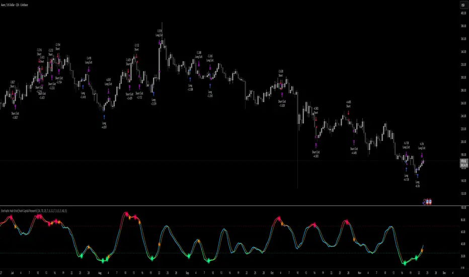
Stochastic Hash Strat [Hash Capital Research]# Stochastic Hash Strategy by Hash Capital Research ## 🎯 What Is This Strategy? The **Stochastic Slow Strategy** is a momentum-based trading system that identifies oversold and overbought market conditions to capture mean-reversion opportunities. Think of it as a "buy low, sell high" approach with smart mathematical filters that remove emotion from your trading decisions. Unlike fast-moving indicators that generate excessive noise, this strategy uses **smoothed stochastic oscillators** to identify only the highest-probability setups when momentum truly shifts. --- ## 💡 Why This Strategy Works Most traders fail because they: - **Chase prices** after big moves (buying high, selling low) - **Overtrade** in choppy, directionless markets - **Exit too early** or hold losses too long This strategy solves all three problems: 1. **Entry Discipline**: Only trades when the stochastic oscillator crosses in extreme zones (oversold for longs, overbought for shorts) 2. **Cooldown Filter**: Prevents revenge trading by forcing a waiting period after each trade 3. **Fixed Risk/Reward**: Pre-defined stop-loss and take-profit levels ensure consistent risk management **The Math Behind It**: The stochastic oscillator measures where the current price sits relative to its recent high-low range. When it's below 25, the market is oversold (time to buy). When above 70, it's overbought (time to sell). The crossover with its moving average confirms momentum is shifting. --- ## 📊 Best Markets & Timeframes ### ⭐ OPTIMAL PERFORMANCE: **Crude Oil (WTI) - 12H Timeframe** - **Why it works**: Oil markets have predictable volatility patterns and respect technical levels **AAVE/USD - 4H to 12H Timeframe** - **Why it works**: DeFi tokens exhibit strong momentum cycles with clear extremes ### ✅ Also Works Well On: - **BTC/USD** (12H, Daily) - Lower frequency but high win rate - **ETH/USD** (8H, 12H) - Balanced volatility and liquidity - **Gold (XAU/USD)** (Daily) - Classic mean-reversion asset - **EUR/USD** (4H, 8H) - Lower volatility, requires patience ### ❌ Avoid Using On: - Timeframes below 4H (too much noise) - Low-liquidity altcoins (wide spreads kill performance) - Strongly trending markets without pullbacks (Bitcoin in 2021) - News-driven instruments during major events --- ## 🎛️ Understanding The Settings ### Core Stochastic Parameters **Stochastic Length (Default: 16)** - Controls the lookback period for price comparison - Lower = faster reactions, more signals (10-14 for volatile markets) - Higher = smoother signals, fewer trades (16-21 for stable markets) - **Pro tip**: Use 10 for crypto 4H, 16 for commodities 12H **Overbought Level (Default: 70)** - Threshold for short entries - Lower values (65-70) = more trades, earlier entries - Higher values (75-80) = fewer but higher-conviction trades - **Sweet spot**: 70 works for most assets **Oversold Level (Default: 25)** - Threshold for long entries - Higher values (25-30) = more trades, earlier entries - Lower values (15-20) = fewer but stronger bounce setups - **Sweet spot**: 20-25 depending on market conditions **Smooth K & Smooth D (Default: 7 & 3)** - Additional smoothing to filter out whipsaws - K=7 makes the indicator slower and more reliable - D=3 is the signal line that confirms the trend - **Don't change these unless you know what you're doing** --- ### Risk Management **Stop Loss % (Default: 2.2%)** - Automatically exits losing trades - Should be 1.5x to 2x your average market volatility - Too tight = death by a thousand cuts - Too wide = uncontrolled losses - **Calibration**: Check ATR indicator and set SL slightly above it **Take Profit % (Default: 7%)** - Automatically exits winning trades - Should be 2.5x to 3x your stop loss (reward-to-risk ratio) - This default gives 7% / 2.2% = 3.18:1 R:R - **The golden rule**: Never have R:R below 2:1 --- ### Trade Filters **Bar Cooldown Filter (Default: ON, 3 bars)** - **What it does**: Forces you to wait X bars after closing a trade before entering a new one - **Why it matters**: Prevents emotional revenge trading and overtrading in choppy markets - **Settings guide**: - 3 bars = Standard (good for most cases) - 5-7 bars = Conservative (oil, slow-moving assets) - 1-2 bars = Aggressive (only for experienced traders) **Exit on Opposite Extreme (Default: ON)** - Closes your long when stochastic hits overbought (and vice versa) - Acts as an early profit-taking mechanism - **Leave this ON** unless you're testing other exit strategies **Divergence Filter (Default: OFF)** - Looks for price/momentum divergences for additional confirmation - **When to enable**: Trending markets where you want fewer but higher-quality trades - **Keep OFF for**: Mean-reverting markets (oil, forex, most of the time) --- ## 🚀 Quick Start Guide ### Step 1: Set Up in TradingView 1. Open TradingView and navigate to your chart 2. Click "Pine Editor" at the bottom 3. Copy and paste the strategy code 4. Click "Add to Chart" 5. The strategy will appear in a separate pane below your price chart ### Step 2: Choose Your Market **If you're trading Crude Oil:** - Timeframe: 12H - Keep all default settings - Watch for signals during London/NY overlap (8am-11am EST) **If you're trading AAVE or crypto:** - Timeframe: 4H or 12H - Consider these adjustments: - Stochastic Length: 10-14 (faster) - Oversold: 20 (more aggressive) - Take Profit: 8-10% (higher targets) ### Step 3: Wait for Your First Signal **LONG Entry** (Green circle appears): - Stochastic crosses up below oversold level (25) - Price likely near recent lows - System places limit order at take profit and stop loss **SHORT Entry** (Red circle appears): - Stochastic crosses down above overbought level (70) - Price likely near recent highs - System places limit order at take profit and stop loss **EXIT** (Orange circle): - Position closes either at stop, target, or opposite extreme - Cooldown period begins ### Step 4: Let It Run The biggest mistake? **Interfering with the system.** - Don't close trades early because you're scared - Don't skip signals because you "have a feeling" - Don't increase position size after a big win - Don't revenge trade after a loss **Follow the system or don't use it at all.** --- ### Important Risks: 1. **Drawdown Pain**: You WILL experience losing streaks of 5-7 trades. This is mathematically normal. 2. **Whipsaw Markets**: Choppy, range-bound conditions can trigger multiple small losses. 3. **Gap Risk**: Overnight gaps can cause your actual fill to be worse than the stop loss. 4. **Slippage**: Real execution prices differ from backtested prices (factor in 0.1-0.2% slippage). --- ## 🔧 Optimization Guide ### When to Adjust Settings: **Market Volatility Increased?** - Widen stop loss by 0.5-1% - Increase take profit proportionally - Consider increasing cooldown to 5-7 bars **Getting Too Few Signals?** - Decrease stochastic length to 10-12 - Increase oversold to 30, decrease overbought to 65 - Reduce cooldown to 2 bars **Getting Too Many Losses?** - Increase stochastic length to 18-21 (slower, smoother) - Enable divergence filter - Increase cooldown to 5+ bars - Verify you're on the right timeframe ### A/B Testing Method: 1. **Run default settings for 50 trades** on your chosen market 2. Document: Win rate, profit factor, max drawdown, emotional tolerance 3. **Change ONE variable** (e.g., oversold from 25 to 20) 4. Run another 50 trades 5. Compare results 6. Keep the better version **Never change multiple settings at once** or you won't know what worked. --- ## 📚 Educational Resources ### Key Concepts to Learn: **Stochastic Oscillator** - Developed by George Lane in the 1950s - Measures momentum by comparing closing price to price range - Formula: %K = (Close - Low) / (High - Low) × 100 - Similar to RSI but more sensitive to price movements **Mean Reversion vs. Trend Following** - This is a **mean reversion** strategy (price returns to average) - Works best in ranging markets with defined support/resistance - Fails in strong trending markets (2017 Bitcoin, 2020 Tech stocks) - Complement with trend filters for better results **Risk:Reward Ratio** - The cornerstone of profitable trading - Winning 40% of trades with 3:1 R:R = profitable - Winning 60% of trades with 1:1 R:R = breakeven (after fees) - **This strategy aims for 45% win rate with 2.5-3:1 R:R** ### Recommended Reading: - *"Trading Systems and Methods"* by Perry Kaufman (Chapter on Oscillators) - *"Mean Reversion Trading Systems"* by Howard Bandy - *"The New Trading for a Living"* by Dr. Alexander Elder --- ## 🛠️ Troubleshooting ### "I'm not seeing any signals!" **Check:** - Is your timeframe 4H or higher? - Is the stochastic actually reaching extreme levels (check if your asset is stuck in middle range)? - Is cooldown still active from a previous trade? - Are you on a low-liquidity pair? **Solution**: Switch to a more volatile asset or lower the overbought/oversold thresholds. --- ### "The strategy keeps losing money!" **Check:** - What's your win rate? (Below 35% is concerning) - What's your profit factor? (Below 0.8 means serious issues) - Are you trading during major news events? - Is the market in a strong trend? **Solution**: 1. Verify you're using recommended markets/timeframes 2. Increase cooldown period to avoid choppy markets 3. Reduce position size to 5% while you diagnose 4. Consider switching to daily timeframe for less noise --- ### "My stop losses keep getting hit!" **Check:** - Is your stop loss tighter than the average ATR? - Are you trading during high-volatility sessions? - Is slippage eating into your buffer? **Solution**: 1. Calculate the 14-period ATR 2. Set stop loss to 1.5x the ATR value 3. Avoid trading right after market open or major news 4. Factor in 0.2% slippage for crypto, 0.1% for oil --- ## 💪 Pro Tips from the Trenches ### Psychological Discipline **The Three Deadly Sins:** 1. **Skipping signals** - "This one doesn't feel right" 2. **Early exits** - "I'll just take profit here to be safe" 3. **Revenge trading** - "I need to make back that loss NOW" **The Solution:** Treat your strategy like a business system. Would McDonald's skip making fries because the cashier "doesn't feel like it today"? No. Systems work because of consistency. --- ### Position Management **Scaling In/Out** (Advanced) - Enter 50% position at signal - Add 50% if stochastic reaches 10 (oversold) or 90 (overbought) - Exit 50% at 1.5x take profit, let the rest run **This is NOT for beginners.** Master the basic system first. --- ### Market Awareness **Oil Traders:** - OPEC meetings = volatility spikes (avoid or widen stops) - US inventory reports (Wed 10:30am EST) = avoid trading 2 hours before/after - Summer driving season = different patterns than winter **Crypto Traders:** - Monday-Tuesday = typically lower volatility (fewer signals) - Thursday-Sunday = higher volatility (more signals) - Avoid trading during exchange maintenance windows --- ## ⚖️ Legal Disclaimer This trading strategy is provided for **educational purposes only**. - Past performance does not guarantee future results - Trading involves substantial risk of loss - Only trade with capital you can afford to lose - No one associated with this strategy is a licensed financial advisor - You are solely responsible for your trading decisions **By using this strategy, you acknowledge that you understand and accept these risks.** --- ## 🙏 Acknowledgments Strategy development inspired by: - George Lane's original Stochastic Oscillator work - Modern quantitative trading research - Community feedback from hundreds of backtests Built with ❤️ for retail traders who want systematic, disciplined approaches to the markets. --- **Good luck, stay disciplined, and trade the system, not your emotions.** Pine Script®策略由Hash_Capital提供88
Systemic Net Liquidity (Macro Fuel for Crypto & Stocks)This indicator tracks Systemic Net Liquidity, the single most important macro factor for determining the long-term trend of risk assets like Bitcoin (BTC) and major indices (S&P 500). It measures the amount of actual cash available in the financial system to chase speculative assets, distinguishing between money that is circulating and money that is locked up at the Federal Reserve. Mechanism (What It Measures) The script uses direct data from the FRED (Federal Reserve Economic Data) to calculate the true state of market funding: \text{Net Liquidity} = \text{Fed Assets (WALCL)} - \text{Treasury General Account (TGA)} - \text{Reverse Repo (RRP)} 1. Fed Assets (WALCL): The total balance sheet of the Fed (The overall supply of money). 2. Treasury General Account (TGA): Funds the US Treasury collects via bond issuance. When the TGA rises, liquidity is actively drained from the banking system (A major bearish pressure). 3. Overnight Reverse Repo (RRP): Cash parked by banks and money market funds at the Fed, effectively frozen and not contributing to market activity. How to Interpret Signals Treat the Net Liquidity line as the market's "Fuel Gauge": 📈 BULLISH SIGNAL (Liquidity Injection): When the Net Liquidity line is rising, money is flowing back into the system, signalling a tailwind for risk assets. 📉 BEARISH SIGNAL (Liquidity Drain): When the line is falling (often due to high TGA balances), cash is being removed. This signals major friction and pressure on price action. ⚠️ DIVERGENCE WARNING: A strong signal is generated when Price (e.g., BTC) rises, but Net Liquidity falls. This macro divergence strongly suggests a major trend reversal or correction is imminent. Important Notes Data Source: Data is directly sourced from FRED and updates daily/weekly. This tool is best used for macro analysis and identifying high-level cycles, not short-term scalping. Disclaimer: Use this indicator as a confirmation tool within your broader strategy. It is not a standalone trading signal.Pine Script®指標由PlanCco提供6
Quantura - Average Intraday Candle VolumeIntroduction “Quantura – Average Intraday Candle Volume” is a quantitative visualization tool that calculates and displays the average traded volume for each intraday time position based on a user-defined historical lookback period. It allows traders to analyze recurring intraday volume patterns, identify high-activity sessions, and detect liquidity shifts throughout the trading day. Originality & Value This indicator goes beyond standard volume averages by normalizing and aligning volume data according to the time of day. Instead of simply smoothing recent bars, it builds an intraday volume profile based on historical daily averages, enabling users to understand when during the day volume typically peaks or drops. Its originality and usefulness come from: Converting standard volume data into time-aligned intraday averages. Visualization of historical intraday liquidity behavior, not just total daily volume. Dynamic scaling using normalization and transparency to emphasize active and quiet periods. Optional day-separator lines for precise intraday structure recognition. Gradient-based coloring for better visual interpretation of volume intensity. Functionality & Core Logic The indicator divides each day into discrete intraday time positions (based on chart timeframe). For each position, it stores and updates historical volume values across the selected number of days. It calculates an average volume per time position by aggregating all stored values and dividing them by the number of valid days. The result is plotted as a continuous histogram showing typical intraday volume distribution. The bar colors and transparency dynamically reflect the relative intensity of volume at each point in the day. Parameters & Customization Number of Days for Averaging: Defines how many past days are included in the volume average calculation (default: 365). UTC Offset: Allows synchronization of intraday cycles with local or exchange time zones. Base Color: Sets the main color for plotted volume columns. Color Mode: Choose between “Gradient” (transparency dynamically adjusts by intensity) or “Normal” (fixed opacity). Day Line: Toggles dashed vertical lines marking the start of each trading day. Visualization & Display Volume is plotted as a series of histogram bars, each representing the average volume for a specific intraday time position. A gradient color mode enhances readability by fading lower-intensity areas and highlighting high-volume regions. Optional day-separator lines visually segment historical sessions for easy reference. Works seamlessly across all chart timeframes that divide the 24-hour day into regular bar intervals. Use Cases Identify when trading activity typically peaks (e.g., session opens, news windows, or overlapping markets). Compare current intraday volume to historical averages for early anomaly detection. Enhance algorithmic or discretionary strategies that depend on volume-timing alignment. Combine with volatility or price structure indicators to confirm market activity zones. Evaluate session consistency across different time zones using the UTC offset parameter. Limitations & Recommendations The indicator requires intraday data (below 1D resolution) to function properly. Volume behavior may vary across brokers and assets; adjust averaging period accordingly. Does not predict price movement — it provides volume-based context for analysis. Works best when combined with structure or momentum-based indicators. Markets & Timeframes Compatible with all intraday markets — including crypto, Forex, equities, and futures — and all intraday timeframes (from 1 minute to 4 hours). It is particularly valuable for analyzing assets with continuous 24-hour trading activity. Author & Access Developed 100% by Quantura. Published as a Open-source script indicator. Access is free. Important This description complies with TradingView’s Script Publishing and House Rules. It provides a clear explanation of the indicator’s originality, logic, and purpose, without any unrealistic performance or predictive claims.Pine Script®指標由Quantura提供37
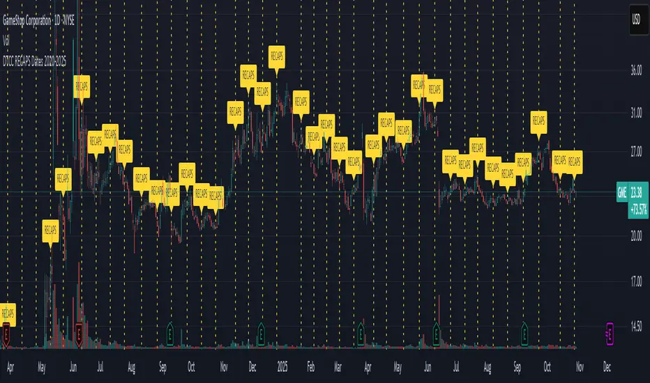
DTCC RECAPS Dates 2020-2025This is a simple indicator which marks the RECAPS dates of the DTCC, during the periods of 2020 to 2025. These dates have marked clear settlement squeezes in the past, such as GME's squeeze of January 2021. ------------------------------------------------------------------------------------------------------------------ The Depository Trust & Clearing Corporation (DTCC) has published the 2025 schedule for its Reconfirmation and Re-pricing Service (RECAPS) through the National Securities Clearing Corporation (NSCC). RECAPS is a monthly process for comparing and re-pricing eligible equities, municipals, corporate bonds, and Unit Investment Trusts (UITs) that have aged two business days or more . At its core, the Reconfirmation and Re-pricing Service (RECAPS) is a risk management tool used by the National Securities Clearing Corporation (NSCC), a subsidiary of the DTCC. Its primary purpose is to reduce the risks associated with aged, unsettled trades in the U.S. securities market . When a trade is executed, it is sent to the NSCC for clearing and settlement. However, for various reasons, some trades may not settle on their scheduled date and become "aged." These unsettled trades create risk for both the trading parties and the clearinghouse (NSCC) because the value of the underlying securities can change over time. If a trade fails to settle and one of the parties defaults, the NSCC may have to step in to complete the transaction at the current market price, which could result in a loss. RECAPS mitigates this risk by systematically re-pricing these aged, open trading obligations to the current market value. This process ensures that the financial obligations of the clearing members accurately reflect the present value of the securities, preventing the accumulation of significant, unmanaged market risk . Detailed Mechanics: How Does it Work? The RECAPS process revolves around two key dates you asked about: the RECAPS Date and the Settlement Date . The RECAPS Date: On this day, the NSCC runs a process to identify all eligible trades that have remained unsettled for two business days or more. These "aged" trades are then re-priced to the current market value. This re-pricing is not just a simple recalculation; it generates new settlement instructions. The original, unsettled trade is effectively cancelled and replaced with a new one at the current market price. This is done through the NSCC's Obligation Warehouse. The Settlement Date: This is typically the business day following the RECAPS date. On this date, the financial settlement of the re-priced trades occurs. The difference in value between the original trade price and the new, re-priced value is settled between the two trading parties. This "mark-to-market" adjustment is processed through the members' settlement accounts at the DTCC. Essentially, the process ensures that any gains or losses due to price changes in the underlying security are realized and settled periodically, rather than being deferred until the trade is ultimately settled or cancelled. Are These Dates Used to Check Margin Requirements? Yes, indirectly, this process is closely tied to managing margin and collateral requirements for NSCC members. Here’s how: The NSCC requires its members to post collateral to a clearing fund, which acts as a mutualized guarantee against defaults. The amount of collateral each member must provide is calculated based on their potential risk exposure to the clearinghouse. By re-pricing aged trades to current market values through RECAPS, the NSCC gets a more accurate picture of each member's outstanding obligations and, therefore, their current risk profile. If a member has a large number of unsettled trades that have moved against them in value, the re-pricing will crystallize that loss, which will be settled the next day. This regular re-pricing and settlement of aged trades prevent the build-up of large, unrealized losses that could increase a member's risk profile beyond what their posted collateral can cover. While RECAPS is not the only mechanism for calculating margin (the NSCC has a complex system for daily margin calls based on overall portfolio risk), it is a crucial component for managing the specific risk posed by aged, unsettled transactions. It ensures that the value of these obligations is kept current, which in turn helps ensure that collateral levels remain adequate. -------------------------------------------------------------------------------------------------------------- Future dates of 2025: - November 12, 2025 (Wed) - November 25, 2025 (Tue) - December 11, 2025 (Thu) - December 29, 2025 (Mon) The dates for 2026 haven't been published yet at this time. The RECAPS process is essentially the industry's way of retrying the settlement of all unresolved FTDs, netting outstanding obligations, and gradually forcing resolution (either delivery or buy-in). Monitoring RECAPS cycles is one way to track the lifecycle, accumulation, and eventual resolution (or persistence) of failures to deliver in the U.S. market. The US Stock market has become a game of settlement dates and FTDs, therefore this can be useful to track.Pine Script®指標由Infinite_Noise提供30
Squeeze Hour Frequency [CHE]Squeeze Hour Frequency (ATR-PR) — Standalone — Tracks daily squeeze occurrences by hour to reveal time-based volatility patterns Summary This indicator identifies periods of unusually low volatility, defined as squeezes, and tallies their frequency across each hour of the day over historical trading sessions. By aggregating counts into a sortable table, it helps users spot hours prone to these conditions, enabling better scheduling of trading activity to avoid or target specific intraday regimes. Signals gain robustness through percentile-based detection that adapts to recent volatility history, differing from fixed-threshold methods by focusing on relative lowness rather than absolute levels, which reduces false positives in varying market environments. Motivation: Why this design? Traders often face uneven intraday volatility, with certain hours showing clustered low-activity phases that precede or follow breakouts, leading to mistimed entries or overlooked calm periods. The core idea of hourly squeeze frequency addresses this by binning low-volatility events into 24 hourly slots and counting distinct daily occurrences, providing a historical profile of when squeezes cluster. This reveals time-of-day biases without relying on real-time alerts, allowing proactive adjustments to session focus. What’s different vs. standard approaches? - Reference baseline: Classical volatility tools like simple moving average crossovers or fixed ATR thresholds, which flag squeezes uniformly across the day. - Architecture differences: - Uses persistent arrays to track one squeeze per hour per day, preventing overcounting within sessions. - Employs custom sorting on ratio arrays for dynamic table display, prioritizing top or bottom performers. - Handles timezones explicitly to ensure consistent binning across global assets. - Practical effect: Charts show a persistent table ranking hours by squeeze share, making intraday patterns immediately visible—such as a top hour capturing over 20 percent of total events—unlike static overlays that ignore temporal distribution, which matters for avoiding low-liquidity traps in crypto or forex. How it works (technical) The indicator first computes a rolling volatility measure over a specified lookback period. It then derives a relative ranking of the current value against recent history within a window of bars. A squeeze is flagged when this ranking falls below a user-defined cutoff, indicating the value is among the lowest in the recent sample. On each bar, the local hour is extracted using the selected timezone. If a squeeze occurs and the bar has price data, the count for that hour increments only if no prior mark exists for the current day, using a persistent array to store the last marked day per hour. This ensures one tally per unique trading day per slot. At the final bar, arrays compile counts and ratios for all 24 hours, where the ratio represents each hour's share of total squeezes observed. These are sorted ascending or descending based on display mode, and the top or bottom subset populates the table. Background shading highlights live squeezes in red for visual confirmation. Initialization uses zero-filled arrays for counts and negative seeds for day tracking, with state persisting across bars via variable declarations. No higher timeframe data is pulled, so there is no repaint risk from external fetches; all logic runs on confirmed bars. Parameter Guide ATR Length — Controls the lookback for the volatility measure, influencing sensitivity to short-term fluctuations; shorter values increase responsiveness but add noise, longer ones smooth for stability — Default: 14 — Trade-offs/Tips: Use 10-20 for intraday charts to balance quick detection with fewer false squeezes; test on historical data to avoid over-smoothing in trending markets. Percentile Window (bars) — Sets the history depth for ranking the current volatility value, affecting how "low" is defined relative to past; wider windows emphasize long-term norms — Default: 252 — Trade-offs/Tips: 100-300 bars suit daily cycles; narrower for fast assets like crypto to catch recent regimes, but risks instability in sparse data. Squeeze threshold (PR < x) — Defines the cutoff for flagging low relative volatility, where values below this mark a squeeze; lower thresholds tighten detection for rarer events — Default: 10.0 — Trade-offs/Tips: 5-15 percent for conservative signals reducing false positives; raise to 20 for more frequent highlights in high-vol environments, monitoring for increased noise. Timezone — Specifies the reference for hourly binning, ensuring alignment with market sessions — Default: Exchange — Trade-offs/Tips: Set to "America/New_York" for US assets; mismatches can skew counts, so verify against chart timezone. Show Table — Toggles the results display, essential for reviewing frequencies — Default: true — Trade-offs/Tips: Disable on mobile for performance; pair with position tweaks for clean overlays. Pos — Places the table on the chart pane — Default: Top Right — Trade-offs/Tips: Bottom Left avoids candle occlusion on volatile charts. Font — Adjusts text readability in the table — Default: normal — Trade-offs/Tips: Tiny for dense views, large for emphasis on key hours. Dark — Applies high-contrast colors for visibility — Default: true — Trade-offs/Tips: Toggle false in light themes to prevent washout. Display — Filters table rows to focus on extremes or full list — Default: All — Trade-offs/Tips: Top 3 for quick scans of risky hours; Bottom 3 highlights safe low-squeeze periods. Reading & Interpretation Red background shading appears on bars meeting the squeeze condition, signaling current low relative volatility. The table lists hours as "H0" to "H23", with columns for daily squeeze counts, percentage share of total squeezes (summing to 100 percent across hours), and an arrow marker on the top hour. A summary row above details the peak count, its share, and the leading hour. A label at the last bar recaps total days observed, data-valid days, and top hour stats. Rising shares indicate clustering, suggesting regime persistence in that slot. Practical Workflows & Combinations - Trend following: Scan for hours with low squeeze shares to enter during stable regimes; confirm with higher highs or lower lows on the 15-minute chart, avoiding top-share hours post-news like tariff announcements. - Exits/Stops: Tighten stops in high-share hours to guard against sudden vol spikes; use the table to shift to conservative sizing outside peak squeeze times. - Multi-asset/Multi-TF: Defaults work across crypto pairs on 5-60 minute timeframes; for stocks, widen percentile window to 500 bars. Combine with volume oscillators—enter only if squeeze count is below average for the asset. Behavior, Constraints & Performance Logic executes on closed bars, with live bars updating counts provisionally but finalizing on confirmation; table refreshes only at the last bar, avoiding intrabar flicker. No security calls or higher timeframes, so no repaint from external data. Resources include a 5000-bar history limit, loops up to 24 iterations for sorting and totals, and arrays sized to 24 elements; labels and table are capped at 500 each for efficiency. Known limits: Skips hours without bars (e.g., weekends), assumes uniform data availability, and may undercount in sparse sessions; timezone shifts can alter profiles without warning. Sensible Defaults & Quick Tuning Start with ATR Length at 14, Percentile Window at 252, and threshold at 10.0 for broad crypto use. If too many squeezes flag (noisy table), raise threshold to 15.0 and narrow window to 100 for stricter relative lowness. For sluggish detection in calm markets, drop ATR Length to 10 and threshold to 5.0 to capture subtler dips. In high-vol assets, widen window to 500 and threshold to 20.0 for stability. What this indicator is—and isn’t This is a historical frequency tracker and visualization layer for intraday volatility patterns, best as a filter in multi-tool setups. It is not a standalone signal generator, predictive model, or risk manager—pair it with price action, news filters, and position sizing rules. Disclaimer The content provided, including all code and materials, is strictly for educational and informational purposes only. It is not intended as, and should not be interpreted as, financial advice, a recommendation to buy or sell any financial instrument, or an offer of any financial product or service. All strategies, tools, and examples discussed are provided for illustrative purposes to demonstrate coding techniques and the functionality of Pine Script within a trading context. Any results from strategies or tools provided are hypothetical, and past performance is not indicative of future results. Trading and investing involve high risk, including the potential loss of principal, and may not be suitable for all individuals. Before making any trading decisions, please consult with a qualified financial professional to understand the risks involved. By using this script, you acknowledge and agree that any trading decisions are made solely at your discretion and risk. Do not use this indicator on Heikin-Ashi, Renko, Kagi, Point-and-Figure, or Range charts, as these chart types can produce unrealistic results for signal markers and alerts. Best regards and happy trading Chervolino Thanks to Duyck for the ma sorter Pine Script®指標由chervolino提供已更新 25
Nth Candle by exp3rtsThis lightweight and versatile TradingView indicator highlights every Xth candle on your chart, making it easy to spot cyclical price behavior or track specific intervals in the market. - Custom Interval – Choose how often candles should be highlighted (e.g., every 5th, 10th, or 20th bar). - Color Coding – Highlighted candles are shaded green if bullish and red if bearish, giving you quick visual insights into momentum at those intervals. - Clean Overlay – The indicator draws directly on your main chart without clutter, so you can combine it with your favorite setups and strategies. Use this tool to: 1) Identify repeating patterns and cycles 2) Mark periodic reference candles 3) Support discretionary trading decisions with clear visual cuesPine Script®指標由exp3rts提供3
Global Liquidity Proxy vs BitcoinGlobal Liquidity Proxy vs Bitcoin. Helps to understand the cycles with liquidty.Pine Script®指標由joeshew提供18
US Presidents 1920–2024Description: This indicator displays all U.S. presidential elections from 1920 to 2024 on your chart. Features: Vertical lines at the date of each presidential election. Line color by party: Red = Republican Blue = Democrat Gray = Other/None Labels showing the name of each president. Modern flag style: Presidents from 1900 onward are highlighted as modern, giving clear historical separation. Fully overlayed on the price chart for timeline context. Customizable: Label position (above/below bar) and line width. Use case: Useful for analyzing modern U.S. presidential cycles, market reactions to elections, or quickly referencing recent presidents directly on charts.Pine Script®指標由dragosmarzac提供2
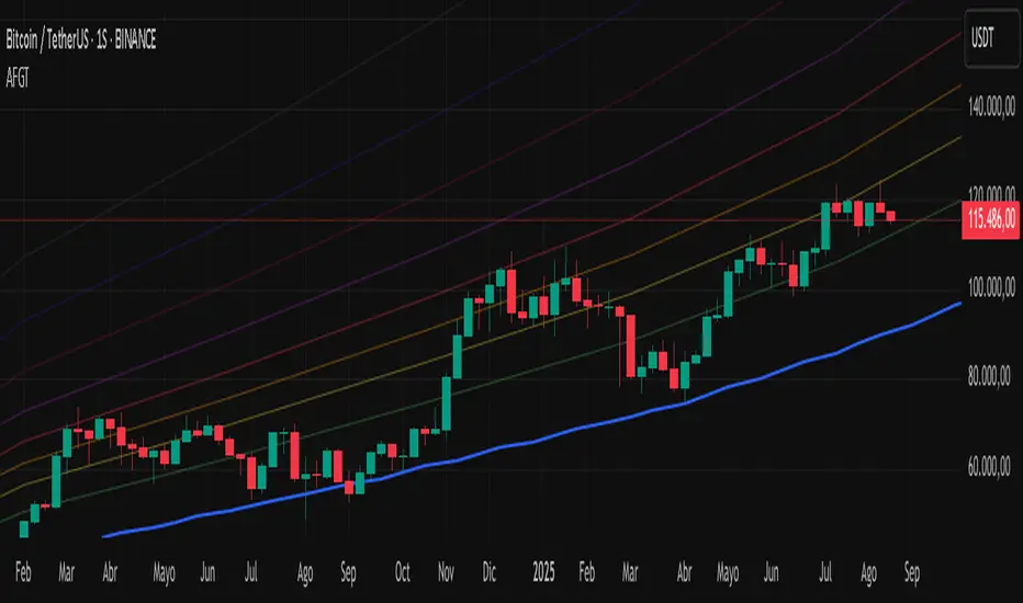
Auto-Fit Growth Trendline# **Theoretical Algorithmic Principles of the Auto-Fit Growth Trendline (AFGT)** ## **🎯 What Does This Algorithm Do?** The Auto-Fit Growth Trendline is an advanced technical analysis system that **automates the identification of long-term growth trends** and **projects future price levels** based on historical cyclical patterns. ### **Primary Functionality:** - **Automatically detects** the most significant lows in regular periods (monthly, quarterly, semi-annually, annually) - **Constructs a dynamic trendline** that connects these historical lows - **Projects the trend into the future** with high mathematical precision - **Generates Fibonacci bands** that act as dynamic support and resistance levels - **Automatically adapts** to different timeframes and market conditions ### **Strategic Purpose:** The algorithm is designed to identify **fundamental value zones** where price has historically found support, enabling traders to: - Identify optimal entry points for long positions - Establish realistic price targets based on mathematical projections - Recognize dynamic support and resistance levels - Anticipate long-term price movements --- ## **🧮 Core Mathematical Foundations** ### **Adaptive Temporal Segmentation Theory** The algorithm is based on **dynamic temporal partition theory**, where time is divided into mathematically coherent uniform intervals. It uses modular transformations to create bijective mappings between continuous timestamps and discrete periods, ensuring each temporal point belongs uniquely to a specific period. **What does this achieve?** It allows the algorithm to automatically identify natural market cycles (annual, quarterly, etc.) without manual intervention, adapting to the inherent periodicity of each asset. The temporal mapping function implements a **discrete affine transformation** that normalizes different frequencies (monthly, quarterly, semi-annual, annual) to a space of unique identifiers, enabling consistent cross-temporal comparative analysis. --- ## **📊 Local Extrema Detection Theory** ### **Multi-Point Retrospective Validation Principle** Local minima detection is founded on **relative extrema theory with sliding window**. Instead of using a simple minimum finder, it implements a cross-validation system that examines the persistence of the extremum across multiple historical periods. **What problem does this solve?** It eliminates false minima caused by temporal volatility, identifying only those points that represent true historical support levels with statistical significance. This approach is based on the **statistical confirmation principle**, where a minimum is only considered valid if it maintains its extremum condition during a defined observation period, significantly reducing false positives caused by transitory volatility. --- ## **🔬 Robust Interpolation Theory with Outlier Control** ### **Contextual Adaptive Interpolation Model** The mathematical core uses **piecewise linear interpolation with adaptive outlier correction**. The key innovation lies in implementing a **contextual anomaly detector** that identifies not only absolute extreme values, but relative deviations to the local context. **Why is this important?** Financial markets contain extreme events (crashes, bubbles) that can distort projections. This system identifies and appropriately weights them without completely eliminating them, preserving directional information while attenuating distortions. ### **Implicit Bayesian Smoothing Algorithm** When an outlier is detected (deviation >300% of local average), the system applies a **simplified Kalman filter** that combines the current observation with a local trend estimation, using a weight factor that preserves directional information while attenuating extreme fluctuations. --- ## **📈 Stabilized Extrapolation Theory** ### **Exponential Growth Model with Dampening** Extrapolation is based on a **modified exponential growth model with progressive dampening**. It uses multiple historical points to calculate local growth ratios, implements statistical filtering to eliminate outliers, and applies a dampening factor that increases with extrapolation distance. **What advantage does this offer?** Long-term projections in finance tend to be exponentially unrealistic. This system maintains short-to-medium term accuracy while converging toward realistic long-term projections, avoiding the typical "exponential explosions" of other methods. ### **Asymptotic Convergence Principle** For long-term projections, the algorithm implements **controlled asymptotic convergence**, where growth ratios gradually converge toward pre-established limits, avoiding unrealistic exponential projections while preserving short-to-medium term accuracy. --- ## **🌟 Dynamic Fibonacci Projection Theory** ### **Continuous Proportional Scaling Model** Fibonacci bands are constructed through **uniform proportional scaling** of the base curve, where each level represents a linear transformation of the main curve by a constant factor derived from the Fibonacci sequence. **What is its practical utility?** It provides dynamic resistance and support levels that move with the trend, offering price targets and profit-taking points that automatically adapt to market evolution. ### **Topological Preservation Principle** The system maintains the **topological properties** of the base curve in all Fibonacci projections, ensuring that spatial and temporal relationships are consistently preserved across all resistance/support levels. --- ## **⚡ Adaptive Computational Optimization** ### **Multi-Scale Resolution Theory** It implements **automatic multi-resolution analysis** where data granularity is dynamically adjusted according to the analysis timeframe. It uses the **adaptive Nyquist principle** to optimize the signal-to-noise ratio according to the temporal observation scale. **Why is this necessary?** Different timeframes require different levels of detail. A 1-minute chart needs more granularity than a monthly one. This system automatically optimizes resolution for each case. ### **Adaptive Density Algorithm** Calculation point density is optimized through **adaptive sampling theory**, where calculation frequency is adjusted according to local trend curvature and analysis timeframe, balancing visual precision with computational efficiency. --- ## **🛡️ Robustness and Fault Tolerance** ### **Graceful Degradation Theory** The system implements **multi-level graceful degradation**, where under error conditions or insufficient data, the algorithm progressively falls back to simpler but reliable methods, maintaining basic functionality under any condition. **What does this guarantee?** That the indicator functions consistently even with incomplete data, new symbols with limited history, or extreme market conditions. ### **State Consistency Principle** It uses **mathematical invariants** to guarantee that the algorithm's internal state remains consistent between executions, implementing consistency checks that validate data structure integrity in each iteration. --- ## **🔍 Key Theoretical Innovations** ### **A. Contextual vs. Absolute Outlier Detection** It revolutionizes traditional outlier detection by considering not only the absolute magnitude of deviations, but their relative significance within the local context of the time series. **Practical impact:** It distinguishes between legitimate market movements and technical anomalies, preserving important events like breakouts while filtering noise. ### **B. Extrapolation with Weighted Historical Memory** It implements a memory system that weights different historical periods according to their relevance for current prediction, creating projections more adaptable to market regime changes. **Competitive advantage:** It automatically adapts to fundamental changes in asset dynamics without requiring manual recalibration. ### **C. Automatic Multi-Timeframe Adaptation** It develops an automatic temporal resolution selection system that optimizes signal extraction according to the intrinsic characteristics of the analysis timeframe. **Result:** A single indicator that functions optimally from 1-minute to monthly charts without manual adjustments. ### **D. Intelligent Asymptotic Convergence** It introduces the concept of controlled asymptotic convergence in financial extrapolations, where long-term projections converge toward realistic limits based on historical fundamentals. **Added value:** Mathematically sound long-term projections that avoid the unrealistic extremes typical of other extrapolation methods. --- ## **📊 Complexity and Scalability Theory** ### **Optimized Linear Complexity Model** The algorithm maintains **linear computational complexity** O(n) in the number of historical data points, guaranteeing scalability for extensive time series analysis without performance degradation. ### **Temporal Locality Principle** It implements **temporal locality**, where the most expensive operations are concentrated in the most relevant temporal regions (recent periods and near projections), optimizing computational resource usage. --- ## **🎯 Convergence and Stability** ### **Probabilistic Convergence Theory** The system guarantees **probabilistic convergence** toward the real underlying trend, where projection accuracy increases with the amount of available historical data, following **law of large numbers** principles. **Practical implication:** The more history an asset has, the more accurate the algorithm's projections will be. ### **Guaranteed Numerical Stability** It implements **intrinsic numerical stability** through the use of robust floating-point arithmetic and validations that prevent overflow, underflow, and numerical error propagation. **Result:** Reliable operation even with extreme-priced assets (from satoshis to thousand-dollar stocks). --- ## **💼 Comprehensive Practical Application** **The algorithm functions as a "financial GPS"** that: 1. **Identifies where we've been** (significant historical lows) 2. **Determines where we are** (current position relative to the trend) 3. **Projects where we're going** (future trend with specific price levels) 4. **Provides alternative routes** (Fibonacci bands as alternative targets) This theoretical framework represents an innovative synthesis of time series analysis, approximation theory, and computational optimization, specifically designed for long-term financial trend analysis with robust and mathematically grounded projections.Pine Script®指標由didaz提供73
Adaptive MVRV & RSI Strategy V6 (Dynamic Thresholds)Strategy Explanation This is an advanced Dollar-Cost Averaging (DCA) strategy for Bitcoin that aims to adapt to long-term market cycles and changing volatility. Instead of relying on fixed buy/sell signals, it uses a dynamic, weighted approach based on a combination of on-chain data and classic momentum. Core Components: Dual-Indicator Signal: The strategy combines two powerful indicators for a more robust signal: MVRV Ratio: An on-chain metric to identify when Bitcoin is fundamentally over or undervalued relative to its historical cost basis. Weekly RSI: A classic momentum indicator to gauge long-term market strength and identify overbought/oversold conditions. Dynamic, Self-Adjusting Thresholds: The core innovation of this strategy is that it avoids fixed thresholds (e.g., "sell when RSI is 70"). Instead, the buy and sell zones are dynamically calculated based on a long-term (2-year) moving average and standard deviation of each indicator. This allows the strategy to automatically adapt to Bitcoin's decreasing volatility and changing market structure over time. Weighted DCA (Scaling In & Out): The strategy doesn't just buy or sell a fixed amount. The size of its trades is scaled based on conviction: Buying: As the MVRV and RSI fall deeper into their "undervalued" zones, the percentage of available cash used for each purchase increases. Selling: As the indicators rise further into "overvalued" territory, the percentage of the current position sold also increases. This creates an adaptive system that systematically accumulates during periods of fear and distributes during periods of euphoria, with the intensity of its actions directly tied to the extremity of market conditions.Pine Script®策略由wjstienstra提供83
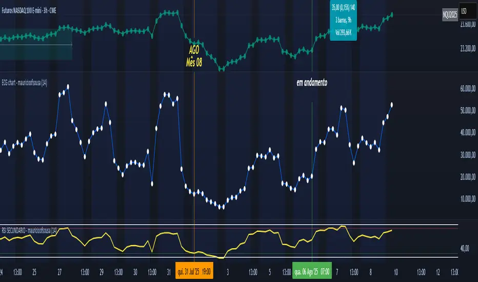
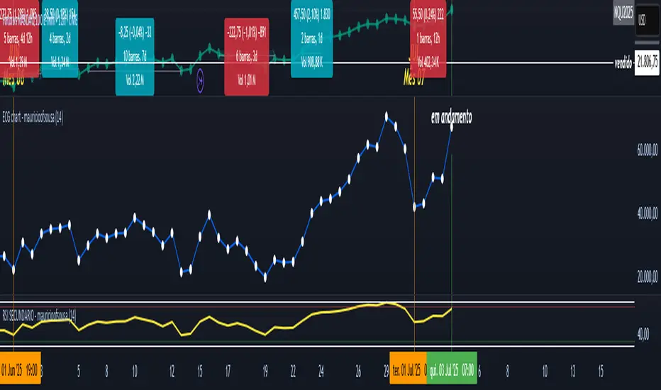
ECG chart - mauricioofsousaMGO Primary – Matriz Gráficos ON The Blockchain of Trading applied to price behavior The MGO Primary is the foundation of Matriz Gráficos ON — an advanced graphical methodology that transforms market movement into a logical, predictable, and objective sequence, inspired by blockchain architecture and periodic oscillatory phenomena. This indicator replaces emotional candlestick reading with a mathematical interpretation of price blocks, cycles, and frequency. Its mission is to eliminate noise, anticipate reversals, and clearly show where capital is entering or exiting the market. What MGO Primary detects: Oscillatory phenomena that reveal the true behavior of orders in the book: RPA – Breakout of Bullish Pivot RPB – Breakout of Bearish Pivot RBA – Sharp Bullish Breakout RBB – Sharp Bearish Breakout Rhythmic patterns that repeat in medium timeframes (especially on 12H and 4H) Wave and block frequency, highlighting critical entry and exit zones Validation through Primary and Secondary RSI, measuring the real strength behind movements Who is this indicator for: Traders seeking statistical clarity and visual logic Operators who want to escape the subjectivity of candlesticks Anyone who values technical precision with operational discipline Recommended use: Ideal timeframes: 12H (high precision) and 4H (moderate intensity) Recommended assets: indices (e.g., NASDAQ), liquid stocks, and futures Combine with: structured risk management and macro context analysis Real-world performance: The MGO12H achieved a 92% accuracy rate in 2025 on the NASDAQ, outperforming the average performance of major global quantitative strategies, with a net score of over 6,200 points for the year.Pine Script®指標由mauricio_of_sousa提供118
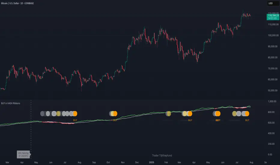
BUY in HASH RibbonsHash Ribbons Indicator (BUY Signal) A TradingView Pine Script v6 implementation for identifying Bitcoin miner capitulation (“Springs”) and recovery phases based on hash rate data. It marks potential low-risk buying opportunities by tracking short- and long-term moving averages of the network hash rate. ⸻ Key Features • Hash Rate SMAs • Short-term SMA (default: 30 days) • Long-term SMA (default: 60 days) • Phase Markers • Gray circle: Short SMA crosses below long SMA (start of capitulation) • White circles: Ongoing capitulation, with brighter white when the short SMA turns upward • Yellow circle: Short SMA crosses back above long SMA (end of capitulation) • Orange circle: Buy signal once hash rate recovery aligns with bullish price momentum (10-day price SMA crosses above 20-day price SMA) • Display Modes • Ribbons: Plots the two SMAs as colored bands—red for capitulation, green for recovery • Oscillator: Shows the percentage difference between SMAs as a histogram (red for negative, blue for positive) • Optional Overlays • Bitcoin halving dates (2012, 2016, 2020, 2024) with dashed lines and labels • Raw hash rate data in EH/s • Alerts • Configurable alerts for capitulation start, recovery, and buy signals ⸻ How It Works 1. Data Source: Fetches daily hash rate values from a selected provider (e.g., IntoTheBlock, Quandl). 2. Capitulation Detection: When the 30-day SMA falls below the 60-day SMA, miners are likely capitulating. 3. Recovery Identification: A rising 30-day SMA during capitulation signals miner recovery. 4. Buy Signal: Confirmed when the hash rate recovery coincides with a bullish shift in price momentum (10-day price SMA > 20-day price SMA). ⸻ Inputs Hash Rate Short SMA: 30 days Hash Rate Long SMA: 60 days Plot Signals: On Plot Halvings: Off Plot Raw Hash Rate: Off ⸻ Considerations • Timeframe: Best applied on daily charts to capture meaningful miner behavior. • Data Reliability: Ensure the chosen hash rate source provides consistent, gap-free data. • Risk Management: Use alongside other technical indicators (e.g., RSI, MACD) and fundamental analysis. • Backtesting: Evaluate performance over different market cycles before live deployment.Pine Script®指標由Tin2100提供已更新 21
Economy RadarEconomy Radar — Key US Macro Indicators Visualized A handy tool for traders and investors to monitor major US economic data in one chart. Includes: Inflation: CPI, PCE, yearly %, expectations Monetary policy: Fed funds rate, M2 money supply Labor market: Unemployment, jobless claims, consumer sentiment Economy & markets: GDP, 10Y yield, US Dollar Index (DXY) Options: Toggle indicators on/off Customizable colors Tooltips explain each metric (in Russian & English) Perfect for spotting economic cycles and supporting trading decisions. Add to your chart and get a clear macro picture instantly!Pine Script®指標由Melatue提供12
[Mustang Algo] Channel Strategy# Mustang Algo Channel Strategy - Universal Market Sentiment Oscillator ## 🎯 ORIGINAL CONCEPT This strategy employs a unique market sentiment oscillator that works on ALL financial assets. It uses Bitcoin supply dynamics combined with stablecoin market capitalization as a macro sentiment indicator to generate universal timing signals across stocks, forex, commodities, indices, and cryptocurrencies. ## 🌐 UNIVERSAL APPLICATION - **Any Asset Class:** Stocks, Forex, Commodities, Indices, Crypto, Bonds - **Market-Wide Timing:** BTC/Stablecoin ratio serves as a global risk sentiment gauge - **Cross-Market Signals:** Trade any instrument using macro liquidity conditions - **Ecosystem Approach:** One oscillator for all financial markets ## 🧮 METHODOLOGY **Core Calculation:** BTC Supply / (Combined Stablecoin Market Cap / BTC Price) - **Data Sources:** DAI + USDT + USDC market capitalizations - **Signal Generation:** RSI(14) applied to the ratio, double-smoothed with WMA - **Timing Logic:** Crossover signals filtered by overbought/oversold zones - **Multi-Timeframe:** Configurable timeframe analysis (default: Daily) ## 📈 TRADING STRATEGY **LONG Entries:** Bullish crossover when market sentiment is oversold (<48) **SHORT Entries:** Bearish crossover when market sentiment is overbought (>55) **Universal Timing:** These macro signals apply to trading any financial instrument ## ⚙️ FLEXIBLE RISK MANAGEMENT **Three SL/TP Calculation Modes:** - **Percentage Mode:** Traditional % based (4% SL, 12% TP default) - **Ticks Mode:** Precise tick-based calculation (50/150 ticks default) - **Pips Mode:** Forex-style pip calculation (50/150 pips default) **Realistic Parameters:** - Commission: 0.1% (adjustable for different asset classes) - Slippage: 2 ticks - Position sizing: 10% of equity (conservative) - No pyramiding (single position management) ## 📊 KEY ADVANTAGES ✅ **Universal Application:** One strategy for all asset classes ✅ **Macro Foundation:** Based on global liquidity and risk sentiment ✅ **False Signal Filtering:** Overbought/oversold zones reduce noise ✅ **Flexible Risk Management:** Multiple SL/TP calculation methods ✅ **No Lookahead Bias:** Clean backtesting with realistic results ✅ **Cross-Market Correlation:** Captures broad market risk cycles ## 🎛️ CONFIGURATION GUIDE 1. **Asset Selection:** Apply to stocks, forex, commodities, indices, crypto 2. **Timeframe Setup:** Daily recommended for swing trading 3. **Sentiment Bounds:** Adjust 48/55 levels based on market volatility 4. **Risk Management:** Choose appropriate SL/TP mode for your asset class 5. **Direction Filter:** Select Long Only, Short Only, or Both ## 📋 BACKTESTING STANDARDS **Compliant with TradingView Guidelines:** - ✅ Realistic commission structure (0.1% default) - ✅ Appropriate slippage modeling (2 ticks) - ✅ Conservative position sizing (10% equity) - ✅ Sustainable risk ratios (1:3 SL/TP) - ✅ No lookahead bias (proper historical simulation) - ✅ Sufficient sample size potential (100+ trades possible) ## 🔬 ORIGINAL RESEARCH This strategy introduces a revolutionary approach to financial markets by treating the BTC/Stablecoin ratio as a global risk sentiment gauge. Unlike traditional indicators that analyze individual asset price action, this oscillator captures macro liquidity flows that affect ALL financial markets - from stocks to forex to commodities. ## 🎯 MARKET APPLICATIONS **Stocks & Indices:** Risk-on/risk-off sentiment timing **Forex:** Global liquidity flow analysis for major pairs **Commodities:** Risk appetite for inflation hedges **Bonds:** Flight-to-safety vs. risk-seeking behavior **Crypto:** Native application with direct correlation ## ⚠️ RISK DISCLOSURE - Designed for intermediate to long-term trading across all timeframes - Market sentiment can remain extreme longer than expected - Always use appropriate position sizing for your specific asset class - Adjust commission and slippage settings for different markets - Past performance does not guarantee future results ## 🚀 INNOVATION SUMMARY **What makes this strategy unique:** - First to use BTC/Stablecoin ratio as universal market sentiment indicator - Applies macro-economic principles to technical analysis across all assets - Single oscillator provides timing signals for entire financial ecosystem - Bridges traditional finance with digital asset insights - Combines fundamental liquidity analysis with technical precisionPine Script®策略由MustangAlgo提供8
RSI - PRIMARIO -mauricioofsousa MGO Primary – Matriz Gráficos ON The Blockchain of Trading applied to price behavior The MGO Primary is the foundation of Matriz Gráficos ON — an advanced graphical methodology that transforms market movement into a logical, predictable, and objective sequence, inspired by blockchain architecture and periodic oscillatory phenomena. This indicator replaces emotional candlestick reading with a mathematical interpretation of price blocks, cycles, and frequency. Its mission is to eliminate noise, anticipate reversals, and clearly show where capital is entering or exiting the market. What MGO Primary detects: Oscillatory phenomena that reveal the true behavior of orders in the book: RPA – Breakout of Bullish Pivot RPB – Breakout of Bearish Pivot RBA – Sharp Bullish Breakout RBB – Sharp Bearish Breakout Rhythmic patterns that repeat in medium timeframes (especially on 12H and 4H) Wave and block frequency, highlighting critical entry and exit zones Validation through Primary and Secondary RSI, measuring the real strength behind movements Who is this indicator for: Traders seeking statistical clarity and visual logic Operators who want to escape the subjectivity of candlesticks Anyone who values technical precision with operational discipline Recommended use: Ideal timeframes: 12H (high precision) and 4H (moderate intensity) Recommended assets: indices (e.g., NASDAQ), liquid stocks, and futures Combine with: structured risk management and macro context analysis Real-world performance: The MGO12H achieved a 92% accuracy rate in 2025 on the NASDAQ, outperforming the average performance of major global quantitative strategies, with a net score of over 6,200 points for the year. Pine Script®指標由mauricio_of_sousa提供已更新 5
Sun Moon Conjunctions Trine Oppositions 2025this script is an astrological tool designed to overlay significant Sun-Moon aspect events for 2025 on a Bitcoin chart. It highlights key lunar phases and aspects—Conjunctions (New Moon) in blue, Squares in red, Oppositions (Full Moon) in purple, and Trines in green—using background colors and labeled markers. Users can toggle visibility for each aspect type and adjust label sizes via customizable inputs. The script accurately marks events from January through December 2025, with labels appearing once per event, making it a valuable resource for exploring potential correlations between lunar cycles and Bitcoin price movements.Pine Script®指標由Dshergill提供3352