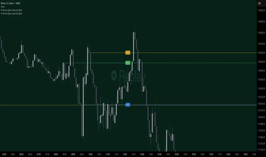
Stef's Money Supply IndicatorI have been fascinated by the growth in the Money Supply. Well, I think we ALL have been fascinated by this and the corresponding inflation that followed. That's why I created my Money Supply Indicator because I always wanted to chart and analyze my symbols based on the Money Supply. This indicator gives you that capability in a way that no other indicator in this field currently offers. Let me explain:
How does the indicator work?
Chart any symbol, turn on this indicator, and instantly it will factor in the M2 money supply on the asset's underlying price. Essentially, you are seeing the price of the asset normalized for the corresponding rise in the money supply. In some ways, this is a rather unique inflation-adjusted view of a symbol's price.
More importantly, you can compare and contrast the symbol's price adjusted for the rise in the Money Supply vs. the symbol's price without that adjustment by indexing all lines to 100. This is essential for understanding if the asset is at all-time highs, lows, or possibly undervalued or overvalued based on the current money supply situation.
Why does this matter?
This tool provides a deeper understanding of how the overall money supply influences the value of assets over time. By adjusting asset prices for changes in the money supply, traders can see the true value of assets relative to the amount of money in circulation.
What features can you access with this indicator?
The ability to normalize all lines to a starting point of 100 allows traders to compare the performance of the Money Supply, the symbol price, and the symbol price adjusted for the money supply all on one readable chart. This feature is particularly useful for spotting divergences and understanding relative performance over time with a rising or falling Money Supply.
What else can you do?
This is just version 1, and so I'll be adding more features rather soon, but there are two other important features in the settings menu including the following:
• Get the capability to quickly spot the highest and lowest points on the Money Supply adjusted price of your asset.
• Get the capability to change the gradient colors of the line when going up or down.
• Turn on the Brrrrrrr printer text as a reminder of our Fed Overlord Jerome Powell... lol
• Drag this indicator onto your main chart to combine it with your candlesticks or other charting techniques.
Stef's Money Supply Indicator! I look forward to hearing your feedback.
在腳本中搜尋"Cycle"
R-Squared Trend Strength and Direction [CHE] Introduction
TradingView is a web-based platform that allows traders and investors to conduct comprehensive technical analyses, develop trading strategies, and track market movements in real-time. One of the many features TradingView offers is the ability to create custom indicators using Pine Script. In this presentation, we will focus on the implementation and application of an R-Squared indicator for analyzing trend strength and direction, as well as using the T3 indicator for trend direction confirmation.
---
What is R-Squared?
R-Squared (R²), also known as the coefficient of determination, is a statistical measure that represents the proportion of the variance for a dependent variable that's explained by an independent variable(s). In technical analysis, R-Squared is used to quantify the clarity of a trend. A higher R-Squared indicates a clearer trend, less affected by random price fluctuations.
---
Pine Script: Implementing the R-Squared Indicator
Inputs:
- Source: The data source to be analyzed, such as the average of high and low prices.
- Period: The period length for calculating sums and R-Squared values.
Sum Calculations:
- Sum X and Sum XX: These sums relate to the indices of the selected period.
- Sum XY and Sum YY: These sums relate to the products of the indices and their respective price values.
- Sum Y: The sum of price values over the chosen period.
Q-Values Calculation:
- Q-values are used to calculate the R-Squared value, which indicates trend clarity.
Trend State:
- Based on the R-Squared value, a trend state is determined, indicating whether a clear trend is present. Specific threshold values are used to identify trend changes.
---
Using the T3 Indicator
The T3 indicator is used exclusively for confirming the trend direction in this strategy. It helps verify the direction of the trend identified by the R-Squared indicator.
T3 Indicator Calculation:
- The T3 indicator uses a series of exponential smoothings to smooth price movements and provide a clearer view of the trend direction.
- The T3 indicator confirms the trend direction indicated by the R-Squared indicator.
---
Functioning of the R-Squared and T3 Combination
1. Input Parameters:
- Define the data source and period length for calculating sums and R-Squared values.
2. Sum Calculations:
- Calculate various sums over the defined period needed to derive Q-values.
3. Q-Values Calculation:
- Derive Q1, Q2, and Q3 from the sums to calculate the R-Squared value.
4. Trend State:
- Use the R-Squared value to determine if a clear trend is present, utilizing threshold values to recognize trend changes.
5. Trend Direction Confirmation with T3:
- Calculate the T3 indicator to confirm the trend direction. The T3 is used solely for direction confirmation, not for clarity.
6. Long and Short Conditions:
- Define long and short entry conditions based on the combination of R-Squared and T3 indicators, and visualize them on the chart.
---
Conclusion
The R-Squared indicator is a powerful tool for analyzing the clarity of a trend. By integrating it into TradingView using Pine Script, traders can make informed decisions and optimize their trading strategies. The T3 indicator is used exclusively in this strategy to confirm the trend direction, enhancing the accuracy of trading signals.
---
Questions and Discussion
Are there any questions about the implementation or application of the R-Squared indicator in TradingView? How can we further improve this indicator or integrate it into existing strategies?
Best regards
Chervolino
Risk Management Calculator with Fees and Take Profit [CHE]Risk Management Calculator with Fees and Take Profit
Welcome to the Risk Management Calculator with Fees and Take Profit script! This powerful tool is designed to help traders manage their risk effectively, calculate leverage, and set take profit targets. The script is inspired by and builds upon the ideas from the following TradingView script: ().
This script is inspired by and builds upon the ideas from the following TradingView script:
Features
1. Portfolio Size Input: Enter the size of your portfolio to accurately calculate your risk and leverage.
2. Max Loss Percent Input: Specify the maximum percentage of your portfolio that you are willing to risk on a single trade.
3. Max Leverage Input: Set the maximum leverage you are comfortable using.
4. Trading Fee Input: Include trading fees in your calculations to get a more realistic view of your potential losses and gains.
5. ATR Settings: Configure the ATR period and multiplier to calculate your stop loss and take profit levels.
6. RSI Settings: Adjust the RSI period for trend analysis.
How to Use
Portfolio Size
- Description: This is the total value of your trading account.
- Input: `portfolioSize`
- Default Value: 100
- Minimum Value: 0.001
Max Loss Percent
- Description: The maximum percentage of your portfolio you are willing to lose on a single trade.
- Input: `maxLossPercent`
- Default Value: 3%
- Range: 0.1% to 100%
Max Leverage
- Description: The maximum leverage you wish to use.
- Input: `maxLeverage`
- Default Value: 125
- Range: 1 to 125
Trading Fee
- Description: The fee percentage you pay per trade.
- Input: `feeRate`
- Default Value: 1%
- Range: 0% to 10%
ATR Settings
- ATR Period: Number of bars used to calculate the Average True Range.
- Input: `atrPeriod`
- Default Value: 5
- ATR Multiplier: Multiplier for ATR to set stop loss levels.
- Input: `atrMultiplier`
- Default Value: 2.0
Take Profit Multiplier
- Description: Multiplier for ATR to set take profit levels.
- Input: `takeProfitMultiplier`
- Default Value: 2.0
RSI Settings
- RSI Period: Period for the RSI calculation.
- Input: `rsiPeriod`
- Default Value: 14
Dashboard
The script includes a customizable dashboard that displays the following information:
- Portfolio Size
- Maximum Loss Amount
- Entry Price
- Stop Loss Price
- Stop Loss Percentage
- Calculated Leverage
- Order Value
- Order Quantity
- Trend Direction
- Adjusted Maximum Loss Percentage
- Take Profit Price
Dashboard Settings
- Location: Choose the position of the dashboard on the chart.
- Options: 'Top Right', 'Bottom Right', 'Top Left', 'Bottom Left'
- Size: Adjust the size of the dashboard text.
- Options: 'Tiny', 'Small', 'Normal', 'Large'
- Text/Frame Color: Set the color for the text and frame of the dashboard.
Underlying Principles and Assumptions
Leverage Calculation
The leverage calculation is fundamental to risk management in trading. It ensures that the risk per trade does not exceed a specified percentage of the portfolio. This calculation takes into account the potential loss from the entry price to the stop loss level, adjusted for trading fees. By dividing the maximum acceptable loss by the total potential loss (including fees), we derive a leverage that limits the exposure per trade. This approach helps traders avoid over-leveraging, which can lead to significant losses.
ATR and Stop Loss
The Average True Range (ATR) is used to set stop loss levels because it measures market volatility. A higher ATR indicates more volatility, which means wider stop losses are needed to avoid being prematurely stopped out by normal market fluctuations. By using an ATR multiplier, the stop loss is dynamically adjusted based on current market conditions, providing a more robust risk management strategy.
Take Profit Calculation
The take profit level is calculated as a multiple of the ATR, ensuring that it is set at a realistic level relative to market volatility. This method aims to capture significant price movements while avoiding the noise of smaller fluctuations. Setting take profit targets this way helps in locking in profits when the market moves favorably.
RSI for Trend Confirmation
The Relative Strength Index (RSI) is used to confirm the trend direction. An RSI above 50 typically indicates a bullish trend, while an RSI below 50 indicates a bearish trend. By aligning trades with the prevailing trend, the script increases the probability of successful trades. This trend confirmation helps in making informed decisions about leverage and position sizing.
Risk Color Coding
The script uses color coding to visually indicate the risk level and trend direction. Green indicates a favorable condition for long trades, red for short trades, and gray for neutral conditions. This intuitive color coding aids in quickly assessing the market conditions and making timely trading decisions.
Conclusion
This script aims to provide a comprehensive risk management tool for traders. By integrating portfolio size, leverage, fees, ATR, and RSI, it helps in making informed trading decisions. We hope you find this tool useful in your trading journey.
Happy Trading!
Percentages from 52 Week HighThis script is helpful for anyone that wants to monitor 5, 10, 20, 30, 40, 50% drops from the 52 week moving high.
I have been using a version of this script for a few years now and thought I would share it back with the community as I wrote it in 2021 to find quick deals when flipping through charts of stocks I've been watching. I never seemed to find anything doing this simple yet intuitive thing and I found myself regularly computing these lines manually on each chart. This will save you from having to do that as it automatically draws each level on your chart based on the recent 52 week or daily high.
I recently added the ability to turn on/off different levels and defaulted to setting 5, 10, and 20 % drops from the 52 week high. You can also change this to be a 52 day moving high if that's your preference.
Please let me know if you have ideas for modification as I wanted to share this with the community given I had not seen anything out there giving me what I wanted - which is why I wrote it.
All the best friends.
Biquad Band Pass FilterThis indicator utilizes a biquad band pass filter to isolate and highlight a specific frequency band in price data, helping traders focus on price movements within a targeted frequency range.
The Length parameter determines the center frequency of the filter, affecting which frequency band is isolated. Adjusting this parameter allows you to focus on different parts of the price movement spectrum.
The Bandwidth (BW) controls the width of the frequency band in octaves. It represents the bandwidth between -3 dB frequencies for the band pass filter. A narrower bandwidth results in a more focused filtering effect, isolating a tighter range of frequencies.
Key Features of Biquad Filters
Biquad filters are a type of digital filter that provides a combination of low-pass, high-pass, band-pass, and notch filtering capabilities. In this implementation, the biquad filter is configured as a band pass filter, which allows frequencies within a specified band to pass while attenuating frequencies outside this band. This is particularly useful in trading to isolate specific price movements, making it easier to detect patterns and trends within a targeted frequency range.
Biquad filters are known for their smooth response and minimal phase distortion, making them ideal for technical analysis. The customizable length and bandwidth allow for flexible adaptation to different trading strategies and market conditions. Designed for real-time charting, the biquad filter operates efficiently without significant lag, ensuring timely analysis.
By incorporating this biquad band pass filter into your trading toolkit, you can enhance your chart analysis with clearer insights into specific frequency bands of price movements, leading to more informed trading decisions.
ICT Killzones and Sessions W/ Silver Bullet + MacrosForex and Equity Session Tracker with Killzones, Silver Bullet, and Macro Times
This Pine Script indicator is a comprehensive timekeeping tool designed specifically for ICT traders using any time-based strategy. It helps you visualize and keep track of forex and equity session times, kill zones, macro times, and silver bullet hours.
Features:
Session and Killzone Lines:
Green: London Open (LO)
White: New York (NY)
Orange: Australian (AU)
Purple: Asian (AS)
Includes AM and PM session markers.
Dotted/Striped Lines indicate overlapping kill zones within the session timeline.
Customization Options:
Display sessions and killzones in collapsed or full view.
Hide specific sessions or killzones based on your preferences.
Customize colors, texts, and sizes.
Option to hide drawings older than the current day.
Automatic Updates:
The indicator draws all lines and boxes at the start of a new day.
Automatically adjusts time-based boxes according to the New York timezone.
Killzone Time Windows (for indices):
London KZ: 02:00 - 05:00
New York AM KZ: 07:00 - 10:00
New York PM KZ: 13:30 - 16:00
Silver Bullet Times:
03:00 - 04:00
10:00 - 11:00
14:00 - 15:00
Macro Times:
02:33 - 03:00
04:03 - 04:30
08:50 - 09:10
09:50 - 10:10
10:50 - 11:10
11:50 - 12:50
Latest Update:
January 15:
Added option to automatically change text coloring based on the chart.
Included additional optional macro times per user request:
12:50 - 13:10
13:50 - 14:15
14:50 - 15:10
15:50 - 16:15
Usage:
To maximize your experience, minimize the pane where the script is drawn. This minimizes distractions while keeping the essential time markers visible. The script is designed to help traders by clearly annotating key trading periods without overwhelming their charts.
Originality and Justification:
This indicator uniquely integrates various time-based strategies essential for ICT traders. Unlike other indicators, it consolidates session times, kill zones, macro times, and silver bullet hours into one comprehensive tool. This allows traders to have a clear and organized view of critical trading periods, facilitating better decision-making.
Credits:
This script incorporates open-source elements with significant improvements to enhance functionality and user experience.
Forex and Equity Session Tracker with Killzones, Silver Bullet, and Macro Times
This Pine Script indicator is a comprehensive timekeeping tool designed specifically for ICT traders using any time-based strategy. It helps you visualize and keep track of forex and equity session times, kill zones, macro times, and silver bullet hours.
Features:
Session and Killzone Lines:
Green: London Open (LO)
White: New York (NY)
Orange: Australian (AU)
Purple: Asian (AS)
Includes AM and PM session markers.
Dotted/Striped Lines indicate overlapping kill zones within the session timeline.
Customization Options:
Display sessions and killzones in collapsed or full view.
Hide specific sessions or killzones based on your preferences.
Customize colors, texts, and sizes.
Option to hide drawings older than the current day.
Automatic Updates:
The indicator draws all lines and boxes at the start of a new day.
Automatically adjusts time-based boxes according to the New York timezone.
Killzone Time Windows (for indices):
London KZ: 02:00 - 05:00
New York AM KZ: 07:00 - 10:00
New York PM KZ: 13:30 - 16:00
Silver Bullet Times:
03:00 - 04:00
10:00 - 11:00
14:00 - 15:00
Macro Times:
02:33 - 03:00
04:03 - 04:30
08:50 - 09:10
09:50 - 10:10
10:50 - 11:10
11:50 - 12:50
Latest Update:
January 15:
Added option to automatically change text coloring based on the chart.
Included additional optional macro times per user request:
12:50 - 13:10
13:50 - 14:15
14:50 - 15:10
15:50 - 16:15
ICT Sessions and Kill Zones
What They Are:
ICT Sessions: These are specific times during the trading day when market activity is expected to be higher, such as the London Open, New York Open, and the Asian session.
Kill Zones: These are specific time windows within these sessions where the probability of significant price movements is higher. For example, the New York AM Kill Zone is typically from 8:30 AM to 11:00 AM EST.
How to Use Them:
Identify the Session: Determine which trading session you are in (London, New York, or Asian).
Focus on Kill Zones: Within that session, focus on the kill zones for potential trade setups. For instance, during the New York session, look for setups between 8:30 AM and 11:00 AM EST.
Silver Bullets
What They Are:
Silver Bullets: These are specific, high-probability trade setups that occur within the kill zones. They are designed to be "one shot, one kill" trades, meaning they aim for precise and effective entries and exits.
How to Use Them:
Time-Based Setup: Look for these setups within the designated kill zones. For example, between 10:00 AM and 11:00 AM for the New York AM session .
Chart Analysis: Start with higher time frames like the 15-minute chart and then refine down to 5-minute and 1-minute charts to identify imbalances or specific patterns .
Macros
What They Are:
Macros: These are broader market conditions and trends that influence your trading decisions. They include understanding the overall market direction, seasonal tendencies, and the Commitment of Traders (COT) reports.
How to Use Them:
Understand Market Conditions: Be aware of the macroeconomic factors and market conditions that could affect price movements.
Seasonal Tendencies: Know the seasonal patterns that might influence the market direction.
COT Reports: Use the Commitment of Traders reports to understand the positioning of large traders and commercial hedgers .
Putting It All Together
Preparation: Understand the macro conditions and review the COT reports.
Session and Kill Zone: Identify the trading session and focus on the kill zones.
Silver Bullet Setup: Look for high-probability setups within the kill zones using refined chart analysis.
Execution: Execute the trade with precision, aiming for a "one shot, one kill" outcome.
By following these steps, you can effectively use ICT sessions, kill zones, silver bullets, and macros to enhance your trading strategy.
Usage:
To maximize your experience, shrink the pane where the script is drawn. This minimizes distractions while keeping the essential time markers visible. The script is designed to help traders by clearly annotating key trading periods without overwhelming their charts.
Originality and Justification:
This indicator uniquely integrates various time-based strategies essential for ICT traders. Unlike other indicators, it consolidates session times, kill zones, macro times, and silver bullet hours into one comprehensive tool. This allows traders to have a clear and organized view of critical trading periods, facilitating better decision-making.
Credits:
This script incorporates open-source elements with significant improvements to enhance functionality and user experience. All credit goes to itradesize for the SB + Macro boxes
HTF OverlayThe "HTF Overlay" indicator provides a fully customizable higher timeframe (HTF) candle overlay on your current chart, designed to enhance your analysis and trading strategies. This tool is particularly useful for traders utilizing ICT's AMD power of three strategies, focusing on key candle OHLC/OLHC expansions, or those who need a quick reference to a higher timeframe without switching charts.
Originality and Usefulness:
The "HTF Overlay" script stands out due to its seamless integration of HTF candles onto lower timeframe charts. It ensures the current developing candle is left untouched, preserving the clarity of ongoing market activity. This feature is crucial for traders who need to analyze market structure on a smaller timeframe within the context of a larger timeframe candle.
Functionality:
Dynamic HTF Candle Display:
The script overlays HTF candles, updating them in real-time as new HTF candles form. This allows traders to see historical price behavior and trends alongside the current price action.
Visual Customization:
Users can adjust various aspects of the HTF candles, including the number of candles displayed, body colors, wick colors, wick thickness, and transparency levels for both body and wick. This ensures the overlay fits seamlessly with any chart setup.
Real-time Updates:
The indicator updates dynamically, ensuring that the HTF candles remain relevant to the current market conditions without affecting the developing candle.
How It Works:
Data Retrieval: The script uses the request.security function to fetch HTF data, including open, high, low, close, time, and time close values.
Candle Overlay: It calculates the visual parameters for the HTF candles (body and wick positions, colors, and transparency) and overlays them on the chart.
Update Mechanism: The script differentiates between new and ongoing candles, updating the current candle in real-time without disrupting its development.
How to Use:
Setup:
Select the higher timeframe you want to overlay (e.g., 240 minutes for 4-hour candles).
Specify the number of HTF candles to display.
Customize the appearance of the HTF candles, including colors and transparency settings for both the body and wicks.
Interpretation:
Use the HTF overlay to validate trading decisions by analyzing price action from a broader perspective.
Identify key support and resistance levels, trend directions, and potential reversal points by comparing current price action with HTF structures.
Integration:
Combine this indicator with other tools your strategy may use for a more comprehensive analysis.
Use it in conjunction with the first and last candle highlight feature to quickly identify key reference points and enhance your trading strategy.
Conclusion:
The "HTF Overlay" indicator is a versatile and essential tool for traders who need to incorporate higher timeframe analysis into their trading strategies. Its customizable features and real-time updates provide a deeper insight into market dynamics, helping traders make more informed decisions. Whether used for trend confirmation, breakout identification, or support/resistance analysis, this indicator enhances your ability to navigate the markets effectively.
Prometheus OscillatorThis oscillator is a tool meant to determine an up or down trend using a measure of volatility and what skews the market has.
Calculation
The first thing to do is normalize the price to have a 0 handle and be a decimal. The reason to do this is to get the 0 line for every asset.
After the source value has been normalized calculate standard deviation and skew.
Standard Deviation
To calculate standard deviation Prometheus uses Pinescript's built-in function.
standard_dev = ta.stdev(src, len, true)
Standard deviation is a decent and quick estimation of historical volatility over a period of time specified by the user.
Skew
Skew is calculated as follows:
mean = ta.sma(src, len)
m3 = math.sum(math.pow(src - mean, 3), len) / len
m2 = math.pow(math.sum(math.pow(src - mean, 2), len) / len, 1.5)
skew = m3 / m2
Skew is a value used to determine how far on one side of a distribution a value is. When the market is aggressively moving higher the skew will be a bigger positive number. When it is moving lower, a negative number. When the values are small, still either positive or negative, is when the market is moving calmly in either direction.
Adding these two values together provides us with our oscillator.
Trade Examples
A simple way to use this tool is to use 0-line crosses as bullish or bearish alerts
Step 1: Cross above 0 line, long alert. The price proceeds to move up.
Step 2: Cross below 0 line, short alert. The Price moves down.
Step 3: Cross above 0 line, long alert. The price chops then the price proceeds to move up.
0 line crosses can work but may not always be reliable.
Step 1: Cross above 0 line, long alert. The price proceeds to move up.
Step 2: Cross below 0 line, short alert. The Price bounces as the downtrend is signaled, but then continues to sell off.
Step 3: Cross above 0 line, long alert. The price chops at the high and then reverses.
Step 4: Cross below 0 line, short alert. proceeds to move down.
Step 5: Cross above 0 line, long alert. The price proceeds to move up.
Not every alert will be perfect, we encourage traders to use tools as well as their own discretion.
Previous highs and lows may be a good tell if the alert will be true.
Step 1: Cross above 0 line, long alert. The price proceeds to move up.
Step 2: Cross below 0 line, short alert. The Price bounces as the downtrend is signaled, false alert.
Step 3: Cross above 0 line, long alert. The price chops at the high and then moves up.
Step 4: Cross below 0 line, short alert. The price chops a lot with a false break to the upside, the oscillator itself does not move fast or high which could have been a sign it was false.
Step 5: Step 3's downtrend continues.
Step 6: Cross above the 0 line. A new up trend emerges.
The indicator has more than one use. Detecting false moves in a greater trend is advantageous to not get faked out.
Step 1: Price moves up, however, the oscillator does not break 0, and the trend remains bearish before a true break of 0 line and moves up.
Step 2: While the oscillator is below the 0 line the price moves up. The oscillator does not change its sign and the downtrend continues until a true break of 0 line and moves up.
Inputs:
Len: Lookback length for how many bars back to go to calculate the oscillator.
No indicator is 100% accurate, use them along with your own discretion.
Bitcoin Production CostFirst inspired by the amazing @capriole_charles, I decided to create my own version of calculating the Bitcoin production cost and to share it with you guys.
One of the main difference is the electricity cost calculation. I used a country-specific input system that calculates the weighted electricity cost leveraged by the distribution of the Bitcoin network hashrate. I like the fact that it requires little updating although it is less realistic for past calculations (further in the past production costs seems too low).
How to use:
- Add the indicator to your chart.
- Adjust the inputs if needed. Update the percentage of Bitcoin network Hashrate or electricity Cost per countries. Update the mining hardware stats to the most recent hardware. For example I used a Bitcoin Miner S21 Pro stats.
- Check the multiple variables in the data window.
- Turn on/off the halving event in the style tab
Non-Sinusoidal Multi-Layered Moving Average OscillatorThis indicator utilizes multiple moving averages (MAs) of different lengths their difference and its rate of change to provide a comprehensive view of both short-term and long-term market trends. The output signal is characterized by its non-sinusoidal nature, offering distinct advantages in trend analysis and market forecasting.
Combining the difference between two moving averages with the ROC allows to assess not only the direction and strength of the trend but also the momentum behind it. Transforming these signal in to non-sinusoidal output enhances its utility.
The indicator allows traders to select any one or more of seven moving average options. Larger timeframes (e.g., MA89/MA144) provide a broader identification of the overall trend, helping to understand the general market direction. Smaller timeframes (e.g., MA5/MA8) are more sensitive to price changes and can indicate better entry and exit points, aiding in the identification of retracements and pullbacks. By combining multiple timeframes, traders can get a comprehensive view of the market, enabling more precise and informed trading decisions.
Key Features:
Multiple Moving Averages:
The indicator calculates several exponential moving averages (EMAs) based on different lengths: MA5, MA8, MA13, MA21, MA34, MA55, MA89, and MA144.
These MAs are further smoothed using a secondary exponential moving average, with the smoothing length customizable by the user.
Percentage Differences:
The indicator computes the percentage differences between successive MAs (e.g., (MA5 - MA8) / MA8 * 100). These differences highlight the relative movement of prices over different periods, providing insights into market momentum and trend strength.
Short-term MA differences (e.g., MA5/MA8) are more sensitive to recent price changes, making them useful for detecting quick market movements.
Long-term MA differences (e.g., MA89/MA144) smooth out short-term fluctuations, helping to identify major trends.
Rate of Change (ROC):
The indicator applies the Rate of Change (ROC) to the percentage differences of the MAs. ROC measures the speed at which the percentage differences are changing over time, providing an additional layer of trend analysis.
ROC helps in understanding the acceleration or deceleration of market trends, indicating the strength and potential reversals.
Transformations:
The percentage differences undergo a series of mathematical transformations (either inverse hyperbolic sine transformation or inverse fisher transformation) to refine the signal and enhance its interpretability. These transformations include adjustments to stabilize the values and highlight significant movements.
checkbox allows users to select which mathematical transformations to use.
Non-Sinusoidal Nature:
The output signal of this indicator is non-sinusoidal, characterized by abrupt changes and distinct patterns rather than smooth, wave-like oscillations.
The non-sinusoidal signal provides clearer demarcations of trend changes and is more responsive to sudden market shifts.
This nature reduces the lag typically associated with sinusoidal indicators, allowing for more timely and accurate trading decisions.
Customizable Options:
Users can select which MA pairs to include in the analysis using checkboxes. This flexibility allows the indicator to adapt to different trading strategies, whether focused on short-term movements or long-term trends.
Visual Representation:
The indicator plots the transformed values on a separate panel, making it easy for traders to visualize the trends and potential entry or exit points.
Usage Scenarios:
Short-Term Trading: By focusing on shorter MAs (e.g., MA5/MA8), traders can capture quick market movements and identify short-term trends.
Long-Term Analysis: Utilizing longer MAs (e.g., MA89/MA144) helps in identifying major market trends.
Combination of MAs: The ability to mix different MA lengths provides a balanced view, helping traders make decisions based on both immediate price actions and overall market direction.
Practical Benefits:
Early Signal Detection: The sensitivity of short-term MAs provides early signals for potential trend changes, assisting traders in timely decision-making.
Trend Confirmation: Long-term MAs offer stable trend confirmation, reducing the likelihood of false signals in volatile markets.
Noise Reduction: The mathematical transformations and ROC applied to the percentage differences help in filtering out market noise, focusing on meaningful price movements.
Improved Responsiveness: The non-sinusoidal nature of the signal allows the indicator to react more quickly to market changes, providing more accurate and timely trading signals.
Clearer Trend Demarcations: Non-sinusoidal signals make it easier to identify distinct phases of market trends, aiding in better interpretation and decision-making.
Fourier Extrapolation of PriceOverview
The "Fourier Extrapolation of Price" indicator utilizes Fourier Transform methods to analyze and predict future price movements based on historical data. By decomposing price series into their frequency components, this indicator provides a forecast of future price trends, making it a powerful tool for traders seeking advanced analytical techniques.
Key Features
Fourier Transform Analysis: Applies Discrete Fourier Transform (DFT) to the price series to identify frequency components.
Price Prediction: Forecasts future prices based on the dominant frequencies detected in the historical data.
Customizable Parameters: Allows users to set the length of historical data for analysis and the forecast period.
Visual Representation: Plots historical and forecasted prices for easy comparison.
How It Works
The indicator first normalizes the price series by subtracting the mean. It then applies the Discrete Fourier Transform (DFT) to the normalized data, extracting the real and imaginary parts. The magnitude and phase of these components are used to forecast future prices through an inverse DFT. Finally, the forecasted prices are denormalized and plotted alongside the historical prices on the chart.
Usage Instructions
Configure Parameters: Set the length of the historical data (DFT Length) and the forecast period (Forecast Length) to suit your analysis.
Apply to Chart: Add the indicator to your chart to start the analysis. Note that the computation may take a minute to complete due to the complexity of the Fourier Transform.
Analyze Results: Review the plotted forecasted prices (in red) alongside the historical prices (in blue) to identify potential future trends.
Trading Decisions: Use the forecasted price trends to inform your trading decisions, such as identifying potential entry and exit points based on predicted market movements.
Note : Due to the computational complexity of the Fourier Transform, the prediction may take a minute to load. Please be patient as the indicator processes the data to provide accurate forecasts.
This indicator is useful for traders who:
Advanced Analysis: Seek advanced mathematical techniques for market analysis.
Trend Prediction: Want to forecast future price movements based on historical data.
Customizable Analysis: Prefer customizable parameters for tailored analysis.
Visual Insights: Appreciate visual representation of historical and forecasted prices for better decision-making.
[MAD] Custom Session VWAP BandsOverview
This indicator helps visualize the Volume Weighted Average Price (VWAP) and its associated standard deviation bands over specified time periods, providing traders with a clear understanding of price trends, volatility, and potential support/resistance levels.
Inputs
Deviation
StDev mult 1: Multiplier for the first standard deviation band (Default: 1.0)
StDev mult 2: Multiplier for the second standard deviation band (Default: 2.0)
StDev mult 3: Multiplier for the third standard deviation band (Default: 3.0)
StDev mult 4: Multiplier for the fourth standard deviation band (Default: 4.0)
Line width: Width of the lines for the bands (Default: 2)
Custom Vwap session reset settings
Many different options are considered when a session is going to be reset.
Plot and Fill Options
Enable Fills: Enable/disable filling between bands.
Plot +4: Enable/disable plotting the +4 standard deviation band.
Plot +3: Enable/disable plotting the +3 standard deviation band.
Plot +2: Enable/disable plotting the +2 standard deviation band.
Plot +1: Enable/disable plotting the +1 standard deviation band.
Plot VWAP: Enable/disable plotting the VWAP line.
Plot -1: Enable/disable plotting the -1 standard deviation band.
Plot -2: Enable/disable plotting the -2 standard deviation band.
Plot -3: Enable/disable plotting the -3 standard deviation band.
Plot -4: Enable/disable plotting the -4 standard deviation band.
How to Use the Indicator
Adding the Indicator
Add the indicator to your chart through your trading platform's indicator menu.
Configuring the VWAP Reset
Specify reset intervals based on time, days of the week, or specific dates.
Adjust the time zone if necessary.
Customizing Standard Deviation Bands
Set the multipliers for the standard deviation bands.
Choose line width for better visualization.
Enabling Plots and Fills
Select which bands to display.
Enable or disable fills between the bands.
Practical Application of VWAP Bands
Understanding VWAP
VWAP is a trading benchmark that calculates the average price a security has traded at throughout the day based on volume and price. It is primarily used for intraday trading but can also offer insights during end-of-day reviews.
Using VWAP for Trading
Intraday Trading
Entry and Exit Points: VWAP can help identify optimal buy and sell points. Buy when the price is above VWAP and sell when it's below.
Support and Resistance: VWAP often acts as a dynamic support/resistance level. Prices tend to revert to VWAP, making it a crucial level for intraday traders.
Trend Confirmation
Uptrends and Downtrends: In an uptrend, the price will generally stay above VWAP. Conversely, in a downtrend, it will stay below. Use this to confirm market direction.
Combining with Other Indicators
Moving Averages and Bollinger Bands: Combining VWAP with these indicators can provide a more robust trading signal, confirming trends and potential reversals.
Setting Stop-Loss and Profit Targets
Conservative Stop Orders: Place stop orders at recent lows for pullback trades.
Profit Targets: Use daily highs or Fibonacci extension levels to set profit targets.
Strategies for Using VWAP
Pullback Strategy
Buy during pullbacks to VWAP in an uptrend, and sell during rallies to VWAP in a downtrend.
Breakout Strategy
Look for breakouts above/below VWAP after the market open to capitalize on new trends.
Momentum Trading
Use VWAP to confirm the strength of a trend. Buy when the price is consistently above VWAP and sell when it's consistently below.
Institutional Strategies
Institutional traders use VWAP to execute large orders without causing significant market impact, ensuring trades are made around the average price.
By incorporating these strategies, traders can better understand market dynamics, make informed trading decisions, and manage their risk effectively.
Some setup possibilities
Weighted Global Liquidity Index (WGLI) ROCThe Weighted Global Liquidity Index (WGLI) ROC indicator calculates the rate of change (ROC) of the WGLI, providing valuable insights into the dynamics of global liquidity. The WGLI consolidates major central bank balance sheets and key financial indicators, such as Foreign Exchange Reserves, Interbank Rates, and Interest Rates, converted to USD and expressed in trillions. Specific US accounts like the Treasury General Account (TGA) and Reverse Repurchase Agreements (RRP) are subtracted from the Federal Reserve's balance sheet for a more detailed view of US liquidity.
Using both the WGLI and the WGLI ROC together allows users to track changes in global liquidity and understand policy trajectories and economic conditions. This dual approach offers insights into asset pricing and helps investors make informed decisions about capital allocation.
Feel free to explore and customize the WGLI ROC script to suit your analysis needs!
Weighted Global Liquidity Index (WGLI)The Weighted Global Liquidity Index (WGLI) provides a comprehensive view of major central bank balance sheets from around the world, using data converted to USD for consistency and expressed in trillions. This indicator includes specific US accounts like the Treasury General Account (TGA) and Reverse Repurchase Agreements (RRP), which are subtracted from the Federal Reserve's balance sheet to offer a more detailed perspective on US liquidity.
The WGLI incorporates not only the balance sheets but also additional key financial indicators such as Foreign Exchange Reserves, Interbank Rates, and Interest Rates, weighted by their global liquidity importance. The regions and central banks included are:
Federal Reserve System (FED) - Treasury General Account (TGA) - Reverse Repurchase Agreements (RRP)
European Central Bank (ECB)
People's Bank of China (PBC)
Bank of Japan (BOJ)
Bank of England (BOE)
Bank of Canada (BOC)
Reserve Bank of Australia (RBA)
Reserve Bank of India (RBI)
Swiss National Bank (SNB)
Central Bank of the Russian Federation (CBR)
Central Bank of Brazil (BCB)
Bank of Korea (BOK)
Reserve Bank of New Zealand (RBNZ)
Sweden's Central Bank (Riksbank)
Central Bank of Malaysia (BNM)
This tool is designed for anyone interested in gaining a snapshot of global liquidity to interpret macroeconomic trends. By examining these balance sheets and additional indicators, users can understand policy trajectories and evaluate the global economic climate. It also offers insights into asset pricing and helps investors make informed capital allocation decisions.
Feel free to explore and customize the WGLI script on Trading View to suit your analysis needs!
US M2### Relevance and Functionality of the "US M2" Indicator
#### Relevance
The "US M2" indicator is relevant for several reasons:
1. **Macro-Economic Insight**: The M2 money supply is a critical indicator of the amount of liquidity in the economy. Changes in M2 can significantly impact financial markets, including equities, commodities, and cryptocurrencies.
2. **Trend Identification**: By analyzing the M2 money supply with moving averages, the indicator helps identify long-term and short-term trends, providing insights into economic conditions and potential market movements.
3. **Trading Signals**: The indicator generates bullish and bearish signals based on moving average crossovers and the difference between current M2 values and their moving averages. These signals can be useful for making informed trading decisions.
#### How It Works
1. **Data Input**:
- **US M2 Money Supply**: The indicator fetches the US M2 money supply data using the "USM2" symbol with a monthly resolution.
2. **Moving Averages**:
- **50-Period SMA**: Calculates the Simple Moving Average (SMA) over 50 periods (months) to capture short-term trends.
- **200-Period SMA**: Calculates the SMA over 200 periods to identify long-term trends.
3. **Difference Calculation**:
- **USM2 Difference**: Computes the difference between the current M2 value and its 50-period SMA to highlight deviations from the short-term trend.
4. **Amplification**:
- **Amplified Difference**: Multiplies the difference by 100 to make the deviations more visible on the chart.
5. **Bullish and Bearish Conditions**:
- **Bullish Condition**: When the current M2 value is above the 50-period SMA, indicating a positive short-term trend.
- **Bearish Condition**: When the current M2 value is below the 50-period SMA, indicating a negative short-term trend.
6. **Short-Term SMA of Amplified Difference**:
- **14-Period SMA**: Applies a 14-period SMA to the amplified difference to smooth out short-term fluctuations and provide a clearer trend signal.
7. **Plots and Visualizations**:
- **USM2 Plot**: Plots the US M2 data for reference.
- **200-Period SMA Plot**: Plots the long-term SMA to show the broader trend.
- **Amplified Difference Histogram**: Plots the amplified difference as a histogram with green bars for bullish conditions and red bars for bearish conditions.
- **SMA of Amplified Difference**: Plots the 14-period SMA of the amplified difference to track the trend of deviations.
8. **Moving Average Cross Signals**:
- **Bullish Cross**: Plots an upward triangle when the 50-period SMA crosses above the 200-period SMA, signaling a potential long-term uptrend.
- **Bearish Cross**: Plots a downward triangle when the 50-period SMA crosses below the 200-period SMA, signaling a potential long-term downtrend.
### Summary
The "US M2" indicator provides a comprehensive view of the US M2 money supply, highlighting significant trends and deviations. By combining short-term and long-term moving averages with amplified difference analysis, it offers valuable insights and trading signals based on macroeconomic liquidity conditions.
BTC outperform atrategy### Code Description
This Pine Script™ code implements a simple trading strategy based on the relative prices of Bitcoin (BTC) on a weekly and a three-month basis. The script plots the weekly and three-month closing prices of Bitcoin on the chart and generates trading signals based on the comparison of these prices. The code can also be applied to Ethereum (ETH) with similar effectiveness.
### Explanation
1. **Inputs and Variables**:
- The user selects the trading symbol (default is "BINANCE:BTCUSDT").
- `weeklyPrice` retrieves the closing price of the selected symbol on a weekly interval.
- `monthlyPrice` retrieves the closing price of the selected symbol on a three-month interval.
2. **Plotting Data**:
- The weekly price is plotted in blue.
- The three-month price is plotted in red.
3. **Trading Conditions**:
- A long position is suggested if the weekly price is greater than the three-month price.
- A short position is suggested if the three-month price is greater than the weekly price.
4. **Strategy Execution**:
- If the long condition is met, the strategy enters a long position.
- If the short condition is met, the strategy enters a short position.
This script works equally well for Ethereum (ETH) by changing the symbol input to "BINANCE:ETHUSDT" or any other desired Ethereum trading pair.