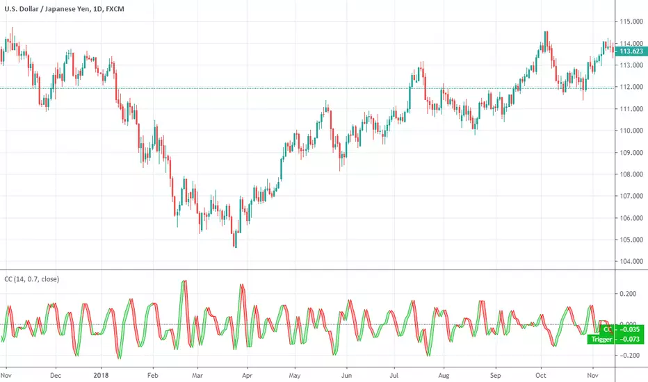
Ehlers Cyber CycleEhlers Cyber Cycle indicator script. This indicator was originally developed by John F. Ehlers (see his book `Cybernetic Analysis for Stocks and Futures`, Chapter 4: `Trading the Cycle`).Pine Script®指標由everget提供已更新 11160
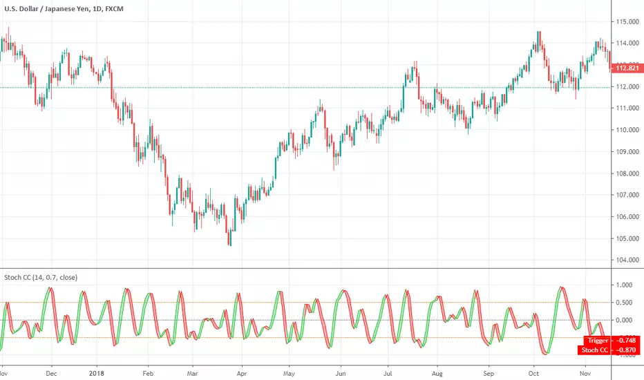
Ehlers Stochastic Cyber CycleEhlers Stochastic Cyber Cycle indicator script. This indicator was originally developed by John F. Ehlers (see his book `Cybernetic Analysis for Stocks and Futures`, Chapter 8: `Stochasticization and Fisherization of Indicators`).Pine Script®指標由everget提供已更新 33235
Ehlers Cycle BandPass Filter [CC]The Cycle BandPass Filter was created by John Ehlers (Cycle Modes and Trend Modes) and this is an alternate to the default BandPass Filter by changing some settings. This will be another series I will be introducing showing some indicators created by Ehlers and that didn't get much attention. This identifies the underlying cycle in the price data and these indicators aren't very common so I want to introduce more of these to tv. Buying and selling with these indicators can be a bit tricky but overall what Ehlers recommends is to buy at the lowest point and sell at the highest point to capture the underlying cycle. I have included strong buy and sell signals as darker colors and normal signals as lighter colors. Buy when the line turns green and sell when it turns red. Let me know if there are any other scripts you would like to see me publish!Pine Script®指標由cheatcountry提供2274
Simple CycleIntroduction A simple and really clean cycle oscillator, in fact its quite precise even if the script use recursion which can sometime produce totally uncorrelated results. On The Code The calculations start with a who is a smoothing/averaging constant. Then comes src who is the input and is defined as the sum of the closing price with the output, then the output is high-pass filtered in b , after that the output is just the weighted average of the input change with b . All those recursions and detrending steps make the indicator able to highlights cycles. Pine Script®指標由alexgrover提供1195
Sinusoidal Cycles OscillatorTitle: Sinusoidal Cycles Oscillator – Multi-Cycle Market Indicator Description: Discover market rhythm with the Sinusoidal Cycles Oscillator, a powerful tool for technical analysis and cyclical trading. Three customizable cycles track short, medium, and long-term market oscillations. Cycle 1 serves as the main reference wave with an optional mirror envelope. Cycles 2 & 3 provide supporting harmonics for deeper insight. Composite wave averages all cycles to reveal overall market phase. Features: Fully adjustable periods and amplitude. Visualize tops, bottoms, and turning points at a glance. Oscillator ranges from -1 to +1 with clear threshold guides. Ideal for traders using cycle analysis, harmonic trading, or market timing. Easy-to-read visual overlay and separate panel option. Use it to: Identify potential price reversals. Compare market cycles across multiple timeframes. Enhance timing and entry/exit decisions.Pine Script®指標由egghen提供12
Bitcoin Bull Runs Mid Cycle Aligned This script plots 2 lines which are the 2013 and 2016 bull run. The plots are aligned on their mid cycles to the 2021 mid cycle. Settings: You can move the plots on the x and y axis in the settings for the Daily, Weekly and Monthly TFs. The plot is weird on the Monthly TF, best to use the Daily and Weekly. If it doesn't load at first you have to zoom out fully and go back to 2013 for it to load. Then it will load.Pine Script®指標由jewinator_8提供已更新 121270
Ehlers Instantaneous Phase Dominant Cycle [CC]The Instantaneous Phase Dominant Cycle was created by John Ehlers (Stocks & Commodities V. 18:3 (16-27)) and this is one of many similar indicators that I will be publishing from Ehlers in the next few months that calculate the current dominant cycle period. The cycle period can be used in multiple ways but generally this means that if the stock is currently at a low then the current cycle period will tell you when the next lowest low will get hit or vice versa. This is also useful for using this cycle period as an input for other indicators to provide a very good adaptive length. Let me know how you wind up using these indicators in your daily trading. I have included the same buy and sell signals from my recent Hilbert Transform and so buy when the line turns green and sell when it turns red. Let me know if there are any other indicators you would like to see me publish!Pine Script®指標由cheatcountry提供22101
CCI Cycle (Modified Schaff Trend Cycle)This is a modified Schaff Trend Cycle (STC), which is designed to provide quicker entries and exits. I've been a huge fan of the STC for a long time, but being based on the MACD means its signals often lag by a bar or two (especially in fast moving markets). All I've done here is take the base STC script (all credit to user @LazyBear), and change the source to a modified CCI. The CCI Cycle provides more timely entries and exits, often by 1-2 bars. The flip side of the increased responsiveness is a prevalence for more false signals (a perfect example is the 17th August on the above chart). It's the nature of the beast! Still, I've been using this for a few months now and it's (in my opinion) an upgrade on the standard STC. As always, you will need to pair this with another indicator or method of technical analysis to provide a trade bias, as the CCI Cycle (and STC) aren't designed to trade every signal. In my experience, either divergence identification, or using one or more moving averages works particularly well. The indicator is also MTF capable, so you can get some interesting results from that. Any queries let me know. DDPine Script®指標由DreamsDefined提供1313 1.6 K
Goertzel Cycle Period Adaptive Fisher Transform [Loxx]Goertzel Cycle Period Adaptive Fisher Transform is an adaptive Fisher Transform using the Goertzel Cycle Algorithm to derive length inputs. What is Goertzel Cycle Algorithm? Read here: What is Fisher Transform? The Fisher Transform is a technical indicator created by John F. Ehlers that converts prices into a Gaussian normal distribution. The indicator highlights when prices have moved to an extreme, based on recent prices. This may help in spotting turning points in the price of an asset. It also helps show the trend and isolate the price waves within a trend. Included: Zero-line and signal cross options for bar coloring Customizable overbought/oversold thresh-holds Alerts Signals ***Please note, the Goertzel Cycle Algorithm is processor heavy, so this indicator will take some time to load.Pine Script®指標由loxx提供3397
Ehlers Mesa Spectrum Dominant Cycle [CC]The Mesa Spectrum Dominant Cycle was created by John Ehlers and this is the foundation for many indicators he created that would later follow. This is his updated version of his original Mesa algorithm and I do not recommend this indicator as a stand alone for trading. This is more of an informational indicator that will tell you the current dominant cycle period which is the approximate period between peaks and valleys in the underlying data. I have color coded buy signals just in case with both strong and normal signals. Darker colors are strong and lighter colors are normal. Buy when the line is green and sell when it is red. Let me know if there are any other indicators you would like to see me publish!Pine Script®指標由cheatcountry提供已更新 2525142
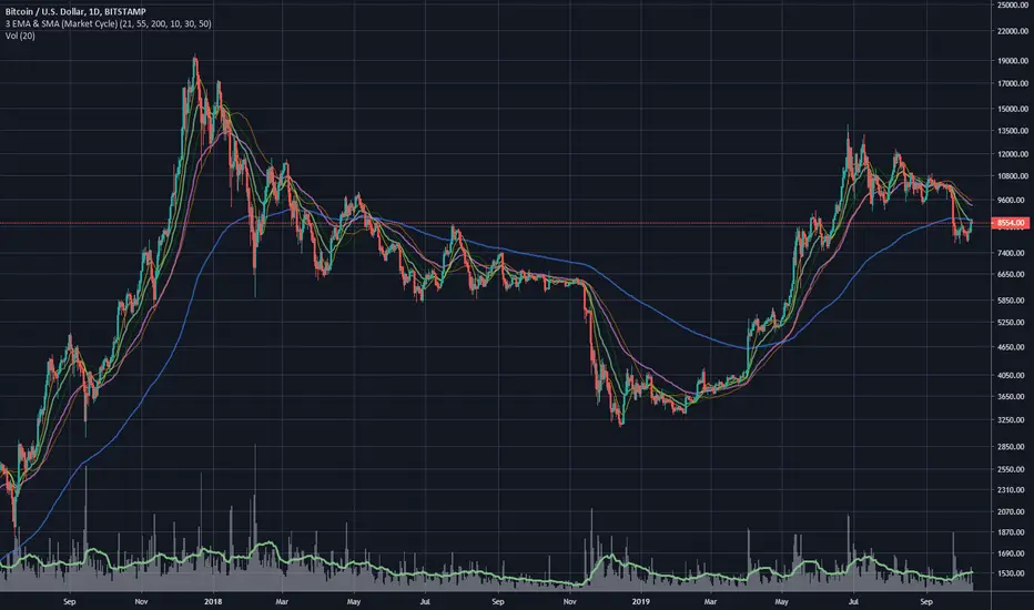
3 EMA & SMA (Market Cycle)Simple Indicator based on 3 Simple and 3 Exponential Moving Averages. Used to indicate Market Cycles. Definition of Bull Market: 10 SMA is above 21 EMA . 30 SMA slope is up. 55 EMA is trending above 200 EMA . Definition of Bear Market: 10 SMA is below 21 EMA . 30 SMA slope is down. 55 EMA is trending below 200 EMA .Pine Script®指標由MrHaugen提供45
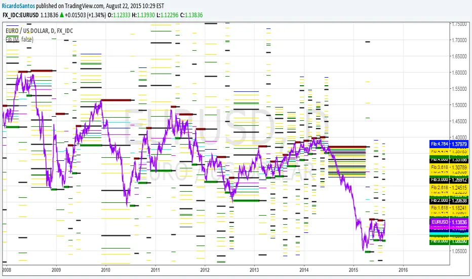
[RS]MTF Fibonacci Cycles V0EXPERIMENTAL: Fibonacci rate levels based on price advance/decline, can be used to make visualizations of fib clusters or for cycles.Pine Script®指標由RicardoSantos提供1414 3.4 K
Dominant Cycle Tuned RsiIntroduction Adaptive technical indicators are importants in a non stationary market, the ability to adapt to a situation can boost the efficiency of your strategy. A lot of methods have been proposed to make technical indicators "smarters" , from the use of variable smoothing constant for exponential smoothing to artificial intelligence. The dominant cycle tuned rsi depend on the dominant cycle period of the market, such method allow the rsi to return accurate peaks and valleys levels. This indicator is an estimation of the cycle finder tuned rsi proposed by Lars von Thienen published in Decoding the Hidden Market Rhythm/Fine-tuning technical indicators using the dominant market vibration/2010 using the cycle measurement method described by John F.Ehlers in Cybernetic Analysis for Stocks and Futures . The following section is for information purpose only, it can be technical so you can skip directly to the The Indicator section. Frequency Estimation and Maximum Entropy Spectral Analysis “Looks like rain,” said Tom precipitously. Tom would have been a great weather forecaster, but market patterns are more complex than weather ones. The ability to measure dominant cycles in a complex signal is hard, also a method able to estimate it really fast add even more challenge to the task. First lets talk about the term dominant cycle , signals can be decomposed in a sum of various sine waves of different frequencies and amplitudes, the dominant cycle is considered to be the frequency of the sine wave with the highest amplitude. In general the highest frequencies are those who form the trend (often called fundamentals) , so detrending is used to eliminate those frequencies in order to keep only mid/mid - highs ones. A lot of methods have been introduced but not that many target market price, Lars von Thienen proposed a method relying on the following processing chain : Lars von Thienen Method = Input -> Filtering and Detrending -> Discrete Fourier Transform of the result -> Selection using Bartels statistical test -> Output Thienen said that his method is better than the one proposed by Elhers. The method from Elhers called MESA was originally developed to interpret seismographic information. This method in short involve the estimation of the phase using low amount of information which divided by 360 return the frequency. At first sight there are no relations with the Maximum entropy spectral estimation proposed by Burg J.P. (1967). Maximum Entropy Spectral Analysis. Proceedings of 37th Meeting, Society of Exploration Geophysics, Oklahoma City. You may also notice that these methods are plotted in the time domain where more classic method such as : power spectrum, spectrogram or FFT are not. The method from Elhers is the one used to tune our rsi. The Indicator Our indicator use the dominant cycle frequency to calculate the period of the rsi thus producing an adaptive rsi . When our adaptive rsi cross under 70, price might start a downtrend, else when our adaptive rsi crossover 30, price might start an uptrend. The alpha parameter is a parameter set to be always lower than 1 and greater than 0. Lower values of alpha minimize the number of detected peaks/valleys while higher ones increase the number of those. 0.07 for alpha seems like a great parameter but it can sometimes need to be changed. The adaptive indicator can also detect small top/bottoms of small periods Of course the indicator is subject to failures At the end it is totally dependent of the dominant cycle estimation, which is still a rough method subject to uncertainty. Conclusion Tuning your indicator is a great way to make it adapt to the market, but its also a complex way to do so and i'm not that convinced about the complexity/result ratio. The version using chart background will be published separately. Feel free to tune your indicators with the estimator from elhers and see if it provide a great enhancement :) Thanks for reading ! References for the calculation of the dominant cycle estimator originally from www.davenewberg.com Decoding the Hidden Market Rhythm (2010) Lars von Thienen Ehlers , J. F. 2004 . Cybernetic Analysis for Stocks and Futures: Cutting-Edge DSP Technology to Improve Your Trading . Wiley Pine Script®指標由alexgrover提供88621
Trend-cycle reversion (multi-timeframe)Trend-cycle reversion (multi-timeframe) is a mean-reversion “stretch” gauge built around a simple idea: price often deviates from its recent path (trend + dominant swing rhythm), and those deviations become more actionable when you scale them by volatility and express them as a standardized score. This script models the last N bars as: 1) a linear trend (to capture drift), plus 2) a single dominant cycle (to capture the most prominent oscillation inside the same window). It then measures how far current price is from the model’s next-bar projection, normalizes that distance by ATR (volatility), and finally converts the result into a rolling Z-score. The output is displayed as a multi-timeframe dashboard so you can see “stretch vs. fit” across several time compressions at once. ------------------------------------------------------------ What you see on the chart ------------------------------------------------------------ The indicator draws a table (overlay) with up to 12 rows (configurable), one per timeframe from your CSV list. Each row shows: • TF: The timeframe being evaluated (e.g., 1, 5, 15, 60, 240, D). • Z: The current Z-score of the volatility-scaled model gap on that timeframe. • State: A simple interpretation using your Z threshold: - “Short ▼” when Z > +threshold (price is extended above the model path) - “Long ▲” when Z < −threshold (price is extended below the model path) - “Hold •” when inside the band (not unusually stretched) Colors follow the same logic: red for high positive Z, green for high negative Z, gray when neutral or unavailable. Important: “Long/Short” here describes the direction of mean-reversion pressure (over/under the fitted path), not a complete trading system by itself. ------------------------------------------------------------ How it works (plain-English math) ------------------------------------------------------------ 1) Optional log transform If “Fit on log(price)” is enabled, the model runs on log(price) instead of raw price. This is often useful for markets that behave multiplicatively (large percentage moves, long-term exponential growth), because distances become closer to “percent-like” rather than absolute dollars. 2) Trend fit (linear regression in the window) Over the last Window Length bars, the script estimates a straight-line trend. Think of this as the baseline path that best explains the window if you ignore swings. 3) Cycle search (best period by least-squares error) After removing the linear trend, the script searches for a single sinusoidal cycle period between: • Min Period and Max Period (in bars), stepping by Period Step. For each candidate period, it computes the best-fitting sine+cosine components and measures the remaining error (SSE). The period with the smallest SSE is selected as the “best” cycle for that window. To reduce recalculation cost and to keep the chosen cycle from flapping every bar, the script re-runs this period search only every “Re-search best period every N bars”. Between searches, it keeps using the last best period. 4) Next-bar projection and “gap” Using the fitted trend + fitted cycle, the script projects the model value one bar ahead (relative to the window indexing). It then computes: gap = (current value) − (projected value) If “Invert sign” is enabled, the gap is multiplied by −1. This doesn’t change magnitude, it only flips interpretation (useful if you prefer the opposite sign convention). 5) Volatility scaling via ATR The raw gap is divided by ATR to make it comparable across symbols and regimes. If you are fitting on log(price), ATR is also computed in log space using a log-based true range, then smoothed similarly (so the scale is consistent). This produces a “gap in ATR units”. 6) Z-score standardization Finally, the script computes a rolling Z-score of the ATR-scaled gap over “Z-score length”: Z = (gapATR − mean(gapATR)) / stdev(gapATR) This is what appears in the table. The Z-score answers: “How unusual is today’s model deviation compared to the last Z-score length observations?” ------------------------------------------------------------ How to interpret the Z-score ------------------------------------------------------------ Z near 0: Price is close to the model path relative to recent volatility (nothing unusual). Z above +threshold: Price is meaningfully ABOVE the fitted path (stretched up). This can be read as elevated downside mean-reversion pressure — but it can also persist during strong trends. Z below −threshold: Price is meaningfully BELOW the fitted path (stretched down). This can be read as elevated upside mean-reversion pressure — but it can also persist during fast selloffs. A practical way to use this indicator is to treat it as a “context filter” or “risk tool”: • Fading extremes: look for mean-reversion setups when Z is beyond the threshold and price action confirms (e.g., momentum stalls, structure breaks, volatility contraction/expansion cues). • Trend-aware reversion: only take “reversion” signals in the direction permitted by your separate trend filter (higher-timeframe trend, moving average regime, market structure, etc.). • Take-profit / risk management: in a trend-following strategy, extremes can be used as partial profit zones or as “don’t chase here” warnings. ------------------------------------------------------------ Multi-timeframe (MTF) notes ------------------------------------------------------------ Each table row is computed with request.security() on that timeframe with no lookahead, so it is not using future bars to form the value. However, like any live indicator, the value for an actively forming bar can change until that bar closes (especially on the lower timeframes). Also, higher-timeframe rows update when that higher-timeframe bar updates/closes. ------------------------------------------------------------ Inputs (what to change first) ------------------------------------------------------------ If you only change a few settings, start here: • Window Length: Controls how much history the model uses. Larger = smoother/stabler, but slower to adapt. • Min/Max Period + Step: Controls the cycle search range and granularity. - Wider ranges can capture more possibilities but cost more computation. - Smaller steps can find a closer match but also cost more. • Re-search every N bars: Higher = faster performance and more stability; lower = more adaptive but can be noisier. • ATR length (scale gap): Controls the volatility scale. Shorter reacts faster to volatility changes; longer is steadier. • Z-score length: Controls how “rare” extremes are. Longer lengths make Z more stable, but require more history and adapt slower to regime shifts. • Z threshold: Defines when the table labels “Long/Short”. Common choices are 1.5–2.5 depending on how selective you want extremes to be. • Timeframes (CSV) + Max table rows: Controls what you see in the dashboard. ------------------------------------------------------------ Limitations and expectations ------------------------------------------------------------ This is a single-cycle, windowed model. Markets can be multi-cycle, non-sinusoidal, or structurally shifting; in those cases the “best period” is simply the best approximation inside the window, not a guarantee of a true underlying rhythm. Z-score extremes are not automatic reversal calls. In strong trends or during volatility shocks, Z can stay extreme longer than expected. Use this as a measurement tool, then combine it with your own confirmation and risk management. This indicator is for analysis/education and does not provide financial advice. Pine Script®指標由Tradenometry提供6
Short-Only Cycle IndicatorThis script is a follow-up to my previous 60-day Cycle, Long-Only Indicator. The "Short-Only Cycle Indicator" is designed to help traders navigate optimal shorting opportunities by analyzing cyclical price behavior over a defined period. It focuses on recognizing distribution phases (ideal for shorting) and accumulation phases (where shorting should be avoided). It should be used with assets that the trader has an existing thesis for downward price movement. Key Features: 1. Cycle Length: The indicator uses a 60-day cycle to identify high and low points in price, which are then used to determine the current market phase. 2. Distribution Phase: When the price is near the cycle high, the indicator signals a distribution phase, indicating potential shorting opportunities. 3. Accumulation Phase: When the price is near the cycle low, the indicator signals an accumulation phase, advising traders to avoid shorting. 4. Short Signal: A short signal is triggered when the price crosses below the cycle high, which is visually marked on the chart for easy identification. This indicator is particularly useful for traders who prefer a short-only strategy, as it helps them time their entries and avoid shorting during unfavorable market conditions. Pine Script®指標由PeakInvestmentStrategies提供52
Bitcoin Golden Pi CyclesTops are signaled by the fast top MA crossing above the slow top MA, and bottoms are signaled by the slow bottom MA crossing above the fast bottom MA. Alerts can be set on top and bottom prints. Does not repaint. Similar to the work of Philip Swift regarding the Bitcoin Pi Cycle Top, I’ve recently come across a similar mathematically curious ratio that corresponds to Bitcoin cycle bottoms. This ratio was extracted from skirmantas’ Bitcoin Super Cycle indicator . Cycle bottoms are signaled when the 700D SMA crosses above the 137D SMA (because this indicator is closed source, these moving averages were reverse-engineered). Such crossings have historically coincided with the January 2015 and December 2018 bottoms. Also, although yet to be confirmed as a bottom, a cross occurred June 19, 2022 (two days prior to this article) The original pi cycle uses the doubled 350D SMA and the 111D SMA . As pointed out this gives the original pi cycle top ratio: 350/111 = 3.1532 ≈ π Also, as noted by Swift, 111 is the best integer for dividing 350 to approximate π. What is mathematically interesting about skirmanta’s ratio? 700/138 = 5.1095 After playing around with this for a while I realized that 5.11 is very close to the product of the two most numerologically significant geometrical constants, π and the golden ratio, ϕ: πϕ = 5.0832 However, 138 turns out to be the best integer denominator to approximate πϕ: 700/138 = 5.0725 ≈ πϕ This is what I’ve dubbed the Bitcoin Golden Pi Bottom Ratio. In the spirit of numerology I must mention that 137 does have some things going for it: it’s a prime number and is very famously almost exactly the reciprocal of the fine structure constant (α is within 0.03% of 1/137). Now why 350 and 700 and not say 360 and 720? After all, 360 is obviously much more numerologically significant than 350, which is proven by the fact that 360 has its own wikipedia page, and 350 does not! Using 360/115 and 720/142, which are also approximations of π and πϕ respectively, this also calls cycle tops and bottoms. There are infinitely many such ratios that could work to approximate π and πϕ (although there are a finite number whose daily moving averages are defined). Further analysis is needed to find the range(s) of numerators (the numerator determines the denominator when maintaining the ratio) that correctly produce bottom and top signals.Pine Script®指標由NgUTech提供已更新 11 1.6 K
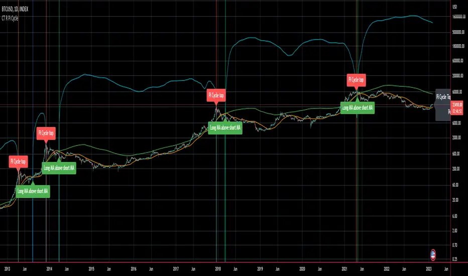
CT Reverse Pi Cycle Bitcoin Top IndicatorIntroducing the Reverse BTC Pi Market Cycle Top indicator Much respect to Philip Swift the original creator of this idea and big thanks to Tradingview author Ninorigo for sharing the script which this indicator is based on. Philip Swift has noted that: Using the x2 multiple of the 350 day moving average along with the 111 day moving average provides an interesting market cycle indicator. Over the past three market cycles, when the 350DMA x2 crosses below the 111DMA, Bitcoin price peaks in its market cycle, this has been accurate to within three days of Bitcoin price topping out. Here I have modified an existing script by Tradingview author @Ninorigo which shows the moving averages and gives signals upon crossover by adding the following features: A function which shows the price at which the 350DMA will Cross Below the 111DMA. (This is calculated from the prior bar closing data and does not repaint) An “anticipated cross” function which may give a 1 bar advanced warning of a cross. (this is calculated from current bar values and may change and repaint) The crossover levels are shown in an info label to the right of the current price. When there is a BTC Pi Market Cycle Top anticipated cross on the next bar there will be an orange background signal. When there is an actual BTC Pi Market Cycle Top cross there will be a red background signal When there is an anticipated cross back there will be a blue background signal When there is an actual cross back there will be a green background signal This indicator will show the appropriate moving averages and crossover information from the daily timeframe regardless of the timeframe you are using. This should be helpful in more accurately identifying the price level where the Pi Market Cycle moving averages will cross denoting a possible market cycle top. It is interesting to note: 350 / 111 = 3.153 Which is the closest we can get to Pi when dividing 350 by another whole number. This is a script to give another view and metric on an interesting experimental idea. This is not financial advice. Pine Script®指標由The_Caretaker提供已更新 2929 1.6 K
DFT - Dominant Cycle Period 8-50 bars - John EhlerThis is the translation of discret cosine tranform (DCT) usage by John Ehler for finding dominant cycle period (DC). The price is first filtered to remove aliasing noise(bellow 8 bars) and trend informations(above 50 bars), then the power is computed. The trick here is to use a normalisation against the maximum power in order to get a good frequency resolution. Current limitation in tradingview does not allow to display all of the periods, still the DC period is plot after beeing computed based on the center of gravity algo. The DC period can be used to tune all of the indicators based on the cycles of the markets. For instance one can use this (DC period)/2 as an input for RSI. Hope you find this of some interrest.Pine Script®指標由littlebigcrypt提供已更新 44187
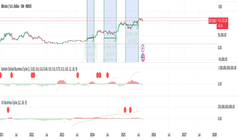
Liquidity-Weighted Business Cycle (Satoshi Global Base)🌍 BTC-Affinity Global Liquidity Business Cycle (MACD Model) This indicator models Bitcoin’s macroeconomic business cycle using a BTC-weighted global liquidity index as its foundation. It adapts a MACD-based framework to visualize expansions and contractions in fiat liquidity across major economies with high Bitcoin affinity. 🔍 What It Does: 🧠 Constructs a Global M2 Liquidity Index from the top 10 most BTC-relevant fiat currencies (USD, EUR, JPY, GBP, INR, CNY, KRW, BRL, CAD, AUD) — each weighted by its Bitcoin adoption score and FX-converted into USD. 📊 Applies a MACD (Moving Average Convergence Divergence) signal to the index to detect macro liquidity trends. 🟢 Plots a histogram of business cycle momentum (red = expansion, green = contraction). 🔴 Marks potential cycle peaks, useful for macro trading alignment. ⚖️ BTC Affinity-Weighted Countries: 🇺🇸 United States 🇪🇺 Eurozone 🇯🇵 Japan 🇬🇧 United Kingdom 🇮🇳 India 🇨🇳 China 🇰🇷 South Korea 🇧🇷 Brazil 🇨🇦 Canada 🇦🇺 Australia Weights are user-adjustable to reflect evolving capital controls, regulation, and real-world BTC adoption trends. ✅ Use Cases: Confirm macro risk-on vs risk-off regimes for BTC and crypto. Identify ideal entry and exit zones in macro pair trades (e.g., MSTR vs MSTY). Monitor how global monetary expansion feeds into BTC valuations.Pine Script®指標由TheGoldphoenix提供已更新 1127
US Liquidity-Weighted Business Cycle📈 BTC Liquidity-Weighted Business Cycle This indicator models the Bitcoin macro cycle by comparing its logarithmic price against a log-transformed liquidity proxy (e.g., US M2 Money Supply). It helps visualize cyclical tops and bottoms by measuring the relative expansion of Bitcoin price versus fiat liquidity. 🧠 How It Works: Transforms both BTC and M2 using natural logarithms. Computes a liquidity ratio: log(BTC) – log(M2) (i.e., log(BTC/M2)). Runs MACD on this ratio to extract business cycle momentum. Plots: 🔴 Histogram bars showing cyclical growth or contraction. 🟢 Top line to track the relative price-to-liquidity trend. 🔴 Cycle peak markers to flag historical market tops. ⚙️ Inputs: Adjustable MACD lengths Toggle for liquidity trend line overlay 🔍 Use Cases: Identifying macro cycle tops and bottoms Timing long-term Bitcoin accumulation or de-risking Confirming global liquidity's influence on BTC price movement Note: This version currently uses US M2 (FRED:M2SL) as the liquidity base. You can easily expand it with other global M2 sources or adjust the weights.Pine Script®指標由TheGoldphoenix提供已更新 20
Ehlers Cycle Amplitude [CC]The Cycle Amplitude was created by John Ehlers (Trend Modes and Cycle Modes) and this indicator wasn't meant to give buy and sell signals by itself but I'm publishing this open source script in case someone comes up with a cool way to use this indicator for buy and sell signals. This indicator essentially tells you the distance between the peaks from the Cycle BandPass Filter and I will be including the last script tomorrow most likely. I'm reusing the same exact buy and sell signals from the cycle bandpass filter so if you have any questions then feel free to refer to the link I posted. Let me know if there are any other scripts you would like to see me publish!Pine Script®指標由cheatcountry提供4443
Missile RSI (RSI of momentum w/ Dominant Cycle length + Fisher)This is a predictive indicator that looks for explosions in momentum of the cycles in price and large shifts in Momentum (Fisher turns the Bimodal PDF into Guassian like) as statistically unlikely events, showing points to exit or reverse positions. You can adjust the lowpass frequency cuttoff (Aka what cycles you want to remove from the calculations through the super smoother filter). To be honest you can monkey trade the direction of the Signal if you'd like but the Divergences and Maxing of the values is whats most useful. Let me know if you guys want me to add anything else.Pine Script®指標由anoojpatel提供247
The Perfect RSI (Ehler's Cycle RSI Modified with Discriminator)This is the RSI indicator that I use. It combines two concepts of John Ehler. It integrates the idea of Highpass filtering the Price data, along with the the idea of automatically determining the Dominant price cycle through a Homodyne Discriminator, and using half of a cycle length as the input for the RSI. Not only determines the most effective range for the RSI by setting it based on the cycle, but also makes the RSI PDF(Probability Distribution Function) adjustable as shown in John Ehler's papers. Still needs some tweaking on determining the best calculations for cycles, and whether or not to better filter the price data into the discriminator. Works just like a normal RSI, but should have less false signals, and also has the option for super smoothing. Play around it and see if theres any new indications or signals that come from it ;) Let me know if there's any concerns or additions!Pine Script®指標由anoojpatel提供1010768