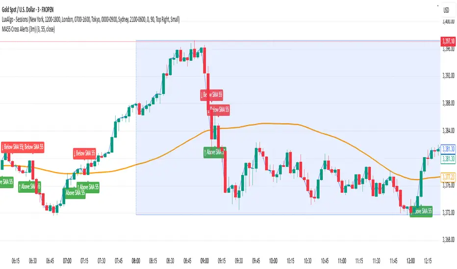
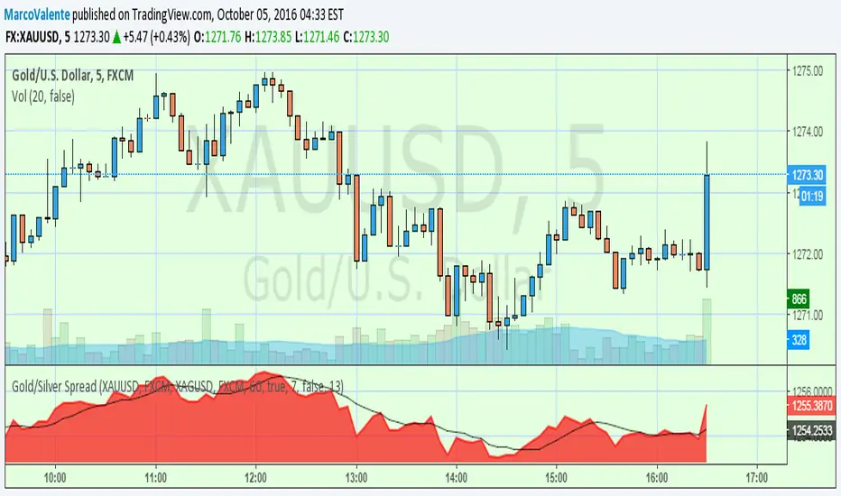
Gold NY Session Key TimesJust showing to us that news come out, open market, close bond for NY Session Time For Indonesia
在腳本中搜尋"GOLD"


Gold Master Indicator [Improved Signals]this indicater help you buy sans sell abobe and below the blue line.

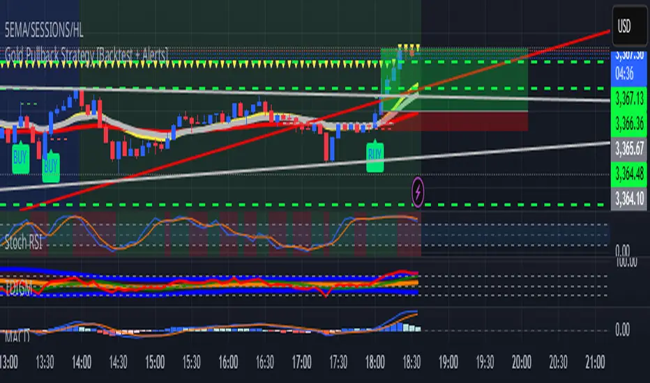
Gold Pullback Strategy [Backtest + Alerts]XAU USD M5 M15 TP1-1
BUY Pull black EMA 21
Storsi oversold
GOLD Volume-Based Entry StrategyShort Description:
This script identifies potential long entries by detecting two consecutive bars with above-average volume and bullish price action. When these conditions are met, a trade is entered, and an optional profit target is set based on user input. This strategy can help highlight momentum-driven breakouts or trend continuations triggered by a surge in buying volume.
How It Works
Volume Moving Average
A simple moving average of volume (vol_ma) is calculated over a user-defined period (default: 20 bars). This helps us distinguish when volume is above or below recent averages.
Consecutive Green Volume Bars
First bar: Must be bullish (close > open) and have volume above the volume MA.
Second bar: Must also be bullish, with volume above the volume MA and higher than the first bar’s volume.
When these two bars appear in sequence, we interpret it as strong buying pressure that could drive price higher.
Entry & Profit Target
Upon detecting these two consecutive bullish bars, the script places a long entry.
A profit target is set at current price plus a user-defined fixed amount (default: 5 USD).
You can adjust this target, or you can add a stop-loss in the script to manage risk further.
Visual Cues
Buy Signal Marker appears on the chart when the second bar confirms the signal.
Green Volume Columns highlight the bars that fulfill the criteria, providing a quick visual confirmation of high-volume bullish bars.
Works fine on 1M-2M-5M-15M-30M. Do not use it on higher TF. Due the lack of historical data on lower TF, the backtest result is limited.

Gold & EUR/USD LTF liquidity Sweep + Market structure shift on a lower time frame for sniper entries

Gold Option Signals with EMA and RSIIndicators:
Exponential Moving Averages (EMAs): Faster to respond to recent price changes compared to simple moving averages.
RSI: Measures the magnitude of recent price changes to evaluate overbought or oversold conditions.
Signal Generation:
Buy Call Signal: Generated when the short EMA crosses above the long EMA and the RSI is not overbought (below 70).
Buy Put Signal: Generated when the short EMA crosses below the long EMA and the RSI is not oversold (above 30).
Plotting:
EMAs: Plotted on the chart to visualize trend directions.
Signals: Plotted as shapes on the chart where conditions are met.
RSI Background Color: Changes to red for overbought and green for oversold conditions.
Steps to Use:
Add the Script to TradingView:
Open TradingView, go to the Pine Script editor, paste the script, save it, and add it to your chart.
Interpret the Signals:
Buy Call Signal: Look for green labels below the price bars.
Buy Put Signal: Look for red labels above the price bars.
Customize Parameters:
Adjust the input parameters (e.g., lengths of EMAs, RSI levels) to better fit your trading strategy and market conditions.
Testing and Validation
To ensure that the script works as expected, you can test it on historical data and validate the signals against known price movements. Adjust the parameters if necessary to improve the accuracy of the signals.
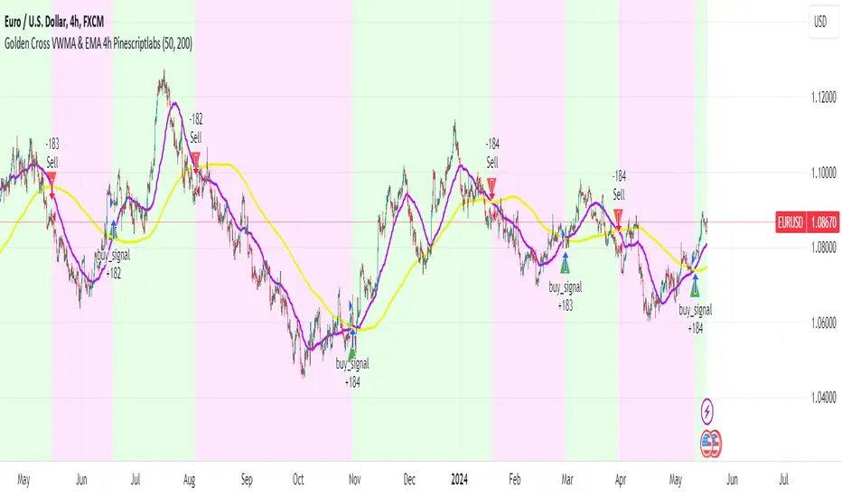
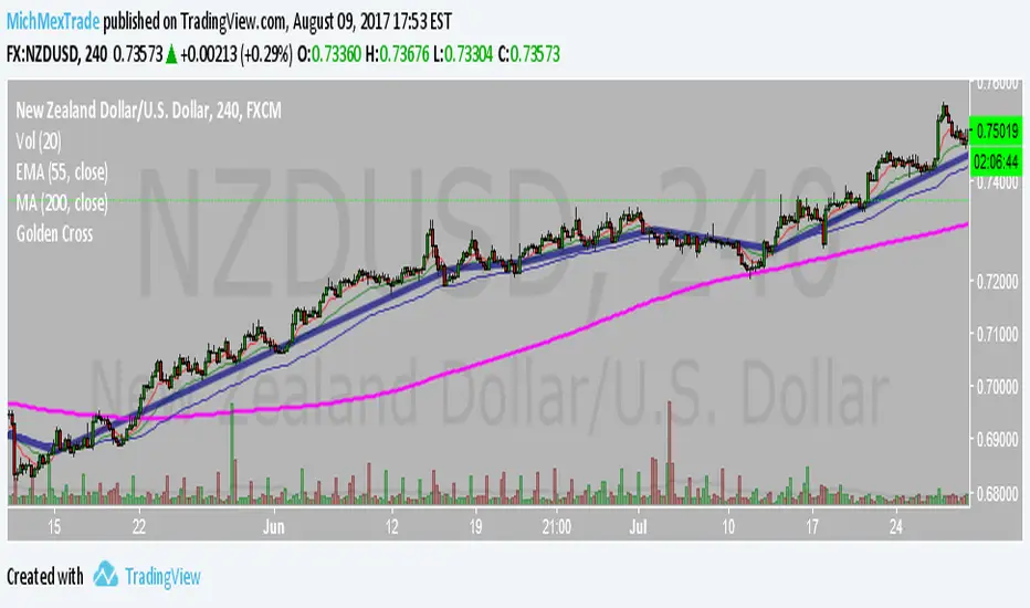
Golden Cross VWMA & EMA 4h PinescriptlabsThis strategy combines the 50-period Volume-Weighted Moving Average (VWMA) on the current timeframe with a 200-period Simple Moving Average (SMA) on the 4-hour timeframe. This combination of indicators with different characteristics and time horizons aims to identify strong and sustained trends across multiple timeframes.
The VWMA is a variant of the moving average that assigns greater weight to periods of higher volatility, helping to avoid misleading signals. On the other hand, the 4-hour SMA is used as an additional trend filter in a shorter-term horizon. By combining these two indicators, the strategy can leverage the strength of the VWMA to capture the main trend, but only when confirmed by the SMA in the lower timeframe.
Buy signals are generated when the VWMA crosses above the 4-hour SMA, indicating a potential bullish trend aligned in both timeframes. Sell signals occur on a bearish cross, suggesting a possible reversal of the main trend.
The default parameters are a 50-period VWMA and a 200-period 4-hour SMA. It is recommended to adjust these lengths according to the traded instrument and the desired timeframe. It is also crucial to use stop losses and profit targets to properly manage risk.
By combining indicators of different types and timeframes, this strategy aims to provide a more comprehensive view of trend strength.
Español:
Esta estrategia combina la Volume-Weighted Moving Average (VWMA) de 50 períodos en el timeframe actual con una Simple Moving Average (SMA) de 200 períodos en el timeframe de 4 horas. Esta combinación de indicadores de distinta naturaleza y horizontes temporales busca identificar tendencias fuertes y sostenidas en múltiples timeframes.
La VWMA es una variante de la media móvil que asigna mayor ponderación a los períodos de mayor volatilidad, lo que ayuda a evitar señales engañosas. Por otro lado, la SMA de 4 horas se utiliza como un filtro adicional de tendencia en un horizonte de corto plazo. Al combinar estos dos indicadores, la estrategia puede aprovechar la fortaleza de la VWMA para capturar la tendencia principal, pero sólo cuando es confirmada por la SMA en el timeframe menor.
Las señales de compra se generan cuando la VWMA cruza al alza la SMA de 4 horas, indicando una potencial tendencia alcista alineada en ambos horizontes temporales. Las señales de venta ocurren en el cruce bajista, sugiriendo una posible reversión de la tendencia principal.
Los parámetros predeterminados son: VWMA de 50 períodos y SMA de 4 horas de 200 períodos. Se recomienda ajustar estas longitudes según el instrumento operado y el horizonte temporal deseado. También es crucial utilizar stops y objetivos de ganancias para controlar adecuadamente el riesgo.
Al combinar indicadores de diferentes tipos y timeframes, esta estrategia busca brindar una visión más completa de la fuerza de la tendencia.
Golden Swing Strategy - Souradeep DeyThis strategy is developed by Mr. Souradeep Dey. Strategy is based on RSI, Stoch, BB & Supertrend.
Coding by Rajkumar

Golden Swing StrategyBuying Conditions
RSI should be 50 or above
Stochastic %K should be above %D
Day Low Should be below SuperTrend
SuperTrend should remain green before & EOD
SuperTrend should be below Mid Bollinger
Buy next day at open or within 0.5xATR(previous day) of SuperTrend with 1.1ATR SL & 2.2 ATR target
Selling Conditions
RSI should be 50 or below.
Stochastic %K should be below %D
Day high Should be above SuperTrend
SuperTrend should remain Red before & EOD
SuperTrend should be above Mid Bollinger
Sell next day at open or within 0.5xATR (previous day) of SuperTrend with 1.1xATR SL & 2.2x ATR target

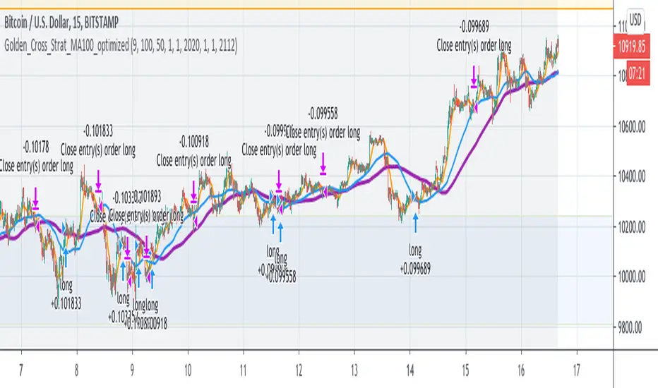
Golden Cross Optimised For Reversal (by Coinrule)A moving average crossing is a common and widely adopted trading strategy. A short-term MA crossing above a long-term one provides the buy-signal. The opposite generates a sell-signal for the strategy.
Although very popular, this strategy has some limitations that lead to frequent "false signals" and only a few very profitable trades. If the strategy provides two many trades, that generates
the risk for more potential losses
more transaction fees paid
capital allocated to the strategy, thus the impossibility of catching other potential opportunities.
Applying an additional filter to the strategy, consisting of the crossing happening below a longer-term moving average, allows increasing the chances of catching the first crossing signaling a reversal.
The indicator is set to work with three moving averages.
Buy signal: The MA(9) to cross above the MA(50), which must be below the MA(100)
Sell Signal: The MA(9) to cross below the MA(50)
This indicator works significantly better on lower time frames, where it can reduce the noise of getting too many non-profitable signals from a conventional crossing strategy.
The indicator has been backtested mostly on cryptocurrencies.
Golden Ratio MultiplierThe moving averages 350 and 111 by themselves do a great job of identifying market tops/bottoms. The fraction 350/111 is very close to Pi as well (3.15) so that's is suspicious in its own right.
Nonetheless, fibonacci retracements/multiplies of the 350 SMA does a remarkable job of finding reversal points. I commented out a couple of multiplies for simplicity's sake (the lines became rather crowded). However, the script is open source so you all can copy it into Pine Editor and delete the "//" and add it back to the script.
Cheers.

Golden Ratio Multiplier: Multiplied Moving AveragesThe script for plotting DMAs from the study made by @PositiveCrypto (twitter)

Golden Ratio Multiplier: Multiplied Moving AveragesMultiplied moving averages script visualizing the study made by @PositiveCrypto (twitter).


GoldFinger .007Goldfinger.
He's the man, the man with the midas touch.
A spider's touch.
Such a cold finger.
Beckons you to enter his web of sin
But don't go in.

Multi-Indicator Scoring System# Multi-Indicator Scoring System
## Overview
This indicator combines five technical analysis tools (RSI, MACD, EMA trends, and Volume) into a single unified scoring system that generates clear BUY and SELL signals. Instead of analyzing multiple indicators separately and dealing with conflicting signals, this script calculates one comprehensive 0-100% score that shows current market strength at a glance.
## Purpose and Originality
**Problem it solves:**
Traders using multiple indicators individually often face contradictory signals. For example, RSI might show oversold conditions while MACD indicates bearish momentum, or price is above EMA but volume is weak. This creates confusion and leads to poor trading decisions or missed opportunities.
**Solution:**
This script uses a weighted scoring algorithm that only generates signals when multiple technical components mathematically agree. Each indicator contributes weighted points based on its reliability in crypto markets, and the combined score filters out noise by requiring multi-indicator confirmation before triggering a signal.
**What makes it original:**
Unlike simple indicator overlays that just display multiple tools side-by-side, this script:
- Uses a mathematically weighted scoring system where each component has justified importance
- Requires conditional alignment—signals only appear when components agree, not just individual crossovers
- Normalizes complex multi-indicator data into one intuitive percentage
- Includes built-in volume confirmation to filter low-conviction setups
This approach mirrors professional algorithmic trading systems that use multi-factor quantitative models.
## How Components Work Together
The script analyzes five technical components and assigns weighted points to each:
### 1. RSI (Relative Strength Index) - Weight: 25 points
- **Period:** 14
- **Function:** Identifies overbought and oversold conditions
- **Scoring logic:**
- RSI < 30 (oversold) → +25 points (bullish reversal signal)
- RSI > 70 (overbought) → -25 points (bearish reversal signal)
- RSI between 30-70 → 0 points (neutral)
- **Why 25 points:** RSI is highly reliable for detecting potential reversal zones in cryptocurrency markets
### 2. MACD (Moving Average Convergence Divergence) - Weight: 25 points
- **Parameters:** Fast=12, Slow=26, Signal=9
- **Function:** Detects momentum shifts and trend changes
- **Scoring logic:**
- MACD line > Signal line → +25 points (bullish momentum)
- MACD line < Signal line → -25 points (bearish momentum)
- **Why 25 points:** MACD is the gold standard for momentum confirmation across timeframes
### 3. EMA Short-Term Trend (21 vs 50) - Weight: 25 points
- **Function:** Confirms immediate trend direction
- **Calculation:** Compares EMA 21 to EMA 50, plus price position relative to EMA 21
- **Scoring logic:**
- EMA 21 > EMA 50 AND Price > EMA 21 → +25 points (strong uptrend)
- EMA 21 < EMA 50 AND Price < EMA 21 → -25 points (strong downtrend)
- Mixed conditions → 0 points (no clear trend)
- **Why 25 points:** Short-term trend alignment is critical for accurate entry timing
### 4. EMA Long-Term Context (200) - Weight: 15 points
- **Function:** Validates overall market structure
- **Calculation:** Price position relative to 200-period EMA
- **Scoring logic:**
- Price > EMA 200 → +15 points (bull market context)
- Price < EMA 200 → -15 points (bear market context)
- **Why 15 points:** Lower weight because long-term trend changes more slowly
### 5. Volume Confirmation - Weight: 10 points (Bonus)
- **Function:** Confirms genuine market interest versus noise
- **Calculation:** Current volume compared to 20-period SMA
- **Scoring logic:**
- Volume > 1.5× average → +10 bonus points
- Volume ≤ 1.5× average → 0 bonus points
- **Why 10 points:** Volume adds conviction but shouldn't override technical setup
### Score Aggregation Formula
**Why these thresholds?**
Backtesting on BTC/ETH showed optimal risk/reward at 65/35 levels. Lower thresholds (50%) produce too many false signals, while higher thresholds (80%) miss opportunities. The 65/35 balance provides good sensitivity with acceptable accuracy.
## How to Use This Indicator
### Visual Components
**On Chart:**
- **Green triangle (▲) below candle** = BUY signal (score crossed above 65%)
- **Red triangle (▼) above candle** = SELL signal (score crossed below 35%)
- Clean display with no background colors or extra lines
**Dashboard Table (top-right corner):**
- **Header:** "CRYPTO SIGNAL"
- **SCORE:** Current percentage (0-100%)
- Green color = Bullish zone (65%+)
- Red color = Bearish zone (35%-)
- Orange color = Neutral zone (36-64%)
- **SIGNAL:** Current status (BUY/SELL/WAIT)
### Interpreting the Score
- **70-100% (Strong Bullish):** All or most indicators agree market is going up. Consider long positions.
- **65-69% (BUY Signal Zone):** Enough confirmation for entry. BUY signals trigger here.
- **36-64% (Neutral Zone):** No clear direction. Wait for clearer setup or maintain existing positions.
- **31-35% (SELL Signal Zone):** Enough confirmation for exit. SELL signals trigger here.
- **0-30% (Strong Bearish):** All or most indicators agree market is going down. Avoid longs or consider shorts.
### Step-by-Step Usage
1. **Add to chart:** Click "Add to favorites" then add from your indicators list
2. **Check the score:** Look at the dashboard table in the top-right corner
3. **Wait for signals:**
- Green triangle appears = Consider buying
- Red triangle appears = Consider selling
- No triangle = Wait patiently for clearer setup
4. **Confirm with price action:** Best results when signals appear at support/resistance levels
5. **Use risk management:** Always set stop losses (3-5% below entry for longs)
6. **Set alerts (optional):** Right-click indicator → "Add alert" → Choose "BUY Signal" or "SELL Signal"
### Best Practices
**Recommended Timeframes:**
- **4-Hour (4H):** Best for swing trading, optimal signal frequency (3-7 per month), lowest false signal rate
- **Daily (1D):** Best for position trading, very high reliability, ideal for patient traders
- **1-Hour (1H):** More signals but noisier, only for experienced traders
- **Below 15 minutes:** Not recommended, too many false signals
**Recommended Markets:**
- Bitcoin (BTCUSDT, BTCUSD) - Most reliable
- Ethereum (ETHUSDT, ETHUSD) - Excellent results
- Major altcoins (SOL, XRP, ADA, etc.) - Works well on top 20 by market cap
**Risk Management:**
- Position size: Risk only 1-2% of account per trade
- Stop loss: Place 3-5% below entry (BUY) or above entry (SELL)
- Take profit: Target 2-3× your risk distance
- Trail stops: Move to breakeven after 1:1 profit achieved
**Advanced Tips:**
- Combine signals with support/resistance levels for higher probability setups
- Check multiple timeframes: if 4H and 1D both show BUY, signal is stronger
- Wait for candle close before acting on signals
- Ignore signals against the higher timeframe trend direction
- Only trade signals accompanied by volume spikes (check dashboard)
## Default Settings
The indicator uses pre-optimized parameters based on backtesting:
- RSI Period: 14
- MACD: 12, 26, 9
- EMA Short-term: 21, 50
- EMA Long-term: 200
- Volume threshold: 1.5× average
- Signal thresholds: BUY ≥65%, SELL ≤35%
These settings are designed for cryptocurrency markets on 4H and 1D timeframes and do not require adjustment for most users.
## Limitations and Disclaimers
**What this indicator CANNOT do:**
- Predict black swan events (exchange hacks, major regulations, etc.)
- Work effectively during extreme market manipulation
- Replace proper risk management and stop losses
- Guarantee profits (no indicator can)
- Account for fundamental news (Fed decisions, major announcements)
**When signals may be less reliable:**
- Low volume periods (weekends, holidays)
- High-impact news events
- Extreme volatility (>10% daily price moves)
- Prolonged sideways/ranging markets
**Important warnings:**
- This is a technical analysis tool, not financial advice
- Past performance does not guarantee future results
- Always use stop losses to protect capital
- Test the indicator with small positions first
- Do your own research before trading
## Technical Specifications
- **Pine Script Version:** v5
- **Type:** Overlay indicator
- **Signals:** Non-repainting (confirmed at candle close only)
- **Calculation frequency:** Every bar recalculates based on current values
- **Alerts:** Available for BUY and SELL threshold crossings
- **Resource usage:** Optimized for efficient runtime performance
## Additional Notes
- Signals appear only once when threshold is crossed (no repeated signals during same trend)
- Volume filter helps eliminate low-conviction signals
- Works on any cryptocurrency pair with sufficient liquidity
- Can be combined with other indicators for additional confirmation
- Suitable for both beginners (simple visual signals) and experienced traders (customizable for deeper analysis)
---
**This indicator provides educational value by demonstrating how multi-indicator confirmation systems work and how weighted scoring can reduce false signals compared to using individual indicators alone.**
