Indicator: Zero Lag EMA & a simple trading strategyZerolag (almost) EMA gives a good indicator of "close" trend. Many are familiar with the fast/slow ema crossing strategy. Try using this zerolag_ema as the fast runner. You will see improved and more reliable crossovers..
In general, when the zero_lag ema is above the EMA the instrument is in a bull mode and when the zero_lag ema is below the EMA the stock is bearish.
More info at www.mesasoftware.com
在腳本中搜尋"LazyBear"
Indicator: 8x MA with configurable lengthsGeneric 8x MA plotter. Marks all MA crossings.
Also, you can specify the type of MA -- SMA or EMA.
I actually added an option to disable a specific MA line by specifying ZERO for it. This seems to break the Pinescript Engine. So, for now, please specify all MA values, though I have support for disabling a line in the code.

Indicator: Derivative OscillatorConstance Brown's Derivative Oscillator was published in her book "Technical Analysis for the Trading Professional".
The oscillator uses a 14-period RSI. The RSI is then double smoothed with exponential moving averages. The default settings for the smoothing periods are 5 and 3.
In a second step a signal line is generated from the smoothed RSI by calculating a simple moving average with a period of 9.
The Derivative Oscillator is calculated as the difference between the smoothed RSI and the signal line and displayed as histogram.
All the values are configurable.
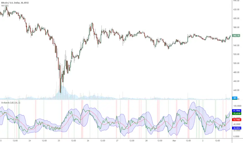
Indicator: MFI or RSI enclosed by Bollinger BandsIndicator allows choosing either MFI or RSI and draws a BB over it to identify oversold / overbought conditions.
Oversold/Overbought breaches are highlighted using different colors for easy identification. Has helped me a lot during sudden pumps to identify the tops, hope you find a use for this.
Indicator: Tirone LevelsTirone Levels are dynamic S/R indicators.
Supports two calculation methods: Midpoint-method and Mean-Method.
I personally like Mean-Method as it provides more realistic and useful S/R levels.

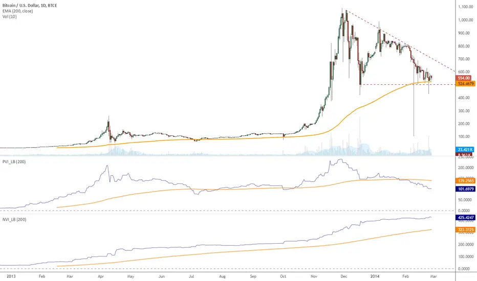
Indicator: Postivie / Negative Volume IndicesMore info at www.investopedia.com
I have included both NVI and PVI. Enjoy :)
Indicator: Vertical Horizontal Filter (VHF)VHF determines whether prices are in trending or congestion phase. Rising edge signifies a trend, falling edge signifies prices may be entering congestion phase.
Many use this as a contrarian indicator, which is my personal preference too.
I have added an option to plot EMA too, to see how strong the trend/no-trend values are.


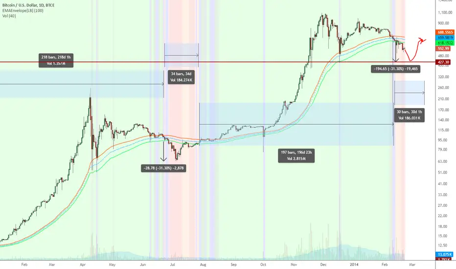
EMA Enveloper Indicator & a crazy predictionEMAEnvelope indicator does just that, draws a nice user-defined period EMA envelope (overlay).
It also can highlight the Bull/Bear breaks using different colors
- Green : High > EMA_HIGH
- Lime : (High > EMA_HIGH) and (Low > EMA_HIGH)
- Orange : Low < EMA_LOW
- Red : (Low < EMA_LOW) and (High < EMA_LOW)
Background highlighting is user-configurable.
Now to the (crazy) prediction: Based on a 100-period EMAEnvelope, we may have to go down to ~427.3 before starting turning Green. Look at the 2 Orange/Red areas highlighted.
EMA 200 tells us a different story, BTW.
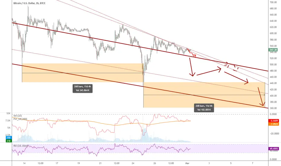
Possible scenario that may play out till MtGox announcementMtGox announcement is something everyone is waiting for...I am expecting a lot of sell off tomm.
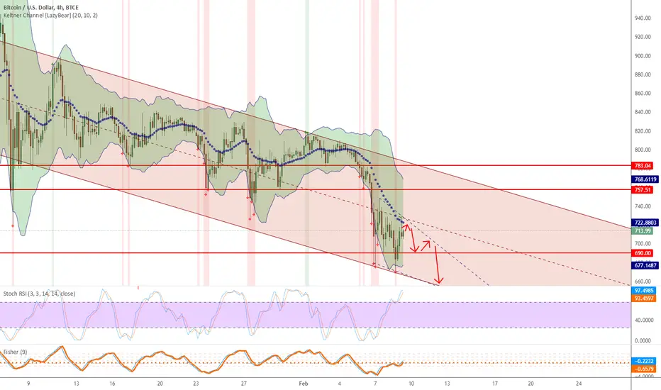
Trading Strategy based on BB/KC squeeze**** [Edit: New version (v02) posted, see the comments section for the code *****
Simple strategy. You only consider taking a squeeze play when both the upper and lower Bollinger Bands go inside the Keltner Channel. When the Bollinger Bands (BOTH lines) start to come out of the Keltner Channel, the squeeze has been released and a move is about to take place.
I have added more support indicators -- I highlight the bullish / bearish KC breaches (using GREEN/RED crosses) and a SAR to see where price action is trending.
Appreciate any feedback. Enjoy!
Color codes for v02:
----------------------------
When both the upper and lower Bollinger Bands go inside the Keltner Channel, the squeeze is on and is highlighted in RED.
When the Bollinger Bands (BOTH lines) start to come out of the Keltner Channel, the squeeze has been released and is highlighted in GREEN.
When one of the Bollinger Bands is out of Keltner Channel, no highlighting is done (this means, the background color shows up, so don't get confused if you have RED/GREEN in your chart's bground :))
Color codes for v01:
----------------------------
When both the upper and lower Bollinger Bands go inside the Keltner Channel, the squeeze is on and is highlighted in YELLOW.
When the Bollinger Bands (BOTH lines) start to come out of the Keltner Channel, the squeeze has been released and is highlighted in BLUE.

Keltner Channel v2 - Auto highlighting of Bull/Bear trendsPlease do not use the previous version (), I was using wrong colors for Bull/Bear there.
All options configurable.
Reversals are marked using crosses. as well as highlighted using green/red color (depending on bull/bear). Enjoy!

Keltner Channel with auto highlighting of Bear/Bull reversals*** New version @ ****
All options configurable.
Reversals are marked using crosses. as well as highlighted using green/red color (depending on bull/bear). Enjoy!


Color coded UO Small modification to stock UO code to highlight lows / highs. This helps to see the trend easily. The length to check for high/low is configurable (lengthSlope), I am yet to find the optimal setting but 30 looks nice so far.

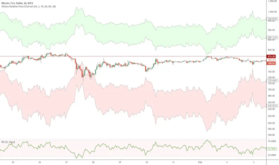
Wilson Relative Price Channel in PinePorted the code from www.thinkscripter.com
Seems to work. Let me know if you find any issues.
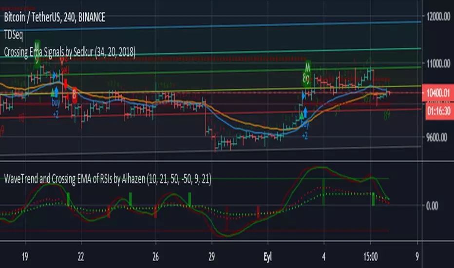
WaveTrend and Crossing EMA of RSIs by AlhazenLazyBear's WaveTrend Oscilator is simplified, and buy & sell signals are added. Green bars indicate SELL signal of WT, and Maroon bars indicate BUY signal of WT.
A new indicator added: Crossing EMA of two RSI's. RSI plots are shown with dotted lines. Lime bars indicate SELL signal of RSI, and Red bars indicate BUY signal of RSI.
You can combine WT and RSI together and decide to BUY or SELL.
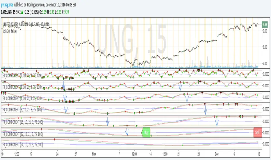
Fractal Resonance BarLazyBear's WaveTrend port has been praised for highlighting trend reversals with precision and punctuality (minimal lag). But strong "3rd Wave" trends can "embed" or saturate any oscillator flashing several premature crosses while stuck overbought/oversold. This happens when the trend stretches over a longer timescale than the oscillator's averaging window or filter time constant. Our solution: monitor many timescales. With Fractal Resonance Bar's rich color codings, strong wavefronts form across timescales and jump out like an approaching line of thunderclouds!
Fractal Resonance Bar color-codes the status of eight underlying stochastic oscillators, with each row averaging over twice the time of the row above.
Fractal Resonance Bar shifts its timescales along with your choice of main chart timescale:
1 minute chart: 1 minute through 128 minute (~2 hour) oscillators.
15 minute chart: 15 minute through 1920 minute (~32 hour) oscillators.
1 hour chart: 1 hour through 128 hour (~2 week) oscillators.
Daily chart: 1 day through 128 day (~4 month) oscillators.
The color map is configured as follows:
Hot Pink: Extreme Overbought (> 100%) rolled over to sell, but oscillators probably embedded with more upside (revert to Dark Green) possible after a pause.
Deep Red: Overbought (> 75%) crossover ripe for selling (validated when red spreads to timescales below).
Brown: Minor (< 75%) crossover sell from which could bounce back green or start a plunge toward gray/black.
Gray/Black: Mature (< -75%) sells turning full black in a plunge before the dawn.
Lime Green: Extreme Oversold (< -100%) and bouncing, though may yet bottom even lower.
Green: Oversold (< -75%) crossover ripe for buy. Green spreading to all timescales below will validate bottom is in.
Dark Green/Teal: Mature buy in overbought (> 75%) range, waiting for sell crossover to Hot Pink for a pause or correction.
White Stripes are Impulsive Trend Warning
Fractal Resonance Bar warns of oscillator embedding by showing white stripes when it detects strong, early surges in the timescale rows below.The white stripes usually accompany Hot Pink warning it's too early to go short, or Lime Green warning it's too early to go long.
Heeding these warnings will probably miss the exact top or bottom, but you're less likely to get overrun in a momentum move.
Usually the market gives us a second opportunity to short very close to the top or buy very close to the bottom after the warning white stripes have subsided.
NOTE: Recently rolled over Futures contracts may not have enough history for all oscillator calculations, in which case no bar colors will appear.
Tweakable Attributes
The default Channel Length, Stochastic Ratio Length and Lag Length work reasonably well on all timescales in our experience. Minor tweaks don't hurt but this may just overfit to a particular chart history.
We don't recommend changing the 75% Overbought and 100% Extreme Overbought default levels as these are ideal numbers relative to the underlying oscillator statistic calculations. But these settings can shift the color transition levels.
Embedded attribute controls the sensitivity/conservativeness of the white strip embedding detectors. Closer to 75 increases the warning sensitivity while closer to 100 decreases the aggressiveness of blocking white stripes.
Embed Separation also affects the white stripe sensitivity.
Row width increases each row's thickness to fill the available screen height you've afforded the bar.

Fractal Resonance ComponentLazyBear's WaveTrend port has been praised for highlighting trend reversals with precision and punctuality (minimal lag). But strong "3rd Wave" trends can "embed" or saturate any oscillator flashing several premature crosses while stuck overbought/oversold. This happens when the trend stretches over a longer timescale than the oscillator's averaging window or filter time constant. Our solution: simultaneously monitor many oscillator timescales. Watch for fresh crossovers in "dominant" timescales alternating most smoothly between the overbought (red shade) and oversold (green shade) range.
Fractal Resonance Component facilitates simultaneous viewing of eight timescales that are power of 2 multiples of the chart timescale. Each timescale shows lead line, lag line, lead-lag difference, and crossover marks. Add 4 to 8 copies to your chart for a good multi-fractal read. Format * the "Timescale Multiplier" attribute of each row to be twice that of the row above for a sequence like 1, 2, 4, 8, 16, 32, 64, 128...
Fractal Resonance Component shifts its timescales along with your choice of main chart timescale:
1 minute chart: 1 minute through 128 minute (~2 hour) oscillators.
1 hour chart: 1 hour through 128 hour (~2 week) oscillators.
Daily chart: 1 day through 128 day (~4 month) oscillators.
Crossovers in different oscillator ranges tend to have different meanings:
Minor (< 75%) crossovers: small green/red dot
usually noise
Overbought/Sold crossovers (shaded 75 to 100%): black outlined dot (o)
reliable reversal indicators (when they appear alone)
Extreme Overbought (> 100%) crossovers: black outlined plus (+).
Can be a major reversal in fast markets, but usually portend the end of Elliot 3rd waves with just a small corrective (4th wave) retrace before the larger impulsive (5-wave) sequence resumes in original direction.
The final 5th-wave terminus should appear later as a lone non-extreme (black outlined circle) crossover on a slower timescale coincident with weaker (non-extreme) dot crosses on this timescale.
Careful examination of historical charts leads to many useful observations such as:
Dominant crossovers punctuating true reversals are usually in the green/red shaded ranges with black outlined dots (o) rather than minor or Extreme (+) ranges.
Due to market's fractal nature, two well-separated timescales like 1 minute and 1 hour can show dominant crosses simultaneously in opposite directions, e.g. the 1 minute showing a very short term high and the 1 hour a medium term low nearby.
Staying Nimble
Watch out for embedding on your supposedly dominant timescale -- a second cross while stuck in the overbought/oversold region suggests a stronger, longer trend than expected. Drop your eyes to a slower timescale below for the real dominant whose crossover will validate main trend reversal.
Embedding can often be predicted even at the first cross mark by checking whether the green lead line of the next slower timescale (one row below) has already hit the Overbought or especially the Extreme Overbought range but isn't close to rolling over. Fractal Resonance Bar (to be published) uses this principle to mark embedded timescales with white stripes, warning of a powerful trend wave on longer timescales you shouldn't fight until the white stripes subside.
Overnight gaps surge all timescales in ways that obscure the dominant timescale, so for shorter than daily charts, these methods work best on Futures contracts that only suffer weekend gaps.
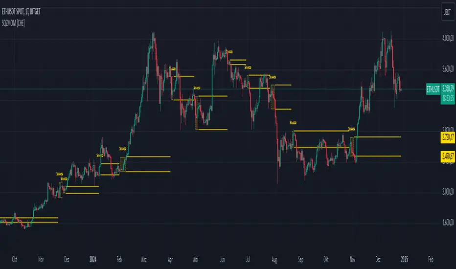
Squeeze Momentum Indicator [CHE] Squeeze Momentum Indicator
The Squeeze Momentum Indicator is an improved and simplified version of the classic Squeeze Momentum Indicator by LazyBear. It focuses on precise detection of squeeze phases without relying on Keltner Channels (KC) or complex momentum calculations. Instead, it emphasizes the dynamic analysis of Bollinger Band widths and their distance changes to provide clear and intuitive signals.
What is the Squeeze Momentum Indicator ?
This indicator helps you identify periods of low volatility (squeeze phases) when the market is often poised for significant moves. With its clear visualization and innovative methods, it enables traders to spot breakout opportunities early and trade strategically.
Differences from the Original LazyBear Indicator
1. Use of Bollinger Bands (BB):
- LazyBear Indicator combines Bollinger Bands with Keltner Channels. A squeeze is detected when the Bollinger Bands fall inside the Keltner Channels.
- CHE Indicator relies solely on Bollinger Bands and an additional analysis of their width (distance between the upper and lower bands). This makes the calculation more straightforward and reduces dependency on multiple indicator families.
2. Squeeze Detection:
- LazyBear: A squeeze is defined based on the relationship between Bollinger Bands and Keltner Channels. It has three states: “Squeeze On,” “Squeeze Off,” and “No Squeeze.”
- CHE: A squeeze is detected when the width of the Bollinger Bands falls below the lower "Distance Bollinger Bands." It only has two states: Squeeze Active and No Squeeze.
3. Momentum Calculation:
- LazyBear: Uses linear regression (LinReg) to calculate momentum and displays it as color-coded histograms.
- CHE: Does not include momentum calculations. The focus is entirely on volatility visualization and squeeze detection.
4. Visualization:
- LazyBear: Displays momentum histograms and horizontal lines to signal different states.
- CHE: Visualizes the width of the Bollinger Bands and their Distance Bollinger Bands as lines on the chart. The chart background turns green when a squeeze is detected, simplifying interpretation.
What Is Plotted?
1. Bollinger Band Width:
- A line representing the distance between the upper and lower Bollinger Bands, measuring market volatility.
2. Distance Bollinger Bands:
- Two additional lines (upper and lower Distance Bollinger Bands) based on the Bollinger Band width, defining thresholds for squeeze conditions.
3. Session-Specific Box:
- A dynamic box is drawn on the chart during a squeeze phase. The box marks the high and low of the market for the squeeze duration. It visually frames the range, helping traders monitor breakouts beyond these levels.
4. Max/Min Markers:
- The indicator dynamically updates and marks the maximum and minimum price levels during a squeeze. These levels can serve as breakout thresholds or critical reference points for price action.
5. Background Color:
- The chart background turns green when a squeeze is active (Bollinger Band width falls below the lower Distance Bollinger Bands). This highlights potential breakout conditions.
How to Use the CHE Indicator
1. Add the Indicator:
- Add the indicator to your chart and customize settings such as Bollinger Band length (`sqz_length`) and multiplier (`sqz_multiplier`) to fit your strategy.
2. Identify Squeeze Conditions:
- Watch for the green background, which signals a squeeze—indicating a period of low volatility where significant market moves often follow.
3. Monitor the Box and Max/Min Levels:
- During a squeeze, the box outlines the trading range, and the maximum and minimum levels are updated in real time. Use these as breakout triggers or support/resistance zones.
4. Session-Specific Analysis:
- The indicator can highlight squeezes during specific trading sessions (e.g., market open), allowing you to focus on key time frames.
5. Additional Confirmation:
- Combine the CHE Indicator with price action analysis or momentum tools to determine the direction of potential breakouts.
Why Use the Squeeze Momentum Indicator ?
- Simplicity: Clear visualization and reduced complexity by eliminating Keltner Channels and momentum calculations.
- Flexibility: Suitable for all markets—stocks, forex, crypto, and more.
- Enhanced Visualization: The box and max/min markers provide real-time visual cues for range-bound trading and breakout strategies.
- Efficiency: Focuses on what matters most—identifying volatility and squeeze phases.
With the Squeeze Momentum Indicator , you can take your trading strategy to the next level. Thanks to its clear design, dynamic range visualization, and innovative methods, you’ll recognize breakout opportunities earlier and trade with greater precision. Try it out and experience its user-friendliness and effectiveness for yourself!
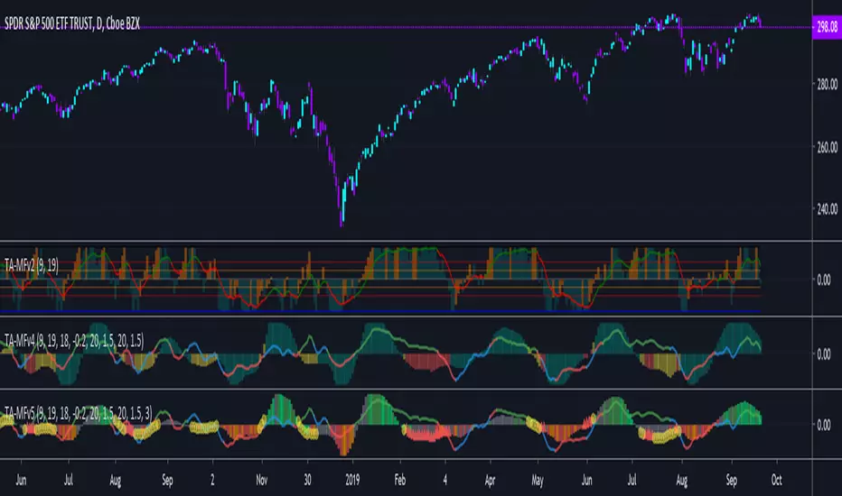
TA-Money Flow-Version5This is the MACD of a stochastic OBV movement indicator, Squeeze Momentum Indicator, and addition coloring for Market Direction Indicator . It is good (right) to work with both price and volume.
In this version we've moved the divergence highlighting to symbols at the ends of the histograms. Same coloring scheme as previous, yellow is divergence of either OBV or SQZ , red is both divergence. In the previous version we added in the "squeeze on - blue" highlighting to show follow through of divergence (or just squeeze/stall). We also added in another old script, but colors so well, Lazybears (Market Direction Indicator, linked below). Also incorporated a 3 color or 5 color scheme from the MDI script as a bool. It works great on any time frame, but you need to have volume data. Not sure where I originally got this (stoch-OBV, somewhere off Tradingview several years ago, thanks to the person who shared), Squeeze/MDI is Lazybear, links below.
Enjoy.
Version 5:
Moved divergence highlighting to symbols on histogram
Added coloring based on MDI
TA-Money-Flow-Version4
TA-Money-Flow-Version3
TA-Money-Flow-Version2
Squeeze-Momentum-Indicator-LazyBear
Market-Direction-Indicator-LazyBear