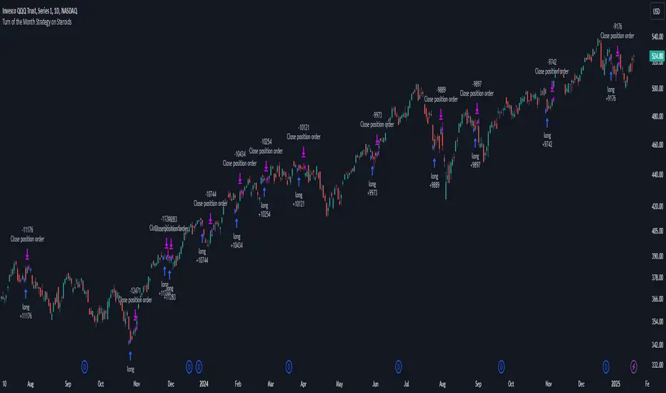
Turn of the Month Strategy on Steroids█ STRATEGY DESCRIPTION
The "Turn of the Month Strategy on Steroids" is a seasonal mean-reversion strategy designed to capitalize on price movements around the end of the month. It enters a long position when specific conditions are met and exits when the Relative Strength Index (RSI) indicates overbought conditions. This strategy is optimized for use on daily or higher timeframes.
█ WHAT IS THE TURN OF THE MONTH EFFECT?
The Turn of the Month effect refers to the observed tendency of stock prices to rise around the end of the month. This strategy leverages this phenomenon by entering long positions when the price shows signs of a reversal during this period.
█ SIGNAL GENERATION
1. LONG ENTRY
A Buy Signal is triggered when:
The current day of the month is greater than or equal to the specified `dayOfMonth` threshold (default is 25).
The close price is lower than the previous day's close (`close < close `).
The previous day's close is also lower than the close two days ago (`close < close `).
The signal occurs within the specified time window (between `Start Time` and `End Time`).
There is no existing open position (`strategy.position_size == 0`).
2. EXIT CONDITION
A Sell Signal is generated when the 2-period RSI exceeds 65, indicating overbought conditions. This prompts the strategy to exit the position.
█ ADDITIONAL SETTINGS
Day of Month: The day of the month threshold for triggering a Buy Signal. Default is 25.
Start Time and End Time: The time window during which the strategy is allowed to execute trades.
█ PERFORMANCE OVERVIEW
This strategy is designed to exploit seasonal price patterns around the end of the month.
It performs best in markets where the Turn of the Month effect is pronounced.
Backtesting results should be analyzed to optimize the `dayOfMonth` threshold and RSI parameters for specific instruments.
在腳本中搜尋"Relative Strength Index (RSI)"
Composer Strategy 1 (Haggis Levered)This strategy dynamically selects an asset to trade each day based on a set of predefined market conditions and technical indicators. It uses relative strength index (RSI) and moving averages to evaluate momentum and trends across multiple tickers, aiming to identify the most advantageous asset for the current market environment. By switching between leveraged ETFs, inverse funds, and defensive assets, the strategy seeks to capitalize on both bullish and bearish scenarios while mitigating risk during uncertain periods.
The approach emphasizes adaptability by monitoring key metrics like overbought or oversold signals and comparing cumulative returns and relative performance across asset classes. This flexibility allows the strategy to respond to changing market dynamics daily, aligning with short-term trends while maintaining a systematic and disciplined methodology for asset allocation.
Flat Market Scanner [CHE]Flat Market Scanner
Introduction
Welcome to our presentation on the "Flat Market Scanner" for TradingView. This innovative indicator is designed to identify and highlight periods of sideways market movement, providing traders with crucial insights for making informed decisions. Sideways phases are characterized by alternating up and down movements within a narrow price range, lacking a clear directional trend.
The Idea Behind the Flat Market Scanner
The core concept of the Flat Market Scanner is to detect and visualize flat (sideways) market conditions. In such periods, the price of an asset does not exhibit significant upward or downward movements, remaining within a narrow range. These flat markets are often characterized by low volatility and can be challenging for trend-following traders.
How It Works:
1. RSI Analysis: The indicator utilizes the Relative Strength Index (RSI) to measure the speed and change of price movements.
2. Cumulative Test Variable: It calculates the cumulative sum of positive and negative price changes to create a test variable.
3. Flat Period Detection: By examining the highest and lowest values of the test variable over a specified period (`flatPeriod`), the indicator determines if the market is flat.
4. Consecutive Flat Periods: It tracks consecutive periods where the market is flat to identify sustained sideways movement.
5. Visualization: When a flat market is detected, a colored box is drawn on the chart to highlight the flat period. The color of the box indicates the current RSI trend.
Why Flat Markets Pose Risks
Flat markets can present several risks and challenges for traders:
1. Reduced Profit Opportunities: In a flat market, price movements are minimal, leading to limited profit opportunities for traders who rely on significant price swings.
2. False Signals: Sideways markets often generate false signals for technical indicators, leading to potential losses if traders misinterpret these signals as trends.
3. Increased Costs: Frequent trading in a flat market can result in higher transaction costs, eating into potential profits.
4. Psychological Stress: The lack of clear direction can cause frustration and stress, leading traders to make impulsive decisions that deviate from their trading strategy.
Benefits of the Flat Market Scanner
- Clarity: The Flat Market Scanner provides visual clarity on when the market is flat, helping traders avoid entering positions during low-volatility periods.
- Risk Management: By identifying flat periods, traders can better manage their risk and allocate their capital to more promising market conditions.
- Strategic Planning: Understanding when the market is flat allows traders to adjust their strategies, such as focusing on range-bound trading techniques or waiting for breakout opportunities.
Conclusion
The Flat Market Scanner is an essential tool for traders seeking to navigate the complexities of market conditions. By effectively identifying and visualizing flat markets, this indicator empowers traders to make smarter decisions, manage risks, and optimize their trading strategies. Embrace the power of the Flat Market Scanner and enhance your trading experience on TradingView.
Thank you for your attention. Happy trading!
Best regards Chervolino

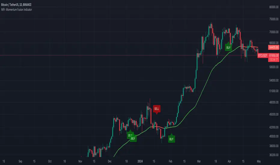
MFI- Momentum Fusion IndicatorIndicator Overview
The "MFI - Momentum Fusion Indicator" is a comprehensive trading tool designed for TradingView that combines several technical analysis methods to assist traders in identifying potential buy and sell opportunities in financial markets.
Key Components
Moving Averages (MA): Uses two Simple Moving Averages (SMA) with periods defined by the user (default 10 and 20). The indicator generates buy signals when the shorter MA (MA 10) crosses above the longer MA (MA 20) and sell signals when it crosses below, helping to pinpoint trend reversals.
Relative Strength Index (RSI): A momentum oscillator that helps identify overbought or oversold conditions, adding a layer of confirmation to the signals generated by the moving averages.
Exponential Moving Average (EMA 50): Used to gauge the medium-term trend direction. The color of the EMA line changes based on whether the trend is up (green) or down (red), providing a visual representation of the market trend.
Average True Range (ATR): This component measures market volatility. Signals are only generated when the ATR confirms significant market movement relative to the EMA50, enhancing the reliability of the signals during volatile conditions.
How It Works
Signal Generation: The core of the indicator is based on the crossover of two SMAs. A buy signal is issued when the short-term MA crosses above the long-term MA during sufficient market volatility (confirmed by ATR). Conversely, a sell signal is triggered when the short-term MA crosses below the long-term MA under similar conditions.
Trend Confirmation: The EMA50 helps confirm the broader market trend, while the ATR ensures that the crossover signals occur during periods of meaningful price movement, filtering out noise and less significant price movements.
Use Case
For Traders: The indicator is ideal for traders who need clear, actionable signals combined with an assessment of market conditions. It’s particularly useful in markets where understanding volatility and momentum is crucial, such as in cryptocurrencies and forex.
Benefits
Comprehensive Analysis: Combines trend, momentum, and volatility analysis in one tool, providing a multifaceted approach to the markets.
Enhanced Decision-Making: By integrating multiple indicators, it reduces the likelihood of false signals and enhances decision-making confidence.
Customizable and Dynamic: Allows for easy adjustment of parameters to fit different trading styles and market conditions.
This indicator equips traders with a powerful blend of tools to analyze price movements and make informed trading decisions based on a combination of trend, momentum, and volatility insights.
NASDAQ 100 Peak Hours StrategyNASDAQ 100 Peak Hours Trading Strategy
Description
Our NASDAQ 100 Peak Hours Trading Strategy leverages a carefully designed algorithm to trade within specific hours of high market activity, particularly focusing on the first two hours of the trading session from 09:30 AM to 11:30 AM GMT-5. This period is identified for its increased volatility and liquidity, offering numerous trading opportunities.
The strategy incorporates a blend of technical indicators to identify entry and exit points for both long and short positions. These indicators include:
Exponential Moving Averages (EMAs) : A short-term 9-period EMA and a longer-term 21-period EMA to determine the market trend and momentum.
Relative Strength Index (RSI) : A 14-period RSI to gauge the market's momentum.
Average True Range (ATR) : A 14-period ATR to assess market volatility and to set dynamic stop losses and trailing stops.
Volume Weighted Average Price (VWAP) : To identify the market's average price weighted by volume, serving as a benchmark for the trading day.
Our strategy uniquely applies a volatility filter using the ATR, ensuring trades are only executed in conditions that favor our setup. Additionally, we consider the direction of the EMAs to confirm the market's trend before entering trades.
Originality and Usefulness
This strategy stands out by combining these indicators within the NASDAQ 100's peak hours, exploiting the specific market conditions that prevail during these times. The inclusion of a volatility filter and dynamic stop-loss mechanisms based on the ATR provides a robust method for managing risk.
By focusing on the early trading hours, the strategy aims to capture the initial market movements driven by overnight news and the opening rush, often characterized by higher volatility. This approach is particularly useful for traders looking to maximize gains from short-term fluctuations while limiting exposure to longer-term market uncertainty.
Strategy Results
To ensure the strategy's effectiveness and reliability, it has undergone rigorous backtesting over a significant dataset to produce a sample size of more than 100 trades. This testing phase helps in identifying the strategy's potential in various market conditions, its consistency, and its risk-to-reward ratio.
Our backtesting adheres to realistic trading conditions, accounting for slippage and commission to reflect actual trading scenarios accurately. The strategy is designed with a conservative approach to risk management, advising not to risk more than 5-10% of equity on a single trade. The default settings in the script align with these principles, ensuring that users can replicate our tested conditions.
Using the Strategy
The strategy is designed for simplicity and ease of use:
Trade Hours : Focuses on 09:30 AM to 11:30 AM GMT-5, during the NASDAQ 100's peak activity hours.
Entry Conditions : Trades are initiated based on the alignment of EMAs, RSI, VWAP, and the ATR's volatility filter within the designated time frame.
Exit Conditions : Includes dynamic trailing stops based on ATR, a predefined time exit strategy, and a trend reversal exit condition for risk management.
This script is a powerful tool for traders looking to leverage the NASDAQ 100's peak hours, providing a structured approach to navigating the early market hours with a robust set of criteria for making informed trading decisions.

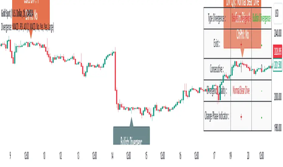
Divergence Signal [TradingFinder] RSI & MACD Reversal On Swing🔵 Introduction
Sometimes in analyzing price charts using indicators, you may observe a discrepancy. For instance, while the price of stocks, currencies, or commodities is increasing, the indicator shows a decrease. Such a phenomenon in technical analysis is termed "divergence." Divergences are categorized into three types based on their formation and the prediction they make about the continuation of the price trend: "Regular Divergence," "Hidden Divergence," and "Time Divergence."
🟣 Important :
• This indicator exclusively identifies regular divergences since its primary function is to detect reversal points.
• This indicator identifies divergences using three indicators: "Moving Average Convergence Divergence" (MACD), "Relative Strength Index" (RSI), and "Awesome Oscillator" (AO). The user can choose each of these indicators in the settings using the "Divergence Detection Method" dropdown menu for identifying divergences. These settings are by default set to the MACD mode.
🔵Types of Divergence
Divergences, as mentioned, offer different predictions about the continuation of price trends. Hence, they have various types. We will focus on explaining regular divergences based on this indicator.
🟣 Regular Divergence(RD) :
Regular divergence is a situation arising from contradictory behavior between the indicator and the price chart at the end of a trend. By identifying regular divergences, we anticipate a change in trend direction resembling a reversal pattern.
Regular divergence has two types based on the trend and prediction:
Negative Regular Divergence (RD-) :
This type occurs between two price peaks at the end of an uptrend. Despite forming a new high, the indicator fails to recognize it, indicating a negative regular divergence. The likelihood of a subsequent downtrend is high. Negative divergence suggests strong selling pressure and weak buying power, portraying an unfavorable future for the stock.
Positive Regular Divergence (RD+) :
In contrast, positive regular divergence happens at the end of a downtrend and between two price troughs. As depicted in the chart, although the price forms a new low, the indicator doesn't acknowledge it. Positive regular divergence indicates robust buying pressure and weak selling power. Upon identifying positive divergence in the chart, we expect a price increase for the stock under review
🔵 How to Use
Information from the indicator is displayed in two ways: Table and Label.
🟣 Table : The table displays information about the latest divergence. This includes the type of divergence, existence or absence of divergence, consecutive divergences, divergence quality, and change in indicator phase.
Type Divergence : Indicates the type of divergence, which can be either "Bullish Divergence" or "Bearish Divergence."
Exist : Indicates the presence of divergence with a "+" sign and absence with a "-" sign. A green color is used for bullish divergence and red for bearish divergence.
Consecutive : Shows the number of consecutive divergences. For example, if there are 3 consecutive divergences, the number 3 is displayed.
Divergence Quality : Displays the quality of the divergence based on the number of consecutive divergences. If there is 1 divergence, the quality is "Normal"; for 2 divergences, it's "Good"; and for 3 or more divergences, it's "Strong."
Change Phase Indicator : Indicates whether a phase change in the indicator has occurred with "+" for yes and "-" for no.
🟣 Label : Unlike the table, which only shows information about the latest divergence, labels display information about each divergence at the point where it occurs. The information includes the type of divergence, detection method, divergence quality, consecutive divergences, and change in phase indicator. The selected method of detection is also displayed. For example, if the chosen method is the "AO" indicator, the label will show "Method: AO."
🔵 Settings
Fractal Period : Determines the period of swings. The minimum and default value is 2.
Divergence Detect Method : Selects the indicator (MACD, RSI, or AO) used for detecting divergences. The default indicator is MACD.
Show Fractal : Chooses whether to display fractals or not. The default is "No."
Show Table : Determines whether to display the table or not. The default is "Yes."
Show Label : Chooses whether to display labels or not. The default is "Yes."
Label Size : Adjusts the size of the labels from "Tiny" to "Large."
Strong Pullback Indicator [Rami_LB]Strong Pullback Indicator
Description:
The Strong Pullback Indicator is designed to identify potential pullbacks or even trend reversals by utilizing a specific candlestick pattern in conjunction with the Relative Strength Index (RSI). It is advised to employ this indicator in chart intervals of 15 minutes or higher, as intervals below 15 minutes may generate excessive false signals.
Working Mechanism:
Upon detecting the designated candlestick pattern, the indicator examines whether any of the last five candles exhibit RSI values below 30 or above 70 across at least four distinct time intervals, depending on whether the pattern is bullish or bearish. The RSI calculations incorporate eight different intervals: 1 minute (1m), 5 minutes (5m), 15 minutes (15m), 30 minutes (30m), 1 hour (1h), 2 hours (2h), 4 hours (4h), and 1 day (1d). An arrow is rendered above or below the current candle only when these conditions are met.
Users have the option to adjust the number of overbought or oversold intervals, as well as the general settings for the RSI.
SL/TP Lines:
The indicator can also serve as a trade signal to initiate trades in the opposite direction. To evaluate the potential success of a trade in a backtesting scenario, SL (Stop Loss) and TP (Take Profit) lines can be displayed on the chart. The SL is calculated by taking the distance from the close of the current candle to the high/low of the previous candle and multiplying it by 2.
In the settings, you can alter the Risk Reward Ratio (RRR) of the trade. Given the pullback nature of this indicator, a RRR of 1:1 is deemed logical, thus set as the default value.
Bullish vs. Bearish Candle Counter:
An additional feature of this indicator is its ability to analyze the last 100 candles to ascertain the ratio of bullish to bearish candles. When a 60% threshold is reached, the chart background color alters accordingly. This feature was conceived after a thorough analysis of over 50,000 candles of a currency pair revealed nearly identical counts of bullish and bearish candles, suggesting a market tendency to maintain this balance.
Within the settings, you have the flexibility to modify the number of candles to be analyzed and the percentage threshold for each candle type.
Should you have any ideas on how to enhance the accuracy of this indicator, or suggestions for other indicators that could improve the signals, feel free to leave a comment.

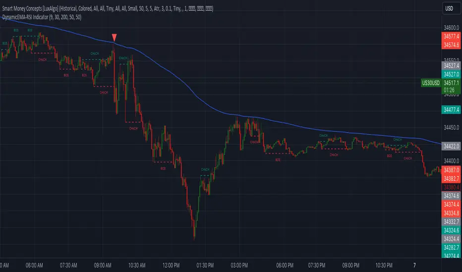
DynamicEMA-RSI IndicatorIntroducing the 'Custom EMA and RSI Indicator' – a powerful trading tool compatible with US30 and USDJPY. This indicator is designed to provide high-precision trading signals once a day. It combines the expertise of Exponential Moving Averages (EMA) and Relative Strength Index (RSI) to identify optimal entry points in the market. With a track record of high accuracy, this indicator can help you make informed trading decisions. It's the perfect addition to your trading arsenal for precision trading on the US30 and USDJPY currency pairs."
Extreme Reversal SignalThe Extreme Reversal Signal is designed to signal potential pivot points when the price of an asset becomes extremely overbought or oversold. Extreme conditions typically signal a brief or extensive price reversal, offering valuable entry or exit points. It's important to note that this indicator may produce multiple signals, making it essential to corroborate these signals with other forms of analysis to determine their validity. While the default settings provide valuable insights, it might be beneficial to experiment with different configurations to ensure the indicator's efficacy.
Two primary conditions define extremely overbought and oversold states. The first condition is that the price must deviate by two standard deviations from the 20-day Simple Moving Average (SMA). The second condition is that the 3-day SMA of the 14-day Stochastic Oscillator (STO) derived from the 14-day Relative Strength Index (RSI) is above or below the upper or lower limit.
Oversold states arise when the first condition is met and the 3-day SMA of the 14-day Stochastic RSI falls below the lower limit, suggesting a buy signal. These are visually represented by green triangles below the price bars. Overbought states arise when the first condition is met and the 3-day SMA of the 14-day Stochastic RSI rises above the upper limit, suggesting a sell signal. These are visually represented by red triangles above the price bars. It's also possible to set up automated alerts to get notifications when either of these two conditions is met to avoid missing out.
While this indicator has traditionally identified overbought and oversold conditions in various different assets, past performance does not guarantee future results. Therefore, it is advisable to supplement this indicator with other technical tools. For instance, trend indicators can greatly improve the decision-making process when planning for entries and exit points.

Oscillator Profile IndicatorDescription:
The Oscillator Profile Indicator (OPI) is designed to provide insights into market trends and potential reversal points by profiling the value distribution of an oscillator or the price chart over a specified lookback period.
The OPI works by calculating the Point of Control (PoC) for the oscillator values or prices in the given lookback period. This PoC, essentially a median, is considered the fair value where most trading activities have happened. Along with this, OPI also calculates lower and upper boundaries by taking the specified percentile of the sorted distribution of values. These boundaries outline the value area within which a significant portion of trading activity has occurred.
The main feature of the OPI is the interpretation of PoC movement and how it relates to general market trends. If the PoC moves above 0 on the oscillator, it's a potential indication that we are in a general uptrend. Conversely, if the PoC moves below 0, this can be a signal for a general downtrend.
Usage:
While OPI can be used on both price charts and oscillators, its effectiveness is more pronounced when used on oscillators. Applying this indicator to oscillators such as the Relative Strength Index (RSI) or the Moving Average Convergence Divergence (MACD) can provide useful insights.
How to Read:
PoC line: The line represents the median of the past 'n' periods. Its movement above or below 0 can be used to identify general uptrends or downtrends respectively.
Upper and Lower Boundary lines: These lines represent the specified percentile of the value distribution in the lookback period.
Colored Fills: The fills between the upper and lower boundary lines visually represent the value area. The color changes based on the relative position of the source value (price or oscillator value) to the PoC.
Signals:
An uptrend is indicated when the PoC moves above 0 on the oscillator, especially when coupled with an upward crossover of the source value through the PoC.
A downtrend is signaled when the PoC drops below 0 on the oscillator, particularly when paired with a downward crossover of the source value through the PoC.
(!) Note: Like all indicators, OPI should be used in conjunction with other technical analysis tools for the best results. It is also advisable to backtest this indicator with your strategy before using it in live trading.

TrendingNowTrendingNow Indicator - An Experimental Study
Introduction:
The TrendingNow indicator is an experimental study designed to identify trending market conditions and potential trading opportunities. It combines various technical analysis tools and parameters to provide insights into trend direction, momentum, volume, and price reversals.
Methodology:
The TrendingNow indicator is calculated based on the following parameters and calculations:
Moving Average: A simple moving average (SMA) is calculated using the specified length parameter. It helps smooth out price fluctuations and identify the overall trend direction.
Upper and Lower Bands: The upper and lower bands are derived from the moving average by adding and subtracting a deviation calculated using the multiplier parameter. These bands provide dynamic levels for potential trend reversals.
Price Reversals: The indicator detects price reversals by identifying when the price crosses above or below the upper or lower bands. These reversals suggest potential entry or exit points in the market.
Trend Confirmation: The indicator uses a moving average of the closing prices over the confirmation length parameter to confirm the overall trend direction. It helps filter out false signals and validates the presence of a trend.
Momentum Oscillator: The indicator calculates the relative strength index (RSI) over the momentum length parameter. The RSI measures the speed and change of price movements, indicating potential overbought and oversold conditions.
Volume Trend Confirmation: The study compares the current volume with the average volume over the specified length. If the current volume is above the volume threshold, it suggests increasing volume activity and potential confirmation of the trend.
Volatility Filter: The indicator incorporates an average true range (ATR) calculation to assess market volatility. The volatility threshold is derived by multiplying the ATR by the volatility multiplier parameter. It helps filter out signals during periods of low volatility.
Experimental Study:
The TrendingNow indicator aims to experiment with the combination of these technical analysis tools to identify trending market conditions and potential trading opportunities. By monitoring the price reversals, trend confirmation, momentum, volume trends, and volatility, traders can potentially identify high-probability trade setups.
The study involves observing the indicator's signals and assessing their effectiveness in different market conditions. Traders can experiment with different parameter values, timeframes, and asset classes to optimize the indicator's performance.
Usage and Interpretation:
When using the TrendingNow indicator, traders can consider the following guidelines:
Trend Identification: A bullish trend is indicated when the price is above the upper band, the moving average is rising, and the trend confirmation is positive. A bearish trend is indicated when the price is below the lower band, the moving average is declining, and the trend confirmation is negative.
Price Reversals: Price crossing above the upper band may suggest a potential selling opportunity, while price crossing below the lower band may indicate a potential buying opportunity. These reversals should be confirmed by other indicators and market conditions.
Momentum and Volume Confirmation: Traders can pay attention to the RSI levels to assess overbought and oversold conditions. High volume activity in line with the trend can provide additional confirmation.
Volatility Consideration: Traders may choose to adjust the volatility multiplier parameter based on the current market conditions. Higher values may be more suitable during periods of higher volatility, while lower values may be preferred during low volatility.
Conclusion:
The TrendingNow indicator offers an experimental approach to identifying trending market conditions and potential trading opportunities. Traders can customize the indicator parameters and combine it with other analysis techniques to suit their trading strategies. It is important to conduct thorough testing and validation before incorporating the indicator into live trading.
Disclaimer:
The information provided in this document, including the TrendingNow indicator and the accompanying experimental study, is for educational and experimental purposes only. It should not be considered as financial advice or a recommendation to engage in any trading or investment activities. Trading and investing in financial markets carry inherent risks, and past performance is not indicative of future results.
Before making any trading decisions, it is essential to conduct your own research, evaluate your risk tolerance, and consider your financial situation. The TrendingNow indicator is based on historical price data and technical analysis tools. However, it is important to understand that market conditions can change rapidly, and the indicator may not accurately predict future market movements or generate profitable trades in all situations.
The experimental study aims to explore the effectiveness of the TrendingNow indicator under different market conditions. However, the results obtained from the study are specific to historical data and may not necessarily be indicative of real-time market performance. It is recommended to exercise caution and use the indicator in conjunction with other analysis techniques and risk management strategies.
The TrendingNow indicator's parameters, such as length, multiplier, confirmation length, momentum length, overbought level, oversold level, volume threshold, and volatility multiplier, are adjustable inputs. Traders should carefully consider and test different parameter settings to suit their trading style and market conditions. Furthermore, it is important to regularly review and update the indicator's parameters as market dynamics change.
Trading in financial markets involves the potential for financial loss, and individuals should only trade with funds they can afford to lose. It is strongly advised to seek the guidance of a qualified financial professional or advisor before making any investment decisions.
By using the TrendingNow indicator and conducting the experimental study, you acknowledge that you are solely responsible for any trading decisions you make, and you agree to hold harmless the authors, developers, and distributors of this indicator for any losses, damages, or liabilities incurred as a result of your trading activities.

Mad_MATHLibrary "MAD_MATH"
This is a mathematical library where I store useful kernels, filters and selectors for the different types of computations.
This library also contains opensource code from other scripters.
Future extensions are very likely, there are some functions I would like to add, but I have to wait for approvals so i can include them.
Ehlers_EMA(_src, _length)
Calculates the Ehlers Exponential Moving Average (Ehlers_EMA)
Parameters:
_src (float) : The source series for calculation
_length (simple int) : The length for the Ehlers EMA
Returns: The Ehlers EMA value
Ehlers_Gaussian(_src, _length)
Calculates the Ehlers Gaussian Filter
Parameters:
_src (float) : The source series for calculation
_length (simple int) : The length for the Ehlers Gaussian Filter
Returns: The Ehlers Gaussian Filter value
Ehlers_supersmoother(_src, _length)
Calculates the Ehlers Supersmoother
Parameters:
_src (float) : The source series for calculation
_length (simple int) : The length for the Ehlers Supersmoother
Returns: The Ehlers Supersmoother value
Ehlers_SMA_fast(_src, _length)
Calculates the Ehlers Simple Moving Average (SMA) Fast
Parameters:
_src (float) : The source series for calculation
_length (simple int) : The length for the Ehlers SMA Fast
Returns: The Ehlers SMA Fast value
Ehlers_EMA_fast(_src, _length)
Calculates the Ehlers Exponential Moving Average (EMA) Fast
Parameters:
_src (float) : The source series for calculation
_length (simple int) : The length for the Ehlers EMA Fast
Returns: The Ehlers EMA Fast value
Ehlers_RSI_fast(_src, _length)
Calculates the Ehlers Relative Strength Index (RSI) Fast
Parameters:
_src (float) : The source series for calculation
_length (simple int) : The length for the Ehlers RSI Fast
Returns: The Ehlers RSI Fast value
Ehlers_Band_Pass_Filter(_src, _length)
Calculates the Ehlers BandPass Filter
Parameters:
_src (float) : The source series for calculation
_length (simple int) : The length for the Ehlers BandPass Filter
Returns: The Ehlers BandPass Filter value
Ehlers_Butterworth(_src, _length)
Calculates the Ehlers Butterworth Filter
Parameters:
_src (float) : The source series for calculation
_length (simple int) : The length for the Ehlers Butterworth Filter
Returns: The Ehlers Butterworth Filter value
Ehlers_Two_Pole_Gaussian_Filter(_src, _length)
Calculates the Ehlers Two-Pole Gaussian Filter
Parameters:
_src (float) : The source series for calculation
_length (simple int) : The length for the Ehlers Two-Pole Gaussian Filter
Returns: The Ehlers Two-Pole Gaussian Filter value
Ehlers_Two_Pole_Butterworth_Filter(_src, _length)
Calculates the Ehlers Two-Pole Butterworth Filter
Parameters:
_src (float) : The source series for calculation
_length (simple int) : The length for the Ehlers Two-Pole Butterworth Filter
Returns: The Ehlers Two-Pole Butterworth Filter value
Ehlers_Band_Stop_Filter(_src, _length)
Calculates the Ehlers Band Stop Filter
Parameters:
_src (float) : The source series for calculation
_length (simple int) : The length for the Ehlers Band Stop Filter
Returns: The Ehlers Band Stop Filter value
Ehlers_Smoother(_src)
Calculates the Ehlers Smoother
Parameters:
_src (float) : The source series for calculation
Returns: The Ehlers Smoother value
Ehlers_High_Pass_Filter(_src, _length)
Calculates the Ehlers High Pass Filter
Parameters:
_src (float) : The source series for calculation
_length (simple int) : The length for the Ehlers High Pass Filter
Returns: The Ehlers High Pass Filter value
Ehlers_2_Pole_High_Pass_Filter(_src, _length)
Calculates the Ehlers Two-Pole High Pass Filter
Parameters:
_src (float) : The source series for calculation
_length (simple int) : The length for the Ehlers Two-Pole High Pass Filter
Returns: The Ehlers Two-Pole High Pass Filter value
pr(_src, _length)
pr Calculates the percentage rank (PR) of a value within a range.
Parameters:
_src (float) : The source value for which the percentage rank is calculated. It represents the value to be ranked within the range.
_length (simple int) : The _length of the range over which the percentage rank is calculated. It determines the number of bars considered for the calculation.
Returns: The percentage rank (PR) of the source value within the range, adjusted by adding 50 to the result.
smma(_src, _length)
Calculates the SMMA (Smoothed Moving Average)
Parameters:
_src (float) : The source series for calculation
_length (simple int)
Returns: The SMMA value
hullma(_src, _length)
Calculates the Hull Moving Average (HullMA)
Parameters:
_src (float) : The source series for calculation
_length (simple int) : The _length of the HullMA
Returns: The HullMA value
tma(_src, _length)
Calculates the Triple Moving Average (TMA)
Parameters:
_src (float) : The source series for calculation
_length (simple int) : The _length of the TMA
Returns: The TMA value
dema(_src, _length)
Calculates the Double Exponential Moving Average (DEMA)
Parameters:
_src (float) : The source series for calculation
_length (simple int) : The _length of the DEMA
Returns: The DEMA value
tema(_src, _length)
Calculates the Triple Exponential Moving Average (TEMA)
Parameters:
_src (float) : The source series for calculation
_length (simple int) : The _length of the TEMA
Returns: The TEMA value
w2ma(_src, _length)
Calculates the Normalized Double Moving Average (N2MA)
Parameters:
_src (float) : The source series for calculation
_length (simple int) : The _length of the N2MA
Returns: The N2MA value
wma(_src, _length)
Calculates the Normalized Moving Average (NMA)
Parameters:
_src (float) : The source series for calculation
_length (simple int) : The _length of the NMA
Returns: The NMA value
nma(_open, _close, _length)
Calculates the Normalized Moving Average (NMA)
Parameters:
_open (float) : The open price series
_close (float) : The close price series
_length (simple int) : The _length for finding the highest and lowest values
Returns: The NMA value
lma(_src, _length)
Parameters:
_src (float)
_length (simple int)
zero_lag(_src, _length, gamma1, zl)
Calculates the Zero Lag Moving Average (ZeroLag)
Parameters:
_src (float) : The source series for calculation
_length (simple int) : The length for the moving average
gamma1 (simple int) : The coefficient for calculating 'd'
zl (simple bool) : Boolean flag for applying Zero Lag
Returns: An array containing the ZeroLag Moving Average and a boolean flag indicating if it's flat
copyright HPotter, thanks for that great function
chebyshevI(src, len, ripple)
Calculates the Chebyshev Type I Filter
Parameters:
src (float) : The source series for calculation
len (int) : The length of the filter
ripple (float) : The ripple factor for the filter
Returns: The output of the Chebyshev Type I Filter
math from Pafnuti Lwowitsch Tschebyschow (1821–1894)
Thanks peacefulLizard50262 for the find and translation
chebyshevII(src, len, ripple)
Calculates the Chebyshev Type II Filter
Parameters:
src (float) : The source series for calculation
len (int) : The length of the filter
ripple (float) : The ripple factor for the filter
Returns: The output of the Chebyshev Type II Filter
math from Pafnuti Lwowitsch Tschebyschow (1821–1894)
Thanks peacefulLizard50262 for the find
wavetrend(_src, _n1, _n2)
Calculates the WaveTrend indicator
Parameters:
_src (float) : The source series for calculation
_n1 (simple int) : The period for the first EMA calculation
_n2 (simple int) : The period for the second EMA calculation
Returns: The WaveTrend value
f_getma(_type, _src, _length, ripple)
Calculates various types of moving averages
Parameters:
_type (simple string) : The type of indicator to calculate
_src (float) : The source series for calculation
_length (simple int) : The length for the moving average or indicator
ripple (simple float)
Returns: The calculated moving average or indicator value
f_getfilter(_type, _src, _length)
Calculates various types of filters
Parameters:
_type (simple string) : The type of indicator to calculate
_src (float) : The source series for calculation
_length (simple int) : The length for the moving average or indicator
Returns: The filtered value
f_getoszillator(_type, _src, _length)
Calculates various types of Deviations and other indicators
Parameters:
_type (simple string) : The type of indicator to calculate
_src (float) : The source series for calculation
_length (simple int) : The length for the moving average or indicator
Returns: The calculated moving average or indicator value

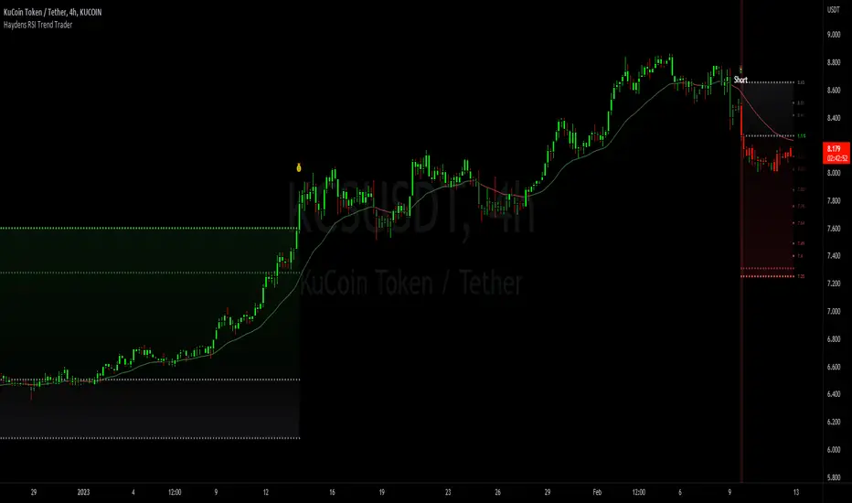
Haydens RSI Trend TraderThis is a simple trend trading companion indicator for Hayden's Advanced RSI, which can be found here:
For best results, please be sure your oscillator and chart companion settings match. Detailed trade information & statistics can be found when hovering over any of the indicator labels. The backtesting results are not calculated the same as TradingView, and the original code can be found here
Shoutout to the following authors for the code snippets that were used in making this indicator: @lazybear @kiosefftrading @Koalafied_3 @mabonyi @Capissimo
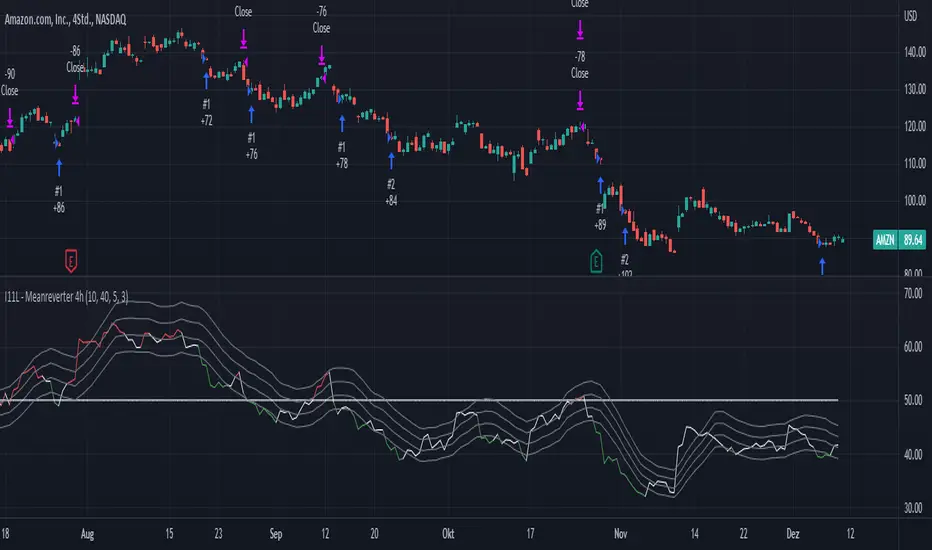
I11L - Meanreverter 4h---Overview---
The system buys fear and sells greed.
Its relies on a Relative Strength Index (RSI) and moving averages (MA) to find oversold and overbought states.
It seems to work best in market conditions where the Bond market has a negative Beta to Stocks.
Backtests in a longer Timeframe will clearly show this.
---Parameter---
Frequency: Smothens the RSI curve, helps to "remember" recent highs better.
RsiFrequency: A Frequency of 40 implies a RSI over the last 40 Bars.
BuyZoneDistance: Spacing between the different zones. A wider spacing reduces the amount of signals and icnreases the holding duration. Should be finetuned with tradingcosts in mind.
AvgDownATRSum: The multiple of the Average ATR over 20 Bars * amount of opentrades for your average down. I choose the ATR over a fixed percent loss to find more signals in low volatility environments and less in high volatility environments.
---Some of my thoughts---
Be very careful about the good backtesting performance in many US-Stocks because the System had a favourable environment since 1970.
Be careful about the survivorship bias as well.
52% of stocks from the S&P500 were removed since 2000.
I discount my Annual Results by 5% because of this fact.
You will find yourself quite often with very few signals because of the high market correlation.
My testing suggests that there is no expected total performance difference between a signal from a bad and a signal from a good market condition but a higher volatility.
I am sharing this strategy because i am currently not able to implement it as i want to and i think that meanreversion is starting to be taken more serious by traders.
The challange in implementing this strategy is that you need to be invested 100% of the time to retrieve the expected annual performance and to reduce the fat tail risk by market crashes.

Non-Lag Inverse Fisher Transform of RSX [Loxx]Non-Lag Inverse Fisher Transform of RSX is an Inverse Fisher Transform on the Non-Lagged Smoothing Filter of Jurik RSX.
What is the Inverse Fisher Transform?
The Inverse Fisher Transform was authored by John Ehlers. The IFT applies some math functions and constants to a moving average of the relative strength index (rsi) of the closing price to calculate its oscillator position. T
read more here: www.mesasoftware.com
What is RSX?
RSI is a very popular technical indicator, because it takes into consideration market speed, direction and trend uniformity. However, the its widely criticized drawback is its noisy (jittery) appearance. The Jurk RSX retains all the useful features of RSI , but with one important exception: the noise is gone with no added lag.
What is the Non-lag moving average?
The Non Lag Moving average follows price closely and gives very quick signals as well as early signals of price change. As a standalone Moving Average, it should not be used on its own, but as an additional confluence tool for early signals.
Included:
Alerts
Signals
Bar coloring
Fisher Transform with SignalsFisher Transform with Signals
The Fisher Transform is a technical indicator created by John F. Ehlers that converts prices into a Gaussian normal distribution.1 The indicator highlights when prices have moved to an extreme, based on recent prices. This may help in spotting turning points in the price of an asset. It also helps show the trend and isolate the price waves within a trend.
-The Fisher Transform is a technical indicator that normalizes asset prices, thus making turning points in price clearer.
-Some traders look for extreme readings to signal potential price reversal areas, while others watch for a change in direction of the Fisher Transform.
-The Fisher Transform formula is typically applied to price, but it can also be applied to other indicators.
-Asset prices are not normally distributed, so attempts to normalize prices via an indicator may not always provide reliable signals.
The Fisher Transform enables traders to create a Gaussian normal distribution, which converts data that isn't typically normal distributed, such as market prices. In essence, the transformation makes peak swings relatively rare events to help better identify price reversals on a chart.
This technical indicator is commonly used by traders looking for leading signals, rather than lagging indicators. The Fisher Transform can also be applied to other technical indicators, such as the relative strength index (RSI) or moving average convergence divergence (MACD).
How to Calculate the Fisher Transform
1.Choose a lookback period, such as nine periods. This is how many periods the Fisher Transform is applied to.
2.Convert the prices of these periods to values between -1 and +1 and input for X, completing the calculations within the formula's brackets.
3.Multiply by the natural log.
4.Multiply the result by 0.5.
5.Repeat the calculation as each near period ends, converting the most recent price to a value between -1 and +1 based on the most recent nine-period prices.
6.Calculated values are added/subtracted from the prior calculated value.
How can this script tell us to buy or sell?
- If the fisher is bigger then trigger background will be colored blue and this means you can buy
- If the trigger is bigger then fisher this means you can sell

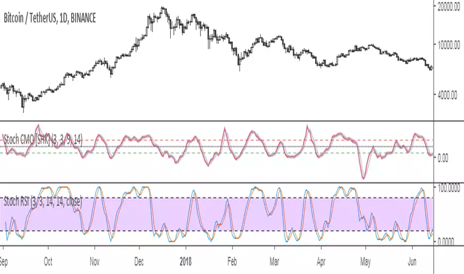
StochCMO - Stochastic CMO [SHK]StochCMO is the combination of Stochastic and CMO (Chande Momentum Oscillator).
The StochCMO is an indicator used in technical analysis that ranges between zero and one and is created by applying the Stochastic Oscillator formula to a set of Chande Momentum Oscillator (CMO) values rather than standard price data. Using CMO values within the Stochastic formula gives traders an idea of whether the current CMO value is overbought or oversold - a measure that becomes specifically useful when the CMO value is confined between its signal levels of 20 and 80.
Usage:
The usage of StochCMO is similar to StochRSI.
StochCMO vs StochRSI:
The difference between these indicators can be realized by comparing CMO & RSI:
CMO is similar to the Relative Strength Index (RSI) except that it measures momentum on both up days and down days. The CMO also does not use internal smoothing and thus does not obscure short-term extremes in momentum. As a result, the CMO often reaches over bought and over sold areas more regularly than momentum indicators, such as the RSI, that have internal smoothing.
Hope it helps you.
Quantitative Qualitative Estimation by ShizaruThe original script was posted on ProRealCode by user Nicolas.
he QQE indicator consists of a smoothed Relative Strength Index (RSI) indicator and two volatility-based trailing levels (fast and slow). The Fast Trailing Level (TL) and Slow TL are constructed by calculating the ATR of the smoothed RSI over n-periods and then further smoothing the ATR using an additional n-periods Wilders smoothing function. This smoothed ATR of RSI is then multiplied by the Fast and Slow ATR Multipliers to calculate the final Fast and Slow Trailing Levels.

Super Trend ReversalsMain Concept
The core idea behind the Super Trend Reversals indicator is to assess the momentum of automated trading bots (often referred to as 'Supertrend bots') that enter the market during critical turning points. Specifically, the indicator is tuned to identify when the market is nearing bottoms or peaks, but just before it shifts direction based on the triggered Supertrend signals. This approach helps traders engage with the market right as the reversal momentum builds up, allowing for entry just as conditions become favorable and exit before momentum wanes.
How It Works
The Super Trend Reversals uses multiple Supertrend calculations, each with different period and multiplier settings, to form a comprehensive view of the trend. The total trend score from these calculations is then analyzed using the Relative Strength Index (RSI) and Exponential Moving Averages (EMA) to gauge the strength and sustainability of the trend.
A key feature of this indicator is the isCurrentRangeSmaller() function, which evaluates if the current price range is lower than the average over the recent period. This function is critical as it helps determine the stability of the market environment, reducing the likelihood of entering or exiting trades based on erratic price movements that could lead to false signals.

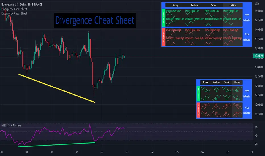
Divergence Cheat Sheet'Divergence Cheat Sheet' helps in understanding what to look for when identifying divergences between price and an indicator. The strength of a divergence can be strong, medium, or weak. Divergences are always most effective when references prior peaks and on higher time frames. The most common indicators to identify divergences with are the Relative Strength Index (RSI) and the Moving average convergence divergence (MACD).
Regular Bull Divergence: Indicates underlying strength. Bears are exhausted. Warning of a possible trend direction change from a downtrend to an uptrend.
Hidden Bull Divergence: Indicates underlying strength. Good entry or re-entry. This occurs during retracements in an uptrend. Nice to see during the price retest of previous lows. “Buy the dips."
Regular Bear Divergence: Indicates underlying weakness. The bulls are exhausted. Warning of a possible trend direction change from an uptrend to a downtrend.
Hidden Bear Divergence: Indicates underlying weakness. Found during retracements in a downtrend. Nice to see during price retests of previous highs. “Sell the rallies.”
Divergences can have different strengths.
Strong Bull Divergence
Price: Lower Low
Indicator: Higher Low
Medium Bull Divergence
Price: Equal Low
Indicator: Higher Low
Weak Bull Divergence
Price: Lower Low
Indicator: Equal Low
Hidden Bull Divergence
Price: Higher Low
Indicator: Higher Low
Strong Bear Divergence
Price: Higher High
Indicator: Lower High
Medium Bear Divergence
Price: Equal High
Indicator: Lower High
Weak Bear Divergence
Price: Higher High
Indicator: Equal High
Hidden Bull Divergence
Price: Lower High
Indicator: Higher High
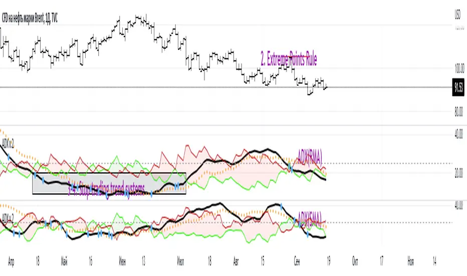
ADX W. Wilders(DI+, DI-, DX, ADXR, Equilibrium Point)The reason for publishing the script was the lack of display of important components in the standard ADX indicator, such as DI+, DI-, DX , ADXR, and the absence of a choice of methods for calculating moving averages in the indicator.
According to the book by the author of the ADX indicator, W. Wilder, the indicator components were calculated using the SMA formula, however, the RMA moving average is used in the code of the built-in indicator in TradingView, which shows excellent results, but this is not a classic calculation method. In addition to SMA and RMA, there are also EMA , HMA , WMA , VWMA moving averages to choose from. Added the ability to display lines ADX , ADXR , DX , DI+, DI- and Equilibrium points (when DI+ and DI- are equal or intersect).
ADX Trading Rules
1. Trade the intersections of DI+ and DI-
2. Extreme Point Rule(EPR). EPR is formed when DI+, DI- (Equilibrium point) crosses, forming a trend reversal point at the extremum of the current bar. In the example on the ADX RMA chart, the DI- line is above DI+. Being in a short position at the reverse intersection of the DI- and DI + lines, it is necessary to take the high price of the crossing bar for the reversal point, upon breakdown of which, turn to long. In this example, the breakdown did not take place and the short position remained active, despite the intersection of the DI+ lines over DI-. This rule is an excellent filter that removes unnecessary transactions in the trading system.
3. DI+ > ADX and DI- > ADX. Stop trading trend-following systems.
4. If ADXR > 25, the trading system will be profitable. With ADXR < 20, trend-following systems need to stop trading. Many mistakenly use ADX values instead of ADXR . The author explicitly pointed to ADXR in his book.
5. Equilibrium Point - balance points. The accumulation of these points on the chart means the presence of a flat in the market. Accumulation often appears on a declining ADX after a top has been established on the ADX indicator. The smaller the distance between the points, the less significant movements occurred in the market.
6. For intraday trading of cryptocurrencies use can the following ADX settings:
DI Length = 100
ADX Smoothing = 14
MA Type = VWMA
Flat Zone = 30
P.S. Fragment from an interview with W. Wilder:
OH: You are probably best known for inventing the Relative Strength Index ( RSI ), Average Directional Index ( ADX ) and Average True Range (ATR). Which of these is the most powerful tool for a trader?
WW: The ADX .
OH: Is it the indicator you are most proud of?
WW: I guess so.
XABCD Harmonic Pattern Custom Range Interactive█ OVERVIEW
This indicator was designed based on Harmonic Pattern Book written by Scott Carney. It was simplified to user who may always used tools such as XABCD Pattern and Long Position / Short Position, which consume a lot of time, recommended for both beginner and expert of Harmonic Pattern Traders. XABCD Pattern require tool usage of Magnet tool either Strong Magnet, Week Magnet or none, which cause error or human mistake especially daily practice.
Simplified Guideline by sequence for Harmonic Pattern if using manual tools :
Step 1 : Trade Identification - XABCD Pattern
Step 2 : Trade Execution - Any manual tools of your choice
Step 3 : Trade Management - Position / Short Position
█ INSPIRATION
Inspired by design, code and usage of CAGR. Basic usage of custom range / interactive, pretty much explained here . Credits to TradingView.
I use a lot of XABCD Pattern and Long Position / Short Position, require 5 to 10 minutes on average, upon determine the validity of harmonic pattern.
Upon creating this indicator, I believed that time can be reduced, gain more confidence, reduce error during drawing XABCD, which helps most of harmonic pattern users.
█ FEATURES
Table can positioned by any postion and font size can be resized.
Table can be display through optimized display or manual control.
Validility of harmonic pattern depends on BC ratio.
Harmonic pattern can be displayed fully or optimized while showing BC ratio validity.
Trade Execution at point D can be displayed on / off.
Stop Loss and Take Profit can be calculated automatically or manually.
Optimized table display based extend line setup and profit and loss setup.
Execution zone can be offset to Point C, by default using Point D.
Currency can be show or hide.
Profit and Loss can be displayed on axis once line is extended.
█ HOW TO USE
Step 1 : Trade Identification - Draw points from Point X to Point C. Dont worry about magnet, point will attached depends on High or Low of the candle.
Step 2 : Trade Execution - Check the validity of BC to determine the validity of harmonic pattern generated. Pattern only generate 1 pattern upon success. Otherwise, redraw to other points.
Step 3 : Trade Management - Determine the current candle either reach Point D or Potential Reversal Zone (PRZ). Check for Profit & Loss once reach PRZ.
█ USAGE LIMITATIONS
Harmonic Patterns only limits to patterns mentioned in Harmonic Trading Volume 3 due to other pattern may have other or different philosophy.
Only can be used for Daily timeframe and below due to bar_time is based on minutes by default.
Not recommended for Weekly and Monthly timeframe.
If Point X, A, B, C and D is next to each other, it is recommend to use lower timeframe.
Automated alert is not supported for this release. However, alert can be done manually. Alert will updated on the version.
█ PINE SCRIPT LIMITATIONS
Known bug for when calculate time in array, causing label may not appeared or offset.
Unable to convert to library due to usage of array.get(). I prefer usage for a combination of array.get(id, 0), array.get(id, 1), array.get(id, 2) into custom function, however I faced this issue during make arrays of label. Index can be simply refered as int, for id, i not sure, already try id refered as simple, nothing happens.
linefill.new() will appeared as diamond box if overused.
Text in box.new() unable to use ternary condition or switch to change color. Bgcolor also affected.
Label display is larger than XABCD tool. Hopefully in future, have function to resize label similar to XABCD tools.
█ IMPORTANTS
Trade Management (Profit & Loss) is calculated from Point A to D.
Take Profit is calculated based on ratio 0.382 and 0.618 of Point A to D.
Always check BC validity before proceed to Trade Management.
Length of XABCD is equal to XAB plus BCD, where XAB and BCD are one to one ratio. Length is measured in time.
Use other oscillator to countercheck. Normally use built-in Relative Strength Index (RSI) and Divergence Indicator to determine starting point of Point X and A.
█ HARMONIC PATTERNS SUPPORTED
// Credits to Scott M Carney, author of Harmonic Trading Volume 3: Reaction vs. Reversal
Alt Bat - Page 101
Bat - Page 98
Crab - Page 104
Gartley - Page 92
Butterfly - Page 113
Deep Crab - Page 107
Shark - Page 119 - 220
█ FAQ
Pattern such as 5-0, perfect XABCD and ABCD that not included, will updated on either next version or new release.
Point D time is for approximation only, not including holidays and extended session.
Basic explaination for Harmonic Trading System (Trade Identification, Trade Execution and Trade Management).
Harmonic Patterns values is pretty much summarized here including Stop Loss.
Basic explanation for Alt Bat, Bat, Crab, Gartley, Deep Crab and Butterfly.
█ USAGE / TIPS EXAMPLES (Description explained in each image)
