@Unwind Pressure Detector - AUDITED v3.0SQUEEZE → UNWIND PRESSURE DETECTOR v3.0
The first indicator that not only finds oversold squeezes… but tells you exactly when the move is exhausting and it’s time to take profits.
Fully audited, clean Pine Script v6, zero repainting, zero lag tricks.
WHAT IT DOES
• Detects high-probability squeeze setups (RSI + Volume + VIX + Trend confluence)
• Scores pressure from 0–115 with dynamic sensitivity (Low to Extreme)
• Identifies CRITICAL zones where explosive moves are most likely
• Most importantly → flags the UNWIND when trapped shorts are finally covering and the rally is running out of fuel (perfect profit-taking signal)
FEATURES
• Real-time pressure dashboard (top-right)
• Color-coded background zones (Critical = red, High = orange)
• Smart anti-spam labels with ATR offset
• Three alert conditions:
→ Squeeze Setup
→ Critical Squeeze
→ Unwind / Take Profit
• Works on all markets & timeframes (stocks, forex, crypto, futures)
WHY THIS VERSION IS DIFFERENT
- v3.0 completely rewrote the unwind logic (now requires rally + sharp pressure drop)
- No false unwinds during strong trends
- Built for real trading, not just pretty screenshots
100% Open Source • Fully commented • Free to modify & rep, I want this in the public library forever.
Created with love for the TradingView community
Drop a ♥ and follow if you find it useful!
#squeeze #ttmsqueeze #unwind #volatility #vix #takeprofits #smartmoney
在腳本中搜尋"Volatility"

Compression Breakout [30min 65+33 EMA]Compression Breakout
by GhostMMXM (inspired by Chris Cady & Steidlmayer Market Profile principles)
This indicator automates the exact compression-to-displacement setup that veteran CBOT floor trader and Market Profile pioneer Chris Cady describes in interviews and his work with Peter Steidlmayer.
Core idea
Chris Cady uses two simple moving averages on the 30-minute chart — a 33-period and a 65-period — to visually detect when the market falls into “balance” (compression). When both lines go almost perfectly flat for several bars, the market is in a low-volatility, high-consensus state — the calm before a violent vertical breakout.
What this script does
• Detects when both the 33 EMA and 65 EMA are virtually flat (user-adjustable sensitivity)
• Requires a minimum of 6 consecutive flat bars (adjustable) before declaring compression
• Draws a light-grey background + live-updating box showing the detecting compression
• Triggers only on the first strong displacing bar that:
– closes entirely above the compression high OR entirely below the compression low
– has a range ≥ 1.5× the average bar range inside the compression zone (adjustable)
• Plots a clear “LONG Cady Break” or “SHORT Cady Break” label on the breakout bar
• Fires a clean alert instantly usable on entire watchlists:
BTC → Compression LONG breakout!
ES1! → Compression SHORT breakout!
Designed for 30-minute charts (BTC, ETH, SOL, NQ, CL, GC, etc.) but works on any timeframe.
Perfect for traders who want to catch the highest-conviction vertical moves that Chris Cady has traded for decades with only a few contracts scaled in aggressively on the break.
Settings
• Minimum flat bars for compression (default 6)
• Max % slope to be considered flat (default 0.08 %)
• Minimum range multiplier vs compression average (default 1.5×)
Enjoy the cleanest, most mechanical version of Chris Cady’s famous compression breakout strategy available on TradingView.
Happy trading!

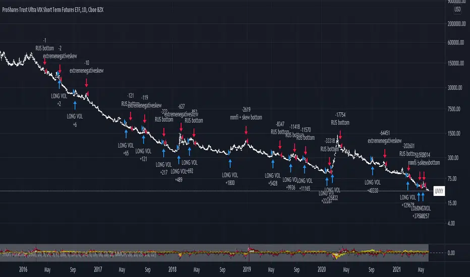
VIX Fix Indicator (Hestla 2015)This script provides a streamlined version of the VIX Fix, referencing the foundational work of Larry Williams and the strategies of Amber Hestla. It serves as a synthetic volatility gauge for assets that lack a dedicated VIX index. The math works by measuring the percentage drop from the highest recent close to the current low, essentially quantifying fear in the market without needing options data.
This specific script is designed to be purely visual. I have removed all the buy and sell labels found in other versions to leave a clean pane that plots only the oscillator and its moving average. You can use this to identify potential market bottoms when the black line spikes significantly, signaling that selling pressure is reaching a mathematical extreme relative to the recent trend.

Accurate ATR Stop Loss Distance — Risk Management ToolAccurate ATR Stop Loss Distance — Risk Management Tool
This indicator calculates an accurate Stop Loss distance in pips using the Average True Range (ATR) multiplied by a user-defined multiplier.
It automatically detects the correct pip size based on the instrument type (Forex, Crypto, Stocks, Indices, Futures), adjusting for 2-, 3-, 4-, or 5-digit quotes — ensuring professional-grade precision that matches institutional ATR-based risk systems.
📊 Features:
Uses ATR × Multiplier to determine precise SL distance in pips.
Automatically adjusts pip value depending on the asset type (handles 5-digit Forex brokers).
Clean and minimal design — displays only one info box in the top-right corner.
Fully customizable text and background colors.
Includes alert condition for automated SL updates.
⚙️ How to use:
Set your preferred ATR period and multiplier.
The indicator instantly displays your Stop Loss distance in pips at the top-right of the chart.
Combine with your entry strategy to calculate lot size or risk per trade.
💡 Ideal for traders who want consistent, objective SL distances derived from volatility rather than arbitrary points or emotions.
Note: Educational and informational tool only. Does not execute trades or give financial advice.

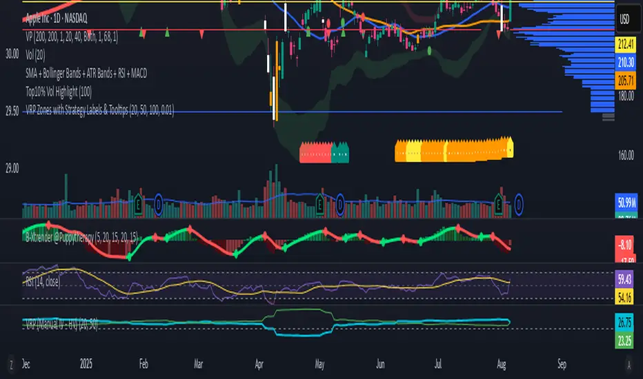
VRP Zones with Strategy Labels & TooltipsThis script marries the core concept of Volatility Risk Premium—how far implied vol sits above or below realized vol—with practical, on-chart signals that guide you toward specific options trades. By seeing “High VRP” in orange or “Negative VRP” in red right on your price bars (with hover-for-tooltip strategy tips), you get both the quantitative measure and the qualitative trade idea in one glance.
VIX9D to VIX RatioVIX9D to VIX Ratio
The ratio > 1 can signal near-term fear > long-term fear (potential short-term stress).
The ratio < 1 implies long-term implied volatility is higher — more typical in calm markets.

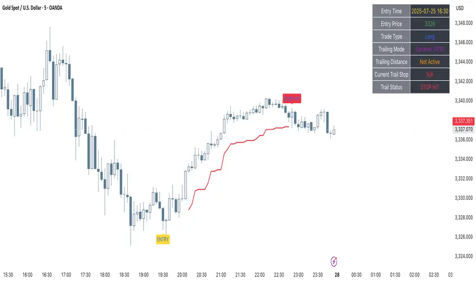
Clarix Trailing MasterClarix Trailing Master
Advanced Manual Entry Trailing Stop Strategy
Purpose :
Clarix Trailing Master is designed to give traders precise control over trade exits with a customizable trailing stop system. It combines manual entry inputs with dynamic and static trailing stop options, empowering users to protect profits while minimizing premature stop-outs.
How It Works:
You manually input your trade entry price and specify the trade direction (Long or Short).
The strategy activates the trailing stop only after the price moves favorably by a configurable profit threshold. This helps avoid early stop losses during initial market noise.
You can choose between a dynamic trailing stop based on Average True Range (ATR) or a fixed static trailing distance. The ATR can also be computed on a higher timeframe for enhanced stability.
Once active, the trailing stop updates live with price movements, ensuring your gains are locked in progressively.
If the price crosses the trailing stop, a clear alert triggers, and the stop-hit status displays visually on the chart.
Key Features:
Manual entry with exact price and timestamp input for precise trade tracking.
Supports both Long and Short trades.
Choice between dynamic ATR-based trailing or static trailing stops.
Configurable profit threshold before trailing stop activation to avoid early exits.
Visual markers for entry and stop-hit points (yellow and red respectively).
Live dashboard displaying entry details, trade status, trailing mode, and current stop level.
Works on all asset classes and timeframes, adaptable to various trading styles.
Built-in audio alert notifies you immediately when the trailing stop is hit.
Usage Tips:
Adjust the profit threshold and ATR settings based on your asset’s volatility and timeframe. For example, use higher ATR multipliers for more volatile markets like crypto.
Consider using higher timeframe ATR values for smoother trailing stops in fast-moving markets.
Ideal for swing trading or position trading where precise stop management is crucial.
Always backtest and paper trade before applying to live markets.
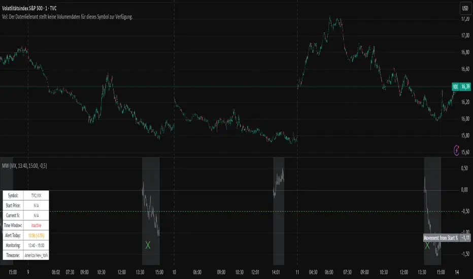
Movement WatcherMovement Watcher – Intraday Price Change Alert
This indicator tracks the percentage price movement of a selected symbol (e.g., VIX) from a configurable start time. If the intraday movement crosses a defined threshold (up or down), it triggers a one-time alert per day.
Key Features:
Monitors intraday % change from the specified start time.
Triggers one-time alerts for upper or lower threshold crossings.
Optional end time for monitoring period.
Visual plots and alert markers.
Useful for automated trading via webhook integrations.
This script was designed to work with automated trading tools such as the Trading Automation Toolbox. You can use it to generate alerts based on intraday volatility and route them via webhook for automated strategies.
Relative ATRThis indicator enhances the standard Average True Range (ATR) by providing context about current volatility relative to its recent historical average. It highlights periods where ATR is significantly higher or lower than its own recent norm.

BONK/USD (1H) - $4k DCA + Dual Trailing + Date FilterThis strategy trades BONK/USD on the 1-hour chart, employing a Dollar-Cost Averaging (DCA) approach for long entries.
It initiates a Base Order when a faster Exponential Moving Average (EMA) crosses above a slower one (signaling a potential uptrend, default 9/21 EMA). If the price declines after entry, it can automatically place up to two additional Safety Orders at predetermined lower levels, calculated using either Average True Range (ATR) volatility or fixed percentage drops.
Exits are triggered by a trend reversal (EMA crossunder) or a dual trailing stop-loss mechanism, which includes both a standard trail and a tighter profit-locking trail activated after reaching a certain profit target.
The strategy includes user-configurable inputs for all key parameters (EMAs, order sizes, trailing stops, SO spacing) and an optional date filter to limit backtesting or execution to a specific period. It also generates alerts formatted for potential automation with platforms like 3Commas.

pips barThis indicator displays a line (pips bar) of lengths corresponding to the set number of pips on the chart. This pips bar serves as a reference for assessing the volatility of the displayed chart. One pip for currency pairs is distinguished for JPY pairs and for others.
The horizontal position of the pips bar is offset to the right of the latest bar by the specified bar amount, and the vertical position can be selected from Top, Middle, or Bottom, calculated using the maximum and minimum values visible on the chart.

Concept Probability ConeThe Concept Probability Cone is a mathematical indicator designed to demonstrate the potential price range of an asset based on its historical volatility and statistical probabilities. Unlike most publicly available probability cone scripts, which often contain inaccuracies and oversimplifications, this tool is developed with a strong focus on precision and accuracy. It is important to note, however, that the Concept Probability Cone is currently in its initial stage, and further improvements and refinements may be introduced over time.
One significant difference between the Concept Probability Cone and other publicly available scripts is the incorporation of inverse Cumulative Distribution Functions (CDFs) in its calculations. Inverse CDFs are used to map a random variable's probability distribution to its corresponding quantile, which helps in determining the asset's price boundaries with a higher level of precision. This key feature sets the Concept Probability Cone apart from other tools, addressing the flaws found in many existing probability cone scripts.
This is a proof of concept indicator. Users are encouraged to play around with the tool, explore its features, and gain a deeper understanding of the statistical principles it demonstrates.

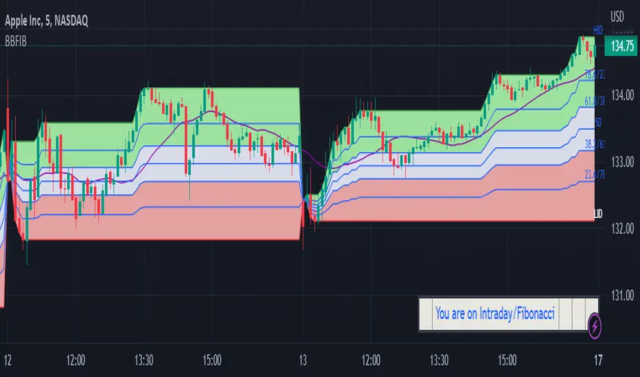
BBFIB Regular /Intraday Bollinger Bands and Fibonacci Levels Indicator displays Fibonacci levels for Intraday and Regular ( for given number of bars) for Bollinger Bands and for Highest and Lowest levels on Chart .
The indicator facilitates to switch over to following options by checking the relevant Check Boxes like Regular and Fibonacci or Regular and Bollinger Bands or Intraday and Fibonacci or Intraday and Bollinger Band. Default is Regular and Fibonacci for Length of 20 bars .
Regular/Intraday
Regular
Intraday
Fibonacci/Bollinger Bands
Fibonacci
Bollinger Bands
Default multiplier for Bollinger Bands is 2 and Moving Average is SMA 20. Default Length of Bars for General Moving Average is SMA 20.
User is provided with options to Input number of bars under Regular option for Bollinger Bands Moving Average and Fibonacci Levels for highest and lowest levels. For Intraday the script automatically updates the Length base from Day open .Input option is provided for Length of General Moving Average.
User is provided with the following Oscillation input options;
Regular:SMA,EMA,WMA ,VWMA
Intraday:SMA,WMA ,VWMA
General Moving Average:SMA,EMA,WMA, VWMA
The indicator helps the User to monitor level of volatility and the position of Price with relevance to Fibonacci levels for Intraday/Regular bars.
DISCLAIMER: For educational and entertainment purposes only. Nothing in this content should be interpreted as financial advice or a recommendation to buy or sell any sort of security or investment.
ADR + IDR [vnhilton]Average Day Range (ADR) is an indicator that calculates the average range of high to low of the candles for a set period of time. This is more useful for intraday trading, where, on an average day, you'd expect price to trade in a range similar to the ADR. This indicator also includes an Intraday Day Range (IDR), which can be used to track progress of the intraday range. By default, IDR is in multiplier form i.e. if it's 2, then the day has traded at a range twice as large as the ADR (you have the option to change IDR to price form if you wish). Therefore, IDR can also be used to measure intraday volatility (as well as taking profit & perhaps fading false breakouts when IDR is at 1x, 1.5x, 2x, etc.) by seeing if today is above/below/at average. This means that this indicator is intended for intraday use, but can be used up to the daily timeframe.
(ADR & IDR values can be seen in the top left)
The indicator also plots intraday high & low levels so when price trades near these levels then the indicator can become of use (if price trades far away from these levels, then you don't need to pay any attention to the indicator).
We can see in the chart snapshot image above for BTCUSDT, its 10 period ADR is 1149.37, & IDR is 0.52 (just over 50% of the ADR) as of 21:40 BST, meaning that BTCUSDT price range today is lower than average.
You may notice that the intraday high & low isn't touching the intraday high & low lines respectively on instruments that isn't cryptocurrencies nor forex pairs. To solve this problem, you would have to get extra market data from TradingView, or to integrate your broker with TradingView to pass along your broker's data feed (provided your broker also has real-time data - if not you may need to get extra market data via the broker.


Long/Short Volatility AlgoA modification of my leveraged ETF algorithm. Giving out for free because it's a sloppy algorithm, and I personally use a much more refined algorithm developed by someone much smarter than me.
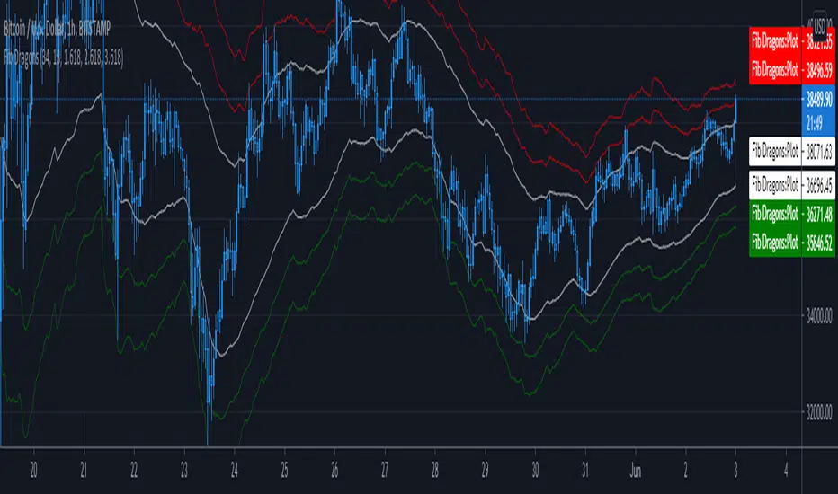
Fib DragonsCreates bands based on Fibonacci golden ratio numbers and EMA w/ATR
This allows for a faster reaction and significantly less lag than SMA w/ATR
EMA is set to 34 - Recommend range by taste 21, 34, 55, 62
ART is set to 13 - Recommend 13 or 21
Fib Bands are set to 1.618, 2.618, 3.618 however you can set to what works for you. I recommend keeping them at the golden ratios.
Based on indicator by rstraat
How to trade - Same rules apply
- Best to use in ranging market conditions
- Place on two different time frames such as the 15 min. and 60 min for intraday trading
- Take trades off either short or long term chart.
- Best trades occur when both charts show same trigger/condition.
- Trades are short term reversals in direction of major trend on longer term chart unless you expect a trend reversal.
- Determine which band is the limiting band for the volatility of the instrument.
- When the market closes outside of the limiting band then returns inside, take a long/short one tick above/below the high/low of the previous bar.
- Place stop below/above the low/high of the the recent swing low/high.
- Set targets at opposite band of chart
Use any oscillator you favor or see fit with this indicator or any other strategies that work for you.
True Range PercentageIt shows the true range/closing price percentage. With this indicator, you can infer the volatility of the market
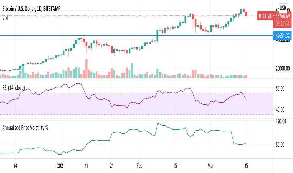
Annualised Price Volatility % CRYPTO dailiesThis is the correct annualisation for crypto currencies (continually traded). It is the rolling 1m vol using 30 days (instead of 25) and an annualisation factor of sqrt(365) not sqrt(252).
[BMAX] Daily Gaps(ENGLISH)
This indicator was built to allow traders to observe the open gaps between sessions in the Market. It can be used either on daily or weekly timeframes. Also it incluses a standard deviation band (such as bollinger band) in order to verify the gaps variance. This indicator can be used to check what is the variance on the session open gaps and prepare to protect the positions against market volatility when swing or position trading.
(PORTUGUÊS)
Este indicador foi construído para permitir que traders observem os gaps de abertura de seção no Mercado. Ele pode ser utilizado no tempo gráfico Diário ou Semanal. Também inclui uma banda de desvio padrão (assim como usado nas Bandas de Bolinger) que permite verifcar a variância dos gaps. Este indicador pode ser usado para se preparar para proteger uma posição em swing ou position trading onde o mercado pode abrir com forte gap em situações de alta volatilidade.

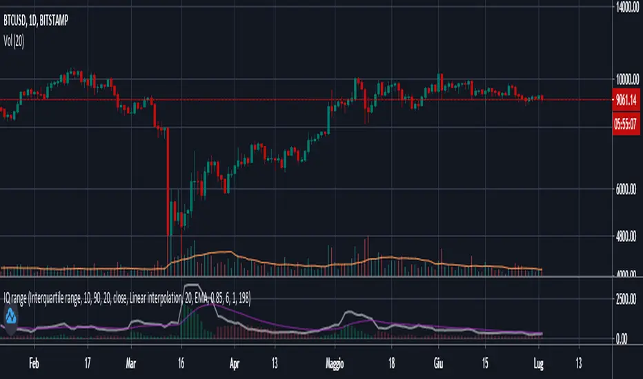
Interquartile rangeThis script plots the Interquartile range (difference between 3rd and 1st quartile), providing useful infos about price distribution and volatility . It is designed to work paired with my other script "Moving percentiles channel", but you can also use it alone.
Features:
- You can compute the percentiles using Linear interpolation or Nearest Rank methods
- You can plot not only the Interquartile range, but also the range (difference between 100th and 0 percentiles) or a User defined range (you have to select which percentiles you want to use from the settings)
- The script also plots a signal line that you can use to obtain signals when the Range line crosses the signal line itself. You can plot the signal line using many different MAs ( SMA , EMA , DEMA , TEMA , WMA , VWMA , HMA , ALMA , LSMA , FRAMA ).
- It also plots an histogram that represents the difference between the Range and the Signal line. It will be green colored when positive, and red colored when negative.
Please show me your support and follow me if you like my scripts. Many more of them are coming in the future.
@ Bezzus
Buddy Carter EMA StormtrackerBased on Buddy Carter's Idea to track the change of volatility by comparing different exponential moving averages. The indicator shows difference of shorter-term True Range and a base-length True Range.

[PX] Forex ATRCompare forex volatility at a glance.
If you are looking for someone to develop your own indicator or trading strategy, don't hesitate to get in touch with me here on TradingView or below.
Contact:
www.pascal-simon.de
info@pascal-simon.de
