[Pandora] Vast Volatility Treasure TroveINTRODUCTION:
Volatility enthusiasts, prepare for VICTORY on this day of July 4th, 2024! This is my "Vast Volatility Treasure Trove," intended mostly for educational purposes, yet these functions will also exhibit versatility when combined with other algorithms to garner statistical excellence. Once again, I am now ripping the lid off of Pandora's box... of volatility. Inside this script is a 'vast' collection of volatility estimators, reflecting the indicators name. Whether you are a seasoned trader destined to navigate financial strife or an eagerly curious learner, this script offers a comprehensive toolkit for a broad spectrum of volatility analysis. Enjoy your journey through the realm of market volatility with this code!
WHAT IS MARKET VOLATILITY?:
Market volatility refers to various fluctuations in the value of a financial market or asset over a period of time, often characterized by occasional rapid and significant deviations in price. During periods of greater market volatility, evolving conditions of prices can move rapidly in either direction, creating uncertainty for investors with results of sharp declines as well as rapid gains. However, market volatility is a typical aspect expected in financial markets that can also present opportunities for informed decision-making and potential benefits from the price flux.
SCRIPT INTENTION:
Volatility is assuredly omnipresent, waxing and waning in magnitude, and some readers have every intention of studying and/or measuring it. This script serves as an all-in-one armada of volatility estimators for TradingView members. I set out to provide a diverse set of tools to analyze and interpret market volatility, offering volatile insights, and aid with the development of robust trading indicators and strategies.
In today's fast-paced financial markets, understanding and quantifying volatility is informative for both seasoned traders and novice investors. This script is designed to empower users by equipping them with a comprehensive suite of volatility estimators. Each function within this script has been meticulously crafted to address various aspects of volatility, from traditional methods like Garman-Klass and Parkinson to more advanced techniques like Yang-Zhang and my custom experimental algorithms.
Ultimately, this script is more than just a collection of functions. It is a gateway to a deeper understanding of market volatility and a valuable resource for anyone committed to mastering the complexities of financial markets.
SCRIPT CONTENTS:
This script includes a variety of functions designed to measure and analyze market volatility. Where applicable, an input checkbox option provides an unbiased/biased estimate. Below is a brief description of each function in the original order they appear as code upon first publish:
Parkinson Volatility - Estimates volatility emphasizing the high and low range movements.
Alternate Parkinson Volatility - Simpler version of the original Parkinson Volatility that I realized.
Garman-Klass Volatility - Estimates volatility based on high, low, open, and close prices using a formula that adjusts for biases in price dynamics.
Rogers-Satchell-Yoon Volatility #1 - Estimates volatility based on logarithmic differences between high, low, open, and close values.
Rogers-Satchell-Yoon Volatility #2 - Similar estimate to Rogers-Satchell with the same result via an alternate formulation of volatility.
Yang-Zhang Volatility - An advanced volatility estimate combining both strengths of the Garman-Klass and Rogers-Satchell estimators, with weights determined by an alpha parameter.
Yang-Zhang (Modified) Volatility - My experimental modification slightly different from the Yang-Zhang formula with improved computational efficiency.
Selectable Volatility - Basic customizable volatility calculation based on the logarithmic difference between selected numerator and denominator prices (e.g., open, high, low, close).
Close-to-Close Volatility - Estimates volatility using the logarithmic difference between consecutive closing prices. Specifically applicable to data sources without open, high, and low prices.
Open-to-Close Volatility - (Overnight Volatility): Estimates volatility based on the logarithmic difference between the opening price and the last closing price emphasizing overnight gaps.
Hilo Volatility - Estimates volatility using a method similar to Parkinson's method, which considers the logarithm of the high and low prices.
Vantage Volatility - My experimental custom 'vantage' method to estimate volatility similar to Yang-Zhang, which incorporates various factors (Alpha, Beta, Gamma) to generate a weighted logarithmic calculation. This may be a volatility advantage or disadvantage, hence it's name.
Schwert Volatility - Estimates volatility based on arithmetic returns.
Historical Volatility - Estimates volatility considering logarithmic returns.
Annualized Historical Volatility - Estimates annualized volatility using logarithmic returns, adjusted for the number of trading days in a year.
If I omitted any other known varieties, detailed requests for future consideration can be made below for their inclusion into this script within future versions...
BONUS ALGORITHMS:
This script also includes several experimental and bonus functions that push the boundaries of volatility analysis as I understand it. These functions are designed to provide additional insights and also are my ideal notions for traders looking to explore other methods of volatility measurement.
VOLATILITY APPLICATIONS:
Volatility estimators serve a common role across various facets of trading and financial analysis, offering insights into market behavior. These tools are already in instrumental with enhancing risk management practices by providing a deeper understanding of market dynamics and the inherent uncertainty in asset prices. With volatility estimators, traders can effectively quantifying market risk and adjust their strategies accordingly, optimizing portfolio performance and mitigating potential losses. Additionally, volatility estimations may serve as indication for detecting overbought or oversold market conditions, offering probabilistic insights that could inform strategic decisions at turning points. This script
distinctly offers a variety of volatility estimators to navigate intricate financial terrains with informed judgment to address challenges of strategic planning.
CODE REUSE:
You don't have to ask for my permission to use/reuse these functions in your published scripts, simply because I have better things to do than answer requests for the reuse of these functions.
Notice: Unfortunately, I will not provide any integration support into member's projects at all. I have my own projects that require way too much of my day already.
在腳本中搜尋"Volatility"

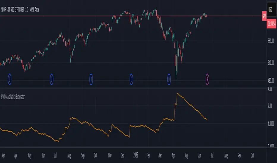
EWMA Volatility EstimatorThis script calculates EWMA Volatility (Exponentially Weighted Moving Average Volatility).
Commonly used model in financial risk management.
It estimates recent price volatility by applying more weight to the most recent returns, capturing volatility clustering while remaining responsive to fast market shifts.
The method uses a decay factor (λ) of 0.94, the standard value used in models like RiskMetrics, and converts the variance estimate into annualized volatility in percentage terms.
This is not a forecasting tool. It’s an estimator that reflects the magnitude of recent price moves in a statistically robust way.
It can be helpful for:
Understanding regime shifts in market behavior
Designing position sizing rules based on recent volatility
Filtering entries during high or low volatility phases
How It Works
Computes log returns of the closing price.
Squares the returns to get a proxy for variance.
Applies an exponential moving average to the squared returns using an equivalent EMA period based on λ = 0.94.
Converts the result to volatility by taking the square root and scaling to a percentage.
Key Characteristics
Backward-looking estimator
Reacts faster than standard rolling-window volatility
Smooths noise while still being sensitive to recent spikes
This script is educational and informational. It is not financial advice or a guarantee of performance. Always test any tool as part of a broader strategy before using it in live markets.
Volatility with Power VariationVolatility Analysis using Power Variation
The "Volatility with Power Variation" indicator is designed to measure market volatility. It focuses on providing traders with a clear understanding of how much the market is moving and how this movement changes over time.. This indicator helps in identifying potential periods of market expansion or contraction, based on volatility.
What the indicator does:
This indicator analyzes volatility which refers to the degree of variation in the returns of a financial instrument over time. It's an important measure to understand how much the price and returns of a asset fluctuates. High volatility means large price swings, meanwhile low volatility indicates smaller and consolidating movements. Realized (Historical) Volatility refers to volatility based on past price data.
Power Variation
Power Variation is an extension of the traditional methods used to calculate realized volatility. Instead of simply summing up squared returns (as done in calculating variance), Power Variation raises the magnitude of returns to a power p . This allows the indicator to capture different types of market behavior depending on the chosen value of p .
When P = 2, the Power variation behaves like a traditional variance measure. Lower values of p (e.g., p=1) make the indicator more sensitive to smaller price changes, meanwhile higher values make it more responsive to large jumps, but smaller price moves wont affect the measure that much or won't most likely.
Bipower Variation
Bipower variation is another method used to analyze the changes in price. It specifically isolates the continuous part of price movements from the jumps, which can help by understanding whether volatility is coming from regular market activity or from sharp, sudden moves.
How to Use the Indicator.
Understand Realized and Historical Volatility. Volatility after periods of low volatility you can eventually expect a expansion or an increase in volatility. Conversely, after periods of high volatility, the market often contracts and volatility decreases. If the variation plot is really low and you start seeing it increasing, shown by the standard deviation channels and moving average and you see it trending and increasing then that means you can expect for volatility to increase which means more price moves and expansions. Also if the scaling seems messed up, then use the logarithmic chart scale.

[GYTS] Volatility Toolkit Volatility Toolkit
🌸 Part of GoemonYae Trading System (GYTS) 🌸
🌸 --------- INTRODUCTION --------- 🌸
💮 What is Volatility Toolkit?
Volatility Toolkit is a comprehensive volatility analysis indicator featuring academically-grounded range-based estimators. Unlike simplistic measures like ATR, these estimators extract maximum information from OHLC data — resulting in estimates that are 5-14× more statistically efficient than traditional close-to-close methods.
The indicator provides two configurable estimator slots, weighted aggregation, adaptive threshold detection, and regime identification — all with flexible smoothing options via
GYTS FiltersToolkit integration.
💮 Why Use This Indicator?
Standard volatility measures (like simple standard deviation) are highly inefficient, requiring large amounts of data to produce stable estimates. Academic research has shown that range-based estimators extract far more information from the same price data:
• Statistical Efficiency — Yang-Zhang achieves up to 14× the efficiency of close-to-close variance, meaning you can achieve the same estimation accuracy with far fewer bars
• Drift Independence — Rogers-Satchell and Yang-Zhang correctly isolate variance even in strongly trending markets where simpler estimators become biased
• Gap Handling — Yang-Zhang properly accounts for overnight gaps, critical for equity markets
• Regime Detection — Built-in threshold modes identify when volatility enters elevated or suppressed states
↑ Overview showing Yang-Zhang volatility with dynamic threshold bands and regime background colouring
🌸 --------- HOW IT WORKS --------- 🌸
💮 Core Concept
The toolkit groups volatility estimators by their output scale to ensure valid comparisons and aggregations:
• Log-Return Scale (σ) — Close-to-Close, Parkinson, Garman-Klass, Rogers-Satchell, Yang-Zhang. These are comparable and can be aggregated. Annualisable via √(periods_per_year) scaling.
• Price Unit Scale ($) — ATR. Measures volatility in absolute price terms, directly usable for stop-loss placement.
• Percentage Scale (%) — Chaikin Volatility. Measures the rate of change of the trading range — whether volatility is expanding or contracting.
Only estimators with the same scale can be meaningfully compared or aggregated. The indicator enforces this and warns when mixing incompatible scales.
💮 Range-Based Estimator Overview
Range-based estimators utilise High, Low, Open, and Close prices to extract significantly more information about the underlying diffusion process than close-only methods:
• Parkinson (1980) — Uses High-Low range. ~5× more efficient than close-to-close. Assumes zero drift.
• Garman-Klass (1980) — Incorporates Open and Close. ~7.4× more efficient. Assumes zero drift, no gaps.
• Rogers-Satchell (1991) — Drift-independent. Superior in trending markets where Parkinson/GK become biased.
• Yang-Zhang (2000) — Composite estimator handling both drift and overnight gaps. Up to 14× more efficient.
💮 Theoretical Background
• Parkinson, M. (1980). The Extreme Value Method for Estimating the Variance of the Rate of Return. Journal of Business, 53 (1), 61–65. DOI
• Garman, M.B. & Klass, M.J. (1980). On the Estimation of Security Price Volatilities from Historical Data. Journal of Business, 53 (1), 67–78. DOI
• Rogers, L.C.G. & Satchell, S.E. (1991). Estimating Variance from High, Low and Closing Prices. Annals of Applied Probability, 1 (4), 504–512. DOI
• Yang, D. & Zhang, Q. (2000). Drift-Independent Volatility Estimation Based on High, Low, Open, and Close Prices. Journal of Business, 73 (3), 477–491. DOI
🌸 --------- KEY FEATURES --------- 🌸
💮 Feature Reference
Estimators (8 options across 3 scale groups):
• Close-to-Close — Classical benchmark using closing prices only. Least efficient but useful as baseline. Log-return scale.
• Parkinson — Range-based (High-Low), ~5× more efficient than close-to-close. Assumes zero drift. Log-return scale.
• Garman-Klass — OHLC-optimised, ~7.4× more efficient. Assumes zero drift, no gaps. Log-return scale.
• Rogers-Satchell — Drift-independent, handles trending markets where Parkinson/GK become biased. Log-return scale.
• Yang-Zhang — Gap-aware composite, most comprehensive (up to 14× efficient). Uses internal rolling variance (unsmoothed). Log-return scale.
• Std Dev — Standard deviation of log returns. Log-return scale.
• ATR — Average True Range in absolute price units. Useful for stop-loss placement. Price unit scale.
• Chaikin — Rate of change of range. Measures volatility expansion/contraction, not level. Percentage scale.
Smoothing Filters (10 options via FiltersToolkit):
• SMA / EMA — Classical moving averages
• Super Smoother (2-Pole / 3-Pole) — Ehlers IIR filter with excellent noise reduction
• Ultimate Smoother (2-Pole / 3-Pole) — Near-zero lag in passband
• BiQuad — Second-order IIR with configurable Q factor
• ADXvma — Adaptive smoothing, flat during ranging periods
• MAMA — MESA Adaptive Moving Average (cycle-adaptive)
• A2RMA — Adaptive Autonomous Recursive MA
Threshold Modes:
• Static — Fixed threshold values you define (e.g., 0.025 annualised)
• Dynamic — Adaptive bands: baseline ± (standard deviation × multiplier)
• Percentile — Threshold at Nth percentile of recent history (e.g., 80th percentile for high)
Visual Features:
• Level-based colour gradient — Line colour shifts with percentile rank (warm = high vol, cool = low vol)
• Fill to zero — Gradient fill intensity proportional to volatility level
• Threshold fills — Intensity-scaled fills when thresholds are breached
• Regime background — Chart background indicates HIGH/NORMAL/LOW volatility state
• Legend table — Displays estimator names, parameters, current values with percentile ranks (P##)
💮 Dual Estimator Slots
Compare two volatility estimators side-by-side. Each slot independently configures:
• Estimator type (8 options across three scale groups)
• Lookback period and smoothing filter
• Colour palette and visual style
This enables direct comparison between estimators (e.g., Yang-Zhang vs Rogers-Satchell) or between different parameterisations of the same estimator.
↑ Yang-Zhang (reddish) and Rogers-Satchell (greenish)
💮 Flexible Smoothing via FiltersToolkit
All estimators (except Yang-Zhang, which uses internal rolling variance) support configurable smoothing through 10 filter types. Using Infinite Impulse Response (IIR) filters instead of SMA avoids the "drop-off artefact" where volatility readings crash when old spikes exit the window.
Example: Same estimator (Parkinson) with different smoothing filters
Add two instances of Volatility Toolkit to your chart:
• Instance 1: Parkinson with SMA smoothing (lookback 14)
• Instance 2: Parkinson with Super Smoother 2-Pole (lookback 14)
Notice how SMA creates sharp drops when volatile bars exit the window, while Super Smoother maintains a gradual transition.
↑ Two Parkinson estimators — SMA (red mono-colour, showing drop-off artefacts) vs Super Smoother (turquoise mono colour, with smooth transitions)
↑ Garman-Klass with BiQuad (orangy) and 2-pole SuperSmoother filters (greenish)
💮 Weighted Aggregation
Combine multiple estimators into a single weighted average. The indicator automatically:
• Validates scale compatibility (only same-scale estimators can be aggregated)
• Normalises weights (so 2:1 means 67%:33%)
• Displays clear warnings when scales differ
Example: Robust volatility estimate
Combine Yang-Zhang (handles gaps) with Rogers-Satchell (handles drift) using equal weights:
• E1: Yang-Zhang (14)
• E2: Rogers-Satchell (14)
• Aggregation: Enabled, weights 1:1
The aggregated line (with "fill to zero" enabled) provides a more robust estimate by averaging two complementary methodologies.
↑ Yang-Zhang + Rogers-Satchell with aggregation line (thicker) showing combined estimate (notice how opening gaps are handled differently)
Example: Trend-weighted aggregation
In strongly trending markets, weight Rogers-Satchell more heavily since it's drift-independent:
• Estimator 1: Garman-Klass (faster, higher weight in ranging)
• Estimator 2: Rogers-Satchell (drift-independent, higher weight in trends)
• Aggregation: weights 1:2 (favours RS during trends)
💮 Adaptive Threshold Detection
Three threshold modes for identifying volatility regime shifts. Threshold breaches are visualised with intensity-scaled fills that grow stronger the further volatility exceeds the threshold.
Example: Dynamic thresholds for regime detection
Configure dynamic thresholds to automatically adapt to market conditions:
• High Threshold Mode: Dynamic (baseline + 2× std dev)
• Low Threshold Mode: Dynamic (baseline - 2× std dev)
• Show threshold fills: Enabled
This creates adaptive bands that widen during volatile periods and narrow during calm periods.
Example: Percentile-based thresholds
Use percentile mode for context-aware regime detection:
• High Threshold Mode: Percentile (96th)
• Low Threshold Mode: Percentile (4th)
• Percentile Lookback: 500
This identifies when volatility enters the top/bottom 4% of its recent distribution.
↑ Different threshold settings, where the dynamic and percentile methods show adaptive bands that widen during volatile periods, with fill intensity varying by breach magnitude. Regime detection (see next) is enabled too.
💮 Regime Background Colouring
Optional background colouring indicates the current volatility regime:
• High Volatility — Warm/alert background colour
• Normal — No background (neutral)
• Low Volatility — Cool/calm background colour
Select which source (Estimator 1, Estimator 2, or Aggregation) drives the regime display.
Example: Regime filtering for trade decisions
Use regime background to filter trading signals from other indicators:
• Regime Source: Aggregation
• Background Transparency: 90 (subtle)
When the background shows HIGH volatility (warm), consider tighter stops. When LOW (cool), watch for breakout setups.
↑ Regime background emphasis for breakout strategies. Note the interesting A2RMA smoothing for this case.
🌸 --------- USAGE GUIDE --------- 🌸
💮 Getting Started
1. Add the indicator to your chart
2. Estimator 1 defaults to Yang-Zhang (14) — the most comprehensive estimator for gapped markets
3. Keep "Annualise Volatility" enabled to express values in standard annualised form
4. Observe the legend table for current values and percentile ranks (P##). Hover over the table cells to see a little more info in the tooltip.
💮 Choosing an Estimator
• Trending equities with gaps — Yang-Zhang. Handles both drift and overnight gaps optimally.
• Crypto (24/7 trading) — Rogers-Satchell. Drift-independent without Yang-Zhang's multi-period lag.
• Ranging markets — Garman-Klass or Parkinson. Simpler, no drift adjustment needed.
• Price-based stops — ATR. Output in price units, directly usable for stop distances.
• Regime detection — Combine any estimator with threshold modes enabled.
💮 Interpreting Output
• Value (P##) — The volatility reading with percentile rank. "0.1523 (P75)" means 0.1523 annualised volatility at the 75th percentile of recent history.
• Colour gradient — Warmer colours = higher percentile (elevated volatility), cooler colours = lower percentile.
• Threshold fills — Intensity indicates how far beyond the threshold the current reading is.
• ⚠️ HIGH / 🔻 LOW — Table indicators when thresholds are breached.
🌸 --------- ALERTS --------- 🌸
💮 Direction Change Alerts
• Estimator 1/2 direction change — Triggers when volatility inflects (rising to falling or vice versa)
💮 Cross Alerts
• E1 crossed E2 — Triggers when the two estimator lines cross
💮 Threshold Alerts
• E1/E2/Aggr High Volatility — Triggers when volatility breaches the high threshold
• E1/E2/Aggr Low Volatility — Triggers when volatility falls below the low threshold
💮 Regime Change Alerts
• E1/E2/Aggr Regime Change — Triggers when the volatility regime transitions (High ↔ Normal ↔ Low)
🌸 --------- LIMITATIONS --------- 🌸
• Drift bias in Parkinson/GK — These estimators overestimate variance in trending conditions. Switch to Rogers-Satchell or Yang-Zhang for trending markets.
• Yang-Zhang minimum lookback — Requires at least 2 bars (enforced internally). Cannot produce instantaneous readings like other estimators.
• Flat candles — Single-tick bars produce near-zero variance readings. Use higher timeframes for illiquid assets.
• Discretisation bias — Estimates degrade when ticks-per-bar is very small. Consider higher timeframes for thinly traded instruments.
• Scale mixing — Different scale groups (log-return, price unit, percentage) cannot be meaningfully compared or aggregated. The indicator warns but does not prevent display.
🌸 --------- CREDITS --------- 🌸
💮 Academic Sources
• Parkinson, M. (1980). The Extreme Value Method for Estimating the Variance of the Rate of Return. Journal of Business, 53 (1), 61–65. DOI
• Garman, M.B. & Klass, M.J. (1980). On the Estimation of Security Price Volatilities from Historical Data. Journal of Business, 53 (1), 67–78. DOI
• Rogers, L.C.G. & Satchell, S.E. (1991). Estimating Variance from High, Low and Closing Prices. Annals of Applied Probability, 1 (4), 504–512. DOI
• Yang, D. & Zhang, Q. (2000). Drift-Independent Volatility Estimation Based on High, Low, Open, and Close Prices. Journal of Business, 73 (3), 477–491. DOI
• Wilder, J.W. (1978). New Concepts in Technical Trading Systems . Trend Research.
💮 Libraries Used
• VolatilityToolkit Library — Range-based estimators, smoothing, and aggregation functions
• FiltersToolkit Library — Advanced smoothing filters (Super Smoother, Ultimate Smoother, BiQuad, etc.)
• ColourUtilities Library — Colour palette management and gradient calculations

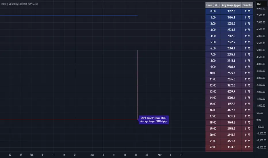
Hourly Volatility Explorer📊 Hourly Volatility Explorer: Master The Market's Pulse
Unlock the hidden rhythms of price action with this sophisticated volatility analysis tool. The Hourly Volatility Explorer reveals the most potent trading hours across multiple time zones, giving you a strategic edge in timing your trades.
🌟 Key Features:
⏰ Multi-Timezone Analysis
• GMT (UTC+0)
• EST (UTC-5) - New York
• BST (UTC+1) - London
• JST (UTC+9) - Tokyo
• AEST (UTC+10) - Sydney
Perfect for tracking major market sessions and their overlaps!
📈 Dynamic Visualization
• Color-gradient hourly bars for instant pattern recognition
• Real-time volatility comparison
• Interactive data table with comprehensive statistics
• Automatic highlighting of peak volatility periods
🎯 Strategic Applications:
Day Trading:
• Identify optimal trading windows
• Avoid low-liquidity periods
• Capitalize on session overlaps
• Fine-tune entry/exit timing
Risk Management:
• Set appropriate stop losses based on hourly volatility
• Adjust position sizes for different market hours
• Optimize risk-reward ratios
• Plan around high-impact hours
Global Market Analysis:
• Track volatility across all major sessions
• Spot institutional trading patterns
• Identify quiet vs. active periods
• Monitor 24/7 market dynamics
💡 Perfect For:
• Forex traders navigating global sessions
• Crypto traders in 24/7 markets
• Day traders optimizing execution times
• Algorithmic traders fine-tuning strategies
• Risk managers calibrating exposure
📊 Advanced Features:
• Rolling 3-month analysis for reliable patterns
• Precise pip movement calculations
• Sample size tracking for statistical validity
• Real-time current hour comparison
• Color-coded visual system for instant insights
⚡ Pro Trading Tips:
• Use during major session overlaps for maximum opportunity
• Compare patterns across different instruments
• Combine with volume analysis for deeper insights
• Track seasonal variations in hourly patterns
• Build trading schedules around peak hours
🎓 Educational Value:
• Understand market microstructure
• Learn global market dynamics
• Master timezone relationships
• Develop timing intuition
🛠️ Customization:
• Adjustable lookback period
• Flexible pip multiplier
• Multiple timezone options
• Visual preference settings
Whether you're scalping the 1-minute chart or managing longer-term positions, the Hourly Volatility Explorer provides the precise timing intelligence needed for today's global markets.
Transform your trading schedule from guesswork to science. Know exactly when markets move, why they move, and how to position yourself for maximum opportunity.
#TechnicalAnalysis #Trading #Volatility #MarketTiming #DayTrading #Forex #Crypto #TradingView #PineScript #MarketAnalysis #TradingStrategy #RiskManagement #GlobalMarkets #FinancialMarkets #TradingTools #MarketStructure #PriceAction #Scalping #SwingTrading #AlgoTrading
VIX, ATR, and Volatility Indicatorhere what the indictor do !
The "VIX, ATR, and Volatility Indicator" combines the Volatility Index (VIX), Average True Range (ATR), and moving averages to provide insights into market volatility.
VIX (Volatility Index):
The VIX measures the expected volatility in the market over the next 30 days. A higher VIX value indicates increased market volatility, while a lower value suggests lower volatility.
ATR (Average True Range):
The ATR is a technical indicator that measures the average range between high and low prices over a specified period. It provides a sense of the market's volatility by considering price movements. Higher ATR values indicate greater volatility, while lower values indicate lower volatility.
Moving Averages:
The indicator calculates both an Exponential Moving Average (EMA) and Simple Moving Average (SMA) with a specific period (e.g., 50).
Moving averages smooth out price data to identify trends and potential areas of support or resistance.
Volatility Detection:
By comparing the current closing price to the EMA and SMA, the indicator determines if there is high volatility.
If the current closing price is higher than either the EMA or SMA, it indicates potential high volatility.
Visualization:
The VIX and ATR are typically plotted on the chart, providing a visual representation of market volatility and price range.
Additionally, markers or labels may be used to highlight periods of high volatility when the current price exceeds the moving averages.
what are the VIX and ATR
Volatility Index (VIX):
Monitor the VIX value from financial platforms or market data providers. A higher VIX value indicates increased market volatility, suggesting potential trading opportunities. Conversely, a lower VIX value indicates lower volatility, which may influence your trading strategy.
Average True Range (ATR):
Calculate the ATR manually or use charting platforms that provide ATR as an indicator.
Plot the ATR on your trading chart to visualize the range of price movements.
Determine suitable entry and exit points based on ATR values. For example, higher ATR values may indicate larger potential price swings, while lower ATR values may suggest a more stable market.
how it work
Fetching VIX Data:
The request.security function is used to fetch the daily VIX data from the "CBOE:VIX" symbol. It retrieves the closing price of the VIX for each day.
Calculating ATR:
The ta.atr function calculates the Average True Range (ATR) with a period of 14. ATR measures the average range between the high and low prices over the specified period, providing an indication of market volatility.
Calculating Moving Averages:
Two types of moving averages are calculated: Exponential Moving Average (EMA) and Simple Moving Average (SMA). Both moving averages are calculated using a period of 50, but you can adjust the period as needed.
The ta.ema function calculates the Exponential Moving Average, which places greater weight on recent prices.
The ta.sma function calculates the Simple Moving Average, which gives equal weight to all prices in the period.
Identifying High Volatility:
The indicator determines if there is high volatility by comparing the current closing price to both the EMA and SMA.
If the current closing price is higher than either the EMA or SMA, the isHighVolatility variable is set to true, indicating potential high volatility.
Plotting the Indicators:
The VIX and ATR are plotted using the plot function, assigning colors and line widths for visual differentiation.
The plotshape function is used to plot markers below the bars to indicate highly volatile periods. The isHighVolatility variable determines when the markers appear.

Volatility Regimes | GainzAlgo📊 OVERVIEW:
=========
This is a comprehensive ATR-based trading system designed for professional
traders who need advanced volatility analysis, precise trade management, and
intelligent market regime detection. The indicator combines multiple proven
volatility concepts into one powerful, customizable tool.
⭐ WHY THIS SYSTEM IS UNIQUE AND WORTHY OF PUBLICATION:
====================================================
This is not simply a collection of ATR-based indicators placed together.
It represents a unified volatility analysis framework where each component
is specifically designed to work in concert with the others, creating a
complete trading workflow that cannot be replicated by using multiple
separate indicators.
🔗 SYNERGISTIC INTEGRATION - How Components Work Together:
🧠 1. CONTEXT-AWARE ANALYSIS
The Volatility Regime Detection acts as the "brain" of the system,
classifying market conditions into 4 distinct phases. Every other
component then adapts its behavior based on this regime classification:
- ATR Bands expand/contract with regime changes
- Stop Loss distances automatically adjust (tighter in compression,
wider in high volatility)
- Take Profit targets scale proportionally to current regime
- Signal sensitivity filters itself based on market phase
📐 2. UNIFIED VOLATILITY FOUNDATION
All calculations share a single ATR baseline calculation, ensuring
internal consistency across the entire system. When ATR changes, every
element updates in perfect synchronization:
- Bands recalculate from the same ATR value
- Risk management levels use the same volatility measurement
- Regime classification and signals reference identical data
🛡️ 3. INTEGRATED RISK MANAGEMENT
The system doesn't just show WHERE to enter - it calculates HOW MUCH
to risk:
- Dynamic Stop Loss adapts to current ATR automatically
- Position Size Calculator uses the dynamic stop to compute exact quantities
- Take Profit levels scale proportionally, maintaining optimal risk:reward
✅ 4. TWO-STAGE SIGNAL CONFIRMATION
The alert system creates a logical progression:
Step 1: Volatility Breakout → Market energy is building
Step 2: Trend Confirmation → Direction confirmed with volatility support
This prevents false breakouts by requiring both volatility AND direction.
🏦 5. PROFESSIONAL WORKFLOW INTEGRATION
The system mirrors how institutional traders analyze markets:
Phase 1: Assess regime → What's the market doing?
Phase 2: Identify setup → Where's the opportunity?
Phase 3: Calculate risk → What's my exposure?
Phase 4: Set targets → Where do I take profit?
Phase 5: Monitor regime → When do conditions change?
❌ WHY NOT USE SEPARATE INDICATORS?
- Separate ATR Bands: Don't know about regime changes, remain static
- Separate Regime Indicator: Doesn't automatically adjust stop/targets
- Separate Position Calculator: Doesn't know your actual ATR-based stop
- Manual Integration: Requires constant mental calculation and cross-referencing
🧮 DETAILED CALCULATION METHODOLOGY:
=================================
📏 ATR (AVERAGE TRUE RANGE) CALCULATION:
- True Range = Maximum of:
1. Current High - Current Low
2. Absolute value of (Current High - Previous Close)
3. Absolute value of (Current Low - Previous Close)
- ATR = Simple Moving Average of True Range over specified period (default: 14)
📊 DYNAMIC ATR BANDS:
- Upper Band = Current Close + (ATR × Band Multiplier)
- Lower Band = Current Close - (ATR × Band Multiplier)
- Band 1: 1.0× ATR (closest support/resistance)
- Band 2: 2.0× ATR (intermediate zone)
- Band 3: 3.0× ATR (extended zone)
🌡️ VOLATILITY REGIME CLASSIFICATION:
Step 1: Calculate ATR Baseline
- Baseline ATR = SMA or EMA of ATR over long period (default: 50 bars)
- This represents "normal" volatility for the instrument
Step 2: Calculate ATR Ratio
- ATR Ratio = Current ATR ÷ Baseline ATR
- Example: If current ATR = 70 and baseline = 50, ratio = 1.40
Step 3: Classify Regime Based on Ratio
- COMPRESSION: Ratio < 0.70 (ATR is 30% below normal)
Market consolidating, volatility contracting, energy building
- EXPANSION: Ratio between 1.15 and 1.40 (ATR is 15-40% above normal)
Volatility breaking out, early phase of directional movement
- HIGH VOLATILITY: Ratio > 1.40 (ATR is 40%+ above normal)
Strong sustained trend with high participation
- EXHAUSTION: ATR declining after high volatility period
Requires: Previous high ratio + declining ATR over X bars (default: 5)
Trend maturity, potential reversal or consolidation approaching
🛑 DYNAMIC STOP LOSS CALCULATION:
- For Long Positions: Stop Loss = Entry Price - (ATR × SL Multiplier)
- For Short Positions: Stop Loss = Entry Price + (ATR × SL Multiplier)
- Default Multiplier: 2.0× ATR
- Adjusts automatically: Wider in high volatility, tighter in compression
🎯 TAKE PROFIT LEVELS:
- TP1 = Entry Price ± (ATR × TP1 Multiplier)
- TP2 = Entry Price ± (ATR × TP2 Multiplier)
- TP3 = Entry Price ± (ATR × TP3 Multiplier)
- Direction (+ or -) depends on trade direction
📦 POSITION SIZE CALCULATION:
Formula: Position Size = Account Risk Amount ÷ Stop Loss Distance
Step-by-step:
1. Risk Amount = Account Size × (Risk Percentage ÷ 100)
2. Stop Distance = |Entry Price - Stop Loss Price|
3. Position Size = Risk Amount ÷ Stop Distance
📈 ATR PERCENTILE RANKING:
- >80% = Extremely high volatility
- 20-80% = Normal volatility range
- <20% = Extremely low volatility
🌀 VOLATILITY CONTRACTION PATTERN:
Detects extended low-volatility periods indicating imminent breakout.
🧭 TREND DETECTION SIGNALS:
Bullish: Price > MA AND Current ATR > ATR MA
Bearish: Price < MA AND Current ATR > ATR MA
⚡ VOLATILITY BREAKOUT SIGNALS:
Triggered when ATR exceeds its moving average by a defined threshold.
🧩 CORE FEATURES:
==============
1. ATR BANDS (Dynamic Support/Resistance)
2. VOLATILITY REGIME DETECTION
3. DYNAMIC STOP LOSS SYSTEM
4. MULTIPLE TAKE PROFIT LEVELS
5. SUPPORT & RESISTANCE LEVELS
6. RISK MANAGEMENT CALCULATOR
7. ATR PERCENTILE RANKING
8. VOLATILITY CONTRACTION PATTERN
9. TREND DETECTION SIGNALS
10. VOLATILITY BREAKOUT SIGNALS
⚙️ RECOMMENDED SETTINGS BY TRADING STYLE:
======================================
DAY TRADING • SWING TRADING • POSITION TRADING • SCALPING
📘 HOW TO USE THIS INDICATOR:
==========================
STEP 1: Identify Market Regime
STEP 2: Wait for Entry Signal
STEP 3: Set Stop Loss
STEP 4: Set Take Profits
STEP 5: Position Sizing
STEP 6: Monitor & Manage
🔔 ALERT SYSTEM:
=============
Alerts for volatility breakouts, trend changes, regime transitions,
ATR band crossings, contraction completion, and percentile extremes.
🎨 CUSTOMIZATION:
==============
All visuals, thresholds, multipliers, colors, alerts, and risk parameters
can be fully customized.
⚠️ IMPORTANT DISCLAIMER:
=====================
This indicator is a volatility analysis tool and does NOT provide financial advice.
Past performance does not guarantee future results.
All trading involves substantial risk.
All trading decisions are the sole responsibility of the user.

ATR Volatility AlertsOverview:
This is a dynamic alert tool based on the Average True Range (ATR), designed to help traders detect sudden price movements that exceed normal volatility levels. Whether you are trading breakouts or monitoring for abnormal spikes, this indicator visualizes these events on the chart and triggers system alerts when the price move exceeds your specified ATR multiplier.
Key Features:
Fully Customizable ATR Range:
You can adjust the ATR Length (Default: 14) and the Multiplier (Default: 1.5x).
Tip: Increase the multiplier (e.g., to 2.0 or 3.0) to catch only extreme volatility, or lower it for scalping smaller moves.
Visual Chart Signals:
Visual markers appear instantly when a bar's movement exceeds the ATR threshold.
Green Triangle: Indicates an Upward Spike.
Red Triangle: Indicates a Downward Spike.
Flexible System Alerts:
Designed to integrate seamlessly with TradingView's alert system. You can choose from three specific alert directions based on your strategy:
1.Price Spike Up: Triggers only on sharp upward moves.
2.Price Spike Down: Triggers only on sharp downward moves.
3.Bidirectional Volatility Alert: Triggers on BOTH huge pumps and dumps.
How to Set Alerts:
Click the "Create Alert" button in TradingView.
Select ATR Volatility Alerts in the "Condition" dropdown.
Choose the specific logic you need:
· Select Price Spike Up for bullish monitoring.
· Select Price Spike Down for bearish monitoring.
· Select Bidirectional Volatility Alert to watch for any volatility expansion.

Cross Asset VolatilityThis script brings together a number of volatility indexes from the CBOE in one space making it easier to use rather than adding a number of different securities to one chart. One could create a template with these securities attached, but sometimes, you don't want to switch charts, for whatever reason, and adding an indicator for is quick and simple.
One note is that due some securities exhibit much larger volatility than others (i.e. oil vs bonds) and it can be difficult to see clearly those securities whose volatilities are low, and hence we have added the ability to calculate the values as a Log value to make the indicator more readable. Another way to do this is to change the Y-axis on the chart to Logarithmic while leaving the indicator at its default settings (i.e. the checkbox for using Log calculations remains unchecked).

Volatility DashboardThis indicator calculates and displays volatility metrics for a specified number of bars (rolling window) on a TradingView chart. It can be customized to display information in English or Thai and can position the dashboard at various locations on the chart.
Inputs
Language: Users can choose between English ("ENG") and Thai ("TH") for the dashboard's language.
Dashboard Position: Users can specify where the dashboard should appear on the chart. Options include various positions such as "Bottom Right", "Top Center", etc.
Calculation Method: Currently, the script supports "High-Low" for volatility calculation. This method calculates the difference between the highest and lowest prices within a specified timeframe.
Bars: Number of bars used to calculate the volatility.
Display Logic
Fills the islast_vol_points array with the calculated volatility points.
Sets the table cells with headers and corresponding values:
=> Highest Volatility: The maximum value in the islast_vol_points array
=> Mean Volatility: The average value in the islast_vol_points array,
=> Lowest Volatility: The minimum value in the islast_vol_points array, Number of Bars: The rolling window size.

[-_-] Volatility Calibrated ATRDescription:
An indicator based on ATR adjusted for volatility of the market. It uses Heikin Ashi data to find short and long opportunities and displays a dynamic stop loss level. Additionally, it has alerts for when the trend changes (which is an entry signal).
How it works:
It works by dynamically calculating the Period for ATR which depends on current volatility level that is calculated by a function that uses Standard Deviation of price. ATR is then smoothed by Weighted Moving Average and multiplied by ATR Factor, resulting in a plot that changes its colour to red when we're in a downtrend and green when in an uptrend. This plot should be used as a dynamic Stop Loss level. Trend change is determined by price crossing the dynamic Stop Loss level. The squared red and green labels appear when the trend changes, and should be used as Entry signals.
Parameters:
- Source -> data used for calculations
- ATR Factor -> higher values produce less noise and longer trends, lower values give more signals

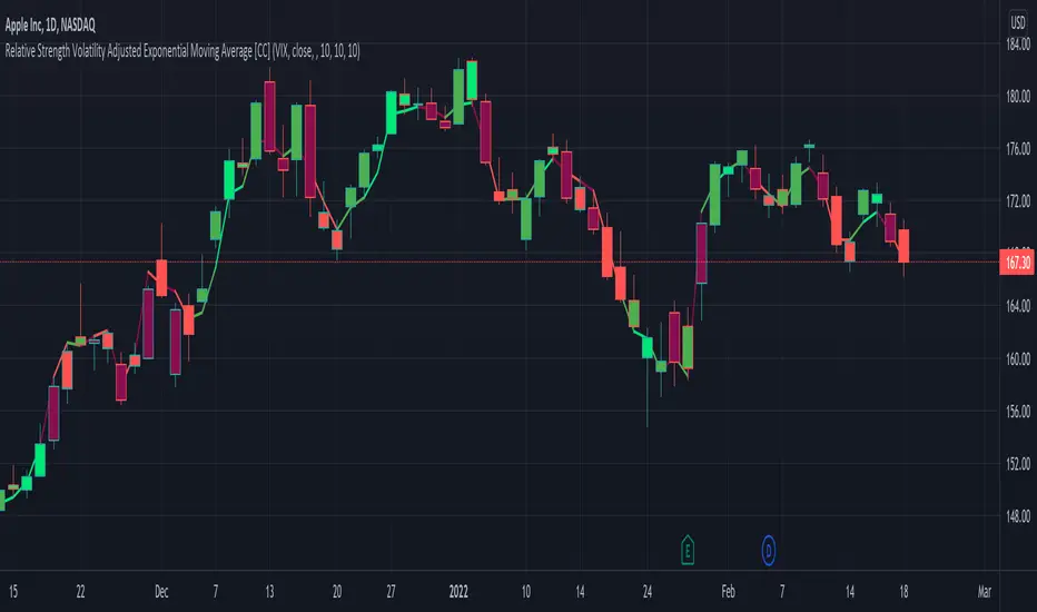
Relative Strength Volatility Adjusted Ema [CC]The Relative Strength Volatility Adjusted Exponential Moving Average was created by Vitali Apirine (Stocks and Commodities Mar 2022) and this is his final indicator of his recent Relative Strength series. I published both of the previous indicators, Relative Strength Volume Adjusted Exponential Moving Average and Relative Strength Exponential Moving Average
This indicator is particularly unique because it uses the Volatility Index (VIX) symbol as the default to determine volatility and uses this in place of the current stock's price into a typical relative strength calculation. As you can see in the chart, it follows the price much closer than the other two indicators and so of course this means that this indicator is best for choppy markets and the other two are better for trending markets. I would of course recommend to experiment with this one and see what works best for you.
I have included strong buy and sell signals in addition to normal ones so strong signals are darker in color and normal signals are lighter in color. Buy when the line turns green and sell when it turns red.
Let me know if there are any other indicators or scripts you would like to see me publish!
Jurik Volatility BandsVolatility is a core concept in trading and impacts our trading strategies. Therefore, all traders should have some sort of volatility indicator displayed to gauge the current volatility and future expected moves.
Jurik Volatility Bands displays the price inside a volatility channel. In this way, we can measure the current price action in accordance with its volatility.
Usage
The indicator is mainly used for scalping and intraday trading. Whenever the price touches either the upper or lower volatility band, we can consider it a volatility move. It can lead to a pullback or breakout move. However, we know that when the volatility is high, we expect more significant price moves and should prepare ourselves for it.
Disclaimer: No financial advice, only for educational/entertainment purposes.

Implied Volatility LevelsOverview:
The Implied Volatility Levels Indicator is a powerful tool designed to visualize different levels of implied volatility on your trading chart. This indicator calculates various implied volatility levels based on historical price data and plots them as dynamic dotted lines, helping traders identify significant market thresholds and potential reversal points.
Features:
Multi-Level Implied Volatility: The indicator calculates and plots multiple levels of implied volatility, including the mean and both positive and negative standard deviation multiples.
Dynamic Updates: The levels update in real-time, reflecting the latest market conditions without cluttering your chart with outdated information.
Customizable Parameters: Users can adjust the lookback period and the standard deviation multiplier to tailor the indicator to their trading strategy.
Visual Clarity: Implied volatility levels are displayed using distinct colors and dotted lines, providing clear visual cues without obstructing the view of price action.
Support for Multiple Levels: Includes additional levels (up to ±5 standard deviations) for in-depth market analysis.
How It Works:
The indicator computes the standard deviation of the closing prices over a user-defined lookback period. It then calculates various implied volatility levels by adding and subtracting multiples of this standard deviation from the mean price. These levels are plotted as dotted lines on the chart, offering traders a clear view of the current market's volatility landscape.
Usage:
Identify Key Levels: Use the plotted lines to spot potential support and resistance levels based on implied volatility.
Analyze Market Volatility: Understand how volatile the market is relative to historical data.
Plan Entry and Exit Points: Make informed trading decisions by observing where the price is in relation to the implied volatility levels.
Parameters:
Lookback Period (Days): The number of days to consider for calculating historical volatility (default is 252 days).
Standard Deviation Multiplier: A multiplier to adjust the distance of the levels from the mean (default is 1.0).
This indicator is ideal for traders looking to incorporate volatility analysis into their technical strategy, providing a robust framework for anticipating market movements and potential reversals.
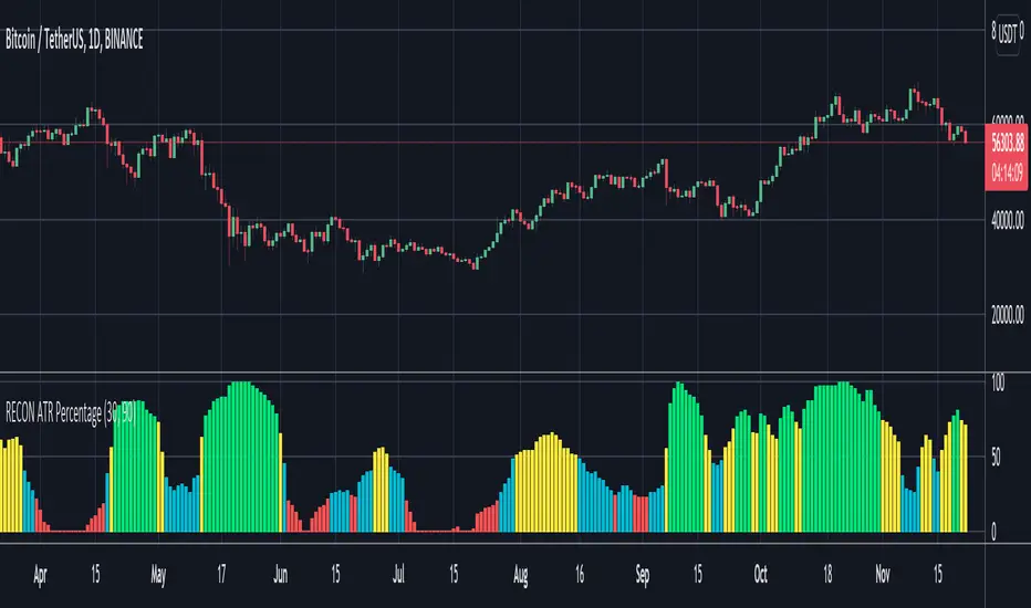
RECON ATR Volatility PercentageThe original Average True Range (ATR) indicator is a technical analysis indicator designed to measure volatility. The higher the ATR the higher the volatility.
The RECON ATR Volatility Percentage indicator calculates the Average True Range (ATR) as a percentage.
Suggested chart timeframes: 1h, 4h and 1D seem to produce the most useful intel but can be used on lower timeframes as well.
The Recon ATR Volatility Percentage can be utilized for identifying trading pairs with a desired amount of volatility, for example deploying a grid trading strategy on pairs that are trending up with a high amount of volatility (say over 50%) might produce desirable results.
It is important to note the ATR does not indicate price direction and can be high in both a rising or falling market.
The ATR Length, Period Look Back Length parameters as well as the color of the columns can be configured per your specifications.
[SGM GARCH Volatility]I'm excited to share with you a Pine Script™ that I developed to analyze GARCH (Generalized Autoregressive Conditional Heteroskedasticity) volatility. This script allows you to calculate and plot GARCH volatility on TradingView. Let's see together how it works!
Introduction
Volatility is a key concept in finance that measures the variation in prices of a financial asset. The GARCH model is a statistical method that predicts future volatility based on past volatilities and prediction residuals (errors).
Indicator settings
We define several parameters for our indicator:
length = input.int(20, title="Length")
p = input.int(1, title="Lag order (p)")
q = input.int(1, title="Degree of moving average (q)")
cluster_value = input(0.2,title="cluster value")
length: The period used for the calculations, default 20.
p: The order of the delay for the GARCH model.
q: The degree of the moving average for the GARCH model.
cluster_value: A threshold value used to color the graph.
Calculation of logarithmic returns
We calculate logarithmic returns to capture price changes:
logReturns = math.log(close) - math.log(close )
Initializing arrays
We initialize arrays to store residuals and volatilities:
var float residuals = array.new_float(length, 0)
var float volatilities = array.new_float(length, 0)
We add the new logarithmic returns to the tables and keep their size constant:
array.unshift(residuals, logReturns)
if (array.size(residuals) > length)
array.pop(residuals)
We then calculate the mean and variance of the residuals:
meanResidual = array.avg(residuals)
varianceResidual = array.stdev(residuals, meanResidual)
volatility = math.sqrt(varianceResidual)
We update the volatility table with the new value:
array.unshift(volatilities, volatility)
if (array.size(volatilities) > length)
array.pop(volatilities)
GARCH volatility is calculated from accumulated data:
var float garchVolatility = na
if (array.size(volatilities) >= length and array.size(residuals) >= length)
alpha = 0.1 // Alpha coefficient
beta = 0.85 // Beta coefficient
omega = 0.01 // Omega constant
sumVolatility = 0.0
for i = 0 to p-1
sumVolatility := sumVolatility + beta * math.pow(array.get(volatilities, i), 2)
sumResiduals = 0.0
for j = 0 to q-1
sumResiduals := sumResiduals + alpha * math.pow(array.get(residuals, j), 2)
garchVolatility := math.sqrt(omega + sumVolatility + sumResiduals)
Plot GARCH volatility
We finally plot the GARCH volatility on the chart and add horizontal lines for easier visual analysis:
plt = plot(garchVolatility, title="GARCH Volatility", color=color.rgb(33, 149, 243, 100))
h1 = hline(0.1)
h2 = plot(cluster_value)
h3 = hline(0.3)
colorGarch = garchVolatility > cluster_value ? color.red: color.green
fill(plt, h2, color = colorGarch)
colorGarch: Determines the fill color based on the comparison between garchVolatility and cluster_value.
Using the script in your trading
Incorporating this Pine Script™ into your trading strategy can provide you with a better understanding of market volatility and help you make more informed decisions. Here are some ways to use this script:
Identification of periods of high volatility:
When the GARCH volatility is greater than the cluster value (cluster_value), it indicates a period of high volatility. Traders can use this information to avoid taking large positions or to adjust their risk management strategies.
Anticipation of price movements:
An increase in volatility can often precede significant price movements. By monitoring GARCH volatility spikes, traders can prepare for potential market reversals or accelerations.
Optimization of entry and exit points:
By using GARCH volatility, traders can better identify favorable times to enter or exit a position. For example, entering a position when volatility begins to decrease after a peak can be an effective strategy.
Adjustment of stops and objectives:
Since volatility is an indicator of the magnitude of price fluctuations, traders can adjust their stop-loss and take-profit orders accordingly. Periods of high volatility may require wider stops to avoid being exited from a position prematurely.
That's it for the detailed explanation of this Pine Script™ script. Don’t hesitate to use it, adapt it to your needs and share your feedback! Happy analysis and trading everyone!

Aurora Volatility Bands [JOAT]Aurora Volatility Bands - Dynamic ATR-Based Envelope System
Introduction and Purpose
Aurora Volatility Bands is an open-source overlay indicator that creates multi-layered volatility envelopes around price using ATR (Average True Range) calculations. The core problem this indicator solves is that static bands (like fixed percentage envelopes) fail to adapt to changing market conditions. During high volatility, static bands are too tight; during low volatility, they're too wide.
This indicator addresses that by using ATR-based dynamic bands that automatically expand during volatile periods and contract during quiet periods, providing contextually appropriate support/resistance levels at all times.
Why These Components Work Together
The indicator combines three analytical approaches:
1. Triple-Layer Band System - Inner (1x ATR), Outer (2x ATR), and Extreme (3x ATR) bands provide graduated levels of significance
2. Volatility State Detection - Compares current ATR to historical average to classify market regime
3. Multiple MA Types - Allows customization of the center line calculation method
These components complement each other:
The triple-layer system gives traders multiple reference points - inner bands for normal moves, outer for significant moves, extreme for rare events
Volatility state detection tells you WHEN bands are expanding or contracting, helping anticipate breakouts or mean-reversion
MA type selection lets you match the indicator to your trading style (faster EMA vs smoother SMA)
How the Calculation Works
The bands are calculated using ATR multiplied by configurable factors:
float atr = ta.atr(atrPeriod)
float innerUpper = centerMA + (atr * innerMult)
float outerUpper = centerMA + (atr * outerMult)
float extremeUpper = centerMA + (atr * extremeMult)
Volatility state is determined by comparing current ATR percentage to its historical average:
float atrPercent = (atr / close) * 100
float avgAtrPercent = ta.sma(atrPercent, volatilityLookback)
float volatilityRatio = atrPercent / avgAtrPercent
bool isExpanding = volatilityRatio > 1.2 // 20%+ above average
bool isContracting = volatilityRatio < 0.8 // 20%+ below average
Signal Types
Band Touch - Price reaches inner, outer, or extreme bands
Mean Reversion - Price returns to center after touching outer/extreme bands
Breakout - Sustained move beyond outer bands during volatility expansion
Dashboard Information
Volatility - Current state (EXPANDING/CONTRACTING/NORMAL)
Vol Ratio - Current volatility vs average (e.g., 1.5x = 50% above average)
ATR - Current ATR value
ATR % - ATR as percentage of price
Zone - Current price position (EXTREME HIGH/UPPER ZONE/CENTER ZONE/etc.)
Position - Price position as percentage within band structure
Width - Total band width as percentage of price
Using SMA in settings:
How to Use This Indicator
For Mean-Reversion Trading:
1. Wait for price to touch outer or extreme bands
2. Check that volatility state is NORMAL or CONTRACTING (not expanding)
3. Look for reversal candlestick patterns at the band
4. Enter toward center MA with stop beyond the band
For Breakout Trading:
1. Wait for volatility state to show EXPANDING
2. Look for price closing beyond outer bands
3. Enter in direction of breakout
4. Use the band as trailing stop reference
For Volatility Analysis:
1. Monitor volatility ratio for regime changes
2. CONTRACTING often precedes large moves (squeeze)
3. EXPANDING confirms trend strength
Using VWMA and Mean Reversion Signal/MR:
Input Parameters
ATR Period (14) - Period for ATR calculation
Inner/Outer/Extreme Multipliers (1.0/2.0/3.0) - Band distance from center
MA Type (EMA) - Center line calculation method
MA Period (20) - Period for center line
Volatility Comparison Period (20) - Lookback for volatility state
Timeframe Recommendations
15m-1H: Good for intraday mean-reversion
4H-Daily: Best for swing trading and breakout identification
Weekly: Useful for position trading and major level identification
Limitations
ATR-based bands lag during sudden volatility spikes
Mean-reversion signals can fail in strong trends
Breakout signals may whipsaw in ranging markets
Works best on liquid instruments with consistent volatility patterns
Open-Source and Disclaimer
This script is published as open-source under the Mozilla Public License 2.0 for educational purposes. The source code is fully visible and can be studied to understand how each component works.
This indicator does not constitute financial advice. Band touches do not guarantee reversals. Past performance does not guarantee future results. Always use proper risk management, position sizing, and stop-losses.
- Made with passion by officialjackofalltrades

Volatility Resonance CandlesVolatility Resonance Candles visualize the dynamic interaction between price acceleration, volatility, and volume energy.
They’re designed to reveal moments when volatility expansion and directional momentum resonate — often preceding strong directional moves or reversals.
🔬 Concept
Traditional candles display direction and range, but they miss the energetic structure of volatility itself.
This indicator introduces a resonance model, where ATR ratio, price acceleration, and volume intensity combine to form a composite signal.
* ATR Resonance: compares short-term vs. long-term volatility
* Acceleration: captures the rate of price change
* Volume Energy: reinforces the move’s significance
When these components align, the candle color “resonates” — brighter, more intense candles signal stronger volatility–momentum coupling.
⚙️ Features
* Adaptive Scaling
Normalizes energy intensity dynamically across a user-defined lookback period, ensuring consistency in changing market conditions.
* Power-Law Transformation
Optional non-linear scaling (gamma) emphasizes higher-energy events while keeping low-intensity noise visually subdued.
* Divergence Mode
When enabled, colors can invert to highlight energy divergence from candle direction (e.g., bearish pressure during bullish closes).
* Customizable Styling
Full control over bullish/bearish base colors, transparency scaling, and threshold sensitivity.
🧠 Interpretation
* Bright / High-Intensity Candles → Strong alignment of volatility and directional energy.
Often signals the resonant phase of a move — acceleration backed by volatility expansion and volume participation.
* Dim / Low-Intensity Candles → Energy dispersion or consolidation.
These typically mark quiet zones, pauses, or inefficient volatility.
* Opposite-Colored Candles (if divergence mode on) → Potential inflection zones or hidden stress in the trend structure.
⚠️ Disclaimer
This script is for educational purposes only.
It does not constitute financial advice, and past performance is not indicative of future results. Always do your own research and test strategies before making trading decisions.

ATR% | Volatility NormalizerThis indicator measures true volatility by expressing the Average True Range (ATR) as a percentage of price. Unlike basic ATR plots, which show raw values, this version normalizes volatility to make it directly comparable across instruments and timeframes.
How it works:
Uses True Range (High–Low plus gaps) to capture actual market movement.
Normalizes by dividing ATR by the chosen price base (default: Close).
Multiplies by 100 to output a clean ATR% line.
Smoothing is flexible: choose from RMA, SMA, EMA, or WMA.
Optional Feature:
For comparison, you can toggle an auxiliary line showing the average absolute close-to-close % move, highlighting the difference between simplified and true volatility.
Why use it:
Track regime shifts: identify when volatility expands or contracts in % terms.
Compare volatility across different markets (equities, crypto, forex, commodities).
Integrate into risk management: position sizing, stop placement, or volatility filters for entries.
Interpretation:
Rising ATR% → expanding volatility, potential breakouts or unstable ranges.
Falling ATR% → contracting volatility, possible consolidation or range-bound conditions.
Sudden spikes → market “shocks” worth paying attention to.

Volatility State Index [Interakktive]The Volatility State Index (VSI) classifies market volatility into three behavioral states: Expansion, Decay, and Transition. It answers one question visually: Is volatility supporting price movement, withdrawing, or unstable?
Unlike traditional volatility indicators that show levels or bands, VSI diagnoses the current volatility regime so traders can adapt their approach accordingly.
█ WHAT IT DOES
• Classifies volatility into three states: Expansion (teal), Decay (grey), Transition (amber)
• Measures volatility momentum as a percentage rate-of-change
• Applies stability filtering to detect unstable/choppy conditions
• Uses persistence logic to prevent state flickering
• Exports state data for use in alerts and strategies
█ WHAT IT DOES NOT DO
• NO buy/sell signals
• NO entry/exit recommendations
• NO alerts (v1 is diagnostic only)
• NO performance claims
This is a volatility diagnostic tool, not a trading system.
█ HOW IT WORKS
The VSI processes volatility through a five-stage pipeline:
STAGE 1 — Base Volatility
Calculates ATR as the foundation for volatility measurement.
STAGE 2 — Smoothing
Applies EMA smoothing to reduce noise in the volatility series.
STAGE 3 — Volatility Momentum
Computes the percentage rate-of-change of smoothed volatility:
Volatility Momentum (%) = ((Current ATR - Previous ATR) / Previous ATR) × 100
Positive values indicate expanding volatility; negative values indicate contracting volatility.
STAGE 4 — Stability Filter
Tracks how frequently volatility momentum changes direction. Frequent sign changes indicate unstable, choppy conditions.
Stability Score = 1 - (Average Flip Rate)
Low stability forces the Transition state regardless of momentum level.
STAGE 5 — State Classification
Combines momentum thresholds and stability to determine the final state:
• Expansion: Momentum ≥ +5% (default threshold)
• Decay: Momentum ≤ -5% (default threshold)
• Transition: Between thresholds OR low stability
A persistence filter requires states to hold for multiple bars before confirming, preventing visual noise.
█ INTERPRETATION
EXPANSION (Teal)
Volatility is increasing in a sustained way. Price moves are becoming larger.
What it suggests:
• Breakouts are more likely to follow through
• Stops may need wider placement
• Trend-following approaches tend to work better
• Mean-reversion weakens
DECAY (Grey)
Volatility is decreasing. Price is compressing into tighter ranges.
What it suggests:
• Breakouts are more likely to fail
• Ranges tend to hold
• Trend-following underperforms
• Mean-reversion strengthens
TRANSITION (Amber)
Volatility behavior is unclear or unstable. This is NOT neutral — it is uncertainty.
What it suggests:
• Mixed signals — one bar huge, next bar dead
• Higher whipsaw risk
• Reduced conviction in either direction
• Consider waiting for clarity
The key insight: Amber is a warning, not a middle ground. It appears when volatility cannot decide what it wants to do.
█ VISUAL DESIGN
The indicator uses a state-first histogram design:
• Histogram height shows volatility momentum percentage
• Histogram color shows the classified state
• Zero line provides visual anchor
• Optional momentum line for confirmation
• Optional background tint (default OFF for clean charts)
The visual hierarchy prioritizes instant state recognition. A trader should understand the volatility environment in under one second without reading numbers.
█ INPUTS
Core Settings
• ATR Length: Base volatility measurement period (default: 14)
• Smoothing Length: EMA smoothing applied to ATR (default: 10)
• Momentum Length: Rate-of-change lookback (default: 10)
State Classification
• Expansion Threshold (%): Momentum above this = Expansion (default: 5.0)
• Decay Threshold (%): Momentum below this = Decay (default: -5.0)
• Persistence Bars: Bars required to confirm state change (default: 3)
• Stability Lookback: Window for stability calculation (default: 20)
• Stability Threshold: Below this = forced Transition (default: 0.5)
Visual Settings
• Show State Histogram: Toggle main display (default: ON)
• Show Momentum Line: Thin confirmation line (default: OFF)
• Show Zero Line: Baseline reference (default: ON)
• Show Background Tint: Subtle state coloring (default: OFF)
█ DATA WINDOW EXPORTS
When enabled, the following values are exported:
• ATR (Raw)
• ATR (Smoothed)
• Volatility Momentum (%)
• Stability Score (0-1)
• State (-1/0/1): Decay = -1, Transition = 0, Expansion = 1
• Is Expansion (0/1)
• Is Decay (0/1)
• Is Transition (0/1)
These exports allow VSI to be used as a filter in Pine Script strategies or alert conditions.
█ ORIGINALITY
While ATR and volatility indicators are common, VSI is original because it:
1. Classifies volatility into behavioral states rather than showing raw levels
2. Applies momentum analysis to volatility itself (rate-of-change of ATR)
3. Uses stability filtering to detect genuinely unstable conditions
4. Implements persistence logic to prevent state flickering
5. Provides a state-first visual design optimized for instant recognition
VSI is state-first: it classifies volatility regimes (Expansion/Decay/Transition) rather than plotting volatility level alone, using momentum and stability to reduce false regime reads.
This is not a modified ATR or Bollinger Band — it is a volatility regime classifier.
█ SUITABLE MARKETS
Works on: Stocks, Futures, Forex, Crypto
Timeframes: All timeframes — state classification adapts accordingly
Best on: Instruments with consistent volatility patterns
█ RELATED
• Market Efficiency Ratio — measures price path efficiency
• Effort-Result Divergence — compares volume effort to price result
█ DISCLAIMER
This indicator is for educational purposes only. It does not constitute financial advice. Past performance does not guarantee future results. Always conduct your own analysis before making trading decisions.

Volatility-Adjusted Momentum Oscillator (VAMO)Concept & Rationale: This indicator combines momentum and volatility into one oscillator. The idea is that a price move accompanied by high volatility has greater significance. We use Rate of Change (ROC) for momentum and Average True Range (ATR) for volatility, multiplying them to gauge “volatility-weighted momentum.” This concept is inspired by the Weighted Momentum & Volatility Indicator, which multiplies normalized ROC and ATR values. The result is shown as a histogram oscillating around zero – rising green bars indicate bullish momentum, while falling red bars indicate bearish momentum. When the histogram crosses above or below zero, it provides clear buy/sell signals. Higher magnitude bars suggest a stronger trend move. Crypto markets often see volatility spikes preceding big moves, so VAMO aims to capture those moments when momentum and volatility align for a powerful breakout.
Key Features:
Momentum-Volatility Fusion: Measures momentum (price ROC) adjusted by volatility (ATR). Strong trends register prominently only when price change is significant and volatility is elevated.
Intuitive Histogram: Plotted as a color-coded histogram around a zero line – green bars above zero for bullish trends, red bars below zero for bearish. This makes it easy to visualize trend strength and direction at a glance.
Clear Signals: A cross above 0 signals a buy, and below 0 signals a sell. Traders can also watch for the histogram peaking and then shrinking as an early sign of a trend reversal (e.g. bars switching from growing to shrinking while still positive could mean bullish momentum is waning).
Optimized for Volatility: Because ATR is built-in, the oscillator naturally adapts to crypto volatility. In calm periods, signals will be smaller (reducing noise), whereas during volatile swings the indicator accentuates the move, helping predict big price swings.
Customization: The lookback period is adjustable. Shorter periods (e.g. 5-10) make it more sensitive for scalping, while longer periods (20+) smooth it out for swing trading.
How to Use: When VAMO bars turn green and push above zero, it indicates bullish momentum with strong volatility – a cue that price is likely to rally in the near term. Conversely, red bars below zero signal bearish pressure. For example, if a coin’s price has been flat and then VAMO spikes green above zero, it suggests an explosive upward move is brewing. Traders can enter on the zero-line cross (or on the first green bar) and consider exiting when the histogram peaks and starts shrinking (signaling momentum slowdown). In sideways markets, VAMO will hover near zero – staying out during those low-volatility periods helps avoid false signals. This indicator’s strength is catching the moment when a quiet market turns volatile in one direction, which often precedes the next few candlesticks of sustained movement.

Volatility Cycle IndicatorThe Volatility Cycle Indicator is a non-directional trading tool designed to measure market volatility and cycles based on the relationship between standard deviation and Average True Range (ATR). In the Chart GBPAUD 1H time frame you can clearly see when volatility is low, market is ranging and when volatility is high market is expanding.
This innovative approach normalizes the standard deviation of closing prices by ATR, providing a dynamic perspective on volatility. By analyzing the interaction between Bollinger Bands and Keltner Channels, it also detects "squeeze" conditions, highlighting periods of reduced volatility, often preceding explosive price movements.
The indicator further features visual aids, including colored zones, plotted volatility cycles, and highlighted horizontal levels to interpret market conditions effectively. Alerts for key events, such as volatility crossing significant thresholds or entering a squeeze, make it an ideal tool for proactive trading.
Key Features:
Volatility Measurement:
Tracks the Volatility Cycle, normalized using standard deviation and ATR.
Helps identify periods of high and low volatility in the market.
Volatility Zones:
Colored zones represent varying levels of market volatility:
Blue Zone: Low volatility (0.5–0.75).
Orange Zone: Transition phase (0.75–1.0).
Green Zone: Moderate volatility (1.0–1.5).
Fuchsia Zone: High volatility (1.5–2.0).
Red Zone: Extreme volatility (>2.0).
Squeeze Detection:
Identifies when Bollinger Bands contract within Keltner Channels, signaling a volatility squeeze.
Alerts are triggered for potential breakout opportunities.
Visual Enhancements:
Dynamic coloring of the Volatility Cycle for clarity on its momentum and direction.
Plots multiple horizontal levels for actionable insights into market conditions.
Alerts:
Sends alerts when the Volatility Cycle crosses significant levels (e.g., 0.75) or when a squeeze condition is detected.
Non-Directional Nature:
The indicator does not predict the market's direction but rather highlights periods of potential movement, making it suitable for both trend-following and mean-reversion strategies.
How to Trade with This Indicator:
Volatility Squeeze Breakout:
When the indicator identifies a squeeze (volatility compression), prepare for a breakout in either direction.
Use additional directional indicators or chart patterns to determine the likely breakout direction.
Crossing Volatility Levels:
Pay attention to when the Volatility Cycle crosses the 0.75 level:
Crossing above 0.75 indicates increasing volatility—ideal for trend-following strategies.
Crossing below 0.75 signals decreasing volatility—consider mean-reversion strategies.
Volatility Zones:
Enter positions as volatility transitions through key zones:
Low volatility (Blue Zone): Watch for breakout setups.
Extreme volatility (Red Zone): Be cautious of overextended moves or reversals.
Alerts for Proactive Trading:
Configure alerts for squeeze conditions and level crossings to stay updated without constant monitoring.
Best Practices:
Pair the Volatility Cycle Indicator with directional indicators such as moving averages, trendlines, or momentum oscillators to improve trade accuracy.
Use on multiple timeframes to align entries with broader market trends.
Combine with risk management techniques, such as ATR-based stop losses, to handle volatility spikes effectively.

Historical Volatility EstimatorsHistorical volatility is a statistical measure of the dispersion of returns for a given security or market index over a given period. This indicator provides different historical volatility model estimators with percentile gradient coloring and volatility stats panel.
█ OVERVIEW There are multiple ways to estimate historical volatility. Other than the traditional close-to-close estimator. This indicator provides different range-based volatility estimators that take high low open into account for volatility calculation and volatility estimators that use other statistics measurements instead of standard deviation. The gradient coloring and stats panel provides an overview of how high or low the current volatility is compared to its historical values.
█ CONCEPTS We have mentioned the concepts of historical volatility in our previous indicators, Historical Volatility, Historical Volatility Rank, and Historical Volatility Percentile. You can check the definition of these scripts. The basic calculation is just the sample standard deviation of log return scaled with the square root of time. The main focus of this script is the difference between volatility models.
Close-to-Close HV Estimator: Close-to-Close is the traditional historical volatility calculation. It uses sample standard deviation. Note: the TradingView build in historical volatility value is a bit off because it uses population standard deviation instead of sample deviation. N – 1 should be used here to get rid of the sampling bias.
Pros:
• Close-to-Close HV estimators are the most commonly used estimators in finance. The calculation is straightforward and easy to understand. When people reference historical volatility, most of the time they are talking about the close to close estimator.
Cons:
• The Close-to-close estimator only calculates volatility based on the closing price. It does not take account into intraday volatility drift such as high, low. It also does not take account into the jump when open and close prices are not the same.
• Close-to-Close weights past volatility equally during the lookback period, while there are other ways to weight the historical data.
• Close-to-Close is calculated based on standard deviation so it is vulnerable to returns that are not normally distributed and have fat tails. Mean and Median absolute deviation makes the historical volatility more stable with extreme values.
Parkinson Hv Estimator:
• Parkinson was one of the first to come up with improvements to historical volatility calculation. • Parkinson suggests using the High and Low of each bar can represent volatility better as it takes into account intraday volatility. So Parkinson HV is also known as Parkinson High Low HV. • It is about 5.2 times more efficient than Close-to-Close estimator. But it does not take account into jumps and drift. Therefore, it underestimates volatility. Note: By Dividing the Parkinson Volatility by Close-to-Close volatility you can get a similar result to Variance Ratio Test. It is called the Parkinson number. It can be used to test if the market follows a random walk. (It is mentioned in Nassim Taleb's Dynamic Hedging book but it seems like he made a mistake and wrote the ratio wrongly.)
Garman-Klass Estimator:
• Garman Klass expanded on Parkinson’s Estimator. Instead of Parkinson’s estimator using high and low, Garman Klass’s method uses open, close, high, and low to find the minimum variance method.
• The estimator is about 7.4 more efficient than the traditional estimator. But like Parkinson HV, it ignores jumps and drifts. Therefore, it underestimates volatility.
Rogers-Satchell Estimator:
• Rogers and Satchell found some drawbacks in Garman-Klass’s estimator. The Garman-Klass assumes price as Brownian motion with zero drift.
• The Rogers Satchell Estimator calculates based on open, close, high, and low. And it can also handle drift in the financial series.
• Rogers-Satchell HV is more efficient than Garman-Klass HV when there’s drift in the data. However, it is a little bit less efficient when drift is zero. The estimator doesn’t handle jumps, therefore it still underestimates volatility.
Garman-Klass Yang-Zhang extension:
• Yang Zhang expanded Garman Klass HV so that it can handle jumps. However, unlike the Rogers-Satchell estimator, this estimator cannot handle drift. It is about 8 times more efficient than the traditional estimator.
• The Garman-Klass Yang-Zhang extension HV has the same value as Garman-Klass when there’s no gap in the data such as in cryptocurrencies.
Yang-Zhang Estimator:
• The Yang Zhang Estimator combines Garman-Klass and Rogers-Satchell Estimator so that it is based on Open, close, high, and low and it can also handle non-zero drift. It also expands the calculation so that the estimator can also handle overnight jumps in the data.
• This estimator is the most powerful estimator among the range-based estimators. It has the minimum variance error among them, and it is 14 times more efficient than the close-to-close estimator. When the overnight and daily volatility are correlated, it might underestimate volatility a little.
• 1.34 is the optimal value for alpha according to their paper. The alpha constant in the calculation can be adjusted in the settings. Note: There are already some volatility estimators coded on TradingView. Some of them are right, some of them are wrong. But for Yang Zhang Estimator I have not seen a correct version on TV.
EWMA Estimator:
• EWMA stands for Exponentially Weighted Moving Average. The Close-to-Close and all other estimators here are all equally weighted.
• EWMA weighs more recent volatility more and older volatility less. The benefit of this is that volatility is usually autocorrelated. The autocorrelation has close to exponential decay as you can see using an Autocorrelation Function indicator on absolute or squared returns. The autocorrelation causes volatility clustering which values the recent volatility more. Therefore, exponentially weighted volatility can suit the property of volatility well.
• RiskMetrics uses 0.94 for lambda which equals 30 lookback period. In this indicator Lambda is coded to adjust with the lookback. It's also easy for EWMA to forecast one period volatility ahead.
• However, EWMA volatility is not often used because there are better options to weight volatility such as ARCH and GARCH.
Adjusted Mean Absolute Deviation Estimator:
• This estimator does not use standard deviation to calculate volatility. It uses the distance log return is from its moving average as volatility.
• It’s a simple way to calculate volatility and it’s effective. The difference is the estimator does not have to square the log returns to get the volatility. The paper suggests this estimator has more predictive power.
• The mean absolute deviation here is adjusted to get rid of the bias. It scales the value so that it can be comparable to the other historical volatility estimators.
• In Nassim Taleb’s paper, he mentions people sometimes confuse MAD with standard deviation for volatility measurements. And he suggests people use mean absolute deviation instead of standard deviation when we talk about volatility.
Adjusted Median Absolute Deviation Estimator:
• This is another estimator that does not use standard deviation to measure volatility.
• Using the median gives a more robust estimator when there are extreme values in the returns. It works better in fat-tailed distribution.
• The median absolute deviation is adjusted by maximum likelihood estimation so that its value is scaled to be comparable to other volatility estimators.
█ FEATURES
• You can select the volatility estimator models in the Volatility Model input
• Historical Volatility is annualized. You can type in the numbers of trading days in a year in the Annual input based on the asset you are trading.
• Alpha is used to adjust the Yang Zhang volatility estimator value.
• Percentile Length is used to Adjust Percentile coloring lookbacks.
• The gradient coloring will be based on the percentile value (0- 100). The higher the percentile value, the warmer the color will be, which indicates high volatility. The lower the percentile value, the colder the color will be, which indicates low volatility.
• When percentile coloring is off, it won’t show the gradient color.
• You can also use invert color to make the high volatility a cold color and a low volatility high color. Volatility has some mean reversion properties. Therefore when volatility is very low, and color is close to aqua, you would expect it to expand soon. When volatility is very high, and close to red, you would it expect it to contract and cool down.
• When the background signal is on, it gives a signal when HVP is very low. Warning there might be a volatility expansion soon.
• You can choose the plot style, such as lines, columns, areas in the plotstyle input.
• When the show information panel is on, a small panel will display on the right.
• The information panel displays the historical volatility model name, the 50th percentile of HV, and HV percentile. 50 the percentile of HV also means the median of HV. You can compare the value with the current HV value to see how much it is above or below so that you can get an idea of how high or low HV is. HV Percentile value is from 0 to 100. It tells us the percentage of periods over the entire lookback that historical volatility traded below the current level. Higher HVP, higher HV compared to its historical data. The gradient color is also based on this value.
█ HOW TO USE If you haven’t used the hvp indicator, we suggest you use the HVP indicator first. This indicator is more like historical volatility with HVP coloring. So it displays HVP values in the color and panel, but it’s not range bound like the HVP and it displays HV values. The user can have a quick understanding of how high or low the current volatility is compared to its historical value based on the gradient color. They can also time the market better based on volatility mean reversion. High volatility means volatility contracts soon (Move about to End, Market will cooldown), low volatility means volatility expansion soon (Market About to Move).
█ FINAL THOUGHTS HV vs ATR The above volatility estimator concepts are a display of history in the quantitative finance realm of the research of historical volatility estimations. It's a timeline of range based from the Parkinson Volatility to Yang Zhang volatility. We hope these descriptions make more people know that even though ATR is the most popular volatility indicator in technical analysis, it's not the best estimator. Almost no one in quant finance uses ATR to measure volatility (otherwise these papers will be based on how to improve ATR measurements instead of HV). As you can see, there are much more advanced volatility estimators that also take account into open, close, high, and low. HV values are based on log returns with some calculation adjustment. It can also be scaled in terms of price just like ATR. And for profit-taking ranges, ATR is not based on probabilities. Historical volatility can be used in a probability distribution function to calculated the probability of the ranges such as the Expected Move indicator. Other Estimators There are also other more advanced historical volatility estimators. There are high frequency sampled HV that uses intraday data to calculate volatility. We will publish the high frequency volatility estimator in the future. There's also ARCH and GARCH models that takes volatility clustering into account. GARCH models require maximum likelihood estimation which needs a solver to find the best weights for each component. This is currently not possible on TV due to large computational power requirements. All the other indicators claims to be GARCH are all wrong.
