Accurate Bollinger Bands mcbw_ [True Volatility Distribution]The Bollinger Bands have become a very important technical tool for discretionary and algorithmic traders alike over the last decades. It was designed to give traders an edge on the markets by setting probabilistic values to different levels of volatility. However, some of the assumptions that go into its calculations make it unusable for traders who want to get a correct understanding of the volatility that the bands are trying to be used for. Let's go through what the Bollinger Bands are said to show, how their calculations work, the problems in the calculations, and how the current indicator I am presenting today fixes these.
--> If you just want to know how the settings work then skip straight to the end or click on the little (i) symbol next to the values in the indicator settings window when its on your chart <--
--------------------------- What Are Bollinger Bands ---------------------------
The Bollinger Bands were formed in the 1980's, a time when many retail traders interacted with their symbols via physically printed charts and computer memory for personal computer memory was measured in Kb (about a factor of 1 million smaller than today). Bollinger Bands are designed to help a trader or algorithm see the likelihood of price expanding outside of its typical range, the further the lines are from the current price implies the less often they will get hit. With a hands on understanding many strategies use these levels for designated levels of breakout trades or to assist in defining price ranges.
--------------------------- How Bollinger Bands Work ---------------------------
The calculations that go into Bollinger Bands are rather simple. There is a moving average that centers the indicator and an equidistant top band and bottom band are drawn at a fixed width away. The moving average is just a typical moving average (or common variant) that tracks the price action, while the distance to the top and bottom bands is a direct function of recent price volatility. The way that the distance to the bands is calculated is inspired by formulas from statistics. The standard deviation is taken from the candles that go into the moving average and then this is multiplied by a user defined value to set the bands position, I will call this value 'the multiple'. When discussing Bollinger Bands, that trading community at large normally discusses 'the multiple' as a multiplier of the standard deviation as it applies to a normal distribution (gaußian probability). On a normal distribution the number of standard deviations away (which trades directly use as 'the multiple') you are directly corresponds to how likely/unlikely something is to happen:
1 standard deviation equals 68.3%, meaning that the price should stay inside the 1 standard deviation 68.3% of the time and be outside of it 31.7% of the time;
2 standard deviation equals 95.5%, meaning that the price should stay inside the 2 standard deviation 95.5% of the time and be outside of it 4.5% of the time;
3 standard deviation equals 99.7%, meaning that the price should stay inside the 3 standard deviation 99.7% of the time and be outside of it 0.3% of the time.
Therefore when traders set 'the multiple' to 2, they interpret this as meaning that price will not reach there 95.5% of the time.
---------------- The Problem With The Math of Bollinger Bands ----------------
In and of themselves the Bollinger Bands are a great tool, but they have become misconstrued with some incorrect sense of statistical meaning, when they should really just be taken at face value without any further interpretation or implication.
In order to explain this it is going to get a bit technical so I will give a little math background and try to simplify things. First let's review some statistics topics (distributions, percentiles, standard deviations) and then with that understanding explore the incorrect logic of how Bollinger Bands have been interpreted/employed.
---------------- Quick Stats Review ----------------
.
(If you are comfortable with statistics feel free to skip ahead to the next section)
.
-------- I: Probability distributions --------
When you have a lot of data it is helpful to see how many times different results appear in your dataset. To visualize this people use "histograms", which just shows how many times each element appears in the dataset by stacking each of the same elements on top of each other to form a graph. You may be familiar with the bell curve (also called the "normal distribution", which we will be calling it by). The normal distribution histogram looks like a big hump around zero and then drops off super quickly the further you get from it. This shape (the bell curve) is very nice because it has a lot of very nifty mathematical properties and seems to show up in nature all the time. Since it pops up in so many places, society has developed many different shortcuts related to it that speed up all kinds of calculations, including the shortcut that 1 standard deviation = 68.3%, 2 standard deviations = 95.5%, and 3 standard deviations = 99.7% (these only apply to the normal distribution). Despite how handy the normal distribution is and all the shortcuts we have for it are, and how much it shows up in the natural world, there is nothing that forces your specific dataset to look like it. In fact, your data can actually have any possible shape. As we will explore later, economic and financial datasets *rarely* follow the normal distribution.
-------- II: Percentiles --------
After you have made the histogram of your dataset you have built the "probability distribution" of your own dataset that is specific to all the data you have collected. There is a whole complicated framework for how to accurately calculate percentiles but we will dramatically simplify it for our use. The 'percentile' in our case is just the number of data points we are away from the "middle" of the data set (normally just 0). Lets say I took the difference of the daily close of a symbol for the last two weeks, green candles would be positive and red would be negative. In this example my dataset of day by day closing price difference is:
week 1:
week 2:
sorting all of these value into a single dataset I have:
I can separate the positive and negative returns and explore their distributions separately:
negative return distribution =
positive return distribution =
Taking the 25th% percentile of these would just be taking the value that is 25% towards the end of the end of these returns. Or akin the 100%th percentile would just be taking the vale that is 100% at the end of those:
negative return distribution (50%) = -5
positive return distribution (50%) = +4
negative return distribution (100%) = -10
positive return distribution (100%) = +20
Or instead of separating the positive and negative returns we can also look at all of the differences in the daily close as just pure price movement and not account for the direction, in this case we would pool all of the data together by ignoring the negative signs of the negative reruns
combined return distribution =
In this case the 50%th and 100%th percentile of the combined return distribution would be:
combined return distribution (50%) = 4
combined return distribution (100%) = 10
Sometimes taking the positive and negative distributions separately is better than pooling them into a combined distribution for some purposes. Other times the combined distribution is better.
Most financial data has very different distributions for negative returns and positive returns. This is encapsulated in sayings like "Price takes the stairs up and the elevator down".
-------- III: Standard Deviation --------
The formula for the standard deviation (refereed to here by its shorthand 'STDEV') can be intimidating, but going through each of its elements will illuminate what it does. The formula for STDEV is equal to:
square root ( (sum ) / N )
Going back the the dataset that you might have, the variables in the formula above are:
'mean' is the average of your entire dataset
'x' is just representative of a single point in your dataset (one point at a time)
'N' is the total number of things in your dataset.
Going back to the STDEV formula above we can see how each part of it works. Starting with the '(x - mean)' part. What this does is it takes every single point of the dataset and measure how far away it is from the mean of the entire dataset. Taking this value to the power of two: '(x - mean) ^ 2', means that points that are very far away from the dataset mean get 'penalized' twice as much. Points that are very close to the dataset mean are not impacted as much. In practice, this would mean that if your dataset had a bunch of values that were in a wide range but always stayed in that range, this value ('(x - mean) ^ 2') would end up being small. On the other hand, if your dataset was full of the exact same number, but had a couple outliers very far away, this would have a much larger value since the square par of '(x - mean) ^ 2' make them grow massive. Now including the sum part of 'sum ', this just adds up all the of the squared distanced from the dataset mean. Then this is divided by the number of values in the dataset ('N'), and then the square root of that value is taken.
There is nothing inherently special or definitive about the STDEV formula, it is just a tool with extremely widespread use and adoption. As we saw here, all the STDEV formula is really doing is measuring the intensity of the outliers.
--------------------------- Flaws of Bollinger Bands ---------------------------
The largest problem with Bollinger Bands is the assumption that price has a normal distribution. This is assumption is massively incorrect for many reasons that I will try to encapsulate into two points:
Price return do not follow a normal distribution, every single symbol on every single timeframe has is own unique distribution that is specific to only itself. Therefore all the tools, shortcuts, and ideas that we use for normal distributions do not apply to price returns, and since they do not apply here they should not be used. A more general approach is needed that allows each specific symbol on every specific timeframe to be treated uniquely.
The distributions of price returns on the positive and negative side are almost never the same. A more general approach is needed that allows positive and negative returns to be calculated separately.
In addition to the issues of the normal distribution assumption, the standard deviation formula (as shown above in the quick stats review) is essentially just a tame measurement of outliers (a more aggressive form of outlier measurement might be taking the differences to the power of 3 rather than 2). Despite this being a bit of a philosophical question, does the measurement of outlier intensity as defined by the STDEV formula really measure what we want to know as traders when we're experiencing volatility? Or would adjustments to that formula better reflect what we *experience* as volatility when we are actively trading? This is an open ended question that I will leave here, but I wanted to pose this question because it is a key part of what how the Bollinger Bands work that we all assume as a given.
Circling back on the normal distribution assumption, the standard deviation formula used in the calculation of the bands only encompasses the deviation of the candles that go into the moving average and have no knowledge of the historical price action. Therefore the level of the bands may not really reflect how the price action behaves over a longer period of time.
------------ Delivering Factually Accurate Data That Traders Need------------
In light of the problems identified above, this indicator fixes all of these issue and delivers statistically correct information that discretionary and algorithmic traders can use, with truly accurate probabilities. It takes the price action of the last 2,000 candles and builds a huge dataset of distributions that you can directly select your percentiles from. It also allows you to have the positive and negative distributions calculated separately, or if you would like, you can pool all of them together in a combined distribution. In addition to this, there is a wide selection of moving averages directly available in the indicator to choose from.
Hedge funds, quant shops, algo prop firms, and advanced mechanical groups all employ the true return distributions in their work. Now you have access to the same type of data with this indicator, wherein it's doing all the lifting for you.
------------------------------ Indicator Settings ------------------------------
.
---- Moving average ----
Select the type of moving average you would like and its length
---- Bands ----
The percentiles that you enter here will be pulled directly from the return distribution of the last 2,000 candles. With the typical Bollinger Bands, traders would select 2 standard deviations and incorrectly think that the levels it highlights are the 95.5% levels. Now, if you want the true 95.5% level, you can just enter 95.5 into the percentile value here. Each of the three available bands takes the true percentile you enter here.
---- Separate Positive & Negative Distributions----
If this box is checked the positive and negative distributions are treated indecently, completely separate from each other. You will see that the width of the top and bottom bands will be different for each of the percentiles you enter.
If this box is unchecked then all the negative and positive distributions are pooled together. You will notice that the width of the top and bottom bands will be the exact same.
---- Distribution Size ----
This is the number of candles that the price return is calculated over. EG: to collect the price return over the last 33 candles, the difference of price from now to 33 candles ago is calculated for the last 2,000 candles, to build a return distribution of 2000 points of price differences over 33 candles.
NEGATIVE NUMBERS(<0) == exact number of candles to include;
EG: setting this value to -20 will always collect volatility distributions of 20 candles
POSITIVE NUMBERS(>0) == number of candles to include as a multiple of the Moving Average Length value set above;
EG: if the Moving Average Length value is set to 22, setting this value to 2 will use the last 22*2 = 44 candles for the collection of volatility distributions
MORE candles being include will generally make the bands WIDER and their size will change SLOWER over time.
I wish you focus, dedication, and earnest success on your journey.
Happy trading :)
在腳本中搜尋"algo"

CandelaCharts - OHLC Range Map 📝 Overview
Explore the intricate art of candlestick analysis with the OHLC Range Map!
Elevate your TradingView experience by integrating this dynamic tool into your trading strategies with actionable insights. This cutting-edge indicator transcends standard OHLC visuals, leveraging Inner Circle Trader (ICT) concepts to dissect accumulation, manipulation, and distribution on a candle-by-candle basis.
ICT traders recognize manipulation through the wick extending opposite the candle’s close. This movement often serves to mislead market participants into taking positions in the "wrong" direction, signaling potential manipulation legs. Analysts can use these insights to anticipate a candle’s distribution phase. During distribution, price extends to higher or lower levels, offering key clues for identifying liquidity draws, potential retracements, or reversals.
These levels offer valuable insights into order flow, highlighting how price interacts with them and the sequence of its delivery.
To enhance price mapping, the tool also charts the average timing for the completion of manipulation and distribution phases. This feature empowers traders to combine historical timing patterns with the price levels associated with manipulation and distribution for a deeper analysis.
Like all tools based on historical data, this indicator does not guarantee that past patterns will replicate in future market conditions. Designed with a data-driven edge, it highlights moments when candles are likely to reverse following manipulation phases or retrace after completing defined distributions, helping analysts spot potential turning points.
📦 Features
This tool offers a range of powerful features to enhance your trading analysis:
Average Range Accuracy : Simplify candlestick analysis with advanced lines and labels to pinpoint manipulation, distribution, and time pivots. Graph average ranges for your chosen timeframe to navigate market volatility and uncover key support and resistance zones.
Custom Timeframe Selection : Align your analysis with your trading strategy by choosing a timeframe that highlights the candle’s manipulation, distribution, and key timing.
Real-time Data Feed : Stay updated with live candlestick stats, with each new candle updating OHLC data and performing ongoing historical calculations, even on sub-minute timeframes.
Historical Mapping : Backtest past market scenarios with ease using the historical mapping feature. Traders can revisit and analyze previous data, refine strategies, and customize label displays for journaling flexibility.
User-Friendly Interface : Designed for advanced traders, the intuitive interface allows easy navigation and customization of display settings, offering a personalized experience for data-driven analysis.
⚙️ Settings
Timeframe: Sets the timeframe to which will be drawn.
Period: Controls period length in days.
Algorithm: Sets the desired calculation algorithm.
History: Display Range Map drawings for previous sessions.
Timezone: Dsiplay the data based on the selected timezone.
Use NY Midnight Open: Controls from where a Range Map will start detection.
Opn: Style for Open line.
Man: Style for Manipulation line.
Dis: Style for Distribution line.
Time: Style for Timeline.
Labels: Controls the size and abbreviations.
Line Position: Manage the Range Map line position
Table Position: Manage the Range Map table position
⚡️ Showcase
Here’s a visual showcase of the tool in action, highlighting its key features and capabilities:
Manipilation & Distribution
Time
📒 Usage
Here’s how you can use the OHLC Range Map to enhance your analysis:
Add OHLC Range Map to your Tradingview chart.
Select a timeframe and customize the styles to fit your preferences.
Watch as calculated manipulation, distribution, and delivery times align with your analysis.
Combine this data with other models and insights to strengthen your trading strategy.
Example 1
Example 2
By following these steps, you'll unlock powerful insights to refine and elevate your trading strategies.
🔹 Notes
On Bullish candles:
Manipulation: Open - Low
Distribution: Open - High
On Bearish candles:
Manipulation: Open - High
Distribution: Open - Low
Available calculation methods:
Mean
Median
Price patterns on OHLC Range Map:
Open - -Man - +Dis
Open - -Man - Open - +Dis
Open - -Man - +Man - +Dis
Open - -Man - +Man - -Dis
Open - +Man - -Dis
Open - +Man - Open - -Dis
Open - +Man - -Man - -Dis
Open - +Man - -Man - +Dis
🚨 Alerts
The indicator does not provide any alerts!
⚠️ Disclaimer
These tools are exclusively available on the TradingView platform.
Our charting tools are intended solely for informational and educational purposes and should not be regarded as financial, investment, or trading advice. They are not designed to predict market movements or offer specific recommendations. Users should be aware that past performance is not indicative of future results and should not rely on these tools for financial decisions. By using these charting tools, the purchaser agrees that the seller and creator hold no responsibility for any decisions made based on information provided by the tools. The purchaser assumes full responsibility and liability for any actions taken and their consequences, including potential financial losses or investment outcomes that may result from the use of these products.
By purchasing, the customer acknowledges and accepts that neither the seller nor the creator is liable for any undesired outcomes stemming from the development, sale, or use of these products. Additionally, the purchaser agrees to indemnify the seller from any liability. If invited through the Friends and Family Program, the purchaser understands that any provided discount code applies only to the initial purchase of Candela's subscription. The purchaser is responsible for canceling or requesting cancellation of their subscription if they choose not to continue at the full retail price. In the event the purchaser no longer wishes to use the products, they must unsubscribe from the membership service, if applicable.
We do not offer reimbursements, refunds, or chargebacks. Once these Terms are accepted at the time of purchase, no reimbursements, refunds, or chargebacks will be issued under any circumstances.
By continuing to use these charting tools, the user confirms their understanding and acceptance of these Terms as outlined in this disclaimer.

GG Short & Long IndicatorGG Short & Long Indicator is a powerful signal indicator with AI
How do indicator signals work?
The main purpose of the indicator is to give a signal that is most likely to bring profit based on historical data. This ORIGINAL trend algorithm gives SHORT and LONG signals when several conditions coincide: 1) Breakout of the average value of the modernized VWAP (this VWAP takes data only from certain time periods and trading sessions, as a result, its breakout most often coincides with the beginning of a strong trend); 2) The previous condition must be confirmed by volumes. I noticed that on some crypto exchanges, depending on whether the breakout is false or true, the volumes are different relative to each other. I applied this knowledge for additional filtering of signals (this point works only on crypto assets, on other assets the algorithm works without taking it into account, maybe later I will refine it); 3) When some of my original formulas to determine overbought (similar in principle to RSI, but more designed to work with the trader algorithm), should not show overbought - so that the entry into the transaction was not at too unfavorable values. To summarize, the algorithm tries to find a balance to determine a true breakout, during which the price will not go too far (for an acceptable RR).
But the most important thing is that the parameters to customize the algorithm are governed by our original AI algorithm. It can adjust the indicator in two modes: 1) Settings are selected based on the most profitable historical settings. 2) The settings are selected based not only on historical profitability, but also on winrate, frequency of trades, and a few other items that we will not disclose (so the code is closed) - we consider this approach as a priority, because according to our observations, it gives the highest performance compared to manual tuning. In addition, AI simply simplifies the work with the indicator - you do not need to adjust the settings manually for different trading pairs or timeframes, AI will do it all by itself and immediately give the ready result (backtest) on the table.
How to trade?
After the signal is issued, the indicator determines the recommended levels to close the trade (green dots). Stop loss should be placed behind the corresponding gray SL mark. Levels for closing a deal (TP) and the level of stop loss setting (SL) are also determined automatically for the selected pair and TF, based on volatility and selected indicator settings
To make a trade, you can also use the built-in “Support and Resistance Zones” tool, which displays ranges on the chart based on the modernized ATR, from which the price is more likely to rebound (here I also used my own approach, where in addition to the classic ATR formula, I also used volumes from certain crypto exchanges to determine more accurate price rebound zones)
These zones are also adjusted by AI - the algorithm compares several dozens of variations of these zones (with different settings) and chooses the one that best fits the current settings of the signal algorithm. For example, if the indicator is set up for frequent trades - the zones will be updated faster and will be less deep than if the indicator is set up for medium-term trading
If desired, you can customize the indicator manually using the corresponding section of the settings. Each paramater has a tooltip describing how and what it affects.
Statistisc panel
The panel can be divided into 2 conditional parts:
1) Statistics for each individual TP for the selected strategy. It shows the winrate and gross profit, if you fix a trade on a single target completely
2) Total trading result, if you trade clearly according to the strategy and fix the position by equal hours on 4 TPs. The total trading result is displayed for the current indicator settings, it also shows the best, worst and optimal of the possible indicator settings and the trading result of these settings on the side.
How do setup the indicator?
The indicator has preset settings for several major pairs and timeframes. These are fixed settings specifically selected for individual pairs and timeframes. You can use these presets, or you can choose one of the adaptive settings, which will AUTOMATICALLY select the best/optimal indicator settings.
I recommend choosing the “Adaptive Optimal” preset, as it uses more data to determine the optimal indicator settings and according to my observations this method works better in comparison to manual indicator settings or the “Adaptive Best” preset
Or you can use the manual settings, as mentioned earlier.

Intellect_city - Halvings Bitcoin CycleWhat is halving?
The halving timer shows when the next Bitcoin halving will occur, as well as the dates of past halvings. This event occurs every 210,000 blocks, which is approximately every 4 years. Halving reduces the emission reward by half. The original Bitcoin reward was 50 BTC per block found.
Why is halving necessary?
Halving allows you to maintain an algorithmically specified emission level. Anyone can verify that no more than 21 million bitcoins can be issued using this algorithm. Moreover, everyone can see how much was issued earlier, at what speed the emission is happening now, and how many bitcoins remain to be mined in the future. Even a sharp increase or decrease in mining capacity will not significantly affect this process. In this case, during the next difficulty recalculation, which occurs every 2014 blocks, the mining difficulty will be recalculated so that blocks are still found approximately once every ten minutes.
How does halving work in Bitcoin blocks?
The miner who collects the block adds a so-called coinbase transaction. This transaction has no entry, only exit with the receipt of emission coins to your address. If the miner's block wins, then the entire network will consider these coins to have been obtained through legitimate means. The maximum reward size is determined by the algorithm; the miner can specify the maximum reward size for the current period or less. If he puts the reward higher than possible, the network will reject such a block and the miner will not receive anything. After each halving, miners have to halve the reward they assign to themselves, otherwise their blocks will be rejected and will not make it to the main branch of the blockchain.
The impact of halving on the price of Bitcoin
It is believed that with constant demand, a halving of supply should double the value of the asset. In practice, the market knows when the halving will occur and prepares for this event in advance. Typically, the Bitcoin rate begins to rise about six months before the halving, and during the halving itself it does not change much. On average for past periods, the upper peak of the rate can be observed more than a year after the halving. It is almost impossible to predict future periods because, in addition to the reduction in emissions, many other factors influence the exchange rate. For example, major hacks or bankruptcies of crypto companies, the situation on the stock market, manipulation of “whales,” or changes in legislative regulation.
---------------------------------------------
Table - Past and future Bitcoin halvings:
---------------------------------------------
Date: Number of blocks: Award:
0 - 03-01-2009 - 0 block - 50 BTC
1 - 28-11-2012 - 210000 block - 25 BTC
2 - 09-07-2016 - 420000 block - 12.5 BTC
3 - 11-05-2020 - 630000 block - 6.25 BTC
4 - 20-04-2024 - 840000 block - 3.125 BTC
5 - 24-03-2028 - 1050000 block - 1.5625 BTC
6 - 26-02-2032 - 1260000 block - 0.78125 BTC
7 - 30-01-2036 - 1470000 block - 0.390625 BTC
8 - 03-01-2040 - 1680000 block - 0.1953125 BTC
9 - 07-12-2043 - 1890000 block - 0.09765625 BTC
10 - 10-11-2047 - 2100000 block - 0.04882813 BTC
11 - 14-10-2051 - 2310000 block - 0.02441406 BTC
12 - 17-09-2055 - 2520000 block - 0.01220703 BTC
13 - 21-08-2059 - 2730000 block - 0.00610352 BTC
14 - 25-07-2063 - 2940000 block - 0.00305176 BTC
15 - 28-06-2067 - 3150000 block - 0.00152588 BTC
16 - 01-06-2071 - 3360000 block - 0.00076294 BTC
17 - 05-05-2075 - 3570000 block - 0.00038147 BTC
18 - 08-04-2079 - 3780000 block - 0.00019073 BTC
19 - 12-03-2083 - 3990000 block - 0.00009537 BTC
20 - 13-02-2087 - 4200000 block - 0.00004768 BTC
21 - 17-01-2091 - 4410000 block - 0.00002384 BTC
22 - 21-12-2094 - 4620000 block - 0.00001192 BTC
23 - 24-11-2098 - 4830000 block - 0.00000596 BTC
24 - 29-10-2102 - 5040000 block - 0.00000298 BTC
25 - 02-10-2106 - 5250000 block - 0.00000149 BTC
26 - 05-09-2110 - 5460000 block - 0.00000075 BTC
27 - 09-08-2114 - 5670000 block - 0.00000037 BTC
28 - 13-07-2118 - 5880000 block - 0.00000019 BTC
29 - 16-06-2122 - 6090000 block - 0.00000009 BTC
30 - 20-05-2126 - 6300000 block - 0.00000005 BTC
31 - 23-04-2130 - 6510000 block - 0.00000002 BTC
32 - 27-03-2134 - 6720000 block - 0.00000001 BTC

Trend and Reversal ScannerHello Traders!
The TRN Trend and Reversal Scanner highlights in a user-friendly and easy to read table trend and reversal signals from up to 20 assets of your choosing. With it, you can efficiently monitor your preferred instruments simultaneously without jumping from one chart to the next. You will never miss a signal again. The indicator automatically finds swing-based up and down trends, bullish and bearish divergences, detects ranges and range breakouts as well as trend and reversal signals by the built-in trend detection algorithm called TRN Bars. Furthermore, you can conveniently stay updated with real-time alerts, notifying you whenever the scanner finds interesting market situations.
Feature List
Swing-based up and down trend detection
Divergence detection for any given (Custom) Indicator
Price range and breakout detection
Bar trend and reversal detection
Scanner alerts
The value of this indicator is to support traders to easily identify trend-based signals in an automated way and across many different markets at the same time. The trader saves a lot of time scanning the markets for up and down swings, divergences, consolidations and bar pattern-based trends and reversals, since finding and alerting these signals is done automatically for the trader.
For a visualization of the detected signals, you can add the TRN Bars and the Swing Suite indicator to your chart.
How does Trend Scanner work?
On the right side of the chart, you can find a table displaying the symbols monitored by the TRN Trend and Reversal Scanner for signal detection (first column). The table provides information on the status of each symbol. This visual representation allows you to quickly identify evolving signals across different symbols, helping you stay informed and make timely trading decisions.
The scanner operates specifically on the timeframe you are currently viewing, ensuring that the detected signals align precisely with your trading perspective.
In the following, we will describe the different signals displayed in the different columns of the table
Column 1 – Symbols
Column 2 – Bar Trend & Signals
Column 3 – Up & Down Swing Trend
Column 4 – Ranges & Range Breakouts
Column 5 – Bullish Divergences
Column 6 – Bearish Divergences
Bar Trend & Signals
In the second column, you can observe the status of TRN Bars, the built-in trend detection algorithm.
UP – Uptrend
DN – Downtrend
REV (Green) – Bullish Reversal Bar
REV (Red) – Bearish Reversal Bar
CON (Green) – Bullish Continuation Bar
CON (Red) – Bearish Continuation Bar
B/O (Green) – Bullish Range Breakout Bar
B/O (Red) – Bearish Range Breakout Bar
TRN Bars is designed to spot bullish and bearish trends and reversals. The trend analysis is based on a new algorithm that weights several different inputs:
classical and advanced bar patterns and their statistical frequency
probability distributions of price expansions after certain bar patterns
bar information such as wick length in %, overlapping of the previous bar in % and many more
historical trend and consolidation analysis
It provides high-probability trend continuation analysis and reversal detections.
Up and Downtrend
The second column (Trend) indicates whether the price of the asset moves within an uptrend (UP) or a downtrend (DN), as detected by our unique swing detection algorithm, on the selected timeframe.
The swing detection algorithm identifies pivot points (swings) with high accuracy. It works in real-time and does not need a look-a-head to find swings.
Ranges & Range Breakouts
The third column provides insights into the price behavior of a symbol within the selected timeframe, as analyzed by the range feature of the TRN Bars algorithm.
ACTIVE – Price moves within a price range
UP – Breakout detected
DN – Breakdown detected
UP CONF – Breakout confirmed
DN CONF – Breakdown confirmed
The bar range feature automatically finds consolidations where the price range of several consecutives bars is rather small. The detection of the bar ranges includes among other things the overlapping percentage of these bars.
Divergence Detection for any given (Custom) Indicator
The divergence detector finds with unrivaled precision bullish and bearish as well as regular and hidden divergences. The main difference compared to other divergences indicators is that this indicator finds rigorously the extreme peaks of each swing, both in price and in the corresponding indicator. This precision is unmatched and therefore this is one of the best divergences detectors.
The build in divergence detector works with any given indicator, even custom ones. In addition, there are 11 built-in indicators. Most noticeable is the cumulative delta indicator, which works astonishingly well as a divergence indicator. Full list:
External Indicator (see next section for the setup)
Awesome Oscillator (AO)
Commodity Channel Index (CCI)
Cumulative Delta Volume (CDV)
Chaikin Money Flow (CMF)
Moving Average Convergence Divergence (MACD)
Money Flow Index (MFI)
Momentum
On Balance Volume (OBV)
Relative Strength Index (RSI)
Stochastic
Williams Percentage Range (W%R)
Another highlight of the divergence detection is that it works with every indicator, even custom ones. To do this, you must add the (custom) indicator to your chart. Afterwards, simply go to the “Divergence Detection” section in the indicator settings and choose "External Indicator". If the custom indicator has one reference value, then choose this value in the “External Indicator (High)” field. If there are high and low values (e.g. candles), then you also must set the “External Indicator Low” field.
The visualization of the divergence detection is represented in the fifth column (Div Bull) and the sixth and last column (Div Bear).
REG – Regular divergence detected
HID – Hidden divergence detected
Scanner Alerts
You can opt to receive alerts for the following scenarios:
Detected up and down swings
Detected bullish and bearish divergences
Detected bar trend changes
Confirmed Reversal Bars
Confirmed Continuation Bars
Confirmed ange breakouts
The alert function is activated for all symbols listed in the scanner and corresponds to the timeframe of the chart you are currently viewing. This ensures that you receive alerts specifically tailored to the symbols and timeframe you are interested in.
Risk Disclaimer
The content, tools, scripts, articles, and educational resources offered by TRN Trading are intended solely for informational and educational purposes. Remember, past performance does not ensure future outcomes.

Adaptive Fisherized Z-scoreHello Fellas,
It's time for a new adaptive fisherized indicator of me, where I apply adaptive length and more on a classic indicator.
Today, I chose the Z-score, also called standard score, as indicator of interest.
Special Features
Advanced Smoothing: JMA, T3, Hann Window and Super Smoother
Adaptive Length Algorithms: In-Phase Quadrature, Homodyne Discriminator, Median and Hilbert Transform
Inverse Fisher Transform (IFT)
Signals: Enter Long, Enter Short, Exit Long and Exit Short
Bar Coloring: Presents the trade state as bar colors
Band Levels: Changes the band levels
Decision Making
When you create such a mod you need to think about which concepts are the best to conclude. I decided to take Inverse Fisher Transform instead of normalization to make a version which fits to a fixed scale to avoid the usual distortion created by normalization.
Moreover, I chose JMA, T3, Hann Window and Super Smoother, because JMA and T3 are the bleeding-edge MA's at the moment with the best balance of lag and responsiveness. Additionally, I chose Hann Window and Super Smoother because of their extraordinary smoothing capabilities and because Ehlers favours them.
Furthermore, I decided to choose the half length of the dominant cycle instead of the full dominant cycle to make the indicator more responsive which is very important for a signal emitter like Z-score. Signal emitters always need to be faster or have the same speed as the filters they are combined with.
Usage
The Z-score is a low timeframe scalper which works best during choppy/ranging phases. The direction you should trade is determined by the last trend change. E.g. when the last trend change was from bearish market to bullish market and you are now in a choppy/ranging phase confirmed by e.g. Chop Zone or KAMA slope you want to do long trades.
Interpretation
The Z-score indicator is a momentum indicator which shows the number of standard deviations by which the value of a raw score (price/source) is above or below the mean value of what is being observed or measured. Easily explained, it is almost the same as Bollinger Bands with another visual representation form.
Signals
B -> Buy -> Z-score crosses above lower band
S -> Short -> Z-score crosses below upper band
BE -> Buy Exit -> Z-score crosses above 0
SE -> Sell Exit -> Z-score crosses below 0
If you were reading till here, thank you already. Now, follows a bunch of knowledge for people who don't know the concepts I talk about.
T3
The T3 moving average, short for "Tim Tillson's Triple Exponential Moving Average," is a technical indicator used in financial markets and technical analysis to smooth out price data over a specific period. It was developed by Tim Tillson, a software project manager at Hewlett-Packard, with expertise in Mathematics and Computer Science.
The T3 moving average is an enhancement of the traditional Exponential Moving Average (EMA) and aims to overcome some of its limitations. The primary goal of the T3 moving average is to provide a smoother representation of price trends while minimizing lag compared to other moving averages like Simple Moving Average (SMA), Weighted Moving Average (WMA), or EMA.
To compute the T3 moving average, it involves a triple smoothing process using exponential moving averages. Here's how it works:
Calculate the first exponential moving average (EMA1) of the price data over a specific period 'n.'
Calculate the second exponential moving average (EMA2) of EMA1 using the same period 'n.'
Calculate the third exponential moving average (EMA3) of EMA2 using the same period 'n.'
The formula for the T3 moving average is as follows:
T3 = 3 * (EMA1) - 3 * (EMA2) + (EMA3)
By applying this triple smoothing process, the T3 moving average is intended to offer reduced noise and improved responsiveness to price trends. It achieves this by incorporating multiple time frames of the exponential moving averages, resulting in a more accurate representation of the underlying price action.
JMA
The Jurik Moving Average (JMA) is a technical indicator used in trading to predict price direction. Developed by Mark Jurik, it’s a type of weighted moving average that gives more weight to recent market data rather than past historical data.
JMA is known for its superior noise elimination. It’s a causal, nonlinear, and adaptive filter, meaning it responds to changes in price action without introducing unnecessary lag. This makes JMA a world-class moving average that tracks and smooths price charts or any market-related time series with surprising agility.
In comparison to other moving averages, such as the Exponential Moving Average (EMA), JMA is known to track fast price movement more accurately. This allows traders to apply their strategies to a more accurate picture of price action.
Inverse Fisher Transform
The Inverse Fisher Transform is a transform used in DSP to alter the Probability Distribution Function (PDF) of a signal or in our case of indicators.
The result of using the Inverse Fisher Transform is that the output has a very high probability of being either +1 or –1. This bipolar probability distribution makes the Inverse Fisher Transform ideal for generating an indicator that provides clear buy and sell signals.
Hann Window
The Hann function (aka Hann Window) is named after the Austrian meteorologist Julius von Hann. It is a window function used to perform Hann smoothing.
Super Smoother
The Super Smoother uses a special mathematical process for the smoothing of data points.
The Super Smoother is a technical analysis indicator designed to be smoother and with less lag than a traditional moving average.
Adaptive Length
Length based on the dominant cycle length measured by a "dominant cycle measurement" algorithm.
Happy Trading!
Best regards,
simwai
---
Credits to
@cheatcountry
@everget
@loxx
@DasanC
@blackcat1402

Support & Resistance AI (K means/median) [ThinkLogicAI]█ OVERVIEW
K-means is a clustering algorithm commonly used in machine learning to group data points into distinct clusters based on their similarities. While K-means is not typically used directly for identifying support and resistance levels in financial markets, it can serve as a tool in a broader analysis approach.
Support and resistance levels are price levels in financial markets where the price tends to react or reverse. Support is a level where the price tends to stop falling and might start to rise, while resistance is a level where the price tends to stop rising and might start to fall. Traders and analysts often look for these levels as they can provide insights into potential price movements and trading opportunities.
█ BACKGROUND
The K-means algorithm has been around since the late 1950s, making it more than six decades old. The algorithm was introduced by Stuart Lloyd in his 1957 research paper "Least squares quantization in PCM" for telecommunications applications. However, it wasn't widely known or recognized until James MacQueen's 1967 paper "Some Methods for Classification and Analysis of Multivariate Observations," where he formalized the algorithm and referred to it as the "K-means" clustering method.
So, while K-means has been around for a considerable amount of time, it continues to be a widely used and influential algorithm in the fields of machine learning, data analysis, and pattern recognition due to its simplicity and effectiveness in clustering tasks.
█ COMPARE AND CONTRAST SUPPORT AND RESISTANCE METHODS
1) K-means Approach:
Cluster Formation: After applying the K-means algorithm to historical price change data and visualizing the resulting clusters, traders can identify distinct regions on the price chart where clusters are formed. Each cluster represents a group of similar price change patterns.
Cluster Analysis: Analyze the clusters to identify areas where clusters tend to form. These areas might correspond to regions of price behavior that repeat over time and could be indicative of support and resistance levels.
Potential Support and Resistance Levels: Based on the identified areas of cluster formation, traders can consider these regions as potential support and resistance levels. A cluster forming at a specific price level could suggest that this level has been historically significant, causing similar price behavior in the past.
Cluster Standard Deviation: In addition to looking at the means (centroids) of the clusters, traders can also calculate the standard deviation of price changes within each cluster. Standard deviation is a measure of the dispersion or volatility of data points around the mean. A higher standard deviation indicates greater price volatility within a cluster.
Low Standard Deviation: If a cluster has a low standard deviation, it suggests that prices within that cluster are relatively stable and less likely to exhibit sudden and large price movements. Traders might consider placing tighter stop-loss orders for trades within these clusters.
High Standard Deviation: Conversely, if a cluster has a high standard deviation, it indicates greater price volatility within that cluster. Traders might opt for wider stop-loss orders to allow for potential price fluctuations without getting stopped out prematurely.
Cluster Density: Each data point is assigned to a cluster so a cluster that is more dense will act more like gravity and
2) Traditional Approach:
Trendlines: Draw trendlines connecting significant highs or lows on a price chart to identify potential support and resistance levels.
Chart Patterns: Identify chart patterns like double tops, double bottoms, head and shoulders, and triangles that often indicate potential reversal points.
Moving Averages: Use moving averages to identify levels where the price might find support or resistance based on the average price over a specific period.
Psychological Levels: Identify round numbers or levels that traders often pay attention to, which can act as support and resistance.
Previous Highs and Lows: Identify significant previous price highs and lows that might act as support or resistance.
The key difference lies in the approach and the foundation of these methods. Traditional methods are based on well-established principles of technical analysis and market psychology, while the K-means approach involves clustering price behavior without necessarily incorporating market sentiment or specific price patterns.
It's important to note that while the K-means approach might provide an interesting way to analyze price data, it should be used cautiously and in conjunction with other traditional methods. Financial markets are influenced by a wide range of factors beyond just price behavior, and the effectiveness of any method for identifying support and resistance levels should be thoroughly tested and validated. Additionally, developments in trading strategies and analysis techniques could have occurred since my last update.
█ K MEANS ALGORITHM
The algorithm for K means is as follows:
Initialize cluster centers
assign data to clusters based on minimum distance
calculate cluster center by taking the average or median of the clusters
repeat steps 1-3 until cluster centers stop moving
█ LIMITATIONS OF K MEANS
There are 3 main limitations of this algorithm:
Sensitive to Initializations: K-means is sensitive to the initial placement of centroids. Different initializations can lead to different cluster assignments and final results.
Assumption of Equal Sizes and Variances: K-means assumes that clusters have roughly equal sizes and spherical shapes. This may not hold true for all types of data. It can struggle with identifying clusters with uneven densities, sizes, or shapes.
Impact of Outliers: K-means is sensitive to outliers, as a single outlier can significantly affect the position of cluster centroids. Outliers can lead to the creation of spurious clusters or distortion of the true cluster structure.
█ LIMITATIONS IN APPLICATION OF K MEANS IN TRADING
Trading data often exhibits characteristics that can pose challenges when applying indicators and analysis techniques. Here's how the limitations of outliers, varying scales, and unequal variance can impact the use of indicators in trading:
Outliers are data points that significantly deviate from the rest of the dataset. In trading, outliers can represent extreme price movements caused by rare events, news, or market anomalies. Outliers can have a significant impact on trading indicators and analyses:
Indicator Distortion: Outliers can skew the calculations of indicators, leading to misleading signals. For instance, a single extreme price spike could cause indicators like moving averages or RSI (Relative Strength Index) to give false signals.
Risk Management: Outliers can lead to overly aggressive trading decisions if not properly accounted for. Ignoring outliers might result in unexpected losses or missed opportunities to adjust trading strategies.
Different Scales: Trading data often includes multiple indicators with varying units and scales. For example, prices are typically in dollars, volume in units traded, and oscillators have their own scale. Mixing indicators with different scales can complicate analysis:
Normalization: Indicators on different scales need to be normalized or standardized to ensure they contribute equally to the analysis. Failure to do so can lead to one indicator dominating the analysis due to its larger magnitude.
Comparability: Without normalization, it's challenging to directly compare the significance of indicators. Some indicators might have a larger numerical range and could overshadow others.
Unequal Variance: Unequal variance in trading data refers to the fact that some indicators might exhibit higher volatility than others. This can impact the interpretation of signals and the performance of trading strategies:
Volatility Adjustment: When combining indicators with varying volatility, it's essential to adjust for their relative volatilities. Failure to do so might lead to overemphasizing or underestimating the importance of certain indicators in the trading strategy.
Risk Assessment: Unequal variance can impact risk assessment. Indicators with higher volatility might lead to riskier trading decisions if not properly taken into account.
█ APPLICATION OF THIS INDICATOR
This indicator can be used in 2 ways:
1) Make a directional trade:
If a trader thinks price will go higher or lower and price is within a cluster zone, The trader can take a position and place a stop on the 1 sd band around the cluster. As one can see below, the trader can go long the green arrow and place a stop on the one standard deviation mark for that cluster below it at the red arrow. using this we can calculate a risk to reward ratio.
Calculating risk to reward: targeting a risk reward ratio of 2:1, the trader could clearly make that given that the next resistance area above that in the orange cluster exceeds this risk reward ratio.
2) Take a reversal Trade:
We can use cluster centers (support and resistance levels) to go in the opposite direction that price is currently moving in hopes of price forming a pivot and reversing off this level.
Similar to the directional trade, we can use the standard deviation of the cluster to place a stop just in case we are wrong.
In this example below we can see that shorting on the red arrow and placing a stop at the one standard deviation above this cluster would give us a profitable trade with minimal risk.
Using the cluster density table in the upper right informs the trader just how dense the cluster is. Higher density clusters will give a higher likelihood of a pivot forming at these levels and price being rejected and switching direction with a larger move.
█ FEATURES & SETTINGS
General Settings:
Number of clusters: The user can select from 3 to five clusters. A good rule of thumb is that if you are trading intraday, less is more (Think 3 rather than 5). For daily 4 to 5 clusters is good.
Cluster Method: To get around the outlier limitation of k means clustering, The median was added. This gives the user the ability to choose either k means or k median clustering. K means is the preferred method if the user things there are no large outliers, and if there appears to be large outliers or it is assumed there are then K medians is preferred.
Bars back To train on: This will be the amount of bars to include in the clustering. This number is important so that the user includes bars that are recent but not so far back that they are out of the scope of where price can be. For example the last 2 years we have been in a range on the sp500 so 505 days in this setting would be more relevant than say looking back 5 years ago because price would have to move far to get there.
Show SD Bands: Select this to show the 1 standard deviation bands around the support and resistance level or unselect this to just show the support and resistance level by itself.
Features:
Besides the support and resistance levels and standard deviation bands, this indicator gives a table in the upper right hand corner to show the density of each cluster (support and resistance level) and is color coded to the cluster line on the chart. Higher density clusters mean price has been there previously more than lower density clusters and could mean a higher likelihood of a reversal when price reaches these areas.
█ WORKS CITED
Victor Sim, "Using K-means Clustering to Create Support and Resistance", 2020, towardsdatascience.com
Chris Piech, "K means", stanford.edu
█ ACKNOLWEDGMENTS
@jdehorty- Thanks for the publish template. It made organizing my thoughts and work alot easier.

Auto Harmonic Pattern - Screener [Trendoscope]At Trendoscope, we take pride in offering a wide range of indicators on Harmonic Patterns, including both free and premium options. While we have successfully developed various advanced tools, we recognize that creating a Harmonic Pattern screener is an audacious endeavor that few have ventured into.
Creating a harmonic pattern screener presents a formidable challenge. The intricate nature of the algorithm, coupled with the limitations of cloud-based processing and platform memory, makes it exceedingly difficult to implement the screener functionality without encountering runtime errors.
Today marks a historic achievement as we overcome numerous challenges to unveil our groundbreaking harmonic pattern-based screener. This significant leap signifies our commitment to innovation in the field.
Without further delay, let's dive right into the new Auto Harmonic Pattern - Screener algorithm
🎲 Features Overview
🎯 Primary Functionality
We prefer not to categorize this as a traditional indicator, as it goes beyond that scope. Instead, it's a unique amalgamation of both a screener and an indicator, designed to achieve primarily two essential functions.
Firstly, it efficiently scans multiple tickers, up to 20, for harmonic pattern formations and presents them on a user-friendly dashboard
Secondly, it provides harmonic pattern drawings on the chart, but only if the current chart ticker is part of the screener and exhibits a harmonic pattern formation.
🎯 Secondary Features
In addition to its primary functionalities, our revolutionary algorithm offers an array of secondary features that cater to traders' diverse needs
Users have the privilege of accessing enhanced settings, providing limitless customization options for the zigzag and pattern detection algorithm
The platform empowers traders to effortlessly customize stop entry target ratios, facilitating automatic calculations and display of suggestions
The freedom to personalize the visualization and display of patterns and dashboard ensures a seamless and intuitive user experience
And finally, the algorithm leaves no stone unturned, keeping traders well-informed through timely alerts on every bar, highlighting tickers exhibiting Harmonic Pattern formations.
🎯 Limitations
Our innovative screener harnesses the power of the recursive zigzag algorithm to deliver efficient and accurate harmonic pattern detections. While the deep search algorithm, present in our other Harmonic Pattern algorithms, offers unparalleled precision, its resource-intensive nature makes it unsuitable for simultaneous scanning of 20 tickers. By focusing on the recursive zigzag approach, we strike the perfect balance between performance and functionality, ensuring seamless scanning across multiple tickers without compromising on accuracy. This strategic decision allows us to deliver a powerful and reliable screener that meets the diverse needs of traders and empowers them with real-time harmonic pattern insights.
🎲 Chart Components
Upon loading the indicator and configuring your tickers, our user-friendly interface offers two key components seamlessly integrated into the chart:
A color-coded screener dashboard : The dashboard presents a clear visualization of tickers with bullish and bearish harmonic patterns. This intuitive display allows you to quickly identify potential trading opportunities based on pattern formations.
Dynamic pattern display : As you interact with the chart, our algorithm dynamically highlights possible harmonic patterns based on the latest zigzag pivots. Please note that patterns may not always be visible on the chart, especially in cases where higher-level zigzags take time to form pivots. However, rest assured that our sophisticated algorithm ensures real-time updates, providing you with accurate and timely harmonic pattern insights.
🎯 Screener Dashboard
In our screener dashboard, you will find a wealth of information at your fingertips:
Bullish patterns : Tickers exhibiting bullish harmonic patterns are prominently highlighted with a refreshing green background
Bearish patterns : Similarly, tickers featuring bearish harmonic patterns stand out with a striking red background
Dual patterns : Tickers displaying both bullish and bearish patterns are cleverly highlighted in a captivating purple background, providing a comprehensive view of the harmonic pattern landscape.
Tickers without current patterns : Tickers lacking any current patterns are elegantly displayed with a silver background. These tickers do not trigger tooltips, streamlining your focus on actionable pattern-related data.
🎲 Settings in Detail
🎯 Tickers
Our platform currently allows users to select up to 20 tickers for the harmonic pattern screener. We understand the importance of flexibility and scalability, and while we are excited to accommodate more tickers in the future, our present focus is to ensure optimal performance within the CPU and memory limitations. Rest assured, we are continuously working on enhancing our capabilities to provide you with an even more comprehensive experience. Stay tuned for updates as we strive to meet your evolving needs.
🎯 Zigzag and Harmonic Pattern
In this section, we present a range of essential settings that play a pivotal role in the calculation of the zigzag and the scanning of patterns. These parameters share similarities with other premium indicators associated with Harmonic patterns. These settings serve as building blocks for our advanced algorithms' suite.
This include
Zigzag length and depth settings for calculation of the multi level recursive zigzag
Pattern scanning settings to filter patterns based on preferences of category, pattern name, accuracy of calculation, and other considerations.
User preference of pattern trading ratios that are used for calculating entry, stop and target prices.
🎯 Screener Dashboard and Alerts
In this section, we introduce the parameters that define the format and content of alerts and the screener dashboard, offering you maximum flexibility in customizing their display. These settings encompass the following key aspects:
Screener dashboard position, layout and size that influence the display of screener dashboard.
List of parameters that can be shown on dashboard tooltips as well as on alerts.
Format of alert and tooltip data
🎯 Pattern Display
These are the settings related to pattern display on the chart and to limit calculation to last n bars
Will soon make video tutorials on this soon.
付費腳本

Channel Based Zigzag [HeWhoMustNotBeNamed]🎲 Concept
Zigzag is built based on the price and number of offset bars. But, in this experiment, we build zigzag based on different bands such as Bollinger Band, Keltner Channel and Donchian Channel. The process is simple:
🎯 Derive bands based on input parameters
🎯 High of a bar is considered as pivot high only if the high price is above or equal to upper band.
🎯 Similarly low of a bar is considered as pivot low only if low price is below or equal to lower band.
🎯 Adding the pivot high/low follows same logic as that of regular zigzag where pivot high is always followed by pivot low and vice versa.
🎯 If the new pivot added is of same direction as that of last pivot, then both pivots are compared with each other and only the extreme one is kept. (Highest in case of pivot high and lowest in case of pivot low)
🎯 If a bar has both pivot high and pivot low - pivot with same direction as previous pivot is added to the list first before adding the pivot with opposite direction.
🎲 Use Cases
Can be used for pattern recognition algorithms instead of standard zigzag. This will help derive patterns which are relative to bands and channels.
Example: John Bollinger explains how to manually scan double tap using Bollinger Bands in this video: www.youtube.com This modified zigzag base can be used to achieve the same using algorithmic means.
🎲 Settings
Few simple configurations which will let you select the band properties. Notice that there is no zigzag length here. All the calculations depend on the bands.
With bands display, indicator looks something like this
Note that pivots do not always represent highest/lowest prices. They represent highest/lowest price relative to bands.
As mentioned many times, application of zigzag is not for buying at lower price and selling at higher price. It is mainly used for pattern recognition either manually or via algorithms. Lets build new Harmonic, Chart patterns, Trend Lines using the new zigzag?

STD-Stepped Fast Cosine Transform Moving Average [Loxx]STD-Stepped Fast Cosine Transform Moving Average is an experimental moving average that uses Fast Cosine Transform to calculate a moving average. This indicator has standard deviation stepping in order to smooth the trend by weeding out low volatility movements.
What is the Discrete Cosine Transform?
A discrete cosine transform (DCT) expresses a finite sequence of data points in terms of a sum of cosine functions oscillating at different frequencies. The DCT, first proposed by Nasir Ahmed in 1972, is a widely used transformation technique in signal processing and data compression. It is used in most digital media, including digital images (such as JPEG and HEIF, where small high-frequency components can be discarded), digital video (such as MPEG and H.26x), digital audio (such as Dolby Digital, MP3 and AAC), digital television (such as SDTV, HDTV and VOD), digital radio (such as AAC+ and DAB+), and speech coding (such as AAC-LD, Siren and Opus). DCTs are also important to numerous other applications in science and engineering, such as digital signal processing, telecommunication devices, reducing network bandwidth usage, and spectral methods for the numerical solution of partial differential equations.
The use of cosine rather than sine functions is critical for compression, since it turns out (as described below) that fewer cosine functions are needed to approximate a typical signal, whereas for differential equations the cosines express a particular choice of boundary conditions. In particular, a DCT is a Fourier-related transform similar to the discrete Fourier transform (DFT), but using only real numbers. The DCTs are generally related to Fourier Series coefficients of a periodically and symmetrically extended sequence whereas DFTs are related to Fourier Series coefficients of only periodically extended sequences. DCTs are equivalent to DFTs of roughly twice the length, operating on real data with even symmetry (since the Fourier transform of a real and even function is real and even), whereas in some variants the input and/or output data are shifted by half a sample. There are eight standard DCT variants, of which four are common.
The most common variant of discrete cosine transform is the type-II DCT, which is often called simply "the DCT". This was the original DCT as first proposed by Ahmed. Its inverse, the type-III DCT, is correspondingly often called simply "the inverse DCT" or "the IDCT". Two related transforms are the discrete sine transform (DST), which is equivalent to a DFT of real and odd functions, and the modified discrete cosine transform (MDCT), which is based on a DCT of overlapping data. Multidimensional DCTs (MD DCTs) are developed to extend the concept of DCT to MD signals. There are several algorithms to compute MD DCT. A variety of fast algorithms have been developed to reduce the computational complexity of implementing DCT. One of these is the integer DCT (IntDCT), an integer approximation of the standard DCT, : ix, xiii, 1, 141–304 used in several ISO/IEC and ITU-T international standards.
Notable settings
windowper = period for calculation, restricted to powers of 2: "16", "32", "64", "128", "256", "512", "1024", "2048", this reason for this is FFT is an algorithm that computes DFT (Discrete Fourier Transform) in a fast way, generally in 𝑂(𝑁⋅log2(𝑁)) instead of 𝑂(𝑁2). To achieve this the input matrix has to be a power of 2 but many FFT algorithm can handle any size of input since the matrix can be zero-padded. For our purposes here, we stick to powers of 2 to keep this fast and neat. read more about this here: Cooley–Tukey FFT algorithm
smthper = smoothing count, this smoothing happens after the first FCT regular pass. this zeros out frequencies from the previously calculated values above SS count. the lower this number, the smoother the output, it works opposite from other smoothing periods
Included
Alerts
Signals
Loxx's Expanded Source Types
Additional reading
A Fast Computational Algorithm for the Discrete Cosine Transform by Chen et al.
Practical Fast 1-D DCT Algorithms With 11 Multiplications by Loeffler et al.
Cooley–Tukey FFT algorithm

Weighted Burg AR Spectral Estimate Extrapolation of Price [Loxx]Weighted Burg AR Spectral Estimate Extrapolation of Price is an indicator that uses an autoregressive spectral estimation called the Weighted Burg Algorithm. This method is commonly used in speech modeling and speech prediction engines. This method also includes Levinson–Durbin algorithm. As was already discussed previously in the following indicator:
Levinson-Durbin Autocorrelation Extrapolation of Price
What is Levinson recursion or Levinson–Durbin recursion?
In many applications, the duration of an uninterrupted measurement of a time series is limited. However, it is often possible to obtain several separate segments of data. The estimation of an autoregressive model from this type of data is discussed. A straightforward approach is to take the average of models estimated from each segment separately. In this way, the variance of the estimated parameters is reduced. However, averaging does not reduce the bias in the estimate. With the Burg algorithm for segments, both the variance and the bias in the estimated parameters are reduced by fitting a single model to all segments simultaneously. As a result, the model estimated with the Burg algorithm for segments is more accurate than models obtained with averaging. The new weighted Burg algorithm for segments allows combining segments of different amplitudes.
The Burg algorithm estimates the AR parameters by determining reflection coefficients that minimize the sum of for-ward and backward residuals. The extension of the algorithm to segments is that the reflection coefficients are estimated by minimizing the sum of forward and backward residuals of all segments taken together. This means a single model is fitted to all segments in one time. This concept is also used for prediction error methods in system identification, where the input to the system is known, like in ARX modeling
Data inputs
Source Settings: -Loxx's Expanded Source Types. You typically use "open" since open has already closed on the current active bar
LastBar - bar where to start the prediction
PastBars - how many bars back to model
LPOrder - order of linear prediction model; 0 to 1
FutBars - how many bars you want to forward predict
BurgWin - weighing function index, rectangular, hamming, or parabolic
Things to know
Normally, a simple moving average is calculated on source data. I've expanded this to 38 different averaging methods using Loxx's Moving Avreages.
This indicator repaints
Included
Bar color muting
Further reading
Performance of the weighted burg methods of ar spectral estimation for pitch-synchronous analysis of voiced speech
The Burg algorithm for segments
Techniques for the Enhancement of Linear Predictive Speech Coding in Adverse Conditions
Related Indicators

Auto Fibonacci Retracement - Real-Time (Expo)█ Fibonacci retracement is a popular technical analysis method to draw support and resistance levels. The Fibonacci levels are calculated between 2 swing points (high/low) and divided by the key Fibonacci coefficients equal to 23.6%, 38.2%, 50%, 61.8%, and 100%. The percentage represents how much of a prior move the price has retraced.
█ Our Auto Fibonacci Retracement indicator analyzes the market in real-time and draws Fibonacci levels automatically for you on the chart. Real-time fib levels use the current swing points, which gives you a huge advantage when using them in your trading. You can always be sure that the levels are calculated from the correct swing high and low, regardless of the current trend. The algorithm has a trend filter and shifts the swing points if there is a trend change.
The user can set the preferred swing move to scalping, trend trading, or swing trading. This way, you can use our automatic fib indicator to do any trading. The auto fib works on any market and timeframe and displays the most important levels in real-time for you.
█ This Auto Fib Retracement indicator for TradingView is powerful since it does the job for you in real-time. Apply it to the chart, set the swing move to fit your trading style, and leave it on the chart. The indicator does the rest for you. The auto Fibonacci indicator calculates and plots the levels for you in any market and timeframe. In addition, it even changes the swing points based on the current trend direction, allowing traders to get the correct Fibonacci levels in every trend.
█ How does the Auto Fib Draw the levels?
The algorithm analyzes the recent price action and examines the current trend; based on the trend direction, two significant swings (high and low) are identified, and Fibonacci levels will then be plotted automatically on the chart. If the algorithm has identified an uptrend, it will calculate the Fibonacci levels from the swing low and up to the swing high. Similarly, if the algorithm has identified a downtrend, it will calculate the Fibonacci levels from the swing high and down to the swing low.
█ HOW TO USE
The levels allow for a quick and easy understanding of the current Fibonacci levels and help traders anticipate and react when the price levels are tested. In addition, the levels are often used for entries to determine stop-loss levels and to set profit targets. It's also common for traders to use Fibonacci levels to identify resistance and support levels.
Traders can set alerts when the levels are tested.
-----------------
Disclaimer
Copyright by Zeiierman.
The information contained in my Scripts/Indicators/Ideas/Algos/Systems does not constitute financial advice or a solicitation to buy or sell any securities of any type. I will not accept liability for any loss or damage, including without limitation any loss of profit, which may arise directly or indirectly from the use of or reliance on such information.
All investments involve risk, and the past performance of a security, industry, sector, market, financial product, trading strategy, backtest, or individual's trading does not guarantee future results or returns. Investors are fully responsible for any investment decisions they make. Such decisions should be based solely on an evaluation of their financial circumstances, investment objectives, risk tolerance, and liquidity needs.
My Scripts/Indicators/Ideas/Algos/Systems are only for educational purposes!

Technimentals RobotThis robot includes multiple trade signal algorithms and technical overlays. With tools for all markets and trading styles, access original and beautiful charting tools that work for you.
Flexible and robust trend detection & confirmation
Maverick mean reversion signals
Immensely customizable settings for all markets
Indicator prediction zones, perfect for options traders
The most beautiful bands in the world
As of this update, Technimentals Robot includes:
Queen Mary - A powerful mean reversion algorithm which compares the performance of the chart against the performance of a user-chosen benchmark. She uses short term mean reversion optionally combined with longer term trend following logic to detect possible deviations and thus unique pivot points which may lead to short term reversals or continuations of trend.
Brian - An agile and fully customizable trend following algorithm which uses various filtering systems to hone signals.
Prediction Zones - Projections of future price levels and indicator levels, currently featuring RSI and MFI.
Volume Weighted Filtered Bands - The most beautiful bands in the world.
...and much more! Check the change log below for new features.
Technimentals Robot is an all-in-one suite of indicators designed to be used as a standalone trading system. The backbone of this indicator is the trade signal generation. However, blindly following trade signals without context is unwise and that's where the supplementary bands and Prediction Zones come in. The signals are designed to be used primarily for entry signals; the bands can be used to determine whether or not a chart is overextended (and worth stopping out or profit taking) or not. The Prediction Zones are built in particular for those wishing to trade these signals via options due to the quantifiable nature of their predictions, but they too can be used to add an extra data point for knowing which areas of support & resistance to use when determining take profit and stop loss locations.
Sub-Component Descriptions:
Queen Mary
Queen Mary is a versatile trading signal generator which uses another symbol as a benchmark to build trading signals for your chart.
Queen Mary works by detecting whether or not there are sustained divergences and alerts the user via trade signals for when reversions to the mean are expected.
A typical use case for Queen Mary would be to set her to run on a technology stock with a technology ETF as the benchmark, but you use any pair of your choice.
Buy signals on the chart simultaneously indicate sell signals in the benchmark.
This can be used for pairs trading and long/short portfolio strategies.
Suppose the following; you’ve applied Queen Mary to a chart of AAPL and are using XLK as the benchmark. A buy signal for AAPL would also indicate a sell signal for the XLK. The user could then long AAPL and short XLK the same dollar amount, expecting a reversion to the mean.
Brian
Brian is a flexible trend following algorithm which uses multiple filtering techniques to hone entries and exits.
Brian has been designed to catch every major trend without fail. The inevitable problem all breakout or trend following algorithms face is their propensity to get chopped up during sideways market action. Brian addresses this problem via the ‘Risk’ setting which allows the user to determine the market conditions via a risk/reward standpoint.
During periods of sideways action, the risk setting should be increased. This will reduce the number of signals Brian gives and increase the odds of the breakout leading to a continuation.
Brian signals profit taking signals via blue flags. These always occur at a user defined risk to reward ratio. Partial profits should always be taken as soon as these flags occur. It is advised to use a user-defined trailing stop loss on the remaining position which suits the user’s own risk preferences.
Prediction Zones
Prediction Zones predict zones of indicator and price levels into the future.
Currently featuring the Relative Strength Index and the Money Flow Index, Prediction Zones will display at what future prices these indicators will reach user defined outputs.
A classic use-case example of this would be for options traders as these zones can be used as support and resistance areas. For example, if you believe the daily RSI won’t reach below 30 before the end of the week, you can use this zone as another data point for deciding where to put your short strike.
The zones can be shown into the past too so you can see how they behaved on historical data.
Volume Weighted Filtered Bands
These bands are built by firstly using a volatility and short term range detection algorithm and plugging this into three different lengths of smoothing filters. The output is then combined and filtered one last time before being coloured and plotted as multiple bands.
They can be customized to suit any trading style, but were built with scalp traders particularly in mind. It’s rare for prices to deviate from these bands for long.
A typical use case for these bands would be to trade with the trend while price is trading cleanly inside and in the same direction as the bands. Profit taking should typically be considered when price exceeds the bands, although this will depend on the settings chosen by the user.
The bands can also be used to gauge volatility (with an unusual increase in width) and volume (increased brightness).
The brightness of the bands are determined by volume, the brighter the bands are, the greater the volume.
Queen Mary
Brian
Most of the above images were carefully chosen, others were not. No indicator or strategy is perfect. Trend following algorithms will inevitably experience chop. Mean reversion algorithms will inevitably miss out on the big moves. Our tools aim to give you the data to help you determine which signals to act upon.
You are responsible for your own trading decisions. Trading signals are worthless if you do not have a clear plan, including exit targets and risk management. If you do not have these, you should study them seriously before considering fancy indicators. This indicator is probably unsuitable for beginners.

Synthetic Price Action GeneratorNOTICE:
First thing you need to know, it "DOES NOT" reflect the price of the ticker you will load it on. THIS IS NOT AN INDICATOR FOR TRADING! It's a developer tool solely generating random values that look exactly like the fractals we observe every single day. This script's generated candles are as fake as the never ending garbage news cycles we are often force fed and expected to believe by using carefully scripted narratives peddled as hypnotic truth to psychologically and emotionally influence you to the point of control by coercion and subjugation. I wanted to make the script's synthetic nature very clear using that analogy, it's dynamically artificial. Do not accidentally become disillusioned by this scripts values, make trading decisions from it, and lastly don't become victim to predatory media magic ministry parrots with pretty, handsome smiles, compelling you to board their ferris wheel of fear. Now, on to the good stuff...
BACKSTORY:
Occasionally I find myself in situations where I have to build analyzers in Pine to actually build novel quantitative analytic indicators and tools worthy of future use. These analyzers certainly don't exist on this platform, but usually are required to engineer and tweak algorithms of the highest quality with the finest computational caliber. I have numerous other synthesizers to publish besides this one.
For many reasons, I needed a synthetic environment to utilize the analyzers I built in Pine, to even pursue building some exotic indicators and algorithms. Pine doesn't allow sourcing of tuples. Not to mention, I required numerous Pine advancements to make long held dreams into tangible realities. Many Pine upgrades have arrived and MANY, MANY more are in need of implementation for all. Now that I have this, intending to use it in the future often when in need, you can now use it too. I do anticipate some skilled Pine poets will employ this intended handy utility to design and/or improved indicators for trading.
ORIGIN:
This was inspired by the brilliance from the world renowned ALGOmist John F. Ehlers, but it's taken on a completely alien form from its original DNA. Browsing on the internet for something else, I came across an article with a small code snippet, and I remembered an old wish of mine. I have long known that by flipping back and forth on specific tickers and timeframes in my Watchlist is not the most efficient way to evaluate indicators in multiple theatres of price action. I realized, I always wanted to possess and use this sort of tool, so... I put it into Pine form, but now have decided to inject it with Pine Script steroids. The outcome is highly mutable candle formations in a reusable mutagenic package, observable above and masquerading as genuine looking price candles.
OVERVIEW:
I guess you could call it a price action synthesizer, but I entitled it "Synthetic Price Action Generator" for those who may be searching for such a thing. You may find this more useful on the All or 5Y charts initially to witness indication from beginning (barstate.isfirst === barindex==0) to end (last_bar_index), but you may also use keyboard shortcuts + + to view the earliest plottable bars on any timeframe. I often use that keyboard shortcut to qualify an indicator through the entirety of it's runtime.
A lot can go wrong unexpectedly with indicator initialization, and you will never know it if you don't inspect it. Many recursively endowed Infinite Impulse Response (IIR) Filters can initialize with unintended results that minutely ring in slightly erroneous fashion for the entire runtime, beginning to end, causing deviations from "what should of been..." values with false signals. Looking closely at spg(), you will recognize that 3 EMAs are employed to manage and maintain randomness of CLOSE, HIGH, and LOW. In fact, any indicator's barindex==0 initialization can be inspected with the keyboard shortcuts above. If you see anything obviously strange in an authors indicator, please contact the developer if possible and respectfully notify them.
PURPOSE:
The primary intended application of this script, is to offer developers from advanced to even novice skill levels assistance with building next generation indicators. Mostly, it's purpose is for testing and troubleshooting indicators AND evaluating how they perform in a "manageable" randomized environment. Some times indicators flake out on rare but problematic price fluctuations, and this may help you with finding your issues/errata sooner than later. While the candles upon initial loading look pristine, by tweaking it to the minval/maxval parameters limits OR beyond with a few code modifications, you can generate unusual volatility, for instance... huge wicks. Limits of minval= and maxval= of are by default set to a comfort zone of operation. Massive wicks or candle bodies will undoubtedly affect your indication and often render them useless on tickers that exhibit that behavior, like WGMCF intraday currently.
Copy/paste boundaries are provided for relevant insertion into another script. Paste placement should happen at the very top of a script. Note that by overwriting the close, open, high, etc... values, your compiler will give you generous warnings of "variable shadowing" in abundance, but this is an expected part of applying it to your novel script, no worries. plotcandle() can be copied over too and enabled/disabled in Settings->Style. Always remember to fully remove this scripts' code and those assignments properly before actual trading use of your script occurs, AND specifically when publishing. The entirety of this provided code should never, never exist in a published indicator.
OTHER INTENTIONS:
Even though these are 100% synthetic generated price points, you will notice ALL of the fractal pseudo-patterns that commonly exist in the markets, are naturally occurring with this generator too. You can also swiftly immerse yourself in pattern recognition exercises with increased efficiency in real time by clicking any SPAG Setting in focus and then using the up/down arrow keys. I hope I explained potential uses adequately...
On a personal note, the existence of fractal symmetry often makes me wonder, do we truly live in a totality chaotic universe or is it ordered mathematically for some outcomes to a certain extent. I think both. My observations, it's a pre-deterministic reality completely influenced by infinitesimal amounts of sentient free will with unimaginable existing and emerging quantities. Some how an unknown mysterious mechanism governing the totality of universal physics and mathematics counts this 100.0% flawlessly and perpetually. Anyways, you can't change the past that long existed before your birth or even yesterday, but you can choose to dream, create, and forge the future into your desires and hopes. As always, shite always happens when your not looking for it. What you choose to do after stepping in it unintentionally... is totally up to you. :) Maybe this tool and tips provided will aid you in not stepping in an algo cachucha up to your ankles somehow.
SCRIPTING LESSONS PORTRAYED IN THIS SCRIPT:
Pine etiquette and code cleanliness
Overwrite capabilities of built-in Pine variables for testing indicators
Various techniques to organize Settings panel while providing ease of adjustment utility
Use of tooltip= to provide users adequate valuable information. Most people want to trade with indicators, not blindly make adjustments to them without any knowledge of their intended operation/effects
When available time provides itself, I will consider your inquiries, thoughts, and concepts presented below in the comments section, should you have any questions or comments regarding this indicator. When my indicators achieve more prevalent use by TV members , I may implement more ideas when they present themselves as worthy additions. Have a profitable future everyone!
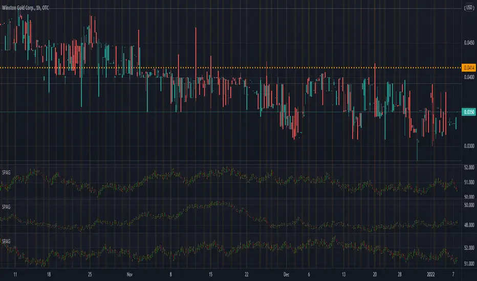
SB Master Chart v5 (Public)SB Master Chart v5 is the latest progression of the SB Master Chart series of charts.
The original SB Master Chart and its successors was designed to be a visual aid for the savvy investor. The original concept was designed to provide valuable information so decisions could be made at a glance with utmost confidence.
As the chart progressed through versions, it has slowly shifted the responsibility of decision making from the trader to the indicator. In this version of the script, we have updated the backend decision code. The script has 3 distinct personalities coded to compliment each other, as well as keep the others in check..
The first personality is the buy algorithm. The buy personality is based on two conditions. The first algorithm first determines a trend, then it waits for a confirmation. The personality is comprised of the following indicators.
EMA 7
EMA 14
MACD
Stochastic
RSI
By default, the first personality has its visual settings disabled. Its still working, its just not displayed on the chart. It can be enabled in the settings. The background colors designate trend and confirmation.
The second personality is stubborn and its committed to making a profit. Its a hard line in the sand that configurable by you the user. Its the take profit/trailing take profit setting. It will not let other personalities sell for less than these configured values. The visual component of personality two is represented by black dots. This serves to showcase its minimum profit target when opening a trade and a trailing stop loss when the price exceeds the minimum profit target.
The third personality is the guy that does the dirty work that nobody wants to admit they do. This personality is based on the original SB Master Chart algorithm. This personality takes over when the first personality is unable to turn a profit. This personality goes to work finding appropriate places to dollar cost average. There are two settings that affect this personality.
DCA %
Risk Multiplier (use extreme caution, this could cause a margin call if used inappropriately).
DCA percent setting restricts this algorithm from buying when the price has not fallen below this threshold.
Risk Multiplier instructs this algorithm how much positions/qty to buy when it buys. At 2x, the algorithm will buy enough shares to double its current position, at 3x the algorithm will buy enough shares to triple its current position.
The visual representations of the third personality are that of red, orange, yellow and green. Red means overbought. When an orange appears just prior to a red, that orange means overbought with volume. Green means oversold and an orange preceding a green is an oversold with volume. Both the red and green represent an possible trend reversal and that's the signal to buy when its green.
This personality is comprised of the following indicators:
RSI
Stochastic
MACD
Bollinger
Volume
The code also features 3 modes. Altering the mode setting changes the way the personalities work together (or do not work together).
Normal
Aggressive
Buy the Dip
Mode Normal works exactly like described above. Each personality has its own duty and they do not interfere with each others work.
Aggressive mode adjusts the dynamic and both the first personality and the third personality share an equal part in opening starter positions.
Buy the Dip mode prevents personality one from buying. Since personality one only buys uptrends, you will never see it buying a dip. This mode puts personality 3 in the spotlight. All position are typically opened during a fast/quick market decline. Personality three is still bound by the rules of personality 2, but its responsible for buying and dollar cost averaging.
I have also included labels for every buy/sell. A green label is the script making its first purchase, yellow is points where it decided to dollar cost average and the red is where it chose to deleverage by closing out all its positions. Nothing prevents the algorithm from buying immediately after a sell, this is by design because we do not want to miss out on an uptrend, but we also do not want to be caught with too much leverage.
Also included vital statistics on the top right of the chart.
Open Positions
Cost Basis
Current Gain/Loss
Minimum Profit Target
Trailing Stop Loss
Total Trades to Date
Maximum Positions/Qty to Date
In the bottom right of the chart, I have the user configurable settings. This is important so a user can at a glance see the settings of the chart without having to open the options menu.
Together, all three personalities form a COMPLETE trading system. The system tracks purchase quantity, cost basis from the first buy, adjust with each new buy and calculates the running profit from the begining of the date set in the settings if it were to have bought and sold at every signal. The public version of the script requires the trader to use the script in real time watching for buy and sell opportunities. The private subscription version of the script has custom alerts that can be configured to alert the user on when to buy and sell and also gives the user appropriate trailing stop loss settings to automate the trading process.
I want to name the personalities at some point in time for the novelty factor, but I wanted to release the script as soon as possible for others to enjoy, so they are nameless at this point. If you have suggestions, please contact me with your suggestion. I will credit the person with the best personality with a free subscription to the private version of this indicator.
As always, understand the risks of trading and trade responsibly. Nothing in this script can predict the future. Past results do not guarantee future performance

JD's Apollo ConfirmationsJD Apollo Confirmations Indicator is used as the confirmation indicators for a number of other algorithms.
This has been specifically designed for Indicies, namely the US30.
How to use;
When the bars align, it means the price is heading in the direction of alignment.
This indicator is intended to be used as a confirmation indicator for other algorithms for best effect.
This algorithm combines a number of indicators with specifically tested and chosen settings that have shown to work on a number of timeframes.
How to Access
Gain access to JD Apollo Confirmations for your TradingView account through our website, links below.
7 day paid trials, subscriptions and lifetime access are all available.

JD Progress ConfirmationsJD Progress Confirmations Indicator is used as the confirmation indicators for a number of other algorithms.
This can be applied to Forex, Stocks and Crypto.
How to use;
When the bars align, it means the price is heading in the direction of alignment.
This indicator is intended to be used as a confirmation indicator for other algorithms for best effect.
This algorithm combines a number of indicators with specifically tested and chosen settings that have shown to work on a number of timeframes.
How to Access
Gain access to JD Progress Confirmations for your TradingView account through our website, links below.
7 day paid trials, subscriptions and lifetime access are all available.
All tiers give you full instructions on how to trade this strategy.

JD ConfirmationsJD Confirmations Indicator is used as the confirmation indicators for a number of other algorithms.
This can be applied to Forex, Stocks and Crypto.
How to use;
When the bars align, it means the price is heading in the direction of alignment.
This indicator is intended to be used as a confirmation indicator for other algorithms for best effect.
This algorithm combines a number of indicators with specifically tested and chosen settings that have shown to work on a number of timeframes.
How to Access
Gain access to JD Core for your TradingView account through our website, links below.
Both 7 day paid trials and lifetime access are available.
Both tiers give you full instructions on how to trade this strategy.
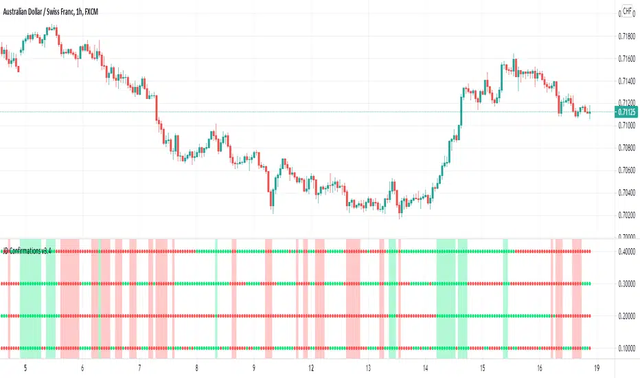
PRICE SATURATION INDEX / FİYAT YOĞUNLUK ENDEKSİEN: PRICE SATURATION INDEX is a momentum algorithm that measures price intensity. It helps us to determine the times when the price reaches intensity and calculates the latency in those moving averages. Moving averages have lag. The lag is necessary because the smoothing is done using past data. It shows you how to filtered a selected amount of lag from an exponential moving average (ema) and price movements. Removing all the lag is not necessarily a good thing, because with no lag, the indicator would just track out the price we were filtering, just as it is the moving average of 1 period; the amount of lag removed is a tradeoff with the amount of smoothing we are willing to forgo with golden ratio and multiline function. We show you the effects of lag removal in an indicator and then use the filter in an effective trading strategy with multiline function. The multiline function is inspired by Jhon Ehlers' zero lag formule, smooth moving average strategy and Schrödinger equation. The Schrödinger equation is a wave function based on quantum mechanics
TR: FİYAT YOĞUNLUK ENDEKSİ, fiyat yoğunluğunu ölçen bir momentum algoritmasıdır. Fiyatın yoğunluğa ulaştığı zamanları belirlememize ve hareketli ortalamalardaki gecikmeyi hesaplamamıza yardımcı olur. Hareketli ortalamalar daima gecikir. Gecikme gereklidir çünkü yumuşatma geçmiş veriler kullanılarak yapılır. Bu algoritma hem fiyat hareketlerindeki hemde üstel hareketli ortalamadaki gecikme miktarının nasıl filtreleneceğini gösterir. Tüm gecikmenin kaldırılması iyi bir şey değildir, çünkü gecikme olmadığında gösterge sadece 1 periyodun hareketli ortalaması gibi davranacağı için filtrelediğimiz fiyatı izleyecektir; filtrelenen gecikme miktarı, terk etmek istediğimiz yumuşatma miktarına alternatif bir multiline fonksiyon ve altın orana uyarlanan frekans değirinden oluşur. Bu göstergede gecikmenin ortadan kaldırılmasının etkilerini gösteriyoruz ve daha sonra filtreyi multiline fonksiyona sahip etkili bir trading stratejisi olarak kullanıyoruz. Multiline fonksiyon, Jhon Ehler'in zero lag formülü, smooth hareketli ortalama stratejisi ve Schrödinger denkleminden esinlenmiştir. Schrödinger denklemi ise kuantum mekaniğini temel alan bir dalga fonksiyonudur.

ICT Base Candle with Volume Filter📘 ICT BASE CANDLE WITH VOLUME FILTER
Institutional Base Candle Detection System
Smart Money Concepts (SMC/ICT)
🔍 What This Indicator Does
ICT Base Candle with Volume Filter automatically detects institutional Base Candles—also known as pause candles, decision candles, compression candles, or repricing pauses.
These candles often appear at key algorithmic points:
After a displacement
After a liquidity sweep
Before a fair value gap reaction
Inside an Order Block (OB)
At premium/discount zones
Before large expansions
This tool highlights these candles using:
✔ Body-percentage filtering
✔ Optional volume-based filtering
✔ Bullish/Bearish color coding
✔ Optional labels (+ / –)
✔ Accurate fixed historical plotting
✔ Customizable settings
This makes it extremely useful for SMC, ICT, and algorithmic orderflow traders.
🎯 Why Base Candles Matter (SMC/ICT Context)
The market moves in an algorithmic sequence:
Liquidity Sweep (grab stops above/below)
Displacement (strong impulse candle)
Base Candle (pause candle before continuation)
Expansion / Reversal
Base candles indicate:
Loss of momentum
Repricing
Order absorption (buy/sell programs)
Potential mitigation zones
Possible entry (continuation)
Possible reversal (if sweep + base + displacement)
They act as footprints of algorithmic activity, confirming where smart money is momentarily active.
🎨 Indicator Features
✔ Customizable Base Candle Colors
Choose unique colors for bullish and bearish base candles.
Option to use the same color for both.
✔ Volume Filter
Enable/disable volume filtering
Adjust lookback and threshold values.
✔ Label Toggles
Display “+” above bullish base candles
Display “–” below bearish base candles
✔ Fixed Historical Markers
All detected base candles remain consistent as bars update.
✔ Tooltip-Enhanced Inputs
Includes advanced trading notes inside input tooltips.
📈 How to Use (Practical Guide)
1️⃣ Identify the Impulse
Look for strong displacement or impulsive candles.
2️⃣ Locate the Base Candle
A small-body candle directly following a displacement.
3️⃣ Validate With Volume (Optional)
Low volume confirms a pause in the algorithm's movement.
4️⃣ Use It With SMC Tools
Base candles work best when aligned with:
FVGs
Order Blocks
BOS / CHoCH
Liquidity sweeps
Premium/discount equilibrium
5️⃣ Entry Model (Example)
Continuation Model:
Displacement
Base Candle forms (small body)
Enter on break of base candle
SL beyond candle wick
TP at liquidity / FVG end
📌 Example Explanation
A bullish impulse appears → price pauses → forms a bullish base candle → FVG below → price mitigates → resumes trend.
This indicator marks the base candle and helps you visualize where the algorithm slowed down before continuing the move.
🚫 Limitations & Notes
This is not a buy/sell signal indicator
It highlights context, not trades
Must be combined with structure & liquidity analysis
Volume filter is optional and should be tested per asset
🔒 Invite-Only Access (If Applicable)
If published as Invite-Only, include this:
Access is manually approved
Redistribution is not allowed
Do not share access publicly
Contact the author to request access
Unauthorized reselling is strictly prohibited
🏁 Final Notes
This indicator is designed for traders who understand:
Smart Money Concepts
Institutional orderflow
Liquidity models
Algorithmic ranges
Candle behavior within displacement
Use it as part of a full trading framework—not as a standalone signal.
📜 Credits
Created by: Manish Kumar Gupta / ask2maniish
Inspired by ICT / SMC price delivery concepts

Quicksilver Recovery Overlay [Strict]The Quicksilver Recovery Overlay is a proprietary visual analysis tool designed to identify high-probability reversal points in volatile markets. Originally developed for internal use to stabilize Prop Firm drawdowns, this script translates complex algorithmic logic into simple, actionable visual signals on your chart.
🚫 The Problem:
Most traders lose capital trying to "catch a falling knife." They buy too early during a crash and get liquidated before the reversal happens.
✅ The Solution:
This overlay forces discipline. It will only print a "QS BUY" signal when three specific institutional criteria are met simultaneously. If the setup is not perfect, the chart remains clean, keeping you out of bad trades.
The Logic (The "Triple Confluence" Engine):
Deep Exhaustion: The Stochastic RSI must pierce the extreme oversold zone (< 20), indicating seller exhaustion.
Momentum Crossover: The Fast %K line must cross above the Slow %D line, confirming momentum has shifted.
Heikin Ashi Filter: The current Heikin Ashi candle must be GREEN (Bullish). This filters out "fake" reversals where price is still wicking down.
Features:
Visual Signal Labels: Green "QS BUY" and Red "QS SELL" tags appear directly on the bar.
Zero Repaint Logic: Signals are confirmed on candle close.
Status Dashboard: A built-in monitor in the top right corner confirms the algorithm is active.
Recommended Settings:
Assets: ETHUSD, BTCUSD, XAUUSD (Gold).
Timeframes:
1-Minute: For scalping and drawdown recovery.
15-Minute: For swing trading and trend reversals.
How to Get Access:
This is a Protected Script. Access is granted exclusively to members of the Quicksilver Algo Systems ecosystem.
Get your license key here: whop.com
Risk Disclosure: Trading involves substantial risk. Past performance is not indicative of future results.

[GYTS-Pro] Market Regime Detector🧊 Market Regime Detector (Professional Edition)
🌸 Part of GoemonYae Trading System (GYTS) 🌸
🌸 --------- INTRODUCTION --------- 🌸
💮 What is the Market Regime Detector?
The Market Regime Detector (Pro) is an elite, consensus-based market state analyzer designed to filter noise and identify the true underlying market structure. By distinguishing between trending (bullish or bearish) and cyclic (range-bound) market conditions with high precision, this detector acts as the "brain" of your trading system. Instead of forcing a single strategy across incompatible market conditions, the detector empowers you to deploy the right tactic at exactly the right time.
💮 The Importance of Market Regimes
Markets constantly shift between different behavioural states or "regimes":
• Bullish trending markets - characterised by sustained upward price movement
• Bearish trending markets - characterised by sustained downward price movement
• Cyclic markets - characterised by range-bound, oscillating behaviour
Each regime requires fundamentally different trading approaches. Trend-following strategies excel in trending markets but fail in cyclic ones, while mean-reversion strategies shine in cyclic markets but underperform in trending conditions. However, detecting these regimes is easier said than done, and we have gone through hundreds of hours of testing to create the Market Regime Detector, using multiple very sophisticated methods in an easy-to-use indicator.
💮 Professional vs Community Edition
The Market Regime Detector comes in two versions: a comprehensive Professional Edition and a streamlined Community Edition.
Key advantages of the Professional Edition:
• Enhanced detection accuracy - Utilises 5 advanced detection methods (compared to only 2 in the CE version)
• Proprietary cycle measurement - Automatically detects the market's dominant cycle instead of requiring manual input
• Superior consensus mechanism - Includes a unique "strength-weighted decision" mode that gives more influence to stronger signals
• Reduced false signals - Multiple complementary methods working together provide more reliable regime identification
• Advanced DSP algorithms - Implements sophisticated digital signal processing techniques for superior market analysis
The Professional Edition delivers significant improvements in detection accuracy, signal stability, and overall trading performance.
🌸 --------- KEY FEATURES --------- 🌸
💮 Consensus-Based Detection
Rather than relying on a single method, our detector employs multiple complementary detection methodologies that analyse different aspects of market behaviour:
• Advanced digital signal processing techniques
• Volatility and momentum analysis
• Adaptive filters and mathematical transformations
• Cycle identification
• Channel breakout detection
These diverse perspectives are synthesised into a robust consensus that minimises false signals while maintaining responsiveness to genuine regime changes.
💮 Proprietary Dominant Cycle Measurement ( Pro Edition only )
At the heart of our Professional Edition detector is a proprietary dominant cycle measurement system that automatically and adaptively identifies the market's natural rhythm. This system provides a stable reference framework that continuously adapts to changing market conditions while avoiding the erratic behaviour of typical cycle-finding algorithms like Hilbert Transforms, Discrete Fourier Transforms, or autocorrelation measurements.
Unlike the Community Edition which requires manual input of a single, constant dominant cycle period, the Professional Edition automatically detects and continuously adapts this critical parameter. This automated and adaptive approach ensures optimal detection accuracy across different markets and timeframes without requiring user expertise in cycle analysis, and provides significantly better responsiveness to evolving market conditions.
💮 Intuitive Parameter System
We've distilled complex technical parameters into intuitive controls that traders can easily understand:
• Adaptability - how quickly the detector responds to changing market conditions
• Sensitivity - how readily the detector identifies transitions between regimes
• Consensus requirement - how much agreement is needed among detection methods
This approach makes the detector accessible to traders of all experience levels while preserving the power of the underlying algorithms.
💮 Visual Market Feedback
The detector provides clear visual feedback about the current market regime through:
• Colour-coded chart backgrounds (purple shades for bullish, pink for bearish, yellow for cyclic)
• Colour-coded price bars
• Strength indicators showing the degree of consensus
• Customisable color schemes to match your preferences or trading system
💮 Integration in the GYTS suite
What is of paramount importance, is that the Market Regime Detector is compatible with the GYTS Suite , i.e. it passes the regime into the Order Orchestrator where you can set how to trade the trending and cyclic regime. The intention is to integrate it with more indicators.
🌸 --------- CONFIGURATION SETTINGS --------- 🌸
💮 Adaptability
Controls how quickly the Market Regime detector adapts to changing market conditions. You can see it as a low-frequency, long-term change parameter:
• Very Low: Very slow adaptation, most stable but may miss regime changes
• Low: Slower adaptation, more stability but less responsiveness
• Normal: Balanced between stability and responsiveness
• High: Faster adaptation, more responsive but less stable
• Very High: Very fast adaptation, highly responsive but may generate false signals
This setting affects lookback periods and filter parameters across all detection methods.
💮 Sensitivity
Controls the conviction threshold required to trigger a regime change. This acts as a high-frequency, short-term filter for market noise:
• Very Low: Requires overwhelming evidence to identify a regime change.
• Low: Prioritizes stability; reduces false signals but may delay transition detection.
• Normal: Balanced sensitivity suitable for most liquid markets.
• High: Highly responsive; detects subtle regime changes early but may react to market noise.
• Very High: Extremely sensitive; detects minor fluctuations immediately.
Pro Feature Note: In the Strength-Weighted Decision mode, this setting acts as a dynamic calibrator. It not only adjusts individual method thresholds but also scales the global consensus threshold . A 'High' sensitivity lowers the barrier for the weighted consensus, allowing the system to react to early-stage breakouts even if not all methods fully agree yet.
💮 Consensus Mode
Determines how the signals from all detection methods are combined to produce the final market regime:
• Any Method (OR) : Signals bullish/bearish if any method detects that regime. If methods conflict, the stronger signal wins. More sensitive, catches more regime changes but may produce more false signals.
• All Methods (AND) : Signals only when all methods agree on the regime. More conservative, reduces false signals but might miss some legitimate regime changes.
• Weighted Decision : Balances all methods with equal voting rights. Signals bullish/bearish when the weighted consensus reaches a fixed majority (0.5). Provides a middle ground between sensitivity and stability.
• Strength-Weighted Decision ( Pro Edition only ): A "meritocratic" approach where methods reporting extreme confidence (high signal strength) are given proportionally more weight than those reporting weak signals. Unlike standard voting, a single clear signal from a highly reliable method can override indecision from others.
Note: The threshold for this decision is dynamically calibrated by your 'Sensitivity' setting, ensuring the logic adapts to your desired risk profile.
Each mode also calculates a continuous regime strength value that drives the color intensity in the 'unconstrained' display mode, giving you a visual heatmap of trend conviction.
💮 Display Mode
Choose how to display the market regime colours:
• Unconstrained regime: Shows the regime strength as a continuous gradient. This provides more nuanced visualisation where the intensity of the color indicates the strength of the trend.
• Consensus only: Shows only the final consensus regime with fixed colours based on the detected regime type.
The background and bar colours will change to indicate the current market regime:
• Purple shades : Bullish trending market. In 'unconstrained' mode, darker purple indicates a stronger bullish trend.
• Pink shades : Bearish trending market. In 'unconstrained' mode, darker pink indicates a stronger bearish trend.
• Yellow : Cyclic (range-bound) market.
💮 Custom Color Options
The Market Regime Detector allows you to customize the color scheme to match your personal preferences or to coordinate with other indicators:
• Use custom colours: Toggle to enable your own color choices instead of the default scheme
• Transparency: Adjust the transparency level of all regime colours
• Bullish colours: Define custom colours for strong, medium, weak, and very weak bullish trends
• Bearish colours: Define custom colours for strong, medium, weak, and very weak bearish trends
• Cyclic color: Define a custom color for cyclic (range-bound) market conditions
🌸 --------- DETECTION METHODS --------- 🌸
💮 Five-Method Consensus Architecture
The Professional Edition employs a sophisticated multi-stage architecture to determine market regimes with high precision.
The detection process flows through four logical stages:
1. Market Data & Cycle Detection
Price data flows into the system where the Dominant Cycle Detector automatically identifies the market's natural rhythm. This adaptive cycle length calibrates all subsequent calculations, ensuring the detector remains in sync with changing market conditions without manual adjustments.
2. Five Detection Methods
Using the detected cycle, five complementary algorithms independently evaluate the market state:
• Cyclic Centroid Analysis : Calculates the market's 'centre point' over its dominant cycle and measures price displacement to determine trend or equilibrium.
• Spectral Momentum : Measures momentum across the market's frequency spectrum to identify trend concentration.
• Energy Distribution Gauge : Gauges how price movement energy is distributed to flag cyclic or trending states.
• Volatility Channel : Models the market's volatility state, using band breakouts to indicate a trend.
• Phase Coherence Detector : Analyses phase relationships between adaptive low-pass filters to detect trend stability and identify early regime shifts.
3. Consensus Engine
The signals from all five methods are fed into the Consensus Engine. Depending on your configuration, it aggregates these votes using one of four logic modes (Any, All, Weighted, or Strength-Weighted) to filter out noise and confirm the true market regime.
4. Regime Output
The final result is broadcast as a clear market state:
• Bullish (1) : Trending upwards
• Bearish (-1) : Trending downwards
• Cyclic (0) : Range-bound or oscillating
This output drives the visual feedback on your chart and can be streamed directly to the Order Orchestrator for automated strategy switching.
💮 Synergy & Complementarity
What makes these methods powerful is not just their individual sophistication, but how they complement one another:
• Some excel at early detection while others provide confirmation
• Some analyse time-domain behaviour while others work in the frequency domain
• Some focus on momentum characteristics while others assess volatility patterns
• Some respond quickly to changes while others filter out market noise
This creates a comprehensive analytical framework that can detect regime changes more accurately than any single method. All methods utilize the automatically detected and continuously adaptive dominant cycle period, ensuring they remain precisely calibrated to current market conditions without manual intervention.
🌸 --------- USAGE GUIDE --------- 🌸
💮 Starting with Default Settings
The default settings (Normal for Adaptability, Sensitivity, and Consensus) provide a balanced starting point suitable for most markets and timeframes. Begin by observing how these settings identify regimes in your preferred instruments.
💮 Adjusting Parameters
• If you notice too many regime changes → Decrease Sensitivity or increase Consensus requirement
• If regime changes seem delayed → Increase Adaptability
• If a trending regime is not detected, the market is automatically assigned to be in a cyclic state. The majority of methods actually measure this explicitly.
• If you want to see more nuanced regime transitions → Try the "unconstrained" display mode (note that this will not affect the output to other indicators)
💮 Trading Applications
Regime-Specific Strategies:
• Bullish Trending Regime - Use trend-following strategies, trail stops wider, focus on breakouts, consider holding positions longer, and emphasise buying dips
• Bearish Trending Regime - Consider shorts, tighter stops, focus on breakdown points, sell rallies, implement downside protection, and reduce position sizes
• Cyclic Regime - Apply mean-reversion strategies, trade range boundaries, apply oscillators, target definable support/resistance levels, and use profit-taking at extremes
Strategy Switching:
Create a set of rules for each market regime and switch between them based on the detector's signal. This approach can significantly improve performance compared to applying a single strategy across all market conditions. The Pro Edition's multiple detection methods and advanced consensus mechanisms provide more reliable regime transitions, leading to better strategy switching decisions.
GYTS Suite Integration:
• In the GYTS 🎼 Order Orchestrator, select the '🔗 STREAM-int 🧊 Market Regime' as the market regime source
• Note that the consensus output (i.e. not the "unconstrained" display) will be used in this stream
• Create different strategies for trending (bullish/bearish) and cyclic regimes. The GYTS 🎼 Order Orchestrator is specifically made for this.
• The output stream is actually very simple, and can possibly be used in indicators and strategies as well. It outputs 1 for bullish, -1 for bearish and 0 for cyclic regime.
🌸 --------- FINAL NOTES --------- 🌸
💮 Development Philosophy
The Market Regime Detector has been developed with several key principles in mind:
1. Robustness - The detection methods have been rigorously tested across diverse markets and timeframes to ensure reliable performance.
2. Adaptability - The detector automatically adjusts to changing market conditions, requiring minimal manual intervention.
3. Complementarity - Each detection method provides a unique perspective, with the collective consensus being more reliable than any individual method.
4. Intuitiveness - Complex technical parameters have been abstracted into easily understood controls.
💮 Ongoing Refinement
The Market Regime Detector is under continuous development. We regularly:
• Fine-tune parameters based on expanded market data using state-of-the-art Machine Learning techniques
• Research and integrate new detection methodologies
• Optimise computational efficiency for real-time analysis
Your feedback and suggestions are very important in this ongoing refinement process!

NeuraAlgo - Market DynamicsNeuraAlgo – Market Dynamics
Simplyfying the Market Dynamics
Unlock the complexity of financial markets with NeuraAlgo – Market Dynamics. Designed for traders and investors alike, this intelligent tool distills the chaos of price movements, volume fluctuations, and trend directions into clear, actionable insights. With advanced algorithms working behind the scenes, it simplifies market dynamics so you can focus on making informed decisions, spotting opportunities, and managing risk with confidence.
Behind this simple overlay lies a powerful, complex algorithm.
Main Settings -Main Algorithm
Timeframe – Choose the chart timeframe that the indicator will analyze. It adapts the calculations to the selected interval for precise market insights.
Preset – Select the operating mode:
Main Trend: Focuses on the dominant market trend.
Multi Trend: Analyzes multiple trend layers for a broader perspective.
Sensitivity – Adjusts the indicator’s responsiveness to price changes. Higher values make the system more reactive to market fluctuations, while lower values smooth out minor noise.
Smooth Tuner – Controls the smoothing of the underlying calculations, helping to reduce false signals and provide cleaner trend visualization.
Orderflow Statistics – Toggle to display detailed order flow statistics directly on the chart for deeper market analysis.
Performance Statistics – Toggle to enable backtesting tables, showing historical performance metrics of the indicator for strategy evaluation.
2.Art Settings -Change Visuals
Color Scheme – Select a pre-defined visual theme for your charts:
Bright Light – High-contrast, vibrant colors for maximum clarity.
Freezer Mode – Cool-toned palette for calm, visually comfortable analysis.
Standard Mode – Balanced, neutral colors for everyday use.
Delta Mode – Highlights key differences and movements with distinct colors.
Custom – Fully customize the colors of bullish, bearish, and range elements.
Green / Red / Range (Custom Colors) – When “Custom” is selected, these options allow you to define the colors for bullish (Green), bearish (Red), and neutral/range areas (Range) according to your preference.
Candle Coloring Type – Choose how candles are highlighted based on market signals:
Confirmation Simple – Basic signal-based coloring for clear, direct visualization.
Confirmation Gradient – Smooth gradient-based coloring for more dynamic and aesthetic signal representation.
3.Dashboard -Market Statistics
The Dashboard provides a compact, at-a-glance overview of key market conditions and indicator metrics, helping traders make faster and more informed decisions.
Functionality & Layout – The dashboard dynamically displays multiple sections:
Optimal Scale ⚖️ – Shows key market scaling metrics like volatility for better decision-making.
Risk Manager 📊 – Indicates the active risk management strategy (e.g., Risk-Reward, Partial Exits, or Trailing Stop Loss).
Orderflow Statistics 📈 – Displays market sentiment, footprint strength, and delta trends for precise order flow analysis.
Market Status 🌐 – Highlights current trend conditions and trend strength across different timeframes.
Bias Scores 🎯 – Provides trend strength percentages across multiple timeframes (5min, 15min, 30min, 1H, 4H, 1D) to quickly gauge market bias.
Backtest Performance -A summary panel showing the overall performance of the strategy.
Deposit -The starting capital used for backtesting.
Win Trades -Total number of profitable trades.
Winrate -Percentage of winning trades out of all trades.
Max DD -Maximum drawdown — the largest peak-to-trough loss.
PnL -Net profit or loss generated by the strategy.
Return -Percentage growth of the account during the test.
Profit Factor -Ratio of total profits to total losses.
The dashboard uses color-coded indicators (green for bullish, red for bearish, yellow for neutral) and merged cells for a clean and organized display.
It’s designed to simplify complex market dynamics into a visually intuitive interface, giving traders real-time insights without cluttering the chart.
4.Neura Engineering – Enhancements
This section provides advanced filtering options to fine-tune market analysis, reduce noise, and highlight meaningful trends.
Noise Filter – Smoothens minor price fluctuations to reduce false signals.Noise Sensitivity helps Adjust how aggressively the filter suppresses noise.
Gap Filter – Detects and smooths price gaps to improve trend clarity.Gap Sensitivity helps Controls the responsiveness of the gap filter.
Range Filter – Filters out small-range price movements to focus on significant market swings.helps Adjusts how tightly the filter defines meaningful ranges.
Volatility Filter – Highlights periods of high market volatility while filtering less active periods.helps Sets the threshold for what constitutes high volatility.
Trend Filter – Focuses analysis on strong trends by filtering out weaker signals.helps Determines the minimum strength required for a trend to be considered valid.helps Uses Average True Range to dynamically adjust trend filtering based on market movement.
These enhancement tools allow traders to customize signal clarity, reduce noise, and focus on meaningful market dynamics, creating a cleaner and more actionable charting experience.
5.Neura Overlays – Market Visual Enhancements
These overlays add visual intelligence to your chart, helping you instantly understand trend behavior, sentiment shifts, and price structure.
Reversal Cloud - Highlights potential reversal zones where price may change direction.Reversal Sensitivity helps Controls how quickly the cloud reacts to shifts in momentum.
Sentiment Cloud -Maps the underlying market mood—bullish, bearish, or neutral—directly onto the chart.Sentiment Sensitivity helps Adjusts how sensitive the sentiment readings are.
Price Steps -Draws structured “price steps” that reveal hidden market rhythm, impulse strength, and trend flow.Price Step Depth helps Determines the size and spacing of these steps.
Market Bias -Shows directional bias based on deeper trend pressure and underlying orderflow.Bias Sensitivity helps Controls how strict or lenient the bias detection is.
6.Risk Management Settings – Intelligent Trade Control
This module controls how your trades manage themselves after entry. Choose between traditional Risk/Reward exits, partial profit-taking, or an adaptive trailing stop system.
RiskReward
A classic risk-to-reward exit system.You set a risk multiple (e.g., 1:2), and the indicator automatically sets one Stop Loss and one Take Profit based on that ratio.
Partials
Scales out your position at multiple take-profit levels.Instead of closing the entire trade at once, the system secures profits gradually at TP1, TP2, and TP3 while keeping the remainder running.
TrailingStop
Uses a dynamic stop loss that follows price as it moves in your favor.There is no fixed Take Profit; instead, the trailing stop locks in profit and exits the trade automatically when momentum reverses.
7.Automatic Alert System
This is the System that organizes all settings related to the automatic webhook alert creator inside the indicator.
Rule No. 1 is never lose money. Rule No. 2 is never forget Rule No. 1.
Warren Buffet
NeuraAlgo – Market Dynamics transforms complex market behavior into clear, actionable insights for smarter trading decisions.
