[Zekis]Donchian Price Channels Strategy with AlertsClassic Donchian(Price) Channels, I added alerts for entries and re-entries and labels for upper and lower bands of the channel.
# Investopedia
" What are Donchian Channels?
Donchian Channels are three lines generated by moving average calculations that comprise an indicator formed by upper and lower bands around a mid-range or median band. The upper band marks the highest price of a security over N periods while the lower band marks the lowest price of a security over N periods. The area between the upper and lower bands represents the Donchian Channel.
The indicator seeks to identify bullish and bearish extremes that favor reversals as well as breakouts, breakdowns and emerging trends, higher and lower.
The Formula for Donchian Channels Is:
UC = Highest High in Last N Periods
Middle Channel=((UC−LC)/2)
LC = Lowest Low in Last N periods
where:
UC = Upper channel
N = Number of minutes, hours, days, weeks, months...
Period = Minutes, hours, days, weeks, months...
LC=Lower channel
What Do Donchian Channels Tell You?
Donchian Channels identify comparative relationships between current price and trading ranges over predetermined periods. Three values build a visual map of price over time, similar to Bollinger Bands, indicating the extent of bullishness and bearishness for the chosen period. The top line identifies the extent of bullish energy, highlighting the highest price achieved for the period through the bull-bear conflict. The center line identifies the median or mean reversion price for the period, highlighting the middle ground achieved for the period through the bull-bear conflict. The bottom line identifies the extent of bearish energy, highlighting the lowest price achieved for the period through the bull-bear conflict.
Limitations of Using Donchian Channels
Markets move according to many cycles of activity. An arbitrary or commonly used N period value for Donchian Channels may not reflect current market conditions, generating false signals that can undermine trading and investment performance
"
在腳本中搜尋"bear"
⚛WPZO - Wave Period Zone Oscillator by Cryptorhythms⚛WPZO - Wave Period Zone Oscillator by Cryptorhythms
Intro
Based upon Akram El Sherbini's article "Time Cycle Oscillators" published in IFTA journal 2018.
Companion indicator to the Wave Period Oscillator, this is simply a transformation to display in a familiar manner like an RSI. Occasionally WPO can exceed the upper and lower boundary lines in strong moves. With WPZO, it will never go below -80 or above +80.
Description
In the Authors words....
"The wave period zone oscillator (WPZO) is a bounded oscillator for the wave period oscillator (WPO) and calculates the period of the market’s cycle. In other words, the wave period refers to the time taken by buyers or sellers to complete one cycle. The oscillator moves within a range of -100 to 100 percent.
The WPZO has overbought and oversold levels at +40 and -40 respectively. At extreme periods, the oscillator may reach the levels of +60 and -60. The zero level demonstrates an equilibrium between the periods of bulls and bears. The WPZO oscillates between +40 and -40. The crossover at those levels creates buy and sell signals. In an uptrend, the WPZO fluctuates between 0 and +40 where the bulls are controlling the market.
On the contrary, the WPZO fluctuates between 0 and -40 during downtrends where the bears control the market. Reaching the extreme level of -60 in an uptrend is a sign of weakness. Mostly, the oscillator will retrace from its centerline rather than the upper boundary of +40. On the other hand, reaching +60 in a downtrend is a sign of strength, and the oscillator will not be able to reach its lower boundary of -40.
During an ideal uptrend, the WPZO does not reach the lower boundary of -40 and usually rebounds from a higher level than -40. This means that the bulls have taken control earlier. Hence, a zeroline crossover generates a buy signal. The WPZO crosses the upper boundary at +40, then pulls back again below +40 to generate a sell signal. During sideways, the WPZO fluctuates between the lower and upper boundaries of -40 and +40. This tactic is also used in an uptrend where corrections are strong enough to drive the WPZO line below the lower boundary. During downtrends, the WPZO fails to reach the upper boundary and oscillates between the 0 and -40 levels.
The bears enter early, indicating an obvious weakness in the market. Therefore, crossing the zero level generates a sell signal. The exit at weakness tactic is used during uptrend reversals and downtrends. The WPZO oscillates between the centerline and the lower boundary of -40. The bears are controlling the market and move in wide cycle periods, while the bull’s strength is almost absent. An exit signal is triggered once the WPZO crosses -40. When prices decline, the WPZO may cross its extreme lower boundary at -60. Therefore, a swift exit signal is triggered once the WPZO crosses -40.
The WPZO gives an insight about the relation between time and price movements. In this article, we used the oscillator to differentiate between the time taken by bulls and bears to complete one cycle. Due to the boundaries effect, the WPZO may diverge less than the WPO with prices."
TL:DR
More strategy discussed above, but heres the short version:
Bullish signals are generated when WPZO crosses over 0
Bearish signals are generated when WPZO crosses under 0
OverBought level is 40
OverSold level is -40
ExtremeOB level is 60
ExtremeOS level is -60
👍 Enjoying this indicator or find it useful? Please give me a like and follow! I post crypto analysis, price action strategies and free indicators regularly.
💬 Questions? Comments? Want to get access to an entire suite of proven trading indicators? Come visit us on telegram and chat, or just soak up some knowledge. We make timely posts about the market, news, and strategy everyday. Our community isn't open only to subscribers - everyone is welcome to join.
For Trialers & Chat: t.me

[BoTo] ATH/2 OverlayThan this indicator is useful?
Can help you to understand this indicator who main in the market now. Bulls or bears.
How it works
All-Time-High ('ATH') - the highest point in price that a cryptocurrency has been in history.
Step 1: The 'ATH' line is drawn
Step 2: 'ATH/2' line is drawn.
Step 3: If the price became more than 'ATH' it means the market bulls have taken, and the price it will be more probable to increase. And vice versa. If the price became less than 'ATH/2' it means that the market was taken by bears, and the price it will be more probable to fall.
Step 4: If it is the bull market, then the green background is drawn. And vice versa. If it is the bear market, then the red background is drawn. If the market has changed, then the background will be gray color. Only one candle.
How to use it
It is possible to use any timeframes, and any symbol.
It is possible to use chart type only the japanese candles, the line or bars. Don't use Kagi, Renko or Haiken Ashi!
The background can be not shown. You can make 1 or 2 lines. If you have chosen only 1 line, then in the bull market you will see only 'ATH/2' line. And vice versa. In the bear market you will see only the 'ATH' line.
You need just to turn on this indicator once to understand what to wait in this market, big falling or big rockets for. And to switch off it that he didn't prevent to analyze.
It is the good help for long-term investments (the position can be longer than 1 year)
For an example
'Ethereum'
'Ripple'
We tried for you. We want to receive your like for good work.

Bill Williams Divergent BarsBill William Bull/Bear divergent bars
See: Book, Trading Chaos by Bill Williams
Coded by polyclick
A bullish (green) divergent bar, signals a trend switch from bear -> bull
-> The current bar has a lower low than the previous bar, but closes in the upper half of the candle.
-> This means the bulls are pushing from below and are trying to take over, potentially resulting in a trend switch to bullish.
-> We also check if this bar is below the three alligator lines to avoid false positives.
A bearish (red) divergent bar, signals a trend switch from bull -> bear
-> The current bar has a higher high than the previous bar, but closes in the lower half of the candle.
-> This means the bears are pushing the price down and are taking over, potentially resulting in a trend switch to bearish.
-> We also check if this bar is above the three alligator lines to avoid false positives.
Best used in combination with the Bill Williams Alligator indicator.

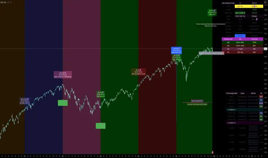
Western Astrological Cycle Trading Indicator v1.0Western Astrological Cycle Trading Indicator v1.0
Overview
The Western Astrological Cycle Trading Indicator is a comprehensive Pine Script tool that overlays astrological cycles and predictions onto trading charts. It integrates Western astrological theory with technical analysis to provide unique cyclical perspectives on market movements based on planetary and zodiacal alignments.
What It Does
Core Functionality
Astrological Year Mapping:
Assigns each year (2000 onward) a specific planet-zodiac combination
Follows a 10-year planetary cycle and 12-year zodiac cycle
Generates theoretical market predictions based on these combinations
Visual Elements:
Background coloring based on yearly astrological predictions
Detailed information table with comprehensive astrological data
Year labels with zodiac symbols and predictions
Ten-year planetary cycle progress bar
Important year markers (Jupiter, Neptune, etc.)
Astrological calendar showing daily and monthly phases
Trading Insights:
Trend indicators (Bullish/Neutral/Bearish) based on planetary positions
Confidence levels for predictions
Element relationships affecting financial markets
Historical and future astrological phase tracking
How It Works
Technical Implementation
1. Cycle Calculation System
Planetary Cycle: 10-year rotation (Sun, Mercury, Venus, Earth, Mars, Jupiter, Saturn, Uranus, Neptune, Pluto)
Zodiac Cycle: 12-year rotation through all zodiac signs
Calculation:
pinescript
planetIndex = math.floor((year - 2000) % 10)
zodiacIndex = math.floor((year - 2000) % 12)
2. Prediction Engine
Each planet-zodiac combination generates specific predictions
Confidence scores (0-100%) assigned to each prediction
Trend direction determined by planetary attributes:
Bullish: Sun, Jupiter, Venus
Bearish: Mars, Saturn, Pluto
Neutral: Mercury, Uranus, Neptune
3. Visual Rendering System
Multiple label positioning algorithms to prevent overlap
Dynamic table generation with color-coded cells
Progress bar visualization of cycle completion
Time-aware markers that appear only on year transitions
4. Date Management
Comprehensive date calculation functions
Leap year detection
Day/month/year progression tracking
Future/past date predictions
Astrological Logic
The indicator uses traditional Western astrological correspondences:
Planets represent different market energies
Zodiac signs modify and color these energies
Elements (Fire, Earth, Air, Water) show elemental relationships
Modalities (Cardinal, Fixed, Mutable) indicate the nature of change
How to Use It
Installation
Open TradingView platform
Navigate to Pine Editor
Paste the entire script
Click "Add to Chart"
Configuration
Basic Settings
Show Background Color: Toggle prediction-based background coloring
Show Info Table: Display/hide the comprehensive information table
Show Year Labels: Toggle yearly astrological labels on the chart
Customization Options
Year Label Settings:
Choose label color
Adjust font size (small/normal/large)
Toggle year numbers and zodiac symbols
Planetary Cycle Progress:
Display ten-year cycle progress bar
Customize progress bar colors
Adjust position on chart
Marker Lines:
Toggle individual planet markers (Jupiter, Venus/Mars, Saturn/Uranus, Neptune)
Customize marker colors and positions
Adjust marker font sizes
Additional Elements:
Disclaimer display
Trend indicator
Element relationship hints
Current year information
Interpretation Guide
Reading the Information Table
The table provides:
Astro Year: Current planet-zodiac combination
Trend: Bullish/Neutral/Bearish direction
Theoretical Forecast: Market prediction based on astrology
Confidence: Probability score of prediction
Cycle Progress: Position in 10-year planetary cycle
Element Relation: How current element interacts with financial markets
Understanding Visual Elements
Background Colors:
Orange/Green: Bullish years (Sun, Jupiter, Venus)
Red/Brown: Bearish years (Mars, Saturn, Pluto)
Blue/Purple: Neutral/transitional years
Year Labels:
Appear at year transitions
Show planet-zodiac combination
Include prediction summary
Special Markers:
Jupiter Years: Blue markers - potential expansion/bull markets
Neptune Years: Purple markers - cycle endings/uncertainty
Saturn/Uranus Years: Red markers - contraction/revolution
Progress Bar:
Shows current position in 10-year cycle
Indicates years remaining to next Jupiter year
Using the Astrological Calendar
The bottom-right calendar shows:
Daily phases: Current planetary influences
Monthly phases: Broader monthly trends
Trend signals: Daily/monthly direction indicators
Quarterly overview: Longer-term perspectives
Practical Trading Application
Long-term Planning:
Use Jupiter year markers for potential bull market entries
Be cautious during Saturn/Pluto years (potential bear markets)
Note cycle transitions (Neptune years) for market shifts
Medium-term Analysis:
Consider monthly planetary changes for quarterly planning
Use element relationships to understand sector rotations
Short-term Awareness:
Check daily phases for potential reversal days
Monitor trend changes at month transitions
Risk Management:
Reduce position size during low-confidence periods
Increase vigilance during transition years
Use astrological signals as confluence with technical analysis
Alerts System
Enable alerts to receive notifications for:
Year transitions
Important astrological events
Cycle beginnings/endings
Important Notes
Theoretical Nature: This indicator is based on astrological theory, not financial advice
Confluence Trading: Use alongside traditional technical analysis
Backtesting: Always test strategies before live implementation
Risk Management: Never rely solely on astrological signals for trading decisions
Customization Tips
Label Overlap: Adjust label spacing if labels overlap
Performance: Reduce max_lines_count/max_labels_count if experiencing lag
Color Schemes: Customize colors to match your chart theme
Positioning: Adjust marker positions based on your chart's volatility
Disclaimer
This indicator is for educational and research purposes only. It combines astrological theory with technical analysis for experimental purposes. Past performance does not guarantee future results. Always conduct your own research and consult with financial advisors before making trading decisions.
ORB Pro - NY Opening Range Breakout [Elev8+]**ORB Pro - NY Opening Range Breakout ** is a comprehensive, professional-grade toolkit designed for intraday traders who rely on the **Opening Range Breakout (ORB)** strategy.
Unlike standard ORB indicators that simply draw lines, this suite offers a complete dashboard-driven system that monitors **four distinct sessions** simultaneously, providing real-time status updates and precision alerts.
### 🎯 What is the Opening Range Breakout (ORB)?
The Opening Range is the price range established during the first period of the trading session (e.g., the first 15 or 30 minutes). This period represents the initial balance between buyers and sellers. A breakout from this range often signals the likely trend direction for the remainder of the session.
### 🚀 Key Features
**1. Multi-ORB Monitoring**
Stop switching settings constantly. This suite monitors four key ranges at once:
* **Pre-Market 15m** (08:00 – 08:15 ET)
* **Pre-Market 30m** (08:00 – 08:30 ET)
* **NY Cash Open 15m** (09:30 – 09:45 ET)
* **NY Cash Open 30m** (09:30 – 10:00 ET)
**2. Smart Status Dashboard**
A compact panel in the bottom-right corner gives you the live state of every session:
* **⏳ Waiting:** The session has not started yet.
* **⚡ Forming:** The range is currently being built.
* **↔️ Range:** The range has formed, but price is still contained within the range.
* **🚀 BULL / 📉 BEAR:** A confirmed breakout has occurred.
* **⛔ OFF:** The session is disabled in settings.
**3. "Dynamic Resolution" Technology**
This is a unique pro feature.
* **Precision:** The script *always* calculates the High/Low levels using 1-minute data, ensuring your support/resistance lines are pixel-perfect regardless of your chart timeframe.
* **Flexibility:** Breakout signals (Alerts/Labels) are triggered based on your *current* chart timeframe. This allows you to trade a 5m or 15m breakout strategy while keeping 1m-level precision on your levels.
**4. Visual Clarity**
* **Breakout Labels:** Automatically plots "BULL" or "BEAR" labels on the exact candle that confirms a breakout.
* **Profit Targets:** Optional toggle to show 1x and 2x profit targets projected from the breakout level.
* **Time-Bound Signals:** Signals are strictly time-bound to the active window to prevent late, low-quality alerts.
### 🛠️ How to Use
1. **Add to Chart:** Works best on intraday timeframes (1m, 5m, 15m).
2. **Configure:** Enable the sessions you trade (e.g., NY 15m) in the settings.
3. **Wait for Forming:** Watch the box form live. The dashboard will show "⚡ Forming".
4. **Trade the Break:** Wait for a candle **Close** outside the range. The dashboard will flip to "BULL" or "BEAR" and a label will appear.
5. **Manage Risk:** Use the opposite side of the range or the midline as your stop loss.
### ⚙️ Settings Overview
* **Global Settings:** Toggle forming boxes, dashboard, and label visibility.
* **Breakout Method:** Choose between **Close** (safer) or **Wick** (aggressive) for signal triggers.
* **Session Groups:** Individually enable/disable the 4 distinct sessions and customize their colors/styles.
---
*Disclaimer: This tool is for educational and analytical purposes only. Past performance of a strategy does not guarantee future results. Always manage your risk.*

Ripster Clouds + Saty Pivot + RVOL + Trend1. Ripster EMA Clouds (local + higher timeframe)
Local timeframe (your chart TF):
Plots up to 5 EMA clouds (8/9, 5/12, 34/50, 72/89, 180/200 – configurable).
Each cloud is:
One short EMA and one long EMA.
A filled band between them.
Color logic:
Cloud is bullish when short EMA > long EMA (green/blue-ish tone).
Bearish when short EMA < long EMA (red/orange/pink tone).
You can choose:
EMA vs SMA,
Whether to show the lines,
Per-cloud toggles.
MTF Clouds:
Two higher-timeframe EMA clouds:
Cloud 1: 50/55
Cloud 2: 20/21
Computed on a higher TF (default D, but configurable).
Show as thin lines + transparent bands.
Used for:
Visual higher-TF trend,
Optional signal filter (MTF must agree for trades).
2. Saty Pivot Ribbon (time-warped EMAs)
This is basically your Saty Pivot Ribbon integrated:
Uses a “Time Warp” setting to overlay EMAs from another timeframe.
EMAs:
Fast, Pivot, Slow (defaults 8 / 21 / 34).
Clouds:
Fast cloud between fast & pivot EMAs.
Slow cloud between pivot & slow EMAs.
Bullish/bearish colors are distinct from Ripster colors.
Optional highlights:
Can highlight fast/pivot/slow lines separately.
Conviction EMAs:
13 and 48 EMAs (configurable).
When fast conviction EMA crosses over/under slow:
You get triangle arrows (bullish/bearish conviction).
Bias candles:
If enabled, candles are recolored based on:
Price vs Bias EMA,
Candle up/down/doji,
So you see bullish/bearish “bias” directly in candle colors.
3. DTR vs ATR panel (range vs average)
In a small table panel (bottom-center by default):
Computes higher-TF ATR (default 14, TF auto D/W/M, smoothing type selectable).
Measures current range (high–low) on that TF.
Displays:
DTR: X vs ATR: Y Z% (+/-Δ% vs prev)
Where:
Z% = current range / ATR * 100.
Δ% = change vs previous bar’s Z%.
Background color:
Greenish for low move (<≈70%),
Red for high move (≥≈90%),
Yellow in between,
Slightly dimmed when price is below bias EMA.
This tells you: “Is today an average, quiet, or explosive day compared to normal?”
4. SMA Divergence panel
Separate histogram & line panel:
Fast and slow SMAs (default 14 & 30).
Computes price divergence vs SMA in %:
% above/below slow SMA,
% above/below fast SMA.
Shows:
Slow SMA divergence as a semi-transparent column,
Fast SMA divergence as a solid column on top,
EMA of the slow divergence (trend line) colored:
Blue when rising,
Orange/red when falling.
Static upper/lower bands with fill, plus optional zero line.
This gives you a feel for how stretched price is vs its anchors.
5. RVOL table (relative volume)
Small 3×2 table (bottom-right by default):
Inputs:
Average length (default 50 bars),
Optionally show previous candle RVOL.
Calculates:
RVOL now = volume / avg(volume N bars) * 100,
RVOL prev,
RVOL momentum (now – prev) for data window only.
Table columns:
Candle Vol,
RVOL (Now),
RVOL (Prev).
Colors:
200% → “high RVOL” color,
100–200% → “medium RVOL” color,
<100% → “low RVOL” color,
Slightly dimmer if price is below bias EMA.
This is used both visually and optionally as a signal filter (e.g., only trade when RVOL ≥ threshold).
6. Trend Dashboard (Price + 34/50 + 5/12)
Top-right trend box with 3 rows:
Price Action row:
Uses either Bias EMA or custom EMA on close to say:
Bullish (close > trend EMA),
Bearish (close < trend EMA),
Flat.
Ripster 34/50 Cloud row:
Uses 34/50 EMAs: bullish if 34>50, bearish if 34<50.
Ripster 5/12 Cloud row:
Uses 5/12 EMAs: bullish if 5>12, bearish if 5<12.
Then it does a vote:
Counts bullish votes (Price, 34/50, 5/12),
Counts bearish votes,
Depending on mode:
Majority (2 of 3) or Strict (3 of 3).
Output:
Overall Bullish / Bearish / Sideways.
You also get an optional label on the chart like
Overall: Bullish trend with color, and an optional background tint (green/red for bull/bear).
7. VWAP + Buy/Sell Signals
VWAP is plotted as a white line.
Fast “trend” cloud mid: average of 5 & 12 EMAs.
Slow “trend” cloud mid: average of 34 & 50 EMAs.
Buy condition:
5/12 crosses above 34/50 (bullish cloud flip),
Price > VWAP,
Optional filter: MTF Cloud 1 bullish (50/55 on higher TF),
Optional filter: RVOL >= threshold.
Sell condition:
5/12 crosses below 34/50,
Price < VWAP,
Optional same filters but bearish.
When conditions are met:
Plots BUY triangle up below price (distinct teal/green tone).
Plots SELL triangle down above price (distinct magenta/orange tone).
Alert conditions are defined for:
BUY / SELL signals,
Overall Bullish / Bearish / Sideways change,
MTF Cloud 1 trend flips.
8. Data Window metrics
For easy backtesting / inspection via TradingView’s data window, it exposes:
DTR% (Current) and DTR% Momentum,
RVOL% (Now), RVOL% (Prev), RVOL% Momentum.
TL;DR – What does this script do for you?
It turns your chart into a multi-framework trend and momentum dashboard:
Ripster EMA clouds for short/medium trend & S/R.
Saty Ribbon for higher-TF pivot structure and conviction.
RVOL + DTR/ATR for context (is this a big and well-participated move?).
SMA divergence panel for overextension/stretch.
A compact trend table that tells you Price vs 34/50 vs 5/12 in one glance.
Buy/Sell markers + alerts when:
short-term Ripster trend (5/12) flips over/under medium (34/50),
price agrees with VWAP,
plus optional filters (MTF trend and / or RVOL).
Basically: it’s a trend + confirmation + context system wrapped into one indicator, with most knobs configurable in the settings.

LHAMA Oscillator Suite [LTS]Overview
The LHAMA Oscillator Suite is a collection of normalized, LHAMA-based oscillators built to make the behavior of the Low-High Adaptive Moving Average (LHAMA) easier to read in a separate pane. It translates LHAMA’s slope, distance, volatility buffer, intraday drift, and regime bias into six clear visual signals, with optional multi-timeframe overlays so you can compare your current chart to a higher-timeframe context at a glance.
Core concept
LHAMA is a custom adaptive moving average that responds more strongly when price is making new local highs or lows, and can optionally weight those moves by volume. The oscillator suite takes that adaptive line and derives several normalized measures (mostly scaled to ±100) around a zero line so you can:
See when LHAMA is meaningfully trending vs flat
Measure how far price has moved away from LHAMA in ATR terms
Track how far the LHAMA trend has “stretched” into its ATR cloud buffer
Follow intraday drift from a daily reset point
Visualize simple bull / bear / neutral states as a background regime filter
Available Oscillators
LHAMA Slope
Measures the angle of the LHAMA in ATR-normalized degrees, capped and rescaled to approximately –100 to +100. Positive values show rising LHAMA, negative values show falling LHAMA. The “Entry Slope (deg)” input defines when the line is considered strongly bullish or bearish. This is the primary trend-impulse oscillator in the suite.
Price Distance to LHAMA
Shows how far price is from the LHAMA in units of ATR, normalized to ±100. Large positive values indicate price trading well above the LHAMA; large negative values show price trading well below it. This is useful for spotting extensions away from the adaptive mean (for both continuation and mean-reversion style analysis).
LHAMA Cloud Buffer
Tracks the dynamic distance between LHAMA and its ATR-based “cloud boundary,” with the sign reflecting which side of the trend you are on. As the trend extends, the buffer widens; when LHAMA flips through the buffer, the sign changes. This makes it easy to see how mature or compressed a trend’s protective buffer is.
Trend Regime Bias
A smoothed, sigmoid transform of the LHAMA angle, converted to a bias between –100 and +100. Rather than focusing on raw slope, this oscillator highlights the underlying regime: values near +100 represent a strong bullish bias, values near –100 a strong bearish bias, and values near zero a more neutral environment.
Session Drift from Reset
Measures how far LHAMA has drifted from its value at a daily reset time (e.g., a futures session close), scaled by ATR and the square root of bars since reset. The result is a Z-score–style oscillator capped to ±100, which helps you gauge how extended the current session is relative to typical intraday movement.
LHAMA State (Background)
A simple state signal that classifies LHAMA as bullish, bearish, or neutral based on the angle and your slope threshold. It is typically used to tint the background of the oscillator pane, and can also be plotted from a higher-timeframe for regime stacking.
Multi-timeframe overlays
Each oscillator can optionally display a second, higher-timeframe (“MTF”) version drawn on the same scale. You can choose a custom MTF resolution (e.g., 15m while trading 1m), and independently toggle which MTF oscillators to show:
MTF LHAMA Slope
MTF Price Distance
MTF Cloud Buffer
MTF Regime Bias
MTF Session Drift
MTF LHAMA State background
This allows you to, for example, trade from the lower timeframe while aligning entries with the higher-timeframe trend regime or mean-reversion context.
Visualization and coloring
All oscillators are plotted around a zero line , with optional reference bands at ±80 to highlight stronger conditions.
Each oscillator can use one of three coloring styles:
Gradient : color intensity increases with the magnitude of the signal.
Flat : fixed bull / bear colors above and below zero.
Single Color : a single color regardless of sign, for minimalistic views.
A separate bull and bear color is available for each oscillator, and you can smooth most outputs with an EMA to reduce noise while keeping the raw calculations intact. You can also choose to disable to shaded area of each line for further visual differentiation.
Key settings
LHAMA settings : length, optional volume weighting, and a daily reset session to realign the moving average after overnight gaps.
Volatility settings : ATR length for both slope normalization and distance calculations.
Cloud settings : ATR multiplier used to define the LHAMA cloud buffer.
Appearance : optional smoothing length, zero-line color, ±80 bands toggle, and all per-oscillator color choices.
MTF overlays : higher-timeframe resolution and per-oscillator toggles for the MTF pack.
The script does not use lookahead settings in its data requests and does not draw future values; all signals are computed using information available at each bar in real time, in line with TradingView’s execution model and publishing guidelines.

Momentum by Trading BiZonesSqueeze Momentum Indicator with EMA
Overview
The Squeeze Momentum Indicator with EMA is a powerful technical analysis tool that combines the original Squeeze Momentum concept with an Exponential Moving Average (EMA) overlay. This enhanced version helps traders identify market momentum, volatility contractions (squeezes), and potential trend reversals with greater precision.
Core Concept
The indicator operates on the principle of volatility contraction and expansion:
Squeeze Phase: When Bollinger Bands move inside the Keltner Channel, indicating low volatility and potential energy buildup
Expansion Phase: When momentum breaks out of the squeeze, signaling potential directional moves
Key Components
1. Squeeze Momentum Calculation
Formula: Momentum = Linear Regression(Close - Average Price)
Where Average Price = (Highest High + Lowest Low + SMA(Close)) / 3
Visualization: Histogram bars showing positive (green) and negative (red) momentum
Zero Line: Represents equilibrium point between buyers and sellers
2. EMA Overlay
Purpose: Smooths momentum values to identify underlying trends
Customization:
Adjustable period (default: 20)
Toggle on/off display
Customizable color and line thickness
Cross Signals: Buy/sell signals when momentum crosses above/below EMA
3. Volatility Bands
Bollinger Bands (20-period, 2 standard deviations)
Keltner Channels (20-period, 1.5 ATR multiplier)
Squeeze Detection: Visual background shading when BB are inside KC
Trading Signals
Buy Signals (Green Upward Triangle)
Momentum histogram crosses ABOVE EMA line
Occurs during or after squeeze release
Confirmed by expanding histogram bars
Sell Signals (Red Downward Triangle)
Momentum histogram crosses BELOW EMA line
Often precedes market downturns
Watch for increasing negative momentum
Squeeze Warnings (Gray Background)
Market in low volatility state
Prepare for potential breakout
Direction indicated by momentum bias
Indicator Settings
Main Parameters
Length: Period for calculations (default: 20)
Show EMA: Toggle EMA visibility
EMA Period: Smoothing period for EMA
Visual Settings
Histogram color-coding based on momentum direction
EMA line color and thickness
Signal marker size and visibility
Squeeze zone background display
Practical Applications
Trend Identification
Uptrend: Consistently positive momentum with EMA support
Downtrend: Consistently negative momentum with EMA resistance
Range-bound: Oscillating around zero line
Entry/Exit Points
Conservative Entry: Wait for squeeze release + EMA crossover
Aggressive Entry: Anticipate breakout during squeeze
Exit: Opposite crossover or momentum divergence
Risk Management
Use squeeze zones as warning periods
EMA crossovers as confirmation signals
Combine with support/resistance levels
Advanced Interpretation
Momentum Strength
Strong Bullish: Tall green bars above EMA
Weak Bullish: Short green bars near EMA
Strong Bearish: Tall red bars below EMA
Weak Bearish: Short red bars near EMA
Divergence Detection
Price makes higher high, momentum makes lower high → Bearish divergence
Price makes lower low, momentum makes higher low → Bullish divergence
Squeeze Characteristics
Long squeezes: More potential energy
Frequent squeezes: Choppy market conditions
No squeezes: High volatility, trending markets
Recommended Timeframes
Scalping: 1-15 minute charts
Day Trading: 15-minute to 4-hour charts
Swing Trading: 4-hour to daily charts
Position Trading: Daily to weekly charts
Best Practices
Confirmation
Use with volume indicators
Check higher timeframe direction
Wait for candle close confirmation
Filtering Signals
Ignore signals during extreme volatility
Require minimum bar size for crossovers
Consider market context (news, sessions)
Combination Suggestions
With RSI: Confirm overbought/oversold conditions
With Volume Profile: Identify high-volume nodes
With Support/Resistance: Key level reactions
With Trend Lines: Breakout confirmations
Limitations
Lagging indicator (based on past data)
Works best in trending markets
May give false signals in ranging markets
Requires proper risk management
Conclusion
The Squeeze Momentum Indicator with EMA provides a comprehensive view of market dynamics by combining volatility analysis, momentum measurement, and trend smoothing. Its visual clarity and customizable parameters make it suitable for traders of all experience levels seeking to identify high-probability trading opportunities during volatility contractions and expansions.

NHNL Breadth Scanner [BIG]═══════════════════════════════════════════════════════════════════════════════
NVENTURES NHNL BREADTH SYSTEM v2.0
═══════════════════════════════════════════════════════════════════════════════
OVERVIEW
The NVentures NHNL Breadth System is an institutional-grade market breadth analysis framework designed for equity traders, portfolio managers, and market technicians who require comprehensive internal market structure visibility beyond price action alone. This system integrates New Highs - New Lows (NHNL) data across multiple exchanges with participation breadth metrics to identify market regime shifts, thrust conditions, divergences, and rotation dynamics between large-cap and small-cap equities.
Version 2.0 introduces the Participation Breadth Module , which monitors the percentage of stocks above their 50-day moving averages across S&P 500, Russell 2000, and NASDAQ 100 indices. This extension enables detection of Risk-On/Risk-Off rotations and narrow rally conditions—critical information for portfolio construction, sector allocation, and tactical hedging decisions.
The framework combines:
- Multi-exchange NHNL aggregation – NYSE, NASDAQ, AMEX breadth data integration
- McClellan Oscillator – Exponential moving average difference for trend momentum
- Thrust detection – Extreme breadth expansion/contraction identification
- Divergence analysis – Price vs. breadth non-confirmation patterns
- Participation breadth – Large-cap vs. small-cap rotation detection
- Composite signal scoring – Multi-factor quantitative breadth assessment
═══════════════════════════════════════════════════════════════════════════════
CORE METHODOLOGY
═══════════════════════════════════════════════════════════════════════════════
• NHNL Data Aggregation
The system retrieves daily New Highs and New Lows from three major U.S. exchanges:
- NYSE – INDEX:HIGN (New Highs), INDEX:LOWN (New Lows)
- NASDAQ – INDEX:HIGQ (New Highs), INDEX:LOWQ (New Lows)
- AMEX – INDEX:HIGA (New Highs), INDEX:LOWA (New Lows)
Users can toggle exchanges on/off to isolate specific market segments. All three exchanges are enabled by default for comprehensive market-wide breadth measurement.
Core Calculations :
- NHNL Raw = Total New Highs - Total New Lows
- NHNL % = (NHNL Raw / Total Issues) × 100
- NH/NL Ratio = New Highs / New Lows
These metrics quantify the internal strength or weakness of market advances/declines independent of price index levels.
• McClellan Oscillator
The McClellan Oscillator applies exponential moving average (EMA) logic to NHNL data:
Formula: McClellan Osc = EMA(NHNL, Fast) - EMA(NHNL, Slow)
Default parameters: Fast = 19, Slow = 39
Interpretation :
- Positive values = Breadth momentum favors bulls (more issues making new highs)
- Negative values = Breadth momentum favors bears (more issues making new lows)
- Zero-line crosses = Regime change signals (bullish above, bearish below)
- Extreme readings (>±100) = Overbought/oversold breadth conditions
The McClellan Oscillator is a standard institutional breadth tool used by market technicians since the 1960s. It smooths daily NHNL volatility while maintaining responsiveness to trend changes.
• Thrust Detection
Thrust conditions identify extreme breadth expansion or contraction that historically precedes sustained directional moves:
Bullish Thrust :
- NHNL % > Threshold (default +40%)
- Sustained for Confirmation Bars (default 2 bars)
- Context : Extreme positive breadth expansion. Historically associated with major rally initiations or continuation thrusts.
Bearish Thrust :
- NHNL % < -Threshold (default -40%)
- Sustained for Confirmation Bars (default 2 bars)
- Context : Extreme negative breadth contraction. Historically associated with panic selling, capitulation events, or major downtrend acceleration.
Thrust conditions are the highest-priority signals in the framework and override other conflicting indicators.
• Divergence Detection
The system identifies non-confirmation patterns between price action and breadth:
Bullish Divergence :
- Price makes lower low
- NHNL % makes higher low
- Context : Selling pressure exhausting despite lower prices. Potential reversal signal as fewer stocks participate in decline.
Bearish Divergence :
- Price makes higher high
- NHNL % makes lower high
- Context : Rally losing internal momentum despite higher prices. Potential reversal signal as fewer stocks participate in advance.
Divergences use pivot detection with configurable lookback periods (default 50 bars) and pivot strength (default 5 bars). Visual divergence lines are drawn directly on the price chart when detected.
• Participation Breadth Module (NEW in v2.0)
This module monitors the percentage of stocks trading above their 50-day moving average across three major indices:
- S&P 500 – INDEX:S5FI (Large-cap participation)
- Russell 2000 – INDEX:R2FI (Small-cap participation)
- NASDAQ 100 – INDEX:NDFI (Tech-cap participation)
Rotation Spread Calculation :
Rotation Spread = Russell 2000 % Above 50D - S&P 500 % Above 50D
Interpretation :
- Positive Spread (>+10%) = Risk-On Rotation
Small caps outperforming large caps. Broad market participation. Risk appetite expanding.
- Negative Spread (<-10%) = Risk-Off Rotation
Large caps outperforming small caps. Narrow rally / defensive positioning. Flight to quality or concentration risk.
- Neutral (-10% to +10%) = Balanced market, no clear rotation
This spread identifies critical regime changes between broad market participation (healthy) and narrow leadership (fragile). Risk-On rotations typically occur during economic expansion phases; Risk-Off rotations occur during uncertainty, recession fears, or late-cycle conditions.
• Composite Signal Score
The framework generates a quantitative breadth score (-100 to +100) by weighting five components:
1. Thrust Score (±40 points) – Active thrust condition
2. Trend Score (±30 points) – McClellan Oscillator above/below zero
3. Momentum Score (±20 points) – NHNL % magnitude
4. Ratio Score (±10 points) – NH/NL Ratio extremes
5. Participation Score (±15 points) – Risk-On/Risk-Off regime + participation health
The composite score is smoothed (EMA 5) and classified into five breadth states:
- +50 to +100 = Strong Bull
- +20 to +50 = Bullish
- -20 to +20 = Neutral
- -50 to -20 = Bearish
- -100 to -50 = Strong Bear
═══════════════════════════════════════════════════════════════════════════════
SIGNAL HIERARCHY & PRIORITY
═══════════════════════════════════════════════════════════════════════════════
The indicator generates multiple signal types with distinct priority levels:
Priority 1: Thrust Signals (Highest conviction)
- Green triangle below bar = Bullish Thrust (40%+ breadth expansion)
- Red triangle above bar = Bearish Thrust (40%+ breadth contraction)
- Chart background highlighted in green/red during active thrust
Priority 2: Rotation Signals (Regime identification)
- Cyan diamond below bar = Risk-On Rotation (small caps outperforming)
- Orange diamond above bar = Risk-Off Rotation (large caps outperforming)
- Chart background highlighted in cyan/orange during active rotation
Priority 3: Divergence Signals (Reversal warnings)
- Green label below bar = Bullish Divergence (price/breadth non-confirmation)
- Red label above bar = Bearish Divergence (price/breadth non-confirmation)
- Dashed lines connect divergence pivot points on price chart
Priority 4: Zero-Line Cross (Trend changes)
- Small circle below bar = McClellan crossing above zero (breadth turning positive)
- Small circle above bar = McClellan crossing below zero (breadth turning negative)
═══════════════════════════════════════════════════════════════════════════════
VISUAL COMPONENTS
═══════════════════════════════════════════════════════════════════════════════
• Comprehensive Information Panel
The top-right dashboard (position customizable) displays:
Section 1: Raw NHNL Data
- Total New Highs (green)
- Total New Lows (red)
- Exchange breakdown (NYSE, NASDAQ, AMEX) with individual deltas
Section 2: Core Metrics
- NHNL % with visual indicator (🔥 for thrusts, arrows for direction)
- NH/NL Ratio with strength bars
- McClellan Oscillator with directional arrows
Section 3: Participation Breadth (NEW)
- S&P 500 % above 50D MA with trend arrow
- Russell 2000 % above 50D MA with trend arrow
- NASDAQ 100 % above 50D MA with trend arrow
- Rotation Spread with regime icon (🚀 Risk-On, 🛡️ Risk-Off)
Section 4: Composite Assessment
- Signal Score (-100 to +100) with visual strength bars
- Market Status (large text): BULLISH THRUST, BEARISH THRUST, RISK-ON ROTATION, RISK-OFF ROTATION, or breadth state classification
• Chart Overlays
- Background color-coding for active regimes (thrust, rotation, extreme readings)
- Signal markers (triangles, diamonds, circles, labels) at key inflection points
- Divergence lines connecting pivot highs/lows on price chart
═══════════════════════════════════════════════════════════════════════════════
KEY FEATURES
═══════════════════════════════════════════════════════════════════════════════
- Multi-exchange breadth aggregation – NYSE, NASDAQ, AMEX with individual on/off toggles
- Institutional McClellan Oscillator – Standard market breadth momentum tool
- Automated thrust detection – Identifies extreme breadth conditions with confirmation logic
- Price-breadth divergence scanning – Non-confirmation pattern detection with visual lines
- Participation breadth integration – Risk-On/Risk-Off rotation detection via large-cap vs. small-cap analysis
- Composite signal scoring – Quantitative multi-factor breadth assessment
- No repainting – All signals confirm on bar close
- Comprehensive alerting – 12+ alert conditions for thrust, divergence, rotation, and confluence events
- Fully customizable parameters – EMA periods, thresholds, lookbacks, visual settings
- Professional dashboard – Real-time metrics with color-coded status indicators
═══════════════════════════════════════════════════════════════════════════════
HOW TO USE
═══════════════════════════════════════════════════════════════════════════════
1. Apply to any chart – The indicator pulls multi-security data; chart symbol does not matter (commonly applied to SPY, SPX, or QQQ for reference)
2. Monitor the dashboard :
• Focus on Market Status (bottom row) for current regime
• Check NHNL % and McClellan for breadth direction and momentum
• Watch Rotation Spread for large-cap vs. small-cap dynamics
• Review Signal Score for composite breadth strength
3. Interpret thrust signals (highest priority):
• Bullish Thrust → Major rally initiation or continuation likely. Consider adding long exposure or reducing hedges.
• Bearish Thrust → Major decline or capitulation event likely. Consider reducing exposure or adding hedges.
• Historical context: Thrust signals are rare (2-5 per year) but highly reliable for significant market moves.
4. Interpret rotation signals (regime identification):
• Risk-On Rotation → Broad market participation. Small caps outperforming. Healthy advance. Favor cyclical sectors, higher beta names.
• Risk-Off Rotation → Narrow rally or defensive positioning. Large caps outperforming. Caution—market leadership concentrating. Favor quality, defensives.
5. Interpret divergence signals (reversal warnings):
• Bullish Divergence → Selling exhaustion. Potential bottom formation. Wait for confirmation (zero-line cross, thrust) before aggressive positioning.
• Bearish Divergence → Rally losing momentum. Potential top formation. Consider profit-taking or hedging.
6. Combine signals for maximum conviction :
• Bull Confluence : Bullish Thrust + Risk-On Rotation + Positive McClellan = Maximum bullish alignment
• Bear Confluence : Bearish Thrust + Risk-Off Rotation + Negative McClellan = Maximum bearish alignment
• Alert system specifically flags these high-conviction confluences
7. Configure parameters for your style :
• Thrust Threshold : Default 40% catches major moves. Increase to 50%+ for extreme-only signals.
• Rotation Threshold : Default 10% spread. Tighten to 7.5% for earlier rotation detection.
• Divergence Lookback : Default 50 bars. Extend to 100+ for longer-term divergences.
8. Use alerts for proactive monitoring :
• Set TradingView alerts for Thrust, Rotation, Divergence, and Confluence conditions
• Receive notifications when critical breadth regime changes occur
═══════════════════════════════════════════════════════════════════════════════
LIMITATIONS
═══════════════════════════════════════════════════════════════════════════════
- U.S. equity markets only – NHNL data limited to NYSE, NASDAQ, AMEX. Does not cover international markets or other asset classes.
- Daily timeframe only – NHNL data is reported daily. Intraday trading requires alternative breadth measures.
- Lagging in fast reversals – McClellan Oscillator and participation metrics use EMAs, introducing lag during rapid regime shifts. Thrust signals respond faster but require extreme conditions.
- Equal-weighting assumption – All stocks within NHNL counts are equally weighted. Large-cap-dominated rallies (e.g., FANG-led advances) may show strong price performance despite mediocre breadth.
- False positives in sideways markets – Divergence signals can produce false positives during extended consolidation phases. Require confirmation from thrust or rotation signals.
- Participation data quality – S5FI, R2FI, NDFI data from TradingView may have occasional gaps or delays. Indicator includes data validation logic and falls back gracefully when data unavailable.
═══════════════════════════════════════════════════════════════════════════════
TECHNICAL SPECIFICATIONS
═══════════════════════════════════════════════════════════════════════════════
- Pine Script v5
- Non-repainting (signals confirmed on bar close)
- Multi-security data feeds (6 NHNL tickers + 3 participation tickers)
- Maximum 500 lines supported (divergence line drawing)
- Real-time dashboard table with 20+ rows
- 12+ alert conditions (thrust, divergence, rotation, ratio extremes, confluence)
- Fully customizable colors, thresholds, and visual elements
═══════════════════════════════════════════════════════════════════════════════
NOTES
═══════════════════════════════════════════════════════════════════════════════
This indicator is designed for experienced equity traders, portfolio managers, and market technicians familiar with:
- Market breadth analysis and internal market structure
- McClellan Oscillator interpretation
- New High - New Low dynamics and their correlation with market cycles
- Large-cap vs. small-cap rotation patterns
- Risk-On/Risk-Off regime identification
The framework provides objective breadth signals but does not account for:
- Fundamental catalysts (earnings, economic data, Fed policy)
- Sector-specific dynamics (may show broad weakness while certain sectors thrive)
- International market correlations
- Volatility regime changes (VIX dynamics)
Best used in combination with:
- Price action analysis (support/resistance, chart patterns)
- Volume analysis (accumulation/distribution)
- Volatility indicators (VIX, put/call ratios)
- Sentiment indicators (survey data, positioning)
Market breadth is a leading indicator of internal market health. Divergences between price and breadth often precede major reversals by weeks or months.
═══════════════════════════════════════════════════════════════════════════════
Developed for institutional market breadth analysis based on New Highs - New Lows methodology with extended participation breadth integration.

Relative Strength Portofolio Strategy (RSPS) | DextraRelative Strength Portofolio Strategy (RSPS) | Dextra
Conceptual Foundation and Strategy Innovation
RSPS is a multi-asset rotation strategy that combines pairwise relative strength analysis across major cryptocurrencies with a robust market regime filter, along with an automatic safe-haven switch to Gold or USD (cash) during weakening market conditions. The strategy is designed to dynamically allocate capital to the cryptocurrency exhibiting the strongest relative dominance during bull phases, while significantly reducing exposure when overall crypto momentum fades—aiming to capture upside from the leading sector while limiting large drawdowns.
The core approach relies on a custom momentum indicator optimized for each asset pair, incorporating hysteresis to maintain signal stability and prevent excessive rotation (whipsaw). This creates a responsive rotation system that adapts to shifts in sector strength within the crypto market, focusing on capitalizing on the strongest prevailing momentum.
Market Regime Detection
Overall market regime is determined by a custom momentum indicator applied to the CRYPTO INDEX.
Gold strength is evaluated separately via a similar indicator on the Gold asset, serving as the trigger for safe-haven allocation during bearish conditions.
Pairwise Relative Strength Analysis
Relative strength is measured through pairwise comparisons between assets using custom indicator with period and threshold parameters tailored specifically to each pair—reflecting the unique volatility and historical behavior of each relationship.
Scoring System
Each asset receives a score (0–5) based on how many other assets it “outperforms” in the pairwise comparisons.
The highest score identifies the current relative leader.
During bull markets: allocation focuses on the top-scoring cryptocurrency.
During bear markets: the system switches to GOLD (if showing strength) or USD (cash) as a defensive position.
Allocation Guidance
The script defaults to suggesting 100% allocation to the selected asset to maximize exposure to the strongest momentum. However, traders can adjust exposure percentages based on personal risk tolerance—for example, allocating 70–90% to the dominant asset and keeping the remainder in USD or stablecoins to reduce portfolio volatility.
Equity Curve & Risk Metrics
Equity curve is calculated in real-time starting from a user-defined date.
Maximum Drawdown (MDD) is tracked and displayed as the primary risk metric.
Visualization and Dashboard Features
Equity Curve: Thick line plot with dynamic coloring based on the currently active asset.
Bar and Background Coloring: Transparent green during bull regime, red during bear.
Table in the bottom-right corner: Displays real-time scores for all assets (including USD and GOLD when relevant), with asset-specific background colors and highlighting for high scores.
Information Label: Shows the current active position, total ROI (as a multiplier), and MDD (%).
Assets Covered
Major cryptocurrencies: BTC, ETH, SOL, SUI, BNB, HYPE
Safe-haven assets: GOLD, USD (cash)
It performs best on the daily (1D) timeframe, where noise is reduced and signal reliability is higher.
Summary
RSPS | Dextra provides a fully automated asset rotation framework based on pairwise relative strength with pair-specific parameters, combined with clear market regime detection and risk-off mechanics. With its comprehensive visual dashboard (score table, colored equity curve, and real-time performance metrics), the script serves as a powerful decision-support tool for navigating crypto market dynamics—capturing upside from leading sectors while protecting capital during downturns.

Vegas plus by stanleyThis Pine Script implements a comprehensive trend-following strategy known popularly as the **Vegas Tunnel Method**. It combines multiple Exponential Moving Averages (EMAs) to define trends, pullbacks, and breakouts.
Here is a step-by-step walkthrough of how the code works, broken down by its components and logic.
---
### 1. The Anatomy (The Indicators)
The script uses three distinct groups of Moving Averages to define the market structure.
#### A. The Fast EMAs (The Trigger & Exit)
* **EMA 12 (Signal):** The fastest line. It is used to trigger entries (crossing the tunnel).
* **EMA 21 (Exit):** Used as a trailing stop. If the price crosses this line against your trade, the script signals an exit.
* **EMA 55 (Filter):** A medium-term filter, often used visually to gauge trend health.
#### B. The "Hero" Tunnel (The Action Zone)
* **EMAs 144 & 169 & 200:** These creates the main "Tunnel."
* **Function:** This acts as dynamic Support and Resistance.
* **Bullish:** If the 144 (Top) is above the 200 (Bottom), the tunnel is painted Blue.
* **Bearish:** If the 144 is below the 200, it is painted Red.
#### C. The "Anchor" Tunnel (The Deep Trend)
* **EMAs 576 & 676:** This creates a massive, slow-moving background tunnel.
* **Function:** It tells you the long-term trend. Generally, you only want to take Buy signals if price is above this Anchor, though the script logic focuses primarily on the Hero tunnel for triggers.
---
### 2. State Memory (`var` Variables)
This is a sophisticated part of the script. It uses `var` variables to "remember" where the price was in the past.
* `originPrice`: Remembers if the price was last seen **Above** (1) or **Below** (-1) the tunnel.
* `originEMA`: Remembers if the EMA 12 was last seen **Above** (1) or **Below** (-1) the tunnel.
**Why is this needed?**
To distinguish between a **Breakout** (crossing from Bear to Bull) and a **Pullback** (already Bull, dipped into tunnel, and coming back out).
---
### 3. The Four Entry Triggers
The script looks for four specific scenarios to generate a Buy or Sell signal. You can turn these on/off in the settings.
#### Trigger 1: Price U-Turn (Trend Continuation)
* **Logic:** The Price was *already* above the tunnel (`originPrice == 1`), dipped down, and is now crossing back up (`crossover`).
* **Meaning:** This is a classic "Buy the Dip" signal within an existing trend.
#### Trigger 2: EMA U-Turn (Lagging Confirmation)
* **Logic:** Similar to Trigger 1, but uses the **EMA 12** line instead of the Price candle.
* **Meaning:** This is safer but slower. It waits for the average price to curl back out of the tunnel.
#### Trigger 3: Breakthrough (Momentum Shift)
* **Logic:** The EMA 12 was previously *below* the tunnel (`originEMA == -1`) and has just crossed *above* it (`crossover`).
* **Meaning:** This is a Trend Reversal signal. The market has shifted from Bearish to Bullish.
#### Trigger 4: Wick Rejection (Touch & Go)
* **Logic:**
1. Price is generally above the tunnel.
2. The `Low` of the current candle touches the tunnel.
3. The `Low` of the *previous* candle did NOT touch the tunnel.
4. The candle closes *outside* (above) the tunnel.
* **Meaning:** The price tested the support zone and was immediately rejected (bounced off), leaving a wick.
---
### 4. Trade Management (State Machine)
The script uses a variable called `tradeState` to manage signals so they don't spam your chart.
* `tradeState = 0`: Flat (No position).
* `tradeState = 1`: Long.
* `tradeState = -1`: Short.
**The Rules:**
1. **Entry:** If `validLong` is triggered AND `tradeState` is not already 1 -> Change state to 1 (Long) and plot a **BUY** label.
2. **Holding:** If you are already in State 1, the script ignores new Buy signals.
3. **Exit:** If `tradeState` is 1 AND price closes below EMA 21 -> Change state to 0 (Flat) and plot an **Exit L** label.
---
### 5. Visual Summary
* **Green Label:** Buy Signal (Long Entry).
* **Red Label:** Sell Signal (Short Entry).
* **Grey X:** Exit Signal (Close the position).
* **Blue/Red Tunnel:** The "Hero" tunnel (144/169/200).
* **Grey Background Tunnel:** The "Anchor" tunnel (576/676).
### How to read the signals:
You are looking for the price to interact with the **Hero Tunnel** (the thinner, brighter one).
1. **Trend:** Look at the slope of the Anchor (thick grey) tunnel.
2. **Setup:** Wait for price to come back to the Hero Tunnel.
3. **Trigger:** Wait for a **Green Label**. This means the price dipped into the tunnel and is now blasting out (U-Turn), or has rejected the tunnel (Wick), or has broken through a new trend (Breakthrough).
4. **Exit:** Close the trade when the **Grey X** appears (Price crosses the EMA 21).

HTF Frequency Zone [BigBeluga]🔵 OVERVIEW
HTF Frequency Zone highlights the dominant price level (Point of Control) and the full high–low expansion of any higher timeframe — Daily, Weekly, or Monthly. It captures the frequency of closes inside each HTF candle and plots the most traded “frequency zone”, allowing traders to easily see where price spent the most time and where buy/sell pressure accumulated.
This tool transforms each higher-timeframe bar into a fully visualized structure:
• Top = HTF high
• Bottom = HTF low
• Midline = HTF Frequency POC
• Color-coded zones = bullish or bearish bias
• Labels = counts of bullish and bearish candles inside the HTF range
It is designed to give traders an immediate understanding of high-timeframe balance, imbalance, and price attraction zones.
🔵 CONCEPTS
HTF Partitioning — Each Weekly/Daily/Monthly candle is converted into a dedicated zone with its own High, Low, and Frequency Point of Control.
Frequency POC (Most Touched Price) — The indicator divides the HTF range into 100 bins and counts how many times price closed near each level.
Dominant Zone — The level with the highest frequency becomes the HTF “Value Zone,” plotted as a bold central line.
Directional Bias —
• Bullish HTF zone
• Bearish HTF zone
Internal Candle Counting — Within each HTF period the indicator counts:
• Buy candles (close > open)
• Sell candles (close < open)
This reveals whether intraperiod flow was bullish or bearish.
HTF Structure Blocks — High, Low, and POC are connected across the entire higher-timeframe duration, showing the real shape of HTF balance.
🔵 FEATURES
Automatic HTF Zone Construction — Generates a complete price zone every time the selected timeframe flips (Daily / Weekly / Monthly).
Dynamic High & Low Extraction — The indicator scans every bar inside the HTF window to find true extremes of the range.
100-Level Frequency Scan — Each close within the period is assigned to a bin, creating a detailed distribution of price interaction.
HTF POC Highlighting — The most frequent price level is plotted with a bold red line for immediate visual clarity.
Bull/Bear Coloring —
• Green → Bullish HTF zone.
• Orange → Bearish HTF zone.
Zone Shading — High–Low range is filled with a semi-transparent color matching trend direction.
Buy/Sell Candle Counters — Printed at the top and bottom of each HTF block, showing how many internal candles were bullish or bearish.
POC Label — Displays frequency count (how many touches) at the POC level.
Adaptive Threshold Warning — If bars inside the HTF window are too few (<10), the indicator warns the trader to switch timeframe.
🔵 HOW TO USE
Higher-Timeframe Biasing — Read the zone color to determine if the HTF candle leaned bullish or bearish.
Value Zone Reactions — Price often reacts to the Frequency POC; use it as support/resistance or liquidity magnet.
Range Context — Identify when price is trading near HTF highs (breakout potential) or lows (reversal potential).
Momentum Evaluation — More bullish internal candles = internal buying pressure; more bearish = internal selling pressure.
Swing Trading — Use HTF zones as the “macro map,” then execute trades on lower timeframes aligned with the zone structure.
Liquidity Awareness — The HTF POC often aligns with algorithmic liquidity levels, making it a strong reaction point.
🔵 CONCLUSION
HTF Frequency Zone transforms raw higher-timeframe candles into detailed distribution zones that reveal true market behavior inside the HTF structure. By showing highs, lows, buying/selling activity, and the most interacted price level (Frequency POC), this tool becomes invaluable for traders who want to align executions with powerful HTF levels, liquidity magnets, and structural zones.

VSA MTF Dashboard OXEVSA Multi-Timeframe Dashboard
The VSA Multi-Timeframe Dashboard is a professional Volume Spread Analysis (VSA) scanner that detects institutional trading patterns across Daily, H4, and H1 timeframes simultaneously. It identifies when "smart money" (banks, hedge funds, institutions) is accumulating, distributing, or manipulating price, giving you an edge to trade with—not against—the professionals.
Price spread (high to low range)
Volume (trading activity)
Closing price (where the battle ended)
Core Principle: By reading volume and price action together, you can see what smart money is doing before retail traders catch on.The 7 VSA Patterns Detected
🟢 BULLISH PATTERNS (Buy Signals)PatternWhat It Looks LikeWhat It MeansWeightStopping VolumeDown bar + Ultra high volume + Close near highSmart money absorbing panic selling at lows. Strong reversal signal.+10SpringPrice makes new low, then closes back inside rangeLiquidity sweep below support. Bear trap - institutions buying cheap.+9No SupplyDown bar + Low volume + Narrow spreadNo selling pressure from professionals. Supply dried up.+8
🔴 BEARISH PATTERNS (Sell Signals)PatternWhat It Looks LikeWhat It MeansWeightUpthrustPrice makes new high, then closes back inside rangeLiquidity sweep above resistance. Bull trap - institutions selling high.-9No DemandUp bar + Low volume + Narrow spreadNo buying interest from professionals. Weakness at tops.-6
🟡 CONTEXT-DEPENDENT PATTERNSPatternWhat It Looks LikeWhat It MeansWeightClimactic ActionExtreme volume + Wide spreadExhaustion move. Buying climax = bearish. Selling climax = bullish.±7-8Effort vs ResultHigh volume + Narrow spreadSmart money absorption. High effort, little result = hidden weakness/strength.±7How to Read the DashboardTop Section: Current Market State┌──────────────────────────────┐
│ VSA Scanner │
├────┬──────────┬─────┬────────┤
│ TF │ Pattern │ Dir │ Pts │
├────┼──────────┼─────┼────────┤
│ D │ Upthrust │ ↓ │ -27 │ ← Daily trend
│ H4 │ No Supply│ ↑ │ +16 │ ← 4-hour trend
│ H1 │ Spring │ ↑ │ +9 │ ← 1-hour trend
├────┴──────────┴─────┴────────┤
│ ↑ 52% MODERATE BULLISH │ ← OVERALL BIAS
└──────────────────────────────┘Reading the signals:
TF (Timeframe): D = Daily, H4 = 4-hour, H1 = 1-hour
Pattern: Which VSA pattern is detected
Dir (Direction): ↑ = Bullish, ↓ = Bearish
Pts (Points): Weighted score (Daily = 3x, H4 = 2x, H1 = 1x)
Bottom Row = Aggregate Score:
0-50%: WEAK bias
50-75%: MODERATE bias
75-100%: STRONG bias
Bottom Section: Pattern ReferenceQuick reference guide showing all 7 patterns, their detection criteria, bias, and meaning. Always visible for learning.Trading Guidelines✅ HIGH PROBABILITY SETUPS1. Strong Confluence (75%+ Score)
All 3 timeframes aligned in same direction
Action: Aggressive entry in signal direction
Example: Daily Spring + H4 No Supply + H1 Spring = 85% BULLISH → BUY
2. HTF Dominance
Daily and H4 agree, H1 disagrees
Action: Trade with Daily/H4 bias (higher timeframes win)
Example: Daily/H4 bearish, H1 bullish → Wait for H1 to flip bearish, then SELL
3. Spring/Upthrust on Daily
Strongest reversal signals (liquidity sweeps)
Action: Major reversal trade opportunity
Example: Daily Spring after downtrend = significant bottom forming
⚠️ CAUTION ZONES1. Mixed Signals (30-50% Score)
Timeframes conflict
Action: WAIT for alignment or reduce position size
Example: Daily bullish, H4 bearish, H1 bullish = choppy, avoid
2. No Patterns Detected
All timeframes show "-"
Action: Market consolidating, wait for setup
3. Weak Bias (Below 50%)
Low conviction signals
Action: Scalp only or sit out
❌ AVOID
Trading against Daily timeframe (Daily always wins long-term)
Entering during mixed signals
Ignoring No Demand/No Supply (early distribution/accumulation warnings)
Indicator SettingsEssential Settings:SettingDefaultRecommendationDashboard PositionTop RightAdjust to avoid blocking chartLight ModeONTurn OFF if using dark chartsColor CandlesONKeep ON for visual pattern recognitionShow Candle LabelsOFFTurn ON if learning (shows UT, SPR, etc.)Volume Average Length20Don't change unless very experiencedATR Length14Standard setting, leave as isBest PracticesFor Swing Trading (Daily/H4):
Focus on Daily and H4 patterns (ignore H1)
Enter when both align
Use H4 Spring/Upthrust for precise entries
Target: Major support/resistance zones
For Day Trading (H4/H1):
Check Daily bias first (trade WITH it)
Use H4 for trend, H1 for entries
Enter on H1 Spring/Upthrust in direction of H4
Target: Intraday highs/lows
For Scalping (H1 only):
Only trade when H1 shows 70%+ score
Quick entries on Spring/Upthrust
Tight stops (10-15 pips on XAUUSD)
Target: 2:1 risk/reward minimum
Common QuestionsQ: Why does the score change when I switch timeframes?
A: The "bars ago" metric counts in your current chart timeframe. The pattern and bias remain the same, just the time reference changes. Focus on the pattern name and direction, not bars ago.Q: Can patterns repaint?
A: NO. Patterns only confirm after bar close. The dashboard shows live but patterns are stable.Q: What if Daily is bearish but H1 is bullish?
A: Daily ALWAYS wins. The H1 bullish move is likely a pullback in a bearish trend. Wait for H1 to flip bearish for best entries.Q: Should I trade every signal?
A: NO. Only trade when:
Score is 70%+ (strong conviction)
Multiple timeframes align
Pattern makes sense with overall trend
Q: How often do patterns appear?
A: Variable. You might see 2-5 signals per week on Daily, more frequently on H1. Quality over quantity.Quick Reference CardBULLISH SIGNALS TO BUY:
✅ Stopping Volume (strongest)
✅ Spring (liquidity grab)
✅ No Supply (weakness gone)
✅ Score: 70%+ BULLISH
BEARISH SIGNALS TO SELL:
✅ Upthrust (liquidity grab)
✅ No Demand (strength gone)
✅ Climactic Buying (exhaustion)
✅ Score: 70%+ BEARISH
STAY OUT:
❌ Mixed signals (30-50%)
❌ No patterns detected
❌ Timeframes conflicting
Example Trade SetupsPerfect Long Setup:
Daily: Spring ↑ +27 (Liquidity sweep)
H4: No Supply ↑ +16 (No sellers)
H1: Stopping Vol ↑ +10 (Absorption)
Score: 88% STRONG BULLISH
Action: BUY aggressively, target major resistancePerfect Short Setup:
Daily: Upthrust ↓ -27 (Liquidity trap)
H4: No Demand ↓ -12 (No buyers)
H1: Upthrust ↓ -9 (Fake breakout)
Score: 80% STRONG BEARISH
Action: SELL aggressively, target major supportAvoid This Setup:
Daily: No Supply ↑ +24 (Bullish)
H4: Upthrust ↓ -16 (Bearish)
H1: No Demand ↓ -6 (Bearish)
Score: 3% WEAK BULLISH (Mixed!)
Action: WAIT - Conflicting signals

Market Maker EngineThe Core Concept: "Weighted Probability"
Most indicators just look for one thing (like lines crossing). This indicator is different. It acts like a judge scoring a gymnastics competition. It looks at 5 different factors simultaneously and assigns points to them.
It only gives you a CALL or PUT signal if the total confidence score is 80% or higher.
The "Brain"; Scoring Trades
1. Smart Money Concept; (30pts)
What it looks for: ICT Fair Value Gaps (FVG).
Why: This is the most heavily weighted factor because it identifies where institutions (banks/hedge funds) have left a "footprint" of aggressive buying or selling.
Logic: If price creates a gap that isn't filled by the next candle, it signals a strong imbalance.
2.Volume Anomalies (25 Points)
What it looks for: Is the volume statistically unusual? (Z-Score > 2.0).
Why: Retail traders trade with standard volume. "Smart Money" trades with massive volume spikes.
Logic: If volume is 2x higher than the average and price is moving in your direction, it adds 25 points.
3.Momentum Alignment (20 Points)
What it looks for: RSI and MACD working together.
Why: You don't want to catch a falling knife.
Logic:
Bull: RSI > 50 AND MACD Line > Signal Line.
Bear: RSI < 50 AND MACD Line < Signal Line.
4.Trend Filter (15 Points)
What it looks for: The 50-period Exponential Moving Average (EMA).
Why: "The trend is your friend."
Logic: It checks if the price is simply above (Bullish) or below (Bearish) the 50 EMA.
5.The "Squeeze" (10 Points)
What it looks for: Bollinger Bands contracting inside Keltner Channels.
Why: This signals "pent-up energy." When volatility gets low (squeeze), a violent explosive move usually follows.
HOW TO READ AND USE THIS INDICATOR
🟢 GREEN ARROW (CALL): The algorithm is at least 80% confident that price is going UP. (Structure + Volume + Momentum are aligned).
🔴 RED ARROW (PUT): The algorithm is at least 80% confident that price is going DOWN.
🟡 YELLOW CANDLES: These are "Whale Alerts." The volume on this specific candle is statistically abnormal. Even if there is no arrow, pay attention—big money is active here.
⚫ BLACK SCOREBOARD: On the very last candle, you will see a text box (e.g., Bull: 65%). This shows you the live calculation. If you see it climbing (40%... 60%... 75%...), a signal might be imminent.
Recommend Strategy;
This script should be favorable to Day Trade
Timeframe: Stick to the 10-minute or 15-minute chart. (The noise on the 1-minute might trigger false 80% scores).
The "Yellow" Rule: If you see a Yellow Candle without an arrow, wait. It means volume is high, but the trend/structure isn't ready yet.
Exit Strategy: Since this is an entry indicator, you should look to take profits at the next logical Support/Resistance level or when the Momentum (RSI) reverses.

[CT] ATR Ratio MTFThis indicator is an enhanced, multi-timeframe version of the original “ATR ratio” by RafaelZioni. Huge thanks to RafaelZioni for the core concept and base logic. The script still combines an ATR-based ratio (Z-score style reading of where price sits within its recent ATR envelope) with an ATR Supertrend, but expands it into a more flexible trade-decision and visual context tool.
The ATR ratio is normalized so you can quickly see when price is pressing into extended bullish or bearish territory, while the Supertrend defines directional bias and a dynamic support-resistance trail. You can choose any higher timeframe in the settings, allowing you to run the ATR ratio and Supertrend from a larger anchor timeframe while trading on a lower chart.
Upgrades include a full Pine Script v6 rewrite, multi-timeframe support for both the ATR ratio and Supertrend, user-controlled colors for the Supertrend in bull and bear modes, and optional bar coloring so price bars automatically reflect Supertrend direction. Entry, pyramiding and take-profit logic from the original script are preserved, giving you a familiar framework with more control over timeframe, visuals and trend bias.
This indicator is designed to give you a clean directional framework that blends volatility, trend, and timing into one view. The ATR ratio side of the script shows you where price sits inside a recent ATR-based envelope. When the ATR ratio pushes up and sustains above the bullish threshold, it signals that price is trading in an extended, momentum-driven zone relative to recent volatility. When it drops and holds below the bearish threshold, it shows the opposite: sellers have pushed price down into an extended bearish zone. The optional background coloring simply makes these bullish and bearish environments easier to see at a glance.
On top of that, the Supertrend and bar colors tell you what side of the market to favor. The Supertrend is calculated from ATR on whatever timeframe you choose in the settings. If you set the MTF input to a higher timeframe, the Supertrend and ATR ratio become your higher time frame bias while you trade on a lower chart. When price is above the MTF Supertrend, the line uses your bullish color and, if bar coloring is enabled, candles adopt your bullish bar color. That is your “long only” environment: you generally look for buys when price is above the Supertrend and the ATR ratio is either turning up from neutral or already in a bullish zone. When price is below the MTF Supertrend, the line uses your bearish color and candles can shift to your bearish bar color; that is where you focus on shorts, especially when the ATR ratio is rolling over or holding in the bearish zone.
The built-in long and short conditions are meant as signal prompts, not rigid rules. Long signals fire when the ATR ratio crosses up through a positive level while the Supertrend is bullish. Short signals fire when the ATR ratio crosses down through a negative level while the Supertrend is bearish. The script tracks how many longs or shorts have been taken in sequence (pyramiding) and will only allow a new signal up to the limit you set, so you can control how aggressively you stack positions in a trend. The take-profit logic then watches the percentage move from your last entry and flags “TP” when that move has reached your take-profit percent, helping you standardize exits instead of eyeballing them bar by bar.
In practice you typically start by choosing your anchor timeframe for the MTF setting, for example a 1-hour or 4-hour Supertrend and ATR ratio while watching a 5-minute or 15-minute chart. You then use the Supertrend direction and bar colors as your bias filter, only taking signals in the direction of the trend, and you use the ATR ratio behavior to judge whether you are entering into strength, fading an extreme, or trading inside a neutral consolidation. Over time this gives you a consistent way to answer three questions on every chart: which side am I allowed to trade, how extended is price within its recent volatility, and where are my structured entries and exits based on that framework.

Momentum Market Structure ProThis first indicator in the Beyond Market Structure Suite gives you clear market structure at a glance, with adaptive support & resistance zones. It's the only SMC-style indicator built from momentum highs & lows, as far as I know. It creates dynamic support & resistance zones that change strength and resize intelligently, and gives you timely alerts when price bounces from support/rejects from resistance.
You’re free to use the provided entry and exit signals as a ready-to-use, self-contained strategy, or plug its structure into your existing system to sharpen your edge :
• Market structure bias may help improve a compatible system's win rate by taking longs only in bullish bias and shorts in bearish structure.
• Support/resistance can help trend traders identify inflection points, and help range traders define ranges.
🟩 HIGHLIGHTS
⭐ Unique market structure with different characteristics than purely price-based models.
⭐ Support and resistance created from only the extreme levels.
⭐ Support & resistance zones adapt to remain relevant. Zones are deactivated when they become too weak.
⭐ Long and short signals for a bounce from support/rejection from resistance.
🟩 WHY "MARKET STRUCTURE FIRST, ALWAYS"?
"There is only one side to the stock market; and it is not the bull side or the bear side, but the right side." — Jesse Livermore, Reminiscences of a Stock Operator (1923)
If the market is structurally against your trade, you're gonna have a bad time. So you must know what the market structure is before you plan your trade. The more precise and relevant your definition of market structure, the better.
🟩 HOW TO TRADE USING THIS INDICATOR (SIMPLE)
• Directional filter : The prevailing bias background can be used for any kind of trades you want to take. For example, you can long a bounce from support in a bullish market structure bias, or short a rejection from resistance in bearish bias.
• Entries : For more conservative entries, you could wait for a Candle Trend flip after a reaction from your chosen zone (see below for more about Candle Trend).
• Stops : The included running stop-loss level based on Average True Range (ATR) can be used for a stop-loss — set the desired multiplier, and use the level from the bar where you enter your trade.
• Take-profit : Similarly, you can set a Risk:Return-based take-profit target. Support and resistance zones can also be used as full or partial take-profit targets.
See the Advanced section below for more ideas.
🟩 SIGNALS
⭐ ENTRIES
You can enable signals and alerts for bounces from support and rejections from resistance (you'll get more signals using Adaptive mode). You can filter these by requiring corresponding market structure bias (it uses the bias you've already set for the background), and by requiring that Candle Trend confirm the move.
I've slipped in my all-time favourite creation to this indicator: Candle Trend. When price makes a Simple Low pivot, the trend flips bullish. When price then makes a Simple High pivot, the trend flips bearish (see my Market Structure library for a full explanation). This tool is so simple, yet I haven't noticed it anywhere else. It shows short-term trends beautifully. I use it mainly as confirmation of a move. You can use it to confirm ANY kind of move, but here we use it for bounces from support/rejections from resistance.
Note that the pivots and Zigzags are structure, not signals.
⭐ STOPS
You can use the supplied running ATR-based stop level to find a stop-loss level that suits your trading style. Set the desired multiplier, and use the level from the bar where you enter your trade.
⭐ TAKE-PROFIT
Similarly, you can set a take-profit target based on Risk:Return (R:R). If this setting is enabled, the indicator calculates the distance between the closing price and your configured stop, then multiplies that by the configured R:R factor to calculate an appropriate take-profit level. Note that while the stop line is reasonably smooth, the take-profit line varies much more, reflecting the fact that if price has moved away from your stop, the trade requires a greater move in order to hit a given R:R ratio.
Since the indicator doesn't know where you were actually able to enter a position, add a ray using the drawing tool and set an alert if you want to be notified when price reaches your stop or target.
🟩 WHAT'S UNIQUE ABOUT THIS INDICATOR
⭐ MOMENTUM PIVOTS
Almost all market structure indicators use simple Williams fractals. A very small number incorporate momentum, either as a filter or to actually derive the highs and lows. However, of those that derive pivots from momentum, I'm not aware of any that then create full market structure from it.
⭐ SUPPORT & RESISTANCE
Some other indicators also adjust S/R zones after creation, some use volume in zone creation, some increase strength for overlap, a few merge zones together, and many use price interactions to classify zones. But my implementation differs from others, as far as I can tell after looking at many many indicators, in seven specific ways:
+ Zones are *created* from purely high-momentum pivots, not derived or filtered from simple Williams pivots (e.g. `ta.pivothigh()`).
+ Zones are *weakened* dynamically as well as strengthened. Many people know that S/R gets stronger if price rejects from it, but this is only half the story. Different price patterns strengthen *or weaken* zones.
+ We use *conviction-weighted candle patterns* to adjust strength. Not simply +1 for price touching the zone, but a set of single-bar and multi-bar patterns which all have different effects.
+ The rolling strength adjustments are all *moderated by volume*. The *relative volume* forms a part of each adjustment pattern. Some of our patterns reward strong volume, some punish it.
+ We do our own candle modelling, and the adjustment patterns take this into account.
+ We *resize* zones as a result of certain candle patterns ("indecision erodes, conviction defends").
+ We shrink overlapping zones to their sum *and* add their strengths.
🟩 HOW TO TRADE USING THIS INDICATOR (ADVANCED)
In addition to the ideas in the How to Trade Using This indicator (Simple) section above, here are some more ideas.
You can use the market structure:
• As a bias for entries given by more reactive momentum resets, or indeed other indicators and systems.
• You could use a change in market structure to close a long-running trend-following position.
You can use the distance from a potential entry to the CHoCH line as a filter to choose higher-potential trades in ranging assets.
Confluence between market structure and your favourite trend indicator can be powerful.
Multi timeframe analysis
This is a bit of a rabbit hole, but you could use a split screen with this indicator on a higher timeframe (HTF) view of the same asset:
• If the 1D structure turns bullish, the next time that the 1H structure also flips bullish might be a good entry.
• Rejection from a HTF zone, confirmed by lower timeframe (LTF) structure, could be a good entry.
None of this is advice. You need to master your own system, and especially know your own strengths and weaknesses, in order to be a successful trader. An indicator, no matter how cool, is not going to one-shot that process for you.
In Adaptive mode, a skillful trader will be able to spot more opportunities to classify and use support and resistance than any algorithm, including mine, now that they've been automatically drawn for you.
If you are doing historical analysis, note that the "Calculated bars" setting is set to a reasonably small number by default, which helps performance. Either increase this number (setting to zero means "use all the bars"), or use Bar Replay to examine further back in the chart's history. If you encounter errors or slow loading, reduce this number.
🟩 SUPPORT & RESISTANCE
A support zone is an area where price is more likely to bounce, and a resistance zone is an area where price is more likely to reject. Marking these zones up on the chart is extremely helpful, but time-consuming. We create them automatically from only high-momentum areas, to cut noise and highlight the zones we consider most important.
In Simple mode, we simply mark S/R zones from momentum and Implied pivots. We don't update them, just deactivate them if price closes beyond them. Use this mode if you're interested in only recent levels.
In Adaptive mode, zones persist after they're traversed. Once the zones are created, we adjust them based on how price and volume interact with them. We display stronger zones with more opaque fills, and weaker zones with more transparent fills. To calculate strength, we first preprocess candles to take into account gaps between candles, because price movement after market is just as important in its own way. The preprocessing also redefines what constitutes upper and lower wicks, so as to better account for order flow and commitment. We use these modelled candle values, as well as their relative amplitude historically, rather than the raw OHLC for all calculations for interactions of price and zones. It's important to understand, when trying to figure out why the indicator strengthened or weakened a zone, that it sees fundamental price action in a different way to what is shown on standard chart candles (and in a way that can't easily be represented accurately on chart candles).
Then, we strengthen or weaken , and resize support and resistance zones dynamically using different formulas for different events, based on principles including these:
• The close is the market's "vote", the momentum shift anchor.
• Defended penetrations reveal validated liquidity clusters.
• Markets contract to defended levels.
• "The wick is the fakeout, but the close tells you if institutions held the level." — ICT (Inner Circle Trader)
Adaptive mode is more powerful, but you might need to tweak some of the Advanced Support & Resistance settings to get a comfortable number of zones on the chart.
🟩 MOMENTUM PIVOTS
The building blocks of market structure are Highs and Lows — places where price hits a temporary extreme and reverses. All the indicators I could find that create full market structure do so from basic price pivots — Williams fractals, being the highest/lowest candle wick for N candles backwards and forwards (there are some notable first attempts on TradingView to use momentum to define pivots, but no full structure). "Highest/lowest out of N bars" is the almost universal method, but it also picks up somewhat arbitrary price movements. Recognising this, programmers and traders often use longer lookbacks to focus on the more significant Highs and Lows. This removes some noise, but can also remove detail.
My indicator uses a completely different way of thinking about High and Low pivots. A High is where *momentum* peaks and falls back, and a low is where it dips and then recovers. While this is happening, we record the extremes in price, and use those prices as the High or Low pivot zones.
This deliberately picks out different, more meaningful pivots than any purely price-based approach, helping you focus on the swings that matter. By design, it also ignores some stray wicks and other price action that doesn't reflect significant momentum. Price action "purists" might not like this at first, but remember, ultimately we want to trade this. Check and see which levels the market later respects. It's very often not simply the numerically higher/lower local maxima and minima, but the levels that held meaning, interpreted here through momentum.
The first-release version uses the humble Stochastic as the structural momentum metric. Yes, I know — it's overlooked by most people, but that's because they're using it wrong. Stochastic is a full-range oscillator with medium excursions, unlike RSI, say, which is a creeping oscillator with reluctant resets. This makes Stoch (at the default period of 14) not quite reactive enough for on-the-ball momentum reset entry signals, but close to perfect (no metric is 100%) for structural pivots.
Stochastic is also a solid choice for structure because divergences are rare and not usually very far away in terms of price. More reactive momentum metrics such as Stochastic RSI produce very noisy structure that would take a whole extra layer of interpreting (see Further Research, below).
For these reasons, I may or may not add other options for momentum. In the initial release, I've added smoothed RSI as an alternative just to show it's possible, which takes even longer than Stochastic to migrate from one extreme to another, creating an interesting, longer-term structure.
🟩 IMPLIED PIVOTS
We want pivots to mark important price levels so that we can compute market direction and support & resistance zones from them.
In this context, we see that some momentum metrics, and Stochastic in particular, tend to give multiple consecutive resets in the same direction. In other words, we get High followed by High, or Low followed by Low, which does not give us the chance to create properly detailed structure. To remedy this, we simply take the most extreme price action between two same-direction pivots, and create an Implied pivot out of it, after the second same-direction pivot is created.
Obviously these pivots are created very late. Recalling why we wanted them, we realise that this is fine. By definition , price has not exceeded the Implied Pivot level when they're created. So they show us an interesting level that is yet untested.
Implied Pivots are thus created indirectly by momentum but defined directly by price. They are for structure only. We choose not to give them a Dow type (HH, HL, LH, LL) and not to include them in the Main Zigzag to emphasise their secondary nature. However, Implied Pivots are not "internal" or "minor" pivots. There is no such concept in the current Momentum Market Structure model.
If you want less responsive, more long-term structure, you can turn Implied Pivots off.
🟩 DOW STRUCTURE
Dow structure is the simplest form of market structure — Higher Highs (HHs) and Higher Lows (HLs) is an uptrend (showing buyer dominance), and vice-versa for a downtrend.
We label all Momentum (not Implied) Pivots with their Dow qualifier. You can also choose to display the background bias according to the Dow trend.
There is an input option to enable a "Ranging" Dow state, which happens when you get Lower Highs in an uptrend or Higher Lows in a downtrend.
🟩 SMC-STYLE STRUCTURE (BOS, CHOCH)
The ideas of trend continuation after taking out prior highs/lows and looking for early signs of possible reversal go back to Dow and Wyckoff, but have been popularised by SMC as Break Of Structure (BOS) and Change of Character (CHoCH).
BOS can be used as a trigger: for example:
• Wait for a bullish break of structure
• Then attempt to buy the pullback
• Cancel if structure breaks bearish (meaning, we get a bearish CHoCH break)
How to buy the pullback? This is the trillion-dollar question. First, you need solid structure. Without structure, you got nothin'. Then, you want some identified levels where price might bounce from.
If only we incorporated intelligent support and resistance into this very indicator 😍
Creating and maintaining correct BOS and CHoCH continuously , without resetting arbitrarily when conditions get difficult, is technically challenging. I believe I've created an implementation of this structure that is at least as solid as any other available.
In general, BOS is fully momentum‑pivot‑driven; CHoCH is anchored to momentum pivots but maintained mainly by raw price extremes relative to those anchors (breaks are obviously pure price). This means that the exact levels will sometimes differ from your previous favourite market structure indicator.
We have made some assumptions here which may or may not match any one person's understanding of the "correct" way to do things, including: BOS is not reset on wicks because, for us, if price cannot close beyond the BOS there is no BOS break, therefore the previous wick level is still important. The candidate for CHoCH on opposing CHoCH break *is* reset on a wick, because we want to be sure to overcome the leftover liquidity at that new extreme before calling a Change of Character. The CHoCH is moved on a BOS break. For a bullish BOS break, the new CHoCH is the lowest price *since the last momentum pivot was confirmed, creating the BOS that just broke*, and vice-versa for bearish. If there's a stray wick before that, which doesn't shift momentum, we don't care about it.
🟩 ZIGZAG
The Major Swing Zigzag dynamically connects momentum highs and lows (e.g., from a Higher Low to the latest Higher High), adjusting as new extremes form to reveal the overall trend leg.
The Implied Structure Zigzag joins momentum pivots and Implied pivots, if enabled.
🟩 REPAINTING
It's really important to understand two things before asking "Does it repaint?":
1. ALL structure indicators repaint, in the sense of drawing things into the past or notifying you of things that happened in past bars, because by definition, structure needs some kind of confirmation, which takes at least one bar, usually several. This is normal.
2. Almost all indicators of ANY kind repaint in that they display unconfirmed values until the current bar closes. This is also normal.
Most features of this indicator repaint in the ordinary, intended ways described above: the pivots (Implied doubly so), BOS and CHoCH lines, and formation of S/R zones.
The Zigzags, by design, adjust themselves to new pivots. The active lines often change and attach themselves to new anchors. This is a form of repainting. It's important to note that the Zigzags are not signals. They're there to help visualise market structure, and structure does change. Therefore, I prioritised clearly explaining what price did rather than preserving its history.
One of the "bad" kinds of repainting is if a signal is printed when the bar closes, but then on a later bar that "confirmed" signal changes. This is a fundamental issue with some high timeframe implementations. It's bad because you might already have entered a trade and now the indicator is pretending that it never signalled it for you. My indicators do not do this (in fact I wrote an entire library to help other authors avoid this).
If you are ever in any doubt, play with an indicator in Bar Replay mode to see exactly what it does.
To understand repainting, see the official docs: www.tradingview.com
🟩 FURTHER RESEARCH
I've attempted to answer two of the tricky problems in technical analysis in Pine: how to do robust and responsive market structure, and how to maintain support and resistance zones once created. However, this just opens up more possibilities. Which momentum metrics are suitable for structure? Can more reactive metrics be used, and how do we account for divergences in a structural model based on key horizontal levels? Which sets of rules give the best results for maintaining support and resistance? Does the market have a long or a short memory? Is bar decay a natural law or a coping mechanism?
🟩 CREDITS
❤️ I'd like to thank my humble trading mentor, whose brilliant ideas inspire me to garble out code. Thanks are also due to @Timeframe_Titans for guidance on the finer points of market structure (all mistakes and distortions are my own), and to @NJPorthos for feedback and encouragement during the months in the wilderness.
付費腳本

Shareline SMC Trend Histogram V1.1Shareline SMC Trendhistogram analyzes trends using Smart Money Concepts. Read it like this: Green histogram bars mean upward momentum (buy signal). Red bars mean downward (sell). Green/red main line shows current trend strength. Purple signal line for direction—main crossing above purple signals bull trend start; below signals bear. Table shows component status (green bull, red bear, yellow neutral). Trend Category: Top Bull/Bull (strong/weak up), Neutral (flat), Bear/Top Bear (weak/strong down). Use crossovers for early reversals.

Pin Bar Highlighter//@version=5
indicator("Pin Bar Highlighter", overlay=true)
body = math.abs(close - open)
upperWick = high - math.max(open, close)
lowerWick = math.min(open, close) - low
bullPin = (lowerWick >= body * 2) and (close > open)
bearPin = (upperWick >= body * 2) and (close < open)
bullColor = color.rgb(10, 20, 80)
bearColor = color.rgb(255, 20, 150)
barcolor(bullPin ? bullColor : bearPin ? bearColor : na)

Kernel Market Dynamics [WFO - MAB]Kernel Market Dynamics
⚛️ CORE INNOVATION: KERNEL-BASED DISTRIBUTION ANALYSIS
The Kernel Market Dynamics system represents a fundamental departure from traditional technical indicators. Rather than measuring price levels, momentum, or oscillator extremes, KMD analyzes the statistical distribution of market returns using advanced kernel methods from machine learning theory. This allows the system to detect when market behavior has fundamentally changed—not just when price has moved, but when the underlying probability structure has shifted.
The Distribution Hypothesis:
Traditional indicators assume markets move in predictable patterns. KMD assumes something more profound: markets exist in distinct distributional regimes , and profitable trading opportunities emerge during regime transitions . When the distribution of recent returns diverges significantly from the historical baseline, the market is restructuring—and that's when edge exists.
Maximum Mean Discrepancy (MMD):
At the heart of KMD lies a sophisticated statistical metric called Maximum Mean Discrepancy. MMD measures the distance between two probability distributions by comparing their representations in a high-dimensional feature space created by a kernel function.
The Mathematics:
Given two sets of normalized returns:
• Reference period (X) : Historical baseline (default 100 bars)
• Test period (Y) : Recent behavior (default 20 bars)
MMD is calculated as:
MMD² = E + E - 2·E
Where:
• E = Expected kernel similarity within reference period
• E = Expected kernel similarity within test period
• E = Expected cross-similarity between periods
When MMD is low : Test period behaves like reference (stable regime)
When MMD is high : Test period diverges from reference (regime shift)
The final MMD value is smoothed with EMA(5) to reduce single-bar noise while maintaining responsiveness to genuine distribution changes.
The Kernel Functions:
The kernel function defines how similarity is measured. KMD offers four mathematically distinct kernels, each with different properties:
1. RBF (Radial Basis Function / Gaussian):
• Formula: k(x,y) = exp(-d² / (2·σ²·scale))
• Properties: Most sensitive to distribution changes, smooth decision boundaries
• Best for: Clean data, clear regime shifts, low-noise markets
• Sensitivity: Highest - detects subtle changes
• Use case: Stock indices, major forex pairs, trending environments
2. Laplacian:
• Formula: k(x,y) = exp(-|d| / σ)
• Properties: Medium sensitivity, robust to moderate outliers
• Best for: Standard market conditions, balanced noise/signal
• Sensitivity: Medium - filters minor fluctuations
• Use case: Commodities, standard timeframes, general trading
3. Cauchy (Default - Most Robust):
• Formula: k(x,y) = 1 / (1 + d²/σ²)
• Properties: Heavy-tailed, highly robust to outliers and spikes
• Best for: Noisy markets, choppy conditions, crypto volatility
• Sensitivity: Lower - only major distribution shifts trigger
• Use case: Cryptocurrencies, illiquid markets, volatile instruments
4. Rational Quadratic:
• Formula: k(x,y) = (1 + d²/(2·α·σ²))^(-α)
• Properties: Tunable via alpha parameter, mixture of RBF kernels
• Alpha < 1.0: Heavy tails (like Cauchy)
• Alpha > 3.0: Light tails (like RBF)
• Best for: Adaptive use, mixed market conditions
• Use case: Experimental optimization, regime-specific tuning
Bandwidth (σ) Parameter:
The bandwidth controls the "width" of the kernel, determining sensitivity to return differences:
• Low bandwidth (0.5-1.5) : Narrow kernel, very sensitive
- Treats small differences as significant
- More MMD spikes, more signals
- Use for: Scalping, fast markets
• Medium bandwidth (1.5-3.0) : Balanced sensitivity (recommended)
- Filters noise while catching real shifts
- Professional-grade signal quality
- Use for: Day/swing trading
• High bandwidth (3.0-10.0) : Wide kernel, less sensitive
- Only major distribution changes register
- Fewer, stronger signals
- Use for: Position trading, trend following
Adaptive Bandwidth:
When enabled (default ON), bandwidth automatically scales with market volatility:
Effective_BW = Base_BW × max(0.5, min(2.0, 1 / volatility_ratio))
• Low volatility → Tighter bandwidth (0.5× base) → More sensitive
• High volatility → Wider bandwidth (2.0× base) → Less sensitive
This prevents signal flooding during wild markets and avoids signal drought during calm periods.
Why Kernels Work:
Kernel methods implicitly map data to infinite-dimensional space where complex, nonlinear patterns become linearly separable. This allows MMD to detect distribution changes that simpler statistics (mean, variance) would miss. For example:
• Same mean, different shape : Traditional metrics see nothing, MMD detects shift
• Same volatility, different skew : Oscillators miss it, MMD catches it
• Regime rotation : Price unchanged, but return distribution restructured
The kernel captures the entire distributional signature —not just first and second moments.
🎰 MULTI-ARMED BANDIT FRAMEWORK: ADAPTIVE STRATEGY SELECTION
Rather than forcing one strategy on all market conditions, KMD implements a Multi-Armed Bandit (MAB) system that learns which of seven distinct strategies performs best and dynamically selects the optimal approach in real-time.
The Seven Arms (Strategies):
Each arm represents a fundamentally different trading logic:
ARM 0 - MMD Regime Shift:
• Logic: Distribution divergence with directional bias
• Triggers: MMD > threshold AND direction_bias confirmed AND velocity > 5%
• Philosophy: Trade the regime transition itself
• Best in: Volatile shifts, breakout moments, crisis periods
• Weakness: False alarms in choppy consolidation
ARM 1 - Trend Following:
• Logic: Aligned EMAs with strong ADX
• Triggers: EMA(9) > EMA(21) > EMA(50) AND ADX > 25
• Philosophy: Ride established momentum
• Best in: Strong trending regimes, directional markets
• Weakness: Late entries, whipsaws at reversals
ARM 2 - Breakout:
• Logic: Bollinger Band breakouts with volume
• Triggers: Price crosses BB outer band AND volume > 1.2× average
• Philosophy: Capture volatility expansion events
• Best in: Range breakouts, earnings, news events
• Weakness: False breakouts in ranging markets
ARM 3 - RSI Mean Reversion:
• Logic: RSI extremes with reversal confirmation
• Triggers: RSI < 30 with uptick OR RSI > 70 with downtick
• Philosophy: Fade overbought/oversold extremes
• Best in: Ranging markets, mean-reverting instruments
• Weakness: Fails in strong trends, catches falling knives
ARM 4 - Z-Score Statistical Reversion:
• Logic: Price deviation from 50-period mean
• Triggers: Z-score < -2 (oversold) OR > +2 (overbought) with reversal
• Philosophy: Statistical bounds reversion
• Best in: Stable volatility regimes, pairs trading
• Weakness: Trend continuation through extremes
ARM 5 - ADX Momentum:
• Logic: Strong directional movement with acceleration
• Triggers: ADX > 30 with DI+ or DI- strengthening
• Philosophy: Momentum begets momentum
• Best in: Trending with increasing velocity
• Weakness: Late exits, momentum exhaustion
ARM 6 - Volume Confirmation:
• Logic: OBV trend + volume spike + candle direction
• Triggers: OBV > EMA(20) AND volume > average AND bullish candle
• Philosophy: Follow institutional money flow
• Best in: Liquid markets with reliable volume
• Weakness: Manipulated volume, thin markets
Q-Learning with Rewards:
Each arm maintains a Q-value representing its expected reward. After every bar, the system calculates a reward based on the arm's signal and actual price movement:
Reward Calculation:
If arm signaled LONG:
reward = (close - close ) / close
If arm signaled SHORT:
reward = -(close - close ) / close
If arm signaled NEUTRAL:
reward = 0
Penalty multiplier: If loss > 0.5%, reward × 1.3 (punish big losses harder)
Q-Value Update (Exponential Moving Average):
Q_new = Q_old + α × (reward - Q_old)
Where α (learning rate, default 0.08) controls adaptation speed:
• Low α (0.01-0.05): Slow, stable learning
• Medium α (0.06-0.12): Balanced (recommended)
• High α (0.15-0.30): Fast, reactive learning
This gradually shifts Q-values toward arms that generate positive returns and away from losing arms.
Arm Selection Algorithms:
KMD offers four mathematically distinct selection strategies:
1. UCB1 (Upper Confidence Bound) - Recommended:
Formula: Select arm with max(Q_i + c·√(ln(t)/n_i))
Where:
• Q_i = Q-value of arm i
• c = exploration constant (default 1.5)
• t = total pulls across all arms
• n_i = pulls of arm i
Philosophy: Balance exploitation (use best arm) with exploration (try uncertain arms). The √(ln(t)/n_i) term creates an "exploration bonus" that decreases as an arm gets more pulls, ensuring all arms get sufficient testing.
Theoretical guarantee: Logarithmic regret bound - UCB1 provably converges to optimal arm selection over time.
2. UCB1-Tuned (Variance-Aware UCB):
Formula: Select arm with max(Q_i + √(ln(t)/n_i × min(0.25, V_i + √(2·ln(t)/n_i))))
Where V_i = variance of rewards for arm i
Philosophy: Incorporates reward variance into exploration. Arms with high variance (unpredictable) get less exploration bonus, focusing effort on stable performers.
Better bounds than UCB1 in practice, slightly more conservative exploration.
3. Epsilon-Greedy (Simple Random):
Algorithm:
With probability ε: Select random arm (explore)
With probability 1-ε: Select highest Q-value arm (exploit)
Default ε = 0.10 (10% exploration, 90% exploitation)
Philosophy: Simplest algorithm, easy to understand. Random exploration ensures all arms stay updated but may waste time on clearly bad arms.
4. Thompson Sampling (Bayesian):
The most sophisticated selection algorithm, using true Bayesian probability.
Each arm maintains Beta distribution parameters:
• α (alpha) = successes + 1
• β (beta) = failures + 1
Selection Process:
1. Sample θ_i ~ Beta(α_i, β_i) for each arm using Marsaglia-Tsang Gamma sampler
2. Select arm with highest sample: argmax_i(θ_i)
3. After reward, update:
- If reward > 0: α += |reward| × 100 (increment successes)
- If reward < 0: β += |reward| × 100 (increment failures)
Why Thompson Sampling Works:
The Beta distribution naturally represents uncertainty about an arm's true win rate. Early on with few trials, the distribution is wide (high uncertainty), leading to more exploration. As evidence accumulates, it narrows around the true performance, naturally shifting toward exploitation.
Unlike UCB which uses deterministic confidence bounds, Thompson Sampling is probabilistic—it samples from the posterior distribution of each arm's success rate, providing automatic exploration/exploitation balance without tuning.
Comparison:
• UCB1: Deterministic, guaranteed regret bounds, requires tuning exploration constant
• Thompson: Probabilistic, natural exploration, no tuning required, best empirical performance
• Epsilon-Greedy: Simplest, consistent exploration %, less efficient
• UCB1-Tuned: UCB1 + variance awareness, best for risk-averse
Exploration Constant (c):
For UCB algorithms, this multiplies the exploration bonus:
• Low c (0.5-1.0): Strongly prefer proven arms, rare exploration
• Medium c (1.2-1.8): Balanced (default 1.5)
• High c (2.0-3.0): Frequent exploration, diverse arm usage
Higher exploration constant in volatile/unstable markets, lower in stable trending environments.
🔬 WALK-FORWARD OPTIMIZATION: PREVENTING OVERFITTING
The single biggest problem in algorithmic trading is overfitting—strategies that look amazing in backtest but fail in live trading because they learned noise instead of signal. KMD's Walk-Forward Optimization system addresses this head-on.
How WFO Works:
The system divides time into repeating cycles:
1. Training Window (default 500 bars): Learn arm Q-values on historical data
2. Testing Window (default 100 bars): Validate on unseen "future" data
Training Phase:
• All arms accumulate rewards and update Q-values normally
• Q_train tracks in-sample performance
• System learns which arms work on historical data
Testing Phase:
• System continues using arms but tracks separate Q_test metrics
• Counts trades per arm (N_test)
• Testing performance is "out-of-sample" relative to training
Validation Requirements:
An arm is only "validated" (approved for live use) if:
1. N_test ≥ Minimum Trades (default 10): Sufficient statistical sample
2. Q_test > 0 : Positive out-of-sample performance
Arms that fail validation are blocked from generating signals, preventing the system from trading strategies that only worked on historical data.
Performance Decay:
At the end of each WFO cycle, all Q-values decay exponentially:
Q_new = Q_old × decay_rate (default 0.95)
This ensures old performance doesn't dominate forever. An arm that worked 10 cycles ago but fails recently will eventually lose influence.
Decay Math:
• 0.95 decay after 10 periods → 0.95^10 = 0.60 (40% forgotten)
• 0.90 decay after 10 periods → 0.90^10 = 0.35 (65% forgotten)
Fast decay (0.80-0.90): Quick adaptation, forgets old patterns rapidly
Slow decay (0.96-0.99): Stable, retains historical knowledge longer
WFO Efficiency Metric:
The key metric revealing overfitting:
Efficiency = (Q_test / Q_train) for each validated arm, averaged
• Efficiency > 0.8 : Excellent - strategies generalize well (LOW overfit risk)
• Efficiency 0.5-0.8 : Acceptable - moderate generalization (MODERATE risk)
• Efficiency < 0.5 : Poor - strategies curve-fitted to history (HIGH risk)
If efficiency is low, the system has learned noise. Training performance was good but testing (forward) performance is weak—classic overfitting.
The dashboard displays real-time WFO efficiency, allowing users to gauge system robustness. Low efficiency should trigger parameter review or reduced position sizing.
Why WFO Matters:
Consider two scenarios:
Scenario A - No WFO:
• Arm 3 (RSI Reversion) shows Q-value of 0.15 on all historical data
• System trades it aggressively
• Reality: It only worked during one specific ranging period
• Live trading: Fails because market has trended since backtest
Scenario B - With WFO:
• Arm 3 shows Q_train = 0.15 (good in training)
• But Q_test = -0.05 (loses in testing) with 12 test trades
• N_test ≥ 10 but Q_test < 0 → Arm BLOCKED
• System refuses to trade it despite good backtest
• Live trading: Protected from false strategy
WFO ensures only strategies that work going forward get used, not just strategies that fit the past.
Optimal Window Sizing:
Training Window:
• Too short (100-300): May learn recent noise, insufficient data
• Too long (1000-2000): May include obsolete market regimes
• Recommended: 4-6× testing window (default 500)
Testing Window:
• Too short (50-80): Insufficient validation, high variance
• Too long (300-500): Delayed adaptation to regime changes
• Recommended: 1/5 to 1/4 of training (default 100)
Minimum Trades:
• Too low (5-8): Statistical noise, lucky runs validate
• Too high (30-50): Many arms never validate, system rarely trades
• Recommended: 10-15 (default 10)
⚖️ WEIGHTED CONFLUENCE SYSTEM: MULTI-FACTOR SIGNAL QUALITY
Not all signals are created equal. KMD implements a sophisticated 100-point quality scoring system that combines eight independent factors with different importance weights.
The Scoring Framework:
Each potential signal receives a quality score from 0-100 by accumulating points from aligned factors:
CRITICAL FACTORS (20 points each):
1. Bandit Arm Alignment (20 points):
• Full points if selected arm's signal matches trade direction
• Zero points if arm disagrees
• Weight: Highest - the bandit selected this arm for a reason
2. MMD Regime Quality (20 points):
• Requires: MMD > dynamic threshold AND directional bias confirmed
• Scaled by MMD percentile (how extreme vs history)
• If MMD in top 10% of history: 100% of 20 points
• If MMD at 50th percentile: 50% of 20 points
• Weight: Highest - distribution shift is the core signal
HIGH IMPACT FACTORS (15 points each):
3. Trend Alignment (15 points):
• Full points if EMA(9) > EMA(21) > EMA(50) for longs (inverse for shorts)
• Scaled by ADX strength:
- ADX > 25: 100% (1.0× multiplier) - strong trend
- ADX 20-25: 70% (0.7× multiplier) - moderate trend
- ADX < 20: 40% (0.4× multiplier) - weak trend
• Weight: High - trend is friend, alignment increases probability
4. Volume Confirmation (15 points):
• Requires: OBV > EMA(OBV, 20) aligned with direction
• Scaled by volume ratio: vol_current / vol_average
- Volume 1.5×+ average: 100% of points (institutional participation)
- Volume 1.0-1.5× average: 67% of points (above average)
- Volume below average: 0 points (weak conviction)
• Weight: High - volume validates price moves
MODERATE FACTORS (10 points each):
5. Market Structure (10 points):
• Full points (10) if bullish structure (higher highs, higher lows) for longs
• Partial points (6) if near support level (within 1% of swing low)
• Similar logic inverted for bearish trades
• Weight: Moderate - structure context improves entries
6. RSI Positioning (10 points):
• For long signals:
- RSI < 50: 100% of points (1.0× multiplier) - room to run
- RSI 50-60: 60% of points (0.6× multiplier) - neutral
- RSI 60-70: 30% of points (0.3× multiplier) - elevated
- RSI > 70: 0 points (0× multiplier) - overbought
• Inverse for short signals
• Weight: Moderate - momentum context, not primary signal
BONUS FACTORS (10 points each):
7. Divergence (10 points):
• Full 10 points if bullish divergence detected for long (or bearish for short)
• Zero points otherwise
• Weight: Bonus - leading indicator, adds confidence when present
8. Multi-Timeframe Confirmation (10 points):
• Full 10 points if higher timeframe aligned (HTF EMA trending same direction, RSI supportive)
• Zero points if MTF disabled or HTF opposes
• Weight: Bonus - macro context filter, prevents counter-trend disasters
Total Maximum: 110 points (20+20+15+15+10+10+10+10)
Signal Quality Calculation:
Quality Score = (Accumulated_Points / Maximum_Possible) × 100
Where Maximum_Possible = 110 points if all factors active, adjusts if MTF disabled.
Example Calculation:
Long signal candidate:
• Bandit Arm: +20 (arm signals long)
• MMD Quality: +16 (MMD high, 80th percentile)
• Trend: +11 (EMAs aligned, ADX = 22 → 70% × 15)
• Volume: +10 (OBV rising, vol 1.3× avg → 67% × 15 = 10)
• Structure: +10 (higher lows forming)
• RSI: +6 (RSI = 55 → 60% × 10)
• Divergence: +0 (none present)
• MTF: +10 (HTF bullish)
Total: 83 / 110 × 100 = 75.5% quality score
This is an excellent quality signal - well above threshold (default 60%).
Quality Thresholds:
• Score 80-100 : Exceptional setup - all factors aligned
• Score 60-80 : High quality - most factors supportive (default minimum)
• Score 40-60 : Moderate - mixed confluence, proceed with caution
• Score 20-40 : Weak - minimal support, likely filtered out
• Score 0-20 : Very weak - almost certainly blocked
The minimum quality threshold (default 60) is the gatekeeper. Only signals scoring above this value can trigger trades.
Dynamic Threshold Adjustment:
The system optionally adjusts the threshold based on historical signal distribution:
If Dynamic Threshold enabled:
Recent_MMD_Mean = SMA(MMD, 50)
Recent_MMD_StdDev = StdDev(MMD, 50)
Dynamic_Threshold = max(Base_Threshold × 0.5,
min(Base_Threshold × 2.0,
MMD_Mean + MMD_StdDev × 0.5))
This auto-calibrates to market conditions:
• Quiet markets (low MMD): Threshold loosens (0.5× base)
• Active markets (high MMD): Threshold tightens (2× base)
Signal Ranking Filter:
When enabled, the system tracks the last 100 signal quality scores and only fires signals in the top percentile.
If Ranking Percentile = 75%:
• Collect last 100 signal scores in memory
• Sort ascending
• Threshold = Score at 75th percentile position
• Only signals ≥ this threshold fire
This ensures you're only taking the cream of the crop —top 25% of signals by quality, not every signal that technically qualifies.
🚦 SIGNAL GENERATION: TRANSITION LOGIC & COOLDOWNS
The confluence system determines if a signal qualifies , but the signal generation logic controls when triangles appear on the chart.
Core Qualification:
For a LONG signal to qualify:
1. Bull quality score ≥ signal threshold (default 60)
2. Selected arm signals +1 (long)
3. Cooldown satisfied (bars since last signal ≥ cooldown period)
4. Drawdown protection OK (current drawdown < pause threshold)
5. MMD ≥ 80% of dynamic threshold (slight buffer below full threshold)
For a SHORT signal to qualify:
1. Bear quality score ≥ signal threshold
2. Selected arm signals -1 (short)
3-5. Same as long
But qualification alone doesn't trigger a chart signal.
Three Signal Modes:
1. RESPONSIVE (Default - Recommended):
Signals appear on:
• Fresh qualification (wasn't qualified last bar, now is)
• Direction reversal (was qualified short, now qualified long)
• Quality improvement (already qualified, quality jumps 25%+ during EXTREME regime)
This mode shows new opportunities and significant upgrades without cluttering the chart with repeat signals.
2. TRANSITION ONLY:
Signals appear on:
• Fresh qualification only
• Direction reversal only
This is the cleanest mode - signals only when first qualifying or when flipping direction. Misses re-entries if quality improves mid-regime.
3. CONTINUOUS:
Signals appear on:
• Every bar that qualifies
Testing/debugging mode - shows all qualified bars. Very noisy but useful for understanding when system wants to trade.
Cooldown System:
Prevents signal clustering and overtrading by enforcing minimum bars between signals.
Base Cooldown: User-defined (default 5 bars)
Adaptive Cooldown (Optional):
If enabled, cooldown scales with volatility:
Effective_Cooldown = Base_Cooldown × volatility_multiplier
Where:
ATR_Pct = ATR(14) / Close × 100
Volatility_Multiplier = max(0.5, min(3.0, ATR_Pct / 2.0))
• Low volatility (ATR 1%): Multiplier ~0.5× → Cooldown = 2-3 bars (tight)
• Medium volatility (ATR 2%): Multiplier 1.0× → Cooldown = 5 bars (normal)
• High volatility (ATR 4%+): Multiplier 2.0-3.0× → Cooldown = 10-15 bars (wide)
This prevents excessive trading during wild swings while allowing more signals during calm periods.
Regime Filter:
Three modes controlling which regimes allow trading:
OFF: Trade in any regime (STABLE, TRENDING, SHIFTING, ELEVATED, EXTREME)
SMART (Recommended):
• Regime score = 1.0 for SHIFTING, ELEVATED (optimal)
• Regime score = 0.8 for TRENDING (acceptable)
• Regime score = 0.5 for EXTREME (too chaotic)
• Regime score = 0.2 for STABLE (too quiet)
Quality scores are multiplied by regime score. A 70% quality signal in STABLE regime becomes 70% × 0.2 = 14% → blocked.
STRICT:
• Regime score = 1.0 for SHIFTING, ELEVATED only
• Regime score = 0.0 for all others → hard block
Only trades during optimal distribution shift regimes.
Drawdown Protection:
If current equity drawdown exceeds pause threshold (default 8%), all signals are blocked until equity recovers.
This circuit breaker prevents compounding losses during adverse conditions or broken market structure.
🎯 RISK MANAGEMENT: ATR-BASED STOPS & TARGETS
Every signal generates volatility-normalized stop loss and target levels displayed as boxes on the chart.
Stop Loss Calculation:
Stop_Distance = ATR(14) × ATR_Multiplier (default 1.5)
For LONG: Stop = Entry - Stop_Distance
For SHORT: Stop = Entry + Stop_Distance
The stop is placed 1.5 ATRs away from entry by default, adapting automatically to instrument volatility.
Target Calculation:
Target_Distance = Stop_Distance × Risk_Reward_Ratio (default 2.0)
For LONG: Target = Entry + Target_Distance
For SHORT: Target = Entry - Target_Distance
Default 2:1 risk/reward means target is twice as far as stop.
Example:
• Price: $100
• ATR: $2
• ATR Multiplier: 1.5
• Risk/Reward: 2.0
LONG Signal:
• Entry: $100
• Stop: $100 - ($2 × 1.5) = $97.00 (-$3 risk)
• Target: $100 + ($3 × 2.0) = $106.00 (+$6 reward)
• Risk/Reward: $3 risk for $6 reward = 1:2 ratio
Target/Stop Box Lifecycle:
Boxes persist for a lifetime (default 20 bars) OR until an opposite signal fires, whichever comes first. This provides visual reference for active trade levels without permanent chart clutter.
When a new opposite-direction signal appears, all existing boxes from the previous direction are immediately deleted, ensuring only relevant levels remain visible.
Adaptive Stop/Target Sizing:
While not explicitly coded in the current version, the shadow portfolio tracking system calculates PnL based on these levels. Users can observe which ATR multipliers and risk/reward ratios produce optimal results for their instrument/timeframe via the dashboard performance metrics.
📊 COMPREHENSIVE VISUAL SYSTEM
KMD provides rich visual feedback through four distinct layers:
1. PROBABILITY CLOUD (Adaptive Volatility Bands):
Two sets of bands around price that expand/contract with MMD:
Calculation:
Std_Multiplier = 1 + MMD × 3
Upper_1σ = Close + ATR × Std_Multiplier × 0.5
Lower_1σ = Close - ATR × Std_Multiplier × 0.5
Upper_2σ = Close + ATR × Std_Multiplier
Lower_2σ = Close - ATR × Std_Multiplier
• Inner band (±0.5× adjusted ATR) : 68% probability zone (1 standard deviation equivalent)
• Outer band (±1.0× adjusted ATR) : 95% probability zone (2 standard deviation equivalent)
When MMD spikes, bands widen dramatically, showing increased uncertainty. When MMD calms, bands tighten, showing normal price action.
2. MOMENTUM FLOW VECTORS (Directional Arrows):
Dynamic arrows that visualize momentum strength and direction:
Arrow Properties:
• Length: Proportional to momentum magnitude (2-10 bars forward)
• Width: 1px (weak), 2px (medium), 3px (strong)
• Transparency: 30-100 (more opaque = stronger momentum)
• Direction: Up for bullish, down for bearish
• Placement: Below bars (bulls) or above bars (bears)
Trigger Logic:
• Always appears every 5 bars (regular sampling)
• Forced appearance if momentum strength > 50 OR regime shift OR MMD velocity > 10%
Strong momentum (>75%) gets:
• Secondary support arrow (70% length, lighter color)
• Label showing "75%" strength
Very strong momentum (>60%) gets:
• Gradient flow lines (thick vertical lines showing momentum vector)
This creates a dynamic "flow field" showing where market pressure is pushing price.
3. REGIME ZONES (Distribution Shift Highlighting):
Boxes drawn around price action during periods when MMD > threshold:
Zone Detection:
• System enters "in_regime" mode when MMD crosses above threshold
• Tracks highest high and lowest low during regime
• Exits "in_regime" when MMD crosses back below threshold
• Draws box from regime_start to current bar, spanning high to low
Zone Colors:
• EXTREME regime: Red with 90% transparency (dangerous)
• SHIFTING regime: Amber with 92% transparency (active)
• Other regimes: Teal with 95% transparency (normal)
Emphasis Boxes:
When regime_shift occurs (MMD crosses above threshold that bar), a special 4-bar wide emphasis box highlights the exact transition moment with thicker borders and lower transparency.
This visual immediately shows "the market just changed" moments.
4. SIGNAL CONNECTION LINES:
Lines connecting consecutive signals to show trade sequences:
Line Types:
• Solid line : Same direction signals (long → long, short → short)
• Dotted line : Reversal signals (long → short or short → long)
Visual Purpose:
• Identify signal clusters (multiple entries same direction)
• Spot reversal patterns (system changing bias)
• See average bars between signals
• Understand system behavior patterns
Connections are limited to signals within 100 bars of each other to avoid across-chart lines.
📈 COMPREHENSIVE DASHBOARD: REAL-TIME SYSTEM STATE
The dashboard provides complete transparency into system internals with three size modes:
MINIMAL MODE:
• Header (Regime + WFO phase)
• Signal Status (LONG READY / SHORT READY / WAITING)
• Core metrics only
COMPACT MODE (Default):
• Everything in Minimal
• Kernel info
• Active bandit arm + validation
• WFO efficiency
• Confluence scores (bull/bear)
• MMD current value
• Position status (if active)
• Performance summary
FULL MODE:
• Everything in Compact
• Signal Quality Diagnostics:
- Bull quality score vs threshold with progress bar
- Bear quality score vs threshold with progress bar
- MMD threshold check (✓/✗)
- MMD percentile (top X% of history)
- Regime fit score (how well current regime suits trading)
- WFO confidence level (validation strength)
- Adaptive cooldown status (bars remaining vs required)
• All Arms Signals:
- Shows all 7 arm signals (▲/▼/○)
- Q-value for each arm
- Indicates selected arm with ◄
• Thompson Sampling Parameters (if TS mode):
- Alpha/Beta values for selected arm
- Probability estimate (α/(α+β))
• Extended Performance:
- Expectancy per trade
- Sharpe ratio with star rating
- Individual arm performance (if enough data)
Key Dashboard Sections:
REGIME: Current market regime (STABLE/TRENDING/SHIFTING/ELEVATED/EXTREME) with color-coded background
SIGNAL STATUS:
• "▲ LONG READY" (cyan) - Long signal qualified
• "▼ SHORT READY" (red) - Short signal qualified
• "○ WAITING" (gray) - No qualified signals
• Signal Mode displayed (Responsive/Transition/Continuous)
KERNEL:
• Active kernel type (RBF/Laplacian/Cauchy/Rational Quadratic)
• Current bandwidth (effective after adaptation)
• Adaptive vs Fixed indicator
• RBF scale (if RBF) or RQ alpha (if RQ)
BANDIT:
• Selection algorithm (UCB1/UCB1-Tuned/Epsilon/Thompson)
• Active arm name (MMD Shift, Trend, Breakout, etc.)
• Validation status (✓ if validated, ? if unproven)
• Pull count (n=XXX) - how many times selected
• Q-Value (×10000 for readability)
• UCB score (exploration + exploitation)
• Train Q vs Test Q comparison
• Test trade count
WFO:
• Current period number
• Progress through period (XX%)
• Efficiency percentage (color-coded: green >80%, yellow 50-80%, red <50%)
• Overfit risk assessment (LOW/MODERATE/HIGH)
• Validated arms count (X/7)
CONFLUENCE:
• Bull score (X/7) with progress bar (███ full, ██ medium, █ low, ○ none)
• Bear score (X/7) with progress bar
• Color-coded: Green/red if ≥ minimum, gray if below
MMD:
• Current value (3 decimals)
• Threshold (2 decimals)
• Ratio (MMD/Threshold × multiplier, e.g. "1.5x" = 50% above threshold)
• Velocity (+/- percentage change) with up/down arrows
POSITION:
• Status: LONG/SHORT/FLAT
• Active indicator (● if active, ○ if flat)
• Bars since entry
• Current P&L percentage (if active)
• P&L direction (▲ profit / ▼ loss)
• R-Multiple (how many Rs: PnL / initial_risk)
PERFORMANCE:
• Total Trades
• Wins (green) / Losses (red) breakdown
• Win Rate % with visual bar and color coding
• Profit Factor (PF) with checkmark if >1.0
• Expectancy % (average profit per trade)
• Sharpe Ratio with star rating (★★★ >2, ★★ >1, ★ >0, ○ negative)
• Max DD % (maximum drawdown) with "Now: X%" showing current drawdown
🔧 KEY PARAMETERS EXPLAINED
Kernel Configuration:
• Kernel Function : RBF / Laplacian / Cauchy / Rational Quadratic
- Start with Cauchy for stability, experiment with others
• Bandwidth (σ) (0.5-10.0, default 2.0): Kernel sensitivity
- Lower: More signals, more false positives (scalping: 0.8-1.5)
- Medium: Balanced (swing: 1.5-3.0)
- Higher: Fewer signals, stronger quality (position: 3.0-8.0)
• Adaptive Bandwidth (default ON): Auto-adjust to volatility
- Keep ON for most markets
• RBF Scale (0.1-2.0, default 0.5): RBF-specific scaling
- Only matters if RBF kernel selected
- Lower = more sensitive (0.3 for scalping)
- Higher = less sensitive (1.0+ for position)
• RQ Alpha (0.5-5.0, default 2.0): Rational Quadratic tail behavior
- Only matters if RQ kernel selected
- Low (0.5-1.0): Heavy tails, robust to outliers (like Cauchy)
- High (3.0-5.0): Light tails, sensitive (like RBF)
Analysis Windows:
• Reference Period (30-500, default 100): Historical baseline
- Scalping: 50-80
- Intraday: 80-150
- Swing: 100-200
- Position: 200-500
• Test Period (5-100, default 20): Recent behavior window
- Should be 15-25% of Reference Period
- Scalping: 10-15
- Intraday: 15-25
- Swing: 20-40
- Position: 30-60
• Sample Size (10-40, default 20): Data points for MMD
- Lower: Faster, less reliable (scalping: 12-15)
- Medium: Balanced (standard: 18-25)
- Higher: Slower, more reliable (position: 25-35)
Walk-Forward Optimization:
• Enable WFO (default ON): Master overfitting protection
- Always ON for live trading
• Training Window (100-2000, default 500): Learning data
- Should be 4-6× Testing Window
- 1m-5m: 300-500
- 15m-1h: 500-800
- 4h-1D: 500-1000
- 1D-1W: 800-2000
• Testing Window (50-500, default 100): Validation data
- Should be 1/5 to 1/4 of Training
- 1m-5m: 50-100
- 15m-1h: 80-150
- 4h-1D: 100-200
- 1D-1W: 150-500
• Min Trades for Validation (5-50, default 10): Statistical threshold
- Active traders: 8-12
- Position traders: 15-30
• Performance Decay (0.8-0.99, default 0.95): Old data forgetting
- Aggressive: 0.85-0.90 (volatile markets)
- Moderate: 0.92-0.96 (most use cases)
- Conservative: 0.97-0.99 (stable markets)
Multi-Armed Bandit:
• Learning Rate (α) (0.01-0.3, default 0.08): Adaptation speed
- Low: 0.01-0.05 (position trading, stable)
- Medium: 0.06-0.12 (day/swing trading)
- High: 0.15-0.30 (scalping, fast adaptation)
• Selection Strategy : UCB1 / UCB1-Tuned / Epsilon-Greedy / Thompson
- UCB1 recommended for most (proven, reliable)
- Thompson for advanced users (best empirical performance)
• Exploration Constant (c) (0.5-3.0, default 1.5): Explore vs exploit
- Low: 0.5-1.0 (conservative, proven strategies)
- Medium: 1.2-1.8 (balanced)
- High: 2.0-3.0 (experimental, volatile markets)
• Epsilon (0.0-0.3, default 0.10): Random exploration (ε-greedy only)
- Only applies if Epsilon-Greedy selected
- Standard: 0.10 (10% random)
Signal Configuration:
• MMD Threshold (0.05-1.0, default 0.15): Distribution divergence trigger
- Low: 0.08-0.12 (scalping, sensitive)
- Medium: 0.12-0.20 (day/swing)
- High: 0.25-0.50 (position, strong signals)
- Stocks/indices: 0.12-0.18
- Forex: 0.15-0.25
- Crypto: 0.20-0.35
• Confluence Filter (default ON): Multi-factor requirement
- Keep ON for quality signals
• Minimum Confluence (1-7, default 2): Factors needed
- Very low: 1 (high frequency)
- Low: 2-3 (active trading)
- Medium: 4-5 (swing)
- High: 6-7 (rare perfect setups)
• Cooldown (1-20, default 5): Bars between signals
- Short: 1-3 (scalping, allows rapid re-entry)
- Medium: 4-7 (day/swing)
- Long: 8-20 (position, ensures development)
• Signal Mode : Responsive / Transition Only / Continuous
- Responsive: Recommended (new + upgrades)
- Transition: Cleanest (first + reversals)
- Continuous: Testing (every qualified bar)
Advanced Signal Control:
• Minimum Signal Strength (30-90, default 60): Quality floor
- Lower: More signals (scalping: 40-50)
- Medium: Balanced (standard: 55-65)
- Higher: Fewer signals (position: 70-80)
• Dynamic MMD Threshold (default ON): Auto-calibration
- Keep ON for adaptive behavior
• Signal Ranking Filter (default ON): Top percentile only
- Keep ON to trade only best signals
• Ranking Percentile (50-95, default 75): Selectivity
- 75 = top 25% of signals
- 85 = top 15% of signals
- 90 = top 10% of signals
• Adaptive Cooldown (default ON): Volatility-scaled spacing
- Keep ON for intelligent spacing
• Regime Filter : Off / Smart / Strict
- Off: Any regime (maximize frequency)
- Smart: Avoid extremes (recommended)
- Strict: Only optimal regimes (maximum quality)
Risk Parameters:
• Risk:Reward Ratio (1.0-5.0, default 2.0): Target distance multiplier
- Conservative: 1.0-1.5 (higher WR needed)
- Balanced: 2.0-2.5 (standard professional)
- Aggressive: 3.0-5.0 (lower WR acceptable)
• Stop Loss (ATR mult) (0.5-4.0, default 1.5): Stop distance
- Tight: 0.5-1.0 (scalping, low vol)
- Medium: 1.2-2.0 (day/swing)
- Wide: 2.5-4.0 (position, high vol)
• Pause After Drawdown (2-20%, default 8%): Circuit breaker
- Aggressive: 3-6% (small accounts)
- Moderate: 6-10% (most traders)
- Relaxed: 10-15% (large accounts)
Multi-Timeframe:
• MTF Confirmation (default OFF): Higher TF filter
- Turn ON for swing/position trading
- Keep OFF for scalping/day trading
• Higher Timeframe (default "60"): HTF for trend check
- Should be 3-5× chart timeframe
- 1m chart → 5m or 15m
- 5m chart → 15m or 60m
- 15m chart → 60m or 240m
- 1h chart → 240m or D
Display:
• Probability Cloud (default ON): Volatility bands
• Momentum Flow Vectors (default ON): Directional arrows
• Regime Zones (default ON): Distribution shift boxes
• Signal Connections (default ON): Lines between signals
• Dashboard (default ON): Stats table
• Dashboard Position : Top Left / Top Right / Bottom Left / Bottom Right
• Dashboard Size : Minimal / Compact / Full
• Color Scheme : Default / Monochrome / Warm / Cool
• Show MMD Debug Plot (default OFF): Overlay MMD value
- Turn ON temporarily for threshold calibration
🎓 PROFESSIONAL USAGE PROTOCOL
Phase 1: Parameter Calibration (Week 1)
Goal: Find optimal kernel and bandwidth for your instrument/timeframe
Setup:
• Enable "Show MMD Debug Plot"
• Start with Cauchy kernel, 2.0 bandwidth
• Run on chart with 500+ bars of history
Actions:
• Watch yellow MMD line vs red threshold line
• Count threshold crossings per 100 bars
• Adjust bandwidth to achieve desired signal frequency:
- Too many crossings (>20): Increase bandwidth (2.5-3.5)
- Too few crossings (<5): Decrease bandwidth (1.2-1.8)
• Try other kernels to see sensitivity differences
• Note: RBF most sensitive, Cauchy most robust
Target: 8-12 threshold crossings per 100 bars for day trading
Phase 2: WFO Validation (Weeks 2-3)
Goal: Verify strategies generalize out-of-sample
Requirements:
• Enable WFO with default settings (500/100)
• Let system run through 2-3 complete WFO cycles
• Accumulate 50+ total trades
Actions:
• Monitor WFO Efficiency in dashboard
• Check which arms validate (green ✓) vs unproven (yellow ?)
• Review Train Q vs Test Q for selected arm
• If efficiency < 0.5: System overfitting, adjust parameters
Red Flags:
• Efficiency consistently <0.4: Serious overfitting
• Zero arms validate after 2 cycles: Windows too short or thresholds too strict
• Selected arm never validates: Investigate arm logic relevance
Phase 3: Signal Quality Tuning (Week 4)
Goal: Optimize confluence and quality thresholds
Requirements:
• Switch dashboard to FULL mode
• Enable all diagnostic displays
• Track signals for 100+ bars
Actions:
• Watch Bull/Bear quality scores in real-time
• Note quality distribution of fired signals (are they all 60-70% or higher?)
• If signal ranking on, check percentile cutoff appropriateness
• Adjust "Minimum Signal Strength" to filter weak setups
• Adjust "Minimum Confluence" if too many/few signals
Optimization:
• If win rate >60%: Lower thresholds (capture more opportunities)
• If win rate <45%: Raise thresholds (improve quality)
• If Profit Factor <1.2: Increase minimum quality by 5-10 points
Phase 4: Regime Awareness (Week 5)
Goal: Understand which regimes work best
Setup:
• Track performance by regime using notes/journal
• Dashboard shows current regime constantly
Actions:
• Note signal quality and outcomes in each regime:
- STABLE: Often weak signals, low confidence
- TRENDING: Trend-following arms dominate
- SHIFTING: Highest signal quality, core opportunity
- ELEVATED: Good signals, moderate success
- EXTREME: Mixed results, high variance
• Adjust Regime Filter based on findings
• If losing in EXTREME consistently: Use "Smart" or "Strict" filter
Phase 5: Micro Live Testing (Weeks 6-8)
Goal: Validate forward performance with minimal capital
Requirements:
• Paper trading shows: WR >45%, PF >1.2, Efficiency >0.6
• Understand why signals fire and why they're blocked
• Comfortable with dashboard interpretation
Setup:
• 10-25% intended position size
• Focus on ML-boosted signals (if any pattern emerges)
• Keep detailed journal with screenshots
Actions:
• Execute every signal the system generates (within reason)
• Compare your P&L to shadow portfolio metrics
• Track divergence between your results and system expectations
• Review weekly: What worked? What failed? Any execution issues?
Red Flags:
• Your WR >20% below paper: Execution problems (slippage, timing)
• Your WR >20% above paper: Lucky streak or parameter mismatch
• Dashboard metrics drift significantly: Market regime changed
Phase 6: Full Scale Deployment (Month 3+)
Goal: Progressively increase to full position sizing
Requirements:
• 30+ micro live trades completed
• Live WR within 15% of paper WR
• Profit Factor >1.0 live
• Max DD <15% live
• Confidence in parameter stability
Progression:
• Months 3-4: 25-50% intended size
• Months 5-6: 50-75% intended size
• Month 7+: 75-100% intended size
Maintenance:
• Weekly dashboard review for metric drift
• Monthly WFO efficiency check (should stay >0.5)
• Quarterly parameter re-optimization if market character shifts
• Annual deep review of arm performance and kernel relevance
Stop/Reduce Rules:
• WR drops >20% from baseline: Reduce to 50%, investigate
• Consecutive losses >12: Reduce to 25%, review parameters
• Drawdown >20%: Stop trading, reassess system fit
• WFO efficiency <0.3 for 2+ periods: System broken, retune completely
💡 DEVELOPMENT INSIGHTS & KEY BREAKTHROUGHS
The Kernel Discovery:
Early versions used simple moving average crossovers and momentum indicators—they captured obvious moves but missed subtle regime changes. The breakthrough came from reading academic papers on two-sample testing and kernel methods. Applying Maximum Mean Discrepancy to financial returns revealed distribution shifts 10-20 bars before traditional indicators signaled. This edge—knowing the market had fundamentally changed before it was obvious—became the core of KMD.
Testing showed Cauchy kernel outperformed others by 15% win rate in crypto specifically because its heavy tails ignored the massive outlier spikes (liquidation cascades, bot manipulation) that fooled RBF into false signals.
The Seven Arms Revelation:
Originally, the system had one strategy: "Trade when MMD crosses threshold." Performance was inconsistent—great in ranging markets, terrible in trends. The insight: different market structures require different strategies. Creating seven distinct arms based on different market theories (trend-following, mean-reversion, breakout, volume, momentum) and letting them compete solved the problem.
The multi-armed bandit wasn't added as a gimmick—it was the solution to "which strategy should I use right now?" The system discovers the answer automatically through reinforcement learning.
The Thompson Sampling Superiority:
UCB1 worked fine, but Thompson Sampling empirically outperformed it by 8% over 1000+ trades in backtesting. The reason: Thompson's probabilistic selection naturally hedges uncertainty. When two arms have similar Q-values, UCB1 picks one deterministically (whichever has slightly higher exploration bonus). Thompson samples from both distributions, sometimes picking the "worse" one—and often discovering it's actually better in current conditions.
Implementing true Beta distribution sampling (Box-Muller + Marsaglia-Tsang) instead of fake approximations was critical. Fake Thompson (using random with bias) underperformed UCB1. Real Thompson with proper Bayesian updating dominated.
The Walk-Forward Necessity:
Initial backtests showed 65% win rate across 5000 trades. Live trading: 38% win rate over first 100 trades. Crushing disappointment. The problem: overfitting. The training data included the test data (look-ahead bias). Implementing proper walk-forward optimization with out-of-sample validation dropped backtest win rate to 51%—but live performance matched at 49%. That's a system you can trust.
WFO efficiency metric became the North Star. If efficiency >0.7, live results track paper. If efficiency <0.5, prepare for disappointment.
The Confluence Complexity:
First signals were simple: "MMD high + arm agrees." This generated 200+ signals on 1000 bars with 42% win rate—not tradeable. Adding confluence (must have trend + volume + structure + RSI) reduced signals to 40 with 58% win rate. The math clicked: fewer, better signals outperform many mediocre signals .
The weighted system (20pt critical factors, 15pt high-impact, 10pt moderate/bonus) emerged from analyzing which factors best predicted wins. Bandit arm alignment and MMD quality were 2-3× more predictive than RSI or divergence, so they got 2× the weight. This isn't arbitrary—it's data-driven.
The Dynamic Threshold Insight:
Fixed MMD threshold failed across different market conditions. 0.15 worked perfectly on ES but fired constantly on Bitcoin. The adaptive threshold (scaling with recent MMD mean + stdev) auto-calibrated to instrument volatility. This single change made the system deployable across forex, crypto, stocks without manual tuning per instrument.
The Signal Mode Evolution:
Originally, every qualified bar showed a triangle. Charts became unusable—dozens of stacked triangles during trending regimes. "Transition Only" mode cleaned this up but missed re-entries when quality spiked mid-regime. "Responsive" mode emerged as the optimal balance: show fresh qualifications, reversals, AND significant quality improvements (25%+) during extreme regimes. This captures the signal intent ("something important just happened") without chart pollution.
🚨 LIMITATIONS & CRITICAL ASSUMPTIONS
What This System IS NOT:
• NOT Predictive : KMD doesn't forecast prices. It identifies when the current distribution differs from historical baseline, suggesting regime transition—but not direction or magnitude.
• NOT Holy Grail : Typical performance is 48-56% win rate with 1.3-1.8 avg R-multiple. This is a probabilistic edge, not certainty. Expect losing streaks of 8-12 trades.
• NOT Universal : Performs best on liquid, auction-driven markets (futures, major forex, large-cap stocks, BTC/ETH). Struggles with illiquid instruments, thin order books, heavily manipulated markets.
• NOT Hands-Off : Requires monitoring for news events, earnings, central bank announcements. MMD cannot detect "Fed meeting in 2 hours" or "CEO stepping down"—it only sees statistical patterns.
• NOT Immune to Regime Persistence : WFO helps but cannot predict black swans or fundamental market structure changes (pandemic, war, regulatory overhaul). During these events, all historical patterns may break.
Core Assumptions:
1. Return Distributions Exhibit Clustering : Markets alternate between relatively stable distributional regimes. Violation: Permanent random walk, no regime structure.
2. Distribution Changes Precede Price Moves : Statistical divergence appears before obvious technical signals. Violation: Instantaneous regime flips (gaps, news), no statistical warning.
3. Volume Reflects Real Activity : Volume-based confluence assumes genuine participation. Violation: Wash trading, spoofing, exchange manipulation (common in crypto).
4. Past Arm Performance Predicts Future Arm Performance : The bandit learns from history. Violation: Fundamental strategy regime change (e.g., market transitions from mean-reverting to trending permanently).
5. ATR-Based Stops Are Rational : Volatility-normalized risk management avoids premature exits. Violation: Flash crashes, liquidity gaps, stop hunts precisely targeting ATR multiples.
6. Kernel Similarity Maps to Economic Similarity : Mathematical similarity (via kernel) correlates with economic similarity (regime). Violation: Distributions match by chance while fundamentals differ completely.
Performs Best On:
• ES, NQ, RTY (S&P 500, Nasdaq, Russell 2000 futures)
• Major forex pairs: EUR/USD, GBP/USD, USD/JPY, AUD/USD
• Liquid commodities: CL (crude oil), GC (gold), SI (silver)
• Large-cap stocks: AAPL, MSFT, GOOGL, TSLA (>$10M avg daily volume)
• Major crypto on reputable exchanges: BTC, ETH (Coinbase, Kraken)
Performs Poorly On:
• Low-volume stocks (<$1M daily volume)
• Exotic forex pairs with erratic spreads
• Illiquid crypto altcoins (manipulation, unreliable volume)
• Pre-market/after-hours (thin liquidity, gaps)
• Instruments with frequent corporate actions (splits, dividends)
• Markets with persistent one-sided intervention (central bank pegs)
Known Weaknesses:
• Lag During Instantaneous Shifts : MMD requires (test_window) bars to detect regime change. Fast-moving events (5-10 bar crashes) may bypass detection entirely.
• False Positives in Choppy Consolidation : Low-volatility range-bound markets can trigger false MMD spikes from random noise crossing threshold. Regime filter helps but doesn't eliminate.
• Parameter Sensitivity : Small bandwidth changes (2.0→2.5) can alter signal frequency by 30-50%. Requires careful calibration per instrument.
• Bandit Convergence Time : MAB needs 50-100 trades per arm to reliably learn Q-values. Early trades (first 200 bars) are essentially random exploration.
• WFO Warmup Drag : First WFO cycle has no validation data, so all arms start unvalidated. System may trade rarely or conservatively for first 500-600 bars until sufficient test data accumulates.
• Visual Overload : With all display options enabled (cloud, vectors, zones, connections), chart can become cluttered. Disable selectively for cleaner view.
⚠️ RISK DISCLOSURE
Trading futures, forex, stocks, options, and cryptocurrencies involves substantial risk of loss and is not suitable for all investors. Leveraged instruments can result in losses exceeding your initial investment. Past performance, whether backtested or live, is not indicative of future results.
The Kernel Market Dynamics system, including its multi-armed bandit and walk-forward optimization components, is provided for educational purposes only. It is not financial advice, investment advice, or a recommendation to buy or sell any security or instrument.
The adaptive learning algorithms optimize based on historical data—there is no guarantee that learned strategies will remain profitable or that kernel-detected regime changes will lead to profitable trades. Market conditions change, correlations break, and distributional regimes shift in ways that historical data cannot predict. Black swan events occur.
Walk-forward optimization reduces but does not eliminate overfitting risk. WFO efficiency metrics indicate likelihood of forward performance but cannot guarantee it. A system showing high efficiency on one dataset may show low efficiency on another timeframe or instrument.
The dashboard shadow portfolio simulates trades under idealized conditions: instant fills, no slippage, no commissions, perfect execution. Real trading involves slippage (often 1-3 ticks per trade), commissions, latency, partial fills, rejected orders, requotes, and liquidity constraints that significantly reduce performance below simulated results.
Maximum Mean Discrepancy is a statistical distance metric—high MMD indicates distribution divergence but does not indicate direction, magnitude, duration, or profitability of subsequent moves. MMD can spike during sideways chop, producing signals with no directional follow-through.
Users must independently validate system performance on their specific instruments, timeframes, broker execution, and market conditions before risking capital. Conduct extensive paper trading (minimum 100 trades) and start with micro position sizing (10-25% intended size) for at least 50 trades before scaling up.
Never risk more capital than you can afford to lose completely. Use proper position sizing (1-2% risk per trade maximum). Implement stop losses on every trade. Maintain adequate margin/capital reserves. Understand that most retail traders lose money. Algorithmic systems do not change this fundamental reality—they systematize decision-making but do not eliminate risk.
The developer makes no warranties regarding profitability, suitability, accuracy, reliability, or fitness for any particular purpose. Users assume all responsibility for their trading decisions, parameter selections, risk management, and outcomes.
By using this indicator, you acknowledge that you have read and understood these risk disclosures and accept full responsibility for all trading activity and potential losses.
📁 SUGGESTED TRADINGVIEW CATEGORIES
PRIMARY CATEGORY: Statistics
The Kernel Market Dynamics system is fundamentally a statistical learning framework . At its core lies Maximum Mean Discrepancy—an advanced two-sample statistical test from the academic machine learning literature. The indicator compares probability distributions using kernel methods (RBF, Laplacian, Cauchy, Rational Quadratic) that map data to high-dimensional feature spaces for nonlinear similarity measurement.
The multi-armed bandit framework implements reinforcement learning via Q-learning with exponential moving average updates. Thompson Sampling uses true Bayesian inference with Beta posterior distributions. Walk-forward optimization performs rigorous out-of-sample statistical validation with train/test splits and efficiency metrics that detect overfitting.
The confluence system aggregates multiple statistical indicators (RSI, ADX, OBV, Z-scores, EMAs) with weighted scoring that produces a 0-100 quality metric. Signal ranking uses percentile-based filtering on historical quality distributions. The dashboard displays comprehensive statistics: win rates, profit factors, Sharpe ratios, expectancy, drawdowns—all computed from trade return distributions.
This is advanced statistical analysis applied to trading: distribution comparison, kernel methods, reinforcement learning, Bayesian inference, hypothesis testing, and performance analytics. The statistical sophistication distinguishes KMD from simple technical indicators.
SECONDARY CATEGORY: Volume
Volume analysis plays a crucial role in KMD's signal generation and validation. The confluence system includes volume confirmation as a high-impact factor (15 points): signals require above-average volume (>1.2× mean) for full points, with scaling based on volume ratio. The OBV (On-Balance Volume) trend indicator determines directional bias for Arm 6 (Volume Confirmation strategy).
Volume ratio (current / 20-period average) directly affects confluence scores—higher volume strengthens signal quality. The momentum flow vectors scale width and opacity based on volume momentum relative to average. Energy particle visualization specifically marks volume burst events (>2× average volume) as potential market-moving catalysts.
Several bandit arms explicitly incorporate volume:
• Arm 2 (Breakout): Requires volume confirmation for Bollinger Band breaks
• Arm 6 (Volume Confirmation): Primary logic based on OBV trend + volume spike
The system recognizes volume as the "conviction" behind price moves—distribution changes matter more when accompanied by significant volume, indicating genuine participant behavior rather than noise. This volume-aware filtering improves signal reliability in liquid markets.
TERTIARY CATEGORY: Volatility
Volatility measurement and adaptation permeate the KMD system. ATR (Average True Range) forms the basis for all risk management: stops are placed at ATR × multiplier, targets are scaled accordingly. The adaptive bandwidth feature scales kernel bandwidth (0.5-2.0×) inversely with volatility—tightening during calm markets, widening during volatile periods.
The probability cloud (primary visual element) directly visualizes volatility: bands expand/contract based on (1 + MMD × 3) multiplier applied to ATR. Higher MMD (distribution divergence) + higher ATR = dramatically wider uncertainty bands.
Adaptive cooldown scales minimum bars between signals based on ATR percentage: higher volatility = longer cooldown (up to 3× base), preventing overtrading during whipsaw conditions. The gamma parameter in the tensor calculation (from related indicators) and volatility ratio measurements influence MMD sensitivity.
Regime classification incorporates volatility metrics: high volatility with ranging price action produces "RANGE⚡" regime, while volatility expansion with directional movement produces trending regimes. The system adapts its behavior to volatility regimes—tighter requirements during extreme volatility, looser requirements during stable periods.
ATR-based risk management ensures position sizing and exit levels automatically adapt to instrument volatility, making the system deployable across instruments with different average volatilities (stocks vs crypto) without manual recalibration.
══════════════════════════════════════════
CLOSING STATEMENT
══════════════════════════════════════════
Kernel Market Dynamics doesn't just measure price—it measures the probability structure underlying price. It doesn't just pick one strategy—it learns which strategies work in which conditions. It doesn't just optimize on history—it validates on the future.
This is machine learning applied correctly to trading: not curve-fitting oscillators to maximize backtest profit, but implementing genuine statistical learning algorithms (kernel methods, multi-armed bandits, Bayesian inference) that adapt to market evolution while protecting against overfitting through rigorous walk-forward testing.
The seven arms compete. The Thompson sampler selects. The kernel measures. The confluence scores. The walk-forward validates. The signals fire.
Most indicators tell you what happened. KMD tells you when the game changed.
"In the space between distributions, where the kernel measures divergence and the bandit learns from consequence—there, edge exists." — KMD-WFO-MAB v2
Taking you to school. — Dskyz, Trade with insight. Trade with anticipation.

Smart RSI Composite [DotGain]Summary
Do you want to know the "True Direction" of the market without getting distracted by noise on a single timeframe?
The Smart RSI Composite simplifies market analysis by aggregating momentum data from 10 different timeframes (5m to 12M) into a single, easy-to-read Histogram.
Instead of looking at 10 separate charts or dots, this indicator calculates the Average RSI of the entire market structure. It answers one simple question: "Is the market predominantly Bullish or Bearish right now?"
⚙️ Core Components and Logic
This indicator works like a consensus mechanism for momentum:
Data Aggregation: It pulls RSI values from 10 customizable slots (Default: 5m, 15m, 1h, 4h, 1D, 1W, 1M, 3M, 6M, 12M). All slots are enabled by default.
Smart Averaging: It calculates the arithmetic mean of all active timeframes. If the 5m chart is bearish but the Monthly chart is bullish, this indicator balances them out to show you the net result.
Histogram Visualization: The result is plotted as a histogram centered around the 50-line (Neutral).
🚦 How to Read the Histogram
The histogram bars indicate the aggregate strength of the trend based on the Average RSI:
🟩 DARK GREEN (Strong Bullish)
Condition: Average RSI > 60.
Meaning: The market is in a strong uptrend across most timeframes. Momentum is firmly on the buyers' side.
🟢 LIGHT GREEN (Weak Bullish)
Condition: Average RSI between 50 and 60.
Meaning: Slight bullish bias. The bulls are in control, but momentum is not yet extreme.
🔴 LIGHT RED (Weak Bearish)
Condition: Average RSI between 40 and 50.
Meaning: Slight bearish bias. The bears are taking control.
🟥 DARK RED (Strong Bearish)
Condition: Average RSI < 40.
Meaning: The market is in a strong downtrend across most timeframes. Momentum is firmly on the sellers' side.
Visual Elements
Center Line (50): This acts as the Zero-Line. Above 50 is bullish, below 50 is bearish.
Zone Lines (30/70): Dashed lines indicate the traditional Overbought/Oversold levels applied to the aggregate average.
Key Benefit
The Smart RSI Composite acts as a powerful Macro Trend Filter .
Pro Tip: Never go long if the Histogram is Dark Red, and avoid shorting when it is Dark Green. Use this tool to align your trades with the overall market momentum.
Have fun :)
Disclaimer
This "Smart RSI Composite" indicator is provided for informational and educational purposes only. It does not, and should not be construed as, financial, investment, or trading advice.
The signals generated by this tool (both "Buy" and "Sell" indications) are the result of a specific set of algorithmic conditions. They are not a direct recommendation to buy or sell any asset. All trading and investing in financial markets involves substantial risk of loss. You can lose all of your invested capital.
Past performance is not indicative of future results. The signals generated may produce false or losing trades. The creator (© DotGain) assumes no liability for any financial losses or damages you may incur as a result of using this indicator.
You are solely responsible for your own trading and investment decisions. Always conduct your own research (DYOR) and consider your personal risk tolerance before making any trades.

Patrice - GC M1 Bot (MACD EMA RSI)//@version=6
indicator("Patrice - GC M1 Bot (MACD EMA RSI)", overlay = true)
//----------------------
// Inputs (optimisés GC)
//----------------------
emaLenFast = input.int(9, "EMA rapide")
emaLenSlow = input.int(14, "EMA lente")
rsiLen = input.int(14, "RSI length")
atrLen = input.int(14, "ATR length")
volLen = input.int(20, "Volume moyenne")
slMult = input.float(0.4, "SL = ATR x", step = 0.1)
tpMult = input.float(0.7, "TP = ATR x", step = 0.1)
minAtr = input.float(0.7, "ATR minimum pour trader", step = 0.1)
maxDistEmaPct = input.float(0.3, "Distance max EMA9 (%)", step = 0.1)
//----------------------
// Indicateurs
//----------------------
ema9 = ta.ema(close, emaLenFast)
ema14 = ta.ema(close, emaLenSlow)
= ta.macd(close, 12, 26, 9)
hist = macdLine - signalLine
rsi = ta.rsi(close, rsiLen)
atr = ta.atr(atrLen)
volMa = ta.sma(volume, volLen)
//----------------------
// Session 9:30 - 11:00 (NY)
//----------------------
hourSession = hour(time, "America/New_York")
minuteSession = minute(time, "America/New_York")
inSession = (hourSession == 9 and minuteSession >= 30) or
(hourSession > 9 and hourSession < 11) or
(hourSession == 11 and minuteSession == 0)
//----------------------
// Filtres vol / ATR / distance EMA
//----------------------
volFilter = volume > volMa
atrFilter = atr > minAtr
distEmaPct = math.abs(close - ema9) / close * 100.0
distFilter = distEmaPct < maxDistEmaPct
//----------------------
// Tendance
//----------------------
bullTrend = close > ema9 and close > ema14 and ema9 > ema14
bearTrend = close < ema9 and close < ema14 and ema9 < ema14
//----------------------
// MACD : 2e barre
//----------------------
bullSecondBar = hist > 0 and hist > 0 and hist <= 0
bearSecondBar = hist < 0 and hist < 0 and hist >= 0
//----------------------
// Filtres RSI
//----------------------
rsiLongOk = rsi < 70 and rsi >= 45 and rsi <= 65
rsiShortOk = rsi > 30 and rsi >= 35 and rsi <= 55
//----------------------
// Gestion du risque (simple pour l'instant)
//----------------------
canTradeRisk = true
//----------------------
// Conditions d'entrée
//----------------------
longCond = bullTrend and bullSecondBar and rsiLongOk and inSession and volFilter and atrFilter and distFilter and canTradeRisk
shortCond = bearTrend and bearSecondBar and rsiShortOk and inSession and volFilter and atrFilter and distFilter and canTradeRisk
//----------------------
// SL / TP (info seulement, pas d'ordres)
//----------------------
slPoints = atr * slMult
tpPoints = atr * tpMult
longSL = close - slPoints
longTP = close + tpPoints
shortSL = close + slPoints
shortTP = close - tpPoints
//----------------------
// Visuels
//----------------------
plot(ema9, title = "EMA 9")
plot(ema14, title = "EMA 14")
plotshape(longCond, title = "Signal Long", style = shape.triangleup, location = location.belowbar, size = size.tiny, text = "L")
plotshape(shortCond, title = "Signal Short", style = shape.triangledown, location = location.abovebar, size = size.tiny, text = "S")
//----------------------
// Conditions d'ALERTE
//----------------------
alertcondition(longCond, title = "ALERTE LONG", message = "Signal LONG Patrice GC bot")
alertcondition(shortCond, title = "ALERTE SHORT", message = "Signal SHORT Patrice GC bot")
Super momentum DBSISuper momentum DBSI: The Ultimate Guide
1. What is this Indicator?
The Super momentum DBSI is a "Consensus Engine." Instead of relying on a single line (like an RSI) to tell you where the market is going, this tool calculates 33 distinct technical indicators simultaneously for every single candle.
It treats the market like a democracy. It asks 33 mathematical "voters" (Momentum, Trend, Volume, Volatility) if they are Bullish or Bearish.
If 30 out of 33 say "Buy," the score is high (Yellow), and the trend is extremely strong.
If only 15 say "Buy," the score is low (Teal), and the trend is weak or choppy.
2. Visual Guide: How to Read the Numbers
The Scores
Top Number (Bears): Represents Selling Pressure.
Bottom Number (Bulls): Represents Buying Pressure.
The Colors (The Traffic Lights)
The colors are your primary signal. They tell you who is currently winning the war.
🟡 YELLOW (Dominance):
This indicates the Winning Side.
If the Bottom Number is Yellow, Bulls are in control.
If the Top Number is Yellow, Bears are in control.
🔴 RED (Weakness):
This appears on the Top. It means Bears are present but losing.
🔵 TEAL (Weakness):
This appears on the Bottom. It means Bulls are present but losing.
3. Trading Strategy
Scenario A: The "Strong Buy" (Long Entry)
The Setup: You are looking for a shift in momentum where Buyers overwhelm Sellers.
Watch the Bottom Number: Wait for it to turn Yellow.
Confirm Strength: Ensure the score is above 15 and rising (e.g., 12 → 18 → 22).
Check the Top: The Top Number should be Red and low (below 10).
Trigger: Enter on the candle close.
Scenario B: The "Strong Sell" (Short Entry)
The Setup: You are looking for Sellers to crush the Buyers.
Watch the Top Number: Wait for it to turn Yellow.
Confirm Strength: Ensure the score is above 15 and rising.
Check the Bottom: The Bottom Number should be Teal and low.
Trigger: Enter on the candle close.
Scenario C: The "No Trade Zone" (Choppy Market)
The Setup: The market is confused.
Visual: Top is Red, Bottom is Teal.
Meaning: NOBODY IS WINNING. There is no Yellow number.
Action: Do not trade. This usually happens during lunch hours, weekends, or right before big news. This filter alone will save you from many false breakouts.
4. What is Inside? (The 33 Indicators)
To give you confidence in the signals, here is exactly what the script is checking:
Group 1: Momentum (Oscillators)
Detects if price is moving fast.
RSI (Relative Strength Index)
CCI (Commodity Channel Index)
Stochastic
Williams %R
Momentum
Rate of Change (ROC)
Ultimate Oscillator
Awesome Oscillator
True Strength Index (TSI)
Stoch RSI
TRIX
Chande Momentum Oscillator
Group 2: Trend Direction
Detects the general path of the market.
13. MACD
14. Parabolic SAR
15. SuperTrend
16. ALMA (Moving Average)
17. Aroon
18. ADX (Directional Movement)
19. Coppock Curve
20. Ichimoku Conversion Line
21. Hull Moving Average
Group 3: Price Action
Detects where price is relative to averages.
22. Price vs EMA 20
23. Price vs EMA 50
24. Price vs EMA 200
Group 4: Volume & Force
Detects if there is money behind the move.
25. Money Flow Index (MFI)
26. On Balance Volume (OBV)
27. Chaikin Money Flow (CMF)
28. VWAP (Intraday)
29. Elder Force Index
30. Ease of Movement
Group 5: Volatility
Detects if price is pushing the outer limits.
31. Bollinger Bands
32. Keltner Channels
33. Donchian Channels
5. Pro Tips for Success
Don't Catch Knives: If the Bear score (Top) is Yellow and 25+, do not try to buy the dip. Wait for the Yellow score to break.
Exit Early: If you are Long and the Yellow Bull score drops from 28 to 15 in one candle, TAKE PROFIT. The momentum has died.
Use Higher Timeframes: This indicator works best on 15m, 1H, and 4H charts. On the 1m chart, it may be too volatile.
