Market Trend statusBullTrading Free Indicator Series
What is the Trend State Machine?
A “trend state machine” that fuses DMI (+DI/−DI) with ADX strength. It avoids bells and whistles and answers three things with minimal rules:
1. Whether the market is range-bound (chop) or trending;
2. If trending, whether it is bullish (long) or bearish (short);
3. The trend intensity tier (Strong / Extreme / Decaying) plus a 0–100 strength score.
1-Minute Quick Start (beginners can stop here)
1. Timeframe – pick your trading anchor first
• Crypto: 5–15m
• Gold: 5m or 15m
• FX: 15–30m
2. Mode – top of the panel: set Mode = Simple.
3. Sensitivity – set Sensitivity (1 conservative – 5 aggressive). Recommended:
• Crypto: 3 (use 4 in high volatility)
• Gold: 2–3
• FX: 2–3
• Indices: 2
4. Read the card (top-right)
• Environment: Range/Invalid, Bull Trend (Watch), Bull Trend (Confirmed) (bearish equivalents apply)
• Add-ons: | Strong, | Extreme, | Decay
• Also shows ADX, Enter/Exit thresholds, ΔDI, and Score.
5. Background & lines
• Green/Red background = in trend; deeper shade = stronger.
• Orange thick line = ADX, Green = +DI, Red = −DI; shaded band between lines is the enter/exit zone.
6. Minimal execution rules
• Trade with the trend only: consider entries only when Environment = Confirmed and direction is bull/bear.
• Prioritize strength: when Strong Trend triggers or Score > 70, prefer trend-following adds / enable trailing take-profit.
• Exit: when Exit/Flip alert fires, or after Decay if ADX falls back below the enter threshold, reduce/close.
Note: In Simple mode, built-in hysteresis (Enter > Exit) cuts whipsaws significantly—no need to hand-tune thresholds.
How to Use Alerts
• Three built-in fixed alerts:
1. Trend Confirmed (Bull/Bear) — entry/add trigger
2. Strong Trend — momentum reinforcement (chase/add or tighten trailing TP)
3. Exit or Flip — scale-out/close/observe the other side
• Want dynamic messages with numbers? Check “Enable dynamic alerts (alert())” and, when creating the alert, choose Any alert() function call.
Parameter Guidance (rules of thumb)
• Sensitivity: Higher = earlier entries but more false signals; lower = later confirmation but steadier.
• Timeframe: The smaller the timeframe, the lower the sensitivity you usually need; on higher timeframes you may nudge it up.
• Combos:
• Crypto: 5m/15m + Sens 3 (4 in heavy vol)
• Gold: 5m/15m + Sens 2–3
• FX: 15m/30m + Sens 2–3
• Indices: 15m/30m + Sens 2
Pro Mode Highlights (optional)
• Threshold Mode: switch from Fixed (default) to Percentile Adaptive for better robustness across regimes/markets.
• ΔDI / Slope / Hold / Cool-down:
• ΔDI min separation filters weak price/volume divergences.
• ADX slope > threshold on entry rejects “breakouts without growing strength”.
• Min hold bars confirms before output to reduce whipsaws.
• Cool-down bars prevent immediate re-entry after exit/flip.
• MTF Aggregation: enable MTF, default 3× current timeframe, HTF weight 0.3–0.5.
• Turn on Require HTF not opposite & HTF_ADX ≥ exit threshold to effectively filter higher-TF noise.
Reading Cheat Sheet (what you see = what it means)
• Environment: Range/Invalid → Stand down; avoid counter-trend.
• Trend (Watch) → Just entered the zone; wait for Confirmed or buy the pullback with small size.
• Trend (Confirmed) → Trend-following allowed; use Score and Strong/Decay to size/manage.
• Strong Trend → Consider chasing/relaxing TP; momentum is increasing.
• Extreme → Overheated; be cautious chasing—favor trailing to lock gains.
• Decay → Momentum bending down; prepare to trim or tighten stops.
Common Pitfalls & Fixes
• Whipsaws in ranges → Lower sensitivity or move up a timeframe; in Pro mode, enable Slope filter.
• Confirmation too late → During Trend (Watch), try a probe with smaller size; add on confirmation.
• Cross-asset differences → Use Percentile thresholds and MTF weight, or adjust via market presets (Gold/FX/Index).
• Single-signal bias → Always combine Environment + Score + Strong/Decay to avoid tunnel vision.
⸻
Disclaimer: This tool is for educational and research purposes only and does not constitute investment advice or a promise of profit. Trading involves risk; you are solely responsible for your gains and losses.
BullTrading免费指标系列
趋势状态机 是什么:
一个把 DMI(+DI/-DI) 与 ADX 强度合成的“趋势状态机”。它不追求花哨,而是用最小规则输出三件事:
1. 市场当前是 震荡还是趋势;
2. 如是趋势,是 多还是 空;
3. 趋势的 强弱等级(强趋势/极端/衰减)与一个 0–100 的强度分数。
一分钟上手(新手用这个就够)
1. 时间周期:先选你交易的主周期(例:加密 5–15m;黄金 5m 或 15m;外汇 15–30m)。
2. 模式:面板最上方“模式”= 简单。
3. 敏感度:设“敏感度(1保守–5激进)”。推荐:
• Crypto:3(波动大可 4)
• Gold:2–3
• FX:2–3
• 指数/股指:2
4. 读卡片(右上角)
• 环境:震荡/无效、多头趋势(观察)、多头趋势(已确认)(空头同理)
• 附加:|强趋势、|极端、|衰减
• 同时显示 ADX、进入/退出阈值、ΔDI、评分。
5. 底色 & 线
• 绿色/红色底色=处于趋势;颜色越实=越强。
• 橙色粗线=ADX,绿色=+DI,红色=-DI;中间阴影为进入/退出带。
6. 最小执行规则
• 只顺势:环境=已确认 且方向为多/空时才考虑进场。
• 强势优先:出现 强趋势 或评分>70 时,优先做顺势加仓/启动追踪止盈。
• 退出:出现 退出/翻转 告警,或 衰减 后 ADX 再跌回进入阈值下方时,减仓/平仓。
提醒:简单模式下,脚本已内置迟滞(进入>退出),可显著减少抖动;无需再手动校准阈值。
告警怎么用
• 已内置三条固定告警:
1. 趋势已确认(多/空) — 入场/加仓触发器
2. 强趋势 — 趋势强化(可做追击或加速移动止盈)
3. 退出或翻转 — 减仓/止盈/反向观察
• 想带数值的动态文案:勾选“启用动态告警 alert()”,创建告警时选择 Any alert() function call。
参数建议(简易法则)
• 敏感度:更激进(数字大)=更早进场但更易假信号;更保守(数字小)=更迟确认但更稳。
• 时间周期:越小周期越需要降低敏感度;越大周期可略升敏感度。
• 组合:
• Crypto:5m/15m + 敏感度 3(波动大时 4)
• Gold:5m/15m + 敏感度 2–3
• FX:15m/30m + 敏感度 2–3
• 指数:15m/30m + 敏感度 2
专业模式要点(进阶可选)
• 阈值模式:从“固定阈值(默认)”切到“百分位自适应”,在大波动/换市场时更鲁棒。
• ΔDI/斜率/驻留/冷却:
• ΔDI 最小分离度 过滤弱量价背离;
• 进入需 ADX 斜率>阈值 可拒绝“强度不增”的假突破;
• 最小驻留K数 确认后再输出,减少回撤抖动;
• 冷却K数 防止来回打脸。
• MTF 聚合:勾选“启用 MTF”,默认自动 3× 当前周期,HTF 权重 0.3–0.5。
• 要求HTF不反向且HTF_ADX≥退出阈值 打开,能有效剔除逆大级别噪音。
读图速查(你看到=代表什么)
• 环境:震荡/无效 → 暂停;不要逆势开单。
• 趋势(观察) → 刚进入阈值,等待 已确认 或回踩二次确认。
• 趋势(已确认) → 允许顺势;用评分和“强趋势/衰减”微调仓位。
• 强趋势 → 追击或放宽止盈,趋势动能在增强。
• 极端 → 过热区;谨慎追高,更多用移动止盈锁定。
• 衰减 → 动能下弯,准备减仓或收紧止盈。
常见坑 & 对策
• 在震荡箱体频繁进出:降低敏感度或升周期;专业模式勾选“斜率过滤”。
• 确认太慢错过起点:在确认前的“趋势(观察)”阶段,可用更小仓位的试探单,确认后加仓。
• 不同品种差异大:用“百分位”阈值与 MTF 权重;或按市场预设(Gold/FX/Index)微调。
• 只看一个信号:至少同时看 环境状态 + 评分 + 强/衰 三个维度,避免单指标偏差。
本指标仅供教育与研究,不构成投资建议或收益承诺;交易有风险,盈亏自负。
在腳本中搜尋"bear"

Gildenburg ValueGildenburg Value
Purpose: Trend-strength indicator using three moving averages (fast/mid/slow) to identify Bull/Bear/Neutral zones and generate precise crossover signals.
Default parameters: fast = 8, mid = 13, slow = 21, MA type = EMA.
Zones:
Bull: fast > mid > slow
Bear: fast < mid < slow
Neutral: any other ordering
Signals:
BUY: fast crosses above mid, the post-crossing order is fast > mid > slow, and close > slow.
SELL: fast crosses below mid, the post-crossing order is fast < mid < slow, and close < slow.
Optional filter: minimum percentage gap between fast and mid to ignore weak crosses.
Visualization: three MAs on the chart, optional cloud between fast and mid colored by zone, signal arrows/labels, and alertconditions.
Adjustable settings: MA type (SMA/EMA/WMA/VWMA), MA periods, cloud on/off, show signals, minimum distance threshold.
Use to confirm trends and filter false entries.

Opening Range Breakout with Multi-Timeframe Liquidity]═══════════════════════════════════════
OPENING RANGE BREAKOUT WITH MULTI-TIMEFRAME LIQUIDITY
═══════════════════════════════════════
A professional Opening Range Breakout (ORB) indicator enhanced with multi-timeframe liquidity detection, trading session visualization, volume analysis, and trend confirmation tools. Designed for intraday trading with comprehensive alert system.
───────────────────────────────────────
WHAT THIS INDICATOR DOES
───────────────────────────────────────
This indicator combines multiple trading concepts:
- Opening Range Breakout (ORB) - Customizable time period detection with automatic high/low identification
- Multi-Timeframe Liquidity - HTF (Higher Timeframe) and LTF (Lower Timeframe) key level detection
- Trading Sessions - Tokyo, London, New York, and Sydney session visualization
- Volume Analysis - Volume spike detection and strength measurement
- Multi-Timeframe Confirmation - Trend bias from higher timeframes
- EMA Integration - Trend filter and dynamic support/resistance
- Smart Alerts - Quality-filtered breakout notifications
───────────────────────────────────────
HOW IT WORKS
───────────────────────────────────────
OPENING RANGE BREAKOUT (ORB):
Concept:
The Opening Range is a period at the start of a trading session where price establishes an initial high and low. Breakouts beyond this range often indicate the direction of the day's trend.
Detection Method:
- Default: 15-minute opening range (configurable)
- Custom Range: Set specific session times with timezone support
- Automatically identifies ORH (Opening Range High) and ORL (Opening Range Low)
- Tracks ORB mid-point for reference
Range Establishment:
1. Session starts (or custom time begins)
2. Tracks highest high and lowest low during the period
3. Range confirmed at end of opening period
4. Levels extend throughout the session
Breakout Detection:
- Bullish Breakout: Close above ORH
- Bearish Breakout: Close below ORL
- Mid-point acts as bias indicator
Visual Display:
- Shaded box during range formation
- Horizontal lines for ORH, ORL, and mid-point
- Labels showing level values
- Color-coded fills based on selected method
Fill Color Methods:
1. Session Comparison:
- Green: Current OR mid > Previous OR mid
- Red: Current OR mid < Previous OR mid
- Gray: Equal or first session
- Shows day-over-day momentum
2. Breakout Direction (Recommended):
- Green: Price currently above ORH (bullish breakout)
- Red: Price currently below ORL (bearish breakout)
- Gray: Price inside range (no breakout)
- Real-time breakout status
MULTI-TIMEFRAME LIQUIDITY:
Two-Tier System for comprehensive level identification:
HTF (Higher Timeframe) Key Liquidity:
- Default: 4H timeframe (configurable to Daily, Weekly)
- Identifies major institutional levels
- Uses pivot detection with adjustable parameters
- Suitable for swing highs/lows where large orders rest
LTF (Lower Timeframe) Key Liquidity:
- Default: 1H timeframe (configurable)
- Provides precision entry/exit levels
- Finer granularity for intraday trading
- Captures minor swing points
Calculation Method:
- Pivot high/low detection algorithm
- Configurable left bars (lookback) and right bars (confirmation)
- Timeframe multiplier for accurate multi-timeframe detection
- Automatic level extension
Mitigation System:
- Tracks when levels are swept (broken)
- Configurable mitigation type: Wick or Close-based
- Option to remove or show mitigated levels
- Display limit prevents chart clutter
Asset-Specific Optimization:
The indicator includes quick reference settings for different assets:
- Major Forex (EUR/USD, GBP/USD): Default settings optimal
- Crypto (BTC/ETH): Left=12, Right=4, Display=7
- Gold: HTF=1D, Left=20
TRADING SESSIONS:
Four Major Sessions with Full Customization:
Tokyo Session:
- Default: 04:00-13:00 UTC+4
- Asian trading hours
- Often sets daily range
London Session:
- Default: 11:00-20:00 UTC+4
- Highest liquidity period
- Major institutional activity
New York Session:
- Default: 16:00-01:00 UTC+4
- US market hours
- High-impact news events
Sydney Session:
- Default: 01:00-10:00 UTC+4
- Earliest Asian activity
- Lower volatility
Session Features:
- Shaded background boxes
- Session name labels
- Optional open/close lines
- Session high/low tracking with colored lines
- Each session has independent color settings
- Fully customizable times and timezones
VOLUME ANALYSIS:
Volume-Based Trade Confirmation:
Volume MA:
- Configurable period (default: 20)
- Establishes average volume baseline
- Used for spike detection
Volume Spike Detection:
- Identifies when volume exceeds MA * multiplier
- Default: 1.5x average volume
- Confirms breakout strength
Volume Strength Measurement:
- Calculates current volume as percentage of average
- Shows relative volume intensity
- Used in alert quality filtering
High Volume Bars:
- Identifies bars above 50th percentile
- Additional confirmation layer
- Indicates institutional participation
MULTI-TIMEFRAME CONFIRMATION:
Trend Bias from Higher Timeframes:
HTF 1 (Trend):
- Default: 1H timeframe
- Uses EMA to determine intermediate trend
- Compares current timeframe EMA to HTF EMA
HTF 2 (Bias):
- Default: 4H timeframe
- Uses 50 EMA for longer-term bias
- Confirms overall market direction
Bias Classifications:
- Bullish Bias: HTF close > HTF 50 EMA AND Current EMA > HTF1 EMA
- Bearish Bias: HTF close < HTF 50 EMA AND Current EMA < HTF1 EMA
- Neutral Bias: Mixed signals between timeframes
EMA Stack Analysis:
- Compares EMA alignment across timeframes
- +1: Bullish stack (lower TF EMA > higher TF EMA)
- -1: Bearish stack (lower TF EMA < higher TF EMA)
- 0: Neutral/crossed
Usage:
- Filters false breakouts
- Confirms trend direction
- Improves trade quality
EMA INTEGRATION:
Dynamic EMA for Trend Reference:
Features:
- Configurable period (default: 20)
- Customizable color and width
- Acts as dynamic support/resistance
- Trend filter for ORB trades
Application:
- Above EMA: Favor long breakouts
- Below EMA: Favor short breakouts
- EMA cross: Potential trend change
- Distance from EMA: Momentum gauge
SMART ALERT SYSTEM:
Quality-Filtered Breakout Notifications:
Alert Types:
1. Standard ORB Breakout
2. High Quality ORB Breakout
Quality Criteria:
- Volume Confirmation: Volume > 1.2x average
- MTF Confirmation: Bias aligned with breakout direction
Standard Alert:
- Basic breakout detection
- Price crosses ORH or ORL
- Icon: 🚀 (bullish) or 🔻 (bearish)
High Quality Alert:
- Both volume AND MTF confirmed
- Stronger probability setup
- Icon: 🚀⭐ (bullish) or 🔻⭐ (bearish)
Alert Information Includes:
- Alert quality rating
- Breakout level and current price
- Volume strength percentage (if enabled)
- MTF bias status (if enabled)
- Recommended action
One Alert Per Bar:
- Prevents alert spam
- Uses flag system to track sent alerts
- Resets on new ORB session
───────────────────────────────────────
HOW TO USE
───────────────────────────────────────
OPENING RANGE SETUP:
Basic Configuration:
1. Select time period for opening range (default: 15 minutes)
2. Choose fill color method (Breakout Direction recommended)
3. Enable historical data display if needed
Custom Range (Advanced):
1. Enable Custom Range toggle
2. Set specific session time (e.g., 0930-0945)
3. Select appropriate timezone
4. Useful for specific market opens (NYSE, LSE, etc.)
LIQUIDITY LEVELS SETUP:
Quick Configuration by Asset:
- Forex: Use default settings (Left=15, Right=5)
- Crypto: Set Left=12, Right=4, Display=7
- Gold: Set HTF=1D, Left=20
HTF Liquidity:
- Purpose: Major support/resistance levels
- Recommended: 4H for day trading, 1D for swing trading
- Use as profit targets or reversal zones
LTF Liquidity:
- Purpose: Entry/exit refinement
- Recommended: 1H for day trading, 4H for swing trading
- Use for position management
Mitigation Settings:
- Wick-based: More sensitive (default)
- Close-based: More conservative
- Remove or Show mitigated levels based on preference
TRADING SESSIONS SETUP:
Enable/Disable Sessions:
- Master toggle for all sessions
- Individual session controls
- Show/hide session names
Session High/Low Lines:
- Enable to see session extremes
- Each session has custom colors
- Useful for range trading
Customization:
- Adjust session times for your broker
- Set timezone to match your location
- Customize colors for visibility
VOLUME ANALYSIS SETUP:
Enable Volume Analysis:
1. Toggle on Volume Analysis
2. Set MA length (20 recommended)
3. Adjust spike multiplier (1.5 typical)
Usage:
- Confirm breakouts with volume
- Identify climactic moves
- Filter false signals
MULTI-TIMEFRAME SETUP:
HTF Selection:
- HTF 1 (Trend): 1H for day trading, 4H for swing
- HTF 2 (Bias): 4H for day trading, 1D for swing
Interpretation:
- Trade only with bias alignment
- Neutral bias: Be cautious
- Bias changes: Potential reversals
EMA SETUP:
Configuration:
- Period: 20 for responsive, 50 for smoother
- Color: Choose contrasting color
- Width: 1-2 for visibility
Usage:
- Filter trades: Long above, Short below
- Dynamic support/resistance reference
- Trend confirmation
ALERT SETUP:
TradingView Alert Creation:
1. Enable alerts in indicator settings
2. Enable ORB Breakout Alerts
3. Right-click chart → Add Alert
4. Select this indicator
5. Choose "Any alert() function call"
6. Configure delivery method (mobile, email, webhook)
Alert Filtering:
- All alerts include quality rating
- High Quality alerts = Volume + MTF confirmed
- Standard alerts = Basic breakout only
───────────────────────────────────────
TRADING STRATEGIES
───────────────────────────────────────
CLASSIC ORB STRATEGY:
Setup:
1. Wait for opening range to complete
2. Price breaks and closes above ORH or below ORL
3. Volume > average (if enabled)
4. MTF bias aligned (if enabled)
Entry:
- Bullish: Buy on break above ORH
- Bearish: Sell on break below ORL
- Consider retest entries for better risk/reward
Stop Loss:
- Bullish: Below ORL or range mid-point
- Bearish: Above ORH or range mid-point
- Adjust based on volatility
Targets:
- Initial: Range width extension (ORH + range width)
- Secondary: HTF liquidity levels
- Final: Session high/low or major support/resistance
ORB + LIQUIDITY CONFLUENCE:
Enhanced Setup:
1. Opening range established
2. HTF liquidity level near or beyond ORH/ORL
3. Breakout occurs with volume
4. Price targets the liquidity level
Entry:
- Enter on ORB breakout
- Target the HTF liquidity level
- Use LTF liquidity for position management
Management:
- Partial profits at ORB + range width
- Move stop to breakeven at LTF liquidity
- Final exit at HTF liquidity sweep
ORB REJECTION STRATEGY (Counter-Trend):
Setup:
1. Price breaks above ORH or below ORL
2. Weak volume (below average)
3. MTF bias opposite to breakout
4. Price closes back inside range
Entry:
- Failed bullish break: Short below ORH
- Failed bearish break: Long above ORL
Stop Loss:
- Beyond the failed breakout level
- Or beyond session extreme
Target:
- Opposite end of opening range
- Range mid-point for partial profit
SESSION-BASED ORB TRADING:
Tokyo Session:
- Typically narrower ranges
- Good for range trading
- Wait for London open breakout
London Session:
- Highest volume and volatility
- Strong ORB setups
- Major liquidity sweeps common
New York Session:
- Strong trending moves
- News-driven volatility
- Good for momentum trades
Sydney Session:
- Quieter conditions
- Suitable for range strategies
- Sets up Tokyo session
EMA-FILTERED ORB:
Rules:
- Only take bullish breaks if price > EMA
- Only take bearish breaks if price < EMA
- Ignore counter-trend breaks
Benefits:
- Reduces false signals
- Aligns with larger trend
- Improves win rate
───────────────────────────────────────
CONFIGURATION GUIDE
───────────────────────────────────────
OPENING RANGE SETTINGS:
Time Period:
- 15 min: Standard for most markets
- 30 min: Wider range, fewer breakouts
- 60 min: For slower markets or swing trades
Custom Range:
- Use for specific market opens
- NYSE: 0930-1000 EST
- LSE: 0800-0830 GMT
- Set timezone to match exchange
Historical Display:
- Enable: See all previous session data
- Disable: Cleaner chart, current session only
LIQUIDITY SETTINGS:
Left Bars (5-30):
- Lower: More frequent, sensitive levels
- Higher: Fewer, more significant levels
- Recommended: 15 for most markets
Right Bars (1-25):
- Confirmation period
- Higher: More reliable, less frequent
- Recommended: 5 for balance
Display Limit (1-20):
- Number of active levels shown
- Higher: More context, busier chart
- Recommended: 7 for clarity
Extension Options:
- Short: Levels visible near formation
- Current: Extended to current bar (recommended)
- Max: Extended indefinitely
VOLUME SETTINGS:
MA Length (5-50):
- Shorter: More responsive to spikes
- Longer: Smoother baseline
- Recommended: 20 for balance
Spike Multiplier (1.0-3.0):
- Lower: More sensitive spike detection
- Higher: Only extreme spikes
- Recommended: 1.5 for day trading
MULTI-TIMEFRAME SETTINGS:
HTF 1 (Trend):
- 5m chart: Use 15m or 1H
- 15m chart: Use 1H or 4H
- 1H chart: Use 4H or 1D
HTF 2 (Bias):
- One level higher than HTF 1
- Provides longer-term context
- Don't use same as HTF 1
EMA SETTINGS:
Length:
- 20: Responsive, more signals
- 50: Smoother, stronger filter
- 200: Long-term trend only
Style:
- Choose contrasting color
- Width 1-2 for visibility
- Match your trading style
───────────────────────────────────────
BEST PRACTICES
───────────────────────────────────────
Chart Timeframe Selection:
- ORB Trading: Use 5m or 15m charts
- Session Review: Use 1H or 4H charts
- Swing Trading: Use 1H or 4H charts
Quality Over Quantity:
- Wait for high-quality alerts (volume + MTF)
- Avoid trading every breakout
- Focus on confluence setups
Risk Management:
- Position size based on range width
- Wider ranges = smaller positions
- Use stop losses always
- Take partial profits at targets
Market Conditions:
- Best results in trending markets
- Reduce position size in choppy conditions
- Consider session overlaps for volatility
- Avoid trading near major news if inexperienced
Continuous Improvement:
- Track win rate by session
- Note which confluence factors work best
- Adjust settings based on market volatility
- Review performance weekly
───────────────────────────────────────
PERFORMANCE OPTIMIZATION
───────────────────────────────────────
This indicator is optimized with:
- max_bars_back declarations for efficient processing
- Conditional calculations based on enabled features
- Proper memory management for drawing objects
- Minimal recalculation on each bar
Best Practices:
- Disable unused features (sessions, MTF, volume)
- Limit historical display to reduce rendering
- Use appropriate timeframe for your strategy
- Clear old drawing objects periodically
───────────────────────────────────────
EDUCATIONAL DISCLAIMER
───────────────────────────────────────
This indicator combines established trading concepts:
- Opening Range Breakout theory (price action)
- Liquidity level detection (pivot analysis)
- Session-based trading (time-of-day patterns)
- Volume analysis (confirmation technique)
- Multi-timeframe analysis (trend alignment)
All calculations use standard technical analysis methods:
- Pivot high/low detection algorithms
- Moving averages for trend and volume
- Session time filtering
- Timeframe security functions
The indicator identifies potential trading setups but does not predict future price movements. Success requires proper application within a complete trading strategy including risk management, position sizing, and market context.
───────────────────────────────────────
USAGE DISCLAIMER
───────────────────────────────────────
This tool is for educational and analytical purposes. Opening Range Breakout trading involves substantial risk. The alert system and quality filters are designed to identify potential setups but do not guarantee profitability. Always conduct independent analysis, use proper risk management, and never risk capital you cannot afford to lose. Past performance does not indicate future results. Trading intraday breakouts requires experience and discipline.
───────────────────────────────────────
CREDITS & ATTRIBUTION
───────────────────────────────────────
ORIGINAL SOURCE:
This indicator builds upon concepts from LuxAlgo's-ORB

FVG MagicFVG Magic — Fair Value Gaps with Smart Mitigation, Inversion & Auto-Clean-up
FVG Magic finds every tradable Fair Value Gap (FVG), shows who powered it, and then manages each gap intelligently as price interacts with it—so your chart stays actionable and clean.
Attribution
This tool is inspired by the idea popularized in “Volumatic Fair Value Gaps ” by BigBeluga (licensed CC BY-NC-SA 4.0). Credit to BigBeluga for advancing FVG visualization in the community.
Important: This is a from-scratch implementation—no code was copied from the original. I expanded the concept substantially with a different detection stack, a gap state machine (ACTIVE → 50% SQ → MITIGATED → INVERSED), auto-clean up rules, lookback/nearest-per-side pruning, zoom-proof volume meters, and timeframe auto-tuning for 15m/H1/H4.
What makes this version more accurate
Full-coverage detection (no “missed” gaps)
Default ICT-minimal rule (Bullish: low > high , Bearish: high < low ) catches all valid 3-candle FVGs.
Optional Strict filter (stricter structure checks) for traders who prefer only “clean” gaps.
Optional size percentile filter—off by default so nothing is hidden unless you choose to filter.
Correct handling of confirmations (wick vs close)
Mitigation Source is user-selectable: high/low (wick-based) or close (strict).
This avoids false “misses” when you expect wick confirmations (50% or full fill) but your logic required closes.
State-aware labelling to prevent misleading data
The Bull%/Bear% meter is shown only while a gap is ACTIVE.
As soon as a gap is 50% SQ, MITIGATED, or INVERSED, the meter is hidden and replaced with a clear tag—so you never read stale participation stats.
Robust zoom behaviour
The meter uses a fixed bar-width (not pixels), so it stays proportional and readable at any zoom level.
Deterministic lifecycle (no stale boxes)
Remove on 50% SQ (instant or delayed).
Inversion window after first entry: if price enters but doesn’t invert within N bars, the box auto-removes once fully filled.
Inversion clean up: after a confirmed flip, keep for N bars (context) then delete (or 0 = immediate).
Result: charts auto-maintain themselves and never “lie” about relevance.
Clarity near current price
Nearest-per-side (keep N closest bullish & bearish gaps by distance to the midpoint) focuses attention where it matters without altering detection accuracy.
Lookback (bars) ensures reproducible behaviour across accounts with different data history.
Timeframe-aware defaults
Sensible auto-tuning for 15m / H1 / H4 (right-extension length, meter width, inversion windows, clean up bars) to reduce setup friction and improve consistency.
What it does (under the hood)
Detects FVGs using ICT-minimal (default) or a stricter rule.
Samples volume from a 10× lower timeframe to split participation into Bull % / Bear % (sum = 100%).
Manages each gap through a state machine:
ACTIVE → 50% SQ (midline) → MITIGATED (full) → INVERSED (SR flip after fill).
Auto-clean up keeps only relevant levels, per your rules.
Dashboard (top-right) displays counts by side and the active state tags.
How to use it
First run (show everything)
Use Strict FVG Filter: OFF
Enable Size Filter (percentile): OFF
Mitigation Source: high/low (wick-based) or close (stricter), as you prefer.
Remove on 50% SQ: ON, Delay: 0
Read the context
While ACTIVE, use the Bull%/Bear% meter to gauge demand/supply behind the impulse that created the gap.
Confluence with your HTF structure, sessions, VWAP, OB/FVG, RSI/MACD, etc.
Trade interactions
50% SQ: often the highest-quality interaction; if removal is ON, the box clears = “job done.”
Full mitigation then rejection through the other side → tag changes to INVERSED (acts like SR). Keep for N bars, then auto-remove.
Keep the chart tidy (optional)
If too busy, enable Size Filter or set Nearest per side to 2–4.
Use Lookback (bars) to make behaviour consistent across symbols and histories.
Inputs (key ones)
Use Strict FVG Filter: OFF(default)/ON
Enable Size Filter (percentile): OFF(default)/ON + threshold
Mitigation Source: high/low or close
Remove on 50% SQ + Delay
Inversion window after entry (bars)
Remove inversed after (bars)
Lookback (bars), Nearest per side (N)
Right Extension Bars, Max FVGs, Meter width (bars)
Colours: Bullish, Bearish, Inversed fill
Suggested defaults (per TF)
15m: Extension 50, Max 12, Inversion window 8, Clean up 8, Meter width 20
H1: Extension 25, Max 10, Inversion window 6, Clean up 6, Meter width 15
H4: Extension 15, Max 8, Inversion window 5, Clean up 5, Meter width 10
Notes & edge cases
If a wick hits 50% or the far edge but state doesn’t change, you’re likely on close mode—switch to high/low for wick-based behaviour.
If a gap disappears, it likely met a clean up condition (50% removal, inversion window, inversion clean up, nearest-per-side, lookback, or max-cap).
Meters are hidden after ACTIVE to avoid stale percentages.
TheStrat: Failed 2 + 2 ConfirmationTheStrat: Failed-2 + 2 Confirmation (2-2 option)
This indicator spots a classic Strat “failed 2 → 2” sequence on consecutive bars, and fires alerts only when both conditions are met:
Failed-2 bar on the prior candle
Failed 2-Down (F2D): Took the prior low but closed green
Failed 2-Up (F2U): Took the prior high but closed red
By default this is strict (excludes outside bars/3’s). You can toggle to allow 3’s if you prefer a looser definition.
Current bar is a clean “2”
2U = broke prior high only; 2D = broke prior low only (excludes 3’s).
Optional: Require flip so the second bar must reverse direction (F2D→2U for longs, F2U→2D for shorts). Turn this off if you want any 2 after a Failed-2.
What gets plotted
Tiny markers on each Failed-2 as they occur (F2U/F2D).
A label when the combo confirms on the next bar:
Bullish: F2D→2U (or F2D→2 if flip is off) below the bar
Bearish: F2U→2D (or F2U→2) above the bar
Alerts (set from the “Add Alert” dialog)
Failed2 + 2 (Bull): Prior bar was F2D; current bar is a 2 (flip optional).
Failed2 + 2 (Bear): Prior bar was F2U; current bar is a 2 (flip optional).
Inputs
Colors for Failed-2 markers and combo labels
Require flip (on by default) → focuses on true 2-2 reversals
Count outside bars (3) as Failed-2? (off by default) → stricter = fewer, cleaner signals
How to trade it (typical Strat style)
Bullish combo (F2D→2U): Entry on break of the combo bar’s high; risk under its low (or under the prior bar).
Bearish combo (F2U→2D): Entry on break of the combo bar’s low; risk above its high.
First target = prior pivot (“magnitude”), then nearby pivots/BF levels. Improve odds by aligning with time-frame continuity (e.g., day/week in your direction).
Notes / Best practices
Uses barstate.isconfirmed → signals/labels are based on closed bars to avoid repaint.
If you see too many Failed-2 tags, keep outside-bar counting OFF (strict mode).

Gaussian RibbonSummary
Adaptive Gaussian ribbon with inner/outer sigma bands and soft regime colors—green trend, red pressure, gray neutral.
What it is
A clean Gaussian filter ribbon that maps trend + volatility without the jitter. It uses a Gaussian smoother, a tiny EMA basis, and two standard-deviation bands. Color fades with distance from the basis, and flips softly (no knife-edge).
How it works
Gaussian core: IIR-style smoothing on your chosen source (default hlc3).
Basis: EMA(3) of the Gaussian for a steadier slope.
Bands: Inner = Basis ± (σ × Inner Mult), Outer = Basis ± (σ × Outer Mult).
Regime: z-score → softsign → EMA(3) → bull / neutral / bear.
Faded look: opacity ramps with distance; neutral turns gray.
What “Regime” Means (Simple)
A regime is the market’s “weather.” It shifts between Bull, Neutral, and Bear. Different tactics work in each.
How this indicator detects regime
Builds a smoothed score of price vs. the basis (z-score → softsign → EMA).
Score > 0 = Bull, score < 0 = Bear. Inside the inner band = Neutral filter to cut noise.
Color changes are soft (faded) so flips don’t knife-edge.
Playbook (What to do)
Bull (Green): Buy pullbacks to the inner band; add on strength; cut fast if price falls back inside the ribbon.
Neutral (Gray): Reduce size, fade extremes, or stand down. Wait for a clean break in either direction.
Bear (Red): Sell/short rallies to the ribbon; protect capital; flip long only after a confirmed regime turn.
For Pros (Tuning & Confirmation)
Timeframe bias: Use higher TF (1W/2W) for context; trade on 1D/4H in the higher-TF direction.
Smoother vs faster: Increase Length to reduce flip-flop; decrease for earlier turns.
Vol filter: Widen Outer/Inner multipliers in choppy markets; narrow in strong trends.
Confirm: Use structure (HH/HL vs LH/LL), volume/OBV, or your MA; ribbon = context, not a standalone trigger.
How to read it
Green = trend support; pullbacks to the inner band are typical buy-the-dip zones.
Gray = inside ribbon; chop/mean reversion. Size down or wait.
Red = trend pressure; rallies into ribbon are fade zones until regime flips.
Opacity increases with distance = stronger momentum.
Good starting presets
Macro (1W–2W): Length 90–110, Outer 2.3, Inner 1.3, Source hlc3.
Swing (1D): Length 60–80, Outer 2.0, Inner 1.4.
Intraday (1–4H): Length 30–40, Outer 1.8, Inner 1.2.
Options
Opens in a separate pane (overlay=false). Set overlay=true to place on candles (consider +5 transparency on fills).
Watermark is “CAYEN” (table-based, no editor drama).
Why it’s “safe”
No repaint. No lookahead; uses only closed-bar data.
Deterministic state and divide-by-zero guards.
Limitations
It’s a context tool. It will lag at regime turns (by design). Use structure/volume to time entries.
Credits
Script by Jason Cayen. Gaussian smoothing is classic DSP math (public domain).
Release notes (v1.0)
Initial public release: faded bands, neutral zone, soft regime colors, Non-repainting; pane by default.

Dual ATR Trailing Stop with Buy/Sell SignalsThis indicator applies two ATR-based trailing stops (Fast and Slow) together with a four-state market classifier to visualize trend strength and place crossover Buy/Sell markers. It is a trend-following tool and does not predict future prices. Use it alongside independent analysis and risk management.
How it works
The Fast trail uses ATR with period 5 and multiplier 0.5 by default. The Slow trail uses ATR with period 10 and multiplier 3.0 by default. When price remains above the prior trail, the new trail equals the maximum of the previous trail and close minus the stop-loss distance derived from ATR. When price remains below the prior trail, the new trail equals the minimum of the previous trail and close plus that distance. On a side switch the trail is re-anchored from the current bar. The Fast trail reacts more quickly, while the Slow trail aims to confirm direction and filter noise.
Signals
Buy is when the Fast trail crosses above the Slow trail. Sell is when the Fast trail crosses below the Slow trail. These crossovers are continuation cues rather than standalone trade advice.
Four-state coloring
Strong Bull occurs when Fast is above Slow, the close is above Slow, and the low is above Slow. Bull with Pullback occurs when Fast is above Slow and the close is above Slow, but the low dips below Slow. Strong Bear occurs when Slow is above Fast, the close is below Slow, and the high is below Slow. Bear with Bounce occurs when Slow is above Fast and the close is below Slow, but the high pierces above Slow.
Directional bias
Bias is inferred by comparing which of Strong Bull or Strong Bear occurred more recently using a barsSince comparison. The most recent state defines the current bias and can help filter frequent flips in ranges.
Inputs
You can adjust Fast ATR period from 1 to 50 and its multiplier from 0.1 to 5.0. You can adjust Slow ATR period from 1 to 50 and its multiplier from 0.1 to 10.0. Optional toggles control candle coloring, trail visibility, fill between trails, alerts, and the information panel.
On-chart outputs
The indicator plots the Fast trail and the Slow trail, with optional fill between them. It can show Buy and Sell markers at crossovers. The optional information panel can display last signal side, entry price, current price, P&L since last signal, current market state, Fast and Slow ATR values, and inferred bias.
Alerts
Available alerts are Fast crossing above Slow, Fast crossing below Slow, entering Strong Bull, and entering Strong Bear.
Usage guidelines
For trend following, many users wait for a Buy crossover together with Strong Bull coloring and then manage risk against the Slow trail. For scalping, consider lower timeframes and a smaller Fast ATR such as period 3 and multiplier 0.3, while avoiding over-optimization. When publishing screenshots, use a clean chart with the symbol, timeframe, and the indicator’s name visible.
Limitations and realism
The tool works best in directional markets; ranging conditions may cause frequent side switches. It is designed for standard OHLC charts only and is not intended for Heikin Ashi, Renko, Kagi, Point & Figure, or Range charts. No claims are made about accuracy, profits, or future performance. Always use position sizing, stop-losses, and additional confirmation.
Compatibility and version
Pine Script v6. Default inputs in the publication match the values described above. Version 1.0 initial public release.
Notes
For questions and feedback, please use the comments section on the script page.

RSI DD – RSI Divergence DetectorRSI DD – RSI Divergence Detector (closed-source):
What it does:
Detects and plots regular and hidden RSI–price divergences using confirmed pivots on both series. Lines are drawn between the two most recent qualifying pivots; optional marks highlight OB/OS peaks at confirmation.
Detection method:
1. Compute RSI on a user-selected source and length. Optional EMA/SMA smoothing controls lag.
2. Build price and RSI pivot points with left/right lookbacks; a pivot confirms on the bar where right completes.
3. Pair the latest two pivots of the same type within a user-defined bar-distance window:
• Regular Bullish: price makes a lower low while RSI makes a higher low.
• Hidden Bullish: price makes a higher low while RSI makes a lower low.
• Regular Bearish: price makes a higher high while RSI makes a lower high.
• Hidden Bearish: price makes a lower high while RSI makes a higher high.
4. When a valid pair is found, draw a line on the RSI pane from the first RSI pivot to the second; color encodes divergence type.
5. Optional ticks mark RSI extremes when the confirming pivot is beyond OB/OS thresholds.
Inputs (key settings):
• RSI Period / Source: oscillator base.
• Pivot Lookback Left/Right: structure sensitivity; larger = fewer but stronger pivots.
• Min/Max Pairing Range: bars allowed between the two pivots; filters stale or too-tight pairs.
• Plot Toggles: enable/disable each divergence class.
• Signal Pair (visual): optional fast/slow MA pair and smoothing plotted as context; not used in detection.
• Levels: OB/OS and midline for visual regime.
Plots:
• RSI line.
• Optional RSI signal line.
• Midline (50), OB, OS levels.
• Colored divergence lines on RSI:
o Regular Bullish (aqua), Hidden Bullish (lime), Regular Bearish (yellow), Hidden Bearish (red).
• Optional OB/OS ticks at confirming pivots.
How to use:
• Works on any symbol and timeframe; higher timeframes reduce noise.
• Treat divergences as context. Combine with structure, trend, volume, and risk rules.
• Tighten stops or scale when divergence aligns with S/R and higher-TF bias.
• Increase right lookback and raise Min Range to reduce whipsaws; lower them to catch earlier turns.
Practical guidance:
• Swing trading: RSI 14, left=3/right=5, min=8/max=80, OB/OS 70/30.
• Intraday: RSI 14, left=2/right=3, min=4/max=40; consider slightly higher smoothing.
• If you see too many short lines, raise Min Range or increase right.
• If valid turns are missed, lower right or Min Range.
Limitations:
• Divergences can persist in strong trends.
• Pivot detection waits for confirmation, so signals are not predictive on the unconfirmed bar.
• OB/OS thresholds are conventional and not optimized to any asset.
Alerts (if you add alertcondition)
• Regular/Hidden Bullish/ Bearish detected on confirmation bar.
• Optional alert when RSI crosses back through midline after a divergence.
Version notes:
v2: pivot-pair range filter, optional OB/OS peak markers, object count management to prevent clutter, cosmetic controls, and visual signal pair.
Copyright © 2025 imaclone (Zen Silva). All rights reserved.
License: Private. No copying, sharing, or derivative works. Use limited to this TradingView script. Contact owner for access.

VMS Momentum Trend Matrix Indicator [09.00 to 23.30]VMS Momentum Trend Matrix Indicator - Detailed Explanation
🎯 Overview & Core Philosophy
This is a multi-dimensional trading and a multi-confirmation system that combines 4 independent analytical approaches into one unified framework. The indicator operates on the principle of "consensus trading" - where signals are only considered reliable when multiple systems confirm each other. The system is designed for 9:00 AM to 23:30 PM trading sessions (Indian Market) with dynamic support/resistance levels.
Five Pillars of Analysis:
1. Trend Matrix – Multiple indicator voting system
2. Momentum Suite – Multiple Hybrid oscillator
3. Volume Analysis - Buy/sell pressure quantification
4. Key Level Identification - Dynamic support/resistance
5. EMA Trend: Indicates the overall long-term direction.
📊 DASHBOARD INTERPRETATION - ROW BY ROW
ROW 1: Indicator Name and Cell background colour changes with Trend Matrix
ROW 2: EMA ANALYSIS (It analyses independently and does not combine this analysis with the Combined Analysis and Trading View. Background Colour on price chart is based on this)
Purpose: Long-term trend identification using Exponential Moving Averages
What to Watch:
• Major Trend: Overall market direction (Bullish/Bearish/Neutral)
• Bullish Condition: All EMAs aligned upward
• Bearish Condition: All EMAs aligned downward
• Neutral: Mixed alignment
Trading Significance:
• Trading Condition: Current bias based on EMA alignment
• Bullish Market: Focus on LONG positions only
• Bearish Market: Focus on SHORT positions only
• Neutral Market: Wait for clearer direction
ROW 3-4: KEY LEVELS
Purpose: Dynamic support and resistance identification
Levels to Monitor:
• VMS Line-1 (Support): Dynamic Support for long positions
• VMS Line-2 (Resistance): Dynamic Resistance for short positions
• Up/Down: Daily base levels from opening price calculations
• Up: Daily support level based on opening price
• Down: Daily resistance level based on opening price
How Levels Work:
• Wait for Line-1 and 2 Crossing
• In the Upward movement, Line-1 will move with the price, and Line-2 will be moved as a straight line
• In the Downward movement, Line-2 will move with the price, and Line-2 will be moved as a straight line
• Provide clear entry/exit points
• If the price is between these levels, it is mostly a sideways market. After the Upward movement, if the price crosses Line-1 and other bearish conditions are supported, a short position can be taken. And in the Downward movement, it is the reverse condition.
• If the price is above the up level, it can be considered as bullish and below as bearish
ROW 5-6: VOLUME ANALYSIS
Purpose: Measure buying vs selling pressure
Key Metrics:
• Total Buy Volume: Cumulative buying pressure
• Total Sell Volume: Cumulative selling pressure
• Bullish Candles: Number of up-candles in session
• Bearish Candles: Number of down-candles in session
Interpretation:
• Buy Volume > Sell Volume: Bullish sentiment
• Sell Volume > Buy Volume: Bearish sentiment
• Bullish Candles Dominating: Upward momentum
• Bearish Candles Dominating: Downward momentum
ROW 7-8: MOMENTUM SUITE (Background colour of Oscillator is based on this)
Purpose: Short-term momentum strength and direction
Critical Components:
• Direction: Current momentum (BULLISH/BEARISH)
• Strength: 0-100% strength measurement
• Bullish Height: Positive momentum magnitude
• Bearish Height: Negative momentum magnitude
Strength Classification:
• 80-100%: Very Strong - High conviction trades
• 60-80%: Strong - Good trading opportunities
• 40-60%: Moderate - Caution advised
• 20-40%: Weak - Avoid trading
• 0-20%: Very Weak - No trade zone
ROW 9-11: TREND MATRIX
Purpose: Consensus from Multiple technical indicators
Matrix Scoring:
• Bullish Signals: Number voting UP
• Bearish Signals: Number voting DOWN
• Neutral Signals: Non-committed indicators
• Net Score: Bullish - Bearish signals
Trend Classification:
• Strong Uptrend: Net Score ≥ +5
• Uptrend: Net Score +1 to +4
• Neutral: Net Score = 0
• Downtrend: Net Score -1 to -4
• Strong Downtrend: Net Score ≤ -5
ROW 12: COMBINED ANALYSIS
Purpose: Final integrated signal from all systems
Bias Levels:
• STRONG BULLISH: All systems aligned upward
• BULLISH: Majority systems upward
• NEUTRAL: Mixed or weak signals
• BEARISH: Majority systems downward
• STRONG BEARISH: All systems aligned downward
Confidence Score: 0-100% reliability measurement
ROW 13: TRADING VIEW
Purpose: Clear action recommendations
Possible Actions:
• STRONG LONG: High conviction buy signal
• MODERATE LONG: Medium conviction buy signal
• WAIT FOR CONFIRMATION: No clear signal
• MODERATE SHORT: Medium conviction sell signal
• STRONG SHORT: High conviction sell signal
🎯 COMPLETE TRADING RULES
BUY ENTRY CONDITIONS (All Must Be True)
Primary Conditions:
1. Combined Bias: BULLISH or STRONG BULLISH
2. Trading Action: MODERATE LONG or STRONG LONG
3. Momentum Strength: ≥ 40% (≥60% for STRONG LONG)
4. Trend Matrix: Net Score ≥ +3
5. EMA Trend: Bullish or Neutral
Confirmation Conditions:
6. Price Position: Above VMS Line-1 AND Base Up
7. Volume Confirmation: Buy Volume > Sell Volume
8. Bullish Candles: More bullish than bearish candles
Risk Management:
9. Stop Loss: Below VMS Line-1 OR Base Down (whichever is lower)
10. Position Size: Based on confidence score (higher score = larger position)
11. Take Profit: When Combined Bias turns "NEUTRAL" or momentum strength drops below 20%
12. Exit Signal: Trading Action shows "WAIT FOR CONFIRMATION"
SELL/SHORT ENTRY CONDITIONS (All Must Be True)
Primary Conditions:
1. Combined Bias: BEARISH or STRONG BEARISH
2. Trading Action: MODERATE SHORT or STRONG SHORT
3. Momentum Strength: ≥ 40% (≥60% for STRONG SHORT)
4. Bearish Signals: ≥ 12 in Trend Matrix
5. Trend Matrix: Net Score ≤ -3
6. EMA Trend: Bearish or Neutral
Confirmation Conditions:
6. Price Position: Below VMS Line-2 AND Base Down
7. Volume Confirmation: Sell Volume > Buy Volume
8. Bearish Candles: More bearish than bullish candles
Risk Management:
9. Stop Loss: Above VMS Line-2 OR Base Up (whichever is higher)
10. Position Size: Based on confidence score
11. Take Profit: When Combined Bias turns "NEUTRAL" or momentum strength drops below 20%
12. Exit Signal: Trading Action shows "WAIT FOR CONFIRMATION"
⏰ ENTRY/EXIT TIMING
Best Entry Times:
• 9:30-11:00 AM: Early session momentum established
• 12:30-16:30 AM: Mid-session confirmation
• 21:30-23:00 PM: closing session momentum shifts
Avoid Trading:
• First 15 minutes: Excessive volatility
• 12:00-18:00 PM: Low liquidity period
• After 22:00 PM: Session closing volatility
Exit Triggers:
Profit Taking:
• Target 1: 1:1 Risk-Reward (exit 50% position)
• Target 2: 1.5:1 Risk-Reward (exit remaining 50%)
• Trailing Stop: Move stop to breakeven after Target 1
Stop Loss Triggers:
• Price crosses opposite VMS line
• Combined Bias changes to NEUTRAL
• Momentum Strength drops below 20%
• Volume confirmation reverses
•
Emergency Exit:
• Trend Matrix Net Score reverses direction
• 6-EMA trend changes direction
• Key support/resistance breaks against position
📈 TRADING SCENARIOS
Scenario 1: STRONG BULLISH SETUP
- Combined Bias: STRONG BULLISH
- Trading Action: STRONG LONG
- Momentum Strength: 75%
- Trend Matrix: Net Score +8
- Price: Above VMS Line-1 and Base Up
- Volume: Strong buy volume dominance
ACTION: Enter LONG with full position size
STOP LOSS: Below VMS Line-1
TARGET: 1.5:1 Risk-Reward ratio
Scenario 2: MODERATE BEARISH SETUP
- Combined Bias: BEARISH
- Trading Action: MODERATE SHORT
- Momentum Strength: 55%
- Trend Matrix: Net Score -4
- Price: Below VMS Line-2 but above Base Down
- Volume: Moderate sell volume dominance
ACTION: Enter SHORT with half position size
STOP LOSS: Above VMS Line-2
TARGET: 1:1 Risk-Reward ratio
Scenario 3: NEUTRAL/WAIT SETUP
- Combined Bias: NEUTRAL
- Trading Action: WAIT FOR CONFIRMATION
- Momentum Strength: 35%
- Trend Matrix: Net Score 0
- Mixed volume signals
ACTION: NO TRADE - Wait for clearer signals
________________________________________
⚠️ RISK MANAGEMENT RULES
Position Sizing:
• STRONG Signals (80-100% confidence): 100% normal position
• MODERATE Signals (60-79% confidence): 50-75% position
• WEAK Signals (40-59% confidence): 25% position or avoid
• VERY WEAK (<40% confidence): NO TRADE
Daily Loss Limits:
• Maximum 2% capital loss per day
• Maximum 3 consecutive losing trades
• Stop trading after the daily limit is reached
Trade Management:
• Never move the stop loss against a position
• Take partial profits at predetermined levels
• Never average down losing positions
• Respect all exit signals immediately
________________________________________
🔄 SIGNAL CONFIRMATION PROCESS
Step 1: Trend Direction
Check EMA alignment and Combined Bias
Step 2: Momentum Strength
Verify Momentum Strength ≥ 40% and direction matches trend
Step 3: Volume Confirmation
Confirm volume supports the direction
Step 4: Matrix Consensus
Ensure Trend Matrix agrees (Net Score ≥ |3|)
Step 5: Price Position
Verify price is on the correct side of key levels
Step 6: Entry Execution
Enter on a pullback to support/resistance with a stop loss
________________________________________
This system works best when you wait for all conditions to align. Patience is key - only trade when all systems confirm the same direction with adequate strength. The multiple confirmation layers significantly increase the probability of success but reduce trading frequency.

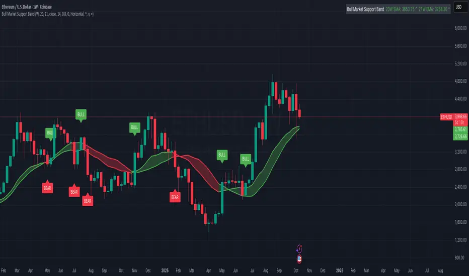
Bull Market Support Band (20W SMA + 21W EMA)🟩 Bull Market Support Band (20W SMA + 21W EMA)
OVERVIEW
The Bull Market Support Band is a long-term trend indicator that combines the 20-week SMA and 21-week EMA.
When price is above the band → bullish trend.
When below → bearish trend.
When within → neutral or transition phase.
This v6 version adds full customization, dynamic coloring, event labels, candle coloring, and a configurable on-chart legend table with trend arrows.
HOW IT WORKS
Calculates the 20W SMA and 21W EMA from a user-selectable higher timeframe (weekly by default).
Plots both averages and shades the area between them to form the support band.
The fill and line colors change automatically based on the market phase:
🟩 Green = Bullish (price above)
🟥 Red = Bearish (price below)
⬜ Gray = Neutral (price within).
Labels appear only when the trend state changes.
Alerts trigger when price crosses the band or either moving average.
Optional candle coloring applies the same bull/bear/neutral logic to price bars.
A convenience legend table displays current 20W SMA and 21W EMA values, along with slope arrows (^, v, =).
INCLUDED FEATURES
Configurable calculation timeframe.
Automatic band fill and line coloring.
Optional candle coloring overlay.
Compact or detailed regime-change labels.
ATR-based label offset and spacing control.
Customizable legend table with background color.
Horizontal or vertical legend layout.
Custom arrow characters (ASCII or Unicode).
Built-in alerts for band and MA crosses.
Optimized for higher-timeframe accuracy using request.security().
USAGE TIPS
Keep the default weekly setting for macro trend context.
On lower chart timeframes, use the band as higher-level support/resistance.
Combine with momentum or volume indicators (RSI, MACD, OBV) for confirmation.
Adjust ATR multiplier to move labels further from price candles.
Increase “Min bars between labels” to reduce visual clutter.
Disable auto-coloring if you prefer a static color theme.
Toggle compact legend or switch between horizontal/vertical layouts for best fit.
INTERPRETATION GUIDE
🟩 Bullish: Price above the band → trend continuation likely.
⬜ Neutral: Price within the band → consolidation or potential reversal zone.
🟥 Bearish: Price below the band → downtrend continuation or distribution.
Sustained closes above or below the band typically align with major market cycle shifts.
NOTES
Uses request.security() for higher-timeframe precision — accurate even on smaller charts.
The legend table is screen-anchored and remains fixed as you pan or zoom.
Plots and labels are price-anchored and move with candles.
Lightweight and efficient for all markets and intervals.
CREDITS
Original concept: The Bull Market Support Band (popularized in crypto analysis).
Enhanced Pine Script v6 version: Ricco .
Modernized for clarity, flexibility, and multi-timeframe accuracy.
SUMMARY
A modern, customizable Bull Market Support Band indicator highlighting long-term market regimes with clean visuals, color logic, and convenience features.
Designed for traders seeking macro clarity, minimal clutter, and professional presentation.
Session-Conditioned Regime ATRWhy this exists
Classic ATR is great—until the open. The first few bars often inherit overnight gaps and 24-hour noise that have nothing to do with the intraday regime you actually trade. That inflates early ATR, scrambles thresholds, and invites hyper-recency bias (“today is crazy!”) when it’s just the open being the open.
This tool was built to:
Separate session reality from 24h noise. Measure volatility only inside your defined session (e.g., NYSE 09:30–16:00 ET).
Judge candles against the current regime, not the last 2–3 bars. A rolling statistic from the last N completed sessions defines what “typical” means right now.
Label “large” and “small” objectively. Bars are colored only when True Range meaningfully departs from the session regime—no gut feel, no open-bar distortion (gap inclusion optional).
Overview
Purpose: objectively identify unusually big or small candles within the active trading session, compared to the recent session regime.
Use cases: volatility filters, entry/exit confirmation, session bias detection, adaptive sizing.
This indicator replaces generic ATR with a session-conditioned, regime-aware measure. It colors candles only when their True Range (TR) is abnormally large/small versus the last N completed sessions of the same session window.
How it works
Session gating: Only bars inside the selected session are evaluated (presets for NYSE, CME RTH, FX NY; custom supported).
Per-bar TR: TR = max(high, prevRef) − min(low, prevRef).
prevRef is the prior close for in-session bars.
First bar of the session can include the overnight gap (optional; default off).
Regime statistic: For any bar in session k, aggregate all in-session TRs from the previous N completed sessions (k−N … k−1), then compute Median (default) or Mean.
Today’s anchor: Running statistic from today’s session start → current bar (for context and the on-chart ratio).
Color logic:
Big if TR ≥ bigMult × RegimeStat
Small if TR ≤ smallMult × RegimeStat
Colored states: big bull, big bear, small bull, small bear.
Non-triggering bars retain the chart’s native colors.
Panel (top-right by default)
Regime ATR (Nd): session-conditioned statistic over the past N completed sessions.
Today ATR (anchored): running statistic for the current session.
Ratio (Today/Regime): intraday volatility vs regime.
Sample size n: number of bars used in the regime calculation.
Inputs
Session Preset: NYSE (09:30–16:00 ET), CME RTH (08:30–15:00 CT), FX NY (08:00–17:00 ET), Custom (session + IANA timezone).
Regime Window: number of completed sessions (default 5).
Statistic: Median (robust) or Mean.
Include Open Gap: include overnight gap in the first in-session bar’s TR (default off).
Big/Small thresholds: multipliers relative to RegimeStat (defaults: Big=1.5×, Small=0.67×).
Colors: four independent colors for big/small × bull/bear.
Panel position & text size.
Hidden outputs: expose RegimeStat, TodayStat, Ratio, and Z-score to other scripts.
Alerts
RegimeATR: BIG bar — triggers when a bar meets the “Big” condition.
RegimeATR: SMALL bar — triggers when a bar meets the “Small” condition.
Hidden outputs (for strategies/screeners)
RegimeATR_stat, TodayATR_stat, Today_vs_Regime_Ratio, BarTR_Zscore.
Notes & limitations
No look-ahead: calculations only use information available up to that bar. Historical colors reflect what would have been known then.
Warm-up: colors begin once there are at least N completed sessions; before that, regime is undefined by design.
Changing inputs (session window, multipliers, median/mean, gap toggle) recomputes the full series using the same rolling regime logic per bar.
Designed for standard candles. Styling respects existing chart colors when no condition triggers.
Practical tips
For a broader or tighter notion of “unusual,” adjust Big/Small multipliers.
Prefer Median in markets prone to outliers; use Mean if you want Z-score alignment with the panel’s regime mean/std.
Use the Ratio readout to spot compression/expansion days quickly (e.g., <0.7× = compressed session, >1.3× = expanded).
Roadmap
More session presets:
24h continuous (crypto, index CFDs).
23h/Globex futures (CME ETH with a 60-minute maintenance break).
Regional equities (LSE, Xetra, TSE), Asia/Europe/NY overlaps for FX.
Half-day/holiday templates and dynamic calendars.
Multi-regime comparison: track multiple overlapping regimes (e.g., RTH vs ETH for futures) and show separate stats/ratios.
Robust stats options: trimmed mean, MAD/Huber alternatives; optional percentile thresholds instead of fixed multipliers.
Subpanel visuals: rolling TodayATR and Ratio plots; optional Z-score ribbon.
Screener/strategy hooks: export boolean series for BIG/SMALL, plus a lightweight strategy template for backtesting entries/exits conditioned on regime volatility.
Performance/QOL: per-symbol presets, smarter warm-up, and finer control over sample caps for ultra-low TF charts.
Changelog
v0.9b (Beta)
Session presets (NYSE/CME RTH/FX NY/Custom) with timezone handling.
Panel enhancements: ratio + sample size n.
Four-state bar coloring (big/small × bull/bear).
Alerts for BIG/SMALL bars.
Hidden Z-score stream for downstream use.
Gap-in-TR toggle for the first in-session bar.
Disclaimer
For educational purposes only. Not investment advice. Validate thresholds and session settings across symbols/timeframes before live use.
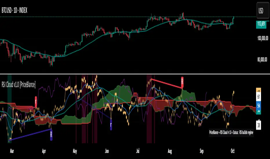
RSI Cloud v1.0 [PriceBlance] RSI Cloud v1.0 — Ichimoku-style Cloud on RSI(14), not on price.
Recalibrated baselines: EMA9 (Tenkan) for speed, WMA45 (Kijun) for stability.
Plus ADX-on-RSI to grade strength so you know when momentum persists or fades.
1. Introduction
RSI Cloud v1.0 applies an Ichimoku Cloud directly on RSI(14) to reveal momentum regimes earlier and cleaner than price-based views. We replaced Tenkan with EMA9 (faster, more responsive) and Kijun with WMA45 (slower, more stable) to fit a bounded oscillator (0–100). Forward spans (+26) and a lagging line (−26) provide a clear framework for trend bias and transitions.
To qualify signals, the indicator adds ADX computed on RSI—highlighting whether strength is weak, strong, or very strong, so you can decide when to follow, fade, or stand aside.
2. Core Mapping (Hook + Bullets)
At a glance: Ichimoku on RSI(14) with recalibrated baselines for a bounded oscillator.
Source: RSI(14)
Tenkan → EMA9(RSI) (fast, responsive)
Kijun → WMA45(RSI) (slow, stable)
Span A: classic Ichimoku midline, displaced +26
Span B: classic Ichimoku baseline, displaced +26
Lagging line: RSI shifted −26
3. Key Benefits (Why traders care)
Momentum regimes on RSI: position vs. Cloud = bull / bear / transition at a glance.
Cleaner confirmations: EMA9/WMA45 pairing cuts noise vs. raw 30/70 flips.
Earlier warnings: Cloud breaks on RSI often lead price-based confirmations.
4. ADX on RSI (Enhanced Strength Normalization)
Grade strength inside the RSI domain using ADX from ΔRSI:
ADX ≤ 20 → Weak (transparency = 60)
ADX ≤ 40 → Strong (transparency = 15)
ADX > 40 → Very strong (transparency = 0)
Use these tiers to decide when to trust, fade, or ignore a signal.
5. How to Read (Quick rules)
Bias / Regime
Bullish: RSI above Cloud and RSI > WMA45
Bearish: RSI below Cloud and RSI < WMA45
Neutral / Transition: all other cases
6. Settings (Copy & use)
RSI Length: 14 (default)
Tenkan: EMA9 on RSI · Kijun: WMA45 on RSI
Displacement: +26 (Span A/B) · −26 (Lagging)
Theme: PriceBlance Dark/Light
Visibility toggles: Cloud, Baselines, Lagging, labels/panel, Overbought/Oversold, Divergence, ADX-on-RSI (via transparency coloring)
7. Credits & License
Author/Brand: PriceBlance
Version: v1.0 (Free)
Watermark: PriceBlance • RSI Cloud v1.0
Disclaimer: Educational content; not financial advice.
8. CTA
If this helps, please ⭐ Star and Follow for updates & new tools.
Feedback is welcome—comment what you’d like added next (alerts, presets, visuals).
Trade PullBack - EMA Pullback System with Auto Risk-Reward# Trade Pull Back - Professional Pullback Trading System
## 📊 Overview
**Trade Pull Back** is a comprehensive pullback trading system that combines trend-following principles with precise entry timing using candlestick pattern confirmation. This indicator is designed for traders who want to enter trending markets at optimal retracement levels with pre-calculated risk-reward ratios.
---
## 🎯 Core Methodology
### Why This System Works
Most traders struggle with two key challenges:
1. **Entering too early** - jumping into trades before the pullback completes
2. **Entering too late** - missing the momentum after the pullback reverses
This system solves both problems by using a **3-Phase Confirmation Process**:
**Phase 1: Trend Identification** → **Phase 2: Pullback Detection** → **Phase 3: Reversal Confirmation**
---
## 🔧 How It Works
### 1. Triple EMA Framework (The Foundation)
Unlike traditional single EMA systems, this indicator uses **3 separate EMAs** with different purposes:
- **EMA Trend (default: 50)** - Determines the overall market direction
- Source: HL/2 for balanced trend reading
- Acts as the primary filter - we only trade in its direction
- **EMA High (default: 20)** - Dynamic resistance in uptrends
- Source: High prices for accurate resistance mapping
- Entry trigger for bullish setups when price closes above it
- **EMA Low (default: 20)** - Dynamic support in downtrends
- Source: Low prices for accurate support mapping
- Entry trigger for bearish setups when price closes below it
**Why 3 EMAs?**
- Single EMA can't distinguish between trend and pullback zones
- Two EMAs (like MACD) don't provide clear entry/exit levels
- Three EMAs create a **channel system** that identifies both trend direction AND optimal entry zones
### 2. Pattern Recognition Engine
The system detects two high-probability reversal patterns:
#### Engulfing Patterns
- **Bullish Engulfing**: Previous bearish candle completely engulfed by bullish candle
- **Bearish Engulfing**: Previous bullish candle completely engulfed by bearish candle
- Validates: Strong momentum reversal with volume confirmation
#### Pin Bar Patterns
- **Bullish Pin Bar (Hammer)**: Long lower wick (60%+ of total range) rejecting lower prices
- **Bearish Pin Bar (Inverted Hammer)**: Long upper wick (60%+ of total range) rejecting higher prices
- Validates: Institutional rejection at support/resistance levels
**Pattern Quality Filter:**
- Body-to-wick ratio must meet minimum standards
- Checks previous candle momentum
- Requires trend alignment before signaling
### 3. Pullback Confirmation System
The system includes **5 mandatory conditions** before generating a signal:
#### For Bullish Signals (BUY):
1. ✅ Close > EMA Trend (uptrend confirmed)
2. ✅ EMA High > EMA Trend AND EMA Low > EMA Trend (healthy trend structure)
3. ✅ Bullish Engulfing OR Bullish Pin Bar (pattern detected)
4. ✅ Close > EMA High (breakout confirmation)
5. ✅ Optional: Low < EMA High (pullback occurred)
#### For Bearish Signals (SELL):
1. ✅ Close < EMA Trend (downtrend confirmed)
2. ✅ EMA High < EMA Trend AND EMA Low < EMA Trend (healthy trend structure)
3. ✅ Bearish Engulfing OR Bearish Pin Bar (pattern detected)
4. ✅ Close < EMA Low (breakdown confirmation)
5. ✅ Optional: High > EMA Low (pullback occurred)
**Additional Filters:**
- **Consecutive Bars Check**: Ensures pullback had momentum (1-5 bearish/bullish bars)
- **Signal Spacing**: Minimum 4 bars between signals to avoid noise
- **Confirmation Delay**: Signal appears only AFTER bar closes (no repainting)
---
## 💰 Automatic Risk-Reward Calculator
### Smart Position Sizing
When a signal triggers, the system automatically calculates:
**For Long Positions:**
- **Entry**: High of signal candle
- **Stop Loss**: Lower of last 2 candle lows (protects against false breakouts)
- **Target 1 (1R)**: Entry + 1x Risk
- **Target 2 (2R)**: Entry + 2x Risk
- **Target 3 (3R)**: Entry + 3x Risk
**For Short Positions:**
- **Entry**: Low of signal candle
- **Stop Loss**: Higher of last 2 candle highs
- **Targets**: Calculated based on risk multiple
### Auto-Remove Feature
Lines and labels automatically disappear when:
- Price hits Stop Loss (trade invalidated)
- Price reaches 3R target (trade complete)
This keeps your chart clean and focuses only on active trades.
---
## 📈 Multi-Timeframe Trend Analysis
### Confluence Trading
The built-in MTF trend box shows trend status across 7 timeframes simultaneously:
- M1, M5, M15, M30, H1, H4, D1
**Color Coding:**
- 🟢 **Green**: Uptrend (Price > EMA Trend AND EMAs aligned bullish)
- 🔴 **Red**: Downtrend (Price < EMA Trend AND EMAs aligned bearish)
- ⚪ **Gray**: No clear trend
**Why This Matters:**
- Trade with higher timeframe trends for better win rate
- Avoid counter-trend trades when all timeframes show same direction
- Identify divergences between timeframes for reversal opportunities
---
## 🎨 Customization Options
### EMA Settings
- Adjust periods for different trading styles (scalping vs swing trading)
- Choose price sources (HL/2, Close, HLC/3) for sensitivity tuning
### Pattern Selection
- Enable/disable Engulfing patterns
- Enable/disable Pin Bar patterns
- Trade only your preferred pattern type
### Signal Filters
- **Require Pullback**: Force pullback condition (stricter entries)
- **Consecutive Bars**: Set momentum requirement (1-5 bars)
### Display Options
- Show/hide EMA lines
- Show/hide signals
- Enable/disable alerts
- Customize Risk-Reward line styles and extensions
---
## 📋 How to Use This Indicator
### Step 1: Identify the Trend
- Wait for price to establish clear direction relative to EMA Trend (50)
- Check MTF box to confirm higher timeframe alignment
### Step 2: Wait for Pullback
- In uptrend: Watch for price to pull back toward EMA High
- In downtrend: Watch for price to pull back toward EMA Low
### Step 3: Pattern Confirmation
- Look for Engulfing or Pin Bar pattern (triangle/diamond markers)
- Ensure pattern forms at or near the EMA High/Low zone
### Step 4: Entry & Risk Management
- Enter when signal appears (after bar closes)
- Use displayed Stop Loss and Take Profit levels
- Consider partial profits at 1R and 2R, let remainder run to 3R
### Step 5: Trade Management
- If price hits SL, lines disappear automatically (trade invalidated)
- If price reaches 3R, lines disappear (trade complete)
- Consider trailing stop after 1R is reached
---
## ⚙️ Recommended Settings
### For Scalping (M1-M5)
- EMA Trend: 20-30
- EMA High/Low: 10-15
- Require Pullback: OFF
- Consecutive Bars: 1
### For Day Trading (M15-H1)
- EMA Trend: 50 (default)
- EMA High/Low: 20 (default)
- Require Pullback: ON
- Consecutive Bars: 2-3
### For Swing Trading (H4-D1)
- EMA Trend: 100-200
- EMA High/Low: 50
- Require Pullback: ON
- Consecutive Bars: 3-5
---
## ✅ What Makes This Script Original
### 1. Systematic Approach
This isn't just a collection of indicators. It's a **complete trading system** with:
- Defined entry rules (5-point confirmation checklist)
- Automatic risk management (SL/TP calculation)
- Trade validation (consecutive bars, signal spacing)
### 2. Smart EMA Framework
The 3-EMA system creates a **dynamic channel** that adapts to market conditions:
- Trend EMA = Direction filter
- High/Low EMAs = Entry/Exit zones
- Together they form a "trade zone" that standard EMAs can't provide
### 3. Pattern Quality Control
Not all Engulfing or Pin Bar patterns are equal. This system:
- Validates body-to-wick ratios
- Checks previous candle momentum
- Requires trend alignment before signaling
### 4. Auto Risk-Reward Management
Most indicators just show signals. This one:
- Calculates exact entry prices
- Places stop loss at optimal location (lower of 2 lows)
- Projects 3 profit targets based on risk
- Auto-removes when trade is complete/invalidated
### 5. No Repainting
- All signals appear AFTER bar closes
- No future data leaking
- What you see in backtest = what you get in real-time
---
## 🚨 Alerts
Built-in alerts notify you when:
- Bullish signal confirmed
- Bearish signal confirmed
Alerts fire once per bar (no spam) and only after bar closes (no false alerts).
---
## 📊 Best Practices
### ✅ DO:
- Trade in direction of higher timeframe trends
- Wait for full confirmation (all 5 conditions met)
- Use proper position sizing (1-2% risk per trade)
- Let winners run to at least 2R
### ❌ DON'T:
- Trade against major trend on MTF box
- Enter before signal bar closes
- Ignore the Stop Loss level
- Overtrade - respect the 4-bar minimum spacing
---
## 🔍 Limitations
This indicator is a **tool**, not a crystal ball:
- No indicator wins 100% of the time
- False signals occur in choppy/ranging markets
- Best results in trending conditions
- Requires proper risk management
- Should be combined with fundamental analysis and market context
---
## 📚 Educational Value
This script teaches:
- How to combine trend following with mean reversion
- Pattern recognition and validation
- Risk-reward ratio calculation
- Multi-timeframe analysis
- Proper trade entry timing
---
## 🎓 Credits & Disclaimer
**Original Work**: All code written from scratch
**Methodology**: Based on classical technical analysis principles (EMA crossovers, candlestick patterns, support/resistance)
**Disclaimer**: This indicator is for educational purposes. Past performance does not guarantee future results. Always practice proper risk management.
---
## 📞 Support
If you find this indicator helpful:
- Leave a review
- Share with fellow traders
- Provide feedback for improvements
**Note**: This is a closed-source script to protect the proprietary signal logic and filtering algorithms. The description above provides comprehensive understanding of the methodology without revealing exact implementation details.
---
**Version**: 1.0
**Pine Script Version**: 5
**Type**: Indicator (Overlay)
**Category**: Trend Following + Pattern Recognition
---
*Happy Trading! 🚀*
# 🇹🇭 คู่มือภาษาไทย / Thai Guide
# Trade Pull Back - คู่มือภาษาไทย
## 📊 ภาพรวม
**Trade Pull Back** เป็นระบบเทรด Pullback ที่ผสมผสานการเทรดตามเทรนด์กับการจับจังหวะเข้าออเดอร์ด้วย Candlestick Pattern พร้อมคำนวณ Risk-Reward อัตโนมัติ
---
## 🎯 หลักการทำงาน
### ทำไมระบบนี้ได้ผล?
แก้ปัญหา 2 ข้อหลักของเทรดเดอร์:
1. **เข้าเร็วเกินไป** - เข้าก่อน Pullback เสร็จ
2. **เข้าช้าเกินไป** - พลาดโมเมนตัมหลังกลับตัว
**วิธีแก้**: ใช้กระบวนการยืนยัน 3 ขั้นตอน
- **ขั้น 1**: ระบุเทรนด์ → **ขั้น 2**: ตรวจจับ Pullback → **ขั้น 3**: ยืนยันการกลับตัว
---
## 🔧 ส่วนประกอบหลัก
### 1. ระบบ EMA 3 เส้น
ต่างจาก EMA ทั่วไป ระบบนี้ใช้ 3 เส้นที่มีหน้าที่แยกกัน:
- **EMA Trend (50)** - กำหนดทิศทางเทรนด์หลัก
- **EMA High (20)** - แนวต้านไดนามิก (สำหรับ Buy)
- **EMA Low (20)** - แนวรับไดนามิก (สำหรับ Sell)
**ทำไมต้อง 3 เส้น?**
- 1 เส้น = แยกเทรนด์กับ Pullback ไม่ได้
- 2 เส้น = ไม่มีจุด Entry/Exit ชัดเจน
- 3 เส้น = สร้าง Channel ที่บอกทั้งเทรนด์และโซนเข้าออเดอร์
### 2. ตรวจจับ Pattern
ระบบตรวจจับ 2 Pattern หลัก:
**Engulfing (แท่งกลืน)**
- Bullish: แท่งเขียวกลืนแท่งแดงทั้งหมด
- Bearish: แท่งแดงกลืนแท่งเขียวทั้งหมด
**Pin Bar (แท่งหาง)**
- Bullish: หางล่างยาว 60%+ ของช่วงทั้งหมด
- Bearish: หางบนยาว 60%+ ของช่วงทั้งหมด
### 3. เงื่อนไขยืนยันสัญญาณ (5 ข้อ)
**สัญญาณ Buy:**
1. ✅ ราคาปิด > EMA Trend (เทรนด์ขาขึ้น)
2. ✅ EMA High และ Low เหนือ EMA Trend (โครงสร้างดี)
3. ✅ เกิด Bullish Engulfing หรือ Pin Bar
4. ✅ ราคาปิด > EMA High (ยืนยัน Breakout)
5. ✅ ตัวเลือก: มี Pullback มาแตะ EMA High
**สัญญาณ Sell:**
1. ✅ ราคาปิด < EMA Trend (เทรนด์ขาลง)
2. ✅ EMA High และ Low ใต้ EMA Trend (โครงสร้างดี)
3. ✅ เกิด Bearish Engulfing หรือ Pin Bar
4. ✅ ราคาปิด < EMA Low (ยืนยัน Breakdown)
5. ✅ ตัวเลือก: มี Pullback มาแตะ EMA Low
**ตัวกรองเพิ่มเติม:**
- ต้องมีแท่งติดกัน 1-5 แท่ง (กำหนดได้)
- ห่างสัญญาณก่อนหน้าอย่างน้อย 4 แท่ง
- สัญญาณปรากฏหลังแท่งปิดเท่านั้น (ไม่ Repaint)
---
## 💰 คำนวณ Risk-Reward อัตโนมัติ
เมื่อสัญญาณเกิด ระบบคำนวณให้อัตโนมัติ:
**Long Position:**
- Entry = High ของแท่งสัญญาณ
- Stop Loss = Low ที่ต่ำกว่าของ 2 แท่งล่าสุด
- Target = 1R, 2R, 3R
**Short Position:**
- Entry = Low ของแท่งสัญญาณ
- Stop Loss = High ที่สูงกว่าของ 2 แท่งล่าสุด
- Target = 1R, 2R, 3R
**ลบอัตโนมัติ:** เส้นหายเมื่อราคาชน SL หรือถึง 3R
---
## 📈 กล่องเทรนด์หลาย Timeframe
แสดงเทรนด์พร้อมกัน 7 Timeframe:
- M1, M5, M15, M30, H1, H4, D1
**สีแสดงผล:**
- 🟢 เขียว = Uptrend
- 🔴 แดง = Downtrend
- ⚪ เทา = ไม่มีเทรนด์
**ประโยชน์:** เทรดตาม Timeframe ใหญ่เพื่อเพิ่ม Win Rate
---
## 📋 วิธีใช้งาน (5 ขั้นตอน)
1. **ระบุเทรนด์** - เช็คราคาเทียบกับ EMA Trend และกล่อง MTF
2. **รอ Pullback** - เฝ้าราคา Pullback มาที่ EMA High/Low
3. **เช็ค Pattern** - มองหาลูกศรสามเหลี่ยม (Engulfing) หรือเพชร (Pin Bar)
4. **เข้าออเดอร์** - เข้าเมื่อสัญญาณปรากฏ ใช้ SL/TP ที่แสดง
5. **จัดการเทรด** - เส้นจะหายเองเมื่อชน SL หรือถึง 3R
---
## ⚙️ การตั้งค่าแนะนำ
**Scalping (M1-M5)**
- EMA Trend: 20-30
- EMA High/Low: 10-15
- Require Pullback: ปิด
**Day Trading (M15-H1)**
- EMA Trend: 50 (ค่าเริ่มต้น)
- EMA High/Low: 20 (ค่าเริ่มต้น)
- Require Pullback: เปิด
**Swing Trading (H4-D1)**
- EMA Trend: 100-200
- EMA High/Low: 50
- Require Pullback: เปิด
---
## ✅ จุดเด่นที่แตกต่าง
1. **เป็นระบบสมบูรณ์** - ไม่ใช่แค่รวม Indicator
2. **EMA 3 เส้นสร้าง Channel** - บอกทั้งเทรนด์และโซนเข้า
3. **ตรวจสอบคุณภาพ Pattern** - ไม่ใช่ทุก Pattern ที่ให้สัญญาณ
4. **คำนวณ RR อัตโนมัติ** - วาง SL/TP ให้เลย
5. **ไม่ Repaint** - สัญญาณปรากฏหลังแท่งปิดเท่านั้น
---
## 📊 ควรทำ / ไม่ควรทำ
### ✅ ควรทำ:
- เทรดตามเทรนด์ Timeframe ใหญ่
- รอยืนยันครบ 5 เงื่อนไข
- เสี่ยง 1-2% ต่อเทรด
- ปล่อยกำไรไปอย่างน้อย 2R
### ❌ ไม่ควรทำ:
- เทรดทวนเทรนด์ในกล่อง MTF
- เข้าก่อนแท่งปิด
- ละเลย Stop Loss
- เทรดบ่อยเกินไป
---
## 🔍 ข้อจำกัด
- ไม่มี Indicator ไหนชนะ 100%
- สัญญาณผิดพลาดเกิดในตลาด Sideways
- ผลดีสุดในตลาดที่มีเทรนด์ชัด
- ต้องใช้ Money Management
- ควรดูปัจจัยพื้นฐานประกอบ
---
## 🎓 คำเตือน
**Disclaimer**: อินดิเคเตอร์นี้สำหรับการศึกษา ผลในอดีตไม่รับประกันอนาคต ใช้ Risk Management ที่เหมาะสมเสมอ
---
**เวอร์ชั่น**: 1.0
**Pine Script**: v5
**ประเภท**: Indicator (Overlay)
*Happy Trading! 🚀*
## Screenshots
**Bearish Signals with Risk-Reward:**
! (drive.google.com)
**Bullish Signal with Risk-Reward:**
! (drive.google.com)
**Multi-Timeframe Trend Box:**
! (drive.google.com)
**Settings Panel:**
! (drive.google.com)

BayesStack RSI [CHE]BayesStack RSI — Stacked RSI with Bayesian outcome stats and gradient visualization
Summary
BayesStack RSI builds a four-length RSI stack and evaluates it with a simple Bayesian success model over a rolling window. It highlights bull and bear stack regimes, colors price with magnitude-based gradients, and reports per-regime counts, wins, and estimated win rate in a compact table. Signals seek to be more robust through explicit ordering tolerance, optional midline gating, and outcome evaluation that waits for events to mature by a fixed horizon. The design focuses on readable structure, conservative confirmation, and actionable context rather than raw oscillator flips.
Motivation: Why this design?
Classical RSI signals flip frequently in volatile phases and drift in calm regimes. Pure threshold rules often misclassify shallow pullbacks and stacked momentum phases. The core idea here is ordered, spaced RSI layers combined with outcome tracking. By requiring a consistent order with a tolerance and optionally gating by the midline, regime identification becomes clearer. A horizon-based maturation check and smoothed win-rate estimate provide pragmatic feedback about how often a given stack has recently worked.
What’s different vs. standard approaches?
Reference baseline: Traditional single-length RSI with overbought and oversold rules or simple crossovers.
Architecture differences:
Four fixed RSI lengths with strict ordering and a spacing tolerance.
Optional requirement that all RSI values stay above or below the midline for bull or bear regimes.
Outcome evaluation after a fixed horizon, then rolling counts and a prior-smoothed win rate.
Dispersion measurement across the four RSIs with a percent-rank diagnostic.
Gradient coloring of candles and wicks driven by stack magnitude.
A last-bar statistics table with counts, wins, win rate, dispersion, and priors.
Practical effect: Charts emphasize sustained momentum alignment instead of single-length crosses. Users see when regimes start, how strong alignment is, and how that regime has recently performed for the chosen horizon.
How it works (technical)
The script computes RSI on four lengths and forms a “stack” when they are strictly ordered with at least the chosen tolerance between adjacent lengths. A bull stack requires a descending set from long to short with positive spacing. A bear stack requires the opposite. Optional gating further requires all RSI values to sit above or below the midline.
For evaluation, each detected stack is checked again after the horizon has fully elapsed. A bull event is a success if price is higher than it was at event time after the horizon has passed. A bear event succeeds if price is lower under the same rule. Rolling sums over the training window track counts and successes; a pair of priors stabilizes the win-rate estimate when sample sizes are small.
Dispersion across the four RSIs is measured and converted to a percent rank over a configurable window. Gradients for bars and wicks are normalized over a lookback, then shaped by gamma controls to emphasize strong regimes. A statistics table is created once and updated on the last bar to minimize overhead. Overlay markers and wick coloring are rendered to the price chart even though the indicator runs in a separate pane.
Parameter Guide
Source — Input series for RSI. Default: close. Tips: Use typical price or hlc3 for smoother behavior.
Overbought / Oversold — Guide levels for context. Defaults: seventy and thirty. Bounds: fifty to one hundred, zero to fifty. Tips: Narrow the band for faster feedback.
Stacking tolerance (epsilon) — Minimum spacing between adjacent RSIs to qualify as a stack. Default: zero point twenty-five RSI points. Trade-off: Higher values reduce false stacks but delay entries.
Horizon H — Bars ahead for outcome evaluation. Default: three. Trade-off: Longer horizons reduce noise but delay success attribution.
Rolling window — Lookback for counts and wins. Default: five hundred. Trade-off: Longer windows stabilize the win rate but adapt more slowly.
Alpha prior / Beta prior — Priors used to stabilize the win-rate estimate. Defaults: one and one. Trade-off: Larger priors reduce variance with sparse samples.
Show RSI 8/13/21/34 — Toggle raw RSI lines. Default: on.
Show consensus RSI — Weighted combination of the four RSIs. Default: on.
Show OB/OS zones — Draw overbought, oversold, and midline. Default: on.
Background regime — Pane background tint during bull or bear stacks. Default: on.
Overlay regime markers — Entry markers on price when a stack forms. Default: on.
Show statistics table — Last-bar table with counts, wins, win rate, dispersion, priors, and window. Default: on.
Bull requires all above fifty / Bear requires all below fifty — Midline gate. Defaults: both on. Trade-off: Stricter regimes, fewer but cleaner signals.
Enable gradient barcolor / wick coloring — Gradient visuals mapped to stack magnitude. Defaults: on. Trade-off: Clearer regime strength vs. extra rendering cost.
Collection period — Normalization window for gradients. Default: one hundred. Trade-off: Shorter values react faster but fluctuate more.
Gamma bars and shapes / Gamma plots — Curve shaping for gradients. Defaults: zero point seven and zero point eight. Trade-off: Higher values compress weak signals and emphasize strong ones.
Gradient and wick transparency — Visual opacity controls. Defaults: zero.
Up/Down colors (dark and neon) — Gradient endpoints. Defaults: green and red pairs.
Fallback neutral candles — Directional coloring when gradients are off. Default: off.
Show last candles — Limit for gradient squares rendering. Default: three hundred thirty-three.
Dispersion percent-rank length / High and Low thresholds — Window and cutoffs for dispersion diagnostics. Defaults: two hundred fifty, eighty, and twenty.
Table X/Y, Dark theme, Text size — Table anchor, theme, and typography. Defaults: right, top, dark, small.
Reading & Interpretation
RSI stack lines: Alignment and spacing convey regime quality. Wider spacing suggests stronger alignment.
Consensus RSI: A single line that summarizes the four lengths; use as a smoother reference.
Zones: Overbought, oversold, and midline provide context rather than standalone triggers.
Background tint: Indicates active bull or bear stack.
Markers: “Bull Stack Enter” or “Bear Stack Enter” appears when the stack first forms.
Gradients: Brighter tones suggest stronger stack magnitude; dull tones suggest weak alignment.
Table: Count and Wins show sample size and successes over the window. P(win) is a prior-stabilized estimate. Dispersion percent rank near the high threshold flags stretched alignment; near the low threshold flags tight clustering.
Practical Workflows & Combinations
Trend following: Enter only on new stack markers aligned with structure such as higher highs and higher lows for bull, or lower lows and lower highs for bear. Use the consensus RSI to avoid chasing into overbought or oversold extremes.
Exits and stops: Consider reducing exposure when dispersion percent rank reaches the high threshold or when the stack loses ordering. Use the table’s P(win) as a context check rather than a direct signal.
Multi-asset and multi-timeframe: Defaults travel well on liquid assets from intraday to daily. Combine with higher-timeframe structure or moving averages for regime confirmation. The script itself does not fetch higher-timeframe data.
Behavior, Constraints & Performance
Repaint and confirmation: Stack markers evaluate on the live bar and can flip until close. Alert behavior follows TradingView settings. Outcome evaluation uses matured events and does not look into the future.
HTF and security: Not used. Repaint paths from higher-timeframe aggregation are avoided by design.
Resources: max bars back is two thousand. The script uses rolling sums, percent rank, gradient rendering, and a last-bar table update. Shapes and colored wicks add draw overhead.
Known limits: Lag can appear after sharp turns. Very small windows can overfit recent noise. P(win) is sensitive to sample size and priors. Dispersion normalization depends on the collection period.
Sensible Defaults & Quick Tuning
Start with the shipped defaults.
Too many flips: Increase stacking tolerance, enable midline gates, or lengthen the collection period.
Too sluggish: Reduce stacking tolerance, shorten the collection period, or relax midline gates.
Sparse samples: Extend the rolling window or increase priors to stabilize P(win).
Visual overload: Disable gradient squares or wick coloring, or raise transparency.
What this indicator is—and isn’t
This is a visualization and context layer for RSI stack regimes with simple outcome statistics. It is not a complete trading system, not predictive, and not a signal generator on its own. Use it with market structure, risk controls, and position management that fit your process.
Metadata
- Pine version: v6
- Overlay: false (price overlays are drawn via forced overlay where applicable)
- Primary outputs: Four RSI lines, consensus line, OB/OS guides, background tint, entry markers, gradient bars and wicks, statistics table
- Inputs with defaults: See Parameter Guide
- Metrics and functions used: RSI, rolling sums, percent rank, dispersion across RSI set, gradient color mapping, table rendering, alerts
- Special techniques: Ordered RSI stacking with tolerance, optional midline gating, horizon-based outcome maturation, prior-stabilized win rate, gradient normalization with gamma shaping
- Performance and constraints: max bars back two thousand, rendering of shapes and table on last bar, no higher-timeframe data, no security calls
- Recommended use-cases: Regime confirmation, momentum alignment, post-entry management with dispersion and recent outcome context
- Compatibility: Works across assets and timeframes that support RSI
- Limitations and risks: Sensitive to parameter choices and market regime changes; not a standalone strategy
- Diagnostics: Statistics table, dispersion percent rank, gradient intensity
Disclaimer
The content provided, including all code and materials, is strictly for educational and informational purposes only. It is not intended as, and should not be interpreted as, financial advice, a recommendation to buy or sell any financial instrument, or an offer of any financial product or service. All strategies, tools, and examples discussed are provided for illustrative purposes to demonstrate coding techniques and the functionality of Pine Script within a trading context.
Any results from strategies or tools provided are hypothetical, and past performance is not indicative of future results. Trading and investing involve high risk, including the potential loss of principal, and may not be suitable for all individuals. Before making any trading decisions, please consult with a qualified financial professional to understand the risks involved.
By using this script, you acknowledge and agree that any trading decisions are made solely at your discretion and risk.
Best regards and happy trading
Chervolino.
Do not use this indicator on Heikin-Ashi, Renko, Kagi, Point-and-Figure, or Range charts, as these chart types can produce unrealistic results for signal markers and alerts.

VMS Momentum Trend Matrix Indicator [09.15 to 15.30]VMS Momentum Trend Matrix Indicator - Detailed Explanation
🎯 Overview & Core Philosophy
This is a multi-dimensional trading and a multi-confirmation system that combines 4 independent analytical approaches into one unified framework. The indicator operates on the principle of "consensus trading" - where signals are only considered reliable when multiple systems confirm each other. The system is designed for 9:15 AM to 3:30 PM trading sessions (Indian Market) with dynamic support/resistance levels.
Five Pillars of Analysis:
1. Trend Matrix – Multiple indicator voting system
2. Momentum Suite – Multiple Hybrid oscillator
3. Volume Analysis - Buy/sell pressure quantification
4. Key Level Identification - Dynamic support/resistance
5. EMA Trend: Indicates the overall long-term direction.
📊 DASHBOARD INTERPRETATION - ROW BY ROW
ROW 1: Indicator Name and Cell background colour changes with Trend Matrix
ROW 2: EMA ANALYSIS (It analyses independently and does not combine this analysis with the Combined Analysis and Trading View. Background Colour on price chart is based on this)
Purpose: Long-term trend identification using Exponential Moving Averages
What to Watch:
• Major Trend: Overall market direction (Bullish/Bearish/Neutral)
• Bullish Condition: All EMAs aligned upward
• Bearish Condition: All EMAs aligned downward
• Neutral: Mixed alignment
Trading Significance:
• Trading Condition: Current bias based on EMA alignment
• Bullish Market: Focus on LONG positions only
• Bearish Market: Focus on SHORT positions only
• Neutral Market: Wait for clearer direction
ROW 3-4: KEY LEVELS
Purpose: Dynamic support and resistance identification
Levels to Monitor:
• VMS Line-1 (Support): Dynamic Support for long positions
• VMS Line-2 (Resistance): Dynamic Resistance for short positions
• Up/Down: Daily base levels from opening price calculations
• Up: Daily support level based on opening price
• Down: Daily resistance level based on opening price
How Levels Work:
• Wait for Line-1 and 2 Crossing
• In the Upward movement, Line-1 will move with the price, and Line-2 will be moved as a straight line
• In the Downward movement, Line-2 will move with the price, and Line-2 will be moved as a straight line
• Provide clear entry/exit points
• If the price is between these levels, it is mostly a sideways market. After the Upward movement, if the price crosses Line-1 and other bearish conditions are supported, a short position can be taken. And in the Downward movement, it is the reverse condition.
• If the price is above the up level, it can be considered as bullish and below as bearish
ROW 5-6: VOLUME ANALYSIS
Purpose: Measure buying vs selling pressure
Key Metrics:
• Total Buy Volume: Cumulative buying pressure
• Total Sell Volume: Cumulative selling pressure
• Bullish Candles: Number of up-candles in session
• Bearish Candles: Number of down-candles in session
Interpretation:
• Buy Volume > Sell Volume: Bullish sentiment
• Sell Volume > Buy Volume: Bearish sentiment
• Bullish Candles Dominating: Upward momentum
• Bearish Candles Dominating: Downward momentum
ROW 7-8: MOMENTUM SUITE (Background colour of Oscillator is based on this)
Purpose: Short-term momentum strength and direction
Critical Components:
• Direction: Current momentum (BULLISH/BEARISH)
• Strength: 0-100% strength measurement
• Bullish Height: Positive momentum magnitude
• Bearish Height: Negative momentum magnitude
Strength Classification:
• 80-100%: Very Strong - High conviction trades
• 60-80%: Strong - Good trading opportunities
• 40-60%: Moderate - Caution advised
• 20-40%: Weak - Avoid trading
• 0-20%: Very Weak - No trade zone
ROW 9-11: TREND MATRIX
Purpose: Consensus from Multiple technical indicators
Matrix Scoring:
• Bullish Signals: Number voting UP
• Bearish Signals: Number voting DOWN
• Neutral Signals: Non-committed indicators
• Net Score: Bullish - Bearish signals
Trend Classification:
• Strong Uptrend: Net Score ≥ +5
• Uptrend: Net Score +1 to +4
• Neutral: Net Score = 0
• Downtrend: Net Score -1 to -4
• Strong Downtrend: Net Score ≤ -5
ROW 12: COMBINED ANALYSIS
Purpose: Final integrated signal from all systems
Bias Levels:
• STRONG BULLISH: All systems aligned upward
• BULLISH: Majority systems upward
• NEUTRAL: Mixed or weak signals
• BEARISH: Majority systems downward
• STRONG BEARISH: All systems aligned downward
Confidence Score: 0-100% reliability measurement
ROW 13: TRADING VIEW
Purpose: Clear action recommendations
Possible Actions:
• STRONG LONG: High conviction buy signal
• MODERATE LONG: Medium conviction buy signal
• WAIT FOR CONFIRMATION: No clear signal
• MODERATE SHORT: Medium conviction sell signal
• STRONG SHORT: High conviction sell signal
🎯 COMPLETE TRADING RULES
BUY ENTRY CONDITIONS (All Must Be True)
Primary Conditions:
1. Combined Bias: BULLISH or STRONG BULLISH
2. Trading Action: MODERATE LONG or STRONG LONG
3. Momentum Strength: ≥ 40% (≥60% for STRONG LONG)
4. Trend Matrix: Net Score ≥ +3
5. 6-EMA Trend: Bullish or Neutral
Confirmation Conditions:
6. Price Position: Above VMS Line-1 AND Base Up
7. Volume Confirmation: Buy Volume > Sell Volume
8. Bullish Candles: More bullish than bearish candles
Risk Management:
9. Stop Loss: Below VMS Line-1 OR Base Down (whichever is lower)
10. Position Size: Based on confidence score (higher score = larger position)
11. Take Profit: When Combined Bias turns "NEUTRAL" or momentum strength drops below 20%
12. Exit Signal: Trading Action shows "WAIT FOR CONFIRMATION"
SELL/SHORT ENTRY CONDITIONS (All Must Be True)
Primary Conditions:
1. Combined Bias: BEARISH or STRONG BEARISH
2. Trading Action: MODERATE SHORT or STRONG SHORT
3. Momentum Strength: ≥ 40% (≥60% for STRONG SHORT)
4. Bearish Signals: ≥ 12 in Trend Matrix
5. Trend Matrix: Net Score ≤ -3
6. EMA Trend: Bearish or Neutral
Confirmation Conditions:
6. Price Position: Below VMS Line-2 AND Base Down
7. Volume Confirmation: Sell Volume > Buy Volume
8. Bearish Candles: More bearish than bullish candles
Risk Management:
9. Stop Loss: Above VMS Line-2 OR Base Up (whichever is higher)
10. Position Size: Based on confidence score
11. Take Profit: When Combined Bias turns "NEUTRAL" or momentum strength drops below 20%
12. Exit Signal: Trading Action shows "WAIT FOR CONFIRMATION"
⏰ ENTRY/EXIT TIMING
Best Entry Times:
• 9:30-10:00 AM: Early session momentum established
• 11:00-11:30 AM: Mid-session confirmation
• 1:30-2:00 PM: Afternoon momentum shifts
Avoid Trading:
• First 15 minutes: Excessive volatility
• 12:00-1:00 PM: Low liquidity period
• After 3:00 PM: Session closing volatility
Exit Triggers:
Profit Taking:
• Target 1: 1:1 Risk-Reward (exit 50% position)
• Target 2: 1.5:1 Risk-Reward (exit remaining 50%)
• Trailing Stop: Move stop to breakeven after Target 1
Stop Loss Triggers:
• Price crosses opposite VMS line
• Combined Bias changes to NEUTRAL
• Momentum Strength drops below 20%
• Volume confirmation reverses
•
Emergency Exit:
• Trend Matrix Net Score reverses direction
• 6-EMA trend changes direction
• Key support/resistance breaks against position
📈 TRADING SCENARIOS
Scenario 1: STRONG BULLISH SETUP
- Combined Bias: STRONG BULLISH
- Trading Action: STRONG LONG
- Momentum Strength: 75%
- Trend Matrix: Net Score +8
- Price: Above VMS Line-1 and Base Up
- Volume: Strong buy volume dominance
ACTION: Enter LONG with full position size
STOP LOSS: Below VMS Line-1
TARGET: 1.5:1 Risk-Reward ratio
Scenario 2: MODERATE BEARISH SETUP
- Combined Bias: BEARISH
- Trading Action: MODERATE SHORT
- Momentum Strength: 55%
- Trend Matrix: Net Score -4
- Price: Below VMS Line-2 but above Base Down
- Volume: Moderate sell volume dominance
ACTION: Enter SHORT with half position size
STOP LOSS: Above VMS Line-2
TARGET: 1:1 Risk-Reward ratio
Scenario 3: NEUTRAL/WAIT SETUP
- Combined Bias: NEUTRAL
- Trading Action: WAIT FOR CONFIRMATION
- Momentum Strength: 35%
- Trend Matrix: Net Score 0
- Mixed volume signals
ACTION: NO TRADE - Wait for clearer signals
________________________________________
⚠️ RISK MANAGEMENT RULES
Position Sizing:
• STRONG Signals (80-100% confidence): 100% normal position
• MODERATE Signals (60-79% confidence): 50-75% position
• WEAK Signals (40-59% confidence): 25% position or avoid
• VERY WEAK (<40% confidence): NO TRADE
Daily Loss Limits:
• Maximum 2% capital loss per day
• Maximum 3 consecutive losing trades
• Stop trading after the daily limit is reached
Trade Management:
• Never move the stop loss against a position
• Take partial profits at predetermined levels
• Never average down losing positions
• Respect all exit signals immediately
________________________________________
🔄 SIGNAL CONFIRMATION PROCESS
Step 1: Trend Direction
Check EMA alignment and Combined Bias
Step 2: Momentum Strength
Verify Momentum Strength ≥ 40% and direction matches trend
Step 3: Volume Confirmation
Confirm volume supports the direction
Step 4: Matrix Consensus
Ensure Trend Matrix agrees (Net Score ≥ |3|)
Step 5: Price Position
Verify price is on the correct side of key levels
Step 6: Entry Execution
Enter on a pullback to support/resistance with a stop loss
________________________________________
This system works best when you wait for all conditions to align. Patience is key - only trade when all systems confirm the same direction with adequate strength. The multiple confirmation layers significantly increase the probability of success but reduce trading frequency.

Data Panel## 📊 Enhanced Data Panel
This indicator provides an all-in-one data panel directly on your chart, giving you a quick, at-a-glance summary of a stock's real-time behavior. It's designed to help traders instantly assess volatility, volume, and momentum without needing multiple separate indicators.
Key Features & Metrics Explained
Fully Customizable: Nearly every metric can be toggled on or off in the settings, allowing you to build a panel that shows only what's important to you. You can also customize colors, text size, and table position.
ADR (Average Daily Range): Shows the stock's average price movement per day. A high ADR % suggests higher volatility.
ATR (Average True Range): A popular metric to measure market volatility, taking into account price gaps.
Volume Analysis: Displays today's cumulative volume and compares it to the 20, 50, and 100-day average volumes, letting you know instantly if trading is heavier or lighter than usual.
Volume Value (Turnover): Calculates the total monetary value of the shares traded for the day, showing the conviction behind the volume.
Gap %: Shows the percentage gap between the previous day's close and the current day's open, highlighting morning catalysts.
Icon Guide 💡
The panel uses icons to provide a quick visual summary. You can change their position or hide them in the settings.
Volume & Value Icons
🔥 Extreme Volume: Volume is far above its average.
📊 High Volume: Volume is significantly higher than average.
✅ Above Average: Volume is higher than its 20-day average.
💤 Low Volume: Volume is below average.
Volatility Icons (for ADR & ATR)
⚠️ Extreme Volatility: The stock is moving much more than usual.
⚡ High Volatility: Volatility is elevated.
📈 Normal Volatility: The stock is moving within its typical range.
😴 Low Volatility: The stock is unusually quiet.
Trend & Momentum Icons
🚀 Strong Bullish: Price is up significantly for the day.
📈 Bullish: Price is up moderately.
➡️ Neutral: Price is flat or sideways.
📉 Bearish: Price is down moderately.
💥 Strong Bearish: Price is down significantly for the day.
Alert Badges (in Header)
Special icons appear in the header to flag unique market conditions:
🔥⚠️ Explosive Condition: Extreme volume is occurring alongside high volatility.
🔒 Squeeze Condition: Volatility and volume are both very low, suggesting a potential for a large move.

KDJ Divergence Indicator(Regular & Hidden)📌 中文介绍
KDJ 背离指标(副图版,支持 Regular & Hidden)
这是一个基于 KDJ 指标 的背离检测工具,可以在副图中直观显示 Regular 背离(顶背离/底背离) 和 Hidden 背离(隐藏顶/隐藏底)。
功能特点:
可选计算基线:支持以 J 值 或 K 值 作为背离判定依据。
多种背离类型:
Regular Bullish(底背离):价格创新低,但指标不创新低 → 可能反弹。
Regular Bearish(顶背离):价格创新高,但指标不创新高 → 可能回落。
Hidden Bullish(隐藏底背离):价格不创新低,但指标创新低 → 可能延续上涨。
Hidden Bearish(隐藏顶背离):价格不创新高,但指标创新高 → 可能延续下跌。
连线显示:在副图用线条连接前后两个背离点,帮助更直观地发现趋势变化。
自定义选项:
可选择是否显示 Regular / Hidden 背离。
可调整回溯范围(左侧/右侧/最大最小)。
可自定义颜色和信号样式。
报警提醒:背离出现时会触发报警。
适合:
波段交易者寻找趋势反转。
短线交易者捕捉关键拐点。
技术分析结合 KDJ 的交易策略。
📌 English Introduction
KDJ Divergence Indicator (Sub-Chart, Regular & Hidden Supported)
This is a KDJ-based divergence detection tool, plotted in a sub-window, that highlights Regular Divergences (Bullish/Bearish) and Hidden Divergences (Hidden Bullish/Hidden Bearish).
Key Features:
Selectable Oscillator Line: Choose between J or K line as the basis for divergence detection.
Divergence Types:
Regular Bullish: Price makes a lower low, but oscillator makes a higher low → potential rebound.
Regular Bearish: Price makes a higher high, but oscillator makes a lower high → potential drop.
Hidden Bullish: Price holds higher low, but oscillator makes a lower low → potential trend continuation upward.
Hidden Bearish: Price holds lower high, but oscillator makes a higher high → potential trend continuation downward.
Line Connections: Draws connecting lines between divergence points for better visual clarity.
Customizable Settings:
Enable/disable Regular & Hidden divergences.
Adjustable left/right lookback and range filters.
Custom colors and shapes for signals.
Alert Ready: Alerts trigger when divergences are detected.
Best for:
Swing traders spotting trend reversals.
Short-term traders catching turning points.
Technical analysts using KDJ-based strategies.
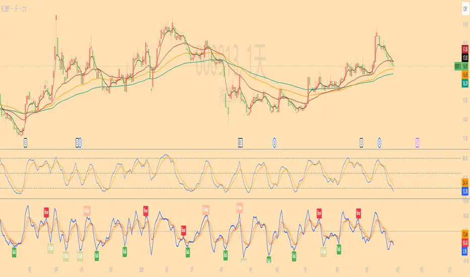
Long-short energy ratio /多空能量比值This indicator calculates the relative strength of bulls and bears by measuring the average candle body movement within a user-defined window (default: 50 bars).
Bull Energy = average percentage change of all bullish candles in the lookback period
Bear Energy = average percentage change of all bearish candles in the lookback period
Energy Ratio = Bull Energy ÷ Bear Energy
The ratio is plotted as a curve around the baseline of 1:
Ratio > 1 → Bull side shows stronger momentum
Ratio < 1 → Bear side shows stronger momentum
Ratio ≈ 1 → Balanced market conditions
This tool helps visualize short-term shifts in buying and selling pressure, offering a simple mean-reversion perspective or a confirmation of trend strength depending on the context.

Specter Trend Cloud [ChartPrime]⯁ OVERVIEW
Specter Trend Cloud is a flexible moving-average–based trend tool that builds a colored “cloud” around market direction and highlights key retest opportunities. Using two adaptive MAs (short vs. long), offset by ATR for volatility adjustment, it shades the background with a gradient cloud that switches color on trend flips. When price pulls back to retest the short MA during an active trend, the script plots diamond markers and extends dotted levels from that retest price. If price later breaks through that level, the extension is terminated—giving traders a clean visual of valid vs. invalid retests.
⯁ KEY FEATURES
Multi-MA Core Engine:
Choose from SMA, EMA, SMMA (RMA), WMA, or VWMA as the base. The indicator tracks both a short-term MA (Length) and a longer twin (2 × Length).
Volatility-Adjusted Offset:
Both MAs are shifted by ATR(200) depending on trend direction—pulling them down in uptrends, up in downtrends—so the cloud reflects realistic breathing room instead of razor-thin bands.
Gradient Trend Cloud:
Between the two shifted MAs, the script fills a shaded region:
• Aqua cloud = bullish trend
• Orange cloud = bearish trend
Gradient intensity increases toward the active edge, providing a visual sense of strength.
Trend Flip Logic:
A flip occurs whenever the short MA crosses above or below the long MA. The cloud instantly changes color and begins tracking the new regime.
Retest Detection:
During an ongoing trend (no flip), if price retests the short MA within a 5-bar “cooldown,” the tool:
• Marks the retest with diamond shapes below/above the bar.
• Draws a dotted horizontal line from the retest price, extending into the future.
Automatic Level Termination:
If price later closes through that dotted level, the line disappears—keeping only active, respected retest levels on your chart.
⯁ HOW IT WORKS (UNDER THE HOOD)
MA Calculations:
ma1 = MA(src, Length), ma2 = MA(src, 2 × Length).
Trend = ma1 > ma2 (bull) or ma1 < ma2 (bear).
ATR shift offsets both ma1 and ma2 by ±ATR depending on trend.
Cloud Fill:
Plots ma1 and ma2 (invisible for long MA). Uses fill() with semi-transparent aqua/orange gradient between the two.
Retest Logic:
• Bullish retest: ta.crossover(low, ma1) while trend = bull.
• Bearish retest: ta.crossunder(high, ma1) while trend = bear.
Only valid if at least 5 bars have passed since last retest.
When triggered, it stores bar index and price, draws diamonds, and extends a dotted line.
Level Clearing:
If current high > retest upper line (bearish case) or low < retest lower line (bullish case), that line is deleted (stops extending).
⯁ USAGE
Use the cloud color as the higher-level trend bias (aqua = long, orange = short).
Look for diamonds + dotted lines as pullback/retest zones where trend continuation may launch.
If a retest level holds and price rebounds, it strengthens confidence in the trend.
If a retest level is broken, treat it as a warning of weakening trend or possible reversal.
Experiment with MA Type (SMA vs. EMA, etc.) to align sensitivity with your asset or timeframe.
Adjust Length for faster flips on low timeframes or smoother signals on higher ones.
⯁ CONCLUSION
Specter Trend Cloud combines trend detection, volatility-adjusted shading, and retest visualization into a single tool. The gradient cloud provides instant clarity on direction, while diamonds and dotted retest levels give you tactical entry/retest zones that self-clean when invalidated. It’s a versatile trend-following and confirmation layer, adaptable across multiple assets and styles.
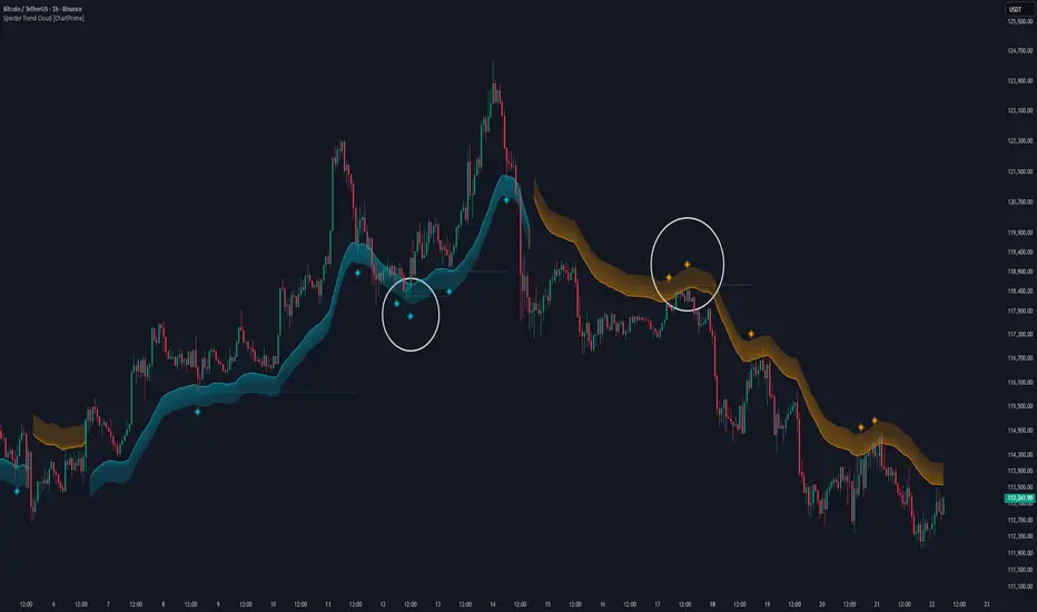
Price Action Trader [BackQuant]Price Action Trader
Introduction
Price Action Trader is an all-in-one, chart-side workflow for reading trend, timing impulses, and mapping high-probability zones the way discretionary traders actually trade. It blends an ensemble trend engine with clean price-action building blocks—Market Structure (BOS/MSB), Fair Value Gaps, Order Blocks, and Volumetric Support/Resistance—so you can form a bias, find confluence, and execute with context.
What is it
A modular “price-action stack” that:
Paints trend bias and impulse shifts on the chart (optional candle coloring).
Auto-annotates internal & swing structure (BOS / MSB).
Finds FVGs on your chosen timeframe and draws them cleanly.
Detects Order Blocks (with optional FVG confirmation).
Builds volumetric S/R levels that adapt to liquidity.
Emits alerts for key events (new levels, touches, breaks, OB creation/touch).
Everything is configurable—keep it minimal (trend + a few zones) or run the full toolkit.
What’s it used for
Bias first, trade second: establish direction/conviction, then execute where structure, gaps, blocks, and volume agree.
Timing: impulse flips and level touches provide actionable triggers.
Risk placement: OB edges, FVG midlines, and volumetric bands give logical stop/target references.
Review & journaling: optional session shading and labeled structures make post-trade notes simple.
Composite Trend Model
A lightweight signal line (default: 30-period) that turns green when the composite regime is bullish and red when bearish. Under the hood, multiple cues (adaptive momentum, de-noised oscillation, volatility-aware filters) are blended into a single directional score; when thresholds flip, the line recolors and optional Long/Short dots appear.
How to use
Treat the line as your bias rail : favor longs while green, shorts while red.
Flat/rapid flips = stand down or reduce size.
Prefer clean charts? Keep only the line and (optionally) trend-painted candles.
Inputs to know
Show Trend Signal Line / Width.
Paint Candles by Trend.
Long/Bearish color controls.
Impulse Model
Highlights short-term pressure shifts with optional impulse candle coloring and ▲/▼ markers. Great for entries in the prevailing trend and for early warnings when impulses fire against bias.
How to use
Up-bias: look for the next impulse-up near structure/FVG/OB or volumetric support.
Down-bias: mirror the logic.
Frequent counter-impulses → expect chop or regime change.
Inputs to know
Show Impulse Signals.
Paint Impulse Candles.
Market Structure
Automatic Internal (tight lookback) and Swing (wider lookback) structure with BOS and MSB (CHoCH) labels. You decide what to show—All, BOS only, MSB only—independently for internal vs swing.
How to use
Use Swing labels for the primary map; Internal for entry refinement.
After a bullish MSB , seek the first HL back into support/FVG/OB.
After a bearish BOS , favor LH fades into resistance/FVG/OB.
Inputs to know
Swing Lookback / Internal Lookback.
Swing/Internal Structure: All | BOS | MSB | None .
Separate bull/bear color controls for both layers.
Fair Value Gaps
Detects bullish/bearish FVGs on the current or higher TF, draws boxes, and can extend them forward. Midlines provide quick visual targeting.
How to use
In-trend fills: in an up-bias, tags of bullish FVGs often offer high-quality continuation entries, especially with structure/OB confluence.
Failed fills: rejections at the midline can signal emerging strength/weakness.
Inputs to know
Show FVG / Show Last N / Extend.
Timeframe (blank = chart TF; set higher TF for macro FVGs).
Bull/Bear colors (tune opacity to taste).
Volumetric Support and Resistance
Builds adaptive S/R from price interaction + relative volume over a rolling lookback. Levels store touch counts; you can show volume stats on labels or inside boxes. Transparency and border thickness can scale with volume so stronger levels are visually louder. Broken levels can auto-remove.
How to use
Use as confluence with structure, OBs, and FVGs. A long at volumetric support + Bull OB + FVG midline is qualitatively different from a naked level.
If a level breaks on strong volume, stop fading—flip expectations or wait for a clean retest.
Inputs to know
Detection Sensitivity / Volume Multiplier.
Analysis Period / Max Levels / Min Distance (%).
Remove Broken / Extend Right / Show Volume Info / Text Inside.
Support/Resistance colors (+ high-vol variants).
Alerts
New Support/Resistance Level Created.
Level Touch.
Level Break.
Order Blocks
Detects bullish/bearish OBs using configurable fractals (3- or 5-bar) with a break confirmation (by Close or High/Low). Optional FVG proximity filter, right-extension, and auto-delete when filled.
How to use
Bullish bias: stalk pullbacks into fresh Bull OBs aligned with a bullish FVG or volumetric support.
If price fills an opposing OB and fails to continue, reassess bias—context may be shifting.
Inputs to know
Fractal Type & Break Method (Close / HL).
Filter with FVG + Max FVG Distance.
Extend Blocks / Delete When Filled / Show Labels.
Alerts
New Order Block Created.
Order Block Touch.
Final Notes
Suggested workflow
Start with Composite Trend (bias).
Mark Swing structure in that direction.
Wait for an Impulse in-direction near an OB / FVG / Volumetric level.
Risk = nearest opposite level or OB edge; targets = FVG midlines / next S/R.
Timeframes & assets
Defaults suit liquid intraday and 1–4H swing.
Slower markets → lengthen lookbacks, lower sensitivity.
Very noisy crypto → keep trend visible, trim drawings (e.g., MSB only, last 3–5 FVGs, 8–12 volume levels).
Keep it readable
Turn off modules you don’t need today—fewer, higher-quality signals beat clutter.
About this release
Internal scoring, smoothing, and detection logic are proprietary. Behavior is controlled via inputs described above.
Trade with a plan, test your settings, and let confluence do the heavy lifting.
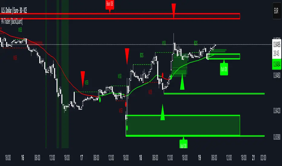
Navigator Range Pro+Title Navigator Range Pro+
What it is Navigator Range Pro+ is a confluence-first indicator that blends multi-timeframe (MTF) trend bias with a Dealing Range (DR) framework. It helps you quickly see when higher timeframes align and pairs that bias with clean breakout triggers from a current range. Designed to reduce noise and keep charts readable.
What you’ll see
Dealing Range: Auto-detected range top/bottom with a midline. Choose Stuck (pivot-based, fixed) or Dynamic (rolling highest/lowest) modes.
MTF Bias: Higher timeframe trend bias derived from a selectable moving average (SMA/EMA).
Compact Info Panel (table): A configurable on-chart panel that summarizes each higher timeframe’s bias, optional lower-timeframe analog labels, and a confluence tally. You can position it, resize text, and set columns/rows to fit your layout.
Clean Charting: Flip labels are optional and default to off, so alerts can fire without covering price action.
How it works
Bias engine: Computes bullish/bearish bias for each selected higher timeframe using your chosen MA length/type, then aggregates them into a confluence count.
DR engine: Finds or follows the current trading range and calculates a midline reference for signals or context.
Signals: You can use pure confluence, pure DR breakouts, or a combined “Bias + DR” confirmation for higher-quality entries.
Inputs to know
HTF Ranges (comma separated): Higher timeframes to assess (e.g., W,D,240,60,15).
MA Length/Type: Controls the bias engine’s sensitivity.
DR Mode: Stuck (pivot-based, fixed until a new pivot confirms) or Dynamic (rolling high/low by lookback).
Swing Length / Dynamic Lookback / Extend Right: Shape how the range is found and displayed.
Panel Position / Text Size / Panel Columns / Panel Rows: Customize the on-chart table.
Alerts: Min HTFs to align and Strict alignment (no opposite) to refine confluence.
Show Flip Labels on Chart: Optional visual flip labels; alerts are unaffected if kept off.
Alert conditions
Multi-TF Confluence Bullish: Minimum number of HTFs are bullish (optionally strict).
Multi-TF Confluence Bearish: Minimum number of HTFs are bearish (optionally strict).
DR Breakout Up: Close crosses above DR top.
DR Breakout Down: Close crosses below DR bottom.
Bias + DR Combo Bullish: Bullish confluence and price above your DR threshold (Midline or Top/Bottom).
Bias + DR Combo Bearish: Bearish confluence and price below your DR threshold (Midline or Top/Bottom).
Tips
For live trading, “Once per bar close” alerts are the safest and most consistent.
Increase the Min HTFs to align to reduce noise; switch Combo Threshold to Top/Bottom for fewer, stronger momentum entries.
Keep flip labels off to maintain a clean chart (alerts still fire).
Disclaimer This script is for educational and informational purposes only and does not constitute financial, investment, or trading advice. Trading involves risk, including the risk of loss. You are solely responsible for your own trading decisions. Past performance does not guarantee future results. Always test on a demo and consult a licensed professional where appropriate.
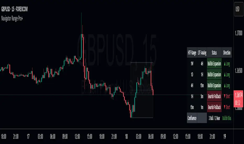
CandelaCharts - Projections 📝 Overview
Projections turns a hand-picked swing window into clean, forward price levels. You pick a time range and an anchor (wick or body); the tool finds that window’s reference extremes (Level 0 & Level 1) and then projects directional extensions (e.g., −1, −2, −2.5, −4) in the chosen bias (Auto / Bullish / Bearish). It draws flat lines across the chart with optional labels so you can plan targets, fade zones, or continuation levels at a glance.
📦 Features
This section highlights the core capabilities you’ll rely on most.
Window-based engine — Define a start/end time; the script records open/high/low/close inside that window and builds levels from those extremes.
Two anchor styles — Project from Wick extremes (Hi/Lo) or Body extremes (max/min of OHLC at the high/low bars).
Directional bias — Auto (up if net up; doji resolves by wick dominance), or force Bullish/Bearish for one-sided extensions.
Default & Custom levels — Toggle pre-sets (−1/−2/−2.5/−4) or enter your own comma-separated list (decimals supported).
Readable drawings — Per-level colors (defaults) or unified bull/bear color (custom), with label size, line style, and width controls.
⚙️ Settings
Use these controls to define the window, pick the projection style, and customize the visuals.
Settings (Core)
From / To — Start and end timestamps of the capture window (everything is computed from this segment).
Bias — Auto / Bullish / Bearish. Guides which way negative levels extend (up for bull, down for bear).
Anchor — Wick uses Hi/Lo; Body uses the body extremes at the high/low bars.
Levels
Levels = Default — Enable any of −1, −2, −2.5, −4 and set each color.
Levels = Custom — Provide your own list (e.g., “−0.5, −1, −1.5, −3”) and pick Bullish/Bearish colors. (Custom uses one color per side.)
Style
Labels — Show/Hide the numeric level tag at the line’s right edge; choose label size.
Lines — Pick solid/dashed/dotted and line width.
⚡️ Showcase
Bearish Projection
Bullish Projection
📒 Usage
Follow these steps to set the window, generate levels, and turn them into a trade plan.
1) Mark the window — Set From/To around the swing you want to project (e.g., prior day, news impulse, weekly move).
2) Choose bias — Auto adapts; or lock Bullish/Bearish if you only want upside or downside projections.
3) Pick anchor — Wick = raw extremes; Body = more conservative reference. Body helps when single-print wicks distort levels.
4) Select levels — Toggle defaults or add a custom list. Negative values (−1, −2, …) extend beyond the reference extreme in the bias direction. (Level 0 and 1 are always drawn as the reference pair.)
5) Style it — Turn labels on, adjust size, and set line style/width for visibility on your timeframe.
6) Trade plan — Treat projections as reaction/continuation zones: scale out into −1/−2/−2.5, watch for fades back into the band, or ride continuation when price accepts beyond a level.
🚨 Alerts
There are no built-in alerts in this version.
⚠️ Disclaimer
Trading involves significant risk, and many participants may incur losses. The content on this site is not intended as financial advice and should not be interpreted as such. Decisions to buy, sell, hold, or trade securities, commodities, or other financial instruments carry inherent risks and are best made with guidance from qualified financial professionals. Past performance is not indicative of future results.

Trapper Magnifying Glass - Bar Decomposer — Last Visible BarHeadline
Decompose any higher-timeframe bar into lower-timeframe candles directly on the chart. Zoom/pan reactive, session-accurate, auto-fit inset, and compliant with TradingView placement limits.
Quick Start
Add the indicator and choose a Child TF (minutes) (e.g., 1, 5, 10, 15).
The inset follows the last visible bar on your screen. Adjust Right separation / Mini width / Gap / Vertical exaggeration as needed.
Leave Show HUD label OFF by default. Turn it on only if you want a compact readout.
Overview
This tool draws a miniature, on-chart inset of lower-timeframe candles that make up the currently viewed higher-timeframe bar. It stays on the main price chart (not in a separate pane), respects zoom/pan, compresses itself to fit available space, and adheres to TradingView’s 500-bar object placement limit.
The design goal is micro-structure inspection without changing the chart timeframe.
What Makes It Different
On-chart inset (not a separate indicator panel) for true visual context.
Zoom/Pan reactive to the last visible bar — works naturally as you navigate.
Auto-fit logic keeps the inset readable while staying inside TradingView’s future-bars limit.
Session-accurate decomposition: uses TradingView’s own lower-timeframe OHLC, exactly within the parent bar’s time window.
Strictly compliant: no synthetic bars, no repaint tricks, no lookahead.
How It Works
Child data is fetched with request.security_lower_tf(syminfo.tickerid, , open/high/low/close).
Only closed lower-TF bars inside the parent bar’s time window are returned by TradingView.
The script maps each child bar to an inset candle (body + wick) scaled to the parent bar’s price range and placed to the right of the parent’s position.
The inset tracks the last visible bar so it always stays relevant to what you’re inspecting.
Inputs (Defaults)
Timeframes
Child TF (minutes): 1 (min 1, max 1440)
Layout
Right separation (bars): 10
Mini candle width (bars): 2
Gap between mini candles (bars): 0
Vertical exaggeration ×: 1.6
Auto-Fit
Auto-fit inset width: ON
Max bars ahead to use: 120
Minimum mini width: 1
Minimum gap: 0
Style
Bull/Bear colors: ON
Body Bull / Body Bear / Wick Bull / Wick Bear: configurable
Body Fill Opacity (0–100): 12
Outline color: dark grey
Outline width: 1
Wick width: 2
HUD
Show HUD label: OFF (recommended default; enable only when you need a summary)
Session Behavior (Important)
TradingView constructs bars strictly by exchange sessions. For US equities (regular session 09:30–16:00, 390 minutes):
On a 1h chart you will see 7 bars per day:
09:30–10:00 (30 minutes)
10:00–11:00, 11:00–12:00, 12:00–13:00, 13:00–14:00, 14:00–15:00 (five full hours)
15:00–16:00 (full hour)
Decomposing the 09:30–10:00 bar into 1m returns 30 minis (not 60).
Decomposing 10:00–11:00 returns 60 minis, as expected.
The last hour (15:00–16:00) decomposes to 60 minis once they exist (i.e., immediately after each child bar closes). If you are mid-session, you will see only the minis that have closed so far.
This is by design and ensures the inset reflects the true lower-timeframe structure TradingView has for that exact bar window. Nothing is synthesized.
Live vs Confirmed Bars
Confirmed bars (historical) always decompose to a full, correct count of child minis for that parent window.
Live bars (currently forming) only return child minis that have already closed. Mid-hour on a 1h chart with 10m children, you might see 3, 4, or 5 minis depending on elapsed time.
This script’s default experience focuses on the last visible bar and displays whatever the platform provides at that moment. The HUD (when enabled) includes the parent bar duration in minutes to make short session bars explicit.
Auto-Fit and Placement Limits
TradingView prevents drawing objects beyond 500 bars into the future. The inset’s right edge is automatically clamped to stay within that boundary. If the requested number of minis would overflow the allowed space, the script proportionally compresses mini width/gap (down to your configured minimums). If necessary, it draws only as many minis as safely fit — favoring stability over clutter.
Styling Tips
For dense decompositions (e.g., 1m inside 1h), set:
Mini width = 1, Gap = 0, Auto-fit = ON, Right separation = 7–12.
Increase Vertical exaggeration to highlight wick-to-body differences when the parent bar is narrow.
Keep HUD OFF for publishing and screenshots unless you’re highlighting counts or session duration.
Notes & Limitations
Child arrays show closed bars only. No forming mini is displayed to avoid misleading totals.
If you reload a chart or switch symbols/timeframes, the most recent confirmed bar’s arrays may be empty on the very first calculation frame; the script guards against this and will draw on the next update.
The tool is an overlay visualization, not a signal generator; there are no alerts or trading advice.
Performance: heavy decompositions on very fast symbols/timeframes can add many objects. Auto-fit and minimal widths help.
Compliance
Uses only native TradingView data (request.security_lower_tf).
No repainting and no lookahead.
No external feeds, synthetic candles, or hidden calculations that would misrepresent the underlying data.
Fully respects TradingView’s object placement constraints.
Recommended Defaults (for broad usability)
Child TF: 5 or 15 (depending on your HTF).
Right separation: 7–12
Mini width / Gap: 2 / 0 for clarity, 1 / 0 for dense fits.
Auto-fit: ON
HUD: OFF
Troubleshooting
“Why aren’t there 60 one-minute minis in this 1h bar?”
Either the parent bar is a session-short bar (09:30–10:00 = 30 minutes) or you are viewing a live bar mid-hour; only closed minis appear.
Inset clipped or not visible to the right:
Increase Max bars ahead to use (Auto-Fit group), reduce Mini width/Gap, or reduce Right separation.
Nothing draws on first load:
Wait for the next bar update, or navigate the chart so the last visible bar changes; arrays refresh as data becomes available.
Change Log
v1.0 – Initial public release.
On-chart inset, zoom/pan reactive, auto-fit width.
Session-accurate lower-TF decomposition.
HUD label toggle (off by default) with child TF, bar count, and parent duration.
Hardened array handling for confirmed snapshots.
Disclaimer
This script is provided strictly for educational and informational purposes only.
It does not constitute financial advice, investment advice, trading signals, or a recommendation to buy or sell any security, asset, or instrument. Trading and investing involve risk; always do your own research and consult with a licensed financial professional before making decisions.