Swiss Knife [MERT]Introduction
The Swiss Knife indicator is a comprehensive trading tool designed to provide a multi-dimensional analysis of the market. By integrating a wide array of technical indicators across multiple timeframes, it offers traders a holistic view of market sentiment, momentum, and potential reversal points. This indicator is particularly useful for traders looking to combine trend analysis, momentum indicators, volume data, and price action into a single, easy-to-read format.
---
Key Features
Multi-Timeframe Analysis : Evaluates indicators on Daily , 4-Hour , 1-Hour , and 15-Minute timeframes.
Comprehensive Indicator Suite : Incorporates MACD , Awesome Oscillator (AO) , Parabolic SAR , SuperTrend , DPO , RSI , Stochastic Oscillator , Bollinger Bands , Ichimoku Cloud , Chande Momentum Oscillator (CMO) , Donchian Channels , ADX , volume-based momentum indicators, Fractals , and divergence detection.
Market Sentiment Scoring : Aggregates signals from multiple indicators to provide an overall sentiment score.
Visual Aids : Displays EMA lines, trendlines, divergence signals, and a sentiment table directly on the chart.
Super Trend Reversal Signals : Identifies potential market reversal points by assessing the momentum of automated trading bots.
---
Explanation of Each Indicator
Moving Average Convergence Divergence (MACD)
- Purpose : Measures the relationship between two moving averages of price.
- Interpretation : A positive histogram suggests bullish momentum; a negative histogram indicates bearish momentum.
Awesome Oscillator (AO)
- Purpose : Gauges market momentum by comparing recent market movements to historic ones.
- Interpretation : Above zero indicates bullish momentum; below zero indicates bearish momentum.
Parabolic SAR (SAR)
- Purpose : Identifies potential reversal points in price direction.
- Interpretation : Dots below price suggest an uptrend; dots above price suggest a downtrend.
SuperTrend
- Purpose : Determines the prevailing market trend.
- Interpretation : Provides buy or sell signals based on price movements relative to the SuperTrend line.
Detrended Price Oscillator (DPO)
- Purpose : Removes trend from price to identify cycles.
- Interpretation : Values above zero suggest price is above the moving average; values below zero indicate it is below.
Relative Strength Index (RSI)
- Purpose : Measures the speed and change of price movements.
- Interpretation : Values above 50 indicate bullish momentum; values below 50 indicate bearish momentum.
Stochastic Oscillator
- Purpose : Compares a particular closing price to a range of its prices over a certain period.
- Interpretation : Values above 50 indicate bullish conditions; values below 50 indicate bearish conditions.
Bollinger Bands (BB)
- Purpose : Measures market volatility and provides relative price levels.
- Interpretation : Price above the middle band suggests bullishness; below the middle band suggests bearishness.
Ichimoku Cloud
- Purpose : Provides support and resistance levels, trend direction, and momentum.
- Interpretation : Bullish signals when price is above the cloud; bearish signals when price is below the cloud.
Chande Momentum Oscillator (CMO)
- Purpose : Measures momentum on both up and down days.
- Interpretation : Values above 50 indicate strong upward momentum; values below -50 indicate strong downward momentum.
Donchian Channels
- Purpose : Identifies volatility and potential breakouts.
- Interpretation : Price above the upper band suggests bullish breakout; below the lower band suggests bearish breakout.
Average Directional Index (ADX)
- Purpose : Measures the strength of a trend.
- Interpretation : DI+ above DI- indicates bullish trend; DI- above DI+ indicates bearish trend.
Volume Momentum Indicators (VolMom, CumVolMom, POCMom)
- Purpose : Analyze volume to assess buying and selling pressure.
- Interpretation : Positive values suggest bullish volume momentum; negative values indicate bearish volume momentum.
Fractals
- Purpose : Identify potential reversal points in the market.
- Interpretation : Up fractals may indicate a future downtrend; down fractals may indicate a future uptrend.
Divergence Detection
- Purpose : Identifies divergences between price and various indicators (RSI, MACD, Stochastic, OBV, MFI, A/D Line).
- Interpretation : Bullish divergences suggest potential upward reversal; bearish divergences suggest potential downward reversal.
- Note : This functionality utilizes the library from Divergence Indicator .
---
Coloring Scheme
Background Color
- Purpose : Reflects the overall market sentiment by combining sentiment scores from all indicators across different timeframes.
- Interpretation :
- Green Shades : Indicate bullish market sentiment.
- Red Shades : Indicate bearish market sentiment.
- Intensity : The strength of the color corresponds to the strength of the sentiment score.
Sentiment Table
- Purpose : Displays the status of each indicator across different timeframes.
- Interpretation :
- Green Cell : The indicator suggests a bullish signal.
- Red Cell : The indicator suggests a bearish signal.
- Percentage Score : Indicates the overall bullish or bearish sentiment on that timeframe.
Exponential Moving Averages (EMAs)
- Purpose : Provide dynamic support and resistance levels.
- Colors :
- EMA 10 : Lime
- EMA 20 : Yellow
- EMA 50 : Orange
- EMA 100 : Red
- EMA 200 : Purple
Trendlines
- Purpose : Visual representation of support and resistance levels based on pivot points.
- Interpretation :
- Upward Trendlines : Colored green , indicating support levels.
- Downward Trendlines : Colored red , indicating resistance levels.
- Note : Trendlines are drawn using the library from Simple Trendlines .
---
Utility of Market Sentiment
The indicator aggregates signals from multiple technical indicators across various timeframes to compute an overall market sentiment score . This comprehensive approach helps traders understand the prevailing market conditions by:
Confirming Trends : Multiple indicators pointing in the same direction can confirm the strength of a trend.
Identifying Reversals : Divergences and fractals can signal potential turning points.
Timeframe Alignment : Aligning signals across different timeframes can enhance the probability of successful trades.
---
Divergences
Divergence occurs when the price of an asset moves in the opposite direction of a technical indicator, suggesting a potential reversal.
- Bullish Divergence : Price makes a lower low, but the indicator makes a higher low.
- Bearish Divergence : Price makes a higher high, but the indicator makes a lower high.
The indicator detects divergences for:
RSI
MACD
Stochastic Oscillator
On-Balance Volume (OBV)
Money Flow Index (MFI)
Accumulation/Distribution Line (A/D Line)
By identifying these divergences, traders can spot early signs of trend reversals and adjust their strategies accordingly.
---
Trendlines
Trendlines are essential tools for identifying support and resistance levels. The indicator automatically draws trendlines based on pivot points:
- Upward Trendlines (Support) : Connect higher lows, indicating an uptrend.
- Downward Trendlines (Resistance) : Connect lower highs, indicating a downtrend.
These trendlines help traders visualize the trend direction and potential breakout or reversal points.
---
Super Trend Reversals (ST Reversal)
The core idea behind the Super Trend Reversals indicator is to assess the momentum of automated trading bots (often referred to as 'Supertrend bots') that enter the market during critical turning points. Specifically, the indicator is tuned to identify when the market is nearing bottoms or peaks, just before it shifts direction based on the triggered Supertrend signals. This approach helps traders:
Engage Early : Enter the market as reversal momentum builds up.
Optimize Entries and Exits : Enter under favorable conditions and exit before momentum wanes.
By capturing these reversal points, traders can enhance their trading performance.
---
Conclusion
The Swiss Knife indicator serves as a versatile tool that combines multiple technical analysis methods into a single, comprehensive indicator. By assessing various aspects of the market—including trend direction, momentum, volume, and price action—it provides traders with valuable insights to make informed trading decisions.
---
Citations
- Divergence Detection Library : Divergence Indicator by DevLucem
- Trendline Drawing Library : Simple Trendlines by HoanGhetti
---
Note : This indicator is intended for informational purposes and should be used in conjunction with other analysis techniques. Always perform due diligence before making trading decisions.
---
在腳本中搜尋"bot"

Super Trend ReversalsMain Concept
The core idea behind the Super Trend Reversals indicator is to assess the momentum of automated trading bots (often referred to as 'Supertrend bots') that enter the market during critical turning points. Specifically, the indicator is tuned to identify when the market is nearing bottoms or peaks, but just before it shifts direction based on the triggered Supertrend signals. This approach helps traders engage with the market right as the reversal momentum builds up, allowing for entry just as conditions become favorable and exit before momentum wanes.
How It Works
The Super Trend Reversals uses multiple Supertrend calculations, each with different period and multiplier settings, to form a comprehensive view of the trend. The total trend score from these calculations is then analyzed using the Relative Strength Index (RSI) and Exponential Moving Averages (EMA) to gauge the strength and sustainability of the trend.
A key feature of this indicator is the isCurrentRangeSmaller() function, which evaluates if the current price range is lower than the average over the recent period. This function is critical as it helps determine the stability of the market environment, reducing the likelihood of entering or exiting trades based on erratic price movements that could lead to false signals.

G.O.A.T. Scalper Diagnostics v1OVERVIEW:
The G.O.A.T. Scalper Diagnostics indicator system enables users to discover unorthodox indicator patterns, reading price charts in unusual ways, thus gaining an edge over the majority of market participants they trade against.
CONCEPTS:
Th G.O.A.T. Scalper Diagnostics is a system that aims to satisfy the fundamental condition for successful online trading - providing an edge.
It's a battle between advantages. To take other people's money, successful traders must have an advantage over everybody else. To hope for consistent success in trading, you need to do things differently and see what almost nobody else sees. Of course then you must act on it, and that's where the G.O.A.T. Scalper Diagnostic's mandate ends.
I believe the vast majority of indicators out there show you what everybody else sees. I've always been an indicator guy, I respect and cherish most indicators and I know a good indicator when I see it.
However, although most indicators are great works of art, their practicality is in most cases doubtful. Presenting great information is one thing, but providing an edge over the people you trade against is something different.
What Everybody Else Sees
The G.O.A.T. Scalper Diagnostics is based on indicators most of you have probably heard of and used:
Moving Averages (particularly the Kaufman Moving Average, among others)
ADX and DI
Bollinger Bands
Stochastic (particularly the Stochastic RSI)
Most traders should be well familiar with these classic indicators, they've provided the basis for online indicator trading for decades. But it's also true that due to how popular online trading has become all over the world, one is more and more unable to use these indicators successfully on lower timeframes.
Usually, more noteworthy success is achieved by going up in scale and discovering the timeframe where a particular indicator produces no false signals. Often times these timeframes range from bi-weekly to multi-month scale. In other words, consistently successful low timeframe trading and scalp trading in particular are now almost impossible using indicators.
Traders that dominate the scalping arena are big professional/institutional groups of traders, who have systematic access to the order books of most exchanges. This can be achieved one way or another, but not by individuals, small groups without significant capital or simply traders who lack political/social power and influence in the trading field.
In other words - giant order book traders have an edge over everybody else, who use indicators to trade on lower timeframes.
Through a series of interventions into these classical indicators, the G.O.A.T. System brings them back into the lower timeframe competitive game. Most original formulas are preserved, but these immortal classics are applied in ways popular TA would consider unorthodox.
Ingenious Indicators Built by Creators
The G.O.A.T. Scalper Diagnostics relies on the fundamental work of others. The System is developed on the basis of:
Quadratic Kernel Regression - it uses the publicly published library of Justin Dehorty: www.tradingview.com
PMARP - Price Moving Average Ratio & Percentile, publicly published by "The_Caretaker": www.tradingview.com
These Creators deserve full credit for their fundamental work and are endorsed by the G.O.A.T. Scalper Diagnostics project.
And yet... ingenious and inspired as these tools are, in my humble opinion the general public is presented with a rather unproductive way to apply them. In my own view, these wonderful tools built by JDehorty and The_Caretaker have a massive potential should they be applied and wielded in a different direction. So I tried to bring my vision about them into flesh with the G.O.A.T. Diagnostics.
What the G.O.A.T. Scalper Diagnostics Is and How to Use It
It's a System for new pattern discovery, bringing the disciplines of pattern and indicator trading together.
By using it as a stand-alone, or mixing it with other great indicators, one is able to discover new indicator patterns. Patterns can be compared, matched together and categorized. By applying statistics to differentiated historical pattern groups, we're able to derive their meaning.
Thus, the trader is able to research their own "alphabet" to read the price charts. After categorizing and differentiating pattern groups with statistically predominant meaning, the trader is then able to read into longer scenarios - price set-ups that are harder to detect due to them being stretched in time or misshapen according to the particular situation.
The G.O.A.T. Scalper leverages and encourages group trading, as different traders will probably discover different price "alphabets" for themselves, potentially giving rise to a social economy of sharing and combining "trading languages" based on indicator patterns people have discovered via the G.O.A.T. Diagnostics.
Support/Resistance Trading
The G.O.A.T. Scalper has its own way of deriving Support/Resistance.
Unlike most existing S/R indicators, The Scalper derives Support/Resistance not by measuring price highs, lows and closes, but solely by using momentum and trend strength.
This seems like a much more versatile way to plot S/R during scalping on low timeframes where time is of essence and the trader's view is too narrow to have macro S/R levels in constant consideration.
The Scalper's way to derive S/R in real time and on the go, while staying very relative to important higher timeframe S/R zones, makes it much more desirable than any other S/R indicator I've thus far encountered.
All S/R functionality is derived from the classical ADX and DI indicator. To do this, I use the ADX and DI in an unpopular way. To generate the actual plot of S/R levels I also modify the indicator's code, not by removing functional parts from it, but adding more to it in order to filter the signals it produces.
I can metaphorically describe its action in the following way:
Imagine you're Price action itself;
You're walking through a labyrinth or corridors. You're walking through one straight corridor, and it has a crossing with another corridor ahead;
Very strong wind is blowing along that other corridor. You can't see the wind, but when you reach it and try to move past it, the force of the wind resists your moving ahead and instead pushes you sideways.
At this point, the G.O.A.T. Diagnostics already knows this can only be one thing - resistance.
Orthodox TA and trading demand retests. In my opinion, this deeply rooted tradition wastes time proving the obvious, then wastes time again double-proving the validity of recent past, while scalping opportunities go to waste. Modern successful traders are way ahead of the popular strategy of testing and retesting S/R that almost every trader uses. So-called "Stops hunting" is just one expression of this situation, where wide adoption of the S/R retesting strategy actually lures unsuccessful traders into the schemes of the successful few.
In my own way of trading, I use the G.O.A.T. Diagnostics to take action on Support/Resistance as it's plotted in real time.
But probably my biggest heresy into the DI is my opinion, that the crossings of the +DI and -DI are useless and should actually be discarded.
My research shows that the DIs often show indications of being "oversold", but don't seem to exhibit an "overbought" state. Statistically, I've had much more success basing my TA on that, rather than cross-ups and cross-downs of the DI plot lines.
Therefore I discarded these crossings by presenting the DI part of the ADX and DI as a Heatmap channel rather than crossing lines.
To further enhance the ability of the System to provide S/R analysis, I plot this Heatmap onto an adjustable price offset plots (a percentage above and below current price).
In modern times, the vast majority of trading is done by automatic machines and algorithms. To give a specific example, one can easily notice, that a 5% offset of the BTC 1h price plot leads to remarkably accurate S/R charting. Following the rule to chart a S/R line connecting highs and lows on the 5% price offset often successfully "foresees" valid S/R zones before price ever visits them. Or, the levels were visited so far back in the timeframe's history that orthodox understanding considers them "invalidated" or washed away in the noise of the relevant volume profile.
My explanation for this is simple - I think Grid bots now dominate automatic trading across the majority of exchanges.
In my understanding, by adjusting the percentage offset of current price action I can often discover relevant conglomerations of dominating Grid bot cell parameters and anticipate price reaction. By plotting the DI heatmap on these price action offsets I can use the indicator for my trading decisions.
Heatmaps
Every heatmap produces different series of data. They're not the same.
Bollinger Band heatmap depicts the percentile distance between the Band's extremes.
The price candles heatmap, and the KAMA moving average heatmap, depict the percentile distance between price and the KAMA. So, it's the same thing. However, the percentile of that distance is calculated in two different ways, hence the difference in color in every particular moment. This color discrepancy aims to visualize the "strain" between price action and KAMA, like a soft and hard "springs" that go in unison with each other in sustainable moves, and in dissonance with each other during unsustainable moves.
Price offset heatmap depicts the percentile average of the +DI (above price) and the -DI (below price). A Hot temperature above price and a Cold temperature below price would mean a strong bullish sentiment, and vise versa, while Green would mean neutrality in sentiment.
There are important interplays between different heatmaps. For example, although representing totally different things, a Teal price bar would almost always (according to historical statistics) foreshadow a change in DI's heatmap sentiment. That's just one avenue of correlation between S/R analysis and sentiment analysis using the G.O.A.T. Diagnostics.
Oscillator Chart
In terms of applying Quadratic Kernel Regression, I endorse the natural principle that no center can exist without a periphery, and no periphery can exist without a center. Therefore I try to pay attention not only to the average of the regression's values, but also to the cloud of data points itself.
Following this understanding, I attempt to depict the natural cycles of price converging/diverging towards/from its regression average. To do this, I apply the classic Stochastic formula.
Thus, the Oscillator part of the System depicts the following:
Thin heatmap line displays the cycles of price converging with its quadratic kernel regression average (moving down), and diverging with its regression average (moving up). Its heatmap depicts the percentile of this oscillation.
The wider heatmap line displays the KAMA's cycles of convergence/divergence with its own quadratic kernel regression average. The reason for this is again creating discrepancy - while KAMA is based on price action, its regression data values differ from those of price action's regression. This discrepancy produces useful historic patterns that can be studied statistically.
The thin and wide purple oscillator lines depict the change of slope of price action regression average and KAMA regression average, respectively. Very often change of slope is not detectable with the naked eye, but clearly indicated by the oscillators.
By combining all these elements into a single analysis, a trader can detect hidden trends that are yet to become visible for the rest of market participants.
For example, convergence of price with its quadratic kernel regression average while the slope of the average deteriorates down in most cases (according to statistics) means a sideways consolidation in a downtrend before downtrend continuation. Conversely, deviation of price action from its regression average while the regression average slope deteriorates down usually marks the very beginning of a downtrend.
Bollinger Bands
Bollinger Bands are not modified, but are based on quadratic kernel regression values. Thus, if Bollinger Bands themselves are indicative of volatility, then based on kernel regression values, they should indicate the volatility of change of values in the regression's window.
Again, applying it to both the price and KAMA regression data series, a discrepancy is highlighted that leads to useful historical patterns subject to analysis and categorization.
SOME EXAMPLES
Support / Resistance
Support/Resistance levels are market by White Triangles with dotted lines plotted from them, in real time. The indicator plots Ghost Triangles in anticipation of Support/Resistance, preparing the trader for the eventual confirmation of a zone of interest and signaling price is feeling Support or Resistance pressure.
Dialing the length of the S/R lines to 25 makes the indicator more useful.
Dialing the setting to 500 clearly shows macro S/R zones by conglomerating and bundling individual lines. The thicker the bundling and the confluence of lines, the more significant the zone.
Thus lower timeframe scalping and trading is made more easy, without the need to do nearly as much manual S/R charting. Support/Resistance analysis and plotting is entirely based on a modified ADX.
Heatmap
Sustainable moves are generally marked by Green price color and calm KAMA colors.
Unsustainable moves are usually marked by more extreme colors of price bars and KAMA. Red usually means price is unsustainably distanced from the KAMA, while deep Blue usually means price is undesirably close to the KAMA, foreshadowing a directional distancing.
Usually Teal color of price bars and KAMA foreshadow a change of sentiment of the outside Heatmap sentiment channel.
Red color of the outside channel always signals the direction of the desired sentimental movement, while Blue signals the extent at which the counter-element suffers. Thus, one side being Green, while the other is Blue, often means the Blue will soon evolve into a warmer color, attracting price in that direction. Outside Heatmap channel is entirely based on a modified DI.
Oscillator Chart
An example of Chart Diagnosis using the Oscillator and other elements of the G.O.A.T. Scalper:
First (far left), a Resistance is plotted. This coincides with price bars being Red (distressed state). The thin colorful Oscillator line takes an Up-turn, signifying a period of price moving away from its Quadratic Kernel Regression (pink moving average).
After Price cools down to Green sustainable colors, a Support is plotted. During this time, the thin colorful line is falling down, signifying a period when the distance between price action and its quadratic kernel regression average is decreasing.
During this phase, the thin purple Oscillator line goes up. This signifies the slope of the price regression is restoring to the upside.
Next, the thin colorful line starts going up again, signifying another period of price getting further away from its regression average. This time to the upside.
Resistance is being broken and new support is established. At this point, the thin colorful line starts falling again, signifying distance between price and its regression MA is shortening. This is clearly visible as a sideways consolidation (with a slight tilt up of slope).
A moment comes when all lines - the price and KAMA lines, and price and KAMA regression slopes, all point down. A new down period is clearly starting. This is further indicated by Teal price bars and new Resistance forming. Notice how the external heatmap channel goes into more balanced Green colors with trend enthusiasm calming down.
This analysis may appear to be overwhelming and confusing at first, as these metrics are unorthodox and unpopular. But different aspects of the indicator can be toggled ON/OFF to single them out, which makes observations much simpler for new users. After some time spent discovering personal patterns, or reviewing other users' catalogues with already published pattern libraries, it soon becomes easy to read charts in this new way.
Bollinger Bands
Bollinger Bands provide another way to produce patterns that give users specific chart information.
One noteworthy indication is when the price and KAMA Bollinger Bands separate their value zones. Since the zones of these Bands are based on the kernel regression values of the respective sources, their separation is significant and too often means violent reversals or violent continuations (which usually can be judged using the other metrics the System provides, or additional indicators of choice).
Another noteworthy Bollinger Band pattern is when price action leaves a prolonged trending move.
First phase of the end of a prolonged trending move is the BB zones expanding and doing a significant overlap.
Second stage is price getting reaccepted in the Price BB. This however doesn't mean reacceptance in the KAMA BB and if the moment isn't right, usually leads to bounces and continuations.
The KAMA needs to "make space" for price to get reaccepted into the KAMA BB. While the KAMA is outside its BB or very near to its wall, price reacceptance into it is not very probable. When KAMA withdraws from its BB wall, opening an "entrance on its membrane", that's when price is eligible to get reaccepted into the KAMA BB. That's usually the moment the long awaited consolidation starts and a long trending move is over.
Users of the G.O.A.T. Scalper Diagnostics can discover many more patterns and correlations between patterns within the System. But the System itself can multiply all possible patterns when inspected in the context of additional indicators, leading to vast possibilities of signal and pattern discovery with huge potential.
A very good idea would probably be to use the G.O.A.T. Diagnostics together with the Ichimoku.
Ichimoku has always been famous for its genius simplicity and elegant profoundness, but notorious for its total lack of accuracy, as well as general uselessness on lower timeframes. The G.O.A.T. System has the potential to enhance all of Ichimoku's strengths and cure its weaknesses.
Yet another good idea may be to pair it with kindred indicators, like the Gaussian Channel, which has a stunning performance, but suffers from too high level of generalization. The Diagnostics can provide the intricate texture of price manoeuvres the Gaussian Channel fails to register, while the GC can give the Scalper even more solid context for its patterns.
The worthwhile possibilities seem endless...
Entry Table
I've added a little Entry Table at the bottom right corner. It's designed to potentially help scalpers trade faster, and to visualize a potential trade they're thinking about before they execute it. A Stop Loss is visually plotted in real time to better visualize it's placement in the chart context.
It encourages responsible risk management in its settings:
The user enters the amount of their trading portfolio;
Then specify the percentage of their portfolio they're willing to risk at every trade;
After that the user can chose to specify a flat percentage Stop Loss.
The table will calculate the size of the entry of a market order, so the user only risks the specified percentage of their portfolio should the specified Stop Loss level is hit.
There's also the option to use automatically suggested Stop Loss, based on recent volatility. The actual Stop Loss is calculated 20% away from the actual volatility level, to better protect from unforeseen wicks.
In the current example, the user with a $1000 trading portfolio has to do a $1000 entry to lose 1% of their portfolio ($10) at a 1% Stop Loss.
But the user has to do a $2,525 entry in order to lose 1% of their portfolio (%10) at a much closer Stop Loss which is less than 1%, based on recent volatility.
The Entry Table should be considered as a cosmetic convenience and not a dedicated risk management tool.
CONCLUSION:
The G.O.A.T. Scalper Diagnostics is an indicator System, based on popular, but modified and tweaked versions of indicators like the ADX and DI, Stochastic, Bollinger Bands and MAs. It also leverages the remarkable work of inspired creators: JDehorty's Quadratic Kernel Regression library, and The_Caretaker's PMARP .
The G.O.A.T. Scalper Diagnostics indicator system enables users to discover so-called new "indicator-pattern alphabets", reading price charts in new and unorthodox ways, thus gaining an edge over the majority of market participants they trade against.
The high degree of freedom when discovering new patterns, either within the System itself or correlating its output to external auxiliary indicators, highlights the System's potential for original discoveries leading to highly personalized trading strategies. Exchanging information about personal pattern libraries can potentially also give birth to new private trading communities.

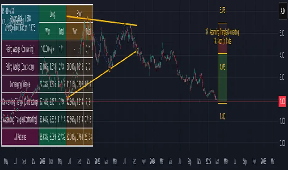
Diverging Chart Patterns - Ultimate [Trendoscope®]🎲 Presenting the Diverging Chart Patterns Ultimate Indicator
Much like its counterpart, the Converging Chart Patterns Ultimate indicator, this tool is an offshoot of our premium Auto Chart Patterns - Ultimate offering. However, it is exclusively designed to focus on diverging patterns.
🎲 Built on Extensive Research and Open-Source Foundations
Our journey toward creating this indicator has been guided by thorough research and insights gleaned from our previous works on Chart Patterns, which include:
Algorithmic Identification of Chart Patterns
Flag and Pennant Chart Patterns
Trading Diverging Chart Patterns
Drawing from the groundwork established by our publicly available indicators - Auto Chart Patterns and Flags and Pennants - this tool represents the culmination of our efforts to furnish traders with a refined approach to navigating diverging patterns. It not only facilitates the formulation of technical trading strategies but also aids in assessing their efficacy through historical performance analysis. The specific patterns addressed by this indicator encompass:
Rising Wedge (Diverging Type)
Falling Wedge (Diverging Type)
Diverging Triangle
Rising Triangle (Diverging Type)
Falling Triangle (Diverging Type)
🎲 Chart Pattern Scanning Methodology
Identifying diverging chart patterns follows a structured approach comprising several key steps:
Zigzag Examination : Start by analyzing each zigzag, focusing on the last 5 or 6 pivot points to pinpoint potential trend line pairs.
Divergence Verification : Project these trend lines backward and scrutinize for intersections within a specified number of bars prior. This step confirms the presence of divergence.
Pattern Categorization : Once divergence is confirmed, categorize each pattern based on the directional orientation of its trend lines. Refer to our article - Algorithmic Identification of Chart Patterns for detailed categorization guidelines.
🎲 Methodology or Trading for Chart Patterns
While traditional perspectives often prescribe specific trading biases to diverging patterns—for instance, labeling Rising Wedges as bearish and Falling Wedges as bullish, while acknowledging Triangles' versatility—there's limited empirical evidence to fully support these assumptions. Our indicator is crafted to empower users to explore and validate a wide range of trading hypotheses, including unconventional ones. This approach liberates trading strategies from being confined to historical market behaviors.
We offer extensive customization options to facilitate testing of diverse strategies. The initial setup accommodates both long and short trading scenarios for each identified pattern. Users retain the freedom to adjust trading directions and other parameters within the indicator's settings to align with their analytical preferences.
This open approach is grounded in the methodology detailed in - Trading Diverging Chart Patterns . It is exemplified by the following process, which users can customize and enhance using our indicator.
🎲 Insight into Indicator Components
The chart below provides an illustration of the components comprising our indicator:
Pattern Visualization : This functionality dynamically showcases patterns on the chart, emphasizing presently active ones. Historical patterns are omitted to uphold clarity and optimize performance, considering limitations in drawing object capacity.
Trading Annotations : The indicator conveniently denotes open trades directly on the chart, accommodating both long and short positions based on user preferences and the ongoing status of associated trades for each pattern.
Performance Metrics Table : A comprehensive table meticulously presents backtesting outcomes for individual patterns alongside aggregated results. It encompasses vital metrics such as win rates and the profit factor, calculated in alignment with the designated risk-reward ratio. These insights provide users with valuable assessments of potential profitability and trade strategy effectiveness.
🎲 Delving into the Indicator's Customization Features
Our indicator boasts a wealth of settings, empowering users to customize criteria and refine their trading strategies. Each setting comes with detailed tooltips, offering valuable insights into its functionality. Let's explore each category methodically.
🎯 Zigzag Configuration Options
These settings provide users with the flexibility to fine-tune their pattern analysis by adjusting the length and depth of the zigzag:
Length Adjustment : Altering this parameter modifies the scale of detected patterns. Higher values highlight larger formations, while lower ones focus on more compact patterns.
Depth Enhancement : This parameter adjusts the complexity of the recursive zigzag analysis, potentially revealing larger patterns across multiple levels. Users should exercise caution, as excessive depth may strain the indicator's processing capacity.
🎯 Pattern Scanning Settings
This collection of settings refines the pattern scanning process, typically adjusted to achieve precise geometric alignment of detected patterns. While many settings can be left at their default values for regular use, users are encouraged to customize them, particularly the "Last Pivot Direction," to explore different theoretical approaches to pattern trading.
🎯 Trade Configuration Settings
Arguably the most vital for users, these settings provide full control in shaping trading strategies based on diverging chart patterns. This encompasses the freedom to establish entry, stop, and target prices, fine-tune risk-reward ratios, choose historical depth for backtesting, and integrate filters to guide trade direction.
🎯 Pattern Specific Settings
Here, users have the flexibility to customize settings for individual patterns or groups, thereby refining the precision of their strategies. Alongside the option to enable/disable specific patterns and pattern groups, users can also choose pattern-specific settings such as Last Pivot Direction, Trade Direction Filter, and external filters.
🎯 Fully Customizable Alerts
Utilizing the alert() function, these notifications circumvent the usual template within the alert widget. To address this, we've integrated placeholders in the settings for creating comprehensive alert templates.
Available Categories Include
New - Alerts when a new pattern is identified
Entry - Alerts when an entry condition for a configured pattern based trade is met.
Stop - Alerts when a trade that has reached entry gets stopped out without reaching target
Target - Alerts when a trade reaches its target
Invalidation - Alerts when a trade reaches an invalidation point before reaching the entry.
Each alert type can possess its unique template. Tailorable templates are crucial for effectively utilizing alerts within broker or exchange integration.
Here are some of the placeholders that are defined in the indicator.
{type} - Alert type - new/entry/stop/target/invalid
{pid} - Pattern ID of the pattern belonging to trade. Multiple trades can have same pattern id since a pattern can be traded in both long and short directions.
{tid} - Unique Trade ID for the given trade.
{ticker} - Ticker ID on which the indicator is run
{timeframe} - Chart timeframe on which the indicator is run
{basecurrency} - Base currency of the symbol
{quotecurrency} - Quote currency of the symbol
{pivots} - Pivot values of the pattern
{price} - Current price when the alert is triggered.
{pattern} - Name of the pattern on which the alert is triggered.
{direction} - Direction of the trade.
{entrydirection} - Direction of the entry signal. Used for specific bot integration.
{exitdirection} - Direction of the exit signal. Used for specific bot integration.
{entry} - Entry price of the trade
{stop} - Stop price of the trade
{target} - Target price of the trade
{invalidation} - Invalidation price of the trade
🎯 Display and Stats
These settings regulate the display options on the chart. Closed trade statistics are showcased in a table and appear in the bottom-left corner of the chart. These can be tailored using the display settings.

speed of tradesThis indicator calculates the speed of trades, on other platform that is called speed of tape, but they said you need delta and others for the calculation.
Calculation method
This indicator calculates the number of trades per bar and filter it, if they are above a sma it highlights the column to know that could be a bar where there are more trades than usual.
It's based on an example of pinescript v5 user manual where explain the use of varip
HF Bots filter and common uses
know where there are more trades than usual help you to have an idea that could be HF Bots working on that bar, also if you dont belive on that, can also help you to have an idea of momentum or stoping action.
Why is this indicator original?
The speed of trades indicator give you an counter of number of trades and a filter for bars where there are a lot of trades, so searching speed of tape/trades indicator that don't exist on tradingview, this indicator is original.
How to charge data?
By default it doesn't load historical tick data, this indicator only works on realtime bars.

Converging Chart Patterns - Ultimate [Trendoscope®]🎲 Introducing the Converging Chart Patterns Ultimate Indicator
Derived from the comprehensive capabilities of our premium offering, the Auto Chart Patterns - Ultimate , this new indicator focuses exclusively on converging chart patterns. It marks the beginning of a series that, over time, will encompass the full spectrum of chart pattern analysis, ultimately enhancing and expanding beyond the scope of Auto Chart Patterns.
This strategic separation into more focused indicators is designed to cater to traders seeking precision in specific chart pattern categories.
🎲 Leveraging Research and Open-Source Foundations
Our journey to this indicator has been paved by extensive research and the insights gained from our prior works on Chart Patterns, including:
Algorithmic Identification of Chart Patterns
Flag and Pennant Chart Patterns
Trading Converging Chart Patterns
Drawing upon the foundation laid by our publicly shared indicators - Auto Chart Patterns and Flags and Pennants - this tool is the culmination of our efforts to provide traders with a refined method for strategizing around converging patterns. It not only facilitates the development of technical trading strategies but also aids in evaluating their effectiveness through historical performance analysis. The specific patterns addressed by this indicator include:
Rising Wedge (Converging Type)
Falling Wedge (Converging Type)
Converging Triangle
Rising Triangle (Converging Type)
Falling Triangle (Converging Type)
🎲 Chart Pattern Scanning Methodology
The process of identifying converging chart patterns involves several key steps:
Begin by examining each zigzag for the last 5 or 6 pivot points to identify potential trend line pairs.
Determine if these trend lines are converging by projecting them forwards and checking for an intersection within a specified number of bars ahead.
Upon confirming convergence, categorize each pattern based on the directional orientation of its trend lines, as detailed in our article - Algorithmic Identification of Chart Patterns
🎲 Methodology or Trading for Chart Patterns
While traditional views assign specific trading biases to converging patterns (e.g., Rising Wedges as bearish and Falling Wedges as bullish, with Triangles being more versatile), empirical support for these assumptions is limited. Our indicator is designed to empower users to explore and validate various trading hypotheses, including unconventional ones, thereby not confining trading strategies to past market behaviors.
We enable extensive customization for testing different strategies, with the initial setup allowing for both long and short trading scenarios for each identified pattern. Users have the liberty to adjust trading directions and other parameters within the indicator's settings to suit their analytical needs.
This open approach is rooted in the methodology outlined in - Trading Converging Chart Patterns , exemplified by the following process, which users can adapt and refine through our indicator.
🎲 Overview of Indicator Components
The components of our indicator are illustrated in the chart below
Pattern Visualization : This feature dynamically displays the patterns on the chart, focusing on currently active patterns. To maintain clarity and performance, historical patterns are not shown due to the constraints of drawing objects.
Trading Annotations : The indicator marks open trades directly on the chart, accommodating both long and short positions depending on the user's settings and the current status of trades associated with each pattern.
Performance Metrics Table : A comprehensive table presents the back testing results for individual patterns as well as aggregated outcomes. It includes crucial metrics such as win rates and the profit factor based on the set risk-reward ratio, offering users valuable insights into the potential profitability of their configurations and trade strategies.
🎲 Exploring the Indicator's Customization Options
This indicator is rich in settings, offering users the capability to tailor criteria and adapt their trading rules. Each setting is accompanied by detailed tooltips, providing insights into their use. Let's examine each category systematically.
🎯 Zigzag Configuration Options
These settings enable users to adjust the scope of their pattern analysis by varying the zigzag's length and depth.
Length Adjustment : Modifying this parameter changes the scale of detected patterns, with higher values spotting larger formations and lower ones focusing on more compact patterns.
Depth Enhancement : This alters the intricacy of the recursive zigzag analysis, potentially unveiling larger patterns across several levels. Caution is advised, as excessive depth may lead to the indicator exceeding its processing capacity.
🎯 Pattern Scanning Settings
This suite of settings fine-tunes the pattern scanning process, generally calibrated for precise geometric alignment of identified patterns. While most settings may remain as default for routine use, users are encouraged to tweak them, especially the "Last Pivot Direction," to explore various theoretical approaches to pattern trading.
🎯 Trade Configuration Settings
Arguably the most crucial for users, these settings offer complete autonomy in defining trading strategies around converging chart patterns. This includes the flexibility to set entry, stop, and target prices, adjust risk-reward ratios, select the historical depth for back testing, and incorporate filters to steer trade direction.
🎯 Pattern Specific Settings
Here, users can personalize settings for individual patterns or groups, enhancing the specificity of their strategy. Apart from enabling/disabling individual patterns and pattern groups, users can also select pattern specific Last Pivot Direction, Trade Direction Filter and external filters for each pattern.
🎯 Fully Customizable Alerts
Implemented through the alert() function, these alerts bypass the standard template in the alert widget. To counteract this, we've introduced placeholders within the settings to craft detailed alert templates.
Available Categories Include
New - Alerts when a new pattern is identified
Entry - Alerts when an entry condition for configured pattern based trade is met.
Stop - Alerts when a trade that has reached entry gets stopped out without reaching target
Target - Alerts when a trade reaches its target
Invalidation - Alerts when a trade reaches invalidation point before reaching the entry.
Each alert types can have its own template. Customizable templates are very important in using alerts for broker or exchange integration.
Here are some of the placeholders that are defined in the indicator.
{type} - Alert type - new/entry/stop/target/invalid
{pid} - Pattern ID of the pattern belonging to trade. Multiple trades can have same pattern id since a pattern can be traded in both long and short directions.
{tid} - Unique Trade ID for the given trade.
{ticker} - Ticker ID on which the indicator is run
{timeframe} - Chart timeframe on which the indicator is run
{basecurrency} - Base currency of the symbol
{quotecurrency} - Quote currency of the symbol
{pivots} - Pivot values of the pattern
{price} - Current price when the alert is triggered.
{pattern} - Name of the pattern on which the alert is triggered.
{direction} - Direction of the trade.
{entrydirection} - Direction of the entry signal. Used for specific bot integration.
{exitdirection} - Direction of the exit signal. Used for specific bot integration.
{entry} - Entry price of the trade
{stop} - Stop price of the trade
{target} - Target price of the trade
{invalidation} - Invalidation price of the trade
🎯 Display and Stats
These settings are used to control the display options on the chart. Closed trade stats is displayed in a table and printed in the bottom left corner of the chart. This can be customized by using display settings.
MACD-all in one_Pro[vn]👉 Hello traders.
Introducing the "MACD-All-in-One" indicator including functions:
• Automatically scan MACD-Histogram divergence
• Automatically scan MACD-Histogram divergence-missing right shoulder
• Automatically scan the Engulfing candlestick pattern when the MACD line crosses the Signal line
• Automatically create warnings when there are signals of Regular divergence, missing right shoulder divergence, Engulfing candlestick pattern
Explain:
💥1. Regular divergence
1.1 Bullish divergence
+ The price creates the next bottom lower than the previous bottom
+ The histogram of the next bottom is higher than the previous bottom and is located below the 0 axis (between the two histogram bottoms there must be a histogram located on the 0 axis for clear distinction)(Hình 1)👇👇
1.2 Bearish divergence
+ The price creates a higher peak than the previous peak
+ The histogram of the next bottom is lower than the previous bottom and is above the 0 axis (between the two histogram peaks there must be a histogram below the 0 axis for clear distinction)(Hình 2)👇👇
💥2. Divergence lacking right shoulder
2.1 Bullish divergence missing the right shoulder
+ The price creates the next bottom lower than the previous bottom
+ The histogram of the posterior bottom does not form and the histogram is still above the zero line (only the histogram of the previous bottom is below the zero line)
+ The meaning is that when the price creates a lower bottom but the buying force is already very strong, the histogram of the next bottom does not form and the price will increase(hình 3&4)👇👇
2.2 Bearish divergence missing the right shoulder
+ The price creates a higher peak than the previous peak
+ The histogram of the next peak does not form and the histogram is still below the zero line (only the histogram of the previous peak is on the zero line)
+ The meaning is that when the price creates a higher peak but the buying force has weakened, the histogram of the next bottom does not form and the price will go down.(hình 5 & 6)👇👇
💥3. Engulfing candlestick pattern
When the MACD and Signal lines intersect and there appears a pair of engulfing (completely) candlesticks, that candlestick will be marked as 'E⌃' in green (bullish engulfing) or 'E⌄' in red (Bearish engulfing)(hình 7 & 8)👇👇
💥4. Automatic alerts include 5 levels: Bull, Bear, Bullish Engulfing, Bearish Engulfing, bullish divergence missing the shoulder, bearish divergence missing the shoulder
//-------------------------Extra feature: Impulse System
This indicator also includes the “Impulse System”. The Impulse System is based on two indicators, a 13-day exponential moving average and the MACD-Histogram, and identifies inflection points where a trend speeds up or slows down. The moving average identifies the trend, while the MACD-Histogram measures momentum. This unique indicator combination is color coded into the price bars or macd histogram bars for easy reference.
Calculation:
Green Price Bar: (13-period EMA > previous 13-period EMA) and
(MACD-Histogram > previous period's MACD-Histogram)
Red Price Bar: (13-period EMA < previous 13-period EMA) and
(MACD-Histogram < previous period's MACD-Histogram)
Histogram bars are colored blue when conditions for a Red Histogram Bar or Green Histogram Bar are not met. The MACD-Histogram is based on MACD(12,26,9).
The Impulse System works more like a censorship system. Green histogram bars show that the bulls are in control of both trend and momentum as both the 13-day EMA and MACD-Histogram are rising (you don't have permission to sell). A red histogram bar indicates that the bears have taken control because the 13-day EMA and MACD Histogram are falling (you don't have permission to buy). A blue histogram bar indicates mixed technical signals, with neither buying nor selling pressure predominating (either both buying or selling are permitted).
-------------------------------//
💥5. Additional:
+Shows a pair of EMA12 vs EMA24.
+Shows Keltner Channels (using ATR) are volatility-based envelopes set above and below an exponential moving average.
//-------------------------------------------------------------------------------------------------------------//
✍️Conclude:
From this indicator there are 3 ways to trade:
• Method 1: Enter an order following the automatic Bull or Bear signal when the indicator appears
• Method 2: Enter an order following the automatic signal of the green vertical line (Long) or the red vertical line (Short) when the indicator appears
• Method 3: Enter orders according to the pair of engulfing candles 'E⌃' or 'E⌄' (because this is a combination of the method of engulfing candles and 2 MA lines intersecting each other)
• From this indicator, I created a "bot" that scans for "right shoulder missing divergence" signals for 40 trading pairs at the same time in real time. (hình 9)👇👇👇
//---------------------------------------------------------------------------------------------------------------
👉 Xin chào trader Việt Nam.
Giới thiệu chỉ báo "MACD-Tất cả trong một " bao gồm các chức năng:
• Tự động quét phân kì MACD-Histogram
• Tự động quét phân kì MACD-Histogram-thiếu vai phải
• Tự động quét mô hình nến nhấn chìm(Engulfing) khi đường MACD cắt đường Signal
• Tự động tạo cảnh báo khi có tín hiệu phân kì thường(Regular) , phân kì thiếu vai phải, mô hình nến Engulfing
Diễn giải:
💥1. Phân kì thường
1.1 Phân kì tăng
+ Giá tạo đáy sau thấp hơn đáy trước
+ Histogram của đáy sau cao hơn đáy trước và nằm bên dưới trục số 0(giữa hai đáy histogram phải có histogram nằm trên trục số 0 để phân biệt rõ ràng)(Hình 1 bên trên)☝️☝️
1.2 Phân kì giảm
+ Giá tạo đỉnh sau cao hơn đỉnh trước
+ Histogram của đáy sau thấp hơn đáy trước và nằm trên trên trục số 0(giữa hai đỉnh histogram phải có histogram nằm dưới trục số 0 để phân biệt rõ ràng)(Hình 2 bên trên)☝️☝️
💥2. Phân kì thiếu vai phải
2.1 Phân kì tăng thiếu vai phải
+ Giá tạo đáy sau thấp hơn đáy trước
+ Histogram của đáy sau không hình thành và histogram vẫn nằm bên trên trục số 0(chỉ có histogram của đáy trước dưới trục số 0)
+ Ý nghĩa rằng khi giá tạo đáy sau thấp hơn nhưng lực mua đã rất mạnh làm cho histogram đáy sau không hình thành và giá sẽ tăng lên(Hình 3 vs 4 bên trên)☝️☝️
2.2 Phân kì giảm thiếu vai phải
+ Giá tạo đỉnh sau cao hơn đỉnh trước
+ Histogram của đỉnh sau không hình thành và histogram vẫn nằm bên dưới trục số 0(chỉ có histogram của đỉnh trước trên trục số 0)
+ Ý nghĩa rằng khi giá tạo đỉnh sau cao hơn nhưng lực mua đã yếu dần làm cho histogram đáy sau không hình thành và giá sẽ đi xuống(Hình 5 vs 6 bên trên)☝️☝️
💥3.mô hình nến nhấn chìm
Khi hai đường MACD và Signal cắt nhau mà tại đó xuất hiện cặp nến nhấn chìm (hoàn toàn) thì trên thanh nến đó sẽ đánh dấu là 'E⌃' màu xanh (nhấn chìm tăng) hay 'E⌄' màu đỏ(nhấn chìm giảm)(Hình 7 vs 8 bên trên)☝️☝️
💥4. Cảnh báo tự động bao gồm có 5 mức : Bull, Bear, Bullish Engulfing, Bearish Engulfing, phân kì tăng thiếu vai, phân kì giảm thiếu vai
//--------------------Tính năng bổ sung: Hệ thống Impulse(xung)
Chỉ báo này cũng bao gồm “Hệ thống xung”. Hệ thống Impulse dựa trên hai chỉ báo, đường trung bình động hàm mũ EMA13 và Biểu đồ MACD, đồng thời xác định các điểm uốn trong đó xu hướng tăng tốc hoặc chậm lại. Đường trung bình động xác định xu hướng, trong khi biểu đồ MACD đo động lượng. Sự kết hợp chỉ báo độc đáo này được sơn thanh biểu đồ macd-histogram để dễ tham khảo.
Phép tính:
Thanh giá xanh lá : (EMA13 kỳ > EMA 13 kỳ trước đó) và (histogram sau > histogram trước)
Thanh giá màu đỏ: (EMA13 kỳ < EMA 13 kỳ trước đó) và (histogram sau < histogram trước)
Thanh biểu đồ có màu xanh lam khi các điều kiện cho histogram màu đỏ hoặc histogram màu xanh lá không được đáp ứng. Biểu đồ MACD dựa trên MACD(12,26,9).
Lưu ý: Hệ thống Impulse hoạt động giống một hệ thống kiểm duyệt hơn. Các thanh biểu đồ màu xanh lá cho thấy phe bò đang kiểm soát cả xu hướng và động lượng vì cả EMA13 và MACD-Histogram đều tăng (bạn không được phép bán). Thanh biểu đồ màu đỏ cho biết phe gấu đã nắm quyền kiểm soát vì biểu đồ EMA13 và MACD histogram đang giảm (bạn không được phép mua). Thanh biểu đồ màu xanh lam biểu thị các tín hiệu kỹ thuật hỗn hợp, không có áp lực mua và bán chiếm ưu thế (cho phép cả mua hoặc bán).
-------------------------//
💥5. Bổ sung:
+ Hiển thị một cặp EMA12 vs EMA24.
+ Hiển thị Kênh Keltner (sử dụng ATR) là các đường bao dựa trên mức độ biến động được đặt ở trên và dưới đường trung bình động hàm mũ.
//----------------------------------------------------------------------------------------------------------------//
✍️Kết luận:
Từ chỉ báo này có 3 cách giao dịch:
• Cách 1: Vào lệnh theo tín hiệu tự động Bull hoặc Bear khi chỉ báo hiện ra
• Cách 2: Vào lệnh theo tín hiệu tự động đường dọc xanh(Long) hoặc đường dọc đỏ(Short) khi chỉ báo hiện ra
• Cách 3: Vào lệnh theo cặp nến nhấn chìm 'E⌃' hay 'E⌄'(vì đây là tổng hợp từ phương pháp của nến nhấn chìm và 2 đường MA cắt nhau)
• Từ chỉ báo này tôi có lập nên "con bot" quét tín hiệu "phân kì thiếu vai phải " cùng lúc 40 cặp giao dịch theo thời gian thực. (Hình 9 bên trên)☝️☝️☝️

MACD-Histogram Divergence missing right shoulder_Pro[vn]👉Hello Traders!
Many traders have asked me about MACD's Histogram divergence, how to use it effectively, because the signal occurs a lot, I suddenly remembered the famous book by Dr. Alexander Elder's "Two Roads Diveged" has an introduction and definition of "MACD Histogram divergence lacking the right shoulder". It is an extremely strong signal of reversal divergence and it is difficult to determine, mainly experienced traders discover it.
- From that book, I wrote the code for the indicator "MACD Histogram divergence lacking the right shoulder" so that it automatically scans over 40 trading codes and when a signal appears I can identify it.
- For the MACD-Histogram signal to have bullish divergence (Regular) occur when:
+ The price creates the next bottom lower than the previous bottom
+ The histogram of the next bottom is higher than the previous bottom and is below the 0 axis (between the two histogram bottoms there must be a histogram on the 0 axis for clear distinction)👇👇👇(Hình 1)
- For MACD-Histogram signal to have bearish divergence (Regular) occur when:
+ The price creates a higher peak than the previous peak
+ The histogram of the next bottom is lower than the previous bottom and is on the 0 axis (between the two histogram peaks there must be a histogram below the 0 axis for clear distinction)👇👇👇(Hình 2)
💥 So to go from MACD-Histogram to regularization to right shoulder missing increase divergence is when:
+ The price of creating the following bottom is lower than the previous bottom
+ The histogram of the back bottom does not form and the histogram remains on the zero axis (only the histogram of the previous bottom is below the zero axis)
+ It means that when the price creates a lower bottom but the buying force is very strong, the posterior bottom histogram does not form and the price will increase 👇👇👇(Hình 3)
💥 So to go from MACD-Histogram to regularized divergence to right shoulder deficiency divergence is when:
+ The price creates the following peak higher than the previous peak
+ The histogram of the posterior vertex does not form and the histogram remains below the zero axis (only the histogram of the anterior vertex is above the zero axis)
+ It means that when the price creates a higher peak but the buying force has weakened, the posterior bottom histogram does not form and the price will go down 👇👇👇(Hình 4)
//-------------------------Extra feature: Impulse System
This indicator also includes the “Impulse System”. The Impulse System is based on two indicators, a 13-day exponential moving average and the MACD-Histogram, and identifies inflection points where a trend speeds up or slows down. The moving average identifies the trend, while the MACD-Histogram measures momentum. This unique indicator combination is color coded into the price bars or macd histogram bars for easy reference.
Calculation:
Green Price Bar: (13-period EMA > previous 13-period EMA) and
(MACD-Histogram > previous period's MACD-Histogram)
Red Price Bar: (13-period EMA < previous 13-period EMA) and
(MACD-Histogram < previous period's MACD-Histogram)
Histogram bars are colored blue when conditions for a Red Histogram Bar or Green Histogram Bar are not met. The MACD-Histogram is based on MACD(12,26,9).
The Impulse System works more like a censorship system. Green histogram bars show that the bulls are in control of both trend and momentum as both the 13-day EMA and MACD-Histogram are rising (you don't have permission to sell). A red histogram bar indicates that the bears have taken control because the 13-day EMA and MACD Histogram are falling (you don't have permission to buy). A blue histogram bar indicates mixed technical signals, with neither buying nor selling pressure predominating (either both buying or selling are permitted).
-------------------------------//
- When on the MACD indicator, the Histogram bars of the current price are the color, then the corresponding cell |0| shows that color, because I define |0| as the current candle.
|1| is the candle preceding the current candle |0|
|2| is the candle immediately preceding candle |1|
|3| is the candle immediately preceding candle |2|
from cells |3| |2| |1| |0| so that traders know that the cell colors green, blue, and red correspond to the colors of the histogram bar and when there is a signal to enter a Long order. '🅻', Short '🆂' will display on those cells.
- When the Bot identifies a divergence lacking the right shoulder, the "Result" cell will be displayed corresponding to "Long" - bullish divergence or "Short" - bearish divergence.👇👇👇(Hình 5)
- When the trader hovers over the "Long" or "Short" cell, a tooltip will be displayed indicating the order entry time, order entry price, stoploss point(Stl), stoploss percentage(%Stl), current price (C.price), previous peak and low Histogram counts (Hist +, Hist -) and the number of Histogram bars when entering the order. From there, traders can filter out the best signals to enter orders.👇👇👇(Hình 6)
- When the entry point is in the same trend as the price with a given profit percentage, it will display a profit, and when the above two MACD and Signal lines intersect, it will notify the Trader to take profit '✅', otherwise when entering Orders that go against the price trend will be reported to exit the order early '❌' 👇👇👇(Hình 7)
- When the MACD and Signal lines intersect and there appears a pair of engulfing candles (completely), the box will be marked as 'E⌃' (bullish engulfing) or 'E⌄' (bearish engulfing) plus add % of the engulfing candle body 👇👇👇 (Hình 8)
- There are 6 smart warning functions to find the right target including: 'Long', 'Short', 'Long-Short', 'Take Profit', 'Stoploss', 'All' . Where 'All' includes all 5 preceding warnings
--------------------------------------------------------------------------------------------------------------
✍️ Conclude:
From this indicator there are 2 ways to trade:
+ Method 1: Enter an order following the automatic Long or Short signal when the indicator appears
+ Method 2: Enter orders according to the pair of engulfing candles 'E⌃' or 'E⌄' (because this is a combination of the method of engulfing candles and 2 MA lines intersecting each other)
--------------------------------------------------------------------------------------------------------
Vietnamese
👉 Xin chào các Trader Việt Nam
Rất nhiều nhà giao dịch có hỏi tôi về phân kì Histogram của MACD làm sao để sử dụng hiệu quả, vì tín hiệu xảy ra rất nhiều, tôi chợt nhớ đến cuốn sách nổi tiếng của tiến sĩ Dr. Alexander Elder là " Two Roads Diveged " có giới thiệu và cách xác định về "phân kì MACD Histogram thiếu vai phải". Nó là tín hiệu cực mạnh về phân kì đảo chiều và rất khó để xác định, chủ yếu trader có kinh nghiệm mới phát hiện ra nó.
- Từ sách đó tôi có viết codes về chỉ báo "phân kì MACD Histogram thiếu vai phải" để nó tự động quét trên 40 mã giao dịch và khi có tín hiệu xuất hiện tôi có thể xác định được nó.
- Để tín hiệu MACD-Histogram phân kì tăng (Regular) xảy ra khi:
+ Giá tạo đáy sau thấp hơn đáy trước
+ Histogram của đáy sau cao hơn đáy trước và nằm dưới trục số 0(giữa hai đáy histogram phải có histogram nằm trên trục số 0 để phân biệt rõ ràng) (Hình 1 bên trên)☝️☝️☝️
- Để tín hiệu MACD-Histogram phân kì giảm (Regular) xảy ra khi:
+ Giá tạo đỉnh sau cao hơn đỉnh trước
+ Histogram của đáy sau thấp hơn đáy trước và nằm trên trục số 0(giữa hai đỉnh histogram phải có histogram nằm dưới trục số 0 để phân biệt rõ ràng) (Hình 2 bên trên)☝️☝️☝️
💥 Vậy để từ MACD-Histogram phân kì tăng (pk thường) trở thành phân kì tăng thiếu vai phải là khi :
+ Giá tạo đáy sau thấp hơn đáy trước
+ Histogram của đáy sau không hình thành và histogram vẫn nằm trên trục số 0(chỉ có histogram của đáy trước dưới trục số 0)
+ Ý nghĩa rằng khi giá tạo đáy sau thấp hơn nhưng lực mua đã rất mạnh làm cho histogram đáy sau không hình thành và giá sẽ tăng lên (Hình 3 bên trên) ☝️☝️☝️
💥 Vậy để từ MACD-Histogram phân kì giảm (regular) trở thành phân kì giảm thiếu vai phải là khi :
+ Giá tạo đỉnh sau cao hơn đỉnh trước
+ Histogram của đỉnh sau không hình thành và histogram vẫn nằm dưới trục số 0(chỉ có histogram của đỉnh trước trên trục số 0)
+ Ý nghĩa rằng khi giá tạo đỉnh sau cao hơn nhưng lực mua đã yếu dần làm cho histogram đáy sau không hình thành và giá sẽ đi xuống (Hình 4 bên trên) ☝️☝️☝️
//--------------------Tính năng bổ sung: Hệ thống Impulse(xung)
Chỉ báo này cũng bao gồm “Hệ thống xung”. Hệ thống Impulse dựa trên hai chỉ báo, đường trung bình động hàm mũ EMA13 và Biểu đồ MACD, đồng thời xác định các điểm uốn trong đó xu hướng tăng tốc hoặc chậm lại. Đường trung bình động xác định xu hướng, trong khi biểu đồ MACD đo động lượng. Sự kết hợp chỉ báo độc đáo này được sơn thanh biểu đồ macd-histogram để dễ tham khảo.
Phép tính:
Thanh giá xanh lá : (EMA13 kỳ > EMA 13 kỳ trước đó) và (histogram sau > histogram trước)
Thanh giá màu đỏ: (EMA13 kỳ < EMA 13 kỳ trước đó) và (histogram sau < histogram trước)
Thanh biểu đồ có màu xanh lam khi các điều kiện cho histogram màu đỏ hoặc histogram màu xanh lá không được đáp ứng. Biểu đồ MACD dựa trên MACD(12,26,9).
Lưu ý: Hệ thống Impulse hoạt động giống một hệ thống kiểm duyệt hơn. Các thanh biểu đồ màu xanh lá cho thấy phe bò đang kiểm soát cả xu hướng và động lượng vì cả EMA13 và MACD-Histogram đều tăng (bạn không được phép bán). Thanh biểu đồ màu đỏ cho biết phe gấu đã nắm quyền kiểm soát vì biểu đồ EMA13 và MACD histogram đang giảm (bạn không được phép mua). Thanh biểu đồ màu xanh lam biểu thị các tín hiệu kỹ thuật hỗn hợp, không có áp lực mua và bán chiếm ưu thế (cho phép cả mua hoặc bán).
-------------------------//
- Khi trên chỉ báo MACD những thanh Histogram của giá hiện tại là màu gì thì tại ô(cell) |0| tương ứng thể hiện màu đó, bởi vì tôi định nghĩa |0| là cây nến hiên tại.
|1| là nến đứng trước liền kề nến hiện tại |0|
|2| là nến đứng trước liền kề nến |1|
|3| là nến đứng trước liền kề nến |2|
từ những ô |3| |2| |1| |0| để trader biết rằng màu ô(cell) xanh lá , xanh lam, đỏ tương ứng với những màu của thanh histogram và khi có tín hiệu vào lệnh Long '🅻', Short '🆂' sẽ hiển thị trên những ô đó.
- Khi Bot xác định được phân kì thiếu vai phải thì tại ô(cell) "Result" sẽ hiển thị tương ứng với "Long"- phân kì tăng giá hoặc "Short"- phân kì giảm giá (Hình 5 bên trên) ☝️☝️☝️
- Khi trader di chuột vào tại ô(cell) "Long", hoặc "Short" thì tại đó hiển thị tooltip cho biết thời gian vào lệnh, giá vào lệnh , điểm stoploss(Stl), phần trăm stoploss(%Stl),giá hiện tại(C.price), số đếm Histogram đỉnh đáy trước(Hist +, Hist -) và số thanh Histogram khi vào lệnh.Từ đó trader có thể lọc ra được những tín hiệu đẹp nhất để vào lệnh (Hình 6 bên trên) ☝️☝️☝️
- Khi điểm vào lệnh cùng xu hướng với giá mà đã cho % lời thì nó sẽ hiển thị được lợi nhuận, và đến khi hai đường MACD và Signal trên cắt nhau thì sẽ báo Trader nên chốt lời '✅', ngược lại khi vào lệnh ngược với xu hướng giá thì sẽ báo thoát lệnh sớm '❌' (Hình 7 bên trên) ☝️☝️☝️
- Khi hai đường MACD và Signal cắt nhau mà tại đó xuất hiện cặp nến nhấn chìm (hoàn toàn) thì trên ô đó sẽ đánh dấu là 'E⌃' (nhấn chìm tăng) hay 'E⌄'(nhấn chìm giảm) cộng thêm % của thân nến nhấn chìm (Hình 8 bên trên) ☝️☝️☝️
- Có 6 chức năng cảnh báo thông minh tìm đúng đối tượng bao gồm:'Long', 'Short', 'Long-Short', 'Take Profit', 'Stoploss', 'All'
trong đó 'All' là bao gồm toàn bộ 5 cảnh báo đứng trước đó
---------------------------------------------------------------------------------------------------------------------
✍️ Kết luận:
Từ chỉ báo này có 2 cách giao dịch:
+ cách 1: Vào lệnh theo tín hiệu tự động Long hoặc Short khi chỉ báo đưa ra
+ cách 2: Vào lệnh theo cặp nến nhấn chìm 'E⌃' hay 'E⌄'(vì đây là tổng hợp từ phương pháp của nến nhấn chìm và 2 đường MA cắt nhau)

TTP Alt HedgeAlt hedge is a pine script that allows you to backtest and live hedge trade alt coin pairs.
Once you have selected 20 alt coins and your preferred take profit and a stop loss settings the script will find pairs: one coin that is very overbought and one that is very oversold. It will then long the one in discount and short the premium one.
The script will show you the PNL of the hedge combined position. If together they reach the TP or SL the position will be closed.
Use the "max profit retracement" to target larger TP levels and lock in profits if they retrace more than the chosen ratio. Example: if the TP retraces more than the golden ratio of 0.618 then close the position.
The indicator offers a table of profits with overall PNL and win rate stats.
It can be hooked up to WickHunter bots using alerts and the UUID of the bot.
Debug alerts shows the messages that will be sent for entry/exit deal messages.
Plot PNL shows the cumulative PNL in percentage in the same chart. This function is particularly useful since it shows the performance of the bot.
Each deal in this bot can consist of any pair of coins provided by the user. For example: long ADA + short ETH when ADA is very expensive and ETH is very cheap.
Consider using alt coins that have either strong or vey low correlation, the closer to 1 or -1 in correlation coefficient the better.
Have fun!

[DisDev] D-I-Y Gridbot🟩 This script is a “do-it-yourself” Grid Bot Simulator, used for visualizing support and resistance levels. Prices are divided into grids, or trade zones, that will trigger signals each time a new zone is entered. During ranging markets, each transaction is followed by a “take profit.” As the market starts to trend, transactions are stacked (compare to DCA ), until the market consolidates. No signals are triggered above the upper gridline or below the lower gridline. Unlike the previous version, all grids may be adjusted in real-time by dragging the gridlines up and down to the desired support and resistance levels.
When adding the indicator to a new chart, you must choose six grid levels by clicking on the desired support or resistance price. You can change all of these levels at any time directly on the chart.
⚡ OVERVIEW ⚡
The D-I-Y Gridbot is an interactive tool designed for visualizing support and resistance levels. As a continuation of the original Gridbot Simulator , which has received significant recognition on TradingView, earning over 4000 boosts and an Editor's Pick status. This tool serves not only as an evolved version of its predecessor, but also as an open-source template for developing future gridbots. It aims to foster discussions and facilitate innovations around grid-trading strategies.
One of the new features of this gridbot is the real-time adjustability of all gridlines. Users can move these lines up and down to set their desired support and resistance levels in response to changing market conditions. Additionally, the D-I-Y Gridbot is compatible with multiple timeframes and can be used on most TradingView charts.
Drag gridlines up or down to desired price level.
Key Features 🔑
All gridlines are adjustable in real-time, directly on the chart
Signals can be filtered by a customizable moving average or by VWAP
Customizable support and resistance levels
Potentially increases profitability in ranging markets
Benefits 💸
Customizable Support and Resistance Levels : The D-I-Y Gridbot allows users to set their preferred support and resistance levels, which can be changed at any time directly on the chart. This provides users with the ability to customize their trading parameters based on their strategy and risk tolerance.
Various Trading Strategies : The D-I-Y Gridbot supports various trading strategies, including Mean Reversion, Ranging Markets, and Dollar-cost averaging (DCA). This allows users to capitalize on price reversals, execute buy and sell orders at predetermined levels, and buy more of an asset as the price falls, respectively.
Multi-Timeframe and Versatility : The D-I-Y Gridbot is compatible with multiple timeframes and can be used on any TradingView chart.
Experimental and Educational : The D-I-Y Gridbot is considered a proof-of-concept tool that is both experimental and educational. This can provide traders with a deeper understanding of grid trading strategies and the ability to experiment with different trading parameters and strategies.
⚙️ CONFIGURATION & SETTINGS ⚙️
Inputs 🔧
Trigger : Candle location to trigger the signal. "Wick" will use either high or low, depending on the signal direction. "Close" will use the close price. “MA” will use the selected moving average or VWAP.
Confirmation : Market direction to confirm the candle trigger. "Reverse" will confirm the signal when the price crosses back over the trigger. "Breakout" will confirm when the price breaks out of the trigger.
Number of Support/Resistance zones : 1 = Only Top Grid is Support/Only Bottom Grid is Resistance. 2 = Top two grids are Resistance/Bottom two grids are Support. 3 = Top three grids are Resistance/Bottom three grids are Support
MA Type : Exponential Moving Average (EMA), Hull Moving Average (HMA), Simple Moving Average (SMA), Triple Exponential Moving Average (TEMA), Volume Weighted Moving Average (VWMA), Volume Weighted Average Price (VWAP)
MA Filter : Use Moving Average as a reversion filter for signals. When enabled, no buys when above MA, no sells when below. Use in conjunction with S/R zones to reduce false signals.
Allow Repeat Signals . When enabled, signals will reset when nearest gridline is triggered. When disabled, only one signal will be triggered per gridline.
Line/Fill colors
Gridlines . Adjusts gridline prices manually.
Left : Trigger = Wick. Confirm = Breakout. Buys are signaled when LOW breaks below gridline. Sells are triggered when HIGH breaks above gridline.
Right : Trigger = Close. Confirm = Breakout. Buys are signaled when the candle CLOSES below the gridline. Sells are triggered when the candle CLOSES above the gridline.
Left : Confirm=Breakout. Signals on breaking through the next gridline.
Right : Confirm=Reverse. Signals only when crossing back from the gridline.
S/R Zones=1. Upper gridline is Resistance / Lower is Support. Middle 4 are neutral.
S/R Zones = 3. Upper three gridlines are Resistance / Lower three are Support
Notes:
If gridlines are dragged out of order on a live chart, they will auto-sort into the correct order.
Price levels may be entered in settings, or adjusted in real-time directly on the chart.
When changing symbols, remember to adjust the gridlines to accommodate the new symbol.
Alerts 🔔
Users can set alerts based on their chosen parameters for triggers, confirmations, number of support/resistance zones, and smoothing type, enabling precise control over alert conditions.
💡 USAGE & STRATEGY 💡
Trading Strategies 📈
Mean Reversion: The script can be used to capitalize on price reversals back to the mean.
Ranging Markets: The script excels in ranging markets, executing buy and sell orders at predetermined levels.
Dollar-cost averaging (DCA): The script can be used to execute DCA orders, buying more of an asset as the price falls, and lowering the average cost per unit.
Timeframes and Symbols ⌚
Multi-Timeframe: The indicator is compatible with multiple timeframes.
Versatile: Can be used on any crypto trading pair on TradingView.
🤖 DETAILS & METHODOLOGY 🤖
Algorithm and Calculation 🛡️
Grids are set and adjusted when loading the indicator on the chart and may be customized anytime afterward by clicking and dragging the gridlines on the chart.
Gridlines are updated, sorted, and stored in a float array.
Signals are calculated based on candle trigger, market direction, and previous price level.
📚 ADDITIONAL RESOURCES 📚
Chart Examples 📊
S/R Zones = 3: Three Support and Three Resistance. Filter = 50-period Triple Exponential Moving Average (TEMA)
S/R Zones = 1: One Support, One Resistance, and Four Neutral Zones. Support Zones: Buys only. Resistance Zones: Sells only. Neutral Zones: Grid-dependent
When MA filter is enabled, Buys are only triggered below Moving Average, and Sells are only triggered above.
Trigger = Wick. Confirmation = Breakout. Buys are signaled when Low breaks above the next grid level. Sells are signaled when High breaks below the next grid level.
🚀 CONCLUSION 🚀
The D-I-Y Gridbot is a proof-of-concept, emphasizing its experimental and educational nature. In future versions, we will aim to incorporate concepts such as auto-adjusting grids and angled grids for trending markets. The script is designed to evolve through user feedback and suggestions, shaping its future iterations.
Credit: This is a continuation of the Gridbot series by xxattaxx-DisDev . Explicit permission was granted by user xxattaxx-disdev to re-use all Gridbot code and all materials without restrictions.
⚠️ DISCLAIMER ⚠️
This indicator is a proof-of-concept and is considered experimental and educational. When gridlines are drawn in hindsight, signals appear to be predictive and valid. Future results may always vary when the trend direction changes. Comments and suggestions are encouraged.
This indicator is provided as a tool for traders and should not be used as the sole basis for making trading decisions. Always conduct your own research and consider your risk tolerance before entering any trades.
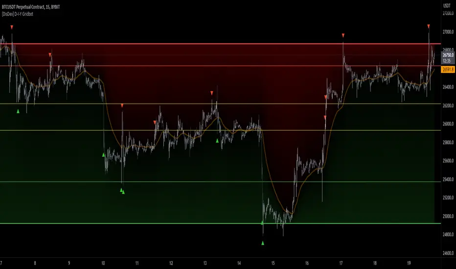
Keltner Trend V3It's just a simple keltner trend with options added to:
Eradicate repainting
more MAs
Json alerts (useful for bots)
I recommend using "open" option for all sources if you are going to use it with a bot, or if you want to be safe and enter with confirmations. Using the default settings would also show you all the entries without repainting as it uses high and low prices to check breakouts and not solely the close price (which is generally a false representative in historic analysis).
My favorite lengths are 7, 14, and 21. There is no specific reason, they just seem to work well most of the time. You can (and should) optimize it to your purposes.
Thanks to the original author @jaggedsoft this script is just a improved version of theirs.

OKX Perpetual Swap Position Sizer by RainbowLabsI created this tool to simplify the process of setting up trading bots on OKX perpetual swap pairs via Alertatron.
Instead of manually searching for each pair on www.okx.com and calculating the position size from dollar to contract, I developed a Python bot to scrape the necessary data and built an indicator to convert that data into TradingView.
Simply input the desired order amount in USDT, and the indicator will calculate the maximum number of contracts that can be traded without exceeding the user-defined risk amount.
Please note that this indicator only works with OKX perpetual swap pairs and is intended for educational and informational purposes only.
It should not be construed as financial advice, and traders should always perform their own analysis and make their own decisions regarding whether or not to enter a trade.
This indicator requires human updates. As a result, the most recent coins may not be available until a new update is released.

Сoncentrated Market Maker Strategy by oxowlConcentrated Market Maker Strategy by oxowl. This script plots an upper and lower bound for liquidity provision, and checks for rebalancing conditions. It also includes alert conditions for when the price crosses the upper or lower bounds.
Here's an overview of the script:
It defines the input parameters: liquidity range percentage, rebalance frequency in minutes, and minimum trade size in assets.
It calculates the upper and lower bounds for liquidity provision based on the liquidity range percentage.
It initializes variables for the last rebalance time and price.
It defines a rebalance condition based on the frequency and current price within the specified range.
If the rebalance condition is met, it updates the last rebalance time and price.
It plots the upper and lower bounds on the chart as lines and adds price labels for both bounds.
It defines alert conditions for when the price crosses the upper or lower bounds.
Finally, it creates alert conditions with appropriate messages for when the price crosses the upper or lower bounds.
Concentrated liquidity is a concept often used in decentralized finance (DeFi) market-making strategies. It allows liquidity providers (LPs) to focus their liquidity within a specific price range, rather than across the entire price curve. Using an indicator with concentrated liquidity can offer several advantages:
Increased capital efficiency: Concentrated liquidity allows LPs to allocate their capital within a narrower price range. This means that the same amount of capital can generate more significant price impact and potentially higher returns compared to providing liquidity across a broader range.
Customized risk exposure: LPs can choose the price range they feel most comfortable with, allowing them to better manage their risk exposure. By selecting a range based on their market outlook, they can optimize their positions to maximize potential returns.
Adaptive strategies: Indicators that support concentrated liquidity can help traders adapt their strategies based on market conditions. For example, they can choose to provide liquidity around a stable price range during low-volatility periods or adjust their range when market conditions change.
To continue integrating this script into your trading strategy, follow these steps:
Import the script into your TradingView account. Navigate to the Pine editor, paste the code, and save it as a new script.
Apply the indicator to a trading pair chart. You can customize the input parameters (liquidity range percentage, rebalance frequency, and minimum trade size) based on your preferences and risk tolerance.
Set alerts for when the price crosses the upper or lower bounds. This will notify you when it's time to take action, such as adding or removing liquidity, or rebalancing your position.
Monitor the performance of your strategy over time. Adjust the input parameters as needed to optimize your returns and manage risk effectively.
(Optional) Integrate the script with a trading bot or automation platform. If you're using an API-based trading solution, you can incorporate the logic and conditions from the script into your bot's algorithm to automate the process of providing concentrated liquidity and rebalancing your positions.
Remember that no strategy is foolproof, and past performance is not indicative of future results. Always exercise caution when trading and carefully consider your risk tolerance.

Futures/Spot Ratiowhat is Futures /Spot Ratio?
Although futures and spot markets are separate markets, they are correlated. arbitrage bots allow this gap to be closed. But arbitrage bots also have their limits. so there are always slight differences between futures and spot markets. By analyzing these differences, the movements of the players in the market can be interpreted and important information about the price can be obtained. Futures /Spot Ratio is a tool that facilitates this analysis.
what it does?
it compresses the ratio between two selected spot and futures trading pairs between 0 and 100. its purpose is to facilitate use and interpretation. it also passes a regression (Colorful Regression) through the middle of the data for the same purpose.
about Colorful Regression:
how it does it?
it uses this formula:
how to use it?
use it to understand whether the market is priced with spot trades or leveraged positions. A value of 50 is the breakeven point where the ratio of the spot and leveraged markets are equal. Values above 50 indicate excess of long positions in the market, values below 50 indicate excess of short positions. I have explained how to interpret these ratios with examples below.
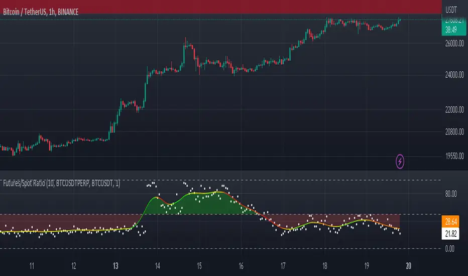
CryptoGraph Entry BuilderA complete system to generate buy & sell signals, based on multiple indicators, timeframes and assets
═════════════════════════════════════════════════════════════════════════
🟣 How it works
This indicator allows you to create buy & sell signals, based on multiple trigger conditions, placed in one easy to use TradingView indicator to produce alerts, backtest, reduce risk and increase profitability. This script is especially designed to be used with the CryptoGraph Strategizer indicator. Signals produced by this indicator, can be used as external input with the CryptoGraph Strategizer, by adding both indicators to your chart and selecting "External Input" as entry source in the inputs of the Strategizer indicator. From that point on, buy & sell signals generated by the Entry Builder, will be used for backtesting.
Each trigger or filtering condition is selectable and able to be combined using the selection boxes.
Trigger or filter conditions can be used on a different timeframes, and with different assets or coin pairs. Make sure to set higher timeframe filters, to a higher timeframe than your chart timeframe.
🟣 How to use
• Add the indicator to your chart
• Select an indicator you woud like to use for entry analysis. Combine more indicators for more entry filtering
• Configure entry conditions per indicator. It is recommended to add and configure one indicator at a time
• Analyse your buy/sell entries
• Connect to CryptoGraph Strategizer as external input source for backtesting purposes
🟣 Indicator Filters
• ATR :
Average True Range (ATR) is a tool used in technical analysis to measure volatility .
Possible options for ATR entry filtering are an ATR value greater/smaller than your input variable for trade entries, or the ATR crossing your input variable for trade entries.
This enables the possibility to only enter positions when the market has a certain degree of volatility .
• ADX :
The Average Directional Index ( ADX ) helps traders determine the strength of a trend, not its actual direction. It can be used to find out whether the
market is ranging or starting a new trend.
Possible options for ADX entry filtering are an ADX value greater/smaller than your input variable for trade entries, or the ADX crossing your input variable for trade entries.
• OBV :
The On Balance Volume indicator (OBV) is used in technical analysis to measure buying and selling pressure. It is a cumulative indicator meaning that on days where price went up, that day's volume is added to the cumulative OBV total.
Possible options for OBV entry filtering are Regular, Hidden or Regular&Hidden divergences. Divergence is when the price of an asset is moving in the opposite direction of a technical indicator, such as an oscillator, or is moving contrary to other data. Divergence warns that the current price trend may be weakening, and in some cases may lead to the price changing direction.
• Moving Average :
Moving Average (MA) is a price based, lagging (or reactive) indicator that displays the average price of a security over a set period of time. A Moving Average is a good way to gauge momentum as well as to confirm trends, and define areas of support and resistance .
Possible options for MA entry filtering are price being above/below Moving Average 1, price crossing up/down Moving Average 1, Moving Average 1 being above/below Moving Average 2 and Moving Average 1 crossing up/down Moving Average 2.
• Supertrend :
Supertrend (ST) is a trend-following indicator based on Average True Range (ATR). The calculation of its single line combines trend detection and volatility . It can be used to detect changes in trend direction and to position stops.
Possible options for ST entry filtering are Supertrend being in upward/downward direction, or Supertrend changing direction.
• RSI :
The Relative Strength Index ( RSI ) is a well versed momentum based oscillator which is used to measure the speed (velocity) as well as the change (magnitude) of directional price movements.
Possible options for RSI entry filtering are RSI being smaller/greater than your input value, or RSI crossing up/down your input value.
• Stochastic RSI :
The Stochastic RSI indicator ( Stoch RSI ) is essentially an indicator of an indicator. It is used in technical analysis to provide a stochastic calculation to the RSI indicator. This means that it is a measure of RSI relative to its own high/low range over a user defined period of time.
Possible options for Stoch RSI entry filtering are Stoch RSI crossing below or above your input value.
• VWAP Bands :
Volume Weighted Average Price ( VWAP ) is a technical analysis tool used to measure the average price weighted by volume . VWAP is typically used with intraday charts as a way to determine the general direction of intraday prices.
We use standard deviations, determined by user input, to create VWAP bands.
Possible options for VWAP long entry filtering are: price being below the lower VWAP band, price crossing back up the lower VWAP band or price crossing down the lower VWAP band.
Possible options for VWAP short entry filtering are: price being above the upper VWAP band, price crossing back down the upper VWAP band, or price crossing up the upper VWAP band.
• Bollinger Bands :
Bollinger Bands (BB) are a widely popular technical analysis instrument created by John Bollinger in the early 1980’s. Bollinger Bands consist of a band of three lines which are plotted in relation to security prices. The line in the middle is usually a Simple Moving Average ( SMA ) set to a period of 20 days (the type of trend line and period can be changed by the trader; however a 20 day moving average is by far the most popular).
Possible options for BB long entry filtering are: price being below the lower Bollinger band , price crossing back up the lower Bollinger band or price crossing down the lower Bollinger band .
Possible options for BB short entry filtering are: price being above the upper Bollinger band , price crossing back down the upper Bollinger band , or price crossing up the upper Bollinger band .
• WaveTrend :
WaveTrend (WT) is a smoothed momentum oscillator which enables it to detect true reversals in an accurate manner.
Possible options for WT entry filtering are: Green/red dots below or above a certain WaveTrend value, Regular Divergence, Hidden Divergence and Regular&Hidden Divergence.

GRIDBOT Scalper by nnamWhat is this Indicator used for?
Made specifically for GRID Bots
note: before continuing... this indicator works on any timeframe, but it WORKS BEST ON THE 15 MINUTE TIMEFRAME
Straters and Forex Master Pattern Value Line Traders use this to help determine when the price could reverse.
This indicator is a scalping indicator that produces signals when a "potential" reversal in price is indicated. When the price moves UP and a Potential Bearish Reversal Signal occurs, traders can use this signal as a potential SHORT entry signal for their Short Grid Bot. The process is the same in reverse. After a sustained move down, a Potential Bullish Signal can be used by the trader as a potential LONG entry signal for their GridBot.
As shown in the screenshot below, lines develop on the chart (either RED or GREEN) indicating that a sustained move in one direction is currently occurring; however, there is no potential reversal signal plotted (this means that price action is currently moving in one direction only).
As shown in the screenshot below, lines can be used as a stop-loss after entering the GRIDbot. (usually, by this time, the Grid Bot is in Profit as it usually moves in the opposite direction first)
What this Indicator Does
The GRIDBOT Scalper provides information regarding potential reversals in the market after a sustained movement in one direction (either Bullish or Bearish).
The indicator is based on PRICE-ACTION ONLY and does not take into account the current state of the market (Bullish or Bearish).
Once the price moves in a particular direction for at least 14 bars , a line appears as shown in a previous screenshot. Once the price stops moving in that direction and begins moving in the opposite direction - and after a sustained run - a "signal" appears alerting the trader that a "potential" reversal could be on the horizon soon.
If price moves in one direction and plots both a line and a signal and then begins moving back in the other direction in a sustained manner, the original signal will remain even when a NEW line begins forming (the original line will disappear). (see below) This line will continue to move as the price continues to move. Not until a signal plots on the chart is the potential reversal forming. THE LINE DOES NOT SIGNAL A REVERSAL . Some traders, however, use this information to "ride the wave UP or DOWN" and exit their positions once the signal prints.
As shown below, optional input settings allow the trader to set the line at CLOSE or HIGH/LOW of the candle preceding the potential reversal.
It is suggested to use Close instead of High or Low but the setting allows one to use either.
As shown in the screenshot below, it is typical on LOWER TIME FRAMES to see the price pass the signal line. The Indicator works best on the 15 minute timeframe, as it gives the trader time to make the decisions required as the volatility is less on the 15 minute chart vs the 1 minute or 5 minute charts.
If you have any questions or suggestions for this indicator, please join our Discord. We offer free training on this Indicator on our Discord Server.

[E5 Trading] Setups & TrendsE5 Trading Setups & Trends helps traders identify buy and sell opportunities through established trading techniques, including proven trade setups, bullish and bearish trend reversal signals, price strength, stop-loss and take-profit guardrails, a real-time divergences confluence system, local support and resistance levels, and anchored volume-weighted average price features.
These powerful capabilities help traders of all experience levels build confluence to improve the probability of success for each trade.
Trade Setups
Select from one (1) of three (3) trade setups for LONG and SHORT signals: 1. Transition; 2. Momentum; 3. Phase Shift. All trade setups work on all timeframes.
Several factors impact the consistent accuracy of algorithm-based setups over a long duration.
Examples include volatile global markets, liquidity, and an evolving mix of retail and institutional participants in a specific asset.
Therefore, traders must have various trade setup options and signals available to help them identify confluence.
Traders should evaluate the accuracy of each trade setup under existing market conditions and select the best one.
Trade setup signals are just one feature to consider as part of a discretionary trading system and should not be considered as stand-alone buy and sell signals.
They can be used as an effective market screener to help the trader quickly narrow the playing field of tradeable assets based on current market conditions.
Traders should seek confluence among several indicator suite features before entering or exiting a trade.
Use the color selector boxes to change LONG and SHORT label colors.
Color Candles per Setup
Toggle (Color Candles per Setup) to change candle coloring based on LONG and SHORT signals generated by Trade Setups.
All candles after a LONG signal plot with Bull candle coloring until a SHORT signal generates.
All candles after a SHORT signal plot with Bear candle coloring until a LONG Signal generates.
Enabling this feature allows the trader to observe and interpret the price trends of the asset more easily.
Squeeze Filter
The Squeeze Filter eliminates all trade setups inside a low-volatility squeeze where trade setup signals are typically less reliable and where the future trend can be more challenging to determine.
This feature helps traders avoid potentially noisy signals, and instead focus on Squeeze Early Entry and Squeeze Breakout signals generated by the E5 Trading Squeezes and Breakouts indicator.
Disciplined traders who play squeeze breakout price action can perform well with this strategy as long as good risk management is practiced (i.e., responsible position-sizing and use of a stop-loss on every trade).
Toggle Squeeze Filter (On) to eliminate all trade setups inside a low-volatility squeeze.
Trend Reversal Signals
Trend Reversal Signals (R) identify the potential end of a local trend and the beginning of a new one. Default (On). Default drop-down (Potential Reversal).
All reversal signals are deemed POTENTIAL reversals until price action of the next one or two candles after the reversal signal confirms the reversal.
Reversal signals may be CONFIRMED MANUALLY by a simple method described below or CONFIRMED AUTOMATICALLY using the Trend Reversal Signals drop-down menu.
To manually confirm a potential bullish reversal, the close of the 1st or 2nd candle following the reversal candle must be greater than the high (wick) of the reversal candle.
To manually confirm a potential bearish reversal, the close of the 1st or 2nd candle following the reversal candle must be less than the low (wick) of the reversal candle.
To use automated confirmation capabilities, select either "1-Candle Confirmed" or "2-Candle Confirmed" from the drop-down menu.
Selecting "1-Candle Confirmed" will result in any potential reversal signal (R) updating to a faded/transparent reversal signal (R) if not confirmed by the next candle only.
Sometimes there is market indecision (i.e., sideways price action) after a potential reversal signal, requiring the use of a 2nd candle to confirm the reversal.
Selecting "2-Candle Confirmed" will result in any potential reversal signal (R) updating to a faded/transparent reversal signal (R) if not confirmed by the next one or two candles.
"Reversals Sensitivity" drop-down to provide three (3) sensitivity levels for reversal signals.
The available drop-down options are: "Less Signals", "Default", and "More Signals".
"Less Signals" decreases the number of Potential Reversals compared to Default, and "More Signals" increases the number of Potential Reversals compared to Default.
This feature provides more opportunities to play reversals while still helping to eliminate all non-actionable reversal signals using the auto-confirmation capability.
Play the probabilities and avoid fake-outs: IGNORE any reversal signal not confirmed by the above method.
Use the color selector boxes to change the bullish and bearish reversal signal colors.
Price Strength
Price Strength Signals were designed to flag the onset of potentially explosive price moves based on market conditions and price action. Default (Off).
Bull price strength default (large triangles with bull candle coloring).
Bear price strength default (large triangles with bear candle coloring).
Dynamic Stop-Loss (SL) | Take-Profit (TP) Guardrails
This feature helps traders to effectively time trade entries/exits, automate the calculation of stop-loss | take-profit levels, and stay in trades while price action remains inside its calculated normal volatility range.
Due to its dynamic real-time update capability and utility as a trailing stop-loss | take-profit automation tool, this feature can be a powerful addition to both manual and algorithm (i.e., bot-based) trading systems.
Toggle (SL | TP Guardrails) to view dynamic stop-loss | take-profit levels based on user-defined Length and Multiple settings.
Define the Length (default: 14) and Multiple (default: 1.5) to establish the desired dynamic stop-loss | take-profit parameters.
Use the color selector boxes to change the Stop-Loss and Take-Profit guardrail colors.
A simple example trading technique using this feature is to go long when the guardrail transitions from being above price action (i.e., resistance) to below price action (i.e., support). Vice versa for short trades.
Traders monitoring a manual trade can move their stop-loss | take-profit level based on the calculated bull or bear guardrail.
Traders using a 3rd-party bot-trading platform can set up a webhook within a TradingView alert to automate their trade based on price action crossing the dynamic stop-loss | take-profit threshold.
Real-Time Divergences Confluence
Divergences occur when a technical indicator, like an oscillator, moves in the opposite direction of price.
They often serve as an early warning of a trend reversal (via regular divergence signals) or trend continuation (via hidden divergence signals).
Divergences flag in real-time directly on the price chart and provide a strength rating (1 to 6) based on the number of oscillators that simultaneously detect a divergence.
Bullish divergences flag below price action and bearish divergences flag above price action to help traders detect potential trend reversals (regular divergences) or trend continuations (hidden divergences).
This indicator evaluates a total of six (6) oscillators simultaneously to identify divergences compared to price action.
Each divergence is assigned a strength rating (1 to 6) based on the number of oscillators that simultaneously detect a divergence.
The real-time nature of the divergences will cause the divergence line to re-plot with each successive candle until the divergence confirms at the end of the trend.
The divergence strength rating will also continuously update with each successive candle based on the number of divergences detected at that time.
When the divergence confirms, the divergence line and label on the chart will update from a lighter/transparent shade to a darker/opaque shade.
Use the color selector to change label and line colors.
Use line selector to change the line style. Default (solid line).
Toggle (Regular Divergence (Bull)) to display regular bullish divergences. Default (Off).
Toggle (Regular Divergence (Bear)) to display regular bearish divergences. Default (Off).
Toggle (Hidden Divergence (Bull)) to display hidden bullish divergences. Default (Off).
Toggle (Hidden Divergence (Bear)) to display hidden bearish divergences. Default (Off).
Local Support | Resistance
Local Support and Resistance levels are calculated automatically based on price action and represent supply and demand zones to help traders establish buy and sell targets, stop-loss, and take-profit levels.
Awareness of key support and resistance levels is critical for developing a trading plan, trading level-by-level, and avoiding unnecessary risk (e.g., longing into resistance or shorting into support).
Local Support and Resistance levels are especially useful when combined with other indicator suite features to identify confluence.
Toggle (Local Support | Resistance) to display key support and resistance levels. Default (Off).
Anchored Volume-Weighted Average Price (AVWAP)
Anchored Volume-Weighted Average Price (AVWAP) helps traders determine the fair market value of an asset based on the volume-weighted average price over a user-specified period.
This fair market value can establish areas of support and resistance on the chart with the idea that price is attracted back to the fair market value over time. Default (Off).
The AVWAP line then serves as a critical support | resistance level that price action will eventually test.
Select the AVWAP source from the drop-down box. Default (hlc3) which means (High + Low + Close) / 3. Use the color selector box to change the color of the AVWAP line.
AVWAP Start (Option 1): Use the date and time selectors to select the Start position of the AVWAP line.
AVWAP Start (Option 2): Change the AVWAP Start position directly on the chart by moving the vertical line that appears to a specific candle (e.g., pivot high, pivot low, day/week start).
First, click on the AVWAP line, then drag the vertical AVWAP position line on the chart to the desired candle.
Toggle (AVWAP Support | Resistance) to display a horizontal support | resistance zone based on the current Anchored Volume-Weighted Average Price.
When price action is above the AVWAP, the horizontal AVWAP support | resistance zone acts as support with bullish zone coloring.
When price action is below the AVWAP, the horizontal AVWAP support | resistance zone acts as resistance with bearish zone coloring.

Bender Stochastic MTF With Buy & Sell SignalsA stochastic indicator is a technical analysis tool that uses random data points to forecast price changes in a financial security. It compares the closing price of a security to its price range over a set period of time. The indicator is designed to indicate when a security is overbought or oversold by comparing the closing price to the price range over a certain number of periods. A stochastic indicator can be used to identify potential buying or selling opportunities. It is often used in conjunction with other technical analysis tools to provide a more comprehensive analysis of market conditions.
Configurable Indicator Signals
Signal on k & d Stochastic Line Crosses
Invalidate Signal if not in a overbought or oversold pressure zone
Invalidate signal on neutral zone breach
Invalidate signal on reverse cross
Invalidate signal after a user set number of bars
Delay signal until the cross is considered strong by calculating the distance between the stochastic lines the a user set threshold
Please Note:
This indicator is also embedded in the Bender Bot strategy script. Signals and confluence identified by this indicator can be used to autonomously mange strategies. The below settings will not have any effect on this indicator's functionality when used as a stand alone indicator.
Bender Bot Strategy Confluence
Close any open trade on reverse k & d Stochastic line crosses
Require any signal and Stochastic directional confluence before opening any trade
Require any signal and Stochastic pressure to be in confluence before opening any trade
Require any signal to be in directional confluence with the Stochastic signal

Bender Filtered MA Cloud with Buy Sell SignalsBender MA Cloud is a powerful indicator that uses two moving averages filtered by standard deviation to create a "cloud" on the chart. The upper and lower bounds of the cloud could be key levels of support and resistance, and the indicator plots lines on the chart that reflects the average price of the stock over a specified period of time. The standard deviation is used to filter out noise and identify significant trends. Bender MA Cloud also generates signals based on the direction changes of the fast moving average, crosses of the cloud, and breaches of the cloud boundaries. This indicator is a useful tool for traders who want to make informed decisions based on reliable market trends and anticipate potential trade opportunities. (Video Demo Coming Soon)
Configurable Indicator Signals
Signal on :
Pullbacks
A pullback begins when the fast MA1 line changes direction and moves opposite to the cloud. The pullback is confirmed when the fast MA1 line returns to the direction of the cloud on the close of the bar. These signals can be fine-tuned using the invalidation settings below.
Breaches
A breach is signaled when the price closes beyond the slow MA2 line in the opposite direction of the cloud. These signals can be optimized using the invalidation settings.
Crosses
A cross is signaled by a change in the direction of the cloud. The strength of the cross can be evaluated using the settings below..
Signal Filters
Confirmed pullbacks allowed after a cross
The number of confirmed pullbacks allowed after a cross can be set using this option. If the number of confirmed pullbacks since the last cross exceeds the specified value, the pullback signal will be invalidated.
Allowed Number of bars in Pullback
The pullback signal is considered invalid if the specified number of bars form within the pullback without a reversal occurring. This limits the number of bars allowed in the pullback.
Invalidate Pullback if price breaches the slow MA2
The pullback signal is considered invalid if the price crosses the slow MA2 during the pullback. This indicates that the trend may be reversing and the signal is no longer reliable.
Require Strong Cloud During Pullback
This option allows you to invalidate the pullback signal if the cloud is not considered strong using the ATR strength threshold. This can help to ensure that the signal is reliable and accurate..
Require Strong Cross. _ look-back bars.
This option allows you to invalidate the cross signal if the cloud is not considered strong over a specified number of look-back bars. The strength of the cloud is measured using the ATR strength threshold, and the signal will be invalidated if the cloud is not considered strong. This can help to ensure that the signal is reliable and accurate..
Strength Threshold ATR Length
This option allows you to specify the ATR length that should be used to gauge the strength of the cloud. Keep in mind that the ATR is a dynamic measure, so if there is a spike in the ATR, the cloud strength calculations will also change. This can affect the reliability and accuracy of the signals generated by the indicator.
Cloud Size Must Be _ times the size of the Threshold ATR to be considered strong
This option allows you to specify the minimum size that the cloud must be relative to the Threshold ATR in order to be considered strong. If the distance between the fast MA1 and the slow MA2 is less than the specified value multiplied by the Threshold ATR, the cloud is considered weak. For example, if the cloud size is not at least 2 times the ATR, it will be considered weak.
This indicator is also incorporated into the Bender Bot strategy script and can be used to autonomously manage strategies based on signals and confluences identified by the indicator. When used as a standalone indicator, the features below will not affect the indicators functionality.
Bender Bot Strategy Confluence
Require Signal Confluence before opening any position
This option requires that all of the signal conditions are met before opening any position. If all conditions are satisfied, the signal will remain "Long" or "Short" until it is invalidated.
Require MA Cloud Directional Confluence before opening any position
This option requires that the direction of the cloud (either "Long" or "Short") is in agreement before opening any position. The direction of the cloud changes on crosses.
Close Position if Pullback is started
This option closes the position if a pullback is started and causes the fast MA1 line to change direction and oppose the open position.
Please feel free to contact me if there are any questions

Bender Money Flow Index MTF with Buy & Sell SignalsMFI = Money Flow Index
MTF = Multi Timeframe
The Money Flow Index (MFI) is a technical indicator that can generate sentiment insight or pressure using both price and volume data.
Configurable Indicator Signals
Signal on MFI line directional changes
Invalidate Signal if not in a overbought or oversold pressure zone
Invalidate signal if MFI line is not in confluence with the moving average
Invalidate signal after a defined number of bars in the opposing direction
Please Note:
This indicator is also embedded in the Bender Bot strategy script. Signals and confluence identified by this indicator can be used to autonomously mange strategies. The below features will not have any effect on this indicator's functionality when used as a stand alone indicator.
Bender Bot Strategy Confluence
Require any signal and MFI directional confluence before opening any trade
Require any signal and MFI and Moving average to be in confluence before opening any trade
Require any signal to be in directional confluence with the full MFI signal
Please feel free to contact me with any questions or concerns.

[ADOL_]EasyTradingENG) EasyTrading Indicator(ET)
Introduce)
This is the result of long research and trial and error. This indicator is an indicator that marks the signal on the chart.
Short-term, mid-term, and long-term points are analyzed, and signals leading to long-term trends are marked with a background color.
Indicates oversold and overbought, and modified Ichimoku equilibrium. Indicates the criteria for the new TD.
It is the latest version of the signal indicator that complements the limitations of existing indicators.
Noise cancellation is the key to overcoming limitations.
Alerts are included in the signal notation, allowing integration with bots that utilize alerts.
So that even beginners can use it easily, we exclude miscellaneous functions and focus only on whether it is long or short.
principle)
Principle of Moving Average: Various moving averages (SMA, EMA, WMA, HMA, RMA, SWMA, VWMA) can be used. Simply using only moving averages cannot overcome the existing problems.
The problems that arise from existing signal indicators include structural problems in which entry and exit do not appear properly due to lagging and delay of indicators, and frequent overuse of RBIs.
In order to compensate for these limitations, BNF's disparate rate trading method was referred to. I did not use the existing moving average as it is, but I optimized the formula by reflecting my experience, so the existing moving average
It is characterized by the fact that it cannot be implemented according to the signal of the indicator.
The principle of oversold and overbought: implemented using RSI.
Short-term signal: The principle of the TD indicator has been utilized and modified. The setup principle of the TD indicator,
which compares the current candlestick and the four previous candlesticks and indicates numbers from 1 to 9, was modified by applying it to the moving average.
Intermediate Signal: Moving averages and Ichimoku balance have been modified. We applied the breakthrough of clouds (positive and negative) created in Ichimok balance.
Long-term signal: The principle of moving averages was used.
comparison with existing indicators)
Compared to Supertrends:
The top is the ET indicator, and the bottom is the supertrend indicator. Supertrend is set to 14,3, which is commonly used.
Looking at the background color representing the long-term signal of ET while the super trend repeatedly displays buy and sell and sees loss of intervals
ET does not see section loss as no signal appears in the middle after one entry.
The same goes for other sports.
Compared to the moving average (sma):
Even when compared to the golden cross and dead cross conditions that break through the moving average line, the moving average line accumulates losses due to frequent entries and exits in the section that moves sideways.
ET, which compensates for the limitations, continues the trend without noise.
Comparison with Ichimoku:
ET has less noise than entering a trade using Ichimoku's red cloud and green cloud.
Necessity)
In order to work with the bot, the key is to accurately implement the hitting point and remove noise. It is a basic approach to trading even if it is not linked to a bot.
In the setting of most indicators, if you increase the period, you can see the long-term trend, but the entry point is delayed, and if you decrease the period, the entry point becomes frequent and enters a place where you shouldn't enter.
ET catches the entry point and noise removal, and helps you approach the entry point correctly even if you don't trade often.
Catching the two rabbits was the most difficult. how many years...
chart)
Notation of background color:
Long-term signals are displayed in the background color so that trends can be grasped at a glance.
Long term signal:
It is indicated by an arrow on the chart.
Mid term signal:
The decline is indicated by a black gradient on the candle and a red circle above the candle.
The rise is indicated by a white gradient on the candle and a green circle below the candle.
short-term signal:
On the chart, the candlesticks are numbered from 1 to 9.
Oversold/Overbought:
Oversold conditions are indicated by yellow diamonds (◆).
Overbought is indicated by a blue diamond (◆).
Determine the TP on the first oversold or overbought bar. Split profit start.
timeframes and alerts)
It can be applied to all time frames, and the standard time at the center is 1h.
You can adjust the dot while viewing the 15-minute bar and the 1-hour bar together.
multi time frame. It is recommended to observe multiple times at the same time using the split screen.
Note)
This indicator is not a guarantee of absolute returns, and you are solely responsible for any trading decisions you make.
How to use)
It is set to be used by invited users only.
If you receive an invitation, tap Add indicator to favorites at the bottom of the indicator.
If you go to the chart screen and press the indicator at the top, there is a Favorites tab on the left tab.
Add an indicator by clicking on the indicator name in the Favorites tab (or Invite Only).
If a study error occurs when adding an indicator even though permission has been granted
You may be able to fix the problem by turning off all charts and restarting.
KOR) EasyTrading 지표(ET)
소개)
이것은 오랜 연구와 시행착오의 결과물입니다. 해당 지표는 차트에 시그널을 표기해주는 지표입니다.
단기, 중기, 장기 타점을 분석하며, 장기트렌드를 이끄는 시그널은 배경색으로 표기됩니다.
과매도와 과매수를 표시하며, 변형된 일목균형을 표시합니다. 새로운 TD의 기준을 표시합니다.
기존의 지표들이 가지는 한계를 보완한 시그널 지표의 가장 최신 버전입니다.
한계를 극복하는데는 노이즈 제거가 핵심이라고 볼 수 있습니다.
시그널 표기에는 얼러트가 포함되어, 얼러트를 활용하는 봇과 연동이 가능합니다.
초보자도 쉽게 활용할 수 있도록 잡다한 기능은 빼고, 롱이냐 숏이냐에만 집중합니다.
원리)
이동평균선의 원리 : 여러가지 이동평균선(SMA, EMA, WMA, HMA, RMA, SWMA, VWMA) 을 활용할 수 있습니다. 단순히 이동평균선만 활용하는 것으로는 기존의 문제점을 뛰어넘을 수 없습니다.
기존의 시그널 지표에서 발생하는 문제점은, 기본적으로 지표가 가지는 후행성과 지연으로 인해, 진입과 청산의 자리가 제대로 나오지 않는 구조적인 문제, 잦은 타점 남발 등이 있습니다.
이러한 한계를 보완하기 위해서 BNF의 괴리율 매매법을 참고하였습니다. 기존의 이평선을 그대로 쓰는 것이 아니라 저의 경험을 반영해 수식을 최적화하였기 때문에 기존의 이평선으로는
해당 지표의 시그널을 따라 구현할 수 없다는 것이 특징입니다.
과매도, 과매수의 원리 : RSI를 활용하여 구현하였습니다.
단기시그널 : TD 지표의 원리를 활용 및 변형하였습니다. 현재 캔들과 4개이전의 캔들을 비교해 1~9까지 숫자로 표기하는 TD 지표의 setup 원리를 이평선에 적용하여 변형하였습니다.
중기시그널 : 이평선 및 일목균형을 변형하였습니다. 일목균형에서 만들어지는 구름(양운과 음운)의 돌파를 응용하였습니다.
장기시그널 : 이평선의 원리를 활용하였습니다.
기존의 지표들과 비교)
슈퍼트렌드와 비교 :
상단은 ET지표, 하단은 슈퍼트렌드 지표입니다. 슈퍼트렌드는 일반적으로 많이 쓰는 14,3 으로 세팅하였습니다.
슈퍼트렌드가 buy와 sell을 반복적으로 띄우며 구간손실을 보는동안, ET의 장기시그널을 나타내는 배경색을 보면
ET는 한번의 진입후 중간에 시그널이 출현하지 않으면서 구간손실을 보지 않고 있습니다.
다른 종목에서도 마찬가지입니다.
이동평균선(sma)과 비교 :
이동평균선을 돌파하는 골든크로스와 데드크로스 조건과 비교해도 횡보하는 구간에서 이동평균선은 잦은 진입과 청산으로 손실을 누적하지만
한계를 보완한 ET는 노이즈 없이 추세를 이어나갑니다.
일목균형과 비교 :
일목균형의 양운과 음운을 활용하여 타점을 진입하는 것보다 노이즈가 적습니다.
필요성)
봇과 연동하기 위해서는 타점을 정확하게 구현하는 것과 노이즈의 제거가 핵심입니다. 봇과 연동하지 않더라도 매매의 기본적인 접근입니다.
대부분의 지표의 설정에서 기간을 늘리면 장기추세를 볼 수 있으나 진입점이 늦어지고, 기간을 줄이면 진입점이 잦아 들어가지 말아야 할 곳에 들어가게 됩니다.
ET는 진입점과 노이즈 제거 두마리 토끼를 잡아, 자주 매매하지 않더라도 바르게 진입점에 접근할 수 있도록 도와줍니다.
두마리 토끼를 잡는 것이 가장 어려웠습니다. 몇년의 시간..
차트로 설명)
배경색의 표기 :
장기시그널을 배경색으로 표기하여 트렌드를 한눈에 파악할 수 있도록 하였습니다.
장기시그널 :
차트상에서 화살표로 표기됩니다.
중기 시그널 :
하락은 캔들의 검정색 그라데이션과 캔들 위 빨간색 원으로 표시됩니다.
상승은 캔들의 하얀색 그라데이션과 캔들 아래 초록색 원으로 표시됩니다.
단기시그널 :
차트상에서 캔들에 1~9까지 숫자로 표시됩니다.
과매도/과매수 :
과매도는 노란색 다이아몬드(◆)로 표시됩니다.
과매수는 파란색 다이아몬드(◆)로 표시됩니다.
과매도, 과매수가 처음 발생하는 봉에서 TP를 결정합니다. 분할익절 시작.
타임프레임 및 얼러트)
모든 시간프레임에 적용 가능하며, 중심이 되는 기준시간은 1h 입니다.
15분봉과 1시간봉을 같이 보면서 타점을 조절할 수 있습니다.
멀티타임프레임. 화면분할을 활용하여 여러 시간을 동시에 관찰하는 것을 추천합니다.
참고사항)
해당지표는 절대수익을 보장하는 지표가 아니며, 귀하가 내리는 모든 거래 결정은 전적으로 귀하의 책임입니다.
사용방법 )
초대된 사용자만 사용할 수 있도록 설정이 되어있습니다.
초대를 받을 경우, 지표 하단의 즐겨찾기에 인디케이터 넣기를 누릅니다.
차트화면으로가서 상단에 지표를 눌러 왼쪽탭에 보면 즐겨찾기 탭이 있습니다.
즐겨찾기 탭 (또는, 인바이트 온리) 에서 지표이름을 눌러서 지표를 추가합니다.
권한이 부여됐음에도 지표추가시 study error가 발생할 경우
차트를 모두 끄고 재시작함으로써 문제점을 해결할 수 있습니다.

Grid Strategy Back Tester (Long/Short/Neutral)Preface
I'd like to send a thank you to @xxattaxx-DisDev.
The 'Line' Code, which was the most difficult to plan the Grid Indicator, was solved through the 'Grid Bot Simulator' script of @xxattaxx-DisDev.
A brief description of the indicators
These indicators are designed for backtesting of grid trading that can be opened on various exchanges.
Grid trading is a method of selling at particular intervals as prices rise and fall for gird interval price range.
This indicator is actually designed to see what the Long / Short / Neutral grid has achieved and how much it has achieved over a given period of time.
How to use
1. Lower Limit and Upper Limit are required when putting indicators on the chart.
After that, choose the 'Time' when to open the grid.
Also, select Long / Short / Neutral direction if necessary.
2. Statistics Table
Matched Grid shows how many grid pairs were engaged during the backtesting period.
The Daily Average Matching Profit is calculated based on the number of these closed grids.
Total Matching Profit is calculated as Matching Grid * Per Matching Profit.
Position Profit/Loss shows the benefits and losses from your current position.
Total Profit/Loss is sum of Total Matching Profit and Position Profit/Loss.
The Expanded APY shows the benefits of running the strategy on these terms for a year.
Max Loss of Upper is the maximum loss assumed to be directly at the top of the grid range.
BEP days (Upper) show how many days of maintenance relative to Average Matching Profit can result in greater profit than maximum loss if the grid continues to move within range.
(In the case of Long Strategy, it appears to be 'Min Profit', which shows minimal benefit if it reaches the top.)
Max Loss of Lower and BEP days (Lower) shows the opposite.
(In the case of Short Strategy, it is also referred to as 'Min Profit', which shows minimal benefit if it reaches the bottom.)
3. Grid Info
Total Grid Number, Upper Limit, and Lower Limit show the values you set in INPUT.
Grid Open Price shows the price for the period you decide to open.
Starting Position shows the number of positions that were initially held in the case of a Long / Short Strategy.
(0 for Neutral Strategy)
Per Grid qty shows how many positions are allocated to one grid
Grid Interval shows the spacing of each grid.
Per Matched Profit shows how much profit is generated when a single grid is matched.
Caution
Backtesting results for these indicators may vary depending on the time frame.
Therefore, I recommend that you use it only to compare Profit/Loss over time.
*In addition, there is a problem that all lines in the grid are not implemented, but it is independent of the backtest results.
--------------------------------------
서문
지표를 기획함에 있어서 가장 어려웠던 line 코드를 @xxattaxx-DisDev의 'Grid Bot Simulator' 스크립트를 통해 해결할 수 있었습니다.
이에 감사의 말씀을 드립니다.
해당 지표에 대한 간단한 설명
해당 지표는 다양한 거래소에서 오픈할 수 있는 그리드 매매에 대한 백테스팅을 위해 만들어졌습니다.
그리드매매는, 특정 가격 구간에 대해 가격이 오르고 내림에 따라 일정 간격에 맞춰 매매를 하는 방식입니다.
이 지표는 실질적으로 롱/숏/중립 그리드가 어떠한 성과를, 특정 기간동안 얼마나 냈는지를 확인하고자 만들어졌습니다.
사용방법
1. 인풋
지표를 차트위에 넣을 때, Lower Limit과 Upper Limit이 필요합니다.
그 후 그리드를 언제부터 오픈할 것인지를 선택하세요.
또, 필요하다면 Long / Short / Neutral의 방향을 선택하세요.
2. 그리드 통계
Matched Grid는, 백테스팅 기간동안 체결된 그리드 쌍이 몇개인지를 보여줍니다.
이 체결된 그리드의 갯수를 바탕으로 Daily Average Matched Profit이 계산됩니다.
Total Matched Profit은, Matched Grid * Per Matched Profit으로 계산됩니다.
Position Profit/Loss는, 현재 갖고 있는 포지션으로 인한 이익과 손실을 보여줍니다.
Total Matched Profit과 Position Profit/Loss를 합친 금액이 Total Profit/Loss가 됩니다.
Expcted APY는, 이러한 조건으로 전략을 1년동안 운영했을 때의 이익을 보여줍니다.
Max Loss of Upper는, 그리드 범위의 최상단에 바로 도달했을 경우를 가정한 최대 손실입니다.
BEP days(Upper)는, 그리드가 범위 내에서 계속 움직일 경우, Average Matched Profit을 기준으로 며칠동안 유지되어야 최대손실보다 더 큰 이익이 발생할 수 있는지를 보여줍니다.
(Long Strategy의 경우, ‘Min Profit’이라고 나타나는데, 최상단에 도달했을 경우 최소한의 이익을 보여줍니다)
Max Loss of Lower는 그 반대의 경우를 보여줍니다.
(Short Strategy의 경우, 역시 ‘Min Profit’이라고 나타나는데, 최하단에 도착했을 경우 최소한의 이익을 보여줍니다)
3. 그리드 정보
그리드 갯수, Upper Limt, Lower Limt은 자신이 설정한 값을 보여줍니다.
Grid Open Price는, 자신이 오픈하기로 정했던 기간의 가격을 보여줍니다.
Starting Position은, 롱/숏 그리드의 경우에 처음에 들고 시작했던 포지션의 갯수를 보여줍니다.
Neutral Strategy의 경우 0입니다.
Per Grid qty는, 하나의 그리드에 얼마만큼의 포지션이 배분되었는지를 보여주며
Grid Interval은 각 그리드의 간격을 보여줍니다.
또, Per Matched Profit은 하나의 그리드가 체결될 때 얼마만큼의 이익이 발생하는 지를 보여줍니다.
이러한 지표에 대한 역테스트 결과는 시간 프레임에 따라 달라질 수 있습니다.
따라서 시간 경과에 따른 손익을 비교할 때만 사용하는 것이 좋습니다.
*추가로, 그리드의 라인이 모두 구현되지 않는 문제가 있지만, 백테스팅 결과와는 무관합니다.
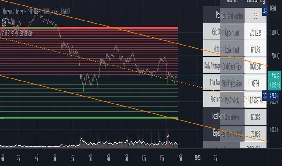
Full Volatility Statistics and Forecast
This is a tool designed to translate the data from the expected volatility of different assets, such as for example VIX, which measures the volatility of SP500 index.
Once get the data from the volatility asset we want to measure(for this test I have used VIX), we are going to translate it the required timeframe expected move by dividing the initial value into :
252 = if we want to use the daily timeframe, since there are ~252 aproximative daily trading days
52 = if we want to use the weekly timeframe, since there 52 trading weeks in a year
12 = if we want to use the monthly timeframe, since there are 12 months in a year
For this example I have used 252 with the daily timeframe.
In this scenario, we can see that we had 5711 total cnadles which we analysed, and in this case, we had 942 crosses, where the daily movement ended up either above or below the channel made from the opening daily candle value + expected movement from the volatility, giving as a total of 16.5% of occurances that volatility was higher than expected, and in 83.5% of the times, we can see that the price stayed within our channel.
At the same time, we can see that we had 6 max losses in a row ( OUT) AND 95 max wins in a row (IN), and at the same time in those moments when the volatility crosses happen we had a 0.51% avg movements when the top crossed happened, and 0.67% avg movements when the bot happened.
Lastly on the second part of the panel, we had E which means the expected movement of today, for example it has 61.056$ , so lets say price opened on 4083, our top is 4083 + 61 and our bot is 4083 - 61 ( giving us the daily channel). At continuation we can see that overall the avg bull candle os 0.714% and avg bear candle was 0.805% .
I hope this tool will help you with your future analysis and trades !
If you have any questions please let me know !