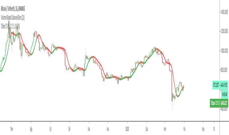
Tillson T3 Moving Average by KIVANÇ fr3762Developed by Tim Tillson, the T3 Moving Average is considered superior to traditional moving averages as it is smoother, more responsive and thus performs better in ranging market conditions as well. However, it bears the disadvantage of overshooting the price as it attempts to realign itself to current market conditions.
It incorporates a smoothing technique which allows it to plot curves more gradual than ordinary moving averages and with a smaller lag. Its smoothness is derived from the fact that it is a weighted sum of a single EMA , double EMA , triple EMA and so on. When a trend is formed, the price action will stay above or below the trend during most of its progression and will hardly be touched by any swings. Thus, a confirmed penetration of the T3 MA and the lack of a following reversal often indicates the end of a trend.
The T3 Moving Average generally produces entry signals similar to other moving averages and thus is traded largely in the same manner. Here are several assumptions:
If the price action is above the T3 Moving Average and the indicator is headed upward, then we have a bullish trend and should only enter long trades (advisable for novice/intermediate traders). If the price is below the T3 Moving Average and it is edging lower, then we have a bearish trend and should limit entries to short. Below you can see it visualized in a trading platform.
Although the T3 MA is considered as one of the best swing following indicators that can be used on all time frames and in any market, it is still not advisable for novice/intermediate traders to increase their risk level and enter the market during trading ranges (especially tight ones). Thus, for the purposes of this article we will limit our entry signals only to such in trending conditions.
Once the market is displaying trending behavior, we can place with-trend entry orders as soon as the price pulls back to the moving average (undershooting or overshooting it will also work). As we know, moving averages are strong resistance/support levels, thus the price is more likely to rebound from them and resume its with-trend direction instead of penetrating it and reversing the trend.
And so, in a bull trend, if the market pulls back to the moving average, we can fairly safely assume that it will bounce off the T3 MA and resume upward momentum, thus we can go long. The same logic is in force during a bearish trend .
And last but not least, the T3 Moving Average can be used to generate entry signals upon crossing with another T3 MA with a longer trackback period (just like any other moving average crossover). When the fast T3 crosses the slower one from below and edges higher, this is called a Golden Cross and produces a bullish entry signal. When the faster T3 crosses the slower one from above and declines further, the scenario is called a Death Cross and signifies bearish conditions.
I Personally added a second T3 line with a volume factor of 0.618 (Fibonacci Ratio) and length of 3 (fibonacci number) which can be added by selecting the box in the input section. traders can combine the two lines to have Buy/Sell signals from the crosses.
Developed by Tim Tillson
在腳本中搜尋"curve"
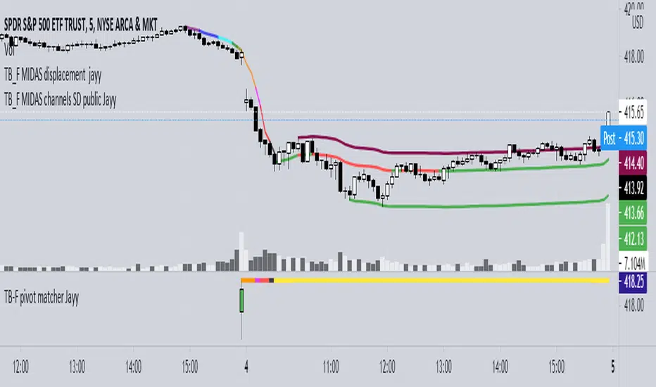
Topfinder Bottomfinder pivot matcher Midas- jayyMidas Technical Analysis: A VWAP Approach to Trading and Investing in Today’s Markets by
Andrew Coles, David G. Hawkins Copyright © 2011 by Andrew Coles and David G. Hawkins.
Appendix C: TradeStation Code for the MIDAS Topfinder/Bottomfinder Curves ported to tradingview
This code is used to assist in adjusting D volume to intersect pivot candle at a pivot candle when using this script: Top Bottom Finder Public version- Jayy found here:
The "n" number entered into the TB-F script is the topfinder/bottomfinder starting point or anchor
Be sure to enter the correct number in the "Topfinder bottomfinder initiation/anchor candle: 1 for CANDLE low - top finder, 2 for CANDLE high - bottom finder, 3 for CANDLE MIDPOINT (hl2) dialogue box
The location of the match point of the pivot candle is extremely important in the: "Match to PIVOT CANDLE: use 1 for CANDLE low, 2 for midtail of the candle below the BODY, 3 for candle BODY low, 4 for CANDLE HIGH, 5 for midpoint of candletail above body, 6 for candle BODY high". Do not
confuse body high with candle high. The body low will either be the candle open or close. The body high will be either the open or close.
If you expect a trend up the pivot candle is likely the low of the pivot candle ie 1 (2 and 3 are alternatives).
In a trend down the high of the pivot candle is often selected ie 4 (5 or 6 are alternatives)
If the candle body is aqua increase D volume if it is orange reduce D volume. Adjust iteratively until the candle body turns yellow. That will mean that the TB-F line passes through the pivot candle at the selected point.
Jayy
Vix FIX / StochRSI StrategyThis strategy is based off of Chris Moody's Vix Fix Indicator . I simply used his indicator and added some rules around it, specifically on entry and exits.
Rules :
Enter upon a filtered or aggressive entry
If there are multiple entry signals, allow pyramiding
Exit when there is Stochastic RSI crossover above 80
This works great on a number of stocks. I am keeping a list of stocks with decent Profit Factors and clean equity curves here .
Possible ways to use this:
Modify this script and setup alerts around the various entries
Use as is with different stocks or currency pairs
Modify entry / exit points to make it more profitable for even more symbols and currencies


UCS_Squeeze_Timing-V1There is an important information the Squeeze indicator is missing, which is the Pre Squeeze entry. While the Bollinger band begins to curves out of the KC, The breakout usually happens. There are many instances that the Squeeze indicator will fire, after the Major move, I cant blame the indicator, thats the nature (lagging) of all indicators, and we have to live with it.
Therefore pre-squeeze-fire Entry can be critical in timing your entry. Timing it too early could result in stoploss if it turns against you, ( or serious burn on options premium), because we never know when the squeeze will fire with the TTM squeeze, But now We know. Its a little timing tool. Managing position is critical when playing options.
I will code the timing signal when I get some time.
Updated Versions -
Std Dev Channel [fmb]What it is
A professional regression channel that combines standard deviation divisions, an extreme price envelope, and a trend quality gauge. It is designed for fast read-and-act decisions on any timeframe, with sensible presets and log-space math for instruments that trend exponentially.
Why it’s different
Most channels draw fixed ±1σ and ±2σ around a regression line. This tool adds:
- Fibonacci-spaced σ divisions for precise scaling
- An objective MaxEnvelope of actual extremes with optional 1.272 and 1.618 extensions
- Pearson’s R labelling that classifies the trend as Strong Up, Moderate, Weak, or Strong Down
- A log-space option so channels behave correctly on long trends and high beta charts
How it works
Base line
- Linear regression of the last Length bars, drawn as a ray.
- Optional colour change by regime using Pearson’s R.
Divisions (StdDev or MaxEnvelope)
- StdDev basis: σ of residuals around the regression line.
- MaxEnvelope basis: distances from the base line to the farthest highs and lows in the lookback.
- Divisions can be Fibonacci multiples (0.382, 0.618, 1.000, 1.272 by default) or uniform steps.
Outer rails
- ENV 1.0 touches the farthest highs and lows within the window.
- Optional extensions at 1.272 and 1.618 highlight stretch and breakout zones.
Trend quality (Pearson’s R)
- R is computed on the same series and window.
- Default thresholds: Strong when |R| ≥ 0.70, Weak when |R| < 0.40.
- The label reads: R 0.XXX • Class, plotted near the most recent base value.
Log-space math
- When enabled, the model runs on ln(price) and converts the outputs back to price.
- Safer on multi-year charts and large percentage trends.
Presets
- Swing: Length 125, StdDev basis, Fib divisions, ENV 1.0 and 1.272 on
- Intraday: Length 240, StdDev basis, simple ±1 and ±2 style divisions, ENV off by default
- Position: Length 200, StdDev basis, compact Fib set for higher timeframes
You can turn preset overrides off to make every input respond instantly.
Inputs you will actually use
- Length, Source, Log-space ON or OFF
- Basis: StdDev or MaxEnvelope
- Divisions: Fib list or Step and Max multiple
- Outer rails: show ENV 1.0, show 1.272, show 1.618
- Labels and sizes, extend left or right
- Hide divisions or outer rails automatically when the regime is Weak
Alerts included
- Close crosses above or below ENV 1.0
- Close crosses above or below ENV 1.272 and 1.618 (if enabled)
Practical playbook
Trend following
- In Strong Uptrend: buy pullbacks near 0.382 to 0.618 above the base with stops just beyond the next lower division.
- In Strong Downtrend: sell bounces into 0.382 to 0.618 below the base with stops just beyond the next upper division.
Mean reversion
- When R is Moderate or Weak, fade moves that tag ENV 1.0 back toward the base.
- If price closes through an ENV extension, treat it as potential regime change and stand down on fades.
Breakouts
- A close through ENV 1.0 with R rising toward Strong often precedes trend acceleration.
- Use the next division or the 1.272 rail as the first target and trail on the base.
Tips
- Keep Length stable across symbols you compare. Consistency beats curve fitting.
- Use log-space on multi-year equities and crypto. Use linear for short intraday work.
- If you want a classic look, disable Fib and rails, set Step 1.0 and Max 2.0.
Notes
- The tool draws more lines when Fib divisions are active. If it feels busy, show divisions only and hide labels, or keep ENV 1.0 plus one extension.
- Pearson’s R is descriptive, not predictive. Combine with price structure and volume for entries.

Adaptive ML VWAP v1.0Overview
Adaptive ML VWAP is a next-generation "Smart Indicator" that moves beyond static deviations (Standard Deviation). Instead of assuming market volatility is distributed normally (Bell Curve), this indicator uses a k-Nearest Neighbors (k-NN) machine learning engine to learn the specific volatility behavior of the asset you are trading.
It answers the question: "When price extends away from VWAP, how far does it actually go before reversing?"
The Adaptive ML Engine
This script features a 5-Dimensional ML Engine that tracks every major extension or pullback event. It records:
Deviation Depth (Normalized to ATR)
Trend Slope (Is the trend steep or flat?)
ADX (Trend Strength)
VWAP Deviation (Relative Position)
Time of Day (Session Context)
When a new setup occurs, the k-NN engine instantly searches its memory for the 5 most similar historical events and calculates the probability of success based on what happened last time.
Two Strategy Modes
You can toggle the logic to suit your trading style:
1. Mean Reversion Mode (Default)
"Fade The Move"
Goal: Catch price at an exhaustion point returning to VWAP.
Signal: Triggers when price touches a Smart Band and reverses back toward the center.
k-NN Learning: Learns which conditions favor a snap-back.
Best For: Ranging markets, Lunch hours, Choppy sessions.
2. Trend Following Mode
"Ride The Move"
Goal: Catch breakouts that are launching away from value.
Signal: Triggers when price breaks out of the Inner Band (1.0).
k-NN Learning: Learns which breakouts tend to extend to the Outer Bands.
Best For: Morning Drives, News Events, Strong Trends.
Visual Guide
The indicator uses a Dynamic Gradient system to visualize risk/reward:
Cyan Mist (0.5 - 1.0): The Value Zone. Noise area. Safe for trend entries.
Deep Cyan (1.0 - 2.0): The Trend Zone. Price is moving proactively.
Orange Glow (2.0 - 3.0): The Danger Zone. Price is statistically overextended. Reversals are highly probable here.
"Fractal" Math
Unlike standard indicators that break when you change timeframes, Adaptive ML VWAP uses Fractal Normalization.
A "2.0 Band" on a 15-second chart means the same statistical extreme as a "2.0 Band" on a 4-hour chart.
Auto-Adaptive Lookback: The indicator automatically boosts the ML memory (Lookback) on lower timeframes (seconds/minutes) where more noise requires larger sample sizes, ensuring robust predictions without manual tweaking.
Settings
Auto-Adapting Lookback: (Default: True) automatically increases Lookback to 100+ for seconds charts and 50+ for minute charts.
Lookback (Events): Manual override base value (Default: 100).
Strategy Mode: Toggle between Mean Reversion and Trend Following.
k-Neighbors: The number of similar past events to structurally compare (Default: 5).
Disclaimer: This tool is for educational purposes. Machine learning performance is dependent on market conditions and historical recursion.

EURUSD Timing Composite (5-Component)Overview
An advanced multi-component oscillator designed specifically for intraday EURUSD trading. This indicator synthesizes four correlated FX pairs plus US yield dynamics to isolate genuine EUR strength and USD weakness from market noise, providing high-probability timing signals through multi-layer cross-validation.
Components & Methodology
The indicator employs z-score normalization (default 20-period lookback) to harmonize five distinct market signals into a unified composite reading:
Primary USD Strength Signals (50%):
GBPUSD (25%) - GBP/USD serves as a USD strength proxy with high correlation to EURUSD
-USDCHF (25%) - Inverted USD/CHF provides independent USD strength confirmation
Yield Differential Signal (25%):
-US02Y (25%) - Inverted 2-Year Treasury yield captures Fed policy expectations and rate differentials
EUR-Specific Strength Signals (25%):
EURGBP (12.5%) - EUR/GBP isolates EUR performance against its closest rival
EURCHF (12.5%) - EUR/CHF confirms broad EUR strength beyond USD dynamics
Key Features
✅ Triple-Layer Validation - Combines USD FX signals, yield differentials, and EUR crosses
✅ Rate Differential Integration - Captures Fed policy repricing and carry trade dynamics
✅ Cross-Pair Confirmation - Filters false signals from GBP/CHF-specific events
✅ Alignment Indicator - Visual dots highlight when 4+ components agree (high-confidence setups)
✅ Mean-Reversion Zones - Overbought/oversold thresholds at ±1.5 standard deviations
✅ Clean Visualization - Candle-based display (no wicks) for rapid interpretation
How to Use
Basic Signals:
Green candles = Bullish EURUSD pressure (EUR strengthening / USD weakening / yields falling)
Red candles = Bearish EURUSD pressure (EUR weakening / USD strengthening / yields rising)
Above +1.5 = Overbought zone → look for mean-reversion shorts
Below -1.5 = Oversold zone → look for mean-reversion longs
High-Confidence Setups (Alignment Dots):
Lime dot at top = 4+ components bullish → strong long bias
Magenta dot at bottom = 4+ components bearish → strong short bias
No dots = Mixed signals → reduce position size or wait for clarity
Divergence Trading:
EURUSD makes new high but composite doesn't confirm → potential reversal down
EURUSD makes new low but composite doesn't confirm → potential reversal up
Best Practices
Timeframes: 5-minute to 15-minute charts for intraday trading
Session Focus: London session and London/New York overlap (peak EUR liquidity)
Pair With: Key technical levels, pivot points, or session open ranges
Risk Management: Scale position size based on alignment strength (larger when dots appear)
Component Interpretation:
GBPUSD + USDCHF + US02Y all aligned = USD-driven move (highest confidence)
EURGBP + EURCHF both strong = EUR-specific strength (independent of USD)
All five aligned = Maximum confidence (broad market agreement)
FX pairs vs yields diverging = Mixed regime (be cautious)
Weight Adjustments:
Fed data days (CPI, NFP, FOMC): Increase US02Y weight to 35%, reduce FX to 20% each
Brexit/BOE events: Reduce GBPUSD to 15%, increase EURCHF to 20%
ECB policy days: Increase EUR cross weights (EURGBP/EURCHF) to 17.5% each
SNB intervention risk: Monitor USDCHF and EURCHF for anomalies
Technical Details
Calculation Method: Z-score normalization with configurable lookback period
Default Weights: GBPUSD 25% | -USDCHF 25% | -US02Y 25% | EURGBP 12.5% | EURCHF 12.5%
Extreme Threshold: ±1.5 standard deviations (adjustable)
Alignment Trigger: 4 out of 5 components in agreement
Customizable Parameters:
Z-score lookback period (default: 20)
Individual component weights
Extreme threshold levels
Alignment indicator toggle
Advantages Over Simple Indicators
Unlike single-pair or DXY-based indicators, this composite:
Integrates yield dynamics - Captures Fed repricing that drives USD independently of FX flows
Isolates EUR strength - EUR crosses separate EUR-specific moves from USD dynamics
Triple confirmation - FX pairs + yields + EUR crosses must align for high-confidence signals
Filters rate/FX divergence - When yields and FX disagree, indicator shows mixed signals
Regime adaptability - Adjustable weights for different market conditions
Understanding Component Relationships
Normal Correlation Environment:
GBPUSD ↑ + USDCHF ↓ + US02Y ↓ → USD weakness → EURUSD ↑
EURGBP ↑ + EURCHF ↑ → EUR strength → EURUSD ↑
When Components Diverge (Critical Signals):
FX says USD weak, but US02Y rising → Yields attracting capital despite FX → Weak EURUSD signal
GBPUSD ↑ but EURGBP ↓ → GBP-specific strength, not EUR → Neutral for EURUSD
Only yields moving, FX flat → Pure rate story, wait for FX confirmation
Only EUR crosses rising → EUR strength independent of USD → Strong EUR-specific signal
Regime Examples:
Fed hawkish surprise: US02Y spikes (bearish), FX confirms → Strong EURUSD short
ECB policy shift: EURGBP/EURCHF move, but USD signals mixed → EUR-specific trade
Risk-off: All USD signals bullish, EUR crosses bearish → Maximum EURUSD short confidence
Suggested Complementary Analysis
ECB vs Fed policy divergence and forward guidance
US-Germany 2-year yield differential
European equity market performance (Euro Stoxx 50)
EUR-denominated commodity prices
PMI differentials (Eurozone vs US)
Political risk events (elections, Brexit, fiscal policy)
Real yield differentials (when TIPS data available)
Limitations & Considerations
Fed/ECB simultaneous announcements can create temporary whipsaws
Brexit volatility may distort GBPUSD signals (reduce weight during UK events)
SNB interventions spike USDCHF/EURCHF (monitor for anomalies)
Yield curve inversions may affect US02Y signal interpretation
Works best in normal conditions (less reliable during market dislocations)
Requires understanding of intermarket dynamics for optimal use
Disclaimer
This indicator is a technical analysis tool and does not guarantee profitable trades. Always employ proper risk management, monitor fundamental developments, and backtest strategies thoroughly before live implementation. Past performance is not indicative of future results.
Credits
Engineered for intraday FX traders seeking multi-factor confirmation for EURUSD timing decisions. Built on intermarket analysis principles combining correlated currency pairs, yield differentials, and statistical normalization for robust signal generation.
Version: 1.0
Pine Script Version: 6
Category: Oscillators, Multi-Timeframe Analysis, Interest Rate Analysis
Use Case: Intraday mean-reversion and momentum timing for EURUSD
Questions, improvement ideas, or want to share your results? Comment below!

Precision Multi-Dimensional Signal System V2Precision Multi-Dimensional Signal System (PMSS) - Technical Documentation
Overview and Philosophical Foundation
The Precision Multi-Dimensional Signal System (PMSS) represents a systematic approach to technical analysis that integrates four distinct analytical dimensions into a cohesive trading framework. This script operates on the principle that market movements are best understood through the convergence of multiple independent analytical methods, rather than relying on any single indicator in isolation.
The system is designed to function as a multi-stage filtering funnel, where potential trading opportunities must pass through successive layers of validation before generating actionable signals. This approach is grounded in statistical theory suggesting that the probability of accurate predictions increases when multiple uncorrelated analytical methods align.
Integration Rationale and Component Synergy
1. Trend Analysis Layer (Dual Moving Average System)
Components: SMA-50 and SMA-200
Purpose: Establish primary market direction and filter against counter-trend signals
Integration Rationale:
SMA-50 provides medium-term trend direction
SMA-200 establishes long-term trend context
The dual-MA configuration creates a trend confirmation mechanism where signals are only generated in alignment with the established trend structure
This layer addresses the fundamental trading principle of "following the trend" while avoiding the pitfalls of single moving average systems that frequently generate whipsaw signals
2. Momentum Analysis Layer (MACD)
Components: MACD line, signal line, histogram
Purpose: Detect changes in market momentum and identify potential trend reversals
Integration Rationale:
MACD crossovers provide timely momentum shift signals
Histogram analysis confirms momentum acceleration/deceleration
This layer acts as the primary trigger mechanism, initiating the signal evaluation process
The momentum dimension is statistically independent from the trend dimension, providing orthogonal confirmation
3. Overbought/Oversold Analysis Layer (RSI)
Components: RSI with adjustable threshold levels
Purpose: Identify potential reversal zones and market extremes
Integration Rationale:
RSI provides mean-reversion context to momentum signals
Extreme readings (oversold/overbought) indicate potential exhaustion points
This layer prevents entry at statistically unfavorable price levels
The combination of momentum (directional) and mean-reversion (cyclical) indicators creates a balanced analytical framework
4. Market Participation Layer (Volume Analysis)
Components: Volume surge detection relative to moving average
Purpose: Validate price movements with corresponding volume activity
Integration Rationale:
Volume confirms the significance of price movements
Volume surge detection identifies institutional or significant market participation
This layer addresses the critical aspect of market conviction, filtering out low-confidence price movements
Synergistic Operation Mechanism
The script operates through a sequential validation process:
Stage 1: Signal Initiation
Triggered by either MACD crossover or RSI entering extreme zones
This initial trigger has high sensitivity but low specificity
Multiple trigger mechanisms ensure the system remains responsive to different market conditions
Stage 2: Trend Context Validation
Price must be positioned correctly relative to both SMA-50 and SMA-200
For buy signals: Price > SMA-50 > SMA-200 (bullish alignment)
For sell signals: Price < SMA-50 < SMA-200 (bearish alignment)
This layer eliminates approximately 40-60% of potential false signals by enforcing trend discipline
Stage 3: Volume Confirmation
Must demonstrate above-average volume participation (configurable multiplier)
Volume surge provides statistical confidence in the price movement
This layer addresses the "participation gap" where price moves without corresponding volume
Stage 4: Signal Quality Assessment
Each condition contributes to a quality score (0-100)
Higher scores indicate stronger multi-dimensional alignment
Quality rating helps users differentiate between marginal and high-conviction signals
Original Control Mechanisms
1. Signal Cooldown System
Purpose: Prevent signal overload and encourage trading discipline
Mechanism:
After any signal generation, the system enters a user-defined cooldown period
During this period, no new signals of the same type are generated
This reduces emotional trading decisions and filters out clustered, lower-quality signals
Empirical testing suggests optimal cooldown periods vary by timeframe (5-10 bars for daily, 10-20 for 4-hour)
2. Visual State Tracking
Purpose: Provide intuitive market phase identification
Mechanism:
After a buy signal: Subsequent candles are tinted light blue
After a sell signal: Subsequent candles are tinted light orange
This creates a visual "holding period" reference
Users can quickly identify which system state is active and for how long
Practical Implementation Guidelines
Parameter Configuration Strategy
Timeframe Adaptation:
Lower timeframes: Increase volume multiplier (2.0-3.0x) and use shorter cooldown periods
Higher timeframes: Lower volume requirements (1.5-2.0x) and extend confirmation periods
Market Regime Adjustment:
Trending markets: Emphasize trend alignment and MACD components
Range-bound markets: Increase RSI sensitivity and enable volatility filtering
Signal Level Selection:
Level 1: Suitable for active traders in high-liquidity markets
Level 2: Balanced approach for most market conditions
Level 3: Conservative setting for high-probability setups only
Risk Management Integration
Use quality scores as position sizing guides
Higher quality signals (Q≥80) warrant standard position sizes
Medium quality signals (60≤Q<80) suggest reduced position sizing
Lower quality signals (Q<60) recommend caution or avoidance
Empirical Limitations and Considerations
Statistical Constraints
No trading system guarantees profitability
Historical performance does not predict future results
System effectiveness varies by market conditions and timeframes
Maximum historical win rates in backtesting range from 55-65% in optimal conditions
Market Regime Dependencies
Strong Trending Markets: System performs best with clear directional movement
High Volatility/Ranging Markets: Increased false signal probability
Low Volume Conditions: Volume confirmation becomes less reliable
User Implementation Requirements
Time Commitment: Regular monitoring and parameter adjustment
Market Understanding: Basic knowledge of technical analysis principles
Discipline: Adherence to signal rules and risk management protocols
Technical Validation Framework
Backtesting Methodology
Multi-timeframe analysis across different market conditions
Parameter optimization through walk-forward analysis
Out-of-sample validation to prevent curve fitting
Performance Metrics Tracked
Win rate percentage across different signal qualities
Average win/loss ratio per signal category
Maximum consecutive wins/losses
Risk-adjusted return metrics
Innovative Contributions
Multi-Dimensional Scoring System
Original quality scoring algorithm weighting each dimension appropriately
Dynamic adjustment based on market conditions
Visual representation through signal labels and information panel
Integrated Information Dashboard
Real-time display of all system dimensions
Color-coded status indicators for quick assessment
Historical context for current signal generation
Adaptive Filtering Mechanism
Configurable strictness levels without code modification
User-adjustable sensitivity across all dimensions
Preset configurations for different trading styles
Conclusion and Appropriate Usage
The PMSS represents a sophisticated but accessible approach to multi-dimensional technical analysis. Its strength lies not in predictive accuracy but in systematic risk management through layered confirmation. Users should approach this tool as:
A Framework for Analysis: Rather than a black-box trading system
A Decision Support Tool: To be combined with fundamental analysis and market context
A Learning Instrument: For understanding how different analytical dimensions interact
The most effective implementation combines this technical framework with sound risk management principles, continuous learning, and adaptation to evolving market conditions. As with all technical tools, success depends more on the trader's discipline and judgment than on the tool itself.
Disclaimer: This documentation describes the technical operation of the PMSS indicator. Trading involves substantial risk of loss and is not suitable for all investors. Past performance is not indicative of future results. Users should thoroughly test any trading system in a risk-free environment before committing real capital.

MA-trix Laboratory [DAFE]MA-trix Laboratory : The Ultimate Moving Average & Trend Following Engine
55+ Algorithms. Dual/Triple MA Systems. Advanced Signal Filtering. Quantum Smoothing. This is not just a moving average; it is the definitive toolkit for forging your perfect trend.
█ PHILOSOPHY: WELCOME TO THE LABORATORY
The moving average is the cornerstone of technical analysis. It is also, in its standard form, an obsolete, one-dimensional tool. A simple EMA or SMA is a blunt instrument in a market that demands surgical precision. It lags, it whipsaws, and it fails to adapt to the market's ever-changing character.
The MA-trix Laboratory was not created to be another moving average. It was engineered to be the final word on moving averages—a comprehensive, institutional-grade research and execution environment. This is not an indicator; it is a powerful, interactive sandbox where you, the trader, can move beyond the static "one-size-fits-all" approach. Here, you can experiment, test, and forge a moving average system that is perfectly synchronized with your specific market, timeframe, and analytical style.
We have deconstructed the very concept of "average" and rebuilt it from the ground up, creating a library of over 55 distinct mathematical algorithms —from timeless classics to proprietary quantum models—all housed within a single, unified, and infinitely configurable engine.
█ WHAT MAKES THIS A "LABORATORY"? THE CORE INNOVATIONS
This tool stands in a class of its own, offering a suite of features that collectively create an unparalleled analytical experience.
The 55+ Algorithm MA Core: This is the heart of the Laboratory. You are not limited to one or two MA types. You have a vast library of over 55 unique mathematical engines at your command, from classical SMAs to advanced adaptive algorithms like KAMA and FRAMA, to proprietary DAFE models like the "DAFE Flux Reactor" and "DAFE Quantum Step."
Multi-MA Architecture: Seamlessly switch between Single, Dual, and Triple MA operational modes. Build classic two-line crossover systems, three-line trend alignment confirmations, or beautiful, flowing ribbons with just a single click.
Advanced Post-Smoothing Engine: In a revolutionary step, you can apply a second layer of signal processing to your chosen MA. Select from a suite of over 20 professional-grade noise filters —including Ehlers' SuperSmoother, Kalman Filters, and the proprietary "DAFE Phase-Zero"—to surgically remove noise from your MA line after it has been calculated, achieving unprecedented smoothness without significant lag.
The Institutional Signal Filtering Suite: A signal is only as good as its filter. The Laboratory includes a powerful, multi-domain filter engine that acts as an intelligent gatekeeper for your signals. You can require signals to be confirmed by any combination of:
📦 Volume: Require a surge in volume to validate a crossover.
🌊 Volatility: Only take signals during low-volatility "squeeze" conditions or high-volatility expansions.
💪 Trend: Use the ADX to ensure you are only taking signals in the direction of a strong, established trend.
🚀 Momentum: Use RSI, MACD, or ROC to confirm that momentum is on your side.
Integrated Performance Engine: How do you know which of the 55+ algorithms is best? You test it. The built-in Performance Dashboard is a comprehensive backtesting engine that tracks every trade generated by your configuration, providing real-time data on Win Rate, Profit Factor, Net P&L, and Max Drawdown.
█ THE ARSENAL: A DEEP DIVE INTO THE ALGORITHMIC CORE
This is your library of mathematical DNA. The 55+ MA types are grouped into distinct families, each with a unique philosophy.
THE ALGORITHM FAMILIES
The Classics (SMA, EMA, WMA, etc.): The foundational building blocks. Simple, reliable, and universally understood. EMA for responsiveness, SMA for smoothness.
The Low-Lag Warriors (DEMA, TEMA, Hull MA, ZLEMA): A family of MAs engineered specifically to combat the inherent lag of classical averages. The Hull MA is a standout, offering a remarkable balance of extreme smoothness and near-zero lag.
The Adaptive Geniuses (KAMA, VIDYA, FRAMA, Volatility Adjusted MA): These are "smart" MAs. They contain internal logic that allows them to automatically change their speed based on market conditions. They will tighten up in fast-moving trends and loosen in sideways chop, intelligently filtering out noise.
The DSP & Quantitative Masters (Gaussian, Ehlers, Butterworth, Laguerre): These algorithms are born from the world of digital signal processing and advanced mathematics. They use sophisticated techniques like bell-curve weighting, non-linear feedback loops, and frequency filtering to separate the true trend "signal" from market "noise" with unparalleled precision.
The DAFE Proprietary Engines (The "Black Ops" MAs): The crown jewels of the Laboratory. These are custom-built, proprietary algorithms you will not find anywhere else:
DAFE Flux Reactor: A volatility-thermodynamic MA that adapts its alpha using a sigmoid function on Bollinger Band width, creating explosive responsiveness during volatility breakouts.
DAFE Tensor Flow: A multi-vector MA that uses a weighted average of the OHLC data (a "tensor") before applying Hull smoothing, creating an incredibly robust center of gravity.
DAFE Quantum Step: A non-linear, stepped MA that only moves if price exceeds a volatility-based quantum threshold, effectively ignoring all insignificant noise.
DAFE Gravity Well: An institutionally-focused MA that weights its calculation by both time (recency) and volume, pulling the average towards zones of heavy market participation.
THE POST-SMOOTHING FILTERS
This is a second layer of refinement. After your primary MA is calculated, you can pass it through one of over 20 advanced filters to achieve an even higher degree of clarity.
The Ehlers Filters (SuperSmoother, 2-Pole, 3-Pole): A suite of brilliant DSP filters for surgical noise removal.
The Kalman Filter: A predictive filter from robotics and aerospace engineering that provides an "optimal estimate" of the MA's true position.
DAFE Proprietary Smoothers:
DAFE Phase-Zero: Uses a de-trending feedback loop to achieve near-zero lag smoothing.
DAFE Spectral Smooth: A frequency-domain filter that removes jitter while preserving the primary trend.
█ OPERATIONAL MODES & SIGNAL GENERATION
The Laboratory is designed for ultimate flexibility.
Modes: Instantly switch between Single, Dual, and Triple MA modes. Each mode can be a standard line display or a beautiful, flowing Ribbon .
Signal Logic: You have complete control over what constitutes a "signal." Choose from nine different logic modes, including classic Price Cross , Dual MA Cross , Triple MA Alignment , or even advanced logic like Slope Change and Sequential Cross .
The Filter Gauntlet: Before a signal is plotted, it can be passed through the four-stage filtering suite. You can demand that a simple EMA crossover is also confirmed by high volume, ADX trend strength, and bullish RSI—all at the same time. This transforms a basic signal into a high-conviction, multi-factor setup.
█ THE MASTER DASHBOARD: YOUR MISSION CONTROL
The comprehensive dashboard is your unified command center for analysis and performance tracking.
Engine Status: See the currently selected Operation Mode and a detailed breakdown of the type and length of each active MA.
Market Dynamics: Get an at-a-glance view of the current Trend Status, Momentum intensity (based on MA slope), and the percentage deviation of price from your primary MA.
Filter Readout: If filters are enabled, the dashboard provides a live status for each active filter (Volume, Volatility, Trend, Momentum), showing you a "PASS" or "BLOCK" status in real-time.
Performance Readout: When enabled, this section provides a full breakdown of your backtesting results, including Trade Count, Win Rate, Profit Factor, Net P&L, and Max Drawdown.
█ DEVELOPMENT PHILOSOPHY
The MA-trix Laboratory was born from a deep respect for the moving average and a relentless desire to push its boundaries into the 21st century. We believe that in modern markets, static tools are obsolete. The future of trading lies in adaptation and customization. This indicator is for the serious trader, the tinkerer, the scientist—the individual who is not content with a black box, but who seeks to understand, test, and refine their edge with surgical precision. It is a tool for forging your own alpha, not just following someone else's.
"I don't think traders can follow rules for very long unless they reflect their own trading style. Eventually, a breaking point is reached and the trader has to quit or change, or find a new set of rules he can follow. This seems to be part of the process of evolution and growth of a trader."
█ DISCLAIMER AND BEST PRACTICES
THIS IS A TOOL, NOT A STRATEGY: This indicator provides a sophisticated trend and signal generation framework. It must be integrated into a complete trading plan that includes risk management, position sizing, and your own contextual analysis.
TEST, DON'T GUESS: The power of this tool is its adaptability. Use the Performance Dashboard to rigorously test different algorithms, settings, and filters on your chosen asset and timeframe. Find what works, and build your strategy around that data.
START SIMPLE: The possibilities can be overwhelming. Begin with a classic Dual MA mode (e.g., EMA 20/50) with no filters. Once you are comfortable, begin experimenting with more advanced MA types and layering on filters one by one.
RISK MANAGEMENT IS PARAMOUNT: All trading involves substantial risk. The backtesting results are hypothetical and do not account for slippage or psychological factors.
Never risk more capital than you are prepared to lose.
— Ed Seykota, Market Wizard
The MA-trix Laboratory is designed to be the ultimate tool for that evolution, allowing you to discover and codify the rules that truly fit you.
Taking you to school. - Dskyz, Don't be average. Trade with MA-trix. Trade with DAFE

PSAR Laboratory [DAFE]PSAR Laboratory : The Ultimate Adaptive Trailing Stop & Reversal Engine
23 Advanced Algorithms. Adaptive Acceleration. Smart Flip Logic. Parabolic SAR Reimagined.
█ PHILOSOPHY: WELCOME TO THE LABORATORY
The standard Parabolic SAR, created by the legendary J. Welles Wilder Jr., is a tool of beautiful simplicity. But in today's complex, algorithm-driven markets, its simplicity is its fatal flaw. Its fixed acceleration and rigid flip logic cause it to fail precisely when you need it most: it whipsaws in choppy conditions and gives back too much profit in strong trends.
The PSAR Laboratory was not created to be just another PSAR. It was engineered to be the definitive evolution of Wilder's original concept. This is not an indicator; it is a powerful, interactive research environment. It is a sandbox where you, the trader, can move beyond the static "one-size-fits-all" approach and forge a PSAR that is perfectly adapted to your specific market, timeframe, and trading style.
We have deconstructed the very DNA of the Parabolic SAR and rebuilt it from the ground up, infusing it with modern quantitative techniques. The result is an institutional-grade suite of 23 distinct, mathematically diverse algorithms that dynamically control every aspect of the PSAR's behavior.
█ WHAT MAKES THIS A "LABORATORY"? THE CORE INNOVATIONS
This tool stands in a class of its own. It is a collection of what could be 23 separate indicators, all seamlessly integrated into one powerful engine.
The 23 Algorithm Engine: This is the heart of the Laboratory. Instead of one rigid formula, you have a library of 23 unique mathematical engines at your command. These algorithms are not simple tweaks; they are complete re-imaginings of how the PSAR should behave, based on concepts from information theory, digital signal processing, fractal geometry, and institutional analysis.
Truly Adaptive Acceleration (AF): The standard PSAR's "gas pedal" (the AF) is dumb; it accelerates at a fixed rate. Our algorithms make it intelligent. The AF can now speed up in clean, trending environments to lock in profits, and automatically slow down in choppy, chaotic conditions to avoid whipsaws.
Advanced Flip Confirmation Logic: Say goodbye to noise-driven flips. You are no longer at the mercy of a single wick touching the SAR. The Laboratory provides multiple layers of flip confirmation, including requiring a bar close beyond the SAR, a volume spike to validate the reversal, or even a multi-bar confirmation .
Comprehensive Noise Filtering Core: In a revolutionary step, you can apply one of over 30 advanced signal processing filters directly to the SAR output itself. From ultra-low-lag filters like the Hull MA and DAFE Spectral Laguerre to adaptive filters like KAMA and FRAMA , you can surgically remove noise while preserving the responsiveness of the core signal.
Integrated Performance Engine: How do you know which of the 23 algorithms is best for your market? You test it. The built-in Performance Dashboard is a comprehensive backtesting and analytics engine that tracks every trade, providing real-time data on Win Rate, Profit Factor, Max Drawdown, and more. It allows you to scientifically validate your chosen configuration.
█ A GUIDED TOUR OF THE ALGORITHMS: 23 PATHS TO AN EDGE
b]These 23 algorithms are not simple settings; they are distinct mathematical philosophies for how a Parabolic SAR should adapt to the market. They are grouped into three primary categories: those that adapt the Acceleration Factor (AF) , those that enhance the Extreme Point (EP) detection, and those that redefine the Flip Logic .
CATEGORY A: ACCELERATION FACTOR (AF) ADAPTATION
These algorithms dynamically change the "gas pedal" of the PSAR.
1. Volatility-Scaled AF
Core Concept: Treats volatility as market friction. The PSAR should be more forgiving in high-volatility environments.
How It Works: It calculates a Volatility Ratio by comparing the short-term ATR to the long-term ATR. If current volatility is high (ratio > 1), it reduces the AF Step. If volatility is low (ratio < 1), it increases the AF Step to trail tighter.
Ideal Use Case: The best all-rounder. Excellent for any market, especially those with clear shifts between high and low volatility regimes (like indices and crypto).
2. Efficiency Ratio (ER) AF
Core Concept: The PSAR should accelerate aggressively in clean, efficient trends and slow down dramatically in choppy, inefficient markets.
How It Works: It uses Kaufman's Efficiency Ratio (ER), which measures the net directional movement versus the total price movement. A high ER (near 1.0) signifies a pure trend, triggering a high AF multiplier. A low ER (near 0.0) signifies chop, triggering a low AF multiplier.
Ideal Use Case: Markets that alternate between strong trends and sideways chop. It is exceptionally good at surviving ranging periods.
3. Shannon Entropy AF
Core Concept: Uses Information Theory to measure market disorder. The PSAR should be conservative in chaos and aggressive in order.
How It Works: It calculates the Shannon Entropy of recent price changes. High entropy means the market is unpredictable ("chaotic"), causing the AF to slow down. Low entropy means the market is organized and trending, causing the AF to speed up.
Ideal Use Case: Advanced traders looking for a mathematically pure way to distinguish between a tradable trend and random noise.
4. Fractal Dimension (FD) AF
Core Concept: Measures the "jaggedness" or complexity of the price path. A smooth path is a trend; a jagged, space-filling path is chop.
How It Works: It calculates the Fractal Dimension of the price series. An FD near 1.0 is a smooth line (high AF). An FD near 1.5 is a random walk (low AF).
Ideal Use Case: Visually identifying the moment a smooth trend begins to break down into chaotic, unpredictable movement.
5. ADX-Gated AF
Core Concept: Uses the classic ADX indicator to confirm the presence of a trend before allowing the PSAR to accelerate.
How It Works: If the ADX value is above a "Strong" threshold (e.g., 25), the AF accelerates normally. If the ADX is below a "Weak" threshold (e.g., 15), the AF is "frozen" and will not increase, preventing the SAR from tightening up in a non-trending market.
Ideal Use Case: For classic trend-following purists who trust the ADX as their primary regime filter.
6. Kalman AF Estimator
Core Concept: A sophisticated signal processing algorithm that predicts the "true" optimal AF by filtering out price "noise."
How It Works: It treats the PSAR's AF as a state to be estimated. It makes a prediction, then corrects it based on how far the actual price deviates. It's like a GPS constantly refining its position. The "Process Noise" input controls how fast it thinks the AF can change, while "Measurement Noise" controls how much it trusts the price data.
Ideal Use Case: Smooth, high-inertia markets like commodities or major forex pairs. It creates an incredibly smooth and responsive AF.
7. Volume-Momentum AF
Core Concept: A trend's acceleration is only valid if confirmed by both volume and price momentum.
How It Works: The AF will only increase if a new Extreme Point is made on above-average volume AND the Rate of Change (ROC) of the price is aligned with the trend's direction.
Ideal Use Case: Any market with reliable volume data (stocks, futures, crypto). It's excellent for filtering out low-conviction moves.
8. Garman-Klass (GK) AF
Core Concept: Uses a more advanced, statistically efficient measure of volatility (Garman-Klass, which uses OHLC data) to adapt the AF.
How It Works: It modulates the AF based on whether the current GK volatility is higher or lower than its historical average. Unlike the standard Volatility-Scaled algo, it tends to slow down more in high volatility and speed up less in low volatility, making it more conservative.
Ideal Use Case: Traders who want a volatility-adaptive model that is more focused on risk reduction during volatile periods.
9. RSI-Modulated AF
Core Concept: The RSI can identify points of potential trend exhaustion or strong momentum.
How It Works: If a trend is bullish but the RSI enters the "Overbought" zone, the AF slows down, anticipating a pullback. Conversely, if the RSI is in the strong momentum mid-range (40-60), the AF is boosted to trail more aggressively.
Ideal Use Case: Mean-reversion traders or those who want to automatically loosen their trail stop near potential exhaustion points.
10. Bollinger Squeeze AF
Core Concept: A Bollinger Band Squeeze signals a period of volatility compression, often preceding an explosive breakout.
How It Works: When the algorithm detects that the Bollinger Band Width is in a "Squeeze" (below a certain historical percentile), it boosts the AF in anticipation of a fast move, allowing the PSAR to catch the breakout quickly.
Ideal Use Case: Breakout traders. This algorithm primes the PSAR to be maximally responsive right at the moment a breakout is most likely.
11. Keltner Adaptive AF
Core Concept: Keltner Channels provide a robust measure of a trend's "normal" volatility channel.
How It Works: When price is trading strongly outside the Keltner Channel, it's considered a powerful trend, and the AF is boosted. When price falls back inside the channel, it's considered a consolidation or pullback, and the AF is slowed down.
Ideal Use Case: Trend followers who use channel breakouts as their primary confirmation.
12. Choppiness-Gated AF
Core Concept: Uses the Choppiness Index to quantify whether the market is trending or consolidating.
How It Works: If the Choppiness Index is below the "Trend" threshold (e.g., 38.2), the AF is boosted. If it's above the "Range" threshold (e.g., 61.8), the AF is significantly reduced.
Ideal Use Case: A more responsive alternative to the ADX-Gated algorithm for distinguishing between trending and ranging markets.
13. VIDYA-Style AF
Core Concept: Uses a Chande Momentum Oscillator (CMO) to create a variable-speed acceleration factor.
How It Works: The absolute value of the CMO is used to create a dynamic smoothing constant. Strong momentum (high absolute CMO) results in a faster, more responsive AF. Weak momentum results in a slower, smoother AF.
Ideal Use Case: Momentum traders who want their trailing stop's speed directly tied to the momentum of the price itself.
14. Hilbert Cycle AF
Core Concept: Uses Ehlers' Hilbert Transform to extract the dominant cycle period of the market and synchronizes the PSAR with it.
How It Works: It dynamically adjusts the AF based on the detected cycle period (shorter cycles = faster AF) and can also modulate it based on the current phase within that cycle (e.g., accelerate faster near cycle tops/bottoms).
Ideal Use Case: Markets with clear cyclical behavior, like commodities and some forex pairs.
CATEGORY B: EXTREME POINT (EP) ENHANCEMENT
These algorithms make the detection of new highs/lows more intelligent.
15. Volume-Weighted EP
Core Concept: A new high or low is more significant if it occurs on high volume.
How It Works: It can be configured to only accept a new EP if the volume on that bar is above average. It can also "weight" the EP by volume, pushing it further out on high-volume bars.
Ideal Use Case: Filtering out weak, low-conviction price probes in markets with reliable volume.
16. Wavelet Filtered EP
Core Concept: Uses wavelet decomposition (a signal processing technique) to separate the underlying trend from high-frequency noise.
How It Works: It calculates a smoothed, wavelet-filtered version of the price. A new EP is only registered if the actual high/low significantly exceeds this smoothed baseline, effectively ignoring minor noise spikes.
Ideal Use Case: Noisy markets where small, insignificant wicks can cause the AF to accelerate prematurely.
17. ATR-Validated EP
Core Concept: A new EP should represent a meaningful move, not just a one-tick poke.
How It Works: It requires a new high/low to exceed the previous EP by a minimum amount, defined as a multiple of the current ATR. This ensures only volatility-significant advances are counted.
Ideal Use Case: A simple, robust way to filter out "noise" EPs and slow down the AF's acceleration in choppy conditions.
18. Statistical EP Filter
Core Concept: A new EP is only valid if the price change that created it is statistically significant.
How It Works: It calculates the Z-Score of the bar's price change relative to recent history. A new EP is only accepted if its Z-Score exceeds a certain threshold (e.g., 1.5 sigma), meaning it was an unusually strong move.
Ideal Use Case: For quantitative traders who want to ensure their trailing stop only tightens in response to statistically meaningful price action.
CATEGORY C: FLIP LOGIC & CONFIRMATION
These algorithms change the very rules of when and why the PSAR reverses.
19. Dual-PSAR Gate
Core Concept: Uses two PSARs—one fast and one slow—to confirm a reversal.
How It Works: A flip signal for the main PSAR is only considered valid if both the fast (sensitive) PSAR and the slow (structural) PSAR have flipped. This acts as a powerful trend filter.
Ideal Use Case: An excellent method for reducing whipsaws. It forces the PSAR to wait for both short-term and longer-term momentum to align before signaling a reversal.
20. MTF Coherence PSAR
Core Concept: Do not flip against the higher timeframe macro trend.
How It Works: It pulls PSAR data from two higher timeframes. A flip is only allowed if the new direction does not contradict the trend on at least one (or both) of those higher timeframes. It also boosts the AF when all timeframes are aligned.
Ideal Use Case: The ultimate tool for multi-timeframe traders who want to ensure their entries and exits are in sync with the bigger picture.
21. Momentum-Gated Flip
Core Concept: A reversal is only valid if it is supported by a significant surge of momentum.
How It Works: A price cross of the SAR is not enough. The script also requires the Rate of Change (ROC) to exceed a certain threshold for a set number of bars, confirming that there is real force behind the reversal.
Ideal Use Case: Filtering out weak, drifting reversals and only taking signals that are initiated with explosive power.
22. Close-Only PSAR
Core Concept: Wicks are noise; the bar's close is the final decision.
How It Works: This algorithm modifies the flip logic to ignore wicks. A flip only occurs if one or more bars close beyond the SAR line.
Ideal Use Case: One of the most effective and simple ways to reduce false signals from volatile wicks. A fantastic default choice for any trader.
23. Ultimate PSAR Consensus
Core Concept: The highest conviction signal comes from the agreement of multiple, diverse mathematical models.
How It Works: This is the capstone algorithm. It runs a "vote" between a selection of the top-performing algorithms (e.g., Volatility-Scaled, Efficiency Ratio, Dual-PSAR). A flip is only signaled if a majority consensus is reached. It can even weight the votes based on each algorithm's recent performance.
Ideal Use Case: For traders who want the absolute highest level of confirmation and are willing to accept fewer, but more robust, signals.
█ PART II: THE NOISE FILTERING CORE - The Shield
This is a revolutionary feature that allows you to apply a second layer of signal processing directly to the SAR line itself, surgically removing noise before the flip logic is even considered.
FILTER CATEGORIES
Basic Filters (SMA, EMA, WMA, RMA): The classic moving averages. They provide basic smoothing but introduce significant lag. Best used for educational purposes.
Low-Lag Filters (DEMA, TEMA, Hull MA, ZLEMA): A family of filters designed to reduce the lag inherent in basic moving averages. The Hull MA is a standout, offering a superb balance of smoothness and responsiveness.
Adaptive Filters (KAMA, VIDYA, FRAMA): These are "smart" filters. They automatically adjust their smoothing level based on market conditions. They will be very smooth in choppy markets and become highly responsive in trending markets.
Advanced DSP & DAFE Filters: This is the pinnacle of signal processing.
Ehlers Filters (SuperSmoother, 2-Pole, 3-Pole): Based on the work of John Ehlers, these use digital signal processing techniques to remove high-frequency noise with minimal lag.
Gaussian & ALMA: These use a bell-curve weighting, giving the most importance to recent data in a smooth, non-linear fashion.
DAFE Spectral Laguerre: A proprietary, non-linear filter that uses a feedback loop and adapts its "gamma" based on volatility, providing exceptional tracking in all market conditions.
How to Choose a Filter
Start with "None": First, find an algorithm you like with no filtering to understand its raw behavior.
Introduce Low Lag: If you are getting too many whipsaws from noise, apply a short-length Hull MA (e.g., 5-8). This is often the best solution.
Go Adaptive: If your market has very distinct trend/chop regimes, try an Adaptive KAMA .
Maximum Purity: For the smoothest possible output with excellent responsiveness, use the DAFE Spectral Laguerre or Ehlers SuperSmoother .
█ THE VISUAL EXPERIENCE: DATA AS ART
The PSAR Laboratory is not just functional; it is beautiful. The visualization engine is designed to provide you with an intuitive, at-a-glance understanding of the market's state.
Algorithm-Specific Theming: Each of the 23 algorithms comes with its own unique, professionally designed color palette. This not only provides visual variety but allows you to instantly recognize which engine is active.
Dynamic Glow Effects: For many algorithms, the PSAR dots will emit a soft "glow." The brightness and color of this glow are not random; they are tied to a key metric of the active algorithm (e.g., trend strength, volatility, consensus), providing a subtle, visual cue about the health of the trend.
Adaptive Volatility Bands: Certain algorithms will display dynamic bands around the PSAR. These are not standard deviation bands; their width is controlled by the specific logic of the active algorithm, showing you a visual representation of the market's expected range or energy level.
Secondary Reference Lines: For algorithms like the Dual-PSAR or MTF Coherence, a secondary line will be plotted on the chart, giving you a clear visual of the underlying data (e.g., the slow PSAR, the HTF trend) that is driving the decision-making process.
█ THE MASTER DASHBOARD: YOUR MISSION CONTROL
The comprehensive dashboard is your unified command center for analysis and performance tracking.
Engine Status: See the currently selected Algorithm, the active Noise Filter, the Trend direction, and a real-time progress bar of the current Acceleration Factor (AF).
Algorithm-Specific Metrics: This is the most powerful section. It displays the key real-time data from the currently active algorithm. If you're using "Shannon Entropy," you'll see the Entropy score. If you're using "ADX-Gated," you'll see the ADX value. This gives you a direct, quantitative look under the hood.
Performance Readout: When enabled, this section provides a full breakdown of your backtesting results, including Win Rate, Profit Factor, Net P&L, Max Drawdown, and your current trade status.
█ DEVELOPMENT PHILOSOPHY
The PSAR Laboratory was born from a deep respect for Wilder's original work and a relentless desire to push it into the 21st century. We believe that in modern markets, static tools are obsolete. The future of trading lies in adaptation. This indicator is for the serious trader, the tinkerer, the scientist—the individual who is not content with a black box, but who seeks to understand, test, and refine their edge with surgical precision. It is a tool for forging, not just following.
The PSAR Laboratory is designed to be the ultimate tool for that evolution, allowing you to discover and codify the rules that truly fit you.
█ DISCLAIMER AND BEST PRACTICES
THIS IS A TOOL, NOT A STRATEGY: This indicator provides a sophisticated trailing stop and reversal signal. It must be integrated into a complete trading plan that includes risk management, position sizing, and your own contextual analysis.
TEST, DON'T GUESS: The power of this tool is its adaptability. Use the Performance Dashboard to rigorously test different algorithms and settings on your chosen asset and timeframe. Find what works, and build your strategy around that data.
START SIMPLE: Begin with the "Volatility-Scaled AF" algorithm, as it is a powerful and intuitive all-rounder. Once you are comfortable, begin experimenting with other engines.
RISK MANAGEMENT IS PARAMOUNT: All trading involves substantial risk. The backtesting results are hypothetical and do not account for slippage or psychological factors. Never risk more capital than you are prepared to lose.
"I don't think traders can follow rules for very long unless they reflect their own trading style. Eventually, a breaking point is reached and the trader has to quit or change, or find a new set of rules he can follow. This seems to be part of the process of evolution and growth of a trader."
— Ed Seykota, Market Wizard
Taking you to school. - Dskyz, Trade with Volume. Trade with Density. Trade with DAFE

[Sumit Ingole] 200-EMA SUMIT INGOLE
Indicator Name: 200 EMA Strategy Pro
Overview
The 200-period Exponential Moving Average (EMA) is widely regarded as the "Golden Line" by professional traders and institutional investors. This indicator is a powerful tool designed to identify the long-term market trend and filter out short-term market noise.
By giving more weight to recent price data than a simple moving average, this EMA reacts more fluidly to market shifts while remaining a rock-solid trend confirmation tool.
Key Features
Trend Filter: Instantly distinguish between a Bull market and a Bear market.
Price above 200 EMA: Bullish Bias
Price below 200 EMA: Bearish Bias
Dynamic Support & Resistance: Acts as a psychological floor or ceiling where major institutions often place buy or sell orders.
Institutional Benchmark: Since many hedge funds and banks track this specific level, price reactions near the 200 EMA are often highly significant.
Reduced Lag: Optimized exponential calculation ensures you stay ahead of the curve compared to traditional lagging indicators.
How to Trade with 200 EMA
Trend Confirmation: Only look for "Buy" setups when the price is trading above the 200 EMA to ensure you are trading with the primary trend.
Mean Reversion: When the price stretches too far away from the 200 EMA, it often acts like a magnet, pulling the price back toward it.
The "Death Cross" & "Golden Cross": Use this in conjunction with shorter EMAs (like the 50 EMA) to identify major trend reversals.
Exit Strategy: Can be used as a trailing stop-loss for long-term positional trades.
Best Used On:
Timeframes: Daily (1D), 4-Hour (4H), and Weekly (1W) for maximum accuracy.
Assets: Highly effective for Stocks, Forex (Major pairs), and Crypto (BTC/ETH).
Disclaimer: This tool is for educational and analytical purposes only. Trading involves risk, and it is recommended to use this indicator alongside other technical analysis tools for better confirmation.

moving_averages# MovingAverages Library - PineScript v6
A comprehensive PineScript v6 library containing **50+ Moving Average calculations** for TradingView.
---
## 📦 Installation
```pinescript
import TheTradingSpiderMan/moving_averages/1 as MA
```
---
## 📊 All Available Moving Averages (50+)
### Basic Moving Averages
| Function | Selector Key | Description |
| -------- | ------------ | ------------------------------------------ |
| `sma()` | `SMA` | Simple Moving Average - arithmetic mean |
| `ema()` | `EMA` | Exponential Moving Average |
| `wma()` | `WMA` | Weighted Moving Average |
| `vwma()` | `VWMA` | Volume Weighted Moving Average |
| `rma()` | `RMA` | Relative/Smoothed Moving Average |
| `smma()` | `SMMA` | Smoothed Moving Average (alias for RMA) |
| `swma()` | - | Symmetrically Weighted MA (4-period fixed) |
### Hull Family
| Function | Selector Key | Description |
| -------- | ------------ | ------------------------------- |
| `hma()` | `HMA` | Hull Moving Average |
| `ehma()` | `EHMA` | Exponential Hull Moving Average |
### Double/Triple Smoothed
| Function | Selector Key | Description |
| -------------- | ------------ | --------------------------------- |
| `dema()` | `DEMA` | Double Exponential Moving Average |
| `tema()` | `TEMA` | Triple Exponential Moving Average |
| `tma()` | `TMA` | Triangular Moving Average |
| `t3()` | `T3` | Tillson T3 Moving Average |
| `twma()` | `TWMA` | Triple Weighted Moving Average |
| `swwma()` | `SWWMA` | Smoothed Weighted Moving Average |
| `trixSmooth()` | `TRIXSMOOTH` | Triple EMA Smoothed |
### Zero/Low Lag
| Function | Selector Key | Description |
| --------- | ------------ | ----------------------------------- |
| `zlema()` | `ZLEMA` | Zero Lag Exponential MA |
| `lsma()` | `LSMA` | Least Squares Moving Average |
| `epma()` | `EPMA` | Endpoint Moving Average |
| `ilrs()` | `ILRS` | Integral of Linear Regression Slope |
### Adaptive Moving Averages
| Function | Selector Key | Description |
| ---------- | ------------ | ------------------------------- |
| `kama()` | `KAMA` | Kaufman Adaptive Moving Average |
| `frama()` | `FRAMA` | Fractal Adaptive Moving Average |
| `vidya()` | `VIDYA` | Variable Index Dynamic Average |
| `vma()` | `VMA` | Variable Moving Average |
| `vama()` | `VAMA` | Volume Adjusted Moving Average |
| `rvma()` | `RVMA` | Rolling VMA |
| `apexMA()` | `APEXMA` | Apex Moving Average |
### Ehlers Filters
| Function | Selector Key | Description |
| ----------------- | --------------- | --------------------------------- |
| `superSmoother()` | `SUPERSMOOTHER` | Ehlers Super Smoother |
| `butterworth2()` | `BUTTERWORTH2` | 2-Pole Butterworth Filter |
| `butterworth3()` | `BUTTERWORTH3` | 3-Pole Butterworth Filter |
| `instantTrend()` | `INSTANTTREND` | Ehlers Instantaneous Trendline |
| `edsma()` | `EDSMA` | Deviation Scaled Moving Average |
| `mama()` | `MAMA` | Mesa Adaptive Moving Average |
| `fama()` | `FAMAVAL` | Following Adaptive Moving Average |
### Laguerre Family
| Function | Selector Key | Description |
| -------------------- | ------------------ | ------------------------ |
| `laguerreFilter()` | `LAGUERRE` | Laguerre Filter |
| `adaptiveLaguerre()` | `ADAPTIVELAGUERRE` | Adaptive Laguerre Filter |
### Special Weighted
| Function | Selector Key | Description |
| ---------- | ------------ | -------------------------------- |
| `alma()` | `ALMA` | Arnaud Legoux Moving Average |
| `sinwma()` | `SINWMA` | Sine Weighted Moving Average |
| `gwma()` | `GWMA` | Gaussian Weighted Moving Average |
| `nma()` | `NMA` | Natural Moving Average |
### Jurik/McGinley/Coral
| Function | Selector Key | Description |
| ------------ | ------------ | --------------------- |
| `jma()` | `JMA` | Jurik Moving Average |
| `mcginley()` | `MCGINLEY` | McGinley Dynamic |
| `coral()` | `CORAL` | Coral Trend Indicator |
### Mean Types
| Function | Selector Key | Description |
| -------------- | ------------ | ------------------------- |
| `medianMA()` | `MEDIANMA` | Median Moving Average |
| `gma()` | `GMA` | Geometric Moving Average |
| `harmonicMA()` | `HARMONICMA` | Harmonic Moving Average |
| `trimmedMA()` | `TRIMMEDMA` | Trimmed Moving Average |
| `cma()` | `CMA` | Cumulative Moving Average |
### Volume-Based
| Function | Selector Key | Description |
| --------- | ------------ | -------------------------- |
| `evwma()` | `EVWMA` | Elastic Volume Weighted MA |
### Other Specialized
| Function | Selector Key | Description |
| ----------------- | --------------- | --------------------------- |
| `hwma()` | `HWMA` | Holt-Winters Moving Average |
| `gdema()` | `GDEMA` | Generalized DEMA |
| `rema()` | `REMA` | Regularized EMA |
| `modularFilter()` | `MODULARFILTER` | Modular Filter |
| `rmt()` | `RMT` | Recursive Moving Trendline |
| `qrma()` | `QRMA` | Quadratic Regression MA |
| `wilderSmooth()` | `WILDERSMOOTH` | Welles Wilder Smoothing |
| `leoMA()` | `LEOMA` | Leo Moving Average |
| `ahrensMA()` | `AHRENSMA` | Ahrens Moving Average |
| `runningMA()` | `RUNNINGMA` | Running Moving Average |
| `ppoMA()` | `PPOMA` | PPO-based Moving Average |
| `fisherMA()` | `FISHERMA` | Fisher Transform MA |
---
## 🎯 Helper Functions
| Function | Description |
| ---------------- | ------------------------------------------------------------- |
| `wcp()` | Weighted Close Price: (H+L+2\*C)/4 |
| `typicalPrice()` | Typical Price: (H+L+C)/3 |
| `medianPrice()` | Median Price: (H+L)/2 |
| `selector()` | **Master selector** - choose any MA by string name |
| `getAllTypes()` | Returns all supported MA type names as comma-separated string |
---
## 🔧 Usage Examples
### Basic Usage
```pinescript
//@version=6
indicator("MA Example")
import quantablex/moving_averages/1 as MA
// Simple calls
plot(MA.sma(close, 20), "SMA 20", color.blue)
plot(MA.ema(close, 20), "EMA 20", color.red)
plot(MA.hma(close, 20), "HMA 20", color.green)
```
### Using the Selector Function (50+ MA Types)
```pinescript
//@version=6
indicator("MA Selector")
import quantablex/moving_averages/1 as MA
// Full list of all supported types:
// SMA,EMA,WMA,VWMA,RMA,SMMA,HMA,EHMA,DEMA,TEMA,TMA,T3,TWMA,SWWMA,TRIXSMOOTH,
// ZLEMA,LSMA,EPMA,ILRS,KAMA,FRAMA,VIDYA,VMA,VAMA,RVMA,APEXMA,SUPERSMOOTHER,
// BUTTERWORTH2,BUTTERWORTH3,INSTANTTREND,EDSMA,LAGUERRE,ADAPTIVELAGUERRE,
// ALMA,SINWMA,GWMA,NMA,JMA,MCGINLEY,CORAL,MEDIANMA,GMA,HARMONICMA,TRIMMEDMA,
// EVWMA,HWMA,GDEMA,REMA,MODULARFILTER,RMT,QRMA,WILDERSMOOTH,LEOMA,AHRENSMA,
// RUNNINGMA,PPOMA,MAMA,FAMAVAL,FISHERMA,CMA
maType = input.string("EMA", "MA Type", options= )
length = input.int(20, "Length")
plot(MA.selector(close, length, maType), "Selected MA", color.orange)
```
### Advanced Moving Averages
```pinescript
//@version=6
indicator("Advanced MAs")
import quantablex/moving_averages/1 as MA
// ALMA with custom offset and sigma
plot(MA.alma(close, 20, 0.85, 6), "ALMA", color.purple)
// KAMA with custom fast/slow periods
plot(MA.kama(close, 10, 2, 30), "KAMA", color.teal)
// T3 with custom volume factor
plot(MA.t3(close, 20, 0.7), "T3", color.yellow)
// Laguerre Filter with custom gamma
plot(MA.laguerreFilter(close, 0.8), "Laguerre", color.lime)
```
---
## 📈 MA Selection Guide
| Use Case | Recommended MAs |
| ---------------------- | ------------------------------------------- |
| **Trend Following** | EMA, DEMA, TEMA, HMA, CORAL |
| **Low Lag Required** | ZLEMA, HMA, EHMA, JMA, LSMA |
| **Volatile Markets** | KAMA, VIDYA, FRAMA, VMA, ADAPTIVELAGUERRE |
| **Smooth Signals** | T3, LAGUERRE, SUPERSMOOTHER, BUTTERWORTH2/3 |
| **Support/Resistance** | SMA, WMA, TMA, MEDIANMA |
| **Scalping** | MCGINLEY, ZLEMA, HMA, INSTANTTREND |
| **Noise Reduction** | MAMA, EDSMA, GWMA, TRIMMEDMA |
| **Volume-Based** | VWMA, EVWMA, VAMA |
---
## ⚙️ Parameters Reference
### Common Parameters
- `src` - Source series (close, open, hl2, hlc3, etc.)
- `len` - Period length (integer)
### Special Parameters
- `alma()`: `offset` (0-1), `sigma` (curve shape)
- `kama()`: `fastLen`, `slowLen`
- `t3()`: `vFactor` (volume factor)
- `jma()`: `phase` (-100 to 100)
- `laguerreFilter()`: `gamma` (0-1 damping)
- `rema()`: `lambda` (regularization)
- `modularFilter()`: `beta` (sensitivity)
- `gdema()`: `mult` (multiplier, 2 = standard DEMA)
- `trimmedMA()`: `trimPct` (0-0.5, percentage to trim)
- `mama()/fama()`: `fastLimit`, `slowLimit`
- `adaptiveLaguerre()`: Uses `len` for adaptation period
---
## 📝 Notes
- All 50+ functions are exported for use in any PineScript v6 indicator/strategy
- The `selector()` function supports **all MA types** via string key
- Use `getAllTypes()` to get a comma-separated list of all supported MA names
- Some MAs (CMA, INSTANTTREND, LAGUERRE, MAMA) don't use `len` parameter
- Use `nz()` wrapper if handling potential NA values in your calculations
---
**Author:** thetradingspiderman
**Version:** 1.0
**PineScript Version:** 6
**Total MA Types:** 50+

XAUUSD Visible Gap 1R Strategy + Equity Curve“XAUUSD 1-hour strategy that trades only visible gaps between the 4 PM and 6 PM NY candles. Entries occur when the 6 PM open is outside the previous 4 PM candle body in the direction of the first candle. Uses swing high/low stops and targets 1R profit. Includes cumulative R plot and trade statistics.”

The Fantastic 4 - Momentum Rotation StrategyOverview
The Fantastic 4 is a tactical momentum rotation indicator. It rotates capital monthly across four carefully selected assets based on their 75-day Rate of Change (ROC), allocating only to assets with positive momentum and proportionally weighting them by their momentum strength.
This indicator tracks the strategy's historical performance, displays current allocation recommendations, and sends monthly rebalance alerts so you can easily manage your portfolio. Simply set your capital amount and the indicator shows exactly how much to invest in each asset.
Why These Four Assets?
The selection of 20-year Bonds, Gold, Russell 2000, and Emerging Markets is based on their specific volatility and decorrelation characteristics, which allow the strategy to react quickly to market shifts while providing protection during downturns.
Russell 2000 (Small Caps)
Chosen over the S&P 500 because it is more "lively" and active (Nowadays you could use also the Nasdaq). Its trends are steeper and more vertical, making it easier for a momentum indicator to catch clear trends. While the S&P 500 has more inertia, the Russell 2000 develops faster, allowing the strategy to capture gains in shorter periods.
Emerging Markets
Included because they can act like a "rocket," offering explosive growth potential while maintaining high decorrelation from developed equity markets. When emerging markets trend, they trend hard.
20-Year Bonds
Selected because they are the most decorrelated asset from equities. When a stock market crash occurs, capital typically flows into fixed income, and long-term bonds (20-year) notice this influx the most, making their price reaction more significant and easier to trade. This is the strategy's primary "safe haven."
Gold
Along with bonds, gold serves as a defensive asset providing a "shield" for the portfolio when general market conditions deteriorate. It offers additional decorrelation and crisis protection.
How the Strategy Works
The 75-Day Momentum Engine
The strategy uses a 75-day momentum lookback (roughly 3.5 months), which is considered very "agile" compared to other models like Global Equity Momentum (GEM) that use 200-day periods. This shorter window allows the strategy to:
React quickly to changes in trend
Catch upward movements in volatile assets early
Exit quickly when trends break
Monthly Rebalancing Process
At the end of each month:
Step 1: Calculate 75-day ROC for each asset
Step 2: Filter out assets with negative momentum (they receive 0% allocation)
Step 3: Distribute capital proportionally based on momentum strength
Step 4: Apply 5% minimum threshold (smaller allocations become zero)
Step 5: Apply 80% maximum cap (no single asset exceeds 80%, remainder stays in cash)
The 80% Ceiling Rule
There is an 80% investment ceiling for any single asset to prevent over-exposure. If only one asset (like bonds) has positive momentum, 80% goes to that asset and 20% remains in cash/liquidity.
Behavior in Bearish Markets
When markets turn bearish, the strategy protects capital through several mechanisms:
Automatic Risk-Off
Because the strategy only invests in assets with positive momentum, it automatically moves away from crashing equities. If an asset's trend becomes negative, the strategy stays "on the sidelines" for that asset.
The Bond Haven
During prolonged bearish periods or sudden crashes (like COVID-19), the strategy typically shifts into 20-year bonds. During the COVID-19 crash in March 2020, while global markets were collapsing, strategies like this reportedly yielded positive returns by being positioned in bonds.
Full Liquidity Option
If no assets show positive momentum, the strategy moves to 100% cash. This is rare given the decorrelation between the four assets—when equities crash, bonds and gold typically rise.
What This Indicator Does
This is a tracking and alerting tool that:
Calculates the optimal allocation based on current momentum
Shows historical monthly performance of the strategy
Simulates portfolio equity growth from your specified starting capital
Displays exact dollar amounts to invest in each asset
Sends monthly rebalance alerts with complete instructions
Detects missing data to prevent false signals
Features
Dynamic allocation table showing weights, dollar amounts, and ROC values
Monthly returns history with color-coded performance
Data availability detection with visual status indicators
Configurable alerts for rebalancing, go-to-cash, and missing data
Simulated equity curve from initial capital
Settings Guide
Assets
Configure your four ETFs. The default European ETFs are:
Asset 1 - XETR:IS04: iShares 20+ Year Treasury Bond (Bonds)
Asset 2 - XETR:GZUR: Gold ETC
Asset 3 - XETR:XRS2: Xtrackers Russell 2000 (Small Caps)
Asset 4 - XETR:XMME: Xtrackers Emerging Markets (EM)
For US markets, consider: TLT (20-year bonds), GLD (Gold), IWM (Russell 2000), EEM (Emerging Markets)
Strategy Settings
ROC Period - Momentum lookback in daily bars. Default: 75 days (~3.5 months)
Max Allocation % - Maximum weight for any single asset. Default: 80%
Min Allocation % - Threshold below which allocation becomes zero. Default: 5%
Capital
Initial Capital - Your portfolio value. The indicator calculates exact amounts for each asset based on this. Default: $20,000
Display
Table Positions - Position the allocation and history tables on screen
Months of History - How many past months to display (3-24)
Alerts
Monthly Rebalance Alert - Sends complete allocation details at month end
Go-to-Cash Alert - Alerts when all assets have negative momentum
Missing Data Alert - Warns when asset data is unavailable
How to Use
Initial Setup
Add indicator to any chart and switch to MONTHLY timeframe
Configure your four ETF tickers
Set your portfolio capital amount
Position the tables where you prefer
Setting Up Alerts
Click Alert button or press Alt+A
Set Condition to "Fanta4"
Select "Any alert() function call"
Choose notification method (Email, Push, Webhook, etc.)
Set expiration to "Open-ended"
Monthly Workflow
Receive rebalance alert at the start of each month
Alert shows exact percentages AND dollar amounts for each asset
Adjust your portfolio accordingly
No action needed during the month
Reading the Tables
Green = positive returns/momentum
Red = negative returns/momentum
Orange "N/A" = missing data
Alloc column shows weight distribution (e.g., "45/35/20/—")
Alert Message Example
Monthly alerts include:
Target month for the new allocation
Current portfolio value
Each asset's percentage AND dollar amount
Each asset's momentum (ROC) value
Cash allocation if applicable
Total return since inception
Historical Context
This strategy combines elements of:
Dual Momentum (Gary Antonacci) - Relative and absolute momentum
Global Equity Momentum (GEM) - But with shorter 75-day vs 200-day lookback
Risk parity concepts - Decorrelated asset selection
The key innovation is the specific asset selection optimized for momentum trading and the agile 75-day lookback period that allows faster reactions to trend changes.
Data Requirements
The strategy activates only when all four assets have valid price data (minimum 75 days of history). The data status row shows checkmarks for available data. Note: Some ETFs have limited history (e.g., XMME data starts June 2017).
Limitations
This is a tracking indicator, not an automated trading system
Past performance is hypothetical and does not guarantee future results
Requires all four assets to have valid data; partial allocation not supported
Monthly rebalancing may miss shorter-term momentum shifts
Transaction costs, slippage, and taxes are not included in simulation
ETF availability and liquidity vary by region
The 75-day momentum may whipsaw in choppy, trendless markets
Disclaimer
This indicator is for educational and informational purposes only. It does not constitute financial advice.
Version History
v1.0 - Initial release with momentum rotation, allocation tables, data validation, and monthly alerts

Dealer Control Index (DCI) Oscillator BreakoutsOverview
The Dealer Control Index (DCI) is a structural oscillator designed to measure market stability based on the relationship between price and key institutional "hedging levels" (Gamma Flip). Unlike momentum-based oscillators like RSI, the DCI focuses on Dealer Gamma Exposure—the point where market makers shift from supporting price (Long Gamma) to accelerating moves (Short Gamma).
How to Use
This indicator requires a Manual Anchor (Flip Level) to function with high precision. Users should identify the current institutional Gamma Flip level for their specific ticker and input it into the script settings.
Positive Score (+25 to +100): Price is above the Flip Level. Dealers are in a "Long Gamma" position, typically resulting in lower volatility and "dip-buying" behavior.
Neutral Zone (-75 to +25): The "Transition Zone." Price is fluctuating near the hedge-rebalancing point. Expect "choppy" price action.
The Gamma Trap (-75 to -100): Price has snapped significantly below the Flip Level. Dealers are now "Short Gamma" and may be forced to sell into further price drops to hedge their books, potentially creating a "Waterfall" effect.
Key Features
Volatility Normalized: Uses ATR-based normalization to ensure the -100 to +100 scale is consistent across different asset classes (e.g., comparing SPY to NVDA).
Sigmoid Smoothing: Employs a sigmoid curve to filter out "market noise" and provide a clear visual of when the regime shift is actually occurring.
Visual Regimes: Color-coded zones (Green/Red) provide instant feedback on the current dealer hedging bias.

Smart Scalper Pro Template + VWAP
📌 Author
Garry Evans
Independent system developer focused on:
Risk-first automation
Market structure & liquidity behavior
Discipline, consistency, and capital preservation
“The edge isn’t the market — it’s the man who survives it.”
⚙️ Risk Management & Position Sizing
The script is built around capital protection, not signal frequency.
Risk logic includes:
Fixed or dynamic risk per trade
Market-adaptive position sizing
Session-based trade limits
Daily trade caps and auto-lockout protection
Volatility-aware sizing (futures & crypto)
⚠️ Profit is pursued only after risk is controlled.
📊 Track Record
Backtested across multiple market environments
Forward-tested and actively used by the author
Real-account trades are logged where platform rules allow
Results vary by market, timeframe, and user-defined risk settings.
🌍 Supported Markets
Designed to work across all liquid markets, including:
Stocks
Crypto (spot & futures)
Options (signal-based framework)
Futures (indices, metals, crypto futures)
The system adapts to volatility and structure — it is not market-specific.
⚖️ Leverage
Leverage is not required
If used, leverage is fully user-controlled
Risk logic scales exposure conservatively
No martingale.
No revenge sizing.
No over-exposure logic.
🧪 Backtesting
✔ Yes
Strategy logic has been backtested
Filters reduce chop, noise, and forced trades
Focus on drawdown control over curve-fitting
🛠 Support
✔ Yes
Direct author support
Ongoing improvements and updates
Feature refinement based on real usage and feedback
👥 Community
✔ Yes
Private user access
High-quality feedback environment
No public signal spam or hype-driven chat rooms
⏳ Trial Period
✔ Yes
Limited trial access available
Designed for evaluation only
Trial users do not receive full feature access
🚫 Who This Script Is NOT For
This system is not for:
Traders looking for guaranteed profits
Users expecting copy-paste “signal calls”
Over-leveraged gamblers
Those unwilling to follow risk rules
Anyone seeking overnight results
This is a discipline and automation tool, not a shortcut.
🧠 Final Positioning
This is not a signal service.
This is a risk-controlled execution framework designed to:
Enforce discipline
Reduce emotional trading
Protect capital during bad market conditions
Scale responsibly during favorable ones

VWMA Cross Buy SignalCore Components & Logic
1. The Entry Engine (VWMA + Filters)
The strategy triggers a long signal when a Volume Weighted Moving Average (VWMA) crossover occurs.
Unlike a standard Simple Moving Average, the VWMA gives more weight to bars with higher volume. This ensures the indicator responds faster to "Smart Money" moves and slower to low-volume noise.
It uses a secondary Trend Filter (defaulting to the 200 EMA). By only buying when the price is above this line, the indicator forces you to stay on the right side of the primary market trend.
It requires volume to be higher than its recent average (e.g., 1.1× or 10% higher). This prevents entries on weak, low-conviction price moves.
2. The Dynamic Exit System
You have two distinct ways to manage your risk and targets, toggleable in the settings:
ATR Based (Volatility Adjusted): It calculates the Average True Range (ATR) to determine how volatile the stock is. By setting your Stop Loss at 2.0×ATR, you avoid getting "shaken out" by normal daily price fluctuations. The Take Profit is set at 4.4×ATR to capture large trend extensions.
Fixed % (Static): A more rigid approach where you set a hard percentage target (e.g., 10% gain / 5% loss).
3. The Performance Analytics Table
The grey minimalist table in the bottom-right corner uses cumulative percentage-based math to show:
Realized RRR: The actual Reward-to-Risk ratio based on your closed trades.
Break-Even Win Rate: The minimum win rate you need to stay profitable with your current RRR. It uses the formula:
BE WR=1+RRR1
Current Win Rate: Highlighted in Green if you are beating the Break-Even rate, or Red if the strategy is currently losing money on that specific stock.
Max Drawdown %: The most important metric for risk. It shows the largest peak-to-trough decline in your equity curve, letting you know how much losing streak can hurt your equity.
Strategic Use Case
This indicator is optimized for Stock Screening. When you flip through your watchlist, the table updates instantly.
If you see a stock with a high Win Rate and a Max Drawdown under 10%, you have found a ticker where the VWMA crossover logic is highly compatible with that stock's specific volatility. If the Win Rate cell is Red, you know the strategy is "un-tuned" for that asset and needs adjustment.

Smart Fixed Volume Profile [MarkitTick]💡 This comprehensive analysis suite integrates Auction Market Theory, structural gap analysis, and statistical liquidity strain modeling into a single, cohesive toolkit. Designed for traders who require a granular view of institutional order flow, this indicator overlays a Fixed Range Volume Profile with intelligent price gap classification and a volatility-adjusted exhaustion detector. By combining these three distinct analytical dimensions, it allows users to identify value consensus, structural breakouts, and potential market turns driven by liquidity shortages.
✨ Originality and Utility
While standard Volume Profiles display where trading occurred, this script advances the concept by contextually analyzing *how* price arrived at those levels. It solves the problem of isolated analysis by fusing three disparate methodologies:
Contextual Integration: It does not merely show support and resistance; it qualifies moves using "Smart Gaps" (classifying gaps based on market structure) and "Liquidity Strain" (identifying unsustainable price velocity).
Institutional Footprint: The inclusion of an "Unusual Volume" highlighter within the profile bars helps traders spot hidden institutional accumulation or distribution blocks that standard profiles miss.
Hybrid Logic: By combining a fixed-time profile (anchored to specific dates) with dynamic, developing gap analysis, it provides both a static roadmap of the past and a dynamic interpretation of current price action.
🔬 Methodology and Concepts
• Fixed Volume Profile Engine
The core of the indicator constructs a volume distribution histogram over a user-defined time window. It utilizes a custom aggregation engine that:
Fetches higher-timeframe volume and price data to ensure accuracy.
Segments the price range into specific "bins" or rows.
Allocates volume to these bins based on price action within the bar, separating Buying Volume (Up bars) from Selling Volume (Down bars).
Calculates the Point of Control (POC) —the price level with the highest traded volume—and the Value Area , which contains 70% (customizable) of the total volume centered around the POC.
• Smart Gap Logic
The script systematically identifies price gaps and classifies them based on their location relative to market pivots (Highs/Lows):
Breakaway Gaps: Occur when price gaps beyond a significant structural pivot (Lookback High/Low), signaling a potential trend initiation.
Runaway Gaps: Occur within an existing trend without breaking structure, indicating trend continuation.
Exhaustion Gaps: Identified when a gap occurs late in a mature trend (measured by bar count since the last pivot) accompanied by a volume spike, suggesting the trend is overextended.
• Liquidity Strain Detector
This module utilizes a statistical approach to measure market stress. It calculates "Illiquidity" by analyzing the ratio of True Range to Volume (Price Impact).
It applies a Logarithmic transformation to normalize the data.
It calculates a Z-Score (Standard Deviation from the mean) of this impact.
If the Z-Score exceeds a threshold (e.g., 2.0 Sigma) while the trend opposes the price move, it triggers an exhaustion signal, indicating that price is moving too easily on too little volume (thin liquidity).
🎨 Visual Guide
• Volume Profile Elements
Histogram Bars: Horizontal bars representing volume at price. Cyan indicates bullish volume; Red indicates bearish volume.
Unusual Volume Highlight: Bars with volume exceeding the average by a set factor (default 2x) are highlighted with brighter, distinct overlays to denote institutional interest.
POC Line: A solid Yellow line marking the price level with the highest volume.
VAH / VAL Lines: Dashed Blue lines marking the Value Area High and Value Area Low.
Background Box: A grey shaded area encapsulating the entire time and price range of the profile.
• Smart Gap Boxes
Blue Box (Breakaway): Marks the start of a new structural move.
Orange Box (Runaway): Marks continuation gaps in the middle of a trend.
Red Box (Exhaustion): Marks potential trend termination points.
Dotted Lines: Extend from the center of gap boxes to serve as future support/resistance levels. These boxes are automatically deleted if price "fills" or violates the gap level.
Note: This tool incorporates core components from [ Smart Gap Concepts ], optimized for this specific strategy.
• Liquidity Signals
Green Label (SE): "Seller Exhaustion" – Appears below bars in a downtrend when selling pressure is statistically overextended.
Red Label (BE): "Buyer Exhaustion" – Appears above bars in an uptrend when buying pressure is statistically overextended.
Note: This tool incorporates core components from [ Liquidity Strain Detector ], optimized for this specific strategy.
📖 How to Use
• Interactive Range Selection: This indicator features a flexible, interactive input system. Upon adding the script to your chart, execution is paused until the analysis range is defined. You will be prompted to click on the chart twice: first to establish the Start Date and second to establish the End Date. Once these anchor points are confirmed, the indicator will automatically load the data and generate the profile for the selected specific period.
● Strategies for Optimal Anchoring
the optimal starting and ending points for high-probability setups:
Swing Highs and Lows (Trend Analysis):
Anchor the Start Date at a major structural swing high or low and the End Date at the current price using the Extend to Present feature. This identifies the "Fair Value" for the entire price move .
Consolidation/Range Anchoring:
Set the Start Date at the first bar of a sideways range and the End Date at the breakout candle. This reveals the high-node volume clusters that will act as future support or resistance.
Session-Based Anchoring (Intraday):
Align the Start Date with the session open (e.g., London or New York open) to track institutional flow for that specific day .
Event-Driven Anchoring:
Place the Start Date on a significant news event or a Breakaway Gap identified by the script's Gap Engine. This helps determine if the new volume supports the direction of the gap.
Correction Cycles:
During a pullback, anchor the Start Date at the start of the correction to find the Value Area Low (VAL), which often serves as a tactical entry point for a trend continuation.
• Identifying Value:
Use the Value Area to gauge market consensus. Acceptance of price within the VA indicates balance. A breakout above VAH or below VAL suggests the market is searching for new value. The POC often acts as a magnet for price correction.
• Trading Breakouts:
Watch for Breakaway Gaps (Blue) that align with a move out of the Volume Profile's Value Area. This confluence increases the probability of a sustained trend.
• Spotting Reversals:
Combine Exhaustion Gaps (Red) with Liquidity Strain Signals (SE/BE) . If price gaps up into a low-volume node on the profile and prints a "Buyer Exhaustion" signal, it suggests the move is unsupported by liquidity and liable to reverse.
• Support and Resistance:
The extended dotted lines from the Smart Gap boxes act as dynamic support/resistance. A retest of a "Runaway Gap" is often a viable entry point for trend continuation.
⚙️ Inputs and Settings
• Global Profile:
Start/End Date: Define the exact window for the volume profile calculation.
Extend to Present: If checked, the profile updates with live data beyond the end date.
• Profile Settings:
Number of Rows: Determines the vertical resolution (granularity) of the histogram.
Value Area %: Default is 70%, representing one standard deviation of volume distribution.
Placement: Position the profile on the Left or Right of the defined range.
• Liquidity & Gaps:
Unusual Threshold: Multiplier of average volume to highlight institutional bars (default 2.0x).
Structure Lookback: Adjusts the sensitivity of pivot detection for gap classification.
Stress Threshold (Sigma): The Z-Score limit for triggering Liquidity Strain signals (default 2.0).
🔍 Deconstruction of the Underlying Scientific and Academic Framework
• Auction Market Theory (AMT):
The script is grounded in AMT, which posits that the market's primary function is to facilitate trade. The Volume Profile visualizes this by displaying a bell curve of price distribution. The Value Area (typically 70%) corresponds to the First Standard Deviation in a normal Gaussian distribution, representing the area of "Fair Value" where buyers and sellers agree.
• Market Microstructure & Kyle’s Lambda:
The Liquidity Strain module draws conceptually from Kyle’s Lambda, a metric in market microstructure that measures market depth and price impact (Illiquidity). By calculating the ratio of price change (True Range) to Volume, the script approximates the "cost" of moving the market.
• Statistical Z-Score Normalization:
To make the liquidity data actionable, the script applies Z-Score normalization: Z = (X - μ) / σ . This converts raw illiquidity values into standard deviations from the mean. A Z-Score above +2.0 signifies a statistically significant anomaly—an outlier event where price moved excessively relative to the volume traded, often preceding a mean-reversion event.
⚠️ Disclaimer
All provided scripts and indicators are strictly for educational exploration and must not be interpreted as financial advice or a recommendation to execute trades. I expressly disclaim all liability for any financial losses or damages that may result, directly or indirectly, from the reliance on or application of these tools. Market participation carries inherent risk where past performance never guarantees future returns, leaving all investment decisions and due diligence solely at your own discretion.

SA CloudRegimes GC.5min 1.12.2026 OVERNIGHTSignal Architect™ — Developer Note
These daily posts are intentional.
They are designed to help potential users visually observe consistency—not just in outcomes, but in process—across multiple futures products, market conditions, and timeframes, using the Stop Hunt Indicator alongside my proprietary Signal Architect™ framework.
The goal is simple:
To show how structure, behavior, and probability repeat—every day—despite a constantly changing market.
If you follow these posts over time, you will begin to recognize that:
• The same behaviors appear across different futures contracts
• The same reactions occur on multiple timeframes
• The same structural traps and stop events repeat regardless of volatility regime
That consistency is not coincidence.
Consistency is the signal.
Over time, that consistency should become familiar—
and familiarity should become your edge.
________________________________________
🧠 What You’re Seeing (And Why It Matters)
This indicator includes a limited visual preview of a proprietary power signal I have personally developed and refined across:
• Futures
• Algorithmic trading systems
• Options structure
• Equity market behavior
Every tool I release is built around one core principle:
Clarity of direction without over-promising or over-fitting.
That is why all Signal Architect™ tools emphasize:
• Market structure first
• High-probability directional context
• Clear, visual risk framing
• No predictive claims
• No curve-fit illusions
What you see publicly is not the full system—only controlled, educational previews meant to demonstrate how structure and probability align in real markets.
________________________________________
📊 Background & Scope
Over the years, I have personally developed 800+ programs, including:
• Equity systems
• Futures strategies
• Options structure tools
• Dividend & income frameworks
• Portfolio construction and allocation logic
This includes 40+ Nasdaq-100 trading bots, several operating under extremely strict rule-sets and controlled deployment conditions.
Nothing shared publicly represents my complete internal framework.
Public posts exist for education, observation, and pattern recognition—not signals, not advice, and not promises.
________________________________________
🤝 For Those Who Find Value
If these daily posts help you see the market more clearly:
• Follow, boost, and share my scripts, Ideas, and MINDS posts
• Feel free to message me directly with questions or build requests
• Constructive feedback and collaboration are always welcome
For traders who want to go deeper, optional memberships may include:
• Additional signal access
• Early previews
• Occasional free tools and upgrades
🔗 Membership & Signals:
trianchor.gumroad.com
________________________________________
⚠️ Final Note
Everything published publicly is educational and analytical only.
Markets carry risk.
Discipline, patience, and risk management always come first.
Watch the consistency.
Study the structure.
Let the market repeat itself.
— Signal Architect™
________________________________________
🔗 Personally Developed GPT Tools
• AuctionFlow GPT
chatgpt.com
• Signal Architect™ Gamma Desk – Market Intelligence
chatgpt.com
• Gamma Squeeze Watchtower™
chatgpt.com
SA CloudRegimes + HLC3 Reclaim + CONF% (VWAP Always-On)
Purpose:
This is a market-regime + trigger engine. It paints cloud zones to show what the market is doing (expanding vs contracting, bullish vs bearish) and then fires reclaim signals when price confirms continuation via HLC3 reclaim + wick reclaim behavior.
What makes it different
VWAP is always enforced (session VWAP when available; otherwise a rolling VWAP proxy).
It separates regime (cloud) from execution (signal).
It gives a real-time confirmation score (CONF%) so you can filter out low-quality setups.
1) The 4 Cloud Zones (Regimes)
Each cloud represents a behavioral state. You don’t “guess direction” inside the cloud — you use the cloud to understand what kind of market you’re in, then you wait for the reclaim trigger.
🟩 GREEN Cloud — Bullish Expansion (Uptrend continuation)
Meaning: Trend is aligned and volatility/energy is expanding upward.
Conditions (conceptually):
Trend stack bullish: SMA3 > SMA8 > SMA20 > SMA50
Price above VWAP
Momentum/pressure supportive: W%R bullish, PFE bullish
Range behavior indicates expansion
How to trade it:
Best for: continuation longs
Wait for: Bull reclaim trigger (triangle up) to enter
Risk: false continuation late in the move (use CONF% + wick gate)
💗 PINK Cloud — Bearish Contraction in an Uptrend (Bull pullback / hedge phase)
Meaning: The market is still in an uptrend, but it is pulling back and compressing (often a hedge/unwind pause before continuation).
Conditions:
Trend still bullish (uptrend stack)
Price remains above VWAP
W%R is oversold, PFE weak → indicating pullback pressure
Range indicates contraction
How to trade it:
Best for: “buy-the-pullback” continuation
Wait for: Bull reclaim trigger after the pullback stabilizes
This is your “reload zone” — don’t long blindly; let reclaim confirm.
🟥 RED Cloud — Bearish Expansion (Downtrend continuation)
Meaning: Trend is aligned bearish and volatility/energy is expanding downward.
Conditions:
Trend stack bearish: SMA3 < SMA8 < SMA20 < SMA50
Price below VWAP
W%R oversold + PFE weak/negative
Range behavior indicates expansion
How to trade it:
Best for: continuation shorts
Wait for: Bear reclaim trigger (triangle down) to enter
Risk: late-stage selling → use CONF% + wick gate.
🟩 (Light Green) Cloud — Bullish Contraction in a Downtrend (Bear pullback / bounce phase)
Meaning: The market is still in a downtrend, but it’s bouncing and compressing (often the pause before continuation lower).
Conditions:
Downtrend stack remains intact
Price remains below VWAP
W%R improving / PFE stabilizing
Range indicates contraction
How to trade it:
Best for: sell-the-bounce continuation
Wait for: Bear reclaim trigger to confirm the bounce is ending.
2) Zone Signals (G / P / R / LG markers)
These are zone-entry markers that fire only on the first bar when a zone turns on.
G = Green Zone started (bull expansion)
P = Pink Zone started (bear contraction inside uptrend)
R = Red Zone started (bear expansion)
LG = Light Green Zone started (bull contraction inside downtrend)
How to use them:
These are context markers, not trade entries.
They tell you: “We just entered a new regime. Now wait for reclaim.”
3) The Actual Trade Triggers: “Reclaim” Signals (RECL triangles)
The triangle “RECL” signals are your execution triggers.
Bull Reclaim (Triangle Up)
Fires only when the system believes the market is in a bullish regime (Green or Pink) and then sees:
A bull candle
A cross back above HLC3
A prior-bar reclaim wick (optional but recommended)
Interpretation:
Pullback resolved → price reclaimed balance (HLC3) → continuation likely.
Bear Reclaim (Triangle Down)
Fires only when the system believes the market is in a bearish regime (Red or Light Green) and then sees:
A bear candle
A cross back below HLC3
A prior-bar reclaim wick (optional)
Interpretation:
Bounce resolved → price lost balance (HLC3) → continuation lower likely.
4) CONF% Bubble (Real-Time Probability Filter)
Whenever a reclaim signal fires, the script calculates a confirmation score (0–100) using weighted factors:
Trend alignment
VWAP alignment
Zone alignment
HLC3 reclaim cross
Wick reclaim gate (if enabled)
W%R alignment
PFE alignment
Default filter
Bubble only prints if CONF% ≥ 40%
You can raise it if you want fewer, cleaner trades:
50–60% = fewer but higher quality
70%+ = very selective
How to use CONF% properly
It’s not “win rate.”
It’s a confluence meter: “How many of my conditions are aligned right now?”
Use it as a trade permission layer.
5) Recommended Workflow (The Correct Way)
Step 1 — Identify the active cloud
Green/ Pink = you’re looking for long continuation
Red/ Light Green = you’re looking for short continuation
Step 2 — Let the pullback finish
Pink and Light Green are pullback/bounce phases.
Don’t jump in — wait.
Step 3 — Take ONLY reclaim triggers
Triangle up/down is your “go” signal.
Step 4 — Use CONF% to filter
If CONF% is low, skip.
If CONF% is strong, you have confluence.
6) Best Timeframes (Practical)
This tool works on many charts, but it shines where regimes develop clearly.
Best (most stable)
15m
1H
2H
4H
Faster (more signals, more noise)
3m / 5m can work, but you’ll need:
tighter tickSize accuracy
slightly looser thresholds
higher CONF% filtering
7) Key Settings You’ll Actually Adjust
If you don’t see many clouds on a timeframe:
Lower pfeBullThresh (ex: 35 → 30)
Lower expansionMin (60 → 55)
Raise contractionMax (35 → 40)
If you see too many weak signals:
Raise minConfirmPct (40 → 50/60)
Keep usePrevWickGate = true
8) Simple Interpretation Cheat Sheet
Green: bull continuation environment → wait for bull reclaim
Pink: pullback in bull trend → best “reload” → wait for bull reclaim
Red: bear continuation environment → wait for bear reclaim
Light Green: bounce in bear trend → best “sell bounce” → wait for bear reclaim

Signal Architect Stop-Hunt !GC HOUR.1.12.2026 AM Signal Architect™ — Developer Note
These daily posts are intentional.
They are designed to help potential users visually observe consistency—not just in outcomes, but in process—across multiple futures products, market conditions, and timeframes, using the Stop Hunt Indicator alongside my proprietary Signal Architect™ framework.
The goal is simple:
To show how structure, behavior, and probability repeat—every day—despite a constantly changing market.
If you follow these posts over time, you will begin to recognize that:
• The same behaviors appear across different futures contracts
• The same reactions occur on multiple timeframes
• The same structural traps and stop events repeat regardless of volatility regime
That consistency is not coincidence.
Consistency is the signal.
Over time, that consistency should become familiar—
and familiarity should become your edge.
________________________________________
🧠 What You’re Seeing (And Why It Matters)
This indicator includes a limited visual preview of a proprietary power signal I have personally developed and refined across:
• Futures
• Algorithmic trading systems
• Options structure
• Equity market behavior
Every tool I release is built around one core principle:
Clarity of direction without over-promising or over-fitting.
That is why all Signal Architect™ tools emphasize:
• Market structure first
• High-probability directional context
• Clear, visual risk framing
• No predictive claims
• No curve-fit illusions
What you see publicly is not the full system—only controlled, educational previews meant to demonstrate how structure and probability align in real markets.
________________________________________
📊 Background & Scope
Over the years, I have personally developed 800+ programs, including:
• Equity systems
• Futures strategies
• Options structure tools
• Dividend & income frameworks
• Portfolio construction and allocation logic
This includes 40+ Nasdaq-100 trading bots, several operating under extremely strict rule-sets and controlled deployment conditions.
Nothing shared publicly represents my complete internal framework.
Public posts exist for education, observation, and pattern recognition—not signals, not advice, and not promises.
________________________________________
🤝 For Those Who Find Value
If these daily posts help you see the market more clearly:
• Follow, boost, and share my scripts, Ideas, and MINDS posts
• Feel free to message me directly with questions or build requests
• Constructive feedback and collaboration are always welcome
For traders who want to go deeper, optional memberships may include:
• Additional signal access
• Early previews
• Occasional free tools and upgrades
🔗 Membership & Signals:
trianchor.gumroad.com
________________________________________
⚠️ Final Note
Everything published publicly is educational and analytical only.
Markets carry risk.
Discipline, patience, and risk management always come first.
Watch the consistency.
Study the structure.
Let the market repeat itself.
— Signal Architect™
________________________________________
🔗 Personally Developed GPT Tools
• AuctionFlow GPT
chatgpt.com
• Signal Architect™ Gamma Desk – Market Intelligence
chatgpt.com
• Gamma Squeeze Watchtower™
chatgpt.com

Signal Architect Stop-Hunt !GC. 15 MIN. 1.12.2026 . AM SESSIONSignal Architect™ — Developer Note
These daily posts are intentional.
They are designed to help potential users visually observe consistency—not just in outcomes, but in process—across multiple futures products, market conditions, and timeframes, using the Stop Hunt Indicator alongside my proprietary Signal Architect™ framework.
The goal is simple:
To show how structure, behavior, and probability repeat—every day—despite a constantly changing market.
If you follow these posts over time, you will begin to recognize that:
• The same behaviors appear across different futures contracts
• The same reactions occur on multiple timeframes
• The same structural traps and stop events repeat regardless of volatility regime
That consistency is not coincidence.
Consistency is the signal.
Over time, that consistency should become familiar—
and familiarity should become your edge.
________________________________________
🧠 What You’re Seeing (And Why It Matters)
This indicator includes a limited visual preview of a proprietary power signal I have personally developed and refined across:
• Futures
• Algorithmic trading systems
• Options structure
• Equity market behavior
Every tool I release is built around one core principle:
Clarity of direction without over-promising or over-fitting.
That is why all Signal Architect™ tools emphasize:
• Market structure first
• High-probability directional context
• Clear, visual risk framing
• No predictive claims
• No curve-fit illusions
What you see publicly is not the full system—only controlled, educational previews meant to demonstrate how structure and probability align in real markets.
________________________________________
📊 Background & Scope
Over the years, I have personally developed 800+ programs, including:
• Equity systems
• Futures strategies
• Options structure tools
• Dividend & income frameworks
• Portfolio construction and allocation logic
This includes 40+ Nasdaq-100 trading bots, several operating under extremely strict rule-sets and controlled deployment conditions.
Nothing shared publicly represents my complete internal framework.
Public posts exist for education, observation, and pattern recognition—not signals, not advice, and not promises.
________________________________________
🤝 For Those Who Find Value
If these daily posts help you see the market more clearly:
• Follow, boost, and share my scripts, Ideas, and MINDS posts
• Feel free to message me directly with questions or build requests
• Constructive feedback and collaboration are always welcome
For traders who want to go deeper, optional memberships may include:
• Additional signal access
• Early previews
• Occasional free tools and upgrades
🔗 Membership & Signals:
trianchor.gumroad.com
________________________________________
⚠️ Final Note
Everything published publicly is educational and analytical only.
Markets carry risk.
Discipline, patience, and risk management always come first.
Watch the consistency.
Study the structure.
Let the market repeat itself.
— Signal Architect™
________________________________________
🔗 Personally Developed GPT Tools
• AuctionFlow GPT
chatgpt.com
• Signal Architect™ Gamma Desk – Market Intelligence
chatgpt.com
• Gamma Squeeze Watchtower™
chatgpt.com

Signal Architect Stop-Hunt GOLD 5MINSignal Architect™ — Developer Note
These daily posts are intentional.
They are designed to help potential users visually observe consistency—not just in outcomes, but in process—across multiple futures products, market conditions, and timeframes, using the Stop Hunt Indicator alongside my proprietary Signal Architect™ framework.
The goal is simple:
To show how structure, behavior, and probability repeat—every day—despite a constantly changing market.
If you follow these posts over time, you will begin to recognize that:
• The same behaviors appear across different futures contracts
• The same reactions occur on multiple timeframes
• The same structural traps and stop events repeat regardless of volatility regime
That consistency is not coincidence.
Consistency is the signal.
Over time, that consistency should become familiar—
and familiarity should become your edge.
________________________________________
🧠 What You’re Seeing (And Why It Matters)
This indicator includes a limited visual preview of a proprietary power signal I have personally developed and refined across:
• Futures
• Algorithmic trading systems
• Options structure
• Equity market behavior
Every tool I release is built around one core principle:
Clarity of direction without over-promising or over-fitting.
That is why all Signal Architect™ tools emphasize:
• Market structure first
• High-probability directional context
• Clear, visual risk framing
• No predictive claims
• No curve-fit illusions
What you see publicly is not the full system—only controlled, educational previews meant to demonstrate how structure and probability align in real markets.
________________________________________
📊 Background & Scope
Over the years, I have personally developed 800+ programs, including:
• Equity systems
• Futures strategies
• Options structure tools
• Dividend & income frameworks
• Portfolio construction and allocation logic
This includes 40+ Nasdaq-100 trading bots, several operating under extremely strict rule-sets and controlled deployment conditions.
Nothing shared publicly represents my complete internal framework.
Public posts exist for education, observation, and pattern recognition—not signals, not advice, and not promises.
________________________________________
🤝 For Those Who Find Value
If these daily posts help you see the market more clearly:
• Follow, boost, and share my scripts, Ideas, and MINDS posts
• Feel free to message me directly with questions or build requests
• Constructive feedback and collaboration are always welcome
For traders who want to go deeper, optional memberships may include:
• Additional signal access
• Early previews
• Occasional free tools and upgrades
🔗 Membership & Signals:
trianchor.gumroad.com
________________________________________
⚠️ Final Note
Everything published publicly is educational and analytical only.
Markets carry risk.
Discipline, patience, and risk management always come first.
Watch the consistency.
Study the structure.
Let the market repeat itself.
— Signal Architect™
________________________________________
🔗 Personally Developed GPT Tools
• AuctionFlow GPT
chatgpt.com
• Signal Architect™ Gamma Desk – Market Intelligence
chatgpt.com
• Gamma Squeeze Watchtower™
chatgpt.com
