Daily Network Value to Transactions Signal (NVTS)
Quote of GlassNode ...
The NVT Signal (NVTS) is a modified version of the original NVT Ratio.
It uses a 90 day moving average of the daily transaction volume in the denominator instead of the raw daily transaction volume.
This moving average improves the ratio to better function as a leading indicator.
The Network Value to Transactions (NVT) Ratio is calculated by dividing the market cap by the transferred on-chain volume measured in USD.
GlassNode says the NVT Ratio was created by Willy Woo.
I have peaked into Glassnode and took their idea.
I also added a few more Moving Averages to select from, and the length can also be changed.
This script does not depend on Glassnode alone, instead I pulls data of several services...
CoinMarketCap
CoinMetrics
GlassNode
IntoTheBlock
Therefor we have more Tokens to select from.
I have also blocked some faulty data of each service.
If you get a study error of any kind then there is no data available,
or you on a wrong timeframe.
Best to use this script in a daily chart.
And keep in mind it pulls data of yesterday.
Therefor the plot is offset by 1 to the left.
The script will check each service if the data for the chart is available.
Market Cap is taken in the following order ...
CainMarketCap
GlassNode
CoinMetrics
Transaction volume as USD is taken in the following order ...
IntoTheBlock
CoinMetrics
GlassNode
Happy Trading!
在腳本中搜尋"daily"

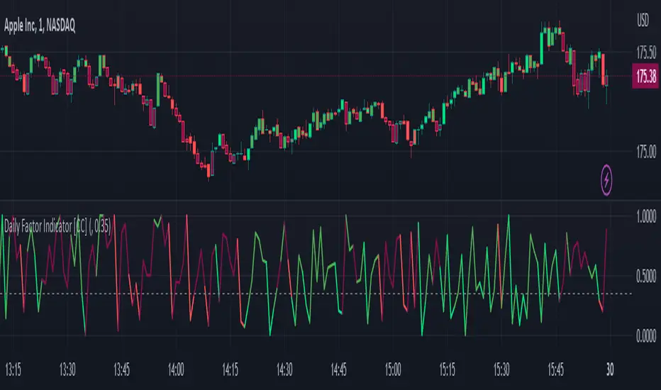
Daily Factor Indicator [CC]The Daily Factor Indicator was created by Andrea Unger (Stocks and Commodities Jun 2023 pgs 26-31), and this is a new volatility indicator that compares the body, which is the absolute difference between the previous open and previous close, and the range which is the difference between the previous high and previous low. The indicator is calculated by dividing the body and range to determine the volatility for the previous bar. This indicator will range between 0 and 1. Values closer to 1 mean very high volatility, and values closer to 0 mean very low volatility. I have introduced a simple moving average strategy to decide buy or sell signals and colors. Darker colors mean the indicator is above the threshold level, and lighter colors mean the indicator is below the threshold level. Colors are shades of green when the price is above the moving average and shades of red when the price is below the moving average. Feel free to try out your own threshold level and general buy and sell signals.
Let me know if there are any other indicators you would like me to publish!
Daily Gaps & Trapped PositionsThis script builds substantially upon the default Gaps script provided by Tradingview. Functionality was added to allow users to decide what price from the previous session is used to determine a daily gap, added support for showing gaps across all timeframes up to the daily time frame, and also allow gaps to be shown even with ETH enabled on the chart. This script provides support across normal securities, futures, and also crypto.
Users can decide between the following selections to determine if a daily gap has formed:
- Previous Session Close
- Previous Session High/Low
- Last RTH Candle High/Low
The other larger piece that was added is something called trapped positions or what some folks familiar with Market Profile would call "single prints". They could also be considered FVGs but they are a specific subset of FVGs as these must from above or below the current session's high/low.
Single prints form above or below a current session's high/low and can be considered an area where price has moved too fast in that area and price will most likely return to these areas at a later point in time. In some teachings, these are also looked at as "trapped shorts" (lighter blue box color) or "trapped supply" (yellow orange box color) which creates an area where there will be potential support (trapped shorts) or resistance (trapped supply) when this area is revisited in the future. Adding these to your chart will simply provide additional areas of interest where you may see buying or selling.
Both gaps and trapped positions have the following options:
- Show only active gaps/trapped positions. Selecting this will only show areas where price has not completely traded through the box.
- Close gaps/trapped positions partially. If this is selected, it will reduce the box size as price is traded through the area. If it is not selected, the box will only disappear once price has traded through the entire box completely.
There are some additional settings that allow you to tailor how many boxes show up on the chart. These settings are as follows:
- Max number of boxes. This setting will only plot up to this number of gaps/trapped positions.
- Minimum Deviation. This will prevent gaps/trapped positions from showing if they are too small relative to average across that last 14 periods.
- Limit Max Box Trail Length (bars). If checkbox is selected, the box will stop being extended after X number of bars given in this input.

Daily Opening GAPPlots the daily opening gap as a box. As price moves into the box the size of the box is reduced until the gap is closed and the box no longer extends forward.
There are options to include middle lines for the center of the gap, as well as quartile lines.
While there are plenty of opening gap scripts out there none that I found tracked the closing of the gap over time.
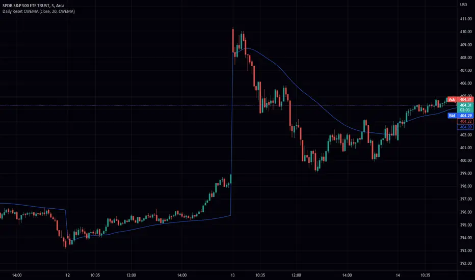
Daily Reset CWEMA/CWTEMAThis Pine Script code defines an indicator called "Daily Reset CWEMA" that plots a custom weighted moving average on a chart. The indicator takes three inputs: a source series (usually the close price of a security), a length parameter that specifies the number of periods over which the moving average is calculated, and a style parameter that specifies the type of moving average to use (either a custom weighted exponential moving average (CWEMA) or a custom weighted triple exponential moving average (CWTEMA)).
The code first checks the current time frame and adjusts the length parameter accordingly. If the time frame is daily, weekly, or monthly, the length parameter is used as-is. Otherwise, the length is set to the number of bars since the last day change, unless this value is less than the length parameter, in which case the length is set to the number of bars since the last day change.
The ema(), tema(), wma(), cwema(), and cwtema() functions are then defined. The ema() function calculates the exponential moving average of the source data using the number of bars since the last day change as the length. The tema() function calculates the triple exponential moving average of the source data using the number of bars since the last day change as the length. The wma() function calculates the weighted moving average of the source data using the given weights and the number of bars since the last day change as the length. The cwema() and cwtema() functions are similar to the wma() function, but use the ema() and tema() functions to calculate the moving average values instead of the source data directly.
Finally, the ma() function is defined, which takes the source data, length, and style as inputs and calls the appropriate moving average function based on the style parameter. The result of this function is then plotted on the chart.
Suggested by: @hjsjshs
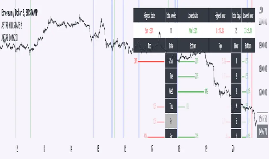
Daily Manual KILLZONESThis indicator is to be used with "KILLSTATS", our indicator allowing to backtest on hundreds of days at which time, and which day the top/low of the day and week is formed.
"Manual Killzone" allows to define our statistical killzones by day of the week manually: you define your own rules according to your interpretation of our Killstats indicator.
It integrates a daily price action filter according to the ICT concept:
It will only display bullish probabilities (green) defined if and only if we are in discount and out of the daily range 25/75%.
Same for bearish probabilities (red)
The blue color is to be applied in case of reversal with high contradictory probability (Example: to be used for Tuesday from 2pm to 3pm, if Tuesday is a day with high probability to form a top, but 2pm/15pm is the time with high probability to form a bottom AND a top. Indecision => blue)
WARNING : Calculated according to Etc/UTC time : put "0" in the Timezone parameter of killstats.
It is necessary to use the replay mode regularly during the backtesting to update the data!
Nasy -- Daily, Weekly, Monthly MADaily High Low, Daily Open Close, Weekly High Low, Weekly Open Close, Monthly High Low, Monthly Open Close

Daily Profile (Nephew_Sam_)From getting several requests to combine many of my indicators into one, this indicator plots everything you need for a Daily Profile.
1. Session = Current session + Daily dividers + day of the week
2. Open Lines = Plot the open of the day, midnight, week and month
3. Asian Range = Plots the asian range with an option for midpoint and extending lines
4. Previous OHLC = Plot the previous day/week/month OHLC
EVERY line/label/color/size/style is fully customizable in this indicator.
Important to adjust your timezone to get the correct data

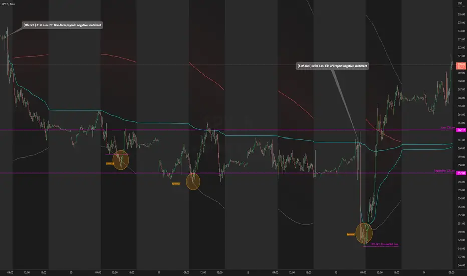
Daily RTH Moving Average On Intraday Timeframes [vnhilton]This indicator is intended for intraday use from the daily timeframe down to the 1 minute. Outside this range, the indicator won't work as intended.
Higher timeframe moving averages are step-lines as they use values from higher timeframes to calculate the moving average. To have a smoother moving average from higher timeframes plotted on lower timeframes, this indicator uses the chart timeframe's candles, allowing for a smooth higher timeframe moving average. This indicator also includes Bollinger Bands. Note that the indicator only uses values from regular trading hours, as to not give weighting to values from extended trading hours.
In the chart above, at October 7th, pre-market price action is bearish due to fundamentals around US employment data. This day led to an all-day-fader, stopping above the June low after attempting to break down the level again (previous breakdown attempts led to the September low). Note that the price is within the Bollinger bands of the 5 day moving average. We can see in the following days that $SPY trended downwards, staying below the anchored VWAP when the October 7th news released, & pay attention to October 10th, where price attempts to make a new low-of-day but ends up outside the 5 day period ma, leading to a reversal. Look at October 13th, where pre-market price action again shows bearish sentiment, but due to fundamentals around CPI data. $SPY opens below the September low, but also ends up outside the daily 5 period MA bands, meaning that the downside extension has extended too far, signalling for a reversion to the mean. This is why October 13th didn't lead to another all-day-fader, & instead trapped sellers trying to short the pre-market low, helping to fuel the relief rally to cause the upsides the June & September lows, & the anchored VWAPs from both significant pre-market events, to be reclaimed, where price pauses at the confluence of the 5 day moving average & the June low.
Daily VolumeShows a table in the top right of the chart with a few options:
Only show intraday: By default the table will not be visible on timeframes of 1D or above, but this can be changed to show all the time if desired.
Daily volume: Displays the volume for the day so far, regardless of what timeframe is currently showing.
Yesterday's volume: Displays the volume from the previous day. As with the daily volume , it will show the entire previous day's volume regardless of the current timeframe.
Average Volume: Displays the average volume based on a user-specified number of days. The default value is 30 days.
Text color and table color: Choose the color settings for the table text and background.

Daily Volume, RVol, RRVol, and RS/RW LabelsHeads-up display of essential Real Day Trading criteria
Daily Volume
Relative Strength/Weakness
ATR 14 and ATR 14 percent of price
Relative Volume (RVol)
Relative Volume to SPY RVol (RRVol)

Daily SMA In Lower Timeframe public versionThis script aims to provide the daily SMAs (50,100,200) in lower time frames, but ONLY if current price is less than 5% away from it (public code version)

Daily SMA In Lower TimeframeThis script aims to provide the daily SMAs (50,100,200) in lower time frames, but ONLY if current price is less than 5% away from it

Daily Short Volume RatioThe short volume ratio is the number of shares sold short divided by the average daily volume and is used to indicate sentiment. In its most basic form, short volume ratio above 0.5 indicates more folks are shorting the stock while a short volume ratio below 0.5 indicates more folks are buying the stock. Short volume and total volume data is collected daily from FINRA for the NYSE and the NASDAQ exchange and represents lit markets. Daily short and total volume is calculated after the exchanges close so will lag by a day on the chart.
This indicator displays the short volume ratio for the last 1, 2, 3, 4, and 5 days and includes a smoothing function (def: off) to better visualize trends.
The indicator also includes the ability to view the short volume ratio for the last day for a reference ticker (def: SPY) to compare with total market sentiment.
Thanks to those before me for providing ideas and code.

Daily Short VolumeThis is a script to utilize Quandl (Now Nasdaq Data Link) FINRA Short Volume datasets to see daily volume proportions by short / long activity.
For clarity, long volume does not indicate buying or selling, just that some volume for the day was either buying-to-open or selling-to-close.
Similar but opposite, short volume indicates that some volume for the day was either selling-to-open or buying-to-close.
The decimal value indicates the proportion of Long to Short volume. Example, 0.40 green / 0.60 red would indicate 40% long volume / 60% short volume for that day.
We can take that information as well as the overall outcome of the days session to get an idea for who was drove the market direction for the day.
The four clear outcomes that we can look for are:
If the volume was mostly long (a mostly green bar in the indicator) than an up day would indicate position holders added to long positions.
If the volume was mostly long (a mostly green bar in the indicator) than a down day would indicate position holders reduced from long positions.
If the volume was mostly short (a mostly red bar in the indicator) than a down day would indicate position holders sold short and added to short positions.
If the volume was mostly short (a mostly red bar in the indicator) than an up day would indicate position holders bought to cover long positions.
Those are the clearest possible cases but far more likely the volume will be muddled between short and long making interpreting the net outcome of the day far more difficult.
Unfortunately this data is only published at a daily resolution by FINRA and is usually available at the end of the trading day approximately 3-4 hours following market close.
Please reach out with any questions, suggestions, or recommendations on how to improve this indicator.
Best,
Zero

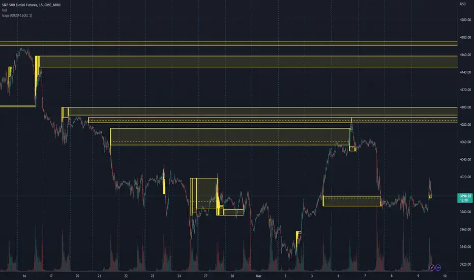
Daily and Weekly Sweep - LiquidityDaily and Weekly Sweep – Liquidity
Description:
The script is designed to illustrate the sweeps of the high and low of the previous day and week. The larger the ratio of shares traded to the percentage price change, the more deep and liquid the market is presumed to be, therefore the market maker always seeks liquidity. Liquidity rests above previous highs and below previous lows as many traders see these as obvious points to place their stops. These are areas on the chart where many orders are placed together and serve as tipping points for market makers. The script focuses on the previous day and week. We can assume these are potential areas for mitigation.
How to use:
The indicator plots the highs and lows of the previous day and week. On default, it also shows the high and low price for the first 8 hours of the opening day of the week. Users can customise this in settings. The weekly open is also plotted. The background changes colour once a daily/weekly high or low has been breached and stops at the extreme point of price. These areas may provide points of interest in the future.
A good understanding of supply and demand, order blocks, market structure, and how to identify fresh levels is expected to utilise it's full potential.
Alert function added for:
- Daily Sweep
- Weekly Sweep
Indicator in use:

Daily Scalping Moving AveragesThis is a technical analysis study based on the most fit leading indicators for short timeframes like EMA and SMA.
At the same time we have daily channel made from the last 2 weeks of ATR values, which will give us the daily top and bottom expected values(with 80%+ confidence)
We have 3 groups of lengths for short length, medium length and a bigger length.
At the same time we combine it with the daily vwap values .
In the end we are going to have a total of 7 indicators telling us the direction.
The way we can use it :
The max ratings that we can have are +7 for long and -7 for short
In general once we have at least 5 indicators(fast and medium ones) giving us a direction, there is a high chance that we can scalp that trend and then we can exit either when we will be at +7 or close to neutral point
At the same time is very important to be aware of the current position inside of the TOP/BOTTOM channel that we have.
For example lets assume we are at 40k on BTC and our top channel is around 41-42k while the bottom is around 38k. In this case the margin that we have for long is much smaller than for short, so we should be prepared to exit once we reach the top values and from there wait and see if there is a huge continuation or a reversal. If the top channel was hit and the market started the rebounce going downwards and the moving averages confirms it, then we have a huge advantage using the top points as a STOP LOSS and continue the short movements, giving us an amazing risk/reward ratio .
If you have any questions let me know !

Daily, Weekly, Monthly Pivot Points StandardShow Higher timeframe Pivot Point along with 3 support/Resistance and mid line between them
Option to show the Monthly lines, with or without mid line, and can select the color
Option to show the Weekly lines, with or without mid line, and can select the color
Option to show the Daily lines, with or without mid line, and can select the color
Option to show a tables with the previous Open, High, Low, Close for these higher timeframe
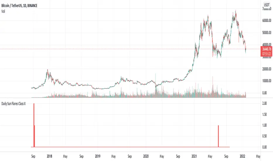
Daily Sun Flares Class XThe classification system for solar flares uses the letters A, B, C, M or X, according to the peak flux as measured at the Earth by the GOES spacecraft.
These are daily Class X sun flares. The data was created by counting daily flares of this class based on the peak time of the flare.
2015-01-01 until 2021-08-25
Daily EMA50 100 200 + BBStandard Bollinger Bands (timeframe dependent), period and standard deviation are configurable.
And standard daily triple EMA (timeframe independent). Short, Medium and Long periods are configurable (50/100/200 by default)
Daily Sun Flares Class MThe classification system for solar flares uses the letters A, B, C, M or X, according to the peak flux as measured at the Earth by the GOES spacecraft.
These are daily Class M sun flares. The data was created by counting daily flares of this class based on the peak time of the flare.

Daily Sun Flares Class CThe classification system for solar flares uses the letters A, B, C, M or X, according to the peak flux as measured at the Earth by the GOES spacecraft.
These are daily Class C sun flares. The data was created by counting daily flares of this class based on the peak time of the flare.

Daily Settlement (BM&FBOVESPA B3 FUTURES)This script is simple designed to plot the daily settlement to any Securities traded on B3, Brazilian stock exchange.
The daily settlement is an important price where position traders are adjusted every day. This adjustment is defined by the exchange itself every day at approximately 4 pm, with an average of all trades in this window.
We consider that the settlement is a region of "money spent", where every day, some player "woke up" in long or in short at that price. As this is a region of "money spent", traders should give significant attention when traded at this price.
