Crypto Camp Day Key LevelsDaily key levels Daily key levels Daily key levels Daily key levels Daily key levels Daily key levels
在腳本中搜尋"daily"

5-Day & 20-Day Prior MA Lines (Gap Label)
Daily 5 & 20 Moving Average Levels
This indicator plots the Daily 5-period and Daily 20-period moving averages as horizontal levels on any timeframe. Each level starts at the first bar of the trading day and extends only to the current price, keeping the chart clean and focused on the active session.
The levels update once per day using confirmed daily data and are designed to act as intraday bias, support, and resistance references. Labels are aligned on the right side for a minimal, institutional-style presentation.
Useful for:
* Intraday trading on lower timeframes
* Identifying daily trend bias
* Mean reversion and pullback setups
* Futures, stocks, ETFs, and options
No future extension, no repainting, and no unnecessary clutter.

Timeframe Overlay 24HrDaily High–Low Box (00:00–23:59)
This indicator highlights each trading day with a shaded box spanning from 00:00 to 23:59 (based on the selected timezone) and covering the day’s highest and lowest price.
• Green box when the day closes above its open
• Red box when the day closes below its open
• Historical days are fully drawn for easy comparison
• Current day box builds dynamically as new candles form
Useful for visualising daily range, market bias, and intraday structure across all timeframes.

OFM Key LevelsDaily and Weekly Levels Only
Daily Levels Calculated from RTH Sessions
Weekly Levels Calculated ETH

AP Index - Geomagnetic disturbancesDaily AP index back to 2015-01-01.
Geomagnetic disturbances can be monitored by ground-based magnetic observatories recording the three magnetic field components. The global Kp index is obtained as the mean value of the disturbance levels in the two horizontal field components, observed at 13 selected, subauroral stations . The name Kp originates from "planetarische Kennziffer" ( = planetary index).
The three-hour index ap and the daily indices Ap, Cp and C9 are directly related to the Kp index. In order to obtain a linear scale from Kp, J. Bartels gave the following table to derive a three-hour equivalent range, named ap index.
Geomagnetic Ap Index: The daily index Ap is obtained by averaging the eight values of ap for each day.
Based on the data from Helmholtz Centre Potsdam GFZ German Research Centre for Geosciences.

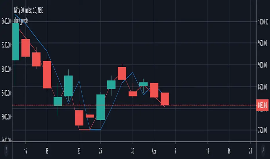
daily_pivots_beta_persistenttraderDaily central pivots for today and tomorrow are plotted. This is strictly BETA version.
Irrespective of timeframe chosen for the charts, it's DAILY pivots that are plotted.
Pls note that this is made available as-is and I make it clear that I am not responsible for any profilt or loss or any other outcome directly or indirectly arising out of use of this formula.
3 MA(50,100,200)_DAILYDaily Moving Average (50, 100, 200) in one code, indicates daily MA values in all time frames
Daily Weekly Monthly ClosesFeatures:
Labels showing the close price for each period
Toggle visibility for day, week, and month closes
Customizable colors for each level
Adjustable line width and style (solid, dashed, dotted)
Labels appear on the right side of the chart


Daily Xth Percentile Volume SpikeA percentile is a statistical measure that indicates the relative standing of a specific value within a dataset by identifying the percentage of data points that fall at or below it. Volume percentile indicates how that trading compares to other days. For example, volume above the 95th percentile means more shares/contracts traded than in the last 20-days lookback period.

Daily ATR + DeltaThis indicator shows last value of ATR with this parameters: Length 14, Smoothing RMA, Timeframe 1 day i Wait for timeframe closes.
Also, it shows Delta in percentage.
Delta is calculated in this way: -((the last one-minute closing price of the previous day's stock exchange)-(last price at the moment))/(value of ATR) * 100
Notice:
If you are in postmarket or premarket, delta will be also calculated from the "the last one-minute closing prices of the previous day's stock exchange" not from the "the last one-minute closing price of the todays stock exchange".
You dont need to have indicator Average True Range for this indicator to be working.

Daily Upside LinePlots an intraday upside line.
Uses proprietary breakout score logic to show when intraday setups are ripe for continuation.
Finds the average of these lines to plot the upside line

Daily Opens (Today/Yesterday/Prev Week)Market open markers for Volume profile traders, Marks Current Day open, Previous Day open, Previous Week open.


Daily Extension from 50DMA (adjustable) in ATR%Indicator to easily spot over extended prices in relation to ATR.
ATR or ADR easily referenced

Daily Gap + Pre-Market Zones + EMA 9Intraday Gap Zones & Pre-Market Range
Description
Concept & Overview This indicator is designed for intraday traders (Indices and Equities) who focus on structural price action at the market open. The script automates the drawing of two critical liquidity zones:
The Gap Zone: The empty space between the previous Regular Trading Hours (RTH) Close and the current day's Open.
The Pre-Market Range: The High and Low established between 04:00 AM and 09:30 AM ET.
By visualizing these levels automatically, traders can instantly see if the market is opening inside value or gapping out of range. It also includes an EMA 9 to assist with trend determination.
Key Features
Automated Gap Visualization: Automatically draws a box from yesterday's 4:00 PM Close to today's 9:30 AM Open. This box extends to the right, creating a visual reference for potential "Gap Fill" plays.
Pre-Market High/Low: Captures the full range of the pre-market session. Once the market opens, these levels are locked and extended as key Support/Resistance levels for the day.
Timezone Intelligence: The script is hardcoded to America/New_York time. This ensures accurate level detection regardless of your local timezone or chart settings.
Smart Alerts (Context Aware): Unlike standard EMA alerts, this script utilizes specific logic. Alerts are only triggered if an EMA crossover occurs inside the Gap Zone. This filters out noise and focuses on reversals or continuations specifically within the gap.
How it Works
Session Tracking: The script distinguishes between Pre-Market (04:00-09:30 ET) and RTH (09:30-16:00 ET).
Level Locking: At 09:30 AM ET, the script takes a snapshot of the pre-market high/low and the calculated gap. It draws the boxes and locks them for the remainder of the trading day.
EMA Filter: A standard 9-period EMA runs continuously.
Signal Generation: If price is strictly trading inside the Gap Box during RTH, and it crosses the EMA 9, a signal is generated.
Settings & Customization
Gap Zone Color: Customize the color and transparency of the Gap box.
Pre-Market Zone Color: Customize the look of the pre-market range.
EMA Length: Adjust the moving average period (Default: 9).
Best Practices
Timeframe: Best used on intraday timeframes (1m, 3m, 5m, 15m).
Markets: Optimized for US Equities and Indices (SPY, QQQ, NVDA, TSLA, etc.) due to the specific RTH logic.
Disclaimer & Risk Warning
For Educational Purposes Only This script and the indicators generated are for educational and informational purposes only. They do not constitute financial advice, investment recommendations, or a solicitation to buy or sell any securities.
Risk Warning Trading financial markets involves a high level of risk and may not be suitable for all investors. You should be aware of all the risks associated with trading and seek advice from an independent financial advisor if you have any doubts.
No Guarantee: Past performance of any trading system or methodology is not necessarily indicative of future results.
Software Limitations: While every effort has been made to ensure the accuracy of the calculations in this script, technology failures, data feed errors, or bugs may occur. Always verify levels manually before executing trades.
Usage By using this script, you acknowledge that you are solely responsible for your own trading decisions and results.


Daily Candle Bias Backtesting Stats @MaxMaserati This indicator, is a powerful backtesting and probability tool designed to quantify the "follow-through" of specific candle types across different market sessions.
It identifies specific price action setups and tracks whether price hits a "Target" (continuation) or an "Invalidation" (reversal) first, providing real-time win rates for your favorite sessions.
The Candle Bias Stats indicator automatically categorizes every candle based on the MMM candle bias and tracks their historical success rate. It calculates how often a candle's high/low is broken before its opposite end is touched. By breaking this data down into sessions (Asian, London, NY), it identifies high-probability "time-of-day" windows where specific price action setups are most reliable.
MMM CANDLE LOGIC
Bullish Expansion & Breakout Signatures
Bullish Body Close Plus (BuBC Plus): Represents strong bullish momentum where price closes above the previous high and near its own top, signaling that buyers are in complete control.
Bullish Body Close Minus (BuBC Minus): Indicates weak bullish momentum; while the price closes above the previous high, a long top wick shows sellers pushed back, suggesting a potential retest of the previous high.
Bearish Expansion & Breakout Signatures
Bearish Body Close Plus (BeBC Plus): A very strong bearish signal where price closes below the previous low and near its own bottom, indicating sellers are dominant.
Bearish Body Close Minus (BeBC Minus): Signifies weak bearish momentum; the price breaks the previous low but finishes with a long bottom wick as buyers push back, often leading to a retest of the old ceiling.
Bullish Reversal & Trap Signatures (Affinity)
Bullish Affinity Plus (BuAF Plus): A strong bullish reversal where a new low is made, but sellers hit a wall and get trapped, causing price to finish near its top with a long bottom wick.
Bullish Affinity Minus (BuAF Minus): A weak bullish bounce where a new low is made and price finishes back inside the previous range, but buyers lack the energy for a significant move.
Bearish Reversal & Trap Signatures (Affinity)
Bearish Affinity Plus (BeAF Plus): A strong bearish reversal; buyers are trapped after making a new high, and price finishes near its bottom with a long top wick.
Bearish Affinity Minus (BeAF Minus): A weak bearish drop where sellers stop the rise but lack the energy to push price significantly lower.
Neutral & Volatility Signatures
Close Inside Bullish (CI•BuAF): Bullish neutral state where price stays inside the previous candle’s range but finishes in the top half, indicating buyers are slightly more active.
Close Inside Bearish (CI•BeAF): Bearish neutral state where price remains inside the previous box and finishes in the bottom half.
Seek & Destroy Bullish (S&D•BuAF): Bullish volatility characterized by price moving above and below the previous candle before buyers win the battle and close price near the top.
Seek & Destroy Bearish (S&D•BeAF): Bearish volatility where sellers win a high-chaos battle, closing price near the bottom after sweeping both sides of the previous candle.
H4 CANDLE EXAMPLE
Deep Dive: Analysis of the 4H Statistics
The image presents a comprehensive backtest of 4,999 total candles from September 2022 to December 2025. Here is the breakdown of what the interface is telling us:
1. The Strategy: Target vs. Invalidation
The indicator tracks BuBC (Bullish Body Close) and BeBC (Bearish Body Close).
The Target: For a Bullish candle, the target is the High. For a Bearish candle, it is the Low.
The Invalidation: The opposite end of the candle (the Low for Bullish, the High for Bearish).
The Goal: To see which level is touched first in the subsequent bars.
2. Global Performance (The Top Right Table)
Looking at the BuBC (1402 samples) section:
Target First (67.8%): In nearly 7 out of 10 cases, once a 4H candle closes "bullish" (breaking the previous high), the price continues higher to break its own high before it ever returns to take out its own low.
Both Hit (17.7%): This is a critical metric. It represents "Stop Runs" or "Wicks" where price hits the target but also hits the invalidation within the same tracking period.
Efficiency (1.3 Bars): This tells us the "follow-through" is almost immediate. If the trade doesn't work within 1 or 2 candles, the statistical edge drops off significantly.
3. The Session Breakdown (The Bottom Left Table)
This is where the "Edge" is found. Not all hours of the day are created equal.
Asian Late (02:00-06:00) – The "Star" Performer: With a 72.9% Target rate, this is labeled "BEST." It has the lowest "Both%" (6.5%), meaning moves during these hours are incredibly "clean." If a setup forms here, price usually moves directly to the target without looking back.
London Open & Overlap (06:00-14:00): These sessions maintain a high win rate (approx. 70%). This suggests that the European session provides reliable trend continuation for the S&P 500.
NY Session (14:00-18:00) – The "Trap" Zone: This is labeled "WORST" for a reason. While the win rate is basically a coin flip (49.6%), the Both% spikes to 36.7%. This means that even if you are right about the direction, the market is highly likely to "sweep" your stop loss before going to the target. It is the most volatile and "fake-out" prone time for this specific setup.
Summary of the Data
The statistics show that the S&P 500 4H Candle Bias is a highly reliable trend-following indicator, provided you trade it at the right time.
The data suggests a clear three-step logic:
Directional Edge: Both Bullish and Bearish body closes have a natural ~67% probability of continuation.
Timing is Everything: Trading during the Late Asian and London sessions increases your probability of success to over 70% with very low risk of a "fake-out."
Risk Warning: Avoid "Body Close" breakout strategies during the NY Mid-day (14:00-18:00). The statistics prove that this window is dominated by "Seek and Destroy" price action, where price is mathematically likely to hit both your target and your stop, usually hitting the stop first.

Daily SMA 20/50/100/200Simple Moving Averages indicator displaying four commonly used trend lines on the price chart. Plots the 20, 50, 100, and 200 period SMAs to help identify short-, medium-, and long-term trend direction, dynamic support and resistance, and overall market structure. Color-coded for clarity: 20 SMA in green, 50 SMA in blue, 100 SMA in orange, and 200 SMA in red, with uniform line thickness for clean visual consistency.

Daily SMA 20/50/100/200Simple Moving Averages indicator displaying four commonly used trend lines on the price chart. Plots the 20, 50, 100, and 200 period SMAs to help identify short-, medium-, and long-term trend direction, dynamic support and resistance, and overall market structure. Color-coded for clarity: 20 SMA in green, 50 SMA in blue, 100 SMA in orange, and 200 SMA in red, with uniform line thickness for clean visual consistency.

Daily SMA 20/50/100/200Simple Moving Averages indicator displaying four commonly used trend lines on the price chart. Plots the 20, 50, 100, and 200 period SMAs to help identify short-, medium-, and long-term trend direction, dynamic support and resistance, and overall market structure. Color-coded for clarity: 20 SMA in green, 50 SMA in blue, 100 SMA in orange, and 200 SMA in red, with uniform line thickness for clean visual consistency.

Daily & Pre-Market Key Levels (v5)Plots:
- Today's high/low
- Pre-market High/Low
- Yesterday's high/low/close
- Day before yesterday high/low

Daily Vertical Linesadjust the time hour and minute base on ur timeframe.
please note that for asian beijing time you will need to deduct 1 hour
