在腳本中搜尋"daily"


Daily Real-Time Relative Volume *Eastern Time Zone Only*Calculates the current relative volume in real-time compared to the inputted moving average length.
*VOLUME MUST CHANGE on the current chart, once loaded, with the indicator before the script activates and presents the current relative volume*
On high volume stocks the script should activate almost immediately on low volume stocks it may take a little while.
Relative Volume that equals or exceeds the High Volume Threshold set will color the column either red or green (based on current and previous days close).
Relative Volume that is below the Low Volume Threshold set will color the column yellow.
Relative volume between the Low and High Volume Thresholds set will color the column black.


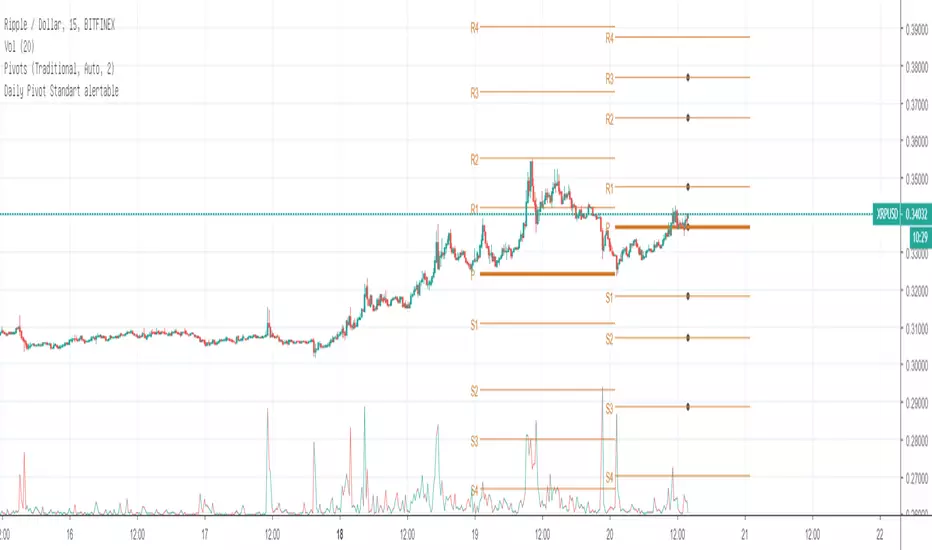
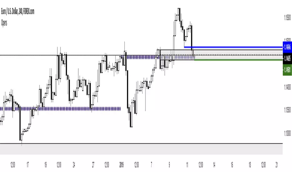
Daily Pivot Standart alertableWith this Indicator u can set allert between the Pivot points s15.directupload.net
So it is useful for scalping
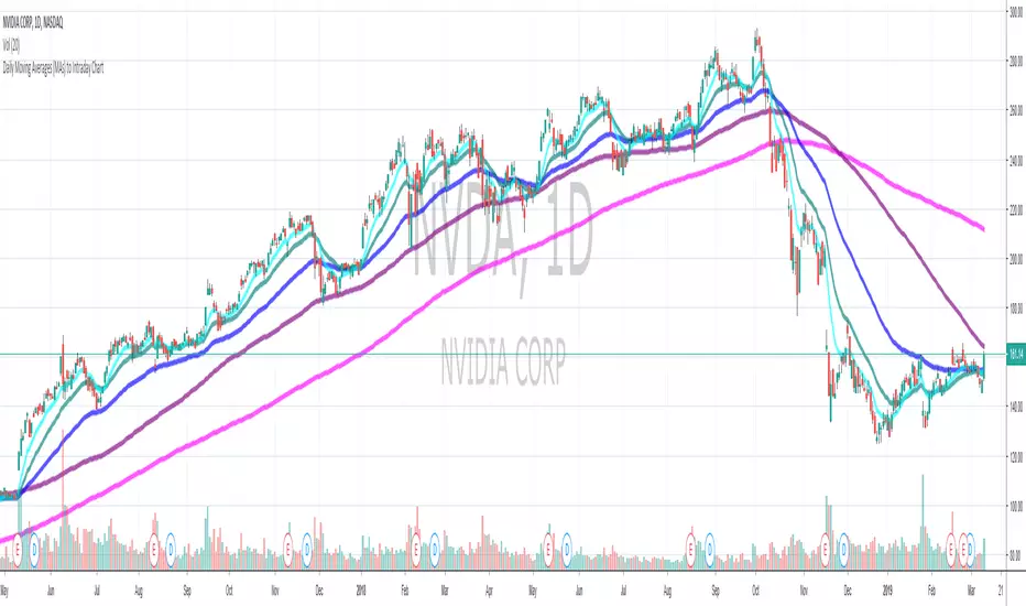
Daily Moving Average to Intraday Chart BradleyRUses Robertob's Script with Mike's colors for Warrior Pro Students.


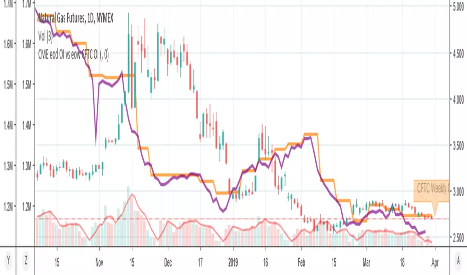
MY_CME eod OI vs CFTC eow OIDaily e-o-d Open Interest as published by CME.
As CFTC COT Open Interest relates to last Tuesday, here you can have an idea how things evolved day-by-day since then.
As CME total OI is not accessibl as data, here I sum OI of the next 9 outstanding contracts, which gives a fair idea of the trend in OI

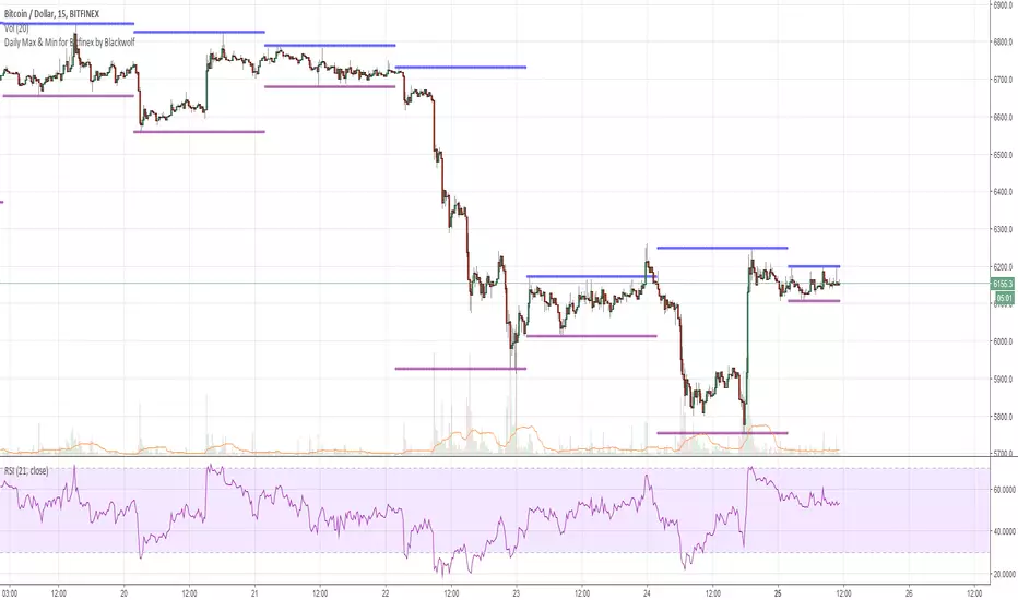
Daily Max & Min for Bitfinex by BlackwolfThis script shows the min and max price level of each day. It can be used also for support and resistance level.
Lo script mostra il prezzo massimo e minimo raggiunto nelle 24 ore. può essere utilizzato come idea per supporti e resistenze
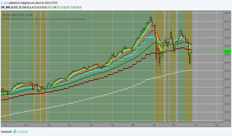
MTF EMA Combo with Background ColorDaily/Weekly EMA combo for longer term trend direction, with combo background color for varying trend direction.
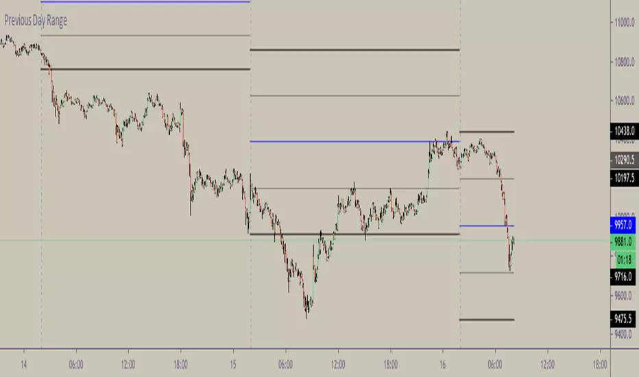
CMGB Pivot PointsDaily and weekly pivots.
Setting: specify how many candles are in a day (in the time frame you are using)
For example for 15m TF there are 91 (not 96) candles. When you get the number right, the lines will align nicely.


Daily SARThe image describes how to use the indicator fairly well, and I used 1 minute candles here, but it's best used on 1H candles.
There's a little bit of noise as the SAR updates, you can expect two movements before it settles. Ignore the first one, it is largely irrelevant except as a signal that the real movement is about to occur (and a hint at which direction).


Daily Average True Range OverlayPlots the upper and lower average true range away from the previous days close on all time frames.

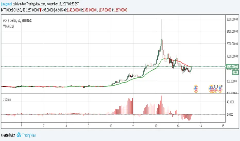
Daily GainPlot today's gain (%) of current security. It's a value of increase/decrease of current price compared to today's 00:00:00 candle open price.
I'm open for idea to improve this script. Drop me message or email to juraganet@gmail.com.