SOPR | QuantumResearchIntroducing Rocheur’s SOPR Indicator
The Spent Output Profit Ratio (SOPR) indicator by Rocheur is a powerful tool designed for analyzing Bitcoin market dynamics using on-chain data. By leveraging SOPR data and smoothing it through short- and long-term moving averages, this indicator provides traders with valuable insights into market behavior, helping them identify trends, reversals, and potential trading opportunities.
Understanding SOPR and Its Role in Trading
SOPR is a metric derived from on-chain data that measures the profit or loss of spent outputs on the Bitcoin network. It reflects the behavior of market participants based on the price at which Bitcoin was last moved. When SOPR is above 1, it indicates that outputs are being spent at a profit. Conversely, values below 1 suggest that outputs are being spent at a loss.
Rocheur’s SOPR indicator enhances this raw data by incorporating short-term and long-term smoothed trends, allowing traders to observe shifts in market sentiment and momentum.
How It Works
Data Source: The indicator uses SOPR data from Glassnode’s BTC_SOPR metric, updated daily.
Short-Term Trend (STH SOPR):
A Double Exponential Moving Average (DEMA) is applied over a customizable short-term length (default: 150 days).
This reflects recent market participant behavior.
Long-Term Trend (1-Year SOPR):
A Weighted Moving Average (WMA) is applied over a customizable long-term length (default: 365 days).
This captures broader market trends and investor behavior.
Trend Comparison:
Bullish Market: When STH SOPR exceeds the 1-year SOPR, the market is considered bullish.
Bearish Market: When STH SOPR falls below the 1-year SOPR, the market is considered bearish.
Neutral Market: When the two values are equal, the market is neutral.
Visual Representation
The indicator provides a color-coded visual representation for easy trend identification:
Green Bars: Indicate a bullish market where STH SOPR is above the 1-year SOPR.
Red Bars: Represent a bearish market where STH SOPR is below the 1-year SOPR.
Gray Bars: Show a neutral market condition where STH SOPR equals the 1-year SOPR.
The dynamic bar coloring allows traders to quickly assess the prevailing market sentiment and adjust their strategies accordingly.
Customization & Parameters
The SOPR Indicator offers several customizable settings to adapt to different trading styles and preferences:
Short-Term Length: Default set to 150 days, defines the smoothing period for the STH SOPR .
Long-Term Length: Default set to 365 days, defines the smoothing period for the 1-year SOPR.
Color Modes: Choose from seven distinct color schemes to personalize the indicator’s appearance.
Final Note
Rocheur’s SOPR Indicator is a unique tool that combines on-chain data with technical analysis to provide actionable insights for Bitcoin traders. Its ability to blend short- and long-term trends with a visually intuitive interface makes it an invaluable resource for navigating market dynamics. As with all indicators, backtesting and integration into a comprehensive strategy are essential for optimizing performance.
在腳本中搜尋"daily"

Bollinger Breakout Strategy with Direction Control [4H crypto]Bollinger Breakout Strategy with Direction Control - User Guide
This strategy leverages Bollinger Bands, RSI, and directional filters to identify potential breakout trading opportunities. It is designed for traders looking to capitalize on significant price movements while maintaining control over trade direction (long, short, or both). Here’s how to use this strategy effectively:
How the Strategy Works
Indicators Used:
Bollinger Bands:
A volatility-based indicator with an upper and lower band around a simple moving average (SMA). The bands expand or contract based on market volatility.
RSI (Relative Strength Index):
Measures momentum to determine overbought or oversold conditions. In this strategy, RSI is used to confirm breakout strength.
Trade Direction Control:
You can select whether to trade:
Long only: Buy positions.
Short only: Sell positions.
Both: Trade in both directions depending on conditions.
Breakout Conditions:
Long Trade:
The price closes above the upper Bollinger Band.
RSI is above the midline (50), confirming upward momentum.
The "Trade Direction" setting allows either "Long" or "Both."
Short Trade:
The price closes below the lower Bollinger Band.
RSI is below the midline (50), confirming downward momentum.
The "Trade Direction" setting allows either "Short" or "Both."
Risk Management:
Stop-Loss:
Long trades: Set at 2% below the entry price.
Short trades: Set at 2% above the entry price.
Take-Profit:
Calculated using a Risk/Reward Ratio (default is 2:1).
Adjust this in the strategy settings.
Inputs and Customization
Key Parameters:
Bollinger Bands Length: Default is 20. Adjust based on the desired sensitivity.
Multiplier: Default is 2.0. Higher values widen the bands; lower values narrow them.
RSI Length: Default is 14, which is standard for RSI.
Risk/Reward Ratio: Default is 2.0. Increase for more aggressive profit targets, decrease for conservative exits.
Trade Direction:
Options: "Long," "Short," or "Both."
Example: Set to "Long" in a bullish market to focus only on buy trades.
How to Use This Strategy
Adding the Strategy:
Paste the script into TradingView’s Pine Editor and add it to your chart.
Setting Parameters:
Adjust the Bollinger Band settings, RSI, and Risk/Reward Ratio to fit the asset and timeframe you're trading.
Analyzing Signals:
Green line (Upper Band): Signals breakout potential for long trades.
Red line (Lower Band): Signals breakout potential for short trades.
Blue line (Basis): Central Bollinger Band (SMA), helpful for understanding price trends.
Testing the Strategy:
Use the Strategy Tester in TradingView to backtest performance on your chosen asset and timeframe.
Optimizing for Assets:
Forex pairs, cryptocurrencies (like BTC), or stocks with high volatility are ideal for this strategy.
Works best on higher timeframes like 4H or Daily.
Best Practices
Combine with Volume: Confirm breakouts with increased volume for higher reliability.
Avoid Sideways Markets: Use additional trend filters (like ADX) to avoid trades in low-volatility conditions.
Optimize Parameters: Regularly adjust the Bollinger Bands multiplier and RSI settings to match the asset's behavior.
By utilizing this strategy, you can effectively trade breakouts while maintaining flexibility in trade direction. Adjust the parameters to match your trading style and market conditions for optimal results!

Honest Volatility Grid [Honestcowboy]The Honest Volatility Grid is an attempt at creating a robust grid trading strategy but without standard levels.
Normal grid systems use price levels like 1.01;1.02;1.03;1.04... and place an order at each of these levels. In this program instead we create a grid using keltner channels using a long term moving average.
🟦 IS THIS EVEN USEFUL?
The idea is to have a more fluid style of trading where levels expand and follow price and do not stick to precreated levels. This however also makes each closed trade different instead of using fixed take profit levels. In this strategy a take profit level can even be a loss. It is useful as a strategy because it works in a different way than most strategies, making it a good tool to diversify a portfolio of trading strategies.
🟦 STRATEGY
There are 10 levels below the moving average and 10 above the moving average. For each side of the moving average the strategy uses 1 to 3 orders maximum (3 shorts at top, 3 longs at bottom). For instance you buy at level 2 below moving average and you increase position size when level 6 is reached (a cheaper price) in order to spread risks.
By default the strategy exits all trades when the moving average is reached, this makes it a mean reversion strategy. It is specifically designed for the forex market as these in my experience exhibit a lot of ranging behaviour on all the timeframes below daily.
There is also a stop loss at the outer band by default, in case price moves too far from the mean.
What are the risks?
In case price decides to stay below the moving average and never reaches the outer band one trade can create a very substantial loss, as the bands will keep following price and are not at a fixed level.
Explanation of default parameters
By default the strategy uses a starting capital of 25000$, this is realistic for retail traders.
Lot sizes at each level are set to minimum lot size 0.01, there is no reason for the default to be risky, if you want to risk more or increase equity curve increase the number at your own risk.
Slippage set to 20 points: that's a normal 2 pip slippage you will find on brokers.
Fill limit assumtion 20 points: so it takes 2 pips to confirm a fill, normal forex spread.
Commission is set to 0.00005 per contract: this means that for each contract traded there is a 5$ or whatever base currency pair has as commission. The number is set to 0.00005 because pinescript does not know that 1 contract is 100000 units. So we divide the number by 100000 to get a realistic commission.
The script will also multiply lot size by 100000 because pinescript does not know that lots are 100000 units in forex.
Extra safety limit
Normally the script uses strategy.exit() to exit trades at TP or SL. But because these are created 1 bar after a limit or stop order is filled in pinescript. There are strategy.orders set at the outer boundaries of the script to hedge against that risk. These get deleted bar after the first order is filled. Purely to counteract news bars or huge spikes in price messing up backtest.
🟦 VISUAL GOODIES
I've added a market profile feature to the edge of the grid. This so you can see in which grid zone market has been the most over X bars in the past. Some traders may wish to only turn on the strategy whenever the market profile displays specific characteristics (ranging market for instance).
These simply count how many times a high, low, or close price has been in each zone for X bars in the past. it's these purple boxes at the right side of the chart.
🟦 Script can be fully automated to MT5
There are risk settings in lot sizes or % for alerts and symbol settings provided at the bottom of the indicator. The script will send alert to MT5 broker trying to mimic the execution that happens on tradingview. There are always delays when using a bridge to MT5 broker and there could be errors so be mindful of that. This script sends alerts in format so they can be read by tradingview.to which is a bridge between the platforms.
Use the all alert function calls feature when setting up alerts and make sure you provide the right webhook if you want to use this approach.
Almost every setting in this indicator has a tooltip added to it. So if any setting is not clear hover over the (?) icon on the right of the setting.
ICT Professional Accumulation DistributionICT Professional Accumulation Distribution (ICT AD) provides a x-ray view into market accumulation and distribution. You can literally see the institutions at work.
The indicator consists of two cumulative lines derived from:
Cumulative change from open to close
Cumulative change from previous close to new open
By overlaying these two cumulative lines, you can detect real meaningful divergence that is narrative based not mathematically derived. You're seeing the real works of algorithms in play working in this area.
These divergences are only useful at extremes (topping or bottoming formations), not while trending. It will probably confirm your suspicion about making a important high or low.
This works on all timeframes but is most impactful on the daily.
How to use:
Method 1:
Enable the option for "Show Open vs Close."
Calculate the shift by subtracting the "Open vs Close" line value from the ICT Accumulation/Distribution (AD) line value.
Look for divergences between the two cumulative lines.
Method 2:
Switch the chart's display mode to "Line View" (representing the Open vs Close).
look for divergences between the line chart and the ICT AD line.

MTF SqzMom [tradeviZion]Credits:
John Carter for creating the TTM Squeeze and TTM Squeeze Pro.
Lazybear for the original interpretation of the TTM Squeeze: Squeeze Momentum Indicator.
Makit0 for evolving Lazybear's script by incorporating TTM Squeeze Pro upgrades – Squeeze PRO Arrows.
MTF SqzMom - Multi-Timeframe Squeeze & Momentum Tool
MTF SqzMom is a tool designed to help traders easily monitor squeeze and momentum signals across multiple timeframes in a simple, organized format. Built using Pine Script 5, it ensures that data remains consistent, even when switching between different time intervals on the chart.
Key Features:
Multi-Timeframe Monitoring: Track squeeze and momentum signals across various timeframes, all in one view. This includes key timeframes like 1-minute, 5-minute, hourly, and daily.
Dynamic Table Display: A color-coded table that automatically adjusts based on the selected timeframes, offering a clear view of market conditions.
Alerts for Key Market Events: Get notifications when a squeeze starts or fires across your chosen timeframes, so you can stay informed without needing to monitor the chart continuously.
Customizable Appearance: Tailor the look of the table by selecting colors for squeeze levels and momentum shifts, and choose the best position on your chart for easy access.
How It Works:
MTF SqzMom is based on the concept of the squeeze, which signals periods of lower volatility where price breakouts may occur. The tool tracks this by monitoring the contraction of Bollinger Bands within Keltner Channels. Along with this, it provides momentum analysis to help you gauge the potential direction of the market after a squeeze.
Squeeze Conditions: The script tracks four levels of squeeze conditions (no squeeze, low, mid, and high), each represented by a different color in the table.
Momentum Analysis: Momentum is visually represented by colors indicating four stages: up increasing, up decreasing, down increasing, and down decreasing. This color coding helps you quickly assess whether the market is gaining or losing momentum.
Using Alerts:
You can enable two types of alerts: when a squeeze starts (indicating consolidation) and when a squeeze fires (indicating a breakout). These alerts cover all timeframes you’ve selected, so you never miss important signals.
How to Set It Up:
1. Enable Alerts in Settings: Turn on "Alert for Squeeze Start" and "Alert for Squeeze Fire" in the settings.
2. Add Alerts to Your Chart:
Click the three dots next to the indicator name.
Select "Add alert on tradeviZion - MTF SqzMom."
3. Customize and Save: Adjust alert options, choose your notification type, and click "Create."
Why Use MTF SqzMom ?
Consistent Data: The tool ensures that squeeze and momentum data remain consistent, even when you switch between chart intervals.
Real-Time Alerts: Stay updated with alerts for squeeze conditions without needing to constantly watch the chart.
Simple to Use, Customizable to Fit: You can easily adjust the table’s look and choose the timeframes and colors that best suit your trading style.
Acknowledgment:
While this tool builds on the TTM Squeeze concept developed by John Carter of Simpler Trading, it offers added flexibility through multi-timeframe analysis, alerts, and customizability to make monitoring market conditions more accessible.

Multi-time Frame Trend DirectionThis is a multi-time frame trend direction indicator. It indicates whether the trend is ascending or descending across multiple time frames: 5M, 15M, 30M, 1H, 4H, and Daily.
The logic is based on the positions of EMA12 and EMA26.
These EMAs are smoothed with an SMA.
Why 12 and 26, and why are they smoothed with 9?
As you might surmise, these parameters are derived from the MACD.
I recommend not altering the parameters, but the choice is yours. Enjoy.
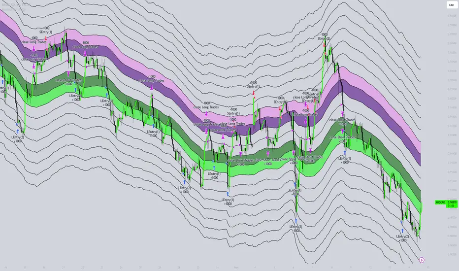
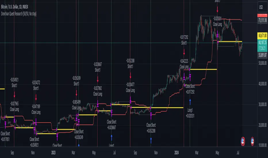
Donchian Quest Research// =================================
Trend following strategy.
// =================================
Strategy uses two channels. One channel - for opening trades. Second channel - for closing.
Channel is similar to Donchian channel, but uses Close prices (not High/Low). That helps don't react to wicks of volatile candles (“stop hunting”). In most cases openings occur earlier than in Donchian channel. Closings occur only for real breakout.
// =================================
Strategy waits for beginning of trend - when price breakout of channel. Default length of both channels = 50 candles.
Conditions of trading:
- Open Long: If last Close = max Close for 50 closes.
- Close Long: If last Close = min Close for 50 closes.
- Open Short: If last Close = min Close for 50 closes.
- Close Short: If last Close = max Close for 50 closes.
// =================================
Color of lines:
- black - channel for opening trade.
- red - channel for closing trade.
- yellow - entry price.
- fuchsia - stoploss and breakeven.
- vertical green - go Long.
- vertical red - go Short.
- vertical gray - close in end, don't trade anymore.
// =================================
Order size calculated with ATR and volatility.
You can't trade 1 contract in BTC and 1 contract in XRP - for example. They have different price and volatility, so 1 contract BTC not equal 1 contract XRP.
Script uses universal calculation for every market. It is based on:
- Risk - USD sum you ready to loss in one trade. It calculated as percent of Equity.
- ATR indicator - measurement of volatility.
With default setting your stoploss = 0.5 percent of equity:
- If initial capital is 1000 USD and used parameter "Permit stop" - loss will be 5 USD (0.5 % of equity).
- If your Equity rises to 2000 USD and used parameter "Permit stop"- loss will be 10 USD (0.5 % of Equity).
// =================================
This Risk works only if you enable “Permit stop” parameter in Settings.
If this parameter disabled - strategy works as reversal strategy:
⁃ If close Long - channel border works as stoploss and momentarily go Short.
⁃ If close Short - channel border works as stoploss and momentarily go Long.
Channel borders changed dynamically. So sometime your loss will be greater than ‘Risk %’. Sometime - less than ‘Risk %’.
If this parameter enabled - maximum loss always equal to 'Risk %'. This parameter also include breakeven: if profit % = Risk %, then move stoploss to entry price.
// =================================
Like all trend following strategies - it works only in trend conditions. If no trend - slowly bleeding. There is no special additional indicator to filter trend/notrend. You need to trade every signal of strategy.
Strategy gives many losses:
⁃ 30 % of trades will close with profit.
⁃ 70 % of trades will close with loss.
⁃ But profit from 30% will be much greater than loss from 70 %.
Your task - patiently wait for it and don't use risky setting for position sizing.
// =================================
Recommended timeframe - Daily.
// =================================
Trend can vary in lengths. Selecting length of channels determine which trend you will be hunting:
⁃ 20/10 - from several days to several weeks.
⁃ 20/20 or 50/20 - from several weeks to several months.
⁃ 50/50 or 100/50 or 100/100 - from several months to several years.
// =================================
Inputs (Settings):
- Length: length of channel for trade opening/closing. You can choose 20/10, 20/20, 50/20, 50/50, 100/50, 100/100. Default value: 50/50.
- Permit Long / Permit short: Longs are most profitable for this strategy. You can disable Shorts and enable Longs only. Default value: permit all directions.
- Risk % of Equity: for position sizing used Equity percent. Don't use values greater than 5 % - it's risky. Default value: 0.5%.
⁃ ATR multiplier: this multiplier moves stoploss up or down. Big multiplier = small size of order, small profit, stoploss far from entry, low chance of stoploss. Small multiplier = big size of order, big profit, stop near entry, high chance of stoploss. Default value: 2.
- ATR length: number of candles to calculate ATR indicator. It used for order size and stoploss. Default value: 20.
- Close in end - to close active trade in the end (and don't trade anymore) or leave it open. You can see difference in Strategy Tester. Default value: don’t close.
- Permit stop: use stop or go reversal. Default value: without stop, reversal strategy.
// =================================
Properties (Settings):
- Initial capital - 1000 USD.
- Script don't uses 'Order size' - you need to change 'Risk %' in Inputs instead.
- Script don't uses 'Pyramiding'.
- 'Commission' 0.055 % and 'Slippage' 0 - this parameters are for crypto exchanges with perpetual contracts (for example Bybit). If use on other markets - set it accordingly to your exchange parameters.
// =================================
Big dataset used for chart - 'BITCOIN ALL TIME HISTORY INDEX'. It gives enough trades to understand logic of script. It have several good trends.
// =================================
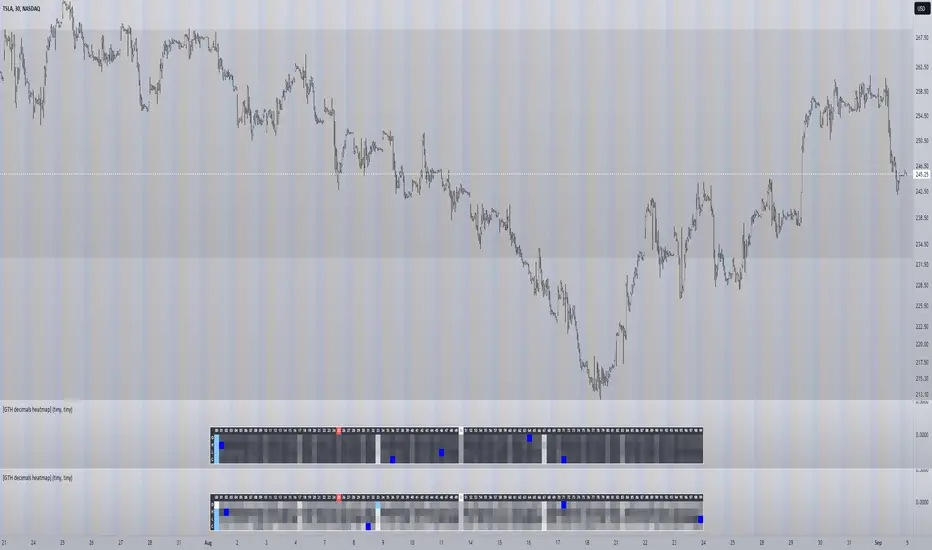
[GTH decimals heatmap] (wide screen advised)Preface
I share my personal general view on indicators below; skip ahead to the Description below if you are not interested.
It is my personal conviction that most - if not all - indicators rely mainly on trader's belief that they work, and in a feedback system like free markets they might become a self-fulfilling prophecy as a result, if (!) a big part of the traders believes in it, because some famous trader releases an indicator, or such person's public statement goes viral.
One of those voodoo indicators is the famous "follow-through day". There is zero statistical evidence for its validity, beyond the validity of a statement like "If it's bright at day it's usually the sun shining". The uselessness was proven exactly on its inventor's YT channel, Investors Business Daily. According to the examiner, its inventor William J. O'Neil himself could not explain the values used for this indicator. It might have been an incidental observation at some point without general validity. A.k.a "curve fitting". Still, it's being used by many today.
Another one of those indicators is the three points reversal on the S&P 500 Volatility Index (VIX) which allegedly might potentially maybe indicate a possible shift in trend. Both indicators share an immediately problematic feature: They use absolute values. Nothing is ever absolute in a highly subjective and emotionally driven game like the markets where a lot of money can be made and lost.
Most indicators can not produce additional information since they can only re-pack price/volume action. Many times an interpretion of the distance between price and a moving average and/or the slope of a moving average deliver very similar - if not better - results than MACD, RSI etc., especially with standard settings, the origin of which are usually unknown (always a warning sign). Very few indicators can deliver information which is otherwise hard to quantify, e. g. market noise (Kaufman's Efficiency Ratio or Price Density) or volatility, standard deviation etc.
It is common knowledge that trading the markets is a game of probability. No indicator works all the time (or at all, see above). In order to make decisions based on any indicator, the probability for its validity and the conditions under which validity seemed to have occurred, must be known. Otherwise it is just coffee grounds reading under the illusion of adding to the edge, when in fact it is only adding to the trees, making it even harder to see the forest.
Description
A common belief is that whole or half-dollar prices tend to be attraction points in price action, so a number of traders include those into decision making. But are they really...?
Spoiler Alert:
Generally, it is safe to say that for the big majority of stocks there is very thin evidence for it. It depends vastly on the asset, the timeframe used and the market period (pre/post/main trading times). If at all, there seems to be an above random but still thin evidence for whole prices being significant attraction points. Interesting/surprising patterns are visible on many stocks/timeframes/session periods, though.
The screenshot shows TSLA, 30m timeframe, two heatmaps added. The top one shows pre/post-market data only, the bottom one main market data only. The cyan fields indicate the strongest occurrence, the dark blue fields indicate the weakest occurrence of open/high/low/close prices at the respective decimal. The red field indicates the current/last price decimal.
Clearly, TSLA displays a strong pre-market attraction for .00, followed by .33 and .67 and .50. This pattern of thirds seems to be a unique feature of TSLA. In the main trading session it is being diluted by a more random distribution.
Other interesting equities to examine:
SPY: No significant pattern on any timeframe!
META: Generally weak patterns on all timeframes, but interestingly on the 1D there is evidence for less randomness on O and H, more on L and most on C.
AAPL: 1D, foggy attraction areas around .35 and .12. Whole price is no attraction area at all! Very weak attraction around .73.
AMD: Strong pattern on D, W, M, attraction areas around 1/16th intervals. No patterns on lower timeframes.
AMZN: Significant differences between pre/post and main session. Strong 1/16th pattern below D in pre/post.
TAOP: Strong 1/5th pattern on all timeframes.
Read the tool tips and go explore!
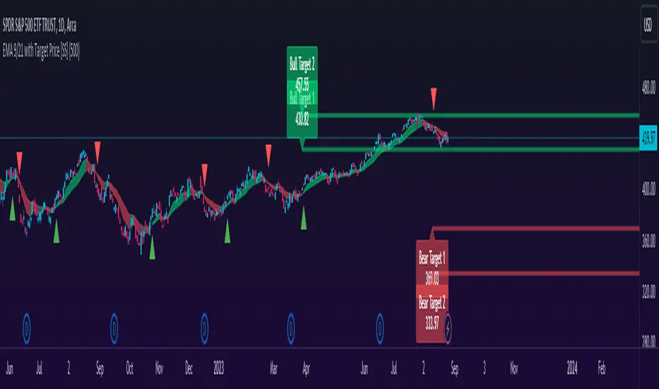
EMA 9/21 with Target Price [SS]Hey everyone,
Coming back with my EMA 9/21 indicator.
My original one was removed a long time ago because I didn't really realize that there were already plenty of similar indicators (my bad!) but this one is my unique, Steversteves edition haha.
About the Indicator:
Essentially, it just combines the 2 only EMA's I ever really use (the 9 and 21) with an ATR based analysis to calculate the average range a ticker undergoes after an EMA 9 / 21 Cross-over and Cross-under.
You can see the major example being in the chart above. I use this for dramatic effect as SPY just happened to have topped at the second expected bull target on the daily. But obviously the intention for this indicator is to be used on the smaller timeframes. Let's take a look at some examples with various tickers.
TSLA:
So let's just use the previous day as example (which was Friday). If we look to the chart below:
TSLA did an EMA 9/21 crossover (bullish) in premarket. This put the immediate TP at 234.59. If we play out the chart:
We shot right to it at open.
We then did a cross under with a TP of 225.93, but that was not realized as the sentiment was too bullish. We then cross back over to the upside, putthing next TP at 238.88 which was realized:
NVDA:
On Friday, NVDA was a bit of a mess, lots of whipsaw off open. But once we finally had a cross under with 3 consecutive closes below the EMA9/21 on the 5 minute chart, it solidified the likelihood of a short:
And this was the result:
We came down to the first target, held it actually as support before finally crossing back over, setting the next TP at 475.05. We got 3 consecutive closes above the EMA 9/21, so let's see what happened:
Nothing really, we closed before we got there, but we did make progress towards it.
And last but not least SPY:
We opened the day with a bullish crossover and 3 consecutive closes above the EMA9/21, making our TP 441.38 (chart above). Let's see what happened:
We came just shy of it after the fed release volatility slammed it down, where we got a crossunder (bearish) to a TP of 436.21:
This ended up playing out, we did get a bullish crossover later in the day and so let's see what happened then:
So those are the real examples, most recent examples of trading using this. They are not all perfect, which is intentional because you need to use a bit of your own analysis, of course, when you are using this type of strategy or indicator. The EMA 9/21 is not sufficient generally on its own, but it is very helpful to gauge the immediate PA and whether the expected move aligns with your overall thesis on the day in terms of realistic target prices.
Customizability:
In terms of the customizability, this is a very basic indicator aside from the assessment of ranges. So there really is not a lot to customize.
You can toggle off and on the labels if you do not want them, you can also adjust the lookback length for the ATR assessment. The lookback length is defaulted to 500, I do really highly suggest you leave it at 500 because this has worked well for me and in back-testing, it has performed above my own expectations.
But, that said, you can take this and back-test as you wish with whatever parameters you feel are most appropriate. I haven't back-tested this on every stock known to man, my go to's are SPY, QQQ, sometimes MSFT and so it works well on those. But perhaps some others will have differing results.
Final Thoughts:
That is the indicator in a nutshell! It is really self explanatory and its likely a strategy most of you already know. This just helps to add realistic price targets and context to those cross-overs and cross-unders.
It also works fine on larger timeframes. We can see it on the 1 hour with MSFT:
On the 2 hour hour with QQQ:
And I am sure you can find other examples!
That's it everyone, safe trades!
D-Bot Alpha RSI Breakout StrategyHello dear Traders,
Here is a simple yet effective strategy to use, for best profit higher time frame, such as daily.
Structure of the code
The code defines inputs for SMA (simple moving average) length, RSI (relative strength index) length, RSI entry level, RSI stop loss level, and RSI take profit level. The default values of these variables can be customized as per the user's preferences.
The script calculates SMA and RSI based on the input parameters and the closing price of the asset.
Trading logic
This strategy allows the placement of a long position when:
The RSI crosses above the RSI entry level and
The close price is above the SMA value.
After entering a long position, it applies a trailing stop mechanism. The stop price is updated to the close price if the close price is lower than the last close price.
The script closes the long position when:
RSI falls below the stop loss level.
RSI reaches or exceeds the take profit level.
If the trailing stop is activated (once RSI reaches or exceeds the take profit level), the closing price falls below the trailing stop level.
Strengths
The strategy includes mechanisms for entering a position, taking profit, and stopping losses, which are fundamental aspects of a trading strategy.
It applies a trailing stop mechanism that allows to capture further gains if the price keeps increasing while protecting from losses if the price starts to decrease.
Weaknesses
This strategy only contemplates long positions. Depending on the market situation, the strategy may miss opportunities for short selling when the market is on a downward trend.
The choice of the fixed RSI entry, stop loss, and take profit levels may not be ideal for all market conditions or assets. It might benefit from a more adaptive mechanism that adjusts these levels according to market volatility or trend.
The strategy doesn't factor in trading costs (such as spread or commission), which could have a significant impact on the net profit, especially if the user is trading with a high frequency or in a low liquidity market.
How to trade with this strategy
Given these parameters and the strategy outlined by the code, the trader would enter a long position when the RSI crosses above the RSI entry level (default 34) and the closing price is above the SMA value (SMA calculated with default period of 200). The trader would exit the position when either the RSI falls below the RSI stop loss level (default 30), or RSI rises above the RSI take profit level (default 50), or when the trailing stop is hit.
Remember "The strategies I have prepared are entirely for educational purposes and should not be considered as investment advice. Support your trades using other tools. Wishing everyone profitable trades..."

Fair Value Strategy UltimateThis is a strategy using an index's (SPX, NDX, RUT) Fair Value derived from Net Liquidity.
Net Liquidity function is simply: Fed Balance Sheet - Treasury General Account - Reverse Repo Balance
Formula for calculating the fair value of and Index using Net Liquidity looks like this: net_liquidity/1000000000/scalar - subtractor
The Index Fair Value is then subtracted from the Index value which creates an oscillating diff value.
When diff is greater than the overbought threshold, Index is considered overbought and we go short/sell.
When diff is less than the oversold signal, Index is considered oversold and we cover/buy.
The net liquidity values I calculate outside of TradingView. If you'd like the strategy to work for future dates, you'll need to update the reference to my NetLiquidityLibrary , which I update daily.
Parameters:
Index: SPX, NDX, RUT
Strategy: Short Only, Long Only, Long/Short
Inverse (bool): check if using an inverse ETF to go long instead of short.
Scalar (float)
Subtractor (int)
Overbought Threshold (int)
Oversold Threshold (int)
Start After Date: When the strategy should start trading
Close Date: Day to close open trades. I just like it to get complete results rather than the strategy ending with open trades.
Optimal Parameters:
I've optimized the parameters for each index using the python backtesting library and they are as follows =>
SPX
Scalar: 1.1
Subtractor: 1425
OB Threshold: 0
OS Threshold: -175
NDX
Scalar: 0.5
Subtractor: 250
OB Threshold: 0
OS Threshold: -25
RUT
Scalar: 3.2
Subtractor: 50
OB Threshold: 25
OS Threshold: -25

Kalman Gain Parameter MechanicsFrequently asked question is to explain how Gain parameter works in kalman funtion. This script serves as a visual representation of Gain parameter of Kalman function used in HMA-Kalman & Trendlines script. (The function creator's name was misspeled in that script as Kahlman)
To see better results set your Chart's timeframe to Daily.

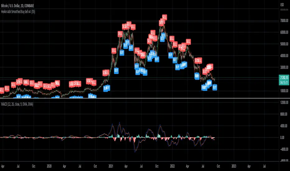
Heikin Ashi Smoothed Buy Sell (Sunseeder) I like to use it on the daily. This helps with indicating buy signals on the DXY, BITCOIN and ETH charts. You're able to customize the colors of the buy signals etc. Enjoy!
Three Golden By Moonalert =========================
English
=========================
Three Golden By Moonalert
(Green Bar) BUY = All three conditions are agree uptrend.
1 candlestick is on the middle line of Bollinger Bands
2 RSI is more than 50
3 MACD cross up Zero Line
(Red Bar) SELL = All three conditions are agree downtrend
1 candlestick is under the middle line of Bollinger Bands
2 RSI is less than 50
3 MACD cross down Zero Line
(Yello Bar) Wait and see = some candition are agree uptrend or downtrend
Basic logic is
Green = Buy
Red = Sell
Yello = wait and see
Working Good for TF Daily.
=========================
THAI
=========================
เขียว = ซื้อ ( Bollinger bands , Rsi , Macd บอกขึ้นทั้งหมด )
เเดง = ขาย ( Bollinger bands , Rsi , Macd บอกลงทั้งหมด )
เหลือง = นั่งนิ่งๆ ( Bollinger bands , Rsi , Macd บอกขั้นหรือลงบางตัว )
สามารถปรับMACD ระหว่าง
Cross Signal กับ Cross Zeroได้ เเนะนำอย่างหลัง
สามารถปรับ EMA 20 50 200 เปิดปิดได้ที่ตั้งค่า
Multi-timeframe MAs + Stoch RSI SignalsHello traders,
I welcome you to my first published script on TradingView: “Multi-timeframe Moving Averages + Stochastic RSI”.
The script is based on a simple formula: Buy signals are generated when a fast moving average is above a slower moving average (uptrend) and the Stochastic RSI K line is crossing above the oversold level (entry).
Sell signals are generated when a fast moving average is below a slower moving average (downtrend) and the Stochastic RSI K line is crossing below the overbought level (entry).
This indicator works best in strong trends!
**Please note the above example has repainting turned on which may produce unrealistic results when viewing historical data. See below for more information regarding this and how you can turn it off.**
The user has the following inputs:
- Option to change the Stochastic RSI settings, including the oversold and overbought levels.
- Option to enter any value for both the Fast Moving Average and the Slow Moving Average.
- Option to change between EMA or SMA for each moving average.
- Multiple time frames to choose from, as well as the ability to selectively turn off individual time frames (both plots and alerts).
(Default time frames are 1 hour, 4 hour, and Daily. You can have a 4th time frame by changing your current time frame to something lower than the other 3 time frames)
- Turn on/off repainting: If repainting is turned on you will get an alert and buy/sell signal on chart immediately when condition is met, however the signal may disappear from chart if the condition reverses during the same candle.
If repainting is turned off, the indicator will wait for the candle to close before issuing the alert and painting the signal on chart.
For higher time frames, the indicator will wait for the candle in the higher time frame to close before issuing a signal if repaint is turned off. Default is set to Repaint on, so please be aware of this if you do not want repainting.
How to use alerts:
- Before you do anything, make sure your current time frame is the lowest time frame you’d like alerts on, as you will still receive alerts for the higher time frames you selected in settings.
- Once you have all the settings changed to how you like, save your chart first. Then right click on any of the indicator’s buy/sell signals on the chart and click “Add Alert on MAs + Stoch RSI”.
- Make sure “Any alert() function call” is selected under the Condition.
- You can delete or change the text in “Alert name” if you want as the alert message is already built into the indicator, and it will tell you in the alert message which asset and time frame to buy or sell.
Other things to note:
- The indicator will not display the buy/sell signals of lower time frames when you are on a higher time frame. This was done purposely to reduce clutter on the chart when you switch to higher time frames.
- While the alert message will tell you which time frame a signal was generated, the plots on the chart will instead show “Buy/Sell TF1, or TF2, or TF3”.
If the signal is from the current time frame that the alert was created on, then it will simply show “Buy” or “Sell”.
Hope you guys enjoy using this one, please drop a like if you found it useful. If anyone wants to modify my script in any way, please just credit me for the original work when you publish the script. Good luck!

Momentum Performance This Indicator displays the momentum (performance) of the symbol in percent.
You can compare the performance with other symbols.
The default benchmarks are the S&P 500, the MSCI World and the FTSE All World EX US.
The default length corresponds to one year in the timeframes monthly, weekly and daily.
In intraday the default length is 200, but you can also set your own setting.
You have also the opportunity to display a average momentum performance of the main symbol.
