LTPI TOTAL | JeffreyTimmermansLong-Term Trend Probability Indicator
The "Long-Term Trend Probability Indicator" on TOTAL is a custom-built tool designed to analyze the global crypto market (TOTAL) from a long-term perspective. Unlike short-term indicators that react to price volatility, LTPI focuses on major trend shifts across the entire crypto market, helping to identify major trend shifts early.
This version of the LTPI is applied to the TOTAL market cap, making it a broad trend following tool.
Key Features
Long-Term Focus:
Designed for macro market analysis with less sensitivity to short-term noise.
10 Input Signals:
Combines 10 carefully selected inputs (trend following indicators) into a single score that reflects the overall market condition.
Market Regimes:
Classifies the TOTAL market into:
Bullish: Strong uptrend, expansion phase
Bearish: Strong downtrend, contraction phase
Neutral: Transitional or uncertain
Visual Background:
Background colors clearly display which regime is active.
Comprehensive Dashboard:
The panel at the bottom shows each input’s state, the composite LTPI score, and the resulting market trend.
How It Works
Inputs Analysis:
Each of the 10 inputs outputs one of three states:
+1 (Bullish)
-1 (Bearish)
0 (Neutral)
Score Calculation:
The total score is the sum of all 10 input signals divided by 10.
Score > 0.1 = Bullish
Score < -0.1 = Bearish
Between -0.1 and 0.1 = Neutral
Background Coloring:
Background colors dynamically adjust to reflect the long-term market regime.
Use Cases
Long-Term Positioning:
Identify periods of global expansion or contraction to position yourself accordingly.
Macro Confirmation:
Use LTPI in combination with medium-term (MTPI) and short-term tools for multi-timeframe confirmation.
Market Timing:
Alerts when LTPI crosses key thresholds help highlight the start of major bullish or bearish phases.
Dynamic Alerts:
Bullish Entry: LTPI score crosses above 0.1
Bearish Entry: LTPI score crosses below -0.1
Neutral Zone: Score moves back between -0.1 and 0.1
Conclusion
The Long-Term Trend Probability Indicator (LTPI – TOTAL) is a powerful tool for identifying long-term market phases across the entire crypto ecosystem. By focusing on long term trends and combining 10 inputs into a single probability score, it provides a clear macro perspective for strategic decision-making.
在腳本中搜尋"entry"
tenth-عشرAshri Indicator – Clean Entry Rules for Daily Options Traders
A visual indicator for intraday options traders, built on breakout structure and Kijun confirmation.
✅ Call Entry:
Triggered when any candle closes above the green resistance line
and breaks above the most recent swing high.
🛑 Stop-loss: Close below the Kijun line (same timeframe).
❌ Put Entry:
Triggered when any candle closes below the red support line
and breaks below the most recent swing low.
🛑 Stop-loss: Close above the Kijun line (same timeframe).
⚠️ This is a rule-based visual tool — not financial advice. Entries are based on market structure and momentum, and remain subject to market conditions. Always trade with proper risk management.

LTPI Global Liquidity | JeffreyTimmermansLong-Term Probability Indicator (LTPI)
The "Long-Term Probability Indicator (LTPI)" on a generic liquidity ticker is a custom-built analytical tool designed to evaluate market conditions over a long-term horizon, with a strong focus on global liquidity trends. By combining six carefully selected input signals into a single probability score, this indicator helps traders and analysts identify prevailing long-term market states: Bullish, Bearish, or Neutral.
Where short-term systems/timeframes react quickly to price fluctuations, LTPI smooths out noise and focuses on the bigger picture, allowing for informed strategic decision-making rather than short-term speculation.
Key Features
Multi-Input Aggregation:
Uses six independent inputs, each based on long-term liquidity and macro-related data, to generate a composite market probability score.
Long-Term Focus:
Prioritizes medium-to-long-term trends, ignoring smaller fluctuations that often mislead traders in volatile markets.
Simplified Market States:
Classifies the global market into three primary states:
Bullish: Favorable liquidity and conditions for long-term risk-taking.
Bearish: Tightening liquidity and conditions that require caution.
Neutral: Transitional phases or uncertain conditions.
Background Coloring:
Visual cues on the chart help identify which regime is active at a glance.
Global Liquidity Perspective:
Designed for use on a generic liquidity ticker, based on M2 money supply, to track macroeconomic liquidity flows and risk appetite.
Dashboard Display:
A compact on-screen table summarizes all six inputs, their states, and the resulting LTPI score.
Dynamic Alerts:
Real-time alerts signal when the LTPI shifts from one regime to another.
Inputs & Settings
LTPI Inputs:
Input Sources (6): Each input is a carefully chosen trend following indicator.
Weighting: Each input contributes equally to the final score.
Score Calculation:
Bullish = +1
Bearish = -1
Neutral = 0
Color Settings:
Strong Bullish: Bright Green
Weak Bullish: Light Green
Neutral: Gray/Orange
Weak Bearish: Light Red
Strong Bearish: Bright Red
(Colors can be customized.)
Calculation Process
Collect Data:
Six long-term inputs are evaluated at each bar.
Scoring:
Each input’s state contributes +1 (bullish), -1 (bearish), or around 0 (neutral).
Aggregate Probability:
The LTPI Score is calculated as the sum of all six scores divided by 6, resulting in a value between -1 and +1.
Market Classification:
Score > 0.1: Bullish regime
Score < -0.1: Bearish regime
-0.1 ≤ Score ≤ 0.1: Neutral
Background Coloring:
Background colors are applied to highlight the current regime.
How to Use LTPI
Strategic Positioning:
Bullish: Favor holding or adding to long-term positions.
Bearish: Reduce risk, protect capital.
Neutral: Wait for confirmation before making significant moves.
Confirmation Tool:
LTPI works best when combined with shorter-term indicators like MTPI or trend-following tools to confirm alignment across multiple timeframes.
Dynamic Alerts:
Bullish Regime Entry: When the LTPI Score crosses above 0.1.
Bearish Regime Entry: When the LTPI Score crosses below -0.1.
Neutral Zone: When the score moves back between -0.1 and 0.1.
These alerts help identify significant macro-driven shifts in market conditions.
Conclusion
The Long-Term Probability Indicator (LTPI) is an advanced, liquidity-focused tool for identifying macro-driven market phases. By consolidating six inputs into a single probability score and presenting the results visually, LTPI helps long-term investors and analysts stay aligned with global liquidity trends and avoid being distracted by short-term volatility.
Gann Single Square Swing Trading System with Gann AnglesGann Single Square Swing Trading System
This script automatically detects "squares" - geometric patterns where price movement equals time movement. When price moves the same distance as the number of bars (time), it creates powerful support/resistance levels based on Gann theory.
Key Visual Elements
• Box: The detected square pattern
• Dark Blue Line (50%): Most important trading level
• Green Lines: Profit target levels (125%, 150%)
• Red Lines: Stop loss levels (-25%, -50%)
• Colored Angle Lines: Gann angles for trend direction
• Quality Score: Blue label showing setup strength (aim for 70%+)
Simple Trading Rules
LONG Trades (Green 🟢 Square)
1. Entry: Buy when price touches the dark blue 50% line from above
2. Stop Loss: Place below the red -25% line
3. Take Profit: Exit at green 125% line (first target) or 150% line (second target)
SHORT Trades (Red 🔴 Square)
1. Entry: Sell when price touches the dark blue 50% line from below
2. Stop Loss: Place above the red -25% line
3. Take Profit: Exit at green 125% line (first target) or 150% line (second target)
Entry Checklist
✅ Square quality score > 70%
✅ Price touches 50% level (dark blue line)
✅ Volume above average (if volume filter enabled)
✅ Clear square formation visible
Alerts
The script generates automatic alerts when price reaches the 50% trading level. Enable alerts in TradingView to get notified of setups.
Bottom Line: Wait for the alert → Check quality score → Enter at 50% level → Set stop at red line → Take profit at green line.

Mickey's EMAMickey’s EMA is a lightweight, overlay indicator that combines two Exponential Moving Averages (EMAs) with automatic entry, stop-loss and target visual signals—plus dynamic JSON alerts for seamless webhook integration. It’s designed for both day-traders and swing-traders who want clear, on-chart cues and fully-customizable risk parameters.
🔍 Overview
Dual EMAs (fast & slow) to capture trend changes.
Automated “BUY” / “SELL” markers at every EMA crossover.
Customizable Stop-Loss % and Target % levels, plotted as ❌ and 🎯 bubbles.
“SL Hit (Custom)” if the opposite EMA crossover occurs before price touches your stop level.
JSON-formatted alerts containing ticker, instrument type, timeframe, trend (“CE” for bullish, “PE” for bearish), and price—ready for webhooks.
⚙️ Inputs
| Setting | Default | Description |
| ------------------------ | ------- | ----------------------------------------------- |
| **Fast EMA Length** | 20 | Period for the faster EMA. |
| **Slow EMA Length** | 200 | Period for the slower EMA. |
| **Price Source** | Close | Data series to calculate EMAs on. |
| **Custom Stop Loss %** | 0.1% | Stop-loss level as a percentage of entry price. |
| **Target %** | 0.5% | Profit-target level as a percentage of entry. |
| **Show Entry/SL/Target** | ON | Toggle all entry, SL and target visuals. |
📊 What It Plots
Fast EMA (blue) & Slow EMA (white) overlayed on price.
BUY 🟢 label below bar when Fast EMA crosses above Slow EMA.
SELL 🔴 label above bar when Fast EMA crosses below Slow EMA.
❌ (Custom) bubble at entry price if an opposite EMA crossover occurs before price hits your custom stop-loss.
❌ bubble at the stop-loss price when price actually breaches the stop level.
🎯 bubble at target price when price first reaches your profit-target level.
🔔 Alerts & Webhooks
On-screen alert conditions “Mickey’s EMA → BUY” and “Mickey’s EMA → SELL” appear in the Create-Alert dialog.
Dynamic JSON payload sent via alert() when a crossover fires, e.g.:
{
"script": "AAPL",
"scriptType": "equity",
"instrumentType": "NASDAQ",
"timeframe": "5",
"trend": "CE",
"price": 174.25
}
Use these alerts to integrate with bots, chat systems, manual, or any webhook-driven workflow.
🚀 Why Use Mickey’s EMA?
Clarity & Precision: All signals appear exactly at the EMA or price-level of interest.
Custom Risk Management: Define your own stop-loss and target percentages.
Seamless Automation: Dynamic JSON alerts mean zero manual setup for webhooks.
Versatile: Equally effective on intraday charts or daily/weekly timeframes.
Add Mickey’s EMA to your TradingView chart today and get instant, aesthetically-pleasing guidance on trend entries, risk exits, and profit targets—all in one elegant overlay.

BullTrading Easy Tops & BottomsTRADING TOOL OVERVIEW
The Easy Tops & Bottoms indicator identifies potential reversal points on intraday charts by analysing volatility patterns and momentum shifts during major trading sessions. It projects horizontal zones that may act as support or resistance, adapting dynamically to price behavior.
This indicator is designed for use on intraday timeframes from 1-minute to 15-minute charts only.
HOW THE INDICATOR WORKS
The indicator uses an adaptive algorithm to evaluate momentum exhaustion and volatility clusters within intraday sessions (aligned with New York local time). It generates time based zones when conditions indicate potential trend reversals, such as after volatility spikes followed by contraction. These zones extend horizontally until price breaks boundaries or a bar limit is reached.
- Support Zones : Formed during bullish sessions with tail volatility, suggesting potential bottoms.
- Resistance Zones : Formed during bearish sessions with wick volatility, suggesting potential tops.
Zones are filtered for significant sessions to focus on meaningful price action. Signals trigger based on price interaction with the zone, requiring a specific relationship between the candle's low, high, and close relative to the zone level—for example, engulfing the level but closing in the reversal direction.
Note that signals and zone behaviors will differ across timeframes (e.g., 1m, 5m, 15m) due to varying candle sizes affecting how closes relate to zone triggers. Shorter timeframes may show more frequent but noisier interactions, while longer ones capture broader momentum shifts.
USERS GUIDE
What the Indicator Does?
The indicator has two operating modes: Buy/Sell Signal Mode (suitable for beginners and trend-following traders—important note: trend-following traders must filter according to their own trend criteria) and Support/Resistance Mode, which is a full and complete trading system.
- Plots Dynamic Zones: Horizontal boxes appear at qualifying session ends, representing support (bottoms) or resistance (tops).
- Active zones use a semi-transparent colour (customisable) and extend rightward while valid.
- Expired zones (after break or timeout) shift to a historical colour for reference.
- Generates Signals (in Buy/Sell Signal Mode): Labels appear on zone interactions confirming reversal potential:
- "BUY" (green) for support zones.
- "SELL" (red) for resistance zones.
- Time Based Focus: Ties to intraday periods like Asian, London, and New York transitions. Use NY Local Time in your charts.
- Additional Elements: Includes a watermark with symbol, timeframe, and date; an optional NotePad table for notes.
How to Interpret Signals
- Zone Dynamics: Active zones indicate ongoing validity; expiration signals a potential shift (e.g., a support break may turn it into resistance).
- Signal Triggers: Require price to test the zone level with a closing bias toward reversal. These are suitable for beginners learning basic reversals or trend traders adding their own filters (e.g., moving averages for direction).
- Value for Users: Beginners can use zone height to set stop-loss (SL) below/above the box, enabling a 1:2 risk-reward ratio (RR) for take-profit (TP) at twice the zone distance.
- Timeframe Variations: Expect different signals on 1m vs. 15m, as smaller candles on lower frames may trigger more selectively based on close positions relative to zones.
- Note on Entries in Internal Range Zones: For all entries (the Internal Range inside range zones), when a big zone swallows smaller zones ahead, consider using the bigger zone or the SL price level as an entry level.
PRACTICAL TRADING SCENARIOS
Here, we expand on how to apply the indicator in real-world trading, with detailed examples for each mode. These scenarios assume a basic understanding of risk management, such as position sizing at 0.5-1.5% of account capital per trade. Always backtest these ideas on historical data for your specific instrument (e.g., forex pairs like EUR/USD or indices like US30).
Buy/Sell Signal Mode: Reversal and Trend-Following Applications
This mode is ideal for spotting reversal opportunities while allowing flexibility for trend filters. Signals appear as labels when price interacts with zones in a confirmatory way, making it beginner-friendly for learning entry points. Trend-following traders should overlay their preferred trend indicators (e.g., a 50-period EMA) to avoid counter-trend trades.
Important critical note: In this mode, the 1:2 RR is based and measured directly on the zone height (not on the actual distance from entry price to SL). The correct SL placement is at the far edge of the zone (e.g., zone bottom for buys, zone top for sells), and TP is set at twice the zone height from the signal level (the key trigger price where the label appears).
- Basic Reversal Scalping (Beginner-Friendly): On a 5-minute chart during the London session open, after a sharp down-move in EUR/USD, a support zone forms with signal level at 1.0850 (zone top) and height of 10 pips (zone bottom at 1.0840). Wait for a "BUY" signal when price dips to test the zone (low touches 1.0850) but closes above it. Enter long at the current price (e.g., 1.0855). Set SL at the zone bottom (1.0840), and TP at the signal level + 2x zone height (1.0850 + 20 pips = 1.0870). This ensures the 1:2 RR is measured purely on the zone (risk = 10 pips zone height, reward = 20 pips), regardless of exact entry. If volatility is high (filter enabled), this setup prioritizes stronger sessions for better win rates.
- Trend-Following with Filter: On a 15-minute chart of GBP/JPY during New York AM, the overall trend is upward (price above a 200-period SMA). A support zone appears with signal level at 185.20 (zone top) after a pullback, with a height of 20 pips (zone bottom at 185.00). Ignore any "SELL" signals as they counter the trend; instead, wait for a "BUY" when price tests the zone from above and closes bullishly. Enter long at the current price (e.g., 185.25). Set SL at the zone bottom (185.00), and TP at the signal level + 2x zone height (185.20 + 40 pips = 185.60). Add a trend filter like MACD histogram turning positive for confirmation, reducing whipsaws in ranging markets. The RR remains 1:2 based on the zone (risk = 20 pips height, reward = 40 pips).
- Range-Bound Day Trading: In a 1-minute chart of USD/JPY during Asian session consolidation, multiple zones form stacking as support/resistance. Monitor for "SELL" at a resistance zone with signal level at 147.80 (zone bottom) and height of 8 pips (zone top at 147.88) after an uptick. Enter short on the signal at the current price (e.g., 147.78). Set SL at the zone top (147.88), and TP at the signal level - 2x zone height (147.80 - 16 pips = 147.64). Shorter timeframes like 1m may produce more signals due to tighter candle closes, but use the volatility filter to avoid flat periods—test historically to see how 1m noise compares to 15m's smoother triggers. The RR is fixed at 1:2 on the zone (risk = 8 pips height, reward = 16 pips).
Support/Resistance Mode: Standalone Contrarian System for Fading Breaks
This mode hides signals and labels, turning the indicator into a complete contrarian trading system focused on fading zone breaks. It treats broken zones as "flips"—a broken support becomes potential resistance, and vice versa. Entries use limit orders at a distance equal to the zone height, with fixed 1:2 RR based on that height. No additional filters are required, but combining with session timing enhances edge. Alerts fire on new zone creation, allowing proactive setup.
When a setup results in a stop loss in Support/Resistance Mode, the original zone can be used for a "Stop & Reverse" trade with the same trading proportions. This means reversing the position direction upon hitting SL, using the original zone to set the new entry (at the box top/bottom trigger level), SL (at the opposite box edge), and TP (2x the height beyond entry)—effectively capturing momentum in the opposite direction while maintaining the 1:2 RR.
- Fading a Support Break (Short Setup): On a 5-minute chart of AUD/USD during NY PM, a support zone at 0.6650 (height 12 pips) breaks when low pierces below 0.6638. Consider the zone flipped to resistance. Place a sell limit order 12 pips above the broken zone (at 0.6662), SL 12 pips above entry (0.6674), and TP 24 pips below entry (0.6638, achieving 1:2 RR). This anticipates sellers re-entering on pullbacks to the former support. If the volatility filter is on, this only applies to significant breaks; historically, test on pairs with clear pip values to adjust for spreads.
Stop & Reverse Scenario: If the short position hits SL at 0.6674 (price rallies above), reverse to a long position. Use the original 12-pip zone: Place a buy limit order on the original broken support (now acting as flipped resistance, at 0.6650 box top), SL 12 pips below the new entry (0.6638 box bottom), and TP 24 pips above the new entry (0.6674, maintaining 1:2 RR). This captures potential upside momentum after the false break.
- Fading a Resistance Break (Long Setup): In a 15-minute chart of Nasdaq futures (NQ) during London close, a resistance zone at 18500 (height 50 points) breaks upward (high > 18550). Flip it to support. Place a buy limit order 50 points below the broken zone (at 18450), SL 50 points below entry (18400), TP 100 points above entry (18550). This catches pullbacks in uptrends. Longer timeframes like 15m may show fewer but more reliable breaks due to broader candle relationships—compare to 1m, where smaller candles might invalidate zones quicker.
Stop & Reverse Scenario: If the long position hits SL at 18400 (price drops below), reverse to a short position. Use the original 50-point zone: Place a sell limit order on the original broken resistance (now acting as flipped support, at 18500 box bottom), SL 50 points above the new entry (18550 box top), and TP 100 points below the new entry (18400, maintaining 1:2 RR). This captures potential downside momentum after the false break.
- Multi-Zone Contrarian Scalping in High-Volatility Sessions: On a 1-minute chart of Bitcoin (BTC/USD) during NY open, several zones form and break in quick succession. After a resistance at 65000 (height 200 USD) breaks, place buy limit 200 USD below (64800), SL at 64600, TP at 65200. Conversely, for a broken support at 64000 (height 150 USD), sell limit 150 USD above (64150), SL 64300, TP 63850. Use the max bars setting to limit zone lifespan in fast markets; enable volatility filter to focus on explosive sessions like news releases. This mode's standalone nature suits automated mindsets—backtest to quantify edge, noting 1m's frequent triggers vs. 15m's strategic ones.
Stop & Reverse Scenario: For the buy after resistance break, if it hits SL at 64600 (price falls below), reverse to short. Use the original 200 USD zone: Place a sell limit order on the original broken resistance (now acting as flipped support, at 65000 box bottom), SL 200 USD above the new entry (65200 box top), TP 400 USD below the new entry (64600, maintaining 1:2 RR). Similarly, for the sell after support break, if it hits SL at 64300 (price rallies above), reverse to buy: Use the original 150 USD zone: Place a buy limit order on the original broken support (now acting as flipped resistance, at 64000 box top), SL 150 USD below the new entry (63850 box bottom), TP 300 USD above the new entry (64300, maintaining 1:2 RR). This captures potential momentum after the false breaks.
- Risk Considerations for Both Modes: Always test scenarios historically and adjust for instrument specifics like pip/point values and spreads. For example, forex might use 1-2 pip buffers, while crypto needs larger due to volatility. This is not trading advice; users should evaluate independently and consult professionals.
KEY SETTINGS
- Indicator Mode: "Buy/Sell Signal Mode" for signals; "Support/Resistance Mode" for zones only.
- Show S/R Zones: Toggle box visibility.
- Colours: Customise active/historical zones, buy/sell labels.
- Max Bars for Signal: Zone extension limit (default: 288).
- Require Significant Volatility: Filter for notable sessions (default: true).
- Days to Keep Historical Zones: Retention period (default: 7).
- Show NotePad?: Toggle notes table.
ALERTS
- Signal Mode: On BUY/SELL triggers.
- S/R Mode: On new zone creation.
Backtest thoroughly before use.
Why Protected?
This script uses a proprietary zone detection method designed to highlight support/resistance zones in a clear, structured way. To maintain the integrity and unique utility of the algorithm, the code is closed-source.
Important Considerations
This tool does not guarantee profits and is not intended to replace sound trade management or risk discipline. It is designed to aid traders in visualiSing market structure. Use responsibly with appropriate risk measures.
Legal Disclaimer
This indicator is provided for educational and informational purposes only. It is not intended as financial, investment, or trading advice, and does not constitute a recommendation to buy, sell, or hold any financial instrument.
Trading financial markets involves substantial risk. Past performance of any trading strategy or indicator is not indicative of future results. Users of this indicator assume full responsibility for their trading decisions. No guarantees are made regarding the accuracy, reliability, or profitability of the signals generated by this tool.
This indicator is published as-is, without any express or implied warranties. The publishers shall not be held liable for any losses or damages, direct or indirect, arising from the use, misuse, or reliance on this tool.
All trading decisions should be made with consideration of your financial situation and risk tolerance. Consultation with a licensed financial advisor is strongly recommended before making any investment decisions.
By using this indicator, you acknowledge and agree to these terms. Your use constitutes acceptance of full responsibility and the understanding that trading is inherently risky and should be approached with caution and discipline.

Chaikin Oscillator Enhanced📊 What Is the Chaikin Oscillator?
The Chaikin Oscillator is a momentum indicator that helps traders understand the strength of buying and selling pressure in the market, based on volume and price movement.
It is calculated as the difference between two moving averages (short-term and long-term) of the Accumulation/Distribution Line (A/D Line). This line combines price and volume to show whether money is flowing into or out of an asset.
________________________________________
🧠 Simple Concept
• When big traders are buying, they usually do so with volume support—the Chaikin Oscillator picks this up.
• When volume is rising but price is falling, or vice versa, it shows hidden strength or weakness.
So, this indicator helps you see what the smart money is doing, even if the price isn’t moving much.
________________________________________
🛠️ How It Works
• Oscillator Value Above Zero → More buying pressure (bullish).
• Oscillator Value Below Zero → More selling pressure (bearish).
• Crossing above zero → A potential buy signal.
• Crossing below zero → A potential sell signal.
The histogram (vertical bars) in the indicator changes color:
• Green bars = Positive momentum.
• Red bars = Negative momentum.
________________________________________
🎯 How Traders Use It for Entry and Exit
✅ For Entries:
• Buy Entry: When the oscillator crosses above the zero line and the bars turn green, it means buyers are stepping in with volume.
• For better confirmation, combine it with price breaking above a resistance level.
❌ For Exits or Shorts:
• Sell Exit or Short Entry: When the oscillator crosses below the zero line and bars turn red, it suggests selling pressure is growing.
• If the price is also below support, it’s a stronger signal.
________________________________________
🔍 Example Use Case:
1. You’re watching a stock or crypto that's been going sideways.
2. Suddenly, the Chaikin Oscillator crosses above zero, and green bars appear.
3. That’s your early clue that big buyers might be entering.
4. If price confirms this with a breakout, you can enter a long position.
________________________________________
🌐 Where Is It Useful?
The Chaikin Oscillator is great for:
• Stocks (especially volume-heavy large caps)
• ETFs
• Cryptocurrency (on exchanges that provide volume data)
• Forex – less reliable unless volume is proxy-based
⚠️ Important: It won’t work well on instruments where volume data is missing or unreliable (like some CFDs or synthetic assets).
________________________________________
🧭 Pro Tips for Using It:
• Combine it with support/resistance, moving averages, or candlestick patterns.
• Avoid trading only based on this indicator—use it as confirmation.
• Use the alerts (added in the script) so you don’t miss key movements.
________________________________________

Previous Daily High/LowThe previous day’s high and low are critical price levels that traders use to identify potential support, resistance, and intraday trading opportunities. These levels represent the highest and lowest prices reached during the prior trading session and often act as reference points for future price action.
Why Are Previous Daily High/Low Important?
Support & Resistance Zones
The previous day’s low often acts as support (buyers defend this level).
The previous day’s high often acts as resistance (sellers defend this level).
Breakout Trading
A move above the previous high suggests bullish momentum.
A move below the previous low suggests bearish momentum.
Mean Reversion Trading
Traders fade moves toward these levels, expecting reversals.
Example: Buying near the previous low in an uptrend.
Institutional Order Flow
Market makers and algos often reference these levels for liquidity.
How to Use Previous Daily High/Low in Trading
1. Breakout Strategy
Long Entry: Price breaks & closes above previous high → bullish continuation.
Short Entry: Price breaks & closes below previous low → bearish continuation.
2. Reversal Strategy
Long at Previous Low: If price pulls back to the prior day’s low in an uptrend.
Short at Previous High: If price rallies to the prior day’s high in a downtrend.
3. Range-Bound Markets
Buy near previous low, sell near previous high if price oscillates between them.
Example Trade Setup
Scenario: Price opens near the previous day’s high.
Bullish Case: A breakout above it targets next resistance.
Bearish Case: Rejection at the high signals a pullback.
OptionHawk1. What makes the script original?
• Unique concept: It integrates a Keltner based custom supertrend with a multi-EMA energy visualization, ATR based multi target management, and on chart options (CALL/PUT) trade signals—creating a toolkit not found in typical public scripts.
• Innovative use: Instead of off the shelf indicators, it reinvents them:
• Keltner bands used as dynamic Supertrend triggers.
• Fifteen EMAs layered for “energy” zones (bullish/bearish heatmaps).
• ATR dynamically scales multi-TP levels and stop loss.
These are creatively fused into a unified signal and automation engine.
________________________________________
2. What value does it provide to traders?
• Clear entries & exits: Labels for entry price/time, five TP levels, and SL structure eliminate guesswork.
• Visualization & automation: Real-time bar coloring and energy overlays allow quick momentum reads.
• Targeted to common pain points: Many traders struggle with manual TP/SL and entry timing—this automates that process.
• Ready for real use: Just plug into intraday (e.g., 5 min) or swing setups; no manual calculations. Signals are actionable out of the box.
________________________________________
3. Why invite only (worth paying)?
• Proprietary fusion: Public indicators like Supertrend or EMA are common—but your layered use, ATR based scaling, and label logic are exclusive.
• Auto-generated options format: Unique labeling for CALL/PUT, with graphical on chart signals, isn’t offered freely elsewhere.
• Time-saver & edge-provider: Saves traders hours of configuration and enhances consistency—worth the subscription cost over piecing together mash ups.
________________________________________
4. How does it work?
• Signal backbone: Custom supertrend uses Keltner bands crossing with close for direction, filtered by trend direction EMAs.
• Multi time logic: Trend defined by crossover of price over dynamic SMA thresholds built from ATR.
• Energy bar-colors/EMAs: 15 fast EMAs color-coded green/red to instantly show momentum.
• Entry logic: “Bull” when close crosses above supertrend; “Bear” when crosses below.
• Risk management: SL set at previous bar; up to 5 ATR scaled targets (or percentage based).
• Options formatted alerts: CALL/PUT labels with ₹¬currency values, embedded timestamp, SL/TP all printed on the chart.
________________________________________
5. How should traders use it?
• Best markets & timeframes: Ideal for intraday / low timeframe (1 15m) setups and 1 hour swing trades in equities, indices, options.
• Conditions: Works best in trending or volatility driven sessions—visible via Keltner bands and EMA energy alignment.
• Recommended combo: Use alongside volume filters or broader cycles; when supertrend & energy EMAs align, validation is stronger.
________________________________________
6. Proof of effectiveness?
• On chart visuals: Entry/exit labels, confirmed labels, TP and SL markers make past hits obvious.
• Real trade examples: Highlighted both bull & bear setups with full profit realization or SL hits.
• Performance is paint tested: Easy to showcase historic signals across multiple tickers.
• Data-backed: Users can export chart data to calculate win rate and avg return per trade.
________________________________________
Summary Pitch:
OptionHawk offers a holistic, execution-ready trading tool:
1. Proprietary blend of Keltner-supertrend and layered EMAs—beyond standard scripts.
2. Automates entries, multi-tier targets, SL, and options-format labels.
3. Visual energy overlays for quick momentum readings.
4. Use-tested in intraday and swing markets.
5. Installs on chart and works immediately—no setup complexity.
It's not a public indicator package; it's a self-contained, plug and play trade catalyst—worth subscribing for active traders seeking clarity, speed, and structure in their decision-making.
6. While OptionHawk is designed for clarity and structure, no script can predict the market. Always use with discretion and proper risk management.
---------------------------------------------------------------------------------------------------------------------
OptionHawk: A Comprehensive Trend-Following & Volatility-Adaptive Trading System
The "OptionHawk" script is a sophisticated trading tool designed to provide clear, actionable signals for options trading by combining multiple technical indicators and custom logic. It aims to offer a holistic view of market conditions, identifying trend direction, momentum, and potential entry/exit points with dynamic stop-loss and take-profit levels.
________________________________________
1. Why These Specific Indicators and Code Elements?
The "OptionHawk" script is a strategic fusion of the Supertrend indicator (modified with Keltner Channels), a multi-EMA "Energy" ribbon, dynamic trend lines (based on SMA and ATR), a 100-period Trend Filter EMA, and comprehensive trade management logic (SL/TP). My reason and motivation for this mashup stem from a desire to create a robust system that accounts for various market aspects often overlooked by individual indicators:
• Supertrend with Keltner Channels: The standard Supertrend is effective for trend identification but can sometimes generate whipsaws in volatile or ranging markets. By integrating Keltner Channels into the Supertrend calculation, the volatility measure becomes more adaptive, using the (high - low) range within the Keltner Channel for its ATR-like component. This aims to create a more responsive yet less prone-to-false-signals Supertrend.
• Multi-EMA "Energy" Ribbon: This visually striking element, composed of 15 EMAs, provides a quick glance at short-to-medium term momentum and potential support/resistance zones. When these EMAs are stacked and moving in one direction, it indicates strong "energy" behind the trend, reinforcing the signals from other indicators.
• Dynamic Trend Lines (SMA + ATR): These lines offer a visual representation of support and resistance that adapts to market volatility. Unlike static trend lines, their ATR-based offset ensures they remain relevant across different market conditions and asset classes, providing context for price action relative to the underlying trend.
• 100-Period Trend Filter EMA: A longer-period EMA acts as a higher-timeframe trend filter. This is crucial for confirming the direction identified by the faster-acting Supertrend, helping to avoid trades against the prevailing broader trend.
• Comprehensive Trade Management Logic: The script integrates automated calculation and display of stop-loss (SL) and multiple take-profit (TP) levels, along with trade confirmation and "TP Hit" labels. This is critical for practical trading, providing immediate, calculated risk-reward parameters that individual indicators typically don't offer.
This combination is driven by the need for a multi-faceted approach to trading that goes beyond simple signal generation to include trend confirmation, volatility adaptation, and essential risk management.
________________________________________
2. What Problem or Need Does This Mashup Solve?
This mashup addresses several critical gaps that existing individual indicators often fail to fill:
• Reliable Trend Identification in Volatile Markets: While Supertrend is good, it can be late or whipsaw. Integrating Keltner Channels helps it adapt to changing volatility, providing more reliable trend signals.
• Confirmation of Signals: A common pitfall of relying on a single indicator is false signals. "OptionHawk" uses the multi-EMA "Energy" ribbon and the 100-period EMA to confirm the trend identified by the Keltner-Supertrend, reducing false entries.
• Dynamic Support/Resistance & Trend Context: Static support and resistance levels can quickly become irrelevant. The dynamic SMA + ATR trend lines provide continually adjusting zones that reflect the current market's true support and resistance, giving traders a better understanding of price action within the trend.
• Integrated Risk and Reward Management: Most indicators just give entry signals. This script goes a significant step further by automatically calculating and displaying clear stop-loss and up to five take-profit levels (either ATR-based or percentage-based). This is a vital component for structured trading, allowing traders to pre-define their risk and reward for each trade.
• Visual Clarity and Actionable Information: Instead of requiring traders to layer multiple indicators manually, "OptionHawk" integrates them into a single, cohesive display with intuitive bar coloring, shape plots, and informative labels. This reduces cognitive load and presents actionable information directly on the chart.
In essence, "OptionHawk" provides a more comprehensive, adaptive, and actionable trading framework than relying on isolated indicators.
________________________________________
3. How Do the Components Work Together?
The various components of "OptionHawk" interact in a synergistic and often sequential manner to generate signals and manage trades:
• Keltner-Supertrend as the Primary Signal Generator: The supertrend function, enhanced by keltner_channel, is the core of the system. It identifies potential trend reversals and continuation signals (bullish/bearish crosses of the supertrendLine). The sensitivity and factor inputs directly influence how closely the Supertrend follows price and its responsiveness to volatility.
• Multi-EMA "Energy" Ribbon for Momentum and Confirmation: The 15 EMAs (from ema1 to ema15) are plotted to provide a visual representation of short-term momentum. When the price is above these EMAs and they are spread out and pointing upwards, it suggests strong bullish "energy." Conversely, when price is below them and they are pointing downwards, it indicates bearish "energy." This ribbon serves as a simultaneous visual confirmation for the Supertrend signals; a buy signal from Supertrend is stronger if the EMA ribbon is also indicating upward momentum.
• Dynamic Trend Lines for Context and Confirmation: The sma_high and sma_low lines, incorporating ATR, act as dynamic support and resistance. The trend variable, determined by price crossing these lines, provides an overarching directional bias. This component works conditionally with the Supertrend; a bullish Supertrend signal is more potent if the price is also above the sma_high (indicating an uptrend).
• 100-Period Trend Filter EMA for Macro Trend Confirmation: The ema100 acts as a macro trend filter. Supertrend signals are typically considered valid if they align with the direction of the ema100. For example, a "BUY" signal from the Keltner-Supertrend is ideally taken only if the price is also above the ema100, signifying that the smaller trend aligns with the larger trend. This is a conditional filter.
• Trade Confirmation and SL/TP Logic (Sequential and Conditional):
• Once a bull or bear signal is generated by the Keltner-Supertrend, the tradeSignalCall or tradeSignalPut is set to true.
• A confirmation step then occurs for a "BUY" signal, the script checks if the close of the next bar is higher than the entry bar's close. For a "SELL" signal, it checks if the close of the next bar is lower. This is a sequential confirmation step aimed at filtering out weak signals.
• Upon a confirmed signal, the stop-loss (SL) is immediately set based on the previous bar's low (for calls) or high (for puts).
• Multiple take-profit (TP) levels are calculated and stored in arrays. These can be based on a fixed percentage or dynamic ATR multiples, based on user input.
• The TP HIT logic continuously monitors price action simultaneously against these pre-defined target levels, displaying labels when a target is reached. The SL HIT logic similarly monitors for a stop-loss breach.
In summary, the Supertrend generates the initial signal, which is then confirmed by the dynamic trend lines and the 100-period EMA, and visually reinforced by the EMA "Energy" ribbon. The trade management logic then takes over, calculating and displaying vital risk-reward parameters.
________________________________________
4. What is the Purpose of the Mashup Beyond Simply Merging Code?
The purpose of "OptionHawk" extends far beyond merely combining different indicator codes; it's about creating a structured and informed decision-making process for options trading. The key strategic insights and functionalities added by combining these elements are:
• Enhanced Signal Reliability and Reduced Noise: By requiring multiple indicators to align (e.g., Keltner-Supertrend signal confirmed by EMA trend filter and dynamic trend lines), the script aims to filter out false signals and whipsaws that commonly plague individual indicators. This leads to higher-probability trade setups.
• Adaptive Risk Management: The integration of ATR into both the Supertrend calculation and the dynamic stop-loss/take-profit levels makes the entire system adaptive to current market volatility. This means stop-losses and targets are not static but expand or contract with the market's price swings, promoting more realistic risk management.
• Clear Trade Entry and Exit Framework: The script provides a complete trading plan with each signal: a clear entry point, a precise stop-loss, and multiple cascading take-profit levels. This holistic approach empowers traders to manage their trades effectively from initiation to conclusion, rather than just identifying a potential entry.
• Visual Confirmation of Market Strength: The "Energy" ribbon and dynamic trend lines provide an immediate visual understanding of the market's momentum and underlying trend strength, helping traders gauge conviction behind a signal.
• Improved Backtesting and Analysis: By combining these elements into one script, traders can more easily backtest a comprehensive strategy rather than trying to manually combine signals from multiple overlaying indicators, leading to more accurate strategy analysis.
• Suitability for Options Trading: Options contracts are highly sensitive to price movement and volatility. This script's focus on confirmed trend identification, dynamic volatility adaptation, and precise risk management makes it particularly well-suited for the nuanced demands of options trading, where timing and defined risk are paramount.
________________________________________
5. What New Functionality or Insight Does Your Script Offer?
"OptionHawk" offers several new functionalities and insights that significantly enhance decision-making, improve accuracy, and provide clearer signals and better timing for traders:
• "Smart" Supertrend: By basing the Supertrend's volatility component on the Keltner Channel's range instead of a simple ATR, the Supertrend becomes more sensitive to price action within its typical bounds while still adapting to broader market volatility. This can lead to earlier and more relevant trend change signals.
• Multi-Confirmation System: The script doesn't just provide a signal; it layers multiple confirmations (Keltner-Supertrend, multi-EMA "Energy" coloration, dynamic trend lines, and the 100-period EMA). This multi-layered validation significantly improves the accuracy of signals by reducing the likelihood of false positives.
• Automated and Dynamic Risk-Reward Display: This is a major functionality enhancement. The automatic calculation and clear display of stop-loss and five distinct take-profit levels (based on either ATR or percentage) directly on the chart, along with "TP HIT" and "SL HIT" labels, streamline the trading process. Traders no longer need to manually calculate these crucial levels, leading to enhanced decision-making and better risk management.
• Visual Trend "Energy" and Momentum: The vibrant coloring of the multi-EMA ribbon based on price relative to the EMA provides an intuitive and immediate visual cue for market momentum and "energy." This offers an insight into the strength of the current move, which isn't available from single EMA plots.
• Post-Signal Confirmation: The "Confirmation" label appearing on the bar after a signal, if the price continues in the signaled direction, adds an extra layer of real-time validation. This helps to improve signal timing by waiting for initial follow-through.
• Streamlined Options Trading Planning: For options traders, having clear entry prices, stop-losses, and multiple target levels directly annotated on the chart is invaluable. It helps in quickly assessing potential premium movements and managing positions effectively.
In essence, "OptionHawk" transitions from a collection of indicators to a semi-automated trading assistant, providing a comprehensive, visually rich, and dynamically adaptive framework for making more informed and disciplined trading decisions.
----------------------------------------------------------------------------------------------------------------
Performance & Claims
1. What is the claimed performance of the script or strategy?
Answer: The script does not claim any specific performance metrics (e.g., win rate, profit factor, percentage gains). It's an indicator designed to identify potential buy/sell signals and target/stop-loss levels. The labels it generates ("BUY CALL," "BUY PUT," "TP HIT," "SL HIT") are informational based on its internal logic, not a representation of actual trading outcomes.
2. Is there any proof or backtesting to support this claim?
Answer: No, the provided code does not include any backtesting functionality or historical performance proof. As an indicator, it simply overlays visual signals on the chart. To obtain backtesting results, the logic would need to be implemented as a Pine Script strategy with entry/exit rules and commission/slippage considerations.
3. Are there any unrealistic or exaggerated performance expectations being made?
Answer: The script itself does not make any performance expectations. It avoids quantitative claims. However, if this script were presented to users with implied promises of profit based solely on the visual signals, that would be unrealistic.
4. Have you clearly stated the limitations of the performance data (e.g., “based on backtesting only”)?
Answer: There is no statement of performance data or its limitations because the script doesn't generate performance data.
5. Do you include a disclaimer that past results do not guarantee future performance?
Answer: No, the script does not include any disclaimers about past or future performance. This is typically found in accompanying documentation or marketing materials for a trading system, not within the indicator's code itself.
________________________________________
Evidence & Transparency
6. How are your performance results measured (e.g., profit factor, win rate, Sharpe ratio)?
Answer: Performance results are not measured by this script. It's an indicator.
7. Are these results reproducible by others using the same script and settings?
Answer: The visual signals and calculated levels (Supertrend line, EMAs, target/SL levels) generated by the script are reproducible on TradingView when applied to the same instrument, timeframe, and with the same input settings. However, the actual trading results (profit/loss) are not generated or reproducible by this indicator.
8. Do you include enough data (charts, equity curves, trade logs) to support your claims?
Answer: No, the script does not include or generate equity curves or trade logs. It provides visual labels on the chart, which can be seen as a form of "data" to support the signal generation, but not the performance claims (as none are made by the code).
________________________________________
Future Expectations
9. Are you making any predictions about future market performance?
Answer: No, the script does not make any explicit predictions about future market performance. Its signals are based on historical price action and indicator calculations.
10. Have you stated clearly that the future is fundamentally uncertain?
Answer: No, the script does not contain any statements about the uncertainty of the future.
11. Are forward-looking statements presented with caution and appropriate language?
Answer: The script does not contain any forward-looking statements beyond the visual signals it generates based on real-time data.
________________________________________
Risk & Disclosure
12. Have you disclosed the risks associated with using your script or strategy?
Answer: No, the script does not include any risk disclosures. This is typically found in external documentation.
13. Do you explain that trading involves potential loss as well as gain?
Answer: No, the script does not contain any explanation about the potential for loss in trading.
________________________________________
Honesty & Integrity
14. Have you avoided hype words like “guaranteed,” “foolproof,” or “no losses”?
Answer: Yes, the script itself avoids these hype words. The language used within the code is technical and describes the indicator's logic.
15. Is your language grounded and realistic rather than promotional?
Answer: Yes, the language within the provided Pine Script code is grounded and realistic as it pertains to the technical implementation of an indicator.
16. Are you leaving out any important details that might mislead users (e.g., selective performance snapshots)?
Answer: From the perspective of the code itself, no, it's not "leaving out" performance details because it's not designed to generate them. However, if this indicator were to be presented as a "strategy" that implies profitability without accompanying disclaimers, backtesting results, and risk disclosures, then that external presentation could be misleading. The script focuses on signal generation and visual representation.
⚠️ Disclaimer:
This indicator is for informational and educational purposes only. It does not guarantee any future results or performance. All trading involves risk. Please assess your own risk tolerance and consult a licensed financial advisor if needed. Past performance does not indicate future returns.

Oculus Quantum RangeOculus Quantum Range
The Oculus Quantum Range is a sophisticated indicator designed to track dynamic support and resistance levels, based on market volatility and price action. It uses the Average True Range (ATR) to define a dynamic range, giving traders powerful breakout and breakdown targets for more informed decision-making.
Key Features:
Dynamic Support & Resistance Levels: The indicator calculates key dynamic levels using the highest high and lowest low over a user-defined period (default: 20 bars). These levels adjust according to market volatility, helping to reflect current market conditions.
Breakout & Breakdown Targets: The system calculates breakout and breakdown targets based on the ATR, adding flexibility to the classic support and resistance levels. The targets are plotted above and below the dynamic range.
Volume Confirmation: The breakout and breakdown targets are confirmed when there is a spike in volume, enhancing the reliability of these trade signals.
Pivot Levels: The middle level (pivot) is plotted as the average of the highest high and the lowest low over the range period, offering an additional reference point for traders.
How to Use:
Breakout Entry:
When the price crosses above the Dynamic Top Line (Resistance), a breakout is considered. The breakout target is calculated and plotted above the resistance level.
A confirmed breakout is when the price crosses the resistance with volume higher than the 20-period volume average.
Breakdown Entry:
When the price crosses below the Dynamic Bottom Line (Support), a breakdown is considered. The breakdown target is calculated and plotted below the support level.
A confirmed breakdown is when the price crosses the support with volume higher than the 20-period volume average.
Pivot Zone:
The middle level (pivot) acts as a reference zone, showing potential areas where price action may pause or reverse before continuing toward breakout or breakdown targets.
Alert Conditions:
Breakout Alert: Triggered when the price crosses above the dynamic top line (resistance).
Breakdown Alert: Triggered when the price crosses below the dynamic bottom line (support).
Visualization:
The Dynamic Top Line (Resistance) is plotted in red.
The Middle Level (Pivot) is plotted in blue.
The Dynamic Bottom Line (Support) is plotted in green.
Breakout Targets are plotted in purple above the resistance, and Breakdown Targets are plotted in orange below the support.
Confirmed Breakout/Breakdown are marked with green and red lines respectively, and the background will change to green or red for a visual cue.
This indicator is perfect for traders looking to make timely decisions based on price action, volatility, and volume. It’s ideal for identifying potential breakout and breakdown opportunities with clear, dynamic targets.

EMA 200 Monitor - Bybit CoinsEMA 200 Monitor - Bybit Coins
📊 OVERVIEW
The EMA 200 Monitor - Bybit Coins is an advanced indicator that automatically monitors 30 of the top cryptocurrencies traded on Bybit, alerting you when they are close to the 200-period Exponential Moving Average on the 4-hour timeframe.
This indicator was developed especially for traders who use the EMA 200 as a key support/resistance level in their swing trading and position trading strategies.
🎯 WHAT IT'S FOR
Multi-Asset Monitoring: Simultaneous monitoring of 30 cryptocurrencies without having to switch between charts
Opportunity Identification: Detects when coins are approaching the 200 EMA, a crucial technical level
Automated Alerts: Real-time notifications when a coin reaches the configured proximity
Time Efficiency: Eliminates the need to manually check chart collections
⚙️ HOW IT WORKS
Main Functionality
The indicator uses the request.security() function to fetch price data and calculate the 200 EMA of each monitored asset. With each new bar, the script:
Calculates the distance between the current price and the 200 EMA for each coin
Identifies proximity based on the configured percentage (default: 2%)
Displays results in a table organized on the chart
Generates automatic alerts when proximity is detected
Monitored Coins
Major : BTC, ETH, BNB, ADA, XRP, SOL, DOT, DOGE, AVAX
DeFi : UNI, LINK, ATOM, ICP, NEAR, OP, ARB, INJ
Memecoins : SHIB, PEPE, WIF, BONK, FLOKI
Emerging : SUI, TON, APT, POL (ex-MATIC)
📋 AVAILABLE SETTINGS
Adjustable Parameters
EMA Length (Default: 200): Exponential Moving Average Period
Proximity Percentage (Default: 2%): Distance in percentage to consider "close"
Show Table (Default: Active): Show/hide results table
Table Position: Position of the table on the chart (9 options available)
Color System
🔴 Red: Distance ≤ 1% (very close)
🟠 Orange: Distance ≤ 1.5% (close)
🟡 Yellow: Distance ≤ 2% (approaching)
🚀 HOW TO USE
Initial Configuration
Add the indicator to the 4-hour timeframe chart
Set the parameters according to your strategy
Position the table where there is no graphic preference
Setting Alerts
Click "Create Alert" in TradingView
Select the "EMA 200 Monitor" indicator
Set the notification frequency and method
Activate the alert to receive automatic notifications
Results Interpretation
The table shows:
Coin: Asset name (e.g. BTC, ETH)
Price: Current currency quote
EMA 200: Current value of the moving average
Distance: Percentage of proximity to the core code
💡 STRATEGIES TO USE
Reversal Trading
Entry: When price touches or approaches the EMA 200
Stop: Below/above the EMA with a safety margin
Target: Previous resistance/support levels
Breakout Trading
Monitoring: Watch for currencies consolidating near the EMA 200
Entry: When the media is finally broken
Confirmation: Volume and close above/below the EMA
Swing Trading
Identification: Use the monitor to detect setups in formation
Timing: Wait for the EMA 200 to approach for detailed analysis
Management: Use the EMA as a reference for stops dynamics
⚠️ IMPORTANT CONSIDERATIONS
Technical Limitations
Request Bybit data: Access to exchange symbols required
Specific timeframe: Optimized for 4-hour analysis
Minimum delay: Data updated with each new bar
Usage Recommendations
Combine with technical analysis: Use together with other indicators
Confirm the configuration: Check the graphic patterns before trading
Manage risk: Always use stop loss and adequate position sizing
Backtesting: Test your strategy before applying with real capital
Disclaimer
This indicator is a technical analysis tool and does not constitute investment advice. Always do your own analysis and manage detailed information about the risks of your operations.
🔧 TECHNICAL INFORMATION
Pine Script version: v6
Type: Indicator (overlay=true)
Compatibility: All TradingView plans
Resources used: request.security(), arrays, tables
Performance: Optimized for multiple simultaneous queries
📈 COMPETITIVE ADVANTAGES
✅ Simultaneous monitoring of 30 major assets ✅ Clear visual interface with intuitive core system ✅ Customizable alerts for different details ✅ Optimized code for maximum performance ✅ Flexible configuration adaptable to different strategies ✅ Real-time update without the need for manual refresh
Developed for traders who value efficiency and accuracy in identifying market opportunities based on the EMA 20

Position Size Calculator ProPosition Size Calculator Pro is a professional risk management tool that helps traders calculate optimal position sizes based on their account size, risk tolerance, and trade setup. The indicator provides real-time calculations with interactive price lines and a comprehensive horizontal table display for quick decision-making.
✨ Key Features
Multiple Entry Modes: Current price, manual price, or interactive buy line
Flexible Stop Loss Options: LOD (Low of Day), manual price, percentage-based, or interactive stop line
Advanced Risk Calculations: Includes brokerage impact and adjusted risk metrics
Interactive Price Lines: Visual buy and stop loss lines with real-time updates
Horizontal Table Display: Compact 2-row table showing all critical metrics
Smart Color Coding: Visual feedback based on risk and allocation levels
Professional UI: Clean, modern interface with intuitive controls
Indian Market Ready: Optimized for Indian trading with ₹ currency display
🔧 Input Parameters
💰 Risk Management
Account Size (₹): Total trading capital (default: 10,00,000)
Risk per Trade (%): Maximum risk percentage per trade (default: 0.25%, range: 0.01-5%)
Brokerage (%): Combined buy and sell brokerage (default: 0.12%, range: 0-2%)
📊 Entry & Stop Loss
Entry Mode: Choose between Current Price, Manual Price, or Buy Line
Manual Entry Price: Custom entry price (when Manual Price selected)
Stop Loss Mode: LOD SL, Manual SL, Manual SL %, or SL Line
Manual Stop Loss: Custom stop loss price
SL Percentage (%): Percentage below entry for stop loss (default: 2%, range: 0.1-20%)
📈 Interactive Lines
Buy Line Price: Interactive buy line (click on chart to set)
Stop Loss Line: Interactive stop loss line (click on chart to set)
Show Lines: Toggle line visibility
🎨 Display Options
Show Table: Toggle calculation table visibility
Table Size: Adjustable from tiny to huge
Position: Top, middle, or bottom placement
Alignment: Left, center, or right alignment
Update Frequency: Real-time or bar close
📊 Calculation Methodology
Position Size Formula
Position Size = (Account Size × Risk %) ÷ (Adjusted Risk per Share)
Risk Calculations
Base Risk: |(Entry Price - Stop Loss)| ÷ Entry Price × 100
Adjusted Risk: Includes brokerage impact on both entry and exit
Risk Amount: Position Size × Base Risk per Share
Brokerage Impact
Entry with Brokerage: Entry Price × (1 + Brokerage% ÷ 200)
Exit with Brokerage: Stop Loss × (1 - Brokerage% ÷ 200)
🎮 How to Use
Basic Setup
Set your account size and risk percentage
Configure brokerage percentage according to your broker
Choose entry and stop loss modes
The calculator automatically updates position size
Interactive Lines Setup
⚠️ IMPORTANT: After selecting line modes, refresh the chart to ensure lines are visible
For Buy Line:
Select Entry Mode: "Buy Line"
Set "Buy Line Price" or leave 0 for current price
Refresh chart to see the green buy line
Adjust price by clicking on chart or changing input value
For Stop Loss Line:
Select Stop Loss Mode: "SL Line"
Set "Stop Loss Line" or leave 0 for current low
Refresh chart to see the red stop loss line
Adjust price by clicking on chart or changing input value
Table Information
The horizontal calculation table displays:
SL: Stop Loss price
Entry: Entry price level
Risk%: Adjusted risk percentage (with brokerage)
SL%: Base stop loss risk percentage
Cap%: Account risk percentage setting
Qty: Recommended quantity to buy
Investment: Total investment amount required
Alloc%: Portfolio allocation percentage
Risk ₹: Total risk amount in Rupees
Color Coding Guide
Green Values: Positive/profitable metrics
Red Values: Risk/loss related metrics
Orange Values: Warning levels (high risk/allocation)
Blue Headers: Table headers
Bright Green Line: Buy line with target icon
Bright Red Line: Stop loss line with shield icon
🚨 Alert Conditions
Built-in Alerts
High Allocation Warning: Triggers when position exceeds 20% of account
High Risk Warning: Triggers when stop loss risk exceeds 5%
Invalid Position: Triggers when calculation parameters are invalid
Setting Up Alerts
Click "Add Alert" on the chart
Select "Position Size Calculator Pro"
Choose desired alert condition
Configure notification settings
⚠️ Important Notes & Troubleshooting
Interactive Lines
Lines not visible? Refresh the chart after selecting line modes
Lines moving together? Each line operates independently - check you're adjusting the correct price input
Default behavior: Buy line starts at current price, Stop line starts at current low
Price = 0: Uses automatic defaults (current price/low)
Risk Disclaimers
This tool is for educational purposes only
Always verify calculations independently
Consider market conditions, gaps, and liquidity
Past performance doesn't guarantee future results
Technical Limitations
Interactive lines require chart refresh for initial visibility
Calculations update based on selected frequency
Maximum 10 lines and 10 labels on chart simultaneously
Best Practices
Always set realistic account size
Never risk more than you can afford to lose
Consider slippage and market gaps in volatile conditions
Review calculations before placing actual trades
Use appropriate position sizing for your trading strategy
Refresh chart when switching between line modes
🛠️ Technical Requirements
TradingView account (any tier)
Pine Script v6 compatibility
Modern browser for interactive features
Real-time or delayed data feed
📈 Performance Features
The script includes several optimizations:
Efficient calculation updates based on frequency setting
Smart memory management for line drawings
Conditional table updates to reduce resource usage
Optimized number formatting for better readability
🎯 Use Cases
Day Trading
Quick position sizing for intraday setups
Real-time risk assessment
Interactive line placement for entry/exit planning
Swing Trading
Portfolio allocation management
Multi-timeframe risk analysis
Position size optimization for longer holds
Investment Planning
Capital allocation for stock purchases
Risk-based position sizing
Long-term portfolio management
Disclaimer: This tool is for educational and informational purposes only. Trading involves substantial risk of loss and is not suitable for all investors. Always conduct your own research and consider seeking advice from qualified financial professionals.

Momentum Fusion v1Momentum Fusion v1
Overview
Momentum Fusion v1 (MFusion) is a multi-oscillator indicator that combines several components to analyze market momentum and trend strength. It incorporates modified versions of classic indicators such as PVI (Positive Volume Index), NVI (Negative Volume Index), MFI (Money Flow Index), RSI, Stochastic, and Bollinger Bands Oscillator. The indicator displays a histogram that changes color based on momentum strength and includes "FUSION🔥" signal labels when extreme values are reached.
Indicator Settings
Parameters:
EMA Length – Smoothing period for the moving average (default: 255).
Smoothing Period – Internal calculation smoothing parameter (default: 15).
BB Multiplier – Standard deviation multiplier for Bollinger Bands (default: 2.0).
Show verde / marron / media lines – Toggles the display of auxiliary lines.
Show FUSION🔥 label – Enables/disables signal labels.
Indicator Components
1. PVI (Positive Volume Index)
Formula:
pvi := volume > volume ? nz(pvi ) + (close - close ) / close * sval : nz(pvi )
Description:
PVI increases when volume rises compared to the previous bar and accounts for price percentage change. The stronger the price movement with increasing volume, the higher the PVI value.
2. NVI (Negative Volume Index)
Formula:
nvi := volume < volume ? nz(nvi ) + (close - close ) / close * sval : nz(nvi )
Description:
NVI tracks price movements during declining volume. If the price rises on low volume, it may indicate a "stealth" trend.
3. Money Flow Index (MFI)
Formula:
100 - 100 / (1 + up / dn)
Description:
An oscillator measuring money flow strength. Values above 80 suggest overbought conditions, while values below 20 indicate oversold conditions.
4. Stochastic Oscillator
Formula:
k = 100 * (close - lowest(low, length)) / (highest(high, length) - lowest(low, length))
Description:
A classic stochastic oscillator showing price position relative to the selected period's range.
5. Bollinger Bands Oscillator
Formula:
(tprice - BB midline) / (upper BB - lower BB) * 100
Description:
Indicates the price position relative to Bollinger Bands in percentage terms.
Key Lines & Histogram
1. Verde (Green Line)
Calculation:
verde = marron + oscp (normalized PVI)
Interpretation:
Higher values indicate stronger bullish momentum. A FUSION🔥 signal appears when the value reaches 750+.
2. Marron (Brown Line)
Calculation:
marron = (RSI + MFI + Bollinger Osc + Stochastic / 3) / 2
Interpretation:
A composite oscillator combining multiple indicators. Higher values suggest overbought conditions.
3. Media (Red Line)
Calculation:
media = EMA of marron with smoothing period
Interpretation:
Acts as a signal line for trend confirmation.
4. Histogram
Calculation:
histo = verde - marron
Colors:
Bright green (>100) – Strong bullish momentum.
Light green (>0) – Moderate bullish momentum.
Orange (<0) – Bearish momentum.
Red (<-100) – Strong bearish momentum.
Signals & Alerts
1. FUSION🔥 (Strong Momentum)
Condition:
verde >= 750
Visualization:
A "FUSION🔥" label appears below the chart.
Alert:
Can be set to trigger notifications when the condition is met.
2. Background Aura
Condition:
verde > 850
Visualization:
The chart background turns teal, indicating extreme momentum.
Usage Recommendations
FUSION🔥 Signal – Can be used as a long entry point when confirmed by other indicators.
Histogram:
1. Green bars – Potential long entry.
2. Red/orange bars – Potential short entry.
3. Media & Marron Crossover – Can serve as an additional trend filter.
4. Suitable for a 5-15 minute time frame
Conclusion
Momentum Fusion v1 is a powerful tool for momentum analysis, combining multiple indicators into a unified system. It is suitable for:
Trend traders (catching strong movements).
Scalpers (identifying short-term impulses).
Swing traders (filtering entry points).
The indicator features customizable settings and visual signals, making it adaptable to various trading styles.

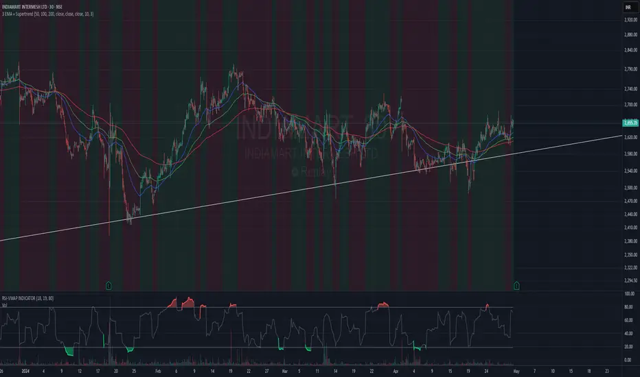
3 EMA + SupertrendThree EMAs: Helps you identify the general trend direction and potential crossovers.
When the Fast EMA crosses above the Medium or Slow EMAs, it may indicate a bullish trend, and vice versa for bearish trends.
Supertrend: Works as a trend filter. You can use it to identify overall market conditions:
When the Supertrend is green, it indicates an uptrend.
When the Supertrend is red, it indicates a downtrend.
Combination: The EMAs help you confirm the trend, and the Supertrend can act as a filter or confirmation tool for your entries and exits.
Potential Strategy Idea:
Long Entry: When the Fast EMA crosses above the Medium EMA, and the Supertrend is green.
Short Entry: When the Fast EMA crosses below the Medium EMA, and the Supertrend is red.
Exit: You can use either the Supertrend turning from green to red (for long exits) or vice versa.
Lyapunov Market Instability (LMI)Lyapunov Market Instability (LMI)
What is Lyapunov Market Instability?
Lyapunov Market Instability (LMI) is a revolutionary indicator that brings chaos theory from theoretical physics into practical trading. By calculating Lyapunov exponents—a measure of how rapidly nearby trajectories diverge in phase space—LMI quantifies market sensitivity to initial conditions. This isn't another oscillator or trend indicator; it's a mathematical lens that reveals whether markets are in chaotic (trending) or stable (ranging) regimes.
Inspired by the meditative color field paintings of Mark Rothko, this indicator transforms complex chaos mathematics into an intuitive visual experience. The elegant simplicity of the visualization belies the sophisticated theory underneath—just as Rothko's seemingly simple color blocks contain profound depth.
Theoretical Foundation (Chaos Theory & Lyapunov Exponents)
In dynamical systems, the Lyapunov exponent (λ) measures the rate of separation of infinitesimally close trajectories:
λ > 0: System is chaotic—small changes lead to dramatically different outcomes (butterfly effect)
λ < 0: System is stable—trajectories converge, perturbations die out
λ ≈ 0: Edge of chaos—transition between regimes
Phase Space Reconstruction
Using Takens' embedding theorem , we reconstruct market dynamics in higher dimensions:
Time-delay embedding: Create vectors from price at different lags
Nearest neighbor search: Find historically similar market states
Trajectory evolution: Track how these similar states diverged over time
Divergence rate: Calculate average exponential separation
Market Application
Chaotic markets (λ > threshold): Strong trends emerge, momentum dominates, use breakout strategies
Stable markets (λ < threshold): Mean reversion dominates, fade extremes, range-bound strategies work
Transition zones: Market regime about to change, reduce position size, wait for confirmation
How LMI Works
1. Phase Space Construction
Each point in time is embedded as a vector using historical prices at specific delays (τ). This reveals the market's hidden attractor structure.
2. Lyapunov Calculation
For each current state, we:
- Find similar historical states within epsilon (ε) distance
- Track how these initially similar states evolved
- Measure exponential divergence rate
- Average across multiple trajectories for robustness
3. Signal Generation
Chaos signals: When λ crosses above threshold, market enters trending regime
Stability signals: When λ crosses below threshold, market enters ranging regime
Divergence detection: Price/Lyapunov divergences signal potential reversals
4. Rothko Visualization
Color fields: Background zones represent market states with Rothko-inspired palettes
Glowing line: Lyapunov exponent with intensity reflecting market state
Minimalist design: Focus on essential information without clutter
Inputs:
📐 Lyapunov Parameters
Embedding Dimension (default: 3)
Dimensions for phase space reconstruction
2-3: Simple dynamics (crypto/forex) - captures basic momentum patterns
4-5: Complex dynamics (stocks/indices) - captures intricate market structures
Higher dimensions need exponentially more data but reveal deeper patterns
Time Delay τ (default: 1)
Lag between phase space coordinates
1: High-frequency (1m-15m charts) - captures rapid market shifts
2-3: Medium frequency (1H-4H) - balances noise and signal
4-5: Low frequency (Daily+) - focuses on major regime changes
Match to your timeframe's natural cycle
Initial Separation ε (default: 0.001)
Neighborhood size for finding similar states
0.0001-0.0005: Highly liquid markets (major forex pairs)
0.0005-0.002: Normal markets (large-cap stocks)
0.002-0.01: Volatile markets (crypto, small-caps)
Smaller = more sensitive to chaos onset
Evolution Steps (default: 10)
How far to track trajectory divergence
5-10: Fast signals for scalping - quick regime detection
10-20: Balanced for day trading - reliable signals
20-30: Slow signals for swing trading - major regime shifts only
Nearest Neighbors (default: 5)
Phase space points for averaging
3-4: Noisy/fast markets - adapts quickly
5-6: Balanced (recommended) - smooth yet responsive
7-10: Smooth/slow markets - very stable signals
📊 Signal Parameters
Chaos Threshold (default: 0.05)
Lyapunov value above which market is chaotic
0.01-0.03: Sensitive - more chaos signals, earlier detection
0.05: Balanced - optimal for most markets
0.1-0.2: Conservative - only strong trends trigger
Stability Threshold (default: -0.05)
Lyapunov value below which market is stable
-0.01 to -0.03: Sensitive - quick stability detection
-0.05: Balanced - reliable ranging signals
-0.1 to -0.2: Conservative - only deep stability
Signal Smoothing (default: 3)
EMA period for noise reduction
1-2: Raw signals for experienced traders
3-5: Balanced - recommended for most
6-10: Very smooth for position traders
🎨 Rothko Visualization
Rothko Classic: Deep reds for chaos, midnight blues for stability
Orange/Red: Warm sunset tones throughout
Blue/Black: Cool, meditative ocean depths
Purple/Grey: Subtle, sophisticated palette
Visual Options:
Market Zones : Background fields showing regime areas
Transitions: Arrows marking regime changes
Divergences: Labels for price/Lyapunov divergences
Dashboard: Real-time state and trading signals
Guide: Educational panel explaining the theory
Visual Logic & Interpretation
Main Elements
Lyapunov Line: The heart of the indicator
Above chaos threshold: Market is trending, follow momentum
Below stability threshold: Market is ranging, fade extremes
Between thresholds: Transition zone, reduce risk
Background Zones: Rothko-inspired color fields
Red zone: Chaotic regime (trending)
Gray zone: Transition (uncertain)
Blue zone: Stable regime (ranging)
Transition Markers:
Up triangle: Entering chaos - start trend following
Down triangle: Entering stability - start mean reversion
Divergence Signals:
Bullish: Price makes low but Lyapunov rising (stability breaking down)
Bearish: Price makes high but Lyapunov falling (chaos dissipating)
Dashboard Information
Market State: Current regime (Chaotic/Stable/Transitioning)
Trading Bias: Specific strategy recommendation
Lyapunov λ: Raw value for precision
Signal Strength: Confidence in current regime
Last Change: Bars since last regime shift
Action: Clear trading directive
Trading Strategies
In Chaotic Regime (λ > threshold)
Follow trends aggressively: Breakouts have high success rate
Use momentum strategies: Moving average crossovers work well
Wider stops: Expect larger swings
Pyramid into winners: Trends tend to persist
In Stable Regime (λ < threshold)
Fade extremes: Mean reversion dominates
Use oscillators: RSI, Stochastic work well
Tighter stops: Smaller expected moves
Scale out at targets: Trends don't persist
In Transition Zone
Reduce position size: Uncertainty is high
Wait for confirmation: Let regime establish
Use options: Volatility strategies may work
Monitor closely: Quick changes possible
Advanced Techniques
- Multi-Timeframe Analysis
- Higher timeframe LMI for regime context
- Lower timeframe for entry timing
- Alignment = highest probability trades
- Divergence Trading
- Most powerful at regime boundaries
- Combine with support/resistance
- Use for early reversal detection
- Volatility Correlation
- Chaos often precedes volatility expansion
- Stability often precedes volatility contraction
- Use for options strategies
Originality & Innovation
LMI represents a genuine breakthrough in applying chaos theory to markets:
True Lyapunov Calculation: Not a simplified proxy but actual phase space reconstruction and divergence measurement
Rothko Aesthetic: Transforms complex math into meditative visual experience
Regime Detection: Identifies market state changes before price makes them obvious
Practical Application: Clear, actionable signals from theoretical physics
This is not a combination of existing indicators or a visual makeover of standard tools. It's a fundamental rethinking of how we measure and visualize market dynamics.
Best Practices
Start with defaults: Parameters are optimized for broad market conditions
Match to your timeframe: Adjust tau and evolution steps
Confirm with price action: LMI shows regime, not direction
Use appropriate strategies: Chaos = trend, Stability = reversion
Respect transitions: Reduce risk during regime changes
Alerts Available
Chaos Entry: Market entering chaotic regime - prepare for trends
Stability Entry: Market entering stable regime - prepare for ranges
Bullish Divergence: Potential bottom forming
Bearish Divergence: Potential top forming
Chart Information
Script Name: Lyapunov Market Instability (LMI) Recommended Use: All markets, all timeframes Best Performance: Liquid markets with clear regimes
Academic References
Takens, F. (1981). "Detecting strange attractors in turbulence"
Wolf, A. et al. (1985). "Determining Lyapunov exponents from a time series"
Rosenstein, M. et al. (1993). "A practical method for calculating largest Lyapunov exponents"
Note: After completing this indicator, I discovered @loxx's 2022 "Lyapunov Hodrick-Prescott Oscillator w/ DSL". While both explore Lyapunov exponents, they represent independent implementations with different methodologies and applications. This indicator uses phase space reconstruction for regime detection, while his combines Lyapunov concepts with HP filtering.
Disclaimer
This indicator is for research and educational purposes only. It does not constitute financial advice or provide direct buy/sell signals. Chaos theory reveals market character, not future prices. Always use proper risk management and combine with your own analysis. Past performance does not guarantee future results.
See markets through the lens of chaos. Trade the regime, not the noise.
Bringing theoretical physics to practical trading through the meditative aesthetics of Mark Rothko
Trade with insight. Trade with anticipation.
— Dskyz , for DAFE Trading Systems

EMA with ColoringDescription:
The "EMA with Coloring" indicator plots a customizable Exponential Moving Average (EMA) on the price chart, with its color dynamically changing based on the Ichimoku Cloud's trend signals. This tool helps traders identify trend direction and potential trading opportunities by combining the simplicity of an EMA with the robust trend analysis of the Ichimoku system. The EMA changes color to reflect bullish (uptrend), bearish (downtrend), or neutral (in-cloud) market conditions, making it easier to spot trend shifts and trade setups.
How It Works:
EMA Calculation: The indicator calculates an EMA based on the user-defined period (default: 9). The EMA is plotted directly on the price chart, overlaying candlesticks or bars.
Ichimoku Coloring Logic: The EMA’s color is determined by an underlying Ichimoku Cloud system:
Green (Uptrend): When the price is above the Ichimoku Cloud and bullish conditions are confirmed (e.g., Conversion Line above Base Line and rising momentum).
Red (Downtrend): When the price is below the Ichimoku Cloud and bearish conditions are confirmed (e.g., Conversion Line below Base Line and falling momentum).
ATR Whipsaw Protection: The indicator uses an Average True Range (ATR) filter to reduce false signals during choppy markets, ensuring more reliable trend identification.
Customizable Settings:
EMA Length: Adjust the period of the EMA (default: 9) to make it more or less sensitive to price changes.
Uptrend/Downtrend Colors: Choose from Green, Red, or Blue for the EMA’s color in bullish or bearish conditions.
Transparency: Set the EMA’s opacity (default: 0, fully opaque) for better visibility on the chart.
How to Trade It:
Trend Identification:
Bullish (Green EMA): Indicates a strong uptrend. Look for buying opportunities when the EMA turns green, especially if the price is above the cloud and the EMA is sloping upward.
Bearish (Red EMA): Indicates a strong downtrend. Consider selling or shorting when the EMA turns red, particularly if the price is below the cloud and the EMA is sloping downward.
Neutral (Gray EMA): Signals a range-bound market. Avoid trend-based trades and consider range trading or waiting for a breakout.
Entry Signals:
Long Entry: Enter a buy trade when the EMA changes from gray or red to green, and the price breaks above a recent high or key resistance, confirming bullish momentum.
Short Entry: Enter a sell/short trade when the EMA changes from gray or green to red, and the price breaks below a recent low or key support, confirming bearish momentum.
Exit Signals:
Exit long trades when the EMA turns gray or red, indicating a potential trend reversal or consolidation.
Exit short trades when the EMA turns gray or green, suggesting the downtrend may be weakening.
Risk Management:
Use stop-losses below recent swing lows (for longs) or above swing highs (for shorts) to protect against unexpected reversals.
Combine with support/resistance levels, candlestick patterns, or other indicators (e.g., RSI, MACD) for confirmation.
Tips:
Adjust the EMA length to suit your trading style: shorter periods (e.g., 5–10) for scalping/day trading, longer periods (e.g., 20–50) for swing trading.
Test the indicator on your preferred timeframe and asset to optimize settings.
Settings:
EMA Settings:
EMA Length: Default is 9. Increase for smoother trends, decrease for more sensitivity.
EMA Color Settings:
Uptrend EMA Color: Choose Green, Red, or Blue (default: Green) for bullish conditions.
Downtrend EMA Color: Choose Green, Red, or Blue (default: Red) for bearish conditions.
EMA Color Transparency: Default is 0 (fully opaque). Adjust to 10–100 for partial transparency if needed.
Notes:
Best used on timeframes where trends are clear (e.g., 1H, 4H, Daily).
The Ichimoku logic runs in the background with fixed parameters optimized for reliability, so only the EMA and color settings are adjustable.
Always backtest and practice on a demo account before using in live trading.

Opening Range BreakoutOPENING RANGE BREAKOUT (ORB) INDICATOR
DESCRIPTION
The Opening Range Breakout indicator is a powerful technical analysis tool designed specifically for US equity markets. It identifies and visualizes the opening range established during the first configurable minutes of each trading day (starting at 9:30 AM EST), then provides clear signals when price breaks out of or rejects from these key levels.
This indicator combines multiple timeframe analysis capabilities with precise breakout detection to help traders identify high-probability trading opportunities based on opening range dynamics.
KEY FEATURES
Configurable Opening Range:
• Set opening range duration from 5 minutes to 4 hours
• Automatically adjusts calculations based on your chart timeframe
• Works on any timeframe (1m, 5m, 15m, 1h, etc.)
Multi-Day Range Display:
• Shows up to 50 days of historical opening ranges
• Each day's range properly contained within its trading session
• Range lines extend from market open (9:30 AM) to market close (4:00 PM EST)
Clear Signal System:
• Green arrows (⬆): Bullish breakouts and rejections
• Red arrows (⬇): Bearish breakouts and rejections
• Two signal types: Close breakouts (normal size) and wick rejections (small size)
Visual Range Highlighting:
• Opening range period highlighted with colored box
• Customizable colors for range fill, borders, and midline
• Clean, professional appearance with configurable line styles
SIGNAL TYPES
Bullish Signals (Green ⬆):
1. Close Breakout Above Range (Normal Size): 5-minute candle closes above the opening range high
2. Wick Rejection from Below (Small Size): Price wicks below the opening range low but closes back inside the range
Bearish Signals (Red ⬇):
1. Close Breakout Below Range (Normal Size): 5-minute candle closes below the opening range low
2. Wick Rejection from Above (Small Size): Price wicks above the opening range high but closes back inside the range
CONFIGURATION OPTIONS
Range Settings:
• Opening Range Minutes: Duration of opening range (default: 30 minutes)
• Lookback Days: Number of historical days to display (default: 20 days)
Visual Customization:
• Range Color: Fill color for the opening range area
• Border Color: Color for range high/low lines
• Midline Color: Color for the range midpoint line
• Opening Range Highlight Color: Color for the opening period box
• Line Style: Solid, Dashed, or Dotted lines
• Line Width: 1-4 pixel width options
Display Options:
• Show Midline: Toggle midpoint line display
• Show Range Labels: Toggle price level labels
• Arrow Distance: Adjust arrow positioning (0.1-2.0%)
USAGE GUIDE
Basic Setup:
1. Add the indicator to your chart (works best on 5-minute timeframe)
2. Configure your preferred opening range duration (15m, 30m, or 60m are popular choices)
3. Adjust lookback days based on your analysis needs
4. Customize colors and line styles to match your chart theme
Trading Applications:
Breakout Trading:
• Long Entry: Green arrow (close breakout above range) + confirmation
• Short Entry: Red arrow (close breakout below range) + confirmation
• Stop Loss: Opposite side of the opening range
• Target: 1-2x the range size or key support/resistance levels
Range Rejection Trading:
• Reversal Setups: Small arrows indicate failed breakouts
• Mean Reversion: Trade back toward range midline
• Support/Resistance: Use range levels as key price zones
Multi-Day Analysis:
• Identify recurring support/resistance levels
• Analyze range expansion/contraction patterns
• Compare current day's activity to recent history
BEST PRACTICES
1. Timeframe Selection: 5-minute charts provide optimal signal clarity
2. Range Duration: 30-minute opening range is most commonly used, but adjust based on:
- Market volatility
- Stock characteristics
- Trading style preference
3. Confirmation: Use additional indicators or price action for trade confirmation
4. Risk Management: Always use appropriate position sizing and stop losses
MARKET SESSIONS
The indicator is specifically designed for US equity markets:
• Market Open: 9:30 AM EST
• Market Close: 4:00 PM EST
• Opening Range: Calculated from market open
• Range Lines: Extend throughout the trading day only
PERFORMANCE NOTES
• Optimized for real-time trading with minimal lag
• Automatically manages memory by cleaning old ranges
• Efficiently handles multiple timeframes and range calculations
KNOWN ISSUES & WORKAROUNDS
Historical Buffer Error:
Issue: Occasionally, you may encounter an error: "The requested historical offset (XXX) is beyond the historical buffer's limit (770)"
Workaround:
1. Switch to a different timeframe temporarily
2. Switch back to your original timeframe
3. The indicator will reload and function normally
This is a Pine Script limitation related to historical data access and doesn't affect the indicator's core functionality.
COMPATIBILITY
• Pine Script Version: v6
• Chart Types: All chart types supported
• Timeframes: All timeframes (optimized for 1m-1h)
• Markets: Designed for US equity markets during regular trading hours
TIPS FOR MAXIMUM EFFECTIVENESS
1. Combine with Volume: High volume on breakouts increases reliability
2. Market Context: Consider overall market direction and volatility
3. News Awareness: Be cautious around earnings and major announcements
4. Range Quality: Wider ranges often provide better breakout opportunities
5. Time of Day: Early breakouts (first 1-2 hours) often have higher follow-through
This indicator is provided for educational and informational purposes. Always conduct your own analysis and manage risk appropriately.

0x278's Swing-Failure-Pattern (SFP)0x278's Swing-Failure-Pattern (SFP) ‑ Confirmed Short
Table of Contents
Introduction
Core Concept – What Is an SFP?
How the Indicator Works
Visual Elements & Their Meaning
Input Parameters Explained
Step-by-Step Trading Playbook
Example Workflow (Daily BTC-USDT)
Alerts & Automation
Tips, Tricks & Best Practices
FAQ
Advanced Configuration & Asset-Class Playbook
1. Introduction
The Swing-Failure-Pattern (SFP) – Confirmed Short indicator spots and tracks bearish SFPs on any market and timeframe, with defaults tuned for Daily charts.
A bearish SFP occurs when price sweeps a prior swing high (liquidity grab) and then decisively rejects lower , signalling a possible trend reversal or sharp pullback.
This script automatically:
Identifies the liquidity sweep & rejection (‐"SFP-SHORT" label)
Confirms directional intent via a structure-breaking close below the setup low
Paints a preferred sell-on-retest zone and tracks its validity
Identifies optimal entry opportunities when price retests the zone
Generates optional retest and entry alerts when trading conditions appear
Self-cleans after a configurable number of bars – keeping your chart tidy
Default Timeframe : Daily
Default Market : Crypto / FX majors
Works On : All symbols + timeframes – simply adjust parameters.
2. Core Concept – What Is an SFP?
Sweep (Liquidity Grab) – Price trades above a meaningful swing high, triggering stops & inducing breakout buyers.
Rejection – The same bar (or the next) closes back below the swept high, invalidating the breakout.
Structure Break – Bears confirm intent by closing below the "setup low" (the most recent pivot low before the sweep).
Retest – Price retraces to the sweep zone. Traders seek entries inside the upper half of that zone with invalidation just above the swing high.
The indicator encodes these four steps so you can spot high-quality bearish reversals without manual bar-by-bar analysis.
3. How the Indicator Works
Phase: Sweep & Rejection
Script Logic: high > lastSwingHigh and close < lastSwingHigh
Visual Cue: Red SFP-SHORT label above candle
Phase: Structure Break
Script Logic: Close < setupLow while pattern locked
Visual Cue: Zone (red line-box) plotted; SFP-SHORT label stays
Phase: Retest Tracking
Script Logic: Zone stays active for retestExpiry bars or until tapped
Visual Cue: Orange SFP-RETEST label when hit
Phase: Entry Signal
Script Logic: Price rejection within retest zone
Visual Cue: Green ENTRY label at optimal entry point
Phase: Expiry / Cleanup
Script Logic: Zone deleted after expiry
Visual Cue: Labels fade but remain visible for reference
All calculations reset after each completed/expired pattern ensuring fresh, uncluttered signals.
4. Visual Elements & Their Meaning
SFP-SHORT (red) – Bar that swept a prior high and closed below it.
Red Box / Line – Preferred sell zone between the swing high (upper bound) and dynamic lower bound (see sizing methods). Extends right until filled/expired.
SFP-RETEST (orange) – Bar that first tags the zone after confirmation.
ENTRY (green) – Appears when a high-probability entry signal occurs within the retest zone.
EXPIRED (gray) – Appears when the retest zone expires without being hit.
Visual Persistence – Labels fade but remain visible after expiry for reference and historical analysis.
5. Input Parameters Explained
Pivot Detection
Pivot left / right : Bars left/right of the pivot that must stay below/above it. Tip : Symmetrical values (3/3) work best for clean structure.
Retest Management
Retest expiry (bars) : Lifespan of a retest zone before it is considered stale. Default: 14 bars on Daily . Tip : Shorten for intraday, lengthen for swing trading.
Retest Zone Sizing
Sizing method : Select Static %, ATR-based or Hybrid logic for the lower boundary. Tip : Hybrid balances tight stops with realistic fills.
Static % : Fixed fraction of sweep range when Static/Hybrid is selected. Tip : Higher % deepens zone & widens stop.
ATR period : Look-back length for ATR when volatility sizing is used. Tip : Increase to smooth choppy markets.
ATR multiplier : Multiplier applied to ATR in ATR-based/Hybrid mode. Tip : Higher value widens zone during volatility.
Visual – Retest Zone
Show retest zone box : Toggles drawing of the semi-transparent sell zone box. Tip : Disable for ultra-clean look.
Retest box color : Fill colour of the box (alpha = transparency). Tip : Match your chart theme.
Max retest boxes : How many historical boxes remain visible (0 = unlimited). Tip : Lower to boost performance.
Only show active boxes : Automatically deletes a box once it's hit. Tip : Reduces clutter during back-testing.
Visual – General
Minimal mode : Hides most visuals apart from critical labels. Tip : Ideal for screenshots.
Show retest zone line : Draws a vertical line linking upper/lower boundaries. Tip : Acts as a quick depth guide.
Show ENTRY labels : Plots 'ENTRY' on optimal candles. Tip : Turn off for manual confirmation.
Labels
Label size : Overall size of all labels. Tip : tiny / small / normal.
Use simple label style : Switches to pixel text style for labels. Tip : Faster rendering on low-spec machines.
Advanced
minPct / maxPct (hard-coded) : Internal floor/cap for Hybrid logic. Tip : Exposed in code for power-users only.
Zone-Sizing Methods
Static – Lower bound = sweepRange × staticPct.
ATR-based – Lower bound = ATR × multiplier, normalised to the sweepRange.
Hybrid – Uses the greater of Static and ATR-based (capped by an internal safety ceiling).
6. Step-by-Step Trading Playbook
Identify Context – Prefer setups against extended moves into obvious highs (e.g., daily swing highs, prior week high, round numbers).
Wait for SFP Confirmation – The indicator will label an SFP-SHORT only after the candle closes. Do not front-run.
Structure-Break Close – A close below setupLow turns the zone live. This is your go signal – prepare sell orders.
Place Orders in the Zone
Entry : Limit order anywhere between retestLower and the swing high.
Stop : 1-2 ticks/pips above the swing high.
Risk Management
Size position so risk per trade ≤ account risk % (common: 0.5-1%).
If no retest before retestExpiry bars → cancel order .
Targets
Conservative: First liquidity pocket / FVG below.
Aggressive: 2-3× risk or next HTF support.
Trail or Partial – Consider trailing stop once 1R is achieved or partial profit at 1R.
7. Example Workflow (Daily BTC-USDT)
BTC trades to a fresh one-month high at $31 050 sweeping prior highs.
Candle closes at $30 420 – below the swept high – SFP-SHORT label appears.
Two days later, candle closes below setupLow at $29 880 – confirmation & zone plotted (upper = $31 050, lower ≈ $30 550).
Five days later price retests the zone hitting $30 750 – SFP-RETEST alert fires, trade filled.
Stop placed @ $31 120 (70$ risk). 1R target = $29 680 reached four days later.
8. Alerts & Automation
SFP Short confirmed
Fires When: Structure-break close below setupLow.
Suggested Action: Prepare/submit sell-limit order in the zone.
SFP Short retest
Fires When: Price enters the retest zone.
Suggested Action: Monitor for entry signals or prepare for manual entry.
SFP Short Entry Signal
Fires When: Optimal entry conditions detected within retest zone.
Suggested Action: Execute short trade with defined risk parameters.
Use TradingView's Webhook URL to forward alerts to a trade-execution bot (e.g., PineConnector) for automated order placement.
9. Tips, Tricks & Best Practices
Combine with HTF Bias – Only take bearish SFPs in bearish weekly trend.
Watch Volume – High volume on the sweep bar adds conviction.
Time Window – SFPs during NY session FX / US session crypto tend to be stronger.
Cluster Zones – Multiple overlapping SFP zones increase probability; treat the cluster as one larger supply.
Avoid News – Skip SFPs forming minutes before high-impact macro news.
10. FAQ
Q: Can I use this on lower timeframes?
A: Yes – reduce retestExpiry (e.g., 15 bars on 15-minute) and test ATR-based sizing.
Q: Does it work for longs?
A: This script focuses on bearish SFPs. Clone & invert conditions for longs.
Q: Why did a zone disappear?
A: Either it expired (retestExpiry) without a retest or the cleanup routine removed old visuals to stay within Pine limits (500 objects per type).
Q: What's the difference between the "SFP-RETEST" and "ENTRY" signals?
A: "SFP-RETEST" indicates price has entered the zone, while "ENTRY" signals an optimal entry opportunity based on price rejection within the zone.
Q: How do I customize the label appearance?
A: Use the "Label size" and "Use simple label style" settings to adjust all labels to your preferred visual style.
Happy trading & trade safe!
11. Advanced Configuration & Asset-Class Playbook
Why does the retest box feel "too high" and how do I actually get filled? Use the quick tweaks below or the power-user code snippet to shape the zone to your personality and instrument.
11.1 Why the default box is shallow
The Static 25 % / ATR-Hybrid logic keeps stops small. Around 50 % of Daily BTC SFPs never look back – that's the cost of tight risk. If you need higher fill-rates, deepen the zone (11.2).
11.2 Three slider moves – no coding required
Retest zone sizing method – switch Static → Hybrid or ATR-based
Static % – raise from 0.25 → 0.45-0.60
ATR multiplier – raise from 1.0 → 1.5-2.0
Each turn pulls the lower edge of the box deeper while keeping the invalidation at the swing high.
11.3 One-liner for coders
To allow >60 % of the sweep range edit the source:
Old code:
minPct = 0.05
maxPct = 0.60
New code:
minPct = 0.05
maxPct = input.float(0.60, "Max retest % of sweep", step = 0.05, minval = 0.10, maxval = 0.95)
Then dial the cap up to ~0.80-0.90 from the settings panel.
11.4 If price never comes back…
No-retest partial – take 25-40 % size on the confirmation candle, stop above the high.
Lower-TF confirmation – drop to 4 h / 1 h and hunt an internal SFP or bearish FVG inside the sweep.
ATR trail – if price dumps immediately, trail the stop above each new lower-high.
11.5 Asset-Class Cheat-Sheet
Crypto – Daily : Static %: 0.20-0.35, ATR mult: 1.0, Retest Expiry: 12-20 . Notes : High volatility; sweeps expand fast.
FX Majors – 4 h/D : Static %: 0.25-0.40, ATR mult: 1.2, Retest Expiry: 15-25 . Notes : ATR handles session compression.
Index Futures – 1 h : Static %: 0.30-0.50, ATR mult: 1.5, Retest Expiry: 10-20 . Notes : Hybrid recommended; gaps tighten sweeps.
US Equities – 30 m : Static %: 0.35-0.55, ATR mult: 1.5-2.0, Retest Expiry: 10-14 . Notes : Consider no-retest entry on earnings spikes.
Always forward-test on your own symbol & timeframe ✔️
MMM @MaxMaserati 2.0MMM @MaxMaserati 2.0 - TradingView Indicator
The Backbone of the Max Maserati Method
The MMM @MaxMaserati 2.0 indicator is the core of the proprietary Max Maserati Method (MMM), a trading system designed to decode institutional price action. It integrates candle bias analysis, market structure identification, volume-based signals, and precise entry zones to align traders with smart money.
Core Components of the MMM System
1. Six Core Candle Classifications
Master these patterns to reveal institutional behavior:
Bullish Body Close: Closes above previous high, signaling strong buying.
Bearish Body Close: Closes below previous low, indicating intense selling.
Bullish Affinity: High tests previous low, closes within range, showing hidden bullish strength.
Bearish Affinity: Low tests previous high, closes within range, reflecting bearish pressure.
Seek & Destroy: Breaks both previous high/low, closes inside, direction depends on close.
Close Inside: High/low within previous range, bias based on close.
2. Plus/Minus Strength System
Quantifies candle conviction:
Bullish Strength: Low to close distance.
Bearish Strength: High to close distance.
Plus (+): Dominant strength signals strong follow-through.
Minus (-): Balanced strengths suggest caution.
3. PO4 Candles (Power of OHLC (4))
Analyzes OHLC for body-closed candles after swing high/low fractals:
C2: Body close above high/below low post fractal with strength conditions.
C3: Stronger body close with pronounced low/high breakouts.
C4: Body close which show strength and might trigger a BeB/BuB
Visualization: Green (bullish), purple (bearish) bars; triangle markers for fractals.
4. MC2 (High Volume Reversal Candles)
High buy/sell volume candles reversed by opposing volume:
Bullish MC2: Buy volume flipped by sell volume, signaling exhaustion.
Bearish MC2: Sell volume flipped by buy volume, indicating reversal.
Visualization: Dark green (bullish), dark red (bearish) bars.
5. MMM Blocks (eBlocks and iBlocks)
Marks institutional order blocks:
External Blocks (eBlocks): At market structure changes (MSC), labeled BuB/BeB.
Internal Blocks (iBlocks): Within trends, labeled L/S.
Volume: Normalized with indicators (🔥 high, ↑ above average, ↓ low).
Filters: Discount (0-50), premium (50-100), extreme (0-20, 80-100), mid-range (20-50, 50-80).
6. Entry Blocks - Specific Entry Areas
Entry Blocks are precise zones for framing trades based on the MMM system, triggered post-MSC to capitalize on institutional momentum:
Purpose: Pinpoint high-probability entry areas following a Market Structure Change (MSC), aligning with smart money direction.
Formation:
MMM Entry Block Long: Forms after a bullish MSC (BuB), typically at the swing low (e.g., lowerValueMSC) of the fractal pattern, marking a long entry zone.
MMM Entry Block Short: Forms after a bearish MSC (BeB), typically at the swing high (e.g., upperValueMSC), marking a short entry zone.
Styles :
Close-to-Swing High/Low: Box drawn from the candle’s close to the swing high/low level, emphasizing the fractal pivot.
High/Low-to-Close: Box drawn from the candle’s high/low to its close, capturing the full price action range.
Visualization:
Labeled “MMM Entry Block Long” (cyan background/border) or “Short” (pink background/border).
Includes a dashed midline for reference.
Volume displayed if enabled, normalized with markers (🔥 >150%, ⚡ >120%, ❄️ <70%).
Behavior:
Deletes when price touches the level (On Level Touch) or closes beyond it (On Candle Close)
Limited to a configurable number ( default 5) to avoid clutter.
Trade Framing:
Entry: Enter within the eBreak box, ideally on a pullback or confirmation candle aligning with MMM bias (e.g., Bullish Body Close or Affinity).
Stop-Loss: Placed below the eBreak low (bullish) or above the high (bearish), leveraging the swing level as support/resistance.
Take-Profit: Targets higher timeframe high (bullish) or low (bearish), with ratio (default 2.0) for risk-reward.
MMM Integration: Use candle bias (Plus/Minus), PO4 signals, and MMPD consensus to confirm entry direction and strength.
Significance: eBreaks frame trades by isolating institutional entry points post-MSC, reducing noise and enhancing precision.
7. Market Structure Change (MSC)
Tracks structure shifts:
Detection: Fractal highs/lows with adjustable candle count.
Visualization: Green (BuB), red (BeB) lines/labels; numbered breaks (Bub1/Beb1).
Counter: Tracks consecutive MSCs for trend strength.
8. MMPD (Market Momentum Price Delivery)
Analyzes momentum/trend:
Conditions: Red (bearish), Green (bullish), Pink (modifying bearish), Pale Green (modifying bullish).
Traps: Flags bullish/bearish traps when MMPD conflicts with body close.
Metrics: SuperMaxTrend, momentum (K/D), MMPD level.
Consensus: Rated signals (e.g., “Very Strong Buy ★★★★★”).
9. Trade and Risk Management
Disciplined trading:
Entry Visualization: Entry, stop-loss, take-profit lines/labels with customizable risk (riskAmount, default $50) and reward (ratio).
Behavior: Shows last/all entries, removes on MSC shift or breach.
Text Size: Tiny, Small, Normal.
NB: The Trade and risk management is to use with caution, it is not fully implemented yet.
10. Stats Table
Real-time dashboard:
Elements: Timeframe, symbol, candle bias, strength, MMPD, momentum, SuperMaxTrend, MMPD level, volume, consensus, divergence, delta MA, price delivery, note (“Analyze | Wait | Repeat”).
Customization: Position, size, element visibility.
Colors: Green (bullish), red (bearish), orange (warnings), gray (neutral).
11. Delta MA and Divergence
Monitors volume delta:
Delta MA: Smoothed delta with direction arrows (↗↘→).
Divergence: Flags MMPD-momentum divergences (⚠️).
Key Features
Automated Analysis: Detects PO4, MSC, blocks, MC2, Entry Block via OHLC.
Color-Coded Visualization: Bars, lines, table cells reflect bias/strength.
Dynamic Bias Lines: Higher timeframe high/low lines with labels.
Volume Analysis: Normalized volume across blocks, entries, MC2.
Flexible Filters: Tailors block/entry Block display to strategies.
Real-Time Metrics: Tracks strength, delta, trend points.
Trading Advantages
Institutional Insight: Decodes manipulation via OHLC and volume.
Early Reversals: Spots shifts via PO4, MC2, MSC, Entry Blocks.
Precise Entries: entry block frame high-probability trades.
Robust Risk Management: Stop-loss, take-profit, risk-reward.
Simplified Complexity: Actionable signals from complex action.
Profit Target Framework
Bullish: Higher timeframe high.
Bearish: Higher timeframe low.
Plus Strength: Direct move.
Minus Strength: Pullbacks expected.
Entry Blocks/MSC-Driven: Entry anchor entries to MSC targets.
Trader’s Mantra
“Analyze | Wait | Repeat” - Discipline drives profits.
The MMM @MaxMaserati 2.0 indicator, with Entry Blocks as specific trade-framing zones, offers a professional-grade framework for precise, institutional-aligned trading.
Note: Based on the proprietary Max Maserati Method for educational and analytical use.
ADX and DI - Trader FelipeADX and DI - Trader Felipe
This indicator combines the Average Directional Index (ADX) and the Directional Indicators (DI+ and DI-) to help traders assess market trends and their strength. It is designed to provide a clear view of whether the market is in a trending phase (either bullish or bearish) and helps identify potential entry and exit points.
What is ADX and DI?
DI+ (Green Line):
DI+ measures the strength of upward (bullish) price movements. When DI+ is above DI-, it signals that the market is experiencing upward momentum.
DI- (Red Line):
DI- measures the strength of downward (bearish) price movements. When DI- is above DI+, it suggests that the market is in a bearish phase, with downward momentum.
ADX (Blue Line):
ADX quantifies the strength of the trend, irrespective of whether it is bullish or bearish. The higher the ADX, the stronger the trend:
ADX > 20: Indicates a trending market (either up or down).
ADX < 20: Indicates a weak or sideways market with no clear trend.
Threshold Line (Gray Line):
This horizontal line, typically set at 20, represents the threshold for identifying whether the market is trending or not. If ADX is above 20, the market is considered to be in a trend. If ADX is below 20, it suggests that the market is not trending and is likely in a consolidation phase.
Summary of How to Use the Indicator:
Trend Confirmation: Use ADX > 20 to confirm a trending market. If ADX is below 20, avoid trading.
Long Entry: Enter a long position when DI+ > DI- and ADX > 20.
Short Entry: Enter a short position when DI- > DI+ and ADX > 20.
Avoid Sideways Markets: Do not trade when ADX is below 20. Look for other strategies for consolidation phases.
Exit Strategy: Exit the trade if ADX starts to decline or if the DI lines cross in the opposite direction.
Combine with Other Indicators: Use additional indicators like RSI, moving averages, or support/resistance to filter and confirm signals.
Stochastic RSI with MTF TableShort Description of the Script
The provided Pine Script indicator, titled "Stochastic RSI with MTF Table," calculates and displays the Stochastic RSI for the current timeframe and multiple other timeframes (5m, 15m, 30m, 60m, 240m, and daily). The Stochastic RSI is a momentum indicator that blends the Relative Strength Index (RSI) and Stochastic Oscillator to identify overbought and oversold conditions, as well as potential trend reversals via K and D line crossovers.
Key features of the script include:
Inputs: Customizable parameters such as K smoothing (default 3), D smoothing (default 3), RSI length (default 14), Stochastic length (default 14), source price (default close), and overbought/oversold levels (default 80/20).
MTF Table: A table displays the Stochastic RSI status for each timeframe:
"OB" (overbought) if K > 80, "OS" (oversold) if K < 20, or "N" (neutral) otherwise.
Crossovers: "K↑D" for bullish (K crosses above D) and "K↓D" for bearish (K crosses below D).
Visualization: Plots the K and D lines for the current timeframe, with horizontal lines at 80 (overbought), 50 (middle), and 20 (oversold), plus a background fill for clarity.
Table Position: Configurable to appear in one of four chart corners (default: top-right).
This indicator helps traders assess momentum across multiple timeframes simultaneously, aiding in the identification of trend strength and potential entry/exit points.
Trading Strategy with 50EMA and 200EMA for Highest Winning Rate
To create a strategy with the best probability of a high winning rate using the Stochastic RSI MTF indicator alongside the 50-period Exponential Moving Average (50EMA) and 200-period Exponential Moving Average (200EMA), we can combine trend identification with momentum-based entry timing. The 50EMA and 200EMA are widely used to determine medium- and long-term trends, while the Stochastic RSI MTF table provides multi-timeframe momentum signals. Here’s the strategy:
1. Determine the Overall Trend
Bullish Trend: The 50EMA is above the 200EMA on the current timeframe (e.g., daily or 60m chart). This suggests an uptrend, often associated with a "Golden Cross."
Bearish Trend: The 50EMA is below the 200EMA on the current timeframe. This indicates a downtrend, often linked to a "Death Cross."
Implementation: Plot the 50EMA and 200EMA on your chart and visually confirm their relative positions.
2. Identify Entry Signals Using the Stochastic RSI MTF Table
In a Bullish Trend (50EMA > 200EMA):
Look for timeframes in the MTF table showing:
Oversold (OS): K < 20, indicating a potential pullback in the uptrend where price may rebound.
Bullish Crossover (K↑D): K crosses above D, signaling rising momentum and a potential entry point.
Example: If the 60m and 240m timeframes show "OS" or "K↑D," this could be a buy signal.
In a Bearish Trend (50EMA < 200EMA):
Look for timeframes in the MTF table showing:
Overbought (OB): K > 80, suggesting a rally in the downtrend where price may reverse downward.
Bearish Crossover (K↓D): K crosses below D, indicating declining momentum and a potential short entry.
Example: If the 30m and daily timeframes show "OB" or "K↓D," this could be a sell/short signal.
Current Timeframe Check: Use the plotted K and D lines on your trading timeframe for precise entry timing (e.g., confirm a K↑D crossover on a 60m chart for a long trade).
3. Confirm Signals Across Multiple Timeframes
Strengthen the Signal: A higher winning rate is more likely when multiple timeframes align with the trend and signal. For instance:
Bullish trend + "OS" or "K↑D" on 60m, 240m, and daily = strong buy signal.
Bearish trend + "OB" or "K↓D" on 15m, 60m, and 240m = strong sell signal.
Prioritize Higher Timeframes: Signals from the 240m or daily timeframe carry more weight due to their indication of broader trends, increasing reliability.
4. Set Stop-Loss and Take-Profit Levels
Long Trades (Bullish):
Stop-Loss: Place below the most recent swing low or below the 50EMA, whichever is closer, to protect against trend reversals.
Take-Profit: Target a key resistance level or use a risk-reward ratio (e.g., 2:1 or 3:1) based on the stop-loss distance.
Short Trades (Bearish):
Stop-Loss: Place above the most recent swing high or above the 50EMA, whichever is closer.
Take-Profit: Target a key support level or apply a similar risk-reward ratio.
Trailing Stop Option: As the trend progresses, trail the stop below the 50EMA (for longs) or above it (for shorts) to lock in profits.
5. Risk Management
Position Sizing: Risk no more than 1-2% of your trading capital per trade to minimize losses from false signals.
Volatility Consideration: Adjust stop-loss distances and position sizes based on the asset’s volatility (e.g., wider stops for volatile stocks or crypto).
Avoid Overtrading: Wait for clear alignment between the EMA trend and MTF signals to avoid low-probability setups.
Example Scenario
Chart: 60-minute timeframe.
Trend: 50EMA > 200EMA (bullish).
MTF Table: 60m shows "OS," 240m shows "K↑D," and daily is "N."
Action: Enter a long position when the 60m K line crosses above D, confirming the table signal.
Stop-Loss: Below the recent 60m swing low (e.g., 2% below entry).
Take-Profit: At the next resistance level or a 3:1 reward-to-risk ratio.
Outcome: High probability of success due to trend alignment and multi-timeframe confirmation.
Why This Strategy Works
Trend Following: Trading in the direction of the 50EMA/200EMA trend reduces the risk of fighting the market’s momentum.
Momentum Timing: The Stochastic RSI MTF table pinpoints pullbacks or reversals within the trend, improving entry timing.
Multi-Timeframe Confirmation: Alignment across timeframes filters out noise, increasing the win rate.
Risk Control: Defined stop-loss and position sizing protect against inevitable losses.
Caveats
No strategy guarantees a 100% win rate; false signals can occur, especially in choppy markets.
Test this strategy on historical data or a demo account to verify its effectiveness for your asset and timeframe.
This approach leverages the strengths of both trend-following (EMA) and momentum (Stochastic RSI) tools, aiming for a high-probability, disciplined trading system.

Hybrid Swing/Day Alert System - PLATINUM EditionThis indicator is a complete trading assistant designed for crypto swing and day traders, built to identify high-probability long and short setups based on a multi-confirmation system.
Strategy Logic
The system scans and confirms entries only when 6 major confluences align:
1. EMA Trend: Price is above or below the EMA 9, 21, and 200 (bullish or bearish trend).
2. RSI Zone: RSI(14) is between 40-60 (ideal reversal zone).
3. Volume Confirmation: Volume is declining on pullback and then spikes.
4. Accumulation/Distribution: A/D line rising (for longs) or falling (for shorts).
5. Fibonacci Pullback Zone: Automatic detection of swing high/low and checks if price is inside the golden zone (0.5-0.618).
Built-In Alerts
- Long Setup Confirmed - Short Setup Confirmed - Setup Forming: Monitor
Conclusion
This script is ideal for disciplined traders who value confluence-based entries, risk/reward logic, and trend-aligned trades. Perfect for semi-automated trading via alerts or manual execution.6. Candle Pattern: Bullish (hammer, doji, engulfing) or Bearish (rejection wick, engulfing, doji).
Visual Features
- Long Entry: Green square
- Short Entry: Red triangle
- Pre-Signal Alert: Blue circle (confluence forming)
- Dynamic Table: Displays all 6 confirmations in real time
- Fibonacci Zones: Auto-plotted long/short retracement zones
- Customizable: Turn on/off alerts, overlays, and direction filters
Best Use Cases
- 4H/Daily: Trend confirmation
- 1H: Entry execution
- 15min: Scalping (use cautiously)
- Works great with BTC, ETH, SOL, XAU, and meme coins
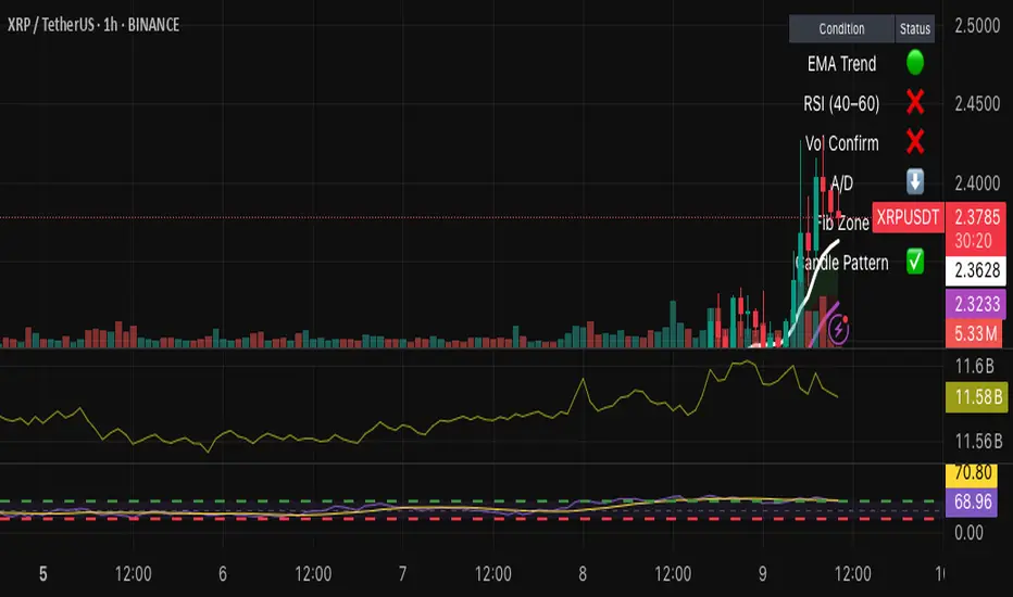
Position Size CalculatorPosition Size Calculator - User Guide
A simple tool to calculate optimal position size based on your risk preferences, visualize trade levels, and automatically determine trade direction.
Introduction
The Position Size Calculator is a TradingView indicator designed to help traders calculate the optimal position size for their trades based on account size and risk tolerance. This tool visually represents entry, stop loss, and take profit levels while automatically calculating the appropriate position size to maintain consistent risk management.
Getting Started
Setting Up Your Account Parameters
Setting Price Levels
Understanding the Visual Elements
Adjusting Your Trade on the Chart
Reading the Information Panel
1. Getting Started
After adding the indicator to your chart, you'll see three horizontal lines representing:
Yellow line: Entry price
Green line: Take profit price
Red line: Stop loss price
The indicator automatically detects whether you're planning a Long or Short trade based on the position of your take profit relative to your entry.
2. Setting Up Your Account Parameters
In the "Position Calculator" settings group:
Account Size : Enter your total account balance
Account Currency : Set your account currency (USD, EUR, etc.)
Risk (%) : Enter the percentage of your account you're willing to risk per trade (e.g., 2%)
Instrument Type : Select your trading instrument (Forex, Futures, Stocks, or Crypto)
Value per 0.01 lot per tick : Enter the value of 0.01 lots per tick (for most Forex pairs, this is $1 per pip for 0.01 lot)
Minimum Lot Size : Set the minimum lot size allowed by your broker (usually 0.01 for Forex)
3. Setting Price Levels
In the "Price Levels" section:
Entry Price : The price at which you plan to enter the trade
Stop Loss Price : Where you'll exit if the trade goes against you
Take Profit Price : Your target price where you'll take profits
If you set Entry Price to 0, it will default to the current price. If Stop Loss or Take Profit are set to 0, they'll default to 5% below or above entry price respectively.
4. Understanding the Visual Elements
Yellow line : Your entry price
Green line : Your take profit level
Red line : Your stop loss level
Green zone : The profit zone (between entry and take profit)
Red zone : The loss zone (between entry and stop loss)
Information panel : Shows all calculations and trade details
5. Adjusting Your Trade on the Chart
The beauty of this tool is its interactivity:
You can drag any of the lines directly on the chart to adjust entry, stop loss, or take profit
If you drag the take profit above the entry , the indicator automatically sets up for a Long trade
If you drag the take profit below the entry , it automatically configures for a Short trade
All calculations and visuals update in real-time as you adjust the lines
This means you can quickly test different scenarios and see how they affect your position size and potential profit/loss.
6. Reading the Information Panel
The information panel displays:
Account details : Your account size and currency
Risk information : Your percentage risk and the equivalent monetary amount
Position Size : The optimal lot size calculated based on your risk parameters
Price levels : Entry, Stop Loss, and Take Profit with distances in ticks
Risk/Reward ratio : Shown as 1:X (where X is the reward relative to 1 unit of risk)
Potential outcomes : The exact amount you stand to gain or lose on this trade
Trade direction : Whether this is a Long or Short trade
Visual Settings
You can customize the appearance in the "Visual" settings group:
Adjust colors for profit and loss zones
Change the transparency of colored zones
Toggle the filling of spaces between lines
Adjust how far the lines extend beyond the last candle
Practical Tips
Always double-check your "Value per 0.01 lot per tick" setting for the specific instrument you're trading
For Forex major pairs, the standard is usually $1 per pip for 0.01 lots
For other instruments, consult your broker's specifications
The indicator works best when you place your stop loss at a logical market level (support/resistance, swing high/low) rather than a fixed percentage
Final Thoughts
This Position Size Calculator helps remove emotion from your trading by objectively calculating your position size based on your predefined risk parameters. It ensures that you maintain consistent risk across all your trades, regardless of the stop loss distance, which is a key component of successful risk management.
Remember: The most important goal in trading is capital preservation. This tool helps you ensure that each trade risks only what you've decided is acceptable for your trading strategy.