Master000 automation trade indicatorIndicator description:
The Master000 indicator is four indicators built into one. They work together to provide trading insights including trend and momentum, reversal points, potential entry points, and projections of future reversal or breakout levels.
Trend power
Shows strength of trend and a change in momentum
Red: The trend has been determined and is short
Lime: The trend has been determined and is long
Aqua: Continuation of the down trend, but showing down trend is in weakness.
Fuchsia: Continuation of the up trend, but showing up trend is in weakness
Yellow: Trend is reversing or trend is missing direction
Zig Zag Trend Lines (Major/Minor )
Major
The trend is graphed based on changes in price. The major trend should be used in deciding which way to enter the trade.
Min or
The minor trend is similar to the major but it is used to determine your entry point. It is easy to spot higher highs or lower lows. Take not when the minor trend fails to set a new high or a new low.
Channels
These dotted lines are provided as a quick guide to determine where the trend is headed. They show if price is getting squeezed and we should look for a break out using a flag or pennant pattern or is there an ever widening channel creating a broadening wedge. Look for hesitation or a reversal near the channel lines.
Entry Signals
Should be taken as a suggestion and not taken everyone. Do your research before entering any trade. There could also be many profitable trades even when an entry signal was not given.
Not good now, just reference for you.
Strategies for using the indicator
Major and minor trendlines: Once major trendline has been set look for a pullback for an entry. Look for a reversal in the major trendline when the minor trendline fails to create a higher high or lower low.
Trend Power: Look for an optimal entry point when the trend power turns teal. This mean the trend is reversing and should be an optimal place for an entry going against the previous trend.
Indicator Explain video at YouTube:
youtu.be
Anyone can apply to use it, you will get two weeks for testing it. [/b
Just click 'like', when I get the message, I will add you as 'invite only' indicator.
在腳本中搜尋"entry"
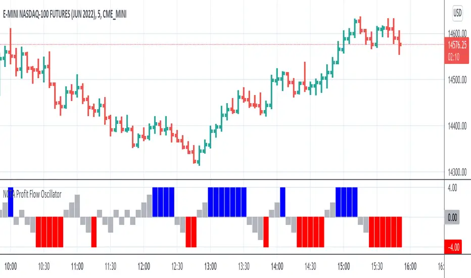
NCTA Profit Flow OscillatorProfit Flow Oscillator
The Profit Flow Oscillator is one of two technical pattern indicators that are part of the Profit Flow Analytics.
New Cycle Trading and Analytics is a group of traders creating market analytics for traders. The objective is to take complex combinations of multiple technical pattern indicators and present to the trader a simple, single signal entry.
The Profit Flow Oscillator is excellent in short 1, 3, and 5 minute timeframes for futures traders and short term options traders. Longer timeframes such as the 5, 10, and 30 minute timeframes work well for options traders.
The Profit Flow Oscillator consists of a simple, single entry indicator designed to provide an entry very close to the shift on the intra-day cycle. It is designed to filter out false signals and provide the trader with an optimum timing of an entry.
HOW TO USE: Go long when a blue bar appears and go short when a red bar appears. These prints very closely identify the beginning of a new cycle
The Profit Flow Oscillator, which is part of the Profit Flow Analytics set of indicators, is traded in a live trading room every market day, hosted by our friends at Options Money Maker.
To learn more and to get a free trial of the Profit Flow Oscillator, use the following link:
www.newcycletrading.com
NQU2019
SP:SPX
POWER INDICATOR PREMIUM WITH MANY FUNCTIONS BY OeZkAn
👑 POWER INDICATOR PRO PREMIUM V24: Predictive Intelligence Meets Precision ExecutionThe POWER INDICATOR PRO PREMIUM V24 is the pinnacle of algorithmic trading intelligence. This system transcends traditional indicators by utilizing a sophisticated framework of advanced mathematical equations to predict the impending trend direction before the market moves. It combines Smart Money Concepts (SMC), Multi-Timeframe (MTF) convergence, and Dynamic Risk Management to deliver unparalleled clarity and execution confidence.If you seek a trading partner that provides leading, predictive signals and high-probability entries, this system is your definitive solution.
🧠 The Core Element: Predictive Market Context & Directional ForecastThe foundational strength of the POWER INDICATOR is its ability to forecast the market's bias through advanced quantification:
🚀 Directional Pre-Cognition (LRC & Mathematical Models):The system utilizes the Linear Regression Curve (LRC) and proprietary statistical models as its core mathematical engine. This process extrapolates the probable trend path and generates a Directional Forecast for the coming bars, enabling you to anticipate moves rather than react to them. This forecast serves as the ultimate bias filter.
🧠 The Convictional Filter: Quantifying Probability ($60\%$ Confidence):This filter is our proprietary Probability Brain. It eliminates market noise by forcing convergence across multiple high-level factors (MTF agreement, Momentum, SMC levels).High-Conviction Threshold: Independent analysis confirms that the Conviction Filter provides an exceptionally high win rate and signal quality starting at just $60\%$. Setting your threshold at this level ensures you only consider trades where the predictive mathematical components are in strong alignment.
🌊 FVG & GP Predictive Zones:The system automatically identifies and projects critical Fair Value Gaps (FVG/LSOB) and the Golden Pocket (GP) Re-Test Zone. These zones are algorithmically identified as high-probability targets for pullbacks and reversals, providing a clear map of where liquidity will be sought.
💡 The Convictional Trading Workflow: A 3-Step Guide to ExecutionContext Check: Confirm the LRC Directional Forecast aligns with your trade and the Conviction Score Meter is above your desired threshold (minimum $60\%$).Optimal Entry: Wait for the signal to trigger at a high-R:R entry point (GP, FVG, or Aggressive Impulse), guided by your chosen trading mode.Dynamic Management: Let the system handle risk, utilizing Structural SL and automatic Multi-Method Trailing Stops post-TP1.
🎯 Mode Selection: Matching Strategy to MarketThe indicator's power lies in its Modularity. Selecting the correct mode is crucial for optimizing your results.Trading StyleRecommended ModesPrimary Rationale & Entry LogicHigh-Frequency ScalpingCT Scalp-OnlyDesigned for counter-trend entries in a pullback towards the Golden Pocket (GP). Uses tighter SL/TP multipliers for quick profit-taking. (Fast, high-R:R)ATR Channel Scalp (ACS)Utilizes volatility channels (ATR bands) for quick mean-reversion trades when price overextends.Strategic Day Trading / Swing TradingUltimate Fusion Mode (UFM)The highest probability mode. Best for catching major shifts confirmed by SMC (LRC, GP, FVG, MSS). Waits for a deep, high-R:R Re-Test Entry.Haupttrend & Scalp (Kombi)Excellent general-purpose mode. Focuses on trend continuation but allows for high-R:R pullback entries at key levels (GP/FVG). (Balanced)FVG Mitigation Entry (FME)Ideal for SMC traders. Waits for the price to precisely re-test and mitigate an unmitigated Fair Value Gap (FVG) or Liquidity Sweep (LSOB) zone before entry.Breakout & Momentum TradingBand Breakout-OnlyTriggers an entry only when price decisively breaks outside the SMA Volatility Bands (configurable). Filtered by momentum requirements.Dynamic Range Expansion (DRE)Specifically detects low-volatility consolidation before an anticipated high-momentum expansion phase.
🔔 The Master Alert System: Your Execution EdgeThe powerful Alert functionality ensures you can monitor multiple assets and timeframes without being glued to the screen.1.
✅ Dynamic MASTER ALARM (Compact Text)The core alert uses a compact, dynamic JSON/text message that contains all necessary information for quick execution:Action: BUY / SELLMode Used: Conviction Score: Key Level: 2. LRC/GP Combo-Alert (High-R:R)This is the most valuable alert for strategic traders. It triggers only when the LRC direction is confirmed and the price enters the Golden Pocket (GP) Re-Test Zone, indicating an optimal high-R:R pullback opportunity.Final Note: To maximize the predictive power, ensure the useConvictionFilter is set to a minimum of $60\%$ and the useStructureSL is activated to protect your capital with intelligent stop placement.Stop reacting. Start predicting. Activate the POWER INDICATOR PRO PREMIUM V24 and lead the market today!
⚠️ IMPORTANT NOTICE: Full Version vs. Public Release
This current version, the POWER INDICATOR PRO PREMIUM V24 (Full Feature Test Release), is publicly available only for demonstration and testing purposes to showcase the system's full potential (including all 12 Dynamic Modes and the advanced Convictional Filter).
A slightly streamlined Public Version will remain permanently free and accessible to the community. However, the Full Premium Version—featuring the complete 12-Mode selection, all predictive functionalities, and crucial additions such as enhanced, precise Entry/Exit Labels and Dynamic Stop Loss/Take Profit Labels directly calculated by the algorithm—will soon be available exclusively for subscribers.
Test the power now and be ready for the subscription launch!

POWER INDICATOR - PRO PREMIUM by OeZKAN 👑 POWER INDICATOR PRO PREMIUM V24: Predictive Intelligence Meets Precision ExecutionThe POWER INDICATOR PRO PREMIUM V24 is the pinnacle of algorithmic trading intelligence. This system transcends traditional indicators by utilizing a sophisticated framework of advanced mathematical equations to predict the impending trend direction before the market moves. It combines Smart Money Concepts (SMC), Multi-Timeframe (MTF) convergence, and Dynamic Risk Management to deliver unparalleled clarity and execution confidence.If you seek a trading partner that provides leading, predictive signals and high-probability entries, this system is your definitive solution.🧠 The Core Element: Predictive Market Context & Directional ForecastThe foundational strength of the POWER INDICATOR is its ability to forecast the market's bias through advanced quantification:🚀 Directional Pre-Cognition (LRC & Mathematical Models):The system utilizes the Linear Regression Curve (LRC) and proprietary statistical models as its core mathematical engine. This process extrapolates the probable trend path and generates a Directional Forecast for the coming bars, enabling you to anticipate moves rather than react to them. This forecast serves as the ultimate bias filter.🧠 The Convictional Filter: Quantifying Probability ($60\%$ Confidence):This filter is our proprietary Probability Brain. It eliminates market noise by forcing convergence across multiple high-level factors (MTF agreement, Momentum, SMC levels).High-Conviction Threshold: Independent analysis confirms that the Conviction Filter provides an exceptionally high win rate and signal quality starting at just $60\%$. Setting your threshold at this level ensures you only consider trades where the predictive mathematical components are in strong alignment.🌊 FVG & GP Predictive Zones:The system automatically identifies and projects critical Fair Value Gaps (FVG/LSOB) and the Golden Pocket (GP) Re-Test Zone. These zones are algorithmically identified as high-probability targets for pullbacks and reversals, providing a clear map of where liquidity will be sought.💡 The Convictional Trading Workflow: A 3-Step Guide to ExecutionContext Check: Confirm the LRC Directional Forecast aligns with your trade and the Conviction Score Meter is above your desired threshold (minimum $60\%$).Optimal Entry: Wait for the signal to trigger at a high-R:R entry point (GP, FVG, or Aggressive Impulse), guided by your chosen trading mode.Dynamic Management: Let the system handle risk, utilizing Structural SL and automatic Multi-Method Trailing Stops post-TP1.🎯 Mode Selection: Matching Strategy to MarketThe indicator's power lies in its Modularity. Selecting the correct mode is crucial for optimizing your results.Trading StyleRecommended ModesPrimary Rationale & Entry LogicHigh-Frequency ScalpingCT Scalp-OnlyDesigned for counter-trend entries in a pullback towards the Golden Pocket (GP). Uses tighter SL/TP multipliers for quick profit-taking. (Fast, high-R:R)ATR Channel Scalp (ACS)Utilizes volatility channels (ATR bands) for quick mean-reversion trades when price overextends.Strategic Day Trading / Swing TradingUltimate Fusion Mode (UFM)The highest probability mode. Best for catching major shifts confirmed by SMC (LRC, GP, FVG, MSS). Waits for a deep, high-R:R Re-Test Entry.Haupttrend & Scalp (Kombi)Excellent general-purpose mode. Focuses on trend continuation but allows for high-R:R pullback entries at key levels (GP/FVG). (Balanced)FVG Mitigation Entry (FME)Ideal for SMC traders. Waits for the price to precisely re-test and mitigate an unmitigated Fair Value Gap (FVG) or Liquidity Sweep (LSOB) zone before entry.Breakout & Momentum TradingBand Breakout-OnlyTriggers an entry only when price decisively breaks outside the SMA Volatility Bands (configurable). Filtered by momentum requirements.Dynamic Range Expansion (DRE)Specifically detects low-volatility consolidation before an anticipated high-momentum expansion phase.🔔 The Master Alert System: Your Execution EdgeThe powerful Alert functionality ensures you can monitor multiple assets and timeframes without being glued to the screen.1. ✅ Dynamic MASTER ALARM (Compact Text)The core alert uses a compact, dynamic JSON/text message that contains all necessary information for quick execution:Action: BUY / SELLMode Used: Conviction Score: Key Level: 2. LRC/GP Combo-Alert (High-R:R)This is the most valuable alert for strategic traders. It triggers only when the LRC direction is confirmed and the price enters the Golden Pocket (GP) Re-Test Zone, indicating an optimal high-R:R pullback opportunity.Final Note: To maximize the predictive power, ensure the useConvictionFilter is set to a minimum of $60\%$ and the useStructureSL is activated to protect your capital with intelligent stop placement.Stop reacting. Start predicting. Activate the POWER INDICATOR PRO PREMIUM V24 and lead the market today!

S50 Complete Hedge & Trade SystemTFEX:S501!
คู่มือการเทรด CALENDAR SPREAD
1. กลยุทธ์หลัก: MEAN REVERSION SPREAD TRADING
หลักการ:
- Spread ระหว่าง series จะมีค่าเฉลี่ย (Mean) และแกว่งไปมารอบๆ ค่าเฉลี่ยนี้
- เมื่อ Spread เบี่ยงเบนไปจาก Mean มากเกินไป จะกลับมาหาค่าเฉลี่ย (Mean Reversion)
2. INDICATORS ที่ใช้
A. Z-Score
Z-Score = (Spread ปัจจุบัน - Spread เฉลี่ย) / Standard Deviation
การตีความ:
- Z > +2.0 → Spread แพงเกินไป → SHORT spread
- Z < -2.0 → Spread ถูกเกินไป → LONG spread
- Z ≈ 0 → Spread อยู่ที่ค่าเฉลี่ย → EXIT
B. Correlation
Correlation > 0.9 = ดีมาก (เคลื่อนไหวพร้อมกัน 90%+)
Correlation > 0.7 = ดี (ใช้ได้)
Correlation < 0.7 = ไม่แนะนำ (Hedge ไม่มีประสิทธิภาพ)
C. Beta & Hedge Ratio
Beta = Cov(S1, S2) / Var(S2)→ บอกว่า S1 เคลื่อนไหวเท่าไหร่เมื่อ S2 เคลื่อนไหว 1 หน่วย
Hedge Ratio = Beta→ ใช้คำนวณจำนวน contract ที่ต้อง hedge
3. วิธีการเทรด SPREAD (ทีละขั้นตอน)
STEP 1: หาโอกาส
เงื่อนไข Entry:
1. |Z-Score| >= 2.0
2. Correlation > 0.7
3. Signal = "SHORT SPREAD" หรือ "LONG SPREAD"
STEP 2: คำนวณ Position Size
ตัวอย่าง:
- Account Size = 1,000,000 บาท
- Risk Per Trade = 2% = 20,000 บาท
- Spread Std Dev = 15 จุด
- Stop Loss = 1.0x Std Dev = 15 จุด
- S50 มูลค่า = 5 บาท/จุด
Position Size = Risk Amount / (SL Distance × Point Value)
= 20,000 / (15 × 5)
= 20,000 / 75
= 266 contracts (ปัดเป็น 26 สัญญา)
STEP 3: คำนวณ Hedge Ratio
สมมติ: Beta (S1:S2) = 1.05
ถ้าเทรด SHORT S2-S1 spread:
- Sell S2: 26 contracts
- Buy S1: 26 × 1.05 = 27.3 → ปัดเป็น 27 contracts
Portfolio Delta ≈ 0 (Market Neutral)
4. ตัวอย่างการเทรดจริง
SCENARIO A: SHORT SPREAD (Z-Score = +2.5)
สถานการณ์:
- S2-S1 Spread = 50 จุด
- Spread MA = 35 จุด
- Spread Std Dev = 6 จุด
- Z-Score = (50-35)/6 = +2.5 ⚠️ แพงเกินไป
- Correlation = 0.92 ✅
- Beta = 1.05
TRADE PLAN:
1. SELL S2: 10 contracts @ 1,200
2. BUY S1: 10 × 1.05 = 10.5 → 11 contracts @ 1,150
Initial Spread = 50 จุด
Take Profit (TP):
- Target Spread = MA = 35 จุด
- TP Distance = 50 - 35 = 15 จุด
- Profit = 15 × 5 = 75 บาท/spread
- Total Profit = 75 × 10 = 750 บาท
Stop Loss (SL):
- SL Spread = MA + (1.5 × Std Dev) = 35 + 9 = 44 จุด
- SL Distance = 50 - 44 = 6 จุด (ผิดพลาด - ควรเป็น 50 + 6 = 56)
- Loss = 6 × 5 × 10 = 300 บาท
Risk:Reward = 300:750 = 1:2.5
SCENARIO B: LONG SPREAD (Z-Score = -2.3)
สถานการณ์:
- S3-S2 Spread = 20 จุด
- Spread MA = 35 จุด
- Spread Std Dev = 6.5 จุด
- Z-Score = (20-35)/6.5 = -2.3 ⚠️ ถูกเกินไป
- Correlation = 0.88 ✅
- Beta = 1.03
TRADE PLAN:
1. BUY S3: 10 contracts @ 1,230
2. SELL S2: 10 × 1.03 = 10.3 → 10 contracts @ 1,210
Initial Spread = 20 จุด
Take Profit:
- Target Spread = 35 จุด
- Profit = (35-20) × 5 × 10 = 750 บาท
Stop Loss:
- SL Spread = MA - (1.5 × Std Dev) = 35 - 9.75 = 25.25 จุด
- SL = 20 - (20-25.25) = 14 จุด
- Loss = 6 × 5 × 10 = 300 บาท
5. RISK MANAGEMENT
A. Position Sizing Rules
1. อย่าเสี่ยงเกิน 2-3% ต่อการเทรด
2. ใช้ Beta Hedge Ratio เสมอ
3. ตรวจสอบ Margin requirement
B. Stop Loss Strategy
วิธีที่ 1: Fixed Std Dev
- SL = Entry ± (1.0-1.5x Std Dev)
วิธีที่ 2: ATR-based
- SL = Entry ± (1.5x ATR)
วิธีที่ 3: Time-based
- ปิดภายใน 3-5 วัน ถ้าไม่ได้กำไร
C. Take Profit Strategy
วิธีที่ 1: Target MA
- TP เมื่อ Spread กลับมาที่ MA
วิธีที่ 2: Partial Profit
- ปิด 50% เมื่อได้ 1x Std Dev
- ปิดอีก 50% เมื่อ Z-Score = 0
วิธีที่ 3: Trailing Stop
- Trailing SL = 0.5x Std Dev
6. สูตรคำนวณสำคัญ
1. Position Size
position_size = (account_size × risk_pct) / (sl_distance × point_value)
2. Hedge Contracts
hedge_contracts = position_size × beta
3. Profit/Loss Calculation
pnl = (exit_spread - entry_spread) × contracts × point_value
4. Risk:Reward Ratio
risk = sl_distance × contracts × point_value
reward = tp_distance × contracts × point_value
rr_ratio = reward / risk // ควร >= 2:1
5. Spread Value
spread_value = price_far - price_near
7. CHECKLIST ก่อนเทรด
☐ Z-Score >= ±2.0
☐ Correlation > 0.7
☐ Beta Hedge Ratio คำนวณแล้ว
☐ Position Size ไม่เกิน 2-3% risk
☐ TP/SL กำหนดชัดเจน
☐ Risk:Reward >= 2:1
☐ Margin เพียงพอ
☐ ตรวจสอบ Expiry Date ทั้ง 2 series
8. เทคนิคขั้นสูง
A. Calendar Roll Strategy
เมื่อ Near series ใกล้หมดอายุ:
1. ปิด Near leg
2. เปิด Next series leg ใหม่
3. รักษา Spread position ต่อไป
B. Butterfly Spread
ใช้ 3 series พร้อมกัน:
- Buy S1
- Sell 2×S2
- Buy S3
เหมาะกับตลาดไซด์เวย์
C. Dynamic Hedging
ปรับ Hedge Ratio ตาม:
- Beta ที่เปลี่ยนแปลง
- Volatility
- Time to Expiry
MACD-V Multi-Timeframe Confluence DashboardThis indicator identifies high-probability trade entries by analyzing momentum alignment across multiple timeframes using the MACD-V (Volatility Normalized MACD) formula. It features a fully customizable signal engine that allows traders to specify exactly which timeframes must agree before a trade signal is generated.
Optimized Defaults
By default, the indicator is tuned to the 5-minute, 15-minute, and 1-hour timeframes. We have found this specific combination performs best for identifying robust trends while filtering out noise. However, the strategy is fully flexible—users can easily adjust these settings to fit scalping (1m/5m) or swing trading (4H/Daily) styles.
Indicator Features
Dynamic Confluence: A Buy or Sell signal (displayed as a large + on the chart) is generated only when all selected timeframes are in agreement. This ensures you are trading with the dominant trend across multiple time scales.
Alternating Signal Filter: To prevent repetitive alerts during strong trends, the script uses a smart filter: a new Buy signal will only trigger if the last confirmed signal was a Sell (and vice versa).
Live Dashboard: An on-screen table displays the real-time status of every timeframe (Trend, Curl, and MACD Value). Timeframes currently active in your strategy are highlighted in yellow.
Local Entry Arrows (Optional): The script includes smaller red/green arrows that indicate simple MACD line crosses on the current chart's timeframe. These can be useful for precise timing but can be noisy in choppy markets. These are turned off by default to keep the chart clean, but can be enabled in the "Visuals" settings if you require granular entry signals.
How to Use
Check the Dashboard: Look for the yellow-highlighted rows in the table to see which timeframes are currently driving your signals.
Wait for the Cross (+): A green + indicates bullish momentum is aligned across all your chosen timeframes.
Refine (Optional): Turn on "Show Local Arrows" if you want to see the specific moment the MACD crosses on your current timeframe to fine-tune your entry.

BALANCED Strategy: Intraday Pro + Smart DashboardWelcome to the BALANCED Strategy: Intraday Pro.
This all-in-one indicator is designed for Intraday traders looking to capture trend movements while effectively filtering out sideways market noise. It combines the power of Supertrend for direction, EMA 100 for the baseline trend, and rigorous validation via RSI and ADX.
The script also integrates a complete Risk Management system with targets based on the Golden Ratio (Fibonacci) and a real-time Dashboard.
⏳ Recommended Timeframes
This algorithm is optimized for Intraday volatility:
M5 (5 Minutes) ⭐️: Ideal for quick Scalping. The ADX filter is crucial here to avoid false signals.
M15 (15 Minutes) 🏆: The "Sweet Spot." It offers the best balance between signal frequency and trend reliability.
M30 / H1: For a "Swing Intraday" approach—calmer, fewer signals, but higher precision.
Not recommended for M1 (1 Minute) with default settings (too much noise).
🚀 How It Works
The algorithm follows a strict 3-step logic to generate high-quality signals:
1. Trend Identification (The Engine)
Supertrend: Determines the immediate direction.
EMA 100: Acts as a background trend filter. We only buy above and sell below the EMA.
2. Noise Filtering (Safety)
ADX (Average Directional Index): The signal is only validated if there is sufficient volatility (Configurable threshold, default 12) to avoid "chop markets" (flat markets).
RSI (Relative Strength Index): Strict momentum filter. Buy only if RSI > 50, Sell if RSI < 50.
3. Entry Confirmation (The Trigger)
The script doesn't just rely on a crossover. It waits for "Price Action" confirmation: the candle must close higher than the previous one (for Long) or lower (for Short) to validate the entry.
🛡️ Risk Management (Money Management)
This is the core strength of this tool. Upon signal validation, the script automatically calculates and plots:
Stop Loss (SL): Based on volatility (ATR). It places the stop at the recent Low/High with a safety padding.
Take Profit (TP): Two modes available:
Fibonacci Mode (Default): Targets the 1.618 extension (Golden Ratio) of the risk taken.
Fixed Ratio Mode: Targets a manual Risk/Reward ratio (e.g., 2.0).
📊 The Dashboard
Located at the bottom right, the smart dashboard provides vital info at a glance:
Signal Time: To check if the alert is fresh.
Type (LONG/SHORT): Color-coded (Green/Pink).
Tech Data: RSI and ADX values at the moment of the signal.
Exact Prices: Entry Level, Target (TP), and Stop Loss (SL).
⚙️ Configurable Settings
Sensitivity: Adjust the Supertrend factor (Default 2.0).
Filters: Toggle the RSI filter ON/OFF or adjust the ADX threshold.
Execution: Choose between Fibonacci Target (1.618) or a Manual Ratio.
⚠️ Disclaimer: This tool is a technical decision aid and does not constitute financial investment advice. Always use prudent risk management and backtest the indicator on your preferred assets before live use.

Gold Sniper V21: M15 Holding MasterGold Sniper Entry (Follow Trend to enter)
My Indicator :
- Clarify the M30 in Up/Down Trend
- Only entry the trade in M1/M5 Timeframe to make a Sniper Entry.
- Indicator will show when to TP before the Trend Change

Quantum Expansion Engine MTF# 🎯 QUANTUM EXPANSION ENGINE MTF
## *Your Unfair Advantage in the Markets*
---
## 🔥 WHAT IS THIS BEAST?
Welcome to the **Quantum Expansion Engine MTF** - the most advanced multi-timeframe market scanner that separates winners from losers. This isn't just another indicator. This is your personal trading radar that scans multiple markets simultaneously and tells you EXACTLY:
✅ **WHICH** market to trade (ranked by opportunity)
✅ **WHICH** direction to trade (BUY or SELL)
✅ **WHEN** to enter (price location analysis)
✅ **WHERE** to take profit (probability-based targets)
While other traders are guessing, you'll know **with mathematical precision** where the best opportunities are hiding.
---
## 💎 WHY THIS CHANGES EVERYTHING
### **The Problem with Traditional Trading:**
- You stare at ONE chart, hoping it moves
- You have NO IDEA if better opportunities exist elsewhere
- You chase moves that already happened
- You miss the REAL winners because you weren't watching
### **The Quantum Solution:**
✨ Scans **8+ markets simultaneously** in real-time
✨ Uses **multi-timeframe analysis** (4H for direction, current TF for entry)
✨ Calculates **expansion potential** using ADR (Average Daily Range) and ATR
✨ Ranks opportunities from **BEST to WORST**
✨ Shows you **exact entry zones** with color-coded price location
✨ Gives **probability-based profit targets** so you know what's realistic
**Translation:** You'll never trade a dead market again. You'll always be on the HOTTEST movers. 🔥
---
## 🎮 THE CONTROL CENTER: YOUR SETTINGS
### **🎯 Display Filter** (Temperature Control)
Choose what opportunities you want to see:
- **"Show All"** - See everything (beginners start here)
- **"HOT Only"** 🔥 - ONLY the absolute best setups (advanced traders)
- **"WARM Only"** ⚡ - Moderate opportunities
- **"HOT + WARM"** 🔥⚡ - **RECOMMENDED** - Filters out garbage, shows quality
- **"WARM + COLD"** - Everything except hot (not recommended)
**Pro Tip:** Set to **"HOT + WARM"** and only trade what appears. This alone will 10x your win rate.
---
### **📊 Asset Type Filter** (Market Focus)
Focus on what you trade best:
- **"Show All"** - All markets
- **"Forex Only"** 💱 - Currency pairs only (EURUSD, GBPUSD, etc.)
- **"Indices Only"** 📈 - Stock indices (US30, NAS100, SPX500)
- **"Commodities Only"** 🥇 - Gold, Silver, Oil
- **"Forex + Indices"** 💱📈 - Most popular combo
- **"Forex + Commodities"** 💱🥇
- **"Indices + Commodities"** 📈🥇
**Pro Tip:** Forex traders → "Forex Only". Index traders → "Indices Only". Don't mix if you're focused.
---
### **📊 Higher Timeframe (MTF Analysis)**
Default: **240 (4-Hour)**
This is WHERE the magic happens. The engine analyzes trend direction and momentum on a HIGHER timeframe (4H or Daily), then shows you entries on your current timeframe.
**Why This Works:**
- Higher timeframe = stronger trends
- Current timeframe = precise entries
- You trade WITH the big picture, not against it
**Settings to Try:**
- **240 (4H)** - Swing traders, intraday trends
- **D (Daily)** - Position traders, major swings
- **60 (1H)** - Day traders (faster signals)
---
### **🎚️ Thresholds** (Fine-Tuning)
**🔥 HOT Threshold** (Default: 0.0015)
- Higher = stricter (fewer hot signals, higher quality)
- Lower = more generous (more hot signals)
- **Keep at 0.0015** unless you know what you're doing
**⚡ WARM Threshold** (Default: 0.0008)
- Defines the minimum "decent" opportunity
- **Keep at 0.0008** for balanced results
---
### **🎯 Take Profit Settings**
**TP1 Distance:** 250 points (conservative, high probability)
**TP2 Distance:** 500 points (moderate, balanced)
**TP3 Distance:** 1000 points (aggressive, trending markets)
**How to Use:**
- The engine shows **probability %** for each target
- Look for the **🎯 target icon** - that's your recommended exit
- **Green TP (70%+)** = High confidence, take it
- **Yellow TP (50-69%)** = Decent chance
- **Red TP (<50%)** = Low probability, avoid or scale down
**Pro Strategy:** Take 50% profit at TP1, let 50% run to TP2 or TP3. Lock in wins, let winners run.
---
## 🏆 THE QUANTUM TRADING METHOD (STEP-BY-STEP)
### **PHASE 1: SETUP** ⚙️
1. Add indicator to ANY chart (doesn't matter which - it scans all symbols)
2. Set **Display Filter** to **"HOT + WARM"**
3. Set **Asset Type Filter** to your preferred markets
4. Set **Higher Timeframe** to **240** (4H)
5. Position HUD where you like it (Bottom Right recommended)
---
### **PHASE 2: SCAN** 👀
**Every morning or before your trading session:**
1. Open the chart and check the HUD
2. Look at **RANK #1** - This is your BEST opportunity
3. Check its color:
- 🔥 **GREEN (#1)** = Prime setup, highest priority
- ⚡ **YELLOW (#1)** = Good setup, decent opportunity
- ❄️ **RED (#1)** = Market is cold, wait or skip
4. Note the **DIRECTION**: 📈 BUY or 📉 SELL
5. Check **📍LOC%** (price location in daily range)
---
### **PHASE 3: VALIDATE** ✅
**Before entering, confirm these THREE things:**
**✅ CHECK #1: Temperature + Direction Match**
- 🔥 GREEN + 📈 BUY = STRONG
- 🔥 GREEN + 📉 SELL = STRONG
- ⚡ YELLOW = DECENT
- ❄️ RED = SKIP
**✅ CHECK #2: Price Location Makes Sense**
For **📈 BUY** signals, you want:
- 🟢 0-20% = PERFECT (price at lows)
- 🔵 20-40% = GOOD (still low)
- 🟡 40-60% = OKAY (middle, less ideal)
- 🟠 60-80% = RISKY (price high)
- 🔴 80-100% = AVOID (price at highs, don't buy!)
For **📉 SELL** signals, you want:
- 🔴 80-100% = PERFECT (price at highs)
- 🟠 60-80% = GOOD (still high)
- 🟡 40-60% = OKAY (middle, less ideal)
- 🔵 20-40% = RISKY (price low)
- 🟢 0-20% = AVOID (price at lows, don't sell!)
**✅ CHECK #3: Take Profit Probability**
- Look for **GREEN TP** percentages (70%+)
- The **🎯 icon** shows recommended target
- If all TPs are red/low, market may be exhausted
---
### **PHASE 4: EXECUTE** 🎯
**The Entry:**
1. Switch to the specific market (e.g., EURUSD, NAS100)
2. Switch to YOUR entry timeframe (5M, 15M, 1H - whatever you trade)
3. Wait for a pullback/confirmation in your direction
4. Enter with proper risk management (1-2% risk per trade)
**The Stop Loss:**
Use ATR-based stops:
- **Conservative:** 1.5 x ATR below entry (BUY) or above entry (SELL)
- **Aggressive:** 1.0 x ATR
- **Or use structure:** Recent swing high/low
**The Targets:**
Follow the **🎯 recommended TP** from the HUD:
- If **TP1** is recommended → Conservative exit at 250 points
- If **TP2** is recommended → Hold for 500 points
- If **TP3** is recommended → Let it run to 1000 points
**Pro Scaling Strategy:**
- Take 33% profit at TP1
- Take 33% profit at TP2
- Let 33% run to TP3 or trailing stop
---
### **PHASE 5: MONITOR** 📊
**Throughout the day:**
- Check HUD every 1-4 hours for NEW opportunities
- If a HOTTER setup appears, consider moving capital
- The #1 spot can change as markets move
- **Alerts enabled?** You'll get notified automatically! 🔔
---
## 🚀 ADVANCED TECHNIQUES FOR DOMINANCE
### **🔥 THE "HOT ONLY" SNIPER METHOD**
**Settings:**
- Display Filter: **"HOT Only"**
- Asset Filter: Your specialty (Forex/Indices)
- Higher TF: **240** or **D**
**Strategy:**
Only trade when markets appear in the HUD. If nothing shows = NO TRADES TODAY.
**Why This Works:**
You're ONLY trading the absolute best setups. Your win rate will skyrocket because you're ultra-selective. You might only take 2-3 trades per week, but they'll be QUALITY.
---
### **⚡ THE "MULTI-MARKET" SCALPER METHOD**
**Settings:**
- Display Filter: **"HOT + WARM"**
- Asset Filter: **"Show All"**
- Higher TF: **60** (1H)
**Strategy:**
Trade the top 3 opportunities simultaneously. Diversify across markets (one forex, one index, one commodity).
**Why This Works:**
You're not putting all eggs in one basket. If NAS100 is choppy, EURUSD might be trending. Spread risk, increase opportunities.
---
### **📈 THE "SESSION HUNTER" METHOD**
**Settings:**
- Display Filter: **"HOT + WARM"**
- Asset Filter: Changes per session
- Higher TF: **240**
**Strategy:**
- **Asian Session (8PM-4AM EST):** Focus on **"Forex Only"** (JPY pairs)
- **London Session (3AM-12PM EST):** Focus on **"Forex + Indices"** (EUR, GBP, FTSE)
- **NY Session (8AM-5PM EST):** Focus on **"Indices Only"** (US30, NAS100, SPX500)
**Why This Works:**
You trade markets when they're MOST ACTIVE. Asian session = Yen. London = Euro/Pound. NY = Indices. Maximum volatility = maximum profit potential.
---
## 💰 REAL-WORLD EXAMPLE TRADE
**Scenario:** It's 9 AM EST (NY Session Opens)
**Step 1:** Check HUD
```
🔥 1 EURUSD 📈 BUY 0.5995 🟢 8% TP1: 0% TP2: 0% TP3: 0%
⚡ 2 GBPUSD 📈 BUY 0.5992 🟢 5% TP1: 85% TP2: 60% TP3: 45%
```
**Step 2:** Analyze
- **EURUSD** is HOT 🔥 but TPs are 0% (market exhausted for the day)
- **GBPUSD** is WARM ⚡ with STRONG TP probabilities
- **GBPUSD** shows 📈 BUY + 🟢 5% (price near lows) = PERFECT SETUP
**Step 3:** Execute GBPUSD Trade
- Switch to GBPUSD 15-minute chart
- Wait for bullish confirmation (break of resistance, candlestick pattern)
- Enter BUY at 1.2650
- Stop Loss: 1.2620 (30 pips, 1.5x ATR)
- Take Profit #1: 1.2675 (25 pips) ← **TP1 has 85% probability**
- Take Profit #2: 1.2700 (50 pips) ← **TP2 has 60% probability**
**Step 4:** Manage
- Price hits TP1 at 1.2675 → Take 50% profit (+25 pips)
- Move stop loss to breakeven
- Let remaining 50% run to TP2
- Price hits TP2 at 1.2700 → Take remaining profit (+50 pips)
**Result:** +37.5 pips average (25+50/2), ZERO risk after TP1, HIGH probability setup. 💰
---
## 🎯 THE GOLDEN RULES OF QUANTUM TRADING
### **RULE #1: Trust the Temperature 🌡️**
If it's 🔥 GREEN = Trade it
If it's ⚡ YELLOW = Consider it
If it's ❄️ RED = Skip it
The math doesn't lie. Cold markets stay cold. Hot markets MOVE.
---
### **RULE #2: Location, Location, Location 📍**
NEVER buy 📈 at 🔴 80%+
NEVER sell 📉 at 🟢 0-20%
Wait for price to be in the RIGHT zone or walk away.
---
### **RULE #3: Respect the Probabilities 🎲**
If TP shows 25% probability, it's a COIN FLIP.
If TP shows 75% probability, it's FAVORABLE ODDS.
Trade the odds, not emotions.
---
### **RULE #4: Higher Timeframe is BOSS 👑**
The 4H/Daily trend direction is your NORTH STAR.
Don't fight it. Trade WITH it.
---
### **RULE #5: No HUD Signal = No Trade 🚫**
If nothing appears in your filtered view, the markets are DEAD.
Cash is a position. Patience is a strategy.
---
## 🔔 ALERT SETUP (Never Miss a Setup!)
**Enable Alerts:**
1. In settings, turn ON:
- 🔥 **Enable HOT Alerts**
- ⚡ **Enable WARM Alerts** (optional)
2. In TradingView, right-click chart → **Add Alert**
3. Set **Condition:** Your indicator name
4. **Notification:** Phone, Email, SMS - your choice
5. Click **Create**
**What Happens:**
You get notified THE MOMENT a hot opportunity appears. You can be away from computer and still catch setups!
---
## 📊 BEST PRACTICES & PRO TIPS
### **⏰ BEST TIMES TO SCAN:**
- **Pre-Market:** 30 min before major sessions open
- **Session Opens:** London (3 AM EST), NY (9:30 AM EST)
- **Mid-Session:** Check every 2-4 hours
- **Avoid:** Late Friday (low liquidity), major news events (wait for dust to settle)
### **💼 RISK MANAGEMENT:**
- Never risk more than 1-2% per trade
- If #1 and #2 are both 🔥 HOT, split your risk (1% each)
- Use proper position sizing calculators
- **The engine finds setups. YOU manage risk.**
### **🧠 PSYCHOLOGY:**
- **FOMO is the enemy.** If you miss #1, there's always a #2, #3, tomorrow
- **Quality > Quantity.** 3 great trades/week beats 20 mediocre trades
- **The HUD is objective.** Your emotions are not. Trust the system.
### **📈 PERFORMANCE TRACKING:**
Keep a journal:
- What was the rank? (#1, #2, #3)
- What was the temperature? (🔥⚡❄️)
- What was price location? (🟢🔵🟡🟠🔴)
- What was TP probability?
- Did it hit target?
**After 20 trades, patterns emerge.** You'll see what works best for YOUR style.
---
## 🏆 THE COMPETITIVE EDGE
**What 99% of traders do:**
❌ Trade the same pair every day (even when dead)
❌ Guess direction based on "feeling"
❌ Have no idea where to take profit
❌ Miss better opportunities in other markets
❌ Chase moves that already happened
**What YOU now do:**
✅ Trade ONLY the hottest opportunities
✅ Follow mathematically-calculated direction
✅ Use probability-based profit targets
✅ Scan 8+ markets simultaneously
✅ Catch moves BEFORE they happen
**Result?** You're not just "trading better." You're playing a completely different game.
---
## 🚀 YOUR QUANTUM TRADING JOURNEY
**Week 1-2: LEARNING PHASE**
- Keep Display Filter on "Show All"
- Observe how markets move when they're HOT vs COLD
- Paper trade or micro lots
- Build confidence in the system
**Week 3-4: IMPLEMENTATION PHASE**
- Switch Display Filter to "HOT + WARM"
- Start taking real trades on top 1-2 opportunities
- Use conservative TP1 targets
- Track results in journal
**Month 2+: MASTERY PHASE**
- Experiment with different filters for your style
- Increase position sizes as win rate proves itself
- Use advanced multi-market strategies
- Let TP2 and TP3 targets run on high-probability setups
**Month 3+: DOMINATION PHASE**
- You're consistently profitable
- You know which setups are YOUR bread and butter
- You're capitalizing on multiple markets
- You're trading less, earning more
- **You've become the 1%** 👑
---
## 💎 FINAL WORDS
The **Quantum Expansion Engine MTF** is not magic. It's mathematics, probability, and market mechanics working in harmony.
It won't make you rich overnight.
It won't win every trade.
It won't eliminate losses.
**But it WILL:**
✅ Show you WHERE the best opportunities are
✅ Tell you WHICH direction has momentum
✅ Give you REALISTIC profit targets
✅ Keep you OUT of dead markets
✅ Stack the odds in your favor
**The difference between a losing trader and a winning trader isn't talent.**
It's **information, discipline, and execution.**
You now have the information.
The discipline and execution? That's on you.
**Welcome to the Quantum level.**
Now go dominate. 🚀🔥💰
---
## 📞 QUICK REFERENCE CARD
**🔥 HOT** = Score ≥ 0.0015 (TRADE IT)
**⚡ WARM** = Score ≥ 0.0008 (CONSIDER IT)
**❄️ COLD** = Score < 0.0008 (SKIP IT)
**📈 BUY** = Want 🟢🔵 location (low in range)
**📉 SELL** = Want 🟠🔴 location (high in range)
**🎯 TP Icons** = Follow the recommendation
**GREEN TP** = High confidence (70%+)
**YELLOW TP** = Medium confidence (50-69%)
**RED TP** = Low confidence (<50%)
**Best Settings for Beginners:**
- Display Filter: "HOT + WARM"
- Asset Filter: "Forex Only" or "Indices Only"
- Higher TF: 240
- Take TP1 always, let TP2 run sometimes
**Remember:** The market will always be there tomorrow. Only trade when the engine gives you 🔥 or ⚡. Patience pays.
---
*Built for traders who refuse to be average. 🎯*

HRESH SNIPER PRO - V77🦅 HRESH SNIPER PRO V77: High-Precision Visual AidThis indicator is a powerful, proprietary tool designed for extreme accuracy by identifying high-momentum entries. HRESH PRO prioritizes quality over quantity, delivering clean signals that are highly responsive to market structure.🎯 Operational Constraints (Strict adherence is mandatory)FeatureRequirementNotesAssetSTRICTLY BTC/USDTThe indicator's specialized calibration requires focused operation exclusively on Bitcoin's market profile.Timeframe1-Minute (1M)Designed for scalping and precision entry timing.RiskUSER'S SOLE RESPONSIBILITYRISK IS ENTIRELY YOUR RESPONSIBILITY. This indicator is a technical aid; it is not a prediction tool or financial advice.✨ Signal Presentation & LogicThe HRESH PRO system uses a sophisticated process to confirm high-quality entries, focusing entirely on a clean visual hierarchy to maintain continuous trend information:Primary Entry Label (SNIPER): The large "SNIPER" label is reserved for initiating a new sequence or major re-entry. It appears at the start of a trend or when a new powerful impulse occurs after a 7-hour time lapse, confirming a renewed opportunity.Continuation Feedback: To avoid repeating large labels, all subsequent confirmed entries are marked by Small, Color-Coded Diamonds/Dots. These marks visually validate the ongoing trend direction without cluttering the chart.Neon Bar Coloring: Price bars are colored strongly (Neon Lime/Red) throughout the active signal sequence for immediate visual identification of the primary trend.🛑 Important DisclaimerThis indicator (HRESH SNIPER PRO) is provided as a sophisticated technical analysis tool only. It is not financial advice. All risks associated with trading, including capital loss, are borne by the user. Do your own research (DYOR) and strictly adhere to sound risk management principles.

STS FULL OPTIONAL 2.0 (SURGICAL EDIT)STS TITAN 2.0: The End of Manual Analysis
Stop drawing lines. Stop guessing directions. Start executing trades.
Trading shouldn't be about spending hours analyzing charts. It should be about spotting the opportunity and taking it. STS TITAN 2.0 (Surgical Edit) is not just an indicator—it is an institutional-grade algorithm that does the analysis for you.
It doesn't just show you "data"; it projects actionable, high-probability ENTRY ZONES directly onto your chart.
💎 WHY THIS IS DIFFERENT (The Unfair Advantage)
Most indicators clutter your screen. TITAN gives you clarity. It applies a "Triple Confluence Algorithm" (Market Structure + Volume POC + Fibonacci) to filter out noise and leave you with only the highest quality setups.
🔥 KEY FEATURES:
🎯 Zero Analysis Required: The algorithm automatically identifies Supply & Demand zones. You don't have to draw a single box.
🛡️ The "SAFE STRIP" Technology: Inside every zone, TITAN highlights the inner "Safe Strip" (the optimal 25%). This tells you exactly where to place your limit order for maximum precision and zero drawdown.
⚡ Surgical "Auto-Clean": The code is strict. If a candle wick invalidates a zone, TITAN instantly removes it. No confusion, no old levels. Only fresh, tradable zones.
🧠 Automated Confluence: A zone only turns BLUE (Buy) or RED (Sell) when the Asian Strategy, Fibonacci Golden Zone, and Volume Profile align.
This is the closest you will get to having a professional analyst sitting next to you 24/7.
👉 Unlock your edge. Let TITAN find the trade.
(Alternative: Ultra-Short Version)
🚀 STS TITAN 2.0: Automated Institutional Entries
Tired of manual analysis? Let the algorithm do the work. TITAN 2.0 scans Market Structure, Volume POC, and Fibonacci levels to project High-Probability Entry Zones directly on your chart.
✅ Auto Supply & Demand: No drawing needed.
✅ Surgical Precision: "Safe Strip" technology for sniper entries.
✅ Verified Setups: Zones change color only when fully confirmed.
Stop guessing. Let the code find the entry.

Gyspy Bot Trade Engine - V1.2B - Alerts - 12-7-25 - SignalLynxGypsy Bot Trade Engine (MK6 V1.2B) - Alerts & Visualization
Brought to you by Signal Lynx | Automation for the Night-Shift Nation 🌙
1. Executive Summary & Architecture
Gypsy Bot (MK6 V1.2B) is not merely a strategy; it is a massive, modular Trade Engine built specifically for the TradingView Pine Script V6 environment. While most tools rely on a single dominant indicator to generate signals, Gypsy Bot functions as a sophisticated Consensus Algorithm.
Note: This is the Indicator / Alerts version of the engine. It is designed for visual analysis and generating live alert signals for automation. If you wish to see Backtest data (Equity Curves, Drawdown, Profit Factors), please use the Strategy version of this script.
The engine calculates data from up to 12 distinct Technical Analysis Modules simultaneously on every bar closing. It aggregates these signals into a "Vote Count" and only fires a signal plot when a user-defined threshold of concurring signals is met. This "Voting System" acts as a noise filter, requiring multiple independent mathematical models—ranging from volume flow and momentum to cyclical harmonics and trend strength—to agree on market direction.
Beyond entries, Gypsy Bot features a proprietary Risk Management suite called the Dump Protection Team (DPT). This logic layer operates independently of the entry modules, specifically scanning for "Moon" (Parabolic) or "Nuke" (Crash) volatility events to signal forced exits, preserving capital during Black Swan events.
2. ⚠️ The Philosophy of "Curve Fitting" (Must Read)
One must be careful when applying Gypsy Bot to new pairs or charts.
To be fully transparent: Gypsy Bot is, by definition, a very advanced curve-fitting engine. Because it grants the user granular control over 12 modules, dozens of thresholds, and specific voting requirements, it is extremely easy to "over-fit" the data. You can easily toggle switches until the charts look perfect in hindsight, only to have the signals fail in live markets because they were tuned to historical noise rather than market structure.
To use this engine successfully:
Visual Verification: Do not just look for "green arrows." Look for signals that occur at logical market structure points.
Stability: Ensure signals are not flickering. This script uses closed-candle logic for key decisions to ensure that once a signal plots, it remains painted.
Regular Maintenance is Mandatory: Markets shift regimes (e.g., from Bull Trend to Crab Range). Gypsy Bot settings should be reviewed and adjusted at regular intervals to ensure the voting logic remains aligned with current market volatility.
Timeframe Recommendations:
Gypsy Bot is optimized for High Time Frame (HTF) trend following. It generally produces the most reliable results on charts ranging from 1-Hour to 12-Hours, with the 4-Hour timeframe historically serving as the "sweet spot" for most major cryptocurrency assets.
3. The Voting Mechanism: How Entries Are Generated
The heart of the Gypsy Bot engine is the ActivateOrders input (found in the "Order Signal Modifier" settings).
The engine constantly monitors the output of all enabled Modules.
Long Votes: GoLongCount
Short Votes: GoShortCount
If you have 10 Modules enabled, and you set ActivateOrders to 7:
The engine will ONLY plot a Buy Signal if 7 or more modules return a valid "Buy" signal on the same closed candle.
If only 6 modules agree, the signal is rejected.
4. Technical Deep Dive: The 12 Modules
Gypsy Bot allows you to toggle the following modules On/Off individually to suit the asset you are trading.
Module 1: Modified Slope Angle (MSA)
Logic: Calculates the geometric angle of a moving average relative to the timeline.
Function: Filters out "lazy" trends. A trend is only considered valid if the slope exceeds a specific steepness threshold.
Module 2: Correlation Trend Indicator (CTI)
Logic: Measures how closely the current price action correlates to a straight line (a perfect trend).
Function: Ensures that we are moving up with high statistical correlation, reducing fake-outs.
Module 3: Ehlers Roofing Filter
Logic: A spectral filter combining High-Pass (trend removal) and Super Smoother (noise removal).
Function: Isolates the "Roof" of price action to catch cyclical turning points before standard moving averages.
Module 4: Forecast Oscillator
Logic: Uses Linear Regression forecasting to predict where price "should" be relative to where it is.
Function: Signals when the regression trend flips. Offers "Aggressive" and "Conservative" calculation modes.
Module 5: Chandelier ATR Stop
Logic: A volatility-based trend follower that hangs a "leash" (ATR multiple) from extremes.
Function: Used as an entry filter. If price is above the Chandelier line, the trend is Bullish.
Module 6: Crypto Market Breadth (CMB)
Logic: Pulls data from multiple major tickers (BTC, ETH, and Perpetual Contracts).
Function: Calculates "Market Health." If Bitcoin is rising but the rest of the market is dumping, this module can veto a trade.
Module 7: Directional Index Convergence (DIC)
Logic: Analyzes the convergence/divergence between Fast and Slow Directional Movement indices.
Function: Identifies when trend strength is expanding.
Module 8: Market Thrust Indicator (MTI)
Logic: A volume-weighted breadth indicator using Advance/Decline and Volume data.
Function: One of the most powerful modules. Confirms that price movement is supported by actual volume flow. Recommended setting: "SSMA" (Super Smoother).
Module 9: Simple Ichimoku Cloud
Logic: Traditional Japanese trend analysis.
Function: Checks for a "Kumo Breakout." Price must be fully above/below the Cloud to confirm entry.
Module 10: Simple Harmonic Oscillator
Logic: Analyzes harmonic wave properties to detect cyclical tops and bottoms.
Function: Serves as a counter-trend or early-reversal detector.
Module 11: HSRS Compression / Super AO
Logic: Detects volatility compression (HSRS) or Momentum/Trend confluence (Super AO).
Function: Great for catching explosive moves resulting from consolidation.
Module 12: Fisher Transform (MTF)
Logic: Converts price data into a Gaussian normal distribution.
Function: Identifies extreme price deviations. Uses Multi-Timeframe (MTF) logic to ensure you aren't trading against the major trend.
5. Global Inhibitors (The Veto Power)
Even if 12 out of 12 modules vote "Buy," Gypsy Bot performs a final safety check using Global Inhibitors.
Bitcoin Halving Logic: Prevents trading during chaotic weeks surrounding Halving events (dates projected through 2040).
Miner Capitulation: Uses Hash Rate Ribbons to identify bearish regimes when miners are shutting down.
ADX Filter: Prevents trading in "Flat/Choppy" markets (Low ADX).
CryptoCap Trend: Checks the total Crypto Market Cap chart for broad market alignment.
6. Risk Management & The Dump Protection Team (DPT)
Even in this Indicator version, the RM logic runs to generate Exit Signals.
Dump Protection Team (DPT): Detects "Nuke" (Crash) or "Moon" (Pump) volatility signatures. If triggered, it plots an immediate Exit Signal (Yellow Plot).
Advanced Adaptive Trailing Stop (AATS): Dynamically tightens stops in low volatility ("Dungeon") and loosens them in high volatility ("Penthouse").
Staged Take Profits: Plots TP1, TP2, and TP3 events on the chart for visual confirmation or partial exit alerts.
7. Recommended Setup Guide
When applying Gypsy Bot to a new chart, follow this sequence:
Set Timeframe: 4 Hours (4H).
Tune DPT: Adjust "Dump/Moon Protection" inputs first. These filter out bad signals during high volatility.
Tune Module 8 (MTI): Experiment with the MA Type (SSMA is recommended).
Select Modules: Enable/Disable modules based on the asset's personality (Trending vs. Ranging).
Voting Threshold: Adjust ActivateOrders to filter out noise.
Alert Setup: Once visually satisfied, use the "Any Alert Function Call" option when creating an alert in TradingView to capture all Buy/Sell/Close events generated by the engine.
8. Technical Specs
Engine Version: Pine Script V6
Repainting: This indicator uses Closed Candle data for all Risk Management and Entry decisions. This ensures that signals do not vanish after the candle closes.
Visuals:
Blue Plot: Buy/Sell Signal.
Yellow Plot: Risk Management (RM) / DPT Close Signal.
Green/Lime/Olive Plots: Take Profit hits.
Disclaimer:
This script is a complex algorithmic tool for market analysis. Past performance is not indicative of future results. Cryptocurrency trading involves substantial risk of loss. Use this tool to assist your own decision-making, not to replace it.
9. About Signal Lynx
Automation for the Night-Shift Nation 🌙
Signal Lynx focuses on helping traders and developers bridge the gap between indicator logic and real-world automation. The same RM engine you see here powers multiple internal systems and templates, including other public scripts like the Super-AO Strategy with Advanced Risk Management.
We provide this code open source under the Mozilla Public License 2.0 (MPL-2.0) to:
Demonstrate how Adaptive Logic and structured Risk Management can outperform static, one-layer indicators
Give Pine Script users a battle-tested RM backbone they can reuse, remix, and extend
If you are looking to automate your TradingView strategies, route signals to exchanges, or simply want safer, smarter strategy structures, please keep Signal Lynx in your search.
License: Mozilla Public License 2.0 (Open Source).
If you make beneficial modifications, please consider releasing them back to the community so everyone can benefit.

Vassago & Tesla Ex-Machina 197 45 21 [Hakan Yorganci]Vassago & Tesla Ex-Machina 197 45 21
"Any sufficiently advanced technology is indistinguishable from magic." — Arthur C. Clarke
🌑 The Genesis: Algorithmic Esotericism
This script is not merely a technical indicator; it is a digital artifact born from the convergence of Software Engineering and Hermetic Tradition.
As a developer and researcher dedicated to "Technomancy"—the study of applying esoteric logic to computational systems—I designed this algorithm using a custom, experimental programming environment I am currently developing. My goal was to move beyond standard, arbitrary financial inputs (like the default 200 SMA or 14 RSI) and instead derive parameters based on Universal Harmonics and Historical Archetypes.
This indicator, Ex-Machina, is the result of that transmutation. It applies ancient numeric precision to modern market chaos.
🔢 Decoding the Protocol: 197 - 45 - 21
Why these specific numbers? They were not chosen randomly; they were calculated through specific harmonic reductions to filter out market noise.
1. The Harmonic Trend (Tesla Protocol)
* The Logic: Standard analysis uses the 200-period Moving Average simply out of habit. However, applying Nikola Tesla’s 3-6-9 vibrational principles, the engine reduced the period to 197.
* The Numerology: 1+9+7 = 17 \rightarrow 1+7 = \mathbf{8}. In esoteric numerology, 8 represents infinite power, authority, and financial flow. This creates a baseline that aligns more organically with market accumulation than the static 200.
2. The Hidden Dip (Solomonic Sight)
* The Archetype: Based on the attributes of Vassago, the archetype of discovering "hidden things," the algorithm identified 45 as the precise threshold for a "Sniper Entry."
* The Function: Unlike the standard 30 RSI, this level identifies the exact moment a correction matures within a bullish trend—catching the dip before the crowd returns.
3. The Prophetic Vision
* The Logic: Using the Fibonacci Sequence, the indicator projects the support line 21 bars into the future.
* The Utility: This allows you to visualize where the support will be, granting you foresight before price action arrives.
⚖️ The Dual Mode Engine: Sealed vs. Living
Respecting the user's will, I have engineered this script as a Hybrid System. You can choose how the "spirit" of the code interacts with the market via the settings menu.
1. The Sealed Ritual (Default - Unchecked)
* Philosophy: "Trust in the Constants."
* Behavior: Strictly adheres to the 197 SMA and 45 RSI.
* Visual: Displays a Blue Trend Line.
* Best For: Traders who value stability, long-term trends, and the unyielding nature of harmonic mathematics.
2. The Living Spirit (Adaptive Mode - Checked)
* Philosophy: "As the market breathes, so does the code."
* Behavior:
* Transmutation: The trend line shifts from a Simple Moving Average (SMA) to an Exponential Moving Average (EMA 197) for faster reaction.
* Adaptive Volatility: The RSI entry level (45) becomes dynamic. It expands and contracts based on ATR (Average True Range). In high volatility, it demands a deeper dip to trigger a signal, protecting you from fake-outs.
* Visual: Displays a Fuchsia (Pink) Trend Line.
* Best For: Volatile markets (Crypto/Forex) and traders who want the algorithm to "sense" the fear and greed in the air.
⚙️ How to Trade
* Timeframe: Optimized for 4H (The Builder) and 1D (The Architect).
* The Signal: Wait for the "EX-MACHINA ENTRY" label. This signal manifests ONLY when:
* Price is holding above the 197 Harmonic Trend.
* Momentum crosses the Optimized Threshold (45 or Adaptive).
* Trend Strength is confirmed via ADX.
Author's Note:
I built this tool for those who understand that code is the modern spellbook. Use it wisely, risk responsibly, and let the harmonics guide your entries.
— Hakan Yorganci
Technomancer & Full Stack Developer

Vegas plus by stanleyThis Pine Script implements a comprehensive trend-following strategy known popularly as the **Vegas Tunnel Method**. It combines multiple Exponential Moving Averages (EMAs) to define trends, pullbacks, and breakouts.
Here is a step-by-step walkthrough of how the code works, broken down by its components and logic.
---
### 1. The Anatomy (The Indicators)
The script uses three distinct groups of Moving Averages to define the market structure.
#### A. The Fast EMAs (The Trigger & Exit)
* **EMA 12 (Signal):** The fastest line. It is used to trigger entries (crossing the tunnel).
* **EMA 21 (Exit):** Used as a trailing stop. If the price crosses this line against your trade, the script signals an exit.
* **EMA 55 (Filter):** A medium-term filter, often used visually to gauge trend health.
#### B. The "Hero" Tunnel (The Action Zone)
* **EMAs 144 & 169 & 200:** These creates the main "Tunnel."
* **Function:** This acts as dynamic Support and Resistance.
* **Bullish:** If the 144 (Top) is above the 200 (Bottom), the tunnel is painted Blue.
* **Bearish:** If the 144 is below the 200, it is painted Red.
#### C. The "Anchor" Tunnel (The Deep Trend)
* **EMAs 576 & 676:** This creates a massive, slow-moving background tunnel.
* **Function:** It tells you the long-term trend. Generally, you only want to take Buy signals if price is above this Anchor, though the script logic focuses primarily on the Hero tunnel for triggers.
---
### 2. State Memory (`var` Variables)
This is a sophisticated part of the script. It uses `var` variables to "remember" where the price was in the past.
* `originPrice`: Remembers if the price was last seen **Above** (1) or **Below** (-1) the tunnel.
* `originEMA`: Remembers if the EMA 12 was last seen **Above** (1) or **Below** (-1) the tunnel.
**Why is this needed?**
To distinguish between a **Breakout** (crossing from Bear to Bull) and a **Pullback** (already Bull, dipped into tunnel, and coming back out).
---
### 3. The Four Entry Triggers
The script looks for four specific scenarios to generate a Buy or Sell signal. You can turn these on/off in the settings.
#### Trigger 1: Price U-Turn (Trend Continuation)
* **Logic:** The Price was *already* above the tunnel (`originPrice == 1`), dipped down, and is now crossing back up (`crossover`).
* **Meaning:** This is a classic "Buy the Dip" signal within an existing trend.
#### Trigger 2: EMA U-Turn (Lagging Confirmation)
* **Logic:** Similar to Trigger 1, but uses the **EMA 12** line instead of the Price candle.
* **Meaning:** This is safer but slower. It waits for the average price to curl back out of the tunnel.
#### Trigger 3: Breakthrough (Momentum Shift)
* **Logic:** The EMA 12 was previously *below* the tunnel (`originEMA == -1`) and has just crossed *above* it (`crossover`).
* **Meaning:** This is a Trend Reversal signal. The market has shifted from Bearish to Bullish.
#### Trigger 4: Wick Rejection (Touch & Go)
* **Logic:**
1. Price is generally above the tunnel.
2. The `Low` of the current candle touches the tunnel.
3. The `Low` of the *previous* candle did NOT touch the tunnel.
4. The candle closes *outside* (above) the tunnel.
* **Meaning:** The price tested the support zone and was immediately rejected (bounced off), leaving a wick.
---
### 4. Trade Management (State Machine)
The script uses a variable called `tradeState` to manage signals so they don't spam your chart.
* `tradeState = 0`: Flat (No position).
* `tradeState = 1`: Long.
* `tradeState = -1`: Short.
**The Rules:**
1. **Entry:** If `validLong` is triggered AND `tradeState` is not already 1 -> Change state to 1 (Long) and plot a **BUY** label.
2. **Holding:** If you are already in State 1, the script ignores new Buy signals.
3. **Exit:** If `tradeState` is 1 AND price closes below EMA 21 -> Change state to 0 (Flat) and plot an **Exit L** label.
---
### 5. Visual Summary
* **Green Label:** Buy Signal (Long Entry).
* **Red Label:** Sell Signal (Short Entry).
* **Grey X:** Exit Signal (Close the position).
* **Blue/Red Tunnel:** The "Hero" tunnel (144/169/200).
* **Grey Background Tunnel:** The "Anchor" tunnel (576/676).
### How to read the signals:
You are looking for the price to interact with the **Hero Tunnel** (the thinner, brighter one).
1. **Trend:** Look at the slope of the Anchor (thick grey) tunnel.
2. **Setup:** Wait for price to come back to the Hero Tunnel.
3. **Trigger:** Wait for a **Green Label**. This means the price dipped into the tunnel and is now blasting out (U-Turn), or has rejected the tunnel (Wick), or has broken through a new trend (Breakthrough).
4. **Exit:** Close the trade when the **Grey X** appears (Price crosses the EMA 21).

SMC Pro: Real-Time Final**Description:**
This comprehensive SMC indicator is designed to automatically visualize major **Trading Sessions** and **Killzones**, alongside Fair Value Gaps (FVG). It helps traders identify high-probability setups by correlating time and price, specifically during key market hours (London, New York, Asia).
**Key Features:**
1. **Trading Sessions & Killzones:** The indicator clearly highlights the open and duration of major sessions (Asia, London, New York), allowing traders to spot volatility injections and "Judas Swings."
2. **Automated FVG Detection:** Scans price action to locate valid Fair Value Gaps and Imbalances within these sessions.
3. **Entry Logic:** Marks potential entry zones at the 50% retracement level of the identified FVG.
4. **Risk Management:** Projects a fixed Risk-to-Reward ratio (e.g., 1:3) with automatic Stop Loss and Take Profit levels.
5. **Clean Visualization:** Color-coded boxes for sessions and gaps keep the chart organized.
**How to Use:**
* **Time Analysis:** Watch for price action as the London or NY session opens (highlighted by the indicator).
* **Signal:** Wait for an Imbalance/FVG to form during these high-volume times.
* **Entry:** Set a limit order at the 50% mark of the gap.
* **Exit:** Use the projected TP levels.
**Disclaimer:**
This tool is for educational purposes and technical analysis assistance only. Past performance does not guarantee future results.

QuantMotions - TPR SentinelQuantMotions – TPR Sentinel
The TPR Sentinel Band is a full trade-assistant for discretionary traders.
It combines an adaptive trend engine, directional TPR logic, volume intelligence, ATR-based risk management, a brute-force parameter optimizer, and a modern on-chart UI (entries/TP/SL panel + stats). The goal: fewer fake flips, clearer trend shifts, and visually guided trade management.
1. Core Concept
The Sentinel Line is built from a blend of:
- SMA + EMA
- Midline of highest/lowest high/low (Kijun-style)
- Donchian-style mid close
On top of that, the script calculates a Directional TPR (Time-Price-Ratio):
- Short / medium / long slopes of price
- Normalized by ATR
- Converted into a trend state:
+1 = Uptrend
-1 = Downtrend
0 = Neutral / transition
Hysteresis (Flux) controls how easily the trend flips:
- Higher hysteresis → harder to reverse → fewer fake-outs in chop.
2. Signals, Filters & Volume Intelligence
Signals
- Trend Flip Long: TrendState changes from −1/0 → +1.
- Trend Flip Short: TrendState changes from +1/0 → −1.
Filters
- ADX Filter (optional):
- Only allows trades if ADX is above a chosen threshold.
- Avoids trading in flat, low-energy markets.
R:R Filter:
- Before any signal is accepted, the script checks whether the distance to TP1 is at least the configured Risk:Reward ratio relative to the distance to SL.
- Only if that minimum R:R is reached, a signal becomes valid.
Volume Intelligence & Clouds
- Aggregates up/down volume (optionally across multiple tickers you define).
- Builds Volume Clouds around the Sentinel Line:
a) Positive intensity → buying pressure (bullish cloud).
b) Negative intensity → selling pressure (bearish cloud).
Optional Volume Direction Filter:
- Long only when volume intensity ≥ 0.
- Short only when volume intensity ≤ 0.
3. Risk, Exits & Trailing Stop
The indicator includes a complete exit framework (for visual/manual trading):
Stop Loss Modes
- ATR Fixed: SL placed at a fixed ATR multiple from the entry.
- Trend Line (Dynamic): SL placed directly on the Sentinel Band (structural stop).
Take Profits
- TP1 – “safe target”:
a) Based on ATR distance.
b) Closes a configurable percentage of the position (e.g., 50%).
- TP2 (optional):
Second fixed target used only when Trailing Stop is OFF.
- Trend Runner Mode (Use TP = OFF):
Ignores fixed TP levels and rides the trend until the trend state flips.
Trailing Stop
- Activates after TP1 is hit (if enabled).
- Moves with price at a configurable ATR distance:
a) Long: trail creeps up under price.
b) Short: trail creeps down above price.
- Visually plotted as a purple trail line, dynamically replacing the original SL as the effective exit point.
Each trade is tracked internally and drawn as a green/red box with PnL labels between entry and exit.
4. UI & Stats
Candle Coloring (TRON Theme)
- Cyan = active uptrend & valid environment.
- Orange = active downtrend & valid environment.
Modern Trade Panel (on last bar)
- Live overlay of:
a) Entry
b) TP1
c) TP2
d) SL or active Trail (with dynamic label text: “SL (ATR)”, “SL (Struct)”, “TRAIL”)
Info label shows:
- Historical win rate in the current direction (Long/Short).
- Distance to SL, TP1, TP2 from current price.
- Box color blends from red → green depending on whether price is closer to SL or TP.
Stats Table (Bottom Right)
- Separate stats for Long and Short trades:
a) Win rate (%)
b) Cumulative PnL
Alerts
- Generates JSON alerts on signals, for example: {"side":"buy","ticker":"XYZ","price":123.45}
Perfect for webhooks, bots, or external automation.
5. Brute Force Optimizer (TPR Lab) – Important Limitations
The built-in Optimizer is a numerical helper, not a full strategy optimizer.
What it does:
- Runs brute-force simulations over a sliding window of historical data.
- Scans user-defined ranges for:
- Best Period (“Best Cycle”)
- Best Hysteresis (“Best Flux”)
Uses an efficiency score (average profit per trade) to rank combinations.
Displays results in the bottom-left TRON panel:
- Best Cycle
- Best Hysteresis
- Efficiency Score
What it does NOT optimize or take into account:
- It does not include your actual minimum R:R filter.
- It does not simulate or optimize your Stop Loss modes.
- It does not simulate Trailing Stops.
- It does not use the ADX filter.
- It does not use the Volume filters or Volume Clouds.
Because of this, the suggested “best” Period and Hysteresis are purely computational recommendations based on a simplified internal model.
In real trading, with your full setup (R:R filter, SL mode, Trailing, ADX, Volume confirmation, personal style), other parameter combinations can be superior to what the Optimizer suggests.
You should treat the Optimizer as:
A starting point or a research tool, not the final truth.
Always validate its suggestions visually, in the context of your full system and risk management.
6. Practical Usage
- Works on FX, indices, crypto, commodities – anything with decent liquidity.
- Scalping → use lower Period values, higher responsiveness.
- Swing → use higher Period values, more stability.
Recommended:
- Keep ADX filter ON to avoid dead markets.
- Use Volume Clouds as directional bias.
- Use the Info Panel and Stats to align with your own R:R and risk rules.
Disclaimer
This script is for educational/analytical purposes only and does not constitute financial advice. It does not execute trades or manage your risk automatically. Always combine it with your own strategy, money management, and independent decision-making.
Use the Info Panel and Stats to align with your own R:R and risk rules.
ORB Algo - BitcoinGENERAL SUMMARY
We present our new ORB Algo indicator! ORB stands for "Opening Range Breakout," a common trading strategy. The indicator can analyze the market trend in the current session and generate Buy/Sell, Take Profit, and Stop Loss signals. For more information about the indicator's analysis process, you can read the “How Does It Work?” section of the description.
Features of the new ORB Algo indicator:
Buy/Sell Signals
Up to 3 Take Profit Signals
Stop Loss Signals
Buy/Sell, Take Profit, and Stop Loss Alerts
Fully Customizable Algorithm
Session Control Panel
Backtesting Control Panel
HOW DOES IT WORK?
This indicator works best on the 1-minute timeframe. The idea is that the trend of the current session can be predicted by analyzing the market for a period of time after the session begins. However, each market has its own dynamics, and the algorithm will require fine-tuning to achieve the best possible performance. For this reason, we implemented a Backtesting Panel that shows the past performance of the algorithm on the current ticker with your current settings. Always remember that past performance does not guarantee future results.
Here are the steps of the algorithm explained briefly:
The algorithm follows and analyzes the first 30 minutes (adjustable) of the session.
Then, it checks for breakouts above or below the opening range high or low.
If a breakout occurs in either direction, the algorithm will look for retests of the breakout. Depending on the sensitivity setting, there must be 0 / 1 / 2 / 3 failed retests for the breakout to be considered reliable.
If the breakout is reliable, the algorithm will issue an entry signal.
After entering the position, the algorithm will wait for the Take-Profit or Stop-Loss zones to be reached and send a signal if any of them occur.
If you wonder how the indicator determines the Take-Profit and Stop-Loss zones, you can check the Settings section of the description.
UNIQUENESS
Although some indicators display the opening range of the session, they often fall short in features such as indicating breakouts, entries, and Take-Profit & Stop-Loss zones. We are also aware that different markets have different dynamics, and tuning the algorithm for each market is crucial for better results. That is why we decided to make the algorithm fully customizable.
In addition to this, our indicator includes a detailed backtesting panel so you can see the past performance of the algorithm on the current ticker. While past performance does not guarantee future results, we believe that a backtesting panel is necessary to fine-tune the algorithm. Another strength of the indicator is that it offers multiple options for detecting Take-Profit and Stop-Loss zones, allowing traders to choose the one that fits their style best.
⚙️ SETTINGS
Keep in mind that the best timeframe for this indicator is the 1-minute timeframe.
TP = Take-Profit
SL = Stop-Loss
EMA = Exponential Moving Average
OR = Opening Range
ATR = Average True Range
1. Algorithm
ORB Timeframe → This setting determines how long the algorithm will analyze the market after a new session begins before issuing signals. It is important to experiment with this option and find the optimal setting for the current ticker. More volatile stocks will require a higher value, while more stable stocks can use a shorter one.
Sensitivity → Determines how many failed retests are required before taking an entry. Higher sensitivity means fewer retests are needed to consider the breakout reliable.
If you believe the ticker makes strong moves after breaking out, use high sensitivity.
If the ticker doesn’t define the trend immediately after a breakout, use low sensitivity.
(High = 0 Retests, Medium = 1 Retest, Low = 2 Retests, Lowest = 3 Retests)
Breakout Condition → Determines how the algorithm detects breakouts.
Close = The bar must close above OR High for bullish breakouts or below OR Low for bearish breakouts.
EMA = The bar’s EMA must be above/below the OR Lines instead of relying on the closing price.
TP Method → Method used to determine TP zones.
Dynamic = Searches for the bar where price stops following the current trend and reverses. It uses an EMA, and when the bar’s close crosses the EMA, a TP is placed.
ATR = Determines TP zones before the trade happens, using the ATR of the entry bar. This option also displays the TP zones on the ORB panel.
→ The Dynamic method generally performs better, while the ATR method is safer and more conservative.
EMA Length → Sets the length of the EMA used in both the Dynamic TP method and the “EMA Breakout Condition.” The default value usually performs well, but you can experiment to find the optimal length for the current ticker.
Stop-Loss → Defines where the SL zone will be placed.
Safer = SL is placed closer to OR High in bullish entries and closer to OR Low in bearish entries.
Balanced = SL is placed in the middle of OR High & OR Low.
Risky = SL is placed farther away, giving more room for movement.
Adaptive SL → Activates only if the first TP zone is reached.
Enabled = After the 1st TP hits, SL moves to the entry price, making the position risk-free.
Disabled = SL never changes.

YM Ultimate SNIPER v5# YM Ultimate SNIPER v5 - Documentation & Trading Guide
## 🎯 Unified GRA + DeepFlow | YM/MYM Optimized
**TARGET: 3-7 High-Confluence Trades per Day**
---
## ⚡ QUICK START
```
┌─────────────────────────────────────────────────────────────────┐
│ YM ULTIMATE SNIPER v5 │
├─────────────────────────────────────────────────────────────────┤
│ │
│ SIGNALS: │
│ S🎯 = S-Tier (50+ pts) → HOLD position │
│ A🎯 = A-Tier (25-49 pts) → SWING trade │
│ B🎯 = B-Tier (12-24 pts) → SCALP quick │
│ Z = Zone entry (price at FVG zone) │
│ │
│ SESSIONS (ET): │
│ LDN = 3:00-5:00 AM (London) │
│ NY = 9:30-11:30 AM (New York Open) │
│ PWR = 3:00-4:00 PM (Power Hour) │
│ │
│ COLORS: │
│ 🟩 Green zones = Bullish FVG (buy zone) │
│ 🟥 Red zones = Bearish FVG (sell zone) │
│ 🟣 Purple lines = Single prints (S/R levels) │
│ │
│ TABLE (Top Right): │
│ Pts = Candle point range │
│ Tier = S/A/B/X classification │
│ Vol = Volume ratio (green = good) │
│ Delta = Buy/Sell dominance │
│ Sess = Current session │
│ Zone = In FVG zone status │
│ Score = Confluence score /10 │
│ CVD = Cumulative delta direction │
│ R:R = Risk:Reward ratio │
│ │
└─────────────────────────────────────────────────────────────────┘
```
---
## 📋 VERSION 5 CHANGES
### What's New
- **Removed all imbalance code** - caused compilation errors
- **Simplified delta analysis** - uses candle structure instead of intrabar data
- **Cleaner confluence scoring** - 5 clear factors, max 10 points
- **Reliable table** - updates on last bar only, no flickering
- **Works on YM and MYM** - same logic applies to micro contracts
### Removed Features
- Candle-anchored imbalance markers
- Imbalance S/R zones
- Intrabar volume profile analysis
- POC visualization
### Kept & Improved
- Tier classification (S/A/B)
- FVG zone detection & visualization
- Single print detection
- Session windows with backgrounds
- Confluence scoring
- Stop/Target auto-calculation
- All alerts
---
## 🎯 SIGNAL TYPES
### Tier Signals (S🎯, A🎯, B🎯)
These are high-confluence signals that pass all filters:
| Tier | Points | Value/Contract | Action | Hold Time |
|------|--------|----------------|--------|-----------|
| **S** | 50+ | $250+ | HOLD | 2-5 min |
| **A** | 25-49 | $125-245 | SWING | 1-3 min |
| **B** | 12-24 | $60-120 | SCALP | 30-90 sec |
**Filters Required:**
1. Tier threshold met (points)
2. Volume ≥ 1.8x average
3. Delta dominance ≥ 62%
4. Body ratio ≥ 70%
5. Range ≥ 1.3x average
6. Proper wicks (no reversal wicks)
7. CVD confirmation (optional)
8. In trading session
### Zone Signals (Z)
Zone entries trigger when:
- Price is inside an FVG zone
- Delta shows dominance in zone direction
- Volume is above average
- In active session
- No tier signal already present
---
## 📊 CONFLUENCE SCORING
**Maximum Score: 10 points**
| Factor | Points | Condition |
|--------|--------|-----------|
| Tier | 1-3 | B=1, A=2, S=3 |
| In Zone | +2 | Price inside FVG zone |
| Strong Volume | +2 | Volume ≥ 2x average |
| Strong Delta | +2 | Delta ≥ 70% |
| CVD Momentum | +1 | CVD trending with signal |
**Score Interpretation:**
- **7-10**: Elite setup - full size
- **5-6**: Good setup - standard size
- **4**: Minimum threshold - reduced size
- **< 4**: No signal shown
---
## ⏰ SESSION WINDOWS
### London (3:00-5:00 AM ET)
- European institutional flow
- Character: Slow build-up, clean trends
- Expected trades: 1-2
- Best for: Zone entries, A/B tier
### NY Open (9:30-11:30 AM ET)
- Highest volume, most institutional activity
- Character: Initial balance, breakouts
- Expected trades: 2-3
- Best for: S/A tier, zone confluence
### Power Hour (3:00-4:00 PM ET)
- End-of-day rebalancing, MOC orders
- Character: Mean reversion or trend acceleration
- Expected trades: 1-2
- Best for: Zone entries, B tier scalps
---
## 🟩 FVG ZONES
### What Are FVG Zones?
Fair Value Gaps (FVGs) are price gaps between candles where price moved so fast that a gap was left. These gaps often act as support/resistance.
### Zone Requirements
- Gap size ≥ 25% of ATR
- Impulse candle has strong body (≥ 70%)
- Impulse candle is 1.5x average range
- Volume above average on impulse
- Created during active session
### Zone States
1. **Fresh** (bright color) - Just created, untested
2. **Tested** (gray) - Price touched zone midpoint
3. **Broken** (removed) - Price closed through zone
### Trading FVG Zones
| Zone | Approach From | Expected |
|------|--------------|----------|
| 🟩 Bull | Above (falling) | Support - look for bounce |
| 🟥 Bear | Below (rising) | Resistance - look for rejection |
---
## 🟣 SINGLE PRINTS
Single prints mark candles with:
- Range > 1.3x average
- Body > 70% of range
- Volume > 1.8x average
- Clear delta dominance
These become horizontal support/resistance lines extending into the future.
---
## 📊 TABLE REFERENCE
| Row | Label | Meaning |
|-----|-------|---------|
| 1 | Pts | Current candle point range |
| 2 | Tier | S/A/B/X classification |
| 3 | Vol | Volume ratio vs 20-bar average |
| 4 | Delta | Buy/Sell percentage dominance |
| 5 | Sess | Current session (LDN/NY/PWR/OFF) |
| 6 | Zone | In FVG zone (BULL/BEAR/---) |
| 7 | Score | Confluence score out of 10 |
| 8 | CVD | Delta momentum direction |
| 9 | R:R | Risk:Reward if signal active |
### Color Coding
- **Green/Lime**: Good, meets threshold
- **Yellow**: Caution, borderline
- **Red**: Bad, below threshold
- **Gray**: Inactive/neutral
---
## 🔧 SETTINGS GUIDE
### Tier Thresholds
| Setting | Default | Notes |
|---------|---------|-------|
| S-Tier | 50 pts | ~$250/contract |
| A-Tier | 25 pts | ~$125/contract |
| B-Tier | 12 pts | ~$60/contract |
### Sniper Filters
| Setting | Default | Notes |
|---------|---------|-------|
| Min Volume Ratio | 1.8x | Lower = more signals |
| Delta Dominance | 62% | Lower = more signals |
| Body Ratio | 70% | Higher = fewer, cleaner |
| Range Multiplier | 1.3x | Higher = fewer, bigger moves |
| CVD Confirm | On | Off = more signals |
### Recommended Configurations
**Conservative (3-4 trades/day):**
```
Min Confluence: 6
Volume Ratio: 2.0
Delta Threshold: 65%
Body Ratio: 75%
```
**Standard (5-7 trades/day):**
```
Min Confluence: 4
Volume Ratio: 1.8
Delta Threshold: 62%
Body Ratio: 70%
```
**Aggressive (7-10 trades/day):**
```
Min Confluence: 3
Volume Ratio: 1.5
Delta Threshold: 60%
Body Ratio: 65%
```
---
## ✓ ENTRY CHECKLIST
Before entering any trade:
1. ☐ Signal present (S🎯, A🎯, B🎯, or Z)
2. ☐ Session active (LDN, NY, or PWR)
3. ☐ Score ≥ 4 (preferably 6+)
4. ☐ Vol shows GREEN
5. ☐ Delta colored (not gray)
6. ☐ CVD arrow matches direction
7. ☐ Note stop/target lines
8. ☐ Execute at signal candle close
---
## ⛔ DO NOT TRADE
- Session shows "OFF"
- Score < 4
- Vol shows RED
- Delta gray (no dominance)
- Multiple conflicting signals
- Major news imminent (FOMC, NFP, CPI)
- Overnight session (11:30 PM - 3:00 AM ET)
---
## 🎯 POSITION SIZING
| Tier | Score | Size | Stop |
|------|-------|------|------|
| S (50+ pts) | 7+ | 100% | Below/above candle |
| A (25-49 pts) | 5-6 | 75% | Below/above candle |
| B (12-24 pts) | 4 | 50% | Below/above candle |
| Zone | Any | 50% | Beyond zone |
---
## 🚨 ALERTS
### Priority Alerts (Set These)
| Alert | Action |
|-------|--------|
| 🎯 S-TIER | Drop everything, check immediately |
| 🎯 A-TIER | Evaluate within 15 seconds |
| 🎯 B-TIER | Check if available |
| 🎯 ZONE | Good context entry |
### Info Alerts (Optional)
| Alert | Purpose |
|-------|---------|
| NEW BULL/BEAR FVG | Mark zones on mental map |
| SINGLE PRINT | Note for future S/R |
| SESSION OPEN | Prepare to trade |
---
## 📈 TRADE JOURNAL
```
DATE: ___________
SESSION: ☐ LDN ☐ NY ☐ PWR
TRADE:
├── Time: _______
├── Signal: S🎯 / A🎯 / B🎯 / Z
├── Direction: LONG / SHORT
├── Score: ___/10
├── Entry: _______
├── Stop: _______
├── Target: _______
├── In Zone: ☐ Yes ☐ No
├── Result: +/- ___ pts ($_____)
└── Notes: _______________________
DAILY:
├── Trades: ___
├── Wins: ___ | Losses: ___
├── Net P/L: $_____
└── Best setup: _______________________
```
---
## 🏆 GOLDEN RULES
> **"Wait for the session. Off-hours = noise."**
> **"Score 6+ is your edge. Anything less is gambling."**
> **"Zone + Tier = bread and butter combo."**
> **"One great trade beats five forced trades."**
> **"Leave every trade with money. YM gives you time."**
---
## 🔧 TROUBLESHOOTING
| Issue | Solution |
|-------|----------|
| No signals | Lower min score to 3-4 |
| Too many signals | Raise min score to 6+ |
| Zones cluttering | Reduce max zones to 8 |
| Missing sessions | Check timezone setting |
| Table not updating | Resize chart or refresh |
---
## 📝 TECHNICAL NOTES
- **Pine Script v6**
- **Works on**: YM, MYM, any Dow futures
- **Recommended TF**: 1-5 minute for day trading
- **Min TradingView Plan**: Free (no intrabar data required)
---
*© Alexandro Disla - YM Ultimate SNIPER v5*
*Clean Build | Proven Components Only*

MACD Momentum Structure & Volume Profile Sniper [MTF]**Description and Methodology**
This script offers a unique approach to Market Structure by moving away from traditional fractal-based highs and lows (which can be noisy). Instead, it utilizes **MACD Momentum Swings** to identify significant structural points, combined with an automated Fixed Range Volume Profile to pinpoint high-probability entry zones.
**1. Why MACD Structure? (The Core Concept)**
Traditional "ZigZag" or Fractal indicators rely solely on price action, often leading to fake-outs during low-volume consolidation.
* This script defines a "Swing High" only when the MACD Histogram crosses below zero (Momentum shifts Bearish).
* This script defines a "Swing Low" only when MACD crosses above zero (Momentum shifts Bullish).
By linking structure to momentum, we filter out weak price movements and focus on the true "heartbeat" of the trend.
**2. The "Mashup" Synergy: Structure + Volume + Logic**
This is not a random combination of indicators. Each component serves a specific step in the trading execution sequence:
* **Step 1 (Structure):** The script identifies a Change of Character (CHoCH) based on the MACD peaks described above.
* **Step 2 (Liquidity/Value):** When a CHoCH occurs, the script *automatically* draws a **Fixed Range Volume Profile (FRVP)** specifically covering the impulse leg that caused the break. This reveals the "Point of Control" (POC)—the hidden price level where the most volume occurred during the move.
* **Step 3 (The Sniper Entry):** The script creates a "Zone" around that POC. It then waits for Price to retrace into this zone.
* **Step 4 (Confirmation):** Once the zone is touched, the script monitors a lower timeframe (User selectable, default M1) for a fresh MACD crossover to trigger the final entry signal.
**Features**
* **Multi-Timeframe Dashboard:** Monitor the MACD Trend direction across 4 different timeframes simultaneously.
* **Dynamic Trendlines:** Automatically connects confirmed MACD peaks to visualize trend integrity.
* **Fibo Time Zones:** Projects potential future pivot points based on the duration of the previous swing.
* **Alert System:** Integrated alerts for Zone Touches and "Sniper" entries (Zone Touch + LTF Momentum Confirmation).
**How to Use**
1. **Identify Trend:** Look for the CHoCH labels. Green indicates a shift to Bullish, Red to Bearish.
2. **Wait for Pullback:** Do not chase the break. Wait for price to return to the Yellow POC Zone generated by the Volume Profile.
3. **Entry Trigger:** Watch for the "BUY" or "SELL" marks. These appear only when price hits the zone AND the lower-timeframe momentum aligns with the trade direction.
**Settings & Inputs**
* **Global MACD:** Adjust the sensitivity of the swing detection (Default 12, 26, 9).
* **Sniper Entry:** Select the timeframe used for the final confirmation (e.g., use M1 confirmation for an H1 chart structure).
* **VP Settings:** Customize how the Volume Profile looks on the chart.
*Disclaimer: This script is intended for educational purposes and market analysis. It does not provide financial advice.*

Two Zones Strategy - Nested Zone Breakout📌 Two Zones Strategy – Nested Zone Breakout
This indicator identifies two consecutive contraction zones (Nested Zones) and waits for a clean candle-close breakout to confirm strong momentum entry.
It is designed for swing/positional traders who want structured entries with clear risk-reward levels.
🔍 Concept (How it Works – High-Level Explanation)
This strategy tracks two back-to-back compression zones:
1️⃣ Zone 1 High & Zone 1 Low
2️⃣ Zone 2 High & Zone 2 Low
When price forms two tight zones consecutively, it indicates:
Market accumulation
Low volatility
Possible big expansion move (breakout)
After the second zone completes, the tool:
✔ Draws Zone High & Low
✔ Waits for candle-close breakout above the zone
✔ Marks a clean Entry level
✔ Auto-detects Stoploss (2nd Zone Low )
✔ Calculates Target using fixed Reward Ratio
(Protected logic internally detects the zones, filters noise structures, and confirms breakout strength.)
🎯 Entry Rule
A valid breakout happens only when:
Candle closes above Zone High
Wicks are ignored; only candle-close matters
Entry = Breakout candle close price
This ensures momentum confirmation before entering a trade.
🚫 Stop Loss
SL = 2nd Zone Low
🎯 Target Calculation (1 : 2 Reward Ratio)
Target =2nd Zone size × 2
Zone size = (Zone High – Zone Low)
Example:
If zone size = 1 point → Target = 2 points
⭐ Strategy Highlights
✔ Two-zone structure = Higher probability breakouts
✔ Very clear entry confirmation (no wick noise)
✔ logical stoploss
✔ Works best during momentum moves
✔ Beginner-friendly, rule-based system
✔ No guesswork or discretion
✔ Suitable for swing & positional trades
🧲 Best Timeframes
✔ Weekly (1W) – Most accurate
✔ Daily (1D) – Works w
Avoid: 5m / 15m in volatile stocks.
👥 Who Can Use This
Swing traders
Positional traders
Breakout traders
Higher timeframe followers
(Manual Backtesting is supported, allowing users to analyze past performance with accuracy.)
🔒 Why This is Published as Protected
The core logic uses a proprietary zone-detection approach with custom breakout filtering.
To preserve originality and prevent misuse, only high-level explanation is provided while keeping the internal logic protected. same rules ni telugu lo ivvandi

CandleMapTF — Automatic Position ToolDescription:
This Pine Script code creates an "Automatic Position Tool" for TradingView that visually
manages a trade's entry, stop-loss, and take-profit levels based on user-defined parameters.
Features:
- Entry Price & Time: Manually set when and at what price the trade begins.
- Side: Choose "Long" or "Short".
- Risk %: Determines how far the stop-loss is from the entry.
- RR Ratio: Multiplies the distance to the SL to calculate TP.
- SL/TP Prices: Dynamically computed based on trade direction.
Disclaimer:
This script is for educational and informational purposes only and does not
constitute financial advice, investment advice, or a trading recommendation.
Use at your own risk.

VCP Base Detector
📊 VCP BASE DETECTOR - AUTO-DETECT CONSOLIDATION ZONES
🎯 WHAT IS THIS INDICATOR?
This indicator automatically detects and marks ALL consolidation bases (VCP bases) on your chart. It:
✅ Auto-detects when price enters consolidation
✅ Measures base tightness (volatility contraction)
✅ Tracks base duration (how long consolidating)
✅ Rates base quality (1-5 stars)
✅ Shows volume drying confirmation
✅ Detects base breakouts
✅ Shows progression of multiple bases (VCP pattern)
Use this WITH the "Mark Minervini SEPA Balanced" indicator for complete trading setups!
✅ Mark Minervini SEPA Balanced = Trend + RS + Stage
✅ VCP Base Detector = Base Quality + Progression
Combined = Complete professional trading system!
🎨 WHAT YOU SEE ON YOUR CHART
1️⃣ COLORED BOXES (Base Zones):
🟦 Aqua Box = ⭐⭐⭐⭐⭐ Excellent base (tightest)
🔵 Blue Box = ⭐⭐⭐⭐ Very good base
🟣 Purple Box = ⭐⭐⭐ Good base
🟠 Orange Box = ⭐⭐ Fair base
⬜ Gray Box = ⭐ Weak base
2️⃣ BASE LABELS (With Metrics):
Shows above each base:
• Duration: 20 days
• Tightness: 0.9%
• Quality: ⭐⭐⭐⭐⭐
3️⃣ BREAKOUT LABELS (When price exits base):
Green "BREAKOUT ✓" label shows:
• Price: ₹800
• Volume: 1.6x
4️⃣ DASHBOARD (Top-Left Panel):
Real-time base metrics showing:
• In Base: YES/NO
• Tightness: 0.8%
• Duration: 22 days
• Range: 3.5%
• Volume: Drying/Normal
• Quality: ⭐⭐⭐⭐
📊 UNDERSTANDING BASE QUALITY (⭐ Rating System)
⭐⭐⭐⭐⭐ (EXCELLENT)
├─ Tightness: < 0.8% ATR
├─ Duration: 15-40 days
├─ Volume: Significantly drying
├─ Price Range: < 5%
└─ Result: Most explosive breakouts (best quality)
⭐⭐⭐⭐ (VERY GOOD)
├─ Tightness: 0.8-1.0% ATR
├─ Duration: 15-35 days
├─ Volume: Very dry
├─ Price Range: < 7%
└─ Result: High probability breakouts
⭐⭐⭐ (GOOD)
├─ Tightness: 1.0-1.3% ATR
├─ Duration: 15-30 days
├─ Volume: Drying
├─ Price Range: < 8%
└─ Result: Decent breakout probability
⭐⭐ (FAIR)
├─ Tightness: 1.3-1.5% ATR
├─ Duration: 15-25 days
├─ Volume: Moderate drying
├─ Price Range: < 10%
└─ Result: Lower quality, riskier
⭐ (WEAK)
├─ Tightness: > 1.5% ATR
├─ Duration: Varies
├─ Volume: Not drying enough
├─ Price Range: > 10%
└─ Result: Low quality, skip these
📈 HOW TO USE - STEP BY STEP
STEP 1: ADD INDICATOR TO CHART
────────────────────────────────
1. Open any stock chart (use 1D timeframe for swing trading)
2. Click "Indicators"
3. Search "VCP Base Detector"
4. Click to add to chart
5. Wait a moment for boxes to appear
STEP 2: SCAN FOR BASES
───────────────────────
Look for:
✓ Colored boxes appearing on chart (bases forming)
✓ Dashboard showing "In Base: YES"
✓ Tightness below 1.5%
✓ Volume Dry: YES
STEP 3: MONITOR BASE QUALITY
──────────────────────────────
Dashboard shows stars:
⭐⭐⭐⭐⭐ = Wait for breakout (best setup)
⭐⭐⭐⭐ = Good quality, watch for breakout
⭐⭐⭐ = Decent, but not ideal
⭐⭐ or ⭐ = Skip (lower probability)
STEP 4: WAIT FOR BREAKOUT
──────────────────────────
When price breaks above the box:
✓ Green "BREAKOUT ✓" label appears
✓ Shows breakout price and volume
✓ If volume shows 1.3x+, breakout is confirmed
✓ This is your entry signal!
STEP 5: CHECK MINERVINI CRITERIA (Use Both Indicators)
───────────────────────────────────────────────────────
Before entering:
✓ VCP Base Detector shows ⭐⭐⭐⭐+ quality base
✓ Mark Minervini indicator shows BUY SIGNAL
✓ Dashboard shows 10+ criteria GREEN
✓ Stage shows S2
Result: HIGH-PROBABILITY SETUP! 🎯
📋 DASHBOARD INDICATORS - WHAT EACH MEANS
BASE METRICS SECTION:
─────────────────────
In Base = ✓ YES or ✗ NO
Show if price is currently consolidating
Tightness = 0-3% (lower = tighter = better)
< 0.8% = ⭐⭐⭐⭐⭐ (excellent)
0.8-1.0% = ⭐⭐⭐⭐ (very good)
1.0-1.3% = ⭐⭐⭐ (good)
1.3-1.5% = ⭐⭐ (fair)
> 1.5% = ⭐ (weak)
Duration = Number of days in consolidation
15 days = ⭐ (too short, weak)
20 days = ⭐⭐⭐ (ideal)
30 days = ⭐⭐⭐⭐ (very long, strong)
> 40 days = ⚠️ (too long, may break down)
Range = % movement within the base
< 5% = ⭐⭐⭐⭐⭐ (excellent, very tight)
5-8% = ⭐⭐⭐ (good)
> 10% = ⭐ (loose, not ideal)
Vol Dry = Volume status during consolidation
✓ YES = Volume contracting (good)
✗ NO = Normal/high volume (weak setup)
QUALITY SECTION:
────────────────
Stars = Overall base quality rating
⭐⭐⭐⭐⭐ = Best quality bases (most explosive)
⭐⭐⭐⭐ = Excellent quality
⭐⭐⭐ = Good quality
⭐⭐ = Fair quality
⭐ = Weak quality (skip)
52W INFO SECTION:
─────────────────
From 52W Hi = How far below 52-week high is price?
< 25% = In sweet zone ✓
> 25% = Too far from highs ✗
From 52W Lo = How far above 52-week low is price?
> 30% = In sweet zone ✓
< 30% = Too close to lows ✗
⚙️ CUSTOMIZATION GUIDE
Click ⚙️ gear icon next to indicator to adjust:
MINIMUM BASE DAYS (Default: 15)
──────────────────────────────
Current: 15 = Include shorter bases
Change to 20 = Longer bases only (higher quality)
Change to 10 = Include very short bases (more frequent)
Why: Longer bases = better breakouts, but fewer opportunities
ATR% TIGHTNESS THRESHOLD (Default: 1.5)
────────────────────────────────────────
Current: 1.5 = BALANCED for Indian stocks
Change to 1.0 = ONLY very tight bases (⭐⭐⭐⭐⭐)
Change to 2.0 = Looser bases included (more frequent)
Why: Lower = tighter bases = better quality, fewer signals
VOLUME DRYING THRESHOLD (Default: 0.7)
──────────────────────────────────────
Current: 0.7 = Volume at 70% of average (good drying)
Change to 0.6 = Stricter (more volume drying required)
Change to 0.8 = Looser (less volume drying required)
Why: Volume drying = consolidation confirmation
52W PERIOD (Default: 252)
─────────────────────────
Current: 252 = Full year lookback
Don't change unless you know what you're doing
📈 REAL TRADING EXAMPLE
SCENARIO: Trading MARUTI over 6 weeks
WEEK 1: Nothing happening
─────────────────────────
- No boxes on chart
- Dashboard: "In Base: NO"
- Action: SKIP (not consolidating)
WEEK 2: Base Starting to Form
─────────────────────────────
- Purple box appears (⭐⭐⭐ quality)
- Dashboard: "In Base: YES"
- Tightness: 1.2%
- Duration: 3 days (too new)
- Action: MONITOR (let it develop)
WEEK 3-4: Base Tightening
──────────────────────────
- Box color changes from Purple → Blue (⭐⭐⭐⭐ quality)
- Dashboard: Duration: 12 days
- Tightness: 0.9%
- Vol Dry: YES
- Action: GET READY (high-quality base forming)
WEEK 4-5: Perfect Base Formed
──────────────────────────────
- Box changes to Aqua (⭐⭐⭐⭐⭐ EXCELLENT!)
- Dashboard: Duration: 22 days ✓
- Tightness: 0.8% ✓
- Vol Dry: YES ✓
- Range: 4.2% ✓
- Action: WATCH FOR BREAKOUT
WEEK 5: BREAKOUT HAPPENS!
──────────────────────────
- Price closes above box
- Green "BREAKOUT ✓" label appears
- Shows: Price ₹850, Volume 1.6x
- Mark Minervini indicator: BUY SIGNAL ✓
- Dashboard all GREEN ✓
- Action: ENTER TRADE
Entry: ₹850
Stop: Box low (₹820)
Target: ₹980 (20% move)
RESULT: +15.3% profit in 2 weeks! ✅
💡 PRO TIPS FOR BEST RESULTS
1. COMBINE WITH MINERVINI INDICATOR
Use BOTH indicators together:
✓ VCP Detector = Base quality
✓ Minervini = Trend + RS + Volume
Result = Best high-probability setups
2. PREFER ⭐⭐⭐⭐+ QUALITY BASES
Don't trade ⭐⭐ or ⭐ quality bases
Only trade ⭐⭐⭐+ (ideally ⭐⭐⭐⭐+)
Higher quality = Higher win rate
3. WAIT FOR VOLUME CONFIRMATION
Base must show "Vol Dry: YES"
Breakout must have 1.3x+ volume
Low volume breakouts fail often
4. USE 1D TIMEFRAME ONLY
This indicator optimized for daily charts
Intraday = Too many false signals
Weekly = Misses good setups
5. MONITOR MULTIPLE BASES (VCP PATTERN)
Multiple bases getting tighter = VCP pattern
Each base should be better quality than last
Tightest base = Biggest breakout
6. COMBINE WITH 52W CONTEXT
Dashboard shows "From 52W Hi" and "From 52W Lo"
Price should be in sweet zone:
< 25% from 52W high (uptrend territory)
> 30% above 52W low (not oversold)
7. BACKTEST FIRST
Use TradingView Replay
Go back 6-12 months
See how many bases appeared
See which were profitable
❌ BASES TO SKIP (Lower Probability)
Skip if:
❌ Quality rating < ⭐⭐⭐ (only 1-2 stars)
❌ Tightness > 1.5% (too loose)
❌ Duration < 10 days (too short, weak)
❌ Duration > 50 days (too long, may break down)
❌ Vol Dry: NO (volume not contracting)
❌ Range > 10% (not tight consolidation)
❌ Price < 30% from 52W low (too weak)
❌ Price > 30% from 52W high (too far up, late entry)
⚠️ IMPORTANT DISCLAIMERS
✓ This indicator is for educational purposes only
✓ Past performance does not guarantee future results
✓ Always use proper risk management (position sizing, stop loss)
✓ Never risk more than 2% of your account on one trade
✓ Base detection is technical analysis, not investment advice
✓ Losses can occur - trade at your own risk
✓ Combine with other indicators for best results
🎓 LEARNING RESOURCES
To understand VCP bases better:
→ Study "Trade Like a Stock Market Wizard" by Mark Minervini
→ Watch: "VCP Pattern" videos on YouTube
→ Practice: Backtest on 1-2 years of historical data
→ Learn: How consolidation precedes breakouts
🚀 YOU'RE READY!
Happy trading! 📈🎯

kira 3 mins scalp3-min Strict Scalping HA + PSAR + RSI + 1:2 RR
Purpose: 3-minute scalping using Heikin Ashi candles, Parabolic SAR, and RSI with strict entry rules and automatic 1:2 risk:reward.
Logic:
Entry: 3rd consecutive HA candle with no wick (bullish for buy, bearish for sell)
Filters:
Buy: PSAR below candle + RSI > 50
Sell: PSAR above candle + RSI < 50
SL & TP:
Buy SL: lowest low of last 3 candles
Buy TP: entry + 2×(entry−SL)
Sell SL: highest high of last 3 candles
Sell TP: entry − 2×(SL−entry)
Signals: Triangles plotted on chart; alerts available
Use: Apply on 3-min chart. Enter on 3rd candle meeting conditions; follow SL/TP for 1:2 RR.
