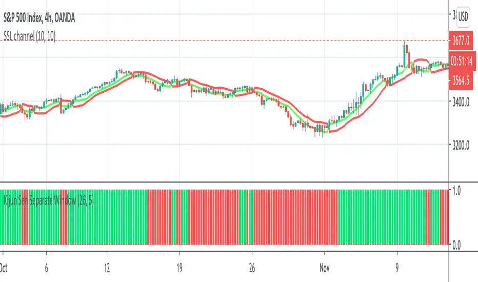
Kijun Sen Separate WindowThis indicator works the same as a regular Kijun Sen but it is on a separate window to allow for other on chart indicators.
I tend to use this as a filter for when to go long/short.
When it is green, I only take longs. When it is red, I only take shorts. Combine with other indicators of your choice.
在腳本中搜尋"ichimoku"
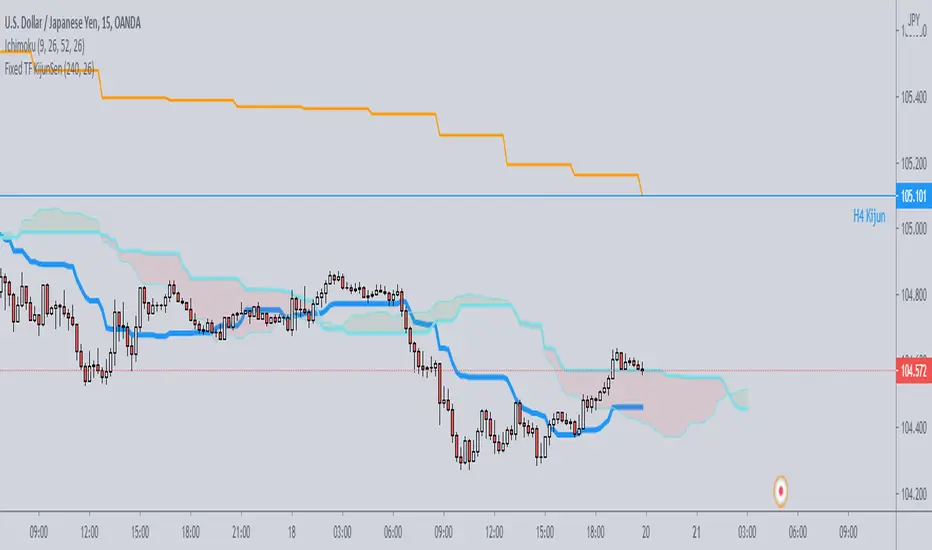
Fixed TF KijunSenJust a simple script which plots on any timeframe the kijunsen of a single specific timeframe, selectable by the user.
Useful for strategies which need to work on various timeframes, but need the kijun of that specific timeframe to be always visible for the analysis.
ORTI MACD (Static Timeframe Multi-Period)The " ORTI Moving Average Convergence Divergence (Static Timeframe Multi-Period) " is now a public script, based into a existing study named " MACD aka Moving Average Convergence Divergence ", but with some better functions about time frame and its measurament. As a redesigned and recalculated set of the common plotted averages, a trend-following momentum indicator that shows the relationship between two moving averages of a security’s price.
The cherry on the top for this version is, when you want to get a predetermined count in (ranges) units of time, as: minutes, hours or days, in any graph you could get a static average, and this count will be automatically respected. For example, an average could be configurated to know a trend per day, week or month... or whatever comes to mind, and at every single chart that you move through (5m, 15m, 1h, 4h, etc), you will see the same average to make your own "trend analysis" into a micro/macro market view.
But now, with the option to convert the " Exponential Moving Average " to adapt into 9 different kinds of "Moving Averages" and by any of the most used Moving Averages, an hybrid basically.
The following options to convert the "Exponential Moving Average ( EMA ) to:
• Double Exponential Moving Average ( DEMA )
• Exponential Moving Average ( EMA )
• Hull Moving Average ( HMA )
• Modified Moving Average ( MMA ) *
• Rolling Moving Average ( RMA ) *
• Simple Moving Average ( SMA )
• Smoothed Moving Average ( SMMA ) *
• Volume-weighted Moving Average ( VWMA )
• Weighted Moving Average ( WMA )
* Same Moving Averages: a Modified Moving Average is otherwise known as the Running Moving Average or Smoothed Moving Average.
The MACD is usually calculated by subtracting the 26-period Exponential Moving Average ( EMA ) from the 12-period EMA . The result of that calculation is the MACD line. A nine-day EMA of the MACD , called the "Signal Line", is then plotted on top of the MACD line which can function as a trigger for buy and sell signals. Traders may buy the security when the MACD crosses above its signal line and sell, or short, the security when the MACD crosses below the signal line.
The MACD has a positive value whenever the 12-period EMA is above the 26-period EMA and a negative value when the 12-period EMA is below the 26-period EMA . The more distant the MACD is above or below its baseline indicates that the distance between the two EMAs is growing. In the following chart, you can see how the two EMAs applied to the price chart correspond to the MACD (blue) crossing above or below its baseline (red dashed) in the indicator below the price chart.
The MACD is often displayed with a histogram which graphs the distance between the MACD and its signal line. If the MACD is above the signal line, the histogram will be above the MACD’s baseline. If the MACD is below its signal line, the histogram will be below the MACD’s baseline. Traders use the MACD’s histogram to identify when bullish or bearish momentum is high.
For more technical information look at Investopedia .
Note: The previous calculation example is not the default, the parameters can be adjusted according to the criteria of the merchant.

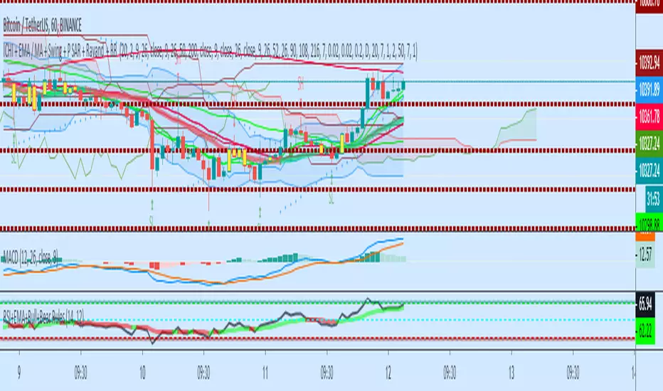
ICHI + EMA / MA + Swing + P SAR + BB A combination of Swing, Ichimuko and 3 different kijunsen, EMA, MA, MA and EMA, ( cross ), Parabolic Sar, BB, and the middle line of Bolinger Band Indicators
open source to the further adjustment


Tenkan Kijun Cross AlertTenkan Kijun cross alert, best used alongside a Volume indicator to help aid with finding those trend continuation patterns.
I prefer to use the Chaikin Money Flow, when it indicates and holds above the 0 line then you will bias Longs, and when below then you will Bias shorts
If you like this then please donate
BTC: 1LRbUgrkvFLQ5Mt7C62EJRD9aMvhDNT22K
ETH: 0xa509b89bccb788234278eFE63470c10946E26F3c
LTC: LV7MUr6arvCffS5N6pbTWgav5S3Yi1Eejp

Skipz multi-indicatorMaking my own indicator pack based on several indicators used by my mentors.
Would love feedback

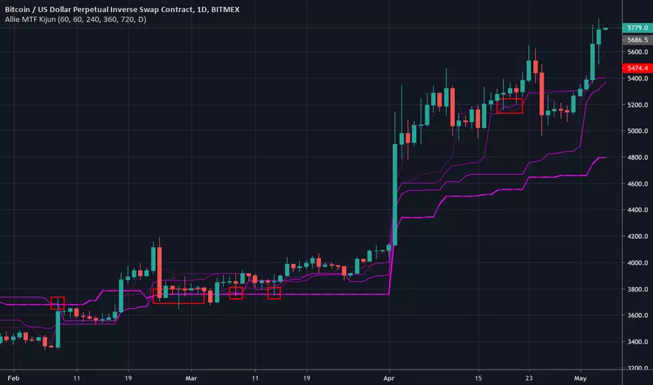
Allie MTF KijunMulti-timeframe kijun. The current timeframe's kijun is represented with dashed line.

Trend Master CryptoFeatures:
Show price trend very clearly.
Mark entry signals on candles.
Getting Started:
Green candle is time to buy or long.
Red candle is time to sell or short.
Set your stoploss around cloud upper or lower ranges.
Contributing:
You can report bugs or issues under this page.
Any advice would be helpful for improving this indicator's accuracy.
Application:
This is an invite only indicator.

CryptocloudHere's a cloud witn both, original & crypto settings.
I had to make some little tweaks in order to get the cloud accurate.
Works well & has more fun in low timeframes. 3D effect :)

OBV-Ts-Ks [by: Bijan Ajdary]This indicator adds Tenkansen and 3 types of Kijunsen to the OBV chart And making it highly efficient for professional traders.
Written based on the teachings of dear Chris

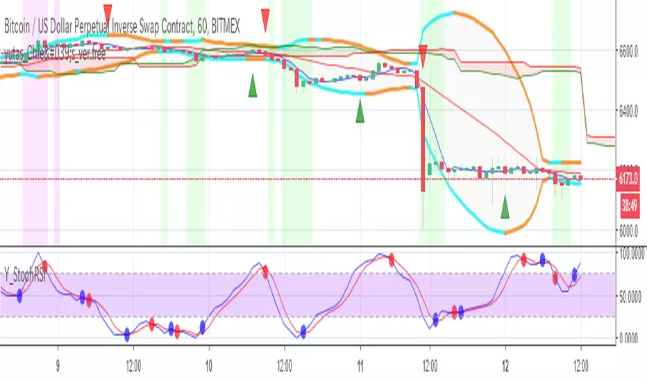
yutas_Chie's Indicator_ver.free
It is a free distribution version of Chie's Indicator.
ちえさんインジケーターの無料配布バージョンです。

TETSU style 2 Black II chobixautoMA3Lines & kumo & ts & tc River TETSU style 2 Black II chobix version


CCS Trading 1.0This is a custom crypto script to be used by CCS. This is a custom crypto script to be used by CCS. This is a custom crypto script to be used by CCS.

Guerrilla AdvancedThis indicator was designed with people without Pro License in mind (Including many of my close friends).
Basically, you will get a combo of few different tools in one box, with ability to turn them on and off with a single check mark, also, you have total control over the input numbers that was used in calculations if you so want to, for example, sometimes when i see a massive bullish up trend, i reduce the short rally from 12 to 8 even 6 to get faster signal for selling the trend.
So, what will you get in this pack?
1- Ichimoko. Yes, you heard it right, although we have it in the default tools but hey, it will use one indicator slot and if you don't have a pro license, you will use that slot
2- Rally. This is an old yet very powerful system for getting buy or sell signals, basically, you get two lines and for making the life easier i draw a cloud between them. when the trend passes above the cloud and it was bellow it in past, right after the very first candle that gets above the cloud you can put the buy order, and vice versa, the moment a candle body enters the cloud, if you want an aggressive signal, you can sell, if not, you may want to wait to see if the candles drop bellow the cloud or not then decide.
3- Resistance Support Cloud. Most of us always heard about resistance and support "lines" but many of us don't know that, in each trend, the trend line itself is a resistance or support line, and when you are going in a bullish or bearish tunnel, the floor and roof of tunnels are again resistance and supports, using this part of the tool, just like rally, you get a cloud that shows you the resistance / support "zone"
4- William Fractals. To be honest, I got this part of the code from another source available around. Why? looking at those fractal indicators, you can easily eyeball the trend line or existence of a tunnel.
5- Different EMA lines. If you are one of those people that use EMA lines for their trading, have fun with them, there are few different standard ones and even a custom one that you can put your desired number for it.
Ichimoku_on_steroids v 1.0 (Scalper's) INSame as overlay version, as an indicator.
Use with caution.
