HTF Power of Three° [Pro+] by toodegreesDescription:
Power of Three ( PO3 ) is one of the many concepts introduced by the Inner Circle Trader , and inspired by Larry Williams .
The PO3 represents a three staged Smart Money campaign: Accumulation , Manipulation , and Distribution ( AMD ).
This tool helps to build narrative, as well as spotting important institutional levels.
ICT traders assume that this pattern represents how any candle is built.
“ This is applicable to every time measurement, as long as you have a beginning time, the highest value, the lowest value, and an ending in terms of measuring time. ”
Consider the development of a Bullish Candle over Time:
– Candle Open (initial value price, prior to dynamic imbalance)
– Accumulation of longs around the opening price
– Manipulation where short liquidity is engineered and long liquidity is neutralized
– Range Expansion (dynamic price imbalance)
– Distribution pairing long exits with pending buy interest
– Candle Close (ending value price, post dynamic imbalance)
The same goes for the development of Bearish Candles, in reverse.
Indicator Features:
The HTF Power of Three° Pro+ Indicator allows to monitor the selected Higher Timeframe Candles in real time:
– Follow HTF Candle development Live
– Plot unlimited HTF Candles on the current resolution
– Use NY Midnight time as the Candle Open on Daily and Weekly timeframes
– Spot HTF PD Arrays while on a lower timeframe
– See where the HTF Open, High, and Low are in the current lower resolution with high precision
– Know when the HTF candle is supposed to Close by monitoring its own countdown (below 1D)
– Note previous HTF Low to High ranges to gain a deeper understanding of LTF market profiles
Additional Features:
– Choose between Candles and Bars to display your HTF PO3s
– Hover on the open and close of past HTF candles to see their OHLC and Range values
– Resize and offset HTF candles to your liking
– Stack multiple instances on the indicator to show multiple higher timeframes at once on the same layout
– Backtest strategies with two (or more) timeframes on one chart
– Study and backtest PO3 in Replay Mode with ease
– Trade PO3 with confidence without needing multiple layouts
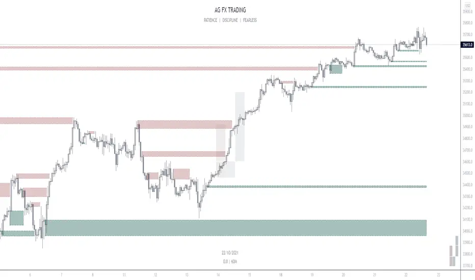
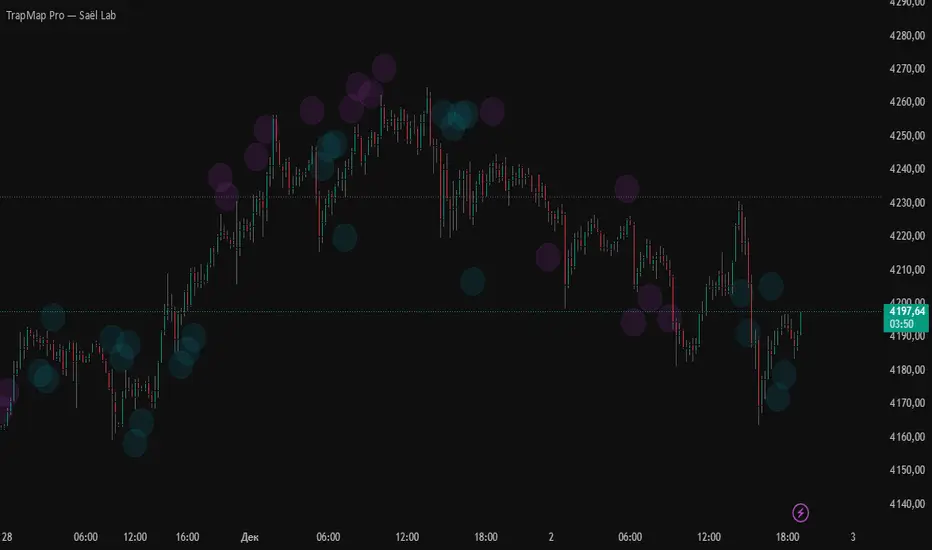
Indicator In Action:
To Get Access, and Level Up see the Author's Instructions below!
This indicator is available only on the TradingView platform.
⚠️ Intellectual Property Rights ⚠️
While this tool's base concepts are public, its interpretation, code, and presentation are protected intellectual property. Unauthorized copying or distribution is prohibited.
⚠️ Terms and Conditions ⚠️
This financial tool is for educational purposes only and not financial advice. Users assume responsibility for decisions made based on the tool's information. Past performance doesn't guarantee future results. By using this tool, users agree to these terms.
付費腳本