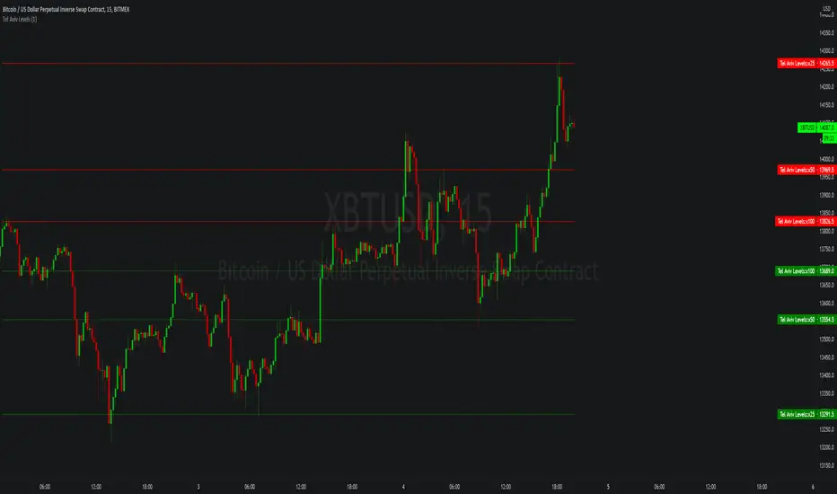
Tel Aviv LevelsSimple script that calculates static support/resistance levels for potential price reversals using a calculation for predicting liquidity from a base price, use in confluence with other technical analysis tools.
DM me on tradingview for access.
在腳本中搜尋"liquidity"
BTC/Fiat Volume Info for Altcoins: Quickly gauge liquidityBTC/Fiat Volume Info for Altcoins - Quickly gauge liquidity
On chart info that:
displays the daily Alt Coin volume in BTC if it is a BTC pair (or whatever the quote currency is)
displays the daily Alt Coin volume in USDT if it is a USDT pair (or whatever the quote currency)
displays the current timeframes volume for the above also.
each option can be configured on/off
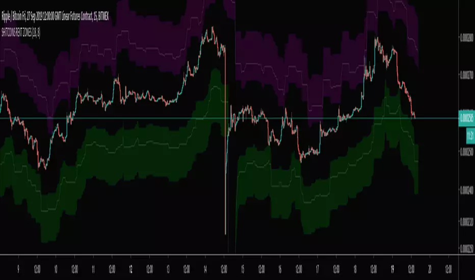
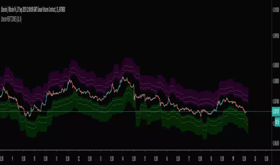
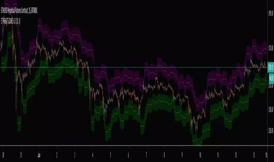
SHITCOINS REKT ZONESShitcoins(XRP, ADA, TRX, EOS, BCH) Bitmex Liquidity Zones. Best used on a 15 min chart.
Don't get REKT! Especially, on Shitcoins :)
TB!Guppy,Fib GMMA, VWap Resistance, Liquidity PoolThis is an assistive chart for the TB! Fibonacci Elliot Wave Oscillator indicator
It incorporates Fib Based fractalized GMMA , Liquidity Pool Theory and VWap based resistance zones.

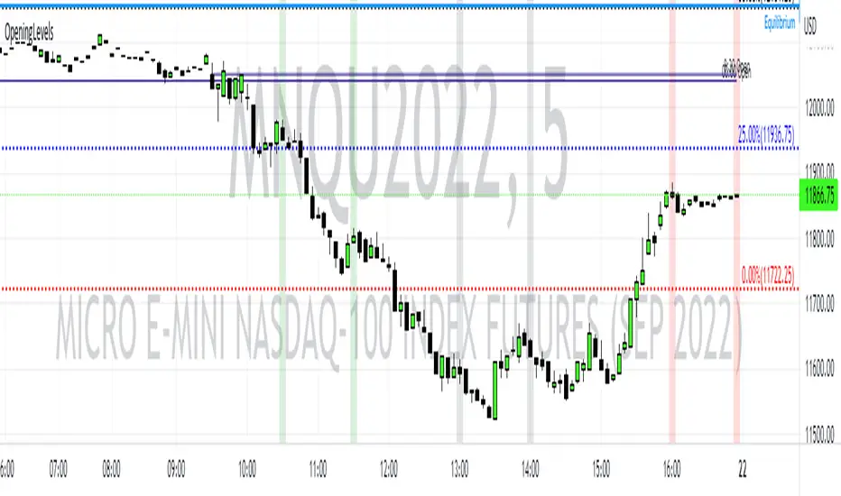
Opening Levels and ZonesThis indicator will show key weekly and daily opening levels including first and last hour trading zones. These will show NY Eastern Time zones only.
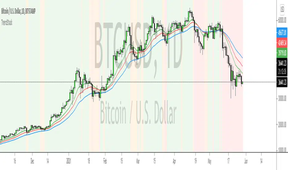
TrendStackTrendStack identifies Bullish, Bearish and Consolidation zones.
The indicator is based on 3 stacked moving averages.
The moving average periods can be changed accordingly under the user settings.
Currently all 3 periods are based on Fibonacci sequence and define short, intermediate and long term trends.
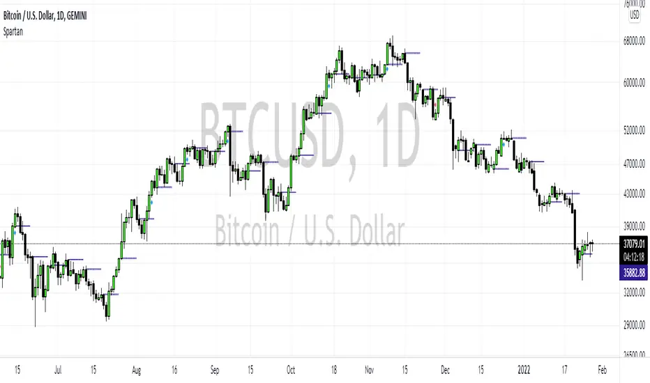
SpartanThe Spartan Strategy.
This is a momentum strategy which attempts to identify when buying pressure or selling pressure is present in the markets.
How to trade the long side:
Once a blue candle appears, enter Long on pullbacks into a blue candle for longs
Place your stop loss on the opposite side of the blue candle.
Target a previous high for longs
How to trade the short side:
Once a red candle appears, enter Short on pullbacks into a red candle for shorts
Place your stop on the opposite side of the red candle.
Target a previous low for shorts
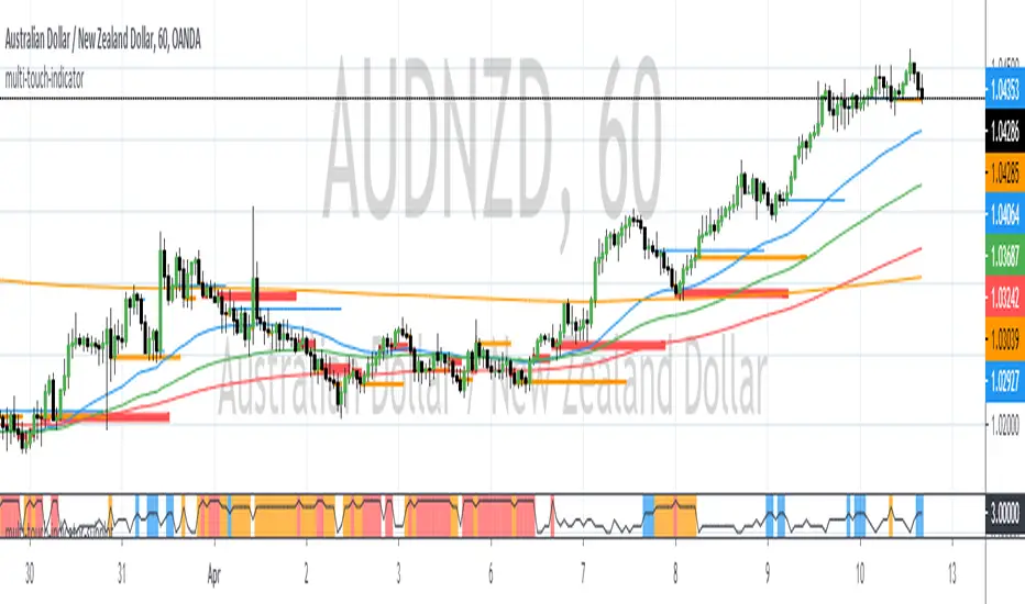
The Multi Touch Confluence Indicator SubplotThe Multi Touch EMA Confluence Indicator Subplot identifies zones where EMAs across 6 different time frames are within a specified range in proximity of the close value. These zones indicate confluence of EMAs.
The confluence zone is specified as a point difference.
When confluence is found, the indicator will paint vertical lines of different color and width.
Blue Zones indicate a confluence of 3 EMAs across all time frames
Orange Zones indicate a confluence of 4 EMAs across all time frames
Red Zones indicate a confluence of 5 or more EMAs across all time frames.
The maximum number of time frames being used is 6.
The maximum number of EMAs per time frame is 4.
When confluence occurs it usually indicates a precursor of price expansion. This indicator can be used to determine when momentum is about to come back into the market.

The Multi Touch EMA Confluence IndicatorThe Multi Touch EMA Confluence Indicator identifies zones where EMAs across 6 different time frames are within a specified range in proximity of the close value. These zones indicate confluence of EMAs.
The confluence zone is specified as a point difference.
When confluence is found, the indicator will paint horizontal lines of different color and width.
Blue Zones indicate a confluence of 3 EMAs across all time frames
Orange Zones indicate a confluence of 4 EMAs across all time frames
Red Zones indicato a confluence of 5 or more EMAs across all time frames.
The maximum number of time frames being used is 6.
The maximum number of EMAs per time frame is 4.
When confluence occurs it usually indicates a precursor of price expansion. This indicator can be used to determine when momentum is about to come back into the market.
ap-fxit-trend-sysAP-FXIT-Trend Indicator
9/19/2019
The following system is designed to capture trend following moves in any market condition.
The system uses two stacked moving averages to filter long and short conditions.
The system uses an oscillator to time when to start looking for entries.
Buy and Sell signals are displayed on chart.
Alerts for BUY ONLY, SELL ONLY or BUY/SELL signals are available.
This system does not provide an alert on when to close positions.
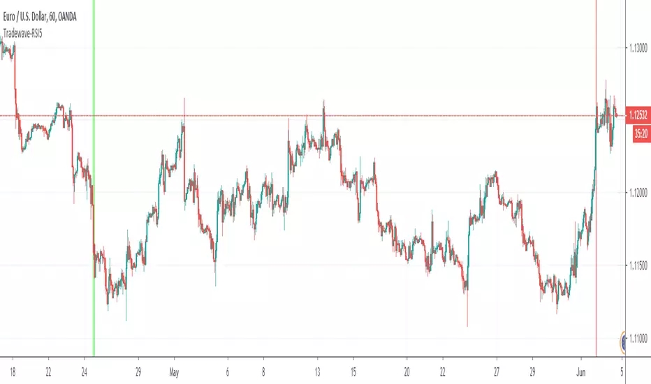
Tradewave-RSI5Calculates the Multi Time Frame RSI Overbought Oversold Conditions.
- Draws a vertical green line when RSI is oversold across 5 time frames of your choice
- Draws a vertical red line when RSI is overbought across 5 time frames of your choice.
Time frames can be modified in indicator settings.
ATRPositionSizerThe ATR Position sizer allows the trader to size Forex and Equity positions based on how much % movement in equity is allowed within a predefined ATR range period.
Current default settings are:
The calculated trade size = N*ATR Movement = % Up/Down Movement in Equity = 1 Unit
N is an ATR multpile.
ATR time frame is defaulted to weekly and can be changed.
% Unit Risk is set to 0.5 and can be changed.
The ATR position sizer plots the recommended trade size (green) and equity line (blue).
A maximum allowed capital allotment to any given trade can also be specified in terms of %. If trade size exceeds max capital allocation, the trade size line turns red.
This type of sizing approach is useful when managing a portfolio of assets.

ForexATRPositionSizerThis script allows me to size up my trades based on account size and ATR. Default is Weekly ATR.
Inputs:
1) Account Size
2) % Unit of Risk
3) ATR Time Frame
4) ATR Period
5) ATR Multiple
The indicator will calculate a trade size for you (1000 = 0.01 lots) across all pairs adjusted by ATR.
1 Unit of Risk (%) is equivalent to ATR Multiple * ATR Weekly of movement.
For example:
Assume you have a 10000 dollar account.
You equate 1% of Equity to N*ATR of movement on weekly chart.
Suppose N*ATR = 100 pips.
Therefore, your trade size will equate to 0.1 lots.
This allows the trader to equalize the effect of equity fluctuations relative to any one given pair.

rb-vwapDeveloper: Andrew Palladino + Rob Booker.
Description: Allows to plot multiple volume weighted moving average lines that start a specified day/time. Currently supports a weekly and monthly VWAP.
1) The Weekly VWAP starts the calculation at a specific time of the week. Default is set to Monday.
2) The Monthly VWAP starts the calculation at a specific time of the month. Default is set to 1.

weekly-vwapAuthor: Andrew Palladino
Date: 1/12/2016
Description: Volume Weighted Moving Average calculated weekly on the start of a specified week day. Default is set to Sunday.
3XLTTrendSignalTriple Long Term Trend Signal
Author: Andrew Palladino
Date: 1/12/2018
Description: The indicator identifies the long term trend alignment on 3 user defined higher time frames.
The indicator will turn green when 3 higher time frames (4H, D, W) are perfectly aligned in an uptrend.
The indicator will turn red when 3 higher time frames (4H, D, W) are perfectly aligned in a downtrend.
The indicator will turn blue when there is not a perfect alighment acrooss 4H, D, W.
The 3 time frames can be changed and customized via the input dialog box.
The transitions between the three states will not change when moving to lower time frames. This enables a lower time frame trader to always know what the higher time frame charts are doing regardless of what time frame the indicator is painting on.

Sharky Reversal IndicatorAuthor: Tradewave
Date: 12/16/2017
Description:
Identifies key reversal area on any time frame. The indicator is based on pure price action and an oscillator.

DayOfWeekAuthor: Andrew Palladino
Date: 12/16/2017
This indicator will shade the background to a specified color based on a chosen day of the week.
1 = Sunday
2 = Monday
3 = Tuesday
4 = Wednesday
5 = Thursday
6 = Friday

SQZMIA modified version of Squeeze Momentum Indicator by Lazy Bear. This one has an alert for Squeeze On Alert Condition.
