Momentum OverviewThis script simply displays the status of my preferred momentum indicator (MACD) on multiple timeframes. Simple to use and helpful for keeping in mind what momentum is doing on multiple time frames. I may consider allowing for changeable timeframes in the future, but for now this is set to selected, important timeframes.
在腳本中搜尋"momentum"

Momentum Squeezing Oscillator Just simple momentum oscillator modeled after the TMI squeeze from john Carter available on TD Ameritrade
Just an added tool to the tool belt
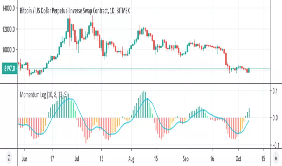
Momentum Log logarithmic momentum oscillator
you can buy if cross zero up , sell cross zero down or if cross up or down the signal (buy or sell)
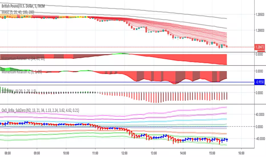
nice to see trends of larger picture
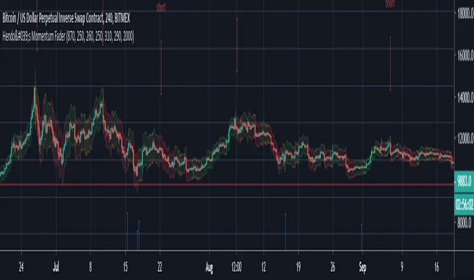
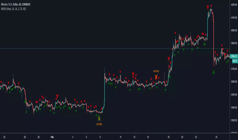
Hendo's Momentum Fader AdvancedMomentum fader with volatillity index, directional bias, volatillity range and multiple settings.
How to use:
Pick a chart, mainly developed on XBT but supports every pair/index.
Pick a time frame:
1M, 5M, 15M, 30M, 1HR, 4HR. Other time frames are not yet supported.
Set your "volatillity setting"
Higher means bigger stop losses (and less risk/reward:more accuracy)
Last but not least:
Pick a setting for the algo to calculate with, every timeframe has multiple settings to work with.
Exits must be done manually, it's not a pivot to pivot indicator.
Interpretation:
Lime green bars signal bullish pivots
Maroon red bars signal bearish pivots
The upper&lower boundaries of the "bands" are logical places to put stop losses outside of volatillity
The colouring of said bounderies indicate trend, likelihood of continuation.
Yellow: Pivot , Green: Bullish , Red: Bearish . Transitions from Yellow/Green to Red and the other way around are the most consistent.
Entries are also signalled in blue (long) or red (short) they are determined by the algo itself. 90% of them run in profit (some short term), keep in mind that exits must be done manually.
Access is ONLY for members.
Don't request the code, I'm not letting people "help" with developments nor am I selling the code.
Stay tuned for more!
IPR Momentum Fader MSCMCMMomentum fader with volatillity index, directional bias, comfortable range and multiple settings.
How to use:
Pick a chart, mainly developed on XBT but supports every paid/index.
Supported Time Frames:
1M, 5M, 15M, 30M, 1HR, 4HR. Anything outside of these time frames will throw an error because those are not yet supported.
After you've picked a time frame select the stop loss size (is not calculated in pips but in volatillity index)
Then pick a setting for the algo to do it's calculations with. Every time frame comes with it's own algo to determine entries.
Exits must be done manually, it's not a pivot to pivot indicator.
Lime green bars signal bullish pivots
Maroon red bars signal bearish pivots
The upper boundaries of the "bands" are logical places to put stop losses outside of volatillity
The colouring of said bounderies indicate trend, likelihood of continuation.
Yellow: Pivot, Green: Bullish, Red: Bearish. Transitions from Yellow/Green to Red and the other way around are the most consistent.
Entries are signalled in blue (long) or red (short) and are fully calculated by the algo. About 95% run in profit short term: The only manual input the user has to give is the exit.
Don't request the code, I'm not selling it, it's not for unlicensed use.

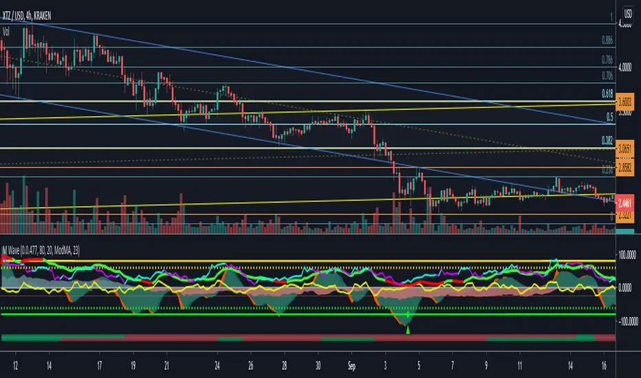
Function : Know Sure Thing ! (KST)Firstly : Know Sure Thing, or KST , is a momentum oscillator developed by Martin Pring to make rate-of-change readings easier for traders to interpret. In a 1992 Stocks and Commodities article, Mr. Pring referred to the indicator as "Summed Rate of Change ( KST )," but the KST term stuck with technical analysts. The indicator is relatively common among technical analysts preferring momentum oscillators to make decisions.
References : Investopedia (www.investopedia.com )
Let's start :
Simply :
KST : Above point 0 means long position (positive zone), below point 0 (negative zone) means short position.
I liked this indicator more than RSI because we can evaluate the breaking points of the channels we draw on the indicator according to the regions.
Plus area (positive area), breaking the channel upwards may indicate a very strong rise, and minus area (negative area) the channel downwards may indicate a very strong fall.
As a person who is very keen to identify major trends in advance, I like the KST indicator to approach the target quickly and simply. I also find it very successful in terms of divergences.
CAUTION : This indicator has been written before many times on TV. I have no effort on it. I saved loads only for variable periods. But I have enough experience to say that you are successful in trends with KST . Nevertheless, do not use it alone, as other promoters may benefit.
For example , I divided the standard periods into 4 as in the script. With a correct adaptive period, it has the potential to contribute greatly to accurate moves! You can use with mutable variable periods. Abundant trend lines can be drawn on the indicator and divergences between price and indicator can be sought. Best regards!

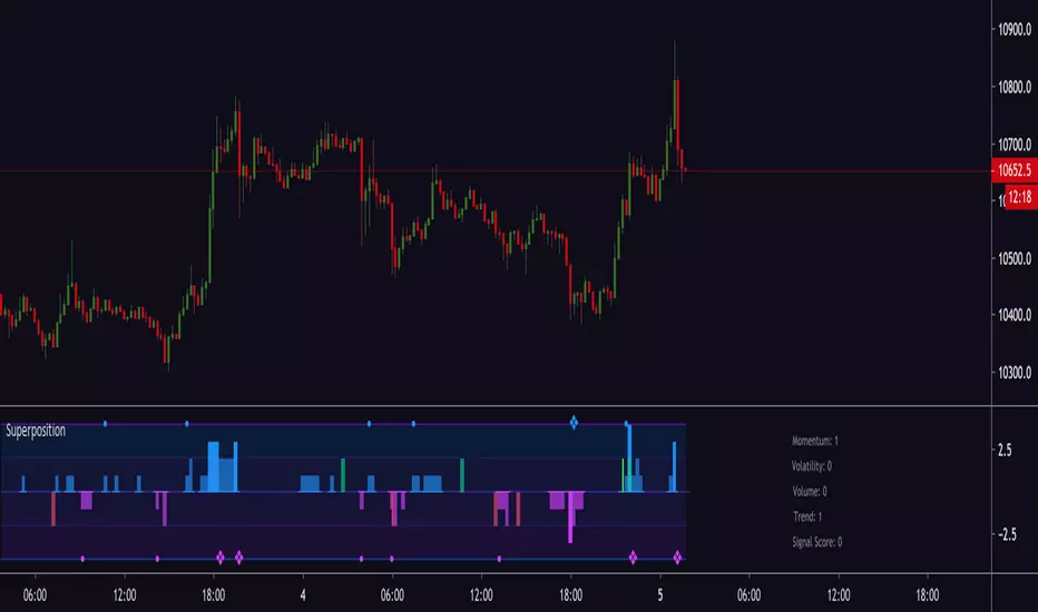
Magick SuperpositionExperimental histogram based on multi indicator signals.
Generates a score based on:
Trend
Volatility
Momentum
Price and volume changes
Candlestick patterns
and many more.
Can be used to detect top and bottoms, reversals, trend, best moments to enter a trade and more.
Invite-only.
Trial available.


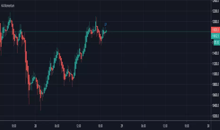
Next Candle HA MomentumVery simple script that updates realtime and shows possible next candle outcome and difference between current HA candle and current regular candle.
It's intended to use on Heikin Ashi and shows actual price on them, while on regular candles shows difference.
Idea was suggested by my husband and we decided to develop and publish it together.
Enjoy and check other scripts on my profile!
Momentum Regression @CosmonautCCustom momentum oscillators combined with a custom type of regression to find entries and exits.
Green arrow = long entry/buy
green circle = long exit/hedge into USD
vice versa for red arrows and circles
No risk management/strategy/backtesting done yet. Purely indicator form so far.
Enjoy!

Momentum Strategy Indicator by ZekisA very powerful strategy with great results that combine a multitude of indicators like Anchored Momentum, Stochastic Momentum Index, Bollinger Bands, Stochastic RSI, a formation of 3 trend indicators that forms a cloud , combinations of EMAs and a lot of condition to met for entries, TP, SL ....
Statistics for March 2019:
*320 long signals for all Binances coins paired with BTC
*208 (65%) winning trades
*108 (33.75%) losing trades
*4 (1.25%) trades still active
*total profit - 486%
*compound profit - 8750%
Time frame recommended: 4h
Conditions for Long entries:
AMOM in bullish cross/side
SMI in bullisih cross/side
Price above BB middle line
SRSI below 50 and heading upward
3x trend cloud must be green/bullish and the price needs to be above the cloud
Price must to be above EMA 400
EMA 100 must to go in an upward direction
The candle must not exceed 10% in height
(all values are preset)
SL line is calculated based on previous structure low (lowest low) from 10 candles in the past(the value can be changed)
TP line is calculated at 1:1 ratio, so at the same distance like SL is from signal, but mirrored
The background is changing when it enters in bull or bear side
Candles are colored for entries for a better view
Alerts are added for entries, TP and SL
Max candle high can be adjusted, according to the market (lower value for a market with low volatility and vice versa)
TP and SL lines calculation(previous structure low) can be adjusted, according to market conditions
(all values are preset, the strategy is ready to go)
Don't go blind with any indicator, do your research before involving real money
Enjoy!
@Zekis


Momentum Exhaustion + Swing Points ComboCombination of @Zeenobit's Swing Points and Momentum Exhaustion indicators; RSX instead of RSI from @jaggedsoft/@everget's RSX Divergences script(s).

Momentum and Trend Strength Entry Exit Pivot StudyUpdated version of previous Momentum Strength Entry Exit Pivot Study:
//************************
// @TheGeeBee - Credit where used
//
//Notes:
//
// Use 1,2,3,5 minute timeframes
// EMA Cross line and offset allows user to alter the sell characteristics where the candle low is above the EMA line and indicates a possible pre-pivot reversal
// Adjust Min and Max pivots based on risk profile
// Single Candle drawdown value represents the maximum size of a single red candle before an Exit Pivot is generated
// ADX Threshold inhibits Pivots when trending signal is below the threshold value
// Percentage Max drawdown since Entry Pivot allows the system to generate an Exit Pivot if the security has dropped X percent from the most recent Entry Pivot point
// Use Bars, Candles (preferred) or Heikin-Ashi
// Multiple Green Bars = BTFD
// Multiple Red bars = If you didn't already get out, do it now!
//
//************************
Allows for Alerts to be set for Entry and Exit Pivots.
Momentum Oscillators [CP]This is collection of 3 Momentum Oscillators:
*RSI
*Stochastic
*SRSI
You can filter each one with the following options:
*SMA
*EMA
*Hull MA
*Linear Regression
*Laguerre
*SuperSmoother
*SuperSmoother

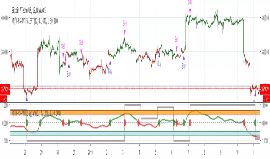
MOMENTUM INDICATOR / INVERS FISHER / RSI / MTF / ALERT// Alerts based on Momentum indicator and Inverse Fisher transform with Multi Time Frame function on Relative Strength Index (RSI)
// Greatest effect on 15M+ time frame
// Created and based on Binance chart
// Working with comission
// No repaints
Momentum Indicator Alerts 15m// Alerts based on Momentum Indicator Strategy
// Greatest effect on 15M time frame
// Created and based on Binance chart
// Working with comission
// No repaints

Momentum VisualizerA colorful indicator that visually shows momentum, fast-moving average on the outside and the slower moving averages in the core. The outer moving average is to see where the outer momentum breaks below again.