Smart Money Zones (FVG + OB) + MTF Trend Panel## Overview
Professional-grade institutional trading zones indicator that identifies **Fair Value Gaps (FVG)** and **Order Blocks (OB)** - key price inefficiencies where smart money operates. Includes a comprehensive **Multi-Timeframe Trend Panel** for complete market context at a glance.
## Core Features
### 🎯 Fair Value Gaps (FVG)
Fair Value Gaps occur when price moves so aggressively that it leaves an "imbalance" or "gap" in the market structure. These zones often act as magnets where price returns to find liquidity.
**Detection Logic:**
- **Bullish FVG**: When current candle's low is above the high of the candle 2 bars ago
- **Bearish FVG**: When current candle's high is below the low of the candle 2 bars ago
- Requires strong impulse candle (configurable body percentage threshold)
- Color-coded zones: Green for bullish, Red for bearish
### 📦 Order Blocks (OB)
Order Blocks represent the last opposite candle before a significant price move - the zone where institutional orders were placed before the breakout.
**Detection Logic:**
- Identifies the last bearish candle before a strong bullish breakout (Bullish OB)
- Identifies the last bullish candle before a strong bearish breakout (Bearish OB)
- Validates breakout strength using ATR multiplier (1.2x default)
- Color-coded zones: Blue for bullish, Orange for bearish
### 📊 Multi-Timeframe Trend Panel
Real-time trend analysis across **7 timeframes** displayed in an elegant dashboard:
- **1 Minute** - Ultra short-term scalping
- **5 Minutes** - Short-term momentum
- **15 Minutes** - Intraday swings
- **30 Minutes** - Session trends
- **1 Hour** - Multi-session trends
- **4 Hours** - Daily structure
- **Daily** - Long-term direction
**Visual Indicators:**
- 🟢 Green circle = Bullish trend
- 🔴 Red circle = Bearish trend
- Clean, professional table design with customizable position and size
## Intelligence Features
### 🧠 Zone Strength Rating
Every zone is automatically classified by strength based on size relative to ATR:
- **VERY STRONG** - 2.0x ATR or more (major institutional zones)
- **STRONG** - 1.5x to 2.0x ATR (significant zones)
- **MEDIUM** - 1.0x to 1.5x ATR (moderate zones)
- **WEAK** - Below 1.0x ATR (minor zones)
Strength rating helps you prioritize which zones to trade from!
### 📉 Smart Mitigation Tracking
Zones automatically track how much they've been "filled" or mitigated:
- Calculates penetration percentage as price enters the zone
- Zones turn **gray** when 50%+ mitigated or fully filled
- Option to **auto-delete** mitigated zones to keep chart clean
- Live zones extend dynamically with price action
### 🎨 Trend Filter (Optional)
When enabled, only shows zones aligned with the current trend:
- Uses customizable MA period (default 50)
- Bullish zones only appear in uptrend
- Bearish zones only appear in downtrend
- Reduces noise and false signals significantly
## Customization Options
### Display Settings
- Toggle FVGs and OBs independently
- Adjust max zones per type (5-200)
- Choose to remove or gray out mitigated zones
- Color customization for all zone types
### Detection Parameters
- **Min Impulse Body %**: Controls how strong the impulse candle must be (0.3-1.0)
- **Order Block Lookback**: How many bars to look back for OB validation (5-50)
- **ATR Length**: Period for ATR calculation (5-50)
### Trend Filter
- Enable/disable trend filtering
- Adjustable MA period for trend determination
### MTF Panel
- Show/hide the trend panel
- 4 position options: Top Right, Top Left, Bottom Right, Bottom Left
- 3 size options: Small, Normal, Large
- Customizable MA period for trend calculation across all timeframes
## Trading Applications
### 1. **Liquidity Grab Entries**
Wait for price to sweep a zone (50%+ mitigation) then enter on reversal. Smart money often "hunts" these zones before the real move begins.
### 2. **Confluence Trading**
Look for zones that align with:
- Multiple timeframe trends showing same direction
- Multiple FVGs/OBs stacking in same area
- Key support/resistance levels
### 3. **Breakout Confirmation**
Use Order Blocks to confirm the strength of breakouts. Strong OBs indicate institutional participation.
### 4. **Retracement Entries**
Enter when price returns to a fresh, unmitigated zone in the direction of the higher timeframe trend.
### 5. **Range Trading**
Identify FVG zones at range extremes - price often reverses at these inefficiencies.
## How It Works
**Fair Value Gaps** form when the middle candle creates such aggressive movement that it leaves a price gap between the high/low of surrounding candles. Institutional traders know these gaps get filled.
**Order Blocks** mark the origin of major moves. The last opposite-colored candle before a breakout is where large orders were placed. Price often returns to these zones for "retests" before continuing.
**Mitigation** happens when price returns to fill these zones. The indicator tracks this automatically, showing you which zones are still "fresh" and which have been used up.
## Best Practices
✅ **Use higher timeframe trends** - Always check the MTF panel before taking trades
✅ **Trade fresh zones** - Unmitigated zones (not gray) have the highest probability
✅ **Combine with price action** - Look for rejection wicks and engulfing candles at zones
✅ **Respect zone strength** - VERY STRONG and STRONG zones are most reliable
✅ **Use trend filter** - Especially on lower timeframes to reduce false signals
❌ **Don't overtrade** - Not every zone will react, wait for confirmation
❌ **Don't ignore context** - Check the MTF panel for conflicting trends
❌ **Don't chase** - Wait for price to come to the zone, don't enter mid-zone
## Technical Details
- **Non-repainting**: All zones are drawn on confirmed candles only
- **Performance optimized**: Uses efficient array management with per-type caps
- **Real-time updates**: Zones extend and track mitigation as price moves
- **Universal compatibility**: Works on all markets and timeframes
## Recommended Settings by Style
**Scalping (1m-5m charts):**
- Max zones: 10-15
- Use trend filter: ON
- MTF Panel: Focus on 1m-15m trends
- Remove mitigated: ON (keep chart clean)
**Day Trading (5m-1H charts):**
- Max zones: 15-20
- Use trend filter: ON
- MTF Panel: Focus on 15m-4H trends
- Remove mitigated: OFF (track zone history)
**Swing Trading (1H-D charts):**
- Max zones: 20+
- Use trend filter: Optional
- MTF Panel: Focus on 1H-1D trends
- Remove mitigated: OFF (important zones persist)
---
## Perfect For
- Smart Money Concept (SMC) traders
- ICT methodology followers
- Institutional order flow traders
- Price action traders seeking key zones
- Multi-timeframe analysis enthusiasts
**Compatible with all markets:** Forex, Crypto, Stocks, Indices, Commodities, Futures
*Trade where the institutions trade. Follow the smart money.*
在腳本中搜尋"mtf"

The Ultimate Price Action & SMC Toolkit: Delta Zones, MTF IndicaThis is an All-in-One Pine Script indicator that seamlessly combines three advanced trading concepts:
Delta Zones (Wick Pressure): Uses Standard Deviation to identify extreme buying/selling pressure within the candlestick wicks, signaling potential stop hunts or liquidity absorption. These are plotted as critical Buy/Sell Boxes.
Multi-Timeframe (MTF) Indicators: Confirms signals using popular indicators (RSI, CCI, Stochastic) calculated from a separate, user-selected Timeframe or the current chart timeframe. This adds a crucial layer of context and momentum confirmation.
Smart Money Concepts (SMC): Automatically detects and plots Orderblocks (OBs) and Breaker Blocks based on confirmed Market Structure Breaks (MSB). This helps locate high-probability Supply and Demand zones.
Key Features:
Integrated plotting for combined indicator signals.
Flexible MTF selection for all standard oscillators.
Automatic Swing High/Low detection for SMC analysis.
Comprehensive Alert system for Delta Pressure, Orderblocks, and Breaker Zones.
Option 2: Focusing on SMC and Flow (Concise)
Title: "SMC Delta Flow: Advanced Orderblock, Breaker, and Wick Reversal Zones with MTF Filter."
Description:
An essential tool for sophisticated SMC traders. This indicator provides high-precision zones:
Smart Money Blocks: Plots Orderblocks and Breaker Blocks following Market Structure Shifts (MSS). Includes a "Chop Control" feature to invalidate re-used or weak Breakers.
Delta Reversal Zones: Pinpoints candles showing extreme high-deviation wick pressure. Use these zones to confirm reversals and identify precise entry points where liquidity was captured.
MTF Confirmation: Incorporates configurable Multi-Timeframe (MTF) RSI, CCI, and Stochastic indicators to act as a momentum filter or confirmation tool.
Add this indicator to unify your analysis of Liquidity, Market Structure, and Momentum on a single chart!
SMC, SmartMoneyConcepts, Orderblock, BreakerBlock, MTF, MultiTimeframe, Delta, Wick, Liquidity, PriceAction, RSI, Stochastic, CCI

Ripster Clouds (EMA + MTF)v6🧠 Purpose
This indicator combines Ripster EMA Clouds and Multi-Timeframe (MTF) EMA Clouds into one script.
It allows you to visualize short vs long exponential (or simple) moving averages as colored “clouds” to identify trend direction and momentum — across both your current timeframe and a higher timeframe (e.g., daily).
⚙️ Main Features
1. EMA Clouds (Local Timeframe)
Up to 5 separate EMA/SMA cloud sets (8/9, 5/12, 34/50, 72/89, 180/200 by default).
Each can be individually enabled/disabled in the settings.
MA type toggle → Choose between EMA and SMA.
Optional line display toggle for showing the short and long MA lines.
Color-coded trend clouds:
Greenish tones = bullish (short > long)
Reddish tones = bearish (short < long)
Configurable leading offset and global offset for alignment.
2. MTF Clouds (Higher Timeframe)
Two sets of higher timeframe EMA clouds (default: 50/55 and 20/21).
Uses request.security() to pull EMA data from a selected higher timeframe (default = Daily).
Optional line visibility toggle (Display Lines).
Blue and teal semi-transparent fills to distinguish from local clouds.
Each MTF cloud can be toggled independently.
3. Unified Controls
Master toggles:
✅ Show EMA Clouds
✅ Show MTF Clouds
Transparent cloud fills with dynamically changing colors based on EMA crossovers and slope.
No local-scope plot() or fill() calls — fully compliant with Pine v6 rules.
🎨 Color Logic
Each EMA cloud uses a unique color pair (5 total).
Cloud color changes dynamically based on whether the short EMA is above or below the long EMA.
Line color changes with slope:
Olive = EMA rising
Maroon = EMA falling
📊 Technical Structure
Written in Pine Script v6.
All plot() and fill() calls are at global scope to prevent compilation errors.
Uses helper functions only for math/color logic.
Performance-optimized for TradingView’s rendering limits.
🧩 Quick Setup in TradingView
Paste the script into the Pine Editor.
Add to chart.
In settings:
Toggle on/off any EMA or MTF clouds.
Adjust timeframe (Resolution), line visibility, or offsets.
Choose EMA or SMA as the base calculation.
✅ Result
You now have one unified, customizable Ripster EMA + MTF Cloud indicator, stable in Pine v6, with complete flexibility to toggle, style, and analyze multiple timeframe trends on a single chart.
Supertrend with ADX & MTF MA Filter# **Supertrend with ADX & MTF MA Filter - Comprehensive Explanation**
---
## **1. Purpose of This Indicator**
This indicator combines three powerful technical analysis tools to create a robust trading system:
✅ **Supertrend** (Trend-following)
✅ **ADX Filter** (Trend strength confirmation)
✅ **MTF MA Filter** (Multi-timeframe trend direction confirmation)
**Primary Goals:**
✔ **Identify high-probability trend reversals** with confirmation from multiple indicators
✔ **Filter out weak trends** using ADX (Average Directional Index)
✔ **Add higher timeframe context** with MTF (Multi-TimeFrame) Moving Average
✔ **Reduce false signals** by requiring confluence between all three components
---
## **2. Core Logic & Components**
### **A. Supertrend (Base Indicator)**
- **Calculation:**
```pine
up = hl2 - (Multiplier * ATR(Periods))
dn = hl2 + (Multiplier * ATR(Periods))
```
- **Bullish trend** when price > `up` (green line)
- **Bearish trend** when price < `dn` (red line)
- **Why Supertrend?**
- Simple yet effective trend-following system
- Adapts to volatility via ATR (Average True Range)
---
### **B. ADX Filter (Trend Strength Confirmation)**
- **ADX Calculation:**
```pine
= calcADX(adxLength, adxSmoothing)
strongTrend = adxVal >= adxThreshold
```
- **ADX > Threshold (Default: 20)** = Strong trend
- **DI+ > DI-** = Bullish momentum
- **DI- > DI+** = Bearish momentum
- **Why ADX?**
- Avoids trading in choppy markets (low ADX = weak trend)
- Confirms if Supertrend signals occur in a strong trend
---
### **C. MTF MA Filter (Higher Timeframe Trend Alignment)**
- **Moving Average Calculation:**
```pine
= getMA(maSource, maLength, maType, maTF)
```
- **MA Type:** SMA, EMA, WMA, or DEMA
- **Timeframe:** Any (1m, 5m, 1H, 4H, D, W, M)
- **Trend Direction:**
- **Buy Signal:** MA must be **rising**
- **Sell Signal:** MA must be **falling**
- **Why MTF MA?**
- Aligns trades with the **higher timeframe trend**
- Reduces counter-trend entries
---
## **3. How to Use This Indicator**
### **A. Buy Conditions (All Must Be True)**
1. **Supertrend turns bullish** (price crosses above `up` line)
2. **ADX ≥ Threshold** (trend is strong)
3. **Higher timeframe MA is rising** (confirms bullish bias)
### **B. Sell Conditions (All Must Be True)**
1. **Supertrend turns bearish** (price crosses below `dn` line)
2. **ADX ≥ Threshold** (trend is strong)
3. **Higher timeframe MA is falling** (confirms bearish bias)
### **C. Recommended Settings**
| Parameter | Recommended Value | Description |
|-----------|------------------|-------------|
| **ATR Period** | 14 | Sensitivity of Supertrend |
| **Multiplier** | 1.5-3.0 | Adjust for volatility |
| **ADX Threshold** | 20-25 | Higher = stricter trend filter |
| **MA Length** | 20-50 | Smoothness of trend filter |
| **MA Timeframe** | 1H/D | Align with trading style |
---
## **4. Trading Strategies**
### **A. Trend-Following Strategy**
- **Enter:** When all 3 conditions align (Supertrend + ADX + MA)
- **Exit:** When Supertrend flips or ADX drops below threshold
### **B. Pullback Strategy**
- **Wait for:**
- Supertrend in trend direction
- ADX remains strong
- MA still aligned
- **Enter:** On pullback to Supertrend line
### **C. Multi-Timeframe Confirmation**
- **Intraday traders:** Use 4H/D MA for trend bias
- **Swing traders:** Use D/W MA for trend bias
---
## **5. Advantages Over Standard Supertrend**
✔ **Fewer false signals** (ADX filters weak trends)
✔ **Higher timeframe alignment** (avoids trading against larger trends)
✔ **Customizable MA types** (SMA, EMA, WMA, DEMA)
✔ **Works on all markets** (stocks, forex, crypto)
---
### **Final Thoughts**
This indicator is designed for traders who want **high-confidence trend signals** by combining:
🔹 **Supertrend** (entry trigger)
🔹 **ADX** (trend strength filter)
🔹 **MTF MA** (higher timeframe trend alignment)
By requiring all three components to align, it significantly improves signal quality compared to standalone Supertrend systems.
**→ Best for:** Swing trading, trend-following, and avoiding choppy markets.
Dynamic MA Convergence (Smooth MTF)DMC-MA (Dynamic MA Convergence) — Functional Details1. Multi-Timeframe (MTF) Monitoring LogicThis indicator doesn't just display a single MA; it constantly monitors the relationship between the "Current Timeframe" and its "Higher Timeframe (High-TF)" equivalent. When you switch charts, the indicator automatically selects the corresponding High-TF according to the following logic:Current Chart TFMonitored High-TF1 minute (1m)5 minutes (5m)5 minutes (5m)15 minutes (15m) *Optionally 30m15 minutes (15m)1 hour (1H)1 hour (1H)4 hours (4H)4 hours (4H)Daily (D)Daily (D)Weekly (W)Weekly (W)Monthly (M)2. Real-Time Status DetectionThe dashboard (table) and alerts categorize the distance and direction between the two MAs into four distinct states:Convergence: The short-term MA is moving toward the High-TF MA. This often indicates a "pullback" or "retracement" within a trend.Divergence: After converging, the MAs begin to separate again without crossing. This suggests a "trend continuation."Breakout / Breakdown: The short-term MA clearly crosses the High-TF MA. This indicates a potential "trend reversal" or shift in momentum.3. Smooth MTF Line (MA Interpolation)Standard MTF indicators often appear "stepped" or "jagged" when displaying higher timeframe data on lower timeframes. This script utilizes linear interpolation to calculate values for every single bar, resulting in a smooth, natural curve. This significantly improves the accuracy of price-action analysis and MA-touch detection.Technical Notes & CorrectionsLocalized Timeframe Labels:We have moved away from raw numerical IDs (like "60"). By setting the "Language" toggle to EN, all alert messages and table headers will display intuitive labels like "1H" instead of "60".5-Minute Chart Flexibility:Exclusively for the 5m chart, an option (Use 30m as High-TF) is included to switch the reference from 15m to 30m, catering to both scalpers and day traders.Calculation Integrity:The core detection algorithms (cross-detection and convergence direction) remain untouched, ensuring consistent logical performance.How to UseSet your preferred MA Length (Default: 20).Choose your Display Language (JP or EN).Configure Display Settings to show either the status of all timeframes or only the current one.
DMC-MA (Dynamic MA Convergence) — 機能詳細1. マルチタイムフレーム (MTF) 監視ロジック本インジケーターは、単一のMAを表示するのではなく、「現在の足」と「その一段上の上位足」のMAがどのような位置関係にあるかを常に監視します。チャートを切り替えると、以下の対応表に基づいて自動的に監視対象(上位足)が選択されます。表示中の時間足 (Current)監視対象の上位足 (High-TF)1分足 (1m)5分足 (5m)5分足 (5m)15分足 (15m) ※設定で30分に変更可15分足 (15m)1時間足 (1H)1時間足 (1H)4時間足 (4H)4時間足 (4H)日足 (D)日足 (D)週足 (W)週足 (W)月足 (M)2. リアルタイム・ステータス判定ダッシュボード(テーブル)およびアラートでは、MA同士の距離と方向から以下の4つの状態を判定します。収束 (Convergence): 短期MAが上位足MAへ向かって近づいている状態。押し目や戻りの形成を示唆します。拡散 (Divergence): 収束した後、交差せずに再び本来のトレンド方向へ離れていく状態。トレンドの再開を示唆します。上抜け・下抜け (Breakout/Down): 短期MAが上位足MAを明確にクロスした状態。トレンド転換の初動を示唆します。3. スムーズMTFライン (MA平滑化)通常、下位足チャートに上位足のMAを表示すると「階段状」にガタつきますが、本スクリプトは線形補間ロジックにより、バーごとに滑らかなラインを描画します。これにより、価格がMAにタッチしたかどうかの判定精度が向上しています。修正箇所と技術的な解説 / Correction & Technical Context時間足ラベルの言語対応:(JP) 以前の「60」などの数字表記を廃止しました。設定の「Language」をJPにすれば「1時間足」、ENにすれば「1H」と、アラートメッセージやテーブルの見出しが完全に切り替わります。(EN) Replaced raw numbers (e.g., "60") with localized labels. Setting the Language to "EN" displays "1H" across alerts and the dashboard.5分足の例外設定:(JP) 5分足を使用する場合のみ、上位足を15分ではなく「30分」に変更できるオプション(Use 30m as High-TF)を搭載しています。これにより、スキャルピングからデイトレードまで柔軟に対応可能です。ロジックの不変性:(JP) 判定アルゴリズム(交差判定、収束方向の計算)には一切変更を加えていません。導入方法移動平均線の期間(デフォルト20)を設定。表示言語(JP/EN)を選択。表示設定で、特定の時間足の状態を常時リストアップするか、現在の足のみ表示するかを選択。

Adaptive MTF EMA (auto TF)Adaptive MTF EMA (Auto TF) — Mid & Slow EMA that adjusts with chart timeframe
by @theadventuredan
This indicator plots two Higher-Timeframe EMAs (a Mid and a Slow EMA) on your current chart — but unlike normal MTF EMA scripts, the higher timeframes adapt automatically when you change the chart timeframe.
Instead of having to reconfigure TFs every time you switch from 5m to 15m to 1h, the indicator keeps the same “relationship” by using timeframe multipliers:
Mid TF = current chart TF × Mid Multiplier
Slow TF = current chart TF × Slow Multiplier
Example (default multipliers: 3× and 12×):
On 5m: Mid = 15m, Slow = 60m
On 15m: Mid = 45m, Slow = 180m (3h)
On 1h: Mid = 3h, Slow = 12h
This is especially useful if you use MTF EMA alignment as a trend filter (e.g., Mid EMA above Slow EMA = bullish bias).
How it works
The script reads your current chart timeframe using timeframe.in_seconds(timeframe.period) and converts it into minutes.
It calculates the adaptive MTF targets:
midMin = curMin × midMult
slowMin = curMin × slowMult
It requests the EMA from those higher timeframes via request.security() and plots them on your chart.
Optional:
A label can display the currently calculated Mid and Slow TFs (in minutes).
Inputs
EMA Length: EMA period (default 50)
Mid TF Multiplier: how many times higher the mid timeframe should be (default 3)
Slow TF Multiplier: how many times higher the slow timeframe should be (default 12)
Use confirmed HTF values (safer):
When enabled, the script uses the previous HTF EMA value (EMA ) to reduce behavior caused by partially formed higher-timeframe candles.
This may lag slightly but is often preferred for signal consistency.
Show TF label: shows a label with the current adaptive TFs
Notes / Limitations
Because the higher timeframe is derived by multiplication, some results may produce less common timeframes (e.g., 45m or 12h). This is expected.
MTF values depend on request.security() and will always reflect higher-timeframe candle logic (especially during an unclosed HTF candle). If you want less “in-progress candle” behavior, enable Use confirmed HTF values.
This is an EMA overlay tool — not a standalone buy/sell system.
Suggested usage
Trend bias filter: Mid EMA > Slow EMA = bullish bias, Mid < Slow = bearish bias
Entry alignment: use the adaptive EMAs as “context” while trading lower TF setups
Dynamic market structure: switch timeframes while keeping consistent “one step higher / two steps higher” EMA reference

Digital MACD Divergences MTF [LUPEN]Digital MACD Divergences MTF V1.0
Overview:
Digital MACD Divergences MTF is an advanced momentum oscillator based on digital signal processing techniques.
Instead of relying on traditional moving-average smoothing, it applies Finite Impulse Response (FIR) digital filters to extract momentum more cleanly, reducing lag and short-term market noise.
The indicator is designed to provide a clear visualization of momentum structure, divergence behavior, and multi-timeframe context, rather than discrete trading signals.
Conceptual Architecture
At its core, the indicator reinterprets the classic MACD framework through digital convolution logic:
FIR filters are used to compute momentum in a more responsive and stable manner than standard EMA-based MACD.
The resulting histogram represents momentum intensity and direction as a continuous state rather than binary conditions.
A digitally smoothed signal line provides structural reference without introducing excessive delay.
This approach emphasizes momentum quality and structure, not signal frequency.
Divergence Detection Logic:
The script includes automatic divergence detection based on pivot analysis:
Regular bullish and bearish divergences are identified using confirmed pivot points.
Divergences are visualized with explicit line structures and optional filled areas, highlighting the zone of disagreement between price behavior and momentum.
The visualization is designed to remain readable without obscuring price action.
Divergences are presented as contextual information, not as mandatory actions.
Multi-Timeframe (MTF) Context
Digital MACD Divergences MTF supports native multi-timeframe analysis through a dual-pane workflow:
A lower-timeframe instance visualizes local momentum dynamics.
A higher-timeframe instance visualizes the broader momentum regime within which lower-timeframe fluctuations occur.
The higher-timeframe view is not intended as confirmation or filtering logic, but as a contextual background layer that helps interpret short-term momentum behavior inside a larger structural environment.
This separation avoids decision compression and keeps each timeframe’s role conceptually distinct.
Visual Design
Gradient-based histogram fills represent momentum intensity in a continuous manner.
Positive and negative momentum regions are clearly differentiated while remaining adaptable to both dark and light chart themes.
All visual elements are designed to emphasize state and regime, not discrete events.
Reliability
No repainting: all divergences and momentum states are confirmed on candle close and remain fixed.
Designed for consistency across instruments and timeframes.
Customization Options
Timeframe selection for MTF mode (leave empty to use the chart’s timeframe).
Adjustable signal smoothing parameters.
Divergence visibility controls, pivot sensitivity, and optional divergence fill.
Fully customizable color palette.
Usage Notes
This indicator is a visual market analysis tool intended to support momentum interpretation and structural context.
It does not provide investment advice, trading signals, or automated decision logic, and should be used as part of a broader analytical framework.
Final quotes:
"Trading is not about prediction, but about understanding momentum structure.
Digital MACD removes noise to make that structure visible."

Adaptive Strength Overlay (MTF) [BackQuant]Adaptive Strength Overlay (MTF)
A multi-timeframe RSI strength visualizer that projects oscillator “pressure” directly onto price using adaptive gradient fills between percent bands. Built to make strength, exhaustion, and regime context readable at a glance, without needing to stare at a separate oscillator panel.
Mean-Reversion mode example
What this indicator does
This indicator converts RSI strength into a chart overlay that reacts to momentum and extremes, then visualizes it as colored “pressure zones” around price.
Instead of plotting RSI in a sub-window, it:
Builds 1 to 3 symmetric percent bands above and below price.
Computes RSI strength on up to 3 different timeframes (MTF).
Smooths RSI with your selected moving average type.
Maps RSI values into discrete transparency “buckets”.
Fills between the bands with a gradient whose opacity reflects strength or exhaustion.
Displays a compact RSI table for all enabled timeframes.
Provides alert conditions for extremes and midline shifts on each timeframe.
The result is an overlay that looks like a dynamic envelope. When strength rises, the envelope “lights up” in the direction of the move. When strength becomes stretched, the outer zones become visually prominent.
Core idea: “Strength as an overlay”
RSI is normally interpreted in a separate oscillator panel. That makes context-switching slow:
You check price action.
You look down at RSI.
You mentally translate RSI into risk or trend bias.
This script removes that translation step by projecting strength directly onto the price area, using band fills as a visual language:
More visible fill = stronger strength or more extreme condition (depending on mode).
Less visible fill = weak strength or neutral state.
Two operating modes
1) Trend mode
Trend mode emphasizes strength aligned with direction:
When RSI is strong on the upside, upper bands become more visible.
When RSI is strong on the downside, lower bands become more visible.
Neutral RSI fades, so the chart de-clutters during chop.
Use Trend mode when:
You want a clean trend-following overlay.
You want to quickly see which timeframe(s) are powering the move.
You want to filter entries to moments when strength confirms direction.
2) Mean-Reversion mode
Mean-Reversion mode flips the emphasis to highlight exhaustion against the move :
Upper extremes become a “potential exhaustion” cue.
Lower extremes become a “potential exhaustion” cue.
The overlay is tuned to make stretched conditions obvious.
This is not an automatic “short overbought / long oversold” system. It is a visualization mode that makes “extended” conditions stand out faster, especially when multiple timeframes align.
How the bands work (Percent Bands)
The indicator constructs up to three symmetric envelopes around price:
Band 1: percent1 scaled by scale
Band 2: percent2 scaled by scale (optional)
Band 3: percent3 scaled by scale (optional)
The percent bands are simple deviations from the selected price source:
Upper = price * (1 + (percent * scaling)/100)
Lower = price * (1 - (percent * scaling)/100)
Why this matters:
It anchors “strength visualization” to meaningful price distance.
It makes the overlay comparable across assets because it’s percent-based.
It gives you a consistent spatial frame for reading momentum versus extension.
Multi-timeframe engine (MTF)
The script runs the same strength calculation on up to three timeframes:
Timeframe 1 uses the chart timeframe by default (empty string input).
Timeframe 2 is optional and defaults to Daily.
Timeframe 3 is optional and defaults to Weekly.
Each timeframe has:
Its own RSI period (len, len2, len3).
Its own smoothing length (slen, slen2, slen3).
The same smoothing type selection (EMA, HMA, etc).
This creates a layered view:
TF1 often reflects tactical pressure (entries/exits).
TF2 reflects structural pressure (swing context).
TF3 reflects macro bias (regime context).
When multiple timeframes agree, the fills stack and the overlay becomes visually louder. When they disagree, the overlay looks mixed or muted, which is exactly the point.
Smoothing options (why so many)
Raw RSI can be noisy. This script lets you smooth RSI with multiple MA types, which changes how “responsive” the overlay feels:
EMA/RMA smooth without lagging as hard as SMA.
HMA responds faster but can be twitchy.
LINREG can feel more “structural”.
ALMA and T3/TEMA provide heavier smoothing profiles with different lag characteristics.
This isn’t cosmetic. Your smoothing choice affects:
How early the overlay “lights up” in Trend mode.
How long extremes remain highlighted in Mean-Reversion mode.
How often fills flicker in chop.
Strength mapping (the transparency buckets)
Instead of mapping RSI to a continuous color scale, the script uses a discrete transparency ladder. That creates a clean, readable visual that avoids constant flickering.
The logic assigns two transparency values per timeframe:
Upper-side transparency responds to lower RSI zones (weak upside strength).
Lower-side transparency responds to higher RSI zones (strong upside strength).
Then the script uses those transparencies differently depending on mode:
Trend mode shows “strength aligned with direction”.
Mean-Reversion mode swaps the emphasis so “extremes” stand out as potential stretch.
You can think of it as:
Trend mode highlights continuation strength.
Mean-Reversion mode highlights potential exhaustion.
Fill stacking (how the overlay is built)
The overlay uses layered fills:
Fill from price to Band 1
Fill from Band 1 to Band 2 (if enabled)
Fill from Band 2 to Band 3 (if enabled)
Upper side uses the negative color (typically red) and lower side uses the positive color (typically green), because upper bands represent “above price” space and lower bands represent “below price” space. The intensity is controlled by the computed transparency per timeframe and selected mode.
Important behavior:
Disabling Band 2 or Band 3 can change how the stacked fills look, because you are removing fill segments.
If you want a clean look, run only Band 1.
If you want a “regime heat” look, run Bands 1–3 with higher scaling.
Table (MTF RSI dashboard)
A compact table prints RSI values for each configured timeframe:
Row labels show TF.
Values show the smoothed RSI output that drives the overlay.
Use it for quick confirmation:
If overlay looks strong but table RSI is neutral, your band settings might be too tight.
If TF3 RSI is extreme while TF1 is neutral, you are likely in a macro stretched regime with local consolidation.
Alerts (built-in)
Alerts are provided for each timeframe separately, covering:
Entering upper extreme (cross above 70)
Exiting upper extreme (cross below 70)
Entering lower extreme (cross below 30)
Exiting lower extreme (cross above 30)
Bullish midline cross (cross above 50)
Bearish midline cross (cross below 50)
This enables workflows like:
Notify when TF2 enters extreme, then wait for TF1 mean-reversion confirmation.
Notify when TF3 crosses midline, then only take TF1 trend setups in that direction.
How to use it (practical reads)
Trend mode reads
Strong continuation: TF1 and TF2 fills become clearly visible on the same side.
Healthy pullback: TF1 fades but TF2 stays visible, suggesting underlying structure remains strong.
Chop warning: fills alternate or remain mostly invisible, indicating neutral strength.
Mean-Reversion mode reads
Exhaustion zones: outer fills become prominent near the extremes, signaling stretched conditions.
Compression after extreme: fill fades while price stabilizes, suggesting “cooling off” rather than immediate reversal.
Multi-TF stretch: TF2 and TF3 extremes together often mark higher significance zones.
Recommended setup presets
Preset A: Clean trend overlay
Mode: Trend
Bands: only Band 1
Scale: 1–2
Smoothing: EMA, moderate slen (6–10)
TF2: Daily on intraday charts
Preset B: Regime and exhaustion mapper
Mode: Mean-Reversion
Bands: Bands 1–3
Scale: 2–4
Smoothing: T3 or RMA, slightly higher slen
TF2: Daily, TF3: Weekly
Limitations
This is a strength visualization tool, not a full entry/exit system.
Percent bands are not volatility-adjusted, they are distance frames. In very high vol conditions, you may need higher band percentages or higher scaling.
MTF values update on their own timeframe closes, so higher timeframes will step rather than update every bar.

Dynamic Market Structure (MTF) - Dow TheoryDynamic Market Structure (MTF)
OVERVIEW
This advanced indicator provides a comprehensive and fully customizable solution for analyzing market structure based on classic Dow Theory principles. It automates the identification of key structural points, including Higher Highs (HH), Higher Lows (HL), Lower Lows (LL), and Lower Highs (LH).
Going beyond simple pivot detection, this tool visualizes the flow of the trend by plotting dynamic Breaks of Structure (BOS) and potential reversals with Changes of Character (CHoCH). It is designed to be a flexible and powerful tool for traders who use price action and trend analysis as a core part of their strategy.
CORE CONCEPTS
The indicator is built on the foundational principles of Dow Theory:
Uptrend: A series of Higher Highs and Higher Lows.
Downtrend: A series of Lower Lows and Lower Highs.
Break of Structure (BOS): Occurs when price action continues the current trend by creating a new HH in an uptrend or a new LL in a downtrend.
Change of Character (CHoCH): Occurs when the established trend sequence is broken, signaling a potential reversal. For example, when a Lower Low forms after a series of Higher Highs.
CALCULATION METHODOLOGY
This section explains the indicator's underlying logic:
Pivot Detection: The indicator's core logic is based on TradingView's built-in ta.pivothigh() and ta.pivotlow() functions. The sensitivity of this detection is fully controlled by the user via the Pivot Lookback Left and Pivot Lookback Right settings.
Structure Calculation (BOS/CHoCH): The script identifies market structure by analyzing the sequence of these confirmed pivots.
A bullish BOS is plotted when a new ta.pivothigh is confirmed at a price higher than the previous confirmed ta.pivothigh.
A bearish CHoCH is plotted when a new ta.pivotlow is confirmed at a price lower than the previous confirmed ta.pivotlow , breaking the established sequence of higher lows.
The logic is mirrored for bearish BOS and bullish CHoCH.
Invalidation Levels: This feature identifies the last confirmed pivot before a structure break (e.g., the last ta.pivotlow before a bullish BOS) and plots a dotted line from it to the breakout bar. This level is considered the structural invalidation point for that move.
MTF Confirmation: This unique feature provides confluence by analyzing a second, lower timeframe. When a pivot (e.g., a Higher Low) is confirmed on the main chart, the script requests pivot data from the user-selected lower timeframe. If a corresponding trend reversal is detected on that lower timeframe (e.g., a break of its own minor downtrend), the pivot is labeled "Firm" (FHL); otherwise, it is labeled "Soft" (SHL).
KEY FEATURES
This indicator is packed with advanced features designed to provide a deeper level of market insight:
Dynamic Structure Lines: BOS and CHoCH levels are plotted with clean, dashed lines that dynamically start at the old pivot and terminate precisely at the breakout bar, keeping the chart clean and precise.
Invalidation Levels: For every structure break, the indicator can plot a dotted "Invalidation" line (INV). This marks the critical support or resistance pivot that, if broken, would negate the previous move, providing a clear reference for risk management.
Multi-Timeframe (MTF) Confirmation: Add a layer of confluence to your analysis by confirming pivots on a lower timeframe. The indicator can label Higher Lows and Lower Highs as either "Firm" (FHL/FLH) if confirmed by a reversal on a lower timeframe, or "Soft" (SHL/SLH) if not.
Flexible Pivot Detection: Fully adjustable Pivot Lookback settings for the left and right sides allow you to tune the indicator's sensitivity to match any timeframe or trading style, from long-term investing to short-term scalping.
Full Customization: Take complete control of the indicator's appearance. A dedicated style menu allows you to customize the colors for all bullish, bearish, and reversal elements, including the transparency of the trend-based candle coloring.
HOW TO USE
Trend Identification: Use the sequence of HH/HL and LL/LH, along with the trend-colored candles, to quickly assess the current market direction on any timeframe.
Entry Signals: A confirmed BOS can signal a potential entry in the direction of the trend. A CHoCH can signal a potential reversal, offering an opportunity to enter a new trend early.
Risk Management: Use the automatically plotted "Invalidation" (INV) lines as a logical reference point for placing stop losses. A break of this level indicates that the structure you were trading has failed.
Confluence: Use the "Firm" pivot signals from the MTF analysis to identify high-probability swing points that are supported by price action on multiple timeframes.
SETTINGS BREAKDOWN
Pivot Lookback Left/Right: Controls the sensitivity of pivot detection. Higher numbers find more significant (but fewer) pivots.
MTF Confirmation: Enable/disable the "Firm" vs. "Soft" pivot analysis and select your preferred lower timeframe for confirmation.
Style Settings: Customize all colors and the transparency of the candle coloring to match your chart's theme.
Show Invalidation Levels: Toggle the visibility of the dotted invalidation lines.
This indicator is a powerful tool for visualizing and trading with the trend. Experiment with the settings to find a configuration that best fits your personal trading strategy.

Session Volume Spike Detector (MTF Arrows)Overview
The Session Volume Spike Detector is a precision multi-timeframe (MTF) tool that identifies sudden surges in buy or sell volume during key market windows. It highlights high-impact institutional participation by comparing current volume against its historical baseline and short-term highs, then plots directional markers on your chart.
This version adds MTF awareness, showing spikes from 1-minute, 5-minute, and 10-minute frames on a single chart. It’s ideal for traders monitoring microstructure shifts across multiple time compressions while staying on a fast chart (like 1-second or 1-minute).
Key Features
Dual Session Windows (DST-aware)
Automatically tracks Morning (05:30–08:30 MT) and Midday (11:00–13:30 MT) activity, adjusted for daylight savings.
Directional Spike Detection
Flags Buy spikes (green triangles) and Sell spikes (magenta triangles) using dynamic volume gates, Z-Score normalization, and recent-bar jump filters.
Multi-Timeframe Projection
Displays higher-timeframe (1m / 5m / 10m) spikes directly on your active chart for continuous visual context — even on sub-minute intervals.
Adaptive Volume Logic
Each spike is validated against:
Volume ≥ SMA × multiplier
Volume ≥ recent-high × jump factor
Optional Z-Score threshold for statistical significance
Session-Only Filtering
Ensures spikes are only plotted within specified trading sessions — ideal for futures or intraday equity traders.
Configurable Alerts
Built-in alert conditions for:
Any timeframe (MTF aggregate)
Individual 1m, 5m, or 10m windows
Alerts trigger only when a new qualifying spike appears at the close of its bar.
Use Cases
Detect algorithmic or institutional activity bursts inside your trading window.
Track confluence of volume surges across multiple timeframes.
Combine with FVGs, bank levels, or range breakouts to identify probable continuation or reversal zones.
Build custom automation or alert workflows around statistically unusual participation spikes.
Recommended Settings
Use on 1-minute chart for full MTF display.
Adjust the SMA length (default 20) and Z-Score threshold (default 3.0) to suit market volatility.
For scalping or high-frequency environments, disable the 10m layer to reduce visual clutter.
Credits
Developed by Jason Hyde
© 2025 — All rights reserved.
Designed for clarity, precision, and MTF-synchronized institutional volume detection.
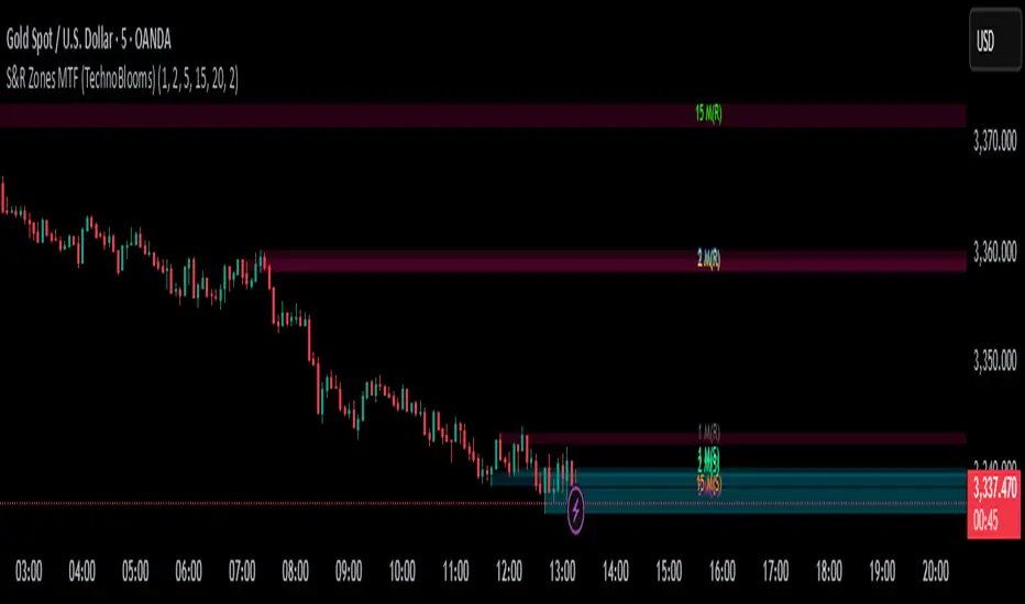
S&R Zones MTF (TechnoBlooms)S&R Zones MTF – Multi-Timeframe Support & Resistance Boxes
🔍 Overview
S&R Zones MTF is a professional-grade yet beginner-friendly indicator that dynamically plots Support & Resistance zones across multiple timeframes, helping traders recognize high-probability reversal areas, entry confirmations, and price reaction points.
This tool visualizes structured zones as colored boxes, allowing both new and experienced traders to analyze multi-timeframe confluence with ease and clarity.
🧠 What Is This Indicator?
S&R Zones MTF automatically detects the most significant support and resistance levels from up to four custom timeframes, using a configurable lookback period. These zones are displayed as colored horizontal boxes directly on the chart, making it easy to:
Spot where price has historically reacted
Identify potential reversal or breakout zones
Confirm entries with institutional-style precision
🛠️ Key Features
✅ Multi-Timeframe Zone Detection (up to 4 timeframes)
📦 Auto Plotted Boxes for Support (Blue) & Resistance (Pink)
🧱 Dynamic Height based on average price range or fixed input
🏷️ Timeframe Labels to instantly identify zone origin
🎛️ Customizable inputs: Lookback length, box color, height style
🔁 Real-time updates as price structure changes
🎓 Educational & Easy to Use
Whether you’re a new trader learning about price structure, or a professional applying institutional concepts, this tool offers an educational layout to understand:
How price respects historic zones
Why multi-timeframe zones offer stronger confluence
How to use zones for entry, exit, or risk placement
📈 How to Use (Multi-Timeframe Strategy)
Select Your Timeframes – Customize up to 4 higher timeframes (e.g., 1m, 5m, 15m, 1h).
Observe Overlapping Zones – When multiple timeframes agree, those zones are more significant.
Entry Confirmation – Wait for price to reach a zone, then look for reversal patterns (engulfing candle, pin bar, etc.)
Combine with Other Tools – Use alongside indicators like RSI, MACD, or Order Blocks for added confidence.
💡 Pro Tips
Zones from higher timeframes (1H, 4H) are often more powerful and reliable.
Confluence matters: If a 15m support zone aligns with a 1H support zone — that's a high-probability reaction area.
Use break-and-retest strategies with zone rejections for sniper entries.
Enable "Auto Height" for a more adaptive, volatility-based zone display.
🌟 Summary
S&R Zones MTF blends precision, clarity, and professional analysis into a visual structure that’s easy to understand. Whether you're learning support & resistance or optimizing your MTF edge — this tool will bring clarity to your charts and confidence to your trades.
Super MTF Clouds (4x3 Pairs)Overview:
This script is based on Ripster's MTF clouds, which transcends the standard moving average cloud indicator by offering a powerful and deeply customizable Multi-Timeframe (MTF) analysis. Instead of being limited to the moving averages of your current charts from the current timeframe, this tool allows you to project and visualize the trend and key support/resistance zones from up to 4 different timeframes simultaneously. User can input up to 6 different EMA values which will form 3 pairs of EMA clouds, for each of the timeframes.
The primary purpose is to provide traders with immediate confluence. By observing how price interacts with moving average clouds from higher timeframes (e.g., Hourly, Daily, Weekly), you can make more informed decisions on your active trading timeframe (e.g., 10 Minute). It's designed as a complete MTF Cloud toolkit, allowing you to display all necessary MTFs in a single script to build a comprehensive view of the market structure without having to flick to different timeframe to look for cloud positions.
Key features:
Four Independent Multi-Timeframe Slots: Each slot can be assigned any timeframe available on TradingView (e.g., D, W, M, 4H).
Three MA Pairs Per Timeframe: For each timeframe, configure up to three separate MA clouds (e.g., a 9/12 EMA pair, a 20/50 EMA pair, and a 100/200 SMA pair).
Complete Customisation: For every single moving average (24 in total), you can independently control:
MA Type: Choose between EMA or SMA.
Length: Any period you require.
Line Color: Full colour selection.
Line Thickness: Adjust the visual weight of each line.
Cloud Control: For every pair (12 in total), you can set the fill colour and transparency.
How To Use This Script:
This tool is best used for confirmation and context. Here are some practical strategies that one can adopt:
Trend Confluence: Before taking a trade based on a signal on your current timeframe, glance at the higher timeframe clouds. If you see a buy signal on the 15-minute chart and the price is currently trading above a thick, bullish Daily cloud, the probability of that trade succeeding is significantly higher. Conversely, shorting into strong HTF support is a low-probability trade.
Dynamic Support & Resistance: The edges of the higher timeframe clouds often act as powerful, dynamic levels of support and resistance. A pullback to the 4-Hour 50 EMA on your 15-minute chart can be a prime area to look for entries in the direction of the larger trend.
Gauging Market Regimes: Use the toggles in the settings to quickly switch between different views. You can have a "risk-on" view with short-term clouds and a "macro" view with weekly and monthly clouds. This helps you adapt your trading style to the current market conditions.
Key Settings:
1. Global Setting
Source For All MAs: This determines the price data point used for every single moving average calculation.
Default: hl2 (an average of the High and Low of each bar). This gives a smooth midpoint price.
Options: You can change this to Close (the most common method), Open, High, Low, or ohlc4 (an average of the open, high, low, and close), among others.
Recommendation: For most standard trend analysis, the default hl2 is the common choice.
2. The Timeframe Group Structure
The rest of the settings are organized into four identical, collapsible groups: "Timeframe 1 Settings" through "Timeframe 4 Settings". Each group acts as a self-contained control panel for one multi-timeframe view.
Within each timeframe group, you have two master controls:
Enable Timeframe: This is the main power switch for the entire group. Uncheck this box to instantly hide all three clouds and lines associated with this timeframe. This is perfect for quickly decluttering your chart or focusing on a different set of analyses.
Timeframe: This dropdown menu is the heart of the MTF feature. Here, you select the higher timeframe you want to analyse (e.g., 1D for Daily, 1W for Weekly, 4H for 4-Hour). All calculations for the three pairs within this group will be based on the timeframe you select here.
3. Pair-Specific Controls
Inside each timeframe group, there are three sections for "Pair 1", "Pair 2", and "Pair 3". These control each individual moving average cloud.
Enable Pair: Just like the master switch for the timeframe, this checkbox turns a single cloud and its two MA lines on or off.
For each pair, the settings are further broken down:
Moving Average Lines (A and B): These two rows control the two moving averages that form the cloud. 'A' is typically used for the shorter-period MA and 'B' for the longer-period one.
Type (A/B): A dropdown menu to select either EMA (Exponential Moving Average) or SMA (Simple Moving Average). EMAs react more quickly to recent price changes, while SMAs are smoother and react more slowly.
Length (A/B): The lookback period for the moving average (e.g., 21, 50, 200).
Color (A/B): Sets the specific colour of the MA line itself on your chart.
Cloud Fill Settings
Fill Color: This controls the colour of the shaded area (the "cloud") between the two moving average lines. For a consistent look, you can set this to the same colour as your shorter MA line.
Transparency: Controls how see-through the cloud is, on a scale of 0 to 100. 0 is a solid, opaque colour, while 100 is completely invisible. The default of 85 provides a light, "cloud-like" appearance that doesn't obscure the price action.
----------------------------------------------------------------------
If anything is not clear please let me know!

BG Ichimoku Tenkan MTFBG Ichimoku Tenkan MTF: Your Multi-Timeframe Trend Compass
Elevate your Ichimoku analysis with the BG Ichimoku Tenkan MTF indicator. This powerful tool provides a comprehensive view of the Tenkan-sen (Conversion Line) across multiple timeframes, helping you identify trends and potential shifts with greater clarity. It's ideal for all markets, including stocks, cryptocurrencies, Forex, and futures.
Key Features:
Main Tenkan-sen Plot: Visualize the Tenkan-sen for your active chart timeframe with adjustable color.
Multi-Timeframe Table: A dynamic table displays the Tenkan-sen's relationship to price (🔼 for above, 🔽 for below) and its current value for up to 7 timeframes.
Continuous MTF Lines: Plot the Tenkan-sen from higher timeframes directly on your current chart, providing clear support/resistance levels and trend confluence.
Fully Customizable Colors: Personalize the color for each individual timeframe in the table and for its corresponding MTF line, ensuring a clean and intuitive visual experience. You can also adjust the main Tenkan-sen color and the MTF line offset.
Gain a deeper understanding of market dynamics by analyzing the Tenkan-sen across different time scales, all in one intuitive indicator.
We created this indicator to help you better navigate the markets. Thank you for using it, and we hope it brings you value. Enjoy it in your daily analysis!
Bab

Heiken Ashi MTF Monitor - Better Formula - EMA, AMA, KAFA, T3Heiken Ashi MTF Monitor - Better Formula - EMA, AMA, KAFA, T3
This indicator is based on the works of Loxx & Smart_Money-Trader, without their initial codes, none of this will be possible.
This Pine Script indicator provides a multi-timeframe (MTF) analysis of Heiken Ashi trends, designed to enhance the traditional Heiken Ashi method with advanced smoothing techniques such as the Exponential Moving Average (EMA), Adaptive Moving Average (AMA), Kaufman’s Adaptive Moving Average (KAMA), and the Triple Exponential Moving Average (T3). The indicator offers a flexible approach to identify bullish, bearish, and neutral trends across six customizable timeframes and various Heiken Ashi calculation methods.
Key Features:
Multi-Timeframe (MTF) Support: The indicator allows you to monitor trends across six timeframes (e.g., 2-hour, 4-hour, daily, weekly, monthly), giving a holistic view of market conditions at different scales.
Heiken Ashi Calculation Methods: Choose between traditional Heiken Ashi or an enhanced "Better HA" method for more refined trend analysis.
Smoothing Options: Apply different smoothing techniques, including EMA, T3, KAMA, or AMA, to the Heiken Ashi values for smoother, more reliable trend signals.
Non-Repaint Option: This feature ensures that the values do not repaint after the bar closes, providing a more reliable historical view.
Customizable Plotting: The indicator offers full customization of which timeframes to display and whether to show labels for each timeframe.
Inputs and Settings:
Timeframe Inputs:
Users can set up to six different timeframes, ranging from intraday (2-hour, 4-hour) to higher timeframes (daily, weekly, monthly).
Timeframes can be enabled or disabled individually for each analysis.
Label Visibility:
Labels indicating the trend direction (bullish, bearish, neutral) can be shown for each timeframe. This helps with clarity when monitoring multiple timeframes simultaneously.
Smoothing Options:
EMA: Exponential Moving Average for standard smoothing.
AMA: Adaptive Moving Average, which adapts its smoothing based on market volatility.
KAMA: Kaufman’s Adaptive Moving Average, which adjusts its sensitivity to price fluctuations.
T3: Triple Exponential Moving Average, providing a smoother and more responsive moving average.
None: No smoothing applied (for raw Heiken Ashi calculations).
Non-Repaint Setting:
Enabling this ensures the trend values do not change after the bar closes, offering a stable historical view of trends.
Core Functions:
Heiken Ashi Calculations:
Traditional HA: The classic Heiken Ashi calculation is used here, where each bar's open, close, high, and low are computed based on the average price of the previous bar.
Better HA: A refined calculation method, where the raw Heiken Ashi close is adjusted by considering the price range. This smoother value is then optionally processed through a moving average function for further smoothing.
Heiken Ashi Trend Calculation:
Based on the selected Heiken Ashi method (Traditional or Better HA), the indicator checks whether the trend is bullish (upward movement), bearish (downward movement), or neutral (sideways movement).
For the "Better HA" method, the trend determination uses the difference between the smoothed Heiken Ashi close and open.
Moving Averages:
The moving averages applied to the Heiken Ashi values are configurable:
EMA: Standard smoothing with an exponential weighting.
T3: A triple exponential smoothing technique that provides a smoother moving average.
KAMA: An adaptive smoothing technique that adjusts to market noise.
AMA: An adaptive moving average that reacts to market volatility, making it more flexible.
None: For raw, unsmoothed Heiken Ashi data.
Trend Detection:
The indicator evaluates the direction of the trend for each timeframe and assigns a color-coded value (bearish, bullish, or neutral).
The trend values are plotted as circles, and their color reflects the detected trend: red for bearish, green for bullish, and white for neutral.
Multi-Timeframe (MTF) Support:
The indicator can be used to analyze up to six different timeframes simultaneously.
The trend for each timeframe is calculated and displayed as circles on the chart.
Users can enable or disable individual timeframes, allowing for a customizable view based on which timeframes they are interested in monitoring.
Plotting:
The indicator plots circles at specific levels based on the detected trend (Level 1 for the 2-hour timeframe, Level 2 for the 4-hour timeframe, etc.). The size and color of these circles represent the trend direction.
These plotted values provide a quick visual reference for trend direction across multiple timeframes.
Usage:
Trend Confirmation: By monitoring trends across multiple timeframes, traders can use this indicator to confirm trends and avoid false signals.
Customizable Timeframe Analysis: Traders can focus on shorter timeframes for intraday trades or look at longer timeframes for a broader market perspective.
Smoothing for Clarity: By applying various moving average techniques, traders can reduce noise and get a clearer view of the trend.
Non-Repainting: The non-repaint option ensures the indicator values remain consistent even after the bar closes, providing more reliable signals for backtesting or live trading.
This Heiken Ashi MTF Monitor indicator with better formulas and smoothing options is designed for traders who want to analyze trends across multiple timeframes while benefiting from advanced moving averages and more refined Heiken Ashi calculations. The customizable settings for smoothing, timeframe selection, and label visibility allow users to tailor the indicator to their specific needs and trading style.

Enhanced Pressure MTF ScreenerEnhanced Pressure Multi-Timeframe (MTF) Screener Indicator
Overview
The Enhanced Pressure MTF Screener is an add-on that extends the capabilities of the Enhanced Buy/Sell Pressure, Volume, and Trend Bar Analysis . It provides a clear and consolidated view of buy/sell pressure across multiple timeframes. This indicator allows traders to determine when different timeframes are synchronized in the same trend direction, which is particularly useful for making high-confidence trading decisions.
Image below: is the Enhanced Buy/Sell Pressure, Volume, and Trend Bar Analysis with the Enhanced Pressure MTF Screener indicator both active together.
Key Features
1.Multi-Timeframe Analysis
The indicator screens various predefined timeframes (from 1 week down to 10 minutes).
It offers a table view that shows buy or sell ratings for each timeframe, making it easy to see which timeframes are aligned.
Traders can choose which timeframes to include based on their trading strategies (e.g., higher timeframes for position trading, lower timeframes for scalping).
2.Pressure and Trend Calculation
Uses Buy and Sell Pressure calculations from the Enhanced Buy/Sell Pressure indicator to determine whether buying or selling is dominant in each timeframe.
By analyzing pressures on multiple timeframes, the indicator gives a comprehensive perspective of the current market sentiment.
The indicator calculates whether a move is strong based on user-defined thresholds, which are displayed in the form of additional signals.
3.Heikin Ashi Option
The Heikin Ashi candle type can be toggled on or off. Using Heikin Ashi helps smooth out market noise and provides a clearer indication of trend direction.
This is particularly helpful for traders who want to filter out market noise and focus on the primary trend.
4.Table Customization
Table Positioning: The table showing timeframe data can be positioned at different locations on the chart—top, middle, or bottom.
Text and Alignment: The alignment and text size of the table can be customized for better visual clarity.
Color Settings: Users can choose specific colors to indicate buying and selling pressure across timeframes, making it easy to interpret.
5.Strong Movement Indicators
The screener provides an additional visual cue (🔥) for timeframes where the movement is deemed strong, based on a user-defined threshold.
This helps highlight timeframes where significant buying or selling pressure is present, which could signal potential trading opportunities.
How the Screener Works
1.Pressure Calculation
For each selected timeframe, the indicator retrieves the Open, High, Low, and Close (OHLC) values.
It calculates buy pressure (the range between high and low when the closing price is higher than the opening) and sell pressure (the range between high and low when the closing price is equal to or lower than the opening).
The screener computes the pressure ratio, which represents the difference between buying and selling pressure, to determine which side is dominant.
2.Trend Rating and Signal Generation
Based on the calculated pressure, the screener determines a trend rating for each timeframe: "Buy," "Sell," or "Neutral." (▲ ,▼ or •)
Additionally, it generates a signal (▲ or ▼) to indicate the current trend direction and whether the move is strong (based on the user-defined threshold).
If the movement is strong, a fire icon (🔥) is added to indicate that there is significant pressure on that timeframe, signaling a higher confidence in the trend.
3.Customizable Strong Move Thresholds
Strong Move Threshold: The screener uses this value to decide whether a trend is significantly strong. A higher value makes it more selective in determining strong moves.
Strong Movement Threshold: Helps determine when an additional strong signal should be displayed, offering further insight into the strength of market movement.
Inputs and Customization
The Enhanced Pressure MTF Screener is highly customizable to fit the needs of individual traders:
General Settings:
Use Heikin Ashi: Toggle this setting to use Heikin Ashi for a smoother trend representation.
Strong Move Threshold: Defines how strong a move should be to be considered significant.
Strong Movement Threshold: Specifies the level of pressure required to highlight a move with the fire icon.
Table Settings:
Position: Choose the vertical position of the screener table (top, middle, or bottom of the chart).
Alignment: Align the table (left, center, or right) to best suit your chart layout.
Text Size: Adjust the text size in the table for better readability.
Table Color Settings:
Users can set different colors to represent buying and selling signals for better visual clarity, particularly when scanning multiple timeframes.
Timeframe Settings:
The screener provides options to include up to ten different timeframes. Traders can select and customize each timeframe to match their strategy.
Examples of available timeframes include 1 Week, 1 Day, 12 Hours, down to 10 Minutes, allowing for both broad and detailed analysis.
Practical Use Case
Identifying Trend Alignment Across Timeframes:
Imagine you are about to take a long trade but want to make sure that the trend direction is aligned across multiple timeframes.
The screener displays "Buy" ratings across the 4H, 1H, 30M, and 10M timeframes, while higher timeframes (like 1W and 1D) also show "Buy" with strong signals (🔥). This indicates that buying pressure is strong across the board, adding confidence to your trade.
Spotting Reversal Opportunities:
If a downtrend is evident across most timeframes but suddenly a higher timeframe, such as 12H, changes to "Buy" while showing a strong move (🔥), this could indicate a potential reversal.
The screener allows you to spot these discrepancies and consider taking early action.
Benefits for Traders
1.Synchronization Across Timeframes:
One of the main strengths of this screener is its ability to show synchronized buy/sell signals across different timeframes. This makes it easy to confirm the strength and consistency of a trend.
For example, if you see that all the selected timeframes display "Buy," this implies that both short-term and long-term traders are favoring the upside, giving additional confidence to go long.
2.Quick and Visual Trend Overview:
The table offers an at-a-glance summary, reducing the time required to manually inspect each timeframe.
This makes it particularly useful for traders who want to make quick decisions, such as day traders or scalpers.
3.Strong Move Indicator:
The use of fire icons (🔥) provides an easy way to identify significant movements. This is particularly helpful for traders looking for breakouts or strong market conditions that could lead to high probability trades.
To put it short or to summarize
The Enhanced Pressure MTF Screener is a powerful add-on for traders looking to understand how buy and sell pressure aligns across multiple timeframes. It offers:
A clear summary of buying or selling pressure across different timeframes.
Heikin Ashi smoothing, providing an option to reduce market noise.
Strong movement signals to highlight significant trading opportunities.
Customizable settings to fit any trading strategy or style.
The screener and the main indicator are best used together, as the screener provides the multi-timeframe overview, while the main indicator provides an in-depth look at each individual bar and trend.
I hope my indicator helps with your trading, if you guys have any ideas or questions there is the comment section :D
Regression Channel Alternative MTF V2█ OVERVIEW
This indicator is a predecessor to Regression Channel Alternative MTF , which is coded based on latest update of type, object and method.
█ IMPORTANT NOTES
This indicator is NOT true Multi Timeframe (MTF) but considered as Alternative MTF which calculate 100 bars for Primary MTF, can be refer from provided line helper.
The timeframe scenarios are defined based on Position, Swing and Intraday Trader.
Suppported Timeframe : W, D, 60, 15, 5 and 1.
Channel drawn based on regression calculation.
Angle channel is NOT supported.
█ INSPIRATIONS
These timeframe scenarios are defined based on Harmonic Trading : Volume Three written by Scott M Carney.
By applying channel on each timeframe, MW or ABCD patterns can be easily identified manually.
This can also be applied on other chart patterns.
█ CREDITS
Scott M Carney, Harmonic Trading : Volume Three (Reaction vs. Reversal)
█ TIMEFRAME EXPLAINED
Higher / Distal : The (next) longer or larger comparative timeframe after primary pattern has been identified.
Primary / Clear : Timeframe that possess the clearest pattern structure.
Lower / Proximate : The (next) shorter timeframe after primary pattern has been identified.
Lowest : Check primary timeframe as main reference.
█ FEATURES
Color is determined by trend or timeframe.
Some color is depends on chart contrast color.
Color is determined by trend or timeframe.
█ EXAMPLE OF USAGE / EXPLAINATION

Supertrend MTF LAG ISSUEThis script based on
we all use Super trend but it main issue is the lag as it buy too late or sell too late
using Deavaet study of Heat map MTF we can do a little trick
if you look on his study you can see that major signal for example will happen in the time frame before it happen at larger time frame
so in this example if signal at MTF 30 min and signal at MTF 60 min happen at the same time at 2 hours or 4 hours candles then this signal are more likely to be true then random signal at each time frame specific.
since we use shorter time frame on larger time frame we can remove the lag issue that make supertrend not so effective
In this example I set the signal to be MTF 30 +60 om 2 hour TF , can be good also for 4 hour candles..
So you get the signal to close inside the larger candle
now if you want to make on even shorter TF then change the code to 15 and 30 MTF on candles on 1 hour
or 1 and 5 min on 30 min or 15 min

SMA Multi-Sync Granville & MTF CounterSMA Multi-Sync Granville & MTF Counter
Overview
This indicator is an environmental awareness tool that identifies when and to what level moving averages (SMAs) across multiple time frames align in the same direction, visualizing the timing and freshness of the trend.
Its greatest feature is that it does not simply determine synchronization; rather, it precisely distinguishes the time frame upon which synchronization is completed using the number of stars (★).
Key Features
1. Calculation of "Stars" Based on Confirmed Time Frame Trigger
The number of stars displayed upon synchronization completion indicates the signal's "temporal weight."
★ (1): Synchronization is completed upon confirmation of the displayed time frame.
★★ (2): Synchronization is completed upon confirmation of the next higher time frame (e.g., 15 minutes).
★★★ (3): Synchronization is completed upon confirmation of the next higher time frame (e.g., 1 hour). The more higher the time frame is confirmed, the more powerful the trend reversal or regression it acts as.
2. MTF Sync Panel
The table on the right side of the screen displays the price position (background) and MA direction (text) for each level (displayed to daily) in real time.
By watching the background and text colors match, you can understand the accumulation of energy before a star appears.
3. Cross Counter
The number of bars elapsed from the synchronization starting point (MA crossover, etc.) to the current bar is displayed numerically in the lower right corner.
The closer to "0" the number, the more likely it is the beginning of a trend, while the higher the number, the more likely it is the end of the trend (expiration date).
Usability of Input Settings
Min Stars (1-5) This sets the signal cutoff. Setting it to "2" eliminates noise caused by the displayed bar being confirmed and narrows down to only the moment when the higher bar is confirmed (★2 or higher).
Cancel Alert if MA Slope Same If the MA of the displayed time frame is already leaning in the same direction (leading), the confirmation (★1) on that time frame will be considered "not an initial move" and excluded.
5m TF: Use 30m SMA When using 5-minute time frames, this physically changes the ★2 trigger from the confirmation on the 15-minute chart to the confirmation on the 30-minute chart. This is effective when targeting milestones on larger time frames.
*If you have any questions about how to use this, please ask in the comments.
SMA Multi-Sync Granville & MTF Counter
概要
本インジケーターは、複数の時間足の移動平均線(SMA)が「いつ、どの階層まで同じ方向に揃ったか」を特定し、そのトレンドの**「確定タイミング」と「鮮度」**を可視化する環境認識ツールです。
最大の特徴は、単なる同調判定ではなく、**「どの時間足の確定(Close)によって同期が完成したか」**を星(★)の数で厳密に区別する点にあります。
主な機能
1. 確定足トリガーによる「星」の算出
同期が完成した瞬間に表示される星の数は、そのシグナルの「時間的な重み」を示します。
★(1つ):表示足の確定により同期が完成。
★★(2つ):1つ上の上位足(15分等)の確定により同期が完成。
★★★(3つ):2つ上の上位足(1時間等)の確定により同期が完成。 上位の足が確定する節目ほど、より強力なトレンドの転換・回帰として機能します。
2. MTF同期パネル
画面右側のテーブルで、各階層(表示足〜日足)の「価格の位置(背景)」と「MAの向き(文字)」をリアルタイムに表示します。
背景色と文字色が一致していく過程を見ることで、星が出る前の**「エネルギーの蓄積」**を把握できます。
3. クロスカウンター
同期の起点(MAクロス等)から、現在の足まで何本経過したかを右下に数値で表示します。
「0」に近いほど初動であり、数値が大きくなるほどトレンドの終盤(賞味期限切れ)である可能性を論理的に示唆します。
インプット設定の使い勝手
Min Stars (1-5) シグナルの足切り設定です。「2」に設定すれば、表示足の確定によるノイズを排除し、**上位足の確定が伴った瞬間(★2以上)**のみに絞り込めます。
Cancel Alert if MA Slope Same 表示足のMAがすでに同方向へ傾いている(先行している)場合、その足での確定(★1)を「初動ではない」とみなして除外します。
5m TF: Use 30m SMA 5分足運用時、★2のトリガーを「15分足」から「30分足」の確定に物理的に変更します。より大きな時間軸の節目を狙う場合に有効です。
※使い方が不明なところはコメントで聞いてください。

FVG Clean MTF + IFVG (Deep Memory)FVG Deep Memory
This is a highly optimized, Multi-Timeframe (MTF) Fair Value Gap indicator designed to solve the common "data limit" issues found in standard FVG scripts.
Most MTF indicators share a single "memory limit" for all zones. This causes a problem: specific high-frequency zones (like 1-minute gaps) flood the memory and accidentally delete your important Higher Timeframe levels (like Daily or 4H gaps).
FVG Deep Memory solves this by assigning Independent Memory Buckets to each timeframe. Your 1-minute noise will never delete your Daily structure again.
🚀 Key Features
1. "Deep Memory" Architecture
5 Independent Timeframes: Monitor the Chart, 15m, 1h, 4h, and Daily intervals simultaneously.
No Cannibalization: Each timeframe has its own dedicated allocation (e.g., 100 zones each). A flood of new zones on the 15m chart will not erase an old Daily zone. They coexist perfectly.
2. Dynamic "Gray Zone" State
SR Channel Logic: When price enters an active FVG, the zone dynamically changes color to Gray (customizable).
Why it helps: This provides an instant visual cue that price is "in traffic" or a decision point, separating it from untouched "fresh" zones.
3. Advanced Logic
Inversion Gaps (IFVG): When a Fair Value Gap is broken, it can automatically flip into an Inversion Gap (Support becomes Resistance) with a dashed style.
Mitigation Handling: Choose between extending zones until broken, or hiding them immediately upon mitigation to keep the chart clean.
Midlines: Optional median lines for precision entries.
4. Soft UI & Customization
Designed with "Soft" transparency to keep your chart readable.
Fully customizable colors for Bullish, Bearish, and "In-Zone" states.
Toggle any timeframe on/off individually without affecting the logic of others.
🛠 Settings Guide
Lookback Limit: How far back (in days) to scan for gaps.
Max Boxes PER Timeframe: The distinct memory limit for each timeframe bucket.
Show Inversion Gaps: Enables the "Support to Resistance" flip logic.
Hide Nested Gaps: Prevents clutter by merging overlapping zones.
Price In Zone Color: The color the zone turns when price is currently trading inside it.
⚠️ Credits
Original detection logic by LuxAlgo.
Heavily modified by Gemini_AI_Optimization to include Independent Memory Architecture, Gray Zone Logic, and Independent MTF Layering.

FVG - MTF Confirmed Tracker [JP/EN]Indicator Description: FVG MTF Concluded Bar Tracker
This indicator is a highly functional tool that identifies FVG for the currently displayed bar or a higher-level bar (MTF) and determines its "resolution" when the candlestick is resolved.
Its most notable feature is that it only displays history (gray) on the chart and sends an alert when a "significant level that has been continuously observed for a certain period of time" is resolved.
1. Timeframe Settings
Base Timeframe: Select the timeframe on which to detect FVG. Select "Same as chart" to use the current bar, or select another bar (1-hour, 4-hour, etc.) to project the FVG of the higher-level bar onto the current chart.
2. Active FVG Settings
Sets the currently active support/resistance area that has not yet been filled by price.
Show Bull/Bear: Individually toggles whether to display bull (buy) and bear (sell) FVG.
Color: Specifies the color of the box for the unresolved state.
Extend Right (Active): When enabled, the box will continue to extend indefinitely toward the right edge of the chart until the FVG is resolved.
Max Active FVG: This sets the maximum number of unresolved boxes to display on the chart. When a new FVG is detected, the oldest unresolved box will be automatically deleted if it exceeds this limit, saving resources.
3. Filled FVG Settings (Resolved, Grayed Out, Determination Logic)
These are very important settings for displaying history when the price fills an FVG.
Show Filled: Select whether to leave resolved FVGs grayed out (default color) as "history."
Color: Specifies the color of boxes that have been resolved (Filled).
Extend Right (Filled): When this is turned off, the box extension will stop at the candlestick where the resolution is confirmed, making the resolution point clear.
Max Filled FVG: This sets the maximum number of grayed out boxes to display as history. When the limit is reached, the oldest history will be deleted.
Min Bars to Keep & Alert (Important): This is the threshold for the number of bars elapsed between the occurrence of an FVG and its resolution.
If the threshold is not met: The event is considered a temporary reaction, and no alert will be sounded. The event will also be deleted without being recorded in the history (gray).
If the threshold is met or exceeded: The event is considered a significant market event, and the box will turn gray and an alert will be sent.
4. Alert Settings (Alert Notification Logic)
Alerts are executed in perfect sync with the "resolution of significant levels (graying out)."
Alert when Bull / Bear turns Gray: A notification will be sent the moment a bullish or bearish FVG is resolved after meeting the threshold and turning gray.
Execution Timing: A notification will only be sent when the candlestick is confirmed. It will not be triggered if the candlestick is only momentarily touched by the wick midway through the candlestick. This allows you to know for sure that the event was resolved at the time of closing.
インジケーター解説:FVG MTF 確定足トラッカー
このインジケーターは、現在表示している足、または上位足(MTF)のFVGを特定し、その「解消」をローソク足の確定時に判定する高機能ツールです。
最大の特徴は、**「一定期間意識され続けた重要な水準」**が解消された時のみ、チャートに履歴(グレー)を残し、アラートを通知する設計にあります。
1. Timeframe Settings(時間足設定)
Base Timeframe / 基準にする時間足: FVGを検知する時間足を選択します。「Same as chart(チャートと同じ)」を選べば現在の足、それ以外(1時間足、4時間足など)を選べば上位足のFVGを現在のチャートに投影します。
2. Active FVG Settings(未解消時の設定ロジック)
まだ価格に埋められていない、現在有効なサポート・レジスタンス領域の設定です。
Show Bull / Bear: ブル(買い)およびベア(売り)のFVGを表示するかどうかを個別に切り替えます。
Color: 未解消状態のボックスの色を指定します。
Extend Right (Active): 有効にすると、FVGが解消されるまでボックスをチャートの右端に向かって無制限に延長し続けます。
Max Active FVG: チャート上に表示する未解消ボックスの最大数です。新しいFVGが検知された際、この上限を超えていると最も古い未解消ボックスが自動的に削除され、リソースを節約します。
3. Filled FVG Settings(解消済み・グレー化・判定本数ロジック)
価格がFVGを埋めた際の、履歴表示に関する非常に重要な設定項目です。
Show Filled: 解消されたFVGを「履歴」としてグレー表示(デフォルト色)で残すかどうかを選択します。
Color: 解消済み(Filled)状態になったボックスの色を指定します。
Extend Right (Filled): これをOFFにすると、解消が確定したローソク足の位置でボックスの延長が止まり、解消地点が明確になります。
Max Filled FVG: 履歴として残すグレーボックスの最大数です。上限に達すると、古い履歴から順に削除されます。
Min Bars to Keep & Alert (重要): FVGが発生してから解消されるまでの「経過本数」の閾値です。
判定本数に満たない場合: 一時的な反応とみなし、アラートを鳴らさず、履歴(グレー)にも残さず削除します。
判定本数以上の場合: 市場で十分に意識された「重要な水準」とみなし、ボックスをグレーに変更し、アラートを通知します。
4. Alert Settings(アラート通知ロジック)
アラートは「重要水準の解消(グレー化)」と完全に同期して実行されます。
Alert when Bull / Bear turns Grey: ブル/ベアそれぞれのFVGが、上記の「判定本数」を満たした状態で解消され、グレーに変化した瞬間に通知を送ります。
実行タイミング: ローソク足の確定時にのみ通知されます。足の途中のヒゲで一時的に触れただけでは鳴りません。これにより、クローズ時点で確実に解消されたことのみを把握できます。

DDDDD : EMA Pack (Matched Colors + MTF)📌 DDDDD : EMA Pack (Matched Colors + MTF)
🔹 Concept
DDDDD : EMA Pack is a clean and minimal Exponential Moving Average (EMA) overlay designed for trend structure analysis and multi-timeframe context.
This indicator focuses on visual clarity, consistent color mapping, and optional MTF EMA projection, allowing traders to read market structure without clutter or signal noise.
It is not an entry or signal generator, but a trend and regime visualization tool.
🔹 Logic
The script plots a fixed set of EMAs commonly used to define short-term momentum, intermediate trend, and long-term bias:
EMA 5
EMA 10
EMA 25
EMA 50
EMA 75
EMA 200
Each EMA is calculated using the standard exponential moving average formula.
If a higher timeframe is selected, the EMA is calculated on that timeframe and projected onto the current chart using request.security().
🔹 Methodology
Users may select:
Source price (default: close)
EMA timeframe
Empty = current chart timeframe
Any higher timeframe = true MTF EMA projection
All EMA colors are manually matched and fixed to maintain visual consistency across markets and timeframes.
Line thickness is kept uniform to avoid visual hierarchy bias.
This design ensures the indicator remains purely structural, without repainting logic, smoothing tricks, or adaptive parameters.
🔹 How to Use
Use EMA alignment and spacing to assess:
Trend direction
Trend strength
Compression vs expansion
Higher-timeframe EMA projection can be used as:
Dynamic support/resistance
Trend filter
Regime context for lower-timeframe execution
This indicator works best when combined with:
Price action
Market structure
Separate entry/exit logic of your own system
⚠️ This indicator does not provide buy/sell signals and should not be used alone for trade execution.
🔹 Notes
No repainting beyond standard MTF behavior
No performance or profitability claims
Designed for discretionary and systematic traders
Suitable for stocks, crypto, forex, and indices

FVG MTF Consensus OscillatorFVG MTF Consensus Oscillator
A multi-timeframe, multi-component oscillator that combines momentum, deviation, and slope analysis across multiple timeframes using Zeiierman's Chebyshev-filtered trend calculation. This indicator identifies potential turning points with zone-based signal classification and timeframe consensus filtering.
Backed by ML/Deep Learning evaluation on ES Futures data from 2015-2024.
🎯 Concept
Traditional oscillators suffer from two major weaknesses:
Single measurement - relying on one metric makes them susceptible to noise
Single timeframe - missing the bigger picture leads to fighting the trend
The FVG MTF Consensus Oscillator addresses both issues by combining three independent measurements across three timeframes into a weighted consensus signal.
The Three Components
Momentum - How fast is the trend moving?
Deviation - How far has price stretched from the trend?
Slope - What is the short-term directional bias?
The Three Timeframes
TF1 (Chart) - Your current chart timeframe (lowest weight)
TF2 (Medium) - Typically 1H or 4H (medium weight)
TF3 (High) - Typically 4H or Daily (highest weight)
By requiring agreement across multiple components AND multiple timeframes, the oscillator filters out noise while capturing meaningful, high-probability market movements.
🔧 How It Works
The Core: Chebyshev Type 1 Filter
At its heart, this indicator uses a Chebyshev Type 1 low-pass filter (inspired by Zeiierman's FVG Trend) to extract a clean trend line from price action. Unlike simple moving averages, the Chebyshev filter offers:
Sharper cutoff between trend and noise
Minimal lag for a given smoothness level
Controlled overshoot via the ripple parameter
Three Oscillator Components
1. Momentum Component
Momentum = Current Trend Value - Previous Trend Value
Measures the velocity of the trend. High positive values indicate strong upward acceleration, while high negative values show downward acceleration.
2. Deviation Component
Deviation = Close Price - Trend Value
Measures how far price has stretched away from the trend line. Useful for identifying overextended conditions and mean reversion opportunities.
3. Slope Component
Slope = Change in Trend over 3 bars
Captures the short-term directional bias of the trend itself, helping confirm trend changes.
Normalization & Component Consensus
Each component is individually normalized to a -100 to +100 scale using adaptive scaling. The oscillator output is a weighted average of all three components, allowing you to emphasize different aspects based on your trading style.
Multi-Timeframe Weighting
The final oscillator value combines all three timeframes using configurable weights:
Combined = (TF1 × Weight1 + TF2 × Weight2 + TF3 × Weight3) / Total Weight
Default weights (1, 2, 3) ensure higher timeframes have more influence, keeping you aligned with the dominant trend while timing entries on lower timeframes.
📊 Zone System
The oscillator uses a fuzzy zone system to classify market conditions:
ZoneRangeInterpretationSignal ColorNeutral-5 to +5No clear bias, avoid tradingGrayContinuation±5 to ±25Trend pullback, continuation setupsAquaDeep Swing±25 to ±50Extended move, stronger setupsGreenReversalBeyond ±50Extreme extension, reversal potentialOrange
When "Show Zone Background" is enabled, the background shading darkens as the oscillator moves into more extreme zones, providing instant visual feedback.
📈 Signal Interpretation
Turn Signals
The indicator plots triangular markers when the oscillator changes direction:
▲ Triangle Up (bottom): Oscillator turning up from a low
▼ Triangle Down (top): Oscillator turning down from a high
Signal Quality by Zone
Not all signals are equal. The signal color indicates which zone the turn occurred in:
ColorZoneProbabilityBest UseGrayNeutralLowAvoid or use very tight stopsAquaContinuationModerateTrend continuation entriesGreenDeep SwingHigherSwing trade entriesOrangeReversalHighestCounter-trend with caution
Timeframe Consensus Filter
Signals only fire when the required number of timeframes agree on direction. With default settings (TF Consensus = 2), at least 2 of 3 timeframes must be moving in the same direction for a signal to trigger.
This prevents:
Taking longs when higher timeframes are bearish
Taking shorts when higher timeframes are bullish
Whipsaws during timeframe disagreement
Trend Coloring
The combined oscillator line changes color based on trend direction:
Light purple (RGB 240, 174, 252): Majority of timeframes trending up
Dark purple (RGB 84, 19, 95): Majority of timeframes trending down
Info Table
When MTF is enabled, a table in the top-right corner displays:
Current oscillator values for each timeframe (TF1, TF2, TF3)
Combined value (CMB)
Color coding: Green = rising, Red = falling
⚙️ Settings Guide
Timeframe Settings
SettingDefaultDescriptionEnable Multi-TimeframeOnMaster switch for MTF functionalityTF1 (Chart)"" (current)First timeframe, typically your chart TFTF2 (Medium)60Second timeframe, typically 1HTF3 (High)240Third timeframe, typically 4HTF1/TF2/TF3 Weight1 / 2 / 3Influence of each TF on combined signal
Timeframe Tips:
Keep TF1 ≤ TF2 ≤ TF3 (ascending order)
For day trading: 5m / 15m / 1H
For swing trading: 1H / 4H / Daily
For position trading: 4H / Daily / Weekly
Display Settings
SettingDefaultDescriptionShow All TimeframesOffDisplay individual TF oscillator linesShow Combined LineOnDisplay the weighted combined oscillatorShow Zone BackgroundOffShade background based on current zone
Trend Filter Settings
SettingDefaultDescriptionTrend Ripple4.0Filter responsiveness (1-10). Higher = faster but more overshootTrend Cutoff0.1Cutoff frequency (0.01-0.5). Lower = smoother trendNormalization Length50Lookback for scaling. Longer = more stable
Component Weights
SettingDefaultDescriptionMomentum Weight1.0Emphasis on trend speedDeviation Weight1.0Emphasis on price stretch from trendSlope Weight1.0Emphasis on short-term trend direction
Component Tips:
For trend-following: Increase Momentum and Slope weights
For mean reversion: Increase Deviation weight
Set any weight to 0 to disable that component
Zone Thresholds
SettingDefaultDescriptionNeutral Zone5Inner boundary (±5 = neutral)Continuation Zone25Middle boundary for continuation setupsDeep Swing Zone50Outer boundary for reversal zone
Adjust based on instrument volatility. More volatile instruments may need wider zones.
Signal Filters
SettingDefaultDescriptionSignal Cooldown3Minimum bars between signalsMin Turn Size2.0Minimum oscillator change for valid turnTF Consensus Required2Minimum TFs agreeing for signal (1-3)
💡 Usage Examples
Example 1: Trend Continuation (Dip Buying)
Setup: Uptrend confirmed by higher timeframes
Check the info table - TF2 and TF3 should show green (rising)
Wait for TF1 to pull back, oscillator enters Continuation zone
Enter on Aqua ▲ signal (turn up with TF consensus)
Stop below recent swing low
Target: Previous high or next resistance
Why it works: You're buying a dip in an established uptrend with multi-timeframe confirmation.
Example 2: Deep Swing Entry
Setup: Extended move showing exhaustion
Oscillator reaches Deep Swing zone (±25 to ±50)
At least 2 TFs start showing the same direction
Enter on Green signal indicating momentum exhaustion
Use tighter stop as the move is already extended
Target: Return to Continuation zone or trend line
Why it works: Extended moves tend to mean-revert. The zone system identifies these opportunities.
Example 3: Reversal Setup (Advanced)
Setup: Extreme extension with diverging timeframes
Oscillator reaches Reversal zone (beyond ±50)
Watch for TF1 to turn while TF3 is still extended
Enter on Orange signal - this is counter-trend!
Use smaller position size and wider stops
Target: Return to Deep Swing or Continuation zone
Why it works: Extreme extensions eventually correct. The orange signal marks high-probability reversal points.
Example 4: Avoiding Bad Trades
What to avoid:
Gray signals in Neutral zone - No edge, random noise
Signals against TF3 direction - Fighting the dominant trend
Signals without TF consensus - Timeframe disagreement = choppy market
Multiple signals in quick succession - Let cooldown filter work
🔬 Multi-Timeframe Analysis Tips
Reading the Info Table
The info table shows real-time oscillator values:
| TF1 | TF2 | TF3 | CMB |
| 23.5 | 45.2 | 67.8 | 52.1 |
All green: Strong uptrend across all timeframes
All red: Strong downtrend across all timeframes
Mixed colors: Potential transition or consolidation
Timeframe Alignment States
TF1TF2TF3Interpretation↑↑↑Strong bull - look for long entries↓↓↓Strong bear - look for short entries↑↑↓Pullback in downtrend - caution on longs↓↓↑Pullback in uptrend - caution on shorts↑↓↑Choppy - reduce position size↓↑↓Choppy - reduce position size
The Power of Consensus
With TF Consensus = 2, signals only fire when 2+ timeframes agree. This single filter eliminates most whipsaws and keeps you aligned with the dominant trend.
For more conservative trading, set TF Consensus = 3 (all timeframes must agree).
⚠️ Important Notes
This indicator does not predict the future. It measures current market conditions and momentum across multiple timeframes.
Always use proper risk management. No indicator is 100% accurate.
Combine with price action. The oscillator works best when confirmed by support/resistance, candlestick patterns, or other confluence factors.
Respect the higher timeframe. When TF3 disagrees, trade smaller or sit out.
Zone signals are probabilistic. Orange (reversal) signals have higher probability but aren't guaranteed reversals.
Adjust settings per instrument. Default settings are optimized for ES Futures but may need tuning for other markets.
🧪 ML/Deep Learning Background
The default parameters and zone thresholds were evaluated using machine learning techniques on ES Futures data spanning 2015-2024. This included:
Optimization of component weights
Zone threshold calibration
Timeframe weight balancing
Signal filter tuning
While past performance doesn't guarantee future results, the parameters represent a data-driven starting point rather than arbitrary defaults.
🙏 Credits
This indicator is inspired by Zeiierman's Multitimeframe Fair Value Gap (FVG) indicator, specifically utilizing concepts from his Chebyshev Type 1 filter implementation for trend calculation.
Original indicator: Multitimeframe Fair Value Gap – FVG (Zeiierman)
📝 Changelog
v1.0
Initial release
Three-component consensus oscillator (Momentum, Deviation, Slope)
Multi-timeframe support with weighted combination
Fuzzy zone classification system
Configurable component and timeframe weights
TF consensus filter for signal quality
Signal cooldown and minimum turn size filters
Real-time info table with TF values
Optional zone background shading

[CT] ATR Ratio MTFThis indicator is an enhanced, multi-timeframe version of the original “ATR ratio” by RafaelZioni. Huge thanks to RafaelZioni for the core concept and base logic. The script still combines an ATR-based ratio (Z-score style reading of where price sits within its recent ATR envelope) with an ATR Supertrend, but expands it into a more flexible trade-decision and visual context tool.
The ATR ratio is normalized so you can quickly see when price is pressing into extended bullish or bearish territory, while the Supertrend defines directional bias and a dynamic support-resistance trail. You can choose any higher timeframe in the settings, allowing you to run the ATR ratio and Supertrend from a larger anchor timeframe while trading on a lower chart.
Upgrades include a full Pine Script v6 rewrite, multi-timeframe support for both the ATR ratio and Supertrend, user-controlled colors for the Supertrend in bull and bear modes, and optional bar coloring so price bars automatically reflect Supertrend direction. Entry, pyramiding and take-profit logic from the original script are preserved, giving you a familiar framework with more control over timeframe, visuals and trend bias.
This indicator is designed to give you a clean directional framework that blends volatility, trend, and timing into one view. The ATR ratio side of the script shows you where price sits inside a recent ATR-based envelope. When the ATR ratio pushes up and sustains above the bullish threshold, it signals that price is trading in an extended, momentum-driven zone relative to recent volatility. When it drops and holds below the bearish threshold, it shows the opposite: sellers have pushed price down into an extended bearish zone. The optional background coloring simply makes these bullish and bearish environments easier to see at a glance.
On top of that, the Supertrend and bar colors tell you what side of the market to favor. The Supertrend is calculated from ATR on whatever timeframe you choose in the settings. If you set the MTF input to a higher timeframe, the Supertrend and ATR ratio become your higher time frame bias while you trade on a lower chart. When price is above the MTF Supertrend, the line uses your bullish color and, if bar coloring is enabled, candles adopt your bullish bar color. That is your “long only” environment: you generally look for buys when price is above the Supertrend and the ATR ratio is either turning up from neutral or already in a bullish zone. When price is below the MTF Supertrend, the line uses your bearish color and candles can shift to your bearish bar color; that is where you focus on shorts, especially when the ATR ratio is rolling over or holding in the bearish zone.
The built-in long and short conditions are meant as signal prompts, not rigid rules. Long signals fire when the ATR ratio crosses up through a positive level while the Supertrend is bullish. Short signals fire when the ATR ratio crosses down through a negative level while the Supertrend is bearish. The script tracks how many longs or shorts have been taken in sequence (pyramiding) and will only allow a new signal up to the limit you set, so you can control how aggressively you stack positions in a trend. The take-profit logic then watches the percentage move from your last entry and flags “TP” when that move has reached your take-profit percent, helping you standardize exits instead of eyeballing them bar by bar.
In practice you typically start by choosing your anchor timeframe for the MTF setting, for example a 1-hour or 4-hour Supertrend and ATR ratio while watching a 5-minute or 15-minute chart. You then use the Supertrend direction and bar colors as your bias filter, only taking signals in the direction of the trend, and you use the ATR ratio behavior to judge whether you are entering into strength, fading an extreme, or trading inside a neutral consolidation. Over time this gives you a consistent way to answer three questions on every chart: which side am I allowed to trade, how extended is price within its recent volatility, and where are my structured entries and exits based on that framework.
