MFX Ultimate Scalper [Mohs Mayfair]MFX Ultimate Scalper is an all-in-one indicator that incorporates 5+ unique components designed for interoperability & confluence with one another to provide a powerful trend following & reversal detection experience.
Users can create various ways to utilize the indicator's features together such as looking for periods of price exhaustion in the market alongside strong reversal signals appearing or getting real-time divergence signals alongside a shift in volume with the volume overlay setting in the market to predict upcoming trends.
The indicator's confirmation feature integrates customizable moving averages and the Volume Weighted Average Price (VWAP), providing additional layers of insight. Traders can fine-tune moving averages to track trend reversals and retracements with precision, while the VWAP offers valuable insights into price and volume dynamics, aiding in the assessment of market sentiment and trends.
This indicator is described as an ”Ultimate Scalper” as it's made up of many different components that can create a systematic approach to analyzing markets alone, however, the indicator also can serve as a great secondary piece to a user's primary analysis.
⨭ FEATURES
Below we describe each component of MFX Ultimate Scalper in order of each's significance for the most confluent analysis possible.
➟ Heat Zones - indicating the relative intensity of price movement, with widening zones suggesting increased volatility and potential trading opportunities.
➟ Exhaustion Signals - Small triangles on the upper or lower heat band zones represent high frequency points that indicate possible reversals or a warning signal to upcoming larger reversal signals. Discerning instances of heightened buying or selling pressure, delineating zones of market saturation and depletion using the historical strength or weakness of a stock or market based on the closing prices of a recent trading period.
➟ Reversal Signals - Kalman filter and Hull trend indicators can reveal trend reversals by dynamically adapting to market conditions and providing timely signals based on smoothed price movements.
➟ Volume Overlay - Upon calculating the relative close of candles, this option allows a coloured overlay upon candles to help confirm volume changes in the market. When price of a closed candle is greater than then open price, the bar will print with a green overlay,
Generally, we recommend using these features in order from first to last, however it is always most productive to ensure you find further confluence alongside any signal that is generated using general market structure and analysis (such as drawing independent supply and demand zones for eg).
⨭ USAGE GUIDE
In the images below, we can see 3 points of interest to a user analyzing MFX Ultimate Scalper based on various different behaviors.
In the circled areas of interest price moves into a one of the heat zones and begins to print a small green or red triangle either above or below the candlestick structure - green = looking for buys and a possible bullish reversal & red = looking for sells and a possible bearish reversal.
As price begins to print these pre reversal points of exhaustion within these heat zones we can begin looking at the market.
This can be used independently or when wanting to perhaps increase the amount of confirmations we can look to apply the reversal confirmation setting, as per below:
What makes this signal particularly more of interest opposed to other reversal signals without the confirmation toggle applied that may not play out right away is the Kalman filter and Hull trend indicator begins to show a clear trend reversal. We can see that it may print the BUY or SELL label a few candles after the initial Small triangles in the upper or lower heat band zones however can be used as a more conservative point of trade entry.
This is a great example above showing how the momentum indicator that measures the magnitude of recent price changes to analyze overbought or oversold conditions (red and green triangles in the heat zone bands) can sometimes print multiple entries. We suggest that if you are looking to increase the accuracy of the signals we found moving to a higher time frame after more than 3 of these indicators have printed, helps.
It is a great indication that price may be looking to reverse and the pressure occurring and that the market could easily reverse in these conditions.
The candles that follow with the confirmation toggle setting means that you could move into a position a little later into the new trend reversal or retracement but also ensures that there is an extra level of confirmation that one is beginning or has begun.
The volume overlay setting is a fantastic tool to use when wanting to confirm your entries for trade and print a clear example in volume shift in the market - the greater the green candle, the greater the buying momentum. The greater the red candle, the greater the selling momentum,
This analysis combined gave us a further indication of a larger reversal which played out with no lag at all as all reversal signals are predictive separate from the Volume Overlay itself, which can be used as a further trend following approach alongside signals & custom hull trend alongside specific moving average confirmations.
In the image above we can see 3 possible setups and 3 different ways each using individual options.
Working left to right, the first setup adheres to:
➟PRICE IN THE BUY ZONE
➟GREEN BUY TRIANGLE REVERSAL
➟GREEN CANDLE VOLUME CHANGE
➟NO BLUE TREND LABEL CONFIRMATION
When scalping a position using the above signals we would aim for 10-15 pips which we can see here, with no drawdown was able to close and hit our suggested take profit within approximately an hour even though the confirmation trend reversal did not print on the chart
Setup two is another BUY signal and adheres to:
➟PRICE IN THE BUY ZONE
➟GREEN BUY TRIANGLE PRINTED
➟BLUE CONFIRMATION PRINTED
➟WAIT FOR THE NEXT CANDLE TO CLOSE
➟TAKE A BUY
This time we have a clear price exhaustion with the candles closing within the heat zones, just the first buy zone. The confirmation reversal trend prints soon after and although we do not have any confirmation on the volume change overlay we can infer that given they were printed very shortly prior to this confirmation and the preliminary Scalpers green triangles had also shown, the trade confirmation is still valid.
You could perhaps place your stop loss at the base of the reversal blue buy label and then set a 1:2 ratio or perhaps simply stick to the 10-15 pips.
With our final example the confirmations are:
➟PRICE IN THE SELL ZONE
➟RED SELL TRIANGLE REVERSAL
➟THE RED TREND CONFIRMATION LABEL
WAS TOO MANY CANDLES AWAY
TO CONSIDER THE TRADE
The volume indicator printing over an engulfing bearish candle whilst also being within our heat zone exhaustion sell area shows a shift in volume and momentum - as calculated, the open price of the candle is greater than that of the closed previous one thus showing RED overlay of the candle.
In order to better experience the volume overlay option we suggest changing your settings on tradingview by clicking the chart screen settings > symbol and changing the body and wicks of the candlesticks to grey.
We can potentially determine at certain points when to 'filter out' reversal signals or to just consider them merely indications of local tops/bottoms opposed to significant tops/bottoms.
Analyzing the reversal confirmation option is useful to consider a trend potentially coming to an end. We recommend studying the outlined chart above & the list of indications at each shaded area to develop a deep understanding of how to navigate varying market conditions & spot various points of confluence during reversals.
⨭CONCLUSION & ACCESS
This indicator is an extremely comprehensive approach to a variety of volume and volatility based tools predominantly that allows users to further develop a systematic approach to trading and can be paired alongside other forms of technical analysis.
Although we believe this indicator to be useful, it's critical to understand that past performance is not necessarily indicative of future results and there are many more factors that go into being a profitable trader.
You can see the Author's instructions below to get instant access to MFX Ultimate Scalper by Mohs Mayfair
在腳本中搜尋"profitable"

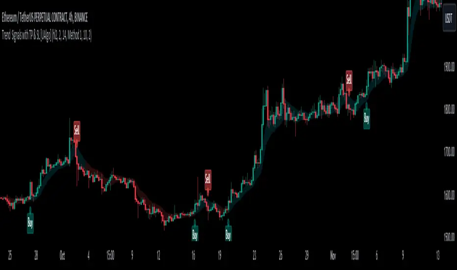
Trend Signals with TP & SL [UAlgo]The "Trend Signals with TP & SL " indicator is a versatile tool designed to assist traders in identifying potential trend continuation opportunities within financial markets Utilizing a combination of technical indicators and user-defined parameters, this indicator aims to provide clear and actionable signals to aid traders in making informed trading decisions.
🔶 Features:
Trend Continuation Signals : The indicator generates signals to identify potential trend continuation points based on the input parameters such as sensitivity, ATR length, and cloud moving average length.
Take-Profit and Stop-Loss Levels: It calculates and plots three levels of take-profit (1R, 2R, 3R) and stop-loss levels based on the entry price of the trade.
Short Position Example:
Long Position Example:
Visualization: The script visualizes the trend signals, entry points, take-profit levels, and stop-loss levels on the price chart, making it easier for traders to interpret the signals.
Alert System: The indicator includes an alert system that notifies the user when there is a change in trend direction or when a buy/sell signal is generated. The alerts provide essential information such as entry price, take-profit levels, and stop-loss levels.
🔶 Calculations :
Trend Calculation: Trend signals are determined based on the comparison between the current closing price and the upper and lower bounds calculated using the Average True Range (ATR) multiplied by a sensitivity factor. A trend is considered bullish if the closing price is above the upper bound and bearish if it's below the lower bound.
Entry, Stop Loss, and Take Profit Calculation: Entry points for long and short positions are identified when there's a change in trend direction.
Stop-loss levels are calculated as a percentage of the entry price, where users can define the percentage based on their risk tolerance.
Take-profit levels are calculated as multiples of the stop-loss level (1R, 2R, 3R).
Cloud Moving Averages: Simple moving averages (SMAs) are calculated for high and low prices over a specified period to create a "cloud" visualization on the chart.
MACD Clouds: Moving Average Convergence Divergence (MACD) indicator is used to determine the market's momentum and trend direction. Positive and negative clouds are plotted based on the MACD line and its signal line, indicating potential bullish or bearish trends.
Signal Generation: Buy and sell signals are generated based on specific conditions such as RSI, CMO (Chande Momentum Oscillator), and pivot points.
Signals are triggered when certain criteria are met, indicating potential opportunities for entering or exiting trades.
🔶 Disclaimer:
Use at Your Own Risk: Trading involves significant risk, and this script is provided for educational and informational purposes only. It does not guarantee profitable trades, and users should exercise caution and perform their own analysis before making trading decisions.
Parameter Sensitivity: The effectiveness of the indicator may vary depending on the chosen parameters, market conditions, and timeframe. Users are encouraged to backtest the script thoroughly and adjust the parameters according to their trading preferences.
Not Financial Advice: The information provided by this script should not be considered as financial advice. Users are solely responsible for their trading decisions and should consult with a qualified financial advisor if needed.
Backtesting and Validation: Before implementing this indicator in live trading, users are strongly encouraged to conduct rigorous backtesting and validation to assess its performance under various market conditions. Past performance is not indicative of future results, and users should carefully evaluate the effectiveness of the indicator based on their individual trading preferences and risk tolerance.
Scalper's Volatility Filter [QuantraSystems]Scalpers Volatility Filter
Introduction
The 𝒮𝒸𝒶𝓁𝓅𝑒𝓇'𝓈 𝒱𝑜𝓁𝒶𝓉𝒾𝓁𝒾𝓉𝓎 𝐹𝒾𝓁𝓉𝑒𝓇 (𝒮𝒱𝐹) is a sophisticated technical indicator, designed to increase the profitability of lower timeframe trading.
Due to the inherent decrease in the signal-to-noise ratio when trading on lower timeframes, it is critical to develop analysis methods to inform traders of the optimal market periods to trade - and more importantly, when you shouldn’t trade.
The 𝒮𝒱𝐹 uses a blend of volatility and momentum measurements, to signal the dominant market condition - trending or ranging.
Legend
The 𝒮𝒱𝐹 consists of a signal line that moves above and below a central zero line, serving as the indication of market regime.
When the signal line is positioned above zero, it indicates a period of elevated volatility. These periods are more profitable for trading, as an asset will experience larger price swings, and by design, trend-following indicators will give less false signals.
Conversely, when the signal line moves below zero, a low volatility or mean-reverting market regime dominates.
This distinction is critical for traders in order to align strategies with the prevailing market behaviors - leveraging trends in volatile markets and exercising caution or implementing mean-reversion systems in periods of lower volatility.
Case Study
Here we can see the indicator's unique edge in action.
Out of the four potential long entries seen on the chart - displayed via bar coloring, two would result in losses.
However, with the power of the 𝒮𝒱𝐹 a trader can effectively filter false signals by only entering momentum-trades when the signal line is above zero.
In this small sample of four trades, the 𝒮𝒱𝐹 increased the win rate from 50% to 100%
Methodology
The methodology behind the 𝒮𝒱𝐹 is based upon three components:
By calculating and contrasting two ATR’s, the immediate market momentum relative to the broader, established trend is calculated. The original method for this can be credited to the user @xinolia
A modified and smoothed ADX indicator is calculated to further assess the strength and sustainability of trends.
The ‘Linear Regression Dispersion’ measures price deviations from a fitted regression line, adding further confluence to the signals representation of market conditions.
Together, these components synthesize a robust, balanced view of market conditions, enabling traders to help align strategies with the prevailing market environment, in order to potentially increase expected value and win rates.

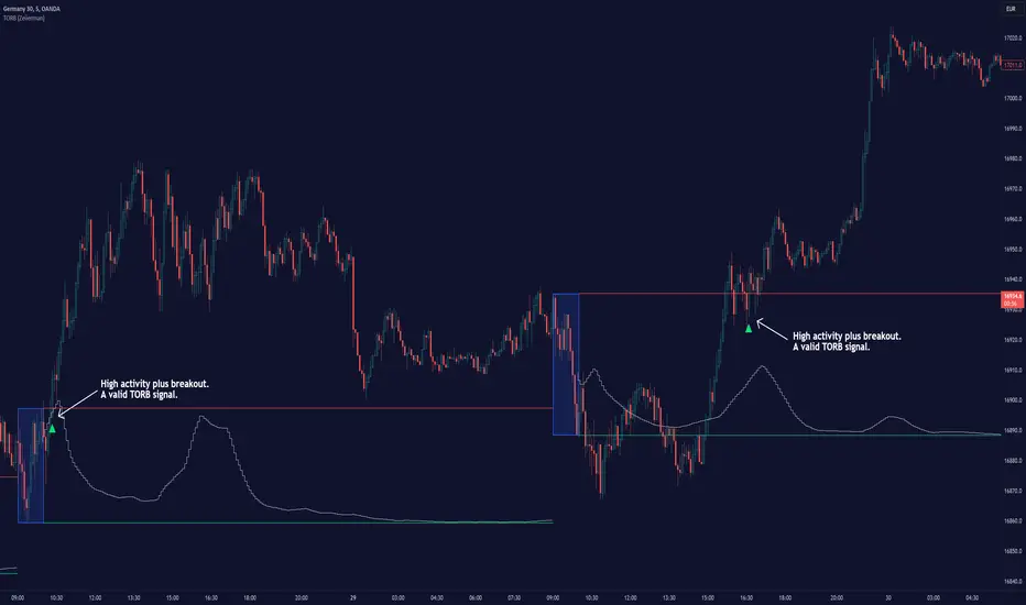
Timely Opening Range Breakout Strategy [TORB] (Zeiierman)█ Overview
The Timely Opening Range Breakout (TORB) indicator builds upon the classic Open Range Breakout (ORB) concept. The ORB strategy is a popular trading setup used to identify trades around the opening range of an asset. It's based on the idea that the first few minutes (15-60 minutes) of trading often set the tone for the rest of the day, with breakouts above or below the opening range signifying potential trends.
TORB refines the concept by stating that a trade is only valid if there is sufficient market activity. This means a breakout beyond the upper or lower range is only of interest during the most active trading hours, as defined by PMMV (Per-Minute Mean Volume)
█ How It Works
ORB
The indicator works by first defining a session's opening range based on user-specified settings, including the session's start and end times and the applicable time zone. During this session, it calculates the high and low price points, which form the basis for identifying potential breakout levels.
PMMV
PMMV (Per-Minute Mean Volume) provides a snapshot of the market's activity level at each minute of the trading day. PMMV is calculated by averaging the trading volume in a one-minute interval over a specified number of trading days. This script uses the average volume over the last N periods to determine the PMMV value. This average volume provides a smoother representation of volume activity compared to using a single volume value. It considers the volume over a broader timeframe, filtering out short-term fluctuations and potentially offering a more reliable indicator of underlying market activity.
TORB
TORB works by integrating the Opening Range Breakout (ORB) highs and lows with the Per-Minute Mean Volume (PMMV) metric to assess the validity of breakouts. The objective is to identify breakouts from the opening high and low levels during periods of heightened market activity, as indicated by PMMV.
█ How to Use
To effectively utilize the Timely Opening Range Breakout (TORB) strategy, follow these steps:
Identify Active Hours: Employ PMMV to pinpoint periods of peak activity within the trading day.
Apply Basic ORB Rules: If the price surpasses the upper range (resistance), buy; if it breaches the lower range (support), sell.
Breakouts
The TORB strategy identifies breakout signals when the price moves beyond the established range, supported by volume exceeding a set threshold. This technique aims to eliminate false signals, focusing on price movements during high market activity.
█ Settings
Session
Trading Session: Customize the trading session's start and end times.
Volume
Volume analysis is integral to the TORB strategy, as it uses volume data to confirm the strength and validity of breakout signals.
Period: Sets the number of periods (or bars) to calculate the average volume, which is then used to assess market activity level.
Sensitivity and Significance: Adjusts how responsive the volume analysis is to changes in trading volume. By adjusting the sensitivity, traders can decide how much emphasis to place on volume spikes, potentially reducing false breakouts and focusing on those supported by significant trading activity.
Breakout Threshold
This setting establishes a criterion to identify when the price movement is significant enough.
Threshold: Traders set a threshold level to identify high market activity. If the PMMV is greater than or equal to this threshold, it indicates significant market activity.
Setting the correct threshold is key to balancing sensitivity and specificity. Too low of a threshold may lead to many false positives, while too high of a threshold might filter out potentially profitable breakouts. This setting helps in pinpointing when market activity indicates a strong move, thereby aligning trade entries with moments of heightened market momentum.
-----------------
Disclaimer
The information contained in my Scripts/Indicators/Ideas/Algos/Systems does not constitute financial advice or a solicitation to buy or sell any securities of any type. I will not accept liability for any loss or damage, including without limitation any loss of profit, which may arise directly or indirectly from the use of or reliance on such information.
All investments involve risk, and the past performance of a security, industry, sector, market, financial product, trading strategy, backtest, or individual's trading does not guarantee future results or returns. Investors are fully responsible for any investment decisions they make. Such decisions should be based solely on an evaluation of their financial circumstances, investment objectives, risk tolerance, and liquidity needs.
My Scripts/Indicators/Ideas/Algos/Systems are only for educational purposes!
SFX Signals & Overlays [YinYangAlgorithms]SFX Signals & Overlays aims to help traders Identify Buy & Sell locations, Reversals, Volatility Zones, Support & Resistance and Overbought & Oversold Zones. All of these may work in harmony with each other by helping to identify when to enter and exit a trade; as well as helping to determine the risk / reward the trade may ensue.
SFX Signals & Overlays’s Buy & Sell signals are momentum based, meaning the Initial ‘Buy’ & ‘Sell’ signal may not be exactly where you want to get in/out. What may occur is the initial signal appears, a few more continuation signals appear afterwards (always in a chain); and once the momentum has ended a ‘Reversal’ signal appears. The reversal is there to help signify that the ‘opportune’ time to buy/sell may have passed and the price may now correct in the opposite direction. This Indicator aims to Buy Low and Sell High; and therefore the Buy signal momentum may occur as the price is either about to fall, currently falling or has started to consolidate. When the Buy signal momentum has ended, this means the momentum is at an impasse, but is favoring Buy momentum and a reversal (correction) may occur.
Buying & Selling at reversal signals may be profitable, however it may be less risky to DCA into your long / short positions during the Buy/Sell momentum signals instead. Let's get into the Tutorial so you can better understand how our SFX Signals & Overlays indicator works.
Tutorial:
Our example above showcases how our SFX Signals & Overlays Indicator looks on the default settings ‘Medium’ for each of our Algorithm Settings:
Trend Sensitivity
Signal Sensitivity
Zone Sensitivity
All of our Algorithm Settings feature 3 different speeds:
Fast
Medium
Slow
These speeds may be applied to each Algorithm Setting individually and affect how quickly they adapt to the current market's momentum. This allows you to tailor this Indicator to fit your trading style by adjusting it to meet your needs accordingly. If you are someone who likes to swing trade on the 1-5 minute timeframe, you may find better confluence with all settings on ‘Fast’. Medium term holders and traders may find better results with all settings on ‘Medium’. Likewise, long term investors may find best results with all settings on ‘Slow’. However, this shouldn’t stop you from finding your own best result by adjusting them individually to meet your own unique trading style.
SFX Signals & Overlays helps you identify shifts in momentum by displaying Momentum Signals. Momentum Signals are shown by either a Green or Red Triangle. Momentum Signals can continue for quite some time until the momentum has ended. We rank the first Momentum Signal from 1/5 to 5/5 for their strength and may help determine the chances of the momentum shift occurring. Once the Momentum Signals have ended we display a Reversal Signal. This Reversal Signal helps signify that the Momentum has ended. When the Momentum ends it means that a reversal may have started. This reversal may mean the price will continue in the direction the signal mentioned; or it may mean the price will consolidate. If the price consolidates then the signal is void as when the consolidation ends the price could go in either direction. If you notice consolidation occurring after a Reversal Signal; wait for more confirmations as it is now too risky.
Our Indicator displays different evaluations for each INITIAL Buy and Sell signal. These evaluations rank the current start of the signal from 1-5; 1 being the lowest and least reliable, 5 being the highest and most reliable. These rankings aren’t indefinite and are simply an evaluation at the time of the initial signal. We may potentially provide evaluations at the reversal later on if requested enough. When a Buy or Sell signal occurs this defines where momentum is occurring in this direction. This momentum is indicated by momentum signals shown through red / green triangles. These triangles indicate that this momentum is present. When these momentum signals end is when the Reversal Signal appears indicating that since this momentum has ended, there may be a decent chance of a reversal occurring. There also adherently may be the potential of consolidation occurring; but generally it means there is either a reversal, or consolidation + then a reversal or a continuation; however it may be apparent that the momentum has ended.
ES:
NQ:
BTC:
If you refer to the 3 examples above, we show how the ES, NQ and BTC look within a 5 minute scalping example. Essentially you’d make your decision on the Buy / Sell signal, the momentum signals, the Reversal Signals, the Trend Colors as well as other oscillators and Due Diligence.
Remember, there’s no such thing as a perfect entry / exit, the more you understand about trading and do your own Due Diligence the better. These Buy and Sell as well as Reversal signals attempt to locate and rank momentum shifts to help you identify where the momentum may be ending and reversing in the opposite direction.
Our zones defined by the Outer (red) and Inner (green) are representations of not only Support and Resistance locations, but likewise Overbought and Oversold locations. These zones help in multiple ways. The hard lines that define each zone's start / end are very useful locations of support / resistance which may indicate where the price will bounce off of. Likewise, when the price is within these zones it represents the price being Overbought or Oversold. Then the price is for instance within the Red Resistance Zone, what generally may happen is the price will correct quickly to get back to the ‘Black Empty Zone’ between the Red and Green zones; OR it may consolidate sideways until it has entered the ‘Black Empty Zone’. This is how the price may redeem itself back to being valued correctly. These zones help you identify and understand, in concatenation with our signals when and how much the price may move.
Our Settings are minimalistic so you don’t need to worry and get overwhelmed about changing values and trying to fiddle to find which values works the best for what. Our Algorithms will take care of all of that for you. Simply select the speeds for your Trend, Signals and Zones and you’re good to start trading! You can likewise customize what information is visible to you and the colors to better customize your experience.
Fast:
Medium:
Slow:
The 3 examples above display what the same portion of the chart looks like when Trend, Signal and Zone Sensitivity is changed from Fast, Medium and Slow.
As you can see, they all look quite different in the results they produce. By default all settings are set to Medium, however they can all be individually changed to suit your trading style and needs.
Our Indicator offers many different alert options which may help you stay informed with how the market is moving and any momentum changes that may occur.
Settings:
1. Algorithm Settings
Trend Sensitivity (Fast, Medium, Slow): Trend Sensitivity refers to how quickly the Trend Bar Colors change. Fast: will change colors very quickly if it senses momentum is changing. Medium: will change almost as quickly as Fast, however, rather than swapping from Bullish to Bearish momentum right away it has an intermediate 'Neutral - Slightly Bullish (Yellow)' and 'Neutral - Slightly Bearish (Orange)'. This way you can better visualize when the momentum is dying in the trend and starting back up by having these trend 'Neutral/Consolidation' areas. Slow: will attempt to only change Trend Bar Colors when the momentum has surely shifted. This may result in a bit of lagging behind.
Signal Sensitivity (Fast, Medium, Slow): Signal Sensitivity refers to how quickly the Buy & Sell Momentum Signals & Reversal Signals appear. These signals are meant to appear when it thinks the price may reverse, but the speeds refer to how much of a reversal they think may happen. Fast: will attempt to locate any and all momentum swings. Medium: will attempt to only locate momentum swings which may drive the price up considerably. Slow: will attempt to locate only the most extreme momentum swings. This may result in some potentially good ones missed however; but the ones it finds may have a higher probability of occuring.
Zone Sensitivity (Fast, Medium, Slow): Zone Sensitivity refers to how quickly the Zones expand based on price movement. These zones may be useful for not only seeing Support & Resistance; but also identifying when it is Overbought & Oversold; as well as visualizing volatility between the Black (Empty area) and the zones. The lines that separate each zone are the Support and Resistance locations; the area within the zones are simply the spacing between these Support and Resistance locations. However, the further the price is to the outer zones does represent Overbought and Oversold. Fast: will expand very quickly. This causes the price to be within the Black (Empty area) more often. This may be useful for finding extremities in price movement which may have a better chance of correcting. Medium: moves fast but not anywhere close to as fast as 'Fast'. Medium will hold its values in an attempt to be as accurate as possible for identifying Support and Resistance locations. Slow: will expand very slowly. This may be useful for identifying Support & Resistance as well as Volatility targets on higher time frames since these zones move much slower.
2. Display Settings:
Show Trend Bar Colors: Trend Bar Color are a way of seeing how the Trend is holding up on a bar by bar basis. This may be useful for seeing momentum starting, ending or simply dying down before any signals actually appear.
Signal Text Display (Both, Buy & Sell, Reversals, None: Signals are a way of seeing potential changes in momentum and when they have actually occurred. Our signals also rank from 1/5 to 5/5 how strong of a chance this momentum change may occur (only at the time of the signal, not at the time of the reversal). These may be useful as potential Entry and Exit locations; as well as when you see the reversal, you know that this momentum change has either begun or a consolidation may be occurring. If a consolidation occurs, the signal is no longer valid as the price can now go either way and it is best to wait for more signals or other technical analysis to determine momentum and movement.
Zone Display (All, Outer + Middle, Inner + Middle, Outer, Middle, Inner, None): Zones are composed of 3 areas above and below. These areas attempt to project Support & Resistance locations as well as display when the Price is Overbought and Oversold. You can specify which zones you wish to view, however all are important.
3. Color Settings:
Buy Color: This is the color of all Buy Signals and Zones.
Sell Color: This is the color of all Sell Signals and Zones.
Buy Reversal Color: This is the color of all Buy Signal Reversals.
Sell Reversal Color: This is the color of all Sell Signal Reversals.
If you have any questions, comments, ideas or concerns please don't hesitate to contact us.
HAPPY TRADING!

[F][IND] FVG IdentifierMastering Market Imbalances with Ease
The FVG Identifier stands as a groundbreaking TradingView indicator, crafted to illuminate the often-overlooked Fair Value Gaps (FVG) in the dynamic world of price action trading. Let’s dive into how this tool is transforming the approach to identifying market inefficiencies.
Decoding Fair Value Gaps
Central to the concept of FVGs is the identification of market imbalances — moments where the equilibrium between buying and selling pressures is disrupted. These gaps are typically seen in a sequence of three candles, where a dominant candle is surrounded by others whose wicks fail to fully overlap it. These formations are critical as they often influence future price directions, acting as potential magnets.
Simplifying the Detection of FVGs
The FVG Identifier is engineered to enhance the visibility of Fair Value Gaps, making them starkly apparent even in complex market charts. Its algorithms ensure that these vital market indicators are easily and promptly recognized, allowing traders to spot valuable trading opportunities with minimal effort.
Features of the FVG Identifier
1. Intuitive Interface: The indicator is designed for ease of use, accommodating both beginners and experienced traders.
2. Customizable Settings: It offers flexible configuration options, allowing for adaptation to various trading styles and strategies.
3. Strategic Trading Insight: By highlighting FVGs, the tool provides traders with actionable insights for strategic entry and exit points based on potential price movements.
Elevating Your Trading Strategy
Incorporating the FVG Identifier into your trading arsenal equips you with a nuanced perspective on market analysis. It not only assists in identifying significant market imbalances but also enriches your technical analysis with powerful, data-backed insights.
Revolutionizing Price Action Trading
The FVG Identifier transcends the role of a mere indicator; it represents a significant leap in trading methodology. Compatible with various trading platforms, this tool is ready to enhance your market understanding and application of Fair Value Gaps.
Embrace the FVG Identifier to uncover the hidden dynamics of market gaps and translate these insights into efficient and profitable trading strategies.
Disclaimer:
This indicator is provided for educational purposes only. Trading involves risk, and users should consult with a financial professional before making any trading decisions.
Your Feedback Matters!
Please feel free to comment or reach out if you have any improvement suggestions or if you would like to request the development of a specific indicator. Your feedback is invaluable!

VWAP RangeThe VWAP Range indicator is a highly versatile and innovative tool designed with trading signals for trading the supply and demand within consolidation ranges.
What's a VWAP?
A VWAP (Volume Weighted Average Price) represents an equilibrium point in the market, balancing supply and demand over a specified period. Unlike simple moving averages, VWAP gives more weight to periods with higher volume. This is crucial because large volumes indicate significant trading activity, often by institutional traders, whose actions can reflect deeper market insights or create substantial market movements. The VWAP is also often used as a benchmark to evaluate the efficiency of executed trades. If a trader buys below the VWAP and sells above it, they are generally considered to have transacted favourably.
This is how it works:
Multiple VWAP Anchors:
This indicator uses multiple VWAPs anchored to different optional time periods, such as Daily, Weekly, Monthly, as well as to the highest high a lowest low within those periods. This multiplicity allows for a comprehensive view of the market’s average price based on volume and price, tailored to different trading styles and strategies.
Dynamic and Fixed Periods:
Traders can choose between using dynamic ranges, which reset at the start of each selected period, and specifying a date and time for a particular fixed range to trade. This flexibility is crucial for analyzing price movements within specific ranges or market phases.
Fixed ranges allow VWAPs to be calculated and anchored to a significant market event, the beginning of a consolidation phase or after a major news announcement.
Signal Generation:
The indicator generates buy and sell signals based on the relationship of the price to the VWAPs. It also allows for setting a maximum number of signals in one direction to avoid overtrading or pyramiding. Be sure to wait for the candle close before trading on the signals.
Average Buy/Sell Signal Lines:
Lines can be plotted to display the average buy and sell signal prices. The difference between the lines shows the average profit per trade when trading on the signals in that range. It's a good way to see how profitable a range is on average without backtesting the signals. The lines will also often turn into support and resistance areas, similar to value areas in a volume profile.
Customizable Settings:
Traders have control over various settings, such as the VWAP calculation method and bar color. There are also tooltips for every function.
Hidden Feature:
There's a subtle feature in this indicator: if you have 'Indicator values' turned on in TradingView, you'll see a Sell/Buy Ratio displayed only in the status line. This ratio indicates whether there are more sell signals than buy signals in a range, regardless of the Max Signals setting. A red value above 1 suggests that the market is trending upward, indicating you might want to hold your long positions a bit longer. Conversely, a green value below 1 implies a downward trend.

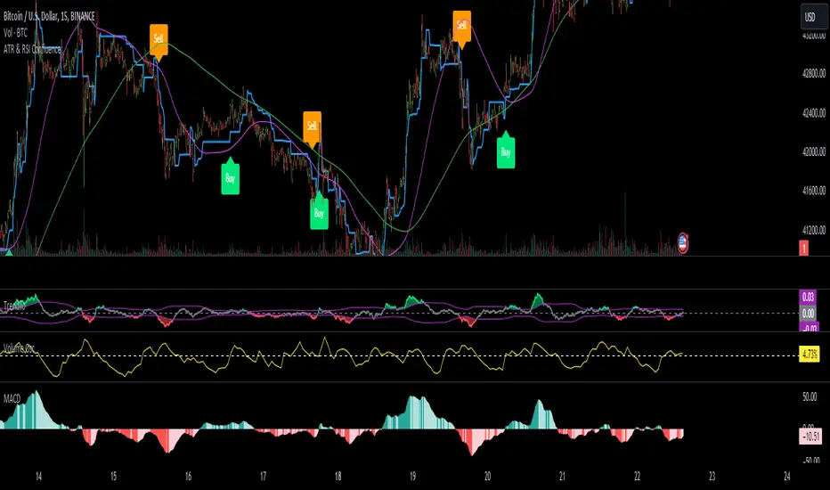
ATR & RSI ConfluenceIntroducing the "Confluence Strategy": Your Go-To for Savvy Trading!
1.ATR Trailing Stop - Your Market Volatility Compass:
What's ATR? Think of it as the pulse of market excitement. It measures how wildly prices are swinging.
ATR Trailing Stop: This is where the magic happens. Picture it as a dynamic line that dances with the price. When the market climbs, it climbs; when the market drops, it drops. It's your trend-tailored safety net, ensuring you ride the waves but bail before the tide turns!
2. RSI - The Market's Mood Ring:
RSI Lowdown: It's like a speedometer for price moves. Ranges from 0 to 100 – the closer to 100, the more it hints that prices might take a breather (overbought), and the closer to 0, the more it suggests prices might jump back up (oversold).
RSI Filter in Action: We're flipping the script here. No selling if the market's not in the oversold zone, and no buying if it's not feeling overbought. We're after that sweet momentum!
3. HEMA and Hull EMA - Your Trend Trackers:
HEMA & Hull EMA: These aren't your grandpa's moving averages. They're faster, sharper, and ready to catch the latest price trends. Like a hawk eyeing its prey, they zero in on the latest market moves.
4. Buy/Sell Signals - Where the Thrill Happens:
Buying (LONG): It's go-time when:
The price is strutting above HEMA.
RSI is strutting its stuff above the overbought catwalk.
ATR trailing stop is nodding along with an uptrend.
And hey, you're not already riding the long wave.
Selling (SHORT): You make your move when:
The price is dipping below HEMA.
RSI is lurking below the oversold alley.
ATR trailing stop is signaling a downhill.
And you're not already surfing the short tide.
How to Rock this Strategy:
New traders, tune in! This strategy's like a symphony of indicators – trend (HEMA and Hull EMA), momentum (RSI), and market volatility (ATR) – all harmonizing to cue your entry points. It's about syncing with the market's rhythm to up your trade game.
Absolutely, let's fine-tune it to a snappier beat:
Rock Your Trades with "Confluence Strategy," MACD & Volume Oscillator!
🔥 MACD: Set at 72/144 for a Smooth Groove:
Think of MACD (72/144 settings) as your market groove detector. It's calibrated to catch longer-term trends and momentum, perfect for harmonizing with our "Confluence Strategy." This setting helps smooth out market noise, giving you a clearer picture of the trend.
🎛️ Volume Oscillator: Your 0% Beat Check:
The Volume Oscillator is your go-to for checking the market's pulse. It's simple: look for it to be above 0% when considering a trade. This indicates that the market is vibing with enough volume to support your move, adding an extra layer of confidence to your strategy.
🚀 Trading Symphony:
Together, "Confluence Strategy," MACD (72/144), and a positive Volume Oscillator create a powerful trio. They align your trades with the market's rhythm and volume energy, setting you up for potentially harmonious and profitable trades.
Remember, the best tunes are played with practice. Test this setup, feel its rhythm, and when you're ready, let your trades sing on the market charts!
BreakoutTrendFollowingINFO:
The "BreakoutTrendFollowing" indicator is a comprehensive trading system designed for trend-following in various market environments. It combines multiple technical indicators, including Moving Averages (MA), MACD, and RSI,
along with volume analysis and breakout detection from consolidation, to identify potential entry points in trending markets. This strategy is particularly effective for assets that exhibit strong trends and significant price movements.
Note that using the consolidation filter reduces the amount of entries the strategy detects significantly, and needs to be used if we want to have an increased confidence in the trend via breakout.
However, the strategy can be easily transformed to various only trend-following strategies, by applying different filters and configurations.
The indicator can be used to connect to the Signal input of the TTS (TempalteTradingStrategy) by jason5480 in order to backtest it, thus effectively turning it into a strategy (instructions below in TTS CONNECTIVITY section)
DETAILS:
The strategy's core is built upon several key components:
Moving Average (MA): Used to determine the general trend direction. The strategy checks if the price is above the selected MA type and length.
MACD Filter: Analyzes the relationship between two moving averages to confirm the trend's momentum.
Consolidation Detection: Identifies periods of price consolidation and triggers trades on breakouts from these ranges.
Volume Analysis: Assesses trading volume to confirm the strength and validity of the breakout.
RSI: Used to avoid overbought conditions, ensuring trades are entered in favorable market situations.
Wick filters: make sure there is not a long wick that indicates selling pressure from above
The strategy generates buy signals when several conditions are met concurrently (each one of them can be individually enabled/disabled)"
The price is above the selected MA.
A breakout occurs from a configurable consolidation range.
The MACD line is above the signal line, indicating bullish momentum.
The RSI is below the overbought threshold.
There's an increase in trading volume, confirming the breakout's strength.
Currently the strategy fires SL signals, as the approach is to check for loss of momentum - i.e. crossunder of the MACD line and signal line, but that is to everyone to determine the exit conditions.
The buy and SL signals are set on the chart using green or orange triangles on the below/above the price action.
SETTINGS:
Users can customize various parameters, including MA type and period, MACD settings, consolidation length, and volume increase percentage. The strategy is equipped with alert conditions for both entry (buy signals) and exit (set stop loss) points, facilitating both manual and automated trading.
Each one of the technical indicators, as well as the consilidation range and breakout/wick settings can be configured and enabled/disabled individually.
Please thoroughly review the available settings of the script, but here is an outline of the most important ones:
Use bar wicks (instead of open/close) - the ref_high/low will be taken based on the bar wicks, rather than the open/close when determining the breakout and MA
Enter position only on green candles - additional filters to make sure that we enter only on strong momentum
MA Filter: (enable, source, type, length) - general settings for MA filter to be checked against the stock price (close or upper wick)
MACD Filter: (enable, source, Osc MA type, Signal MA type, Fast MA length, Slow MA length, Low MACD Hist) - detailed settings for fine MACD tuning
Consolidation:
Consolidation Type: we have two different ways of detecting the consolidation, note the types below.
CONSOLIDATION_BASIC - consolidation areas by looking for the pivot point of a trend and counts the number of bars that have not broken the consolidation high/low levels.
CONSOLIDATIO_RANGE_PERCENT - identifies consolidation by comparing the range between the highest and lowest price points over a specified period.
So in summary the CONSOLIDATIO_RANGE_PERCENT uses a percentage-based range to define consolidation, while CONSOLIDATION_BASIC uses a count of bars within a high-low range to establish consolidation.
Thus the former is more focused on the tightness of the price range, whereas the latter emphasizes the duration of the consolidation phase.
The CONSOLIDATIO_RANGE_PERCENT might be more sensitive to recent price movements and suitable for shorter-term analysis, while CONSOLIDATION_BASIC could be better for identifying longer-term consolidation patterns.
Min consolidation length - applicable for CONSOLIDATION_BASIC case, the min number of bars for the price to be in the range to consider consolidation
Consolidation Loopback period - applicable for CONSOLIDATION_BASIC case, the loopback number of bars to look for consolidation
Consolidation Range percent - applicable for CONSOLIDATIO_RANGE_PERCENT, the percent between the high and low in the range to consider consolidation
Plot consolidation - enables plotting of the consolidation (only for debug purposes)
Breakout: (enable, low, high) - the definition of the breakout from the previous consolidation range, the price should be between to determine the breakout as successfull
Upper wick: (enable, percent) - defines the percent of the upper wick compared to the whole candle to allow breakout (if the wick is too big part of the candle we can consider entering the position riskier)
RSI: (enable, length, overbought) - general settings for RSI TA
Volume (enbale, percentage increase, average volume filter en, loopback bars) - percentage of increase of the volume to consider for a breakout. There are two modes - percentage increase compared to the previous bar, or percentage against the average volume for the last loopback bars.
Note that there are many different configuration that you can play with, and I believe this is the strength of the strategy, as it can provide a single solution for different cases and scenarios.
My advice is to try and play with the different options for different markets based on the approach you want to implement and try turning features on/off and tuning them further.
TTS SETTINGS (NEEDED IF USED TO BACKTEST WITH TTS):
The TempalteTradingStrategy is a strategy script developed in Pine by jason5480, which I recommend for quick turn-around of testing different ideas on a proven and tested framework
I cannot give enough credit to the developer for the efforts put in building of the infrastructure, so I advice everyone that wants to use it first to get familiar with the concept and by checking
by checking jason5480's profile www.tradingview.com
The TTS itself is extremely functional and have a lot of properties, so its functionality is beyond the scope of the current script -
Again, I strongly recommend to be thoroughly explored by everyone that plans on using it.
In the nutshell it is a script that can be feed with buy/sell signals from an external indicator script and based on many configuration options it can determine how to execute the trades.
The TTS has many settings that can be applied, so below I will cover only the ones that differ from the default ones, at least according to my testing - do your own research, you may find something even better :)
The current/latest version that I've been using as of writing and testing this script is TTSv48
Settings which differ from the default ones:
Deal Conditions Mode - External (take enter/exit conditions from an external script)
🔌Signal 🛈➡ - BreakoutTrendFollowing: 🔌Signal to TTS (this is the output from the indicator script, according to the TTS convention)
Order Type - STOP (perform stop order)
Distance Method - HHLL (HigherHighLowerLow - in order to set the SL according to the strategy definition from above)
The next are just personal preferences, you can feel free to experiment according to your trading style
Take Profit Targets - 0 (either 100% in or out, no incremental stepping in or out of positions)
Dist Mul|Len Long/Short- 10 (make sure that we don't close on profitable trades by any reason)
Quantity Method - EQUITY (personal backtesting preference is to consider each backtest as a separate portfolio, so determine the position size by 100% of the allocated equity size)
Equity % - 100 (note above)

G2RIntroducing G2R – The Universal Indicator! Unlock the secret to trading success with G2R an extraordinary indicator that provides automatic signals across every time frame and market, from forex, crypto, stocks, & options with over 80% signal accuracy. Say goodbye to guesswork and hello to precision as G2R empowers you with real-time insights , giving you the edge to seize opportunities in any market condition . Elevate your trading strategy and conquer the financial world with G2R – your ultimate guide to profitable trading!
Features
• Bollinger bands
• 2 exponential moving averages
• Automatic buy and sell signals
• Works for Forex, Crypto, Indices, Stocks, & Options
• Tailored for all Timeframes
Trading Tips
• Trading Signals
• 30 Secs - 1 Min | SCALPING
• 3 Min - 5 Min | DAY TRADING
• 15 Min - 1 Hr | SWING & POSITION
• Take signal trades during London, New York, & Asia sessions
• Take Profits are found on the 15 Min, 30 Min, & 1 Hr timeframe at the trend channel or Moving Averages
• Stop loss are found above or below trend channel or moving averages
Warning
Never blindly take a trade on a G2R - wait for a proper market structure to occur before considering a trade.

Backtest Strategy Optimizer Adapter - Supertrend ExampleSample Code
This is a sample code for my Backtest Strategy Optimizer Adapter library.
You can find the library at:
Backtest Strategy Optimizer Tester
With this indicator, you will be able to run one or multiple backtests with different variables (combinations). For example, you can run dozens of backtests of Supertrend at once with an increment factor of 0.1, or whatever you prefer. This way, you can easily grab the most profitable settings and use them in your strategy. The chart above shows different color plots, each indicating a profit backtest equal to tradingview backtesting system. This code uses my backtest library, available in my profile.
Below the code you should edit yourself
You can use ChatGPT or write a python script to autogenerate code for you.
// #################################################################
// # ENTRIES AND EXITS
// #################################################################
// You can use the link and code in the description to create
// your code for the desired number of entries / exits.
// #################################################################
// AUTO GENERATED CODE
// ▼▼▼▼▼▼▼▼▼▼▼▼▼▼▼▼▼▼▼▼▼▼▼▼▼▼▼▼▼▼▼▼▼▼▼▼▼▼▼▼▼▼▼▼▼▼▼▼▼▼▼▼▼▼▼▼▼▼▼▼▼▼▼▼▼
= ti.supertrend(10, 0.1)
= ti.supertrend(10, 0.2)
= ti.supertrend(10, 0.3)
= ti.supertrend(10, 0.4)
// 005 etc...
pnl_001 = backtest.profit(date_start, date_end, entry_001, exit_001)
pnl_002 = backtest.profit(date_start, date_end, entry_002, exit_002)
pnl_003 = backtest.profit(date_start, date_end, entry_003, exit_003)
pnl_004 = backtest.profit(date_start, date_end, entry_004, exit_004)
plot(pnl_001, title='0.1', color=backtest.color(001))
plot(pnl_002, title='0.2', color=backtest.color(002))
plot(pnl_003, title='0.3', color=backtest.color(003))
plot(pnl_004, title='0.4', color=backtest.color(004))
// Make sure you set the correct array size.
// The amount of tests + 1 (e.g. 4 tests you set it to 5)
var results_list = array.new_string(5)
if (ta.change(pnl_001))
array.set(results_list, 0, str.tostring(pnl_001) + '|0.1')
if (ta.change(pnl_002))
array.set(results_list, 1, str.tostring(pnl_002) + '|0.2')
if (ta.change(pnl_003))
array.set(results_list, 2, str.tostring(pnl_003) + '|0.3')
if (ta.change(pnl_004))
array.set(results_list, 3, str.tostring(pnl_004) + '|0.4')
// ▲▲▲▲▲▲▲▲▲▲▲▲▲▲▲▲▲▲▲▲▲▲▲▲▲▲▲▲▲▲▲▲▲▲▲▲▲▲▲▲▲▲▲▲▲▲▲▲▲▲▲▲▲▲▲▲▲▲▲▲▲▲▲▲▲
// AUTO GENERATED CODE
// #################################################################
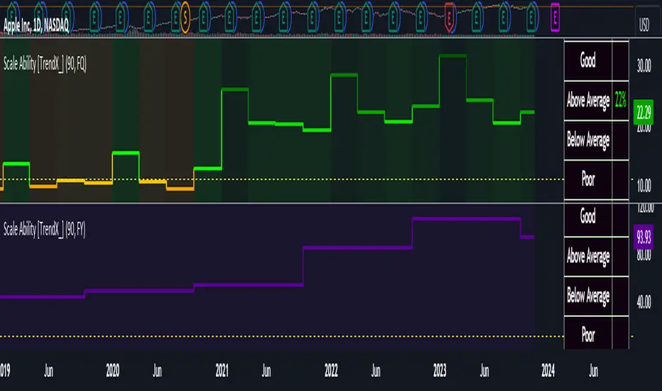
Scale Ability [TrendX_]Scale Ability indicator can indicate a company’s potential for future growth and profitability.
A scalable company is one that can increase its revenue and market share without increasing its costs proportionally, which can benefit from economies of scale. Therefore, the high-scale ability can generate more value for its shareholders - which is important for investment decisions.
Scale Ability indicator consists of 3 financial components:
Cash Flow from Investing Activities to Total Assets Ratio (CFIA / TA)
Net Income to Total Debt Ratio (NI / TD)
Earnings Before Interest, Taxes, Depreciation and Amortization to Equity Ratio (EBITDA / E)
These measures can help investors assess how efficiently and effectively a company uses its resources to generate revenue and profit.
Note:
This can be customizable between Fiscal Quarter (FQ) and Fiscal Year (Fy)
This is suitable for companies in fast-growing industries.
FUNCTION
CFIA / TA Ratio
A company with a net income to total debt of 9% could indicate that it is investing in its assets to keep up with the market demand and the technological changes which can create competitive advantages.
NI/ TD Ratio
A company with a net income to total debt of 9% could show that it is profitable and has a strong financial position, which can easily cover its debt payments.
EBITDA / E Ratio
A company with a net income to total debt of 14% illustrates that it is generating a high return on its equity.
USAGE
Scale index division:
> 43 : Excellent
32 - 43 : Good
12 - 31 : Above Average
= 11 : Average
8 - 10 : Below Average
5 - 7 : Poor
< 4 : Very Poor
DISCLAIMER
This is only a rough estimate, and the actual ratio may differ significantly depending on the stage of the business cycle and the company’s strategy, and the comparison of each company and its peers.
This indicator is not financial advice, it can only help traders make better decisions. There are many factors and uncertainties that can affect the outcome of any endeavor, and no one can guarantee or predict with certainty what will occur.
Therefore, one should always exercise caution and judgment when making decisions based on past performance.
MACD_RSI_trend_followingINFO:
This indicator can be used to build-up a strategy for trading of assets which are currently in trending phase.
My preference is to use it on slowly moving assets like GOLD and on higher timeframes, but practice may show that we find more usefull cases.
This script uses two indicators - MACD and RSI, as the timeframe that those are extracted for is configurable (defaults with the Chart TF, but can be any other selected by the user).
The strategy has the following simple idea - buy if any if the conditions below is true:
The selected TF MACD line crosses above the signal line and the TF RSI is above the user selected trigger value
The selected TF MACD line is above the signal line and the TF RSI crosses above the user selected trigger value
Once we're in position we wait for the selected TF MACD line to cross below the signal line, and then we set a SL at the low of that bar
DETAILS and USAGE:
In the current implementation I find two possible use cases for the indicator:
as a stand-alone indicator on the chart which can also fire alerts that can help to determine if we want to manually enter/exit trades based on them
can be used to connect to the Signal input of the TTS (TempalteTradingStrategy) by jason5480 in order to backtest it, thus effectively turning it into a strategy (instructions below in TTS CONNECTIVITY section)
In the example below we see a position opened at the bar after the buy indicator from the script has been triggered, and then later after the SL indicator from the script has been triggered a SL has been set on the lower wick of the closing candle, and the position eventually got closed once the price hit that level. Note that most of the drawing on the example snapshot below are from the TTS indicator following the buy/sell/SL conditions themseves:
Trading period can be selected from the indicator itself to limit to more interesting periods.
Arrow indications are drawn on the chart to indicate the trading conditions met in the script - green arrow for a buy signal indication and orange for LTF crossunder to indicate setting of SL.
SETTINGS:
Leaving all of the settings as in vanilla use case, as both the MACD and RSI indicator's settings follow the default ones for the stand-alone indicators themselves.
The start-end date is a time filter that can be extermely usefull when backtesting different time periods.
Pesonal preference is using the script on a D/W timeframe, while the indicator is configured to use Monthly chart.
The default value of the RSI filter is left to 50, which can be changed. I.e. if the RSI is above 50 we have a regime filter based on the MACD criteria.
EXTERNAL LIBRARIES:
The script uses a couple of external libraries:
HeWhoMustNotBeNamed/enhanced_ta/14 - collection of TA indicators
jason5480/tts_convention/3 - more details about the Template Trading Strategy below
I would like to highly appreciate and credit the work of both HeWhoMustNotBeNamed and jason5480 for providing them to the community.
TTS SETTINGS (NEEDED IF USED TO BACKTEST WITH TTS):
The TempalteTradingStrategy is a strategy script developed in Pine by jason5480, which I recommend for quick turn-around of testing different ideas on a proven and tested framework
I cannot give enough credit to the developer for the efforts put in building of the infrastructure, so I advice everyone that wants to use it first to get familiar with the concept and by checking
by checking jason5480's profile www.tradingview.com
The TTS itself is extremely functional and have a lot of properties, so its functionality is beyond the scope of the current script -
Again, I strongly recommend to be thoroughly epxlored by everyone that plans on using it.
In the nutshell it is a script that can be feed with buy/sell signals from an external indicator script and based on many configuration options it can determine how to execute the trades.
The TTS has many settings that can be applied, so below I will cover only the ones that differ from the default ones, at least according to my testing - do your own research, you may find something even better :)
The current/latest version that I've been using as of writing and testing this script is TTSv48
Settings which differ from the default ones:
from - False (time filter is from the indicator script itself)
Deal Conditions Mode - External (take enter/exit conditions from an external script)
🔌Signal 🛈➡ - MACD_RSI_trend_following: 🔌Signal to TTSv48 (this is the output from the indicator script, according to the TTS convention)
Sat/Sun - true (for crypto, in order to trade 24/7)
Order Type - STOP (perform stop order)
Distance Method - HHLL (HigherHighLowerLow - in order to set the SL according to the strategy definition from above)
The next are just personal preferenes, you can feel free to experiment according to your trading style
Take Profit Targets - 0 (either 100% in or out, no incremental stepping in or out of positions)
Dist Mul|Len Long/Short- 10 (make sure that we don't close on profitable trades by any reason)
Quantity Method - EQUITY (personal backtesting preference is to consider each backtest as a separate portfolio, so determine the position size by 100% of the allocated equity size)
Equity % - 100 (note above)

Demand and Supply Zones Lite [Afnan]Are you looking to level up your trading game and spot potential turning points in the stock market? Introducing the Smart Money Demand and Supply Zones indicator, a powerful tool designed to identify opportunities created by the Smart money.
The Smart Money Demand and Supply Zones indicator is built upon the principles of Rally Base Rally (RBR), Rally Base Drop (RBD), Drop Base Rally (DBR), Drop Base Drop (DBD).
🔍 Key Details 🔍
The "Smart Money" concept refers to large institutional investors and professional traders who possess significant financial resources and expertise. The importance of smart money lies in their influence on market trends and price movements. Their actions and positions often serve as signals for retail traders and investors to make informed decisions.
Formation of Smart Money: Smart money is attracted to areas in the market where they can find favourable risk-to-reward opportunities.
1. Rally Base Rally (RBR) Zones: These zones occur after a rally (upward price movement), followed by a period of consolidation (base formation), and then another rally. Smart money often forms positions here as it suggests a strong uptrend continuation.
2. Rally Base Drop (RBD) Zones: In this case, there is a rally, followed by a base formation, but instead of another rally, the price drops. Smart money may position themselves here in anticipation of a potential trend reversal.
3. Drop Base Rally (DBR) Zones: These zones form when there is a drop in price, followed by a base formation, and then a rally. Smart money may take positions here, expecting a trend reversal to the upside.
4. Drop Base Drop (DBD) Zones: In this scenario, the price drops, then forms a base, but subsequently continues to drop. Smart money might take bearish positions here, anticipating further downward movement.
🚀 Pending Orders from Smart Money Zones: 🚀
When the price approaches these smart money zones, institutional investors often place remaining pending orders to enter the market.
By identifying RBR/DBR zones as potential buying opportunities and RBD/DBD zones as potential selling opportunities on price charts, retail traders can align their trades with smart money activities. Implementing proper risk management and confirming signals enhances the likelihood of successful trades by following the footsteps of institutional investors.
💡 Key Features of the Indicator 💡
This indicator includes the following features:
Customizable Zone Length: Adjust the number of base candles in a zone to suit your preferences and strategy.
Candle Body Size Customization: Personalize the body size of candles for fine-tuning visual representation.
Base Candle Selection: Choose between the body of the candle or narrow range candles as the base candle for zone plotting.
Colour Customization For Candles: Customize Drop, Base, Rally, and Zone colours to match your visual preferences.
Number of Zones: This feature is flexible, allowing you to customize the quantity of zones displayed on the chart for improved visibility.
Zone Colours: You have the option to personalize the colours for both fresh and tested zones based on your preferences.
Zone Strength Customization: Adjust candle sensitivity for better control.
Swing High and Swing Low: Enable or disable support and demand lines based on Swing High and Swing Low.
Wick of Candle: Customize zone plotting using the body or wicks of candles for flexible analysis.
Previous Zones: You can choose to display or disable previous zones on the chart that have been deleted and utilized before. This option helps you maintain a clutter-free chart while retaining valuable historical information.
Moving Averages: Utilize four (4) customizable Moving Averages to enhance analysis from any time frame.
💎 Employing a Top-Down Approach and Multiple Time Frame Analysis: 💎
Let's delve into the concept of adopting a top-down approach combined with multiple time frame analysis in trading scenarios. It is consistently recommended to trade with the trend because, as the saying goes, "the trend is your friend." If you identify a demand zone on the chart but the overall trend is downward, it's crucial to confirm the stock's trend in higher timeframes. Avoid purchasing from the demand zone in such a scenario as you would be going against the trend. To consider buying from the demand zone, ensure that the overall trend is upward by checking the higher timeframe.
Similarly, if the higher timeframe trend is upward but the price is approaching a higher timeframe supply zone, refrain from buying in the lower timeframe. If the price reaches a higher timeframe supply zone, there is a likelihood that the price will face rejection from this zone.
If the price is significantly extended from the EMA 20 on a higher timeframe, for instance, if you plan to trade on a 30-minute timeframe and the price is considerably extended from the daily EMA 20, consider trading from zones that are closer to the daily EMA 20. When the price is extended from the higher timeframe EMA 20, it implies that the price is expensive, and there may be a tendency for it to return to the EMA 20. Therefore, it is advisable to trade from zones that are closer to the higher timeframe EMA 20 and avoid zones that are extended from the higher timeframe EMA 20.
For instance, imagine you're considering purchasing a stock that has reached a demand zone known as Rally Base Rally (RBR). If you identify a corresponding demand zone in a higher time frame located at the same position, and concurrently observe that the intermediate time frame indicates an upward trend, your potential for a successful trade is enhanced.
Conversely, if you spot a buying zone in a lower time frame, but notice a supply zone in the higher time frame at that exact position, the likelihood of a profitable trade decreases significantly. In such cases, it's prudent to steer clear of the lower time frame zone. This emphasizes the critical significance of employing a top-down approach or conducting a multiple time frame analysis.
Note: By Doing top down approach you can easily follow the footprints of smart money in the stock market or any other market by using this indicator and make well-informed trading decisions.
Remember, don't make decisions based only on one time frame. Check the overall trend of the stock and look at buying and selling points on bigger time scales. If you only use one time scale, your chances of making successful trades will be lower.
💎 To execute these comprehensive analyses and optimize your trading outcomes, you can make use of my indicator called "Demand & Supply Zone Scoring: Rally Base & Drop Concept."💎
This indicator is thoughtfully crafted to assess the strength of trade setups based on demand and supply zones through a scoring mechanism. It serves as your guide for correct top-down and multiple time frame analysis, eliminating the possibility of overlooking any strategic parameters. To gain deeper insights, you can learn more about how to use this indicator in its description.
Lastly, Thank you for your support, your likes & comments." Feel free to ask if you have questions.
Let's conquer the markets together! 🚀

Demand and Supply Zones Pro [Afnan]Are you looking to level up your trading game and spot potential turning points in the stock market? Introducing the Smart Money Demand and Supply Zones indicator, a powerful tool designed to identify opportunities created by the Smart money.
The Smart Money Demand and Supply Zones indicator is built upon the principles of Rally Base Rally (RBR), Rally Base Drop (RBD), Drop Base Rally (DBR), Drop Base Drop (DBD).
🔍 Key Details 🔍
The "Smart Money" concept refers to large institutional investors and professional traders who possess significant financial resources and expertise. The importance of smart money lies in their influence on market trends and price movements. Their actions and positions often serve as signals for retail traders and investors to make informed decisions.
Formation of Smart Money: Smart money is attracted to areas in the market where they can find favourable risk-to-reward opportunities.
1. Rally Base Rally (RBR) Zones: These zones occur after a rally (upward price movement), followed by a period of consolidation (base formation), and then another rally. Smart money often forms positions here as it suggests a strong uptrend continuation.
2. Rally Base Drop (RBD) Zones: In this case, there is a rally, followed by a base formation, but instead of another rally, the price drops. Smart money may position themselves here in anticipation of a potential trend reversal.
3. Drop Base Rally (DBR) Zones: These zones form when there is a drop in price, followed by a base formation, and then a rally. Smart money may take positions here, expecting a trend reversal to the upside.
4. Drop Base Drop (DBD) Zones: In this scenario, the price drops, then forms a base, but subsequently continues to drop. Smart money might take bearish positions here, anticipating further downward movement.
🚀 Pending Orders from Smart Money Zones: 🚀
When the price approaches these smart money zones, institutional investors often place remaining pending orders to enter the market.
By identifying RBR/DBR zones as potential buying opportunities and RBD/DBD zones as potential selling opportunities on price charts, retail traders can align their trades with smart money activities. Implementing proper risk management and confirming signals enhances the likelihood of successful trades by following the footsteps of institutional investors.
💡 Key Features of the Indicator 💡
This indicator includes the following features:
Customizable Zone Length: Adjust the number of base candles in a zone to suit your preferences and strategy.
Candle Body Size Customization: Personalize the body size of candles for fine-tuning visual representation.
Alert Feature: The alert feature can notify you when the price reaches a demand or supply zone, with the ability to customize the risk-to-reward parameters.
Base Candle Selection: Choose between the body of the candle or narrow range candles as the base candle for zone plotting.
Colour Customization For Candles: Customize Drop, Base, Rally, and Zone colours to match your visual preferences.
Number of Zones: This feature is flexible, allowing you to customize the quantity of zones displayed on the chart for improved visibility.
Zone Colours: You have the option to personalize the colours for both fresh and tested zones based on your preferences.
Zone Strength Customization: Adjust candle sensitivity for better control.
Swing High and Swing Low: Enable or disable support and demand lines based on Swing High and Swing Low.
Wick of Candle: Customize zone plotting using the body or wicks of candles for flexible analysis.
Previous Zones: You can choose to display or disable previous zones on the chart that have been deleted and utilized before. This option helps you maintain a clutter-free chart while retaining valuable historical information.
Moving Averages: Utilize four (4) customizable Moving Averages to enhance analysis from any time frame.
💎 Employing a Top-Down Approach and Multiple Time Frame Analysis: 💎
Let's delve into the concept of adopting a top-down approach combined with multiple time frame analysis in trading scenarios. It is consistently recommended to trade with the trend because, as the saying goes, "the trend is your friend." If you identify a demand zone on the chart but the overall trend is downward, it's crucial to confirm the stock's trend in higher timeframes. Avoid purchasing from the demand zone in such a scenario as you would be going against the trend. To consider buying from the demand zone, ensure that the overall trend is upward by checking the higher timeframe.
Similarly, if the higher timeframe trend is upward but the price is approaching a higher timeframe supply zone, refrain from buying in the lower timeframe. If the price reaches a higher timeframe supply zone, there is a likelihood that the price will face rejection from this zone.
If the price is significantly extended from the EMA 20 on a higher timeframe, for instance, if you plan to trade on a 30-minute timeframe and the price is considerably extended from the daily EMA 20, consider trading from zones that are closer to the daily EMA 20. When the price is extended from the higher timeframe EMA 20, it implies that the price is expensive, and there may be a tendency for it to return to the EMA 20. Therefore, it is advisable to trade from zones that are closer to the higher timeframe EMA 20 and avoid zones that are extended from the higher timeframe EMA 20.
For instance, imagine you're considering purchasing a stock that has reached a demand zone known as Rally Base Rally (RBR). If you identify a corresponding demand zone in a higher time frame located at the same position, and concurrently observe that the intermediate time frame indicates an upward trend, your potential for a successful trade is enhanced.
Conversely, if you spot a buying zone in a lower time frame, but notice a supply zone in the higher time frame at that exact position, the likelihood of a profitable trade decreases significantly. In such cases, it's prudent to steer clear of the lower time frame zone. This emphasizes the critical significance of employing a top-down approach or conducting a multiple time frame analysis.
Note: By Doing top down approach you can easily follow the footprints of smart money in the stock market or any other market by using this indicator and make well-informed trading decisions.
Remember, don't make decisions based only on one time frame. Check the overall trend of the stock and look at buying and selling points on bigger time scales. If you only use one time scale, your chances of making successful trades will be lower.
💎 To execute these comprehensive analyses and optimize your trading outcomes, you can make use of my indicator called "Demand & Supply Zone Scoring: Rally Base & Drop Concept."💎
This indicator is thoughtfully crafted to assess the strength of trade setups based on demand and supply zones through a scoring mechanism. It serves as your guide for correct top-down and multiple time frame analysis, eliminating the possibility of overlooking any strategic parameters. To gain deeper insights, you can learn more about how to use this indicator in its description.
Lastly, Thank you for your support, your likes & comments." Feel free to ask if you have questions.
Let's conquer the markets together! 🚀
Dual_MACD_trendingINFO:
This indicator is useful for trending assets, as my preference is for low-frequency trading, thus using BTCUSD on 1D/1W chart
In the current implementation I find two possible use cases for the indicator:
- as a stand-alone indicator on the chart which can also fire alerts that can help to determine if we want to manually enter/exit trades based on the signals from it (1D/1W is good for non-automated trading)
- can be used to connect to the Signal input of the TTS (TempalteTradingStrategy) by jason5480 in order to backtest it, thus effectively turning it into a strategy (instructions below in TTS CONNECTIVITY section)
Trading period can be selected from the indicator itself to limit to more interesting periods.
Arrow indications are drawn on the chart to indicate the trading conditions met in the script - light green for HTF crossover, dark green for LTF crossover and orange for LTF crossunder.
Note that the indicator performs best in trending assets and markets, and it is advisable to use additional indicators to filter the trading conditions when market/asset is expected to move sideways.
DETAILS:
It uses a couple of MACD indicators - one from the current timeframe and one from a higher timeframe, as the crossover/crossunder cases of the MACD line and the signal line indicate the potential entry/exit points.
The strategy has the following flow:
- If the weekly MACD is positive (MACD line is over the signal line) we have a trading window.
- If we have a trading window, we buy when the daily macd line crosses AND closes above the signal line.
- If we are in a position, we await the daily MACD to cross AND close under the signal line, and only then place a stop loss under the wick of that closing candle.
The user can select both the higher (HTF) and lower (LTF) timeframes. Preferably the lower timeframe should be the one that the Chart is on for better visualization.
If one to decide to use the indicator as a strategy, it implements the following buy and sell criterias, which are feed to the TTS, but can be also manually managed via adding alerts from this indicator.
Since usually the LTF is preceeding the crossover compared to the HTF, then my interpretation of the strategy and flow that it follows is allowing two different ways to enter a trade:
- crossover (and bar close) of the macd over the signal line in the HIGH TIMEFRAME (no need to look at the LOWER TIMEFRMAE)
- crossover (and bar close) of the macd over the signal line in the LOW TIMEFRAME, as in this case we need to check also that the macd line is over the signal line for the HIGH TIMEFRAME as well (like a regime filter)
The exit of the trade is based on the lower timeframe MACD only, as we create a stop loss equal to the lower wick of the bar, once the macd line crosses below the signal line on that timeframe
SETTINGS:
All of the indicator's settings are for the vanilla/general case.
User can set all of the MACD parameters for both the higher and lower (current) timeframes, currently left to default of the MACD stand-alone indicator itself.
The start-end date is a time filter that can be extermely usefull when backtesting different time periods.
TTS SETTINGS (NEEDED IF USED TO BACKTEST WITH TTS)
The TempalteTradingStrategy is a strategy script developed in Pine by jason5480, which I recommend for quick turn-around of testing different ideas on a proven and tested framework
I cannot give enough credit to the developer for the efforts put in building of the infrastructure, so I advice everyone that wants to use it first to get familiar with the concept and by checking
by checking jason5480's profile www.tradingview.com
The TTS itself is extremely functional and have a lot of properties, so its functionality is beyond the scope of the current script -
Again, I strongly recommend to be thoroughly epxlored by everyone that plans on using it.
In the nutshell it is a script that can be feed with buy/sell signals from an external indicator script and based on many configuration options it can determine how to execute the trades.
The TTS has many settings that can be applied, so below I will cover only the ones that differ from the default ones, at least according to my testing - do your own research, you may find something even better :)
The current/latest version that I've been using as of writing and testing this script is TTSv48
Settings which differ from the default ones:
- from - False (time filter is from the indicator script itself)
- Deal Conditions Mode - External (take enter/exit conditions from an external script)
- 🔌Signal 🛈➡ - Dual_MACD: 🔌Signal to TTSv48 (this is the output from the indicator script, according to the TTS convention)
- Sat/Sun - true (for crypto, in order to trade 24/7)
- Order Type - STOP (perform stop order)
- Distance Method - HHLL (HigherHighLowerLow - in order to set the SL according to the strategy definition from above)
The next are just personal preferenes, you can feel free to experiment according to your trading style
- Take Profit Targets - 0 (either 100% in or out, no incremental stepping in or out of positions)
- Dist Mul|Len Long/Short- 10 (make sure that we don't close on profitable trades by any reason)
- Quantity Method - EQUITY (personal backtesting preference is to consider each backtest as a separate portfolio, so determine the position size by 100% of the allocated equity size)
- Equity % - 100 (note above)
EXAMPLES:
If used as a stand-alone indicator, the green arrows on the bottom will represent:
- light green - MACD line crossover signal line in the HTF
- darker green - MACD line crossover signal line in the LTF
- orange - MACD line crossunder signal line in the LTF
I recommend enabling the alerts from the script to cover those cases.
If used as an input to the TTS, we'll get more decorations on the chart from the TTS itself.
In the example below we open a trade on the next day of LTF crossover, then a few days later a crossunder in the LTF occurs, so we set a SL at the low of the wick of this day. Few days later the price doesn't recover and hits that SL, so the position is closed.

[blackcat] L3 Six-color Divine Dragon**L3 Six-color Divine Dragon** Indicator consists of red profit holders, yellow floating chips, and green trapped holders, along with their 10-day moving averages, totaling six colors, hence the name Six Color Dragon. The dynamic chips reflect the trading and movement of the main chips within a certain range. Purple represents the stock price entering the oversold zone, and yellow represents the stock price in a normal trend. The Six Color Dragon Indicator calculates the price and volume data over a period of time to display the buyer/seller activity. It analyzes the possible behavior of institutional funds based on the price and volume data of each trading day.
- Deep red bars: the current proportion of profitable holders.
- Red line: the moving average of the red bars.
- Deep green bars: the current proportion of losing holders.
- Light green line: the moving average of the green bars.
- Yellow bars: the proportion of daily traders (buying and selling on that day).
- Yellow line: the moving average of the yellow bars.
When the deep red bars > 50%, it indicates strong control of institutional funds and an easier continuation of the uptrend. When the deep green bars < 50%, it indicates retail investors are trapped inside, making it easier for the downtrend to continue.
The intersection of moving averages indicates a trend reversal signal:
1. Red line crossing above the green line: uptrend.
2. Green line crossing above the red line: downtrend.
The process of major manipulation of stock prices can be roughly divided into the following stages:
1. Accumulation stage: before the start of the main uptrend, the main players repeatedly clean up the chips to obtain more cheap chips; trial actions before the rise are also essential. When the selling pressure from external sources exceeds the expectations of the main players, they will continue to clean up the chips until their desired goal is achieved. After breaking through the platform, they choose to rise. During the rise, the main players will choose to lift, clean up, lift again, clean up again... When most investors feel that every pullback of this stock is a buying opportunity, often the top of this stock is not far away, and the main players have quietly started to exit.
By using the Six Color Dragon Indicator and dynamic chips together, we can effectively grasp the various stages of the main manipulation of stock prices:
1. Accumulation - initial rise: in this stage, the typical features of the Six Color Dragon Indicator are a decrease in trapped holders (green bars), an increase in floating chips (yellow bars), and occasional appearance of profit holders. The dynamic chips show that the stock price always fluctuates around the dense peak area of the chips. This stage is more difficult to operate, so it is recommended to wait for the appearance of a buying signal.
Buying signal: the stock price breaks through the consolidation pattern with increased volume, the 10-day moving average of the profit holders in the Six Color Dragon Indicator is moving upward, and the red bars of the profit holders break through the purple moving average of the profit holders; the stock price is more than 10% away from the dense peak area.
2. Trial trading, chip cleaning: after the main accumulation is completed, before a significant rise, there is often a trial trading phase. If a large amount of selling pressure is observed, it is usually necessary to clean up the floating chips, which is called chip cleaning. The chip cleaning is manifested in the stock price as significant fluctuations.
The main features of this stage are: the 10-day moving average of the profit holders in the Six Color Dragon Indicator changes from an upward trend to a flat or smaller angle, indicating a decrease in profit holders, and the stock price experiences a certain amount of decline. However, the dense peak of the dynamic chips remains unchanged, and the stock price usually fluctuates above the corresponding price level of the dense chip area, rarely falling below the dense peak or quickly recovering after falling below.
At this time, we can choose to buy a portion of the stock near the dense peak of the dynamic chips when the stock price stabilizes. We can then add more positions when there is another significant volume breakthrough of the previous high point, and the dense peak of the dynamic chips does not shift upward.
3. Main rise stage: this stage is the main profit-making stage of significant rise.
- The main features in the early stage of the rise are steadily increasing red bars in the Six Color Dragon Indicator and a steady upward trend of the 10-day moving average of the profit holders.
- In the later stage of the rise, the red bars are mostly above the 10-day moving average of the profit holders or around it. The dense peak of the dynamic chips does not clearly shift upward, or even after the shift, the stock price continues to run above the new dense peak, indicating that the stock still has upside potential and can be held.
4. Distribution stage: the main features of this stage are a slow decrease in profit holders, red bars retracting within the 10-day moving average, accompanied by a decline in the stock price and the emergence of trapped holders; the dense peak of the dynamic chips shifts upward, and the stock price falls below the newly formed dense peak, leading to an increase in trapped holders and profit-taking.
Note: when analyzing weak rebounds, the selected range, the time span on the x-axis, and the turnover statistics may vary, resulting in different effects in dynamic chip analysis. Specifically, the range from the most recent point to the highest point within 3 weeks or more is usually a reasonable range. Remember to identify the high point of a rebound that lasted for 3 weeks or more, otherwise, the accuracy of the analysis will be reduced.
In addition, when using the Six Color Dragon Indicator and dynamic chip analysis, it is necessary to combine other technical analysis tools and market conditions for comprehensive judgment in order to improve the accuracy and reliability of the analysis.

[AbaTherium] Internal ranges analysis - Beta Internal Ranges Analysis - IRA - Beta
Introduction:
Internal Ranges Analysis - IRA - Beta is a cutting-edge technical analysis tool designed to enhance your trading prowess. This beta version introduces three vital concepts: "Liquidity Sweep" , "Single Candle Mitigation Entry" , and "Single Candle Order Block Entry" . These concepts provide traders with a nuanced perspective on price action dynamics and opportunities for entry into the market.
Chapter 1: Understanding Liquidity Sweep
1.1 Liquidity Sweep Defined
- Liquidity Sweep occurs when the market price reacts after taking out a historical pivot. This phenomenon often signifies a swift move designed to clear resting buy or sell orders in the market. IRA - Beta excels at identifying and visualizing Liquidity Sweep events, allowing traders to capitalize on them.
Chapter 2: Single Candle Mitigation Entry
2.1 Introduction to Single Candle Mitigation Entry
- Single Candle Mitigation (SCM) Entry is a strategic approach employed when price action takes out the high or low of the preceding candle. This entry method is designed to capitalize on potential reversals or shifts in market sentiment. IRA - Beta offers effective tools to identify and act upon Single Candle Mitigation opportunities.
2.2 Single Candle Order Block Entry
- Traders can also explore the concept of Single Candle Order Blocks, where specific price levels act as potential entry points. This feature is integrated into IRA - Beta, providing traders with additional options for making well-informed entry decisions.
Chapter 3: Real-World Examples
Trading with internal structures needs to be done carefully with multiple confluences, like current market bias or LTF confirmations.
Here is an example on using liquidities concept and break of SCOB as confluences to enter a trade:
Conclusion:
Internal Ranges Analysis - IRA - Beta is a valuable asset for traders seeking to gain an edge in today's dynamic markets. By focusing on concepts like Liquidity Sweep, Single Candle Mitigation Entry , and Single Candle Order Block Entry , this tool equips traders with the knowledge and tools needed to make informed entry decisions. Whether you're a seasoned trader or just starting your journey, IRA - Bet a can help you navigate through the complexities of price action and make more informed trading choices.
This document serves as a comprehensive guide to Internal Ranges Analysis - IRA - Beta , highlighting its significance in understanding market dynamics and leveraging key trading concepts. Incorporating these principles into your trading strategies can lead to improved decision-making and potentially more profitable outcomes.
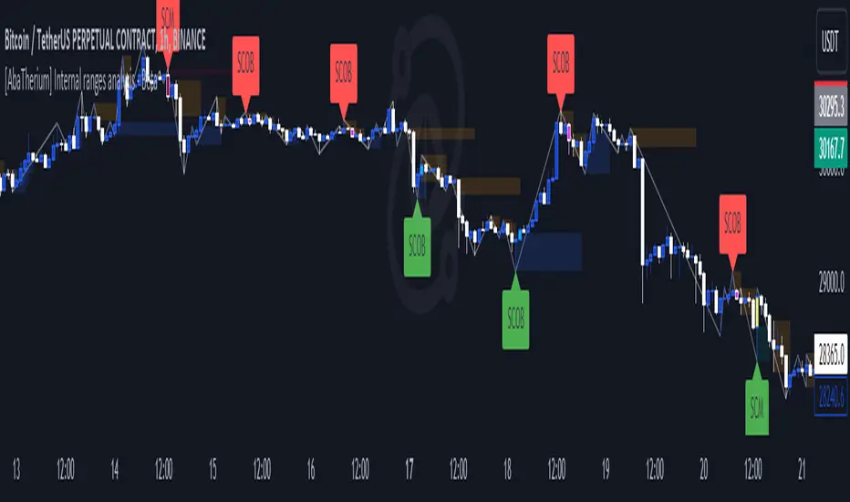
[AlbaTherium] Structure Mapping with Demand & Supply Zones Structure Mapping v3.0 with Demand & Supply Zones
Introduction:
Structure Mapping v3.0 with Demand & Supply Zones marks a significant advancement in the realm of technical analysis and trading tools. This latest version of the indicator is designed to offer traders a comprehensive understanding of market structure and key demand and supply zones based on a refined version of Smart Money Concepts. All the concepts integrated into this method are meticulously defined, empowering users to map the market structure with confidence. With this indicator, there's no need to doubt the accuracy of your markings; it performs this task effectively. There are no hidden 'magic' properties underlying this indicator, ensuring that our users can independently verify each and every feature. It is our unwavering commitment to transparency that distinguishes us and makes us unique in the market.
Chapter 1: Understanding Market Structure
1.1 Market Structure Defined:
- Market structure forms the bedrock upon which successful trading strategies are constructed. It encompasses the highs, lows, and significant price levels that shape a market's behavior. Structure Mapping v3.0 provides a clear visualization of market structure, enabling traders to identify crucial support and resistance levels.
1.2 The Power of Structural Analysis:
- Structural analysis is a pivotal component of this indicator. By recognizing the fundamental elements of market structure, traders can make informed decisions regarding trend direction, potential reversals, and optimal entry and exit points.
1.3 Rules for Structure Mapping:
Let's explore some key definitions:
- Inside bars: These are candles that exist within the range of a preceding candle.
- Pullbacks: In an uptrend, a valid pullback occurs when the low of a previous candle's range (excluding inside bars) is breached, and the price continues to rise.
- Inducements (IDM): An inducement is a price level. In an uptrend, it is defined as the low of the latest pullback before the highest high. It is considered a liquidity area, often revisited by the market to access liquidity before continuing its upward movement.
- Break of Structure (BoS): In an uptrend, after surpassing an IDM , the highest high becomes a Confirmed structure high, or a Major High . If the price then closes above this Major High, a Bullish Break of Structure (Bullish BoS) is confirmed. Similarly, the lowest point between these movements becomes a Confirmed structure low or Major Low in a downtrend.
Change of Character (ChoCh):
In an uptrend, if the price falls below a Major Low, it indicates a shift in market bias from Bullish to Bearish, or a Bearish Change of Character.
Example of a bullish ChoCh:
Chapter 2: Demand & Supply Zones
2.1 Introduction to Demand & Supply Zones:
- Demand and Supply zones are critical areas on a price chart where significant buying or selling pressure is expected. This indicator highlights these zones, enabling traders to anticipate potential price reactions.
2.2 Identifying Demand and Supply Zones:
A Demand or Supply zone is the first candle of a pullback that leaves a Fair value gap.
Classic example of a trade with our indicator:
Conclusion:
Structure Mapping v3.0 with Demand & Supply Zones is a potent tool for traders seeking to gain an advantage in the financial markets. By focusing on market structure and identifying key demand and supply zones, this indicator equips traders with the knowledge they need to make informed decisions. Whether you're a novice or an experienced trader, this tool can enhance your technical analysis and trading strategies in the dynamic world of trading.
This document serves as a comprehensive guide to Structure Mapping v3.0 with Demand & Supply Zones, emphasizing its significance in understanding market dynamics and identifying critical trading zones. Applying these principles in your trading endeavors can lead to improved decision-making and more profitable outcomes.
Liquidity Spike PoolThe “Liquidity Pools” indicator is a tool for market analysts that stands out for its ability to clearly project the intricate zones of manipulation present in financial markets. These crucial territories emerge when supply or demand takes over, resulting in long shadows (wicks) on the chart candles. Imagine these regions as "magnets" for prices, as they represent authentic "liquidity pools" where the flow of money into the market is significantly concentrated. But the value of the indicator goes beyond this simple visualization: these zones, when identified and interpreted correctly, can play a crucial role for traders looking for profitable entry points. They can mutate into important bastions of support or resistance, providing traders with key anchor points to make informed decisions within their trading strategies.
A key aspect to consider is the importance of different time frames in analyzing markets. Larger time frames, such as daily or 4h, tend to host larger and more relevant liquidity zones. Therefore, a successful strategy might involve identifying these areas of manipulation over longer time frames through the use of this indicator, and then applying these findings to shorter time frames. This approach allows you to turn manipulation zones into crucial reference points that merit constant surveillance while making trading decisions on shorter time frames.
The indicator uses color to convey information clearly and effectively:
- Dark blue lines highlight candles with significant upper wick, signaling the possible presence of an important manipulation area in the considered area.
- Dark red lines are reserved for sizable candlesticks with significant upper wick, emphasizing situations that are particularly relevant to traders.
- Dark gray lines highlight candles with significant lower wick, providing a valuable indication of manipulation zones where the bid may have prevailed.
- White lines highlight sizable candlesticks with significant lower wick, clearly indicating situations where demand has been predominant and may have helped form a liquidity pool.
This indicator constitutes an important resource for identifying and clearly displaying candles with significant wicks, allowing traders to distinguish between ordinary market conditions and circumstances particularly relevant to their trading strategies. Thanks to the distinctive colors of the lines, the indicator offers intuitive visual guidance, allowing traders to make more informed decisions while carrying out their analyses.
GKD-C Chaos Visual Averages [Loxx]The Giga Kaleidoscope GKD-C Chaos Visual Averages is a confirmation module included in Loxx's "Giga Kaleidoscope Modularized Trading System."
? GKD-C Chaos Visual Averages
One of the most common errors made by inexperienced traders is attempting to extract excessive information from a single chart by employing numerous unnecessary indicators. The outcome often entails a cluttered chart filled with lines, erratic patterns, and an assortment of distracting elements, all of which weave a conflicting narrative for the trader.
This on-screen "clutter" can bewilder new traders, compelling them to open or maintain unprofitable positions until the dreaded Margin Call looms.
The advice is clear: Keep it simple. But how can one achieve this simplicity?
Enter the Chaos Visual Averages indicator
This indicator not only generates the most precise reversal signals available but also equips traders to seamlessly align with prevailing trends and engage in counter-trend trading to realign with the overall market direction.
For traders opting to employ Chaos, a clean and uncluttered chart is recommended, eschewing the use of additional oscillators, as all the necessary components are already integrated into Visual Chaos.
Tip: Crafting a straightforward and profitable trading system with Chaos involves marking Weekly and Daily Support and Resistance lines and executing counter-trend trades as price approaches these key levels, utilizing the Overbought Extreme and Oversold Extreme signals from the 15-minute Chaos.
Pros:
Remarkable precision in identifying market reversals.
Visually appealing and easily interpretable market conditions.
Suitable for both trend-following and counter-trend trading.
Robust back-testing results (nearly 95% accuracy on "Extreme" signals).
An all-encompassing indicator capable of supporting a livelihood through trading.
Cons:
In rare instances, even with Overbought "Extreme" and Oversold "Extreme" conditions, the indicator may lead to trading against a robust trend, resulting in significant drawdowns before eventual price reversal.
Overbought "Extreme" and Oversold "Extreme" signals can be infrequent when trading on the 15-minute timeframe and above. To mitigate this, it is advisable to trade at least 8 major currency pairs to receive "Extreme" signals with greater frequency."
? Giga Kaleidoscope Modularized Trading System
Core components of an NNFX algorithmic trading strategy
The NNFX algorithm is built on the principles of trend, momentum, and volatility. There are six core components in the NNFX trading algorithm:
1. Volatility - price volatility; e.g., Average True Range, True Range Double, Close-to-Close, etc.
2. Baseline - a moving average to identify price trend
3. Confirmation 1 - a technical indicator used to identify trends
4. Confirmation 2 - a technical indicator used to identify trends
5. Continuation - a technical indicator used to identify trends
6. Volatility/Volume - a technical indicator used to identify volatility/volume breakouts/breakdown
7. Exit - a technical indicator used to determine when a trend is exhausted
8. Metamorphosis - a technical indicator that produces a compound signal from the combination of other GKD indicators*
*(not part of the NNFX algorithm)
What is Volatility in the NNFX trading system?
In the NNFX (No Nonsense Forex) trading system, ATR (Average True Range) is typically used to measure the volatility of an asset. It is used as a part of the system to help determine the appropriate stop loss and take profit levels for a trade. ATR is calculated by taking the average of the true range values over a specified period.
True range is calculated as the maximum of the following values:
-Current high minus the current low
-Absolute value of the current high minus the previous close
-Absolute value of the current low minus the previous close
ATR is a dynamic indicator that changes with changes in volatility. As volatility increases, the value of ATR increases, and as volatility decreases, the value of ATR decreases. By using ATR in NNFX system, traders can adjust their stop loss and take profit levels according to the volatility of the asset being traded. This helps to ensure that the trade is given enough room to move, while also minimizing potential losses.
Other types of volatility include True Range Double (TRD), Close-to-Close, and Garman-Klass
What is a Baseline indicator?
The baseline is essentially a moving average, and is used to determine the overall direction of the market.
The baseline in the NNFX system is used to filter out trades that are not in line with the long-term trend of the market. The baseline is plotted on the chart along with other indicators, such as the Moving Average (MA), the Relative Strength Index (RSI), and the Average True Range (ATR).
Trades are only taken when the price is in the same direction as the baseline. For example, if the baseline is sloping upwards, only long trades are taken, and if the baseline is sloping downwards, only short trades are taken. This approach helps to ensure that trades are in line with the overall trend of the market, and reduces the risk of entering trades that are likely to fail.
By using a baseline in the NNFX system, traders can have a clear reference point for determining the overall trend of the market, and can make more informed trading decisions. The baseline helps to filter out noise and false signals, and ensures that trades are taken in the direction of the long-term trend.
What is a Confirmation indicator?
Confirmation indicators are technical indicators that are used to confirm the signals generated by primary indicators. Primary indicators are the core indicators used in the NNFX system, such as the Average True Range (ATR), the Moving Average (MA), and the Relative Strength Index (RSI).
The purpose of the confirmation indicators is to reduce false signals and improve the accuracy of the trading system. They are designed to confirm the signals generated by the primary indicators by providing additional information about the strength and direction of the trend.
Some examples of confirmation indicators that may be used in the NNFX system include the Bollinger Bands, the MACD (Moving Average Convergence Divergence), and the MACD Oscillator. These indicators can provide information about the volatility, momentum, and trend strength of the market, and can be used to confirm the signals generated by the primary indicators.
In the NNFX system, confirmation indicators are used in combination with primary indicators and other filters to create a trading system that is robust and reliable. By using multiple indicators to confirm trading signals, the system aims to reduce the risk of false signals and improve the overall profitability of the trades.
What is a Continuation indicator?
In the NNFX (No Nonsense Forex) trading system, a continuation indicator is a technical indicator that is used to confirm a current trend and predict that the trend is likely to continue in the same direction. A continuation indicator is typically used in conjunction with other indicators in the system, such as a baseline indicator, to provide a comprehensive trading strategy.
What is a Volatility/Volume indicator?
Volume indicators, such as the On Balance Volume (OBV), the Chaikin Money Flow (CMF), or the Volume Price Trend (VPT), are used to measure the amount of buying and selling activity in a market. They are based on the trading volume of the market, and can provide information about the strength of the trend. In the NNFX system, volume indicators are used to confirm trading signals generated by the Moving Average and the Relative Strength Index. Volatility indicators include Average Direction Index, Waddah Attar, and Volatility Ratio. In the NNFX trading system, volatility is a proxy for volume and vice versa.
By using volume indicators as confirmation tools, the NNFX trading system aims to reduce the risk of false signals and improve the overall profitability of trades. These indicators can provide additional information about the market that is not captured by the primary indicators, and can help traders to make more informed trading decisions. In addition, volume indicators can be used to identify potential changes in market trends and to confirm the strength of price movements.
What is an Exit indicator?
The exit indicator is used in conjunction with other indicators in the system, such as the Moving Average (MA), the Relative Strength Index (RSI), and the Average True Range (ATR), to provide a comprehensive trading strategy.
The exit indicator in the NNFX system can be any technical indicator that is deemed effective at identifying optimal exit points. Examples of exit indicators that are commonly used include the Parabolic SAR, the Average Directional Index (ADX), and the Chandelier Exit.
The purpose of the exit indicator is to identify when a trend is likely to reverse or when the market conditions have changed, signaling the need to exit a trade. By using an exit indicator, traders can manage their risk and prevent significant losses.
In the NNFX system, the exit indicator is used in conjunction with a stop loss and a take profit order to maximize profits and minimize losses. The stop loss order is used to limit the amount of loss that can be incurred if the trade goes against the trader, while the take profit order is used to lock in profits when the trade is moving in the trader's favor.
Overall, the use of an exit indicator in the NNFX trading system is an important component of a comprehensive trading strategy. It allows traders to manage their risk effectively and improve the profitability of their trades by exiting at the right time.
What is an Metamorphosis indicator?
The concept of a metamorphosis indicator involves the integration of two or more GKD indicators to generate a compound signal. This is achieved by evaluating the accuracy of each indicator and selecting the signal from the indicator with the highest accuracy. As an illustration, let's consider a scenario where we calculate the accuracy of 10 indicators and choose the signal from the indicator that demonstrates the highest accuracy.
The resulting output from the metamorphosis indicator can then be utilized in a GKD-BT backtest by occupying a slot that aligns with the purpose of the metamorphosis indicator. The slot can be a GKD-B, GKD-C, or GKD-E slot, depending on the specific requirements and objectives of the indicator. This allows for seamless integration and utilization of the compound signal within the GKD-BT framework.
How does Loxx's GKD (Giga Kaleidoscope Modularized Trading System) implement the NNFX algorithm outlined above?
Loxx's GKD v2.0 system has five types of modules (indicators/strategies). These modules are:
1. GKD-BT - Backtesting module (Volatility, Number 1 in the NNFX algorithm)
2. GKD-B - Baseline module (Baseline and Volatility/Volume, Numbers 1 and 2 in the NNFX algorithm)
3. GKD-C - Confirmation 1/2 and Continuation module (Confirmation 1/2 and Continuation, Numbers 3, 4, and 5 in the NNFX algorithm)
4. GKD-V - Volatility/Volume module (Confirmation 1/2, Number 6 in the NNFX algorithm)
5. GKD-E - Exit module (Exit, Number 7 in the NNFX algorithm)
6. GKD-M - Metamorphosis module (Metamorphosis, Number 8 in the NNFX algorithm, but not part of the NNFX algorithm)
(additional module types will added in future releases)
Each module interacts with every module by passing data to A backtest module wherein the various components of the GKD system are combined to create a trading signal.
That is, the Baseline indicator passes its data to Volatility/Volume. The Volatility/Volume indicator passes its values to the Confirmation 1 indicator. The Confirmation 1 indicator passes its values to the Confirmation 2 indicator. The Confirmation 2 indicator passes its values to the Continuation indicator. The Continuation indicator passes its values to the Exit indicator, and finally, the Exit indicator passes its values to the Backtest strategy.
This chaining of indicators requires that each module conform to Loxx's GKD protocol, therefore allowing for the testing of every possible combination of technical indicators that make up the six components of the NNFX algorithm.
What does the application of the GKD trading system look like?
Example trading system:
Backtest: Multi-Ticker CC Backtest
Baseline: Hull Moving Average
Volatility/Volume: Hurst Exponent
Confirmation 1: Advance Trend Pressure as shown on the chart above
Confirmation 2: uf2018
Continuation: Coppock Curve
Exit: Rex Oscillator
Metamorphosis: Baseline Optimizer
Each GKD indicator is denoted with a module identifier of either: GKD-BT, GKD-B, GKD-C, GKD-V, GKD-M, or GKD-E. This allows traders to understand to which module each indicator belongs and where each indicator fits into the GKD system.
? Giga Kaleidoscope Modularized Trading System Signals
Standard Entry
1. GKD-C Confirmation gives signal
2. Baseline agrees
3. Price inside Goldie Locks Zone Minimum
4. Price inside Goldie Locks Zone Maximum
5. Confirmation 2 agrees
6. Volatility/Volume agrees
1-Candle Standard Entry
1a. GKD-C Confirmation gives signal
2a. Baseline agrees
3a. Price inside Goldie Locks Zone Minimum
4a. Price inside Goldie Locks Zone Maximum
Next Candle
1b. Price retraced
2b. Baseline agrees
3b. Confirmation 1 agrees
4b. Confirmation 2 agrees
5b. Volatility/Volume agrees
Baseline Entry
1. GKD-B Baseline gives signal
2. Confirmation 1 agrees
3. Price inside Goldie Locks Zone Minimum
4. Price inside Goldie Locks Zone Maximum
5. Confirmation 2 agrees
6. Volatility/Volume agrees
7. Confirmation 1 signal was less than 'Maximum Allowable PSBC Bars Back' prior
1-Candle Baseline Entry
1a. GKD-B Baseline gives signal
2a. Confirmation 1 agrees
3a. Price inside Goldie Locks Zone Minimum
4a. Price inside Goldie Locks Zone Maximum
5a. Confirmation 1 signal was less than 'Maximum Allowable PSBC Bars Back' prior
Next Candle
1b. Price retraced
2b. Baseline agrees
3b. Confirmation 1 agrees
4b. Confirmation 2 agrees
5b. Volatility/Volume agrees
Volatility/Volume Entry
1. GKD-V Volatility/Volume gives signal
2. Confirmation 1 agrees
3. Price inside Goldie Locks Zone Minimum
4. Price inside Goldie Locks Zone Maximum
5. Confirmation 2 agrees
6. Baseline agrees
7. Confirmation 1 signal was less than 7 candles prior
1-Candle Volatility/Volume Entry
1a. GKD-V Volatility/Volume gives signal
2a. Confirmation 1 agrees
3a. Price inside Goldie Locks Zone Minimum
4a. Price inside Goldie Locks Zone Maximum
5a. Confirmation 1 signal was less than 'Maximum Allowable PSVVC Bars Back' prior
Next Candle
1b. Price retraced
2b. Volatility/Volume agrees
3b. Confirmation 1 agrees
4b. Confirmation 2 agrees
5b. Baseline agrees
Confirmation 2 Entry
1. GKD-C Confirmation 2 gives signal
2. Confirmation 1 agrees
3. Price inside Goldie Locks Zone Minimum
4. Price inside Goldie Locks Zone Maximum
5. Volatility/Volume agrees
6. Baseline agrees
7. Confirmation 1 signal was less than 7 candles prior
1-Candle Confirmation 2 Entry
1a. GKD-C Confirmation 2 gives signal
2a. Confirmation 1 agrees
3a. Price inside Goldie Locks Zone Minimum
4a. Price inside Goldie Locks Zone Maximum
5a. Confirmation 1 signal was less than 'Maximum Allowable PSC2C Bars Back' prior
Next Candle
1b. Price retraced
2b. Confirmation 2 agrees
3b. Confirmation 1 agrees
4b. Volatility/Volume agrees
5b. Baseline agrees
PullBack Entry
1a. GKD-B Baseline gives signal
2a. Confirmation 1 agrees
3a. Price is beyond 1.0x Volatility of Baseline
Next Candle
1b. Price inside Goldie Locks Zone Minimum
2b. Price inside Goldie Locks Zone Maximum
3b. Confirmation 1 agrees
4b. Confirmation 2 agrees
5b. Volatility/Volume agrees
Continuation Entry
1. Standard Entry, 1-Candle Standard Entry, Baseline Entry, 1-Candle Baseline Entry, Volatility/Volume Entry, 1-Candle Volatility/Volume Entry, Confirmation 2 Entry, 1-Candle Confirmation 2 Entry, or Pullback entry triggered previously
2. Baseline hasn't crossed since entry signal trigger
4. Confirmation 1 agrees
5. Baseline agrees
6. Confirmation 2 agrees

Test - Symbiotic Exiton Measure Enthropic Nexus indicatorThe Symbiotic Exiton Measure Enthropic Nexus (SEMEN) Indicator is a technical analysis tool used in trading and investing. It's name might sound complex, but its function is quite simple - to help traders make informed decisions about buying or selling stocks by predicting market trends.
The SEMEN indicator uses a combination of various factors such as volume, price action, moving averages, and other indicators to generate a single numerical value that represents the overall health of the market. A high reading indicates a strong uptrend, while a low one suggests a downtrend.
Traders can use this information to enter or exit positions with confidence.
In essence, the SEMEN indicator provides a comprehensive view of the market's sentiment and direction, making it an essential tool for any trader or investor looking to make profitable decisions in today's volatile stock markets.
~description generated with Airoboros7b
- The indicator is experimental so use at your own discretion..
MFR RangeHello Traders!
You requested it for many months, we are finally making our proprietary Range available to all.
First of all, how should a trader consider a Range in general:
In trading, a "range" refers to a specific price interval or zone within which an asset's price moves or consolidates for a period of time. Ranges are characterized by relatively horizontal or sideways price movements, where the price oscillates between a defined upper and lower boundary. Traders often use ranges to identify potential trading opportunities, manage risk, and make trading decisions.
Here's how ranges are used in trading:
1. Range Identification:
Traders identify ranges by observing price charts and looking for periods where the price appears to be moving horizontally with clear upper and lower boundaries.
Common range patterns include rectangles, channels, and horizontal consolidations.
2. Range Trading Strategies:
Range trading strategies aim to profit from price movements within the established range. Traders typically use two main approaches within a range:
Buying near the range's lower boundary: Traders buy when the price approaches the lower end of the range, anticipating a bounce or reversal towards the upper boundary. This is often referred to as "buying support."
Selling near the range's upper boundary: Traders sell when the price approaches the upper end of the range, anticipating a pullback or reversal towards the lower boundary. This is known as "selling resistance."
3. Risk Management:
Stop-loss orders are crucial when trading ranges. Traders set stop-loss orders just outside the range's boundaries to limit potential losses if the price breaks out of the range unpredictably.
4. Range Breakouts:
Ranges do not last indefinitely, and eventually, the price may break out of the range, leading to a significant price movement.
Traders often look for breakout patterns and use breakout trading strategies to capitalize on the potential for a strong price movement after the range is broken.
5. Volatility Consideration:
Some traders may assess the volatility within the range. If the price oscillates within the range with high volatility, they may consider trading shorter timeframes for smaller, quicker profits.
Lower volatility may prompt longer-term traders to take positions within the range, expecting a slower, more controlled price movement.
6. Time Frame Analysis:
Traders may analyze the time frame in which the range has developed, in our case MFR range are based solely on the Daily timeframe.
7. Confirmation Indicators:
Traders often use technical indicators like Relative Strength Index (RSI), Moving Averages, or Bollinger Bands to confirm range trading signals and assess overbought or oversold conditions.
8. Range Boundaries as Support and Resistance:
Once a range is identified, its upper and lower boundaries can serve as key support and resistance levels even after the range is broken. Traders pay attention to these levels for future trading decisions.
9. Range Expansion:
Some traders look for signs of range expansion, where the price starts to break out or trend strongly. This can signal the end of a range-bound market and a transition to a trending market.
It's important to note that while range trading can be profitable, it requires careful analysis and risk management. Traders must be prepared for the possibility of a breakout that can result in significant losses if they are on the wrong side of the trade. Additionally, market conditions can change, and ranges can evolve into trends or other patterns, so traders need to adapt their strategies accordingly.
What is specific to MFR range?
This script calculates and plots a trading range on a daily timeframe based on historical price data. Based on Benoit Mandelbrot and Edgar E. Peters publications on Range, we run a set of calculations over a defined period. The script will define those to generate the "Range High" and "Range Low". These values are used to define the upper and lower bounds of the trading range.
In short, how could I use this script?
A trader could use the Range to find overbought or oversold points to enter a position. The Lower Range being the price to buy an asset and the Upper Range being the place to sell an asset. This is recommended to be implemented only when our other indication called Trend matches the strategy: buy when the trend is bullish or short when the trend is bearish.
It's important to note that while Range is a useful tool, it should not be relied upon solely for making trading decisions. It's recommended to use it in conjunction with other technical analysis tools and consider other factors such as market conditions, risk management, and fundamental analysis. Remember that the Range indicator is just one tool among many, and it's important to consider other factors such as volume, momentum, volatility, and overall market conditions when making trading decisions. Additionally, using stop-loss orders and proper risk management techniques is crucial to mitigate potential losses.
We hope that you will find these explanations useful, please contact us by private message for access.
Enjoy!
DISCLAIMER: No sharing, copying, reselling, modifying, or any other forms of use are authorised. This script is strictly for individual use and educational purposes only. This is not financial or investment advice. Investments are always made at your own risk and are based on your personal judgement. Myfractalrange is not responsible for any losses you may incur. Please invest wisely.