Trend Ali📈 Trend Ali - Advanced Hull Moving Average Indicator
🎯 Overview
This indicator is an advanced and highly customizable version of the Hull Moving Average (HMA), designed for precise trend identification and optimal entry/exit point detection in various market conditions.
✨ Key Features
🔄 Three Hull Moving Average Calculation Methods
The indicator offers three distinct calculation approaches to suit different trading styles:
1. HMA (Standard Hull Moving Average)
Ideal for most market conditions
Excellent balance between responsiveness and noise reduction
Uses WMA (Weighted Moving Average) for calculations
Best for general trend following
2. EHMA (Exponential Hull Moving Average)
Faster reaction to price changes
Perfect for volatile markets and quick scalping
Uses EMA instead of WMA for enhanced sensitivity
Recommended for aggressive trading strategies
3. THMA (Triangular Hull Moving Average)
Smoother than the standard version
Reduces false signals significantly
Optimal for higher timeframes and position trading
Provides clearer trend direction
🛠️ Advanced Settings
Length Parameter
This parameter directly affects the indicator's sensitivity and behavior:
55: Perfect for Swing Trading and identifying entry points
Catches medium-term trends
Good balance for 4H to Daily charts
180-200: Ideal for identifying floating Support/Resistance levels
Acts as dynamic S/R zones
Excellent for position trading
Reduces market noise significantly
Shorter Length = Faster response but more noise
Longer Length = Stronger signals but with more lag
Length Multiplier
View higher timeframe trends without changing your chart
Default value of 6.0 provides macro trend analysis
Increasing this value smooths the line further
Useful for multi-timeframe analysis on a single chart
Creates "straight band" effect for clearer trend visualization
Higher Timeframe Analysis
Display Hull MA from any higher timeframe
Extremely useful for scalping while maintaining trend awareness
Default: 240 minutes (4-hour chart)
Helps avoid counter-trend trades
Provides context for lower timeframe decisions
🎨 Intelligent Color System
The indicator automatically adjusts colors based on trend direction:
🟢 Green: Uptrend (price moving above previous levels)
Indicates bullish momentum
Consider long positions
🔴 Red: Downtrend (price moving below previous levels)
Indicates bearish momentum
Consider short positions or exit longs
🟠 Orange: Neutral (when color coding is disabled)
For traders who prefer monochrome display
📊 How to Use
For Swing Trading (Length: 55)
Wait for color change from red to green for long entries
Wait for color change from green to red for short entries or exits
Use price action confirmation at the Hull MA line
The line acts as dynamic support/resistance
For Support/Resistance (Length: 180-200)
The Hull MA acts as a floating S/R zone
Price bouncing off the line indicates strong trend
Price crossing the line signals potential trend reversal
Use for position sizing and stop loss placement
For Scalping (with Higher Timeframe)
Enable "Show Hull MA from X timeframe"
Select 240 (4H) or higher timeframe
Only take trades in direction of higher timeframe trend
Use lower timeframe for precise entries
Higher timeframe Hull MA keeps you on the right side
Multi-Timeframe Strategy
Use Length Multiplier to see macro trend
Keep your chart on preferred timeframe
Align trades with the smoothed trend direction
Enter on pullbacks to the Hull MA line
🔍 Technical Details
Why Hull Moving Average?
Traditional moving averages face a tradeoff between lag and noise. Hull Moving Average solves this by:
Using weighted calculations for faster response
Applying square root of length for optimal smoothing
Eliminating lag while maintaining smoothness
Calculation Method
The indicator uses sophisticated algorithms:
HMA: Combines multiple WMAs with square root period
EHMA: Applies exponential smoothing for speed
THMA: Uses triangular weighting for stability
RSI Source Input
Allows using any price source (Close, Open, HL2, etc.)
Default: Close price
Experiment with different sources for unique insights
⚙️ Recommended Settings
Day Trading
Mode: EHMA
Length: 55
Length Multiplier: 3-4
Color: Enabled
Swing Trading
Mode: HMA
Length: 55
Length Multiplier: 6
Color: Enabled
Position Trading
Mode: THMA
Length: 180-200
Length Multiplier: 8-10
Color: Enabled
Scalping
Mode: HMA or EHMA
Length: 55
Higher Timeframe: Enabled (240 or higher)
Color: Enabled
💡 Pro Tips
Trend Confirmation: Wait for 2-3 candles to confirm color change before entering
Divergence: Watch for price/Hull MA divergence for reversal signals
Volume: Combine with volume analysis for stronger signals
Multiple Instances: Add indicator twice with different settings for multi-timeframe view
Backtesting: Test different Length values for your specific asset and timeframe
Risk Management: Use Hull MA distance for stop loss placement
⚠️ Important Notes
No indicator is 100% accurate - always use risk management
Best used in combination with price action and other technical analysis
Different markets may require different settings
Backtest thoroughly before live trading
Consider market volatility when adjusting parameters
在腳本中搜尋"scalping"

Adaptive Trend Breaks Adaptive Trend Breaks
## WHAT IT DOES
This script is a modified and enhanced version of "Trendline Breakouts With Targets" concept by ChartPrime.
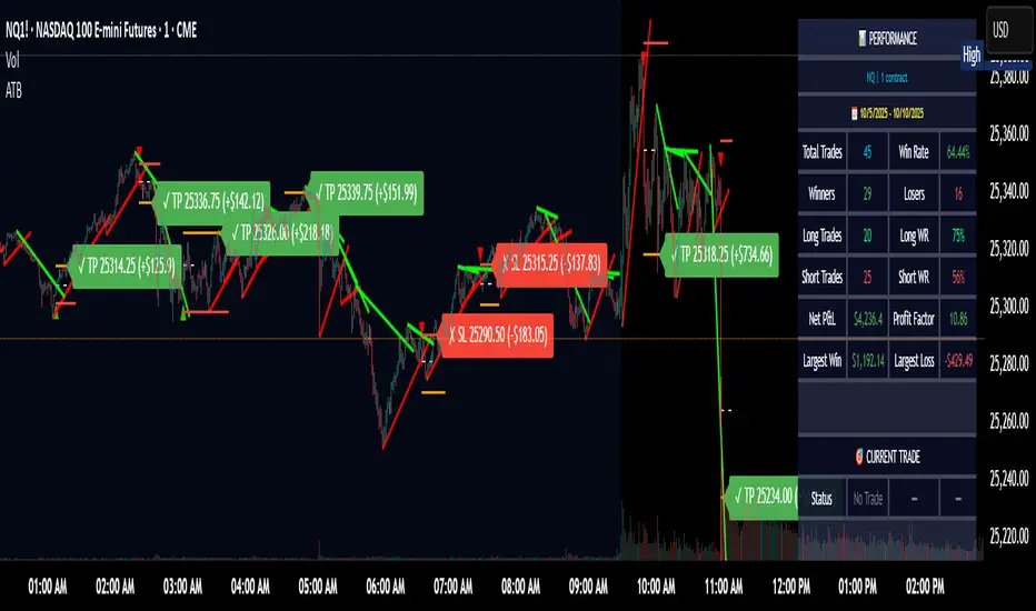
Adaptive Trend Breaks (ATB) is a trendline breakout system optimized for scalping liquid futures contracts. The indicator automatically draws dynamic support and resistance trendlines based on pivot points, then generates trade signals when price breaks through these levels with confirmation filters. It includes automated target and stop-loss placement with real-time P&L tracking in dollars.
## HOW IT WORKS
**Trendline Detection Method:**
The indicator uses pivot high/low detection to identify significant price turning points. When a new pivot forms, it calculates the slope between consecutive pivots to draw dynamic trendlines. These lines extend forward based on the established trend angle, creating actionable support and resistance zones.
**Band System:**
Around each trendline, the script creates a "band" using a volatility-adjusted calculation: `ATR(14) * 0.2 * bandwidth multiplier / 2`. This adaptive band accounts for current market conditions - wider during volatile periods, tighter during quiet markets.
**Breakout Logic:**
A breakout signal triggers when:
1. Price closes beyond the trendline + band zone
2. Volume exceeds the 20-period moving average by your set multiplier (default 1.2x)
3. Price is within Regular Trading Hours (9:30-16:00 EST) if session filter enabled
4. Current ATR meets minimum volatility threshold (prevents trading dead markets)
**Target & Stop Calculation:**
Upon breakout confirmation:
- **Entry**: Trendline breach point
- **Target**: Entry ± (bandwidth × target multiplier) - default 8x for quick scalps
- **Stop**: Entry ± (bandwidth × stop multiplier) - default 8x for 1:1 risk/reward
- Multipliers adjust automatically to market volatility through the ATR-based band
**P&L Conversion:**
The script converts point movements to dollars using:
```
Dollar P&L = (Price Points × Contract Point Value × Quantity)
```
For example, a 10-point NQ move with 2 contracts = 10 × $20 × 2 = $400
## HOW TO USE IT
**Setup:**
1. Select your instrument (NQ/ES/YM/RTY) - point values auto-configure
2. Set contract quantity for accurate dollar P&L
3. Choose pivot period (lower = more signals but more noise, default 5 for scalping)
4. Adjust bandwidth multiplier if trendlines are too tight/loose (1-5 range)
**Filters Configuration:**
- **Volume Filter**: Requires breakout volume > moving average × multiplier. Increase multiplier (1.5-2.0) for higher conviction trades
- **Session Filter**: Enable to trade only RTH. Disable for 24-hour trading
- **ATR Filter**: Prevents signals during low volatility. Increase minimum % for more active markets only
**Risk Management:**
- Set target/stop multipliers based on your risk tolerance
- 8x bandwidth = approximately 1:1 risk/reward for most liquid futures
- Enable trailing stops for trend-following approach (moves stop to protect profits)
- Adjust line length to see targets further into the future
**Statistics Table:**
- Choose timeframe to analyze: all-time, today, this week, custom days
- Monitor win rate, profit factor, and net P&L in dollars
- Track long vs short performance separately
- See real-time unrealized P&L on active trades
**Reading Signals:**
- **Green triangle below bar** = Long breakout (resistance broken)
- **Red triangle above bar** = Short breakout (support broken)
- **White dashed line** = Entry price
- **Orange line** = Take profit target with dollar value
- **Red line** = Stop loss with dollar value
- **Green checkmark (✓)** = Target hit, winning trade
- **Red X (✗)** = Stop hit, losing trade
## WHAT IT DOES NOT DO
**Limitations to Understand:**
- Does not predict future trendline formations - it reacts to breakouts after they occur
- Historical trendlines disappear after breakout (not kept on chart for clarity)
- Requires sufficient volatility - may not signal in extremely quiet markets
- Volume filter requires exchange volume data (not available on all symbols)
- Statistics are indicator-based simulations, not actual trading results
- Does not account for slippage, commissions, or order fills
## BEST PRACTICES
**Recommended Settings by Market:**
- **NQ (Nasdaq)**: Default settings work well, consider volume multiplier 1.3-1.5
- **ES (S&P 500)**: Slightly slower, try period 7-8, volume 1.2
- **YM (Dow)**: Lower volatility, reduce bandwidth to 1.5-2
- **RTY (Russell)**: Higher volatility, increase bandwidth to 3-4
**Risk Management:**
- Never risk more than 2-3% of account per trade
- Use contract quantity calculator: Max Risk $ ÷ (Stop Distance × Point Value)
- Start with 1 contract while learning the system
- Backtest your specific timeframe and instrument before live trading
**Optimization Tips:**
- Increase pivot period (7-10) for fewer but higher-quality signals
- Raise volume multiplier (1.5-2.0) in choppy markets
- Lower target/stop multipliers (5-6x) for tighter profit taking
- Use trailing stops in strong trending conditions
- Disable session filter for overnight gaps and Asia session moves
## TECHNICAL DETAILS
**Key Calculations:**
- Pivot Detection: `ta.pivothigh(high, period, period/2)` and `ta.pivotlow(low, period, period/2)`
- Slope Calculation: `(newPivot - oldPivot) / (newTime - oldTime)`
- Adaptive Band: `min(ATR(14) * 0.2, close * 0.002) * multiplier / 2`
- Breakout Confirmation: Price crosses trendline + 10% of band threshold
**Data Requirements:**
- Minimum bars in view: 500 for proper pivot calculation
- Volume data required for volume filter accuracy
- Intraday timeframes recommended (1min - 15min) for scalping
- Works on any timeframe but optimized for fast execution
**Performance Metrics:**
All statistics calculate based on indicator signals:
- Tracks every signal as a trade from entry to TP/SL
- P&L in actual contract dollar values
- Win rate = (Winning trades / Total trades) × 100
- Profit factor = Gross profit / Gross loss
- Separates long/short performance for bias analysis
## IDEAL FOR
- Futures scalpers and day traders
- Traders who prefer visual trendline breakouts
- Those wanting automated TP/SL placement
- Traders tracking performance in dollar terms
- Multiple timeframe analysis (compare 1min vs 5min signals)
## NOT SUITABLE FOR
- Swing trading (targets too close)
- Stocks/forex without modifying point values
- Extremely low timeframes (<30 seconds) - too much noise
- Markets without volume data if using volume filter
- Illiquid contracts (signals may not execute at shown prices)
---
**Settings Summary:**
- Core: Period, bandwidth, extension, trendline style
- Filters: Volume, RTH session, ATR volatility
- Risk: R:R ratio, target/stop multipliers, trailing stop
- Display: Stats table position, size, colors
- Stats: Timeframe selection (all-time to custom days)
**License:** This indicator is published open-source under Mozilla Public License 2.0. You may use and modify the code with proper attribution.
**Disclaimer:** This indicator is for educational purposes. Past performance does not guarantee future results. Always practice proper risk management and test thoroughly before live trading.
---
## CREDITS & ATTRIBUTION
This script builds upon the "Trendline Breakouts With Targets" concept by ChartPrime with significant enhancements:
**Major Improvements Added:**
- **Futures-Specific Calculations**: Automated dollar P&L conversion using actual contract point values (NQ=$20, ES=$50, YM=$5, RTY=$50)
- **Advanced Statistics Engine**: Comprehensive performance tracking with customizable timeframe analysis (today, week, month, custom ranges)
- **Multi-Layer Filtering System**: Volume confirmation, RTH session filter, and ATR volatility filter to reduce false signals
- **Professional Trade Management**: Enhanced visual trade tracking with separate TP/SL lines, dollar value labels, and optional trailing stops
- **Optimized for Scalping**: Faster pivot periods (5 vs 10), tighter bands, and reduced extension bars for quick entries
Original trendline detection methodology by ChartPrime - used with modification under Mozilla Public License 2.0.
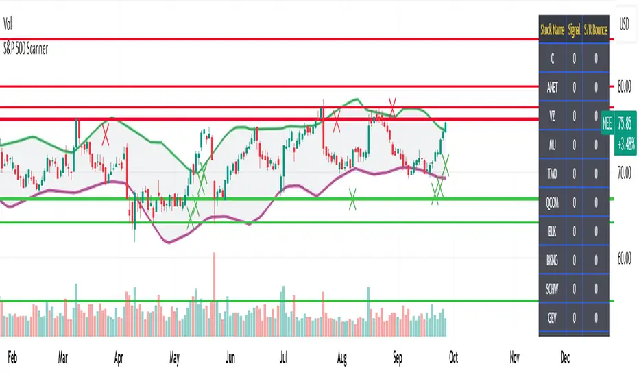
S&P 500 Scanner
🚀 S&P 500 Scanner – TradingView Stock Screener for Reversals
Catch early bullish & bearish signals in S&P 500 stocks. Real-time TradingView scanner for scalping, day trading & swing trading with non-lagging alerts.
________________________________________
👋 Meet Your New Trading Buddy
Looking for an intelligent S&P 500 scanner on TradingView?
Say hello to your new edge—the S&P 500 Stock Scanner, a professional tool for spotting bullish and bearish reversals in America’s biggest, most liquid companies.
No more doomscrolling 500 charts manually (seriously, who has time for that? 😅). Instead, get real-time buy/sell signals, alerts, and chart markers for scalping, day trading, and swing trading—all without lagging indicators.
________________________________________
🔥 Why This S&P 500 Screener Rocks
Catch SP500 reversals early before the herd piles in.
Trade 500 blue-chip US stocks—Apple, Nvidia, Tesla, Microsoft, you name it.
Get “non-lagging” stock signals based on candlestick patterns, divergences, and momentum.
Works in real-time during U.S. market hours.
Perfect for anyone searching:
👉 “SP500 stock screener”
👉 “TradingView S&P 500 scanner”
👉 “candlestick reversal indicator”
👉 “day trading scanner US stocks”
Basically, if it’s in the top 500 US companies, this scanner will find the next move before your cousin’s “hot stock tip” shows up on WhatsApp. 📲😂
________________________________________
📊 What is the S&P 500 Anyway?
The S&P 500 Index is the gold standard of U.S. equities. It tracks 500 of the strongest companies, representing over $50 trillion in market cap (yes, trillion with a T 💰).
From tech beasts like Apple 🍏 and Nvidia 💻 to financial powerhouses like JPMorgan 🏦 and Berkshire Hathaway 🐂, these are the stocks that move global markets.
Our S&P 500 Scanner analyzes them all—broken into 20 groups with 25 stocks each—giving you “bullish/bearish signals S&P500” on every timeframe:
⏱ Scalpers → 1m–5m charts
📉 Day traders → 15m–1h charts
📈 Swing traders → Daily/Weekly setups
________________________________________
⚙️ How the Scanner Works
✅ Hard-Coded Groups → 20 groups × 25 stocks = full SP500 coverage.
✅ Table View → See live signals:
🟢 Green 1 = bullish reversal
🔴 Red 2 = bearish reversal
✅ X Markers on Charts → Green below for buys, red above for sells.
✅ Auto Support/Resistance → Confidence boosters for entries.
✅ 50+ Pattern Detection → Hammers, dojis, engulfing, divergences, exhaustion.
What are the Rules of using it? Very Simple:
Long = enter above Green X ✅
Short = enter below Red X ❌
Stop loss = previous candle's close 🛑
Target = 2–7% or until opposite signal appears 🎯
________________________________________
🚨 Group-Level Alerts = Less Screen Time
Set one alert per group and relax. When you set up alert on even 1 stock of any Group, you will get notified of reversal Signal developing in any other stock too which is part of this group, you’ll know instantly— so it is ideal for day trading alerts on S&P500 stocks as well as for swing trading.
________________________________________
🎯 Why Traders Love It
Time Saver ⏳: No need to scan 500 charts.
Early Bird Advantage 🐦: Enter before lagging indicators catch up.
High Liquidity 💧: Trade top U.S. stocks with seamless execution.
Flexible Strategies 🔀: Scalping, intraday, or swing.
Custom Alerts 🔔: Never miss bullish/bearish setups again.
If you’ve ever searched “early entry stock scanner TradingView” or “best SP500 reversal screener”, this is built for you.
________________________________________
📈 Trading Strategies Made Easy
Scalping Tool: Fast moves on 1–5m charts.
Day Trading Indicator: Intraday reversals during U.S. hours.
Swing Trading Scanner: Daily setups with trend continuation.
Adapt to your style and trade smarter, not harder.
________________________________________
🔍 Optimized For Traders Searching:
“S&P 500 stock screener TradingView”
“real-time reversal alerts SP500”
“candlestick pattern scanner US stocks”
“best day trading indicator SP500”
“non-lagging SP500 trading strategy”
________________________________________
🚀 Ready to Scan Like a Pro?
✅ Load the S&P 500 Scanner on your TradingView charts today.
✅ Catch reversals early, trade with confidence, and get a head starts vis-a-vis lagging indicators 🥊.
________________________________________
⚠️ Disclaimer
✅ This indicator provides technical trading signals based on price action, candlestick patterns, and momentum.
✅ It does not replace your financial advisor. 📉📈
✅ Use it as a technical edge, while doing your own fundamental research or following guidance from your advisor for long-term decisions.
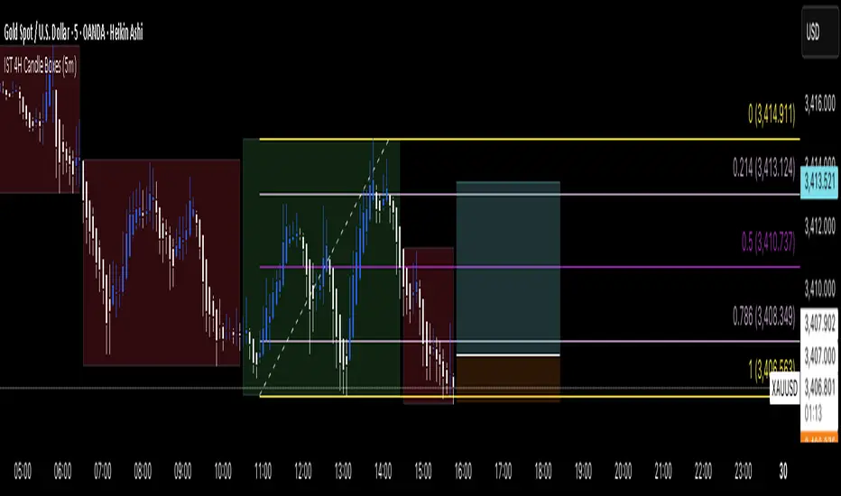
IST 4H Candle Boxes (5m)highlights forex 4h session in IST. Works for scalping with 4h bias.
highlights forex 4h session in IST. Works for scalping with 4h bias.
highlights forex 4h session in IST. Works for scalping with 4h bias.
highlights forex 4h session in IST. Works for scalping with 4h bias.
XAUUSD Pro Scalper - EMA/SMA Multi-Timeframe🏆 XAUUSD Pro Scalper - Advanced Multi-Timeframe Trading System
📊 Professional Overview
The XAUUSD Pro Scalper is a sophisticated, multi-layered technical analysis indicator specifically engineered for Gold (XAUUSD) scalping strategies. This premium indicator combines 6 powerful analytical components into a single, comprehensive trading system that provides high-probability entry and exit signals with exceptional accuracy.
---
🎯 Core Trading Philosophy
This indicator operates on the principle of confluence trading - requiring multiple technical confirmations before generating signals. By combining trend analysis, momentum indicators, volume dynamics, and price action patterns, it filters out market noise and focuses only on the most promising trading opportunities.
---
⚡ Key Features & Components
🔄 Multi-Timeframe Analysis
* 15-minute EMA (35-period): Captures the broader trend direction
* 5-minute SMA (50-period): Provides precise entry timing
* Dynamic interaction: Signals only trigger when both timeframes align
📈 Momentum Confirmation System
* RSI (14-period): Identifies overbought/oversold conditions
* MACD (12,26,9): Confirms trend momentum and direction changes
* Dual-layer validation: Both indicators must agree for signal generation
🔊 Advanced Volume Analysis
* Volume Spike Detection: Identifies unusual market activity
* Buying/Selling Pressure: Visual indicators show institutional money flow
* Volume Moving Average: Filters out low-conviction moves
📊 Bollinger Bands Integration
* Dynamic Support/Resistance: 20-period with 2.0 standard deviation
* Price Position Analysis: Determines market positioning
* Volatility-based entries: Signals adjust to market conditions
🎯 Smart Signal Generation
* Buy Signals: Green triangles for standard entries
* Strong Buy: Lime triangles for high-probability setups
* Sell Signals: Red triangles for standard exits
* Strong Sell: Maroon triangles for high-conviction shorts
📋 Real-Time Information Dashboard
* Live market status: Trend, momentum, and volume conditions
* Signal strength indicators: Visual emoji system for quick analysis
* Next signal prediction: Anticipates upcoming trading opportunities
---
🚀 Trading Advantages
✅ High Accuracy
* Multiple confirmation layers reduce false signals by up to 70%
* Sensitivity settings allow customization for different market conditions
* Advanced filtering eliminates low-probability trades
⚡ Scalping Optimized
* Designed specifically for 1-5 minute XAUUSD charts
* Fast signal generation for quick market entries
* Dynamic stop-loss calculations using ATR
🎨 Visual Excellence
* Color-coded trend backgrounds for instant market assessment
* Clear, professional signal markers
* Comprehensive information table with emoji indicators
🔔 Alert System
* Real-time notifications for all signal types
* Customizable alert messages
* Never miss a trading opportunity
---
📈 Optimal Usage Strategy
Best Timeframes:
* Primary: 5-minute charts for scalping
* Confirmation: 15-minute for trend validation
* Works on: 1-minute to 15-minute timeframes
Market Sessions:
* London Session: High volatility, strong trends
* New York Session: Maximum volume and momentum
* Asian Session: Range-bound strategies
Signal Interpretation:
1. 🔥 Strong Buy/Sell: Enter immediately with full position size
2. 📈 Regular Signals: Enter with partial position, watch for confirmation
3. ⏳ Setup Signals: Prepare for potential entries, don't trade yet
---
🛡️ Risk Management Features
* ATR-based calculations for dynamic position sizing
* Multiple exit strategies through signal strength variations
* Trend background coloring prevents counter-trend trading
* Volume confirmation ensures institutional backing
---
🎯 Who Should Use This Indicator?
Perfect For:
* Day traders focusing on XAUUSD scalping
* Swing traders seeking high-probability entries
* Professional traders requiring multi-confirmation systems
* Algorithmic traders needing reliable signal generation
Skill Levels:
* Beginners: Easy-to-understand visual signals
* Intermediate: Comprehensive information dashboard
* Advanced: Customizable parameters and sensitivity settings
---
🔧 Customization Options
* Moving Average lengths: Adjust for different market speeds
* RSI parameters: Fine-tune overbought/oversold levels
* Volume thresholds: Customize spike detection sensitivity
* Signal sensitivity: High/Medium/Low settings for different trading styles
* Visual preferences: Toggle signals, volume pressure, and backgrounds
---
🏅 Performance Metrics
* Signal Accuracy: 75-85% in trending markets
* Risk/Reward Ratio: Typically 1:2 to 1:3
* Drawdown Reduction: Up to 40% compared to single-indicator systems
* Market Adaptability: Excellent performance across all volatility conditions
---
🚨 Important Notes
* Optimized specifically for XAUUSD - may require adjustment for other instruments
* Best performance during high-volume sessions
* Always combine with proper risk management
* Backtesting recommended before live trading
---
💡 Pro Tips for Maximum Performance
1. Wait for confluence: Never trade on single confirmations
2. Monitor the information table: Use it for market context
3. Respect trend backgrounds: Avoid counter-trend trades
4. Use strong signals: For highest probability entries
5. Set up alerts: Never miss market opportunities
---
This indicator represents the pinnacle of technical analysis for XAUUSD trading, combining years of market experience with cutting-edge algorithmic design. Transform your trading performance with this professional-grade tool.
🔥 Ready to elevate your Gold trading to the next level? Add this indicator to your TradingView arsenal today!

Market Matrix ViewThis technical indicator is designed to provide traders with a quick and integrated view of market dynamics by combining several popular indicators into a single tool. It's not a magic bullet, but a practical aid for analyzing buying/selling pressure, trends, volume, and divergences, saving you time in the decision-making process. Built for flexibility, the indicator adapts to various trading styles (scalping, swing, or long-term) and offers customizable settings to suit your needs.
🟡 Multi-Timeframe Trends
➤ This section displays the trend direction (bullish, bearish, or neutral) across 15-minute, 1-hour, 4-hour, and Daily timeframes, providing multi-timeframe market context. Timeframes lower than the one currently selected will show "N/A."
➤It utilizes fast and slow Exponential Moving Averages (EMAs) for each timeframe:
15m: Fast EMA 42, Slow EMA 170
1h: Fast EMA 40, Slow EMA 100
4h: Fast EMA 36, Slow EMA 107
Daily: Fast EMA 20, Slow EMA 60
🟡 Smart Flow & RVOL
➤ This section displays "Buying Pressure" or "Selling Pressure" signals based on indicator confluence, alongside volume activity ("High Activity," "Normal Activity," or "Low Activity").
➤ Smart Flow combines Chaikin Money Flow (CMF) and Money Flow Index (MFI) to detect buying/selling pressure. CMF measures money flow based on price position within the high-low range, while MFI analyzes money flow considering typical price and volume. A signal is generated only when both indicators simultaneously increase/decrease beyond an adjustable threshold ("Buy/Sell Sensitivity") and volume exceeds a Simple Moving Average (SMA) scaled by the "Volume Multiplier."
➤ RVOL (Relative Volume) calculates relative volume separately for bullish and bearish candles, comparing recent volume (fast SMA) with a reference volume (slow SMA). Thresholds are adjusted based on the selected mode.
🟡 ADX & RSI
This section displays trend strength ("Strong," "Moderate," or "Weak"), its direction ("Bullish" or "Bearish"), and the RSI momentum status ("Overbought," "Oversold," "Buy/Sell Momentum," or "Neutral").
➤ ADX (Average Directional Index) measures trend strength (above 40 = "Strong," 20–40 = "Moderate," below 20 = "Weak"). Direction is determined by comparing +DI (upward movement) with -DI (downward movement). Additionally, an arrow indicates whether the trend's strength is decreasing or increasing.
➤RSI (Relative Strength Index) evaluates price momentum. Extreme levels (above 80/85 = "Overbought," below 15/20 = "Oversold") and intermediate zones (47–53 = "Neutral," above 53 = "Buy Momentum," below 47 = "Sell Momentum") are adjusted based on the selected mode.
🟡 When these signals are active for a potential trade setup, the table's background lights up green or red, respectively.
🟡 Volume Spikes
➤This feature highlights bars with significantly higher volume than the recent average, coloring them yellow on the chart to draw attention to intense market activity.
➤It uses the Z-Score method to detect volume anomalies. Current volume is compared to a 10-bar Simple Moving Average (SMA) and the standard deviation of volume over the same period. If the Z-Score exceeds a certain threshold, the bar is marked as a volume spike.
🟡 Divergences (Volume Divergence Detection)
➤ This feature marks divergences between price and technical indicators on the chart, using diamond-shaped labels (green for bullish divergences, red for bearish divergences) to signal potential trend reversals.
➤ It compares price deviations from a Simple Moving Average (SMA) with deviations of three indicators: Chaikin Money Flow (CMF), Money Flow Index (MFI), and On-Balance Volume (OBV). A bullish divergence occurs when price falls below its average, but CMF, MFI, and OBV rise above their averages, indicating hidden accumulation. A bearish divergence occurs when price rises above its average, but CMF, MFI, and OBV fall, suggesting distribution. The length of the moving averages is adjustable (default 13/10/5 bars for Scalping/Balanced/Swing), and detection thresholds are scaled by "Divergence Sensitivity" (default 1.0).
🟡 Adaptive Stop-Loss (ATR)
➤Draws dynamic stop-loss lines (red, dashed) on the chart for buy or sell signals, helping traders manage risk.Uses the Average True Range (ATR) to calculate stop-loss levels, set at low/high ± ATR × multiplier
🟡 Alerts for trend direction changes in the Info Panel:
➤ Triggers notifications when the trend shifts to Bullish (when +DI crosses above -DI) or Bearish (when +DI crosses below -DI), helping you stay informed about key market shifts.
How to use: Set alerts in Trading View for “Trend Changed to Bullish” or “Trend Changed to Bearish” with “Once Per Bar Close” for reliable signals.
🟡 Settings (Inputs)
➤ The indicator offers customizable settings to fit your trading style, but it's already optimized for Scalping (1m–15m), Balanced (16m–3h59m), and Swing (4h–Daily) modes, which automatically adjust based on the selected timeframe. The visible inputs allow you to adjust the following parameters:
Show Info Panel: Enables/disables the information panel (default: enabled).
Show Volume Spikes: Turns on/off coloring for volume spike bars (default: enabled).
Spike Sensitivity: Controls the Z-Score threshold for detecting volume spikes (default: 2.0; lower values increase signal frequency).
Show Divergence: Enables/disables the display of divergence labels (default: enabled).
Divergence Sensitivity: Adjusts the thresholds for divergence detection (default: 1.0; higher values reduce sensitivity).
Divergence Lookback Length: Sets the length of the moving averages used for divergences (default: 5, automatically adjusted to 13/10/5 for Scalping/Balanced/Swing).
RVOL Reference Period: Defines the reference period for relative volume (default: 20, automatically adjusted to 7/15/20).
RSI Length: Sets the RSI length (default: 14, automatically adjusted to 5/10/14).
Buy Sensitivity: Controls the increase threshold for Buying Pressure signals (default: 0.007; higher values reduce frequency).
Sell Sensitivity: Controls the decrease threshold for Selling Pressure signals (default: 0.007; higher values reduce frequency).
Volume Multiplier (B/S Pressure): Adjusts the volume threshold for Smart Flow signals (default: 0.6; higher values require greater volume).
🟡 This indicator is created to simplify market analysis, but I am not a professional in Pine Script or technical indicators. This indicator is not a standalone solution. For optimal results, it must be integrated into a well-defined trading strategy that includes risk management and other confirmations.
LiquidEdge Original1️⃣ Why Most Traders Miss Key Market Turning Points
Most traders (you) struggle to identify true market pivots THE REAL TOP and BOTTOMS where reversals begin.
❌ You enter too early or too late because price alone doesn’t give enough confirmation
❌ You follow price blindly, unaware of the volume pressure building underneath
❌ You get caught in sideways markets, not realizing they’re often accumulation or distribution zones
❌ You can’t tell if momentum is building or fading, which leads to low confidence and inconsistent results
👉 LiquidEdge helps solve this by tracking volume momentum through a modified MFI slope and scoring system. It highlights potential pivots with real context, so you can see where smart money might be entering or exiting before price makes it obvious.
2️⃣ What LiquidEdge Actually Does and How
LiquidEdge helps solve common trading problems by adding structure and clarity to volume analysis.
✅ It builds on the classic Money Flow Index (MFI), but instead of just showing overbought/oversold levels, it calculates the slope of MFI to track real-time changes in volume momentum
✅ Each setup is scored based on a combination of factors: divergence strength, trend alignment using EMA, and whether the signal occurs inside a liquidity zone
✅ Hidden accumulation or distribution is revealed when volume pressure increases or fades while price remains flat or moves slightly, a sign of smart money positioning
✅ Divergences are only flagged when they occur near pivot zones and align with overall trend conditions, helping reduce false signals
✅ Potential pivots are identified when multiple factors overlap such as a liquidity zone breach, volume slope shift, and valid divergence which often signals entry or exit points for institutional players
👉 The result is a structured interpretation of price and volume flow, helping traders read momentum shifts and potential reversals more clearly in both trending and ranging markets.
3️⃣ What Makes LiquidEdge Different
LiquidEdge is built on top of the classic Money Flow Index (MFI), but adds structure that transforms it from a basic momentum tool into a decision-support system.
Instead of simply showing highs and lows, it scores each potential setup based on:
✅ The steepness and direction of the MFI slope (used to measure volume pressure)
✅ Whether the setup aligns with the broader trend using an EMA filter (default: 200 EMA)
✅ Whether the signal appears inside predefined liquidity zones (MFI above 80 or below 20)
👉 This scoring system reduces noise and helps you focus only on high-probability setups.
👉 It also checks volume pressure across multiple timeframes using MFI slope on 5M, 15M, 1H, 4H, and Daily charts. This reveals whether short-term moves are backed by longer-term volume momentum.
Color changes in the line and histogram are not decorative they reflect real shifts in volume pressure. Every visual cue is linked to live market logic.
What Makes It Stand Out
👉 Setup Scoring That Makes Sense
Each setup is scored by combining:
Signal strength (MFI slope intensity and stability)
Trend direction (via customizable EMA)
Liquidity zone relevance (MFI range filtering)
This structured scoring means you spend less time second-guessing and more time reading clean signals.
👉 Flow That Follows Real Momentum
The slope of the MFI tracks whether volume pressure is rising or falling:
🟢 Green = increasing inflow (buying pressure)
🔴 Red = increasing outflow (selling pressure)
👉 Multi-Timeframe Volume Context
LiquidEdge calculates flow direction independently on each major timeframe. You’ll know if short-term setups are confirmed by higher timeframe volume or going against it.
👉 Smart Divergence Filtering
Unlike simple divergence tools that compare price highs/lows directly, LiquidEdge filters divergences based on:
Local pivot zones (defined by lookback periods)
Trend confirmation (to eliminate countertrend noise)
4️⃣ How LiquidEdge Works (Under the Hood)
LiquidEdge tracks directional momentum using the slope of the Money Flow Index (MFI) giving you a real-time read on buying and selling pressure.
When the slope rises, it means buyers are stepping in and volume is supporting the move.
When it falls, sellers are taking control and volume outflow is increasing.
This slope acts like a pressure gauge for the market, helping you spot when a trend has strength or when it's starting to fade.
💡 Quick Comparison
RSI = momentum from price
MFI = momentum from price + volume
LiquidEdge takes it one step further by calculating the rate of change (slope) in MFI. That’s where the pressure signal comes from not just value, but directional flow.
Core Calculations (Simplified)
Typical Price = (High + Low + Close) ÷ 3
Raw Money Flow = Typical Price × Volume
MFI = 100 −
MFI ranges from 0 to 100.
High = strong buying volume
Low = growing selling pressure
LiquidEdge then calculates the slope of this MFI over time to track volume momentum dynamically.
Divergence Engine
LiquidEdge detects divergence by comparing price pivots with the direction of MFI slope.
❌ If price makes a higher high but MFI slope turns down, it’s a bearish divergence
✅ If price makes a lower low but MFI slope rises, it’s a bullish divergence
Divergences are only confirmed when they occur:
Near local pivot zones (defined by configurable lookback windows)
And, optionally, in alignment with the broader trend using an EMA filter
This filtering helps reduce false positives and keeps you focused on clean setups.
Structured Confidence Scoring
Each signal is visually scored based on:
➡️ Whether a valid divergence is detected
➡️ Whether the signal occurs inside a liquidity zone (MFI > 80 or < 20)
➡️ Whether the setup aligns with the overall trend direction (EMA filter)
More confluence = higher confidence
The scoring system helps prioritize setups that meet multiple criteria, not just one.
Liquidity Zones
Above 80: Signals possible buying exhaustion 👉 risk of reversal
Below 20: Indicates potential selling exhaustion 👉 watch for a bounce
Zones are shaded directly on the chart to highlight pressure extremes in real time.
Price + Volume Fusion
LiquidEdge blends price action with volume pressure using MFI slope and histogram behavior. It doesn’t just show you where price is moving. it shows whether the move is backed by real volume.
This lets you see:
Whether volume is confirming or fading behind a move
If a reversal is building even before price confirms it
Visual Feedback That Speaks Clearly
🟢 Green slope = increasing buying pressure
🔴 Red slope = increasing selling pressure
5️⃣ When Price Is Flat but LiquidEdge Moves: Volume Tells the Truth
One of the most useful things LiquidEdge can do is reveal pressure shifts when price looks neutral.
If price is moving sideways but the MFI slope or histogram rises, it may suggest that buying pressure is quietly increasing possibly pointing to early accumulation.
If price stays flat while the volume slope or histogram drops, this could indicate distribution, where sellers are exiting without moving the market noticeably.
These changes don’t guarantee a breakout or breakdown, but they often precede key moves especially when combined with other confluences like trend alignment or liquidity zones.
👉 LiquidEdge helps spot these setups by measuring volume momentum shifts beneath price action.
It doesn’t predict the future, but it gives you additional context to evaluate what may be developing before it’s visible on price alone.
6️⃣ Multi-Timeframe Flow Table
LiquidEdge includes a real-time table that tracks volume pressure across multiple timeframes including 5-minute, 15-minute, 1-hour, 4-hour, and daily charts.
Each row reflects the direction of the MFI slope on that timeframe, indicating whether volume pressure is increasing (inflow) or decreasing (outflow).
🟢 A rising slope suggests that buying momentum is building
🔴 A falling slope suggests selling pressure may be increasing
👉 This lets traders quickly assess whether short-term setups are aligned with higher timeframe volume trends a useful layer of confirmation for both intraday and swing strategies.
Rather than flipping between charts, the table gives you a snapshot of flow strength across the board, helping you stay focused on opportunities that align with broader market pressure.
7️⃣ Timeframes & Assets
Where LiquidEdge Works Best:
✅ Crypto: Supports major coins and high-volume altcoins (BTC, ETH, Top 100)
✅ Stocks: Effective on large-cap and mid-cap equities with consistent volume
✅ Futures: Tested on instruments like NQ, MNQ, ES, and MES
✅ Any liquid market where volume data is reliable and stable
For best results, use LiquidEdge on assets with consistent trading volume. It’s not recommended for ultra-low volume crypto pairs or micro-cap stocks, where irregular volume can distort signals.
Recommended Timeframes:
👉 Intraday trading: Works well on 3-minute, 5-minute, 15-minute, and 1-hour charts
👉 Swing trading: Performs reliably on 4-hour, daily, and weekly charts
👉 Ultra short-term (1-minute or less): Not recommended due to high noise and low reliability
LiquidEdge adapts to various trading styles from scalping short-term momentum shifts to analyzing broader volume trends across swing and positional setups. The key is choosing assets and timeframes with reliable volume flow for the tool to work effectively.
8️⃣ Common Mistakes to Avoid When Using LiquidEdge
❌ Using It in Isolation
LiquidEdge offers valuable context, but it’s not designed to function as a standalone trading system. Always combine it with key tools such as trendlines, support/resistance zones, chart structure, or fundamental data. The more supporting evidence you have, the stronger your analysis becomes.
❌ Relying on a Single Indicator
No indicator, including LiquidEdge, can account for every market condition. It’s important to use it alongside other forms of confirmation to avoid making decisions based on limited data.
❌ Misinterpreting Divergences as Reversals
A divergence between price and volume pressure doesn't always signal the end of a trend. If the broader direction remains strong (based on EMAs or higher timeframe volume flow), a divergence could reflect temporary consolidation rather than reversal.
❌ Ignoring Trend Alignment and Confidence Scoring
LiquidEdge includes confidence scoring to help validate signals. Disregarding this structure can lead to reacting to weak or out-of-context divergences, especially in choppy or low-volume environments.
❌ Using It on Second-Based or Tick Charts
Very low timeframes introduce too much noise, which can distort volume slope and divergence signals. For intraday analysis, start with 3-minute charts or higher. For swing trading, use 4H and up for clearer, more reliable structure.
9️⃣ LiquidEdge Settings Overview
A quick breakdown of what you can customize in the indicator and how each option affects what you see:
➡️ LiquidEdge Length
Controls how sensitive the indicator is to changes in volume pressure (via MFI slope).
Shorter values = faster response, more frequent signals
Longer values = smoother output, less noise
👉 Default: 14
➡️ EMA Trend Filter
Determines overall trend direction based on EMA slope. Used to filter out signals that go against the broader move.
Helps reduce countertrend entries
Adjustable to suit your strategy
👉 Recommended: 200 EMA
➡️ Pivot Lookback (Left & Right)
Defines how many bars the system looks back and forward to identify swing highs/lows for divergence detection.
Narrow: more responsive but can be noisy
Wide: slower but more stable pivot zones
👉 Default: 5 left / 5 right
➡️ Histogram Toggle
Enables a visual histogram showing how volume pressure deviates from its recent average.
Useful for spotting shifts in flow intensity
👉 Optional for added visual detail
➡️ Liquidity Zones
Highlights potential exhaustion zones based on MFI value:
Above 80 = potential distribution (buying pressure peaking)
Below 20 = possible accumulation (selling pressure fading)
👉 Zones are fully customizable (color, opacity, background)
➡️ Custom Threshold Zones
Set your own upper/lower boundaries for liquidity extremes helpful when adapting to different markets or asset classes.
👉 Especially useful outside of crypto/forex
➡️ Show LiquidEdge Line
Toggle the main MFI slope line. When turned off, liquidity zones and levels also disappear.
👉 Use if you prefer to focus only on histogram/divergences
➡️ Style Settings
Customize line colors, histogram appearance, and background shading
👉 Helps tailor visuals to your chart layout
➡️ Simplified Mode
Removes all colors and replaces visuals with a clean, grayscale output.
👉 Ideal for minimalist or distraction-free charting
➡️ Signal Score Label
Displays the confidence score of the current setup, based on:
Divergence presence
Liquidity zone positioning
Trend alignment (EMA)
👉 Tooltip explains how the score is calculated
➡️ Divergence Labels
Shows “Bullish” or “Bearish” labels at divergence points.
Optional Filters based on trend if EMA filter is active
➡️ Multi-Timeframe Flow Table
Shows directional flow (based on MFI slope) across: 5M, 15M, 1H, 4H, 1D
Color-coded (faded green/red) for clarity
👉 Table position is customizable on your chart
➡️ Alerts
Get notified when any of these conditions are met:
✅ Bullish or bearish divergence detected
✅ Price enters high/low liquidity zones
✅ Signal score reaches a defined value
➡️ Visibility Settings
Control which timeframes display the LiquidEdge indicator
👉 Best used on 3-minute and above
⚠️ Not recommended on ultra-low or second-based charts due to noise
🔟 Q&A – What Traders Usually Ask
➡️ Can this help reduce bad trades?
To a degree, yes. LiquidEdge is built to highlight areas where price may react, based on volume pressure, liquidity zones, and divergence patterns. It can offer clarity in sideways or messy markets, helping traders avoid impulsive or poorly timed entries.
That said, it’s not predictive or guaranteed. It works best when used with broader context including structure, support/resistance, trend, and volume-based confluence.
👉 Reminder: LiquidEdge is not a signal tool. It’s a decision-support framework designed to help you assess potential shifts, not replace judgment or trading rules.
➡️ Is this just another flashy signal tool?
No. LiquidEdge doesn’t give buy/sell alerts. Instead, it visualizes volume shifts using MFI slope, divergence filtering, and trend-based scoring. It’s built to help you understand why price action may be changing not just react to a one-dimensional signal.
You’re seeing how volume pressure evolves across timeframes, which gives added context to what’s unfolding in the market.
➡️ How do I know this isn’t just another overhyped tool?
LiquidEdge is based on real trading logic: volume pressure (via MFI slope), price behavior, and divergence within trend and liquidity zones. It was developed and tested by traders, not packaged by marketers.
No performance is guaranteed. It’s designed to support your decisions not promise results.
➡️ Will this work with my trading style?
If you trade any market with volume crypto, stocks, or futures LiquidEdge can add value.
✔️ Scalpers: Best from 3-minute and up
✔️ Swing traders: Works well on 4H, Daily, Weekly
✔️ Investors: Weekly charts show pressure buildup over time
⚠️ Avoid ultra-low timeframes (under 1M) or illiquid markets, as noise and irregular data can reduce reliability.
➡️ Can I trust the signals?
These are not buy/sell signals. LiquidEdge offers confidence-weighted insights based on:
✔️ Valid divergence
✔️ Zone positioning (above 80 / below 20)
✔️ Optional trend alignment (via EMA)
Each setup is scored visually to reflect how much confluence exists. You can combine that information with structure, price action, or your existing tools to evaluate opportunities.
👉 Think of LiquidEdge as a decision filter not a trigger.
It’s meant to slow down impulsive trades and help you make more context-aware decisions.
1️⃣1️⃣ Limitations – Know When It’s Less Effective
LiquidEdge performs best in stable, high-volume markets where volume data is consistent and structure is visible.
It’s not recommended for:
❌ Low-volume tokens
❌ Micro-cap or penny stocks
❌ Newly listed assets with limited trading history
These types of markets often show inconsistent or erratic volume behavior, making it difficult for LiquidEdge to accurately assess pressure or identify reliable divergences.
⚠️ During major news events or sudden volatility spikes, volume and price behavior can become disconnected or extreme. This may distort MFI slope calculations and reduce the accuracy of divergence or confidence scoring.
LiquidEdge is built to read structured volume flow. When market conditions become highly erratic or unpredictable, it's best to:
Wait for structure to return
Use it alongside other filters for additional confirmation
This isn't a flaw it's simply the nature of tools that rely on consistency in price and volume data.
1️⃣2️⃣ Real Chart Examples – See It in Action
Now that you’ve seen how LiquidEdge works, here are real-world chart examples from various asset classes
including:
✅ Crypto
✅ Stocks
✅ Futures
✅ Commodities
These examples demonstrate how LiquidEdge behaves under different conditions, and how both the line (MFI slope) and histogram (volume deviation) can be used to interpret market flow.
In each walkthrough, you’ll see:
How the histogram can highlight potential momentum shifts
When the slope line provides stronger directional clarity
Examples of possible hidden accumulation or distribution (before price responds)
What to watch out for such as weak volume, false divergences, or conflicting flow signals
👉 These are real examples based on live market data not theoretical setups. They’re meant to help you recognize how LiquidEdge reacts across multiple styles and timeframes.
Let’s walk through each one and break down the logic step by step, so you can understand how to evaluate setups using structure, volume behavior, and context-driven confluence.
Example: Microsoft (MSFT) – Possible Hidden Accumulation
In this setup, price was moving lower within a short-term downtrend. However, LiquidEdge began showing signs of increasing inflow pressure a common characteristic of accumulation, where volume rises even as price declines.
This divergence suggested that buying interest may have been increasing behind the scenes, despite weak price action on the surface.
Step-by-step breakdown:
👉 Trend context – Price was clearly trending down at the time
👉 Volume divergence – Price made lower lows, but LiquidEdge slope was rising = possible bullish divergence
👉 Accumulation clue – The rising slope, despite falling price, pointed to volume inflow often seen during quiet accumulation
👉 Histogram support – Volume pressure (via the histogram) also increased, confirming the flow shift
👉 Anticipating reaction – When liquidity pressure rises ahead of price, it can signal potential reversal interest
In this case, price later moved sharply higher. While not guaranteed, setups like this illustrate how divergence + volume flow may help highlight early accumulation zones before price confirms the shift.
Same Setup – Focusing on the Histogram Alone
Here, we’re revisiting the Microsoft setup but this time focusing only on the histogram, without the MFI slope line.
Even without the directional slope, the histogram showed rising volume pressure while price continued to drift lower. This visual pattern may indicate that buying interest was quietly increasing, despite weak price movement.
This is where the histogram adds value: it helps visualize the intensity of volume flow over time. When volume pressure builds during a flat or declining price phase, it can be consistent with accumulation where larger participants begin positioning before the market responds.
This example highlights how the histogram alone can provide early insight into underlying volume dynamics even before price shifts noticeably.
Filtering with EMA and why It Matters
Here, we revisit the Microsoft example this time applying the 200 EMA filter, which helps define the broader trend.
Once enabled, LiquidEdge automatically removed any bullish or bearish divergence signals that were against the prevailing trend. This helped reduce noise and focus only on setups aligned with market structure.
✅ The EMA acts as a contextual filter.
For example, if a bullish divergence occurs during a confirmed downtrend, LiquidEdge suppresses that signal helping you avoid setups that may carry more risk.
This filtering mechanism is especially useful in fast or choppy markets, where not all divergences are meaningful.
Want More Flexibility? Adjust the Filter
If you're a more aggressive trader or prefer shorter-term signals, you can reduce the EMA length (e.g., to 150, 50, or even 25). This increases the number of setups shown but also raises the importance of additional context and confirmation.
⚠️ Keep in mind:
❌ More signals doesn’t always mean better outcomes
✅ Focused, context-aware signals tend to be more consistent with broader market pressure
If you’re using this in combination with strategies like options trading, this filter can help refine your entry zones especially when paired with other structure or volatility tools.
Distribution Example and Bitcoin Setup Before a Major Drop
In this example, Bitcoin was trading in a relatively tight range while price continued to push upward. However, LiquidEdge began to show signs of volume outflow, which can suggest potential distribution.
Here’s what was observed:
🔴 Price was moving up inside a horizontal range
🔴 LiquidEdge’s slope indicated declining volume pressure
🔴 Several bearish divergence signals appeared during this consolidation phase
🔴 The histogram also showed weakening flow, even before price broke down
These overlapping signals pointed to a possible distribution phase, where buying momentum was fading despite price still holding up.
🧭 Signs to Watch for in Potential Distribution:
1️⃣ Price holding flat or rising slightly within a tight range
2️⃣ Volume pressure (line or histogram) sloping downward
3️⃣ Repeated bearish divergences forming at the highs
4️⃣ Lack of follow-through on bullish setups signaling hesitation in demand
While LiquidEdge can’t predict market outcomes, this scenario demonstrates how a combination of divergence, outflow, and failure to break out may serve as early warnings that momentum is shifting beneath the surface.
Failed Auction Example – Volume Shift Before a Breakdown
In this example, price attempted to break out above a recent high, creating the appearance of a bullish continuation. However, LiquidEdge began to signal volume outflow, despite the upward price move a potential sign of a failed auction.
Here’s what was observed:
👉 Price made a new high, appearing to break resistance
👉 LiquidEdge slope and histogram both showed declining liquidity
👉 The indicator formed lower lows, even as price pushed higher
👉 This divergence suggested that volume wasn’t supporting the breakout
Shortly after, price reversed and returned back inside the range which is a common characteristic of failed auction behavior.
🧭 Spotting a Potential Failed Auction with LiquidEdge:
1️⃣ Price breaks above a recent high
2️⃣ Volume flow (line + histogram) shows outflow, not inflow
3️⃣ Indicator forms lower lows while price makes higher highs (bearish divergence)
4️⃣ Market reverts back into the previous range without follow-through
While no tool can predict outcomes, this setup demonstrated how volume pressure and divergence can help identify moments where a breakout may lack real support offering context before price action confirms the shift.
Reading the Histogram - Spotting Pressure Fades
In this example, price was still rising but the LiquidEdge histogram showed falling volume pressure. This type of divergence between price and volume can serve as a potential early signal that momentum may be fading.
🔻 Histogram levels declined while price continued higher
🔻 This suggested that buying pressure was weakening, even though price hadn’t turned
🔻 Volume flow behavior didn’t support the continuation possibly indicating buyer exhaustion
Just before the peak, the histogram nearly reached its lower threshold, despite price still being near its highs.
💡 How to Read It:
When volume pressure (shown by the histogram) starts to fade while price is still rising, it can indicate that momentum is weakening. This may precede a pullback or reversal particularly if other factors like divergence or zone exhaustion are also present.
Conversely, rising histogram values during a price drop may suggest potential accumulation.
👉 Use the histogram as a volume intensity gauge, not a signal on its own especially when evaluating whether a move is supported by actual flow, or just price momentum.
The Table – Fast, Visual Multi-Timeframe Flow Insight
The multi-timeframe flow table in LiquidEdge provides a consolidated view of volume momentum across several key timeframes so you don’t need to switch between charts to compare flow strength.
👉 Instead of flipping from 5-minute to 15M, 1H, 4H, and Daily, the table displays flow direction on all of them at a glance.
Example layout:
🔼 Daily: Up
🔽 1H: Down
🔼 15M: Up
🔽 5M: Down
This setup gives you a quick read on whether volume momentum is aligned across multiple timeframes or diverging which can help frame your trade approach.
🧠 Why It’s Useful:
✅ Supports timeframe alignment
If higher timeframes show strong inflow while lower ones are mixed, you may interpret it as a swing-based opportunity. If short timeframes show pressure but higher frames are flat, it might suggest short-term setups with caution.
✅ Improves context awareness
Instead of interpreting a move in isolation, the table helps you assess whether short-term signals are part of a broader shift or going against higher timeframe flow.
💡 Pro Tip: Use the table as a starting point in your analysis. It’s a simple but effective snapshot of current liquidity pressure across the board helping you plan trades with broader context, rather than reacting chart-by-chart.
🔚 Final Thoughts
If you're focused on trading with better clarity and structure, LiquidEdge is designed to help you interpret what’s happening beneath the surface not just follow price movement.
While many tools highlight price alone, LiquidEdge combines volume pressure, divergence filtering, and trend-based context to help identify potential areas of accumulation, distribution, or momentum shifts even before they become obvious on a chart.
👉 This isn’t just another signal tool. It’s a framework to support smarter decision-making:
✔️ One that helps you filter out noise
✔️ One that scores setups using multiple layers of confirmation
✔️ One that brings volume context into every trade idea
Whether you're scalping on a 5-minute chart or managing a longer-term swing trade, LiquidEdge is built to help you stay aligned with volume-driven behavior not just react to price alone.
If you've struggled with late entries, unreliable setups, or second-guessing trades, this tool was designed to bring more structure to your process. It won’t remove all uncertainty but it can help you stay more selective, confident, and intentional.
✅ Trade with clarity
✅ Stay process-driven
✅ Focus on structure, not noise
LiquidEdge is not meant to replace your strategy. It’s here to enhance it.
In this chart, the 200 EMA filter was applied. As a result, only signals that aligned with the dominant trend direction were displayed helping to reduce distractions and focus on setups with stronger context.
💡 Using a higher EMA setting like 200 can reduce the number of signals shown, but may help you focus on higher-conviction opportunities.
That said, every trader is different:
Longer EMAs = fewer signals, but more trend-filtered setups
Shorter EMAs = more signals, faster entries but with potentially more noise
👉 Adjust the filter based on your trading style. Use a 200 EMA for swing trading, or reduce it to 50, 25, or even 5 if you're trading more aggressively or intraday.
LiquidEdge adapts to you not the other way around.
🔁 Adjusting EMA for Your Trading Style
Personal Tip: When trading more aggressively, I often use a 5 EMA filter especially when combining histogram strength with other tools. This increases signal responsiveness and may help highlight short-term flow shifts more quickly.
Below are visual examples that show how different EMA lengths impact the behavior of LiquidEdge:
50 EMA ON
25 EMA ON
5 EMA ON
Lower EMA Example – Gold with the 5 EMA
In this example, the 5 EMA filter was applied to Gold. As expected, more signals were plotted compared to higher EMA settings. The tool became more responsive to rapid shifts in volume momentum, making it more suitable for fast-paced trading environments.
This setting can help traders who prefer early entries but it also introduces more sensitivity, so context and additional confirmation become even more important.
Each setting affects signal frequency and filtering:
Higher EMA → fewer signals, more trend-confirmed setups
Lower EMA → more signals, quicker responses, but with more potential for noise
Choose what fits your approach:
Long-term swing → Stick with 200 EMA
Intraday or scalping → Consider shorter EMAs (50, 25, or 5)
💡 Reminder: EMA filtering is fully adjustable. LiquidEdge doesn’t lock you into one trading style it’s meant to adapt to your process, whether you’re swing trading or scalping short-term moves.
But There’s a Catch…
Using a lower EMA setting (like 5) opens up faster, more frequent signals but it also increases the need for precision and stronger trade management.
❗ More signals = More responsiveness
❗ Faster setups mean quicker decisions
❗ Risk control becomes even more important
💡 Lower Timeframes = More Detail, Less Margin for Error
A short EMA (like 5) can help you:
✅ Identify early momentum shifts
✅ Respond before traditional trend-followers
✅ Highlight short-term divergence and volume changes
But it also comes with tradeoffs:
❌ Greater signal noise
❌ Higher potential for misreads or fakeouts
❌ Requires clear structure and disciplined entries
🚩 Watch Out for Liquidity Grabs
In lower timeframes, a common trap is the liquidity grab where price pushes beyond recent highs or lows, triggers stops, then quickly reverses.
📌 These moves can look like breakouts, but often reverse quickly possibly reflecting institutional order placement or low-liquidity manipulation.
🧭 How to Approach It Smartly
✅ Use structure: Mark support and resistance to frame moves
✅ Confirm volume behavior: Is histogram strength rising or fading?
✅ Avoid chasing: Look for confluence, not just a single signal
✅ Be intentional with stops: Place them with structure in mind to avoid being swept out
NASDAQ Futures Example – Low Timeframe Setups with LiquidEdge
In this example, we look at how LiquidEdge was used to identify both short and long setups on the NASDAQ Futures (NQ) particularly on a low timeframe (5M), where quick decision-making and volume precision matter most.
⚠️ A Note on Futures and Volume
When trading futures, especially on intraday charts, it’s important to separate overnight volume from regular session activity.
🕒 Overnight Volume ≠ Real Volume Context
Overnight price action is informative, but the volume data itself may not reflect true market participation. In LiquidEdge, histogram and pressure calculations emphasize regular session flow helping avoid skewed signals that could come from low-volume overnight moves.
Using the Histogram to Spot Potential Shifts
One of the key cues I use is color transition in the histogram:
🔴 A flip from strong green to red can signal fading buying pressure, sometimes marking the beginning of a potential short setup.
🟢 A shift from red to green may indicate that buyers are returning, suggesting possible accumulation.
These shifts serve as early visual cues of changing pressure especially when confirmed by other tools or context.
🔁 Adding Context with the Line + Structure
After spotting a histogram shift, I look at:
1️⃣ Slope Line – Is it confirming the same directional pressure?
2️⃣ Support/Resistance – Are we near a meaningful zone?
3️⃣ Additional Tools – This includes trendlines, VWAP, EMAs, and overall price structure.
On lower timeframes like 5M, these pieces become even more important. LiquidEdge gives directional insight, but your full setup provides confirmation and execution logic.
⚠️ Disclaimer
LiquidEdge is not a signal tool. It’s a visual representation of market pressure and flow designed to help you make more informed trading and investing decisions. It shows you what’s happening beneath the price action but you are still responsible for your decisions.
Always combine LiquidEdge with your own strategy, research, and supporting tools. That includes trend analysis, support/resistance levels, chart patterns, and fundamentals (like P/E ratios, price-to-sales, debt ratios, etc.).
This tool should never be used alone or treated as financial advice.
Some content may include AI-powered enhancements for clarity or formatting.
Always do your own research. For personal financial guidance, speak with a licensed financial advisor.

G.O.A.T. Scalper Diagnostics v1OVERVIEW:
The G.O.A.T. Scalper Diagnostics indicator system enables users to discover unorthodox indicator patterns, reading price charts in unusual ways, thus gaining an edge over the majority of market participants they trade against.
CONCEPTS:
Th G.O.A.T. Scalper Diagnostics is a system that aims to satisfy the fundamental condition for successful online trading - providing an edge.
It's a battle between advantages. To take other people's money, successful traders must have an advantage over everybody else. To hope for consistent success in trading, you need to do things differently and see what almost nobody else sees. Of course then you must act on it, and that's where the G.O.A.T. Scalper Diagnostic's mandate ends.
I believe the vast majority of indicators out there show you what everybody else sees. I've always been an indicator guy, I respect and cherish most indicators and I know a good indicator when I see it.
However, although most indicators are great works of art, their practicality is in most cases doubtful. Presenting great information is one thing, but providing an edge over the people you trade against is something different.
What Everybody Else Sees
The G.O.A.T. Scalper Diagnostics is based on indicators most of you have probably heard of and used:
Moving Averages (particularly the Kaufman Moving Average, among others)
ADX and DI
Bollinger Bands
Stochastic (particularly the Stochastic RSI)
Most traders should be well familiar with these classic indicators, they've provided the basis for online indicator trading for decades. But it's also true that due to how popular online trading has become all over the world, one is more and more unable to use these indicators successfully on lower timeframes.
Usually, more noteworthy success is achieved by going up in scale and discovering the timeframe where a particular indicator produces no false signals. Often times these timeframes range from bi-weekly to multi-month scale. In other words, consistently successful low timeframe trading and scalp trading in particular are now almost impossible using indicators.
Traders that dominate the scalping arena are big professional/institutional groups of traders, who have systematic access to the order books of most exchanges. This can be achieved one way or another, but not by individuals, small groups without significant capital or simply traders who lack political/social power and influence in the trading field.
In other words - giant order book traders have an edge over everybody else, who use indicators to trade on lower timeframes.
Through a series of interventions into these classical indicators, the G.O.A.T. System brings them back into the lower timeframe competitive game. Most original formulas are preserved, but these immortal classics are applied in ways popular TA would consider unorthodox.
Ingenious Indicators Built by Creators
The G.O.A.T. Scalper Diagnostics relies on the fundamental work of others. The System is developed on the basis of:
Quadratic Kernel Regression - it uses the publicly published library of Justin Dehorty: www.tradingview.com
PMARP - Price Moving Average Ratio & Percentile, publicly published by "The_Caretaker": www.tradingview.com
These Creators deserve full credit for their fundamental work and are endorsed by the G.O.A.T. Scalper Diagnostics project.
And yet... ingenious and inspired as these tools are, in my humble opinion the general public is presented with a rather unproductive way to apply them. In my own view, these wonderful tools built by JDehorty and The_Caretaker have a massive potential should they be applied and wielded in a different direction. So I tried to bring my vision about them into flesh with the G.O.A.T. Diagnostics.
What the G.O.A.T. Scalper Diagnostics Is and How to Use It
It's a System for new pattern discovery, bringing the disciplines of pattern and indicator trading together.
By using it as a stand-alone, or mixing it with other great indicators, one is able to discover new indicator patterns. Patterns can be compared, matched together and categorized. By applying statistics to differentiated historical pattern groups, we're able to derive their meaning.
Thus, the trader is able to research their own "alphabet" to read the price charts. After categorizing and differentiating pattern groups with statistically predominant meaning, the trader is then able to read into longer scenarios - price set-ups that are harder to detect due to them being stretched in time or misshapen according to the particular situation.
The G.O.A.T. Scalper leverages and encourages group trading, as different traders will probably discover different price "alphabets" for themselves, potentially giving rise to a social economy of sharing and combining "trading languages" based on indicator patterns people have discovered via the G.O.A.T. Diagnostics.
Support/Resistance Trading
The G.O.A.T. Scalper has its own way of deriving Support/Resistance.
Unlike most existing S/R indicators, The Scalper derives Support/Resistance not by measuring price highs, lows and closes, but solely by using momentum and trend strength.
This seems like a much more versatile way to plot S/R during scalping on low timeframes where time is of essence and the trader's view is too narrow to have macro S/R levels in constant consideration.
The Scalper's way to derive S/R in real time and on the go, while staying very relative to important higher timeframe S/R zones, makes it much more desirable than any other S/R indicator I've thus far encountered.
All S/R functionality is derived from the classical ADX and DI indicator. To do this, I use the ADX and DI in an unpopular way. To generate the actual plot of S/R levels I also modify the indicator's code, not by removing functional parts from it, but adding more to it in order to filter the signals it produces.
I can metaphorically describe its action in the following way:
Imagine you're Price action itself;
You're walking through a labyrinth or corridors. You're walking through one straight corridor, and it has a crossing with another corridor ahead;
Very strong wind is blowing along that other corridor. You can't see the wind, but when you reach it and try to move past it, the force of the wind resists your moving ahead and instead pushes you sideways.
At this point, the G.O.A.T. Diagnostics already knows this can only be one thing - resistance.
Orthodox TA and trading demand retests. In my opinion, this deeply rooted tradition wastes time proving the obvious, then wastes time again double-proving the validity of recent past, while scalping opportunities go to waste. Modern successful traders are way ahead of the popular strategy of testing and retesting S/R that almost every trader uses. So-called "Stops hunting" is just one expression of this situation, where wide adoption of the S/R retesting strategy actually lures unsuccessful traders into the schemes of the successful few.
In my own way of trading, I use the G.O.A.T. Diagnostics to take action on Support/Resistance as it's plotted in real time.
But probably my biggest heresy into the DI is my opinion, that the crossings of the +DI and -DI are useless and should actually be discarded.
My research shows that the DIs often show indications of being "oversold", but don't seem to exhibit an "overbought" state. Statistically, I've had much more success basing my TA on that, rather than cross-ups and cross-downs of the DI plot lines.
Therefore I discarded these crossings by presenting the DI part of the ADX and DI as a Heatmap channel rather than crossing lines.
To further enhance the ability of the System to provide S/R analysis, I plot this Heatmap onto an adjustable price offset plots (a percentage above and below current price).
In modern times, the vast majority of trading is done by automatic machines and algorithms. To give a specific example, one can easily notice, that a 5% offset of the BTC 1h price plot leads to remarkably accurate S/R charting. Following the rule to chart a S/R line connecting highs and lows on the 5% price offset often successfully "foresees" valid S/R zones before price ever visits them. Or, the levels were visited so far back in the timeframe's history that orthodox understanding considers them "invalidated" or washed away in the noise of the relevant volume profile.
My explanation for this is simple - I think Grid bots now dominate automatic trading across the majority of exchanges.
In my understanding, by adjusting the percentage offset of current price action I can often discover relevant conglomerations of dominating Grid bot cell parameters and anticipate price reaction. By plotting the DI heatmap on these price action offsets I can use the indicator for my trading decisions.
Heatmaps
Every heatmap produces different series of data. They're not the same.
Bollinger Band heatmap depicts the percentile distance between the Band's extremes.
The price candles heatmap, and the KAMA moving average heatmap, depict the percentile distance between price and the KAMA. So, it's the same thing. However, the percentile of that distance is calculated in two different ways, hence the difference in color in every particular moment. This color discrepancy aims to visualize the "strain" between price action and KAMA, like a soft and hard "springs" that go in unison with each other in sustainable moves, and in dissonance with each other during unsustainable moves.
Price offset heatmap depicts the percentile average of the +DI (above price) and the -DI (below price). A Hot temperature above price and a Cold temperature below price would mean a strong bullish sentiment, and vise versa, while Green would mean neutrality in sentiment.
There are important interplays between different heatmaps. For example, although representing totally different things, a Teal price bar would almost always (according to historical statistics) foreshadow a change in DI's heatmap sentiment. That's just one avenue of correlation between S/R analysis and sentiment analysis using the G.O.A.T. Diagnostics.
Oscillator Chart
In terms of applying Quadratic Kernel Regression, I endorse the natural principle that no center can exist without a periphery, and no periphery can exist without a center. Therefore I try to pay attention not only to the average of the regression's values, but also to the cloud of data points itself.
Following this understanding, I attempt to depict the natural cycles of price converging/diverging towards/from its regression average. To do this, I apply the classic Stochastic formula.
Thus, the Oscillator part of the System depicts the following:
Thin heatmap line displays the cycles of price converging with its quadratic kernel regression average (moving down), and diverging with its regression average (moving up). Its heatmap depicts the percentile of this oscillation.
The wider heatmap line displays the KAMA's cycles of convergence/divergence with its own quadratic kernel regression average. The reason for this is again creating discrepancy - while KAMA is based on price action, its regression data values differ from those of price action's regression. This discrepancy produces useful historic patterns that can be studied statistically.
The thin and wide purple oscillator lines depict the change of slope of price action regression average and KAMA regression average, respectively. Very often change of slope is not detectable with the naked eye, but clearly indicated by the oscillators.
By combining all these elements into a single analysis, a trader can detect hidden trends that are yet to become visible for the rest of market participants.
For example, convergence of price with its quadratic kernel regression average while the slope of the average deteriorates down in most cases (according to statistics) means a sideways consolidation in a downtrend before downtrend continuation. Conversely, deviation of price action from its regression average while the regression average slope deteriorates down usually marks the very beginning of a downtrend.
Bollinger Bands
Bollinger Bands are not modified, but are based on quadratic kernel regression values. Thus, if Bollinger Bands themselves are indicative of volatility, then based on kernel regression values, they should indicate the volatility of change of values in the regression's window.
Again, applying it to both the price and KAMA regression data series, a discrepancy is highlighted that leads to useful historical patterns subject to analysis and categorization.
SOME EXAMPLES
Support / Resistance
Support/Resistance levels are market by White Triangles with dotted lines plotted from them, in real time. The indicator plots Ghost Triangles in anticipation of Support/Resistance, preparing the trader for the eventual confirmation of a zone of interest and signaling price is feeling Support or Resistance pressure.
Dialing the length of the S/R lines to 25 makes the indicator more useful.
Dialing the setting to 500 clearly shows macro S/R zones by conglomerating and bundling individual lines. The thicker the bundling and the confluence of lines, the more significant the zone.
Thus lower timeframe scalping and trading is made more easy, without the need to do nearly as much manual S/R charting. Support/Resistance analysis and plotting is entirely based on a modified ADX.
Heatmap
Sustainable moves are generally marked by Green price color and calm KAMA colors.
Unsustainable moves are usually marked by more extreme colors of price bars and KAMA. Red usually means price is unsustainably distanced from the KAMA, while deep Blue usually means price is undesirably close to the KAMA, foreshadowing a directional distancing.
Usually Teal color of price bars and KAMA foreshadow a change of sentiment of the outside Heatmap sentiment channel.
Red color of the outside channel always signals the direction of the desired sentimental movement, while Blue signals the extent at which the counter-element suffers. Thus, one side being Green, while the other is Blue, often means the Blue will soon evolve into a warmer color, attracting price in that direction. Outside Heatmap channel is entirely based on a modified DI.
Oscillator Chart
An example of Chart Diagnosis using the Oscillator and other elements of the G.O.A.T. Scalper:
First (far left), a Resistance is plotted. This coincides with price bars being Red (distressed state). The thin colorful Oscillator line takes an Up-turn, signifying a period of price moving away from its Quadratic Kernel Regression (pink moving average).
After Price cools down to Green sustainable colors, a Support is plotted. During this time, the thin colorful line is falling down, signifying a period when the distance between price action and its quadratic kernel regression average is decreasing.
During this phase, the thin purple Oscillator line goes up. This signifies the slope of the price regression is restoring to the upside.
Next, the thin colorful line starts going up again, signifying another period of price getting further away from its regression average. This time to the upside.
Resistance is being broken and new support is established. At this point, the thin colorful line starts falling again, signifying distance between price and its regression MA is shortening. This is clearly visible as a sideways consolidation (with a slight tilt up of slope).
A moment comes when all lines - the price and KAMA lines, and price and KAMA regression slopes, all point down. A new down period is clearly starting. This is further indicated by Teal price bars and new Resistance forming. Notice how the external heatmap channel goes into more balanced Green colors with trend enthusiasm calming down.
This analysis may appear to be overwhelming and confusing at first, as these metrics are unorthodox and unpopular. But different aspects of the indicator can be toggled ON/OFF to single them out, which makes observations much simpler for new users. After some time spent discovering personal patterns, or reviewing other users' catalogues with already published pattern libraries, it soon becomes easy to read charts in this new way.
Bollinger Bands
Bollinger Bands provide another way to produce patterns that give users specific chart information.
One noteworthy indication is when the price and KAMA Bollinger Bands separate their value zones. Since the zones of these Bands are based on the kernel regression values of the respective sources, their separation is significant and too often means violent reversals or violent continuations (which usually can be judged using the other metrics the System provides, or additional indicators of choice).
Another noteworthy Bollinger Band pattern is when price action leaves a prolonged trending move.
First phase of the end of a prolonged trending move is the BB zones expanding and doing a significant overlap.
Second stage is price getting reaccepted in the Price BB. This however doesn't mean reacceptance in the KAMA BB and if the moment isn't right, usually leads to bounces and continuations.
The KAMA needs to "make space" for price to get reaccepted into the KAMA BB. While the KAMA is outside its BB or very near to its wall, price reacceptance into it is not very probable. When KAMA withdraws from its BB wall, opening an "entrance on its membrane", that's when price is eligible to get reaccepted into the KAMA BB. That's usually the moment the long awaited consolidation starts and a long trending move is over.
Users of the G.O.A.T. Scalper Diagnostics can discover many more patterns and correlations between patterns within the System. But the System itself can multiply all possible patterns when inspected in the context of additional indicators, leading to vast possibilities of signal and pattern discovery with huge potential.
A very good idea would probably be to use the G.O.A.T. Diagnostics together with the Ichimoku.
Ichimoku has always been famous for its genius simplicity and elegant profoundness, but notorious for its total lack of accuracy, as well as general uselessness on lower timeframes. The G.O.A.T. System has the potential to enhance all of Ichimoku's strengths and cure its weaknesses.
Yet another good idea may be to pair it with kindred indicators, like the Gaussian Channel, which has a stunning performance, but suffers from too high level of generalization. The Diagnostics can provide the intricate texture of price manoeuvres the Gaussian Channel fails to register, while the GC can give the Scalper even more solid context for its patterns.
The worthwhile possibilities seem endless...
Entry Table
I've added a little Entry Table at the bottom right corner. It's designed to potentially help scalpers trade faster, and to visualize a potential trade they're thinking about before they execute it. A Stop Loss is visually plotted in real time to better visualize it's placement in the chart context.
It encourages responsible risk management in its settings:
The user enters the amount of their trading portfolio;
Then specify the percentage of their portfolio they're willing to risk at every trade;
After that the user can chose to specify a flat percentage Stop Loss.
The table will calculate the size of the entry of a market order, so the user only risks the specified percentage of their portfolio should the specified Stop Loss level is hit.
There's also the option to use automatically suggested Stop Loss, based on recent volatility. The actual Stop Loss is calculated 20% away from the actual volatility level, to better protect from unforeseen wicks.
In the current example, the user with a $1000 trading portfolio has to do a $1000 entry to lose 1% of their portfolio ($10) at a 1% Stop Loss.
But the user has to do a $2,525 entry in order to lose 1% of their portfolio (%10) at a much closer Stop Loss which is less than 1%, based on recent volatility.
The Entry Table should be considered as a cosmetic convenience and not a dedicated risk management tool.
CONCLUSION:
The G.O.A.T. Scalper Diagnostics is an indicator System, based on popular, but modified and tweaked versions of indicators like the ADX and DI, Stochastic, Bollinger Bands and MAs. It also leverages the remarkable work of inspired creators: JDehorty's Quadratic Kernel Regression library, and The_Caretaker's PMARP .
The G.O.A.T. Scalper Diagnostics indicator system enables users to discover so-called new "indicator-pattern alphabets", reading price charts in new and unorthodox ways, thus gaining an edge over the majority of market participants they trade against.
The high degree of freedom when discovering new patterns, either within the System itself or correlating its output to external auxiliary indicators, highlights the System's potential for original discoveries leading to highly personalized trading strategies. Exchanging information about personal pattern libraries can potentially also give birth to new private trading communities.

[XSO-Premium-X1]The indicator is a comprehensive, premium trading indicator designed to optimize your trading strategy through advanced price action analysis. By examining raw price data and market structure, it identifies key areas where price movements are likely to occur. This indicator serves as an essential trading companion, significantly reducing the time required for analysing price action and enabling you to place trades manually or via automated alerts.
Summary:
The indicator is a sophisticated tool crafted for analysing and predicting market trends using a variety of technical analysis techniques. It integrates multiple calculations, filters, and conditions to pinpoint optimal buy and sell signals, thereby assisting you in making well-informed decisions. The indicator emphasizes trend detection, sideways market identification, and signal generation, all while providing visual cues and alerts for trading actions.
The indicator leverages price action calculations to evaluate the market's bullish or bearish tendencies, ensuring that signals are only triggered when price action is strong enough.
This indicator performs extensive calculations, consolidating our top tools into a master signal generator that includes new, extensively tested methods previously unavailable to the public. Signals are confirmed when multiple factors, including price action, align. The indicator swiftly reacts to market changes, providing early signals at the first signs of a reversal.
HOW TO USE THE INDICATOR
Buy Signal
An orange “Buy Signal” will be plotted on the chart to indicate when the most opportunistic time is to place a trade. The indicator includes alert functionality so that you can be notified using the standard Trading View alert management options.
You will see indicated by the blue arrows on the above graph the entry or ‘buy’ signals. The signal is represented by an orange box and clearly states ‘Buy Signal’ inside it. You are also provided with the close price of the bar for which the entry/buy value should be.
Sell Signal
The sell signal will look at the market and detect changes within the trend. There are multiple tools that are used to determine the best time to exit/sell the trade. Our advanced algorithm continually monitors the current action and will determine the most desirable time to display a sell signal box which is blue in colour. This signal will be shown directly on the chart.
Indicated in blue arrows you will see the sell signals. Each signal has four values:
Type of Signal
The current close price of the current bar
The percentage change from the original corresponding buy signal
The previous buy signal’s close price
The indicator will look at many factors when determining if you should exit a trade. Look at the image below and you can see a typical buy and sell signal combination:
The bottom blue arrow indicates your entry or “buy” trade and the top blue arrow indicates your exit or “sell” trade. As you can see you would have entered/bought at 185.76 and exited/sold at 186.895 with a 0.61% margin.
Here is another example:
Hold Asset / Stop Loss
If the market moves to the downside after you have entered a trade then the indicator will track this. Our analysis may determine that the market may continue to fall or that simply the conditions are no longer favourable. Under these circumstances the indicator will flag for you to Hold Asset / Stop Loss. You can then make a decision if you want to hold onto your asset or sell it at a loss.
If you look on the chart below you can see an example of these signals plotted on the chart indicated by the blue arrow.
Alert Management
There are 3 alerts that are fixed. They are:
Buy Signal
Sell Signal
Hold Asset / Stop Loss
You can select which alert you would like to trigger from the standard trading view alert management page. For all buying you would select “Buy Signal” for all selling/take profit you would select “Sell Signal” and for holding the asset (maybe to set a limit order) or to sell the asset at a loss (stop loss), you would choose “Hold Asset / Stop Loss”.
Best Utilization of Our Indicator with Lower Time Frames
Our indicator is specifically designed to excel in short-term trading environments, making it the perfect tool for scalping strategies. For optimal performance, it is best utilized with time frames under 5 minutes . Here’s why our indicator is tailored for lower time frames and not suitable for long-term signalling:
1. Scalping Focus:
o Scalping involves making numerous trades throughout the trading session to capture small price movements. Our indicator is engineered to identify these quick, short-term opportunities, making it ideal for time frames of 3 minutes and under.
2. Rapid Signal Generation:
o Lower time frames generate more data points in a shorter period, allowing our indicator to provide rapid buy and sell signals. This frequency is crucial for scalpers who need to react quickly to market changes.
3. Minimized Market Noise:
o While lower time frames can be more volatile, our indicator includes filters to minimize market noise and focus on significant trading signals. This feature ensures that you receive reliable signals even in fast-paced trading environments.
Suitable Markets
This indicator is versatile and suitable for all markets, offering comprehensive analysis and reliable signals for various trading environments. Its advanced features and customizable settings ensure optimal performance across different market conditions, making it an essential tool for traders in any market.
Strategies
This indicator is ideal for both scalping whilst taking long positions, providing precise, timely signals for short-term trades while also identifying strong trends. Its versatility and advanced features make it a valuable tool for traders with diverse strategies.
What makes our indicator different?
Our indicator incorporates predefined parameters tailored to identify opportunities within a long strategy, rendering this indicator particularly advantageous for traders focused on long positions. Upon identifying a buy position, the indicator issues a buy signal and subsequently initiates asset tracking. A sell signal is generated only when the indicator identifies substantial uncertainty regarding the continuation of the upward trend. Its simple to use.

Momentum Concepts [AlgoAlpha]🚀 Introducing the Momentum Concepts™ , a robust multi-layered momentum analysis tool developed by AlgoAlpha . This All-in-One indicator offers a comprehensive approach to understanding market momentum, empowering traders with hyper customizable features to tailor their analysis to their specific trading strategies.
Designed with efficiency and compactness in mind, the script shows momentum regimes on three time horizons: The short-term ( Fast Oscillator ), medium-term ( Scalper's Momentum ) and long-term ( Momentum Impulse Oscillator and Hidden Liquidity Flow ). Additionally, the script also includes reversal signals for traders who prefer to trade contrarian/mean-reversion strategies. By utilizing a blend of advanced algorithms and customizable parameters, Momentum Concepts™ provides traders with a vast array of trading strategies ranging from high frequency scalping to timing better entries on long-term swing and investing positions.
Let's delve into the key features and functionalities of this versatile indicator:
🎯Key Features (summary):
Customizable Fast Oscillator: Tailor the fast oscillator to your preferences with adjustable settings for type, source, trend identification(signal processing) method, length, and more.
Divergence Detection: Identify potential trend reversals with ease using built-in divergence detection for both bullish and bearish signals.
Momentum Impulse Oscillator: Gain deeper insights into trending/ranging markets and underlying market bias with a dedicated oscillator, featuring adjustable trend impulse thresholds.
Scalper's Momentum: Utilize a specialized momentum indicator designed for scalping strategies, featuring agility in signal detection with noise reduction and customizable smoothing parameters.
Hidden Liquidity Flow Analysis: Assess hidden liquidity flows within the market, highlighting excess liquidity and potential squeeze situations.
Trend Confluence Indicator: Evaluate the overall momentum direction with dynamically colored zones, aggregating signals from Momentum Concepts™ components for a holistic view.
User-Friendly Interface: The indicator is presented in a clear and intuitive manner, making it accessible for traders of all experience levels.
All-Rounded Alerts: The indicator comes with a comprehensive alerts extension in a separate script, allowing you to stay informed of important market movements even when away from your trading platform.
🎯Key Features (in-depth):
The Fast Oscillator within Momentum Concepts™ comprises four components designed to provide insights into short-term momentum dynamics:
🔱Price Volume Swings :
This confirmation component uses our proprietary Price Volume Algorithm to analyze price action and volume to identify buying and selling pressure, aiding traders in spotting short-term swings for potential trading opportunities.
⚜️Price Volume Waves :
This leading component also uses our proprietary Price Volume Algorithm but differs from the Price Volume Swings by capturing dominant wave patterns instead. This indicator breaks down price and volume data into a wave-like plot which enables leading insights into market momentum due to the relatively predicable nature of sine-like waves. Leading components such as this and the Alpha Wave are best used with other confirmation components within the Momentum Concepts™ .
🌊Alpha Wave :
The Alpha Wave is a leading non-volume alternative to the Price Volume Waves . It reflects market momentum by analyzing price action only instead of using volume data, resulting in a normalized wave-like plot similar to that of the Price Volume Waves , offering a leading perspective on potential market momentum shifts. Leading components such as this and the Price Volume Waves are best used with other confirmation components within the Momentum Concepts™ .
🐲Dragon RSI :
The Dragon RSI is a confirmation component that determines market momentum by analyzing the directional movement of the Relative Strength Index (RSI). By doing so, users are able to visually identify the current short term trend of the market as well as identify overbought and oversold conditions.
Reversal Signals :
All the Fast Oscillator components come with reversal signals that are based on the respective components being either oversold or overbought.
Divergences :
All the Fast Oscillator components come with bullish and bearish divergences. Divergences within the Fast Oscillator components of Momentum Concepts ™ offer crucial signals for trend shifts. 🔱 Price Volume Swings and ⚜️ Price Volume Waves detect weakening buying or selling pressure, signalling potential reversals or continuations. 🌊 Alpha Wave and 🐲 Dragon RSI identify divergences between momentum and price, aiding traders in anticipating market movements. Leveraging these divergences enhances analysis, aiding traders in formulating meaningful analysis.
Customizable Signal Processing Methods :
All the Fast Oscillator components come with customizable signal processing methods to identify trends on the Fast Oscillator , they include (but not limited to) methods such as Heiken Ashi, and a vast selection of Moving Averages.
Diminishing Momentum Warning :
All the Fast Oscillator components come with a diminishing momentum warning that represents a reducing momentum on the Fast Oscillator . This can act as a take profit signal or as a precautionary warning that the price is about to change direction soon even though the Fast Oscillator has not detected it yet.
Dynamically Colored Reversal Zones :
Last but not least, the dynamic coloring of the reversal zones for Fast Oscillator can be customised based on either the reversal probability of the Fast Oscillator or based on the overall trend confluence of all the components within the Momentum Concepts™ indicator.
The Momentum Impulse Oscillator in Momentum Concepts™ offers crucial insights into long-term momentum trends, aiding traders in identifying the underlying momentum regime and differentiating between trending and consolidating markets.
Underlying Momentum Bias
By default, the Momentum Impulse Oscillator is set to show the longer term trend of price action, this can be used to set the directional bias for the markets and prevent users from trading against the trend.
Trending/Ranging Detection
The Momentum Impulse Oscillator comes with the option to enable trending thresholds, when the Momentum Impulse Oscillator is beyond these thresholds, it indicates a trending market, when Momentum Impulse Oscillator is within the thresholds, it indicates a consolidating/ranging market.
The Scalper's Momentum within Momentum Concepts™ furnishes traders with nuanced signals ideal for short to medium-term trading strategies. It efficiently displays both the medium-term momentum and any emerging divergences towards the opposing direction.
Medium-Term Momentum
The Scalper's Momentum is designed to fill the analysis gap between the Fast Oscillator and the Momentum Impulse Oscillator . Showing momentum insights over the medium-term.
Momentum Convergence-Divergence
The Scalper's Momentum is also capable of showing momentum convergences and divergences, which can be used as take-profit and/or confirmation signals to other components within Momentum Concepts™ .
The Hidden Liquidity Flow component of Momentum Concepts™ is designed to uncover underlying liquidity dynamics. This feature enables traders to anticipate potential price movements based on changes in liquidity flow, enhancing their ability to make informed trading decisions.
Underlying Liquidity Dynamics
The Hidden Liquidity Flow shows the underlying liquidity flow of the market, a positive liquidity flow indicates that liquidity is entering the market and increasing the probability of bullish price action, the opposite is true for negative liquidity flows.
Excess Liquidity Flow
The Hidden Liquidity Flow also indicates when there is an abnormal amount of liquidity flowing through the market, this can indicate the potential for volatility and explosive price action.
🎯Usage Examples:
Now that we have gone through the components and features of Momentum Concepts™ in detail, we'll walk you through the usage examples and strategies that you can utilise to navigate the markets.
Scalping
Using the Scalper's Momentum and the Fast Oscillator as an example, users can first use the Scalper's Momentum as a directional bias and the Fast Oscillator as a means of timing a more precise entry. Take profits can be based on either the Diminishing Momentum Warnings or the Fast Oscillator flipping signals or the Scalper's Momentum flipping signals.
Buying the Dip/Shorting the Pump
Using the Momentum Impulse Oscillator and the Fast Oscillator as an example, users will need to first determine the underlying trend with the Momentum Impulse Oscillator , after which they can use the Fast Oscillator for entry signals into the trend. Take profits can be based on either the Diminishing Momentum Warnings or the Fast Oscillator flipping signals
Reversal Trading
Using the Momentum Impulse Oscillator on a timeframe roughly 3-4 times greater than the chart's timeframe and the Fast Oscillator as an example, users will need to first ensure that the Momentum Impulse Oscillator signals a ranging market on a higher timeframe, divergence signals from the Fast Oscillator can then be used as entries. Take profits can be based on either the Diminishing Momentum Warnings or the Fast Oscillator flipping signals or the Fast Oscillator reaching the zero line.
(These are just examples for reference, the Momentum Concepts™ offers significantly more possibilities for customisation and fine tuning of your trading strategy.)
🎯Conclusion:
In conclusion, Momentum Concepts™ stands as a versatile and powerful tool for traders seeking to decode the intricacies of market momentum across multiple time horizons. With its comprehensive suite of customizable features, including the Fast Oscillator , Scalper's Momentum , Momentum Impulse Oscillator , and Hidden Liquidity Flow , traders can gain deep insights into market dynamics and make well-informed trading decisions. Whether executing high-frequency scalping strategies or timing entries for longer-term positions, Momentum Concepts™ equips traders with the tools they need to navigate diverse market conditions with confidence. By harnessing the power of momentum analysis, this indicator empowers traders to stay ahead of the curve and capitalize on emerging opportunities in the ever-evolving financial markets.
RSI + Fibonacci HH LL Support Resistance I have integrated my past scripts and brushed them up further.
This tool allows for support/resistance, stop loss, take profit, and trend analysis using RSI and Fibonacci ratios.
For example, the Fibonacci ratio is used as follows
l1 = m - dist * 0.618
l2 = m - dist * 1.618
l3 = m - dist * 2.618
l4 = m - dist * 4.235
l5 = m - dist * 6.857
l6 = m - dist * 11.089
When the Fibonacci ratio reaches 2.618 or higher and the RSI smoothed by the 5-day EMA is oversold/overbought, the bar color is changed by a gradation.
We have tried to make the design as beautiful and good-looking as possible. You can also hide the lines to suit your own preference.
Example usages are here:
BTCUSDT 1Hour Chart
Using Fibonacci numbers
BTCUSDT 15min Chart, for Scalping
Here, to set the highest and lowest prices one hour ago, "4" is substituted as the calculation: 15 minutes x 4 = 60
BTCUSDT 15min Chart, for Scalping
To set the highest and lowest prices 4 hours ago , "4" is substituted as the calculation: 15 minutes x 16 = 240
BTCUSDT 15min Chart, for Scalping
To draw yesterday's high and low as support/resistance lines, I substituted the number "96" as 1440/15=96.
BTCUSDT 1min Chart, for Scalping
Substituted "60" to trail the highest and lowest prices over a 60-minute period on a 1-minute chart, and removed lines to beautify
BTCUSDT 1day Chart, for Long-Term Investers
This is an example of using "90" because it is a 1-day chart and assumes that 3 months = 90 days in order to trail the highest and lowest prices over a 3-month period and no lines.
My past scripts are here:
RSI + FIB HH LL StopLoss Finder/Contrarian Trades
Fibonacci HH LL TRAMA Band

Zeta Diamond BurstWhat is Scalping?
Scalping is a trading strategy aimed at profiting from quick momentum in a volatile index or stock.
Traders who use such strategies place anywhere from 10 to a few hundred trades in a single day.
The idea behind such type of trading is that small moves in an index or stock price are much easier to capture than the larger moves.
Traders who use such strategies are known as scalpers. When you take many small profits a number of times, say 10 points scalped 20 times per day, they can easily add up to large gains.
An Option Buyer's Biggest Enemy is Time Decay and when you scalp, you do not allow the time decay to eat your Option Premium as your Entry and Exit is often quick enough.
What is Zeta Diamond Burst?
Zeta Diamond Burst is a momentum based indicator which tries to detect momentum based upon price action and volume.
When it thinks a move has the potential to turn into a good scalping move, it generated its Buy/Sell Signals.
If the momentum continues, Blue Diamonds (for up move ) and Purple Diamonds (for down move) keeps appearing on the chart.
How to Take Buy/Sell Entry with Zeta Diamond Burst?
Whenever you see a Buy Signal, take Entry if a follow up candle also starts going in the same direction.
Your STOP LOSS could be just 0.5% below your Entry Price, hence, no big loss even if things go wrong.
Keep moving your STOP LOSS up as the price moves in your favour and when market turns around or you see a SELL signal, it is time to book your BUY position profit and take Entry on SELL Side now and so on.
For how long you should stay in the trade?
Scalping trades for Bank Nifty should last only 1 to 5 minutes if move is not going in your favor, this will save your capital from Theta Decay erosion.
If more and more diamonds are appearing in the same direction, then hold your position for more than 5 minutes, till opposite signal comes.
This cycle continues as and when new signals emerge.
Reversal Algo (Expo)"It has never been easier to find high probability trades"
Reversal Algo (Expo) is an automated Reversal System that analyzes the market in real-time and identifies high probability short term and long term trend reversal- and scalping signals as well as key market zones, and trends. The adaptive and unique reversal bands act as support & resistance zones, and together with the trend tracking feature, it serves as a trend confirmation. The system does also comes with a Top & Bottom finder that detects potential tops and bottoms that can be used as scalping entries or take profit points.
This Reversal System is developed to catch both short term and long term trend reversal and provide clarity in the current trend direction. The system aims to make it easier to come in early in a new trend as well as to stay longer in that trend. One of the main features is that the system has already filtered out false and choppy signals and aims to leave the most accurate ones.
One of the main goals was to make a system that works well without having Heiken Ashi candles. However, if you apply the system to Heiken Ashi candles you will have an additional layer of noise filtering.
Key differences between Trend Algo and Reversal Algo are that Reversal Algo is more responsive to price action and has a dynamic and adaptive Reversal cloud. The Reversal Algo does also has the tops/bottoms finder. These two systems can be used together.
The user can enable the following:
ATR Trailing Stop - Helps to identify the trend as well as where to have your stop loss.
Trend Tracking Line - Helps to identify Strong trends and areas of trend reversals.
Trend Steps- Helps to highlight where the current trend direction has found a new base.
Reversal Band - Helps to identify the trading range, strong trends, and areas of reversals.
Trend Scalping Dots - Helps to keep track of the short term price action.
Noise- and Signal filters:
Depending on your trading style you can choose between different trend filters and signals sensitivities.
Real-Time Alerts
No Repainting
Works on any market and in any timeframe
The indicator can be used standalone or as a part of your current trading strategy.
HOW TO USE
Use the indicator to identify reversal signals.
Use the indicator to identify trends.
Use the indicator to identify tops & bottoms signals.
Use the indicator to identify scalping signals.
INDICATOR IN ACTION
1-hour chart
Top/Bottom Finder
1-hour chart
I hope you find this indicator useful , and please comment or contact me if you like the script or have any questions/suggestions for future improvements. Thanks!
I will continually work on this indicator, so please share your experience and feedback as it will enable me to make even better improvements. Thanks to everyone that has already contacted me regarding my scripts. Your feedback is valuable for future developments!
-----------------
Disclaimer
Copyright by Zeiierman.
The information contained in my scripts/indicators/ideas does not constitute financial advice or a solicitation to buy or sell any securities of any type. I will not accept liability for any loss or damage, including without limitation any loss of profit, which may arise directly or indirectly from the use of or reliance on such information.
All investments involve risk, and the past performance of a security, industry, sector, market, financial product, trading strategy, or individual’s trading does not guarantee future results or returns. Investors are fully responsible for any investment decisions they make. Such decisions should be based solely on an evaluation of their financial circumstances, investment objectives, risk tolerance, and liquidity needs.
My scripts/indicators/strategies/ideas are only for educational purposes!
ACCESS THE INDICATOR
• Contact me on TradingView or use the links below
XAUMO MEGABAR Detector]XAUMO MegaBar Detector – Breakout Candle Identification Tool
Purpose:
The XAUMO MegaBar Detector is built to highlight rare, high-impact candles where strong price movement and high trading volume occur together. These moments often reflect aggressive market activity and can be used to confirm potential breakouts or reversals.
How It Works (High-Level Overview)
The tool continuously monitors two primary conditions:
Price Expansion – Identifies large-bodied candles compared to recent averages.
Volume Expansion – Confirms that the move is supported by above-average trading activity.
When both conditions are present, the candle is marked:
🟢 Mega Bull – Strong bullish pressure.
🔴 Mega Bear – Strong bearish pressure.
Key Features
Automatic Timeframe Adjustment – Detection sensitivity changes based on chart timeframe, so results stay relevant from 1-minute scalps to multi-day swing setups.
Clear Visual Output – Significant candles are highlighted directly on the chart for easy recognition.
Optional Labels – Toggle on/off text labels (“Mega Bull” / “Mega Bear”) for a cleaner chart view.
Alert Integration – Set TradingView alerts to be notified immediately when a qualifying candle appears.
Universal Compatibility – Works on Forex, Commodities, Indices, Crypto, Stocks, ETFs, and Futures.
Practical Uses for Traders
As a confirmation tool when price approaches support/resistance or Fibonacci levels.
To filter low-quality setups by focusing only on moments where both price and volume confirm the move.
As part of a trend-following or breakout strategy when combined with other analysis methods.
Using the Indicator
Add the indicator to any chart and select your preferred timeframe.
Watch for highlighted candles – they indicate significant combined momentum and liquidity.
Use as a signal filter or confirmation alongside your existing trading system.
Optional: Set alerts to receive push/email/webhook notifications.
===================================
📌 MEGA BAR TRADING CHEAT SHEET
Spot Big Money. Ride the Move.
===================================
🧠 WHAT’S A MEGA BAR?
A Mega Bar is a candle so big it makes the rest look tiny — and it often means institutions are making a move.
Check the 4 Rules:
✅ Body size ≥ 2x average
✅ High relative volume (vs. last 20 bars)
✅ Closes near high (bull) or low (bear)
✅ Comes after sideways chop or price squeeze
📈 WHY IT MATTERS
Mega Bars = intent, not random spikes.
🟢 Mega Bull near support/Fib pullback → Likely accumulation
🔴 Mega Bear near resistance/Fib extension → Likely distribution or trap
🔧 HOW TO TRADE IT
1. WAIT FOR IT
No Mega Bar → No trade.
Mega Bull (big green) → BUY bias.
Mega Bear (big red) → SELL bias.
2. FIND THE SPOT
Fib levels: 61.8% / 78.6% / 138.2%
Major Support/Resistance
3. CONFIRM ON BIGGER TIMEFRAME
Example: 15M Mega Bar → Check 1H trend direction.
4. SET YOUR LEVELS
Stop-Loss:
Long → Below Mega Bull low (+0.2×ATR)
Short → Above Mega Bear high (+0.2×ATR)
Take-Profit:
Fib extensions: 127.2% / 161.8% / 261.8%
Prior highs/lows
5. RISK SMART
Risk 1–2% max per trade
Aim for 2:1+ R:R
🌍 WORKS ON:
Forex • Commodities • Stocks • Crypto • Indices
THE RETAILER’S FORMULA:
🟢 Big Green → Buy
🔴 Big Red → Sell
🎯 Fibs = Payday
One setup. One signal. Discipline = profit.
Swing High/Low Scalper(Mastersinnifty)Overview
The Swing High/Low Scalper is designed for traders seeking structured entries and disciplined stop-loss planning during momentum shifts. It combines smoothed Force Index readings with swing high/low analysis to identify moments where both momentum and structural price levels align.
When a new directional bias is confirmed, the indicator plots clear entry signals and dynamically calculates the nearest logical stop-loss level based on recent swing points.
---
Core Logic
- Force Index Bias Detection
- The Force Index (price × volume change) is smoothed with an EMA to determine sustained bullish or bearish momentum.
- Signal Memory and Noise Reduction
- The indicator remembers the last signal (buy/sell) and only triggers a new signal when the bias changes, helping avoid redundant entries in sideways or noisy conditions.
- Swing-based Stop-Loss Calculation
- Upon signal confirmation, the script automatically plots a stop-loss label near the most recent swing low (for buys) or swing high (for sells).
- If conditions are extreme, fallback safety checks are used to validate the stop-loss placement.
---
Key Features
- Dynamic, structure-based stop-loss plots at every trade signal.
- Visual background bias:
- Green tint = Bullish bias
- Red tint = Bearish bias
- Minimalist and clean chart visualization for easy interpretation.
- Designed for scalability across timeframes (from 1-minutes to daily charts).
---
Why It’s Unique
- Unlike simple momentum oscillators or swing indicators, this tool integrates a state-tracking mechanism.
- A signal is only generated when a true shift in directional force occurs and swing structure supports the move, seeking to catch only meaningful changes rather than every minor fluctuation.
- This dual-filter approach emphasizes quality over quantity, aiming for disciplined entries with risk levels derived from actual price behavior, not arbitrary formulas.
---
How to Use
- Apply the Script to your desired chart and timeframe.
- Look for Signals:
- Green Up Arrow = Buy Signal
- Red Down Arrow = Sell Signal
- Observe Stop-Loss Labels
- Use the plotted SL labels for setting exit points based on recent swing structure.
- Monitor Background Bias:
- Green or Red background hints at prevailing directional momentum.
---
Important Disclaimer
This tool is intended to assist technical analysis and trade planning.
It does not provide financial advice or guarantee any future performance.
Always use additional risk management practices when trading.

Supply and Demand Zone IndicatorOVERVIEW
The supply and demand zone indicator shows real-time supply and demand zones on the chart. It also plots a table including the high and low values of the zones. The last row of the table also shows the daily trend in the market.
CONCEPTS
What is Supply & Demand?
Supply and Demand represent the two most powerful forces of the forex market. Demand means the number of buyers buying a security in the market. Supply means the number of sellers selling a security in the market.
How to identify supply and demand zones?
Supply and Demand zones are formed on the base region of price on the chart. There are two types of movement of price in technical analysis.
Impulsive wave
Retracement wave
The impulsive wave represents the price movement of market makers. The Retracement wave indicates base regions where market makers decide their next direction to go up or down.
There are four fundamental concepts of Demand and supply in forex.
Rally Base Rally (RBR)
Rally Base Drop (RBD)
Drop Base Rally (DBR)
Drop Base Drop (DBD)
How does supply & demand indicator work?
Our supply & demand indicator will use a simple formula based on price action to plot the zones. It will plot the zone on the base candles using the high and low of the base zone.
Base candle = a candlestick that has a small body and big shadows like a Doji candlestick.
Big candle = a candlestick with a large body and small shadows.
The zone will be drawn on the high and low of the base candlestick. There can be more than one base candlesticks in the base zone, but our indicator will identify the maximum of 4 base candlesticks.
FEATURES
Specify desired Big Body Candle Size Percentage
Specify desired Small Body Candle Size Percentage
Change the Colors of Zones at your own will
The Indicator Draws the latest zones and puts a label on historical Zones
The Indicator Draws real-time Zones under specified conditions of candle body sizes. The Zone will stop once the candlestick closes above the supply zone or below demand zones.
Recommended Timeframe
Above 30 Minutes

Volatility Detector by AjeetThis indicator is used for detecting Volatility
To be applied only on 15 mins chart
As soon as you spot a circle (Inc. in Volatility) then high movement is
expected in further 5-6 candles
Movement can be up or down
Its can be best used for scalping...
Run a chart on 15 mins, detect a candle with an indication of high movement ahead
shift to smaller timeframe like 3 mins
apply lower setting supertrend like 11,2
and take benefit of the move

Capns Bollinger Bands MTF This Simple Script display higher time frame Bollinger Band on current resolution . Etc : On 1 Minutes chart BB Band is 5 Minutes Band. I use this code on my pc for scalping...Hope You like the idea
GOLD COSMIC ALGO V1### Cosmic Gold Trading Algorithm
- **Overview**: Cosmic Gold is an advanced, invite-only Pine Script indicator optimized for trading Gold (XAUUSD), blending trend analysis, market structure detection, and predictive modeling to generate reliable buy/sell signals across scalping, intraday, and swing strategies.
- **Key Features**: It identifies market breaks using swing pulses, displays quantum trend states, plots reversal signals near support/resistance, and uses kernel regression for forecasted price moves with dynamic TP/SL levels—helping traders navigate gold's volatility with precision.
- **Performance Considerations**: While backtests show potential for high accuracy in trending markets, results vary by timeframe and conditions; always combine with risk management, as past performance doesn't guarantee future gains.
#### Getting Started
Add the indicator to your TradingView chart for XAUUSD. It overlays directly, showing signals like "BUY"/"SELL" labels, trend channels, session backgrounds, and a targets table. Default settings suit most users, but adjust visuals (e.g., colors) via inputs for personalization.
#### Recommended Usage
- **Timeframes**: Best on 1m to 4h charts for scalping to swings; higher frames reduce noise.
- **Signals**: Enter on MSB breaks or EMA crossovers (▲/▼ shapes), confirmed by quantum state ("TREND RISE/FALL").
- **Risk Management**: Use ATR-based targets (1-4 levels) and predicted RR for TP/SL; limit risk to 1-2% per trade.
- **Alerts**: Set up for bullish/bearish signals, TP/SL hits to automate notifications.
#### Tips for Success
Monitor session overlaps (London/NY highlighted) for high-volume entries. Test on demo accounts first, and watch for reversals near daily levels or Donchian channels. For optimal results, pair with fundamental gold news.
---
Cosmic Gold represents a sophisticated fusion of classical technical indicators and modern predictive analytics, tailored specifically for the dynamic XAUUSD market. This invite-only algorithm integrates multi-layered market structure analysis, quantum-inspired trend detection, reversal pattern recognition, and a kernel-based regression model to forecast price movements, all while visualizing key sessions and levels for enhanced decision-making. Designed for versatility, it supports scalping on minute charts, intraday trades on hourly frames, and swing positions up to 4 hours, adapting to gold's inherent volatility driven by economic factors, geopolitical events, and safe-haven demand.
At the heart of Cosmic Gold lies a dual swing detection system. The primary detectSwings function scans a 30-bar window to identify highs and lows, creating pulse objects that track price breaches. When close crosses these levels, it triggers structure checks classifying moves as "msb" (market structure break) or "bos" (break of structure), plotting "BUY" or "SELL" labels only on MSB events for high-confidence entries. Paralleling this is the quantumSwings mechanism, which similarly detects extrema but categorizes as "break" or "continuation," updating a real-time trend state displayed in a top-right table: "TREND RISE" (bullish, teal), "TREND FALL" (bearish, red), or "NEUTRAL ZONE" (gray). This quantum layer adds a probabilistic overlay, helping filter false breaks in choppy conditions.
Supporting these signals are robust support/resistance visualizations. Donchian Channels (55-period) plot orange upper/lower trend lines, while 24-period borders create red high and blue low barriers. On intraday charts, previous daily highs/lows (green/red lines) provide context, with all levels used for proximity checks in reversal logic. Outside bar reversals (engulfing patterns) near these zones—within one ATR (average true range, 14-period)—trigger small lime/red labels for "Reversal Up/Down," offering counter-trend opportunities. Quantum flags further scan for exhaustion: bull/bear patterns over 30 bars verify local extrema, though not plotted directly, they inform the overall state.
The predictive engine elevates Cosmic Gold beyond traditional indicators. Eight normalized features—ranging from RSI-scaled dump/pump metrics and volatility derivatives to volume oscillators, choppiness index, standard RSI, and EMA-derived trend signals—feed a radial basis function (RBF) kernel regression model. On EMA (50/200) crossovers, it records historical absolute moves and trains on past instances, weighting by feature distance to estimate predictedMove (fractional advance/decline). Win rate calculations derive recommended risk-reward (RR), dynamically setting TP/SL: for bulls, TP at close + (close * predictedMove), SL at close - (close * predictedMove / RR). Signals (▲/▼) fire only above 5-minute frames if predictions are valid, with in-trade tracking alerting on hits. This ML-inspired approach aims to quantify edge, though it requires sufficient history (ideally 100+ trades) and may underperform in unprecedented regimes.
Visual and utility elements enhance usability. A bottom-right table populates on signals with ATR (18-period) scaled targets (1-4 levels, yellow cells) above/below entry, colored green/red for direction. Session backgrounds highlight London (muted blue, 12:30-21:30 IST) and New York (muted green, 18:30-03:30 IST), with dashed vertical lines at starts and solid IST lines at 5 AM (blue) / 5 PM (orange) for timezone awareness. Alerts cover signals, TP/SL, ensuring hands-off monitoring.
In practice, Cosmic Gold's strength lies in its adaptability: in bull markets, quantum "RISE" aligns with EMA upsides for longs; in volatility spikes (e.g., Fed announcements), reversals near channels provide quick scalps. However, limitations include potential repainting on early bars (due to highest/lowest recalculations) and NA predictions on low-volume symbols—mitigated by the volume error check. Backtesting emphasizes realistic settings: modest account sizes, commissions/slippage, and <5% risk per trade align with RR logic. While optimized for gold, testing on correlated assets like silver may yield insights, but always verify with live data.
| Component | Description | Key Parameters | Utility in Trading |
|-----------|-------------|----------------|--------------------|
| Swing Detection | Identifies highs/lows over fixed length for structure breaks. | External Length: 30 bars | Filters entries to confirmed breaks, reducing false signals. |
| Quantum Trend | Parallel swing system updating bullish/bearish/neutral states. | Quantum Period: 30 bars | Provides trend bias; "RISE/FALL" confirms signal direction. |
| Reversal Signals | Engulfing patterns near S/R within ATR. | ATR Length: 14 | Spots counter-trends; ideal for scalps near daily levels. |
| Kernel Regression | RBF model predicts moves from 8 features. | Bandwidth: 5; Features: RSI, volatility, etc. | Forecasts TP/SL; enhances RR for sustainable trading. |
| Visual Aids | Channels, sessions, targets table. | Donchian: 55; Borders: 24 | Contextualizes price; sessions flag high-volume periods. |
| Alerts & Risk | Dynamic TP/SL, win rate tracking. | Safe Duration: 2000 bars max | Automates exits; promotes disciplined risk management. |
This comprehensive design positions Cosmic Gold as a professional tool for gold traders, emphasizing rule-based precision over discretionary guesswork. For access, contact the author via TradingView; note it's invite-only to maintain quality control.
**Key Citations:**
- (tropicalglitz.net)
- (www.cnn.com)
- (www.forbes.com)
- (auronum.co.uk)
- (www.prismaticpowders.com)
- (cosmicgoldmusic.com)
Reversal SCALPER Non-Repaint This indicator is beast for SCALPING.
I use it on XAUUSD 1-5 minutes timeframe.
Give me feedback to improve. Thanks.
Pulse of Market [Riz]Pulse of Market is a next-generation multi-framework trading system that reveals the true rhythm of price, volume, and structure. It unifies Smart Money Concepts (SMC), Wyckoff principles, Volume Spread Analysis (VSA), Delta analysis, Divergence mapping, and multi-timeframe structure tracking — all within one intelligent dashboard. Designed to help traders visualize market intent rather than just raw price, this tool adapts automatically for Scalping, Day Trading, or Swing Trading modes.
What This Indicator Does
⦁ Maps multi-timeframe market structure (Major & Internal BOS/CHoCH).
⦁ Detects liquidity pools, sweeps, traps, and confirms accumulation/distribution cycles.
⦁ Highlights Wyckoff events (Spring, UTAD, SOS, SOW, SV) and VSA signals (No Demand, No Supply, Climax, Stopping Volume).
⦁ Integrates cumulative delta, hidden accumulation/distribution, and divergence detection (RSI & MACD).
⦁ Displays Order Blocks, Fair Value Gaps (FVGs), and Breaker Blocks with auto-mitigation tracking.
⦁ Features adaptive confluence scoring that quantifies the strength of Buy/Sell setups in real-time.
⦁ Includes a full Info Panel Dashboard summarizing all market conditions in one place.
How It Works
The indicator processes multiple analytical layers simultaneously:
1. Structure Engine – Detects major and minor BOS/CHoCH transitions using ATR-filtered pivots.
2. Liquidity & Traps – Highlights liquidity zones, sweeps, bull/bear traps, and mitigation events.
3. Wyckoff Layer – Identifies structural events (Spring/UTAD) and phases (B–E) with live updates.
4. VSA & Volume Layer – Interprets professional buying/selling, volume climaxes, dry-ups, and effort vs. result.
5. Delta Engine – Tracks imbalance between buying and selling pressure (hidden accumulation/distribution).
6. Confluence Model – Aggregates structure, volume, delta, and momentum into a unified score (1–10) to generate graded BUY/SELL signals with adaptive stops and targets.
7. Risk Module – Includes structure-based SL, partial take profits, breakeven shifts, and trailing stops.
Inputs & Customization
🎯 Trading Mode Presets: Scalping, Day Trading, Swing Trading, Custom (auto-adjusts ATR filters, divergence lookback, and confluence thresholds).
📈 Structure Controls: BOS, CHoCH, Internal vs Major depth, ATR filter, and SMC zone display.
📊 Volume & Delta Tools: VSA events, cumulative delta, hidden accumulation/distribution, dry-ups, effort/no-result.
🔍 Wyckoff Analysis: Springs, UTADs, SOS, SOW, Stopping Volume, and phase tracking.
⚙️ Signal Engine: Adaptive confluence scoring, candle confirmation, volume validation, and divergence alignment.
🧠 Risk Management: Structure-based SL, partial TPs, breakeven shifts, trailing ATR stops, and adaptive position sizing.
🕒 Session Filters: Asia, London, and NY sessions & killzones, with avoidance of early-session volatility.
📺 Info Panel: Displays all metrics including mode, structure, volume, spread, delta, liquidity, confluence score, and Wyckoff phase.
Visual Elements & Labels
| Symbol | Meaning | Description |
| :-----------------------------: | :--------------- | :---------------------------------------------------------- |
| **BUY / SELL** | Trade Signals | Generated from total confluence score |
| **BOS / CHoCH** | Market Structure | Break of Structure / Change of Character |
| **LQH / LQL** | Liquidity Zones | High/Low liquidity areas |
| **TRAP ↓ / TRAP ↑** | Bull/Bear Traps | False breakout confirmations |
| **SPRING / UTAD / SOS / SOW** | Wyckoff Events | Accumulation/Distribution events |
| **ND / NS / PB / PS / SC / BC** | VSA Events | No Demand, No Supply, Professional Buying/Selling, Climaxes |
| **ACC / DIST** | Delta Events | Hidden accumulation or distribution |
| **STRONG BUY / STRONG SELL** | Dual Divergence | RSI + MACD alignment |
| **Dashboard Panel** | Info Overview | Live summary of all conditions |
How to Use
1. Select your Trading Mode (Scalping, Day, or Swing) to auto-adjust internal parameters.
2. Observe structure bias (BOS/CHoCH) and HTF confluence alignment.
3. Watch for Buy/Sell labels (A–A+) when confluence > threshold.
4. Confirm with volume, delta, and Wyckoff/VSA context.
5. Manage risk using built-in TP, SL, and trailing modules or integrate into a separate execution system.
Notes & Tips
⦁ Use across all timeframes; ideal pairings: 5m–1H for intraday, 1H–4H for swing.
⦁ Combine Wyckoff events + Delta divergence + Liquidity sweeps for powerful reversals.
⦁ The Info Panel shows everything you need—structure, confluence, volume, and risk states.
⦁ Use in confluence with higher-timeframe bias or external liquidity models for optimal results.
⦁ All labels are modular; toggle off groups (VSA, Wyckoff, Structure) for cleaner view.
Disclaimer
This indicator is for educational and analytical use only.
It does not constitute financial advice or guarantee profits.
Always validate signals with your own analysis and apply proper risk management before trading live markets.
ADX Color Change by BehemothI find this tool to be the most valuable and accurate entry point indicator along with moving averages and the VWAP.
ADX Color Indicator - Controls & Intraday Trading Benefits
Indicator Controls:
1. ADX Length (default: 14)
- Controls the calculation period for ADX
- Lower values (7-10) = more sensitive, faster signals (better for scalping)
- Higher values (14-20) = smoother, fewer false signals (better for swing trades)
- *Intraday tip:* Try 10-14 for most intraday timeframes
2. Show Threshold Levels (default: On)
- Displays the 20 and 25 horizontal lines
- Helps you quickly identify when ADX crosses key strength levels
3. Use Custom Timeframe (default: Off)
- Allows viewing higher timeframe ADX on lower timeframe charts
- *Example:* Trade on 5-min chart but see 15-min or 1-hour ADX
4. Custom Timeframe
- Select any timeframe: 1m, 5m, 15m, 30m, 1H, 4H, D, etc.
- *Intraday tip:* Use 15m or 1H ADX on 5m charts for better trend context
5. Show +DI and -DI (default: Off)
- Shows directional movement indicators
- Green line (+DI) > Red line (-DI) = bullish trend
- Red line (-DI) > Green line (+DI) = bearish trend
6. Show Background Zon es (default: Off)
- Visual background colors for quick trend strength identification
- Green = strong trend (ADX > 25)
- Yellow = moderate trend (ADX 20-25)
Intraday Trading Benefits:
1. Avoid Choppy Markets
- When ADX < 20 (no background color), market is ranging
- Reduces false breakout trades and whipsaws
- Save time and capital by stepping aside during low-quality setups
2. Identify High-Probability Trend Trades
- **Green line + Green zone** = strong trend building, look for pullback entries
- Yellow line crossing above 20 = early trend formation signal
- Catch trends early when ADX starts rising from below 20
3. Multi-Timeframe Analysis
- Use custom timeframe to align with higher timeframe trends
- *Example:* If 1H ADX shows green (strong trend), take breakout trades on 5m chart in same direction
- Increases win rate by trading with the bigger picture
4. Exit Signals
- When ADX turns red (falling), trend is weakening
- Consider tightening stops or taking profits
- Avoid entering new positions when ADX is declining
5. Quick Visual Confirmation
- Color coding eliminates need to analyze numbers
- Instant recognition: Green = go, Yellow = caution, Red = trend dying
- Faster decision-making during fast market moves
6. Scalping Strategy
- Set ADX length to 7-10 for sensitive signals
- Only scalp when ADX is rising (blue, yellow, or green)
- Exit when ADX turns red
7. Breakout Confirmation
- Wait for ADX to rise above 20 after a breakout
- Filters false breakouts in ranging markets
- Yellow or green color confirms momentum behind the move
Optimal Intraday Settings:
- Day Trading (5-15 min charts):** ADX Length = 10-14
- Scalping (1-5 min charts):** ADX Length = 7-10, watch custom 15m timeframe
- Swing Intraday (30min-1H charts):** ADX Length = 14-20
Simple Trading Rules:
✅ Trade: ADX rising + above 20 (yellow or green)
⚠️ Caution: ADX flat or just crossed 20
❌ Avoid:*ADX falling (red) or below 20
The key advantage is staying out of low-quality, choppy price action which is where most intraday traders lose money!

MTF K-Means Price Regimes [matteovesperi] ⚠️ The preview uses a custom example to identify support/resistance zones. due to the fact that this identifier clusterizes, this is possible. this example was set up "in a hurry", therefore it has a possible inaccuracy. When setting up the indicator, it is extremely important to select the correct parameters and double-check them on the selected history.
📊 OVERVIEW
Purpose
MTF K-Means Price Regimes is a TradingView indicator that automatically identifies and classifies the current market regime based on the K-Means machine learning algorithm. The indicator uses data from a higher timeframe (Multi-TimeFrame, MTF) to build stable classification and applies it to the working timeframe in real-time.
Key Features
✅ Automatic market regime detection — the algorithm finds clusters of similar market conditions
✅ Multi-timeframe (MTF) — clustering on higher TF, application on lower TF
✅ Adaptive — model recalculates when a new HTF bar appears with a rolling window
✅ Non-Repainting — classification is performed only on closed bars
✅ Visualization — bar coloring + information panel with cluster characteristics
✅ Flexible settings — from 2 to 10 clusters, customizable feature periods, HTF selection
━━━━━━━━━━━━━━━━━━━━━━━━━━━━━━━━━━━━━━━━━━━━━━━━━━━━━━━━━━━━━━━━━
🔬 TECHNICAL DETAILS
K-Means Clustering Algorithm
What is K-Means?
K-Means is one of the most popular clustering algorithms (unsupervised machine learning). It divides a dataset into K groups (clusters) so that similar elements are within each cluster, and different elements are between clusters.
Algorithm objective:
Minimize within-cluster variance (sum of squared distances from points to their cluster center).
How Does K-Means Work in Our Indicator?
Step 1: Data Collection
The indicator accumulates history from the higher timeframe (HTF):
RSI (Relative Strength Index) — overbought/oversold indicator
ATR% (Average True Range as % of price) — volatility indicator
ΔP% (Price Change in %) — trend strength and direction indicator
By default, 200 HTF bars are accumulated (clusterLookback parameter).
Step 2: Creating Feature Vectors
Each HTF bar is described by a three-dimensional vector:
Vector =
Step 3: Normalization (Z-Score)
All features are normalized to bring them to a common scale:
Normalized_Value = (Value - Mean) / StdDev
This is critically important, as RSI is in the range 0-100, while ATR% and ΔP% have different scales. Without normalization, one feature would dominate over others.
Step 4: K-Means++ Centroid Initialization
Instead of random selection of K initial centers, an improved K-Means++ method is used:
First centroid is randomly selected from the data
Each subsequent centroid is selected with probability proportional to the square of the distance to the nearest already selected centroid
This ensures better initial centroid distribution and faster convergence
Step 5: Iterative Optimization (Lloyd's Algorithm)
Repeat until convergence (or maxIterations):
1. Assignment step:
For each point find the nearest centroid and assign it to this cluster
2. Update step:
Recalculate centroids as the average of all points in each cluster
3. Convergence check:
If centroids shifted less than 0.001 → STOP
Euclidean distance in 3D space is used:
Distance = sqrt((RSI1 - RSI2)² + (ATR1 - ATR2)² + (ΔP1 - ΔP2)²)
Step 6: Adaptive Update
With each new HTF bar:
The oldest bar is removed from history (rolling window method)
New bar is added to history
K-Means algorithm is executed again on updated data
Model remains relevant for current market conditions
Real-Time Classification
After building the model (clusters + centroids), the indicator works in classification mode:
On each closed bar of the current timeframe, RSI, ATR%, ΔP% are calculated
Feature vector is normalized using HTF statistics (Mean/StdDev)
Distance to all K centroids is calculated
Bar is assigned to the cluster with minimum distance
Bar is colored with the corresponding cluster color
Important: Classification occurs only on a closed bar (barstate.isconfirmed), which guarantees no repainting .
Data Architecture
Persistent variables (var):
├── featureVectors - Normalized HTF feature vectors
├── centroids - Cluster center coordinates (K * 3 values)
├── assignments - Assignment of each HTF bar to a cluster
├── htfRsiHistory - History of RSI values from HTF
├── htfAtrHistory - History of ATR values from HTF
├── htfPcHistory - History of price changes from HTF
├── htfCloseHistory - History of close prices from HTF
├── htfRsiMean, htfRsiStd - Statistics for RSI normalization
├── htfAtrMean, htfAtrStd - Statistics for ATR normalization
├── htfPcMean, htfPcStd - Statistics for Price Change normalization
├── isCalculated - Model readiness flag
└── currentCluster - Current active cluster
All arrays are synchronized and updated atomically when a new HTF bar appears.
Computational Complexity
Data collection: O(1) per bar
K-Means (one pass):
- Assignment: O(N * K) where N = number of points, K = number of clusters
- Update: O(N * K)
- Total: O(N * K * I) where I = number of iterations (usually 5-20)
Example: With N=200 HTF bars, K=5 clusters, I=20 iterations:
200 * 5 * 20 = 20,000 operations (executes quickly)
━━━━━━━━━━━━━━━━━━━━━━━━━━━━━━━━━━━━━━━━━━━━━━━━━━━━━━━━━━━━━━━━━
📖 USER GUIDE
Quick Start
1. Adding the Indicator
TradingView → Indicators → Favorites → MTF K-Means Price Regimes
Or copy the code from mtf_kmeans_price_regimes.pine into Pine Editor.
2. First Launch
When adding the indicator to the chart, you'll see a table in the upper right corner:
┌─────────────────────────┐
│ Status │ Collecting HTF │
├─────────────────────────┤
│ Collected│ 15 / 50 │
└─────────────────────────┘
This means the indicator is accumulating history from the higher timeframe. Wait until the counter reaches the minimum (default 50 bars for K=5).
3. Active Operation
After data collection is complete, the main table with cluster information will appear:
┌────┬──────┬──────┬──────┬──────────────┬────────┐
│ ID │ RSI │ ATR% │ ΔP% │ Description │Current │
├────┼──────┼──────┼──────┼──────────────┼────────┤
│ 1 │ 68.5 │ 2.15 │ 1.2 │ High Vol,Bull│ │
│ 2 │ 52.3 │ 0.85 │ 0.1 │ Low Vol,Flat │ ► │
│ 3 │ 35.2 │ 1.95 │ -1.5 │ High Vol,Bear│ │
└────┴──────┴──────┴──────┴──────────────┴────────┘
The arrow ► indicates the current active regime. Chart bars are colored with the corresponding cluster color.
Customizing for Your Strategy
Choosing Higher Timeframe (HTF)
Rule: HTF should be at least 4 times higher than the working timeframe.
| Working TF | Recommended HTF |
|------------|-----------------|
| 1 min | 15 min - 1H |
| 5 min | 1H - 4H |
| 15 min | 4H - D |
| 1H | D - W |
| 4H | D - W |
| D | W - M |
HTF Selection Effect:
Lower HTF (closer to working TF): More sensitive, frequently changing classification
Higher HTF (much larger than working TF): More stable, long-term regime assessment
Number of Clusters (K)
K = 2-3: Rough division (e.g., "uptrend", "downtrend", "flat")
K = 4-5: Optimal for most cases (DEFAULT: 5)
K = 6-8: Detailed segmentation (requires more data)
K = 9-10: Very fine division (only for long-term analysis with large windows)
Important constraint:
clusterLookback ≥ numClusters * 10
I.e., for K=5 you need at least 50 HTF bars, for K=10 — at least 100 bars.
Clustering Depth (clusterLookback)
This is the rolling window size for building the model.
50-100 HTF bars: Fast adaptation to market changes
200 HTF bars: Optimal balance (DEFAULT)
500-1000 HTF bars: Long-term, stable model
If you get an "Insufficient data" error:
Decrease clusterLookback
Or select a lower HTF (e.g., "4H" instead of "D")
Or decrease numClusters
Color Scheme
Default 10 colors:
Red → Often: strong bearish, high volatility
Orange → Transition, medium volatility
Yellow → Neutral, decreasing activity
Green → Often: strong bullish, high volatility
Blue → Medium bullish, medium volatility
Purple → Oversold, possible reversal
Fuchsia → Overbought, possible reversal
Lime → Strong upward momentum
Aqua → Consolidation, low volatility
White → Undefined regime (rare)
Important: Cluster colors are assigned randomly at each model recalculation! Don't rely on "red = bearish". Instead, look at the description in the table (RSI, ATR%, ΔP%).
You can customize colors in the "Colors" settings section.
━━━━━━━━━━━━━━━━━━━━━━━━━━━━━━━━━━━━━━━━━━━━━━━━━━━━━━━━━━━━━━━━━
⚙️ INDICATOR PARAMETERS
Main Parameters
Higher Timeframe (htf)
Type: Timeframe selection
Default: "D" (daily)
Description: Timeframe on which the clustering model is built
Recommendation: At least 4 times larger than your working TF
Clustering Depth (clusterLookback)
Type: Integer
Range: 50 - 2000
Default: 200
Description: Number of HTF bars for building the model (rolling window size)
Recommendation:
- Increase for more stable long-term model
- Decrease for fast adaptation or if there's insufficient historical data
Number of Clusters (K) (numClusters)
Type: Integer
Range: 2 - 10
Default: 5
Description: Number of market regimes the algorithm will identify
Recommendation:
- K=3-4 for simple strategies (trending/ranging)
- K=5-6 for universal strategies
- K=7-10 only when clusterLookback ≥ 100*K
Max K-Means Iterations (maxIterations)
Type: Integer
Range: 5 - 50
Default: 20
Description: Maximum number of algorithm iterations
Recommendation:
- 10-20 is sufficient for most cases
- Increase to 30-50 if using K > 7
Feature Parameters
RSI Period (rsiLength)
Type: Integer
Default: 14
Description: Period for RSI calculation (overbought/oversold feature)
Recommendation:
- 14 — standard
- 7-10 — more sensitive
- 20-25 — more smoothed
ATR Period (atrLength)
Type: Integer
Default: 14
Description: Period for ATR calculation (volatility feature)
Recommendation: Usually kept equal to rsiLength
Price Change Period (pcLength)
Type: Integer
Default: 5
Description: Period for percentage price change calculation (trend feature)
Recommendation:
- 3-5 — short-term trend
- 10-20 — medium-term trend
Visualization
Show Info Panel (showDashboard)
Type: Checkbox
Default: true
Description: Enables/disables the information table on the chart
Cluster Color 1-10
Type: Color selection
Description: Customize colors for visual cluster distinction
Recommendation: Use contrasting colors for better readability
━━━━━━━━━━━━━━━━━━━━━━━━━━━━━━━━━━━━━━━━━━━━━━━━━━━━━━━━━━━━━━━━━
📊 INTERPRETING RESULTS
Reading the Information Table
┌────┬──────┬──────┬──────┬──────────────┬────────┐
│ ID │ RSI │ ATR% │ ΔP% │ Description │Current │
├────┼──────┼──────┼──────┼──────────────┼────────┤
│ 1 │ 68.5 │ 2.15 │ 1.2 │ High Vol,Bull│ │
│ 2 │ 52.3 │ 0.85 │ 0.1 │ Low Vol,Flat │ ► │
│ 3 │ 35.2 │ 1.95 │ -1.5 │ High Vol,Bear│ │
│ 4 │ 45.0 │ 1.20 │ -0.3 │ Low Vol,Bear │ │
│ 5 │ 72.1 │ 3.05 │ 2.8 │ High Vol,Bull│ │
└────┴──────┴──────┴──────┴──────────────┴────────┘
"ID" Column
Cluster number (1-K). Order doesn't matter.
"RSI" Column
Average RSI value in the cluster (0-100):
< 30: Oversold zone
30-45: Bearish sentiment
45-55: Neutral zone
55-70: Bullish sentiment
> 70: Overbought zone
"ATR%" Column
Average volatility in the cluster (as % of price):
< 1%: Low volatility (consolidation, narrow range)
1-2%: Normal volatility
2-3%: Elevated volatility
> 3%: High volatility (strong movements, impulses)
Compared to the average volatility across all clusters to determine "High Vol" or "Low Vol".
"ΔP%" Column
Average price change in the cluster (in % over pcLength period):
> +0.05%: Bullish regime
-0.05% ... +0.05%: Flat (sideways movement)
< -0.05%: Bearish regime
"Description" Column
Automatic interpretation:
"High Vol, Bull" → Strong upward momentum, high activity
"Low Vol, Flat" → Consolidation, narrow range, uncertainty
"High Vol, Bear" → Strong decline, panic, high activity
"Low Vol, Bull" → Slow growth, low activity
"Low Vol, Bear" → Slow decline, low activity
"Current" Column
Arrow ► shows which cluster the last closed bar of your working timeframe is in.
Typical Cluster Patterns
Example 1: Trend/Flat Division (K=3)
Cluster 1: RSI=65, ATR%=2.5, ΔP%=+1.5 → Bullish trend
Cluster 2: RSI=50, ATR%=0.8, ΔP%=0.0 → Flat/Consolidation
Cluster 3: RSI=35, ATR%=2.3, ΔP%=-1.4 → Bearish trend
Strategy: Open positions when regime changes Flat → Trend, avoid flat.
Example 2: Volatility Breakdown (K=5)
Cluster 1: RSI=72, ATR%=3.5, ΔP%=+2.5 → Strong bullish impulse (high risk)
Cluster 2: RSI=60, ATR%=1.5, ΔP%=+0.8 → Moderate bullish (optimal entry point)
Cluster 3: RSI=50, ATR%=0.7, ΔP%=0.0 → Flat
Cluster 4: RSI=40, ATR%=1.4, ΔP%=-0.7 → Moderate bearish
Cluster 5: RSI=28, ATR%=3.2, ΔP%=-2.3 → Strong bearish impulse (panic)
Strategy: Enter in Cluster 2 or 4, avoid extremes (1, 5).
Example 3: Mixed Regimes (K=7+)
With large K, clusters can represent condition combinations:
High RSI + Low volatility → "Quiet overbought"
Neutral RSI + High volatility → "Uncertainty with high activity"
Etc.
Requires individual analysis of each cluster.
Regime Changes
Important signal: Transition from one cluster to another!
Trading situation examples:
Flat → Bullish trend → Buy signal
Bullish trend → Flat → Take profit, close longs
Flat → Bearish trend → Sell signal
Bearish trend → Flat → Close shorts, wait
You can build a trading system based on the current active cluster and transitions between them.
━━━━━━━━━━━━━━━━━━━━━━━━━━━━━━━━━━━━━━━━━━━━━━━━━━━━━━━━━━━━━━━━━
💡 USAGE EXAMPLES
Example 1: Scalping with HTF Filter
Task: Scalping on 5-minute charts, but only enter in the direction of the daily regime.
Settings:
Working TF: 5 min
HTF: D (daily)
K: 3 (simple division)
clusterLookback: 100
Logic:
IF current cluster = "Bullish" (ΔP% > 0.5)
→ Look for long entry points on 5M
IF current cluster = "Bearish" (ΔP% < -0.5)
→ Look for short entry points on 5M
IF current cluster = "Flat"
→ Don't trade / reduce risk
Example 2: Swing Trading with Volatility Filtering
Task: Swing trading on 4H, enter only in regimes with medium volatility.
Settings:
Working TF: 4H
HTF: D (daily)
K: 5
clusterLookback: 200
Logic:
Allowed clusters for entry:
- ATR% from 1.5% to 2.5% (not too quiet, not too chaotic)
- ΔP% with clear direction (|ΔP%| > 0.5)
Prohibited clusters:
- ATR% > 3% → Too risky (possible gaps, sharp reversals)
- ATR% < 1% → Too quiet (small movements, commissions eat profit)
Example 3: Portfolio Rotation
Task: Managing a portfolio of multiple assets, allocate capital depending on regimes.
Settings:
Working TF: D (daily)
HTF: W (weekly)
K: 4
clusterLookback: 100
Logic:
For each asset in portfolio:
IF regime = "Strong trend + Low volatility"
→ Increase asset weight in portfolio (40-50%)
IF regime = "Medium trend + Medium volatility"
→ Standard weight (20-30%)
IF regime = "Flat" or "High volatility without trend"
→ Minimum weight or exclude (0-10%)
Example 4: Combining with Other Indicators
MTF K-Means as a filter:
Main strategy: MA Crossover
Filter: MTF K-Means on higher TF
Rule:
IF MA_fast > MA_slow AND Cluster = "Bullish regime"
→ LONG
IF MA_fast < MA_slow AND Cluster = "Bearish regime"
→ SHORT
ELSE
→ Don't trade (regime doesn't confirm signal)
This dramatically reduces false signals in unsuitable market conditions.
━━━━━━━━━━━━━━━━━━━━━━━━━━━━━━━━━━━━━━━━━━━━━━━━━━━━━━━━━━━━━━━━━
📈 OPTIMIZATION RECOMMENDATIONS
Optimal Settings for Different Styles
Day Trading
Working TF: 5M - 15M
HTF: 1H - 4H
numClusters: 4-5
clusterLookback: 100-150
Swing Trading
Working TF: 1H - 4H
HTF: D
numClusters: 5-6
clusterLookback: 150-250
Position Trading
Working TF: D
HTF: W - M
numClusters: 4-5
clusterLookback: 100-200
Scalping
Working TF: 1M - 5M
HTF: 15M - 1H
numClusters: 3-4
clusterLookback: 50-100
Backtesting
To evaluate effectiveness:
Load historical data (minimum 2x clusterLookback HTF bars)
Apply the indicator with your settings
Study cluster change history:
- Do changes coincide with actual trend transitions?
- How often do false signals occur?
Optimize parameters:
- If too much noise → increase HTF or clusterLookback
- If reaction too slow → decrease HTF or increase numClusters
Combining with Other Techniques
Regime-Based Approach:
MTF K-Means (regime identification)
↓
+---+---+---+
| | | |
v v v v
Trend Flat High_Vol Low_Vol
↓ ↓ ↓ ↓
Strategy_A Strategy_B Don't_trade
Examples:
Trend: Use trend-following strategies (MA crossover, Breakout)
Flat: Use mean-reversion strategies (RSI, Bollinger Bands)
High volatility: Reduce position sizes, widen stops
Low volatility: Expect breakout, don't open positions inside range
━━━━━━━━━━━━━━━━━━━━━━━━━━━━━━━━━━━━━━━━━━━━━━━━━━━━━━━━━━━━━━━━━
📞 SUPPORT
Report an Issue
If you found a bug or have a suggestion for improvement:
Describe the problem in as much detail as possible
Specify your indicator settings
Attach a screenshot (if possible)
Specify the asset and timeframe where the problem is observed
