10 Minute Futures Session Open RangeInspired by SamRecio's 30sec OR script.
The 10 minute Opening Range (OR) dynamically identifies and visualizes the opening range of a trading session within the first 10 minutes after the market opens at 9:30 AM EST, concluding at 4:00 PM EST, reflecting the typical trading hours for U.S. stock exchanges. This indicator is particularly useful for strategies that rely on the initial market momentum and direction established during the early moments of the trading session.
Upon activation, the indicator calculates the highest (orHigh) and lowest (orLow) price levels reached during the first 10 minutes of the trading session, marking these levels with green (for the high) and red (for the low) lines directly on the chart overlay. Additionally, it computes and plots a midpoint (midPoint) between these high and low levels, displayed as a blue line, offering a visual reference for the median of the opening range.
The calculations are reset daily to ensure the indicator accurately reflects the opening range for each new trading session. By doing so, it avoids carrying over data from previous days, maintaining relevance and precision for day traders and those utilizing short-term trading strategies. The indicator also incorporates timezone adjustments to align with the America/New_York timezone, ensuring that the opening range is accurately captured regardless of the user's local timezone.
This tool is invaluable for traders looking to capitalize on breakout or reversion strategies around the opening range, providing clear visual cues for significant price levels established at the start of the trading session. By focusing on the first 10 minutes of trading, it caters to a specific segment of the market that believes the initial movements can set the tone for the rest of the day's trading activity.
在腳本中搜尋"session"
Stock Data Table█ OVERVIEW
This is a table that shows some information about stocks. It is divided into four sections:
1) Correlation
2) Shares
3) Daily Data
4) Extended Session Data
The table is completely modular, which means you can add or remove each element from the settings menu, and it will automatically rearrange its spaces.
It is also highly customizable, to the extent that you can change almost any color, remove or change titles, invert section rows, and much more.
1) Correlation
The script checks if the stock is listed on NASDAQ, and if so, uses the QQQ (Nasdaq-100 ETF) as the reference index in the first cell; otherwise, it uses the SPY (S&P 500 ETF). The length of the correlation is shown in the second cell. The table then displays the correlation between the reference index and the other index, and the correlation between the reference index and the stock.
To make it easier to interpret the correlation values, each row's last cell is color-coded with a gradient to highlight the type of correlation, and the direction of the gradient can be customized.
The correlation coefficient is a statistical measure that quantifies the strength and direction of the relationship between two variables, indicating how changes in one variable are associated with changes in the other variable, so it can be used to identify patterns and trends.
If you are interested in correlation, I suggest taking a look at my dedicated indicator:
2) Shares
This feature provides you with quick access to key information about shares and market capitalization.
On one row, you can view the total shares outstanding and the market capitalization for the fiscal year or the quarterly year. The total shares outstanding represents the total number of shares of the stock that have been issued and are currently outstanding, regardless of whether they are held by insiders or public investors. The market capitalization is a widely used measure of the company's value as determined by the stock market, calculated by multiplying its current stock price with the total number of outstanding shares.
The other row shows the float, which is the number of shares of a company that are available for public trading, and the corresponding free-float market cap, calculated by multiplying the company's current stock price with the float. Because Pine Script does not allow retrieving information about quarterly year float, you can view the float and the free-float market cap of the fiscal year only. The data can be displayed at all times or only when the difference between the total shares outstanding and the float is significant enough to result in a difference between the market cap and free-float market cap.
The classification for market cap and free-float market cap is set in this way:
Mega Cap: $200 billion or more
Large Cap: between $10 billion and $200 billion
Mid Cap: between $2 billion and $10 billion
Small Cap: between $300 million and $2 billion
Micro Cap: less than $300 million
Penny Stocks: less than $5 (customizable)
Comparing the free-float market cap to the market cap can provide insights into the liquidity of a stock. In fact, if the float is relatively small compared to the total shares outstanding, it may be more difficult to find buyers or sellers, which could lead to increased volatility. On the other hand, a larger float indicates that the stock is more liquid and may be easier to trade, potentially resulting in lower volatility. However, market conditions can change quickly and significantly, especially for intraday traders, and the free-float can also change as insiders or other large shareholders buy or sell shares. Therefore, comparing the data of the fiscal year with that of the quarterly year may not provide the most up-to-date and accurate information for making trading decisions. This limitation can be mitigated by combining those data with other indicators and tools, such as technical analysis or news events, to gain a better understand of the stock's performance and potential trading opportunities.
3) Daily Data
This section is available on daily charts only due to the lack of accuracy of real-time daily data on other time frames. Here, you can view the Average Daily Volume (ADV) over a preferred time range (20 days by default), and the Daily Change, which represents the percentage difference between the closing price on two consecutive trading days.
ADV is useful in measuring the stock's volatility, as it provides an indication of how much trading activity there is in it. Generally speaking, stocks with higher trading volume tend to be less volatile than stocks with lower trading volume. High trading volume means there are more buyers and sellers actively trading the stock, which makes it easier for investors to buy and sell shares at fair prices. This increased liquidity can help to stabilize the stock price, reducing the potential for large swings in either direction. On the other hand, stocks with lower trading volume may experience greater volatility, as there are fewer buyers and sellers actively trading the stock. This can result in larger price swings, as it may be more difficult for investors to buy or sell shares at fair prices.
The daily percentage change can provide an indication of the stock's volatility, with larger values indicating greater volatility and risk. It can also be compared to that of a benchmark such an index or other stocks in the same sector, helping to determine whether the stock is outperforming or underperforming relative to them.
4) Extended Session Data
The fourth section is available on intraday charts only. This section provides two pieces of information: the Extended Session Change and the Pre-Market Volume.
The Extended Session Change indicates the percentage difference between the previous day's closing price and the latest price in the extended session. This gives you the extent and the direction of the price gap that occurred during extended trading hours.
The Pre-Market Volume shows the sum of all shares traded during the pre-market session. This can be helpful in understanding how much interest the stock gained before the market opened.
By default, the two rows will be visible at all times. They will stop updating after the end of their respective time range, and resume updating when it starts again. However, you can choose to automatically hide them outside of their time ranges.
Both the extended session and pre-market time ranges can be customized. Please note that if you select time ranges outside of the regular market session (as set by default), you must enable the extended session to view the corresponding rows.
█ GENERAL NOTES
• Total Shares Outstanding, Float, Average Daily Volume and Pre-Market Volume cells use a customizable color system based on two thresholds, to help you quickly identify whether the value is "too low/acceptable/too high" or "too low/not enough high/acceptable".
• If you cannot see certain data, that simply means it is not available.
BTMM R.NOODLEThis script aims to encompass the style of Traders Reality, Steve M (BTTM), and Stacey Burke (youtube)
yesterday and last wk high and low
Custom watermark with examples (good for fullscreen multicharts)
can set it to show the year and week x of year
Colored candles for ays of week.
The theory behind these colors are that monday and tuesday set your initial balance for the week . having color seperation helps identify the balance
mon-tues = initial balance :green
wed +thu : blue
friday: red
Session boxes and daily initial balance
displays the asian and european trading session as one
displays the ny session first 3 hrs
how to combine sessions, weekly ib, daily ib, and sessions
will add pip lines 00/.50 increments at a later date

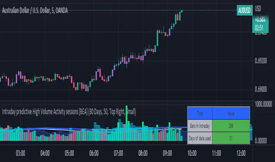
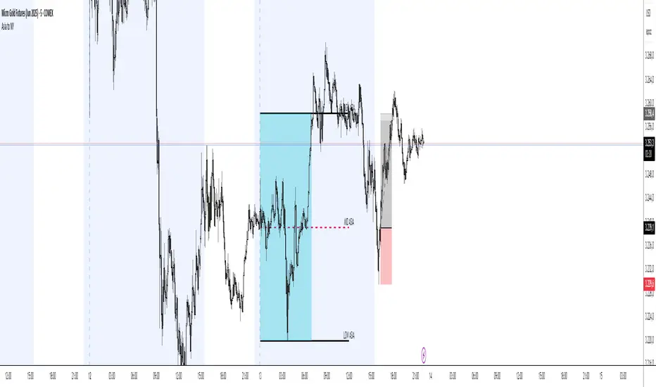
Intraday predictive High Volume Activity sessions [BEA]Idea:
This indicator is designed to know the high traded volume sessions in advance before the day starts.
The predictive volume bars will be plotted in advance once a new trading session starts.
Logic Used:
The basic idea is to store each bar volume / Volume MA data for the selected time. So, the first bar of each data is stored for all selected historical days.
Once the data is stored, I am taking average of each bar data for the selected Historical days.
How to Use:
This gives me an idea of the volume behavior throughout the days based on historical data. So I decide my time of trading for that specific times sessions where the traded volume activity is high.
The bars which are more than the Moving average ( Highlighted Volume bars plotted in future ) is the time session to focus.
Designed only for intraday timeframes.
Here in the image, you can see the session in advance for high traded volume activity.
Try it test it , let me know if it can be improved further.
Have a happy trading.
DISCLAIMER
Any and all liability for risks resulting from investment transactions or other asset dispositions carried out by the user based on information received or a market analysis is expressly excluded by me.
All the information made available here is generally provided to serve as an example only, without obligation and without specific recommendations for action. It does not constitute and cannot replace investment advice. We therefore recommend that you contact your personal financial advisor before carrying out specific transactions and investments.
Do your own research, this is not a financial advice.
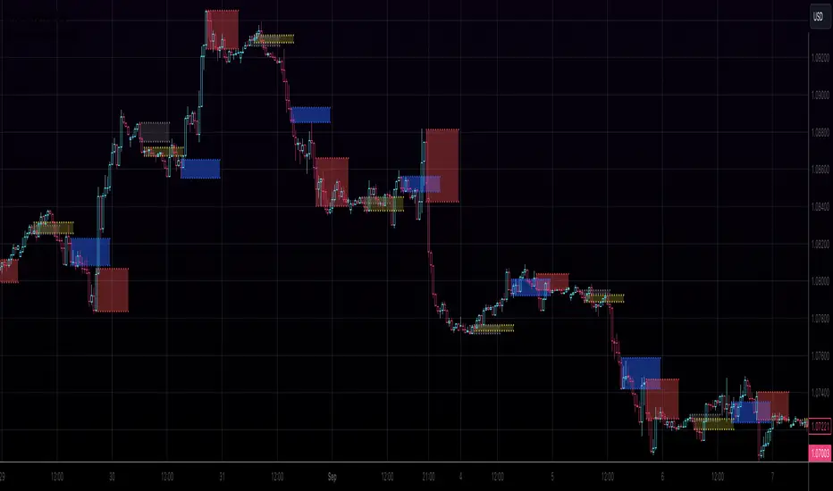
AltSessionHello World
It’s no secret that trading sessions play a massive role in market movement and liquidity. We can clearly see in the image about how important identifying international trading hours are for a trader.
The Asian session starts around 1am GMT and often has a bearish bias through this session lasting for a few hours, after which Frankfurt and London traders start to come online and can often reverse the Asian sentiment.
The London session is the best session to trade traditionally starting around 7am GMT before the American traders come online and reverse market once again.
We have designed this indicator to help identify different trading hours easily with a background shade on the chart and also high/lows of the training session, as these levels can often be revisited.
We hope you find this indicator useful and please feel free to drop a comment if you have any updates you wish to be made or any future indicator script ideas, thank you.

Advanced Forex SessionsEssential for ALL Forex Day Traders!
Don't waste your time trading Forex Sessions with little to no volume or volatility!
The Advanced Forex Sessions tool will search through all 4 sessions, tally up the total volume and ticks moved, and show you which session has the most movement.
It will show you the two best sessions on chart and optionally color the background too.
Configure the position & size of the Infographic table as well as custom Forex Session times and colors.

Kill Zone SessionsKill Zone Sessions
Kill Zone Sessions is an indicator that allows you to highlight customizable backgrounds for specified time zones. The problem with 99% of all session indicators on TradingView is that they only plot real-time, sure this is good when you look back on the charts with loaded data. Looks pretty I guess, but having it in real-time with no forward plotting abilities is useless. It provides a trader with no preparedness or edge to trade within that time frame.
The solution is to plot the next 24 hours in advanced of the current time, that way you will always see when the sessions are in relation to your current time.
This will highlight the time zone 24 hours in advance so you always know when the session are and can plan TA around that!
15m USDCHF
1m GBPUSD
5m BTCUSD

USA VWAPFuture traders commonly watch both the globex VWAP (all time) and the US session VWAP (9:30am to 4:00pm). Trading view's built-in VWAP indicator plots the globex VWAP. The USA VWAP indicator overlays the US session VWAP (using hlc3) onto any futures asset. It works for stocks too, but it would be the exact same thing as using the builtin VWAP indicator.

Volume+ (RVOL By Time of Day)This script is an enhanced volume indicator.
It calculates relative volume (RVOL) based on the average volume at that time of day (rather than using a moving average).
For example, using this indicator you can see today’s volume during the first 5-minute candle of the market open compared to the previous day’s volume at the market open. Or you can see today’s volume at the market close during the last 15-minute candle compared to the average of the past 20 days of volume at the market close.
Due to the different quantity of candlesticks in a session between Stocks and Forex/Crypto, I separated those markets into separate settings, making this an all-in-one volume indicator that works on all markets.
Settings:
Stocks
If you set the lookback period to 1 on the 5-minute chart and look at the 9:30am candle for a stock, then the current volume bar will show you what today’s volume is compared to yesterday’s 9:30am 5-minute candle.
If you set the lookback period to 15, then the current volume bar will show you what today’s volume is compared to the average of the last 15 days of 9:30am 5-minute candles.
Max Lookback: 64 Sessions
Stocks
This setting is for traders who want to use this indicator on a timeframe lower than the 5-minute chart.
Due to limitations in how many historical bars PineScript can reference, referencing 1-minute and 3-minute bars requires a lot more historical data so I separated the two to allow the 5-minute+ timeframes to have a longer lookback period.
Max Lookback: 12 Sessions
Forex/Crypto
When you set the script to Forex/Crypto, it does the same thing for stocks but calculates based on a 24-hour period.
So if you set the lookback period to 1 on the 1-hour chart and look at the 11:00am candle for a currency pair, then the current volume bar will show you what today’s volume is compared to yesterday’s 11:00am 1-hour candle.
If you set the lookback period to 10, then the current volume bar will show you what today’s volume is compared to the average of the last 10 days of 11:00am 1-hour candles.
Max Lookback: 17 Sessions
What Doesn’t It Work On?
Because I had to manually calculate how many volume candles to look back per timeframe to get the previous session’s candle, I had to hard-code the math in this script.
That means that this indicator will only work on 1m, 3m, 5m, 15m, 30m, 45m, 1h, 2h, 3h, 4h, Daily and Weekly timeframes. If you try to use it on any other timeframe it will revert to a regular volume indicator.
Why Is It Useful?
Similar to volume profile by price, this gives you a volume profile by time in a way that the default volume indicator does not.
For example, you can use this to determine when a stock has a particularly strong opening drive, or when a currency pair has a weak fake-out leading up to the London open, or for general confirmation on trading signals with time-specific volume information to work with.
Colors
The purple line and the faint gray bar is the RVOL value.
The blue number is the percentage of the current volume bar relative to RVOL.
There are four different bar color settings:
Heatmap – Changes color to be brighter based on higher RVOL
Price – Changes color based on price action (like the default TradingView volume indicator)
Traffic – Changes color based on RVOL percentages (for fast visual cues)
Trigger – Changes color only when the specified alert conditions are met
Heatmap:
Traffic:
Trigger:
Price:
Heatmap:
Turns very bright green at 2.0 RVOL
Turns light green at 1.0 RVOL
Turns normal green at 0.75 RVOL
Turns medium green at 0.5 RVOL
Turns very dark green at 0.25 RVOL
Is gray otherwise.
Price:
Turns red if the price action candle closed bearish.
Turns green if the price action candle closed bullish.
Traffic:
Turns red if RVOL is between 1.0 and 1.5.
Turns orange if RVOL is between 1.5 and 2.0.
Turns dark green if RVOL is between 2.0 and 3.0.
Turns bright green if RVOL is above 3.0.
Is gray otherwise.
Trigger:
Turns teal if any of the given alert conditions in the user settings are met.
Alerts
Alerts are optional. You have to set them like any other indicator, by creating a new alert and selecting this indicator.
If you leave the "Alert At RVOL %" setting at 0, then alerts will only be triggered if the current candle exceeds the 1.0 (100%) RVOL level.
If you change the "Alert At RVOL %" setting then alerts will be triggered if the RVOL percentage (blue number) exceeds your given value. The blue number is a percentage of the average, so if it’s at 0.5, then it’s 50% of the average.
Notes
- This indicator only works with regular time bars. It will not work with range, tick, renko etc.
- This script has lookback limitations due to restrictions on how many historical bars PineScript can reference. The lookback limit varies based on the market type you choose. The more bars required for calculation the lower the lookback limit.
- If you use it on the Daily timeframe the lookback period will count as 1 week. If you use it on the Weekly timeframe the lookback period will count as 1 month. So a Lookback of 3 on the Daily would be 3 weeks of averages, a Lookback of 5 on the Weekly would be 5 months of averages (for that Day of Week or Week number).
- Big thanks to @tb12345 for the idea and for helping to field-testing the indicator!

ICT Liquidity Engine Free ICT Liquidity Engine is a clean and reliable indicator designed to automatically track key liquidity levels from the Asia and London sessions, based on ICT concepts.
It helps traders clearly identify where liquidity is building and where it is being taken, in real time, without repainting or manual drawing.
🔍 Key Features
Asia High / Low LIVE (02:00–06:00 Paris)
London High / Low LIVE (08:00–11:00 Paris)
Real-time updates during each session
Automatic freeze at session close
Independent removal of High or Low once liquidity is taken
No repaint – replay-safe (1m-based calculations)
Works on all timeframes
🎯 Why use ICT Liquidity Engine?
Save time: no more manual session levels
Cleaner charts, clearer context
Ideal for spotting:
liquidity sweeps
session reactions
high-probability ICT environments
This free version is intentionally simple, fast, and robust, serving as a foundation tool for more advanced ICT models (FVG, IFVG, market structure, etc.).
📈 Markets
Futures (ES, NQ, DAX, etc.)
Forex
Indices
(Works on all assets – optimized for institutional markets)
ℹ️ Notes
This indicator is 100% free and will continue to evolve.
An advanced version with FVG / IFVG detection, multi-timeframe filters, and smart alerts is currently in development.
🔥 Use it as a base. Build your edge on top of it.

Bollinger BandWidth (Session-Adjusted)Description
This indicator is a session-adjusted version of Bollinger BandWidth (BBW), specifically designed for instruments with limited trading hours, such as European stock indices (e.g., FTSE MIB, DAX, CAC, which trades from 09:00 to 17:30 CET — 8.5 hours) or individual stocks.
Standard Bollinger BandWidth on intraday charts can be distorted because calculations include non-trading periods (flat prices overnight), leading to inaccurate volatility readings.This script dynamically adjusts the Bollinger Bands calculation to approximate daily periods based on the actual trading session length, ensuring the BBW reflects true market volatility during active hours.
Key Features
Session-Adjusted Bollinger Bands:
The lookback period (default 20 days) is converted into an equivalent number of intraday candles based on your chart's timeframe and the session duration. This makes the indicator suitable for intraday timeframes (e.g., 5min, 15min, 1H) on limited-session assets.
Bollinger BandWidth (BBW) as Percentage:
Plots (Upper Band - Lower Band) / Middle Band * 100, a relative measure of volatility (higher values = wider bands = higher volatility).
Dynamic Expansion and Contraction Levels:
Red line: Highest BBW over the selected expansion lookback period (default 25 days) — highlights peak volatility levels.
Green line: Lowest BBW over the selected contraction lookback period (default 25 days) — highlights extreme squeezes (low volatility).
Fully customizable inputs for session hours, BB parameters, and dynamic level periods.
How It Works
Session Adjustment: Input session duration (default 8.5 hours).
The script calculates approximate candles per trading day for your current chart timeframe.
Bollinger Bands are computed using length * candlesPerDay bars, simulating a true multi-day calculation within intraday data.
BBW Calculation:
Basis: Simple Moving Average (SMA).
Deviation: Multiplier × Standard Deviation.
BBW = (2 × Deviation / Basis) × 100.
Dynamic Lines:
Expansion line uses the same session-adjusted period for highest BBW.
Contraction line uses the lowest BBW.
Usage and Trading Ideas
Bollinger BandWidth is a powerful volatility indicator popularized by John Bollinger. Low BBW values indicate band contraction ("Squeeze") — periods of low volatility often followed by strong breakouts. High BBW values indicate expansion — trending or volatile phases that may exhaust and lead to consolidation.
Squeeze Setup:
Watch for BBW dropping toward or below the dynamic low (green) line. This signals potential impending volatility expansion and breakout opportunities.
Expansion Confirmation:
BBW rising above the dynamic high (red) line suggests strong volatility — useful for trend-following or avoiding counter-trend trades.
Combine with price action (e.g., break of support/resistance), volume, or momentum indicators (RSI, MACD) for directional bias.
Ideal for intraday or swing trading on European indices, stocks, or other limited-session instruments where standard BBW would be misleading.
This adjustment makes the indicator more accurate on lower timeframes compared to built-in versions, providing cleaner volatility signals aligned with real trading sessions.
Enjoy the script — feedback welcome!

BT Session VP & VolatilityBT Session VP v0.6 is a professional-grade Session Volume Profile designed for futures, index, and intraday traders who need clean, accurate session structure without clutter.
This tool builds a true volume distribution for each trading session using lower-timeframe data, detects high- and low-volume nodes, and tracks a dynamic Point of Control (POC) to help traders identify balance, acceptance, and trend conditions in real time.
• Index futures, session-based crypto trading
• Intraday equity index trading
• Momentum scalping with session context
• Auction market theory workflows
Features
• True session-based volume profile (RTH or ETH)
• Futures-correct ETH handling (18:00–17:00 session)
• Hard session fencing — no volume bleed between sessions
• Lower-timeframe volume aggregation for accuracy
• Dynamic Point of Control (POC) tracking
• High Volume Nodes (HVN) and Low Volume Nodes (LVN)
• Live session and prior session profiles
• Optional volatility-weighted volume
• Fully customizable colors, opacity, and labels
**Volatility-Weighted Volume** is an optional feature that adjusts how volume contributes to the session profile based on current market volatility.
Instead of treating all volume equally, BT Session VP can weight volume more heavily during periods of expansion and less during periods of compression.
When volatility weighting is enabled:
• If volatility is above its recent average, volume is amplified; below volume is dampened
• The strength of this effect is controlled by a user-defined multiplier
• Volatility weighting does not change price levels, Iit does not introduce signals or repainting. It only affects how volume contributes to the distribution
• The feature can be disabled at any time for a traditional volume profile
The Point of Control is calculated dynamically as the session evolves.
• If the POC remains stable for N bars, the market is considered balanced
• If the POC shifts upward, it reflects bullish acceptance
• If the POC shifts downward, it reflects bearish acceptance
• POC color changes automatically based on these conditions
This allows traders to quickly distinguish between balance, rotation, and trend days.
• HVN represent price levels where the market previously accepted value
• LVN represent areas of rejection or inefficiency
Nodes are filtered using:
• Local dominance logic
• Minimum separation (prevents clustering)
These levels often act as:
• Support / resistance
• Acceptance or rejection zones
• Rotation targets during balance
How traders use BT Session VP
• Identify balance vs trend days early
• Use POC direction to confirm market regime
• Trade rotations between HVNs during balance
• Fade LVNs during rejection
• Use prior session nodes as reaction levels
• Combine with momentum tools for confirmation
This indicator is designed to provide context , not signals.
It works best when combined with execution tools, order flow, or momentum confirmation.

XAUUSD Session Move Stats (Last 14 Days)This indicator analyzes Gold (XAUUSD) session behavior over the last 14 days and calculates how price typically moves during the Asia, London, and New York sessions.
For each session, it shows:
Average Max Up (%) – how far price moves up from session open
Average Max Down (%) – how far price moves down from session open
Average Net Close (%) – where price typically finishes relative to the session open
The data is calculated session-by-session and displayed in a table, helping traders understand session bias, volatility tendencies, and directional behavior.
Best used on intraday timeframes for session-based analysis and contextual trade planning (signals only, no automated trades).

ICT Asian & London Range + First Presented FVGIndicator: ICT Sessions + First Presented FVG
What it does: This tool automates the markup of key ICT (Inner Circle Trader) timeframes and entry signals. It allows you to trade on higher timeframes (like the 5m or 15m) while the script automatically "looks inside" the 1-minute chart to find specific setups for you.
Key Features:
Session Ranges (Asian & London)
Automatically highlights the Asian Session (8 PM - Midnight NY) and London Open (2 AM - 5 AM NY).
Draws a shaded box for the session's High and Low.
New: Extends the High and Low lines to 4:00 PM NY (end of the trading day) so you can use them as liquidity targets.
The "First Presented" FVG (Sniper Logic)
It detects the very first Fair Value Gap (FVG) that forms on the 1-minute chart immediately after a session starts.
It draws this 1-minute gap on your current chart, regardless of what timeframe you are viewing.
The FVG box automatically extends to the end of the trading day (4 PM NY), showing you where price might return to "mitigate" or react later in the day.

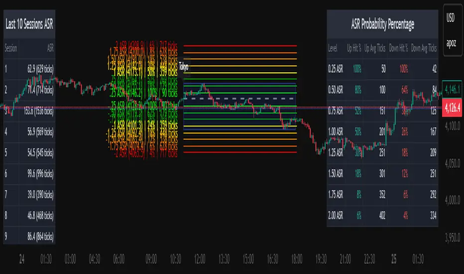
Average Daily Session Range PRO [Capitalize Labs]Average Daily Session Range PRO
The Average Daily Session Range PRO (ADSR PRO) is a professional-grade analytical tool designed to quantify and visualize the probabilistic range behavior of intraday sessions.
It calculates directional range statistics using historical session data to show how far price typically moves up or down from the session open.
This helps traders understand session volatility profiles, range asymmetry, and probabilistic extensions relative to prior performance.
Key Features
Asymmetric Range Modeling: Separately tracks average upside and downside excursions from each session open, revealing directional bias and volatility imbalance.
Probability Engine Modes: Choose between Rolling Window (fixed-length lookback) and Exponential Decay (weighted historical memory) to control how recent or historic data influences probabilities.
Session-Aware Statistics: Calculates values independently for each defined session, allowing region-specific insights (e.g., Tokyo, London, New York).
Dynamic Range Table: Displays key metrics such as average up/down ticks, expected range extensions, and percentage probabilities.
Adaptive Display: Works across timeframes and instruments, automatically aligning with user-defined session start and end times.
Visual Clarity: Includes clean range markers and labels optimized for both backtesting and live-chart analysis.
Intended Use
ADSR PRO is a statistical reference indicator.
It does not generate buy/sell signals or predictive forecasts.
Its purpose is to help users observe historical session behavior and volatility tendencies to support their own discretionary analysis.
Credits
Developed by Capitalize Labs, specialists in quantitative and discretionary market research tools.
Risk Warning
This material is educational research only and does not constitute financial advice, investment recommendation, or a solicitation to buy or sell any instrument.
Foreign exchange and CFDs are complex, leveraged products that carry a high risk of rapid losses; leverage amplifies both gains and losses, and you should not trade with funds you cannot afford to lose.
Market conditions can change without notice, and news or illiquidity may cause gaps and slippage; stop-loss orders are not guaranteed.
The analysis presented does not take into account your objectives, financial situation, or risk tolerance.
Before acting, assess suitability in light of your circumstances and consider seeking advice from a licensed professional.
Past performance and back-tested or hypothetical scenarios are not reliable indicators of future results, and no outcome or level mentioned here is assured.
You are solely responsible for all trading decisions, including position sizing and risk management.
No external links, promotions, or contact details are provided, in line with TradingView House Rules.
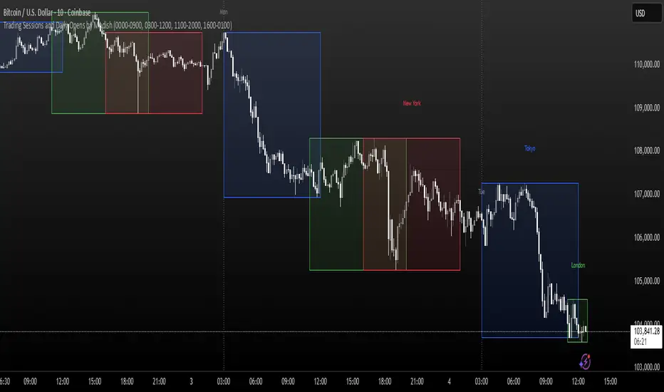
Trading Sessions and Daily Opens by ModishThis Pine Script indicator overlays key forex trading sessions (Sydney, Tokyo, London, New York) on your chart using Kenyan time (EAT/UTC+3), with customizable translucent boxes, borders, and labels positioned neatly above each session for clear visualization. It also plots dotted vertical lines at daily opens (Monday-Friday) with abbreviated day labels for quick reference. Toggle sessions on/off, adjust colors, and ensure seamless integration with candlesticks for dynamic, real-time analysis. Ideal for session-based traders seeking precise timing and structure.
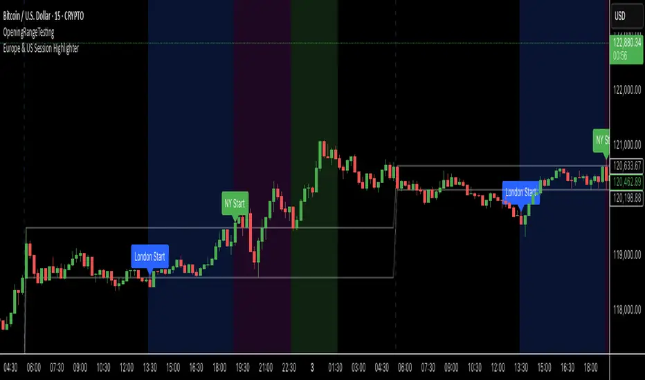
Europe & US Session Highlighter
Bitcoin trading volumes peak during the Europe-US session overlap (13:30–17:00 UTC), driven by institutional activity and market news. This indicator helps traders:
- Focus on high-liquidity periods for better trade execution.
- Avoid low-volume, high-volatility periods outside major sessions.
- Plan entries and exits during Bitcoin’s most active hours.
How to Use:
- Apply the indicator to any Bitcoin intraday chart (e.g., 1M, 5M, 15M).
- Look for blue (London), green (NY), or purple (overlap) backgrounds to identify active sessions.
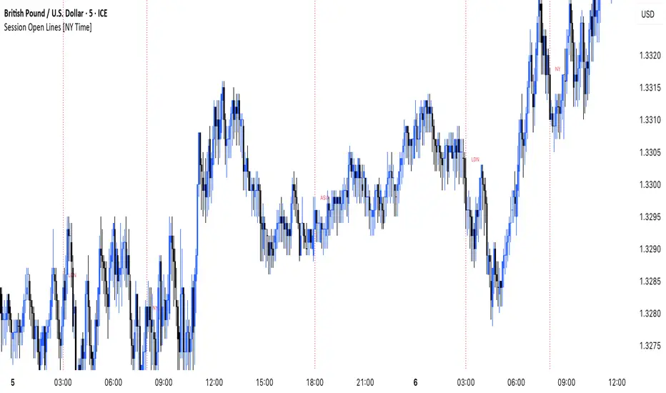
MANI SESSIONSOANDA:GBPUSD This indicator marks the opening times of the three main trading sessions — Asia, London, and New York — using vertical red dotted lines on the chart.
Each session is labeled with a minimal tag (“ASIA”, “LDN”, “NY”) displayed directly on the line for clean and unobtrusive reference.
All session times are based on the New York time zone and adjust automatically for each new day.
This tool helps intraday traders quickly identify session shifts, plan entries around high-volume hours, and stay locked into session-based strategy.
OANDA:GBPUSD
Time Intervals [signBTC]This script is designed to visualize 6 auxiliary time intervals on the chart near the time axis. Each of these intervals can be configured by the user with the following options:
Interval duration: Any duration can be set (for example, 1 hour, 2 hours, 4 hours, etc.).
Interval color: Each time block can have its own color for better visual distinction.
Label: Users can add a custom label for each of the 6 intervals to indicate its purpose or highlight important features.
In the default configuration, the script automatically draws 6 equal four-hour intervals for each trading day, dividing each daily trading session into six parts—two for each of the three standard market sessions, or three per each of two major sessions (if considering only regular daytime and extended overnight trading).
This tool is particularly useful for traders who want to quickly navigate different time areas of the trading day, monitor individual parts of a session, or highlight specific time windows for strategy analysis. All script parameters (interval, color, and label for each block) are easily adjustable in the indicator's settings.

Asia Session Range @mrxautrades🗺️ Asia Session Range by @mrxautrades
🚨 This script is closed-source because it implements a custom logic for session range visualization, deviation projections, and adaptive display based on chart timeframe. No other public script offers this exact functionality.
✅ What does this script do?
This indicator highlights the Asian session range and calculates dynamic extensions during the New York session open. It's designed for traders who rely on price action around key market sessions.
🔧 Unique Features (compared to existing scripts):
Timeframe-aware visibility: The script includes conditional logic to show or hide elements based on the chart timeframe (e.g., only visible on 60-minute or lower charts).
Automatic deviation levels: Calculates and plots extensions above/below the Asian range based on its size, offering projected support/resistance levels in real time.
Adaptive labels: Labels adjust dynamically to chart styling, with options for background, color, and visibility control.
⚙️ Customizable Inputs:
Asian and New York session times
Box, line, and label colors
Number and spacing of deviation levels
Line extension duration (in hours)
Label style: plain text or with background
🧠 Best suited for:
Breakout strategies based on the Asian session range
Using prior session levels as support/resistance
Intraday traders in Forex, indices, or crypto markets
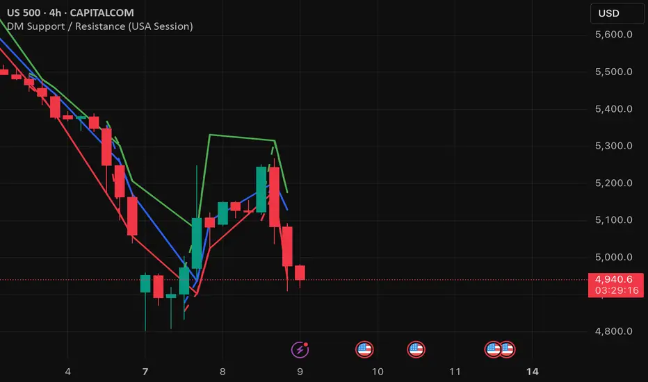
DM Support / Resistance (USA Session)This indicator is specifically designed for use on the 4-hour time frame and helps traders identify key support and resistance levels during the USA trading session (9:30 AM to 4:00 PM Eastern Time). The indicator calculates important price levels to assist in making well-informed entry and exit decisions, particularly for those focusing on swing trades or longer-term intraday strategies. It also includes a feature to skip setups when relevant fundamental news is scheduled, ensuring you avoid trading during periods of high volatility.
Key Features:
Support and Resistance Levels (S1 & R1):
The indicator calculates and displays Support 1 (S1) and Resistance 1 (R1) levels, which act as key barriers for price action and help traders spot potential reversal or breakout zones on the chart.
Pivot Point (PP):
The Pivot Point (PP) is calculated as the average of the previous period's high, low, and close. It serves as a central reference point for market direction, allowing traders to evaluate whether the market is in a bullish or bearish trend.
Market Bias:
The Bias is shown as a histogram that helps traders assess the strength of the market trend. A positive bias suggests bullish sentiment, while a negative bias signals bearish conditions. This can be used to confirm the overall trend direction.
4-Hour Time Frame:
The indicator is optimized for the 4-hour time frame, making it suitable for traders looking for swing trades or those who wish to capture longer-term trends within the USA session. The key support, resistance, and pivot levels are recalculated dynamically to reflect price action over 4-hour periods.
Dynamic Plotting and Alerts:
Support and resistance levels are drawn as dashed horizontal lines, updating in real-time to reflect the most current market data during the USA session. Alerts can be set for significant price movements crossing these levels.
Stop-Loss Strategy Based on 15-Minute Time Frame:
A unique feature of this indicator is its stop-loss strategy, which uses 15-minute time frame support and resistance levels. When a long or short entry is triggered on the 4-hour chart, traders should place their stop-loss according to the relevant 15-minute support or resistance level.
If the price closes above the 15-minute support for a long entry, or closes below the 15-minute resistance for a short entry, it signals the need to exit or adjust your position based on these levels.
Fundamental News Filter:
To avoid unnecessary risk, the indicator incorporates a fundamental news filter. If there is relevant news scheduled during the USA session, such as high-impact economic data or central bank announcements, the indicator will skip the setup for that period. This prevents traders from entering positions during times of elevated volatility caused by news events, which could result in unpredictable price movements.
How to Use:
Long Entry: When the Bias is positive and the price breaks above Support 1 (S1), this signals a potential bullish move. Consider entering a long position at this point.
Stop-Loss Strategy: Set your stop-loss at the respective 15-minute support level. If the price closes below this level, it could signal a reversal, prompting you to exit the trade.
Short Entry: When the Bias is negative and the price breaks below Resistance 1 (R1), this signals a potential bearish move. Enter a short position at this point.
Stop-Loss Strategy: Set your stop-loss at the respective 15-minute resistance level. If the price closes above this level, exit the short trade as it could indicate a bullish reversal.
Pivot Point (PP): The Pivot Point serves as a reference level to gauge potential price reversals. A move above the PP suggests a bullish bias, while trading below the PP suggests a bearish outlook.
Bias Histogram: The Bias Histogram helps confirm trend direction. A positive bias confirms long positions, while a negative bias reinforces short trades.
Avoid Trading During High-Impact News: If there is significant economic news or fundamental events scheduled during the USA session, the indicator will automatically skip any potential setup. This feature ensures you avoid entering trades that might be affected by unexpected news-driven volatility, keeping your trading strategy safer and more reliable.
Why Use This Indicator:
The 4-hour time frame is ideal for traders who prefer swing trading or those looking to capture longer-term trends in a structured manner. This indicator provides crucial insights into market direction, support/resistance levels, and potential entry/exit points.
The stop-loss management based on the 15-minute support and resistance levels helps traders protect their positions from sudden price reversals, ensuring more precise risk management.
The fundamental news filter is particularly useful for avoidance of high-risk periods. By skipping setups during high-impact news events, traders can avoid entering trades when price volatility could be unpredictable.
Overall, this indicator is a powerful tool for traders who want to make data-driven decisions based on technical analysis while ensuring that their positions are managed responsibly and avoiding news-driven risk.
Kviateq - Session Opening RangesThis indicator plots the opening range for each of the market sessions.
Users can chose the length of the opening range, as well as change the time for each of the sessions.
This script is based on opening range breakout strategies, which entail taking a long/short depending on which way the price breaks out.
To trade it, we wait for the session opening range to print, and then we enter upon a candle close.
It's meant to be used on lower timeframes, ideally one hour or lower.
It can be used by itself, but it works even better in combination with other indicators, like moving averages.
Enjoy
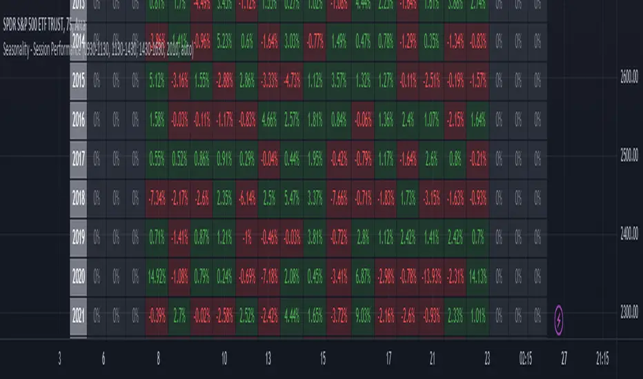
Seasonality - Session Performance - Morning Afternoon EveningUse this indicator on Intraday Timeframe. Higher the timeframe, more the data
This script calculates the performance of an instrument for different sessions.
Session inputs can be updated to study performance of
- Morning vs Afternoon vs Evening
- Pre-Market vs Market vs Post-Market (provided the data feed supports pre and post market)
- Overnight vs Intraday
Three session inputs are provided to tweak the session range
Performance is calculated as session close / session open - 1
Session timeframes can be set for various countries. Make sure the session timeframe aligns with the Candle open/close for the timeframe you choose. Some examples below
US Markets: 0930-1130 1130-1430 1430-1630 Timeframe 1 hour
India Markets: 0915-1030 1030-1415 1415-15:30 Timeframe 75min