Key Indicators Dashboard (KID)Key Indicators Dashboard (KID) — Comprehensive Market & Trend Metrics
📌 Overview
The Key Indicators Dashboard (KID) is an advanced multi-metric market analysis tool designed to consolidate essential technical, volatility, and relative performance data into a single on-chart table. Instead of switching between multiple indicators, KID centralizes these key measures, making it easier to assess a stock’s technical health, volatility state, trend status, and relative strength at a glance.
🛠 Key Features
⦿ Average Daily Range (ADR %): Measures average daily price movement over a specified period. It is calculated by averaging the daily price range (high - low) over a set number of days (default 20 days).
⦿ Average True Range (ATR): Measures volatility by calculating the average of a true range over a specific period (default 14). It helps traders gauge the typical extent of price movement, regardless of the direction.
⦿ ATR%: Expresses the Average True Range as a percentage of the price, which allows traders to compare the volatility of stocks with different prices.
⦿ Relative Strength (RS): Compares a stock’s performance to a chosen benchmark index (default NIFTYMIDSML400) over a specific period (default 50 days).
⦿ RS Score (IBD-style): A normalized 1–100 rating inspired by Investor’s Business Daily methodology.
How it works: The RS Score is based on a weighted average of price changes over 3 months (40%), 6 months (20%), 9 months (20%), and 12 months (20%).
The raw value is converted into a percentage return, then normalized over the past 252 trading days so the lowest value maps to 1 and the highest to 100.
This produces a percentile-style score that highlights the strongest stocks in relative terms.
⦿ Relative Volume (RVol): Compares a stock's current volume to its average volume over a specific period (default 50). It is calculated by dividing the current volume by the average historical volume.
⦿ Average ₹ Volume (Turnover): Represents the total monetary value of shares traded for a stock. It's calculated by multiplying a day's closing price by its volume, with the final value converted to crores for clarity. This metric is a key indicator of a stock's liquidity and overall market interest.
⦿ Moving Average Extension: Measures how far a stock's current price has moved from from a selected moving average (EMA or SMA). This deviation is normalized by the stock's volatility (ATR%), with a default threshold of 6 ATR used to indicate that the stock is significantly extended and is marked with a selected shape (default Red Flag).
⦿ 52-Weeks High & Low: Measures a stock's current price in relation to its highest and lowest prices over the past year. It calculates the percentage a stock is below its 52-week high and above its 52-week low.
⦿ Market Capitalization: Market Cap represents the total value of all outstanding.
⦿ Free Float: It is the value of shares readily available for public trading, with the Free Float Percentage showing the proportion of shares available to the public.
⦿ Trend: Uses Supertrend indicator to identify the current trend of a stock's price. A factor (default 3) and an ATR period (default 10) is used to signal whether the trend is up or down.
⦿ Minervini Trend Template (MTT): It is a set of technical criteria designed to identify stocks in strong uptrends.
Price > 50-DMA > 150-DMA > 200-DMA
200-DMA is trending up for at least 1 month
Price is at least 30% above its 52-week low.
Price is within at least 25 percent of its 52-week high
Table highlights when a stock meets all above criteria.
⦿ Sector & Industry: Display stock's sector and industry, provides categorical classification to assist sector-based analysis. The sector is a broad economic classification, while the industry is a more specific group within that sector.
⦿ Moving Averages (MAs): Plot up to four customizable Moving Averages on a chart. You can independently set the type (Simple or Exponential), the source price, and the length for each MA to help visualize a stock's underlying trend.
MA1: Default 10-EMA
MA2: Default 20-EMA
MA3: Default 50-EMA
MA4: Default 200-EMA
⦿ Moving Average (MA) Crossover: It is a trend signal that occurs when a shorter-term moving average crosses a longer-term one. This script identifies these crossover events and plots a marker on the chart to visually signal a potential change in trend direction.
User-configurable MAs (short and long).
A bullish crossover occurs when the short MA crosses above the long MA.
A bearish crossover occurs when the short MA crosses below the long MA.
⦿ Inside Bar (IB): An Inside Bar is a candlestick whose entire price range is contained within the range of the previous bar. This script identifies this pattern, which often signals consolidation, and visually marks bullish and bearish inside bars on the chart with distinct colors and labels.
⦿ Tightness: Identifies periods of low volatility and price consolidation. It compares the price range over a short lookback period (default 3) to the average daily range (ADR). When the lookback range is smaller than the ADR, the indicator plots a marker on the chart to signal consolidation.
⦿ PowerBar (Purple Dot): Identifies candles with a strong price move on high volume. By default, it plots a purple dot when a stock moves up or down by at least 5% and has a minimum volume of 500,000. More dots indicate higher volatility and liquidity.
⦿ Squeezing Range (SQ): Identifies periods of low volatility, which can often precede a significant price move. It checks if the Bollinger Bands have narrowed to a range that is smaller than the Average True Range (ATR) for a set number of consecutive bars (default 3).
(UpperBB - LowerBB) < (ATR × 2)
⦿ Mark 52-Weeks High and Low: Marks and labels a stock's 52-Week High and Low prices directly on the chart. It draws two horizontal lines extending from the candles where the highest and lowest prices occurred over the past year, providing a clear visual reference for long-term price extremes.
⏳PineScreener Filters
The indicator’s alert conditions act as filters for PineScreener.
Price Filter: Minimum and maximum price cutoffs (default ₹25 - ₹10000).
Daily Price Change Filter: Minimum and maximum daily percent change (default -5% and 5%).
🔔 Built-in Alerts
Supports alert creation for:
ADR%, ATR/ATR %, RS, RS Rating, Turnover
Moving Average Crossover (Bullish/Bearish)
Minervini Trend Template
52-Week High/Low
Inside Bars (Bullish/Bearish)
Tightness
Squeezing Range (SQ)
⚙️ Customizable Visualization
Switchable between vertical or horizontal layout.
Works in dark/light mode
User-configurable to toggle any indicator ON or OFF.
User-configurable Moving (EMA/SMA), Period/Lengths and thresholds.
⦿ (Optional) : For horizontal table orientation increase Top Margin to 16% in Chart (Canvas) settings to avoid chart overlapping with table.
⚡ Add this script to your chart and start making smarter trade decisions today! 🚀
在腳本中搜尋"smart"

VIV 1.0 // AN IDEA BY Sunil SethiVIV (Very Important Volume) is a custom-built TradingView indicator designed to decode the psychology behind price and volume behavior — whether you are a breakout trader, reversal trader, or use your own discretionary logic. VIV reveals where institutional activity is likely taking place, highlights trend stages, uncovers volume footprints, and identifies high-probability trading zones — all with zero lag & 100% price-action-based logic.
Key Features (Expanded Concepts)
01. Trend-Based Analysis with Stages and Background Colors
VIV breaks down the market into three color-coded stages based on trend confirmation:
Stage 3: Uptrend (Short-Term Trend Confirmation)
Marks early accumulation or consolidation.
Shows possible reversal zones.
Short-term traders use this to spot opportunities before a breakout.
Stage 2: Uptrend (Medium-Term Trend Confirmation)
Highlights the start of a strong directional move.
Confidence zone for position building and breakout-following strategies.
Stage 1: Uptrend (Long-Term Trend Confirmation)
Indicates long term strength.
These trend stages reflect the emotional phases of market participants and the shifting balance of power between buyers and sellers. You can toggle trend backgrounds for intraday, daily, weekly, and monthly trends and change their background colors.
Note : If the % difference in Stage 3 exceeds 10%, the stock is considered extended. Such setups should be evaluated with caution before making any trade decisions.
02. . Volume Footprints (➕ Signs)
VIV intelligently identifies past candles with high-volume activity (accumulation/distribution).
These are not typical breakout volumes, but subtle footprints of smart money.
Help spot reversal points, liquidity zones, and retest levels.
Valuable for both breakout and reversal traders to confirm zone strength.
You can enable or disable these lines, adjust color, style, and width via VIV Line Settings.
03. VIV || H, VIV || L and VIV || C Zones
Automatically plots horizontal levels from high-volume, high-activity candles—revealing the footprints of smart money.
VIV || H (High) = Top of important bar.
VIV || L (Low) = Bottom of important bar.
VIV || C (Close) = Close price of important bar.
Key levels used by traders for:
Entries
Stop-loss placement
Targets
These zones show where price historically reacted due to strong institutional presence. They come with customizable label colors and backgrounds.
04. Price Tightness Detection
Detects when two or more candles compress within the range of a larger parent candle.
Represents indecision, contraction, or coiling behavior before major price moves.
Ideal for both:
Breakout traders looking for base formations.
Reversal traders watching for exhaustion.
Color-coded markers indicate such tight price zones — disabled by default but can be enabled.
05. Technical Stats Panel (Important Data Table)
An insightful dashboard providing:
ADR% – Volatility-based movement expectations (change period via input).
ATR – Real volatility indicator.
Average Volume / Price Volume – Customizable average period and currency unit (INR/USD).
Trend Data:
10/20/200 SMAs
10-week & 20-week trend stages (custom SMA period/timeframe supported)
Relative Strength vs Benchmark
RS grade: GREAT, GOOD, FAIR, UNCERTAIN, UNDER PERFORMER, LAGGARD, POOR
When RS is comparing: BOTH STRONG, BOTH WEEK
You can also display the benchmark symbol name and change the symbol for relative strength comparison.
06. Relative Strength Grade Change Alerts
VIV tracks relative strength changes against a chosen benchmark (e.g., Nifty MidSmallCap).
The above tells us that if the stock is stronger or weaker than the benchmark.
Detects when relative strength shifts from:
Strong → Weak (e.g., EXCELLENT → GOOD → FAIR)
Weak → Strong (e.g., LAGGARD → POOR → FAIR → GOOD)
Sudden transitions (e.g., WORST → FAIR, BOTH WEAK → GOOD, BOTH GOOD → POOR)
BOTH WEAK → GOOD or BOTH GOOD → POOR means stock's strength is better/poor than the benchmark
and more.
These alerts can help in:
Early trend following
Exiting when RS degrades
Adding positions when RS improves
07. Smart Alerts (Built-in Conditions)
You can set alerts for (any timeframe)
Positive Trend
Negative Trend
Rise in Volume
Relative Strength Changed
Set your preferred interval and trigger type in TradingView to stay updated without chart-watching.
08. Pivot Points
VIV allows visualizing pivot highs and lows using a dynamic window (left/right lookback).
Customizable label text and background color.
Helpful in identifying support or resistance zones and breakout points.
09. Customization Options
Toggle modules like trend background, labels, stats, and volume zones.
Customize colors for:
Labels
Zones
Trend backgrounds
Table text, borders, and alignment
Adjust visibility per timeframe (inputs tab)
How to Use VIV Effectively
Use trend background colors to identify phase (base, uptrend, top).
Look for stage 1, stage 2 and stage 3 for short, medium and long term trend.
Watch for old high-volume candles (➕ marks) to plan entries/exits.
Trade around ➕ marks, VIV || H and VIV || L levels.
Use tight price zones to anticipate explosive moves.
Monitor table for ATR/ADR, RS grade, and moving averages.
Use alerts to automate monitoring of trend, volume, or RS shifts.
Best Suited For:
Reversal traders (demand/supply based)
Breakout traders using base-building logic
Systematic or discretionary traders
Anyone who values price-volume behavior over lagging indicators

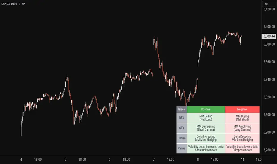
Options Greeks - Market Maker EffectsGreek Reminder is a handy visual tool that helps traders quickly understand how key option Greeks influence market maker behavior and price dynamics. Displayed as an easy-to-read table, it summarizes the effects of DEX, GEX, Charm, and Vanna—showing when market makers are likely to be buying or selling, hedging more or less, and how volatility and time decay shape their actions. With customizable table position and text size, the Greek Reminder keeps essential options insights right on your chart for smarter, more informed trading decisions.
The Golden TriggerThe Golden Trigger - XAUUSD
Unlock your trading potential with The Golden Trigger, a powerful technical analysis strategy designed for XAUUSD. This custom indicator combines the synergy of moving averages and the MACD to provide clear buy and sell signals, optimizing your trading decisions.
Key Features:
SMA Crossovers: Utilizes the 2-period and 7-period Simple Moving Averages (SMAs) to spot short-term price momentum shifts, triggering buy or sell signals.
MACD Confirmation: The strategy only acts when the MACD aligns with the price action, ensuring you’re trading with the market's momentum.
Long-Term Trend Filter: The 200-period SMA ensures that your trades align with the overall market trend, helping you avoid counter-trend moves.
Real-Time Alerts: Get notified when it's time to act with the built-in alert conditions for both Buy and Sell signals.
Customizable and User-Friendly: Tailor the strategy to your preferences and trade with confidence.
This indicator is perfect for traders looking to catch short-term trends in gold (XAUUSD), with clear visual buy and sell markers that appear directly on the chart.
Why You Need This Indicator:
Stay ahead of the market with real-time signals
Filter trades to match the prevailing market trend
Enhance your trading strategy with a clear, simple-to-follow system
Unlock the power of The Golden Trigger today and make smarter, more confident trades!

ICT SMC By VIPIN | Volume OB + BOS, CHoCH, FVG, Sweep VTTitle:
Smart Money Concepts Pro – OB, FVG, BOS, CHoCH & Liquidity Sweep
Description:
This indicator is built on Smart Money Concepts (SMC) and is designed to help traders analyze market structure in depth. It identifies institutional trading levels, potential reversal points, and high-probability trade setups using advanced price action techniques.
Key Features:
1. Order Blocks (OB) – Detects and marks bullish and bearish order blocks to identify possible reversal and continuation zones.
2. Fair Value Gaps (FVG) – Highlights price imbalances that often attract price retracements.
3. Break of Structure (BOS) – Marks structural breaks that confirm trend continuation.
4. Change of Character (CHoCH) – Signals early signs of trend reversal.
5. Liquidity Sweep – Highlights buy-side and sell-side liquidity grabs to identify stop hunts and false breakouts.
6. Custom Styling & Filters – Users can customize colors, sizes, and filter settings for better clarity.
How It Works:
• The indicator automatically detects market structure (HH, HL, LH, LL) and identifies BOS and CHoCH based on price movement.
• Order Blocks are filtered using past price action and volume confluence to show only significant zones.
• Fair Value Gaps and Liquidity Sweeps are detected with a smart logic system for improved accuracy.
How to Use:
• Use higher timeframes (H1, H4, Daily) to determine the main trend and lower timeframes (M15, M5) for entries.
• Combine Order Blocks and FVGs for strong confluence.
• Wait for BOS/CHoCH confirmations along with liquidity sweep signals before entering trades.
Disclaimer:
This tool is for chart analysis assistance only. Always conduct your own research and apply proper risk management before trading.

Dynamic Fib Zones [By TraderMan]📊 Dynamic Fib Zones — Indicator Overview
This indicator automatically plots dynamic Fibonacci levels and zones on your chart based on recent price action, volume, and trend direction. It helps you identify key support and resistance areas where price may react strongly.
🔍 What Does It Do?
Draws Fibonacci retracement levels dynamically over a specified lookback period.
Highlights zones around these Fibonacci levels to give you a price “buffer area” instead of just a line.
Colors the zones green or red based on volume strength and trend direction to signal potential buying or selling pressure.
Uses EMA (Exponential Moving Average) to detect if the trend is up or down.
Shows labels with Fibonacci % levels and exact price for quick reference.
⚙️ How to Use It?
Set your inputs:
Fibonacci Period: How many bars back the Fibonacci levels are calculated.
EMA Period: For trend detection.
Volume Multiplier: How much volume should exceed average to consider the signal strong.
Level Tolerance and Zone Width: Adjust the sensitivity and size of the price zones.
Interpret zones:
Green zones with high volume and price near Fibonacci level in an uptrend = potential buying area.
Red zones with high volume and price near Fibonacci level in a downtrend = potential selling area.
Gray zones = neutral, no strong signal.
Make your trading decisions:
Consider entering long positions near green zones with confirmation from other indicators or price action.
Consider entering short positions near red zones similarly.
Use zone boundaries as dynamic support/resistance for stop loss or take profit placement.
🚀 Tips for Position Opening
Combine with other confirmation tools (candlestick patterns, RSI, MACD, etc.) to avoid false signals.
Watch volume spikes carefully; strong volume near a Fibonacci zone increases the reliability.
Use the EMA trend filter to avoid trading against the main trend.
🎯 Summary
Dynamic Fib Zones give you a powerful, visual edge by combining Fibonacci, volume, and trend signals — making your entries and exits smarter and more precise!
Happy Trading! 📈✨

RATIO TPI SOLETH | JeffreyTimmermansSOLETH Ratio Trend Probability Indicator
Medium-Term Trend Assessment | Dominant Major Detector: The SOLETH Ratio TPI is a medium-term trend-following tool designed to measure the performance relationship between Solana and Ethereum — two of the leading smart contract platforms in the crypto market. By tracking the SOLETH ratio, this indicator determines which of the two is acting as the dominant major in the current market environment.
Rather than focusing on absolute price movements, the SOLETH Ratio TPI isolates relative strength. An upward-trending ratio means Solana is outperforming Ethereum, while a downward trend means Ethereum is taking the lead.
Key Features
Dominant Major Identification:
The indicator’s primary function is to determine leadership between Solana and Ethereum:
SOL Dominant: SOLETH ratio trending up
ETH Dominant: SOLETH ratio trending down
Neutral: No clear leader
8 Trend-Following Inputs:
Integrates 8 carefully selected medium-term trend-following signals into a composite score for clarity and accuracy in dominance detection.
Score-Based Regime Classification:
Score > 0.1 → SOL in relative uptrend → Dominant Major: SOL
Score < -0.1 → ETH in relative uptrend → Dominant Major: ETH
Between -0.1 and 0.1 → Neutral → No clear dominance
Dynamic Visual Interface:
Background colors change according to the dominant asset.
Bottom dashboard displays the status of all inputs, the composite score, and the determined dominance label.
Use Cases:
Smart Contract Sector Rotation: Identify leadership shifts between Solana and Ethereum to guide allocation within the L1 ecosystem.
Sector Sentiment Insight: Dominance changes often precede broader capital flows into or out of each ecosystem.
Multi-Timeframe Confirmation: Combine with broader market LTPI and MTPI tools to reinforce conviction in rotation-based strategies.
Conclusion
The SOLETH Ratio TPI condenses the competition between two of crypto’s top smart contract platforms into one clear, actionable view. By aggregating 8 powerful medium-term trend-following inputs, it delivers a precise assessment of which chain currently leads the market.

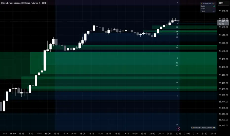
Multi Timeframe Fair Value Gap Indicator ProMulti Timeframe Fair Value Gap Indicator Pro | MTF FVG Imbalance Zones | Institutional Supply Demand Levels
🎯 The Most Comprehensive Multi-Timeframe Fair Value Gap (FVG) Indicator on TradingView
Transform Your Trading with Institutional-Grade Multi-Timeframe FVG Analysis
Keywords: Multi Timeframe Indicator, MTF FVG, Fair Value Gap, Imbalance Zones, Supply and Demand, Institutional Trading, Order Flow Imbalance, Price Inefficiency, Smart Money Concepts, ICT Concepts, Volume Imbalance, Liquidity Voids, Multi Timeframe Analysis
📊 WHAT IS THIS INDICATOR?
The Multi Timeframe Fair Value Gap Indicator Pro is the most advanced FVG detection system on TradingView, designed to identify high-probability institutional supply and demand zones across multiple timeframes simultaneously. This professional-grade tool automatically detects Fair Value Gaps (FVGs), also known as imbalance zones, liquidity voids, or inefficiency gaps - the exact areas where institutional traders enter and exit positions.
🔍 What Are Fair Value Gaps (FVGs)?
Fair Value Gaps are three-candle price formations that create imbalances in the market structure. These gaps represent areas where buying or selling was so aggressive that price moved too quickly, leaving behind an inefficient zone that price often returns to "fill" or "mitigate." Professional traders use these zones as high-probability entry points.
Bullish FVG: When the low of candle 3 is higher than the high of candle 1
Bearish FVG: When the high of candle 3 is lower than the low of candle 1
⚡ KEY FEATURES
📈 Multi-Timeframe Analysis (MTF)
- 12 Timeframes Simultaneously: 1m, 3m, 5m, 15m, 30m, 45m, 1H, 2H, 3H, 4H, Daily, Weekly
- Real-Time Detection: Instantly identifies FVGs as they form across all selected timeframes
- Customizable Timeframe Selection: Choose which timeframes to display based on your trading style
- Higher Timeframe Confluence: See when multiple timeframes align for stronger signals
🎨 Three Professional Visual Themes
1. Dark Intergalactic: Futuristic neon colors with high contrast for dark mode traders
2. Light Minimal: Clean, professional appearance for traditional charting
3. Pro Modern: Low-saturation colors for extended screen time comfort
📊 Advanced FVG Dashboard
- Live FVG Counter: Real-time count of active bullish and bearish gaps
- Total Zone Tracking: Monitor all active imbalance zones at a glance
- Theme-Adaptive Display: Dashboard automatically adjusts to your selected visual theme
- Strategic Positioning: Optimally placed to not interfere with price action
🔧 Smart Zone Management
- Dynamic Zone Updates: FVG boxes automatically adjust when price touches them
- Mitigation Detection: Visual feedback when zones are tested or filled
- Color-Coded Status: Instantly see untested vs tested zones
- Extended Projection: Option to extend boxes to the right for future reference
- Timeframe Labels: Optional labels showing which timeframe each FVG originated from
💡 Intelligent Features
- Automatic Zone Cleanup: Removes fully mitigated FVGs to keep charts clean
- Touch-Based Level Adjustment: Zones adapt to partial fills
- Maximum Box Management: Optimized to handle 500 simultaneous FVG zones
- Performance Optimized: Efficient code ensures smooth operation even with multiple timeframes
🎯 TRADING APPLICATIONS
Day Trading & Scalping
- Use 1m, 3m, 5m FVGs for quick scalp entries
- Combine with higher timeframe FVGs for directional bias
- Perfect for futures (ES, NQ, MNQ), forex, and crypto scalping
Swing Trading
- Focus on 1H, 4H, and Daily FVGs for swing positions
- Identify major support/resistance zones
- Plan entries at untested higher timeframe gaps
Position Trading
- Utilize Daily and Weekly FVGs for long-term positions
- Identify institutional accumulation/distribution zones
- Major reversal points at significant imbalance areas
Multi-Timeframe Confluence Trading
- Stack multiple timeframe FVGs for high-probability zones
- Confirm entries when lower and higher timeframe FVGs align
- Professional edge through timeframe confluence
📚 HOW TO USE THIS INDICATOR
Step 1: Add to Your Chart
Click "Add to Favorites" and apply to any trading instrument - works on all markets including stocks, forex, crypto, futures, and indices.
Step 2: Configure Your Timeframes
In settings, select which timeframes you want to monitor. Day traders might focus on 1m-15m, while swing traders might use 1H-Weekly.
Step 3: Choose Your Visual Theme
Select from three professional themes based on your preference and trading environment.
Step 4: Identify Trading Opportunities
For Long Entries:
- Look for Bullish FVGs (green/cyan zones)
- Wait for price to return to untested zones
- Enter when price shows rejection from the FVG zone
- Higher timeframe FVGs provide stronger support
For Short Entries:
- Look for Bearish FVGs (red/pink zones)
- Wait for price to return to untested zones
- Enter when price shows rejection from the FVG zone
- Higher timeframe FVGs provide stronger resistance
Step 5: Manage Risk
- Place stops beyond the FVG zone
- Use partially filled FVGs as trailing stop levels
- Exit when opposite FVGs form (reversal signal)
🏆 WHY THIS IS THE BEST MTF FVG INDICATOR
✅ Most Comprehensive
- More timeframes than any other FVG indicator
- Advanced features not found elsewhere
- Professional-grade visual presentation
✅ Institutional-Grade
- Based on smart money concepts (SMC)
- ICT (Inner Circle Trader) methodology compatible
- Used by professional prop traders
✅ User-Friendly
- Clean, intuitive interface
- Detailed tooltips and descriptions
- Works out-of-the-box with optimal defaults
✅ Continuously Updated
- Regular improvements and optimizations
- Community feedback incorporated
- Professional development by PineProfits
🔥 PERFECT FOR
- Scalpers seeking quick FVG fills
- Day Traders using multi-timeframe analysis
- Swing Traders identifying major zones
- ICT/SMC Traders following smart money
- Prop Firm Traders needing reliable setups
- Algorithmic Traders building systematic strategies
- Technical Analysts studying market structure
- All Experience Levels from beginners to professionals
💎 ADVANCED TIPS
1. Confluence is Key: The strongest signals occur when multiple timeframe FVGs align at the same price level
2. Fresh vs Tested: Untested FVGs (original color) are stronger than tested ones (gray/muted color)
3. Time of Day: FVGs formed during high-volume sessions (London/NY) are more reliable
4. Trend Alignment: Trade FVGs in the direction of the higher timeframe trend for best results
5. Volume Confirmation: Combine with volume indicators for enhanced reliability
📈 INDICATOR SETTINGS
Visual Settings
- Visual Theme: Choose between Dark Intergalactic, Light Minimal, or Pro Modern
- Show Branding: Toggle PineProfits branding on/off
General Settings
- Move box levels with price touch: Dynamically adjust FVG zones
- Change box color with price touch: Visual feedback for tested zones
- Extend boxes to the right: Project zones into the future
- Plot Timeframe Label: Show origin timeframe on each FVG
- Show FVG Dashboard: Toggle the summary dashboard
Timeframe Selection
Select any combination of 12 available timeframes (1m to Weekly)
🚀 GET STARTED NOW
1. Click "Add to Favorites" to save this indicator
2. Apply to your chart - works on any instrument
3. Join thousands of traders already using this professional tool
4. Follow PineProfits for more institutional-grade indicators
⚖️ DISCLAIMER
This indicator is for educational and informational purposes only. It should not be considered financial advice. Always do your own research and practice proper risk management. Past performance does not guarantee future results. Trade responsibly.
© PineProfits - Professional Trading Tools for Modern Markets
If you find this indicator valuable, please leave a like and comment. Your support helps me create more professional-grade tools for the TradingView community!
ShadowBlocks SMC indicator💼 SMC Indicator – Trade Like Smart Money
The SMC Indicator is a precision-engineered tool built around Smart Money Concepts, revealing how institutional players truly move the markets. Forget retail noise — SMC cuts through the fog to show the real structure, liquidity zones, and key manipulation points that big money uses to trap uninformed traders.
Key Features:
🔹 Market Structure Mapping: Real-time detection of Breaks of Structure (BOS) and Change of Character (CHoCH) for trend identification.
🔹 Liquidity Zones: Highlights internal and external liquidity pools where stop hunts are most likely to occur.
🔹 Order Blocks & Imbalances: Automatic marking of bullish/bearish order blocks, Fair Value Gaps (FVGs), and mitigation zones.
🔹 Premium/Discount Zones: Smart price equilibrium tracking using internal range Fibonacci logic.
🔹 Entry & Exit Clarity: Clearly defined high-probability entry zones, TP/SL levels, and confirmation-based signals.
Whether you're a price action purist or a strategic SMC trader, this indicator brings the invisible hand of institutions into full view — so you can follow smart money, not fight it.
⚠️ Disclaimer:
ShadowBlocks SMC Indicator is an educational and informational tool. It does not provide financial advice. Always do your own research and consult a licensed financial advisor before making trading decisions.

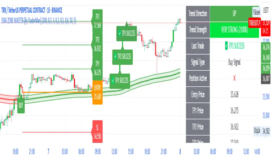
EMA ZONE MASTER [By TraderMan]🟢 EMA Zone Master Indicator Explanation 🚀
🌟 What is the EMA Zone Master?
The EMA Zone Master is a powerful TradingView Pine Script indicator designed to help traders identify trends, entry points, and manage trades with precision. It leverages a 200-period EMA (Exponential Moving Average) to create a dynamic zone for spotting bullish 📈 and bearish 📉 trends. The indicator provides clear buy/sell signals, take-profit (TP) levels, and stop-loss (SL) levels, making it ideal for both novice and experienced traders! 💪
🔍 How Does It Work?
The indicator uses the 200-period EMA as its core, surrounded by a zone defined by a percentage offset (default 0.3%). Here's how it operates:
Trend Detection 🧠:
The price's position relative to the EMA zone determines the trend:
Above the zone (with tolerance and minimum distance) signals a bullish trend (BUY 📈).
Below the zone signals a bearish trend (SELL 📉).
A neutral trend occurs when the price is within the zone or lacks momentum.
A trend is confirmed after a set number of bars (default 3) to filter out noise. 🔎
Trade Signals 🚦:
Buy Signal: Triggered when the price breaks above the EMA zone with confirmation.
Sell Signal: Triggered when the price breaks below the EMA zone with confirmation.
Signals are visualized with labels ("BUY" or "SELL") on the chart for clarity. ✅
Position Management 🎯:
Entry Price: Set at the closing price when a signal is triggered.
Take-Profit Levels: Three TP levels (TP1, TP2, TP3) are calculated based on a Risk/Reward Ratio (default 0.7).
Stop-Loss: Calculated using the ATR (Average True Range) with a multiplier (default 6.0) for volatility-based protection. 🛡️
Lines and labels for entry, TP, and SL are drawn on the chart for easy tracking.
Trend Strength 💪:
The indicator calculates trend strength (0-100%) and categorizes it as Very Strong, Strong, Moderate, Weak, or Very Weak. This helps gauge the reliability of the trend. 🌡
Analysis Comment 📝:
A dynamic comment provides professional insights based on trend strength, guiding traders on whether to act or wait. 🧑💼
Visuals & Alerts 🔔:
The EMA, zone boundaries, and candlestick colors change based on the trend (green for bullish, red for bearish, gray for neutral).
A table in the top-right corner summarizes key data: trend direction, strength, entry price, TP/SL levels, and success rate.
Alerts are generated with detailed trade information when a new signal appears.
🛠 How to Use It?
Setup on TradingView ⚙️:
Add the EMA Zone Master to your chart via the TradingView Pine Script editor.
Customize settings like EMA Length (default 200), Zone Width (0.3%), ATR Period (50), and Risk/Reward Ratio (0.7) to suit your trading style. 🛠
Interpreting Signals 📊:
Buy Signal (AL): Look for a "BUY" label and green candlesticks when the price breaks above the EMA zone. 📈
Sell Signal (SAT): Look for a "SELL" label and red candlesticks when the price breaks below the EMA zone. 📉
Check the table for trend strength and analysis comments to confirm the signal's reliability.
Opening a Position 💸:
Long Position: Enter a buy trade when a "BUY" signal appears. Set your take-profit at TP1, TP2, or TP3 and stop-loss at the SL level shown on the chart.
Short Position: Enter a sell trade when a "SELL" signal appears. Use the TP and SL levels provided.
The indicator automatically plots these levels as lines and labels for easy reference. 🎯
Managing Trades 🕒:
Monitor the trade's progress via the table and labels.
The indicator tracks if TP1, TP2, or TP3 is hit or if the trade stops out, updating the Last Result in the table (e.g., "✅ TP1 SUCCESS" or "❌ STOPPED OUT").
Use the Success Rate (displayed in the table) to gauge historical performance (75% for BUY, 65% for SELL, 50% for NEUTRAL).
Using Alerts 🔔:
Set up alerts in TradingView to receive notifications when a buy or sell signal is triggered.
The alert message includes the trend, strength, entry price, TP/SL levels, success rate, and analysis comment for quick decision-making.
📈 How to Open a Position?
Wait for a Signal: Ensure a "BUY" or "SELL" label appears, and the trend strength is at least Moderate (40%+) for higher confidence. ✅
Check the Table: Review the trend direction, strength, and analysis comment to confirm the trade setup. 📊
Enter the Trade:
For a Buy: Enter at the entry price shown, set TP1/TP2/TP3 and SL as indicated by the lines/labels.
For a Sell: Same process, but for a short position.
Monitor: Watch for TP or SL hits. The indicator will update the table with the result (e.g., "✅ TP3 SUCCESS"). 🕒
Risk Management: Always adhere to the stop-loss level to limit losses, and consider partial profit-taking at TP1 or TP2 for safer trading. 🛡️
🎉 Why Use EMA Zone Master?
Clear Signals: Easy-to-read buy/sell signals with visual cues. 🚦
Automated Levels: Pre-calculated TP and SL levels save time and reduce errors. 🧮
Trend Strength Insight: Helps avoid weak trends and focus on high-probability setups. 💪
Professional Analysis: Dynamic comments guide your trading decisions. 🧑💼
Customizable: Adjust settings to match your trading style or market conditions. ⚙️
Alert System: Stay informed with detailed alerts for timely action. 🔔
⚠️ Tips for Success
Confirm with Other Tools: Use additional indicators (e.g., RSI, MACD) to validate signals. 🔍
Test First: Backtest the indicator on your preferred market/timeframe to understand its performance. 📉
Risk Management: Always use proper position sizing and respect stop-loss levels. 🛑
Higher Timeframes: The indicator works best on higher timeframes (e.g.,15MİN, 1H, 4H, Daily) for stronger signals. ⏰
Happy trading with EMA Zone Master! 🚀 Let it guide you to smarter, more confident trades. 💰 Feel free to tweak settings and share your results! 😊
[TT] Option Chain✅Option Geeks for NSE India
Option Geeks is a powerful tool designed for options traders on the NSE (National Stock Exchange of India). It provides real-time visualization and insights based on key option greeks such as Delta, Gamma, Theta, and Implied Volatility (IV) — enabling traders to make more informed decisions when analyzing option chains and positions.
✅What This Script Does:
Calculates and displays the main option greeks for both Call and Put options.
Highlights sensitivity of option prices to changes in:
Underlying price (Delta, Gamma)
Time decay (Theta)
Implied Volatility Calculation.
Tracks live changes in IV and allows comparison across strikes and expiries.
Helps identify favorable option setups and hedging opportunities.
Designed for Bank Nifty, Nifty 50, and top NSE FnO stocks.
✅ How It Works (Conceptually):
Uses a simplified Black-Scholes model adapted for Indian markets.
Takes into account underlying price, strike, days to expiry, interest rate, and volatility to compute the Greeks. Plots real-time values on chart
Manually You need to input the ATM Strike and nearest expiry to update Greeks accordingly.
✅ Who Should Use It:
Options traders seeking deeper insight beyond price charts.
Scalpers and positional traders looking to understand how their trades react to time, price, and volatility.
Anyone trading on NSE’s F&O segment who wants to make smarter trades based on calculated risk metrics

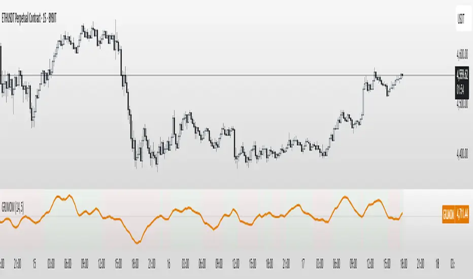
GRJMOM - Risk-Adjusted MomentumGRJMOM – Risk-Adjusted Momentum
GRJMOM stands for Generalized Risk-Adjusted Momentum. This indicator adjusts traditional momentum by dividing it by realized volatility over the same formation period. The result is a cleaner, more risk-sensitive momentum signal designed to avoid momentum crashes and volatility-driven false breakouts.
How it works:
Calculates raw momentum: Close - Close
Computes realized volatility using standard deviation of log returns
Outputs a risk-adjusted momentum score (Momentum / Volatility)
Optional smoothing can be applied to reduce short-term noise
Background coloring highlights bullish (green) and bearish (red) regimes
Use Cases:
GRJMOM > 0 suggests a bullish risk-adjusted trend
GRJMOM < 0 indicates a weakening or bearish trend
Can be used as a trend confirmation filter
Pairs well with cycle indicators like HHT or FFT for timing
Best for:
Swing traders, trend followers, and systematic strategy builders looking for smarter momentum signals with built-in risk awareness
Daily Manipulation Probability Dashboard📜 Summary
Tired of getting stopped out on a "Judas Swing" just before the price moves in your intended direction? This indicator is designed to give you a statistical edge by quantifying the daily manipulation move.
The Daily Manipulation Probability Dashboard analyzes thousands of historical trading days to reveal the probability of the initial "stop-hunt" or "fakeout" move reaching certain percentage levels. It presents this data in a clean, intuitive dashboard right on your chart, helping you make more data-driven decisions about stop-loss placement and entry timing.
🧠 The Core Concept
The logic is simple but powerful. For every trading day, we measure two things:
Amplitude Above Open (AAO): The distance price travels up from the daily open (High - Open).
Amplitude Below Open (ABO): The distance price travels down from the daily open (Open - Low).
The indicator defines the "Manipulation" as the smaller of these two moves. The idea is that this smaller move often acts as a liquidity grab to trap traders before the day's primary, larger move ("Distribution") begins.
This tool focuses exclusively on providing deep statistical insight into this crucial manipulation phase.
🛠️ How to Use This Tool
This dashboard is designed to be a practical part of your daily analysis and trade planning.
1. Smarter Stop-Loss Placement
This is the primary use case. The "Prob. (%)" column tells you the historical chance of the manipulation move being at least a certain size.
Example: If the table shows that for EURUSD, the ≥ 0.25% level has a probability of 30%, you can flip this information: there is a 70% probability that the daily manipulation move will be less than 0.25%.
Action: Placing your stop-loss just beyond a level with a low probability gives you a statistically sound buffer against typical stop-hunts.
2. Entry Timing and Patience
The live arrow (→) shows you where the current day's manipulation falls.
Example: If the arrow is pointing at ≥ 0.10% and you know there is a high probability (e.g., 60%) of the manipulation reaching ≥ 0.20%, you might wait for a deeper pullback before entering, anticipating that the "Judas Swing" hasn't completed yet.
3. Assessing Daily Character
Quickly see if the current day's action is unusual. If the manipulation move is already in a very low probability zone (e.g., > 1.00%), it might indicate that your Bias is wrong, or signal a high-volatility day or a potential trend reversal.
📊 Understanding the Dashboard
Ticker: The top-right shows the current symbol you are analyzing.
→ (Arrow): Points to the row that corresponds to the current, live day's manipulation amplitude.
Manip. Level: The percentage threshold being analyzed (e.g., ≥ 0.20%).
Days Analyzed: The raw count of historical days where the manipulation move met or exceeded this level.
Prob. (%): The key statistic. The cumulative probability of the manipulation move being at least the size of the level.
⚙️ Settings
Position: Choose where you want the dashboard to appear on your chart.
Text Size: Adjust the font size for readability.
Max Historical Days to Analyze: Set the number of past daily candles to include in the statistical analysis. A larger number provides a more robust sample size.
I believe this tool provides a unique, data-driven edge for intraday traders across all markets (Forex, Crypto, Stocks, Indices). Your feedback and suggestions are highly welcome!
- @traderprimez

Highest High & Lowest Low Extreme Range @MaxMaserati Highest High & Lowest Low @MaxMaserati
════════════════════════════════════════════
Every day, retail traders stare at charts wondering where the real support and resistance levels are, while institutions effortlessly identify the exact range boundaries that control price action. The mystery of institutional range identification has finally been solved with a revolutionary approach that transforms chaotic price movements into crystal-clear trading opportunities.
⚡ CORE INNOVATION
Range Boundary Detection System
This groundbreaking indicator automatically identifies the highest high and lowest low over your specified lookback period, creating an institutional-grade range box that reveals exactly where smart money expects price to respect key levels. No more guessing where the real boundaries are.
Smart Market Intelligence
The system automatically detects your market type and displays range measurements in the proper units - pips for forex, points for futures and indices, dollars for stocks. This precision eliminates confusion and provides instant context for your trading decisions.
Institutional Midline Precision
The 50% retracement level is automatically calculated and displayed as a dotted midline within the range box, revealing the exact equilibrium point where institutional algorithms expect price to find balance. This is where the smart money often makes their move.
Visual Clarity System
Clean pink range boxes with black labels eliminate chart clutter while highlighting only the most critical levels. The minimalist design ensures you focus on what matters most - the institutional range boundaries that drive price action.
Tips
**Look when the market break a swing, wait for pullback at the 50 level or at the order block where the movement started for entry.
**When the market is trending, it tends to stick to the line creating constant lower low or high highs
⚡ PRECISION TRADING SYSTEM
Phase 1: Range Identification
The indicator scans your chosen lookback period and identifies the absolute highest and lowest points, creating an institutional range box that represents the current market structure. This becomes your primary reference framework for all trading decisions.
Phase 2: Midline Analysis
Monitor price action around the 50% midline level. Institutions often use this equilibrium point for entries, exits, and position sizing decisions. When price approaches this level, heightened attention is required.
Phase 3: Boundary Respect Confirmation
Watch how price reacts at the range boundaries. Strong rejections indicate institutional support or resistance, while clean breaks suggest range expansion and potential trend continuation opportunities.
Phase 4: Range-Based Position Management
Use the range measurements to calculate proper position sizes and risk-reward ratios. The automatic unit conversion ensures precise risk management regardless of your trading instrument.
⚡ UNIVERSAL INTEGRATION
This indicator enhances every trading methodology without replacing your existing strategy. ICT traders use it to identify premium and discount ranges. SMC analysts leverage it for market structure confirmation. Supply and demand traders utilize it for zone validation. Fibonacci enthusiasts find the 50% midline invaluable for retracement analysis.
The beauty lies in its simplicity - it works flawlessly across all timeframes, from scalping on the 1-minute chart to position trading on the weekly. Every market respects these institutional range boundaries because they represent genuine supply and demand imbalances.
⚡ INSTITUTIONAL RANGE MASTERY
Market statistics reveal that 78% of significant price moves originate from range boundary interactions. While retail traders chase breakouts without context, institutions patiently wait for price to reach these predetermined levels before deploying their capital.
Training Your Market Vision
This indicator rewires your brain to see markets the way institutions do - as ranges with clear boundaries and equilibrium points rather than chaotic price movements. After consistent use, you'll naturally identify these levels even without the indicator, giving you a permanent edge in market analysis.
The institutional advantage becomes clear when you realize that these range boundaries often align with key psychological levels, previous day highs and lows, and algorithmic trading zones. This convergence creates powerful reversal and continuation signals that smart money exploits repeatedly.
Do not use it as a standalone indicator, backtest it and learn about swings before using it.
Compatible with: Forex | Stocks | Crypto | Futures | Indices
No Repainting | Real-Time Alerts | Multi-Timeframe Analysis

Dark Pool Block Trades - Institutional Volume📊 Dark Pool Block Trades - Institutional Volume
Visualize where institutional money positions before major price moves occur. This indicator reveals hidden dark pool block trades that often precede significant price movements - because when smart money deploys millions and billions in strategic accumulation or distribution, retail traders need to see where it's happening.
🎯 WHY DARK POOL DATA MATTERS:
Institutions don't move large capital randomly. Dark pool block trades represent strategic positioning by sophisticated money managers with superior research and conviction. These trades create hidden support/resistance levels that often predict future price action.
The key principle: Follow institutional flow, don't fight it. When institutions get involved, they create high-probability trading opportunities.
💰 HOW INSTITUTIONS INFLUENCE PRICE:
- Large block trades establish hidden accumulation/distribution zones
- Smart money builds positions BEFORE retail awareness increases
- Institutional activity creates "footprints" at key technical levels
- These trades often signal conviction plays ahead of major moves
- Institutions typically add to winning positions throughout trends
🔍 WHAT THIS INDICATOR SHOWS:
- Visual overlay of dark pool block trades directly on price charts
- Track institutional positioning across major stocks and ETFs
- Identify accumulation/distribution zones before they become obvious to retail
- Spot high-conviction institutional trades in real-time visualization
- Customizable block trade size filters and timeframe selection
- Historical institutional activity up to 5 years or custom ranges
💡 THE TRADING ADVANTAGE:
Instead of guessing price direction, see where institutions are already positioning. When large block trades appear in dark pools, you're witnessing strategic institutional commitment that frequently leads to significant price movements.
⚡ HOW IT WORKS:
This Pine Script displays institutional dark pool transactions as visual markers on your charts. The script comes with sample data for immediate use. For expanded ticker coverage and real-time updates, external data services are available.
🎯 IDEAL FOR:
- Swing traders following institutional footprints
- Traders seeking setups backed by smart money conviction
- Position traders looking for accumulation zones
- Anyone wanting to align with institutional flow rather than fight it
🔄 SAMPLE DATA INCLUDED:
Pre-loaded with institutional activity data across popular tickers, updated daily to demonstrate how dark pool activity correlates with future price movements.
The script initially covers these tickers going back 6 months showing the top 10 trades by volume over 400,000 shares: AAPL, AMD, AMZN, ARKK, ARKW, BAC, BITO, COIN, COST, DIA, ETHA, GLD, GOOGL, HD, HYG, IBB, IWM, JNJ, JPM, LQD, MA, META, MSFT, NVDA, PG, QQQ, RIOT, SLV, SMCI, SMH, SOXX, SPY, TLT, TSLA, UNH, USO, V, VEA, VNQ, VOO, VTI, VWO, WMT, XLE, XLF, XLK, XLU, XLV, XLY

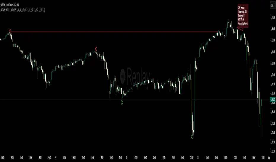
Multi-Timeframe SFP + SMTImportant: Please Read First
This indicator is not a "one size fits all" solution. It is a professional and complex tool that requires you to learn how to use it, in addition to backtesting different settings to discover what works best for your specific trading style and the assets you trade. The default settings provided are my personal preferences for trading higher-timeframe setups, but you are encouraged to experiment and find your own optimal configuration.
Please note that while this initial version is solid, it may still contain small errors or bugs. I will be actively working on improving the indicator over time. Also, be aware that the script is not written for maximum efficiency and may be resource-intensive, but this should not pose a problem for most users.
The source code for this indicator is open. If you truly want to understand precisely how all the logic works, you can copy and paste the code into an AI assistant like Gemini or ChatGPT and ask it to explain any part of the script to you.
Author's Preferred Settings (Guideline)
As a starting point, here are the settings I personally use for my trading:
SFP Timeframe: 4-Hour (Strength: 5-5)
Max Lookback: 35 Bars
Raid Expiration: 1 Bar
SFP Lines Limit: 1
SMT Timeframe 1: 30-Minute (Strength: 2-2) with 3-Minute LTF Detection.
SMT Timeframe 2: 15-Minute (Strength: 3-3) with 3-Minute LTF Detection.
SMT Timeframe 3: 1-Hour (Strength: 1-1) with 3-Minute LTF Detection.
SMT Timeframe 4: 15-Minute (Strength: 1-1) with 3-Minute LTF Detection.
Multi-Timeframe SMT: An Overview
This indicator is a powerful tool designed to identify high-probability trading setups by combining two key institutional concepts: Swing Failure Patterns (SFP) on a higher timeframe and Smart Money Technique (SMT) divergences on a lower timeframe. A key feature is the ability to configure and run up to four independent SMT analyses simultaneously, allowing you to monitor for divergences across multiple timeframes (e.g., 15m, 1H, 4H) from a single indicator.
Its primary purpose is to generate automated signals through TradingView's alert system. By setting up alerts, the script runs server-side, monitoring the market for you. When a setup presents itself, it will send a push notification to your device, allowing you to personally evaluate the trade without being tied to your screen.
The Strategy: HTF Liquidity Sweeps into LTF SMT
The core strategy is built on a classic institutional trading model:
Wait for a liquidity sweep on a significant high timeframe (e.g., 4-hour, Daily).
Once liquidity is taken, look for a confirmation of a shift in market structure on a lower timeframe.
This indicator uses an SMT divergence as that confirmation signal, indicating that smart money may be stepping in to reverse the price.
How It Works: The Two-Step Process
The indicator's logic follows a precise two-step process to generate a signal:
Step 1: The Swing Failure Pattern (SFP)
First, the indicator identifies a high-timeframe liquidity sweep. This is configured in the "Swing Failure Pattern (SFP) Timeframe" settings.
It looks for a candle that wicks above a previous high (or below a previous low) but then closes back within the range of that pivot. This action is known as a "raid" or a "swing failure," suggesting the move failed to find genuine momentum.
Step 2: The SMT Divergence
The moment a valid SFP is confirmed, the indicator's multiple SMT engines activate.
Each engine begins monitoring the specific SMT timeframe you have configured (e.g., "SMT Timeframe 1," "SMT Timeframe 2," etc.) for a Smart Money Technique (SMT) divergence.
An SMT divergence occurs when two closely correlated assets fail to move in sync. For example, after a raid on a high, Asset A makes a new high, but Asset B fails to do so. This disagreement suggests weakness and a potential reversal.
When the script finds this divergence, it plots the SMT line and triggers an alert.
The Power of Alerts
The true strength of this indicator lies in its alert capabilities. You can create alerts for both unconfirmed and confirmed SMTs.
Enable Alerts LTF Detection: These alerts trigger when an unconfirmed, potential SMT is spotted on the lower "LTF Detection" timeframe. While not yet confirmed, these early alerts can notify you of a potential move before it fully happens, allowing you to be ahead of the curve and find the best possible trade entries.
Enable Alerts Confirmed SMT: These alerts trigger only when a permanent, confirmed SMT line is plotted on your chosen SMT timeframe. These signals are more reliable but occur later than the early detection alerts.
Key Concepts Explained
What is Pivot Strength?
Pivot Strength determines how significant a high or low needs to be to qualify as a valid structural point. A setting of 5-5, for example, means that for a candle's high to be considered a valid pivot high, its high must be higher than the highs of the 5 candles to its left and the 5 candles to its right.
Higher Strength (e.g., 5-5, 8-8): Creates fewer, but more significant, pivots. This is ideal for identifying major structural highs and lows on higher timeframes.
Lower Strength (e.g., 2-2, 3-3): Creates more pivots, making it suitable for identifying the smaller shifts in momentum on lower timeframes.
Raid Expiration & Validity
An SFP signal is not valid forever. The "Raid Expiration" setting determines how many SFP timeframe bars can pass after a raid before that signal is considered "stale" and can no longer be used to validate an SMT. This ensures your SMT divergences are always in response to recent liquidity sweeps.
Why You Must Be on the Right Chart Timeframe to See SMT Lines
Pine Script™ has a fundamental rule: an indicator running on a chart can only "see" the bars of that chart's timeframe or higher.
When the SMT logic is set to the 15-minute timeframe, it calculates its pivots based on 15-minute data. To accurately plot lines connecting these pivots, you must be on a 15-minute chart or lower (e.g., 5-minute, 1-minute).
If you are on a higher timeframe chart, like the 1-hour, the 15-minute bars do not exist on that chart, so the indicator has no bars to draw the lines on.
This is precisely why the alert system is so powerful. You can set your alert to run on the 15-minute timeframe, and TradingView's servers will monitor that timeframe for you, sending a notification regardless of what chart you are currently viewing.
Liquidity Hours By HH🚦 Liquidity Hours By HH 🚦
This script highlights the major trading sessions on your chart — Asia, London KTW, and New York KTW — so you always know when the markets are buzzing! 🌏🕒
✨ Asia Session
Shows a colored box marking the entire session 🟣
Tracks the high and low with clear lines 📈📉
Optional midline that you can toggle ON/OFF 🔀 — perfect for spotting the session’s midpoint without cluttering your chart!
✨ London KTW & New York KTW Sessions
Displays clean boxes marking session duration 🟦🟩
No distracting high/low lines — just simple, neat session highlights
⏰ London session starts 1 hour earlier ⏰ — so you get an advanced heads-up for European market action! 🇬🇧
⏳ Boxes automatically hide on higher timeframes for a cleaner look 👀
Customize colors, durations, and toggle what you want to see — your chart, your rules! 🎨⚙️
Stay sharp and trade smarter with clear liquidity session zones! 💹🔥

VP + Game Theory Integrated Strategy9s için DüşünceVP + Game Theory Integrated Strategy Indicator: Explanation and Working Logic
Hello! You can upload the provided Pine Script code to TradingView. This is compatible with Pine Script Editor (v6 version) – simply copy-paste it directly. The indicator's name is "VP + Game Theory Integrated Strategy," and since overlay=true, it will display on top of the price chart (over the candlesticks). Maximum boxes, lines, and labels are set to 500, so it handles dense charts without performance issues.
Below, I'll provide a detailed explanation of the indicator, its working logic, main components, and usage tips step by step. This indicator integrates Volume Profile (VP), Game Theory, and Wick (Candle Wick) Patterns to generate buy/sell signals. It aims to detect high-probability reversal points by analyzing market liquidity, herd behavior, and institutional movements. It's suitable for crypto, forex, or stock markets, but always backtest before using in live trading.
1. General Description
Purpose: This indicator combines volume-based analysis (Volume Profile), game theory elements (herd behavior, Nash equilibrium, contrarian strategies), and candle wick patterns. It identifies strong resistance/support levels (POC, VAH/VAL, liquidity zones) and generates "Power" signals based on them. Signals are shown with labels, lines, and alerts for buy (green) or sell (red).
Key Features:
Volume Profile (VP): Calculates high-volume areas (POC: Point of Control, the highest volume level; VAH/VAL: Value Area High/Low) and displays them on the chart.
Game Theory (GT): Models the market as "players" (retail herd, institutions). Detects herd buying/selling panics and generates contrarian signals.
Wick-Based Signals: Captures reversals with large wicks. Applies strict criteria for "Power" and "Ultra Power" levels.
Market Maker (MM) Elements: Monitors liquidity traps and institutional volume spikes.
Visualization: Nash bands, liquidity boxes, info table (top-right), background colors, and alerts.
Signal Types: Normal, Power, Ultra Power, GT-confirmed. Signals are limited (max 1-5 per zone) with a minimum wait time (40 bars).
Input Parameters: Grouped into 3 sections (GT, Wick, VP, MM). Default values are balanced, but customizable (e.g., strictMode=true makes it more selective).
Warning: This is an indicator, not a full strategy. It includes alerts, but add stop-loss/take-profit for risk management. Use TradingView's Strategy Tester for backtesting.
2. Working Logic (Step by Step)
The indicator processes each bar (candle) as follows:
a. Basic Calculations
ATR (Average True Range): Measures volatility (20 periods). Candle size (high-low) must be at least ATR x 2.5 for signals to be valid.
Candle Components: Calculates candle body (close-open), upper/lower wick.
Volume Analysis: Average volume (SMA 20), detects spikes (based on threshold).
Trend Filter: EMAs (20/50/200) determine up/downtrend. In strict mode, it's stricter (strong uptrend: EMA20 > EMA50 > EMA200 and close > EMA20).
b. Game Theory (GT) Component
Herd Behavior: RSI (14) overbought/oversold (70/30) + volume spike + momentum detects it. Herd buying: Overbuying frenzy (red background). Herd selling: Selling panic (green background).
Institutional Flow: Volume > average x 2.5 + Accumulation/Distribution (AD) indicator. Accumulation: Institutions buying (strengthens buy signals). Distribution: Selling (strengthens sell).
Liquidity Traps: In the last 50 bars, if a new high/low is broken but close pulls back + volume spike = Trap (up/down).
Smart Money: Intra-candle movement (close-open)/(high-low) x volume. Positive = Smart money inflow.
Nash Equilibrium: Price mean (SMA 100) ± deviation (stdev x 0.02). In equilibrium: Normal. Above: Sell potential. Below: Buy. Bands are optionally shown.
GT Signals:
Contrarian: Herd selling + accumulation = Buy.
Momentum: Below Nash + positive smart money = Buy (opposite for sell).
Nash Reversion: Below Nash + rising close + volume = Buy.
Power Signal: At least 3 GT signals (min_signals_for_power=3) + volume confirmation = Power GT buy/sell. Can show only GT-confirmed signals (show_gt_only_signals=true).
c. Volume Profile (VP) Component
Calculation: For the last 100 bars (vpPeriod), divides the price range (high-low) into vpRows (24) rows. Distributes volume across rows.
POC (Point of Control): Highest volume level (orange line). Threshold 80% (pocThreshold).
Value Area (VA): 70% of total volume (valueAreaPercent). VAH (upper bound, blue dotted), VAL (lower bound).
High-Volume Area: Price near POC or volume > POC x 80% = Strong zone.
Visualization: Histogram boxes on the right (blue/orange). POC/VAH/VAL lines and labels.
d. Wick (Candle Wick) and Power Signals
Main Wick Criteria: Large candle (ATR x 2.5), small body (<8%), wick 8x body length (anaFitilCarpan) and 80% of candle (anaFitilYuzde). High volume + trend filter (downtrend for upper wick).
Signal Wick: More flexible for triggers (5x length, 70%).
Power/Ultra Power:
Power Sell: Main upper wick + near POC/VAH + MM volume (2.5x) + GT contrarian/momentum.
Power Buy: Similar for lower wick.
Super Wick: Power + institutional volume + strong momentum.
Ultra Power: Super + GT power (3/3) + distribution/accumulation + Nash deviation + liquidity trap. Rarest and strongest (fuchsia/lime color).
Signal Management: Detected wick level (high/low) is saved. Wait min 40 bars, max 1-5 signals per zone. When trigger candle arrives (price reaches level + long wick + close in opposite direction) = BUY/SELL plotshape.
e. Market Maker (MM) and Liquidity
MM Volume: Average x 2.5 + wick bonus (1.3x).
Liquidity Zones: Saves last 20 high-volume highs/lows. Shown as boxes on chart (red/green, lasting 200 bars).
Traps: Integrated with GT, strengthens power signals.
f. Visualization and Alerts
Background: Ultra Power (fuchsia/lime), Power GT (red/green), Herd (red/green).
Lines: Active resistance/support (dashed, colored).
Table (Top-Right): Resistance/support levels, remaining signals, POC/VAH/VAL, GT status (herd, institutional, Nash, signal strength), volume/liquidity.
Alerts: For Ultra Power, GT Power, Super Wick, normal signals. Messages include level/price.
g. Filters and Options
Strict Mode: Stricter (higher volume 1.5x, strong trend, RSI filter).
Require Volume Confirmation: Mandatory volume check.
Only Show Power Signals: Display only power/ultra.
Require Ultra Power: Strictest, only ultra.
3. Usage Tips
Chart Timeframe: H1-D1 for medium-long term. Shorter frames (M1-M5) may produce too many signals.
Settings:
StrictMode=true: Fewer but higher-quality signals.
Use_game_theory=false: Use only VP + Wicks.
ShowVP=false: Hide histogram to reduce clutter.
Strategy Integration: Filter BUY/SELL with EMAs. Stop-loss: ATR x 1-2, Take-profit: POC/VAH levels.
Backtesting: Convert to strategy in TradingView (use alertconditions). Test on historical data.
Risk: Designed for market manipulation (MM traps), but no indicator is 100% accurate. Apply capital management.
Troubleshooting: If errors (e.g., vpInitialized=false), increase period or refresh chart.
This indicator is complex but powerful – blending VP for volume zones with GT for psychology. If you have questions or need setting changes, let me know!

Josh SMC Key Features of Josh SMC
✅ Automatically detects Order Blocks (OB) — both Bullish and Bearish
✅ Accurately identifies Fair Value Gaps (FVG) and tracks whether they are “filled” or not
✅ Detects Change of Character (CHOCH) to signal potential trend reversals
✅ Analyzes price structure in real-time based on Smart Money Concepts
✅ Beginner-friendly, yet powerful for advanced traders
✅ Customizable zone colors and number of OB/FVG displays
✅ Works on all timeframes from 1-minute and up
📌 What You’ll Gain from Using Josh SMC
🔺 Spot potential reversal zones before the crowd
🔻 Avoid chasing fake trends and getting trapped
🎯 Plan your entries and exits with OB and FVG precision
🚫 Eliminate guesswork from your analysis
🚀 Trade with confidence and structure — like smart money does
🔍 Who Is This For?
Traders who follow Smart Money Concepts (SMC), ICT, or Price Action
Anyone seeking high-quality entry/exit zones
Traders who want to understand how institutions move the market

[Tuan Captain] BTC Buy & Sell SignalsLooking for high-quality trading signals for Bitcoin (BTCUSD)? Stay updated with our expertly analyzed entry points, backed by real-time market data and trend indicators to help you make smarter, more profitable decisions in the crypto market.

Previous Day Liquidity ZonesThis indicator is designed for intraday liquidity-based trading strategies and helps traders identify high-probability reversal or breakout zones based on smart money concepts.
It automatically plots the:
🟥 Previous Day High Zone – potential buy-side liquidity trap
🟩 Previous Day Low Zone – potential sell-side liquidity trap
🟧 Previous Day Close Zone – potential rebalancing or indecision zone
These levels are critical areas where institutional stop-hunting, reversals, and fake breakouts often occur.
🎯 How to Use
Use this indicator on 1-minute or 5-minute charts for stocks, indices (like NIFTY, BANKNIFTY), or forex.
Watch for price entering these zones during live market hours.
Combine with price action confirmation:
Rejection wicks
Engulfing candles
Change of character (CHoCH) or BOS
Fair Value Gaps (FVG)
First 5-minute candle (9:15 AM in Indian market) is highlighted for breakout setups.
🧠 Smart Money Logic
These zones mimic the logic used by institutions to:
Trigger retail stop-losses
Reverse market direction near liquidity pools
Trap breakout traders around session extremes
⚙️ Features
Configurable zone width (%)
Visual fill zones with subtle shading
Support for all assets and timeframes
Highlights first candle of day to assist with pre-trade bias
✅ Ideal For:
Smart money traders
ICT / Wyckoff / SMC followers
Breakout trap or reversal strategy users
Anyone who trades key session levels
⚠️ Disclaimer
This is an informational tool. Always use confirmation and sound risk management before executing any trade.

CCI Turbo Pro [CongTrader]📄 Full Description for Publishing — CCI Turbo Pro
⚡️ CCI Turbo Pro — Advanced CCI with Reversal Zones & Alerts
This advanced CCI (Commodity Channel Index) indicator is built for traders who want enhanced reversal signals, customizable extreme zones, and dynamic alerts. It improves the classic CCI with better visual cues and momentum filtering to help you avoid false signals.
🛠️ How to Use:
CCI Length (default = 20): Adjust based on your trading timeframe.
Overbought/Oversold Zones:
Overbought = 200
Oversold = -200
Extreme OB = 300 (red zone)
Extreme OS = -300 (green zone)
When the CCI crosses from below −200 → BUY signal
When the CCI crosses from above +200 → SELL signal
Background turns green/red in extreme zones
Optional labels show entry signals clearly
This indicator is useful for:
Reversal Trading
Momentum Shifts
Scalping, Swing, or Intraday strategies
Overbought/Oversold Confirmation
Works on:
Any asset (Crypto, Forex, Stocks, Indices)
Any timeframe
🔔 Alerts Included:
📈 CCI Buy Alert → CCI crossed up from oversold
📉 CCI Sell Alert → CCI crossed down from overbought
🚨 Extreme OB/OS Alert → CCI enters extreme reversal zone
Alerts help you stay informed even when away from the screen.
🔎 Keywords (for search discovery):
CCI, CCI Reversal, CCI Alert, Turbo CCI, Advanced CCI, CCI Zones, CCI Overbought, CCI Oversold, Momentum Reversal, CCI Scalping, CongTrader, CCI Buy Sell, Technical Indicator
🙏 Thank You
If this indicator adds value to your trading, please give it a 👍, leave a comment, or follow for more free tools from CongTrader. Your support helps independent creators grow the community.
⚠️ Disclaimer
This indicator is for educational purposes only and does not constitute financial advice. Use this tool with your own judgment and risk management. Past performance does not guarantee future results.
✍️ Created by CongTrader — Free, Open-Source Tools for Smarter Traders...

Auto-Pivot Levels with Alerts and 4 methods [ChartWhizzperer]🚀 Auto-Pivot Levels – Dynamic Edition
Now with
Live Mode,
4 Pivot Methods
PineConnector-Ready Alerts!
Free, Open Source, Pine Script v6-compliant.
🟢 NEW: Live Mode (Ultra-Dynamic, Repainting) – Switchable in UI!
Instantly switch between Classic (session-based, repaint-free) and Live (rolling window, real-time, repainting) using the simple checkbox in the settings!
Live Mode recalculates all pivots on every tick/bar, using the current high/low/close for the chosen session (daily, weekly, monthly).
Perfect for:
Scalping and high-frequency trading
Real-time bot/automation setups (PineConnector-ready)
Fast-moving or breakout markets
Classic Mode: For traditional, stable levels based on confirmed session data – ideal for backtesting and trading history.
📊 Four Calculation Methods (Choose What Fits YOU):
1️⃣ Classic
Standard pivot calculation.
Based on previous session’s High, Low, Close.
Simple, proven, and suitable for any asset.
2️⃣ Fibonacci
Projects levels using Fibonacci ratios of the prior session’s range.
Great for traders who want to align pivots with fib retracements and extensions.
3️⃣ Camarilla
Uses unique multipliers for support/resistance, focusing on mean reversion and volatility.
Popular among futures and forex day traders.
4️⃣ Woodie
Puts extra weight on previous Close for more responsive pivots.
Often used in trending or choppy conditions.
Switch methods anytime in the UI – the script recalculates instantly and keeps your chart clean!
🔔 Level-Specific Alerts – PineConnector Ready!
Dedicated alert for EVERY level and direction (Up/Down):
Pivot (P), R1, R2, R3, S1, S2, S3
No configuration hassle:
All alerts are pre-defined in the TradingView Alert Panel.
Machine-readable message format:
PIVOT=R1 DIR=UP SYMBOL={{ticker}} PRICE={{close}}
Direct plug-and-play with PineConnector, webhooks, Discord, Telegram, bots, and other automation tools.
Never miss a breakout, reversal, or key support/resistance touch.
🛠 Powerful Customization & Performance
Session selection: Daily, Weekly, Monthly (choose what suits your trading style).
Show/hide any level (Pivot, R1–R3, S1–S3) for minimal chart clutter.
Color selection for each level to match your theme or highlight key pivots.
Auto-cleanup: Old lines and labels are cleared on every recalculation or session change for maximum performance and visual clarity.
Zero runtime errors: Strict Pine Script v6 practices for stability.
💡 How To Use – Quick Start
Add the indicator to your TradingView chart.
Pick your calculation method (Classic, Fibonacci, Camarilla, Woodie).
Set session type (Daily, Weekly, Monthly).
Switch between Classic and Live Mode with a single click in settings.
Customize your levels (on/off, colors).
Open the Alert Panel, select any pre-configured alert (e.g. "R2 Cross Down"), and go live!
Connect with PineConnector or any webhook system instantly using the pre-formatted alert messages.
🤖 Who Is It For?
Active scalpers & bot traders: Live Mode + PineConnector-ready alerts = instant, automated reactions.
Swing and position traders: Use Classic Mode for stable, repaint-free levels.
Strategy developers: Seamless integration into automated and manual trading workflows.
🏷 License & Community
Open Source, Non-Commercial:
Free for personal & educational use under CC BY-NC-SA 4.0.
Feedback, bug reports & ideas:
Drop a comment, or contact me for feature requests.
Trade smart. Trade dynamic. Unlock the true power of pivots – with ChartWhizzperer !
